Original Source: http://feedproxy.google.com/~r/tympanus/~3/WhzsB3GOGJ0/


In this tutorial you’ll learn how to create a customizer app that lets you change the colors of a 3D model of a chair using Three.js.

See the demo in action: 3D Model Color Customizer App with Three.js
A quick introduction
This tool is built inspired by the Vans shoe customizer, and uses the amazing JavaScript 3D library Three.js.
For this tutorial, I’ll assume you are comfortable with JavaScript, HTML and CSS.
I’m going to do something a little bit different here in the interest of actually teaching you, and not making you copy/paste parts that aren’t all that relevant to this tutorial, we’re going to start with all of the CSS in place. The CSS really is just for the dressing around the app, it focusses on the UI only. That being said, each time we paste some HTML, I’ll explain quickly what the CSS does. Let’s get started.
Part 1: The 3D model
If you want to skip this part entirely, feel free to do so, but it may pay to read it just so you have a deeper understanding of how everything works.
This isn’t a 3D modelling tutorial, but I will explain how the model is set up in Blender, and if you’d like to create something of your own, change a free model you found somewhere online, or instruct someone you’re commissioning. Here’s some information about how our chairs 3D model is authored.
The 3D model for this tutorial is hosted and included within the JavaScript, so don’t worry about downloading or having to do any of this unless you’d like to look further into using Blender, and learning how to create your own model.
Scale
The scale is set to approximately what it would be in the real world; I don’t know if this is important, but it feels like the right thing to do, so why not?

Layering and naming conventions
This part is important: each element of the object you want to customize independently needs to be its own object in the 3D scene, and each item needs to have a unique name. Here we have back, base, cushions, legs and supports. Note that if you have say, three items all called supports, Blender is going to name them as supports, supports.001, supports.002. That doesn’t matter, because in our JavaScript we’ll be using includes(“supports”) to find all of those objects that contain the string supports in it.

Placement
The model should be placed at the world origin, ideally with its feet on the floor. It should ideally be facing the right way, but this can easily be rotated via JavaScript, no harm, no foul.
Setting up for export
Before exporting, you want to use Blender’s Smart UV unwrap option. Without going too much into detail, this makes textures keep its aspect ratio in tact as it wraps around the different shapes in your model without stretching in weird ways (I’d advise reading up on this option only if you’re making your own model).
You want to be sure to select all of your objects, and apply your transformations. For instance, if you changed the scale or transformed it in any way, you’re telling Blender that this is the new 100% scale, instead of it still being 32.445% scale if you scaled it down a bit.
File Format
Apparently Three.js supports a bunch of 3D object file formats, but the one it recommends is glTF (.glb). Blender supports this format as an export option, so no worries there.
Part 2: Setting up our environment
Go ahead and fork this pen, or start your own one and copy the CSS from this pen. This is a blank pen with just the CSS we’re going to be using in this tutorial.
See the Pen
3D Chair Customizer Tutorial – Blank by Kyle Wetton (@kylewetton)
on CodePen.
If you don’t choose to fork this, grab the HTML as well; it has the responsive meta tags and Google fonts included.
We’re going to use three dependencies for this tutorial. I’ve included comments above each that describe what they do. Copy these into your HTML, right at the bottom:
<!– The main Three.js file –>
<script src=’https://cdnjs.cloudflare.com/ajax/libs/three.js/108/three.min.js’></script>
<!– This brings in the ability to load custom 3D objects in the .gltf file format. Blender allows the ability to export to this format out the box –>
<script src=’https://cdn.jsdelivr.net/gh/mrdoob/Three.js@r92/examples/js/loaders/GLTFLoader.js’></script>
<!– This is a simple to use extension for Three.js that activates all the rotating, dragging and zooming controls we need for both mouse and touch, there isn’t a clear CDN for this that I can find –>
<script src=’https://threejs.org/examples/js/controls/OrbitControls.js’></script>
Let’s include the canvas element. The entire 3D experience gets rendered into this element, all other HTML will be UI around this. Place the canvas at the bottom of your HTML, above your dependencies.
<!– The canvas element is used to draw the 3D scene –>
<canvas id=”c”></canvas>
Now, we’re going to create a new Scene for Three.js. In your JavaScript, lets make a reference to this scene like so:
// Init the scene
const scene = new THREE.Scene();
Below this, we’re going to reference our canvas element
const canvas = document.querySelector(‘#c’);
Three.js requires a few things to run, and we will get to all of them. The first was scene, the second is a renderer. Let’s add this below our canvas reference. This creates a new WebGLRenderer, we’re passing our canvas to it, and we’ve opted in for antialiasing, this creates smoother edges around our 3D model.
// Init the renderer
const renderer = new THREE.WebGLRenderer({canvas, antialias: true});
And now we’re going to append the renderer to the document body
document.body.appendChild(renderer.domElement);
The CSS for the canvas element is just stretching it to 100% height and width of the body, so your entire page has now turned black, because the entire canvas is now black!
Our scene is black, we’re on the right track here.
The next thing Three.js needs is an update loop, basically this is a function that runs on each frame draw and is really important to the way our app will work. We’ve called our update function animate(). Let’s add it below everything else in our JavaScript.
function animate() {
renderer.render(scene, camera);
requestAnimationFrame(animate);
}
animate();
Note that we’re referencing a camera here, but we haven’t set one up yet. Let’s add one now.
At the top of your JavaScript, we’ll add a variable called cameraFar. When we add our camera to our scene, it’s going to be added at position 0,0,0. Which is where our chair is sitting! so cameraFar is the variable that tells our camera how far off this mark to move, so that we can see our chair.
var cameraFar = 5;
Now, above our function animate() {….} lets add a camera.
// Add a camera
var camera = new THREE.PerspectiveCamera( 50, window.innerWidth / window.innerHeight, 0.1, 1000);
camera.position.z = cameraFar;
camera.position.x = 0;
This is a perspective camera, with the field of view of 50, the size of the whole window/canvas, and some default clipping planes. The planes determine how near or far the camera should be before the object isn’t rendered. It’s not something we need to pay attention to in our app.
Our scene is still black, let’s set a background color.
At the top, above our scene reference, add a background color variable called BACKGROUND_COLOR.
const BACKGROUND_COLOR = 0xf1f1f1;
Notice how we used 0x instead of # in our hex? These are hexadecimal numbers, and the only thing you need to remember about that is that its not a string the way you’d handle a standard #hex variable in JavaScript. It’s an integer and it starts with 0x.
Below our scene reference, let’s update the scenes background color, and add some fog of the same color off in the distance, this is going to help hide the edges of the floor once we add that in.
const BACKGROUND_COLOR = 0xf1f1f1;
// Init the scene
const scene = new THREE.Scene();
// Set background
scene.background = new THREE.Color(BACKGROUND_COLOR );
scene.fog = new THREE.Fog(BACKGROUND_COLOR, 20, 100);
Now it’s an empty world. It’s hard to tell that though, because there’s nothing in there, nothing casting shadows. We have a blank scene. Now it’s time to load in our model.
Part 3: Loading the model
We’re going to add the function that loads in models, this is provided by our second dependency we added in our HTML.
Before we do that though, let’s reference the model, we’ll be using this variable quite a bit. Add this at the top of your JavaScript, above your BACKGROUND_COLOR. Let’s also add a path to the model. I’ve hosted it for us, it’s about 1Mb in size.
var theModel;
const MODEL_PATH = “https://s3-us-west-2.amazonaws.com/s.cdpn.io/1376484/chair.glb”;
Now we can create a new loader, and use the load method. This sets theModel as our 3D models entire scene. We’re also going to set the size for this app, the right size seems to be about twice as big as it’s loaded. Thirdly, we’re going to offset the y position by -1 to bring it down a little bit, and finally we’re going to add the model to the scene.
The first parameter is the model’s filepath, the second is a function that runs once the resource is loaded, the third is undefined for now but can be used for a second function that runs while the resource is loading, and the final parameter handles errors.
Add this below our camera.
// Init the object loader
var loader = new THREE.GLTFLoader();
loader.load(MODEL_PATH, function(gltf) {
theModel = gltf.scene;
// Set the models initial scale
theModel.scale.set(2,2,2);
// Offset the y position a bit
theModel.position.y = -1;
// Add the model to the scene
scene.add(theModel);
}, undefined, function(error) {
console.error(error)
});
At this point you should be seeing a stretched, black, pixelated chair. As awful as it looks, this is right so far. So don’t worry!

Along with a camera, we need lights. The background isn’t affected by lights, but if we added a floor right now, it would also be black (dark). There are a number of lights available for Three.js, and a number of options to tweak all of them. We’re going to add two: a hemisphere light, and a directional light. The settings are also sorted for our app, and they include position and intensity. This is something to play around with if you ever adopt these methods in your own app, but for now, lets use the ones I’ve included. Add these lights below your loader.
// Add lights
var hemiLight = new THREE.HemisphereLight( 0xffffff, 0xffffff, 0.61 );
hemiLight.position.set( 0, 50, 0 );
// Add hemisphere light to scene
scene.add( hemiLight );
var dirLight = new THREE.DirectionalLight( 0xffffff, 0.54 );
dirLight.position.set( -8, 12, 8 );
dirLight.castShadow = true;
dirLight.shadow.mapSize = new THREE.Vector2(1024, 1024);
// Add directional Light to scene
scene.add( dirLight );
Your chair looks marginally better! Before we continue, here’s our JavaScript so far:
var cameraFar = 5;
var theModel;
const MODEL_PATH = “https://s3-us-west-2.amazonaws.com/s.cdpn.io/1376484/chair.glb”;
const BACKGROUND_COLOR = 0xf1f1f1;
// Init the scene
const scene = new THREE.Scene();
// Set background
scene.background = new THREE.Color(BACKGROUND_COLOR );
scene.fog = new THREE.Fog(BACKGROUND_COLOR, 20, 100);
const canvas = document.querySelector(‘#c’);
// Init the renderer
const renderer = new THREE.WebGLRenderer({canvas, antialias: true});
document.body.appendChild(renderer.domElement);
// Add a camerra
var camera = new THREE.PerspectiveCamera( 50, window.innerWidth / window.innerHeight, 0.1, 1000);
camera.position.z = cameraFar;
camera.position.x = 0;
// Init the object loader
var loader = new THREE.GLTFLoader();
loader.load(MODEL_PATH, function(gltf) {
theModel = gltf.scene;
// Set the models initial scale
theModel.scale.set(2,2,2);
// Offset the y position a bit
theModel.position.y = -1;
// Add the model to the scene
scene.add(theModel);
}, undefined, function(error) {
console.error(error)
});
// Add lights
var hemiLight = new THREE.HemisphereLight( 0xffffff, 0xffffff, 0.61 );
hemiLight.position.set( 0, 50, 0 );
// Add hemisphere light to scene
scene.add( hemiLight );
var dirLight = new THREE.DirectionalLight( 0xffffff, 0.54 );
dirLight.position.set( -8, 12, 8 );
dirLight.castShadow = true;
dirLight.shadow.mapSize = new THREE.Vector2(1024, 1024);
// Add directional Light to scene
scene.add( dirLight );
function animate() {
renderer.render(scene, camera);
requestAnimationFrame(animate);
}
animate();
Here’s what we should be looking at right now:

Let’s fix the pixelation and the stretching. Three.js needs to update the canvas size when it shifts, and it needs to set its internal resolution not only to the dimensions of the canvas, but also the device pixel ratio of the screen (which is much higher on phones).
Lets head to the bottom of our JavaScript, below where we call animate(), and add this function. This function basically listens to both, the canvas size and the window size, and returns a boolean depending on whether the two sizes are the same or not. We will use that function inside the animate function to determine whether to re-render the scene. This function is also going to take into account the device pixel ratio to be sure that the canvas is sharp on mobile phones too.
Add this function at the bottom of your JavaScript.
function resizeRendererToDisplaySize(renderer) {
const canvas = renderer.domElement;
var width = window.innerWidth;
var height = window.innerHeight;
var canvasPixelWidth = canvas.width / window.devicePixelRatio;
var canvasPixelHeight = canvas.height / window.devicePixelRatio;
const needResize = canvasPixelWidth !== width || canvasPixelHeight !== height;
if (needResize) {
renderer.setSize(width, height, false);
}
return needResize;
}
Now update your animate function to look like this:
function animate() {
renderer.render(scene, camera);
requestAnimationFrame(animate);
if (resizeRendererToDisplaySize(renderer)) {
const canvas = renderer.domElement;
camera.aspect = canvas.clientWidth / canvas.clientHeight;
camera.updateProjectionMatrix();
}
}
Instantly, our chair is looking so much better!

I need to mention a couple things before we continue:
The chair is backwards, this is my bad. We’re going to simply rotate the model on its Y position
The supports are black? but the rest is white? This is because the model has some material information that has been imported with it that I had set up in Blender. This doesn’t matter, because we’re going to add a function that lets us define textures in our app, and add them to different areas of the chair when the model loads. So, if you have a wood texture and a denim texture (spoiler: we will), we will have the ability to set these on load without the user having to choose them. So the materials on the chair right now don’t matter all that much.
Humour me quickly, head to the loader function, and remember where we set the scale to (2,2,2)? Lets add this under it:
// Set the models initial scale
theModel.scale.set(2,2,2);
theModel.rotation.y = Math.PI;
Yeah, much better, sorry about that. One more thing: Three.js doesn’t have support for degrees as far as I know (?), everyone appears to be using Math.PI. This equals 180 degrees, so if you want something angled at a 45 degree angle, you’d use Math.PI / 4.

Okay, we’re getting there! We need a floor though, without a floor there can’t really be any shadows right?
Add a floor, what we’re doing here is creating a new plane (a two-dimensional shape, or a three-dimensional shape with no height).
Add this below our lights…
// Floor
var floorGeometry = new THREE.PlaneGeometry(5000, 5000, 1, 1);
var floorMaterial = new THREE.MeshPhongMaterial({
color: 0xff0000,
shininess: 0
});
var floor = new THREE.Mesh(floorGeometry, floorMaterial);
floor.rotation.x = -0.5 * Math.PI;
floor.receiveShadow = true;
floor.position.y = -1;
scene.add(floor);
Let’s take a look at whats happening here.
First, we made a geometry, we won’t be needing to make another geometry in Three.js in this tutorial, but you can make all sorts.
Secondly, notice how we also made a new MeshPhongMaterial and set a couple options. It’s color, and it’s shininess. Check out some of Three.js other materials later on. Phong is great because you can adjust its reflectiveness and specular highlights. There is also MeshStandardMaterial which has support for more advanced texture aspects such as metallic and ambient occlusion, and there is also the MeshBasicMaterial, which doesn’t support shadows. We will just be creating Phong materials in this tutorial.
We created a variable called floor and merged the geometry and material into a Mesh.
We set the floor’s rotation to be flat, opted in for the ability to receive shadows, moved it down the same way we moved the chair down, and then added it to the scene.
We should now be looking at this:

We will leave it red for now, but, where are the shadows? There’s a couple of things we need to do for that. First, under our const renderer, lets include a couple of options:
// Init the renderer
const renderer = new THREE.WebGLRenderer({canvas, antialias: true});
renderer.shadowMap.enabled = true;
renderer.setPixelRatio(window.devicePixelRatio);
We’ve set the pixel ratio to whatever the device’s pixel ratio is, not relevant to shadows, but while we’re there, let’s do that. We’ve also enabled shadowMap, but there are still no shadows? That’s because the materials we have on our chair are the ones brought in from Blender, and we want to author some of them in our app.
Our loader function includes the ability to traverse the 3D model. So, head to our loader function and add this in below the theModel = gltf.scene; line. For each object in our 3D model (legs, cushions, etc), we’re going to to enable to option to cast shadows, and to receive shadows. This traverse method will be used again later on.
Add this line below theModel = gltf.scene;
theModel.traverse((o) => {
if (o.isMesh) {
o.castShadow = true;
o.receiveShadow = true;
}
});
It looks arguably worse than it did before, but at least theres a shadow on the floor! This is because our model still has materials brought in from Blender. We’re going to replace all of these materials with a basic, white PhongMaterial.
Lets create another PhongMaterial and add it above our loader function:
// Initial material
const INITIAL_MTL = new THREE.MeshPhongMaterial( { color: 0xf1f1f1, shininess: 10 } );
This is a great starting material, it’s a slight off-white, and it’s only a little bit shiny. Cool!
We could just add this to our chair and be done with it, but some objects may need a specific color or texture on load, and we can’t just blanket the whole thing with the same base color, the way we’re going to do this is to add this array of objects under our initial material.
// Initial material
const INITIAL_MTL = new THREE.MeshPhongMaterial( { color: 0xf1f1f1, shininess: 10 } );
const INITIAL_MAP = [
{childID: “back”, mtl: INITIAL_MTL},
{childID: “base”, mtl: INITIAL_MTL},
{childID: “cushions”, mtl: INITIAL_MTL},
{childID: “legs”, mtl: INITIAL_MTL},
{childID: “supports”, mtl: INITIAL_MTL},
];
We’re going to traverse through our 3D model again and use the childID to find different parts of the chair, and apply the material to it (set in the mtl property). These childID’s match the names we gave each object in Blender, if you read that section, consider yourself informed!
Below our loader function, let’s add a function that takes the the model, the part of the object (type), and the material, and sets the material. We’re also going to add a new property to this part called nameID so that we can reference it later.
// Function – Add the textures to the models
function initColor(parent, type, mtl) {
parent.traverse((o) => {
if (o.isMesh) {
if (o.name.includes(type)) {
o.material = mtl;
o.nameID = type; // Set a new property to identify this object
}
}
});
}
Now, inside our loader function, just before we add our model to the scene (scene.add(theModel);)
Let’s run that function for each object in our INITIAL_MAP array:
// Set initial textures
for (let object of INITIAL_MAP) {
initColor(theModel, object.childID, object.mtl);
}
Finally, head back to our floor, and change the color from red (0xff0000) to a light grey(0xeeeeee).
// Floor
var floorGeometry = new THREE.PlaneGeometry(5000, 5000, 1, 1);
var floorMaterial = new THREE.MeshPhongMaterial({
color: 0xeeeeee, // <——- Here
shininess: 0
});
It’s worth mentioning here that 0xeeeeee is different to our background color. I manually dialed this in until the floor with the lights shining on it matched the lighter background color. We’re now looking at this:
See the Pen
3D Chair Customizer Tutorial – Part 1 by Kyle Wetton (@kylewetton)
on CodePen.
Congratulations, we’ve got this far! If you got stuck anywhere, fork this pen or investigate it until you find the issue.

Part 4: Adding controls
For real though this is a very small part, and is super easy thanks to our third dependency OrbitControls.js.
Above our animate function, we add this in our controls:
// Add controls
var controls = new THREE.OrbitControls( camera, renderer.domElement );
controls.maxPolarAngle = Math.PI / 2;
controls.minPolarAngle = Math.PI / 3;
controls.enableDamping = true;
controls.enablePan = false;
controls.dampingFactor = 0.1;
controls.autoRotate = false; // Toggle this if you’d like the chair to automatically rotate
controls.autoRotateSpeed = 0.2; // 30
Inside the animate function, at the top, add:
controls.update();
So our controls variable is a new OrbitControls class. We’ve set a few options that you can change here if you’d like. These include the range in which the user is allowed to rotate around the chair (above and below). We’ve disabled panning to keep the chair centered, enabled dampening to give it weight, and included auto rotate ability if you choose to use them. This is currently set to false.
Try click and drag your chair, you should be able to explore the model with full mouse and touch functionality!
See the Pen
Scrollable by Kyle Wetton (@kylewetton)
on CodePen.
Part 5: Changing colors
Our app currently doesn’t do anything, so this next part will focus on changing our colors. We’re going to add a bit more HTML. Afterwards, I’ll explain a bit about what the CSS is doing.
Add this below your canvas element:
<div class=”controls”>
<!– This tray will be filled with colors via JS, and the ability to slide this panel will be added in with a lightweight slider script (no dependency used for this) –>
<div id=”js-tray” class=”tray”>
<div id=”js-tray-slide” class=”tray__slide”></div>
</div>
</div>
Basically, the .controls DIV is stuck to the bottom of the screen, the .tray is set to be 100% width of the body, but its child, .tray__slide is going to fill with swatches and can be as wide as it needs. We’re going to add the ability to slide this child to explore colors as one of the final steps of this tutorial.
Let’s start by adding in a couple colors. At the top of our JavaScript, lets add an array of five objects, each with a color property.
const colors = [
{
color: ‘66533C’
},
{
color: ‘173A2F’
},
{
color: ‘153944’
},
{
color: ‘27548D’
},
{
color: ‘438AAC’
}
]
Note that these neither have # or 0x to represent the hex. We will use these colors for both in functions. Also, it’s an object because we will be able to add other properties to this color, like shininess, or even a texture image (spoiler: we will, and we will).
Lets make swatches out of these colors!
First, let’s reference our tray slider at the top of our JavaScript:
const TRAY = document.getElementById(‘js-tray-slide’);
Right at the bottom of our JavaScript, lets add a new function called buildColors and immediately call it.
// Function – Build Colors
function buildColors(colors) {
for (let [i, color] of colors.entries()) {
let swatch = document.createElement(‘div’);
swatch.classList.add(‘tray__swatch’);
swatch.style.background = “#” + color.color;
swatch.setAttribute(‘data-key’, i);
TRAY.append(swatch);
}
}
buildColors(colors);

We’re now creating swatches out of our colors array! Note that we set the data-key attribute to the swatch, we’re going to use this to look up our color and make them into materials.
Below our new buildColors function, let’s add an event handler to our swatches:
// Swatches
const swatches = document.querySelectorAll(“.tray__swatch”);
for (const swatch of swatches) {
swatch.addEventListener(‘click’, selectSwatch);
}
Our click handler calls a function called selectSwatch. This function is going to build a new PhongMaterial out of the color and call another function to traverse through our 3d model, find the part it’s meant to change, and update it!
Below the event handlers we just added, add the selectSwatch function:
function selectSwatch(e) {
let color = colors[parseInt(e.target.dataset.key)];
let new_mtl;
new_mtl = new THREE.MeshPhongMaterial({
color: parseInt(‘0x’ + color.color),
shininess: color.shininess ? color.shininess : 10
});
setMaterial(theModel, ‘legs’, new_mtl);
}
This function looks up our color by its data-key attribute, and creates a new material out of it.
This won’t work yet, we need to add the setMaterial function, (see the final line of the function we just added).
Take note of this line: setMaterial(theModel, ‘legs’, new_mtl);. Currently we’re just passing ‘legs’ to this function, soon we will add the ability to change out the different sections we want to update. But first, lets add the zcode>setMaterial
function.
Below this function, add the setMaterial function:
function setMaterial(parent, type, mtl) {
parent.traverse((o) => {
if (o.isMesh && o.nameID != null) {
if (o.nameID == type) {
o.material = mtl;
}
}
});
}
This function is similar to our initColor function, but with a few differences. It checks for the nameID we added in the initColor, and if its the same as the parameter type, it adds the material to it.
Our swatches can now create a new material, and change the color of the legs, give it a go! Here’s everything we have so far in a pen. Investigate it if you’re lost.
See the Pen
Swatches change the legs color! by Kyle Wetton (@kylewetton)
on CodePen.
Part 6: Selecting the parts to change
We can now change the color of the legs, which is awesome, but let’s add the ability to select the part our swatch should add its material to. Include this HTML just below the opening body tag, I’ll explain the CSS below.
<!– These toggle the the different parts of the chair that can be edited, note data-option is the key that links to the name of the part in the 3D file –>
<div class=”options”>
<div class=”option –is-active” data-option=”legs”>
<img src=”https://s3-us-west-2.amazonaws.com/s.cdpn.io/1376484/legs.svg” alt=””/>
</div>
<div class=”option” data-option=”cushions”>
<img src=”https://s3-us-west-2.amazonaws.com/s.cdpn.io/1376484/cushions.svg” alt=””/>
</div>
<div class=”option” data-option=”base”>
<img src=”https://s3-us-west-2.amazonaws.com/s.cdpn.io/1376484/base.svg” alt=””/>
</div>
<div class=”option” data-option=”supports”>
<img src=”https://s3-us-west-2.amazonaws.com/s.cdpn.io/1376484/supports.svg” alt=””/>
</div>
<div class=”option” data-option=”back”>
<img src=”https://s3-us-west-2.amazonaws.com/s.cdpn.io/1376484/back.svg” alt=””/>
</div>
</div>
This is just a collection of buttons with custom icons in each. The .options DIV is stuck to the side of the screen via CSS (and shifts a bit with media queries). Each .option DIV is just a white square, that has a red border on it when a –is-active class is added to it. It also includes a data-option attribute that matches our nameID, so we can identify it. Lastly, the image element has a CSS property called pointer-events: none so that the event stays on the parent even if you click the image.

Lets add another variable at the top of our JavaScript called activeOptions and by default let’s set it to ‘legs’:
var activeOption = ‘legs’;
Now head back to our selectSwatch function and update that hard-coded ‘legs’ parameter to activeOption
setMaterial(theModel, activeOption, new_mtl);
Now all we need to do is create a event handler to change out activeOption when an option is clicked!
Let’s add this above our const swatches and selectSwatch function.
// Select Option
const options = document.querySelectorAll(“.option”);
for (const option of options) {
option.addEventListener(‘click’,selectOption);
}
function selectOption(e) {
let option = e.target;
activeOption = e.target.dataset.option;
for (const otherOption of options) {
otherOption.classList.remove(‘–is-active’);
}
option.classList.add(‘–is-active’);
}
We’ve added the selectOption function, which sets the activeOption to our event targets data-option value, and toggles the –is-active class. Thats it!
Try it out
See the Pen
Changing options by Kyle Wetton (@kylewetton)
on CodePen.
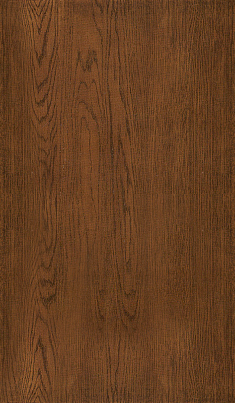
But why stop here? An object could look like anything, it can’t all be the same material. A chair with no wood or fabric? Lets expand our color selection a little bit. Update your color array to this:
const colors = [
{
texture: ‘https://s3-us-west-2.amazonaws.com/s.cdpn.io/1376484/wood.jpg’,
size: [2,2,2],
shininess: 60
},
{
texture: ‘https://s3-us-west-2.amazonaws.com/s.cdpn.io/1376484/denim.jpg’,
size: [3, 3, 3],
shininess: 0
},
{
color: ‘66533C’
},
{
color: ‘173A2F’
},
{
color: ‘153944’
},
{
color: ‘27548D’
},
{
color: ‘438AAC’
}
]
The top two are now textures. We’ve got wood and denim. We also have two new properties, size and shininess. Size is how often to repeat a pattern, so the larger the number, the more dense the pattern is, or more simply put – the more it repeats.
There are two function we need to update to add this ability. Firstly, lets head to the buildColors function and update to this
// Function – Build Colors
function buildColors(colors) {
for (let [i, color] of colors.entries()) {
let swatch = document.createElement(‘div’);
swatch.classList.add(‘tray__swatch’);
if (color.texture)
{
swatch.style.backgroundImage = “url(” + color.texture + “)”;
} else
{
swatch.style.background = “#” + color.color;
}
swatch.setAttribute(‘data-key’, i);
TRAY.append(swatch);
}
}
Now its checking to see if its a texture, if it is, it’s going to set the swatches background to be that texture, neat!
 Notice the gap between the 5th and 6th swatch? The final batch of colors, which I will provide, is grouped into color schemes of 5 colors per scheme. So each scheme will have that small divider in it, this is set in the CSS and will make more sense in the final product.
The second function we’re going to update is the selectSwatch function. Update it to this:
function selectSwatch(e) {
let color = colors[parseInt(e.target.dataset.key)];
let new_mtl;
if (color.texture) {
let txt = new THREE.TextureLoader().load(color.texture);
txt.repeat.set( color.size[0], color.size[1], color.size[2]);
txt.wrapS = THREE.RepeatWrapping;
txt.wrapT = THREE.RepeatWrapping;
new_mtl = new THREE.MeshPhongMaterial( {
map: txt,
shininess: color.shininess ? color.shininess : 10
});
}
else
{
new_mtl = new THREE.MeshPhongMaterial({
color: parseInt(‘0x’ + color.color),
shininess: color.shininess ? color.shininess : 10
});
}
setMaterial(theModel, activeOption, new_mtl);
}
To explain what’s going on here, this function will now check if it’s a texture. If it is, it’s going to create a new texture using the Three.js TextureLoader method, it’s going to set the texture repeat using our size values, and set the wrapping of it (this wrapping option seems to work best, I’ve tried the others, so lets go with it), then its going to set the PhongMaterials map property to the texture, and finally use the shininess value.
If it’s not a texture, it uses our older method. Note that you can set a shininess property to any of our original colors!

Important: if your textures just remain black when you try add them. Check your console. Are you getting cross domain CORS errors? This is a CodePen bug and I’ve done my best to try fix it. These assets are hosted directly in CodePen via a Pro feature so its unfortunate to have to battle with this. Apparently, the best bet here is to not visit those image URLs directly, otherwise I recommend signing up to Cloudinary and using their free tier, you may have better luck pointing your textures there.
Here’s a pen with the textures working on my end at least:
See the Pen
Texture support by Kyle Wetton (@kylewetton)
on CodePen.
Part 7: Finishing touches
I’ve had projects get run passed clients with a big button that is begging to be pressed, positively glistening with temptation to even just hover over it, and them and their co-workers (Dave from accounts) come back with feedback about how they didn’t know there was anything to be pressed (screw you, Dave).
So let’s add some calls to action. First, let’s chuck in a patch of HTML above the canvas element:
<!– Just a quick notice to the user that it can be interacted with –>
<span class=”drag-notice” id=”js-drag-notice”>Drag to rotate 360°</span>
The CSS places this call-to-action above the chair, it’s a nice big button that instructs the user to drag to rotate the chair. It just stays there though? We will get to that.
Let’s spin the chair once it’s loaded first, then, once the spin is done, let’s hide that call-to-action.
First, lets add a loaded variable to the top of our JavaScript and set it to false:
var loaded = false;
Right at the bottom of your JavaScript, add this function
// Function – Opening rotate
let initRotate = 0;
function initialRotation() {
initRotate++;
if (initRotate <= 120) {
theModel.rotation.y += Math.PI / 60;
} else {
loaded = true;
}
}
This simply rotates the the model 360 degrees within the span of 120 frames (around 2 seconds at 60fps), and we’re going to run this in the animate function to call it for 120 frames, once its done, it’s going to set loaded to true in our animate function. Here’s how it will look in its entirely with the new code at the end there:
function animate() {
controls.update();
renderer.render(scene, camera);
requestAnimationFrame(animate);
if (resizeRendererToDisplaySize(renderer)) {
const canvas = renderer.domElement;
camera.aspect = canvas.clientWidth / canvas.clientHeight;
camera.updateProjectionMatrix();
}
if (theModel != null && loaded == false) {
initialRotation();
}
}
animate();
We check that theModel doesn’t equal null, and that the variable loaded is false, and we run that function for 120 frames, at which point the function switches to loaded = true, and our animate function ignores it.
You should have a nice spinning chair. When that chair stops is a great time to remove our call-to-action.
In the CSS, there’s a class that can be added to that call-to-action that will hide it with an animation, this animation has a delay of 3 seconds, so let’s add that class at the same time the rotation starts.
At the top of your JavaScript we will reference it:
const DRAG_NOTICE = document.getElementById(‘js-drag-notice’);
and update your animate function like so
if (theModel != null && loaded == false) {
initialRotation();
DRAG_NOTICE.classList.add(‘start’);
}
Great! Okay, here’s some more colors, update your color array, I’ve give a lightweight sliding function below it:
const colors = [
{
texture: ‘https://s3-us-west-2.amazonaws.com/s.cdpn.io/1376484/wood_.jpg’,
size: [2,2,2],
shininess: 60
},
{
texture: ‘https://s3-us-west-2.amazonaws.com/s.cdpn.io/1376484/fabric_.jpg’,
size: [4, 4, 4],
shininess: 0
},
{
texture: ‘https://s3-us-west-2.amazonaws.com/s.cdpn.io/1376484/pattern_.jpg’,
size: [8, 8, 8],
shininess: 10
},
{
texture: ‘https://s3-us-west-2.amazonaws.com/s.cdpn.io/1376484/denim_.jpg’,
size: [3, 3, 3],
shininess: 0
},
{
texture: ‘https://s3-us-west-2.amazonaws.com/s.cdpn.io/1376484/quilt_.jpg’,
size: [6, 6, 6],
shininess: 0
},
{
color: ‘131417’
},
{
color: ‘374047’
},
{
color: ‘5f6e78’
},
{
color: ‘7f8a93′
},
{
color: ’97a1a7’
},
{
color: ‘acb4b9’
},
{
color: ‘DF9998’,
},
{
color: ‘7C6862’
},
{
color: ‘A3AB84’
},
{
color: ‘D6CCB1’
},
{
color: ‘F8D5C4’
},
{
color: ‘A3AE99’
},
{
color: ‘EFF2F2’
},
{
color: ‘B0C5C1’
},
{
color: ‘8B8C8C’
},
{
color: ‘565F59’
},
{
color: ‘CB304A’
},
{
color: ‘FED7C8’
},
{
color: ‘C7BDBD’
},
{
color: ‘3DCBBE’
},
{
color: ‘264B4F’
},
{
color: ‘389389’
},
{
color: ’85BEAE’
},
{
color: ‘F2DABA’
},
{
color: ‘F2A97F’
},
{
color: ‘D85F52’
},
{
color: ‘D92E37’
},
{
color: ‘FC9736’
},
{
color: ‘F7BD69’
},
{
color: ‘A4D09C’
},
{
color: ‘4C8A67’
},
{
color: ‘25608A’
},
{
color: ’75C8C6′
},
{
color: ‘F5E4B7’
},
{
color: ‘E69041’
},
{
color: ‘E56013’
},
{
color: ‘11101D’
},
{
color: ‘630609’
},
{
color: ‘C9240E’
},
{
color: ‘EC4B17’
},
{
color: ‘281A1C’
},
{
color: ‘4F556F’
},
{
color: ‘64739B’
},
{
color: ‘CDBAC7’
},
{
color: ‘946F43’
},
{
color: ‘66533C’
},
{
color: ‘173A2F’
},
{
color: ‘153944’
},
{
color: ‘27548D’
},
{
color: ‘438AAC’
}
]
Awesome! These hang off the page though, right at the bottom of your JavaScript, add this function, it will allow you to drag the swatches panel with mouse and touch. For the interest of keeping on topic, I won’t delve too much into how it works.
var slider = document.getElementById(‘js-tray’), sliderItems = document.getElementById(‘js-tray-slide’), difference;
function slide(wrapper, items) {
var posX1 = 0,
posX2 = 0,
posInitial,
threshold = 20,
posFinal,
slides = items.getElementsByClassName(‘tray__swatch’);
// Mouse events
items.onmousedown = dragStart;
// Touch events
items.addEventListener(‘touchstart’, dragStart);
items.addEventListener(‘touchend’, dragEnd);
items.addEventListener(‘touchmove’, dragAction);
function dragStart (e) {
e = e || window.event;
posInitial = items.offsetLeft;
difference = sliderItems.offsetWidth – slider.offsetWidth;
difference = difference * -1;
if (e.type == ‘touchstart’) {
posX1 = e.touches[0].clientX;
} else {
posX1 = e.clientX;
document.onmouseup = dragEnd;
document.onmousemove = dragAction;
}
}
function dragAction (e) {
e = e || window.event;
if (e.type == ‘touchmove’) {
posX2 = posX1 – e.touches[0].clientX;
posX1 = e.touches[0].clientX;
} else {
posX2 = posX1 – e.clientX;
posX1 = e.clientX;
}
if (items.offsetLeft – posX2 <= 0 && items.offsetLeft – posX2 >= difference) {
items.style.left = (items.offsetLeft – posX2) + “px”;
}
}
function dragEnd (e) {
posFinal = items.offsetLeft;
if (posFinal – posInitial < -threshold) { } else if (posFinal – posInitial > threshold) {
} else {
items.style.left = (posInitial) + “px”;
}
document.onmouseup = null;
document.onmousemove = null;
}
}
slide(slider, sliderItems);
Now, head to your CSS and under .tray__slider, uncomment this small animation
/* transform: translateX(-50%);
animation: wheelin 1s 2s ease-in-out forwards; */
Okay, let’s finish it off with a the final two touches, and we’re done!
Let’s update our .controls div to include this extra call-to-action:
<div class=”controls”>
<div class=”info”>
<div class=”info__message”>
<p><strong> Grab </strong> to rotate chair. <strong> Scroll </strong> to zoom. <strong> Drag </strong> swatches to view more.</p>
</div>
</div>
<!– This tray will be filled with colors via JS, and the ability to slide this panel will be added in with a lightweight slider script (no dependency used for this) –>
<div id=”js-tray” class=”tray”>
<div id=”js-tray-slide” class=”tray__slide”></div>
</div>
</div>
Note that we have a new info section that includes some instructions on how to control the app.
Finally, let’s add a loading overlay so that our app is clean while everything loads, and we will remove it once the model is loaded.
Add this to the top of our HTML, below the body tag.
<!– The loading element overlays all else until the model is loaded, at which point we remove this element from the DOM –>
<div class=”loading” id=”js-loader”><div class=”loader”></div></div>
Here’s the thing about our loader, in order for it to load first, we’re going to add the CSS to the head tag instead of being included in the CSS. So simply add this CSS just above the closing head tag.
<style>
.loading {
position: fixed;
z-index: 50;
width: 100%;
height: 100%;
top: 0; left: 0;
background: #f1f1f1;
display: flex;
justify-content: center;
align-items: center;
}
.loader{
-webkit-perspective: 120px;
-moz-perspective: 120px;
-ms-perspective: 120px;
perspective: 120px;
width: 100px;
height: 100px;
}
.loader:before{
content: “”;
position: absolute;
left: 25px;
top: 25px;
width: 50px;
height: 50px;
background-color: #ff0000;
animation: flip 1s infinite;
}
@keyframes flip {
0% {
transform: rotate(0);
}
50% {
transform: rotateY(180deg);
}
100% {
transform: rotateY(180deg) rotateX(180deg);
}
}
</style>
Almost there! Let’s remove it once the model is loaded.
At the top of our JavaScript, lets reference it:
const LOADER = document.getElementById(‘js-loader’);
Then in our loader function, after scene.add(theModel), include this line
// Remove the loader
LOADER.remove();
Now our app loads behind this DIV, polishing it off:

And that’s it! Here’s the completed pen for reference.
See the Pen
3D Chair Customizer Tutorial – Part 4 by Kyle Wetton (@kylewetton)
on CodePen.
You can also check out the demo hosted here on Codrops.
Thank you for sticking with me!
This is a big tutorial. If you feel I made a mistake somewhere, please let me know in the comments, and thanks again for following with me as we create this absolute unit.
How to Build a Color Customizer App for a 3D Model with Three.js was written by Kyle Wetton and published on Codrops.


 It sort of feels like our lives are nothing more than an endless string of decision-making, doesn’t it? You go to the grocery store and half an aisle is dedicated to olive oil. Or cereal. Or yogurt. Then, you go home and your streaming services give you literally hundreds of options for horror movies. Or documentaries. Or TV shows. And it doesn’t get any better online.