How to Build Unique, Beautiful Websites with Tailwind CSS
Original Source: https://www.sitepoint.com/tailwind-unique-beautiful-websites/?utm_source=rss

When thinking about what CSS framework to use for a new project, options like Bootstrap and Foundation readily jump to mind. They’re tempting to use because of their ready-to-use, pre-designed components, which developers can use with ease right away. This approach works well with relatively simple websites with a common look and feel. But as soon as we start building more complex, unique sites with specific needs, a couple of problems arise.
At some point, we need to customize certain components, create new components, and make sure the final codebase is unified and easy to maintain after the changes.
It’s hard to satisfy the above needs with frameworks like Bootstrap and Foundation, which give us a bunch of opinionated and, in many cases, unwanted styles. As a result, we have to continuously solve specificity issues while trying to override the default styles. It doesn’t sound like a fun job, does it?
Ready-to-use solutions are easy to implement, but inflexible and confined to certain boundaries. On other hand, styling web sites without a CSS framework is powerful and flexible, but isn’t easy to manage and maintain. So, what’s the solution?
The solution, as always, is to follow the golden middle. We need to find and apply the right balance between the concrete and abstract. A low-level CSS framework offers such a balance. There are several frameworks of this kind, and in this tutorial, we’ll explore the most popular one, Tailwind CSS.
What Is Tailwind?
Tailwind is more than a CSS framework, it’s an engine for creating design systems. — Tailwind website
Tailwind is a collection of low-level utility classes. They can be used like lego bricks to build any kind of components. The collection covers the most important CSS properties, but it can be easily extended in a variety of ways. With Tailwind, customization isn’t pain in the neck anymore. The framework has great documentation, covering every class utility in detail and showing the ways it can be customized. All modern browsers, and IE11+, are supported.
Why Using Utility-first Framework?
A low-level, utility-first CSS framework like Tailwind has a plenty of benefits. Let’s explore the most significant of them:
You have greater control over elements’ appearance. We can change and fine-tune an element’s appearance much more easily with utility classes.
It’s easy to manage and maintain in large projects, because you only maintain HTML files, instead of a large CSS codebase.
It’s easier to build unique, custom website designs without fighting with unwanted styles.
It’s highly customizable and extensible, which gives us unlimited flexibility.
It has a mobile-first approach and easy implementation of responsive design patterns.
There’s the ability to extract common, repetitive patterns into custom, reusable components — in most cases without writing a single line of custom CSS.
It has self-explanatory classes. We can imagine how the styled element looks only by reading the classes.
Finally, as Tailwind’s creators say:
it’s just about impossible to think this is a good idea the first time you see it — you have to actually try it.
So, let’s try it!
Getting Started with Tailwind
To demonstrate Tailwind’s customization features, we need to install it via npm:
npm install tailwindcss
The next step is to create a styles.css file, where we include the framework styles using the @tailwind directive:
@tailwind base;
@tailwind components;
@tailwind utilities;
After that, we run the npx tailwind init command, which creates a minimal tailwind.config.js file, where we’ll put our customization options during the development. The generated file contains the following:
module.exports = {
theme: {},
variants: {},
plugins: [],
}
The next step is to build the styles in order to use them:
npx tailwind build styles.css -o output.css
Finally, we link the generated output.css file and Font Awesome in our HTML:
<link rel=”stylesheet” type=”text/css” href=”output.css”>
<link rel=”stylesheet” href=”https://cdnjs.cloudflare.com/ajax/libs/font-awesome/5.9.0/css/all.min.css”>
And now, we’re ready to start creating.
Building a One-page Website Template
In the rest of the tutorial, we’ll build a one-page website template using the power and flexibility of Tailwind’s utility classes.
Here you can see the template in action.
I’m not going to explain every single utility (which would be boring and tiresome) so I suggest you to use the Tailwind cheatsheet as a quick reference. It contains all available utilities with their effect, plus direct links to the documentation.
We’ll build the template section by section. They are Header, Services, Projects, Team, and Footer.
We firstly wrap all section in a container:
<div class=”container mx-auto”>
<!– Put the sections here –>
</div>
Header (Logo, Navigation)
The first section — Header — will contain a logo on the left side and navigation links on the right side. Here’s how it will look:
Now, let’s explore the code behind it.
<div class=”flex justify-between items-center py-4 bg-blue-900″>
<div class=”flex-shrink-0 ml-10 cursor-pointer”>
<i class=”fas fa-drafting-compass fa-2x text-orange-500″></i>
<span class=”ml-1 text-3xl text-blue-200 font-semibold”>WebCraft</span>
</div>
<i class=”fas fa-bars fa-2x visible md:invisible mr-10 md:mr-0 text-blue-200 cursor-pointer”></i>
<ul class=”hidden md:flex overflow-x-hidden mr-10 font-semibold”>
<li class=”mr-6 p-1 border-b-2 border-orange-500″>
<a class=”text-blue-200 cursor-default” href=”#”>Home</a>
</li>
<li class=”mr-6 p-1″>
<a class=”text-white hover:text-blue-300″ href=”#”>Services</a>
</li>
<li class=”mr-6 p-1″>
<a class=”text-white hover:text-blue-300″ href=”#”>Projects</a>
</li>
<li class=”mr-6 p-1″>
<a class=”text-white hover:text-blue-300″ href=”#”>Team</a>
</li>
<li class=”mr-6 p-1″>
<a class=”text-white hover:text-blue-300″ href=”#”>About</a>
</li>
<li class=”mr-6 p-1″>
<a class=”text-white hover:text-blue-300″ href=”#”>Contacts</a>
</li>
</ul>
</div>
As you can see, the classes are pretty self-explanatory as I mentioned above. We’ll explore only the highlights.
First, we create a flex container and center its items horizontally and vertically. We also add some top and bottom padding, which Tailwind combines in a single py utility. As you may guess, there’s also a px variant for left and right. We’ll see that this type of shorthand is broadly used in many of the other utilities. As a background color, we use the darkest blue (bg-blue-900) from Tailwind’s color palette. The palette contains several colors with shades for each color distributed from 100 to 900. For example, blue-100, blue-200, blue-300, etc.
In Tailwind, we apply a color to a property by specifying the property followed by the color and the shade number. For example, text-white, bg-gray-800, border-red-500. Easy peasy.
For the logo on the left side, we use a div element, which we set not to shrink (flex-shrink-0) and move it a bit away from the edge by applying the margin-left property (ml-10). Next we use a Font Awesome icon whose classes perfectly blend with those of Tailwind. We use one of them to make the icon orange. For the textual part of the logo, we use big, light blue, semi-bolded text, with a small offset to the right.
In the middle, we add an icon that will be visible only on mobile. Here we use one of the responsive breakpoint prefixes (md). Tailwind, like Bootstrap and Foundation, follows the mobile-first approach. This means that when we use utilities without prefix (visible), they apply all the way from the smallest to the largest devices. If we want different styling for different devices, we need to use the breakpoint prefixes. So, in our case the icon will be visible on small devices, and invisible (md:invisible) on medium and beyond.
At the right side we put the nav links. We style the Home link differently, showing that it’s the active link. We also move the navigation from the edge and set it to be hidden on overflow (overflow-x-hidden). The navigation will be hidden (hidden) on mobile and set to flex (md:flex) on medium and beyond.
You can read more about responsiveness in the documentation.
Services
Let’s now create the next section, Services. Here’s how it will look:
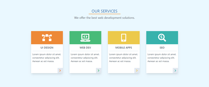
And here’s the code:
<div class=”w-full p-6 bg-blue-100″>
<div class=”w-48 mx-auto pt-6 border-b-2 border-orange-500 text-center text-2xl text-blue-700″>OUR SERVICES</div>
<div class=”p-2 text-center text-lg text-gray-700″>We offer the best web development solutions.</div>
<div class=”flex justify-center flex-wrap p-10″>
<div class=”relative w-48 h-64 m-5 bg-white shadow-lg”>
<div class=”flex items-center w-48 h-20 bg-orange-500″>
<i class=”fas fa-bezier-curve fa-3x mx-auto text-white”></i>
</div>
<p class=”mx-2 py-2 border-b-2 text-center text-gray-700 font-semibold uppercase”>UI Design</p>
<p class=”p-2 text-sm text-gray-700″>Lorem ipsum dolor sit amet, consectetur adipiscing elit. Aenean ac est massa.</p>
<div class=”absolute right-0 bottom-0 w-8 h-8 bg-gray-300 hover:bg-orange-300 text-center cursor-pointer”>
<i class=”fas fa-chevron-right mt-2 text-orange-500″></i>
</div>
</div>
…
</div>
</div>
We create a section with light blue background. Then we add an underlined title and a subtitle.
Next, we use a flex container for the services items. We use flex-wrap so the items will wrap on resize. We set the dimensions for each card and add some space and a drop shadow. Each card has a colored section with a topic icon, a title, and a description. And we also put a button with an icon in the bottom-right corner.
Here we use one of the pseudo-class variants (hover, focus, etc.). They’re used in the same way as responsive breakpoints. We use the pseudo-class prefix, followed by a colon and the property name (hover:bg-orange-300).
You can learn more about pseudo-class variants in the documentation.
For brevity, I show the code only for the first card. The other ones are similar. You have to change only the colors, icons, and titles. See the final HTML file on GitHub repo for a reference.
The post How to Build Unique, Beautiful Websites with Tailwind CSS appeared first on SitePoint.


Leave a Reply
Want to join the discussion?Feel free to contribute!