Original Source: https://www.smashingmagazine.com/2019/10/editorial-design-patterns-css-grid-subgrid-naming/
Editorial Design Patterns With CSS Grid And Named Columns
Editorial Design Patterns With CSS Grid And Named Columns
Rachel Andrew
2019-10-04T12:30:00+02:00
2019-10-04T12:35:51+00:00
Many websites, in particular those which display long-form content, have a fairly straightforward repeating pattern of components: a full-width area for images, a central content area, and perhaps a split view of two half-width blocks. These components repeat to display an article, images and other related content — with content editors selecting the right component as they create articles for publication.
In this article, I’m going to demonstrate an approach to this kind of editorial design, which builds on a few techniques some of which are discussed in the following articles:
“Breaking Out With CSS Grid Layout”
“Breaking Out With CSS Grid Explained”
“Naming Things In CSS Grid Layout”
In addition to this being a nice way to name sections of your layout, this technique exposes a whole bunch of interesting things about Grid Layout which you may find useful in creating your own layout patterns. It also demonstrates more of the promise of subgrid (a part of the upcoming Level 2 of the grid specification and being implemented in Firefox).
Naming Things In CSS Grid Layout
When using CSS Grid Layout, you can name lines and areas. Both of these things can make working with Grid — especially complex grids — more straightforward. Defining naming conventions for things in your layout can be useful when working with your team; it is much easier to understand where anything placed with grid-area: content will end up than having something placed from column-line: 3 / 9.
When using the grid-template-areas approach, you give the items that you want to place on the grid a name by using the grid-area property and then placing them around the grid. In the following example, the item with grid-area: content goes into the grid area defined by the grid-template-areas property:
See the Pen [Layout With Named Area](https://codepen.io/rachelandrew/pen/zYOQBba) by Rachel Andrew.
See the Pen Layout With Named Area by Rachel Andrew.
This works well for components where you have one item to go into one area; however, if you want to place multiple things into the content area (one below the other), using grid-area is the wrong approach. Instead, you might define names for the column lines and place the item from the start to end line.
See the Pen [Layout With Named Columns](https://codepen.io/rachelandrew/pen/xxKNONQ) by Rachel Andrew.
See the Pen Layout With Named Columns by Rachel Andrew.
This isn’t as neat, however, when using the grid-area approach we have to know both the start and end line when placing an item using grid-column or grid-row — or do we?
Take a look at this next CodePen example. My items are placed using a single name or ident by using the grid-column property, even though some of the grid areas being targeted cross a number of columns:
See the Pen [Layout with Named Columns](https://codepen.io/rachelandrew/pen/mdbYEod) by Rachel Andrew.
See the Pen Layout with Named Columns by Rachel Andrew.
My aim here is to abstract away the complexity of the grid setup when actually using the grid. I can put a lot of work into creating the initial grid, but then place things without thinking too much about it as I populate my pages. I also want to make sure that we can repeat the components as often as we need to as we build up the article. What I have in mind is a content creator using a CMS, and creating blocks of content using the different patterns whilst knowing that they will be placed correctly one below the other on the overall grid.
In order to understand how I got to this point requires an understanding of a few things about CSS Grid Layout as well as named lines and areas.
We Can Name Lines
As you’ve already seen in my second example above, we can name lines on the grid that can be pretty much anything we like — other than the word span. The name is an ident rather than a string which is why it is not quoted.
However, you will see many examples where the naming conventions name-start and name-end are used that append -start onto the name of the start line and -end on the name of the end line. This is not purely convention and for the technique I am going to show you why we need to name our lines this way. So you should pick a name for the area you are describing, and then add the -start and -end suffixes — which need to match, of course!
We name our lines inside square brackets. Lines can (and often need to) have multiple names. In this case, space separates the names. When placing the items using line-based positioning, you can pick any name for the line to do the placement.
With our named lines in place, we could place our items using grid-column by specifying the start and end line name. This pattern is just the same as using line numbers, so the name before the slash is the start line and the name after is the end line.
See the Pen [Example using start and end lines](https://codepen.io/rachelandrew/pen/VwZOPgO) by Rachel Andrew.
See the Pen Example using start and end lines by Rachel Andrew.
This places the items but isn’t the neat single name per item that I used in the example. However, we now have everything in place due to the special way that Grid handles named areas and lines.
Line Names Give Us A Named Area
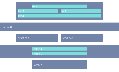
Assuming you have named your lines with -start and -end as I have, Grid will give you a named area of the main name you used. Therefore, in my case, I have areas named content, start-half, end-half, full and center. Each of these areas is a single row (as I don’t have named rows), however, it will span the column tracks from the -start to the -end line.
Named Areas Give Us A Named Line Of The Main Name Used
If we want to be able to place our items as if we have a column name, we also need to make use of the fact that when we create a grid area, we get a line name of the main name used; that is, the main name being the name with -start and -end removed. This line name resolves to the start or end of the area depending on whether we are targeting grid-column-start or grid-column-end.
So, we have an area named content, because we have column lines named content-start and content-end. The area named content also gives us the ability to use grid-column-start: content which will resolve to the start line of that content area, while grid-column-end: content will resolve to the end line of the content area.
This, therefore, means that we can place an item into the content area by using the following:
.content {
grid-column: content / content;
}
Next, we can now tidy up this technique further due to the fact that if you use a named line for grid-column-start and omit the end line (rather than spanning one track as would be the case if you used line numbers), grid copies the name over to the end line. Therefore, grid-column: content is exactly the same as grid-column: content / content;
This is then all we need to be able to place items using grid-column with a simple, single name. This behavior is all exactly as specified and not some kind of “hack”. It demonstrates the depth of thinking that went into the creation of the Grid Layout specification, and the amount of careful work that has gone into making it so straightforward to lay items out in our designs.
Giving This Technique Superpowers With Subgrid
I think this technique is a nice one that enables a very straightforward way of declaring where elements should be placed on the grid. However, if we add subgrid support to the mix, it becomes very powerful indeed.
Currently, subgrid is being implemented in Firefox, and so these next examples require Firefox Nightly to run. You can download Nightly here.
The subgrid value of grid-template-columns and grid-template-rows means that sizing created on a parent grid can be opted into by an item which is a child of the grid (assuming it is also using grid layout) by having display: grid applied.
Note: You can read more about the features of subgrid in my articles here on Smashing Magazine “CSS Grid Level 2: Here Comes Subgrid” and “Digging Into The Display Property: Grids All The Way Down”.
Line Names From The Parent Are Passed Into Subgrids
In addition to the track sizing information being passed into the child grid, any line names set on the parent will be passed in. This means that we can use our “column names” within subgridded components, making this solution very useful in a world where subgrid exists. An item placed in content — even if nested down inside subgrids — will line up with one placed as a direct child of the main grid.
In this next example, I have nested two elements directly inside the div with a class of full-2. I have also placed a ul inside .content. If we look at the items inside full-2, in order to place these on the parent grid, we need to make the selector full-2 a grid with display: grid then use the grid-template-columns property with a value of subgrid.
This causes the grid on .full-2 to use the tracks defined on the parent grid, and have access to the named lines defined there. As this is a full-width item, this really will behave just like the parent grid in terms of placing our items. We can then use any of the names we defined for the different columns to place the items. In this case, I have set both child elements to grid-column: center and they display one after the other in that center area.
.full-2 {
grid-row: 4;
grid-column: full;
display: grid;
row-gap: 10px;
grid-template-columns: subgrid;
}
.full-2 > div {
background-color: rgb(124,222,220);
grid-column: center;
}
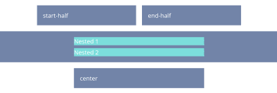
The nested elements line up with the grid on the parent (Large preview)
If we take a look at our nested ul inside .content, we will need to create a subgrid on the selector .content just as with the last example; when we do this, the ul falls into the first track of the subgrid. If we want to lay out the listen items on the subgrid, we need to do two things: cause the ul to take up the same area as its parent by placing it with grid-column: content, and then making it a grid which is a subgrid.
Having done this the list items will lay out using auto-placement into the column tracks of the subgrid:
.content {
grid-row: 1;
grid-column: content;
display: grid;
grid-template-columns: subgrid;
}
.content ul {
grid-column: content;
display: grid;
row-gap: 10px;
grid-template-columns: subgrid;
}
With auto-placement the items fall into the tracks of the parent (Large preview)
Once you have your grid, you can use the names from the parent in exactly the same way as before.
.content li:nth-child(1) {
grid-column: center;
}
.content li:nth-child(2) {
grid-column: start-half;
}
.content li:nth-child(3) {
grid-column: end-half;
}
.content li:nth-child(4) {
grid-column: content;
}
The completed subgrid layout (Large preview)
If you have Firefox Nightly, you can see the full demo in this CodePen example:
See the Pen [Naming Column and Subgrid](https://codepen.io/rachelandrew/pen/OJLYRRb) by Rachel Andrew.
See the Pen Naming Column and Subgrid by Rachel Andrew.
You can keep “nesting’ subgrids into your markup structure like this, and each time the line names will be passed through. This is a feature that I think will be particularly useful.
When you create a subgrid, the line numbers correspond to the lines of the subgrid and not the parent grid. Therefore, if you do want to ensure that elements in the subgrid line up with the parent grid, then using line names or named areas (as shown in this example) will make that straightforward and logical.
Wrapping Up
You now know how to use this technique for your main grid, and hopefully, it won’t take too long before we start seeing support for subgrid in all browsers. It’ll enable techniques such as this one and make it incredibly powerful for us to use.

(il)
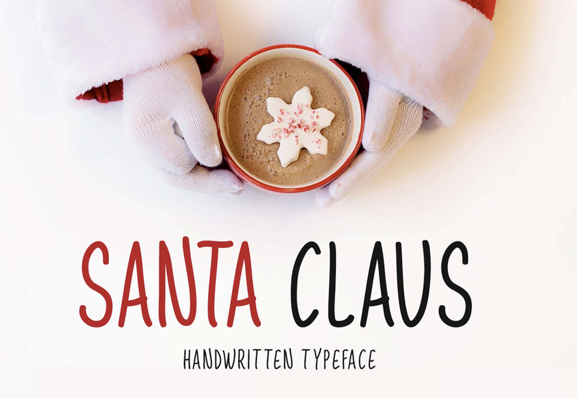
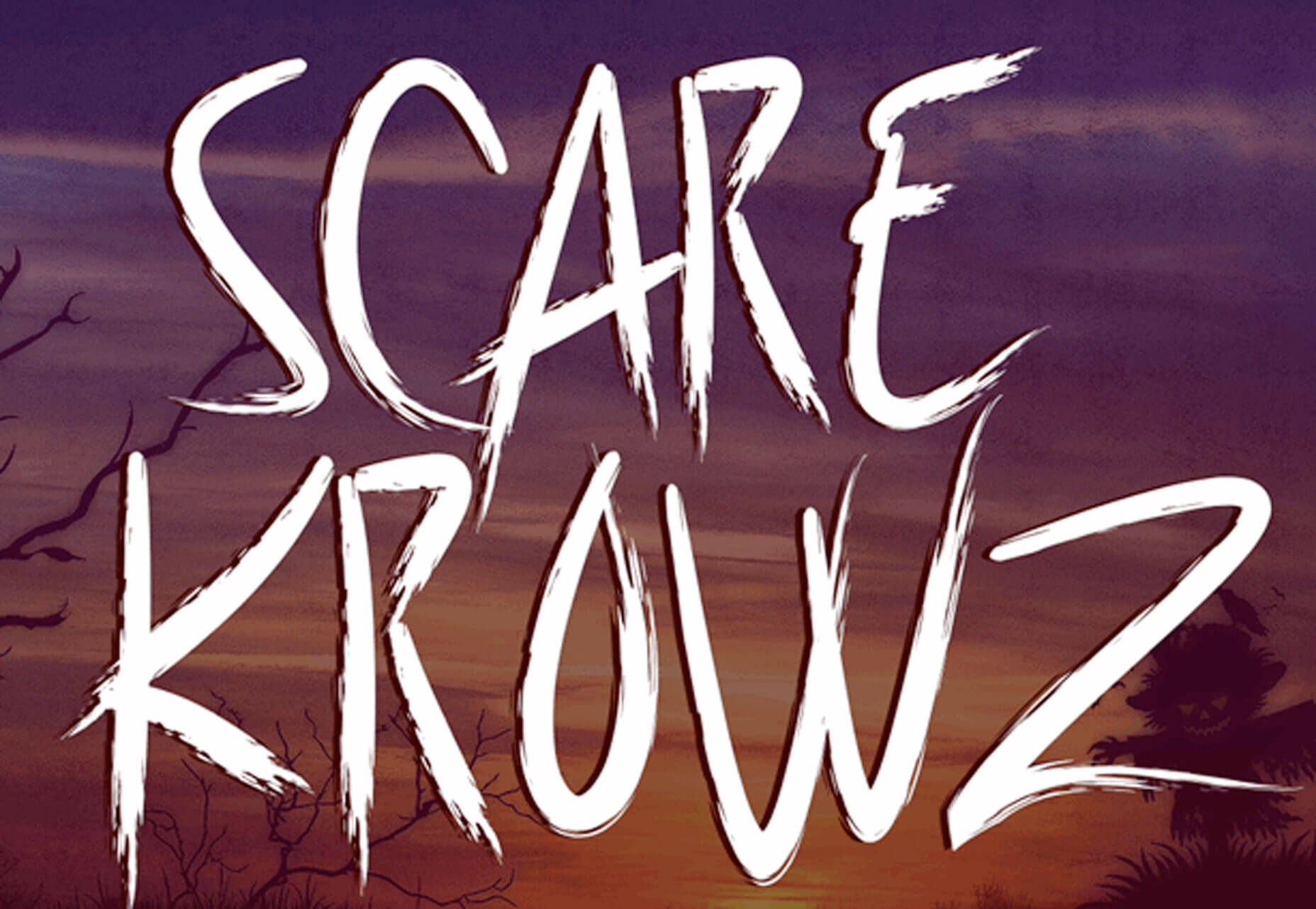
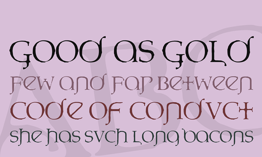
 It’s already time to start thinking about all the seasonal design elements that you will use for the rest of the year. That might be icons or illustrations or fonts. We have a few new elements this month that might fit the bill, as well as learning tools and inspiration. Here’s what new for designers this month.