Introducing 15 Best New Portfolios, October 2019

Original Source: https://www.webdesignerdepot.com/2019/10/introducing-15-best-new-portfolios-october-2019/

All the signs are that web design is entering a phase of exuberance, with clashing colors, rapidly changing graphics, and dense layouts replacing the minimalism that’s dominated digital design for the last decade. Portfolios are beginning to adopt this maximalist approach, but never fear, for those who aren’t quote ready for full-on retina burn on a Monday in late October, we’ve included a few beautifully minimal sites for you to enjoy.
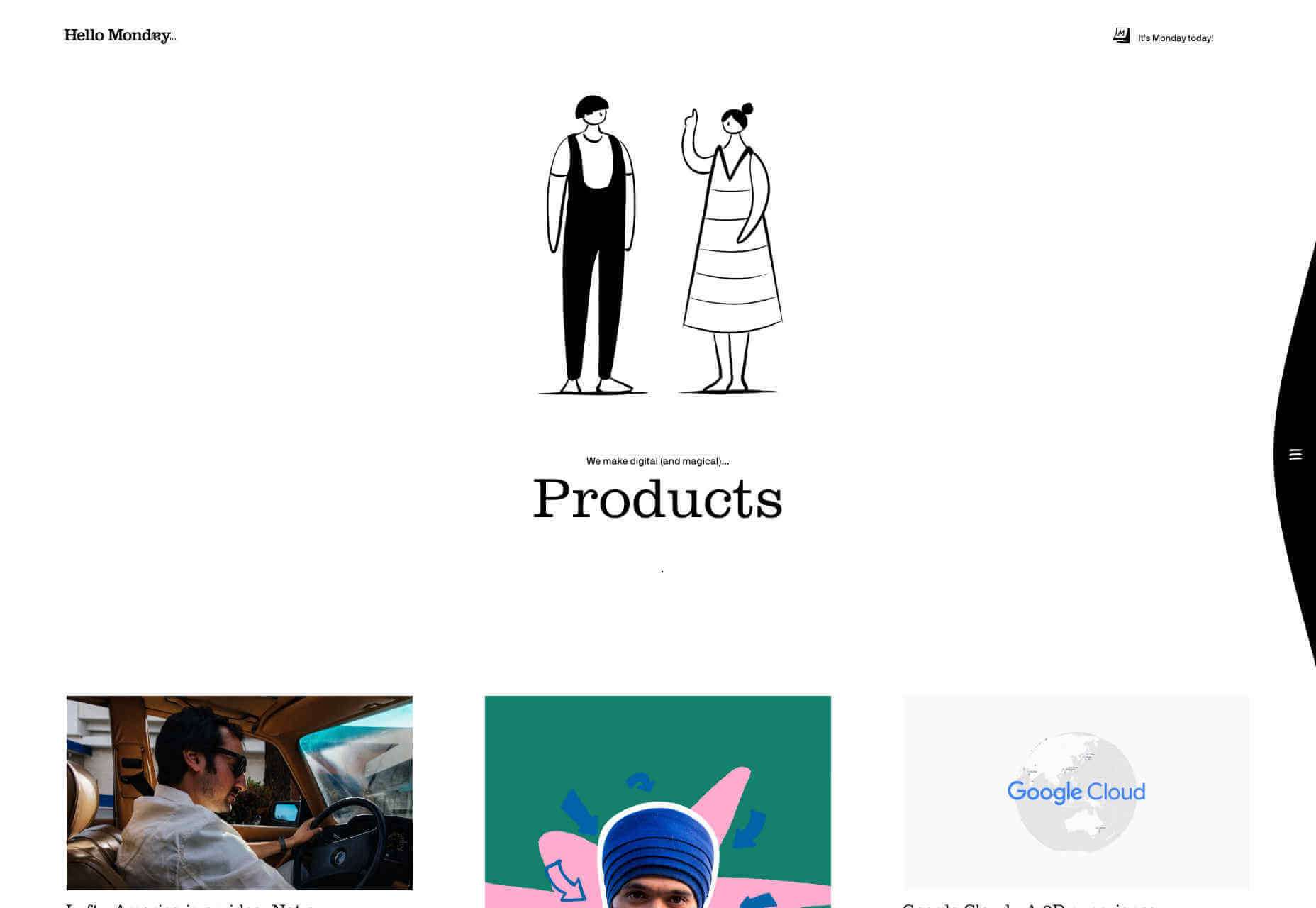
Hello Monday

Hello Monday’s site is utterly charming, with a delightful animation that I could watch for hours. The work section of the site is a masonry-style vertical grid, which is less easy to browse than you would expect, thanks to the number of projects. The best parts of this site are the little details: I love that they tell you how many days it is until Monday, and the way that hamburger menu slips away as you scroll is super-slick.
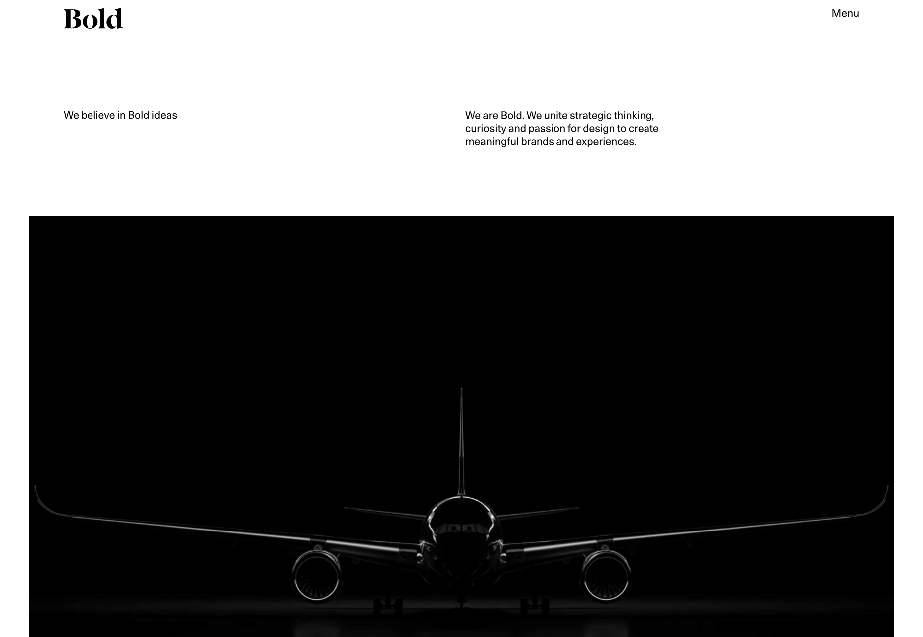
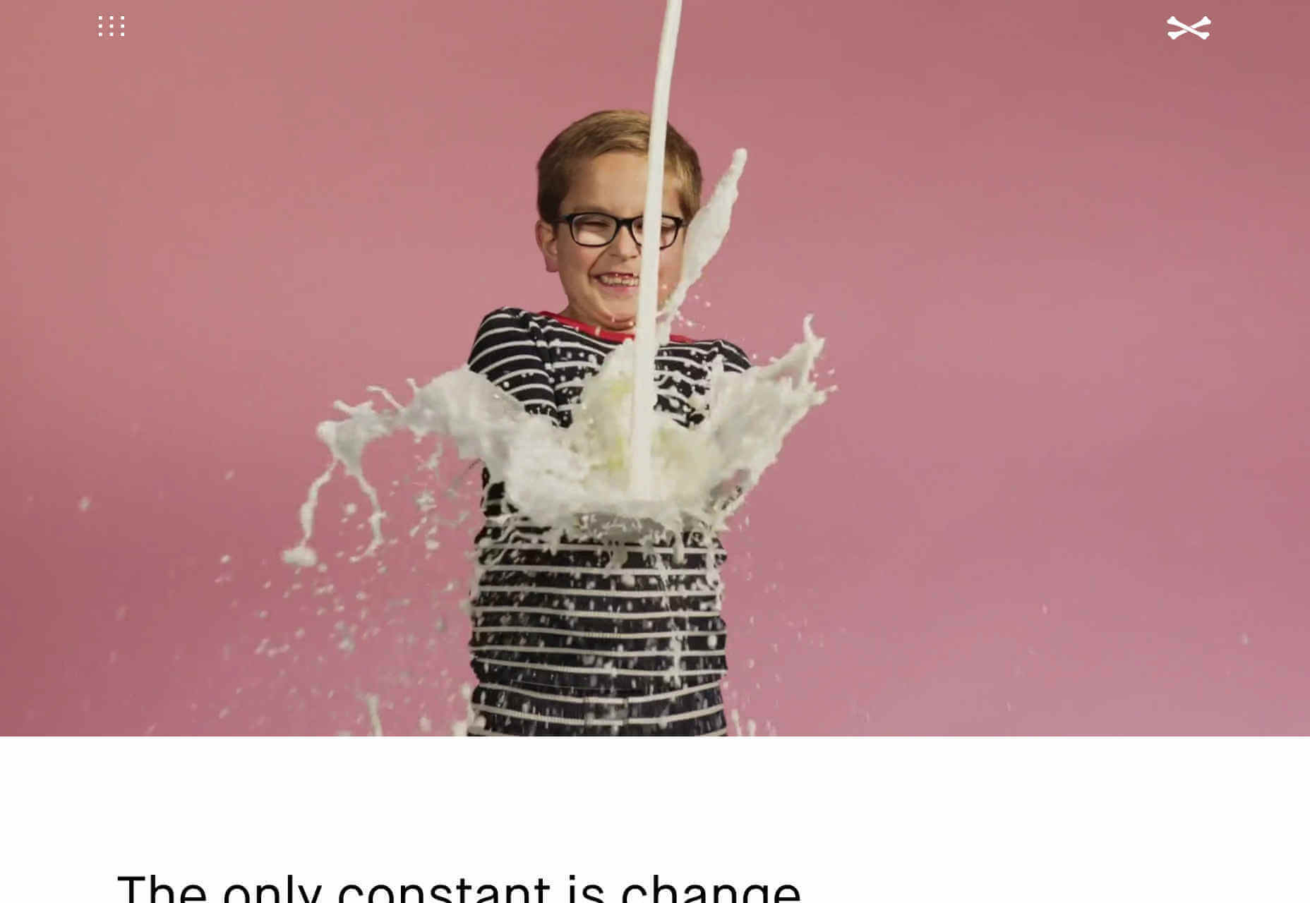
Bold

Bold’s portfolio is about sending a powerful message. It’s the website equivalent of huge shoulder pads, and an enormous, solid gold smartphone. The way the border expands from the featured images, giving you the sense of zooming into the project is inspired. It helps to have huge-name clients as social proof, but this site is excellent at inspiring confidence in the designers behind it.
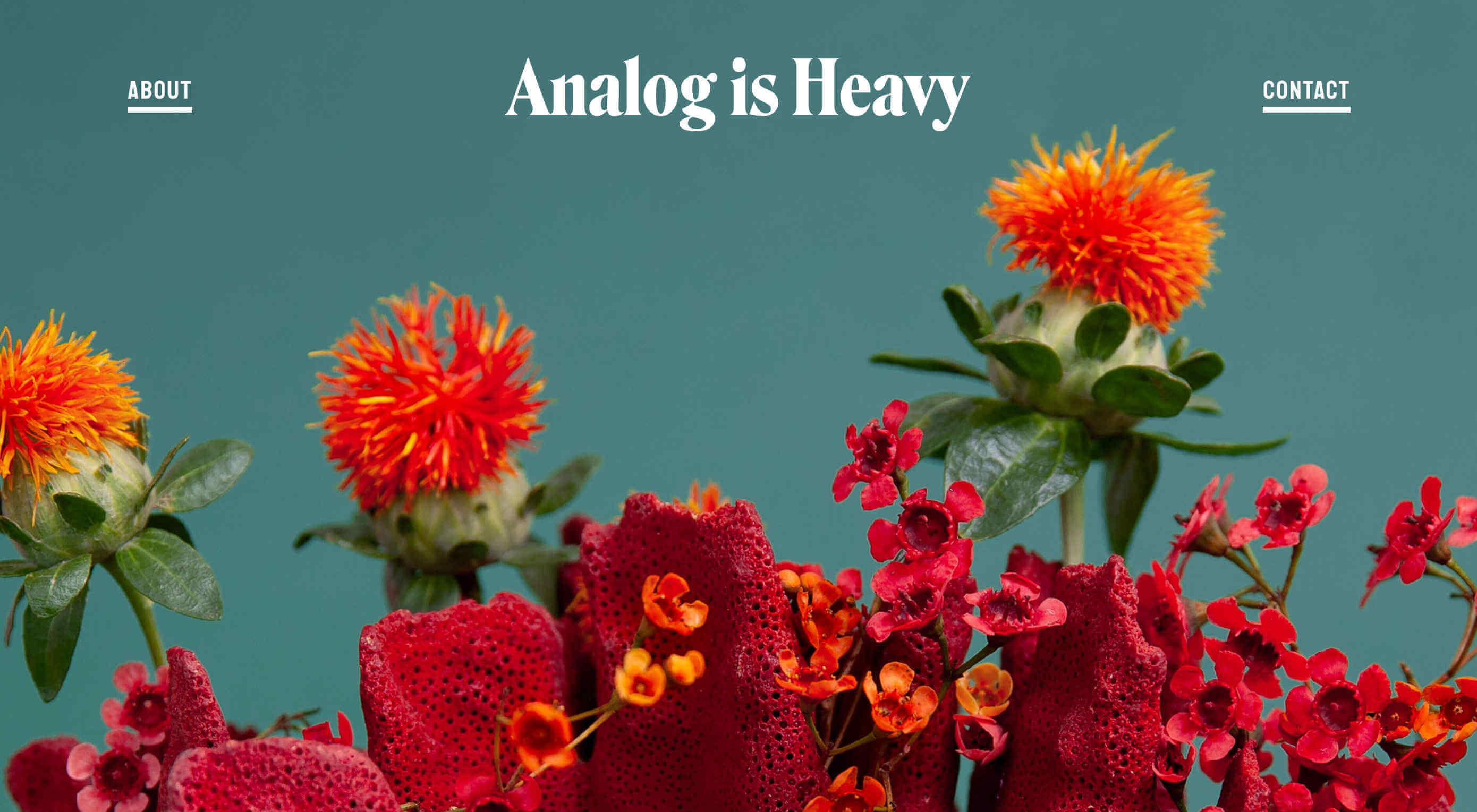
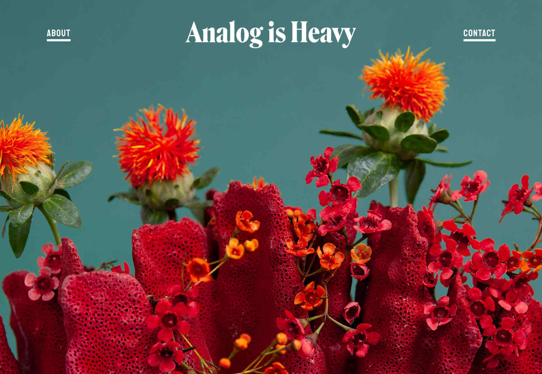
Analog is Heavy

Analog is Heavy is a creative photography practice that works with design studios to hone brand messages with high-quality product photography. Its approach to a portfolio is a vertically aligned grid of images, and that’s it. Targeting design agencies means that they’re speaking to an audience of visually educated professionals, giving Analog is Heavy the freedom to let its work sell itself.
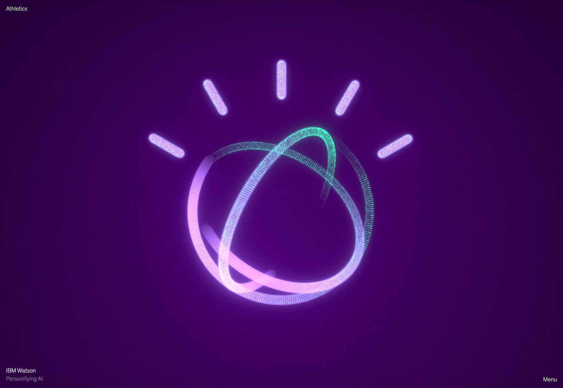
Athletics

Another big agency, with a client list to kill for, Athletics jumps right into fullscreen video case studies of its work for clients like IBM. One trend with many of these portfolios is that work is cherry-picked to be showcased and then less-exciting work is linked to below the initial presentation. In Athletics’ case this means an interesting grid of lower-profile, but equally exciting work.
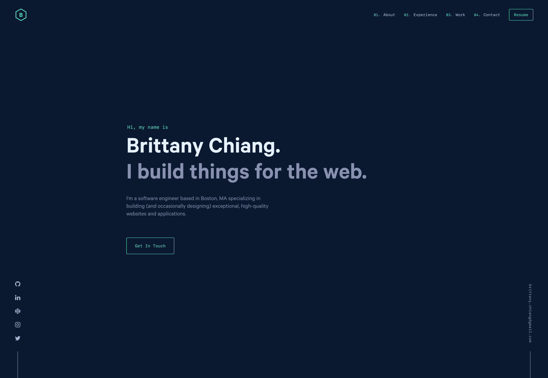
Brittany Chiang

Brittany Chiang builds things for the web. How’s that for a no-nonsense approach? This great little site feels very app-orientated thanks to the dark-mode color palette and the monospaced typeface. Its a single-pager, which are increasingly rare these days, and the simplicity of it works really well. Brittany has out UXed plenty of dedicated UX designers, by being true to herself.
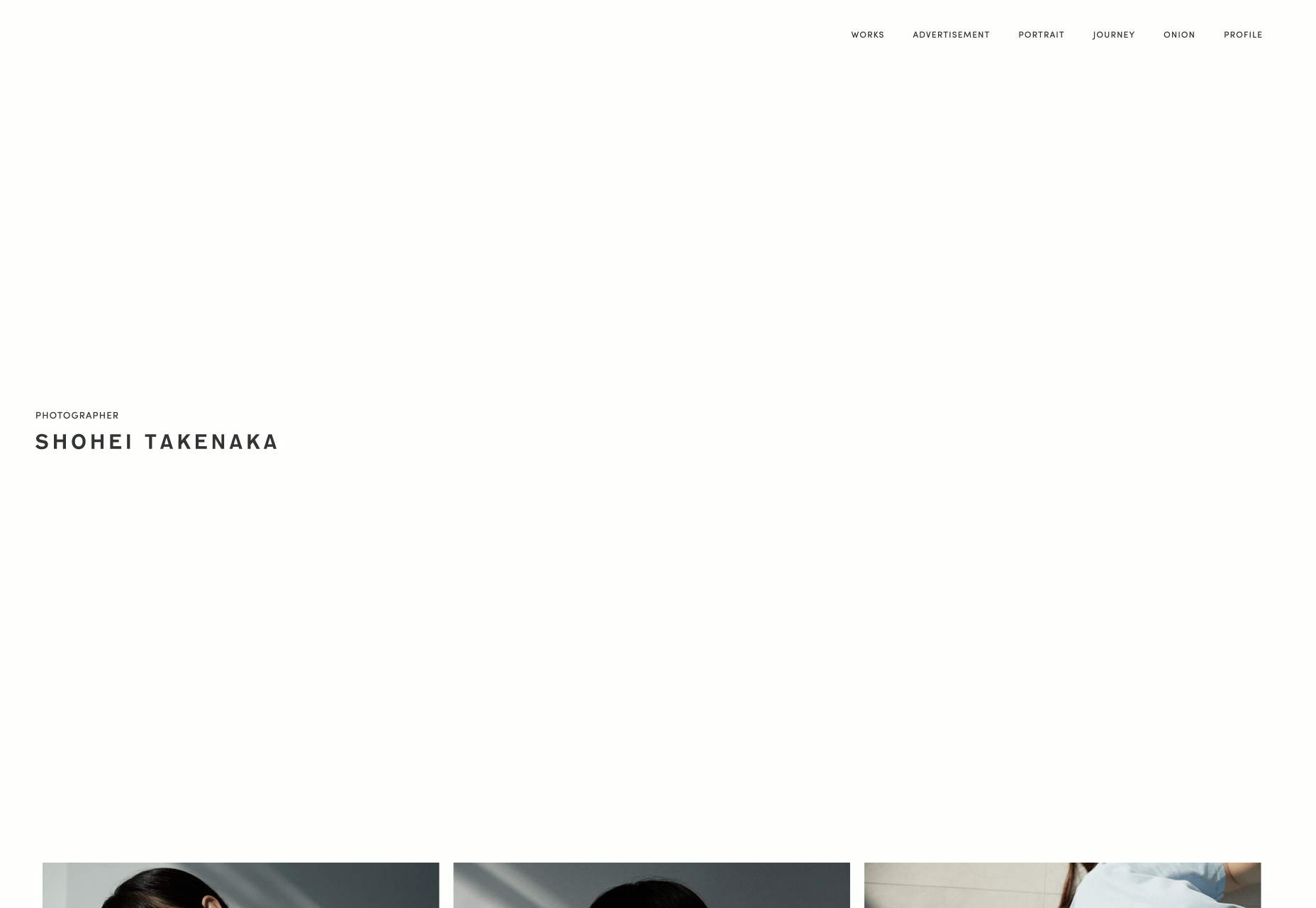
Shohei Takenaka

As the web drifts towards maximalism, it’s great that there are still calm, simple, minimalist masterpieces to admire. Shohei Takenaka’s site is beautiful, with restraint, attention to detail, and ample whitespace. The subtle underlines on the menu text, and the images protruding into the white space to encourage scrolling, as well as the way the color bands are grouped when you scroll, are all perfect examples of clever UI design.
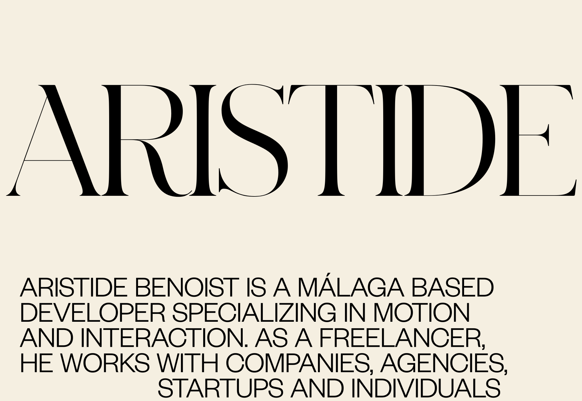
Aristide Benoist

Aristide Benoist’s portfolio features some beautiful typography. It’s great to see a developer take an interest in the finer points of design. The all-caps sans-serif text is a little too much to cope with in large amounts, but here it works just fine. My favourite part of the site is the transition from thumbnail to case study. Hover over the list of projects and a little flag-like ribbon will appear, click on it and it expands into a full project image, delightful!
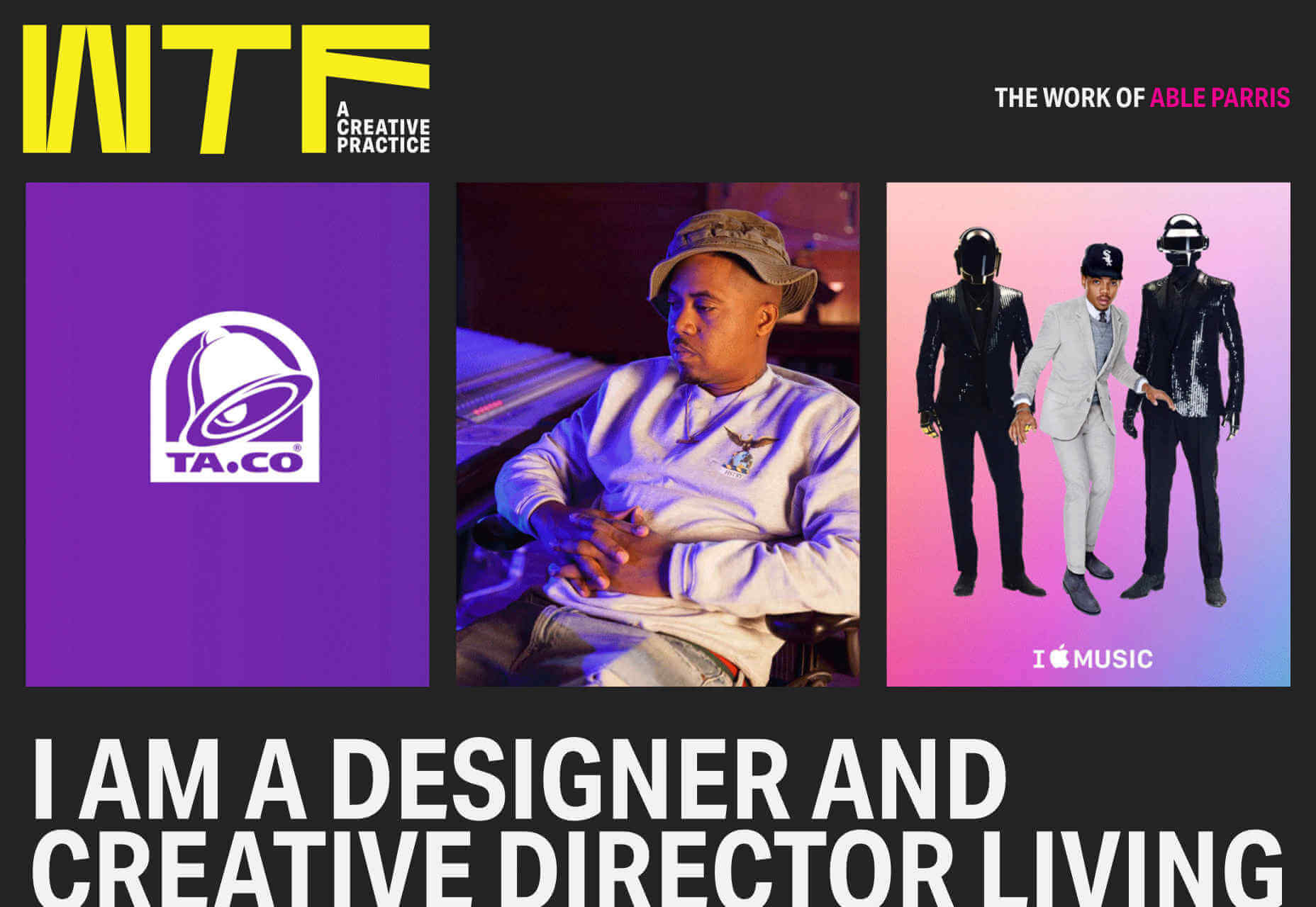
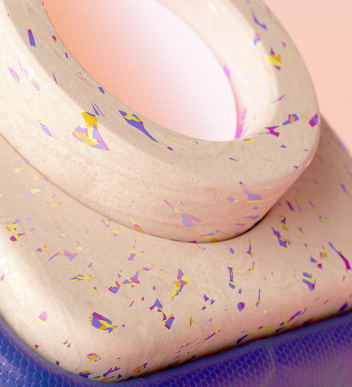
WTF Studio

WTF Studio’s portfolio is as in-yer-face as the name suggests. A front for NYC-based creative director Able Parris, the site slaps you in the eyes with color and animation the moment it loads. But scroll down past the anarchic introduction and you’ll find a series of projects for household names presented as individual case studies. It’s exactly what big brands like to see: creativity and safe hands.
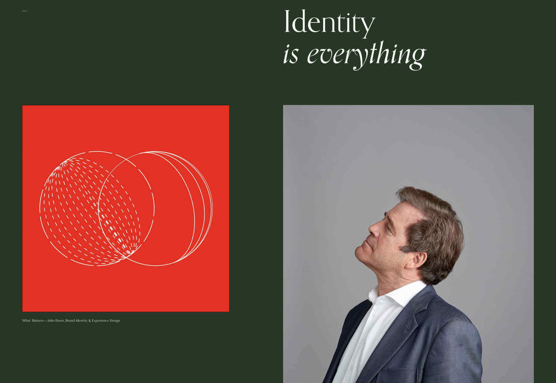
Jim Schachterle

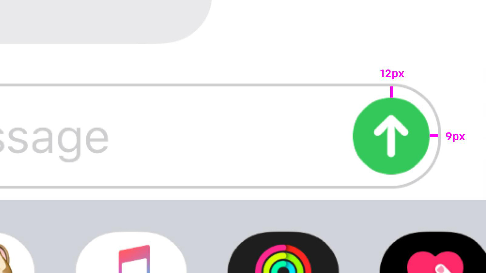
Jim Schachterle’s site takes an approach that we don’t normally see: he’s opted for a dark green background. That simple choice, alongside the carefully paired project shots make for a sophisticated, and distinct style. Unfortunately the choice of typeface doesn’t work in places, at 12px the detail in the design is lost altogether, swapping it out for a simpler sans-serif whenever the font-size was under 18pt would have been a better choice.
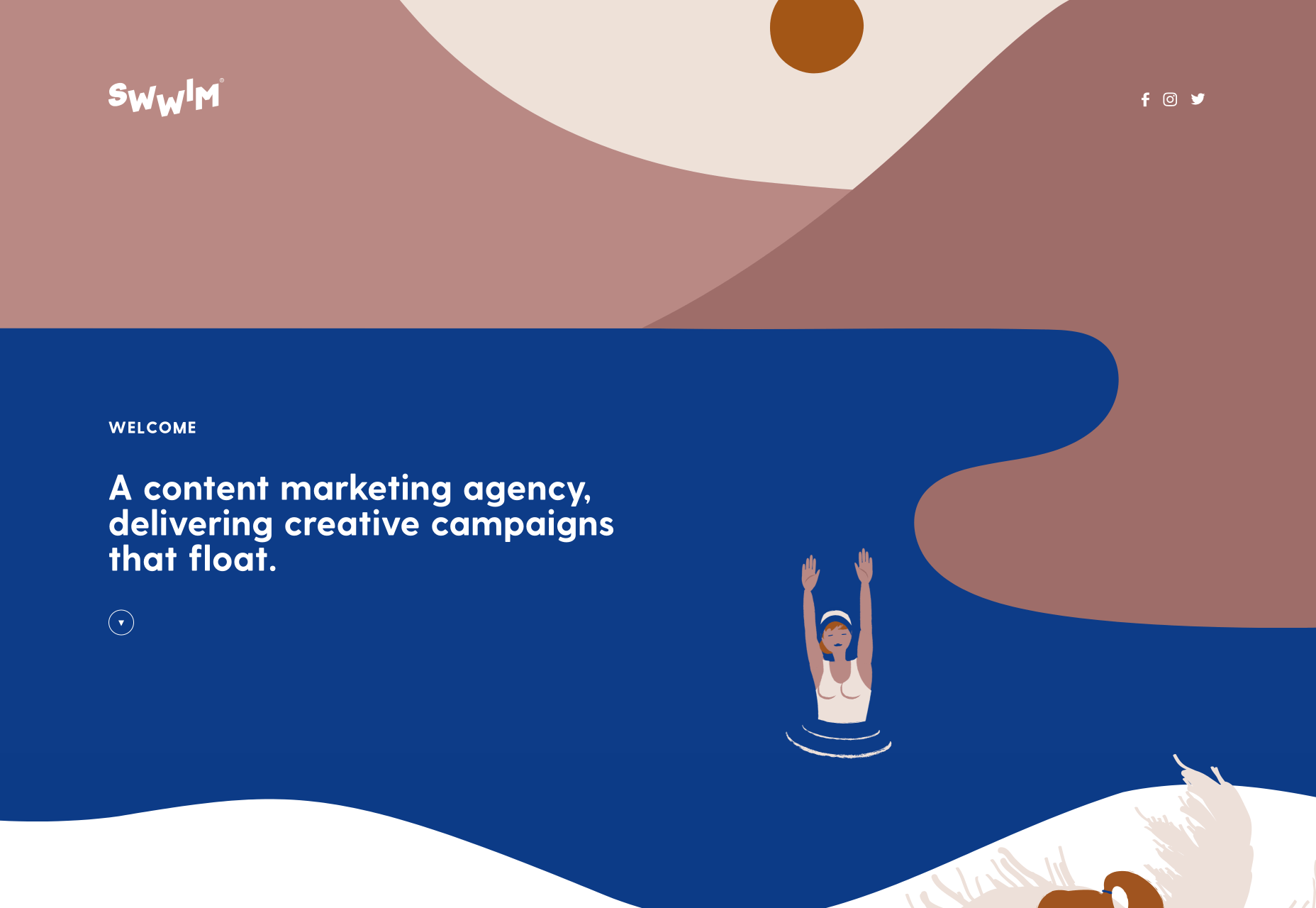
Swwim

Perhaps it’s the chilly Northern climate at this time of year, but this Saint-Tropez looking site for Swwim warms my heart. The rounded sans-serif is an interesting choice — most designers would aim for sharp lines to emphasize precision. I adore the logotype, and its frivolity is echoed throughout the site in section titles. The less-subtle animation feels a little forced, but the wave motion is enticing, and brand-appropriate.

Hadrien Mongouachon

Hadrien Mongouachon is a freelance developer, so it makes perfect sense for him to demo his skills front and center on his site. He’s opted for a variation of the highly-trendy liquid effect, and it works really well. I’m not convinced by the sideways type — it only works in print because you can tilt the page — and the usability is a little compromised by the click-hold action. Once you’re accustomed to the site, it’s fun to traverse.

Butchershop

Butchershop is another design agency relying heavily on a video reel to sell its brand work. What’s really interesting about this site, is all the things it does “wrong”: the logo mark is positioned top right instead of top left, the title of its homepage is “Home”. It keeps breaking with received wisdom, so either they know something we don’t, or they didn’t get the memo about UX being a thing — you decide which.
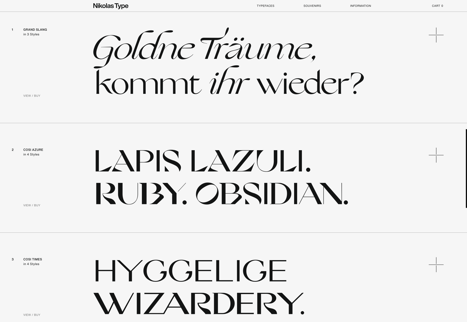
Nikolas Type

It’s rare that we get to enjoy a purely type-based portfolio, because design work is visual, but this minimal showcase is Nikolas Wrobel’s Type Foundry, Nikolas Type. Click through to the product pages and you can edit the preview text. Thanks to the foundry being a small independent, it’s able to show some lovely samples that bring the type to life, something that larger foundries often fail to do.
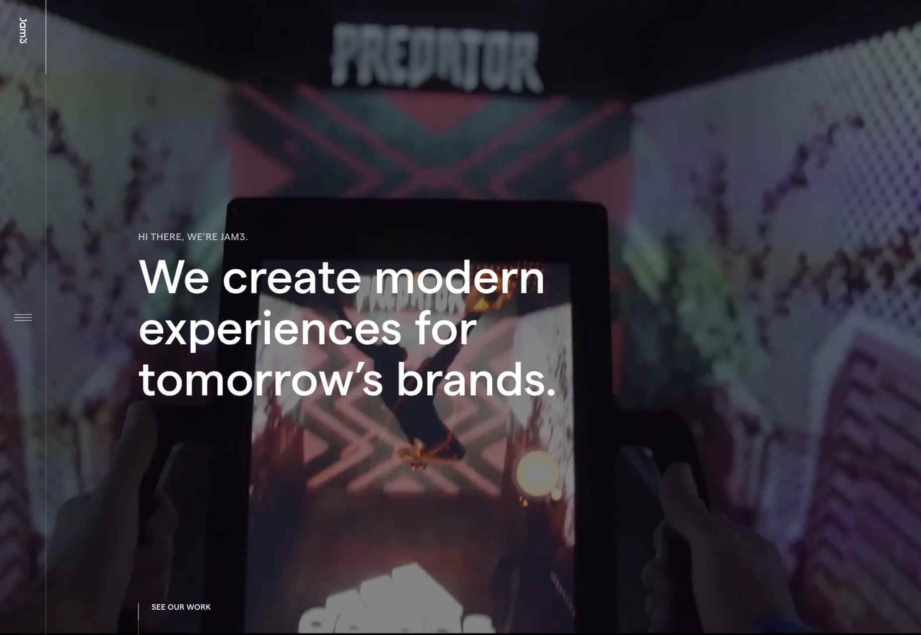
Jam3

It seems video (not static images) are now a must for any portfolio site. Agencies want companies to see real-world experiences, and understand what the working relationship is like. Jam3 is no exception, but scroll past the looping video and you’ll find a rigorously organized set of projects. The menu isn’t easy to locate, but I do like agencies opening up about their approach, and culture. Plus there’s a cool bubble effect hovering over the menu items.

New Land

There’s a tendency among motion graphics and video firms to be slightly mysterious about who they are, and what they do — perhaps it comes from the high-concepts of advertising. New Land’s target audience probably do know who it is, because this is the kind of company that you don’t hire without some prior-knowledge. Interestingly the site is geared around tablet and mobile preferred interactions, as if intended to be passed around a meeting.

Source

p img {display:inline-block; margin-right:10px;}
.alignleft {float:left;}
p.showcase {clear:both;}
body#browserfriendly p, body#podcast p, div#emailbody p{margin:0;}

A Look Into Proper HTML5 Semantics

Original Source: https://www.hongkiat.com/blog/html-5-semantics/

If you carefully plan the structure of your HTML documents, you can help computers make sense of the meaning of your content. Proper syntax is important for sure, but it basically just provides…

Visit hongkiat.com for full content.

Nike Adapt Huarache Campaign

Original Source: http://feedproxy.google.com/~r/abduzeedo/~3/AKwf9frrXyk/nike-adapt-huarache-campaign

Nike Adapt Huarache Campaign

AoiroStudioOct 22, 2019

Our friends from Ars Thanea have shared the project they have worked with Nike. What is it this time? They were part of a campaign to promote the new Nike model: Adapt. Claiming its next-generation of tech and sports footwear. Here are a few keywords: self-lacing system, mobile app. Does that sound great? Let’s give it a look!

Nike Adapt is an innovative self-lacing system which, via a mobile app or using buttons located on the midsole, loosens or tightens cables around your foot. You can choose different modes or even create your own and set the one that fits you best at a particular moment.

Advertising

Nike Adapt Huarache CampaignNike Adapt Huarache CampaignNike Adapt Huarache CampaignNike Adapt Huarache CampaignNike Adapt Huarache CampaignNike Adapt Huarache CampaignBy Ars Thanea

About Ars Thanea

Ars Thanea is a design & craft studio based in Warsaw, Poland. With offices in Poland and New York; they have worked with so many brands in the industry whatever it is tech, fashion, entertainment and you name it. Make sure to follow their work through all channels.

Studio Site
Behance
Credits

Senior Creative Director: Mike Wood
Design Director: Anders Svensson
Design Director: Ryan Noonan
Designer: Yi-Fan Lu
Senior Producer: Perry King
Executive Creative Director: Peter Jaworowski
Art Directors: Bartek Kalinowski, Maciej Mizer
Studio Supervisor: Mikolaj Valencia
Producer: Karolina Sidorowicz
3D Lead Artist: Bartek Kalinowski
3D Artist: Bartek Kalinowski, Paweł Filip, Michal Serafin, Mateusz Bargiel, Piotr Wołoszyński, Bartek Dabkowski Compositing: Łukasz Stolarski, Mateusz Bargiel, Katarzyna Strzelczyk


How to add illustration to your designs for free

Original Source: http://feedproxy.google.com/~r/CreativeBloq/~3/NmRtvszSCy4/open-doodles

A bit of illustration can be an excellent way to enliven a design and bring a bit of humanity to it, particularly when it comes to web design. It's hard to spend any time on the web without coming across a collection of illustrated cartoon figures promoting a new startup; it's one of those hot web design trends that's not going away.

If you want to incorporate illustration into your designs but don't know how to draw or where to start, here's a brilliant solution from Pablo Stanley. He's created a library of hand-drawn illustrations called Open Doodles, and he's released them for free under a Creative Commons licence so that you can use them in any way you wish.

How to tell a story with your illustrations

Open Doodles

Open Doodles are free to use, copy, edit, remix, share, anything

Stanley's a big advocate of open design; he explains that when he was young and wanted to get into digital design he had no money, so had to pirate software and steal CDs from tech magazines in order to learn his skills – at least, until he got caught. "I now offer my stuff for free," he says, "because I know other people are equally eager to learn and are looking for guidance, anywhere they can. I hope that opening my work helps them grow, get better at their craft, and make their parents proud."

They may be free, but Stanley's Open Doodles don't compromise on quality. Rather than simply release his illustration as a set of static PNGs, he's making the actual source files available for download, so that you can check the layers and see how everything fits together, as well as getting a glimpse of his untidy process. "The opportunities to improve, build on top of, fix, and reinvent are yours to discover," he says.

Open Doodles: Generator

Use the generator to quickly set up your own colour scheme

While some of the Open Doodles are scans of hand-drawn sketches, most are illustrations that were drawn on an iPad in Procreate, vectorised in Illustrator and then made into a library with global styles in Sketch before being exported as both SVG and PNG.

As well as the downloadable images, Stanley has also built an Open Doodles Generator along with developer Fang-Pen Lin. This provides a straightforward interface that enables you to change the colours of the ink, accent and background for the illustrations, and then download a custom illustration pack in your chosen palette. There's also a set of ready-made compositions to make life even easier, as well as a gallery of example landing pages demonstrating how these illustrations can be put to work online.

Open Doodles landing page gallery

There’s even an inspiring gallery to give you ideas on how to use the illustrations

Under the CC0 license you're free to copy, edit, remix, share, or redraw the Open Doodles images for any purpose, without restriction. Stanley hopes that this will encourage other designers to create their own kits and share them with the world, and that Open Doodles will make it easer for designers to show the value of illustration in mockups.

And while he's making his illustrations available for free, he also hopes that designers will use them as placeholders before going on to hire actual illustrators to help to help tell their stories; he even provides a set of useful links.

To find out more and grab your own free illustrations, hit the Open Doodles site.

Related articles:

The illustrator hotlist 2019How to move from animation to illustration6 websites that use illustration brilliantly

Great Expectations: Using Story Principles To Anticipate What Your User Expects

Original Source: https://www.smashingmagazine.com/2019/10/users-expectations-story-principles/

Great Expectations: Using Story Principles To Anticipate What Your User Expects

Great Expectations: Using Story Principles To Anticipate What Your User Expects

John Rhea

2019-10-21T13:30:59+02:00
2019-10-21T16:07:51+00:00

Whether it’s in a novel, the latest box office smash, or when Uncle Elmer mistook a potted cactus for a stress ball, we all love stories. There are stories we love, stories we hate, and stories we wish we’d never experienced. Most of the good stories share structure and principles that can help us create consistent website experiences. Experiences that speak to user expectations and guide them to engage with our sites in a way that benefits both of us.

In this article, we’ll pull out and discuss just a few examples of how thinking about your users’ stories can increase user engagement and satisfaction. We’ll look at deus ex machina, ensemble stories, consistency, and cognitive dissonance, all of which center on audience expectations and how your site is meeting those expectations or not.

We can define a story as the process of solving a problem. Heroes have an issue, and they set out on a quest to solve it. Sometimes that’s epic and expansive like the Lord of the Rings or Star Wars and sometimes it’s small and intimate such as Driving Miss Daisy or Rear Window. At its core, every story is about heroes who have a problem and what they do to solve it. So too are visits to a website.

The user is the hero, coming to your site because they have a problem. They need to buy a tchotchke, hire an agency or find the video game news they like. Your site can solve that problem and thus play an important role in the user’s story.

Deus Ex Machina

It’s a term meaning “god from the machine” that goes back to Greek plays — even though it’s Latin — when a large, movable scaffolding or “machine” would bring out an actor playing a god. In the context of story, it’s often used to describe something that comes out of nowhere to solve a problem. It’s like Zeus showing up at the end of a play and killing the villain. It’s not satisfying to the audience. They’ve watched the tension grow between the hero and the villain and feel cheated when Zeus releases the dramatic tension without solving that tension. They watched a journey that didn’t matter because the character they loved did not affect the ending.

The danger of deus ex machina is most visible in content marketing. You hook the audience with content that’s interesting and applicable but then bring your product/site/whatever in out of nowhere and drop the mic like you won a rap battle. The audience won’t believe your conclusion because you didn’t journey with them to find the solution.

If, however, the author integrates Zeus into the story from the beginning, Zeus will be part of the story and not a convenient plot device. Your solutions must honor the story that’s come before, the problem and the pain your users have experienced. You can then speak to how your product/site/whatever solves that problem and heals that pain.

State Farm recently launched a “Don’t Mess With My Discount!” campaign:

Kim comes in to talk to a State Farm rep who asks about a Drive Safe and Save discount. First, for the sake of the discount, Kim won’t speed up to make a meeting. Next, she makes herself and her child hold it till they can get home driving the speed limit. Last, in the midst of labor, she won’t let her partner speed up to get them to the hospital. (Don’t mess with a pregnant lady or her discount.) Lastly, it cuts back to Kim and the agent.

State Farm’s branding and their signature red color are strong presences in both bookend scenes with the State Farm representative. By the end, when they give you details about their “Drive Safe and Save” discount you know who State Farm is, how they can help you, and what you need to do to get the discount.

It’s not a funny story that’s a State Farm commercial in disguise, but a State Farm commercial that’s funny.

Throughout the ad, we know State Farm’s motivations and don’t feel duped into liking something whose only goal is to separate us from our money. They set the expectation of this story being an ad in the beginning and support that throughout.

Another Approach

Sometimes putting your name upfront in the piece might feel wrong or too self-serving. Another way to get at this is to acknowledge the user’s struggle, the pain the user or customer already feels. If your site doesn’t acknowledge that struggle, then your product/site/whatever seems detached from their reality, a deus ex machina. But if your content recognizes the struggle they’ve been through and how your site can solve their problem, the pitch for deeper engagement with your site will be a natural progression of the user’s story. It will be the answer they’ve been searching for all along.

Take this testimonial from Bizzabo:

Emily Fullmer, Director of Global Events for Greenbook said, We are now able to focus less on tedious operations, and more on creating a memorable and seamless experience for our attendees.

Bizzabo solved a real world problem for Greenbook. (Large preview)

It shows the user where Greenbook was, i.e. mired in tedious tasks, and how Bizzabo helped them get past tedium to do what Greenbook says they do best: make memorable experiences. Bizzabo doesn’t come out of the woodwork to say “I’m awesome” or solve a problem you never had. They have someone attesting to how Bizzabo solved a real problem that this real customer needed to be fixed. If you’re in the market to solve that problem too, Bizzabo might be the place to look.

Ensemble Stories

Some experiences, like some stories, aren’t about a single person. They’re about multiple people. If the story doesn’t give enough attention to each member, that person won’t seem important or like a necessary part of the story. If that person has a role in the ending, we feel cheated or think it’s a deus ex machina event. If any character is left out of a story, it should change the story. It’s the same way with websites. The user is the story’s hero, but she’s rarely the only character. If we ignore the other characters, they won’t feel needed or be interested in our websites.

Sometimes a decision involves multiple people because a single user doesn’t have the authority to decide. For instance, Drupalcon Seattle 2019 has a “Convince Your Boss” page. They showcase the benefits of the conference and provide materials to help you get your boss to agree to send you.

You could also offer a friends-and-family discount that rewards both the sharer and the sharee. (Yes, as of this moment, “sharee” is now a word.) Dropbox does this with their sharing program. If you share their service with someone else and they create an account, you get additional storage space.

Dropbox offers an additional 250 MB of space for every friend you get to join their service.

You get extra space, you get extra space, and you get extra space (when you invite a friend). (Large preview)

But you don’t have to be that explicit about targeting other audiences than the user themselves. In social networks and communities, the audience is both the user and their friends. The site won’t reach a critical mass if you don’t appeal to both. I believe Facebook beat MySpace early on by focusing on the connection between users and thus serving both the user and their friends. MySpace focused on individual expression. To put it another way, Facebook included the user’s friends in their audience while MySpace didn’t.

Serving Diametrically Opposed Heros

Many sites that run on ad revenue also have to think about multiple audiences, both the users they serve and the advertisers who want to reach those users. They are equally important in the story, even if their goals are sometimes at odds. If you push one of these audiences to the side, they’ll feel like they don’t matter. When all you care about is ad revenue, users will flee because you’re not speaking to their story any longer or giving them a good experience. If advertisers can’t get good access to the user then they won’t want to pay you for ads and revenue drops off.

Just about any small market newspaper website will show you what happens when you focus only on advertisers’ desires. Newspaper revenue streams have gone so low they have to push ads hard to stay alive. Take, for instance, the major newspaper from my home state of Delaware, the News Journal. The page skips and stutters as ad content loads. Click on any story and you’ll find a short article surrounded by block after block after block of ad content. Ads are paying the bills but with this kind of user experience, I fear it won’t be for long.

Let me be clear that advertisers and users do not have to be diametrically opposed, it’s just difficult to find a balance that pleases both. Sites often lean towards one or the other and risk tipping the scales too far either way. Including the desires of both audiences in your decisions will help you keep that precarious balance.

One way to do both is to have ads conform to the essence of your website, meaning the thing that makes your site different i.e. the “killer app” or sine qua non of your website. In this way, you get ads that conform to the reason the users are going to the site. Advertisers have to conform to the ad policy, but, if it really hits on the reason users are going to the site, advertisers should get much greater engagement.

On my own site, 8wordstories.com, ads are allowed, but they’re only allowed an image, eight words of copy, and a two-word call to action. Thus when users go to the site to get pithy stories, eight words in length, the advertisements will similarly be pithy and short.

Advertisers and users do not have to be diametrically opposed, it’s just difficult to find a balance that pleases both.

Consistency

The hero doesn’t train as a medieval knight for the first half of the story and then find herself in space for the second half. That drastic shift can make the audience turn on the story for dashing their expectations. They think you did a bait-and-switch, showing them the medieval story they wanted and then switching to a space story they didn’t want.

If you try to hook users with free pie, but you sell tubas, you will get lots of pie lovers and very few tuba lovers. Worse yet is to have the free pie contingent on buying a tuba. The thing they want comes with a commitment or price tag they don’t. This happens a lot with a free e-book when you have to create an account and fill out a lengthy form. For me, that price has often been too high.

Make sure the way you’re hooking the audience is consistent with what you want them to read, do, or buy. If you sell tubas offer a free tuba lesson or polishing cloth. This’ll ensure they want what you provide and they’ll think of you the next time they need to buy a tuba.

That said, it doesn’t mean you can’t offer free pie, but it shouldn’t get them in the door, it should push them over the edge.

Audible gives you a thirty-day free trial plus an audio book to keep even if you don’t stay past the trial. They’re giving you a taste of the product. When you say, “I want more.” You know where to get it.

While not offering a freebie, Dinnerly (and most of the other bazillion meal kit delivery companies) offers a big discount on your first few orders, encouraging new customers to try them out. This can be an especially good model for products or services that have fixed costs with enticing new customers.

Dinnerly offers a discount on each of your first three meal kits.

Hmmm… maybe they should offer free pie. (Large preview)

Cognitive Dissonance

There’s another danger concerning consistency, but this one’s more subtle. If you’re reading a medieval story and the author says the “trebuchet launched a rock straight and true, like a spaceship into orbit.” It might be an appropriate allusion for a modern audience, but it’s anachronistic in a medieval story, a cognitive dissonance. Something doesn’t quite make sense or goes against what they know to be true. In the same way, websites that break the flow of their content can alienate their audience without even meaning to (such as statistics that seem unbelievable or are so specific anyone could achieve them).

112% of people reading this article are physically attractive.

(Here’s lookin’ at you, reader.)

This article is the number one choice by physicians in Ohio who drive Yugos.

(Among other questions, why would a European car driving, Ohioan Doctor read a web user experience article?)

These “statistics” break the flow of the website because they make the user stop and wonder about the website’s reputability. Any time a user is pulled out of the flow of a website, they must decide whether to continue with the website or go watch cat videos.

Recently, I reviewed proposals for a website build at my day job. The developers listed in the proposal gave me pause. One with the title “Lead Senior Developer” had seven years of experience. That seemed low for a “lead, senior” developer, but possible. The next guy was just a “web developer” but had twenty years of experience. Even if that’s all correct, their juxtaposition made them look ridiculous. That cognitive dissonance pulled me out of the flow of the proposal and made me question the firm’s abilities.

Similarly poor quality photos, pixelated graphics, unrelated images, tpyos, mispelllings, weird bolding and anything else that sticks out potato can cause cognitive dissonance and tank a proposal or website (or article). The more often you break the spell of the site, the harder it will be for clients/users to believe you/your product/site/thing are as good as you say. Those cat videos will win every time because they always meet the “lolz” expectation.

Conclusion

Users have many expectations when they come to your site. Placing your users in the context of a story helps you understand those expectations and their motivations. You’ll see what they want and expect, but also what they need. Once you know their needs, you can meet those needs. And, if you’ll pardon my sense of humor, you can both …live happily ever after.

Smashing Editorial
(cct, ra, yk, il)

Use Responsive Website Templates for Max Conversions

Original Source: http://feedproxy.google.com/~r/Designrfix/~3/eNnIyl_MyxY/use-responsive-website-templates-for-max-conversions

Websites. Every business needs one, but sadly many companies waste thousands of dollars and tons of time using expensive designers and complicated coding. These days with easy-to-use website builders creating your own site couldn’t be easier and more affordable. Studies show that responsive website templates attract over 50% of all mobile users (luckily you no […]

The post Use Responsive Website Templates for Max Conversions appeared first on designrfix.com.

So sorry, but Apple's Send button is slightly wonky

Original Source: http://feedproxy.google.com/~r/CreativeBloq/~3/DvSNkb1g8rg/apple-wonky-send-button

Some design flaws are obvious. They smack you in the face immediately; everyone tears down the designer, and the project either gets redesigned or fades into oblivion. Other mistakes are just small enough for most people not to even notice, but once pointed out they can't be unseen. It's like have a tiny pebble in your shoe you can never get rid of. 

What's the point of this long-winded introduction? Someone has spotted that the Send button in Apple's Messages iPhone app is very slightly wonky. Behold:

The thoroughly unwanted PSA came from Anh, and it will surprise precisely no one to hear he's an interface designer. Having announced it on Twitter, he unwittingly opened the door to other fastidious designers pointing out myriad other tiny interface flaws in iOS app icons.

Bjorn pointed out that the play circle in Spotify isn't really a circle at all, but an oval.

Noel Cornell flagged up this glaring error:

Product designer Donnie Suazo shared flagged up this blue-one-black monstrosity within the Maps app. 

Ugh. Take a look at the full thread here, if you're feeling brave. Of course, some are making the point that optical illusions are often used in design – and sometimes a technically 'perfect' design looks wrong to the eye. Case in point, this massive debate surrounding Google's 'incorrect' logo. It doesn't make it any less irritating once you've spotted the inconsistency though, does it?

If this hasn't put you off Apple products forever, take a look at our guide to making the most of the Apple Black Friday sale. 

Read more: 

Apple’s 2020 MacBook and iPad Pros could feature all-new display techSurface Pro 7 vs iPad ProWhy Apple's rumoured iPhone SE 2 feels like as BIG disappointment

Going Vintage with Graphic Design: What You Need to Know

Original Source: http://feedproxy.google.com/~r/Designrfix/~3/TGxdxrOkrcE/going-vintage-with-graphic-design-what-you-need-to-know

If there is one thing that will never go out of style, it’s vintage. In fact, it can often seem that the more technology progresses, the more interested people are becoming in this trend. This is perhaps because it is classic, and therefore, timeless. Now, if you are looking to include vintage elements in your […]

The post Going Vintage with Graphic Design: What You Need to Know appeared first on designrfix.com.

11 Pro Web Design Tips for an Attention-Grabbing Business Website

Original Source: http://feedproxy.google.com/~r/Designrfix/~3/0GTfSBx3ldc/11-pro-web-design-tips-for-an-attention-grabbing-business-website

Is your business website appealing to your target audience? Are you getting lucrative outcomes with your website design? Is your brand growing time and again? The answers to these questions can be discovered without spending thousands of dollars on experts and updates. Frequently. there is a situation when you develop a visually-appealing website, but it […]

The post 11 Pro Web Design Tips for an Attention-Grabbing Business Website appeared first on designrfix.com.

What if social media platforms had abstract shapes

Original Source: http://feedproxy.google.com/~r/abduzeedo/~3/xRa4astxCMA/what-if-social-media-platforms-had-abstract-shapes

What if social media platforms had abstract shapes

AoiroStudioOct 16, 2019

I am gonna start by saying that social media platforms can have its benefits and its disadvantages. I won’t be the first to tell you that I have experience both and it’s not always a fairytale. Again, it’s a sense of control that you give yourself on, do you let yourself submerge yourself into the endless sea of notifications or give it some control. Continuing the pursuit of my discoveries of talented designers and artists from Switzerland, I would like to present the work of Andrea Philippon who is based in Lausanne, Switzerland.

Cinema 4D & Digital Art
What if social media platforms had abstract shapesWhat if social media platforms had abstract shapesWhat if social media platforms had abstract shapesWhat if social media platforms had abstract shapesWhat if social media platforms had abstract shapesWhat if social media platforms had abstract shapesWhat if social media platforms had abstract shapesWhat if social media platforms had abstract shapesWhat if social media platforms had abstract shapesWhat if social media platforms had abstract shapesBy Andrea Philippon

About Andrea Philippon

Andrea Philippon is a graphic & motion designer based in Lausanne, Switzerland. I love how her work is mostly around Cinema 4D, Octane and Photoshop. Make sure to follow her work on Behance.

Personal Site
Behance