So sorry, but Apple's Send button is slightly wonky
Original Source: http://feedproxy.google.com/~r/CreativeBloq/~3/DvSNkb1g8rg/apple-wonky-send-button
Some design flaws are obvious. They smack you in the face immediately; everyone tears down the designer, and the project either gets redesigned or fades into oblivion. Other mistakes are just small enough for most people not to even notice, but once pointed out they can't be unseen. It's like have a tiny pebble in your shoe you can never get rid of.
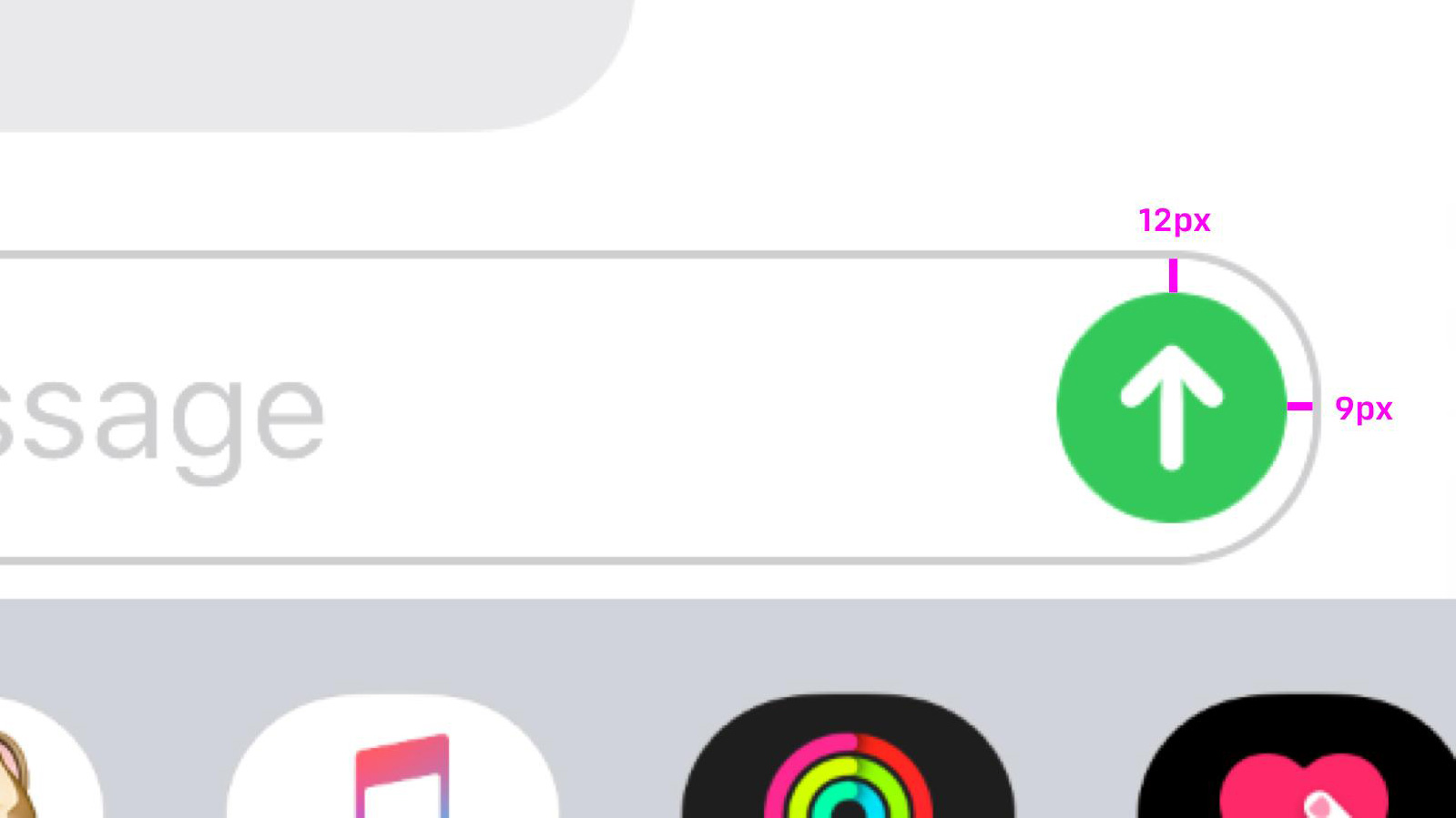
What's the point of this long-winded introduction? Someone has spotted that the Send button in Apple's Messages iPhone app is very slightly wonky. Behold:
The thoroughly unwanted PSA came from Anh, and it will surprise precisely no one to hear he's an interface designer. Having announced it on Twitter, he unwittingly opened the door to other fastidious designers pointing out myriad other tiny interface flaws in iOS app icons.
Bjorn pointed out that the play circle in Spotify isn't really a circle at all, but an oval.

Noel Cornell flagged up this glaring error:
Product designer Donnie Suazo shared flagged up this blue-one-black monstrosity within the Maps app.

Ugh. Take a look at the full thread here, if you're feeling brave. Of course, some are making the point that optical illusions are often used in design – and sometimes a technically 'perfect' design looks wrong to the eye. Case in point, this massive debate surrounding Google's 'incorrect' logo. It doesn't make it any less irritating once you've spotted the inconsistency though, does it?
If this hasn't put you off Apple products forever, take a look at our guide to making the most of the Apple Black Friday sale.
Read more:
Apple’s 2020 MacBook and iPad Pros could feature all-new display techSurface Pro 7 vs iPad ProWhy Apple's rumoured iPhone SE 2 feels like as BIG disappointment


Leave a Reply
Want to join the discussion?Feel free to contribute!