30+ Useful Pure CSS Code Snippets

Original Source: http://feedproxy.google.com/~r/1stwebdesigner/~3/Ox4LMH-rGr4/

In this post, we’ve rounded up a collection of useful pure CSS code snippets for elements that are commonly used when designing and developing a website. We’ve included a few that may be less common, but might be useful for you if you are looking for a way to level up or add interest in your project.

From parallax to animations to tabs and accordions, this list should be helpful for you to refer to any time you are looking for accomplishing something in your web development utilizing only pure CSS and no JavaScript. So be sure to bookmark this page so you can refer to it next time you are looking for some guidance or inspiration.

Unlimited Web Template Downloads Starting at ONLY $16.50 per Month
Site Templates

Site Templates
2,000+ Site Templates

WordPress Themes

WordPress Themes
1,200+ WP Themes

Landing Pages

Landing Pages
600+ Landing Pages

DOWNLOAD NOW
Envato Elements

Slide Down Toggle

A clean and simple hidden panel that slides down smoothly when the button is clicked.

See the Pen Pure CSS Slide Down Toggle by Surjith (@surjithctly) on <a href=’https://codepen.io‘>CodePen.dark

Animated Gradient Background

Here’s a subtle animation effect where the background gradient slowly and endlessly changes.

See the Pen Pure CSS Gradient Background Animation by Manuel Pinto (@P1N2O) on <a href=’https://codepen.io‘>CodePen.dark

Parallax Star Background

A mesmerizing background with stars moving slowly through the night sky.

See the Pen Parallax Star background in CSS by Saransh Sinha (@saransh) on <a href=’https://codepen.io‘>CodePen.dark

Parallax Scrolling

Some may say that parallax has come and gone, but this cool pure CSS version makes a statement that you might want to utilize in your next project.

See the Pen Pure CSS Parallax Scrolling by Keith Clark (@keithclark) on <a href=’https://codepen.io‘>CodePen.dark

Form With SVG Radio Buttons

A simple form with radio buttons replaced with SVGs and a subtle animation.

See the Pen Form with SVG radio buttons by Angela Velasquez (@AngelaVelasquez) on <a href=’https://codepen.io‘>CodePen.dark

Hamburger Slide Out Menu

A handy, simple slide out menu that appears when the hamburger icon is clicked.

See the Pen Pure CSS Hamburger fold-out menu by Erik Terwan (@erikterwan) on <a href=’https://codepen.io‘>CodePen.dark

Custom Checkboxes

Nicely styled checkboxes that will give your forms a clean look.

See the Pen Pure CSS custom checkboxes by Glen Cheney (@Vestride) on <a href=’https://codepen.io‘>CodePen.dark

Popup Modal Window

How about a clean popup modal window that doesn’t use any JavaScript? Here’s one.

See the Pen Pure css popup box by Prakash (@imprakash) on <a href=’https://codepen.io‘>CodePen.dark

CSS Slider

A nice looking, smooth operating content slider with animations and navigation, all in pure CSS.

See the Pen Pure CSS Slider by Damian Drygiel (@drygiel) on <a href=’https://codepen.io‘>CodePen.dark

Glitched Text Animation

Here’s a cool glitch text animation effect that could work well for large headings.

See the Pen CSS Glitched Text by Lucas Bebber (@lbebber) on <a href=’https://codepen.io‘>CodePen.dark

Animated Gradient Ghost Button

Want to spruce up your buttons? Try this nice gradient animation.

See the Pen Animated Gradient Ghost Button Concept by Arsen Zbidniakov (@ARS) on <a href=’https://codepen.io‘>CodePen.dark

One Page Navigation Menu

This is a very clean, single page website with left navigation, where each page slides out from the right without refreshing the browser.

See the Pen One Page Navigation CSS Menu by Alberto Hartzet (@hrtzt) on <a href=’https://codepen.io‘>CodePen.dark

One Page Vertical Navigation

Similar to the previous snippet, and by the same author, this variation loads each page as a sliding panel from the bottom, along with keyboard navigation that syncs with the vertical menu.

See the Pen Pure CSS One page vertical navigation by Alberto Hartzet (@hrtzt) on <a href=’https://codepen.io‘>CodePen.dark

Image Slider

Another pure CSS image slider with a nifty animated transition between slides.

See the Pen CSS image slider w/ next/prev btns & nav dots by Avi Kohn (@AMKohn) on <a href=’https://codepen.io‘>CodePen.dark

Tabs

Need some easy to code/use CSS-only tabs in your next project? Here is a good example!

See the Pen Pure CSS Tabs by Wallace Erick (@wallaceerick) on CodePen.dark

Accordion

How about an accordion instead of tabs to display your content? Thought you couldn’t do it without JavaScript? Think again!

See the Pen Pure CSS Accordion by Rau (@raubaca) on <a href=’https://codepen.io‘>CodePen.dark

Direction-Aware Hover

Here’s a neat trick! Hover over the box from any side and it reveals something different based on which side you slid your cursor in from.

See the Pen Direction aware hover pure CSS by Fabrice W. (@FWeinb) on <a href=’https://codepen.io‘>CodePen.dark

Horizontal News Ticker

An old-school news ticker effect without any Javascript? Yes, it can be done!

See the Pen Pure CSS Ticker (Horizontal) by Lewis Carey (@lewismcarey) on <a href=’https://codepen.io‘>CodePen.dark

Multiline Text Cut Off With Ellipsis

This is a little specific, but still useful in the correct context. Perhaps you need equal height blog post excerpts. Do it with this pure CSS snippet.

See the Pen Pure CSS multiline text with ellipsis by Martin Wolf (@martinwolf) on <a href=’https://codepen.io‘>CodePen.dark

Toggle Buttons

Five clean looking animated toggle buttons.

See the Pen Pure CSS toggle buttons by Mauricio Allende (@mallendeo) on <a href=’https://codepen.io‘>CodePen.dark

Swanky Drop Down Menu

This is a really nice vertical drop down menu with great animations.

See the Pen Swanky Pure CSS Drop Down Menu V2.0 by Jamie Coulter (@jcoulterdesign) on <a href=’https://codepen.io‘>CodePen.dark

12 Loader Animations

Here are some useful spinners and loaders you can use for page load animations.

See the Pen Pure CSS Loaders kit by Viduthalai Mani (@viduthalai1947) on <a href=’https://codepen.io‘>CodePen.dark

Content Filter

A very handy, pure CSS content filter with a multitude of possible use cases.

See the Pen Pure CSS content filter by Sam Gordon (@samgordon) on <a href=’https://codepen.io‘>CodePen.dark

Swagtastic UI Stat Pop Out

A beautifully styled layout that could be used for statistics, a pricing table, or whatever your imagination comes up with.

See the Pen UI Statistic Pop Out CSS by Jamie Coulter (@jcoulterdesign) on <a href=’https://codepen.io‘>CodePen.dark

Folder Tree

A simple folder tree without any JavaScript.

See the Pen Pure CSS Tree by Rafael González (@rgg) on <a href=’https://codepen.io‘>CodePen.dark

Fancy Checkbox and Radio Buttons

Another variation on nicer than browser default checkbox and radio buttons.

See the Pen Pure CSS Fancy Checkbox/Radio by Rau (@raubaca) on <a href=’https://codepen.io‘>CodePen.dark

News Cards

This would be great for a blog post listing. Hover over a card to reveal the excerpt and read more link.

See the Pen News Cards – CSS only by Aleksandar Čugurović (@choogoor) on <a href=’https://codepen.io‘>CodePen.dark

Peeling Sticky

Here’s a fun animation of a label that peels off on hover. How could you use this one?

See the Pen Pure CSS Peeling Sticky by patrickkunka (@patrickkunka) on <a href=’https://codepen.io‘>CodePen.dark

Horizontal Hover Accordion

A nifty horizontal accordion that reveals content on hover.

See the Pen Pure CSS Horizontal Accordion by Aysha Anggraini (@rrenula) on <a href=’https://codepen.io‘>CodePen.dark

Funky Vertical Accordion

Another very nicely done vertical accordion with slick animations and zero JavaScript.

See the Pen Funky Pure CSS Accordion by Jamie Coulter (@jcoulterdesign) on CodePen.dark

Animated Toggles

Another set of toggles, this time in flat and 3D versions, with unique animations for each.

See the Pen Pure CSS Toggles by Rafael González (@rgg) on <a href=’https://codepen.io‘>CodePen.dark

Button Hover Animation

Spice up your buttons and links with this neat little hover animation effect.

See the Pen Button Hover by Katherine Kato (@kathykato) on <a href=’https://codepen.io‘>CodePen.dark

How will you use these handy pure CSS code snippets?

We hope you will find these pure CSS code snippets useful in your future projects, and hopefully we will save you some time next time you’re looking for any of these common elements to incorporate into your development.


Collective #622

Original Source: http://feedproxy.google.com/~r/tympanus/~3/0Bki41-yHfI/

Collective 622 item image

Inspirational Website of the Week: MGcream

A fun design with a modern touch and some lovely details. Our pick this week.

Get inspired

Collective 622 item image

This content is sponsored via Syndicate Ads
Website Heatmaps & Behaviour Analytics Tool

Understand how users are really experiencing your site without drowning in numbers!

Try it free

Collective 622 item image

Parsel

Parsel is a tiny, permissive CSS selector parser by Lea Verou.

Check it out

Collective 622 item image

react-three-flex

React-three-flex brings the flexbox spec to react-three-fiber to make it easier to place content. Check out this amazing demo. By Paul Henschel.

Check it out

Collective 622 item image

REST API: Sorting, Filtering, and Pagination

In this great tutorial, Tania Rascia makes an example API endpoint and SQL query for various sort, paginate, and filter APIs.

Read it

Collective 622 item image

Custom, accessible radio/checkbox buttons with perfect alignment

Learn how to create custom, accessible radio and checkbox buttons in CSS that perfectly align with their labels.

Check it out

Collective 622 item image

How to pick more beautiful colors for your data visualizations

Lisa Charlotte Rost explains how to choose the right colors for your charts and visualizations.

Check it out

Collective 622 item image

Alter

A creative 3D typeface exploration by Yuin Chien.

Check it out

Collective 622 item image

AVIF has landed

Jake Archibald introduces the new AVIF image format that is derived from the keyframes of AV1 video.

Read it

Collective 622 item image

Accessible Color Standards – Designing in the Browser

Una Kravets talks about color contrast in this new episode of “Designing in the Browser”.

Watch it

Collective 622 item image

vanilla-colorful

A tiny color picker custom element for modern web apps. By Serhii Kulykov.

Check it out

Collective 622 item image

Designing With Reduced Motion For Motion Sensitivities

An article by Val Head on how to use the prefers-reduced-motion-media feature.

Read it

Collective 622 item image

How to build awesome forms with only HTML & CSS

A great Twitter thread by Arslan Khalid on how to build solid forms in a step-by-step manner.

Check it out

Collective 622 item image

Candy Ring Preloader

A clever faux 3D ring preloader made by Jon Kantner.

Check it out

Collective 622 item image

What is the Value of Browser Diversity?

Dave Rupert tries to answer a very important question.

Read it

Collective 622 item image

DevTools architecture refresh: Migrating to JavaScript modules

The first article in a series of blog posts describing the changes the Chrome DevTools team is making to DevTools’ architecture and how it is built.

Read it

Collective 622 item image

Duo

A really cool Three.js and GSAP demo by ycw. Check out this one, too.

Check it out

Collective 622 item image

Read Me: Magazine

A fantastic Readymag essay (and template) on how to create good content and set it in type.

Check it out

Collective 622 item image

How they test

A curated collection of publicly available resources on how software companies around the world test their software systems and build their quality culture.

Check it out

Collective 622 item image

#s3e36 ALL YOUR HTML, Interactive Ribbon

A really good video tutorial by Yuri Artyukh where he dissects and builds an interactive WebGL ribbon.

Watch it

Collective 622 item image

Education & LMS landing page design

A free landing page designed in Sketch with an educational theme.

Check it out

Collective 622 item image

Responsive “Cool” Steps

Some fantastic step trickery by Jhey Tompkins.

Check it out

Collective 622 item image

BLINK 3D Gallery

In case you haven’t seen this yet: BLINK is an online platform where art collectors, artists, and art lovers can meet and mingle to explore and enjoy art together.

Check it out

Collective 622 item image

Styling Complex Labels

Danielle Romo’s tip on how to deal with more verbose input labels.

Read it

The post Collective #622 appeared first on Codrops.

Branding & Full Visual Identity for La Mala Pub

Original Source: http://feedproxy.google.com/~r/abduzeedo/~3/DTmyxjanGuk/branding-full-visual-identity-la-mala-pub

Branding & Full Visual Identity for La Mala Pub

abduzeedo09.09.20

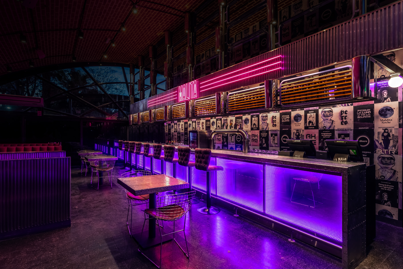
Estudio Nuar shared a beautiful branding project for La Mala Pub. Right in the heart of Palermo, La Mala Pub leads Buenos Aires nightlife. Only a few months after opening, it became so trending that generated the need for more space. In consequence, an extra space was attached and Malita was created. It was a joint work with the architecture team to design the new identity for this space and then generate all the graphic interventions and signage applications. 

La Mala in Spanish means “Bad Girl” and that’s what triggered the visual imaginary, with all these really empowered girls, a bit vintage but updated with the vibrant colors, the contemporary phrases and the spacial mood, meaning she’s from outer space. 

We created this multifaceted character who represents La Mala but also every girl who goes there. Apart from the posters, which are one of the main characters, we worked a lot on the neon signs, together with the architecture team, as they were very important taking into consideration it’s a night pub and the lighting is fundamental.

Credits

Creative Direction: Manuela Ventura y Melisa Rivas.
Architecture: Hitzig Militello Arquitectos.
Production: Crista Bernasconi.
Equipment: Krapa.
Design: Manuela Ventura, Melisa Rivas, Crista Bernasconi y Natasha Furst.
Photography: Federico Kulekdjian.
Animation: Malena Sueiro.


Collective #620

Original Source: http://feedproxy.google.com/~r/tympanus/~3/aujgmiRDX8U/

Inspirational Website of the Week: keysshoes

We love the fun layouts and diverse details! Our pick this week.

Get inspired

What is the Small Web?

Aral Balkan has a vision for the future where every person owns and controls their own place on the shared global network. He also introduces Site.js, a Small Web construction set.

Read it

ztext.js

Easy to implement, 3D typography for the web that works with every font.

Check it out

Collective 619 Item Image

Our Sponsor
The Divi Summer Sale

Only 4 days left! Don’t miss your chance to get a 20% discount on the most powerful WordPress theme in the world.

Check it out

Umami

Umami is a simple, easy to use, self-hosted web analytics solution.

Check it out

The Thing With Leading in CSS

A must-read article by Matthias Ott on why design and implementation can look so different for vertical spaces between texts.

Read it

How to Use AVIF: The New Next-Gen Image Compression Format

Start using next-gen .avif images today progressively with the <picture> element. The format is ~50% smaller in size compared to JPEG, and ~20% smaller than WebP.

Building the Zig-Zag Gradient Lab

Michelle Barker shares the video and transcript of her talk at Vienna Calling about the Zig-Zag Gradient Lab.

Check it out

Use advanced typography with local fonts

Learn all about the Local Fonts API which enumerates the user’s installed local fonts and provides low-level access to the various TrueType/OpenType tables.

Read it

The difference between aria-label and aria-labelledby

Léonie Watson explains the difference between two important accessibility attributes.

Read it

Flume

In case you missed it: Flume is a React-powered node editor and runtime engine

Check it out

Best way to lazy load images for maximum performance

Adrian Bece shows the modern approach of lazy loading images.

Read it

Create blurred fills for images with aspect ratio containers in CSS

A very useful demo by Martijn Cuppens that shows how to automatically create blurred fills as background for images.

Check it out

Codemap

Codemap visualizes function calls in a intuitive way where you can navigate your code in a graph.

Check it out

Gradient Magic

A gallery of stylish and unique CSS gradients.

Check it out

#s3e35 ALL YOUR HTML, Moving through infinite clouds

A great tutorial where Yuri Artyukh shows how to implement the infinite clouds effect from the makingmaiselmarvelous.com site.

Watch it

A Tapestry of Tools

Daniel Eden on the effectiveness of using a variety of design tools.

Read it

Teal

With Teal you can build stateful and portable serverless applications quickly.

Check it out

handwritten.js

With this library you can convert typed text to an image of realistic handwriting.

Check it out

Why CSS Logical Properties Aren’t Ready for Use!

Elad Shechter explains why the new CSS logical properties module is not yet ready for prime time.

Read it

MergeURL

MergeURL helps you merge multiple URLs hassle-free without any user registration.

Check it out

Accordion Icons: Which Signifiers Work Best?

Page Laubheimer and Raluca Budiu looked at several possible icons as signifiers for accordions and found out which one works best.

Read it

Ct.js

In case you didn’t know about it: Ct.js is a free 2D game editor based on web technologies.

Check it out

CSS Shapes Layout Experiment

A funky shapes layout experiment by Kristopher Van Sant.

Check it out

Github Profile Readme Generator

Prettify your GitHub user profile with this readme generator.

Check it out

From Our Blog
Experimental Triangle Image Transitions with WebGL

Some experimental animations using triangles for image transitions with WebGL.

Check it out

From Our Blog
Awesome Demos Roundup #17

A fresh roundup of the most interesting and creative web experiments from the last couple of weeks.

Check it out

The post Collective #620 appeared first on Codrops.

How To Build A Blog With Next And MDX

Original Source: https://smashingmagazine.com/2020/09/build-blog-nextjs-mdx/

Next.js is a React framework that enables you to build static and dynamic apps quickly. It is production-ready and supports server-side rendering and static site generation out of the box, making Next.js apps fast and SEO-friendly.

In this tutorial, I will first explain what exactly Next.js is and why you’d use it instead of Create React App or Gatsby. Then, I’ll show you how to build a blog on which you can write and render posts using Next.js and MDX.

To get started, you’ll need some experience with React. Knowledge of Next.js would come handy but is not compulsory. This tutorial would benefit those who want to create a blog (personal or organizational) using Next.js or are still searching for what to use.

Let’s dive in.

What Is Next.js?

Next.js is a React framework created and maintained by Vercel. It’s built with React, Node.js, Babel, and Webpack. It is production-ready because it comes with a lot of great features that would usually be set up in a “vanilla” React app.

The Next.js framework can render apps on the server or export them statically. It doesn’t wait for the browser to load the JavaScript in order to show content, which makes Next.js apps SEO-friendly and blazing fast.

Why Use Next.js Over Create React App?

Create React App is a handy tool that offers a modern build setup with no configuration and without the hassle of having to set up Webpack, Babel, and so on or having to maintain their dependencies. It’s the recommended way to create React apps nowadays. It has a template for TypeScript and also comes with the React Testing Library.

However, if you want to build a multi-page app, then you’ll need to install an extra library, as if you were rendering a React app on the server. The extra setup could be a problem, and any packages installed could increase the final bundle size of your app.

This is exactly the problem that Next.js is intended to solve. It offers the best developer experience, with all of the things you need for production. It comes with several cool features:

Static exporting (pre-rendering)
Next.js allows you to export your Next.js app at build time to static HTML that runs without a server. It is the recommended way to generate your website because it’s done at build time and not at each request.
Server-side rendering (pre-rendering)
It pre-renders pages to HTML on the server upon every request.
Automatic code splitting
Unlike React, Next.js splits code automatically and only loads the JavaScript needed, which makes the app fast.
File-system-based routing
Next.js uses the file system to enable routing in the app, meaning that every file under the pages directory will be treated automatically as a route.
Hot reloading of code
Next.js relies on React Fast Refresh to hot reload your code, offering a great developer experience.
Styling options
The Next.js framework has built-in support for Styled JSX, CSS modules, Sass, LESS, and more.

Next.js Versus Gatsby

Gatsby is a static site generator built on top of React and GraphQL. It is popular and has a huge ecosystem that provides themes, plugins, recipes, and so on.

Gatsby and Next.js websites are super-fast because they are both rendered either on the server or statically, meaning that the JavaScript code does not wait for the browser to load. Let’s compare them according to the developer experience.

Gatsby is easy to start with, especially if you already know React. However, Gatsby uses GraphQL to query local data and pages. Using Gatsby to build this simple blog might be overkill because GraphQL has a learning curve, and the querying and build time of static pages would be a bit longer. If you built this same blog twice, first with Gatsby and then with Next.js, the one built with Next.js would be much faster at build time because it uses regular JavaScript to query local data and pages.

I hope you take advantage of the power of the Next.js framework and see why it’s so much handier than some alternatives. It’s also a great choice if your website relies heavily on SEO because your app will be fast and easy for Google robots to crawl. That’s the reason why we will be using Next.js in this article to build a blog with the MDX library.

Let’s start by setting up a new Next.js app.

Setting Up

There are two ways to create a Next.js app. We can set up a new app manually or use Create Next App. We’ll go for the latter because it’s the recommended way, and it will set up everything automatically for us.

To start a new app, run the following in the command-line interface (CLI):

npx create-next-app

Once the project is initialized, let’s structure the Next.js app as follows:

src
├── components
| ├── BlogPost.js
| ├── Header.js
| ├── HeadPost.js
| ├── Layout.js
| └── Post.js
├── pages
| ├── blog
| | ├── post-1
| | | └── index.mdx
| | ├── post-2
| | | └── index.mdx
| | └── post-3
| | └── index.mdx
| ├── index.js
| └── _app.js
├── getAllPosts.js
├── next.config.js
├── package.json
├── README.md
└── yarn.lock

As you can see, our project has a simple file structure. There are three things to note:

_app.js allows us to append some content to the App.js component in order to make it global.
getAllPosts.js helps us to retrieve the blog posts from the folder pages/blog. By the way, you can name the file whatever you want.
next.config.js is the configuration file for our Next.js app.

I will come back to each file later and explain what it does. For now, let’s see the MDX package.

Installing the MDX Library

MDX is a format that lets us seamlessly write JSX and import components into our Markdown files. It enables us to write regular Markdown and embed React components in our files as well.

To enable MDX in the app, we need to install the @mdx-js/loader library. To do so, let’s first navigate to the root of the project and then run this command in the CLI:

yarn add @mdx-js/loader

Or, if you’re using npm:

npm install @mdx-js/loader

Next, install @next/mdx, which is a library specific to Next.js. Run this command in the CLI:

yarn add @next/mdx

Or, for npm:

npm install @next/mdx

Great! We are done setting up. Let’s get our hands dirty and code something meaningful.

Configuring the next.config.js File
const withMDX = require(“@next/mdx”)({
extension: /.mdx?$/
});

module.exports = withMDX({
pageExtensions: [“js”, “jsx”, “md”, “mdx”]
});

Earlier in this tutorial, I said that files under the pages folder would be treated as pages/routes by Next.js at build time. By default, Next.js will just pick files with .js or .jsx extensions. That’s why we need a config file, to add some customizations to the default behavior of Next.js.

The next.config.js file tells the framework that files with .md or .mdx extensions should also be treated as pages/routes at build time because the blog folder that contains the articles lives in the pages directory.

That being said, we can start fetching the blog posts in the next part.

Fetching Blog Posts

One of the reasons why building a blog with Next.js is easy and simple is that you do not need GraphQL or the like to fetch local posts. You can just use regular JavaScript to get the data.

In getAllPosts.js:

function importAll(r) {
return r.keys().map((fileName) => ({
link: fileName.substr(1).replace(//index.mdx$/, “”),
module: r(fileName)
}));
}

export const posts = importAll(
require.context(“./pages/blog/”, true, /.mdx$/)
);

This file can be intimidating at first. It’s a function that imports all MDX files from the folder pages/blog, and for each post it returns an object with the path of the file, without the extension (/post-1), and the data of the blog post.

With that in place, we can now build the components in order to style and show data in our Next.js app.

Building The Components

In components/Layout.js:

import Head from “next/head”;
import Header from “./Header”;

export default function Layout({ children, pageTitle, description }) {
return (
<>
<Head>
<meta name=”viewport” content=”width=device-width, initial-scale=1″ />
<meta charSet=”utf-8″ />
<meta name=”Description” content={description}></meta>
<title>{pageTitle}</title>
</Head>
<main>
<Header />
<div className=”content”>{children}</div>
</main>
</>
);
}

Here, we have the Layout component, which we’ll be using as a wrapper for the blog. It receives the meta data to show in the head of the page and the component to be displayed.

In components/Post.js:

import Link from ‘next/link’
import { HeadPost } from ‘./HeadPost’

export const Post = ({ post }) => {
const {
link,
module: { meta },
} = post

return (
<article>
<HeadPost meta={meta} />
<Link href={‘/blog’ + link}>
<a>Read more →</a>
</Link>
</article>
)
}

This component is responsible for displaying a preview of a blog post. It receives the post object to show as props. Next, we use destructuring to pull out the link of the post and the meta to show from the object. With that, we can now pass the data to the components and handle the routing with the Link component.

In components/BlogPost.js:

import { HeadPost } from ‘./HeadPost’

export default function BlogPost({ children, meta}) {
return (
<>
<HeadPost meta={meta} isBlogPost />
<article>{children}</article>
</>
)
}

The BlogPost component helps us to render a single article. It receives the post to show and its meta object.

So far, we have covered a lot — but we have no articles to show. Let’s fix that in the next section.

Writing Posts With MDX

import BlogPost from ‘../../../components/BlogPost’

export const meta = {
title: ‘Introduction to Next.js’,
description: ‘Getting started with the Next framework’,
date: ‘Aug 04, 2020’,
readTime: 2
}

export default ({ children }) => <BlogPost meta={meta}>{children}</BlogPost>;

## My Headline

Lorem ipsum dolor sit amet, consectetur adipiscing elit. Quisque maximus pellentesque dolor non egestas. In sed tristique elit. Cras vehicula, nisl vel ultricies gravida, augue nibh laoreet arcu, et tincidunt augue dui non elit. Vestibulum semper posuere magna, quis molestie mauris faucibus ut.

As you can see, we import the BlogPost component, which receives the meta and the body of the post.

The parameter children is the body of the blog post or, to be precise, everything that comes after the meta object. It is the function responsible for rendering the post.

With that change, we can move to the index.js file and display the posts on the home page.

Displaying Posts
import { Post } from “../components/Post”;
import { posts } from “../getAllPosts”;

export default function IndexPage() {
return (
<>
{posts.map((post) => (
<Post key={post.link} post={post} />
))}
</>
);
}

Here, we start by importing the Post component and the posts fetched from the blog folder. Next, we loop through the array of articles, and for each post, we use the Post component to display it. That being done, we are now able to fetch the posts and display them on the page.

We are almost done. However, the Layout component is still not being used. We can use it here and wrap our components with it. But that won’t affect the articles pages. That’s where the _app.js file comes into play. Let’s use that in the next section.

Using the _app.js File

Here, the underscore symbol (_) is really important. If you omit it, Next.js will treat the file as a page/route.

import Layout from “../components/Layout”;

export default function App({ Component, pageProps }) {
return (
<Layout pageTitle=”Blog” description=”My Personal Blog”>
<Component {…pageProps} />
</Layout>
);
}

Next.js uses the App component to initialize pages. The purpose of this file is to override it and add some global styles to the project. If you have styles or data that need to be shared across the project, put them here.

We can now browse the project folder in the CLI and run the following command to preview the blog in the browser:

yarn dev

Or, in npm:

npm run dev

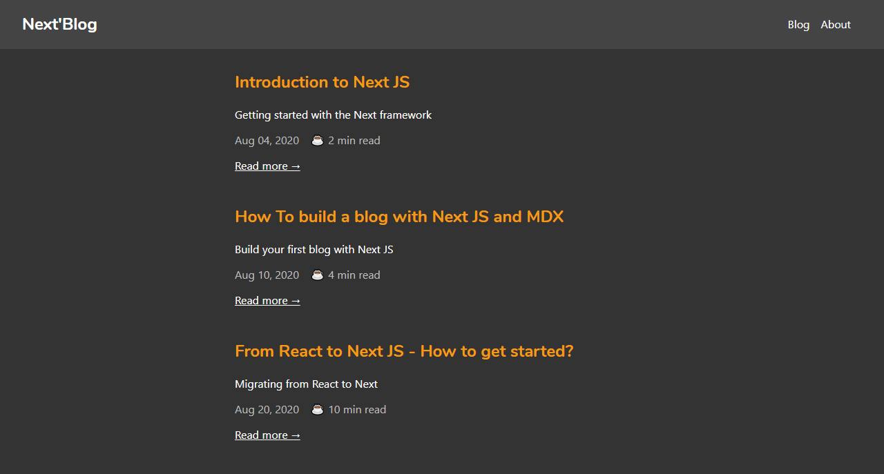
If you open http://localhost:3000 in the browser, you will be able to see this:

Great! Our blog looks good. We are done building the blog app with Next.js and MDX.

Conclusion

In this tutorial, we walked through Next.js by building a blog using the MDX library. The Next.js framework is a handy tool that makes React apps SEO-friendly and fast. It can be used to build static, dynamic JAMstack websites in no time, because it is production-ready and comes with some nice features. Next.js is used widely by big companies, and its performance keeps improving. It’s definitely something to check out for your next project.

You can preview the finished project on CodeSandbox.

Thanks for reading!

Resources

These useful resources will take you beyond the scope of this tutorial.

Next.js documentation
Next.js and MDX documentation
“Create a Next.js App”, Next.js

How Old Computer Advertisements Look Like

Original Source: https://www.hongkiat.com/blog/vintage-tech-ads/

Still remember the good ol’ days with joysticks and bulky monitors? 1TB hard disks may now be a common sight, but did you know that people used to be excited over ads promoting 10MB hard disks?…

Visit hongkiat.com for full content.

Designing With Reduced Motion For Motion Sensitivities

Original Source: https://smashingmagazine.com/2020/09/design-reduced-motion-sensitivities/

CSS has recently added features that allow us to recognize certain user preferences and qualities of the user’s current environment. One of those new features, specifically the prefers-reduced-motion media feature, can be especially useful for designing more inclusive motion on the web.

A few years back, I wrote an article about designing safer web animation for motion sensitivity and the limited options we had at the time to design safe motion on the web. Some things have remained the same since that original article, like the types of motion effects that can be triggering, and the importance of context and user expectations. But what has changed is the existence and support of the prefers-reduced-motion media feature. That makes a big difference in how we can design the motion in our work to be inclusive and accessible.

Why Reduce Motion?

The release of iOS7 back in 2013 sparked a realization throughout the digital design world that some motion on screen — even if it was part of an interface — could have physical consequences for people with motion sensitivities. In the years since then, the major mobile and desktop operating systems have added functionality for people to reduce the amount of motion they encounter in their operating systems.

Articles like “Your Interactive Is Making Me Sick” and “Accessibility For Vestibular Disorders” share first-hand stories of how our design choices, especially around motion, can have physical consequences for those with motion sensitivities. The root causes of these motion sensitivities can vary greatly between individuals. For some, it’s rooted in a vestibular disorder, while for others it might stem from migraines or other factors. What’s triggering can also vary from person to person, or even from day to day for some. The physical symptoms individuals experience as a result of that triggering motion can range from slight dizziness or headaches to nausea or worse.

The design choices we make around animation in our work directly impacts how our work affects people with motion sensitivities. Knowing what kinds of motion are potentially triggering, and how we can mitigate them with our design choices, helps us design experiences that are safe for our audience and won’t cause unintended harm. Animation still absolutely can have a positive impact on our UX efforts, but it’s up to us to make sure we use it responsibly, just like we try to use our other design tools responsibly.

Prefers Reduced Motion On The Web

The prefers-reduced-motion media feature now has strong browser support. It’s supported in current versions of Edge, Firefox, Chrome, Safari, Opera, iOS Safari, as well as on Android Browsers and Chrome for Android. The level of support we have today makes it something that you can absolutely use in production. Also, if someone’s browser doesn’t support this feature, nothing bad happens, it will just be ignored and things will carry on as before.

On the development side, we can test for prefers-reduced-motion in the same way that we would use any other media query in CSS or JavaScript to find out if reduced motion has been requested.

In CSS that will look something like this:

@media (prefers-reduced-motion: reduce) {
/* reduced behaviour */
}

And in JavaScript:

let motionQuery = matchMedia(‘(prefers-reduced-motion)’);

const handleReduceMotionChanged = () => {
if (motionQuery.matches) //reduced behaviour;
}

motionQuery.addListener(handleReduceMotionChanged);
handleReduceMotionChanged()

Whichever way you choose to access it, this media query will return one of two values: no-preference (false), or reduce (true). Once retrieved, you can use these values to inform what you display in the browser.

Of the two values that can be returned, the only one we can be sure has been set intentionally is the reduce (true) value. No-preference (false) can mean that the person in question is fine with all types of motion, or it could mean that that preference just hasn’t been set yet. This makes any approach that equates the value of no preference (false) to the person in question opting in to all levels of motion unreliable. Because of this, the better approach is to reduce potentially triggering motion effects when a value of reduce (true) is returned.

For example, here the looping bounce animation is replaced with a fade in animation when reduced motion is requested:

/* A constant bouncing motion effect applied to the title */
h2 {
animation: bouncing 1.5s linear infinite alternate;
}

/* Replace it with a safer effect when prefers-reduced-motion returns true */
@media (prefers-reduced-motion) {
h2 {
animation: fade 0.5s ease-in both;
}

Reduced Motion From The Users’ Perspective

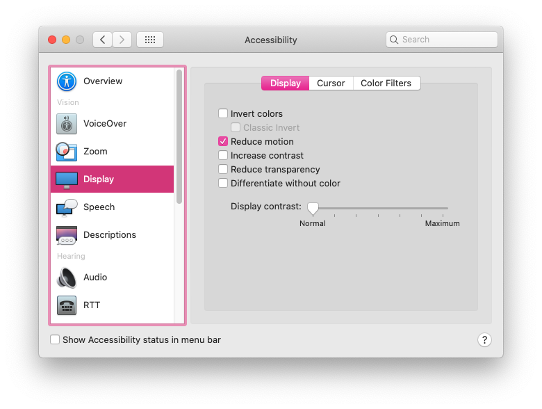
Most major operating systems allow people to set their preferences in their system settings. The exact wording and location of the settings vary, but the preference can be set on iOS, OSX, Windows, and Android operating systems.

The Prefers Reduced Motion Media Feature In Practice

Deciding how to put the prefers-reduced-motion media feature to use is where we have space for creating solutions that best fit the context of our products and content. For most web projects, you’ll want to first identify any potentially triggering motion effects on your site, and then use the prefers-reduced-motion media feature to provide a reduced version of that effect.

Let’s look at each step in more detail.

Identifying Potentially Triggering Motion

To find any potentially triggering motion you might have, go through some typical user flows for your site or product and take a closer look at the motion effects used: Do you have any interactions that have large movements? Any large zooms, spinning effects, or parallax effects? All of those types of animated effects are very likely to be problematic for people with motion sensitivities. In contrast, animated effects like color fades, opacity changes and small changes in scale are unlikely to be problematic. If in doubt, it can’t hurt to add the effect in question to your “to reduce” list to err on the side of caution.

The Web Content Accessibility Guidelines recommend providing a reduced version for any “motion that creates the illusion of movement…that is not essential to the content’s meaning”. I think it’s helpful to see some examples too, especially if you don’t consider yourself to be sensitive to motion on screen. I cover examples of potentially triggering motion in my previous article and this post on the Webkit blog has some too. Chances are, unless your site relies heavily on motion, you’ll end up with a fairly short list of effects to focus on here.

Create A Reduced Motion Version

Next, you want to determine the most appropriate reduced motion condition for these potentially triggering effects. Can the animation easily be adjusted to use a non-motion effect like an opacity fade or crossfade for reduced motion requests? Would pausing the motion or removing the effect entirely for reduced motion preserve the meaning of the content?

The role of the motion in question will be an important factor in deciding what the most appropriate reduced version would be. You don’t want to unintentionally remove content or degrade the overall experience. Here are a few examples of what might work well for the potentially triggering effects you find:

Large Page Transitions

Large page transition effects can likely be replaced with a crossfade effect for a reduced motion mode. The same is usually true for large zooming or spinning transitions that transition between different states or views.

Animated Illustrations

Animated illustrations, on the other hand, might be best replaced with a static version for reduced motion if they are mostly for personality or branding effect. You’ll want to make sure the static version is still meaningful, and the arrangement that has the most meaning may not always be the very beginning or very end of the animation. Adding in functionality to play animated illustrations on demand for reduced motion could also be useful by allowing people to play the animation when they’re ready for it.

Don’t forget to consider the motion in your animated gifs or auto-playing videos here as well. These can also contain potentially triggering motion and would need a reduced version if they do.

Parallax Effects

Parallax effects and exaggerated smooth scrolling effects are universally triggering for folks with motion sensitivities, so those should be significantly reduced or entirely removed for reduced motion. (Every single person I’ve talked to in my research on this has called out parallax specifically as being a problem for them.) Smooth scrolling effects can be replaced with the default browser anchor link behaviour as described here by Eric Bailey. Removing parallax effects for reduced motion is the ideal solution, but make sure to check that all the necessary content is still visible and usable with the parallax removed.

In most cases substituting the potentially triggering effect with a safer effect for reduced motion is the best way to preserve as much of the content’s intent and usability as possible. Luckily, substituting a reduced effect can be pretty straight forward too.

An Example Of Reducing Motion

For example, let’s say I flagged this header animation as potentially triggering when I went through my site. The motion is large enough to create the illusion of motion, so it’s likely to be triggering, and the multiple directions of motion are also likely to be problematic. It’s definitely one I’d put on my list of effects that need a reduced version when reviewing my site.

The Airpods Pro page also responds to reduced motion preferences, but in a very different way because of the content and effects used. Almost all of the motion on the page could be potentially triggering since it has a lot of big zooming movements and parallax-style effects. When reduced motion is requested, all the parallax and large motion effects are removed, but they do more than just pause or remove the animations. The version you see with reduced motion selected has been designed with care to preserve the same content and meaning from the full motion experience. (Here’s a video of The Airpods Pro site both with and without reduced motion selected for reference.)

Add Custom Toggles For Motion-Heavy Experiences

I mentioned above that most “task-based” sites likely have only a handful of animations that might be triggering and need a reduced version. But those aren’t the only kind of web sites out there on the web. Projects that involve a large amount of motion, like sites that are meant more for storytelling or creating an experience might benefit from a slightly different approach.

For projects like these, it would be difficult to make a list of potentially triggering motions and provide a reduced alternative for each because almost all of the motion used could be potentially triggering. Plus, the motion is very much part of the content and its meaning. Designing a reduced motion mode for these types of sites will take a more global approach and more effort to be sure the meaning of your content is preserved even as motion is reduced.

For these highly animated experience sites, providing a visible custom motion toggle is a useful thing to include. This will allow people who may not yet know about the reduced motion setting, or who are experiencing some motion sensitivity at that moment in time, to quickly adjust the experience. A motion toggle provides a way for motion-sensitive folks to participate in your content in a way that won’t make them sick. That’s definitely better for everyone involved than them having to avoid your site entirely.

Context Is A Key Factor

Remember that context also plays a big role here. No one wants to be surprised by large amounts of motion where they don’t expect it. If you’re visiting a site billed as a highly interactive storytelling experience you’ll have very different expectations than when you’re visiting your bank’s web site. Both of those sites certainly could feature large amounts of animation, but it would be an unexpected surprise on the bank site.

Building A Custom Motion Toggle

The idea of a custom toggle is something that I mentioned back in my 2015 article, but today it’s a much more viable option. On today’s web, we can create one with more ease, and even make a smarter toggle than we could have just a few years ago.

Marcy Sutton has a great example of how a modern custom motion toggle could work in this CodePen. (This example is part of her course on making accessible web apps, which is also very much worth checking out.) Her example uses a toggle to remove all motion because it only includes one animation, but this approach can be used to provide reduced motion effects across an entire application or site following the same logic as well.

The key feature of this approach is how nicely Marcy ties it in with modern web technology, i.e. prefers reduced motion and local storage. When using this approach, if someone comes to your site with reduced motion requested, they automatically get the reduced motion version without having to manually activate the toggle as well. And if someone invokes the toggle to reduce motion, that preference will be saved via local storage so they won’t have to repeatedly make this selection every time they visit.

The official Animal Crossing site is a wonderful real-world example of a custom reduce motion toggle combined with the prefers-reduced-motion media feature. It’s one of my favorite examples of handling reduced motion. The design choices they made around how to reduce potentially the triggering motion, while still keeping true to the overall feel of the site and the content, is great. I wrote more about how they pulled it off in this blog post. There are a lot of sites out there whose audience could benefit from a similar approach.

Other Ways To Use Motion Toggles

If you already have a preferences or settings panel, adding a toggle to request reduced motion could be a valuable thing to add to these settings like Twitter does on its site. In this case, there aren’t large amounts of motion immediately presented when visiting the site and there’s already a settings panel, so implementing the toggle as part of the settings preferences fits well. Twitter’s toggle also respects OS-level settings via the preferes reduced motion query and is preset to either on or off based on what the user has set at the OS level. Designing your motion toggle to respect OS settings is definitely a smart approach to implementing them well no matter where the toggle might appear.

Contextual toggles are another approach that could be used to reduce motion on specific animated illustrations or other content areas that appear throughout your site. The Dark Side of The Grid article does this nicely by adding contextual toggle buttons to each animate figure to allow the reader to play the animation when they want to see it, but not have it loop endlessly while they are reading.

Along those same lines, Dave Rupert shared a technique for combining prefers reduced motion with the picture element to show static elements in place of animated gifs when reduced motion has been requested. Chris Coyier took that one step further and suggested presenting a play toggle for those animated gifs based on the same approach. Steve Faulkner’s gif de-animator example could also be a useful approach.

All of these, or something similar, could be good options for mitigating any potentially triggering motion on the web. I bring up these examples for two reasons. The first is to show that there are a number of ways to approach providing reduced motion variations and you have lots of flexibility to find an approach that fits best for your content. And secondly, as time goes on and more folks are building sites with reduced motion options, the more innovative solutions we’ll see shared in the community.

There are many creative ways to add toggles and settings in a way that makes sense for the context of your project. It’s an interesting parallel that we’re seeing more and more web sites include settings panels or options for setting preferences like dark mode. Including an option for reduced motion could be a natural next step.

The More We Use It, The Better It Will Get For Everyone

I think it’s important for us, the people designing and building things for the web, to take advantage of the prefers-reduced-motion media feature to make our work more inclusive. By taking steps to respect motion preferences we make the web safer for more people to use, and that can only be a good thing. We absolutely can be expressive and creative with motion on the web while also being responsible and inclusive.

But the awareness level is still something we need to be, well, aware of. Not everyone who might need reduced motion is aware of the option in their OS settings. Perhaps even fewer people know that it can take effect on content in their browser too since so few websites currently take advantage of it. The more we take advantage of the prefers-reduced-motion media feature, and provide a quality reduced motion experience with it, the more meaningful of a feature it will be for those who need it.

40 Free Cartoon and Comic Fonts

Original Source: https://www.hongkiat.com/blog/40-free-unique-cartoon-and-comic-fonts/

Have you ever feel that traditional fonts are a little too boring and plain for your designs and artworks? Ever wanted to use fonts that are funkier, stylish and fun to look at? Cartoon and comic…

Visit hongkiat.com for full content.

Collective #621

Original Source: http://feedproxy.google.com/~r/tympanus/~3/vF9Y8Q2NROY/

Collective 621 item image

Inspirational Website of the Week: Elias & Valentin

A very fluid experience on another level of sophistication. Our pick this week.

Get inspired

Collective 621 item image

This content is sponsored via Syndicate Ads
Website Behavior Analytics Software

Understand how users are really experiencing your site without drowning in numbers!

Try it free

Collective 621 item image

Component Driven User Interfaces

The Chromatic team made this great resource that explores how modularity is transforming design and front-end development and explains what Component Driven UIs are.

Check it out

Collective 621 item image

Shader Studies: Matrix Effect

Shahriar Shahrabi wrote this break down of the matrix shader effect written by Will Kirby and also implemented a real time matrix Shader in Unity 3D with Triplanar mapping.

Read it

Collective 621 item image

Present

A terminal-based presentation tool with colors and effects.

Check it out

Collective 621 item image

Web Brutalism, Seamfulness, and Notion

A very interesting article on how a tool for sensemaking reconciles two distinct software design ideologies.

Read it

Collective 621 item image

Omatsuri

A great place to find open source browser tools for everyday use.

Check it out

Collective 621 item image

Stitches

A CSS-in-JS library with near-zero runtime, server-side rendering and multi-variant support.

Check it out

Collective 621 item image

Building Website Headers with CSS Flexbox

A very practical tutorial on how to code up responsive flexbox-powered website headers.

Read it

Collective 621 item image

Custom bullets with CSS ::marker

Learn how trivial it has become to customize the color, size or type of number or bullet when using lists.

Read it

Collective 621 item image

CSS ART – Vintage VW Bug

A beautiful VW Bug created with CSS only.

Check it out

Collective 621 item image

An Interesting Explanation of async/await in JavaScript

Learn how to use async/await in JavaScript in this article by Dmitri Pavlutin.

Read it

Collective 621 item image

Proportional Resizing with CSS Variables

A very useful snippet by Ahmad Shadeed on how to proportionally control the dimensions of an element.

Check it out

Collective 621 item image

Is the web getting slower?

Is website performance getting worse overall? The team of DebugBear tries to answer the question.

Check it out

Collective 621 item image

To design and develop an interactive globe

Read about Stripe’s approach to creating a 1:40 million-scale, interactive 3D model of the earth.

Read it

Collective 621 item image

Increment: APIs

This issue of Increment explores all things APIs—from their prehistory to their future, their design and development to their opportunities and impacts.

Check it out

Collective 621 item image

CSS3D Adventure Game

A 3D game rendered entirely in CSS/HTML. Can you escape the dungeon?

Check it out

Collective 621 item image

Flexbox Defense

The Tower Defense game with a twist: all towers must be positioned with CSS Flexbox!

Check it out

Collective 621 item image

Alt text overlay bookmarklet

Christian Heilmann created a bookmarklet to easily test which images have alternative text and what it is.

Check it out

Collective 621 item image

Creating A Custom Scroll Bar In 24 Lines Of CSS

Have you ever encountered a website with a beautiful scrollbar and thought to yourself “wow, I wish I… Tagged with css.

Check it out

Collective 621 item image

CSS Values

A place to search the syntax and all possible values for any valid CSS property.

Check it out

Collective 621 item image

From Our Blog
Diagonal Thumbnail Slideshow Animation

A simple slideshow with tilted thumbnails and large titles that animate when navigating.

Check it out

The post Collective #621 appeared first on Codrops.