Branding & Full Visual Identity for La Mala Pub
Original Source: http://feedproxy.google.com/~r/abduzeedo/~3/DTmyxjanGuk/branding-full-visual-identity-la-mala-pub
Branding & Full Visual Identity for La Mala Pub

abduzeedo09.09.20
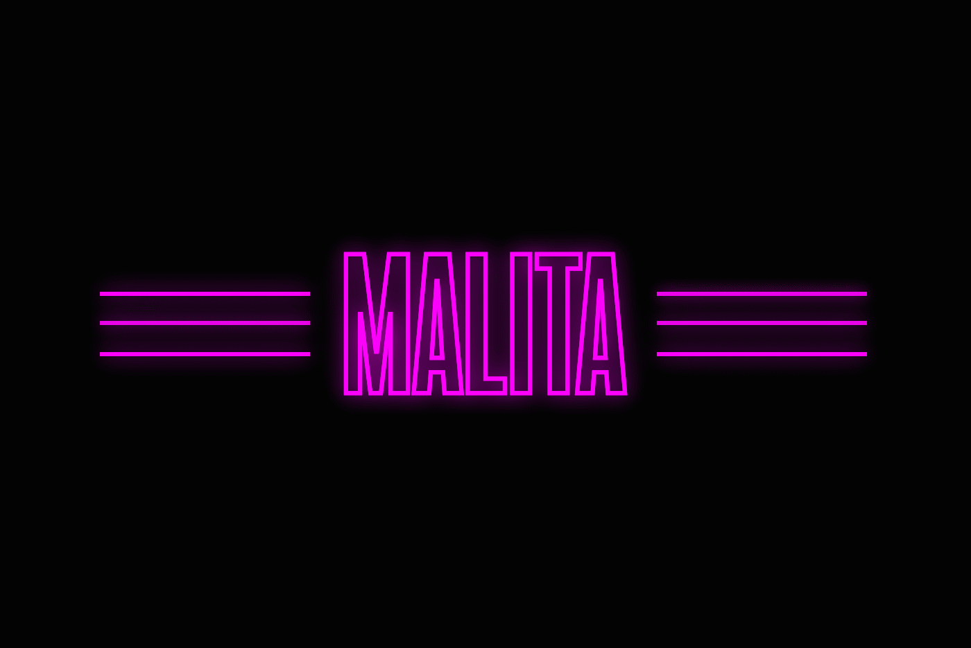
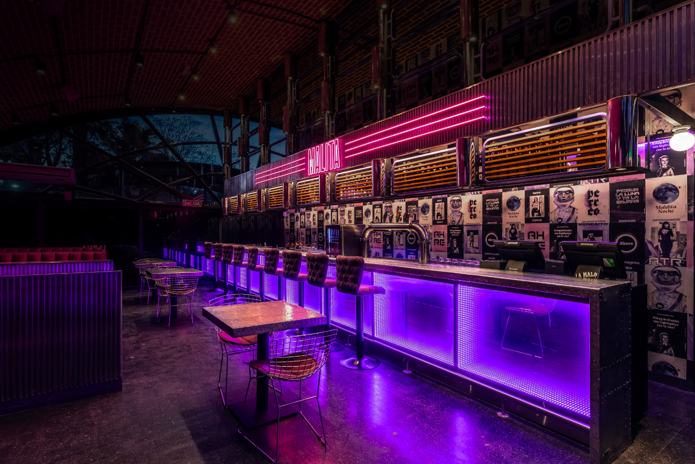
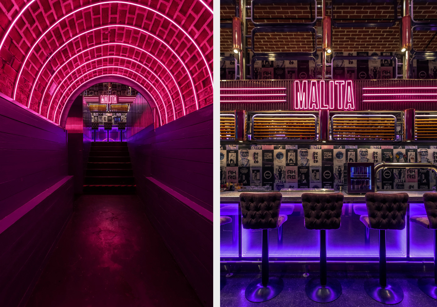
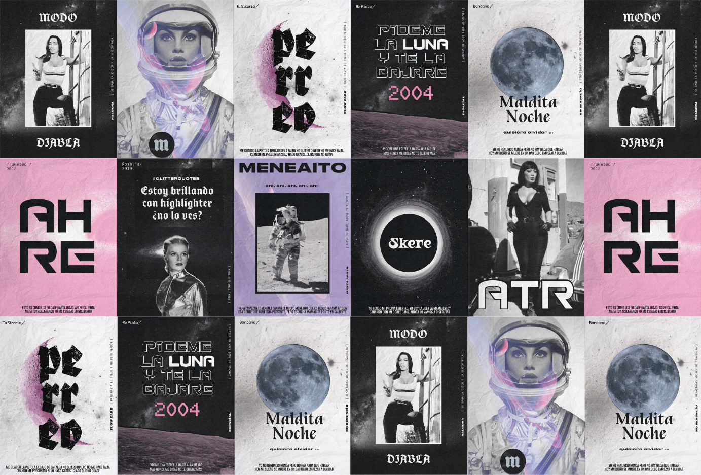
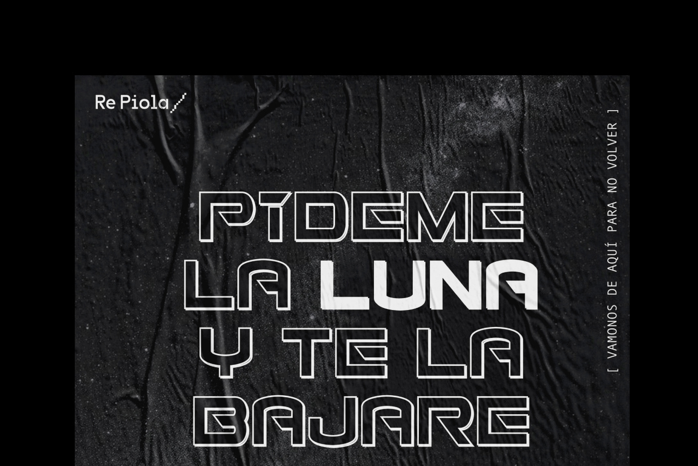
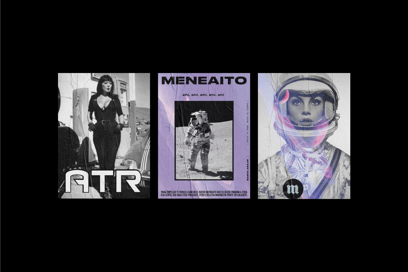
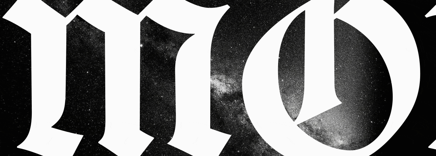
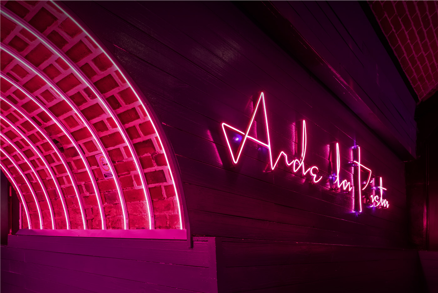
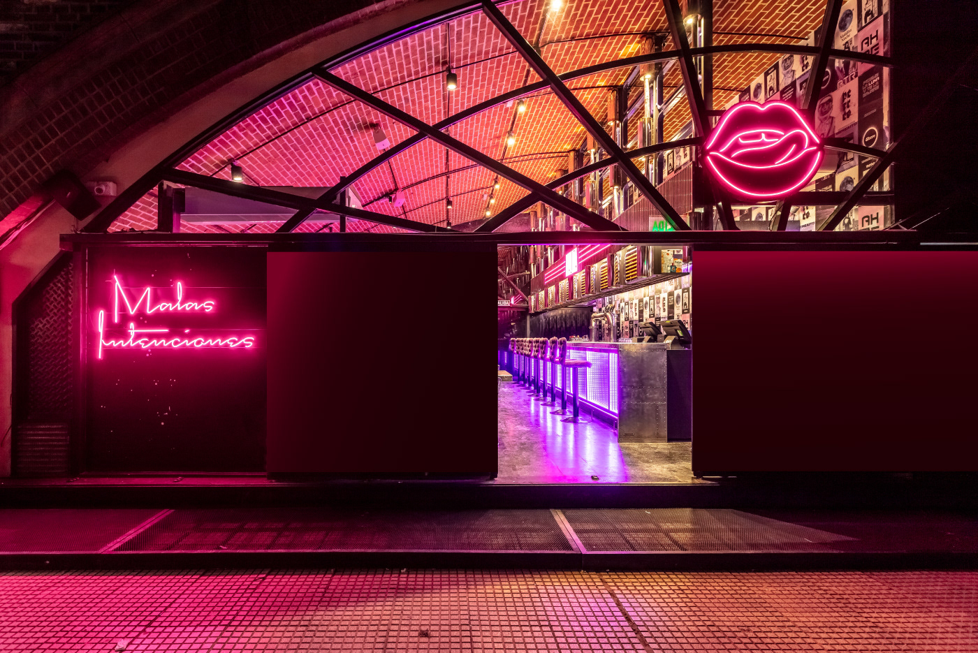
Estudio Nuar shared a beautiful branding project for La Mala Pub. Right in the heart of Palermo, La Mala Pub leads Buenos Aires nightlife. Only a few months after opening, it became so trending that generated the need for more space. In consequence, an extra space was attached and Malita was created. It was a joint work with the architecture team to design the new identity for this space and then generate all the graphic interventions and signage applications.
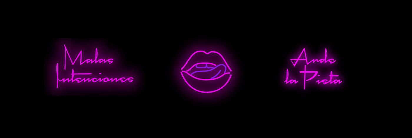
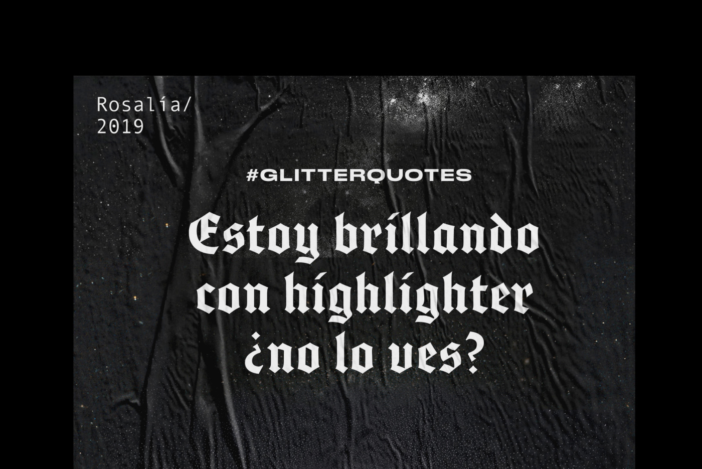
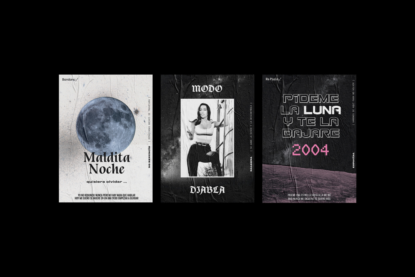
La Mala in Spanish means “Bad Girl” and that’s what triggered the visual imaginary, with all these really empowered girls, a bit vintage but updated with the vibrant colors, the contemporary phrases and the spacial mood, meaning she’s from outer space.
We created this multifaceted character who represents La Mala but also every girl who goes there. Apart from the posters, which are one of the main characters, we worked a lot on the neon signs, together with the architecture team, as they were very important taking into consideration it’s a night pub and the lighting is fundamental.


Credits
Creative Direction: Manuela Ventura y Melisa Rivas.
Architecture: Hitzig Militello Arquitectos.
Production: Crista Bernasconi.
Equipment: Krapa.
Design: Manuela Ventura, Melisa Rivas, Crista Bernasconi y Natasha Furst.
Photography: Federico Kulekdjian.
Animation: Malena Sueiro.


Leave a Reply
Want to join the discussion?Feel free to contribute!