Collective #385

Original Source: http://feedproxy.google.com/~r/tympanus/~3/q3CTVKPSZtM/

C385_WOTW

Inspirational Website of the Week: Active Theory

Active Theory’s new website is out of-this-worldish awesome. Our pick this week.

Get inspired

C385_Northw

This content is sponsored via Syndicate Ads
Northwestern’s Online MS in Information Design & Strategy

Build skills to translate data into compelling visuals and narratives and learn how research and analytics can drive communication strategies and tactics.

Find out more

C385_gridish

CSS Gridish

A tool from IBM that helps teams adopt CSS grid sooner and that enables the creation of more complex layouts. Read more about it in this article.

Check it out

C385_clippath

Using CSS Clip Path to Create Interactive Effects

Learn how to make some creative clip-path effects in this article by Mikael Ainalem.

Read it

C385_githubgrid

Recreating the GitHub Contribution Graph with CSS Grid Layout

A great tutorial by Ire Aderinokun where she challenges herself to create the GitHub contribution graph with CSS Grid.

Read it

C385_redux

React, Redux and JavaScript Architecture

In case you missed it: James Sinclair shows how to write good React and Redux code, but explains first why you’d actually want to use it.

Check it out

C385_cssgridmenu

Grid Experiment No. 4

Jules Forrest shows a beautiful CSS grid example of a menu.

Check it out

C385_streamlineux

Streamline UX

50 fantastic free illustrations from the Streamline UX vector illustration pack.

Get it

C385_fb

Detectron

Facebook just open-sourced Detectron, a software system that implements state-of-the-art object detection algorithms.

Check it out

C385_kenji

tubugl-font

A creative tubugl font rendering demo of twisting letters made by Kenji Saito.

Check it out

C385_github

How I Got Hired by GitHub

Joel Califa shares the design homework that landed him the job at GitHub.

Read it

C385_karamatic

Karmatic

A simplified zero-configuration wrapper around Karma, Webpack, Jasmine and Puppeteer for automatic (headless) browser testing.

Check it out

C385_linqes

Linqes

Collect your favorite content and share it with this advanced bookmarking tool.

Check it out

C385_graphql

A GraphQL Primer: Why We Need A New Kind Of API (Part 1)

Learn how to work with GraphQL in this first article of a two-part series by Eric Baer.

Read it

C385_font

Free Font: College Stencil

Inspired by the architecture of College de France, Corentin Riviere created this creative typeface.

Get it

C385_proposals

Interesting ECMAScript 2017 proposals that weren’t adopted

Kaelan Cooter writes about the ECMAScript proposal process and showcases some proposals that didn’t become part of the language.

Read it

C385_handwritten

Handwritten Font Collection

A fantastic free set of beautiful handwritten fonts that fit perfectly together. By Julia Dreams.

Get it

C385_lazy

Multiple routes, bundling and lazy-loading with webpack

Sérgio Gomes shares some thoughts and code on bundling with multiple entry points in webpack.

Read it

C385_cssgridcourse

Learn Flexbox for free

In these 12 interactive screencasts you’ll learn everything about CSS Flexbox. By Per Harald Borgen.

Check it out

C385_wordpress

create-guten-block

A zero-configuration developer toolkit for building WordPress Gutenberg block plugins without configuring React, Webpack, ES6/7/8/Next, ESLint, Babel, etc. By Ahmad Awais.

Check it out

C385_FF

Firefox 58: The Quantum Era Continues

Read about some of the new goodies that Firefox 58 brings.

Read it

Collective #385 was written by Pedro Botelho and published on Codrops.

How to draw metallic reflections

Original Source: http://feedproxy.google.com/~r/CreativeBloq/~3/jRlZsEZ5Vlg/draw-metallic-reflections

When light strikes a metallic object, it can reflect back onto any nearby object in an unusual way. Normally, light hitting a primary and secondary object gives varying degrees of light, shadow and cast shadows, but reflective light also happens under these circumstances, and will need to be shown in your artwork.

10 expert tips for charcoal drawing

To demonstrate the drawing techniques to make this work, I have produced the images above, working with a dark charcoal pencil and an eraser.

01. Place your objects in light

Position your objects to make the most of the highly lit and shadowed areas

Select interesting objects – such as this highly polished metallic teapot and a ceramic vase – and place them with light catching one side so you can carefully observe the highly lit and shadowed areas. Then draw basic shapes with a charcoal pencil, trying to represent these reasonably accurately, although adjustments can be made later.

02. Get shading

Shading the metallic object is where the fun starts

Shade the object in direct light first – here the ceramic pot to the left – observing the deeper and lighter values. Then move on to shade the object in its shadow – here the metallic object. It was important to really concentrate on the depth of the cast shadow from the ceramic pot as it struck the left side of the metallic one, here. The deepening of the shadow to the right of the metallic pot follows conventional rules of light and shadow.

03. Add some shadows

Add ground shadows to bring your objects down to Earth

The objects appear to be almost floating in space at this stage, so need grounding. Shade the shadows cast by the objects as they fall to the right across the table top, thus sitting the objects on a solid base.

04. Blend and soften

Use an eraser to highlight areas where light is reflected off the metallic object

Using a charcoal eraser, rub out sections of reflections and – here we rubbed out from the already shaded right side of the vase, where the light was reflected back from the teapot. You can see how this is of secondary importance compared to the other highlighted area. 

Finally, blend some areas using your finger to soften the transition of tonal variances on the vase for effect.

This article was originally published in issue 13 of Paint & Draw, the magazine offering tips and inspiration for artists everywhere. Buy issue 13 here.

Related articles:

How to choose the right drawing toolsPencil drawing in 6 simple stepsHow to draw and paint – 100 pro tips and tutorials

10 best off-the-beaten track creative locations in Berlin

Original Source: http://feedproxy.google.com/~r/CreativeBloq/~3/dms2kPdaWZU/10-best-off-the-beaten-track-creative-locations-in-berlin

When it comes to left-field creativity, Berlin is indisputably one of Europe's – if not the world's – most vibrant and inspirational design cities to visit.

Offering a unique blend of subversive counter-culture, bustling cosmopolitan energy and harrowing historical scars, Berlin is a haven for design inspiration.

So whether you're paying the German capital a flying visit, looking to move there to live or just on the hunt for some visual reference material, read on for our guide to 10 of the best off-the-beaten track creative locations in Berlin…

01. Spreepark

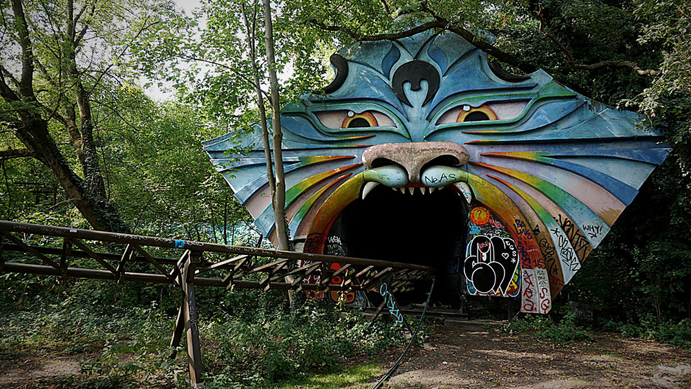
Spreepark Berlin abandoned rollercoaster

An abandoned amusement park might sound more like the favoured stomping ground of a Scooby Doo villain than a must-see creative attraction, but bear with us.

From a towering, derelict Ferris wheel to derailed go-karts peeking out from the undergrowth, Spreepark – once full of life, bright lights and laughter as the GDR's only permanent amusement park – is now a hugely surreal place to become inspired.

Spreepark dinosaur statue and ferris wheel

Everywhere you look, there's a visual cue to spark off a story in your mind – whether it's toppled, overgrown dinosaur statues or colourful animal faces adorning tunnels.

Formerly known as Kulturpark Plänterwald, the park was opened in 1961 and used to attract 1.5 million visitors a year, but fell into financial difficulties after reunification, and was declared insolvent in 2001.

If you're passing by, you can peek through the gates into Spreepark for free – or occasionally there are events, screenings and even concerts hosted inside, if you're lucky.

02. Panke art cafe

Panke art cafe courtyard with graffiti

Berlin is packed with quirky arts venues, of which Panke is a great example. Offering a heady combination of art, food and music, it strives to "support edgy creativity that happens away from mainstream culture".

Its café serves vegan/vegetarian food and coffee by day, and hosts events by night, while the gallery space showcases both established and emerging artists, with a particular interest in digital or net-based art and club culture.

Visual inspiration doesn't stop there, as the bar is continuously redecorated by local and international artists – so you can get a fresh experience every time you visit the city.

03. Monster Kabinett

Monster Kabinett monster sculpture

If you like your artistic inspiration mixed with a dose of mechanised horror, there's no better place to do so than Monster Kabinett – a dark, unsettling showcase of hulking robots and warped, insect-like creatures.

Hosted in a warehouse, it's the brainchild of the Dead Pigeon Collective and features costumed performers among the giant, moving metal sculptures.

It's very literally off the beaten track: you'll find it down a suitably dank, dark alleyway off the side of a busy thoroughfare. It's an unassuming location, and you might not be sure you're in the right place until you're standing directly outside it.

04. Buchstabenmuseum

Buchstabenmuseum typography models

Typography is part of Berlin's design heritage, as the ever-inspiring annual TYPO Berlin conference attests. And you'll find plenty of tangible examples of it in use here.

With an impressive collection gathered from around Berlin and beyond, the Buchstabenmuseum – or Museum of Rescued Letters – is one of the world's first museums to collect letterforms from public spaces and display them as part of urban history.

Featuring all manner of lost, forgotten and abandoned signage that's been saved from the scrapheap, this is a wonderful source of typographical inspiration. Courtesy of LucasFonts, there's even a free Buchstabenmuseum font, based on a selection of the letterforms on display.

05. Haus Schwarzenberg Street Art Alley

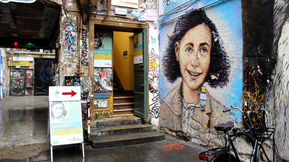
Haus Schwarzenberg Street Art Alley Anne Frank mural

Berlin's street art scene is legendary, from the world-renowned East Side Gallery, painted on the remnants of the Berlin Wall, right down to tucked-away alleyways that can be easily missed.

One such example is Haus Schwarzenberg Street Art Alley. A narrow, unassuming passageway beside a cafe – not far from the famous art nouveau courtyards of Hackeschen Höfe – leads to a colourful explosion of inspiring murals, paste-ups and graffiti.

Given the nature of great street art, the specific creations on display are constantly evolving as new murals are painted on, papered over and adapted, although Jimmy C's beautiful painting of Anne Frank, a centrepiece of the space, remains untouched.

The existence of this pocket of inspiration is all thanks to non-profit arts organisation Haus Schwarzenberg, which occupies the adjacent building.

06. The Return of the Cows

The Return of the Cows sculptures climbing a housing block

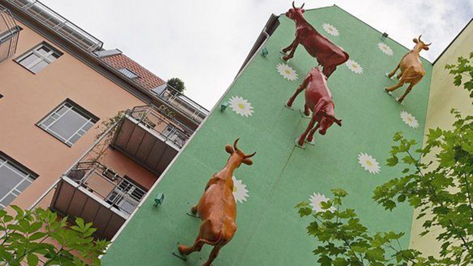
A quiet residential street in between the Prenzlauerberg and Friedrichshain areas of the city, Dietrich-Bonhoeffer Strasse is definitely off the beaten track by most standards. In fact, there would be no real reason to visit if it weren't for Sergej Dott’s delightfully whimsical public art installation, Die Rückkehr der Kühe – or The Return of the Cows.

Peek between two buildings halfway down the road, and you'll spot a photo opportunity unlike any other: a herd of giant cows, seemingly wandering up and down the side of an apartment block.

Dott has created several cow-based installations, which he calls 'Kuhunst' – a cheeky pun that will appeal to German-speakers, combining the words 'Kuh' (cow) and 'Kunst' (art).

07. Stand By Me tree

Tree trunk with engraved Stand By Me lyrics

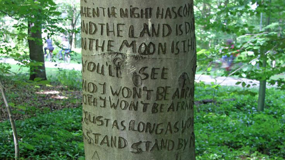
An anonymous fan of Ben E. King has demonstrated their passion for his seminal love song Stand By Me, by carving the lyrics into a tree trunk in Berlin’s Tiergarten Park – turning it into a natural sculpture to inspire all who visit it.

Unlike the transient, temporary nature of some of the street art featured on this list, this lyrical trunk has a pleasing permanence about it. The bark has healed, sealing the words within – and the anonymity of the creator adds to its enigmatic appeal. 

While the exact date it was carved is unknown, the tree first became an attraction following King’s death in 2015, and the famous chorus of the song also appeared on a nearby tree at a similar time.

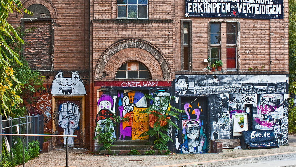
08. Georg von Rauch-Haus

Exterior of Georg von Rauch-Haus

A graffiti-daubed icon of socialist activism, the Georg-von-Rauch-Haus is an infamous Berlin squat that takes its name from a violent German anarchist and so-called 'urban guerilla' who was shot dead by the West German police in 1971.

Shortly after von Rauch's death, squatters and political activists occupied a former nurses’ dormitory near Bethanien Hospital on Mariannenplatz, Kreuzberg. Attempts by the police to evict the inhabitants culminated in a major protest, which was met with tear gas and batons.

With a distinctive ring of graffiti around the lower level, the Georg von Rauch-Haus now operates as a 'free-living' collective, as well as playing host to musical and cultural events.

09. Teufelsberg

Teufelsberg listening station dome

With an intriguing name that translates as 'devil's mountain', Teufelsberg is a former US spy base from the Cold War. It's built on top of a man-made hill outside the city, formed from the remnants of an incomplete Nazi military-technical college, as well as wartime rubble.

Teufelsberg's most distinctive feature is a collection of 'randomes' – enormous listening domes, now dilapidated and broken, but still strangely beautiful – which, like so many of the locations on this list, are plastered with street art.

Despite its dilapidated state, however, there's an entry fee to visit Teufelsberg as the site is now privately owned. Guided tours are also available.

10. Urban Nation

Urban Nation museum building, Berlin

Rounding up our list is a relatively new addition to Berlin's cultural landscape, having only opened its doors in 2017. Capitalising on Berlin's global reputation on the street art scene, Urban Nation is the world's first museum dedicated to all genres of urban contemporary art: graffiti, paste-ups, sculptures, acrylic designs and more.

For over a decade, Urban Nation has championed street art in Berlin and helped transform the once-depressing, Cold War-era concrete cityscape by inviting high-profile muralists to make their mark. Now the organisation has its own free-to-enter permanent space, which features the works of 150 international and local artists.

Related articles:

20 tools to make you more creative in 20185 fantastic design fails – and what we can learn from themThe top 20 US design studios of 2018

Redesigned Leeds United badge has outraged fans

Original Source: http://feedproxy.google.com/~r/CreativeBloq/~3/V-gDBbmoWVk/redesigned-leeds-united-badge-has-outraged-fans

Leeds United has nearly hit its centenary, so to celebrate, the club decided it was time to redesign its badge (above). Despite referencing the 'Leeds Salute', however, the new crest has not been well received by fans.

Unveiled today, Leeds United's new crest took six months of work to complete and involved consultation with more than 10,000 people. For the uninitiated, the 'Leeds Salute' referenced in the new crest is a gesture used by fans on match days, where they place their right hand on heart and sing the club's song Marching on Together.

The redesigned badge is the latest in a series of efforts by the club to re-engage fans and the wider community. Leeds United isn't the first sports organisation to rely on a rebrand to boost interest, of course. Earlier this year, Formula 1 changed its logo to get more people involved.

Leeds United managing director, Angus Kinnear, said “updating the crest is not a decision we have taken lightly, but we are proud to have a new crest that is authentic to Leeds United and honours the quality and loyalty of our fans. It is a symbol of ‘strength in unity’ and a proud expression of the club’s identity and history.”

Currently, however, the only thing Leeds United fans are united by is their dislike of the new crest. Plenty have taken to social media to voice their despair, with some taking aim at how the emblem can be modified to represent other teams. (A popular one sees a Newcastle supporter punching a horse.)

One element that's caused anger and confusion is the crest appears to be covering itself up. If a fan or player does the 'Leeds Salute', of course, by its very nature the gesture obscures the badge – but when it comes to design, blocking your team's badge is a peculiar way to show pride.

With a petition to stop the new badge from being implemented having already racked up over 10,000 signatures, it remains to be seen whether the club holds its ground or gives in to fan pressure.

Related articles:

Photography book celebrates the joy of footballThe 20 posters of the FIFA World Cup5 great EPL football stadium illustrations

10 Best Free Monospaced Fonts For Code Snippets

Original Source: http://feedproxy.google.com/~r/1stwebdesigner/~3/WiXCTL7xeOg/

Webfonts are all the rage these days for practically every website. We often use them for page headings as well as body text. But you can also use them for code snippets.

Most designers never think about changing the default code text style, but it’s pretty simple with Google Fonts. Not to mention these fonts are free to download and use locally if you’d like to change the font in your IDE.

This is my list of the 10 best options for coding fonts – all available for free. Have a look and see what you think!

PT Mono

pt mono font

The free PT Mono font is an excellent place to start. It’s clean, sharp and very easily blends into any layout.

You may notice there is some odd spacing between certain letters – like the “L” and “E” characters. But this only appears when the text is larger and is not very noticeable at smaller sizes.

I’ve never seen this used for code snippets, but it’s definitely one of the sharpest fonts on the list. It would be excellent for code or even page headers, if you like the design.

Fira Mono

firamono font

Here’s another example of a font that can work well in any format. Fira Mono has been designed for use as a monospaced code font, but the bold style looks nice with headings too.

When you resize this font down to around 12-16px, you’ll notice it actually makes a nice navigation link style, too. Specifically, it works well if you use the bold format and have all of your links in uppercase letters.

This is a great font choice for any site and can be useful for more than styling code snippets.

Cutive Mono

cutive mono font

Cutive Mono is a much more traditional monospaced font. This is typically what I think of when looking for a typeface for code snippets.

This font’s thin letter forms with even-spaced glyphs are perfect for any site. You can organize your code properly with this font and it works very well under syntax highlighting.

The only caveat is that when you resize this font to smaller sizes (below 15px), it can be almost impossible to read. Not to mention the letter spacing looks a bit silly at that size. So you’ll probably want to adjust that using the CSS letter-spacing property.

Inconsolata

inconsolata font

This is one heck of a font with one pretty cool name. Inconsolata was originally designed for print code listings but has since become a great choice for programmers and IDE fonts.

It works nicely on the screen and should work flawlessly on a website. No matter how large your code snippets or where you’re using them, Inconsolata is a great choice.

You can use the font in regular or bold format – they both look great at all sizes. I personally prefer the bold font when it’s smaller than 15px, but you can always adjust contrast to make it more readable.

Hack

hack typeface

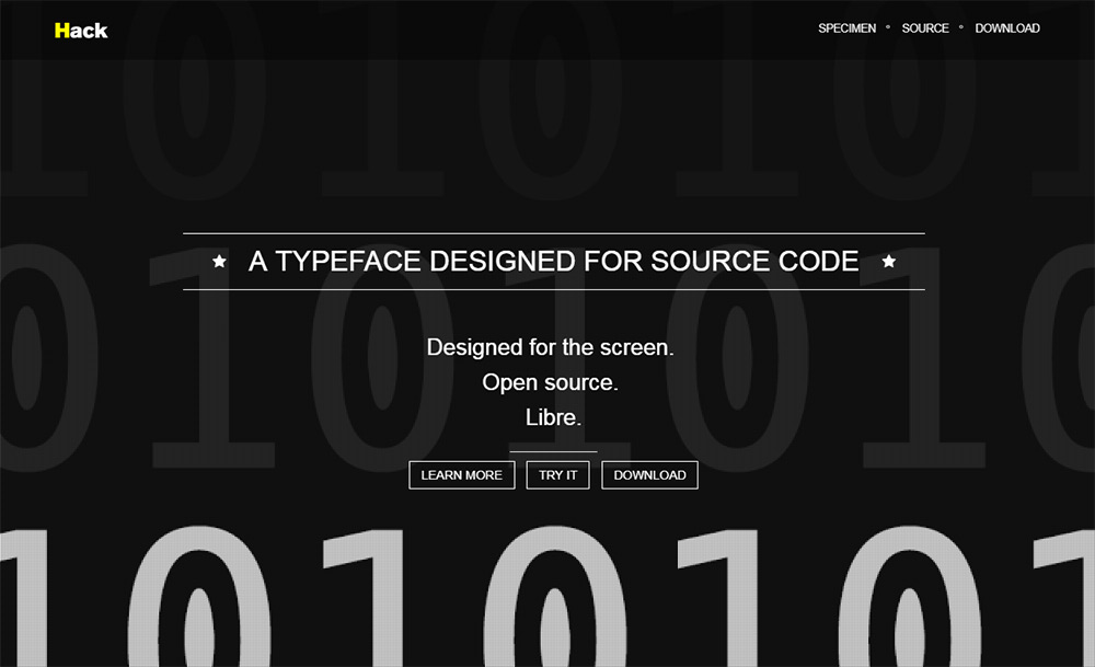
One of the few listings that I didn’t track down through Google Fonts, Hack is a true programmer’s font family.

This is a typeface truly designed for code and can be used on any platform – web, mobile or in your desktop IDE.

You can grab a copy from the main GitHub repo, along with further details regarding the font’s development. The font is multilingual, with support for over 1,500 glyphs (and counting!)

This one is well worth testing, even if you only use Hack for a few projects.

Gohufont

gohufont typeface

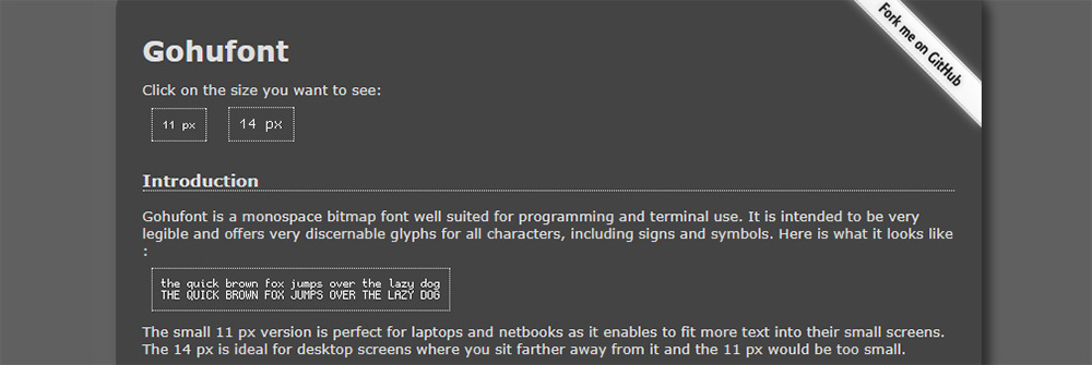
The Gohufont typeface is an excellent pick for that “classic” monospaced look. This reminds me more of the old school Nintendo fonts or the typefaces you’d see within old Gameboy games.

If you look over the main page, you’ll find examples with an auto-resizer. You can test the font at 11px or 14px to compare the differences. This includes all-caps and lowercase letters, along with special symbols.

I actually don’t like this much for an IDE, but it can work well on a website. Or, you might also try using this in your terminal window. Gohufont works really well as a CLI typeface since it matches perfectly to all programs.

Source Code Pro

source code pro typeface

This is perhaps the most famous monospaced font in Google’s entire library. Source Code Pro comes in a bunch of different styles, ranging from super thin to ultra bold.

You can restyle this font family to suit your needs and to match your site’s code tags. If you have any syntax highlighting plugins, this font will work flawlessly.

Note that Source Code Pro was designed as a companion piece to the original Open Sans font. So it works really well on websites that use Open Sans or any of its variations.

Overpass Mono

overpass mono font

I’ve tested the Overpass Mono in my code editor and it works really well. Granted, I’ve never tried using it in a website layout. But I imagine it can work just as well for that, too.

Overpass Mono is an excellent choice, in that it has a variety of styles without veering too far away from a traditional monospace font. It looks just like any other monospace typeface, except it really has its own “feeling” that grows on you over time.

Give it a shot on your website or try it side-by-side in two different IDE windows. You may find that you like this even more than your default font.

Oxygen Mono

oxygen mono

With the Oxygen Mono typeface, you get a design very similar to Overpass. The biggest difference is the lack of stylization and fewer formatting options.

This font only comes in one format: normal. You can still bold or italicize the font, but it will be rendered through CSS – rather than through a font file. I recommend this for the web because it’s smaller and easier to blend with different color schemes.

Not to mention it can work just as well alongside any font stack you choose.

Anonymous Pro

anonymous pro font

I’ve saved the most unique font choice for last with Anonymous Pro. This is a pretty darn creative typeface and it’s one of the easiest fonts to recognize.

One minor complaint I have is the lack of “crispness” of the letters at smaller sizes. You can still recognize the letters and it works fantastic as a code font. But it’ll stand out from all the others in this list, especially anywhere below 12px.

On the plus side, this font straddles the line between monospaced, serif and sans-serif. It borrows ideas from all of them, so you can get this to fit in anywhere on your site.


Power a blog using the WordPress API

Original Source: http://feedproxy.google.com/~r/CreativeBloq/~3/FAHDBL31eIM/power-a-blog-using-the-wordpress-api

Over the past few years, the development of a REST API for WordPress has opened new doors for developers. Developers who had previously been limited to writing a WordPress-powered project in PHP now have more flexibility and control in how they can approach the technology stack of their website-to-be.

This means it’s possible to retain all the advantages of the brilliant WordPress control panel, which is made extremely flexible by popular WordPress plugins such as Advanced Custom Fields, and have a completely custom built frontend that only interacts with WordPress when it needs to.

Download the tutorial files

In this WordPress tutorial we’ll be exploring how to implement the WordPress REST API into a simple blog app, which is currently using a local JSON file as its data source, and is built as a single-page application (SPA) using the popular JavaScript framework Vue.js. This will involve the implementation of Vuex, which we’ll use to store the data we request from a WordPress using a combination of its action and mutation methods.

Once completed, you should have created a lean, simple SPA, which has all the reactivity of Vue.js, while displaying posts retrieved from and managed by WordPress.

01. Set up workspace and dependencies

First things first, you should download the project’s files and open them in your preferred editor. 

In the console, cd into website-template and run the command below to install the project’s node dependencies (if you don’t have Node installed, do that first). We’ll be working purely in the src directory from here on out.

02. Install Vuex 

Next, using the command below, we’ll install Vuex, which is a state management pattern and library for Vue.js applications. This will act as a central information store for all Vue components that depend on the data we receive from WordPress API. For developers familiar with React, Vuex is heavily inspired by Flux.

03. Start development server

In the console, run the command below to start the development server. This will compile the Vue.js project as it currently stands and assign it to a URL so you can access it. This is usually localhost:8080.

One big advantage this brings is live reloading, so once you make changes to the app and save, the page in your browser will update itself without the need to manually reload.

04. Create Vuex store

In src, create a directory called store and within it a new file called index.js. This will be where our Vuex store will be defined. Though before we get to that, we need to first make sure our Vue.js app is aware of its existence. To do this, open main.js and import the store and include it as a dependency, as in the snippet below.

05. Create store scaffolding and install Axios

To help us simplify the AJAX requests our store will be making to WordPress API, we’ll install Axios, which is a Promise-based HTTP client. To do this, open a separate console window, navigate to the website-template directory and run npm install axios — save.

Next, let’s start to scaffold the store by instantiating a new empty Vuex store object. At the moment, it isn’t doing anything, but at least Vue should be aware of it.

06. Create posts state

In Vuex, the state object holds application info, which in this case will be the WordPress post data we’ll grab using the API. Within this object, create a new property called posts and assign it a value of null.

07. Create getPosts action

In Vuex, actions are the main way in which asynchronous requests are handled. These are typically methods defined in the store, which can then be dispatched as required by the app.

In the empty actions object, let’s define one where if our posts state is still null, axios is used to perform an AJAX request to the WordPress API and return a list of posts. Once we’ve received a positive response, we’ll then resolve the promise and commit the posts using the storePosts mutation.

08. Create storePosts mutation

Another concept introduced by Vuex is mutations, which are also typically methods defined in the store. Mutations are the only way to change state in a Vuex store, which allows state to be easily tracked when debugging.

In the empty mutations object, let’s define the storePosts method we referenced in the previous step and make it override the post property in the state object with any data the mutation receives as payload.

09. Trigger getPosts action on load

We’ve created the action and mutation methods that grab posts from WordPress API and commit them to Vuex state, but now we need to actually trigger this process somewhere. In the top level Vue.js component App.vue, add the snippet below.

created() is a lifecycle hook that triggers code as soon as the Vue component is created on load, while the use of the global $store variable allows us to access the contents of our Vuex store and dispatch the getPosts action from step 7.

10. Update attribute paths
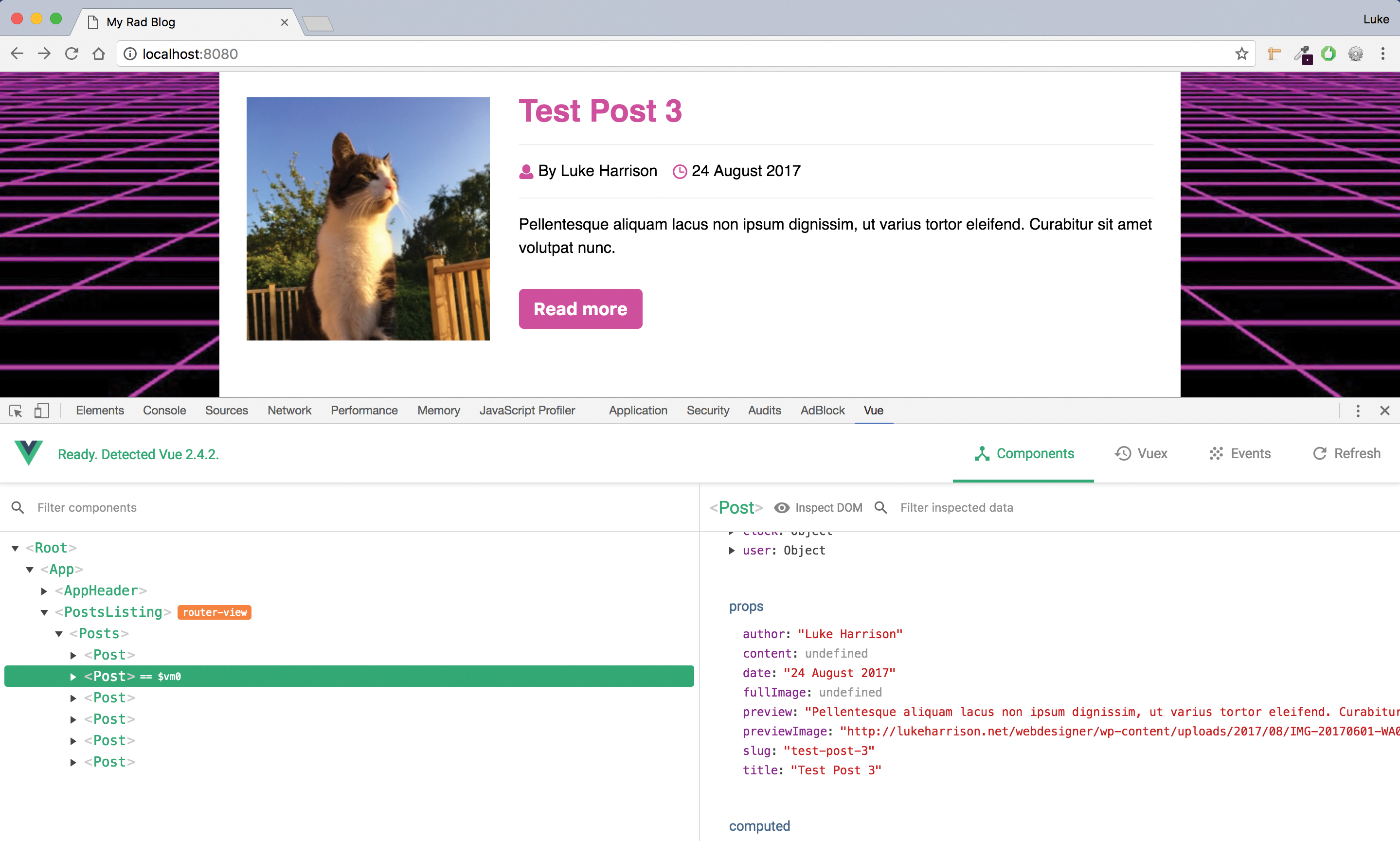
The Vue DevTools extension gives you the power to debug your Vue.js app

If you’re working in Chrome or Firefox and have the Vue.js DevTools extension (if not, I recommend that you do as it’s very useful), you should now be able to see the loaded WordPress posts in Base State under the Vuex tab. 

Back to the app, in /components/posts/posts.vue, the template HTML needs to point to this data, so let’s tweak a few of the attribute paths.

11. Update v-for loop

In the posts component, there’s a Vue.js directive in use called v-for. This loops through all posts and for each one prints an instance of the post component, displaying them in a list. 

We need to update the path passed to this directive as it’s still using the local dummy test data. Update the v-for directive to the snippet below in order to point to our stored posts in the Vuex store.

12. Do some housekeeping

A list of the WordPress posts should now be displaying. As we're no longer using the local post data, let's delete src/data. Then in the posts component, remove the posts: postData.data property in the components local data store and then the postData import.

13. Fix post author

You may notice that for each post the author is showing up as a number. This is because the WordPress API returns an author ID, rather than a name. We need to use this id to query WordPress for the full author information. Let's start by creating a place to store this in our Vuex store, alongside our post info, in store/index.js.

14. Create getAuthors action

As with posts, we'll create an action in /store/index.js to trigger an AJAX request to query WordPress API. Once a successful response is received, the promise will then resolve and trigger the storeAuthors mutation, which we'll create next.

15. Create storeAuthors mutation

Within the mutations object of the Vuex store, create the storeAuthors mutation using the snippet below. Like with storePosts from step 8, this takes the payload its passed and sets it as the value of the authors property in our store's state.

16. Trigger getAuthors on load

We need to get the author info from WordPress as soon as the app begins to load. Let's amend the top level component App.vue again and dispatch the getAuthors action in the same created() lifecycle hook as the getPosts action.

17. Create getUserName method

Now we're querying WordPress for author information on load, all we need to do is define a method in our posts component which lets us pass an author ID and get a name in return. Copy the snippet below into the posts component's methods object, below the existing getSinglePost method.

18. Call getUserName method

Now we just need to call getUsername. Still in the posts component, in the template, replace the author attribute’s reference to post.author so it reflects the snippet below. The author’s name should now be correctly displaying for each post.

19. Blog loading

As we’re loading the post data asynchronously, there is a moment before the request completes where the application is empty. To counter this, we’ll implement a loading state that's active until the blog is fully populated. In the posts component, paste the snippet below just after the opening <script> tag to import the icons we’ll be using.

20. Add icon to components list

Next, still within posts, add a reference to icon in the components objects. This makes the posts component aware of our recently imported icon component.

21. Create loading elements

We now just need to add the loading elements to the posts template so it shows up on the page. Firstly, wrap the second div in the snippet around the two divs with the v-if directives to make sure no posts show up until loading is complete.

Then add the first div from the snippet above it. This contains the loading icon and a v-if directive, which means it will only be visible until the point where the app is fully loaded. Once done, loading should now be implemented.

22. Update single post attribute paths

The only thing left to do is to make sure single posts are correctly set up so they are using the WordPress post data in the Vuex store. The first step is to update the attribute paths in the posts component template within the v-if="this.type === 'single'" div, which handles the display of single posts.

23. Refactor getSinglePost method

We also need to refactor the posts components getSinglePost method. It needs to return a promise that dispatches the getPosts action. In the follow up then function, we'll search the Vuex store's posts for an entry with a slug matching the one passed in the URL. If found, we'll copy the data to our component's local state and resolve the promise. If it isn't found, the promise will be rejected.

24. Refactor posts created() hook

Next, we need to refactor the created() lifecycle hook in the posts component. If we're needing to display a single post, the hook should call the getSinglePost method from the previous step, and if its promise is rejected, send the user to the 404 'page not found' page. This is to account for scenarios where users enter a non-existent post slug in the URL.

25. Add v-if directive

The final step is to add the snippet below to the post component within the v-if="this.type === 'single'" div in the template. This directive means the post will only display when the local post data made available by the getSinglePost method is populated. This is to stop Vue from prematurely rendering the component and thus causing errors.

26. Build the app

Now with everything working, in the console, cancel the npm run dev command or open a new console and run the below command to generate a production ready version to upload to your own server. This will appear in the dist directory.

This article appeared in issue 268 of Web Designer, the creative web design magazine – offering expert tutorials, cutting-edge trends and free resources. Subscribe to Web Designer now.

Read more:

32 best free WordPress themes10 top WordPress resourcesThe 14 best free blogging platforms

Now You See Me: How To Defer, Lazy-Load And Act With IntersectionObserver

Original Source: https://www.smashingmagazine.com/2018/01/deferring-lazy-loading-intersection-observer-api/

Once upon a time, there lived a web developer who successfully convinced his customers that sites should not look the same in all browsers, cared about accessibility, and was an early adopter of CSS grids. But deep down in his heart it was performance that was his true passion: He constantly optimized, minified, monitored, and even employed psychological tricks in his projects.
Then, one day, he learned about lazy-loading images and other assets that are not immediately visible to users and are not essential for rendering meaningful content on the screen.

Preparing for the WordPress Gutenberg Editor

Original Source: http://feedproxy.google.com/~r/1stwebdesigner/~3/xlnNo1XEq5g/

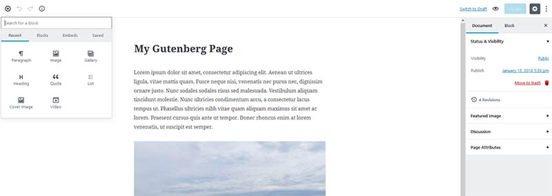
If you use WordPress, a big change is coming. The impending release of version 5.0 will bring along with it the new Gutenberg editor. It’s poised to become a major step up in terms of the ability to customize the look of your content in a default WordPress installation.
It’s a very different experience in that this new editor will break content sections down into “blocks”. Blocks will enable you to, say, add a full-width image right in the middle of a blog post. Or you might build your own custom blocks that allow users to implement different layouts.

In short, Gutenberg brings a little bit of what page builder plugins have been doing for years – without some the fancier bells and whistles. It’s a more unified way to mix text and multimedia into your content. And it promises to be a much more user-friendly and visual way to do things.

This evolution has brought about a ton of debate and, naturally, a good bit of concern. WordPress boasts an enormous market share and designers/developers/users are rightfully wary of such a big change. The team responsible for Gutenberg is taking steps to assuage concerns, but the bottom line is that we won’t know the full effect of things until the official release.

While WordPress 5.0 will be released sometime in 2018, you can try Gutenberg now in the form of a plugin. If you want to get a behind-the-scenes look, check out the 2017 State of the Word Address, which features a live demo.

Gutenberg is something that all of us should be aware of. In order to take full advantage of the new editor, there are some steps we’ll have to take. Plus, some may decide not to use it at all as the “classic” editor will still be available as a plugin for the foreseeable future.

With that in mind, let’s take a look at how to prepare for the big change. We’ll look at the considerations and share some helpful resources that can guide you along the way.

The Gutenberg Editor

The Decision to Switch (Or Not)

Major changes to any software usually lead a healthy portion of users to avoid upgrading. Operating systems are a great example as many larger companies are still a version or two behind. Of course, for security and compatibility reasons, it’s never recommended that we run outdated versions of WordPress. So, in that way, upgrading to 5.0 isn’t really optional.
But since we can decide to continue using the classic editor via a plugin, the decision of whether to utilize Gutenberg is one we’ll all have to make. Depending on the setup of your site, switching could be kind of a big deal. Developers will have to consider:

Any potential complications with existing themes, plugins and customizations.
If a client is responsible for managing content, some training may be required.
The increased demand for customer support, should something unexpectedly break.
If you’re already using a page builder plugin, does it make sense to change?

One thing is for sure, it will be a process for many of us. For mission-critical sites, it might not be a great idea to implement changes without testing them first within a development environment. If you manage multiple sites, that can be a whole lot of work.

I would suspect that some developers would choose to hold off on switching for some time – at least for existing sites. On the other hand, if a site could really benefit from the added capabilities of Gutenberg, then it might make sense to take the plunge.

Your Theme and Gutenberg

By default, your theme should work with Gutenberg just as it does now with the classic editor. But you do have the ability to add in extra styling for the various available blocks. For example, the image block places code similar to the following into a published page:

<figure class=”wp-block-image”><img src=”your-image.jpg”></figure>

So, you could provide some CSS for .wp-block-image to jazz things up a bit – although it’s not required.

But where the editor really holds promise with themes is the ability to create your own custom blocks. Think of the potential to add site-specific layouts and content directly into the editor. Then add in the fact that you can pass styles on to the back end of your site, providing users with a more accurate WYSIWYG experience. This could be quite the game-changer when building a site. Check out the resources section below to learn more.

Your Theme and Gutenberg

Plugin and Customization Compatibility

This is where much of the concern lies with both developers and site owners. Untold numbers of websites have had their back end customized in some shape or form. And just about everyone with a website that runs on WordPress uses plugins. So yes, there is the potential for something to go wrong.

However, this is an area where the folks behind-the-scenes are really working diligently. Backwards compatibility has always been a key part of WordPress and that doesn’t figure to change now. And the larger plugins out there all have an incentive to make sure that their products work with the new editor. There’s simply too much to lose for everyone involved for this not to work.

But, as mentioned earlier, testing everything out in a development environment is the best way to know how Gutenberg will affect the setup of your site. From there, you can figure out what (if any) issues you might need to clean up.

While it certainly sounds like most configurations will work just fine, there is always that chance that something doesn’t play nice with the new editor.

Client Considerations

One other area of interest is how Gutenberg may affect your clients. The way it stands, not everyone knows that an entirely new editing experience is on the way. Casual users probably aren’t paying close attention, even though recent WordPress upgrades have mentioned the coming changes. So they may be in for a bit of a shock when 5.0 drops.

But this is where we can take it upon ourselves to make a difference. Engage clients and let them know that Gutenberg is on the horizon. Provide a general background and maybe a few user-friendly links that might help them become more familiar with the UI.

A little bit of education now can (hopefully) save you from a few panicked calls later on.

Client Considerations

Resources

As Gutenberg continues to evolve, there are more valuable resources coming out to help you learn and prepare:

Gutenberg Handbook
There is a process behind creating custom blocks. To learn more, check out the Gutenberg Handbook. It takes an in-depth look at how the editor works and provides some tutorials on block creation.

Gutenberg Boilerplate
Ahmad Awais has created a boilerplate for building custom blocks for Gutenberg. He has included a few different scenarios that can serve as a great learning tool.

Gutenberg Theme
If you want to see an example of how a theme can take advantage of Gutenberg, take a look at the free Gutenberg Theme over on GitHub. It was built by Tammie Lister, who is the head of the team working on the new editor. The theme isn’t necessarily meant for a production environment, but provides a useful playground for interested developers.

WordPress Gutenberg Guide
Codeinwp has put together an illustrated guide that will get you familiar with the basics of Gutenberg, along with some more advanced tricks.

Development Updates
The official source for Gutenberg Development Updates is a great way to keep up with new features, along with thoughts from the developers themselves.

Block Party

The full release of Gutenberg will be a watershed moment in the history of WordPress. And, overall, it looks to be a change for the better. There will certainly be an adjustment period and some bumps in the road. But that is only more the reason to dig in now and see how everything works.

You’ll get a sense of how you might benefit from Gutenberg and valuable knowledge on how to handle the transition ahead.


Monthly Web Development Update 1/2018: Browser Diversity, Ethical Design, And CSS Alignment

Original Source: https://www.smashingmagazine.com/2018/01/monthly-web-development-update-1-2018/

I hope you had a great start into the new year. And while it’s quite an arbitrary date, many of us take the start of the year as an opportunity to try to change something in their lives. I think it’s well worth doing so, and I wish you the best of luck for accomplishing your realistic goals. I for my part want to start working on my mindfulness, on being able to focus, and on pursuing my dream of building an ethically correct, human company with Colloq that provides real value to users and is profitable by its users.

What Is Node and When Should I Use It?

Original Source: https://www.sitepoint.com/an-introduction-to-node-js/

So you’ve heard of Node.js, but aren’t quite sure what it is or where it fits into your development workflow. Or maybe you’ve heard people singing Node’s praises and now you’re wondering if it’s something you need to learn. Perhaps you’re familiar with another back-end technology and want to find out what’s different about Node. […]

Continue reading %What Is Node and When Should I Use It?%