How to draw metallic reflections
Original Source: http://feedproxy.google.com/~r/CreativeBloq/~3/jRlZsEZ5Vlg/draw-metallic-reflections
When light strikes a metallic object, it can reflect back onto any nearby object in an unusual way. Normally, light hitting a primary and secondary object gives varying degrees of light, shadow and cast shadows, but reflective light also happens under these circumstances, and will need to be shown in your artwork.
10 expert tips for charcoal drawing
To demonstrate the drawing techniques to make this work, I have produced the images above, working with a dark charcoal pencil and an eraser.
01. Place your objects in light
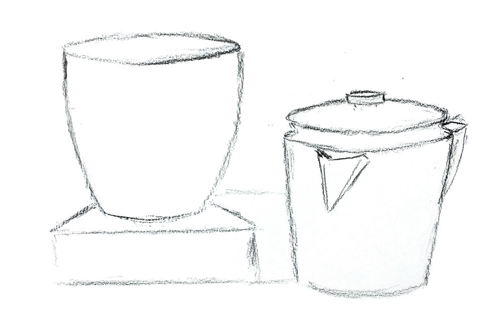
Position your objects to make the most of the highly lit and shadowed areas
Select interesting objects – such as this highly polished metallic teapot and a ceramic vase – and place them with light catching one side so you can carefully observe the highly lit and shadowed areas. Then draw basic shapes with a charcoal pencil, trying to represent these reasonably accurately, although adjustments can be made later.
02. Get shading
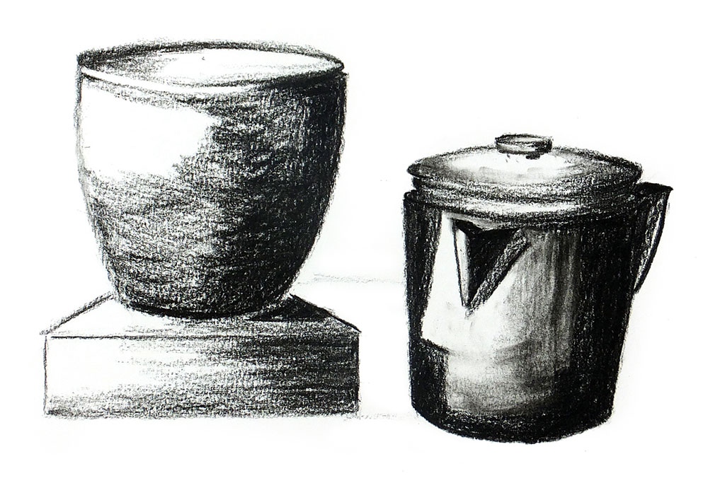
Shading the metallic object is where the fun starts
Shade the object in direct light first – here the ceramic pot to the left – observing the deeper and lighter values. Then move on to shade the object in its shadow – here the metallic object. It was important to really concentrate on the depth of the cast shadow from the ceramic pot as it struck the left side of the metallic one, here. The deepening of the shadow to the right of the metallic pot follows conventional rules of light and shadow.
03. Add some shadows

Add ground shadows to bring your objects down to Earth
The objects appear to be almost floating in space at this stage, so need grounding. Shade the shadows cast by the objects as they fall to the right across the table top, thus sitting the objects on a solid base.
04. Blend and soften
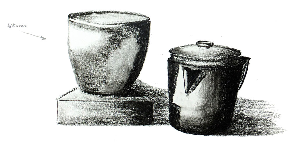
Use an eraser to highlight areas where light is reflected off the metallic object
Using a charcoal eraser, rub out sections of reflections and – here we rubbed out from the already shaded right side of the vase, where the light was reflected back from the teapot. You can see how this is of secondary importance compared to the other highlighted area.
Finally, blend some areas using your finger to soften the transition of tonal variances on the vase for effect.
This article was originally published in issue 13 of Paint & Draw, the magazine offering tips and inspiration for artists everywhere. Buy issue 13 here.
Related articles:
How to choose the right drawing toolsPencil drawing in 6 simple stepsHow to draw and paint – 100 pro tips and tutorials


Leave a Reply
Want to join the discussion?Feel free to contribute!