5 things you didn't know about Photoshop for iPad

Original Source: http://feedproxy.google.com/~r/CreativeBloq/~3/9j_ApZKCL1Y/5-things-you-didnt-know-about-photoshop-for-ipad

It’s fair to say Adobe really has pulled some impressive updates out the bag for Adobe MAX 2018. But, without a doubt, the biggest buzz came on Monday when Adobe chief product manager Scott Belsky introduced Photoshop for iPad. A 15,000-strong crowd went wild as Belsky handed over to product project manager Jenny Lyell, who demonstrated some of the app's capabilities, stating: "This is not a watered down version, this is full Photoshop on the iPad."

Sign up for Adobe CC now

However, despite the impressive demo, getting any further information about the app, in terms of price and release date, was like getting blood out of a stone. Adobe is keeping a lot of information about Photoshop for iPad close to its chest, but we managed to get a few minutes with Lyell, who gave us a little more insight into this tablet-version of Photoshop…

01. It's taken almost three years to make

Approximately three years in the making, Photoshop for iPad came about after two engineers realised user demand via constant online searches for the term Photoshop for iPad. They decided their next challenge would be to see if it was actually possible to get the 28-year-old code base of Photoshop onto a tablet. For years, Adobe had tried it with other apps, including Sketch and other drawing apps, but these didn’t have the code base of Photoshop. So that was the dream, that was the challenge. 

"The code base for Photoshop is 28 years old, it’s a mammoth," says Lyell. "So how do you even comprehend that?"

But a small team at Adobe believed it was possible, and so chatted with their leaders in engineering and product, who gave them the blessing to go work on the project. The project was to be kept quiet in the early stages. "Some people were extremely skeptical in the company and weren’t sure we should be investing in this," says Lyell. Bet those guys feel silly now, huh?

02. The alpha build had just five features

As the technical aspects were going on with the development of Photoshop for iPad, Lyell was busy talking to customers, asking them questions like 'why do you actually want it on iPad? What does it help you with, what problem are/will you be solving with this software?'

"So much of the product roadmap is influenced by our customers," says Lyell. "Once we saw the life of this happening, we knew that we wanted to preview and announce it. But I didn’t want us to get away from the customers, and so we recruited this small group of people to work on the alpha build. 

"At this point there were literally only five features in there. We set their expectations, telling them it would be like using Photoshop 1.0, but that we wanted them to run with us, from the beginning, and give us as much feedback as possible so we could make sure that even at the preview stage, the product we were creating was what the users wanted. Diverting from customers' needs, even just slightly early on, could have had huge ramifications. Customers have to be by our side."

03. It can handle hundreds (if not thousands) of layers

Jenny Lyell demonstrating Photoshop for iPad

At a private Apple event, Photoshop for iPad product lead Jenny Lyell delved a little deeper into the app’s capabilities

As the Adobe design team collected hours and hours of one-on-one interviews, trying to understand user needs, there was a breakthrough moment in the timeline when they got large PSD to open on the iPad. "The whole team was in tears, freaking out," Lyell says. “This is impossible, we thought. But we’d seen it with our own eyes!"

So what constitutes a large PSD? "It was hundreds of layers that we got to open," says Lyell. With the same code base as Photoshop on desktop, Photoshop on iPad will open up any size PSD file. When asked if this would present any technical limitations, Lyell told us: "It would affect it just as a massive document on any machine would. So having the biggest single file on your mac would slow you down a few seconds vs a smaller one. Photoshop for iPad will work in a similar way, but we've optimised it a lot in terms of performance and we didn’t want to bring this out until we knew the hardware and software was ready."

04. It won't necessarily feature all your PS favourites 

If you're expecting to see the full toolset in this app, you'll be disappointed. Instead, the company has armed it with all the core tools users need to do real work in Photoshop. "Photoshop has a dozen different ways you can select an object – the 1.0 functionality is still in the code base!" says Lyell. "So we’re really rethinking how to give users all the core tools they need to do all the work they need, and give them the modern, best version of these tools so that they don’t have to feel any frustrations or inefficiencies."

05. It will feature Adobe's new AI technology

Part of the update to Photoshop CC this year includes a new Adobe Sensei selection tool. When asked if Photoshop for iPad will include this, Lyell was quick to confirm. "We definitely want to get the newest Sensei technology in there, so it’s prioritised on the roadmap," she says. 

Support and pricing

Adobe is pretty elusive about release dates and pricing models for Photoshop for iPad. When asked about when creatives can actually get their hands on the app (and trust us, we were persistent), we weren't even able to get a rough estimate as to when this is expected to ship. 

"It will be available in 2019, and we're still working out the business model in terms of pricing," Lyell said. We also asked whether it will be part of the CC suite or if Adobe is going to offer this as a standalone product and were told "we’re having conversations about that right now". 

Android users, we didn't forget about you either. When asked if this will be an iPad-only app, Lyell replied with: "Our plan is to extend to as many devices as we can right now. We still trying to sort out what's the best experience, and so are testing the different versions to see what’s optimised and what’s best for performance. We don’t want people having a poor experience, so that information will also come out during the launch." 

For what will almost certainly be a highly sought-after product, it’s a little frustrating to have no details as to when we can realistically expect this to ship to the masses. That said, 2019 is just around the corner, so let's hope it's sooner rather than later. 

Read more:

Adobe launches video app Premiere Rush CC13 iPad Pro apps that come alive with Apple PencilProject Gemini: Adobe announces new digital art app

Live Accessibility And Performance Audits At SmashingConf Toronto

Original Source: https://www.smashingmagazine.com/2018/10/smashingconf-toronto-a11y-performance-audits/

Live Accessibility And Performance Audits At SmashingConf Toronto

Live Accessibility And Performance Audits At SmashingConf Toronto

Markus Seyfferth

2018-10-17T13:20:35+02:00
2018-10-17T14:10:37+00:00

Earlier this year, many of your favorite speakers were featured at SmashingConf Toronto, however, things were quite different this time. The speakers had been asked to present without slides. It was interesting to see the different ways our speakers approached the challenge.

Two of our speakers chose to demonstrate how they audit a site or application live on stage: Marcy Sutton on accessibility, and Tim Kadlec on performance. Watch the videos to see an expert perform these audits, and see if there is anything you can take back to your own testing processes.

To watch all of the videos recorded in Toronto, head on over to our SmashingConf Vimeo channel.

Accessibility: Marcy Sutton

Marcy took two example components, built using React, and walked us through how these components could be made more accessible with some straightforward changes.

Performance: Tim Kadlec

Tim demonstrates how to test the performance of a site, and find bottlenecks leading to poor experiences for visitors. If you have ever wondered how to get started testing for performance, this is a talk you will find incredibly useful.

Enjoyed watching these talks? There are many more videos from SmashingConf Toronto on Vimeo. We’re also getting ready for SmashingConf New York next week — see you there? 😉

Smashing Editorial
(ra, il)

Develop WordPress Themes Faster with Gulp

Original Source: https://www.sitepoint.com/fast-gulp-wordpress-theme-development-workflow/

faster development

This article is part of a series created in partnership with SiteGround. Thank you for supporting the partners who make SitePoint possible.

WordPress’ simple theme development is partly responsible for its success. A developer with front-end and PHP knowledge can consult the excellent Codex and get started on their next masterpiece.

Theme development is possible with just a text editor and graphics package, but modern toolsets can revolutionize your workflow. In this tutorial we’ll use Gulp to run tasks including:

copying newer PHP theme files
optimizing images
compiling Sass SCSS files into a single, minified CSS file
merging ordered JavaScript files, remove debugging statements and minifying
automatically refreshing the browser when files are updated.

What is Gulp?

Gulp is a JavaScript-based build system which takes your source files and transforms them into optimized versions. If you’re new to Gulp, please refer to An Introduction to Gulp.js for full installation and usage instructions. A summary of the initial steps:

The post Develop WordPress Themes Faster with Gulp appeared first on SitePoint.

Tackle type transgressions with these tip-top tickets

Original Source: http://feedproxy.google.com/~r/CreativeBloq/~3/dAzA544bs6k/tackle-type-transgressions-with-these-tip-top-tickets

Learning the rules of typography can be both a blessing and a curse. A blessing, because hey, you can do good typography with thoughtful font pairings and everything!

6 embarrassing examples of bad kerning

And a curse, because as soon as you've digested a few typography tutorials you'll immediately start to spot all the appalling typography that's out there, befouling the world with its terrible kerning, stretched type and Comic Sans.

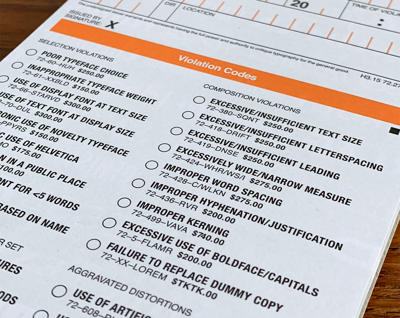
Even worse, the police just don't want to know about it. But now you can take matters into your own hands with the Uniform Ticket Book, from Hoefler&Co's 100 per cent totally real Typographic Violations Division.

Uniform Ticket Book

Stamp out crimes against typography!

Billed as standard equipment for the modern design enforcer, the Uniform Ticket Book lists 32 common typographic infractions, from basic selection and composition violations such as poor typeface choice and improper word spacing, through to more serious crimes such as the use of artificial italics or mansplaining Font vs Typeface. Each infraction comes complete with appropriate penalties, and there's a useful Other section at the bottom for more exotic type transgressions.

Uniform Ticket Book

If you give ’em a good short sharp shock they won’t do it again

The Uniform Ticket Book is designed to provoke maximum anxiety with its searing orange print and ironic use of Helvetica, and it comes with 50 tickets that you could probably tear right through on a walk down the average high street on your lunch hour.

It's available now for just $10 from Hoefler&Co's Design Shop, where it's pointed out that the Uniform Ticket Book is for novelty use only; we're sure they're joking about that bit. Go out and get them, but hey, be careful out there.

Related articles:

The 10 commandments of typographyTypography rules and terms every designer must knowThe 8 biggest typography mistakes designers make

eCommerce Product Pages Optimization Tips

Original Source: http://feedproxy.google.com/~r/1stwebdesigner/~3/ooPWe4w1k8M/

Consider the routes that may have led you to a product page. Perhaps you Googled a specific camera and navigated directly to the product links, skipping the home and about pages.

Maybe you clicked a link shared by a friend on social media or found the product thanks to ad retargeting. Whatever the case, you bypassed the traditional ecosystem and raised the stakes of your interaction with the product page. It has, in effect, become the homepage.

If you land directly on it without any context, the page must be engaging enough to hold your attention, but detailed enough to capture the sale. And achieving that is no easy feat.

A Multi-Faceted Approach

Consider the effort that goes into writing product descriptions. Each item requires a unique blurb of at least 250 to 400 words. That may not sound like much at first, but if you offer 1,000 products, you’re looking at 400,000 words of copy – twice the length of “Moby Dick.” And Herman Melville didn’t have to orchestrate a photo shoot, take inventory, and assign related products after he was done writing.

Getting a product page right requires input from developers, designers, writers, photographers, and a project manager. Every element should center around the content, amplifying the message through complementary buttons, color schemes, fonts, and functionalities.

Product page optimization requires a significant investment of time and resources, but provides an almost immediate return on investment. Here’s what a high-performing product page includes:

1. Engaging Product Descriptions:

Compiling a full product catalog is the only way to gain serious organic traffic. 95% of people interviewed in an eCommerce survey said that product descriptions played an important role in their purchase decisions.

Every description should include a well-crafted, informative take on the product, along with sizing charts for each specific item where applicable. For instance, ASOS offers sizing guides that are specific to different subcategories, such as “Men’s Jumpers and Cardigans.” This resource prevents people from navigating away to look up sizes elsewhere or simply abandoning the sale in frustration.

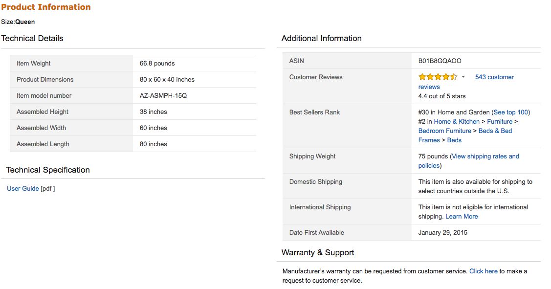
Aside from its shipping, this is where Amazon really succeeds. Their product pages will never win a design award, but that’s secondary to them: It’s not glamorous, but a customer is highly unlikely to leave their product pages because they’re missing information.

One eCommerce study showed that in 20% of cases in which users failed to complete their purchases, incomplete or vague product data was to blame. Customers should never have to Google additional information about an item or feel unclear about what the purchase includes. Effective product descriptions tell them everything they need to know in conversational, relatable language.

2. High-Resolution Product Photos

Images are essential. Large, attractive photos can boost eCommerce sales by up to 9%, and 63% of consumers told Nielsen Norman Group that pictures were “very important” when shopping online.

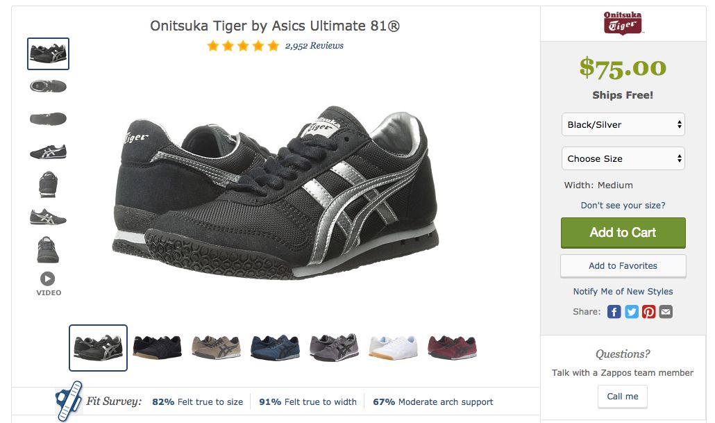
One company, Skinner Auctions, saw a 63% jump in conversion rates after it increased its image sizes. Zappos uses images especially effectively, offering large pictures of its shoes from several different angles. Customers can click through a range of photos and watch a video for additional information. Photos tell prospective buyers what they can expect from a product and reassure them of its value and quality.

3. Sound SEO Elements

Top-performing product pages offer engaging content, high-resolution photos, a clear call to action, and solid SEO. Product pages must have thoughtful keywords in the title tags and body copy so that search engines can pick them up. All data should be marked up so that pricing, shipping, reviews, and other details appear logically in the code. This also impacts search engine rankings.

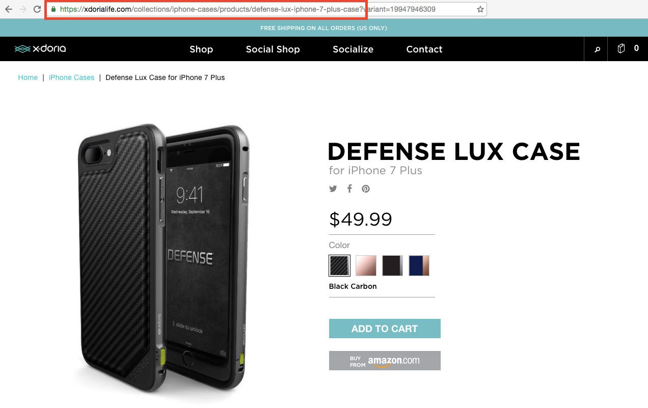
Product page URLs should include relevant keywords so people know they’re in the right place when they land there. Optimizing product page links can increase conversions by 76%. If all of these technical aspects are in order, the site will rise in search rankings every time a new product is added. They also make for an enjoyable customer experience, so people are more likely to buy from the brand in the future.

Good SEO practices should be built into the page design from the outset. It’s very difficult and time-consuming to tweak these performance elements once the page has been launched. Before completing the design, companies should partner with SEO specialists who know how to strategize for eCommerce: building content, descriptions, messages for out of stock and seasonality, 301 strategies, link building and architecture, and user-generated content. This article can give you a good starting point.

4. Fast Load Times

The numbers don’t lie – a 10-second delay in page loading could cause 50% of would-be buyers to abandon their purchases. Amazon estimates that it stands to lose $1.6 billion in sales per year if its site suffers a one-second slowdown. Even for smaller sites, a lagging page can cost millions of dollars in revenue.

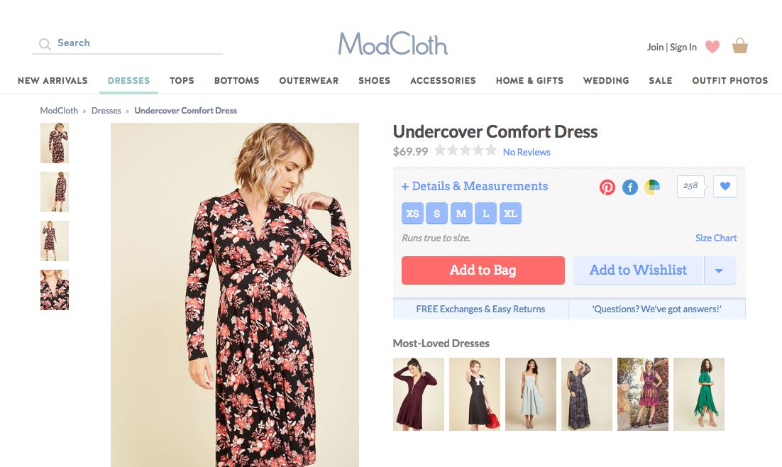
Modcloth is a good example. Their site doesn’t just look great: It loads more than 15 megabytes of content in under three seconds and gets more than an 80% performance grade.

There are several ways to improve load times, such as boosting server response rates, enabling compression, and allowing for automatic image optimization. Development teams should also minify their websites, which means removing any unused or unnecessary code. They can also edit out redundancies to decrease the number of processes the server has to run. Google Pagespeed can automatically optimize different elements to shorten loading times as well.

5. Customer Reviews

People need reassurance before they buy, especially if they’re unfamiliar with the brand. A Figleaves study found that products with reviews had 12.5% higher conversion rates than those without reviews. More importantly, the conversion rate for individual products rose by about 35% after adding customer feedback.

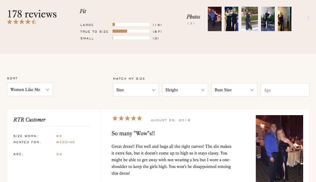
Rent The Runway made the determination that reviews had to be a pillar of the business, and went all in – customers share product reviews and rate by size and share height, age and photos.

Consumers conduct their due diligence before purchasing. They’ll seek out reviews on forums and other sites to determine which brands are trustworthy and compare products. Businesses that include reviews have a better chance of keeping prospects on their product pages because all of the information consumers need is right in front of them. Review pages also rise faster in search rankings than product pages, so they’re a useful way to generate more traffic.

6. Prominent Pricing

Customers might be charmed by engaging copy and a sleek interface, but eventually they want to get to the bottom line – what does the product cost? Companies should make prices visible in the initial impression, along with how much consumers can save by buying from them instead of another business. People like to know that they’re getting a good deal, so it’s important to spell out the savings.

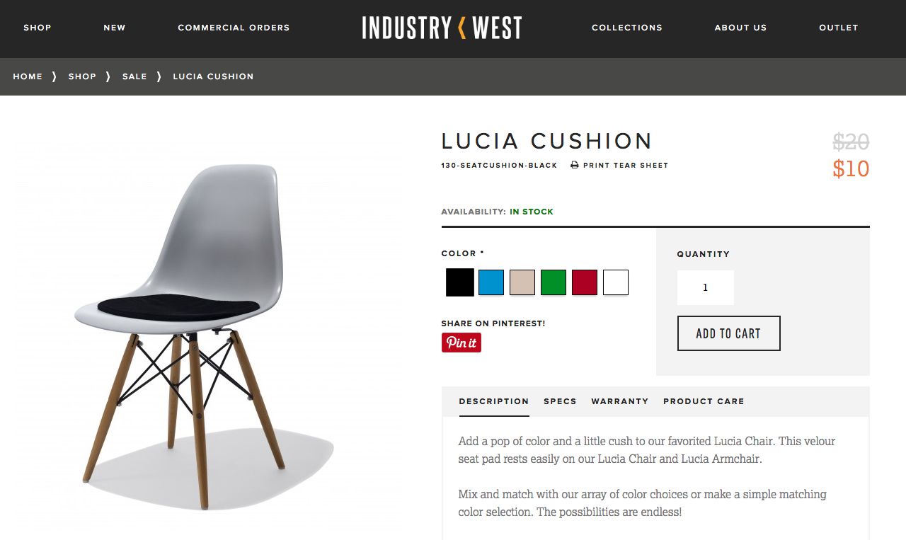
Amazon includes this information on the right side of every product page. Customers can see how much Amazon is charging and how much more they might pay on another site. Amazon also incentivizes recurring sales by listing its subscription rates on different products. The pricing section is a perfect place for these types of upsells. Recommending popular items, related goods, and subscription deals is especially effective when people are already in shopping mode.

But the checkout process shouldn’t be cluttered with additional offers. It should be easy for consumers to check out quickly and without hassle. Because people are concerned about identity theft and credit card fraud, the site should include a message about the brand’s security protocols before a sale is made. The product page should also serve as a 24/7 customer service representative, answering potential questions and offering plenty of contact options.

Conclusion

From descriptions to pricing to SEO, product pages are masterpieces of collaboration and good design. They should appear seamless to customers, offering a blissful shopping experience that leaves them eager to hand over their money. Invest in optimization strategies to create an effect that makes these pages immediately convert browsers to buyers.


3 Ways to Back Up and Restore Databases in WordPress

Original Source: https://www.sitepoint.com/back-up-restore-wordpress-databases/

WordPress is still relevant today, even fifteen years after its first release. It’s often the first choice that comes to one’s mind when starting a new blog.

Although intended to be a content management system, WordPress has been used in a variety of domains in addition to blogging — such as music and ecommerce. As of 2018, WordPress websites account for 14.7% of the top 100 websites.

If you manage a WordPress site, WP Admin should mostly be sufficient. However, to protect yourself against situations like corrupted databases or hacks, you should keep backups. As a standard guide, you could go through the advice in the Backing Up Your Database page in the WordPress Codex, which will help you in creating backups of your database.

WordPress supports only MySQL and MariaDB as databases, although it’s not impossible to sync other databases like PostgreSQL. This post will assume that you use the default WordPress database option — MySQL — although the steps for MariaDB are very similar. We’ll first cover the basics of the WordPress database, and then move on to backup and restore operations.

WordPress Database Basics

The WordPress database is provided to you when you’re installing WordPress for the first time. Most webmasters never encounter the database again — as every admin-related action on WordPress is performed through a GUI.

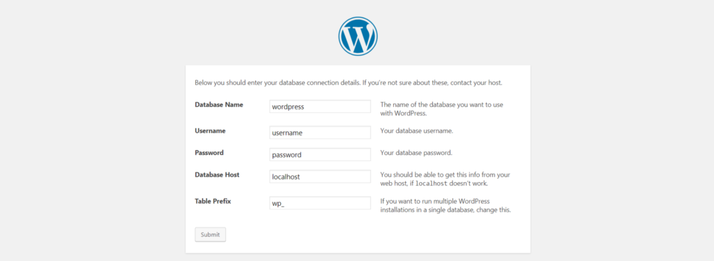
WordPress database defined during installationWordPress database defined during installation

If you notice closely, you’re providing WordPress the host of the MySQL server, its username and password to create the required tables. Notice that a prefix is also supplied, which means that all WordPress-related tables would start with the prefix (in case you want to create backups).

WordPress uses the database to broadly store the following data:

the settings of your website
the details of users registered on your website
the details of published posts and drafts
tag information related to your posts
comments on your posts (assuming you use the comment system of WordPress and not a third-party comment manager like Disqus).

Note: If you’re interested in knowing about details of various tables in the WordPress database and their function, you can refer to this guide on SitePoint.

Needless to say, keeping a backup of your WordPress directory isn’t sufficient for security purposes. The database needs to be backed up at regular intervals too.

#1 WordPress Plugin: Udraft Plus

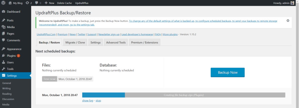
Udraft Plus is a plugin that enables you to back up and restore your entire site, including your database. After installing and activating the plugin, you’re asked to create a backup. Once a backup has been created, you can restore from any backup points in the past.

Udraft Plus creating a backupUdraft Plus creating a backup

In the free tier, you can create backups to a remote location (Dropbox, Drive or Amazon S3), as backing up within the server makes it vulnerable to server failure and attacks. The premium version comes with advanced options like cloning and migration of sites, scheduling backups and reporting.

The post 3 Ways to Back Up and Restore Databases in WordPress appeared first on SitePoint.

Photoshop CC is coming to the iPad

Original Source: http://feedproxy.google.com/~r/CreativeBloq/~3/6K2rf61I5Ts/project-rocket-photoshop-cc-is-coming-to-the-ipad

If you've ever felt there was something missing from your Photoshop workflow, and that something was the ability to use the full software on the go, without switching between different apps, you're in luck. 

At its annual conference, Adobe MAX 2018, Adobe has announced it's expanding Photoshop CC, across all devices, starting with the iPad. This will enable users to open and edit PSD files on an iPad, using the same tools they are used to on desktop.

Sign up to Adobe Creative Cloud
Will it be the 'real Photoshop'?

Photoshop for iPad screenshot

You’ll be able to work with Layers, just like you can on the desktop version

Photoshop for iPad came about when two Photoshop engineers decided to try to run Photoshop on iPad using Photoshop code. That got the design team thinking about how this product might look, and a few months later, they were ready for launch.

Because Photoshop for iPad uses the same code as the desktop version, there won't be any compromises in terms of performance or results. The core tools will all be there, and you'll be able to add filters, work with layers and make selections and adjustments, and much more. This will be a marked improvement in the current offering for iPad users, as they will no longer have to switch between different apps such as Photoshop Mix and Photoshop Fix to perform different functions.

This new Photoshop won't be exactly the same as the desktop version, however, as it will have a "reimagined user experience" that is optimised for touch devices, making the most of the iPad's Pencil, touch gestures and mobility.

A seamless experience

Photoshop for iPad screenshot

Photoshop for iPad will see the user interface redesigned for the device

Not only will you be able to work on PSD files on the iPad, but your files will also sync across devices, via the new Cloud documents. This will mean you can begin working on your desktop, make some changes on your iPad, and then go back to desktop, without having to faff around with importing or exporting files.

Photoshop for iPad will be available on its own, or as a partner to Photoshop on the desktop. 

Initially, a smaller set of features will be released in version 1.0, with more added over time. At the moment, we don't know when Photoshop for iPad will be shipping, or how much it will cost, but keep checking back here for more news.

Read more:

How to manage colours in Photoshop60 top-class Photoshop tutorials to tryThe 38 best Photoshop plugins

Adobe launches exciting new Creative Cloud tools at MAX

Original Source: http://feedproxy.google.com/~r/CreativeBloq/~3/3mhxrK7ZGD0/adobe-launches-exciting-new-creative-cloud-tools-at-max

Today marks the start of Adobe Max 2018 – and it's already going off with a bang. As you'd expect, part of the company's annual creative conference includes details of updates it's made to its Creative Cloud service. And, we have to say, Adobe has pulled some seriously exciting – not to mention, impressive – new tools and apps out of the bag. 

The best laptop for graphic design in 2018

Adobe favourites Photoshop, Illustrator, XD and Lightroom have all had 'under the hood' work, with new features to help streamline creative workflows. But the big news has to be three new apps Adobe will soon be welcoming to the Creative Cloud family; Project Rush, an all-new video editing app, Project Rocket, aka Photoshop on iPad, and Project Gemini, a powerful new digital art app. 

“Today, we unveiled a portfolio of next-generation creative apps that deliver meaningful value to our community by transforming creative workflows across devices and platforms,” said Scott Belsky, chief product officer and executive vice president, Creative Cloud at Adobe. “By continuing to innovate in our flagship apps, extending into exploding segments like experience design and social video content creation, and pioneering in emerging mediums like touch, voice, 3D and augmented reality, Adobe Creative Cloud has truly become the creativity platform for all.”

Excited? So are we. Let's take a closer look at exactly what Adobe has been up to…

Project Rush

Project Rush on different screens

Project Rush was no real secret, as Adobe’s all-new video editing app has been in the pipeline for a while. But now it's well and truly ready to roll. From the demos we've seen so far, this app is highly intuitive, by which we mean you don't need to be a video, colour or audio expert to create a really professional-looking video with it. 

Rush harnesses the power of its older siblings, Premiere Pro and After Effects, and gives users access to professionally designed motion graphics templates in Adobe Stock to get started quickly. Powered by Sensei, Adobe's new AI technology, Rush has a one-click auto-duck feature to adjust music and normalise sound. It also allows access anywhere, enabling users to create compelling video projects – optimised for social distribution – on one device and publish from another, with a consistent user experience across desktop and mobile.

The downside to Rush is that you're out of luck if you're an Android user, with the all-new Premiere Rush CC only available on Windows, macOS and iOS. Adobe states Google Play store availability is coming in 2019, but when exactly that might be is anyone's guess. 

Photoshop for iPad

Project Rocket

Is this the one we've all been waiting for? Adobe MAX 2018 sees the unveiling of Project Rocket, also known as Photoshop CC on the iPad. We've yet to see it fully in action, but Adobe claims the tablet version delivers all the power and precision of its desktop counterpart. Photoshop CC on iPad will let users open and edit native PSD files using Photoshop’s industry-standard image-editing tools and will feature the familiar Photoshop layers panel.

Exciting stuff, which we can't wait to see. Although, we'll all have to wait a while, with Adobe so far saying nothing more than it will be available in 2019. 

Project Gemini

project gemini

A new app designed to accelerate drawing and painting workflows across devices, Project Gemini is coming first to iPad in 2019, and combines raster, vector and new dynamic brushes into a single app experience built for drawing. Project Gemini enables artists to use and sync their favourite Photoshop brushes and works seamlessly with Photoshop CC.

Adobe Sensei

Adobe Sensei is the company's new AI technology built into the Adobe Cloud platform, and it aims to dramatically improve the design and delivery of digital experiences. The 2019 release of Creative Cloud delivers over a dozen new Adobe Sensei-powered features and productivity enhancements – building on the many existing Sensei-powered features already available to Adobe Creative Cloud, Document Cloud and Experience Cloud customers. Sensei-powered features in the 2019 release include:

An expanded Content-Aware Fill workspace in Photoshop CC that offers greater precision and control to save editors valuable time when working with their images.A new Content-Aware Fit feature in InDesign CC that intelligently detects an image and crops or fits it to an image frame automatically.New Freeform Gradients in Illustrator CC that enable the creation of natural gradients.A new tool in Character Animator CC, Characterizer, which transforms any style of portrait into a vivid, animated character.
Project Aero

project aero

Adobe also previewed Project Aero, a new cross-device AR authoring tool that enables creators to design augmented reality experiences. Project Aero is the first AR app built for designers and artists and was first sneaked on-stage at Apple’s Worldwide Developer Conference earlier this year. Project Aero enables optimal delivery of AR experiences, empowering creatives to place digital content in the real world. At Adobe MAX, Adobe showcased an AR-powered retail store of the future revealing the exciting possibilities of immersive design experiences.

Adobe XD

The all-in-one UX/UI solution for designing websites and mobile apps, Adobe XD, now features new capabilities leveraging recently acquired Sayspring technology to empower designers to prototype experiences and apps for voice-powered devices like Amazon Echo. 

New voice capabilities, including voice triggers and speech playback, enable designers to create powerful experience with screen and voice prototyping now in one application. In addition, developers can now leverage Adobe XD APIs to build plugins and app integrations that add new features, automate workflows and connect XD to the tools and services designers use every day.

Adobe favourites

Alongside these new additions, Adobe also introduced major updates to its desktop applications, including:

a new Content-Aware Fill workspace in Photoshop CC.performance and workflow improvements across Lightroom CC and Lightroon Classic. the ability to design with photorealistic, freeform gradients in Illustrator.a powerful Content-Aware Fit in InDesign CC.the power to instantly create and animate unique stylised puppets using a webcam and reference artwork with Character Animator's new Characterizer. a new rendering engine for improved render preview in performance in Dimension CC.a new Sensei-powered search features and exclusive content in Adobe Stock, including a new library from GoPro.In addition, Adobe announced it is addressing the needs of the video animation industry with new workflows and integrations across its apps.
Pricing and availability

Updates to Creative Cloud desktop software are now available to all Creative Cloud subscribers, including membership plans for individuals, students, teams, educational institutions, government agencies and enterprises. Adobe’s mobile apps are available for download from the iOS App Store and Google Play.

Photoshop CC on iPad, Project Aero and Project Gemini on iPad will be available in 2019. Spark Post on Android, previously available as a public beta, is now available as a 1.0 app in the Google Play store.

The all-new Premiere Rush CC, available now on Windows and macOS and via the iOS App Store (Google Play store availability coming in 2019), is offered across a series of plans tailored for customers’ unique needs.


You’re going to fall in love with these portfolio builders! Pick your favorite from these 5 examples

Original Source: https://www.hongkiat.com/blog/you-are-going-to-fall-in-love-with-these-portfolio-builders/

Creating a portfolio website is easier today than it was not too long ago. Once upon a time, you had to learn HTML and CSS to build an online portfolio that was more than above average. You had to…

Visit hongkiat.com for full content.

Smart Bundling: How To Serve Legacy Code To Legacy Browsers

Original Source: https://www.smashingmagazine.com/2018/10/smart-bundling-legacy-code-browsers/

Smart Bundling: How To Serve Legacy Code To Legacy Browsers

Smart Bundling: How To Serve Legacy Code To Legacy Browsers

Shubham Kanodia

2018-10-15T14:30:13+02:00
2018-10-15T12:50:48+00:00

A website today receives a large chunk of its traffic from evergreen browsers — most of which have good support for ES6+, new JavaScript standards, new web platform APIs and CSS attributes. However, legacy browsers still need to be supported for the near future — their usage share is large enough not to be ignored, depending on your user base.

A quick look at caniuse.com’s usage table reveals that evergreen browsers occupy a lion’s share of the browser market — more than 75%. In spite of this, the norm is to prefix CSS, transpile all of our JavaScript to ES5, and include polyfills to support every user we care about.

While this is understandable from a historical context — the web has always been about progressive enhancement — the question remains: Are we slowing down the web for the majority of our users in order to support a diminishing set of legacy browsers?

Transpilation to ES5, web platform polyfills, ES6+ polyfills, CSS prefixing

The different compatibility layers of a web app. (View large version)

The Cost Of Supporting Legacy Browsers

Let’s try to understand how different steps in a typical build pipeline can add weight to our front-end resources:

Transpiling To ES5

To estimate how much weight transpiling can add to a JavaScript bundle, I took a few popular JavaScript libraries originally written in ES6+ and compared their bundle sizes before and after transpilation:

Library
Size
(minified ES6)
Size
(minified ES5)
Difference

TodoMVC
8.4 KB
11 KB
24.5%

Draggable
77.9 KB
11.5 KB
31.3%

Luxon
75.4 KB
100.3 KB
24.8%

Video.js
237.2 KB
335.8 KB
29.4%

PixiJS
370.8 KB
452 KB
18%

On average, untranspiled bundles are about 25% smaller than those that have been transpiled down to ES5. This isn’t surprising given that ES6+ provides a more compact and expressive way to represent the equivalent logic and that transpilation of some of these features to ES5 can require a lot of code.

ES6+ Polyfills

While Babel does a good job of applying syntactical transforms to our ES6+ code, built-in features introduced in ES6+ — such as Promise, Map and Set, and new array and string methods — still need to be polyfilled. Dropping in babel-polyfill as is can add close to 90 KB to your minified bundle.

Front-end is messy and complicated these days. That’s why we publish articles, printed books and webinars with useful techniques to improve your work. Even better: Smashing Membership with a growing selection of front-end & UX goodies. So you get your work done, better and faster.

Explore Smashing Membership ↬

Smashing Cat, just preparing to do some magic stuff.

Web Platform Polyfills

Modern web application development has been simplified due to the availability of a plethora of new browser APIs. Commonly used ones are fetch, for requesting for resources, IntersectionObserver, for efficiently observing the visibility of elements, and the URL specification, which makes reading and manipulation of URLs on the web easier.

Adding a spec-compliant polyfill for each of these features can have a noticeable impact on bundle size.

CSS Prefixing

Lastly, let’s look at the impact of CSS prefixing. While prefixes aren’t going to add as much dead weight to bundles as other build transforms do — especially because they compress well when Gzip’d — there are still some savings to be achieved here.

Library
Size
(minified, prefixed for last 5 browser versions)
Size
(minified, prefixed for last browser version)
Difference

Bootstrap
159 KB
132 KB
17%

Bulma
184 KB
164 KB
10.9%

Foundation
139 KB
118 KB
15.1%

Semantic UI
622 KB
569 KB
8.5%

A Practical Guide To Shipping Efficient Code

It’s probably evident where I’m going with this. If we leverage existing build pipelines to ship these compatibility layers only to browsers that require it, we can deliver a lighter experience to the rest of our users — those who form a rising majority — while maintaining compatibility for older browsers.
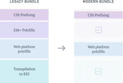
The modern bundle is smaller than the legacy bundle because it forgoes some compatibility layers.

Forking our bundles. (View large version)

This idea isn’t entirely new. Services such as Polyfill.io are attempts to dynamically polyfill browser environments at runtime. But approaches such as this suffer from a few shortcomings:

The selection of polyfills is limited to those listed by the service — unless you host and maintain the service yourself.
Because the polyfilling happens at runtime and is a blocking operation, page-loading time can be significantly higher for users on old browsers.
Serving a custom-made polyfill file to every user introduces entropy to the system, which makes troubleshooting harder when things go wrong.

Also, this doesn’t solve the problem of weight added by transpilation of the application code, which at times can be larger than the polyfills themselves.

Let see how we can solve for all of the sources of bloat we’ve identified till now.

Tools We’ll Need

Webpack
This will be our build tool, although the process will remain similar to that of other build tools, like Parcel and Rollup.
Browserslist
With this, we’ll manage and define the browsers we’d like to support.
And we’ll use some Browserslist support plugins.

1. Defining Modern And Legacy Browsers

First, we’ll want to make clear what we mean by “modern” and “legacy” browsers. For ease of maintenance and testing, it helps to divide browsers into two discrete groups: adding browsers that require little to no polyfilling or transpilation to our modern list, and putting the rest on our legacy list.

Firefox >= 53; Edge >= 15; Chrome >= 58; iOS >= 10.1

Browsers that support ES6+, new CSS attributes, and browser APIs like Promises and Fetch. (View large version)

A Browserslist configuration at the root of your project can store this information. “Environment” subsections can be used to document the two browser groups, like so:

[modern]
Firefox >= 53
Edge >= 15
Chrome >= 58
iOS >= 10.1

[legacy]
> 1%

The list given here is only an example and can be customized and updated based on your website’s requirements and the time available. This configuration will act as the source of truth for the two sets of front-end bundles that we will create next: one for the modern browsers and one for all other users.

2. ES6+ Transpiling And Polyfilling

To transpile our JavaScript in an environment-aware manner, we’re going to use babel-preset-env.

Let’s initialize a .babelrc file at our project’s root with this:

{
“presets”: [
[“env”, { “useBuiltIns”: “entry”}]
]
}

Enabling the useBuiltIns flag allows Babel to selectively polyfill built-in features that were introduced as part of ES6+. Because it filters polyfills to include only the ones required by the environment, we mitigate the cost of shipping with babel-polyfill in its entirety.

For this flag to work, we will also need to import babel-polyfill in our entry point.

// In
import “babel-polyfill”;

Doing so will replace the large babel-polyfill import with granular imports, filtered by the browser environment that we’re targeting.

// Transformed output
import “core-js/modules/es7.string.pad-start”;
import “core-js/modules/es7.string.pad-end”;
import “core-js/modules/web.timers”;

3. Polyfilling Web Platform Features

To ship polyfills for web platform features to our users, we will need to create two entry points for both environments:

require(‘whatwg-fetch’);
require(‘es6-promise’).polyfill();
// … other polyfills

And this:

// polyfills for modern browsers (if any)
require(‘intersection-observer’);

This is the only step in our flow that requires some degree of manual maintenance. We can make this process less error-prone by adding eslint-plugin-compat to the project. This plugin warns us when we use a browser feature that hasn’t been polyfilled yet.

4. CSS Prefixing

Finally, let’s see how we can cut down on CSS prefixes for browsers that don’t require it. Because autoprefixer was one of the first tools in the ecosystem to support reading from a browserslist configuration file, we don’t have much to do here.

Creating a simple PostCSS configuration file at the project’s root should suffice:

module.exports = {
plugins: [ require(‘autoprefixer’) ],
}

Putting It All Together

Now that we’ve defined all of the required plugin configurations, we can put together a webpack configuration that reads these and outputs two separate builds in dist/modern and dist/legacy folders.

const MiniCssExtractPlugin = require(‘mini-css-extract-plugin’)
const isModern = process.env.BROWSERSLIST_ENV === ‘modern’
const buildRoot = path.resolve(__dirname, “dist”)

module.exports = {
entry: [
isModern ? ‘./polyfills.modern.js’ : ‘./polyfills.legacy.js’,
“./main.js”
],
output: {
path: path.join(buildRoot, isModern ? ‘modern’ : ‘legacy’),
filename: ‘bundle.[hash].js’,
},
module: {
rules: [
{ test: /.jsx?$/, use: “babel-loader” },
{
test: /.css$/,
use: [MiniCssExtractPlugin.loader, ‘css-loader’, ‘postcss-loader’]
}
]},
plugins: {
new MiniCssExtractPlugin(),
new HtmlWebpackPlugin({
template: ‘index.hbs’,
filename: ‘index.html’,
}),
},
};

To finish up, we’ll create a few build commands in our package.json file:

“scripts”: {
“build”: “yarn build:legacy && yarn build:modern”,
“build:legacy”: “BROWSERSLIST_ENV=legacy webpack -p –config webpack.config.js”,
“build:modern”: “BROWSERSLIST_ENV=modern webpack -p –config webpack.config.js”
}

That’s it. Running yarn build should now give us two builds, which are equivalent in functionality.

Serving The Right Bundle To Users

Creating separate builds helps us achieve only the first half of our goal. We still need to identify and serve the right bundle to users.

Remember the Browserslist configuration we defined earlier? Wouldn’t it be nice if we could use the same configuration to determine which category the user falls into?

Enter browserslist-useragent. As the name suggests, browserslist-useragent can read our browserslist configuration and then match a user agent to the relevant environment. The following example demonstrates this with a Koa server:

const Koa = require(‘koa’)
const app = new Koa()
const send = require(‘koa-send’)
const { matchesUA } = require(‘browserslist-useragent’)
var router = new Router()

app.use(router.routes())

router.get(‘/’, async (ctx, next) => {
const useragent = ctx.get(‘User-Agent’)
const isModernUser = matchesUA(useragent, {
env: ‘modern’,
allowHigherVersions: true,
})
const index = isModernUser ? ‘dist/modern/index.html’, ‘dist/legacy/index.html’
await send(ctx, index);
});

Here, setting the allowHigherVersions flag ensures that if newer versions of a browser are released — ones that are not yet a part of Can I Use’s database — they will still report as truthy for modern browsers.

One of browserslist-useragent’s functions is to ensure that platform quirks are taken into account while matching user agents. For example, all browsers on iOS (including Chrome) use WebKit as the underlying engine and will be matched to the respective Safari-specific Browserslist query.

It might not be prudent to rely solely on the correctness of user-agent parsing in production. By falling back to the legacy bundle for browsers that aren’t defined in the modern list or that have unknown or unparseable user-agent strings, we ensure that our website still works.

Conclusion: Is It Worth It?

We have managed to cover an end-to-end flow for shipping bloat-free bundles to our clients. But it’s only reasonable to wonder whether the maintenance overhead this adds to a project is worth its benefits. Let’s evaluate the pros and cons of this approach:

1. Maintenance And Testing

One is required to maintain only a single Browserslist configuration that powers all of the tools in this pipeline. Updating the definitions of modern and legacy browsers can be done anytime in the future without having to refactor supporting configurations or code. I’d argue that this makes the maintenance overhead almost negligible.

There is, however, a small theoretical risk associated with relying on Babel to produce two different code bundles, each of which needs to work fine in its respective environment.

While errors due to differences in bundles might be rare, monitoring these variants for errors should help to identify and effectively mitigate any issues.

2. Build Time vs. Runtime

Unlike other techniques prevalent today, all of these optimizations occur at build time and are invisible to the client.

3. Progressively Enhanced Speed

The experience of users on modern browsers becomes significantly faster, while users on legacy browsers continue to get served the same bundle as before, without any negative consequences.

4. Using Modern Browser Features With Ease

We often avoid using new browser features due to the size of polyfills required to use them. At times, we even choose smaller non-spec-compliant polyfills to save on size. This new approach allows us to use spec-compliant polyfills without worrying much about affecting all users.

Differential Bundle Serving In Production

Given the significant advantages, we adopted this build pipeline when creating a new mobile checkout experience for customers of Urban Ladder, one of India’s largest furniture and decor retailers.

In our already optimized bundle, we were able to squeeze savings of approximately 20% on the Gzip’d CSS and JavaScript resources sent down the wire to modern mobile users. Because more than 80% of our daily visitors were on these evergreen browsers, the effort put in was well worth the impact.

Further Resources

“Loading Polyfills Only When Needed”, Philip Walton
@babel/preset-env
A smart Babel preset
Browserslist “Tools”
Ecosystem of plugins built for Browserslist
Can I Use
Current browser marketshare table

Smashing Editorial
(dm, ra, yk, il, al)