Cinemagraphs: A Moment In Time

Original Source: http://feedproxy.google.com/~r/abduzeedo/~3/K-CBv-BdHAg/cinemagraphs-moment-time

Cinemagraphs: A Moment In Time

Cinemagraphs: A Moment In Time

aloa
Aug 15, 2017

When you take a photograph you capture a moment in time. Karl Lagerfeld says the beauty about it is that the moment is “gone forever, impossible to reproduce”. And he’s right. When you’ve encountered a wonderful moment and you took a picture of it you’ll remember that moment forever. 

But sometimes a still frame is not the right representation of a situation. For example when you’re capturing movement. That’s why Apple invented Live Photos and Instagram stole “Stories” from Snapchat. People resonate with short but accurate moments they encounter in their life. 

A cinemagraph tries to capture the stillness of a photograph and the action of movie. It differs from a usual movie by having a steady fixed part in the image and bring attention to small and moving details like fire, water or hair. The term was created by Kevin Burg and Jamie Beck, the most prominent representative of this technique, whose work you’ll find in this article.

Cinemagraphs


Cinemagraph by Kevin Burg & Jamie Beck


Cinemagraph by Kevin Burg & Jamie Beck


Cinemagraph by Kevin Burg & Jamie Beck


Cinemagraph by Kevin Burg & Jamie Beck


Cinemagraph by Kevin Burg & Jamie Beck


Cinemagraph by Shanedoesthis


Cinemagraph by HEBEJesus


Cinemagraph by Black Bird


Cinemagraph by Salwa Saeed


Cinemagraph by Salwa Saeed


Cinemagraph by Kevin Burg & Jamie Beck


Cinemagraph by Unknown


Cinemagraph by Ann Street Studio


Cinemagraph by Ann Street Studio


Cinemagraph by Daria Khoroshavina


Cinemagraph by Julian Douvier


Cinemagraph by Julian Douvier


Cinemagraph by Daniela Lapa


Cinemagraph by Apricot Berlin

Online resources
Easy to use application for MAC to create your own cinemagraphs
Great iOS application to make your own cinemagraphs
Wonderful video compilation with stunning cinemagraphs
Getting started tutorial and valuable advices to begin


cinemagraph
kevin burg
jamie beck


How to Eliminate Endless Client Revisions? 260+ Pre-Built Websites Will Help

Original Source: http://feedproxy.google.com/~r/1stwebdesigner/~3/EmHvKW6HXXU/

The problem might be you, or your client, or the tools you’re using. Chances are, it’s a mix of the final two; since you’re an experienced, knowledgeable website designer. But what can you do about it?

Here’s a practical solution.

Be Theme Will Deliver Exactly What Your Clients Need – Time After Time

The solution lies in a WordPress theme that’s a Top 5 ThemeForest best-seller – Be Theme. The secret of Be Theme‘s success is based on its many powerful core features. But, it is due in large part to its 260+ pre-built websites you can access with one click.

It’s easy to find one (or more) of these pre-build websites that’s a perfect match to your client’s needs. This is irrespective of the niche or industry involved. It’s quite possible to have a fully responsive (and revision-proof) website up and running in about 4 hours.

See how easy it is to install Be Theme with this cool 40-second video:

Here Are 10 Beautiful Be Theme Templates Web Designers Will Love
For clients who sell online courses: Be eLearning

For clients who sell online courses: Be eLearning

Here’s a clean, well-structured website that’s an ideal choice for an online learning business of organization.

Be eLearning provides an excellent match for filling the needs of a client who is attempting to establish an eLearning platform.

For small business owners: Be Craftbeer

For small business owners: Be Craftbeer

Any client in the business of selling a handcrafted product should be more than pleased with a website design based on this pre-built website. Its large, attention-grabbing images are accompanied by some ingenious JavaScript effects, and eye-popping navigation and CTA buttons.

For interior designers and architects: Be Tiles

For interior designers and architects: Be Tiles

It often takes a somewhat unique website style to effectively showcase a client’s visual offerings. This pre-built website, Be Tiles, can easily serve as the basis for an interior design agency’s or architects’ website.

The elements necessary to create a stunning portfolio are easily available.

For clients working in creative industries: Be Artist

For clients working in creative industries: Be Artist

A website design for an artist or creative type needs to showcase that person’s work in a way that spotlights the creativity involved. The image or images would be provided by the client, but it’s up to the web designer to present them in a way that captures the attention of a visitor.

Be Artist makes that happen.

For clients working in the catering industry: Be Burger

For clients working in the catering industry: Be Burger

The food may be mouth-watering delicious, but most food service and catering websites tend to be rather bland in appearance.

This pre-built website, with its clean structure, easy-to-order forms, and images that are good enough to eat, will help you deliver a website that gives your client a definite edge over the competition.

For clients in the fitness & wellness industry: Be Sports club

For clients in the fitness & wellness industry: Be Sports club

This Be Sports Club pre-built website’s dynamic appearance is a perfect fit for the niche it represents. It’s modern, interactive, and features attention-getting special effects in its interior pages.

This is another example of a pre-built website that will enable you to deliver a product that’s not revision prone.

For clients in the travel and lodging industry: Be Hotel2

For clients in the travel and lodging industry: Be Hotel2

When you design a website for a client representing a hotel or destination resort, the best way to ensure that your client will be completely satisfied, is to submit a design that practically compels visitors to phone in to make a booking.

Be Hotel2 has the ingredients to make that a reality.

For restaurant or bistro owners: Be Restaurant

For restaurant or bistro owners: Be Restaurant

Very few eating establishments can boast of a website that has the appeal of this one. This pre-designed website is intended for clients representing anything from a Michelin-rated restaurant to a local café or neighborhood bistro.

It’s attractive, versatile, and features a stunning slider effect.

For your IT clients: Be VPN

For your IT clients: Be VPN

IT companies and teams prefer well-structured, carefully organized content in their websites. Those in the know, also like their websites to include a human touch.

Be VPN accomplishes all the above; an example of the innovative designs characteristic of Be Theme pre-built websites.

For clients who sell luxury products: Be Car

For clients who sell luxury products: Be Car

A client who sells luxury products will want a website which design befits the brand. In other words – a website that conveys a sense of luxury and elegance.

Be Car accomplishes this with its powerful hero image and a clean, modern look. It also features a clever use of white space and well-organized content blocks.

How Does Be Theme Rid You of a Ceaseless Stream of Client Revisions?

In summary, Be Theme accomplishes this in many ways, including these five:

The 260+ library of pre-built websites make finding a perfect match for a client’s needs an easy task;
The pre-built websites are easy to customize! You can easily surprise a client by delivering a complex website. The package includes text, images, video, and special effects, and in as little as 4 hours.
Your theme is a ThemeForest Top 5 best-seller! So, you know you’re working with a premier design tool – that will be reflected in the final product.
It’s easy to find a pre-built website that can be adapted to satisfy the most demanding client. It will also reduce the number of potential revisions to near zero.
Each pre-built website is crafted to meet the standards of the industry it addresses.

Conclusion

Finally, you can say to yourself, “enough is enough”! Simply select a tool that will keep revisions from piling up from this list.

It will be an easy task to pick a pre-built website that’s a perfect match to a client’s needs. Remember, you have more than 260 of those to choose from!

You’ll save a ton of time that you used to spend on an unending stream of revisions. The Be Theme’s one-click installer will save you another ton.

How does building a perfectly awesome website in 4 hours sound?


Top 15 JavaScript Plugins for Extending Your Web Forms

Original Source: http://feedproxy.google.com/~r/1stwebdesigner/~3/AjdzTVj2GNo/

You can add tons of cool features onto your site with JavaScript. But there are so many libraries and plugins to choose from, it can be a drag finding the best options.

If you’re designing custom forms like user signups/logins, contact pages, or settings pages, these plugins can add some extra dynamic features to jazz up your static input fields.

JCF Forms

jcf javascript forms

One of my favorite JS form plugins is JCF Forms created by the team at PSD2HTML. The cryptic JCF acronym stands for JavaScript Custom Forms and it lives up to its name.

You’re able to customize default select menus, range sliders, input fields, upload forms, pretty much everything you’d need in a form.

This is totally free and built on jQuery so it should be no trouble to setup. You can also find more docs and info on the official GitHub repo if you want to learn more.

iCheck

icheck plugin boxes

Checkboxes and radio buttons are a staple of web forms. But they’re also the toughest to customize, and the default styles look very bland.

Thankfully the iCheck plugin is super easy to setup and customize without much JS knowledge. This works on jQuery and comes with a handful of pre-designed themes you can edit with ease.

But aside from looks, this plugin also supports keyboard inputs, 32 custom options and almost a dozen callback methods to handle user behaviors.

Parsley.js

parsleyjs library

If you prefer vanilla JS then you might like Parsley, a free JS-based form validation library. This is totally free to download and it’s one of the most complete plugins made for data validation.

Parsley is unique in that it doesn’t require complex regular expressions to get it working. It comes with built-in validators for all types of inputs like phone numbers, credit cards, addresses, and emails.

Check out the examples page to see if Parsley could be right for you.

FloatLabel.js

floatlabeljs plugin

I don’t mind placeholder text but I vastly prefer the FloatLabel.js technique over anything else. This creates a placeholder for default fields but moves the text just above the field once it’s focused & filled in.

This way you can add information to the field with ease and still keep the form label in clear view.

Note that this is a jQuery plugin so it does require a copy of that library. But setup is pretty simple and you can follow the instructions from GitHub to get this running smoothly.

Tooltipster

tooltipster plugin

Complex forms do well with tooltips guiding the user along the way. That’s the beauty of Tooltipster, a free jQuery plugin that lets you add tooltips anywhere on the screen.

You can define these tooltips based on user behaviors like hover, click, focus, or while entering text into a field. You can also customize their styles and animations while connecting these tooltips into Ajax requests or callback methods.

Flexselect

flexselect plugin

If you don’t like the default HTML select menu style then take a look at Flexselect. This free jQuery plugin restyles all select menus into dropdown panels tied to input fields.

These can blend much nicer into a typical layout, and they do feel easier to use.

Note the setup is a little tricky because this plugin has a couple of dependencies, but it’s also flexible enough to customize and restyle to your liking.

Fort.js

fort.js plugin

Some web sites display progress bars at the top of the screen to show completion of a form. This is more useful on lengthy forms where the user might want to know how soon they’ll be done.

With Fort.js you can quickly add this effect to your site with just a few lines of code. The plugin is totally free and works with any number of input fields.

Also check out the live demo to see how this would look on a real page.

Switchery

ios switchery plugin

The classic iOS-style switch redefined toggle inputs. Those original on/off switches got a redesign in iOS 7 which led to libraries like Switchery.

This free open source plugin lets you create on/off toggles in the same style as iOS 7 inputs. Each switch works on a checkbox where the user clicks to either check(on) or uncheck(off) a setting.

You can spice up any settings page or profile page by swapping out simple checkboxes for these on/off toggles.

jQuery CC Validator

credit card validation plugin

Ecommerce shops have to deal with credit card validation and handling sensitive inputs. Data security is a whole separate topic but this jQuery CC Validator is by far the best plugin for validation.

It’s totally free, and open source, running on top of the jQuery library. It’s super easy to setup, and the live demo shows just how much you can do with this incredible plugin.

Rangeslider.js

rangeslider js plugin

One of the newer features in HTML5 is the range input. This lets the user slide an input bar and select a range of numeric data.

But the default style is pretty basic so plugins like Rangeslider.js have grown in popularity.

This free jQuery plugin works as a polyfill of the HTML5 range slider. For browsers which don’t support it, you’ll still get the classic range input, so this is perfect for all web & mobile browsers.

BS3 Datepicker

bootstrap datetime picker plugin

You can find tons of free Bootstrap frameworks out there for awesome web templates. And the same goes for plugins that add functionality onto the Bootstrap library.

One such example is the BS3 Datepicker made for custom web forms.

There is rarely a one-size-fits-all solution for date picking. But this plugin offers a genuine interface that most people will understand how to use even at a glance. Plus it’s fully designed around the Bootstrap styles, so it blends right in.

Flatpickr

flatpickr plugin

If you want a datepicker that’s a little easier to setup check out Flatpickr. This free plugin uses pure JavaScript to create a full date/time picker with tons of optional features.

The demo page is a great place to check out and see what this thing can do. It uses a simple JavaScript animation along with a basic drop shadow effect to blend into any layout.

Anyone who needs a date/time picker with lots of room for customization will get a lot out of this plugin.

jQuery File Uploads

jquery file upload plugin

Handling user file uploads is by far the most complex form task. You need to create an input that works on all devices, but also accepts specific types of files and knows how to process them on the backend.

This plugin fits nicely with other libraries like jQuery and Angular so it’s really the best choice for anything related to file uploads.

Just note this does take some effort to configure so you’ll need to know your way around JavaScript.

Ideal Forms

idealforms plugin

In the newest version of Ideal Forms 3 you’ll find a host of great features like auto-form validation and custom form designs.

These designs include checkboxes, radio buttons, input fields, calendar UIs, and even support for 3rd party plugins.

The setup process is very lengthy but gives you dozens of extra form features with one library. Take a look at the GitHub setup guide for more details.

jQuery Autotab

jquery autotab plugin

Last but certainly not least is the jQuery Autotab plugin by Matthew Miller. This lets you define a certain length for any form input so it’ll auto-tab onto the next form once completed.

It works best for fields that require a set number of characters like phone numbers or birthdays. Check out the live demo to see how this works and if it could help to extend your web forms.


Top designers reveal their first paid commissions

Original Source: http://feedproxy.google.com/~r/CreativeBloq/~3/C-MJMlPTxIc/top-designers-reveal-their-first-paid-commissions

For new designers and graduates, once you've made a beautiful online portfolio and perfected your creative resumé, it's all about landing your first paid commission or design job. 

How to transform a design internship into a job

There are a multitude of ways to get that first design commission. And – as we'll see – a multitude of ways those commissions might turn out. 

Here, top designers look back on their early days in the creative industry. They reveal how they got their first commissions – and what they learnt from them. 

Whether these early paid jobs are fond memories or recurring nightmares, they all show that even the most successful designers had to start somewhere, and that every experience is a chance to learn.

01. Simon Manchipp

Simon Manchipp, executive creative director and co-founder of SomeOne, had an early start in the world of paid design – aged just 14. "Like many of my generation, I was entranced by all things computer. They were new. Odd. Expensive and quirky. I loved computers," Manchipp tells us.

"I’d noticed that the local Currys electronics shop in Reigate, Surrey, had a pretty terrible window display – a sorry affair of four TVs lined up in the window, stuck on the BBC. All night." 

"As I cycled past I thought this was a desperately wasted promotional opportunity, and so went about my first ever creative pitch."

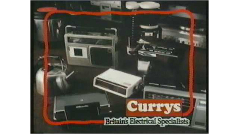
Manchipp approached his first client in an interesting way

"I wrote a program, in BASIC, on my rubber-keyed ZX Spectrum, which sent robotic men walking across the screen carrying promotional messages, like ‘Computer Games £1.99’,  ‘VHS Tapes on sale' and the winning: ‘ALL TV’S 20% OFF’." 

"The following Saturday I walked in armed with a cassette tape holding the data. I secretly loaded it up on the shop's demo computer, while my brother distracted them by trying to loudly play a new shipment of stylophones."

"Once up and running on screen, I politely asked to speak to the manager. When I explained that this could be a way to advertise his wares, all night, on the high street, for free, he loved it." 

"He asked me to create a series of ads that would run over the next three months. I would turn up as they opened, get briefed, dash home, code it up, dash back and have it installed ready for the evening." 

"Sales went up. Everyone was delighted. My parents were mystified."

SomeOne London, which Manchipp co-founded, has won awards for its branding work for huge names

"I was 14, so I couldn’t be legally paid. I negotiated a hard line and instead got paid in computer games and tech. By the end I had all the latest games and duplicates for friends who had helped." 

"I knew I wanted to do more of this kind of thing – something I loved, and got paid for. From then on, everything started to click. Commercial creativity was forever in my blood."

Manchipp's bold approach certainly paid off, and perhaps helped sow the seeds of confidence that led him to set up SomeOne in London.
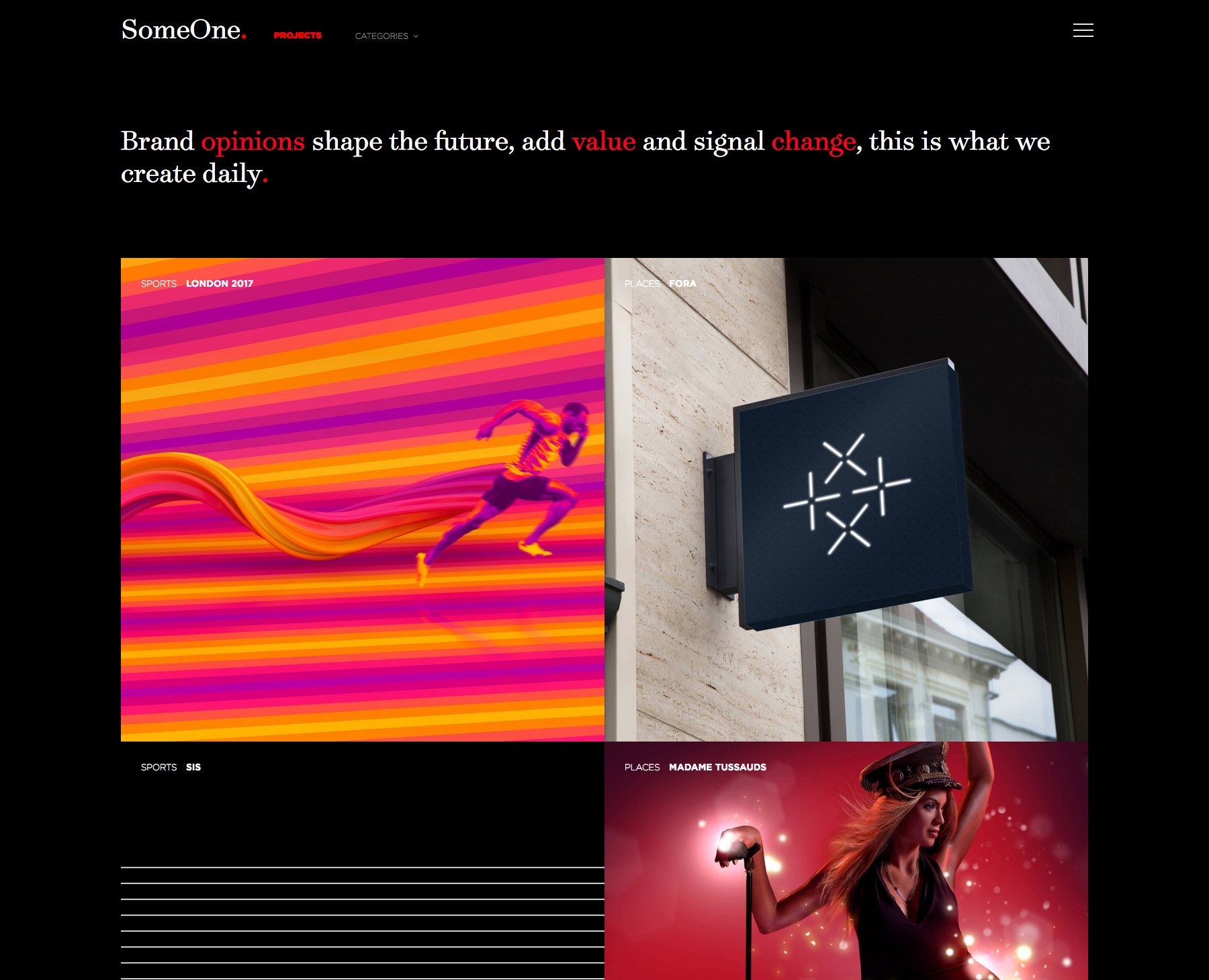
02. Oisín Hurst

Oisín Hurst, creative director at wondr.io, found that an early paid commission provided a steep learning curve.

“A long time ago I designed a buttermilk carton for Tesco," he says. "It was one of my first packaging design pieces, created in an FMCG agency sweatshop in Dublin, where I was employed as a designer. I designed it on the flat keyline and didn’t think to mock it up."

"So I never spotted the offending shapes. To be honest, I didn’t give it a second glance. Why would I – it was buttermilk – what could go wrong?"

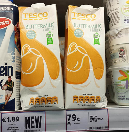
Neither Hurst nor his senior colleagues spotted any issues with the shapes in this design

"Not only did it get past everyone, it sat on the shelves for about seven or eight years before anyone – including myself – noticed. Now every few months it pops up on my Facebook and Twitter feeds to remind me how fallible I am. But I’m glad it does." 

Here are three lessons Hurst learnt from his buttermilk commission:

Own the end result – good or badEverything matters – the little details and the smaller jobsDesign in context – specifically the consumer, audience or customer’s context. This is especially true when designing digital experiences.

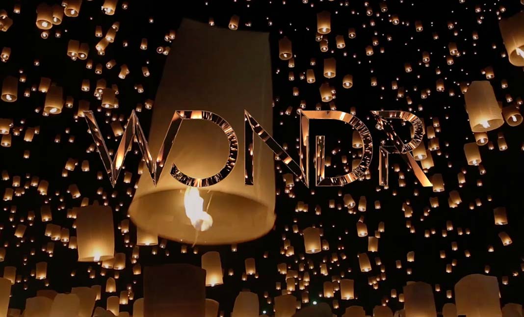
Hurst is now creative director at wondr.io in Dublin, which has won awards for its beautiful website

Hurst learnt a lot from this formative experience, proving that the odd mistake is indeed more valuable for learning than success after success. He is now producing stunning designs at digital agency Wondr.io.

03. Jamie Kelly

Kelly’s first design commission – for a friend – was paid for in drinks

Jamie Kelly, creative partner at Brand Up North, won his first commission through a stroke of luck…

“My route into design wasn't the most orthodox," he says. "After graduating from Liverpool School of Art I found myself in the world of print sales – an experience that's still one of my most valuable. I did this for two years, and although I enjoyed it, I had that burning desire to go back to my passion." 

"Luckily, at the same time I decided this, a friend of mine set up his own print sales business and asked if I would look at his identity."

Kelly’s design is still being used 10 years later

"The fee was predominantly libation-based. I of course agreed, and took what was a good brief with some clear direction. The result was an identity that hit the brief, was on trend – at the time – and pleased all four directors." 

"At this point, I was essentially a graduate designer, not understanding the power of a proposition or positioning to help shape a business and its identity. I also wan't remotely a master of my craft. But this didn't matter: they loved it, therefore I loved it."

"The business is now in its 10th year, doing very well and they still use the same identity. It's emblazoned across their livery, offices and machines." 

"This inspires me, because although I would change many things looking back – my approach, my rationale and the construction – it's still being used with pride. This is all I can ask for from any of the work we do here at Brand Up North: has it helped the business and are they proud of it?"

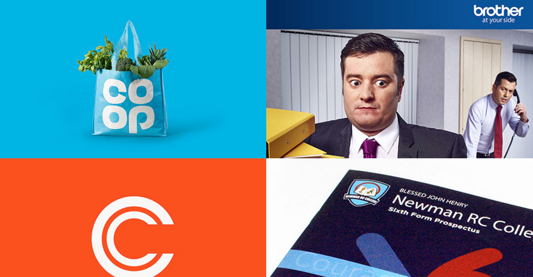
Now creative partner at Brand Up North, Kelly has led big branding projects for the Co-op, Brother UK and more

"10 years later I'm working with the same business on a new offering they have, where I can apply the past 10 years' learnings and hope that I have the same response, with the same longevity and result."

Kelly's successful early commission shows that seizing opportunities – even jobs for friends – is key to gaining valuable opportunities. Although we advocate getting paid in money for your first commissions, not beer.

04. Kyle Wilkinson

Kyle Wilkinson, founder and creative director of Wilkinson&Co, got his first commission by using his initiative and reaching out locally.

"Like a lot of early projects, they didn't come to me for this one – I contacted them touting for work," recalls Wilkinson. "I called a local charity to see if I could help out with anything." 

"Luckily, its old agency had sold up, so the charity was on the hunt for a designer to create a campaign for its upcoming charity event, the Midnight walk."

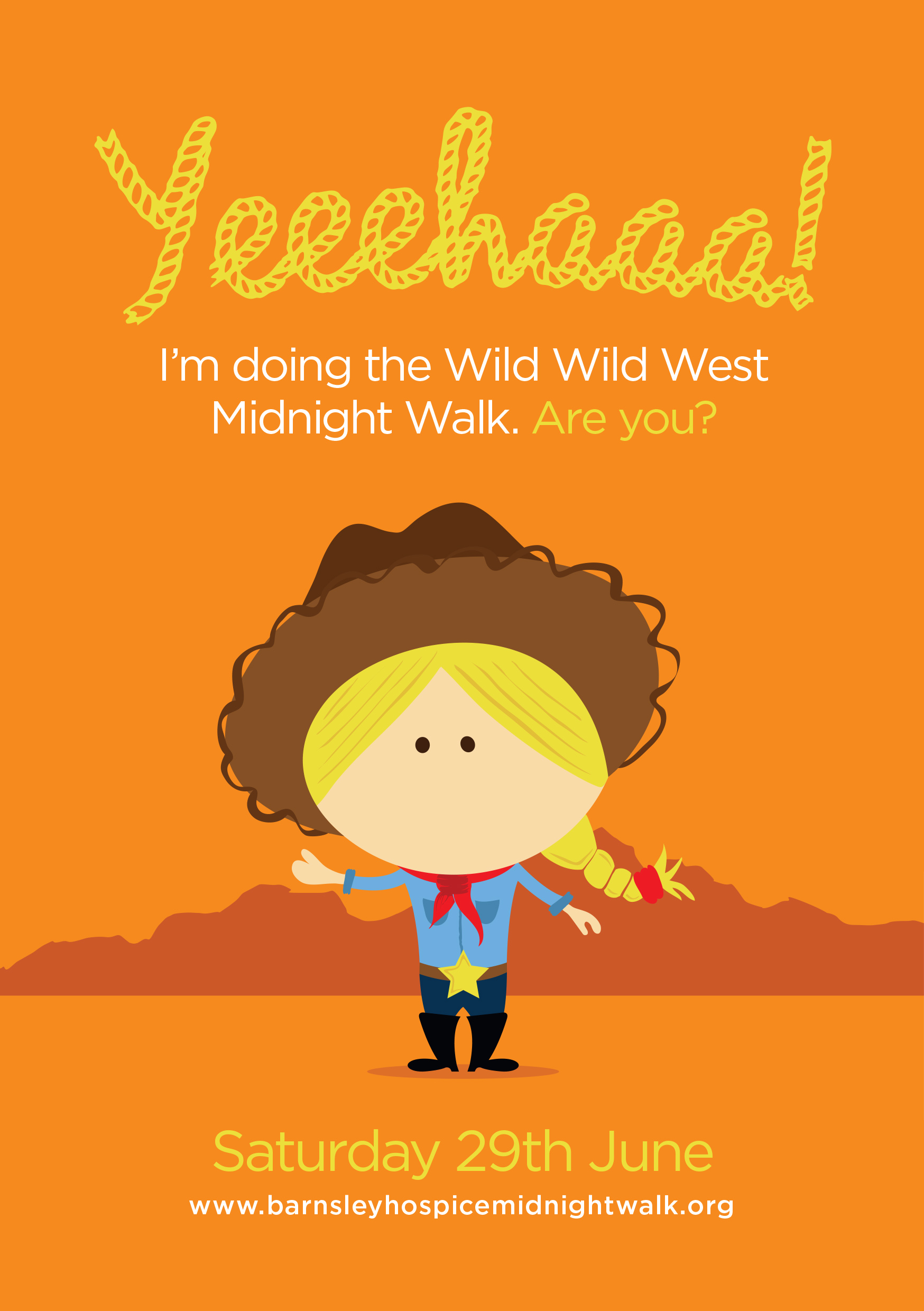
Wilkinson approached a local charity for work when he landed his first commission

"The event invited women of all ages to dress as cowgirls and walk 10 miles at midnight to raise money. I jumped at the chance to design for it and went down an illustrative route, as it was to be used on a lot of different mediums, of all shapes and sizes. It was even printed onto pocket mirrors."

"I remember learning a lot about managing a client, which was something I had very little experience of. I learnt what to say, how to get across ideas and so on."

"It was a steep learning curve, as with most things, but invaluable and acted as a foundation to build upon over the years. Looking back, I actually don't mind the design too much."

Wilkinson now specialises in creating bespoke display typefaces, typography, imagery and visual identities for brands and publications at Wilkinson&Co

Contacting local charities and businesses is a great way for new designers to gain some early experience. Though Wilkinson's style on his Instagram feed and website has developed, that early chance to work closely with a client to create something they love is invaluable.

Share your first commission by commenting on our Facebook page or Facebook group, or Tweet us with the hashtag #FirstCommission.

Related articles:

50 brilliant design portfolios to inspire you20 tips for design interview success15 free resume templates

Get more from your mentor

Original Source: http://feedproxy.google.com/~r/CreativeBloq/~3/_UhgUrsIhpc/get-more-from-your-mentor

For all the books on design and creativity, there’s no substitute for having a stream of mentors in your life – either as a creative student, intern or new designer. 

I learned this lesson while studying at London’s School of Communication Arts. Despite being called a school, it doesn’t have any teachers. Instead, it has a network of over 1,000 mentors, who all donate a couple of days a year to share their knowledge with the students.

I spoke to the school’s dean, Marc Lewis, about what you should look for in a mentor, and how you can best build a powerful working relationship. Here I share tips from both of us on how to get the most from your mentor.

01. Be there in person

Never underestimate the value of face-to-face meetings

Think about closing your laptop and getting out into the world and meeting people. You’re not going to meet like-minded creatives and potential new contacts while sat at home all the time.

When I wanted to meet my current boss, Andy Sandoz, I called the office where he worked, saying that it was the half-term break, and rather than work at home in my pants, did they have a free desk I could use? I ended up with a desk for a week, where I met a bunch of brilliant creatives before finally, at the end of the week, one of them introduced me to Andy.

02. Kiss a lot of frogs

“Every frog might be someone’s prince(ss),” says Lewis. “My advice is that creatives need to get themselves into situations where they can meet lots of interesting people.” 

When you start searching, do so with an open mind. People don’t always need decades of experience to teach you something. Creatives who are newer to the industry can often empathise more with the stage you’re at and could also offer you more relevant advice.

03. Check your motives (and theirs)

Make sure you and your mentor have the same goals in mind

It’s always worth checking what you actually want from a mentor before you go looking. Although mentors can open new doors, you shouldn’t be angling for a job offer or a big name that you can drop into conversation. 

Lewis also recommends asking the same question of potential mentors, “The role of a mentor is not to ask, ‘What’s in it for me?’ or, ‘What’s in it for us?’ but ‘What’s in it for you?’” he says.

04. Act on advice

You’ll get the most from your mentor if you act on the advice they give you

The people you want to talk to are often short on time, which forces you to prioritise what you want to ask them. ‘What would you do if you were me?’ is often a great question that forces your mentor to empathise with your current position. 

And if you trust that they have your interests at heart, act on their advice, however difficult or uncomfortable to hear, Lewis says. Then give them feedback, tell them how it went and ask them what they suggest you do next.

05. Expand your network

Lewis says, “Mentoring is fluid and you should be constantly on the lookout for new mentors who can help you on your journey.”

Once you have a solid rapport with a mentor, it’s always worth asking if they know anyone they think you should meet that could help you. Not only does this help to grow your network, but receiving a personal introduction will carry a lot more weight than emails and cold calls.

06. Challenge your mentor

Your mentor could often do with some advice themselves

You should always feel able to challenge your mentor’s advice. “There is no ego in the room when I engage with one of my mentors, and debate is encouraged,” says Lewis. 

“I find that when I am challenging advice, I am really asking myself the important questions in pursuit of the right answers. Mentoring is not about one person telling another what to do, it is about working things out together. It should be active, not passive.”

07. Keep them in the loop

Your mentor wants to feel like the time they spend with you is helpful, so let them know what happened next. Some form of contact every month is enough to let them know how you’re getting on. 

And it doesn’t have to be all about you; if you see an article or news story you think is relevant to their interests, share it!

08. Give thanks

The School Of Communication has postcards you can send as thank you letters

It’s important not to abuse the generosity of a mentor. Lewis says that School of Communication Arts is built on a model of reciprocity: “I believe that giving thanks is incredibly important. All social transactions should be fair, and ideally should be win-win.” 

Handwritten notes feel much more personal than an email, and showing thanks is essential to maintaining a healthy relationship.

This article was originally published in Computer Arts issue 264. Subscribe here.

Related articles:

How to transform a design internship into a job50 brilliant design portfolios to inspire youTop designers reveal their first paid commissions

Fantastic Artworks by Dofresh

Original Source: http://feedproxy.google.com/~r/abduzeedo/~3/cUpLf3OOpt8/fantastic-artworks-dofresh

Fantastic Artworks by Dofresh

Fantastic Artworks by Dofresh

PauloGabriel
Aug 15, 2017

I really love a good set of concept artworks. Sometimes it’s like reading a book, it just takes you imagining wild stories of far away kingdoms and futures to come. Dofresh, a French artist, comes up with beautiful scenes filled with insane Mecha and more badass elements.

There are only a handful of illustrations. For more of it, please visit the portfolio at ArtStation! I hope you enjoy these! Cheers. 😉

Fantastic Artworks by Dofresh

Fantastic Artworks by Dofresh

Fantastic Artworks by Dofresh

Fantastic Artworks by Dofresh

Fantastic Artworks by Dofresh

Fantastic Artworks by Dofresh

Fantastic Artworks by Dofresh

Fantastic Artworks by Dofresh

Fantastic Artworks by Dofresh

digital illustration
artworks


This Site Knows If Your Online Accounts Have Been Hacked

Original Source: http://www.hongkiat.com/blog/have-i-been-pwned/

Over the years, many websites and services have been hacked by groups of black hat hackers. Stemming from these hacks are lists containing compromised emails and their accompanying passwords, all of which are frequently used by these groups as bargaining chips to extort their victims for money.

Due to the amount of data that is stolen from these hacks, it could be a tedious affair to sift through the information to find out if your email and password could be compromised.

To make this process easier, Microsoft Regional Director and MVP for Developer Security Troy Hunt has used his own spare time to develop a website called “Have I Been Pwned?” that can help users find out if their login credentials are at risk.

The way this website work is relatively straightforward: the user inputs either their email address and password into the provided dialog box and click on the “pwned?” button. After a few seconds, the website would spit out information regarding the safety of their login credentials.

If the login credentials in question are safe, the website would display a green label that informs the user that their login credentials do not appear in the database, making them safe as of the time of checking.

green labelgreen label

However, if the login credentials were to appear in the database of known hacks and passwords, the website would throw up a red-colored warning that informs the user that their credentials may be compromised.

In the event that the user is looking up their email address or usernames, the website would also highlight the hacks that may have compromised their credentials.

you've been pwnedyou've been pwned

The information that is used to create Have I Been Pwned? has been sourced from lists from Anti Public data dump and Exploit.in. As such, the website has a certain degree of accuracy when it comes to identifying whether or not a password has been compromised.

While the list is reliable, Hunt has mentioned that the website is by no means perfect, and that users should still be vigilant about their account’s security.

Most importantly of all, Hunt explicitly reminds those who are looking to use the website to never input a password that they are currently using for their accounts. While the website does not log passwords, Hunt believes that inputting a password into any random third-party service isn’t exactly a wise move.

Designer’s Guide for Designing Web App Interfaces

Original Source: https://line25.com/ui-ux-design/designers-guide-designing-web-app-interfaces

Recently, there has been a lot of development in web design and it’s published daily. Are you part of the web designer community? If this is the case, then you are working to develop web interface design, either in the form of dashboards, or as part of a website. The role of a web designer has been increasing in importance and in future, the role will be even more important as lots of startups are starting to focus on design more each day.

Inexperienced designers might find it challenging to deal with web interfaces. To create an amazing UI design, many factors need to be considered. However, the secret lies in detail accuracy.

Do you want to be a successful user interface designer? Let’s dive in. We’ll start with the basics.

Tips on intuition

UI Design Principles - Intuition

The easier it is to use your website, the higher the number of visitors and vice versa. Intuitive design carries a huge significance even when talking about easiness. This means that your website should have clear usage directions as soon as the visitor opens it.

An intuitive design offers invisibility which is its biggest advantage. There is no default guideline but an approach that most users are familiar with and can easily do what they want to do.

An intuitive design helps people concentrate on the quality of the experience. Any visitor would want to complete a task without losing time on interruptions. A non-intuitive design is disturbing and intrusive.

Intuitive design is invisible but it doesn’t mean that the visitors aren’t aware of its presence. They will notice that all the elements are related to the work they are doing and they will be happy about it.

UI Design principles

There are three principles that determine the use of visual language:

Communication – shows in a manner that is familiar to users
Organization – offer harmonic and precise structure
Economizing – utilizes spectrum of cues efficiently

UI design’s nature

UI Design Nature

The main aim of user interfaces is to offer quality interaction, therefore, offering an amazing user experience.

If the users must complete their task easier, then they should use an effective and straightforward design.

Importance of user interface design on development

Importance of user interface design

Occasionally, owners hold meetings to go through user’s feedbacks and find ways to apply the user’s comments on the design.

This results in an amazing user experience because of the combination of simplicity and functionality.

What role does a web interface play during development?

Role of your web interface in design

A research is conducted using the user’s requirements and preference.

The owners go through every requirement and come up with a solution for every requirement that is possible.

It is important to listen carefully to what your client’s requests and feedback and adjust your design accordingly, keeping best UI design practices in mind.

UI design rules

UI Design Rules

Clarity rule – users anticipate seeing straightforward and clear interface elements. People avoid complicated content when they are online. Also, they won’t find time to learn how to do easy tasks.
Preference rule – users will feel confident when they have an idea of what is expected from them.
Context rule – a UI should let users control what they feel they should control.
Defaults rule – if your website is clear, users won’t try to change the default settings.

It is important to have defaults

TV devices come with default settings which are rarely changed
The fridge’s temperature is rarely changed
Defaults are everywhere in life
Defaults are crucial for every experience

Ensure that defaults are functional and applicable. These defaults are rarely changed.

New interface creation tips

Design Interface Creation Tips

Know your users: differentiate between their goals and yours. Include them in the priorities list. After doing that, go through their experience and competence and know what they want. Get to know their preferred interface and use them.

Avoid the modern trends and those style features that are newly introduced. The only way to help your clients accomplish their task is by focusing on them.

The navigation and structure of a UI design:

Come up with solutions that concentrate on the interaction between users and product and help your users accomplish their task.
Categorize the solutions according to significance, presence, user’s role and relying on usability.
Take care of structure, data architecture, navigation and create a functional UI design with rich content.

Preparation of final document: this final document needs to have the whole UI structure. It needs to contain the product’s path from initialization stage to final stage when it is displayed on web browsers.

Following patterns: users encounter different interfaces most of the time that is different from yours.

Some of the websites that most users encounter daily are Facebook, Twitter, news websites and WordPress.

Perhaps you know how successful these interfaces are and you shouldn’t reinvent them. Instead, go through these platforms to search for solutions for the problems you are facing. It is good to have familiar UI patterns.

Consider feedback: you need to constantly respond to users’ needs. You should give directions to your users and solve the misunderstanding and mistakes.

Ensure that your users are updated of any changes. Keeping them updated to make them feel as if they are part of the changing process. Eventually, your interface will be what the users want.

Making web interfaces easy to learn

The simpler an interaction is, the easier it is for the user to remember that action.

This means that you need to design the interface in such a way for the user to have a limited number of things to do. To do that, you will have to break the information into small digestible chunks.

You should also consider advertising your interface’s features on screen. Don’t stuff it in the users’ faces, though. Consider adding them somewhere in the sidebar, or at the bottom of the screen to avoid hijacking your users’ attention.

Making web interfaces intuitive

Making web interfaces intuitive

The most important factor that determines the performance of your web app is the user interface. Does it have an intuitive dashboard design? No? Then make it intuitive.

UI can show simple methods of achieving the results. It doesn’t matter if you have powerful programs, people ignore an inefficient dashboard design.

What matters is the user’s interaction with a program while helping them achieve their goal. Therefore, web design is concentrating on the user more and more.

Making the user decisions simple

It all starts with making the design as simple as possible.

Why?

Complicated designs confuse users and make it harder for them to make a decision. What do I click? Where? Is it the red button over here? Is it the green one over there?

Implement a visual hierarchy

What are the most important things in your web interface? Highlight them to make the users focus on those. You can use size, colors, typography, white space, among others.

Typography

You might be thinking “Oh, I know a good-looking font”. That isn’t enough. Having a good font in your design is useless if you don’t know how to use it, where, or with what other font to pair it with.

Putting Helvetica everywhere won’t save you. Every font has its own personality and works well for a certain audience.

Besides choosing a font suited for your audience, you should also make sure you use its size well, to highlight certain parts of the design. You should also use colors to do that, but be careful with certain color combinations.

Conclusion

A good interface design is like the air we breathe. We can’t see or think about it. However, it satisfies our needs. If you have ever experienced poor UI, then you will appreciate a site with easy to use user interface.

A good design should always make you confident as you work on your task and eliminate the worry of having made a mistake.

Apps and websites should functional and designers should put more effort and time on the usability of the product.

The post Designer’s Guide for Designing Web App Interfaces appeared first on Line25.

Successful Strategy for Integrating Web and Print Design

Original Source: http://feedproxy.google.com/~r/visualswirl/~3/uEv0ykGnIeE/

Today’s marketplace demands that designers be versatile enough to create an integrated print and web media campaign. This is easier said than done, however, as the differences between designing for these two media are extensive, however, and each presents its own challenges and opportunities.

Designers that are able to successfully navigate these differences and create a unified marketing strategy are highly valued. Here are some tips for how to overcome the disparities and integrate your print and web designs:

Challenges of Bringing the Two Media Together

Though they share some basic principles, designing for print media and designing for the web are two entirely different tasks. Knowing the standards for each will allow your work to be easily translated from one into the other.

In print media, designers usually have more exact control over the appearance of the final product. When creating custom business cards, for example, the designer need only worry about the finished product appearing in one size. The same is not true for web design, however. There are several standard monitor sizes, not to mention mobile devices, and designers must create fluid layouts that will work for all of these displays (and possibly more).

In addition, the design of the will always be viewed as “complete”—no scrolling or sliding is necessary to take in the entire concept. Contrast this with web media, where “big” designs require careful planning and modification to bring off.

For itself, web design offers some benefits that print media cannot match. Web designers have the freedom to take advantage of some incredible techniques that are hard to replicate via digital printing: gradients, small details, and movement in design, for example.

One thing that both print and web designers have in common is color selection—digital printing can often render colors differently than the designer had envisioned, while web designers must be cautious about how different monitors and displays will produce colors.

Successful Integration

The differences between the two media, then, are challenging, but not impossible, to overcome. No matter which medium you begin working in, you must keep the challenges of the other in mind in order to bring them together. Print designers must work within the restrictions of file and image size for digital media, for example, while web designers must keep in mind that subtle details that are easy to bring off on the web may be lost to the printer.

This is important primarily because of branding and brand recognition—your clients’ audience must be able to connect successfully with the colors and images used in both media and recognize them as coming from the same organization. It’s important, then to keep your clients’ specific strategies in mind as you create your designs.

More Tips for Integration

Apart from creating a design that works in both media, there are some other things to keep in mind as you create both that can help create a better unification between the two media. As you work with marketers and designers on both sides of the design aisle, make sure to use cross-promotions and teasers that promise to “enhance” the users’ experience. The website should offer more to the users’ print experience and vice versa.

You should also be sure to mention the other medium with the other—include URLs in offline ads and flyers, for example, or use the website to promote a special direct mailer.

With a solid understanding of the tips and techniques involved in both types of design, you will be able to create designs that are sending the same message no matter the medium.

What are your tips for integrating web and print media? What successes have you had in unifying the two?

Images by ollily and Sergiu Bacioiu 

The post Successful Strategy for Integrating Web and Print Design appeared first on Visual Swirl Design Resources.

30 Beautiful Typographic T-Shirts

Original Source: http://feedproxy.google.com/~r/visualswirl/~3/bpNB3hhILRg/

Some type tees depend on a pithy phrase to make them interesting, in a simple boring font. Some t-shirt designers go above and beyond to enhance the message with beautiful typography. We’re going to take a closer look at those t-shirts.

30 Typographically Awesome T-Shirts

1. No Power in the Verse Can Stop Me t-shirt by RobotrobotROBOT – this apple doesn’t have anything to do with the beautiful and popular computers. This typographic illustration is referencing a scene from a cult TV show Firefly.

2. Enjoy Life By Origin 68 – There are so many ways to enjoy life. Whether you enjoying your life through art, conversations, long walks or nature, this shirt helps remind all of us to enjoy some nice typography while we live our lives.

3. Helbotica by Chop Shop Store – This is one in a series of illustrations utilizing everyone’s favorite font, Helvetica.

4. Find the Color Inside Me by Allmightys – Fun use of color and negative space, creating an appealing t-shirt design.

5. XOXOXO by Jublin, on Designed by Humans – Great mixture of typefaces to make up this patterned t-shirt.

6. Science and Exploration t-shirt from Fictionfield – This shirt is meant to encourage self education, if you never stop learning you’ll always be on an adventure!

7. Human Being packaging t-shirt by Origin68 – If humans cam in packaging, like almost everything else, it might look something like this.

8. Being t-shirt by Pweye – What kind of a being are you?

9. Anything Unrelated to Elephants it Irrelephant by Snorg Tees – clever word play t-shirt featuring a playful typeface and an equally playful elephant.

10. Relentlessly Awesome by Headline Shirts – a bold text with a bold statement.

11. There’s Still Hope from Designed by Humans – If you find hope and piece from sea creatures, you’ll find comfort in this shirt.

12. Sans Serif from Turnnocturnal – an exhausted and beautiful list of sans serifs font, perfect for any designer or typeface enthusiast.

13. Lorem Ipsum from Redbubble – love yourself some filler text? This script front t-shirt celebrate the nonsense words we use as place holders.

14. We are Architects of Our Future from Random Objects – the blue print t-shirt and block text really illustrates the message of this shirt.

15. United Shirt of America t-shirt from Threadless – for those who love handwritten type and geography.

16. Sports t-shirt from Threadless – for all you avid sportball fans.

17. The Political Mind from Headline Shirts – tired of the political rhetoric surrounding the presidential race? It’s a scientific fact that politicians can’t really help it, most of their brain is taken up by the bullshittal lobe.

18. Bike t-shirt from Dark Cycle Clothing – a great shirt for the strong and enthusiastic cycling enthusiasts.

19. Dead Air from Origin68 – Pretty hand drawn letters.

20. I like to Ride Bikes from Print Brigade – if you like to ride let it be known.

21. Owls Ask Too Many Questions from Threadless – it’s so annoying, those darn owls always asking “who?”

22. Saltwater by Allmightys – Cool type, depressing message.

23. This is our time from Deathshed – a perfect shirt to wear while treasure hunting with your friends.

24. Seven Deadly Sins from Chopshop Store – beware the seven deadly sins, keep track of them in this beautifully rendered skill tee.

25. URL Link from Threadless – It’s a link link.

26. Mockingword from Redbubble by Pixhunter – let’s play a word association game; i’ll say Hunger Games and you take whatever you think of and put in the shape of the Mockingjay. Hunger Games.

27. NERD HQ from Theadless – The core of nerdom, looks a little something like this.

28. Donor from Threadless – In case you forget where your organs are.

29. It’s About Time from Ugmonk – interesting type treatment and a vintage computer icon.

30. Sleep When I’m Dead from Insomniac – beautiful text for those who don’t sleep.

The post 30 Beautiful Typographic T-Shirts appeared first on Visual Swirl Design Resources.