Collective #345

Original Source: http://feedproxy.google.com/~r/tympanus/~3/934usKP_vHg/

C345_wotw

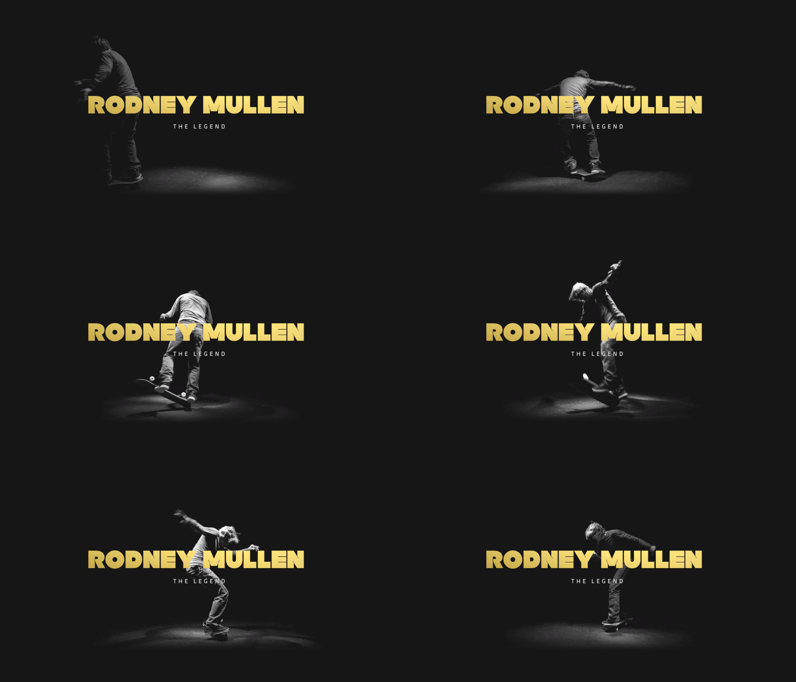
Inspirational Website of the Week: Rich Brown

A fantastic web experience with incredible smoothness and an innovative design.

Get inspired

C345_HelloSign

This content is sponsored via Syndicate Ads
HelloSign API: The Industry’s Fastest eSignature API Integration

Squeaky clean documentation that gets you testing in seconds. Test the API for as long as you need to and sign up when you’re ready. 2X faster integration.

Try it free

C345_reqanimframe

Gain Motion Superpowers with requestAnimationFrame

Benjamin De Cock demystifies requestAnimationFrame for creating powerful animations.

Read it

C345_sketchlibraries

Sketch Libraries: How they work, and the crazy stuff you can do with them

Jon Moore introduces a new, powerful feature in Sketch: Sketch Libraries, which are Sketch documents that can be used globally.

Read it

C345_skeleton

Building Skeleton Screens with CSS Custom Properties

Max Böck shows how to use CSS Custom Properties to create awesome skeleton screens.

Read it

C345_pwa

Yes, That Web Project Should Be a PWA

Aaron Gustafson writes about how misinformation has convinced many designers and developers that PWAs aren’t appropriate for their projects and shows how actually every site should be a PWA.

Read it

C345_nowuikit

Now UI Kit

A responsive Bootstrap 4 UI kit by Invision and Creative Tim.

Get it

C345_freezetab

Freezetab

A bookmarks alternative with lots of great features that groups your tabs based on when you saved them.

Check it out

C345_concurrent

Concurrent JavaScript: It can work!

An article by Filip Pizlo from WebKit that considers what it would take to extend concurrency to the entire JavaScript heap.

Read it

C345_earth

How I built my earthin24 twitter bot

Ryan Seddon writes about how he created a space related Twitter bot.

Read it

C345_antidesign

Let’s talk about anti-design

Get to know what anti-design is all about in this article by Simon Obirek.

Check it out

C345_awesomevuejs

Awesome Vue.js

A curated list of awesome resources related to Vue.js.

Check it out

C345_http2

Managing CSS & JS in an HTTP/2 World

Trevor Davis’ guide on how to deliver CSS and JS on a website with HTTP/2.

Read it

C345_python

What the f*ck Python?

A collection of tricky Python snippets and examples.

Check it out

C345_semiotic

Semiotic

Semiotic is a React based framework optimized to enable effective communication through data visualization.

Check it out

C345_pagebloat

The average web page is 3MB. How much should we care?

In case you missed it: Tammy Everts’ updated analysis on the current state of page bloat.

Read it

C345_proximi

Proximi.io

A unified SDK and API to positioning, geofencing and triggering that allows to build apps that react to the physical world.

Check it out

C345_mathml

The Mathematics of Machine Learning

An article on the importance of Mathematics in Machine Learning by Wale Akinfaderin.

Read it

C345_draggable

Draggable Elements with RxJS

Read how to make DOM elements draggable with RxJS and Hammer in this article by Varun Vachhar.

Read it

C345_fastv8

Fast Properties in V8

Learn how V8 handles JavaScript properties internally in this article by Camillo Bruni.

Read it

C345_languagedatascience

Which Languages Should You Learn For Data Science?

An article by Peter Gleeson where he explains what to take into consideration when choosing a language for data science.

Read it

C345_grid

Here’s a Super Quick Way to Try out CSS Grid

Jen Simmons teaches some very basic things about CSS Grid, and gets you started with a 5-minute taste.

Read it

Collective #345 was written by Pedro Botelho and published on Codrops.

WordPress SEO Plugins: All in One SEO Pack vs. Yoast SEO

Original Source: http://feedproxy.google.com/~r/Designrfix/~3/NnffpWva2A4/wordpress-seo-plugins-seo-pack-yoast-seo

Anyone looking for WordPress SEO plugins will probably have heard that Yoast SEO and All in One SEO Pack are the best of the fold. But which one is better than the other? This article will highlight the most important attributes of both plugins and guide you towards deciding which works best depending on your […]

The post WordPress SEO Plugins: All in One SEO Pack vs. Yoast SEO appeared first on designrfix.com.

React vs Angular: An In-depth Comparison

Original Source: https://www.sitepoint.com/react-vs-angular/

Should I choose Angular, or React? Today’s bipolar landscape of JavaScript frameworks has left many of developers struggling to pick a side in this debate. Whether you’re a newcomer trying to figure out where to start, a freelancer picking a framework for your next project or an enterprise-grade architect planning a strategic vision for your company, you’re likely to benefit from having an educated view on this topic.

To save you some time, let me tell you something up front: this article won’t give a clear answer on which framework is better. But neither will hundreds of other articles with similar titles. I can’t tell you that because the answer depends on a wide range of factors which make a particular technology more or less suitable for your environment and use case.

Since we can’t answer the question directly, we’ll attempt something else. We’ll compare Angular (2+, not the old AngularJS) and React to demonstrate how you can approach the problem of comparing any two frameworks in a structured manner on your own and tailor it to your environment. You know, the old “teach a man to fish” approach. That way, when both are replaced by a BetterFramework.js in a year’s time, you will be able to re-create the same train of thought once more.

Where to Start?

Before you pick any tool you need to answer two simple questions: “Is this a good tool per se?” and “Will it work well for my use case?” None of them mean anything on their own, so you always need to keep both of them in mind. All right, the questions might not be that simple, so we’ll try to break them down into smaller ones.

Questions on the tool itself:

How mature is it and who’s behind it?
What kind of features does it have?
What architecture, development paradigms, and patterns does it employ?
What is the ecosystem around it?

Questions for self-reflection:

Will I and my colleagues be able to learn this tool with ease?
Does is fit well with my project?
What is the developer experience like?

Using this set of questions you can start your assessment of any tool and we’ll base our comparison of React and Angular on them as well.

There’s another thing we need to take into account. Strictly speaking, it’s not exactly fair to compare Angular to React, since Angular is a full-blown feature-rich framework, and React just a UI component library. To even the odds, we’ll talk about React in conjunction with some of the libraries often used with it.

Maturity

An important part of being a skilled developer is being able to keep the balance between established, time-proven approaches and evaluating new bleeding-edge tech. As a general rule, you should be careful when adopting tools which have not yet matured due to certain risks:

The tool might be buggy and unstable.
It might be unexpectedly abandoned by the vendor.
There might not be a large knowledge base or community available in case you need help.

Both React and Angular come from good families, so it seems that we can be confident in this regard.

React

React is developed and maintained by Facebook and used in their own products, including Instagram and WhatsApp. It has been around for roughly three and a half years now, so it’s not exactly new. It’s also one of the most popular projects on GitHub with about 60,000 stars at the time of writing. Sounds good to me.

Angular

Angular (version 2 and above) has been around less then React, but if you count in the history of its predecessor, AngularJS, the picture evens out. It’s maintained by Google and used in AdWords and Google Fiber. Since AdWords is one of the key projects in Google, it is clear they have made a big bet on it and is unlikely to disappear anytime soon.

Features

Like I mentioned earlier, Angular has more features out of the box than React. This can be both a good and a bad thing, depending on how you look at it.

Both frameworks share some key features in common: components, data binding, and platform-agnostic rendering.

Angular

Angular provides a lot of the features required for a modern web application out of the box. Some of the standard features are:

Dependency injection;
Templates, based on an extended version of HTML;
Routing, provided by @angular/router;
Ajax requests by @angular/http;
@angular/forms for building forms;
Component CSS encapsulation;
XSS protection;
Utilities for unit-testing components.

Having all of these features available out of the box is highly convenient when you don’t want to spend time picking the libraries yourself. However, it also means that you’re stuck with some of them, even if you don’t need them. And replacing them will usually require additional effort. For instance, we believe that for small projects having a DI system creates more overhead than benefit, considering it can be effectively replaced by imports.

React

With React, you’re starting off with a more minimalistic approach. If we’re looking at just React, here’s what we have:

No dependency injection;
Instead of classic templates it has JSX, an XML-like language built on top of JavaScript;
XSS protection;
Utilities for unit-testing components.

Not much. And this can be a good thing. It means that you have the freedom to choose whatever additional libraries to add based on your needs. The bad thing is that you actually have to make those choices yourself. Some of the popular libraries that are often used together with React are:

React-router for routing.
Fetch (or axios) for HTTP requests;
A wide variety of techniques for CSS encapsulation;
Enzyme for additional unit-testing utilities.

We’ve found the freedom of choosing your own libraries liberating. This gives us the ability to tailor our stack to particular requirements of each project and we didn’t find the cost of learning new libraries that high.

Languages, Paradigms, and Patterns

Taking a step back from the features of each framework, let’s see what kind higher-level concepts are popular with both frameworks.

React

There are several important things that come to mind when thinking about React: JSX, Flow, and Redux.

JSX

JSX is a controversial topic for many developers: some enjoy it, and others think that it’s a huge step back. Instead of following a classical approach of separating markup and logic, React decided to combine them within components using an XML-like language that allows you to write markup directly in your JavaScript code.

While the topic of mixing markup with JavaScript might be debatable, it has an indisputable benefit: static analysis. If you make an error in your JSX markup, the compiler will emit an error instead of continuing in silence. This helps by instantly catching typos and other silly errors. This is something we really miss in Angular.

Flow

Continue reading %React vs Angular: An In-depth Comparison%

Stockio Review: Stock Photos and More Without the Attribution and Costs

Original Source: http://inspiredm.com/stockio-review-stock-photos-without-attribution-costs/

Inspired Magazine
Inspired Magazine – creativity & inspiration daily

If you’re looking for a featured photo to match that perfect blog post, the process often takes much longer than you would expect.

Most bloggers have no interest, or money, to pay for stock photos, and most of the time you can find royalty-free images that don’t require attribution.

Unfortunately, there are a few main problems when it comes to finding royalty-free images that don’t require attribution:

Many search engines don’t have the proper tools to filter out photographs that aren’t legal to use.
Many times you stumble upon a free stock photography website only to find that you’re required to provide an attribution link on each photo.
There are so many photography sites that you often have to bookmark several of them to find the pictures you need.

It’s a tough process, but with the help of Stockio you should be able to make it much easier.

The Stockio free photo finder is much more than a collection of stock images.

It offers items like fonts, vectors, videos and icons. Therefore, a web designer, blogger or regular business person trying to make marketing materials can go to one location online to find everything.

The True Stockio Advantage

As a blogger and web designer myself, I find it pretty unfortunate when I locate an online asset (like a photo or vector) only to see that it requires attribution (or some sort of credit to the creator). Yes, attribution is great for sending more business to the designers and photographers of the world, but sometimes it simply doesn’t make sense to have a link below the photo. Take book covers, for example. It’d be pretty weird if a beginner blogger on a budget had an attribution link underneath their book cover.

It’s fine to have blog posts with image credits, but you can’t expect companies to place attribution on a slider image.

That’s why Stockio makes so much sense. It allows photographers and designers to find an audience, yet the people using their creations aren’t bogged down by the whole attribution thing.

Stockio encourages its users to credit things like photos and vectors, but it’s not required. Therefore, you can pick and choose for the situations it makes the most sense.

Now that you have a better idea of what Stockio offers, let’s take a look at the functionality of its website, along with the selection you can choose from.

Free Photos with Stockio

The free photos are the main focus on Stockio, so we’ll begin with that. Upon landing on the Stockio website, you’ll see a large Search bar for you to punch in any keyword you want. In addition to that, the website has several featured galleries for images, fonts and everything else on the site.

Let’s say, for example, I have a hardware store client that needs to start featuring some of its lawn maintenance products. We’re talking lawnmowers, fertilizers and sprinklers. Therefore, I want to search for photos that are tagged with the “lawn” keyword.

After doing that on Stockio, I saw a large collection of relevant images pop up. These lawn images are high-resolution, beautiful and ready to be used for marketing, blogging and social media materials.

After finding a photo I liked, the Stockio website brought me to the main page for that photo. What’s great about the image pages is that they’re not cluttered with tons of ads or other buttons that make you confused during the process. All the user sees is a Free Download button without any information about leaving attribution. These photos are available for both personal and commercial use, as long as you don’t go out and resell the actual photos. Depending on the photo, you’ll see some different sizes and formats, allowing you to keep the resolutions high and the formats the same.

Stockio Also Offers Free Fonts and Vectors

The free fonts come in all shapes and sizes, from gothic styles to more professional typography. Stockio eases the search process by presenting a wide assortment of categories. You click on the category that makes the most sense, then you’ll see a full gallery of the photos tagged with that category.

For instance, some of the categories on this page include:

Cartoon.
Fancy.
Retro.
Script.
Square.
Techno.
Trash.

The free vectors appear rather impressive as well. Stockio doesn’t seem to provide categories for the vectors, so you must go through the featured collection or make your search through the homepage.

As with the regular photos, vector files come in multiple forms. For example, this particular vector has both EPS and JPG files. You have the opportunity to select the file format that’s going to work best for your project. Once again, the attribution requirements are completely eliminated from the vector area, leaving you free to download at your own will.

Stockio Has Videos Too!

Quality free videos are hard to come by, so it’s refreshing to see that Stockio keeps a large selection of quality choices. For example, I received at least 20 or 30 great results when I punched in the keyword “lake.” It appears most of the videos come in standard mp4 format, but that’s just from looking at a few of the video downloads. In fact, the video pages are even easier to handle than the photos and vectors. With only one format, you only have to think about clicking that Free Download button.

Don’t Forget Your Icons

As a writer I don’t use icons at all. However, the web designer side of me likes to play around with icons when creating new websites and breaking up the monotony of text. Stockio provides a solid set of free icons. As you can see in the screenshot below, you can choose from icons of cats, houses, PSD files, computers and more. Before downloading, Stockio asks whether you’d like a PNG or SVG. Then, you’ll have to select the size if you go with a PNG.

Stockio is the Real Deal

I’ve said it before, but the free stock image business has seen it’s troubles. Most of the time you find a site riddled with ads or attribution requests, but Stockio has managed to avoid all that. Therefore, I’d recommend giving Stockio a try for your photo, vector, font, video and icon needs. You don’t have to sign up for a free trial or anything. Just start searching and downloading the items you need. Have fun!

This post Stockio Review: Stock Photos and More Without the Attribution and Costs was written by Inspired Mag Team and first appearedon Inspired Magazine.

Find the Perfect Icons with IconShock 2.0

Original Source: http://feedproxy.google.com/~r/1stwebdesigner/~3/VYTvtNy8n2M/

Icons are one of the must-have assets that every designer needs in their toolbox. They’ve become an essential part of crafting the perfect UI.

The trouble is that it can be difficult to find the right icon for the job. Sure, it may be the right object. But it may not be the right color or available in the size you need. That leads to having to settle for something that doesn’t work as well as you’d like.

That’s what makes IconShock 2.0 so unique. They’ve hand-crafted over 2 million icons – over 400 sets in all. Not only that, but they cover over 30 styles with almost all of them being pixel-perfect vectors. But that’s just scratching the surface of what IconShock 2.0 can do.

Customized to Fit Your Needs

Customized to Fit Your Needs

It’s one thing to simply download an icon file and then try to make it fit your project. It’s quite another to download an icon that is customized to your exact specifications. Yet IconShock provides you with that very experience.

Using their web-based customization tool, you can pick an icon and make it your own. Choose the sizing and colors you want. You’ll even get a list of related icons and the ability to search for others. From there, download a transparent PNG file. Premium members get even more options, like large sizes (up to 512px) and the ability to export to SVG or AI file formats. Plus, premium members get access to every single icon in the collection – with 100+ new ones added weekly.

As well as being able to choose and customize those particular icons your project requires, now, with IconShock 2.0, you can also download many of those icons in icon font format as well!

The whole process is quick, fun and really increases efficiency. The end result is getting exactly what you want – which ends up in a better project.

A True Variety of Icon Sets

IconShock 2.0 offers an incredible array of choices (2 million+ icons makes for a pretty good selection). Their icon sets cover multiple industries and, odds are, you’re going to find the perfect fit for whatever you’re working on.

Let’s take a look at five of their most popular sets, each with hundreds of icons you can customize and download for free:

Flat Icons

IconShock 2.0’s Flat Icons Bundle sports a clean, colorful style that will help you to create a standout UI. The soft color palette combined with geometric shapes will add a touch of class to any design project.

Flat Icons

Glyph Icons

The Glyph Icons Bundle is made of up minimal outlined shapes. Perfect for when simplicity is a must.

Glyph Icons

iPhone Icons

With the iPhone Icons Bundle, you’ll find a set of solid monochrome icons based on the original iOS 6 designs. They were built with the original iPhone sizes in mind, but can be customized to match your needs.

iPhone Icons

iOS Line Icons

If you’re looking for truly minimal outline styling, the iOS Line Icons Bundle may be a great fit for you. They’re conceptually accurate with iOS 7 and above.

iOS Line Icons

Material Design Icons

The Material Icons Bundle is a great choice when following Google’s Material Design. Based on minimal glyph icons, but with Material’s color palette added in for extra punch.

Material Design Icons

Icon Fonts

And, don’t forget that all of the above icon sets are available to download in icon font as well. All perfect for quick integration into popular web frameworks like Bootstrap and Semantic.

iPhone Icons

Looking for Something Else?

We’ve only begun digging into the vast icon library of IconShock 2.0. Take a look at their entire list of icon sets to see all that they have to offer.

Start Using IconShock 2.0 for Free

Now that you’ve seen the top-quality icons and game-changing tools of IconShock 2.0, it’s time to add their collection to your design toolbox. You can start using these stellar icons for free. If you’re looking for even more power, upgrade to a premium membership and take things to the next level.


Dwelling On The Past: The Importance Of Project Retrospectives (Part 1)

Original Source: https://www.smashingmagazine.com/2017/09/importance-project-retrospectives-part-1/


We should always look for opportunities to grow and improve. Retrospectives and reflections allow you to codify what you’ve learned from experience, to document mistakes and avoid future ones, and to increase your potential to grow in the future.

Dwelling On The Past: The Importance Of Project Retrospectives (Part 1)

Agile methodologies typically include time for retrospectives throughout a project. Regardless of your methodology, all teams would benefit from having a retrospective at the conclusion of a project.

The post Dwelling On The Past: The Importance Of Project Retrospectives (Part 1) appeared first on Smashing Magazine.

10 Unexpected Sources of Design Inspiration

Original Source: https://www.sitepoint.com/10-unexpected-sources-of-design-inspiration/

There's a source of inspiration for every type of design you can think of. Struggling to create the perfect font pairing? Head to Typewolf. Searching for ideas for your website redesign, or a specific webpage? Browse Crayon. Looking for all-around epic sources of design inspiration? Check out the latest crop of Webby Award winners.

But as awesome as these collections are, it's dangerous to rely on them exclusively. If all designers are referencing the same ideas, concepts and templates from the same websites for design inspiration, every design then sort-of becomes a variation of an existing one. It's almost impossible to create something novel or unique, when all designers are basing their ideas on the same inspiration sources.

Luckily, there's a solution for that…

Throw some new sources of design inspiration into the mix, alongside your regular sources! These 10 websites will keep you inspired in unexpected ways.

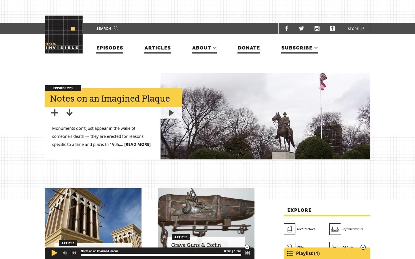
1. 99% Invisible

99% Invisible is a blog and radio show hosted by Roman Mars. It delves into the unnoticed yet beautiful, intriguing and significant forces that shape our world.

In other words…the 99%.

Each episode is approximately 15-25 minutes long and covers a single topic related to architecture, objects, visuals, history, technology, society, cities, sounds and infrastructure. Not only will it help you look at your surroundings with fresh eyes, but it'll help you hone your attention to detail. It's the "little things" that often make or break a design, so an enhanced focus on little details is definitely a skill worth mastering.

99% Invisible

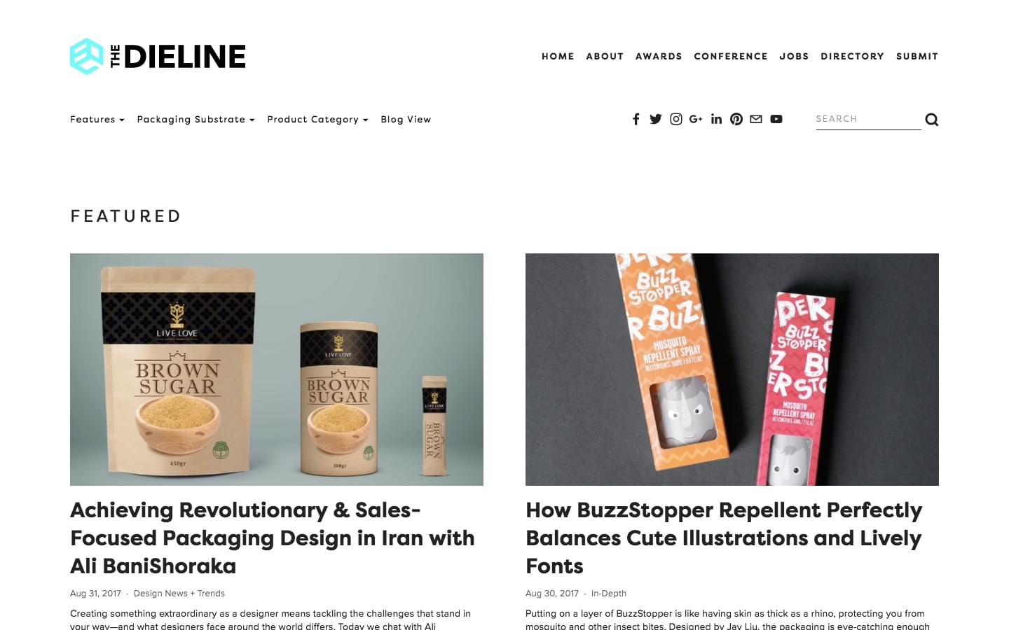
2. The Dieline

My grocery trips have been taking twice as long since I discovered The Dieline. This epic website features at least one innovative packaging design per day, but often shares two or three. You'll be both surprised and delighted to see how the most mundane items (like pencils) can be elevated by logo design and clever packaging.

The fundamentals of design apply to packaging like any other aspect of design. For example, if there's not enough white space in the design on a bag of coffee, it’ll look crowded and strain the consumer's eyes when they're trying to read it in the supermarket, resulting in a loss of sale. Because these design concepts carry over in many ways, scrolling through The Dieline will reinforce your existing design knowledge regardless of whether you’re you're a logo, web or user interface designer.

The Dieline

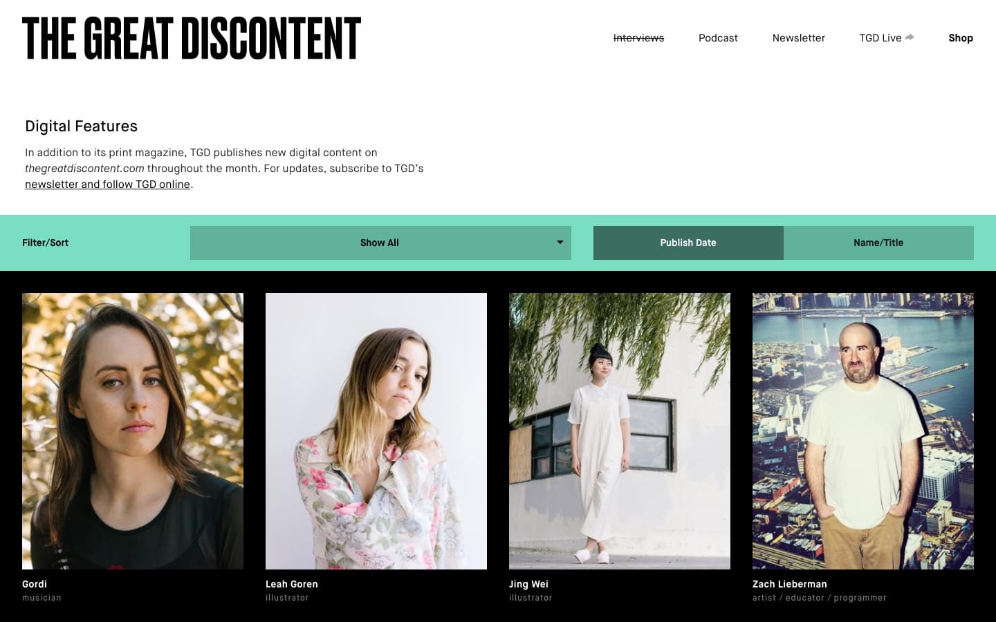
3. The Great Discontent (TGD)

The Great Discontent is a print and digital magazine showcasing all types of creatives from photographers and graphic designers to illustrators and filmmakers. Unlike many other design inspiration sources, TGD features the astonishing designers behind the work, not the only works themselves.

Sometimes it can be even more inspiring to read about an artist's beginnings, their current projects, and the biggest challenges they've faced, than to see the work itself.

After all, creative work can be emotionally draining, since you're not using up both your physical and mental strength equally, but rather 100% (and sometimes more!) of your mental strength. Knowing that others can relate often rejuvenates you and inspires you to carry on. You'll also learn how other creatives generate their amazing ideas.

The Great Discontent

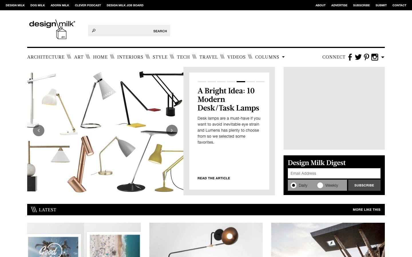
4. Design Milk

Design Milk never lets me down when I need straight-up visual eye-candy. This online magazine curates the best art, interior design, furniture, fashion, technology and architecture from around the world. The photographs are stunning, the cultures and aesthetics are stylistically varied but universally interesting, and the writing is solid. If you need bursts of inspiration from a variety of different art concepts, Design Milk is definitely for you.

And, if you're only interested in a specific vertical—say, architecture—it's easy to filter out other content and narrow down your search.

Design Milk

5. Style Guides by Brad Frost

Nothing fuses the creative and the orderly together like a style guide. Brad Frost, well-known front-end designer and author of Atomic Design, created Style Guides to house an ever-growing collection of resources on the topic. The Talks and Tools sections are certainly worth scrolling through, although my favorite is Examples. You'll find some of the most well-crafted style guides in existence, from the biggest brands today.

Better yet, you can sort through them by their content.

6. Card Nerd

Counterintuitively, rules and restrictions often inspire some of the most inventive designs. After all, they force you to find unexpected solutions and workarounds, where a "no-limits" approach has the tendency to make designers feel lazy.

This explains why business cards are a reliable source of inspiration. A business card designer has a tiny medium for a big task: communicating someone's professional identity. Whenever you're struggling to pare down your copy to the essentials, or make a design feel less busy, use Card Nerd. This gallery is updated several times a day with new business cards, ranging from minimalist to bold and colorful.

Continue reading %10 Unexpected Sources of Design Inspiration%

Stylish UI Design for Nike SB Concept Project

Original Source: http://feedproxy.google.com/~r/abduzeedo/~3/4pynoNruqg0/stylish-ui-design-nike-sb-concept-project

Stylish UI Design for Nike SB Concept Project

Stylish UI Design for Nike SB Concept Project

abduzeedo
Sep 05, 2017

We have featured Side B projects in the past here on Abduzeedo. We like to diversify but they really got me by creating an beautiful UI Design concept project for Nike SB. If you didn’t know, I am a huge skateboarding fan. I used to skateboard when I was younger, I still do from time to time. For some reason I stopped but I keep up with the sport by following skaters as well as watching the Street League. If there’s one thing that got me into design was skateboarding. The culture, the style and the focus on creativity are very important for a skateboarder in a very similar way it’s for designers. Anyway, enough of me talking, check out this super stylish UI design for Nike SB.

UI Design Concept


ui design
ux design
UI/UX


Collective #344

Original Source: http://feedproxy.google.com/~r/tympanus/~3/jaYWctjPQ3I/

C345_PageCloud

Our Sponsor
The Website Builder You’ll Love To Use

Reinventing websites for everyone. Build your own custom site, no code or restrictions. Start with your designs or choose a pre-built layout.

Try PageCloud today

C344_ARexperiments

AR Experiments

A growing collection of augmented reality experiments.

Check it out

C344_GuideCSSGrid

Guide to building layouts with CSS Grid

A place to learn and prototype with CSS Grid.

Check it out

C344_SketchAE

Bringing Sketch and After Effects Closer Together

Josh Fleetwood introduces two new animation workflow tools from UX Motion Design at Google.

Read it

C344_webvr

The Complete Guide For Web VR and immersive experiences

Yuval Keshtcher interviews Austin Knight about virtual reality, augmented reality, and mixed reality.

Read it

C344_checkboxes

CSS Checkbox Library

Lots of custom checkboxes with many styles to choose from.

Check it out

C344_Vivify

Vivify

An easy-to-use CSS animation library.

Check it out

C344_variablefonts

User Interfaces for Variable Fonts

Andrew Johnson writes on how to structure design tools to adapt to the new advantages variable fonts provide us with.

Read it

C344_Crystls

Crystal Caves

A light and shadow experimentation with 2D projections in canvas by Huw.

Check it out

C344_webscraping

Getting started with Puppeteer and Chrome Headless for Web Scraping

Emad Ehsan has put together this starter guide on Web Scraping in Chrome Headless.

Check it out

C344_gitcheatsheet

Git Cheatsheet

A great reference for Git with useful links and resources. By Ashish Rawat.

Check it out

C344_cssgridarticle

Breaking Down a CSS Grid Layout

An article by Tim Wright where he dissects a CSS Grid Layout.

Read it

C344_medium

Make Medium Readable Again

Matt Baer made a Chrome extension to neutralize some bad UI on Medium-powered sites.

Check it out

C344_utilityclasses

So you need a CSS utility library?

An article on CSS utility libraries with lots of resources by Chris Coyier.

Read it

C344_copy

Your logo is copied

Ferdinand Vogler writes on how after a few years in design you eventually find out that everything has been done before.

Read it

C344_roadtrip

Roadtrip

Remembering a 3500 km journey through Google StreetView. By Lionel Tardy.

Check it out

C344_Manualpriority

Manual priority control of resource fetching

Addy Osmani suggests that there should be a value in exposing a way to manually specify the priority of resource requests.

Read it

C344_alexana

Free Font: Alexana

Mark Mora designed this interesting display font.

Get it

C344_particles

Curl Noise

A mesmerizing demo by Misaki Nakano.

Check it out

C344_chatbot

What does it take to build a chatbot? Let’s find out.

Vanco Stojkov shows how straightforward it is to build a chatbot.

Read it

C344_theweb2050

The Web in 2050

Jacques Mattheij has a gloomy outlook on the future of the web. Something to think about.

Read it

C344_Arabic

Designing for the Arab User – Basic Arabic UX for Business

Some great insight to designing layouts for Arabic interfaces. By Anna Rubkiewicz.

Read it

C344_leica

CSS Camera

A great demo of an animated CSS only camera by Cassidy Williams.

Check it out

Collective #344 was written by Pedro Botelho and published on Codrops.