Interaction Design & UI/UX: Cashtree App

Original Source: http://feedproxy.google.com/~r/abduzeedo/~3/Tb2fG7rQolQ/interaction-design-uiux-cashtree-app

Interaction Design & UI/UX: Cashtree App

Interaction Design & UI/UX: Cashtree App

AoiroStudio
Aug 25, 2017

We are taking a closer look at the Cashtree App from an interaction design & UI/UX perspective. There is also brand identity involved but let’s put that aside on this one. What is Cashtree? With the word: Cash in the app name, you just can’t avoid thinking that is related to money. Which is correct since it’s an Earn and Redeem Rewards platform aiming users specifically located in Indonesia. It’s an interesting approach vs business model since it’s based with Pulsa which is prepaid credit for smartphones over there. Give it a look!

MinJee Hahm is a UI/UX designer based in Seoul, Korea. Currently working at Cashtree, the project we are featuring today. Looking foward of seeing more of his work in the near future.

Cashtree is a digital rewards platform aimed to change the whole ecosystem on the Indonesian Mobile App Market. As a leading online advertising service, Cashtree offers a new way to satisfy both advertisers and customers. By accomplishing missions, playing games, purchasing items, discovering vouchers, exchanging Pulsa and more, people will enjoy an opulent lifestyle through the app. We strongly believe that Cashtree will improve the quality of life in Indonesia more than any other time in history.

Project Gallery
Interaction Design & UI/UX: Cashtree AppInteraction Design & UI/UX: Cashtree AppInteraction Design & UI/UX: Cashtree AppInteraction Design & UI/UX: Cashtree AppInteraction Design & UI/UX: Cashtree AppInteraction Design & UI/UX: Cashtree AppInteraction Design & UI/UX: Cashtree AppInteraction Design & UI/UX: Cashtree App


Credits
Art Direction & UI/UX: MinJee Hahm
Creative Design: DaSeul Kim, Muhamad Ridho, Yomi Sunanta
More Links
Learn more about MinJee Hahm at minjeehahm.com
Follow MinJee on Behance

interaction design
UI/UX
app design


20 perfect font pairings

Original Source: http://feedproxy.google.com/~r/CreativeBloq/~3/L9Wv8OR_Dk0/20-perfect-type-pairings-3132120

Finding font pairings that set each other off, don't fight the eye for attention, and harmonise without becoming homogenous and dull is tough for graphic designers. The age-old rule goes as follows: concord or contrast, but don't conflict.

But with so many professional typefaces and free fonts to choose from, how do you find two that work in harmony? Here we bring you top font pairing tips, followed by 20 examples of perfect font pairings.

Tip 1: Use font superfamilies

The easiest way to find perfect font pairings is by using different fonts within the same overarching typeface family. Find a so-called 'superfamily' and you'll have a ready-made range of weights, styles and classifications that are specifically designed to work together.

A good superfamily will include serif and a sans serif version of the same typeface: famous examples include Lucida/Lucida Sans and Meta/Meta Sans.

Best free fonts for designers
Tip 2: Pair contrasting typefaces

Contrast, as the name implies, is about finding totally different, but still complementary typefaces that are each fit for their intended application. Traditionally, this involves pairing a serif with a sans serif. 

Typefaces will generally conflict if they are too similar: two ever-so-slightly different serifs or sans serifs rarely creates nice font pairings.

As a designer, the important thing is to establish a clear hierarchy. This could be as simple as varying size and weight of the same typeface, but where the typeface varies, that's where careful font pairing is crucial. If you have a display face packed with unique personality, you'll need something more neutral to do the hard work.

Tip 3: Pair type sub-categories

Of course, 'serif' and 'sans serif' are themselves broad classifications – each split into several sub-categories. Generally speaking, Old Style serifs such as Bembo, Caslon and Garamond will combine well with Humanist sans serifs, such as Gill Sans and Lucida Grande.

Meanwhile, Transitional serifs have a stronger contrast between thick and thin strokes – examples include Bookman, Mrs. Eaves, Perpetua and Times. These pair with Geometric sans serifs such as Avant Garde, Avenir, Century Gothic, Eurostile, Futura and Univers.

Finally, Modern serifs have an often very dramatic contrast between thick and thin for a more pronounced, stylised effect, as well as a larger x-height. Included in this third sub-category are Bodoni, Didot, New Century Schoolbook and Walbaum. Again, Geometric sans serifs marry best with these.

So what does all this actually look like in practice? Here's our a reference list of tried-and-testing font pairings that are guaranteed to avoid conflict.

01. Freight Sans and Freight Text

Font pairings: Freight

Freight is available in a range of weights and styles

An example of a superfamily, GarageFonts' Freight is available in a large range of weights and styles, including Sans, Text, Display and Micro versions – giving you a versatile typographic toolkit.

02. Super Grotesk and Minion Pro

Font pairings: Minion pro/super grotesk

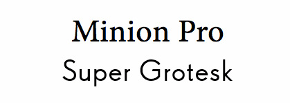
This match creates a luxurious finish

The ever-popular serifed Minion Pro works perfectly as a headlining font in this luxurious pairing. Coupled with the nimble sans-serif Super Grotesk, these two fonts carry a modern sense of elegance with minimal effort.

03. Kaufmann and NeutraDemi

Font pairings: Kaufmann and NeutraDemi

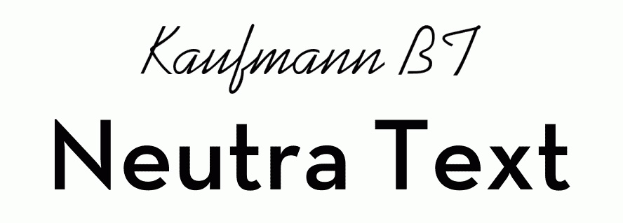
At a dash of handwritten flair with this font pairing

The flowing, handwritten stylings of Kaufmann add a touch of personality to this odd couple. Offsetting the straight and angular sans-serifed NeutraDemi perfectly, these two might not make a likely match, but that doesn't stop them playing off one another beautifully.

04. Brandon Grotesque and Minion Pro

Font pairings: Brandon grotesque minion pro

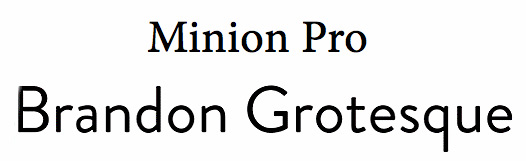
Minion Pro is the perfect choice for small text

The reliable Minion Pro makes another appearance, this time playing second fiddle to the bold and attention-grabbing Brandon Grotesque. It's a classic serif and sans-serif font pairing, with both typefaces remaining crisp and easy to scan.

05. Helvetica Neue and Garamond

Font pairings: Helvetica Neue and Garamond

A type match made in heaven

A famously harmonious duo, with the ubiquitous Neo-Grotesque sans serif for headlines, and the classic Old Style serif for text. Mix up weights and sizes between the two neutral families to establish hierarchy.

06. Caslon and Myriad

Font pairings: Caslon and Myriad

1700s meets late 20th century

Another classic font pairing, this time between an 18th century Old Style serif and a late-20th century Humanist sans serif. Myriad is famously used in Apple’s corporate communication, as well as in the Rolls Royce logo.

07. Fontin and Fontin Sans

Font pairings: Fontin and Fontin Sans

These Dutch typefaces are ideal partners

Our second superfamily, Fontin was designed by Dutch foundry exljbris specifically to be used at small sizes, with a loose spacing and tall x-height. Fontin Sans is designed as an ideal partner for it.

08. Minion and Poppl-Laudatio

Font pairings: Minion and Poppl-Laudatio

Two typefaces with personality that bond perfectly

An Old Style serif typeface with personality, Minion was designed in 1990 but inspired by late Renaissance era type. Although technically a sans serif, Poppl-Laudatio's subtle flared details bring out its pronounced serifs.

09. Liberation Serif and Liberation Sans

Font pairings: Liberation Serif and Liberation Sans

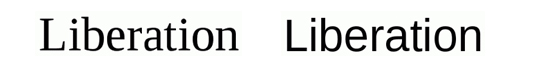
An open source superfamily pairing

Another superfamily, which also includes Sans Narrow and Mono variations, Liberation was intended as an open-source substitute for many commonly used Windows fonts, such as Arial, Times New Roman and Courier New.

10. Trade Gothic Bold and Sabon

Font pairings: Trade Gothic Bold and Sabon

These readable typefaces combine well

This pairing is particularly effective when Trade Gothic is used in its Bold weight for headlines, to set off Jan Tschichold's classic Old Style serif face for text. Both typefaces are highly readable, with a tall x-height, and combine well.

11. Scala and Scala Sans

Font pairings: Scala and Scala Sans

A hugely versatile pairing

FontFont’s superfamily began with the serif version in 1990, followed in ’92 by its sans serif companion. With small caps, various ligatures and old-style figures, it’s hugely versatile and widely used in publishing.

12. Rockwell Bold and Bembo

Font pairings: Rockwell and Bembo

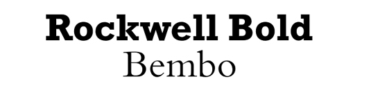
Bold and attention-grabbing meets calmly neutral

One of the classic slab serifs, Rockwell was designed in the 1930s and has a huge amount of personality and attention-grabbing potential when used bold. The much more conservative serif Bembo is neutral but versatile.

13. Myriad Black and Minion

Font pairings: Myriad and Minion

A great combination for clear hierarchy

Myriad and Minion have already cropped up in different font pairings earlier in the list, but this combination of the shouty ultra-bold Black version of the former and the text weight of the latter achieves clear hierarchy.

14. Souvenir and Futura Bold

Font pairings: Souvenir and Futura

Two strong type personalities that work well together

Mixing two strong typographic personalities rarely works, as they end up fighting. Souvenir is softer and more playful than many of its Old Style serif counterparts, while Futura Bold is quirky without being too dominant.

15. Dax Bold and Caslon

Font pairings: Dax and Caslon

Caslon’s second entry on this list

One of the most versatile Old Style serifs, Caslon also appeared earlier on this list. Its neutrality lets the informal, modern Dax Bold deliver strong personality for a headline without competing for attention.

16. Aviano and Aviano Sans

Font pairings: Aviano and Aviano Sans

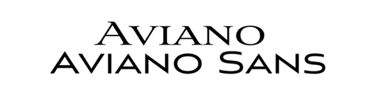
Two tilting typefaces working in harmony

Only available in all-caps varieties, Aviano has sharp, edgy serifs that give it a distinctive personality – while its sans serif version is smoother. They combine well to create hierarchy between two titling faces.

17. Antique Olive Bold and Chaparral

Font pairings: Antique Olive and Chaparral

A quite distinctive font pairing

Initially designed as an alternative to Helvetica and Univers, Antique Olive has a very tall x-height with short ascenders and descenders that make it highly distinctive in display form. Chaparral has a modern feeling but is a much more neutral slab serif.

18. TheSerif and TheSans

Font pairings: TheSerif and TheSans

These typefaces were made to work together

The rather straightforward naming strategy within LucasFonts’ Thesis typeface superfamily makes the foundry's intentions pretty clear: these are totally complementary, and each comes with its own sub-varieties.

19. Renault Light and Apex-New

Font pairings: Renault and Apex

Contemporary sans serif meets authoritative serif

An ideal combination for formal corporate use: both Renault and Apex-New have a very similar ratio of x-height to body height for an effortless partnership between contemporary sans serif and authoritative serif.

20. Calluna and Calluna Sans

Font pairings: Calluna and Calluna Sans

Calluna was born from experimentation

Another exljbris creation, Calluna was born out of an experiment with adding slab serifs to Museo, giving designer Jos Buivenga the idea of 'serifs with direction'. The result is a highly distinctive text face that later spawned a sans serif companion.

You might like these other typography articles:

20 fonts every graphic designer should ownHow to create your own font5 fonts created by famous designers and why they work

Collective #343

Original Source: http://feedproxy.google.com/~r/tympanus/~3/P4J69e_eR_4/

C343_FullStory

This content is sponsored via Syndicate Ads
See What Your Users See With FullStory

FullStory helps you build incredible online experiences by capturing every click, swipe, and scroll, then replaying sessions with pixel-perfect clarity.

Try FullStory, free

C343_CustomElementsEverywhere

Custom Elements Everywhere

A project that shows interoperability issues with Custom Elements and other frameworks, and highlights potential fixes.

Check it out

C343_cboard

Cboard: AAC Communication Board for the Browser

Cboard is an augmentative and alternative communication (AAC) web application, allowing users with speech and language impairments (autism, cerebral palsy) to communicate by symbols and text-to-speech. By Shay Cojocaru.

Check it out

C343_PDF

pdf-bot

A Node queue API for generating PDFs using headless Chrome. Comes with a CLI, S3 storage and webhooks for notifying subscribers about generated PDFs. By Esben Petersen.

Check it out

C343_InterfaceFont

Free Font: Interface

Interface is a typeface specially designed for user interfaces, with excellent legibility at small sizes.

Get it

C343_dashboard

Electron Webpack Dashboard

Electron desktop GUI for the Webpack dashboard by Formidable. Read more about it in this article.

Check it out

C343_QuantumCSS

Inside a super fast CSS engine: Quantum CSS (aka Stylo)

Lin Clark introduces the new CSS engine that is now available for testing in Firefox Nightly.

Read it

C343_HN_ReactLicense

Comments on “Explaining React’s License”

Facebook refuses to remove a controversial clause from React’s license that makes developers feel stranded and insecure about FB’s open source spirit.

Read it

C343_v8

How JavaScript works: inside the V8 engine + 5 tips on how to write optimized code

Alex Zlatkov dives into the internal parts of Google’s V8 JavaScript engine and provides some tips on how to write better JavaScript code.

Read it

C343_PaintWebGL

WebGL Fluid Simulation

A fantastic WebGL demo by Pavel Dobryakov.

Check it out

C343_pushnotifications

Implementing Push Notifications: Setting Up & Firebase

Part one of a two-part series on implementing push notifications. By Pascal Klau.

Read it

C343_Ptsjs

Pts.js

A great library that enables you to compose and visualize points in spaces.

Check it out

C343_Font1

Free font: Celestina

A lovely handwritten brush font designed by Antonina Zhulkova.

Get it

C343_AwesomeLinux

Awesome Linux Software

A list of awesome applications, software, tools and other materials for Linux distros. By Luong T.T. Vo.

Check it out

C343_SketchPlugin

How To Create A Sketch Plugin With Front-End Technologies

Zachary Schuessler shows how to use WebView to create a Sketch plugin using HTML, CSS and JavaScript.

Read it

C343_AsyncAwait

Async/Await Will Make Your Code Simpler

Read how Patrick Triest learned to stop writing callback functions and love JavaScript ES8.

Read it

C343_thinklikeprogrammer

How to think like a programmer

In case you missed it: learn how to think like a programmer with these useful tips. By Zell Liew.

Read it

C343_WaveSVG

SVG Gradient Wave Generator

A generator by Fabio Ottaviani for creating interesting SVG wave patterns with gradients.

Check it out

C343_vuebrunch

Vue.js + Brunch: The Webpack Alternative You’ve Been Hungry For

Anthony Gore shows how to use Brunch with Vue.js, a Webpack alternative for faster and more compact compilation.

Read it

C343_Chrome

Run multiple versions of Chrome side-by-side

Chrome Beta and Chrome Dev can now be installed on the same Windows computer as stable Chrome and run simultaneously, allowing developers to more easily test their site across multiple versions of Chrome.

Read it

C343_HowMachinesLearn

How Machines Learn: A Practical Guide

Karlijn Willems lists seven steps (and 50+ resources) that will help you get started with machine learning.

Read it

C343_Macos

My wonderful world of macOS

A list of applications, alfred workflows and various tools that make a macOS experience even more amazing. By Nikita Voloboev.

Check it out

Collective #343 was written by Pedro Botelho and published on Codrops.

UX Meets MBA: What Happens When A Designer Goes To Business School

Original Source: https://www.smashingmagazine.com/2017/08/ux-mba-designer-business/


If great design can imbue customers with trust, why are designers so removed from product management and the larger business strategy? As a VP of UX with an MBA, I strive to bring both worlds together to create a new model in which user experience and design align with overall business strategy and company vision to drive increased revenue and customer engagement.

UX Meets MBA: What Happens When A Designer Goes To Business School

As the Internet became commercially viable, “first to market” generally prevailed as a dominant corporate strategy. However, as technology has become more open and reusable, product differentiation is now a proven strategic blueprint. This tectonic shift has been a boon for the design discipline. Consequently, design has gotten the proverbial “seat at the table” and is now expected to be a driving, strategic function.

The post UX Meets MBA: What Happens When A Designer Goes To Business School appeared first on Smashing Magazine.

Removing Friction In UX: Last-Minute Travel Planning And Activity Booking (A Case Study)

Original Source: https://www.smashingmagazine.com/2017/08/removing-friction-ux-last-minute-travel-planning-activity-booking/


Most travellers make last-minute decisions, even though they spend significant time researching things to do before embarking on their trip. Finding a hotel and flight is relatively easy, but when it comes to tours and activities, the problem is that late or last-minute bookings are not always available.

Removing Friction In UX: Last-Minute Travel Planning And Activity Booking

And if they are available, the process of making a purchase online is often hard. The mobile experience can also be limited because many websites are slow or their booking process is long and complex.

The post Removing Friction In UX: Last-Minute Travel Planning And Activity Booking (A Case Study) appeared first on Smashing Magazine.

Book Review – Universe: Exploring the Astronomical World

Original Source: http://feedproxy.google.com/~r/abduzeedo/~3/Cdz0U6_UJAA/book-review-universe-exploring-astronomical-world

Book Review – Universe: Exploring the Astronomical World

Book Review - Universe: Exploring the Astronomical World

ibby
Aug 24, 2017

With all of the eclipse hullabaloo we felt very apropos to feature this beautiful book Universe: Exploring the Astronomical World by acclaimed astronomer Paul Murdin. Previous to studying the skies above the US, Australia, England, Scotland and Spain, Murdin was a research scientist for the UK Government and the Royal Astronomical Society. This book is for anyone in your life with an eye for art and an obsession with astronomy. One can explore the stars and planets from ancient cave paintings to animation all brought to life by an international panel of experts.

“I believe everyone should have a broad picture of how the universe operates and our place in it. It is a basic human desire.” —Stephen Hawking

This beautiful book is a groundbreaking survey that celebrates the popular subject of astronomy through 300 images created by those who have been inspired by the mystery of our beloved universe above. Arranged to highlight thought-provoking contrasts and similarities,  you’ll be delighted by paintings, photographs, sculpture, animation, prints, sketches, and digital renderings with iconic works by renowned photographers, artists, and astronomers alongside previously unpublished finds.

You can pre-order Universe now for $59.95 and this title will ship by October 9th, just in time for the holidays. 

Buy Now

book review
universe
Astronomical World


Image Optimization in Advanced Web Development

Original Source: http://feedproxy.google.com/~r/1stwebdesigner/~3/w19uUDx023c/

Web-quality imagery is always a balancing act between using the smallest possible file size while providing good image quality. Embedding a photo straight off your DSLR may look nice, but it will slow your website’s load to a crawl, while an over-compressed image may improve the speed of your site yet discredit the design and overall aesthetic.

For the two types of image assets we predominantly deal with – photos and icons/illustrations – we perform a mixture of image quality checks and compression techniques that work well in most case scenarios.

File Types and When to Use Them

There are three image file types we use when building websites: .jpg .png and .svg.

JPGs are best used for photos such as landscapes, scenery or people. For imagery in content, such as a blog article image, we aim for 20-70kb. Larger background photos can get up to 500kb, but 200kb is a good average.

JPGs are lossy (they recompress and degrade the image quality each time you export), and they don’t manage gradients very well. If you have a gradient in an image, sometimes you can separate the image into two cuts so that you can render the gradient in a separate background using CSS gradients instead.

PNGs are best for assets such as logos and icons because they support transparency and because logo and icons often use a more limited color palette – since PNGs achieve compression through a reduction in the number of colors.

A PNG can be lossy, but we typically use lossless, meaning every pixel is saved exactly without degrading the color palette, resulting in a higher-quality image.

SVGs have the best quality of all and are used for vector art due to their scalability. We often use them with logos, however, SVGs do create more work for the browser to render and can create sluggishness as the page loads, so the quality of your image should always be balanced against its complexity.

As an example of when we use PNGs and SVGs, compare the logos for Silver Screen Insider and Bozeman Websites. For the former, we used an SVG. For Bozeman Websites, because of the complexity introduced with CSS animation when a user scrolls down, we chose to use PNGs instead so as not to compromise browser performance.

Sometimes the best solution is a combination of both: for the logo on JTech’s website, the “JT” component is a PNG, but the “Celebrating 20 Years” is an SVG in order for it to retain its quality in all viewport sizes.

Optimization Techniques

In order to get the best possible results, it is important to optimize your images. To do so, we utilize three programs: ImageOptim (for JPGs and PNGs), ImageAlpha (for PNGs) and Scour (for SVGs).

Optimizing JPGs

ImageOptim reduces the file size of JPGs and PNGs. For large images, such as the ones we use for background panels, we cap dimensions at 1600x1200px. For content photos such as an image inserted in a blog article, we cap dimensions between 200-800px wide.

After resizing to its final resolution, the image is output in Photoshop using the best quality available. Each time we compress the image it loses some fidelity, so we prefer to rely solely on ImageOptim for compression rather than having Photoshop do a pass. Photoshop is noticeably less efficient: its “save for web” at quality 65 produces an image of equal file size but poorer fidelity than ImageOptim’s quality 85.

Retina JPGs

When targeting retina or other high-density displays, we’ve found it works best to save a single JPG at twice the resolution, but use higher compression, around 50-60 in ImageOptim, which can produce a high-quality image that looks good on both retina and standard, lower-density displays. This technique allows us to use a single asset for retina and standard displays rather than cutting and loading multiple versions and without quadrupling the size of our images.

Optimizing PNGs

For PNGs, we output from Photoshop using PNG 24 in their “save for web” option, then run it through ImageOptim. If it detects that the image is using fewer than 256 colors, ImageOptim will losslessly convert the image to a PNG 8, a simpler file format that can produce very light-weight files.

With ImageOptim, our final output of an image without too many complexities (minimal color, simple shapes, and resolution less than 200x200px) can range in size from 15kb down to under 1kb.

Optimizing Larger PNGs

For more complex images, if we can’t produce a file between 15kb and 50kb with ImageOptim, we use ImageAlpha. ImageAlpha is used to process PNGs from a PNG 24 (millions of colors) to a PNG 8 (256 colors maximum), changing the image from lossless to lossy, ultimately aiming for the one with the smallest number of colors.

Lossiness in this format primarily means strategic refinement of the color palette, eliminating the least-noticeable colors to produce an image that still looks great while reducing its complexity.

After exporting from ImageAlpha, we run it through ImageOptim so it can be optimized further.

Optimizing SVGs

When it comes to SVGs, we reduce as much complexity as possible before we export the image from Illustrator. An often tedious process due to their size, we first try to reduce the number of layers to a minimum while still accurately displaying the artwork. It is then saved as an SVG in Illustrator and optimized with a program called Scour.

We use this automator script to make it a bit easier to use in macOS, allowing you to right-click an SVG file in the Finder and optimize the SVG through the Services menu. We often use font files for vector graphics that are single-color with a program called Glyphs.

Conclusion

Properly optimizing imagery is just another way we can improve the performance of our websites, prevent browser bloat, reduce server and bandwidth resource usage, hasten page load time, keep the development infrastructure clean and provide a much more desirable experience for the end-user.

We hope this exploration of our experience with JPG, PNG and SVG file types, image compression and quality tools are a resource for you as we continually refine our own process to produce websites of high caliber.


12 Essential Scroll-To-View Animation Trends

Original Source: https://www.webdesignerdepot.com/2017/08/12-essential-scroll-to-view-animation-trends/

Animated page elements are super common on landing pages and startup websites. But they’re not always talked about in design circles because the idea of “animate on view” isn’t covered a lot.

I use the phrase scroll-to-view because it seems like an accurate description. Basically as you scroll down the page new animated elements come into view.

It’s not a technique that works for every website but it does add a nice touch into certain layouts. And I’ve curated some of my favorites here to showcase how these scroll-to-view animations work and why you might try using them yourself.

1. Tomorrow Sleep

On the Tomorrow Sleep website you’ll notice a few fairly benign animated effects. These fade different pieces of text and CTAs into view all around the layout.

What’s interesting is how most of the images and background areas are fully visible even on first scroll. Many websites use fading animation to display images and screenshots while keeping the text visible.

This minor difference helps draw attention to the text as it fades into view. A great way to capture attention from visitors browsing along.

2. Twist

Another technique I often see is targeting most of the page’s content for on-scroll animations.

For example the Twist app homepage includes varying page segments and blocks of text that animate in & out of view on scroll. These have a very soft fading effect so they’re noticeable yet not too harsh.

Some visitors may be annoyed by the delay but I don’t think it’s too long. Plus it only animates one time so if you hit the bottom of the page all animations are done.

3. Yarn App

For much more complex animations check out the Yarn App lander. This one has multi-part animations and even elements that come into view from different angles.

Some of the screenshot demo images animate upwards while the accompanying text/BG patterns animate down into view. This alternating style is pretty unique and not something I see often.

However the landing page is also incredibly simple and there isn’t much else here to grab attention. In this case varying animations work nicely.

4. DashFlow

Out of all these examples I think DashFlow uses the most common animation techniques.

This lander animates images and text into view all in one sitting. It’s real simple and uses a single-column layout so all content flows straight down in a linear path.

Nothing inherently special about this design beyond the very clear-cut method of animating items on scroll. A great style if you have a similar website and want to keep the animations simple.

5. Quuu Promote

Quuu Promote keeps animations to the bare minimum and only uses them in CTA areas.

I can’t say if this increases conversions but that does seem to be the goal. When you first load the page the very top header animates into view with a tilting animation on the CTA.

As you scroll down you’ll notice the rest of the page is pretty static. But at the bottom there’s one final CTA above the footer that also animates & runs the same tilting animation.

Goes to show you can have on-scroll animation effects that don’t run across the entire page.

6. Qonto

The homepage for Qonto has an interesting take on scroll-to-view animation. It uses the same type of animation across the entire website and animates individual items into view from the side.

For the majority of the page this includes icon sections that have a small graphic above some content explaining the app’s features. Not too subtle yet not overly overt either.

Plus you can find a few other animation styles in the header along with some BG images that fade into view. This page is just a gorgeous example of what web animation can do.

7. Hike

For an example of subtle animations check out Hike.

Their page alternates between animated elements and fixed elements. But the animation effects are fast so you don’t feel annoyed waiting for viewable content.

This is my preference for any scroll-to-animation effect. It’s always a beautiful technique but the timing needs to be quick and to the point. Nobody wants to wait around for content to come into view and Hike clearly understands this.

8. Project Fi

If there’s anyone who knows great UX it’s Google. And across all their products they have a ton of landing pages, Project Fi being one example with some fantastic animations.

These only apply to icons and they don’t fade into view, but rather pop up from lower on the page. As you scroll you’ll find icons that slide up into view for each small section.

It’s a pretty subtle effect but it adds some life into the design. And it’s based solely on the viewer’s position on the page so if you scroll to the top & move back down you’ll be greeted by the same animation effects.

9. Base

The Base CRM homepage is an excellent example of simple animation at work. This site uses custom animation effects to move images up and into the viewer’s eye line.

Based on the number of landing pages I see daily this is very typical of what I expect. It’s not really a complex animation to recreate and it doesn’t affect the experience too much either.

One thing I wish is that the animations would load a bit faster. But beyond that I think this is a prime example of animating images on scroll with a very clean layout to boot.

10. AnyList

All the best mobile applications have their own websites for promotion. And the best ones usually have some pretty snazzy animation styles.

AnyList mixes a few different techniques together on one page. Their header image animates up from beneath the cut-off area but it’s the only “moving” animation on the page.

Everything else just fades into view and it all uses a pretty quick load time for the animation. These techniques are used elsewhere on the site which gives it a more cohesive feel.

11. Ernest

The page style for Ernest is a little different than other landing pages I’ve covered.

It uses parallax scrolling animations to create motion on a single page layout with different sections.

These vary based on the direction you’re scrolling whether you move up or down, and at what speed. They also vary with intensity based on the different sections of the page.

You can navigate using the side dot navigation menu and this quickly jumps around the page to different areas. It’s one of the few techniques you’ll often see on parallax pages and it certainly helps Ernest stand out from the crowd.

12. TaxiNet

To catch a glimpse of full-page animations in action take a look at the TaxiNet website.

It’s a smorgasbord of scroll-based animation effects tied to icons, text, images, and even background styles. Individual page background colors animate into view with the user, definitely not a typical technique but certainly an interesting one.

If you like this style you could absolutely apply a similar approach to your own landing page. Just make sure you keep the animations snappy and quick because nobody wants to wait around for your neat animations to load.

But if you do ‘em right these scroll-to-view elements add a nice effect to any landing page.

LAST DAY: Zelda – A Beautiful and Classy Script Font – only $7!

Source

p img {display:inline-block; margin-right:10px;}
.alignleft {float:left;}
p.showcase {clear:both;}
body#browserfriendly p, body#podcast p, div#emailbody p{margin:0;}

How to Build and Organize Tables in WordPress? Try wpDataTables

Original Source: http://feedproxy.google.com/~r/1stwebdesigner/~3/EuXvIeliBfY/

You have a beautiful, responsive website. Better yet, your visitors love it. Why not – it’s filled with quality content, and it features eye-catching images. You also put effort into incorporating interesting and thought-provoking videos.

Occasionally, however, you hit a bump in the road. That’s when you’re trying to manipulate a huge amount of data. It is not that easy to fit it into a neat-looking, easily-readable table to place on your website.

No matter how hard you try, the resulting table is incomplete or unattractive. Sometimes this huge amount of data just crashes your page when you attempt to load it.

That’s where you’ll find the wpDataTables plugin comes in handy. With this WordPress plugin, you can display any amount of data in a tabular format on your website. You can do so intuitively and interactively.

If you purchase wpDataTables between the 22nd and 29th of August, it’s yours for $22. This is a 50% discount!

Who Has a Use for It?

One of the reasons professionals like wpDataTables is because it doesn’t need a single line of code. Thus, this plugin saves programmers and web designers a ton of time. However, it’s not just for techies.

Anyone faced with a need to organize data in a tabular format will find this WordPress plugin useful.

This would include:

Small business and eCommerce store owners;
Human Resource and other workplace administrators;
Event planners, bloggers, and marketers

What Can You Use WpDataTables For?

You can use this WordPress table plugin to convert any amount of data into readable tables. This includes millions of rows of data, arranged in hundreds or categories or labels.

Moreover, with this plugin, you can publish responsive and informative tables in WordPress. You can use it for:

Product and price comparisons, product and services catalogs, price lists, and inventories
Event rundowns, including sporting events results and statistics
Progress tracking for businesses and projects, and
All types of data collection

How to Use This WordPress Table Plugin: Six Simple Steps, plus a Bonus Step

Creating and publishing a responsive data table is easier than you think. All you need to do is follow these simple steps:

Step 1: Save time from the get-go by being prepared

The best way to successfully work your way through any process is to have a plan. In this case, you want to have your data organized to fit into your tables’ structure. If you already have a table in Excel, you’re just a couple of clicks away from a good start.

The wpDataTables plugin accepts most any type of data; e.g., Google Spreadsheets, Excel, or MySQL.

Want a PHP array-based table with images for a product catalog? Not a problem with this WordPress table plugin.

Step 2: Adding a new table takes only 2 seconds

Go to the left-hand side of your WordPress dashboard, navigate to wpDataTables. Then click Add New.

Step 3: Now, it’s time to organize your table – down to the minutest detail.

When you click on Add New, a Settings menu will appear; from which you can adjust your new table’s parameters.

Now it’s time to give your table a title. You have the option of making it public, or visible to you alone.

Next step: select your data source. You can choose from Excel, Google Spreadsheet, XML, CSV, JSON, or Serialized PHP Array.

You can also build your table manually with the plugin. This does not require the use of the table source. Feel free to create your table manually in WP Admin with wpDataTables.

Now, you can upload your data file of choice. Don’t be concerned with how massive or complex it might be; wpDataTables can accommodate it.

That’s the basics. There are plenty of other useful and interesting features you can work with to make your table just as you want it. Enjoy yourself by taking the time to experiment with them first.

Here’s a sampling of what you can do:

You can make your table responsive (Responsive feature);
You can scroll it horizontally (Scrollable feature);
You can hide it while the page is loading (Hide Table feature);
Do you want to create a filter below each column or within the form? Use the Advanced Filtering feature, or the Filter in Form feature, respectively;
The Table Tools and Enable Sorting features lets you copy, save to Excel or CSV, or sort your tables;
If you want to limit a table’s width, select the Limit Table Layout feature. Also, you can use the Display Length feature to define how many entries you want to display on a page;
If you need to display the sum of the values in numeric columns, the Sum/Totals Row feature will do the trick.

Step 4: Make your table flat-out immaculate

You can preview your table at any time, including when you’re about to make the final touches. This does not involve having to go back and forth to do so.

When you’re satisfied with your table’s structure, it is time to address its aesthetics. Work on different colors, color schemes, or font sizes. You can also edit the columns with respect to their type (numbers, text, strings).

The Conditional Formatting feature is not only useful, but fun to work with. It enables you to highlight rows, columns, or individual cells, based on their content. This is an excellent feature to have available if your table is strictly numerical.

Step 5: Adding a table to a page with a shortcode

When you’re pleased with your table, click Save, and then, Close.

This will take you to the wpDataTables home page. Here you will see your newly-created table, in all its grandeur and ready to publish. You will also be given the shortcode you’ll need to input into your page.

First, copy the shortcode, and then navigate to the page or post the table is to appear on.

Paste the shortcode into the page editor.

Select the location where you want the table to appear on the page. Usually, this is the location that will allow you to build any needed content around it.

Step 6: Publish your table.

Step 6 is not only the easiest step of all, it’s also the most satisfying.

Click on Publish.

That’s it!

The Bonus Step

If you want to have a flawless graph or chart on your website, the wpDataChart Wizard enables you to do just that. As is the case with tables, your graphs and charts can also be responsive. They can also be highly interactive and easily editable.

The Wizard can be used with the Google Charts, Highcharts, and Chart.js render engines.

Wrapping it up

There are other features in addition to those mentioned here. They will help you create beautiful, highly-organized, responsive charts in minutes.

With wpDataTables, there’s no more need for struggling to fit massive amounts of data into a small “box”. Another great advantage is that there is no need to write a single line of code!

You can use wpDataTables to manage and present financial and operation statistics. It also allows you to produce large product or services catalogs in a breeze. Moreover, you can feel like a pro performing complex data analysis and comparisons.

Be sure to mark the period between August 22nd and 29th on your calendar. That’s when you can get wpDataTables at a 50% discount.


An Introduction To Gravit Designer: Designing A Weather App (Part 1)

Original Source: https://www.smashingmagazine.com/2017/08/introduction-gravit-designer-designing-weather-app-part-1/


Being a designer at the moment is great because a wealth of modern design applications are available that let you easily bring your ideas to the screen: Sketch, Affinity Designer, Adobe XD (beta) and Figma, to name just a few (not to mention the classics, Photoshop and Illustrator).

An Introduction To Gravit Designer: Designing A Weather App (Part 1)

One app that is quite new, though — and perhaps a bit overlooked — is the free Gravit Designer app. Gravit gives you all of the tools needed to create functional and elegant screen designs. It can also be used to make icons, designs for print, presentations and much more.

The post An Introduction To Gravit Designer: Designing A Weather App (Part 1) appeared first on Smashing Magazine.