Easy and Responsive Modern CSS Grid Layout
Original Source: https://www.sitepoint.com/easy-responsive-modern-css-grid-layout/
In this article, I’ll show how to create a responsive modern CSS Grid layout, demonstrating how to use fallback code for old browsers, how to add CSS Grid progressively, and how to restructure the layout in small devices and center elements using the alignment properties.
In a previous article we explored four different techniques for easily building responsive grid layouts. That article was written back in 2014 — before CSS Grid was available — so in this tutorial, we’ll be using a similar HTML structure but with modern CSS Grid layout.
Throughout this tutorial, we’ll create a demo with a basic layout using floats and then enhance it with CSS Grid. We’ll demonstrate many useful utilities such as centering elements, spanning items, and easily changing the layout on small devices by redefining grid areas and using media queries. You can find the code in this pen:
See the Pen css-grid-example4 by SitePoint (@SitePoint) on CodePen.
Before we dive into creating our responsive grid demo, let’s first introduce CSS Grid.
CSS Grid is a powerful 2-dimensional system that was added to most modern browsers in 2017. It has dramatically changed the way we’re creating HTML layouts. Grid Layout allows us to create grid structures in CSS and not HTML.
CSS Grid is supported in most modern browsers except for IE11, which supports an older version of the standard that could give a few issues. You can use caniuse.com to check for support.
A Grid Layout has a parent container with the display property set to grid or inline-grid. The child elements of the container are grid items which are implicitly positioned thanks to a powerful Grid algorithm. You can also apply different classes to control the placement, dimensions, position and other aspects of the items.
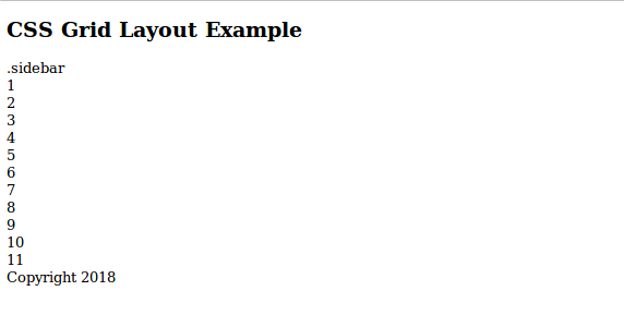
Let’s start with a basic HTML page. Create an HTML file and add the following content:
<header>
<h2>CSS Grid Layout Example</h2>
</header>
<aside>
.sidebar
</aside>
<main>
<article>
<span>1</span>
</article>
<article>
<span>2</span>
</article>
<!–… –>
<article>
<span>11</span>
</article>
</main>
<footer>
Copyright 2018
</footer>
We use HTML semantics to define the header, sidebar, main and footer sections of our page. In the main section, we add a set of items using the <article> tag. <article> is an HTML5 semantic tag that could be used for wrapping independent and self-contained content. A single page could have any number of <article> tags.
This is a screen shot of the page at this stage:
Next, let’s add basic CSS styling. Add a <style> tag in the head of the document and add the following styles:
body {
background: #12458c;
margin: 0rem;
padding: 0px;
font-family: -apple-system, BlinkMacSystemFont,
“Segoe UI”, “Roboto”, “Oxygen”, “Ubuntu”, “Cantarell”,
“Fira Sans”, “Droid Sans”, “Helvetica Neue”,
sans-serif;
}
header {
text-transform: uppercase;
padding-top: 1px;
padding-bottom: 1px;
color: #fff;
border-style: solid;
border-width: 2px;
}
aside {
color: #fff;
border-width:2px;
border-style: solid;
float: left;
width: 6.3rem;
}
footer {
color: #fff;
border-width:2px;
border-style: solid;
clear: both;
}
main {
float: right;
width: calc(100% – 7.2rem);
padding: 5px;
background: hsl(240, 100%, 50%);
}
main > article {
background: hsl(240, 100%, 50%);
background-image: url(‘https://source.unsplash.com/daily’);
color: hsl(240, 0%, 100%);
border-width: 5px;
}
This is a small demonstration page, so we’ll style tags directly to aid readability rather than applying class naming systems.
We use floats to position the sidebar to the left and the main section to the right and we set the width of the sidebar to a fixed 6.3rem width. Then we calculate and set the remaining width for the main section using the CSS calc() function. The main section contains a gallery of items organized as vertical blocks.
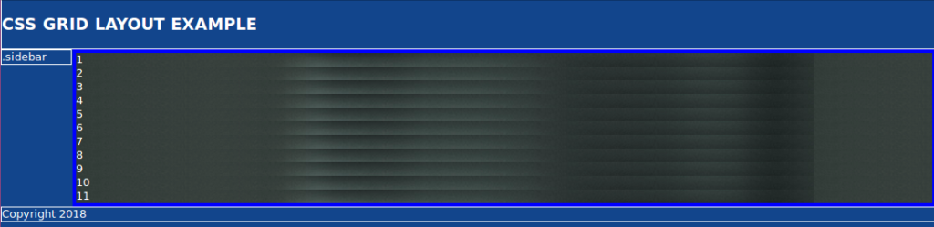
The layout is not perfect. For example, the sidebar does not have the same height as the main content section. There are various CSS techniques to solve the problems but most are hacks or workarounds. Since this layout is a fallback for Grid, it will be seen by a rapidly diminishing number of users. The fallback is usable and good enough.
The latest versions of Chrome, Firefox, Edge, Opera and Safari have support for CSS Grid, so that means if your visitors are using these browsers you don’t need to worry about providing a fallback. Also you need to account for evergreen browsers. The latest versions of Chrome, Firefox, Edge, and Safari are evergreen browsers. That is, they automatically update themselves silently without prompting the user. To ensure your layout works in every browser, you can start with a default float-based fallback then use progressive enhancement techniques to apply a modern Grid layout. Those with older browsers will not receive an identical experience but it will be good enough.
The post Easy and Responsive Modern CSS Grid Layout appeared first on SitePoint.


Leave a Reply
Want to join the discussion?Feel free to contribute!