Original Source: http://feedproxy.google.com/~r/CreativeBloq/~3/MsZ7GBblMd0/websites-10121096
The web is full of endless resources and tutorials on the subject of photography, but sometimes too much choice can be confusing. Here, we've picked the top photography websites that will really help you take your photography skills to the next level.
If you're a designer or creative after stock photography, check out our Best websites to download stock art post. And if you're looking to upgrade your camera, don't miss our guide to the best cameras for creatives.
But if you'd like to learn more about taking stunning photographs, gain inspiration from expert photographers and develop your camera craft, check out these great photo websites.
01. Digital Camera World
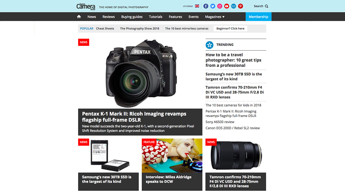
Visit Digital Camera World for daily news, tip, tutorials, reviews and much more
Digital Camera World is the world's fastest-growing photography website, covering every aspect of image-making, from DSLRs and photo editing to mobile photography and drones.
Through informative tutorials, no-nonsense reviews and in-depth buying guides, DCW helps photographers find the best gear, and shows them how to use it. Full disclosure: it's one of our sister titles, also made by Future Publishing.
02. Camera Jabber
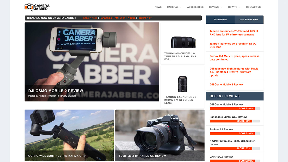
Camera Jabber is a goldmine of news, reviews and tips for photographers
Built by photographers for photographers, Camera Jabber offers up an enticing mix of news, reviews and buyers' guides, on everything from phone cameras and DSLRs up to the latest action and 360 cameras.
You'll also find a wealth of how-to material that'll take you through the photographic basics and on to more specific guides on things like editing your shots and building a portfolio. It's updated daily, and always worth checking in to see what's new.
03. British Journal of Photography
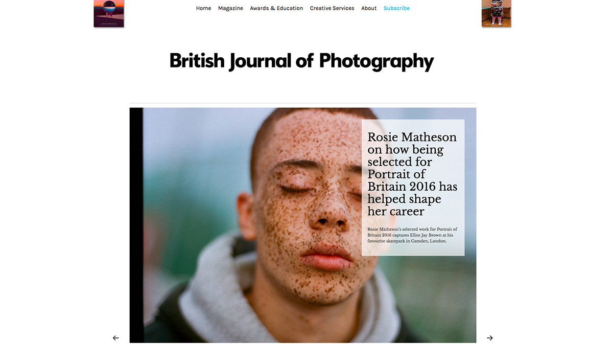
The British Journal Photography has been supporting photographers since 1854
The British Journal of Photography has been around since 1854, and it's kept up with the times since then. Its website is a great accompaniment to the venerable magazine, serving up thought-provoking photography and fresh perspectives every day.
And its student and professional awards are a great way to discover new talent – or, indeed, to get your own photography skills recognised.
04. DIY Photography
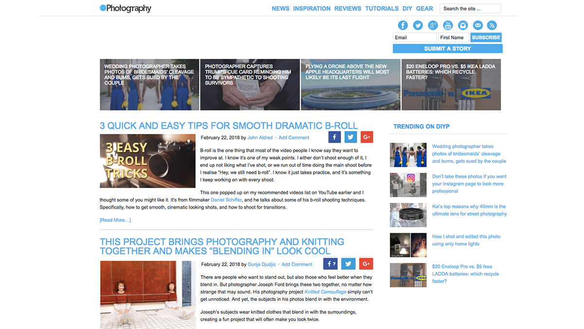
DIY Photography has been running for over 10 years and is rammed with useful advice
Started in 2006 as a place for gear-lusting photographers, DIY Photography is a great place to pick up expert advice and read about the latest kit.
Again written by photographers for photographers, it's heavy on the tutorials with hundreds of useful how-to articles online, plus a whole load of DIY articles that'll help you build your own gear rather than splashing out on expensive kit.
05. iPhone Photography School
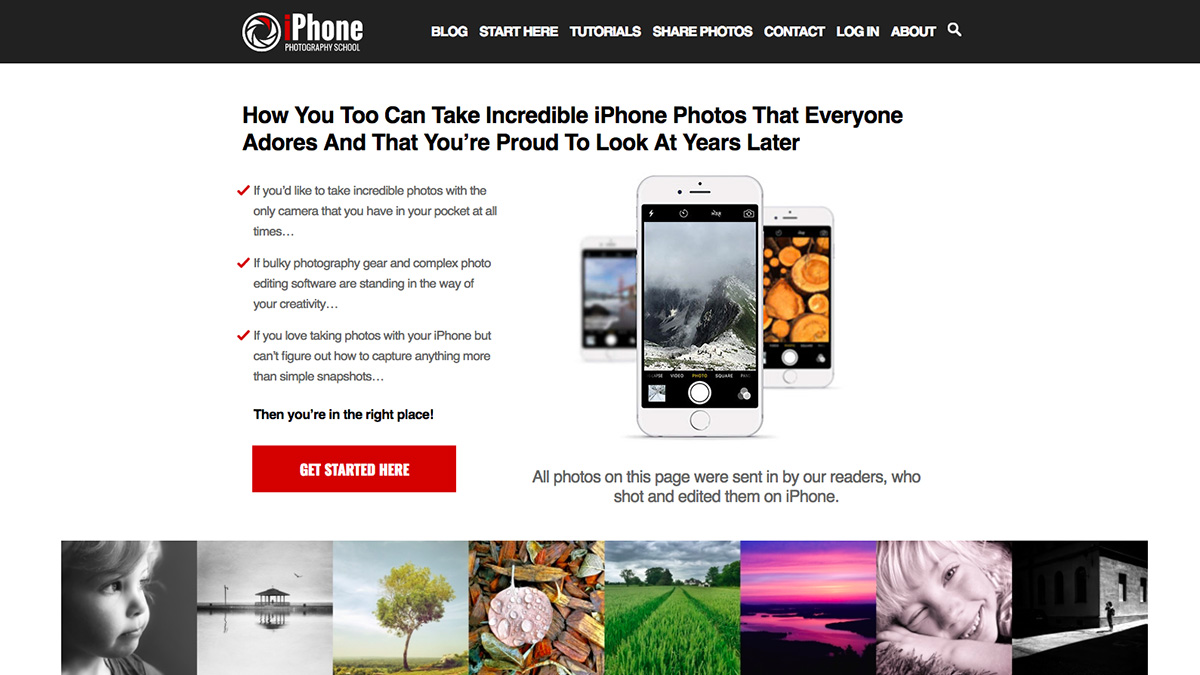
Don’t have a DSLR? You can still take excellent photos with your phone
Just because you don't have a heavyweight camera, it doesn't mean that you can't take beautiful photos. iPhone Photography School has one simple aim: to help you take better photos with your iPhone than most people can with a DSLR. It does this with plenty of in-depth tutorials covering photography techniques and photo editing, as well as inspiring articles and regular competitions so you can pit your newfound skills against others.
06. Digital Photography Review
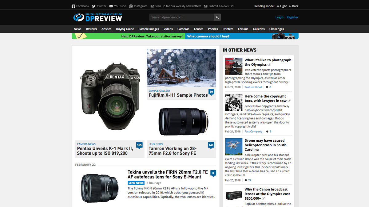
Digital Photography Review is bursting at the virtual seams with all the sector’s latest news and product reviews
Touted as the number one destination for everything digital photography-related, Digital Photography Review is bursting at the virtual seams with all the sector's latest news and product reviews.
Complete with video tutorials, buying guides and forums, there's plenty on this photography website to keep you hooked and clicking back for more.
07. The Spruce: Photography
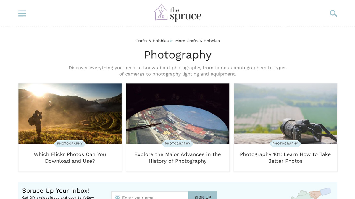
The Spruce: Photography is both an advice centre and repository of extensive further reading
Written by a host of photography experts, The Spruce: Photography is both an advice centre and a repository of extensive further reading. Once you're on this website's photography channel, you'll be clicking from one useful video to another before veering off down a rabbit hole of enlightening articles. There's plenty to enjoy – just make sure that you don't get lost.
08. Digital Photography School
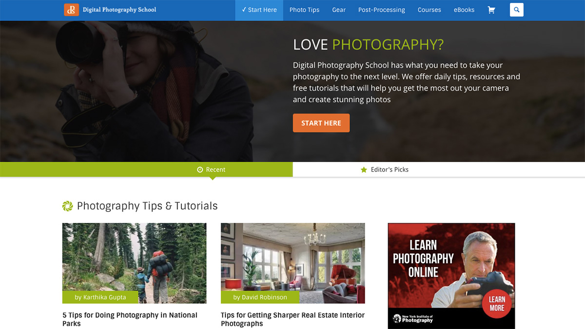
Digital Photographers School aims to help photographers get the most out of their cameras
Digital photography enthusiast Darren Rowse is the man behind Digital Photography School, a site that aims to help photographers get the most out of their cameras. With sections including photo tips, gear and post-processing, all the essentials are well covered.
09. Strobist
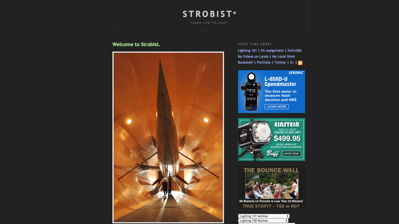
Strobist is a must for anyone just starting out with light
Strobist is about one thing: Learning how to use off-camera flash with your DSLR to take your photos to the next level. Or the next 10 levels. If you’re a complete beginner at lighting, no worries. The free Lighting 101 course starts from the very beginning, and can get you up and running fast.
10. 500px
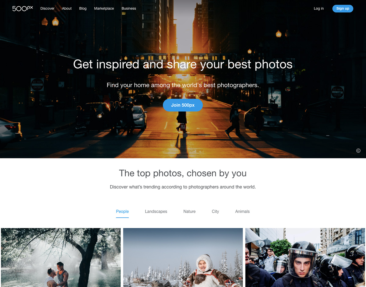
Connect with like-minded people at online photography community 500px
If it's inspirational images you're after then look no further than 500px. Founded by Oleg Gutsol and Evgeny Tchebotarev, this online photography community is a place to gain exposure, find inspiration and connect with other photographers. The site has had a recent redesign, and with a library of over six million photos you'll never run out of pretty pictures to look at and feel inspired by.
11. The Photo Argus
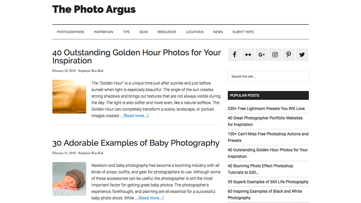
Find helpful tips, tricks and techniques on photography blog The Photo Argus
The Photo Argus is an online resource for photographers – from novice users to advanced pros. The site provides useful information, inspiration, techniques, photographer showcases and more. Find what you're looking for using the organised topic sections or browse through the Popular Posts and the most up-to-date articles on the homepage.
12. PetaPixel
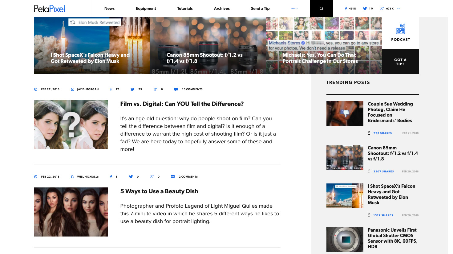
Tutorials cover a range of topics
PetaPixel is a website offering tutorials, news and kit. The tutorials are imaginative and practical, offering videos and screen grabs to guide you through each step.
Equipment covers new camera, lens and other photography kit announcements, but doesn't include reviews (you'll need to look elsewhere for those). News covers all sorts of interesting developments in the photography world – both hilarious and informative.
13. Photography Week
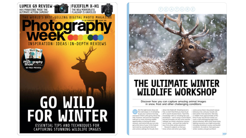
Photography Week is a digital magazine
While not technically a website, Photography Week is a digital magazine, so we're including it here. Packed with beautiful photography, it offers heaps of fresh inspiration every week.
Full disclosure: It's another of our sister titles, also made by Future Publishing. Get it on iPad and iPhone, Android devices or through Zinio for multiple devices, including computers.
Related articles:
15 ways to improve your photography skillsThe best cameras for creativesThe best photo editor apps


 Properly protecting the security of your website has to be number 1 on everybody’s digital checklist. Unfortunately, security is only as strong as the weakest link in the chain, and that weakest link is usually your password.


 Storytelling is great for design, so long as you aren’t trying to sell a fairy tale…