Collective #426

Original Source: http://feedproxy.google.com/~r/tympanus/~3/UEneBiHoou8/

C426_WOTW

Inspirational Website of the Week: OGINO

Pure and perfect design with smooth interactions. Our pick this week.

Get inspired

C426_Monday

This content is sponsored via Syndicate Ads
monday.com – A Revolutionary Visual Project Management Tool

?monday.com – the next generation of visual tools, built specifically for designers and developers. See what everyone on your team’s working on in a single glance.

Sign me up

C426_modules

Using JavaScript modules on the web

Addy Osmani and Mathias Bynens explain how to use JavaScript modules which are now supported in all major browsers.

Read it

C426_countdown

Building a Fancy Countdown Timer with MomentumSlider.js

Luis Manuel shows how to code a really nice looking countdown timer.

Read it

C426_jsconsole

How you can improve your workflow using the JavaScript console

Riccardo Canella shows how to use the JavaScript console to write, manage, and monitor JavaScript in the browser.

Read it

C426_soccerpattern

Soccerpattern

A retrospective of the greatest jerseys worn during soccer worldcups from 1930 to nowadays, as pattern designs.

Check it out

C426_vibora

Vibora (beta)

A very efficient, asynchronous Python web framework.

Check it out

C426_teleport

Introducing Teleport: Over-the-air hot reloading & debugging for PWAs

Eric Simons introduces Teleport, a fast dev-server proxy for simple and painless PWA debugging.

Check it out

C426_centering

Centering: The Newest Coolest Way vs. The Oldest Coolest Way

Chris Coyier updates us with the freshest way to center items using CSS Grid.

Check it out

C426_redux

Understanding Redux: The World’s Easiest Guide to Beginning Redux

A comprehensive and easy to understand guide to Redux by Ohans Emmanuel.

Read it

C426_pixelbuddha

Terrazzo Abstract Patterns

A set of 16 modern patterns for your next stylish design. By Pixelbuddha.

Check it out

C426_voronoi

Voronoi Airports WebGL

A fantastic WebGL experiment showing all airports in the world as a Voronoi diagram. By Callum Prentice.

Check it out

C426_websiteperf

Optimize Website Speed With Chrome DevTools

A tutorial by Kayce Basques where he shows how to use Chrome DevTools to find ways to make your websites load faster.

Read it

C426_browserbug2

I discovered a browser bug

Jake Archibald tells the interesting story of a huge browser bug he ran into.

Read it

C426_notifications

iOS 12 Dark Mode Notifications

Gabrielle Wee created this beautiful design for dark mode notifications on iOS 12.

Check it out

C426_video

Three.js & Video: A love story

Read about a great experiment of interactive video in HTML5 using Three.js by Héctor Monerris.

Read it

C426_placeholder

Don’t Use The Placeholder Attribute

Read why Eric Bailey urges developers to stop using the placeholder attribute.

Read it

C426_layoutsgrid

Three Grids

Tobi Reif made three different responsive layouts that show the awesomeness of CSS Grid.

Check it out

C426_logos

Open Logos

Some lovely free logos for your open source project.

Check it out

C426_drop

SVG Drip Loader

A fun SVG loader by Chris Gannon.

Check it out

C426_draw

Drawing Zone

Michael Shillingburg updated his fun doodeling tool.

Check it out

Collective #426 was written by Pedro Botelho and published on Codrops.

Improving Performance Perception with Pingdom and GTmetrix

Original Source: https://www.sitepoint.com/improving-performance-perception-pingdom-gtmetrix/

This article is part of a series on building a sample application — a multi-image gallery blog — for performance benchmarking and optimizations. (View the repo here.)

In this article, we’ll analyze our gallery application using the tools we explained in the previous guide, and we’ll look at possible ways to further improve its performance.

As per the previous post, please set up Ngrok and pipe to the locally hosted app through it, or host the app on a demo server of your own. This static URL will enable us to test our app with external tools like GTmetrix and Pingdom Tools.

GTmetrix first test

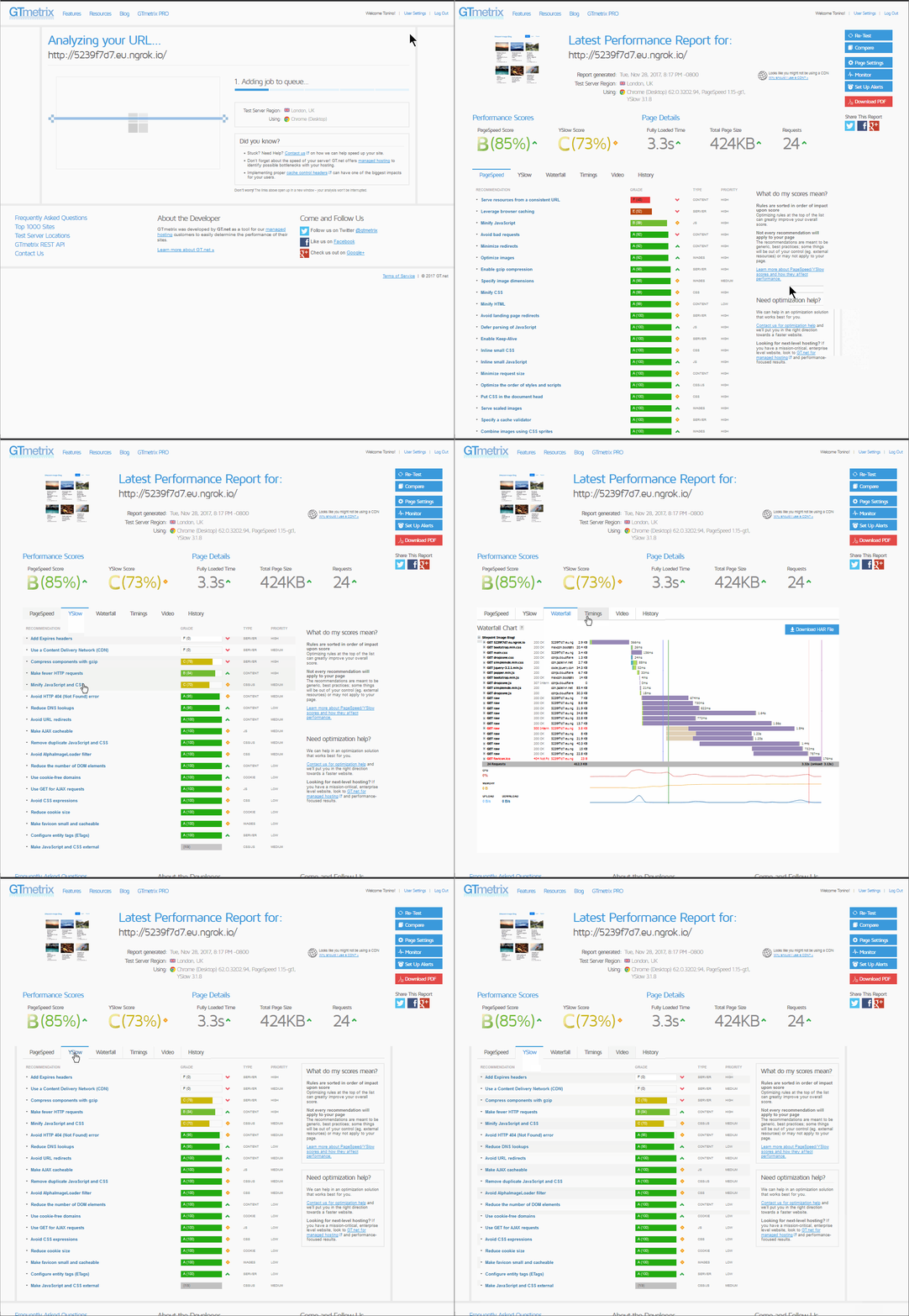
We went and scanned our website with GTmetrix to see how we can improve it. We see that results, albeit not catastrophically bad, still have room for improvement.

The first tab — PageSpeed — contains a list of recommendations by Google. The first item under the PageSpeed tab — a warning about a consistent URL — pertains to our application outputting the images randomly, so that is an item we will skip. The next thing we can do something about is browser caching.

Browser Caching

Browser caching

We see that there is a main.css file that needs its Expires headers set, and the images in the gallery need the same thing. Now, the first idea for these static files would be to set this in our Nginx configuration:

location ~* .(?:ico|css|js|gif|jpe?g|png)$ {
expires 14d;
}

We can simply put this inside our server block and leave it to Nginx, right?

Well, not really. This will take care of our static files, like CSS, but the /raw images we are being warned about aren’t really that static. So this snippet in our Nginx configuration won’t exactly fix this issue so easily. For our images, we have an actual controller that creates these on the fly, so it would be ideal if we could set our response headers right there, in the controller. For some reason, these weren’t being set properly by Glide.

Maybe we could set our Nginx directive in a way to include the raw resources, but we felt the controller approach to be more future-proof. This is because we aren’t sure what other content may end up with an raw suffix eventually — maybe some videos, or even audio files.

So, we opened /src/ImageController.php in our image gallery app, and dropped these two lines inside of our serveImageAction(), just before the line return $response:

// cache for 2 weeks
$response->setSharedMaxAge(1209600);
// (optional) set a custom Cache-Control directive
$response->headers->addCacheControlDirective(‘must-revalidate’, true);

This will modify our dynamic image responses by adding the proper Cache Control and Expires headers.

Symfony has more comprehensive options for the caching of responses, as documented here.

Having restarted Nginx, we re-tested our app in GTmetrix, and lo and behold:

Browser Caching

The post Improving Performance Perception with Pingdom and GTmetrix appeared first on SitePoint.

How Analytics Can Explain Your Abandoned Checkouts

Original Source: https://www.sitepoint.com/how-analytics-can-explain-your-abandoned-checkouts/

If you’re in the ecommerce business, you already know that users often abandon their carts at the checkouts. In fact, studies indicate that the average rate of cart abandonment is 67.91%, although this can be as high as 80% in some cases. Annoying, right?

Why are users doing that? Well, the answer lies in your analytics.

People abandon checkouts for various reasons, and those reasons can vary by user demographic, geographic location and more. It can even be the shock of unexpected shipping costs, or that users aren’t convinced their sensitive details are secure on your website.

And of course, UX plays a huge role in that too. Users hate:

broken functionality
confusing checkout flows
signing up before checking out.

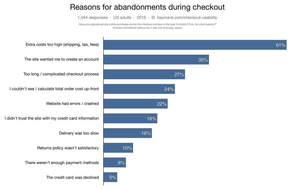
Reasons for abandonments during checkouts

Three out of four checkout abandonments are due to a sub-optimal user experience, but which of these causes is eating into your revenue?

Tools like Google Analytics, Hotjar, Fullstory, Crazy Egg and Optimizely can help us decipher what’s causing our shopping cart abandonments, and come up with effective solutions to improve UX.

In fact, you can easily recover 5–10% of your abandoned carts. Isn’t that cool?

First we’ll detect where users are leaving our website, then why they’re leaving our website, then how we can improve the UX so that future users don’t leave our website. The result? More revenue!

It’s also worth noting that while 59% of shopping experiences happen on mobile, only 15% of dollars are spent on mobile. This indicates that some of the most common UX shortcomings are mobile-specific.

What Tools Can We Use to Analyze User Behavior?

By analyzing user demographics and user behavior, you can improve your website’s user experience. Even though there are many tools that can allow you to do this, I’ll run through this tutorial using Google Analytics (free) and Crazy Egg (affordable) today.

With a quick setup, Google Analytics will help you to understand your visitors as they interact with your website, and from this we can identify where exactly visitors are abandoning our websites.

Crazy Egg is an advanced heatmap tool that allows you to observe those drop-offs in more detail, and to establish why users left and didn’t convert. With Crazy Egg, you’re able to dig deeper into that.

Setting up Conversion Funnels in Google Analytics

A conversion funnel is the journey a customer takes as they convert. We can use Google Analytics to record and analyze these conversion funnels, which begins with you inserting a few lines of JavaScript code on your website (to enable the tracking), although some ecommerce platforms help you to set this up without any code.

Now we need to set up a funnel to measure the conversion rate.

Step 1: Goals

First, log in to your Google Analytics dashboard and click on the Admin tab in the left-hand sidebar, then Goals.

Step 2: Creating a New Goal

Click the + New Goal button, and choose the relevant Goal template, which in this case is Place an order.

After that, click on the Next Step button.

Step 3: Describing the Goal

Next, give your Goal a name, and under the Type heading, choose what needs to be happen to trigger this Goal. In this case, the Goal is triggered when the user reaches the checkout confirmation screen, so choose Destination as the Goal Type.

Step 4: Goal Details

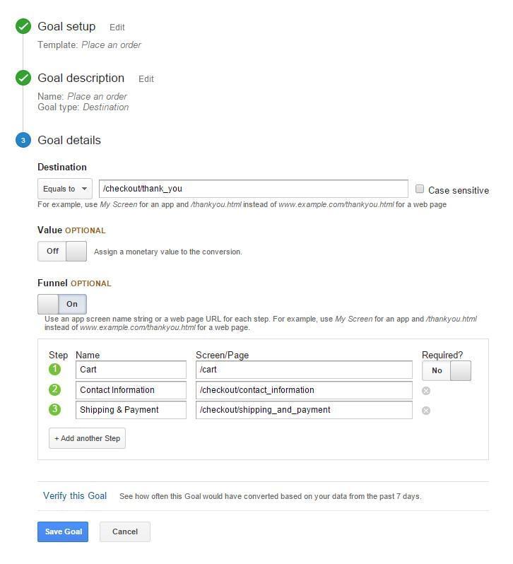
In Goal Details, you’ll need to reference the destination URL. This is the web page that visitors are taken to after they complete their checkout. If you’re using Shopify as your ecommerce CMS, this will most likely be /checkout/thank_you/, although it’ll vary by CMS.

Leave the monetary Value turned off and the Funnel option on.

Next, list all of the web pages (and their URLs) that shoppers navigate through during the checkout flow. The example below represents a typical setup for an ecommerce website hosted on Shopify.

A typical setup for an ecommerce website

Click the Verify this Goal button before the Save Goal button.

The post How Analytics Can Explain Your Abandoned Checkouts appeared first on SitePoint.

Refreshed Visual Identity and Motion Graphics for SPORTV

Original Source: http://feedproxy.google.com/~r/abduzeedo/~3/773RgqUqLSs/refreshed-visual-identity-and-motion-graphics-sportv

Refreshed Visual Identity and Motion Graphics for SPORTV

Refreshed Visual Identity and Motion Graphics for SPORTV

abduzeedo
Jun 28, 2018

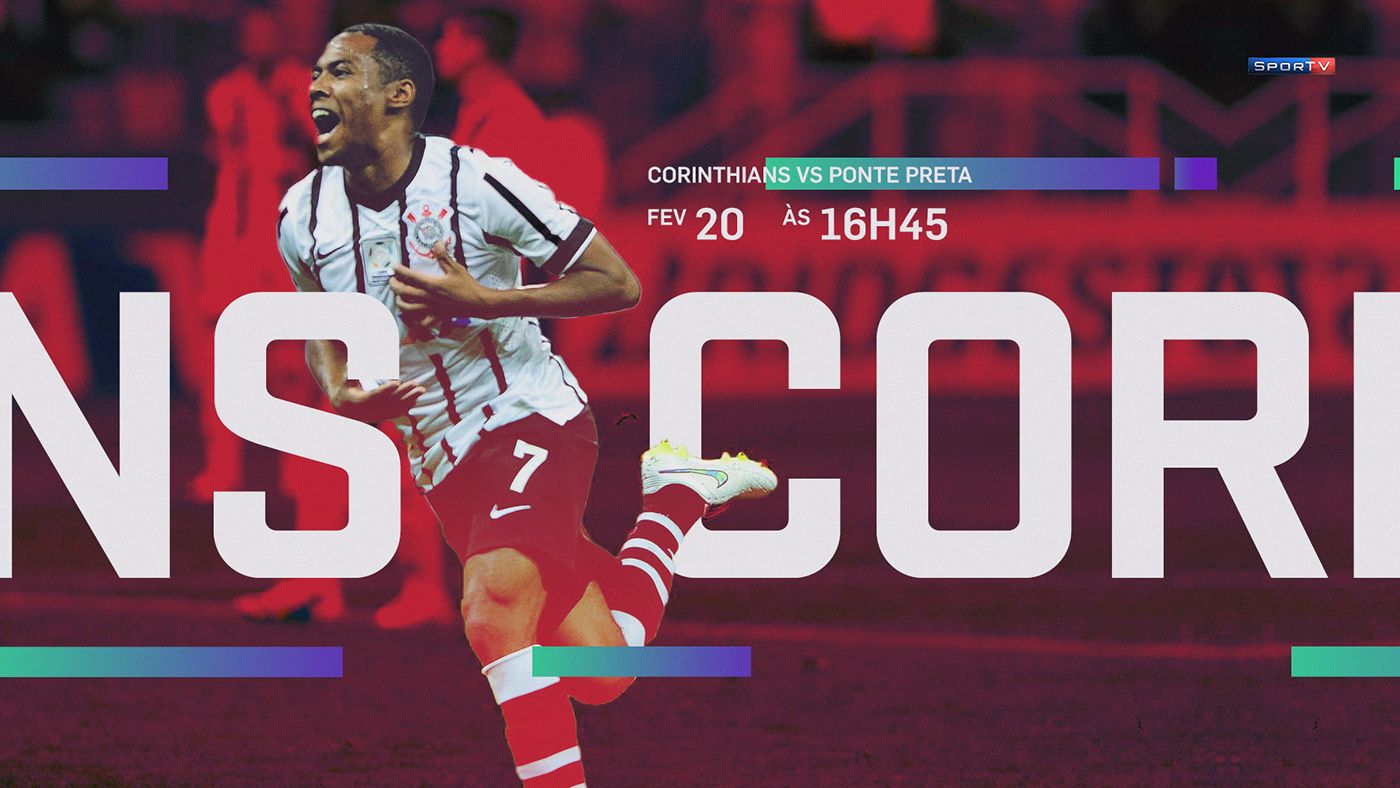
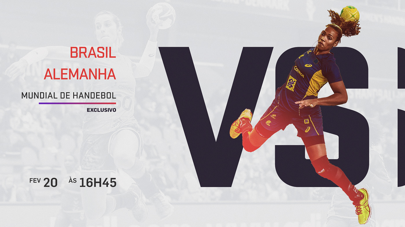
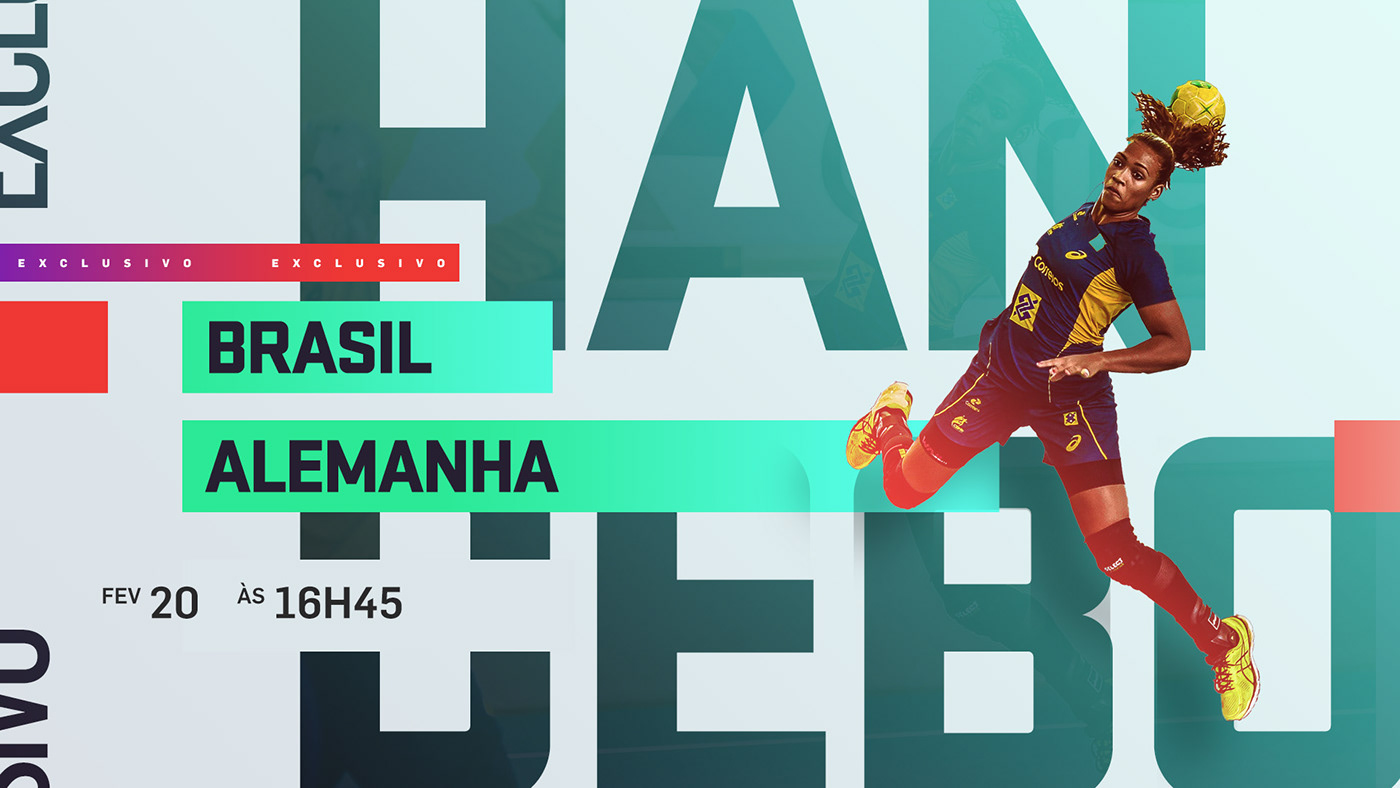
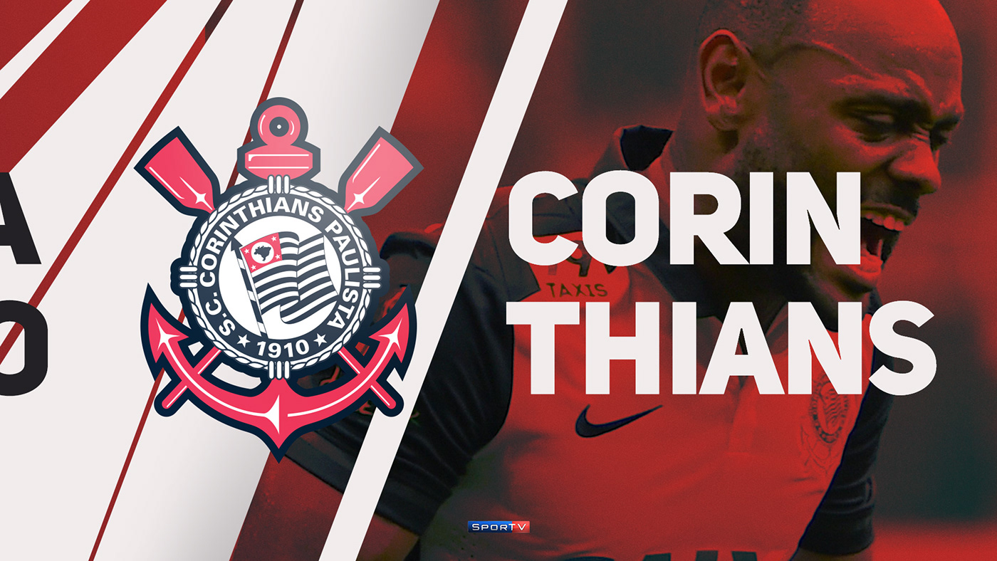
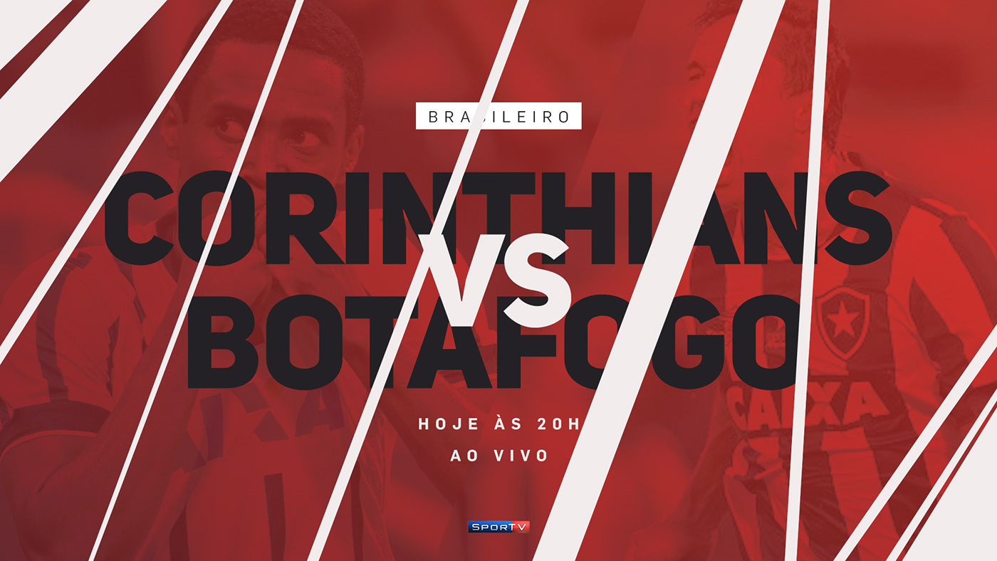
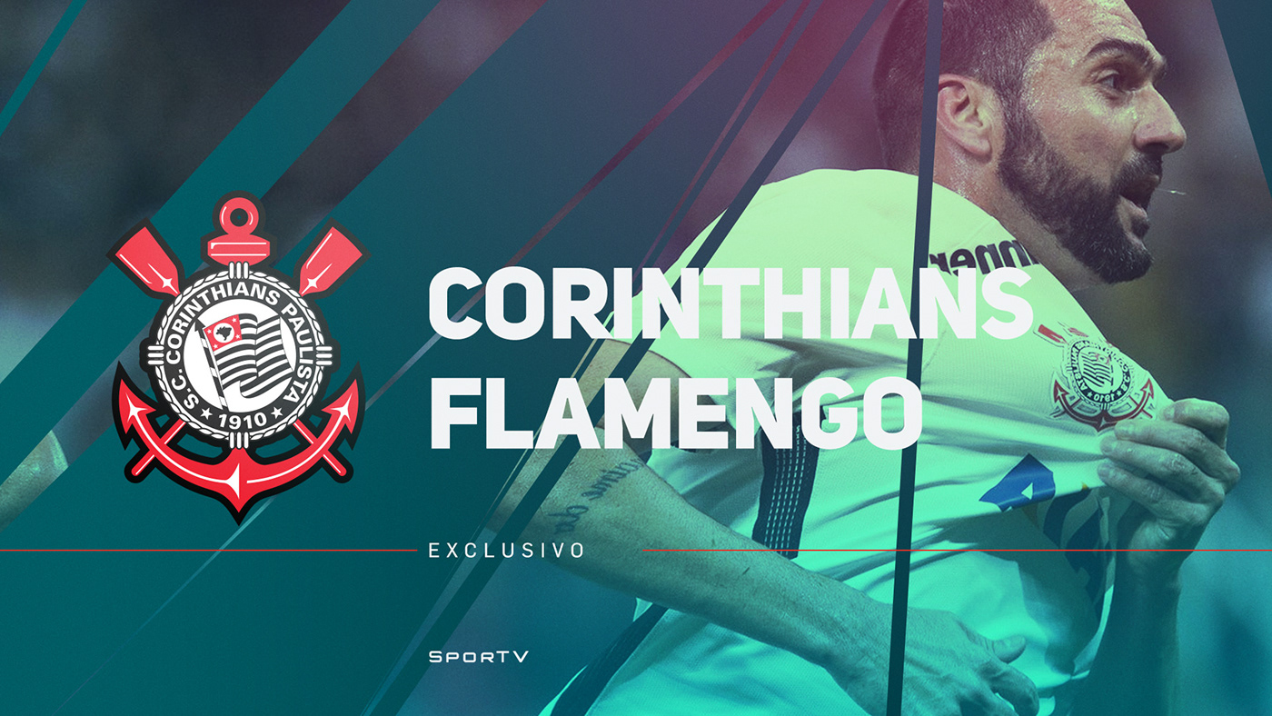
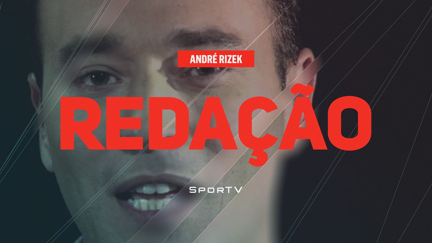
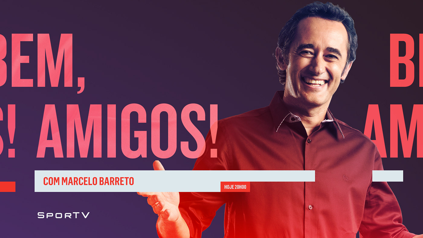
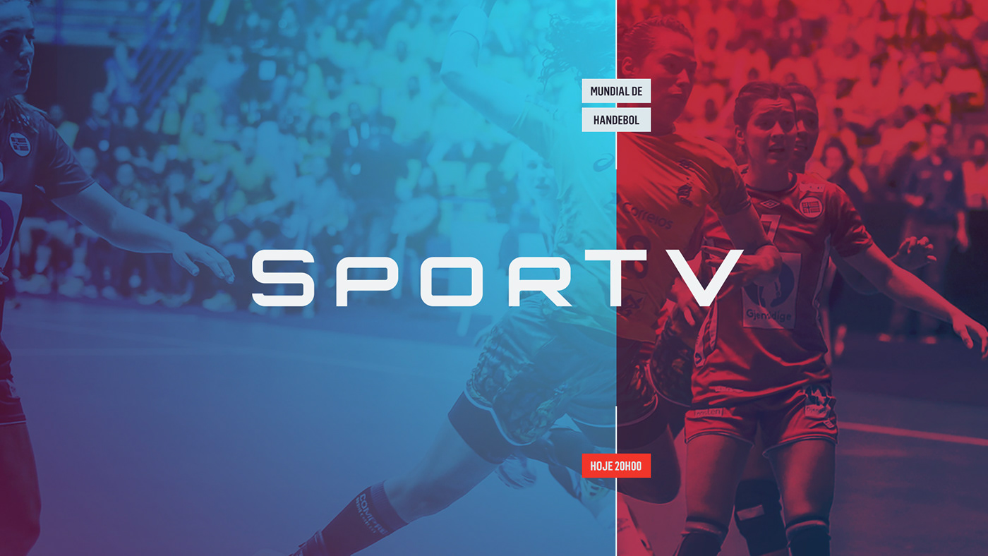
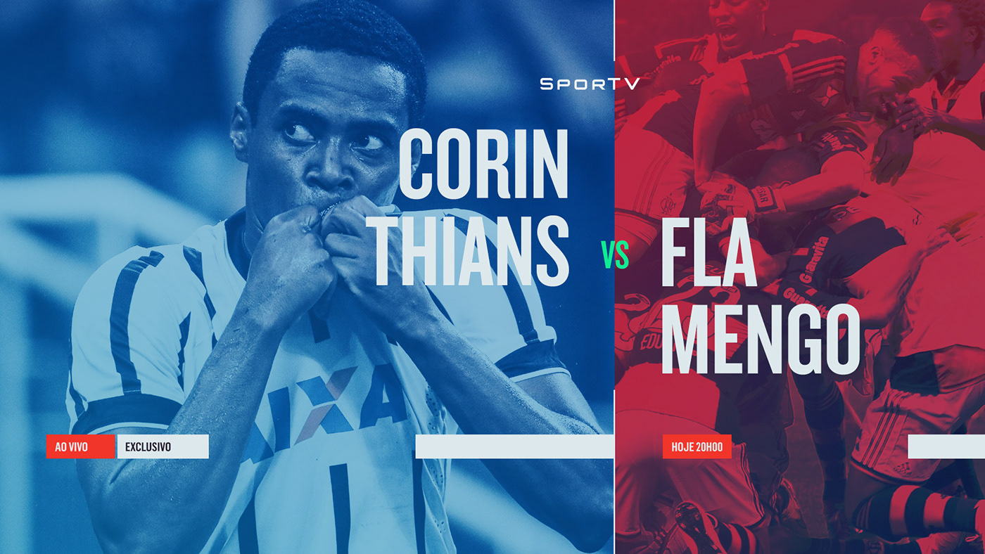
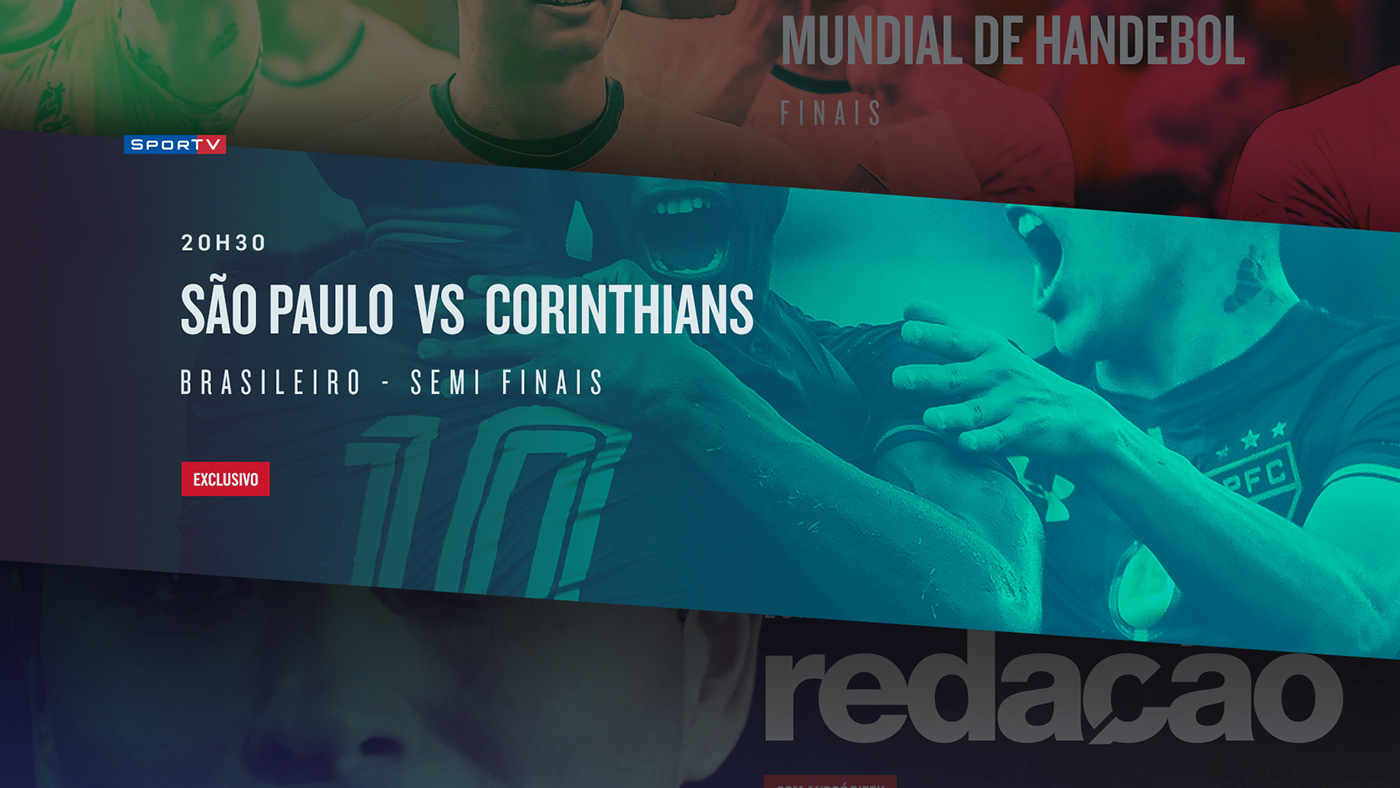
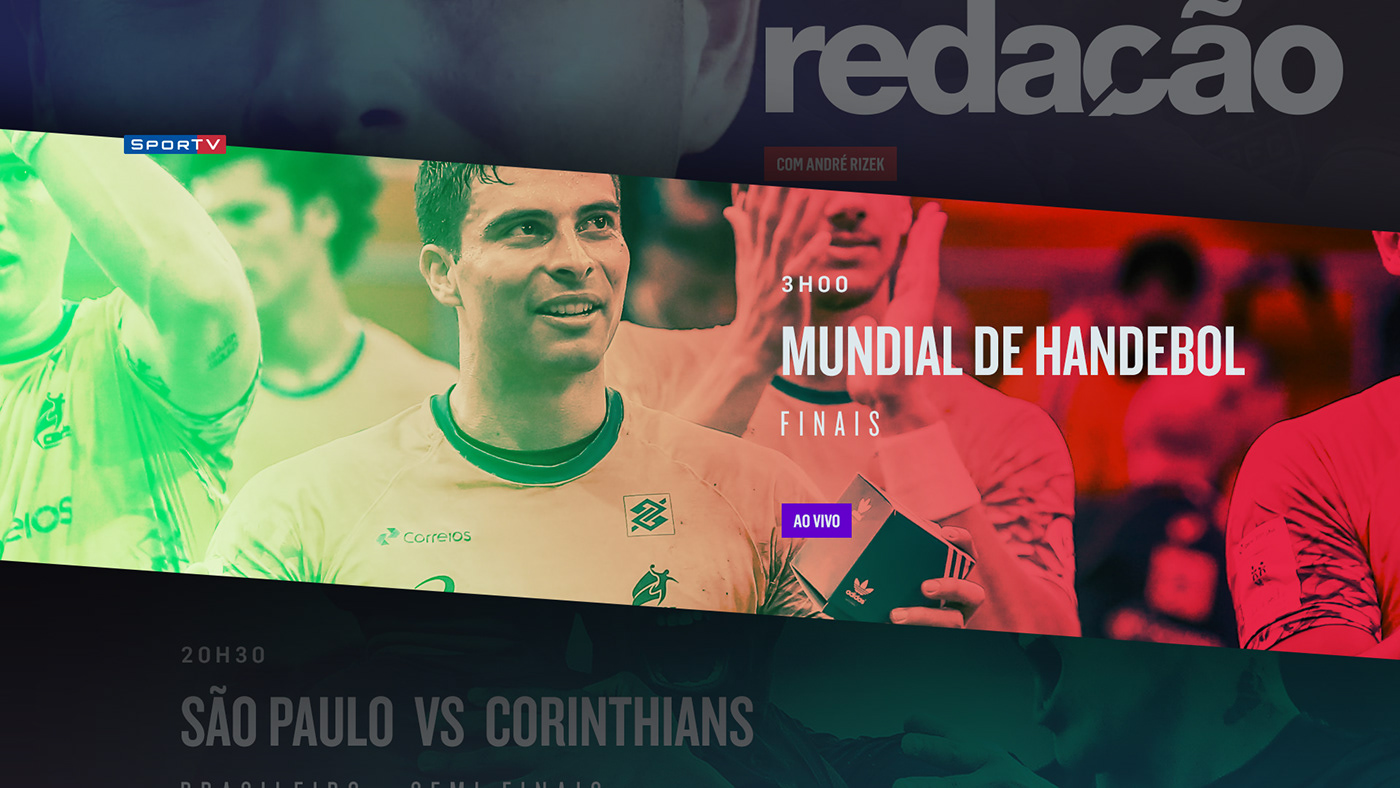
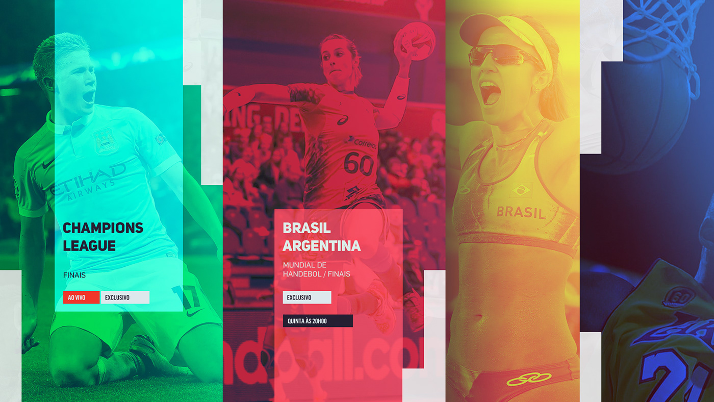
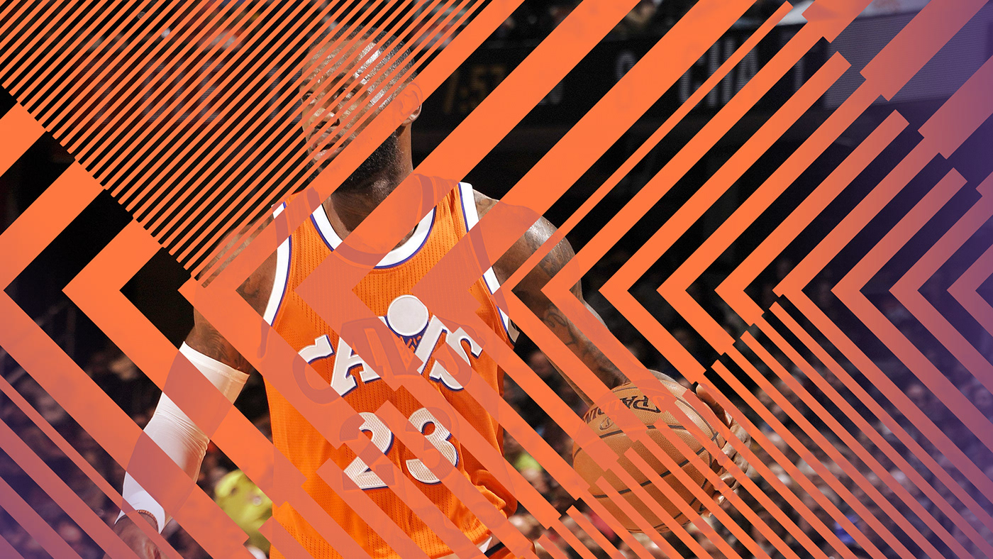
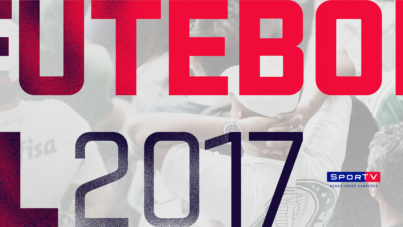
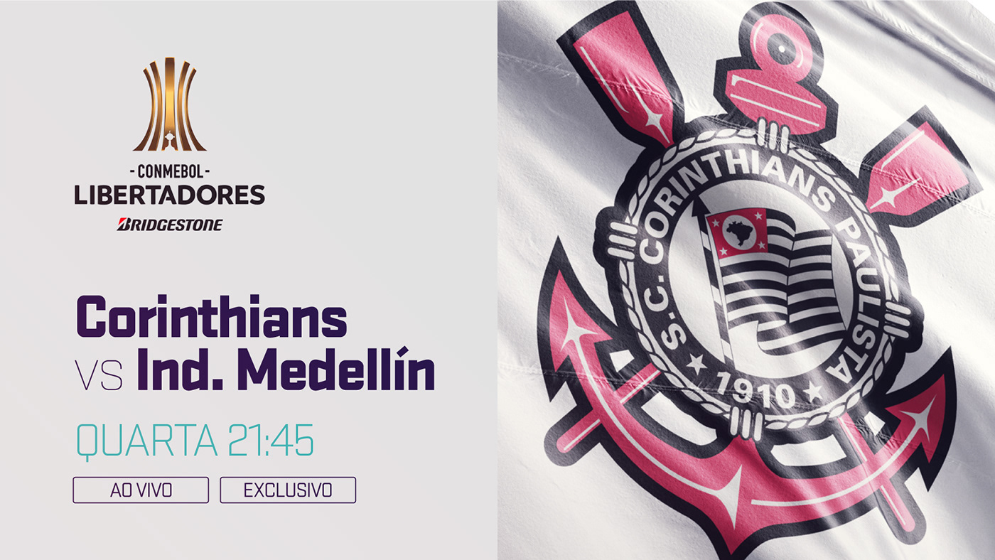
BEELD Motion invited Danilo Gusmão Silveira to help them create a new visual Identity for SPORTV, one of the most prominent Sports Channels in South America. They experimented with several different graphic styles and forms to find a new image for the channel. The result is simply beautiful. The move from the old style which was very 3D with some chrome and other old style broadcast design style is very welcome. I used to watch the SPORTV channel and I can say that this looks much more modern and professional. I especially love the end to end solution which includes typography, grid system, pattern, textures and of course motion.

For more information make sure to check www.danilosilveira.com

Visual Identity

After working in several composition, type and color tests we’ve chosen one direction to go through and we’ve started building grids that support the ID and the all content. The grid was built as an extension from the logo, expanding its form, creating blocks that support the image and content. 

Grid system

We have also created a large gallery of patterns, textures, and color palette that gives personality to each segment of the channel. 

Patterns, textures, and color palette

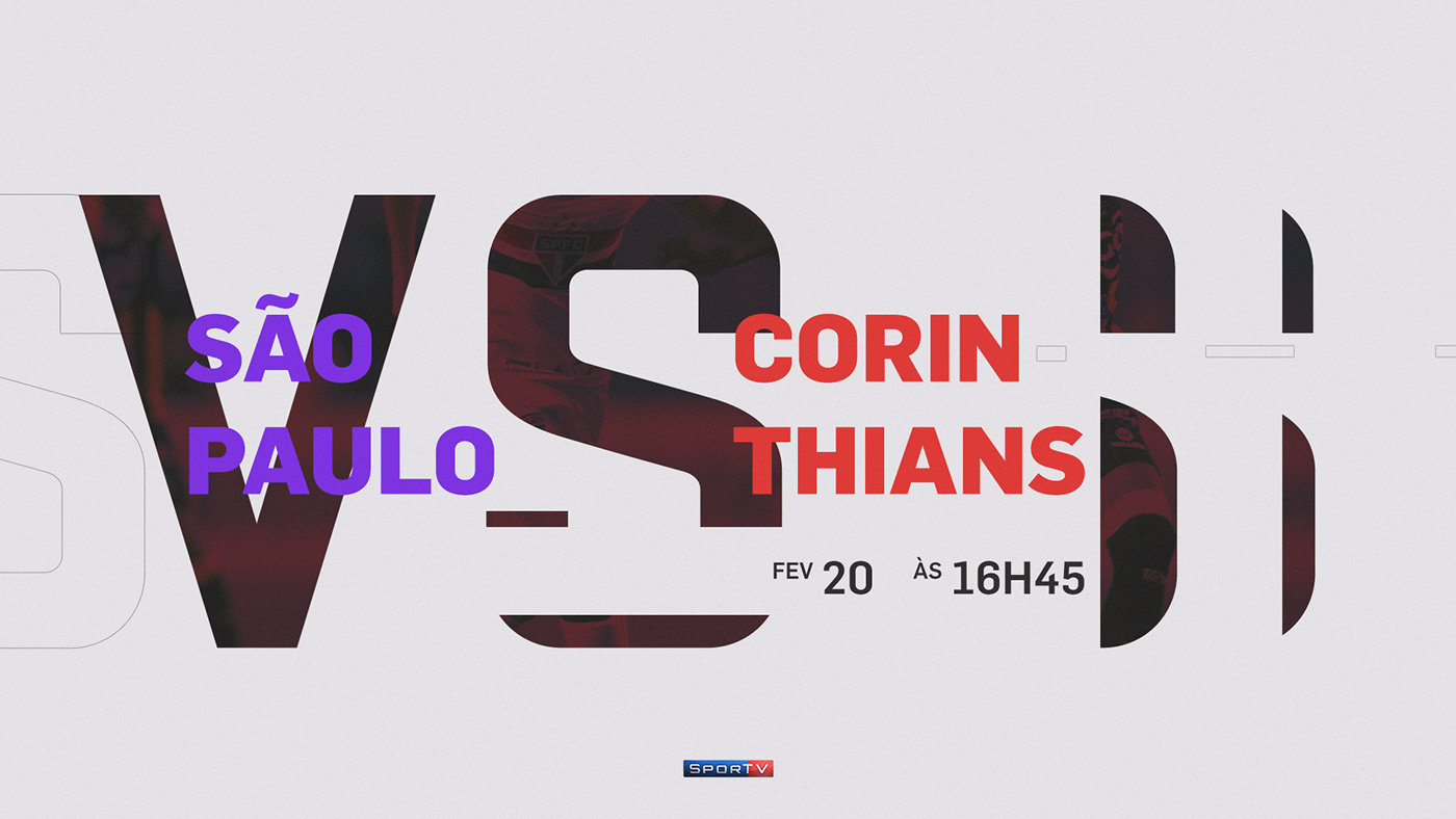
Here are the final frames we have delivered for the channel so they could produce all the rest of the ID.

Motion Graphics

REEL and Motion Graphics videos made by Diego Galluzo e Julio Marcello. Video made by SPORTV speaking a little bit more about the creative process and introducing the new brand. 

branding


Learn Angular: The Collection, Released June 2018

Original Source: https://www.sitepoint.com/learn-angular-the-collection-released-june-2018/

Angular is not just a framework, but rather a platform that empowers developers to build applications for the web, mobile, and the desktop.

This collection is a set of books aimed at getting you up to speed with Angular. It contains:

Learn Angular: Your First Week, a collection of articles introducing Angular
Learn Angular: Build a Todo App, an in-depth project tutorial that builds a complete Angular application from start to finish
Learn Angular: 4 Angular Projects presents four practical Angular projects
Learn Angular: Related Tools & Skills contains a collection of articles outlining essential tools and skills that every modern JavaScript developer should know.

This book is for all front-end developers who want to become proficient with Angular and its related tools. You’ll need to be familiar with HTML and CSS and have a reasonable level of understanding of JavaScript in order to follow the discussion.

Where To Buy

Get the collection on Amazon or on SitePoint Premium – all our books and courses for only $9 a month.

The post Learn Angular: The Collection, Released June 2018 appeared first on SitePoint.

10 Newsletter Layouts With Free Source Code

Original Source: http://feedproxy.google.com/~r/1stwebdesigner/~3/MUQbtsdKsoU/

Designing a newsletter can be tough. Not only do you need knowledge and understanding of how users/readers expect content to be delivered to them, you also have the headache of making the layout compatible with all of the many emails clients.

It helps if you study the layouts of existing newsletters to get an understanding of how the code and layouts work. That’s why I’ve curated 10 of the best newsletter designs that are fully responsive and up-to-date with modern coding standards.

If you’re planning to launch your own newsletter, these designs should be great inspiration for you.

SeatGeek

With a single column design and large typography, I love the way the SeatGeek email uses icons and simple graphics to grab your attention.

The large typography also takes up a high percentage of the page making it very easy to read. Shorter paragraphs, larger text, and a clear CTA at the bottom of the page all increase usability.

For a simple verification email this does the job well.

PlayStation

If you’re looking for a more complex design, Sony’s Battlefield 1 release offers some nice ideas.

Most of this newsletter relies on images to replicate the official Sony PlayStation website. This is great for building brand awareness and trust, but this also feels a bit light on information since it doesn’t tell the reader what to do or what the message means.

Still, it has a really smooth design and it shows how much quality graphics play a role in email layouts.

Social Print Studio

Email verification messages don’t need to be complex. But you should feel okay adding some details about the website/list the user just signed up to.

This email by Social Print Studio is primarily a verification message, but it also includes points about the site and what new users can expect from using it. This even includes a ‘shop’ CTA leading directly to the site where readers can order prints of their Instagram photos.

An excellent example of coaxing users back onto the site while also increasing signup verifications.

Archant

Here’s a real interesting email newsletter with an update preferences message from Archant (online publisher).

The goal is to connect with users who may have subscription settings that are either too strict (blocking all contact) or too lenient (receiving too many emails). It’s a cool way to connect with existing subscribers and ideally get them signed up to more lists.

WistiaFest 2017

Event newsletters like this one are usually pretty simple. They only have a few goals: share information about the event and encourage subscribers to buy their ticket early.

This newsletter has all of that in spades with CTAs to check out the event’s speakers and to sign up for a ticket. The layout also follows a single one-column design which usually works best for emails.

Lists for events also don’t go out regularly, so it’s crucial to include the logo near the very top of the page. This way subscribers know exactly what the message is about since their last message was probably 12 months before.

Sprout Social Webinar

The Sprout Social newsletters are fantastically well-designed and their codebase is phenomenal. Take a look at this simple design promoting an upcoming webinar.

It’s pretty short and uses graphs to draw attention. It also uses bulleted lists with icons to help sell the webinar as bullet points are much easier to read than paragraphs.

Plus, the big green CTA is well above the fold and pushes their webinar schedule. You can replace many of these elements with your own and see fantastic results.

Sprout Social IG Scheduling

Another example from Sprout Social is this promo email covering their Instagram scheduling feature.

One difference with this layout is the alternating two-column features grid. It uses square icons placed alongside square info-boxes with clear visuals. A great concept and it blends in nicely with the overall design.

If you’re looking for a basic template to study and possibly recreate you should check out the Sprout Social emails. Considering all factors like visuals, copy, and page structure, Sprout Social do email marketing right

Moo Design

From business cards to custom stickers, this promo newsletter really sells the product well. You can learn a lot by studying how other websites promote their content, and this Moo newsletter is a terrific example.

Product photos show how these items could be used and you can also learn a lot from the email’s style and flair.

It feels colorful and fun with a light sense of humor. This tells readers how these products feel and why you might want to visit Moo.

The newsletter uses a two-column product feature with blocks of images and text. An excellent way to grab attention and increase conversions.

Under Armor

The Under Armor brand is very popular in the fitness community. They have tons of great products and their newsletter design sells their items well.

Notice how many unique photographs are used in this design. With some products, it just makes sense to add photos more than text. Block elements with photos and CTAs work well for Under Armor’s newsletter and this is usually a good strategy for all physical goods.

Runtastic

Product feature lists are also great for promoting mobile apps and digital software. This Runtastic email relies on app screenshots and small flat-styled icons to grab your attention.

The goal of this newsletter is to encourage clickthroughs and get new users digging deeper into features. It’s an entire suite of programs and tracking tools so it can take time to learn everything.

But with a great follow-up email you can provide just enough info to get people curious and wanting to learn more.

These are just some of the best newsletter designs I’ve found but there are dozens more out there. And regardless of what you’re promoting or why you need a newsletter, these designs will help you plan usable layouts with clean source code to boot.


5 Benefits of Using DepositPhotos for Your First Graphic Design Project

Original Source: http://feedproxy.google.com/~r/Designrfix/~3/wu37hc2TRYQ/depositphotos

Web design is hard, especially now since the Internet is full of websites with stunning graphics and one-of-a-kind photos. Whether you’re starting out as a newbie graphic designer or you’ve started your first blog, and you feel clueless about how to get high-quality images for your blog posts, DepositPhotos may be the answer for you. […]

The post 5 Benefits of Using DepositPhotos for Your First Graphic Design Project appeared first on designrfix.com.

Infographic: How people really use voice assistants

Original Source: http://feedproxy.google.com/~r/CreativeBloq/~3/4Sn4OKrPGg0/infographic-how-people-really-use-voice-assistants

Voice interfaces are one of the hottest user experience trends in recent years. New figures reveal that one in 10 Brits now owns at least one of these devices. But how are we really using them? Code Computerlove polled over 1,000 smart speaker owners, and turned their findings into this top infographic.  And if this inspires you to put together your own data visualisation, take a look at our list of the best infographic tools around. 

Read on for some  surprising facts about how UK residents are using this amazing new smart speaker technology.

infographic on voice technology

That's right, a fifth of us are using our clever invisible friends to make sure we don't overcook our eggs in the morning. It's a task that can be accomplished using a normal clock, but, hey, where's the fun in that? 

In fact, mundane tasks lead the way when it comes to smart help – 65 per cent of owners used their assistant to play music or the radio, and over half use it to check the weather forecast.

Furthermore, Alexa still rules the roost in the voice assistant space, with Amazon Echos making up 70 per cent of the devices owned. There are other good options available though (take a look at our sister site TechRadar's guide to smart speakers for more info). 

infographic on voice technology

The big question with any new technology is: is it just a fad? Perhaps not, judging by the fact that 25 per cent of owners chat to their smart assistants every day, even taking it to bed with them. However, a further 30 per cent have forgotten they even have a voice assistant in the house. Less encouraging.

For more interesting finds – including our deep-seated fears about voice assistants – take a look at the full infographic below. Click on the infographic to see the full-size version. 

Read more:

The 5 biggest UX design trends for 2018How to create amazing infographicsHow to design a chatbot experience

How to rescue a logo that has been saved as a bitmap

Original Source: https://inspiredm.com/how-to-rescue-a-logo-that-has-been-saved-as-a-bitmap/

Every designer at some point will encounter the client who brings in a blurry, pixelated JPEG copy of their logo (the only copy they have) and requests for changes to the logo.

Redesigning the logo entirely from scratch is one option, but it can be hard work, as you’ll have to figure out exactly how the original designer achieved the result. This isn’t always so difficult with simple logos, but it’s definitely an issue with logos that have non-standard fonts or very complex artifacts.

As a designer, you know that clients should always have a vector copy of their logo with transparency in the background, but clients don’t know that. They also don’t always know how terrible it looks when a logo is recycled for different purposes using anything other than the vector copy.

Clients also may not understand about the necessity of their logo to contrast with whatever background it is placed on. You can help them with this kind of thing, but first you’ll need to rescue that logo from Bitmap Hell, and bring it in to the glorious paradise of Vector Heaven.

The following is a method that will help you do this.

Start a new vector project.

Many vector graphics applications let you import a file directly from the file manager, but this is not the best way to do this job. If the imported image is the background layer, it can be difficult to delete it in some vector applications.

To save difficulty, it is better to start a brand new project, and discard unwanted layers later.

Create a transparent layer called “background”.

Most of the time you’ll just need to rename the background layer, but if the background layer is not automatically set to transparent, then you should create a new fully transparent background layer and delete the original one. This is to be completely certain your image does not have a background color behind it.

Lock the background layer.

Having gone to all the trouble of creating a proper transparent background, you don’t want to accidentally mess it up. Locking the layer prevents you from changing or moving the layer.

Create a layer above background called “import”.

This is where we’ll import our original logo to. This step might not be needed if your software automatically creates a new layer for imported images. Renaming the layer to “import” will help you to identify it more easily than if the full path name of the imported file is used for the layer name.

Import your logo file to the import layer.

This is the most obvious step. As stated above, your software might put this on it’s own layer. If that happens, just delete the “import” layer and then rename the layer your software just created.

If you are asked if you want to embed or link to the image, choose the embed option (this is fine, because you’re going to delete this layer later anyway).

Resize the image to fit the import layer.

This step is necessary to make sure parts of the logo won’t be cropped out of the image when you save it. What you see is not always what you get when it comes to vector illustrations.

After resizing, you won’t have all that empty page space around the image any more (this is important for when you export the file, because the whole page is exported, not just the image you create).

Lock the import layer.

Now we need to lock the import layer so that we don’t make any accidental changes to the original image. You also won’t want to accidentally move the layer, and locking it prevents that.

Create a transparent layer above import called “trace”.

This is the layer we’ll be working in. You can create additional trace layers (trace1, trace2, etc) for a very complex logo with a lot of different parts.

Carefully trace over the logo.

This is the part of the job you’re going to hate, but it’s obviously the most important one. It’s where the magic happens. If you’re working in multiple trace layers, remember to lock each layer as you leave it.

Sounds like way too much work? A possible way to save time and effort is to use an “edge detect” filter or color matching filter to detect the parts of the logo that need tracing, and copy these to a new layer. The problem with this quicker way of doing things is that it’s not always reliable or accurate.

While tracing, you’ll need to zoom in very tight. The image will be difficult to look at due to pixelation. Try to work out which pixels are “true” and which are “false”. Avoid tracing false pixels.

Lock the trace layer(s).

When you have finished the trace completely, make sure all trace layers are locked, so there is no danger of the work you’ve just done being wasted.

Delete the import layer.

We don’t need the import layer any more because it has done its job. Deleting it makes your image less cluttered.

Flatten the image.

This is an optional step, but again the idea is to make the image less cluttered by reducing everything to a single layer. That may not always be what you want, so think carefully before committing to this action.

For logos with multiple trace layers, you may find it useful to preserve each layer so you can modify individual logo parts more easily in the future.

Save the file.

You wouldn’t want all that work to go to waste, so save the file. Actually it’s best practice to make incremental saves as you work, but it’s not always easy to remember to do it.

Export to other formats if requested.

Now you have the saved new copy of the logo, you can export it to whatever other formats the client needed. If they’re requesting a jpeg, bitmap, or other file type that doesn’t support background transparency, make sure you know the color of the background the logo is going to be placed on.

You also should ensure the client knows the importance of contrast. If the logo is being placed on a background that does not contrast with it appropriately, you should make a copy of your vector modified for better contrast with the desired background color, and you can again export it to other formats as requested by the client.

header image courtesy of Domestic Society Design Co.

The post How to rescue a logo that has been saved as a bitmap appeared first on Inspired Magazine.

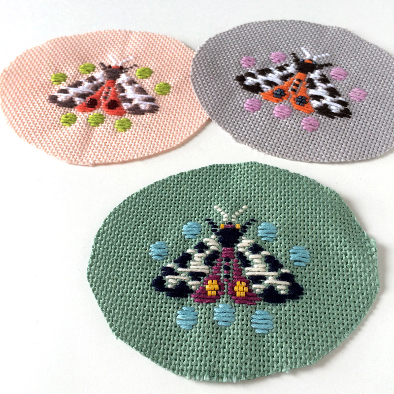
Kogin embroidered Insect Brooches

Original Source: http://feedproxy.google.com/~r/abduzeedo/~3/ML1RoYZLucI/kogin-embroidered-insect-brooches

Kogin embroidered Insect Brooches

Kogin embroidered Insect Brooches

AoiroStudio
Jun 29, 2018

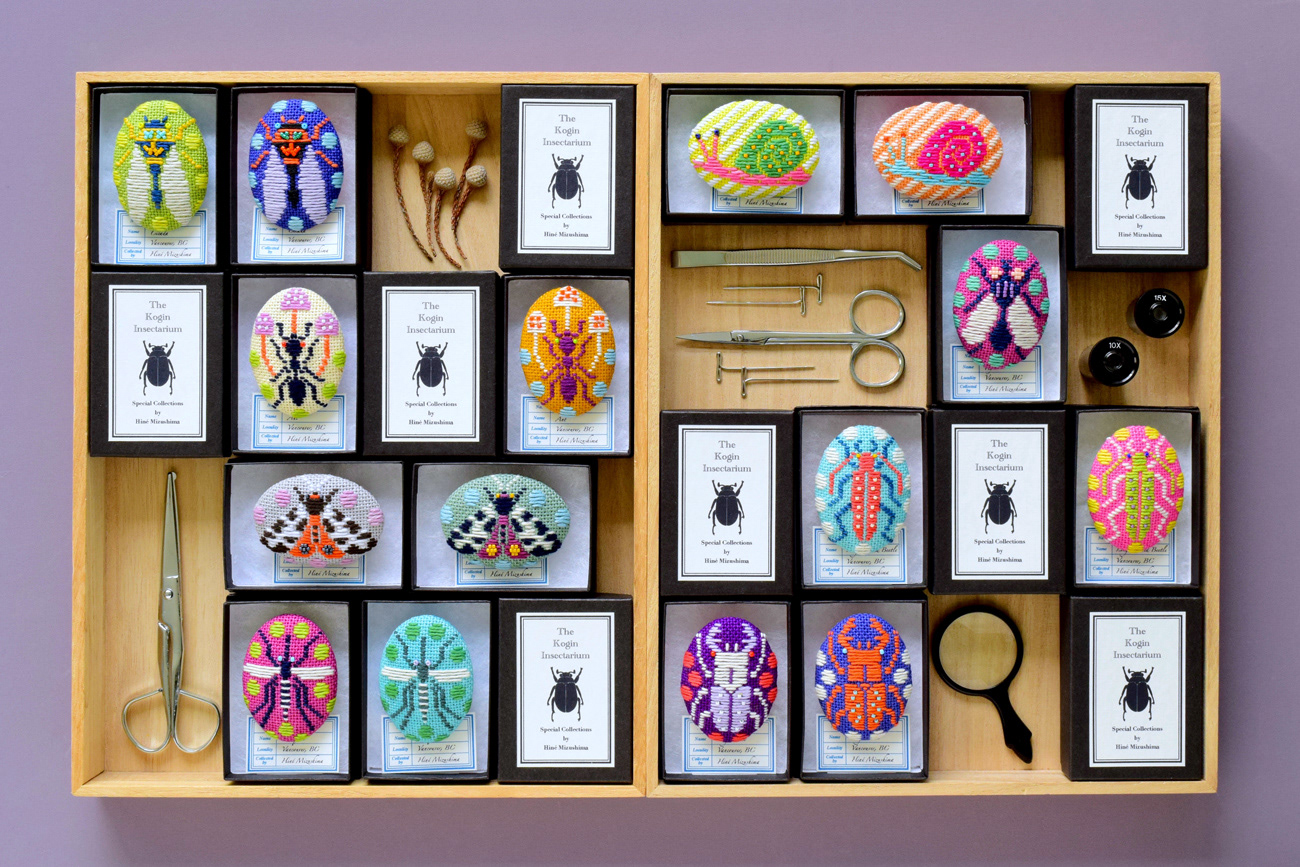
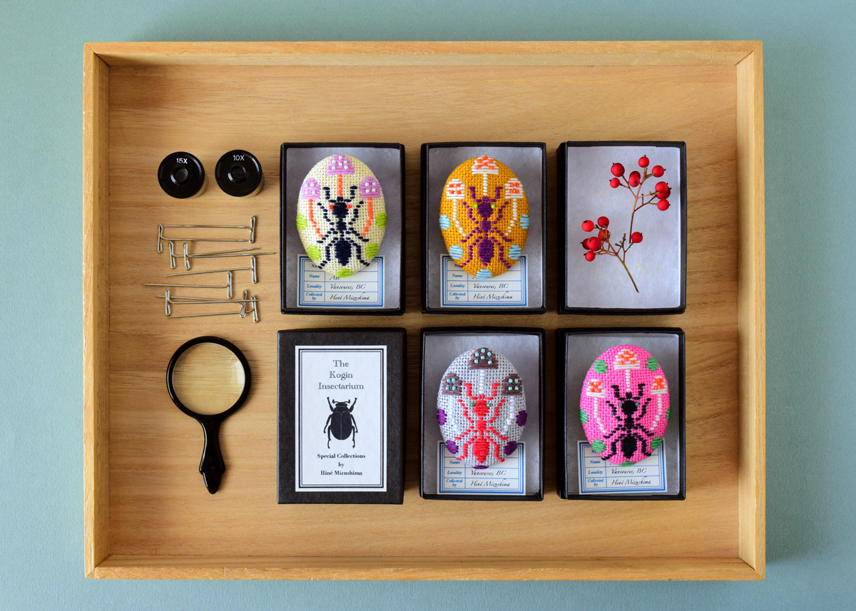
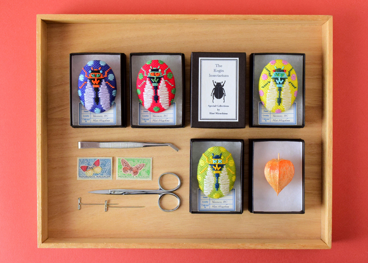
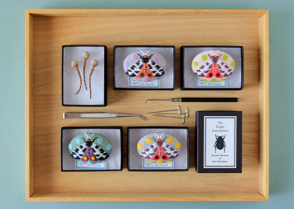
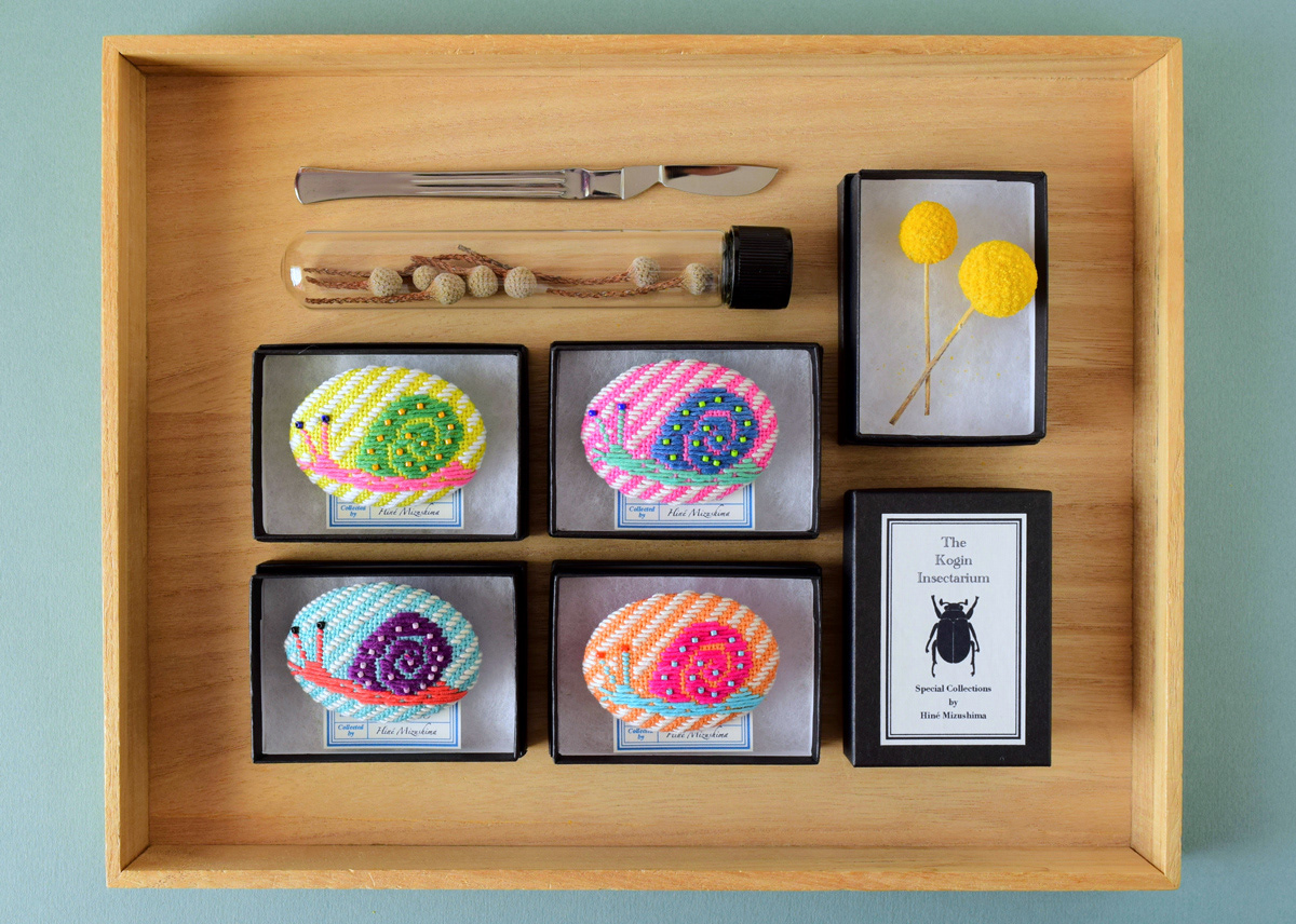
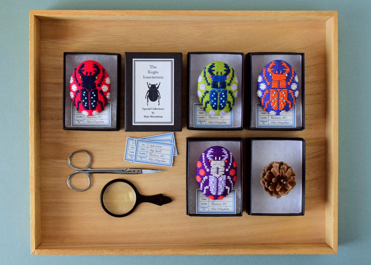
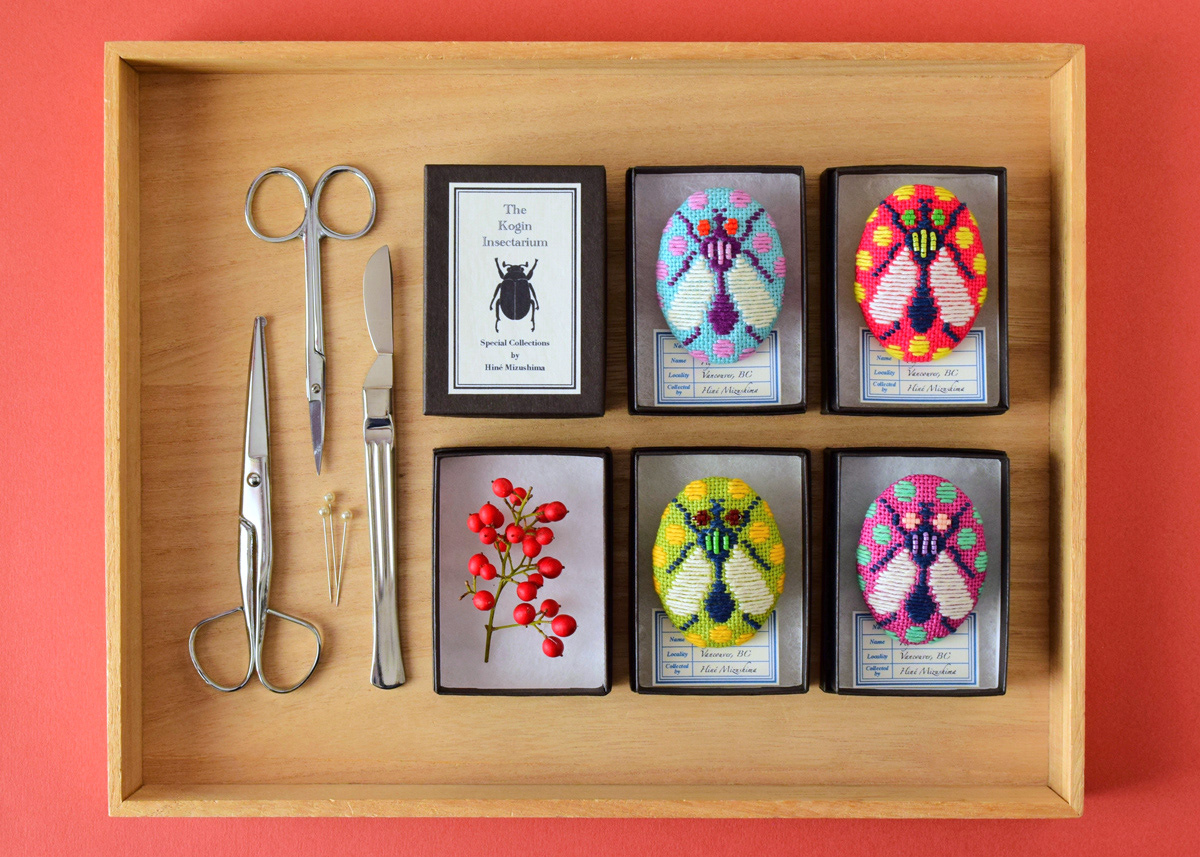
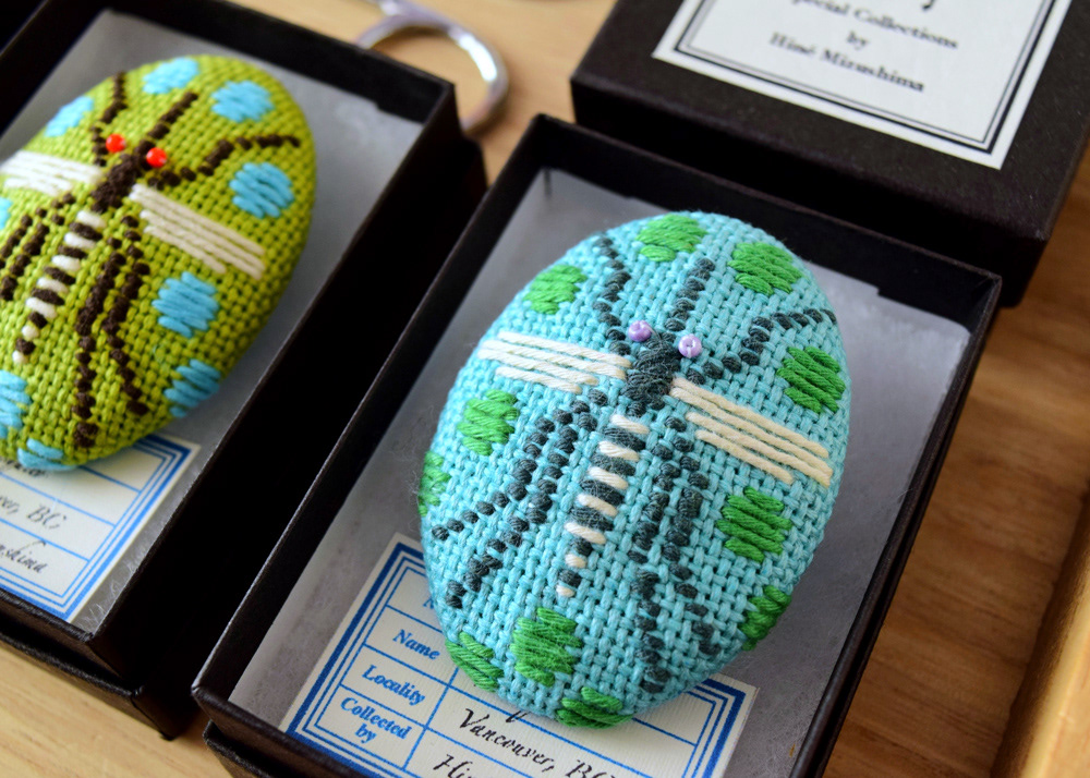
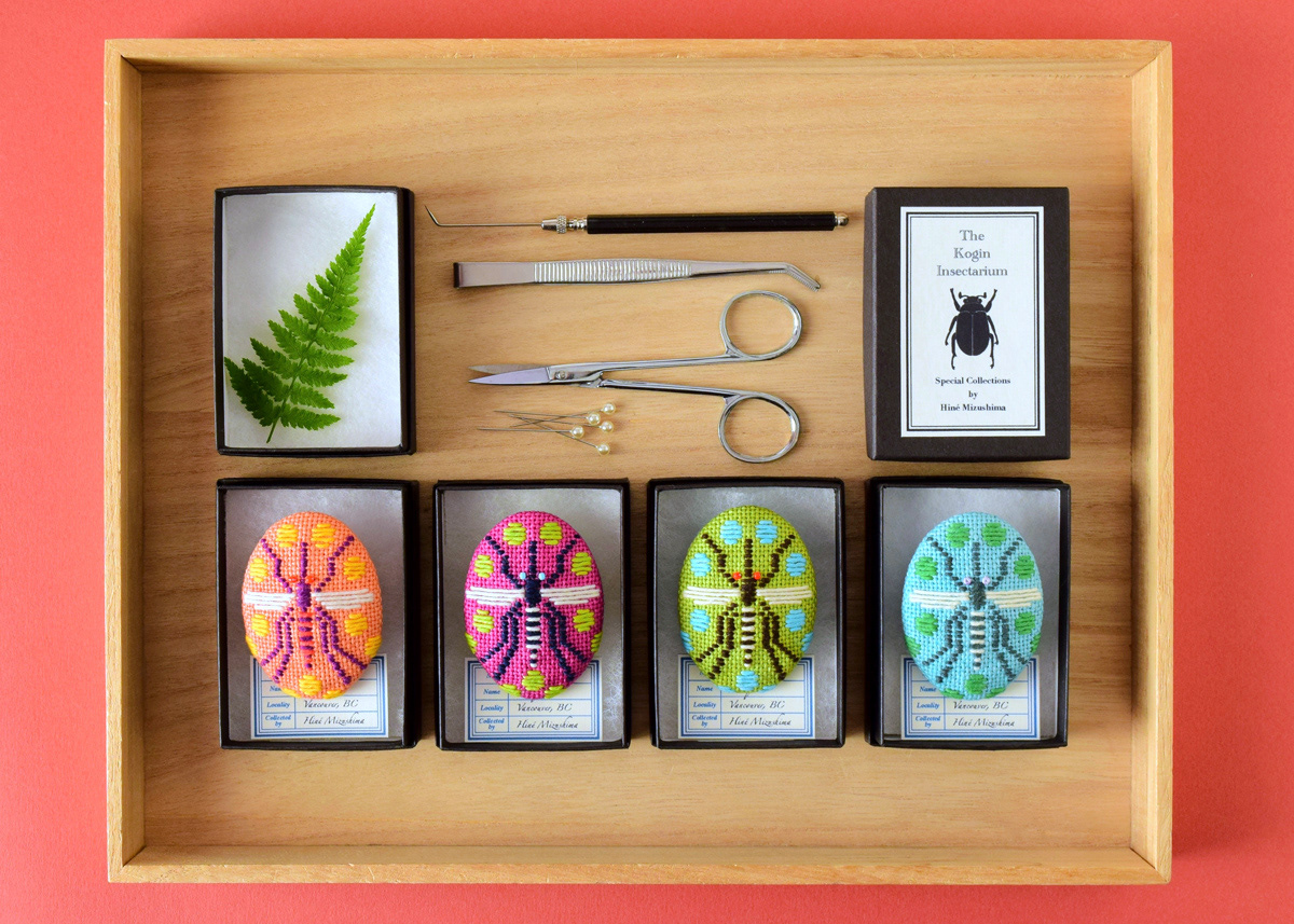
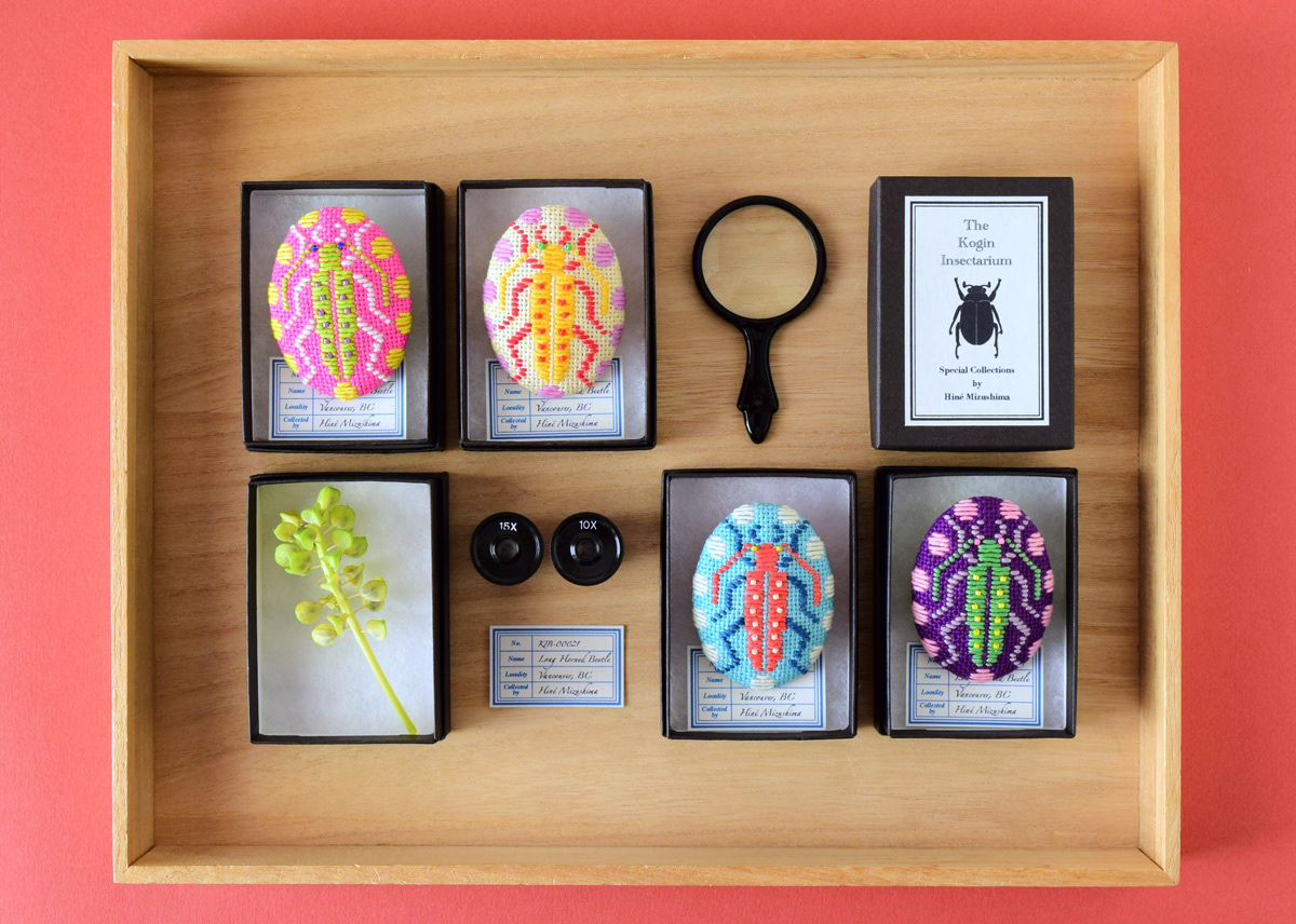
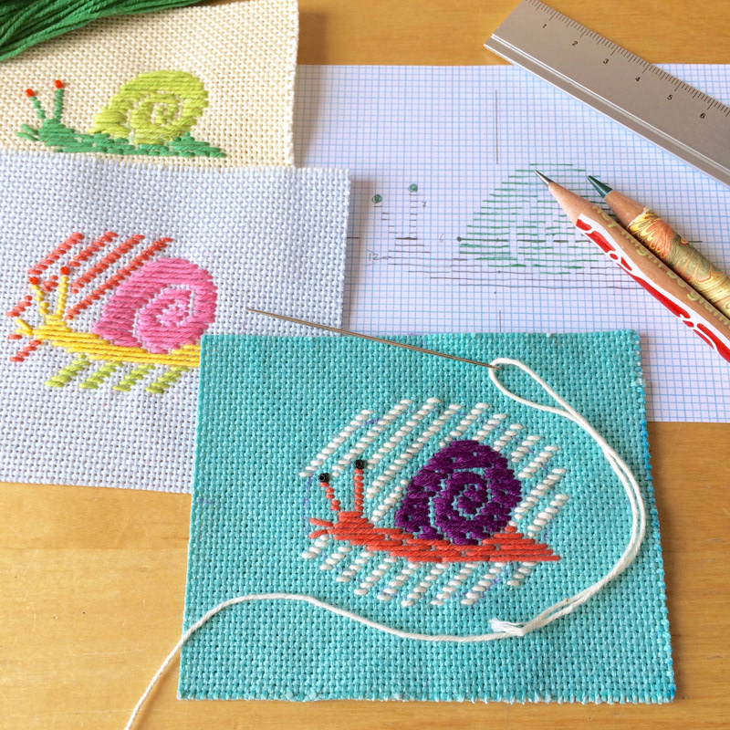
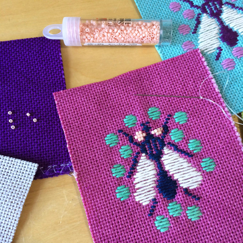
Let’s take a look at this unique project by Hiné Mizushima who is (in his own words) Slow Crafter, Needle-felter and Illustrator based in Vancouver, BC in Canada. We are looking at his Kogin embroidered insect brooches he worked on for a group exhibition happening right now in Osaka, Japan. What is Kogin? It’s a traditional quilting method of Aomori’s Tsugaru region, where its characteristic is the beauty of its design. As you can see in the following, it’s an art and we can definitely appreciate its creativity.

Kogin embroidered insect brooches for a group exhibition, The Kingdom of Specimens at ranbu gallery (2nd floor) in Osaka, Japan, opening June 20th, 2018! I used some of my hand-dyed Kogin fabrics and most of my hand-dyed Kogin threads for the brooches, and I also used tiny Japanese glass beads for the details.

More Links
Learn more about Hiné Mizushima
Follow Hiné’s work on Behance
Kogin embroidered Insect BroochesKogin embroidered Insect BroochesKogin embroidered Insect BroochesKogin embroidered Insect BroochesKogin embroidered Insect BroochesKogin embroidered Insect BroochesKogin embroidered Insect BroochesKogin embroidered Insect BroochesKogin embroidered Insect BroochesKogin embroidered Insect BroochesKogin embroidered Insect BroochesKogin embroidered Insect BroochesKogin embroidered Insect BroochesKogin embroidered Insect Brooches

crafts
embroidery
design