Original Source: http://feedproxy.google.com/~r/CreativeBloq/~3/qCcZTLuPU14/10-skills-graphic-designers-need-to-get-ahead-in-2019-new
A new year is a great time to reflect on the need to upskill yourself over the next 12 months. Why? Because whatever stage you're at in your career, you need to avoid getting swept aside by the tide of history.
“The role of a designer is continuously changing, now more than ever due to a revolution in the way we live and work," explains Bill Strohacker, principal director of Strohacker Design School. "So it’s extremely important for designers to keep up with these changes by continued professional development. Design is evolving, and we need to adapt across the digital experience and be relevant.”
Ben Christie, creative partner at Magpie agrees. "A truly successful graphic designer develops an innate ability to continually grow and adapt to their ever-changing environment," he says. "So you should always be looking and learning. Sucking up as much of the world as you can. Sustained designer nourishment."
But what skills are really going to help you grow your career? Here, we look at what's most in demand right now, and how you can meet those needs by upskilling yourself in 2019.
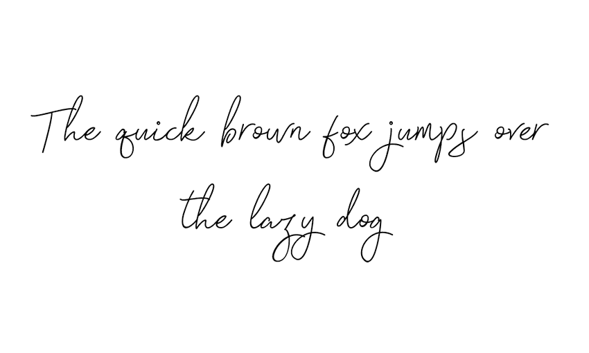
01. Digital typography
If you're working as a graphic designer, you should already know the fundamentals of typography; if not, get started with our refresher, Typography rules and terms every designer must know.
But as graphic design slowly transitions from print to online, the need to understand the principles of digital (as opposed to print) typography have never been greater. And it's not just simply a case of swapping ems for pixels.
"Although the skills are transferable, there are a whole host of differences when designing digitally," says Alexandra Lofthouse, senior UX designer at Fifteen. "These include licensing, font sizes, resources, accessibility and more." And that's not even to mention new technologies like variable fonts and responsive type.
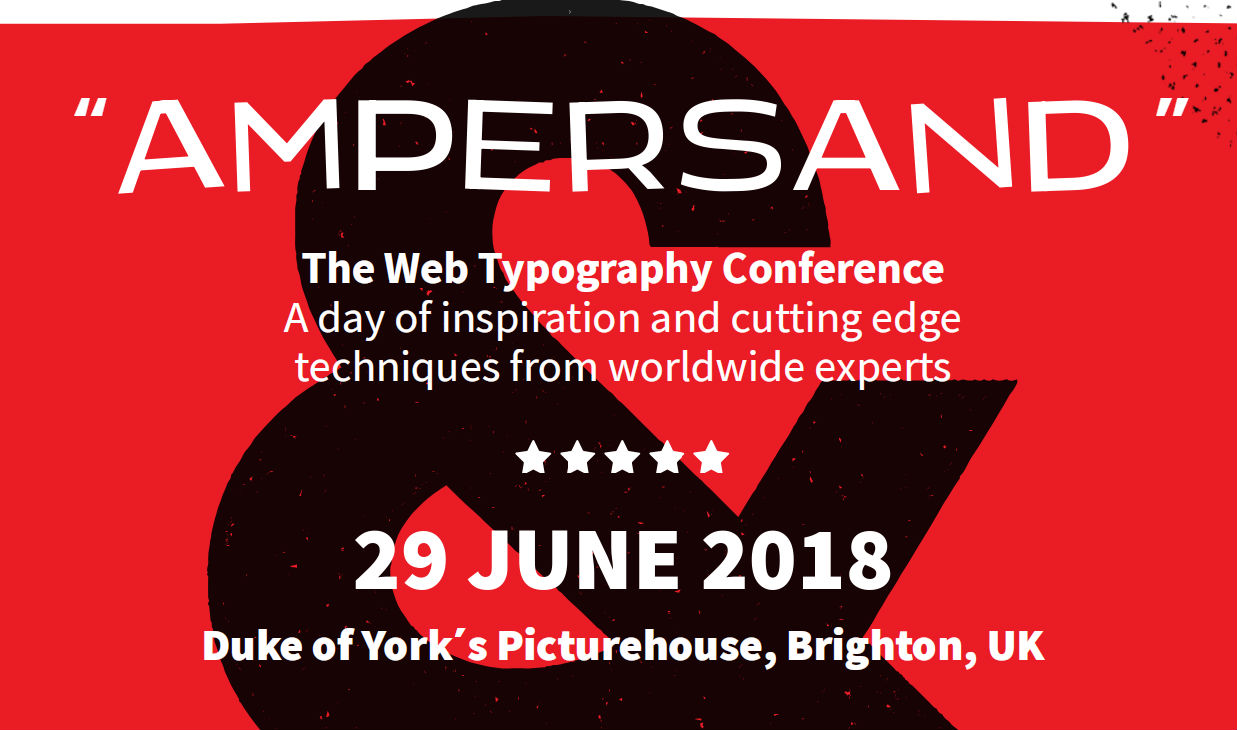
Variable fonts are already in use on the website of type conference Ampersand
With so much to consider, and new techniques evolving all the time, it's important to stay informed by reading around the subject, believes Jack Statham, designer at Ragged Edge.
"There are plenty of high quality tutorials and blogs that cover typography for web and apps," he says. "A more in-depth approach would be to subscribe to a video course. Skillshare and LinkedIn Learning (previously Lynda.com) are two providers of graphic design courses that are put together by professionals."
02. Software skills
It's perfectly possible (and indeed, surprisingly common) for graduates to emerge from respected design courses without actual software skills. And in one sense that's fine: as long as you've covered the fundamental principles of graphic design, you have a firm bedrock on which to add those skills later.
But at some point, you will need to do so. In fact, it's unlikely you'll get even a junior designer job without a good grasp of at least Photoshop, Illustrator and InDesign.
Meanwhile, if you're in a later stage of your career, it always helps when applying for positions to add a few software strings to that bow, depending on which direction you wish to specialise in.
To get a taste of what people are looking for, check out the job listings on a site like Design Jobs Board; most ads will list particular tools as 'must haves' and others as 'preferred'. But also remember that by the time you're fully trained, that may have changed.
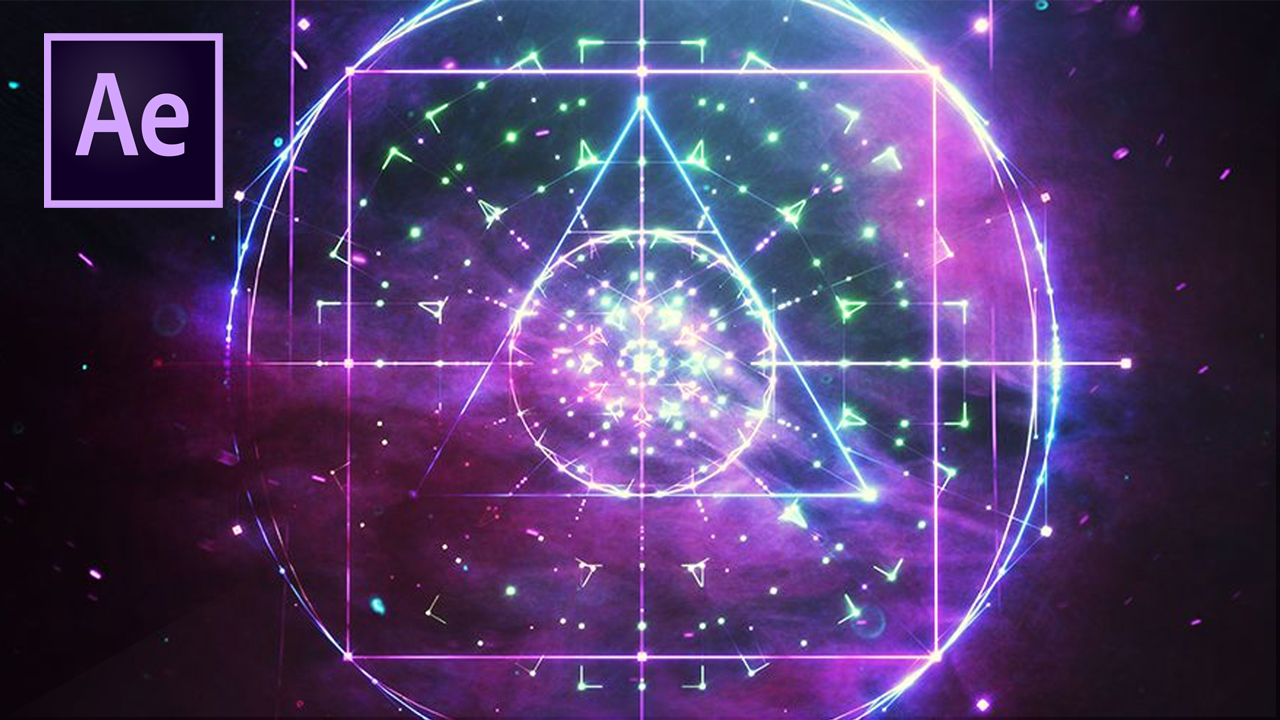
Will 2019 be the year you get your head around After Effects?
The most important thing, then, is to focus on software skills that will help you grow in the areas that you're most passionate about. For instance, you might want to try out Blender in order to develop your 3D modelling skills; After Effects to build your abilities in motion graphics and animation, or WordPress as a way of dipping your toes into web design.
“Constantly changing software, channels and end user terrain mean that nothing stays still for long,” stresses Mick Dean, creative director and lecturer at Edinburgh Napier University. “So it's important to know your strengths and play to them.”
"You can't know everything about everything. But when you recognise either a commercial or academic need, and you also have the passion to drive yourself into new areas, then on completion of that journey, you'll be a better designer."
03. Image editing
As the world gets more visually minded in the age of Instagram and Snapchat, editing and retouching images is becoming an increasingly important part of graphic design jobs at all levels.
Primarily done using Adobe Photoshop and Adobe Lightroom, it's about everything from small-scale cleanup work (removing tiny glitches from a photo such as dirt, dust, flare and glare), to cropping pictures to fit different social platforms, to full-on image manipulation and enhancements.
The best way to improve your skills in this area is, of course on the job. "Since starting working here at PWAR Creative, my photo editing skills have improved massively," says graphic designer Kara Clifford. "I personally think the pressure of working for clients and also working alongside other talented designers has taught me more about image editing than any course has in the past."

Cleaning up, editing and enhancing images is an increasingly important skill for designers
But if your role doesn't currently involve image editing, it's certainly worth taking some time to build on your current skills. Especially as it's something that you're unlikely to ever completely 'master'.
"For me, it's been a slow drip of knowledge over a number of years," says Sarah Gray, a freelance designer based in Dublin. "I've learned as I've needed to from various sources: school, projects for university, YouTube, freelance projects, skills on my internship. But Photoshop is so functionally dense I feel like there's still so much to learn."
You can also boost your image editing skills by taking a course, following Photoshop tutorials or by pursuing a side project.
04. Photography
As well as editing images, the ability to capture original images is an extremely useful one for designers to have. As a freelancer it means you can reduce your reliance on stock imagery and add more value to the client. And if you're working in a studio and commissioning other photographers, your personal knowledge of the discipline can help you communicate with them better and get the exact shots you need.
"Although it’s a cliche, a picture really does say a thousand words," says Jacob Cass. "And for this reason I use photography in the vast majority of my projects, especially in web design. A good example would be for Brooklyn Bowl, where we had to show off artists performing on stage, the extraordinary interiors of the establishment and of course, the finger-licking food. "
There are a near-infinite number of ways to hone and improve your photography skills. "I own a lot of books by photographers and I’ve read plenty of articles, but it was trial and error mainly," says Mark Dearman, a creative director based in Bristol. "Take some photos, analyse them and work out what I needed to do to improve. I’ve learnt a lot from my mistakes. There really is no substitute for taking lots of photos. I always liked the quote: 'Your first 10,000 photographs are your worst.'”
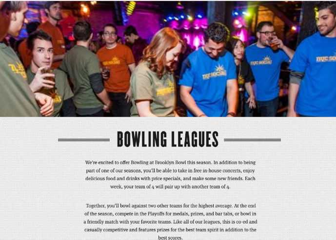
Building his skills with a camera meant Jacob Cass didn’t need to hire a photographer for his website build for Brooklyn Bowl
In practical terms, graphic designer and photographer Matthew Holland recommends: "Get a DSLR and explore all the manual settings. If you rely on automatic, like you get on a smartphone, you're only really capturing half a photo. The camera is making all the decisions for you. It would be the equivalent of laying out a wireframe and clicking a 'design' button which decides the colour pallet, typography, images etc. Only when you start to understand the power of aperture, shutter speed, ISO and white balance can you start to make informed artistic decisions."
He also urges that you "shoot in RAW rather than jpg, as you can then make the processing decisions yourself. If you shoot jpg, then your camera is making the decisions on how your image should look.
"RAW allows you to experiment with exposure, contrast, saturation, Levels, Curves, White Balance and dozens of other settings in post. Some people argue that this makes you lazy as you can 'fix' a photo after capturing it, but people have been adjusting their images in the darkroom for years."
05. UX design
As the design industry becomes ever more focused on digital, user experience (UX) design is becoming more and more important. “Designing the part of products that people interact with is increasingly in-demand among employers,” says Strohacker. “Data has become central to many products, which has created a need for people with user interface design skills who can make those products easy for customers to use.”
So what is UX, exactly? “The role of the UX designer is to take every opportunity to enhance the other person’s enjoyment of an end product, not just visually but cognitively too, removing obstacles and easing the experience,” explains Alec East, founder of Narrative Industries.
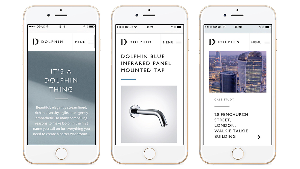
Interface design work by Taxi Studio for Dolphin Solutions
“UX design is not graphic design nor web design; it’s a different discipline that goes much deeper and is more aligned with human behaviour – but it is something that many designers are well equipped to perform if they have the discipline.”
And it’s not necessarily about pursuing a career change to become a UX designer, but boosting your ability to do the job you’re currently in.
“I believe graphic designers should aim for a wide and deep ‘T-shape’ with knowledge and appreciation for other disciplines but with a specialism (and therefore a point of view) that they excel in,” says Lee Carroll, senior interaction designer at Seymourpowell. “So it’s about graphic designers learning to speak the language of UX designers, and to communicate their point of view better, not to replace them.”
Get started by learning some of the basic rules of UX design and check out some of these TED talks on UX design.
06. Coding
As it is for UX, so it is for coding. Nobody is expecting someone focused on graphic design to build a website from start to finish – that would make them a web designer – but the more you can understand about the coding process, the better you can collaborate with developers and programmers on your digital designs.
“I hate the ‘you must code’ dogma,” says designer, developer and artist Mike Brondbjerg. “But learning to code at some level – even if that’s scripting in Illustrator or Sketch – can help designers to generate and iterate through ideas faster, and opens up a world of design complexity that is not possible manually.”
As Dean puts it: “All these skills – or knowledge of what they are and how to design with those aspects in mind – are useful. However, programming is such a vast area that the need to know how to program is less important than the need to understand how and what a programmer needs to create an outcome within a designed environment.”
Follow the advice of Jessica Hische and Russ Maschmeyer: don’t fear the internet but embrace it
Indeed, these skills are in such high demand now that your employer may well provide time at work for you to develop them. Nelson Bostock Group certainly sees things that way, says lead designer Laura Gibbons. “Here, our personal development plans identify areas of interest and important new skills to learn,” she explains.
“We believe in self-learning; encouraging our people to use resources like SkillShare.com alongside their day to day work. We protect this personal development time and offer ‘creative days’ to inspire or realign their thinking and passion. We also encourage partners and suppliers to share skills – this happened recently with an external developer sharing their insight into HTML and responsive coding.”
And even if you can’t get time at work, something as basic as HTML is pretty quick and easy to pick up. There are many good online courses, including the free ones provided by W3Schools. And if you want to go a little further, check out Don’t Fear the Internet, a learning resource from by Jessica Hische and Russ Maschmeyer that’s specifically aimed at print designers, photographers and other creatives.
07. AI/AR/VR
UX and coding have been around for quite some time now, but other, newer technologies are also becoming important to design agency work, including VR (virtual reality), AR (augmented reality), mixed reality and AI (artificial intelligence). Every graphic designer needs to keep a close eye on developments in such fields, stresses Vanessa Eckstein, D&AD Design Jury president 2018 and principal at Blok Design.
“We are designing identities and branding that need to be expansive and seamless and to cross many platforms and experiences,” she says. “This means we all need to get more savvy and knowledgeable about what technologies and innovations are taking place and how these could align with the needs of a particular brand. And then try to rethink the opportunities instead of repeating patterns.
“We can’t avoid being both in awe and overwhelmed about the big shifts taking place in AI, for example. This will affect many spaces we inhabit and the ways we interact with each other and society as a whole.
"But the key is not only to learn about it but to understand that the movement is so rapid that whatever we think we understand today might not be so in five years; while remembering that creativity and storytelling will always be at the core of everything.”
Get started by checking out 20 tutorials to help you use VR in your design work, learning how to mock up AR graphics with After Effects and how to design for artificial intelligence.
08. Print design
Many experienced graphic designers have told us they feel behind the curve on digital skills. Conversely, however, there can be a skills gap with some younger designers when it comes to print design.
Despite the rise of digital, the importance of print media to the design industry is still strong, so understanding how to properly set up your screen designs for the physical world is still a vital part of a designer's knowledge base.
“I would encourage a junior to visit a print production house,” says Gibbons. “These guys know it all; they can share their knowledge and experience on the print process, artworking, paper stock, use of colour, finishing, and more.
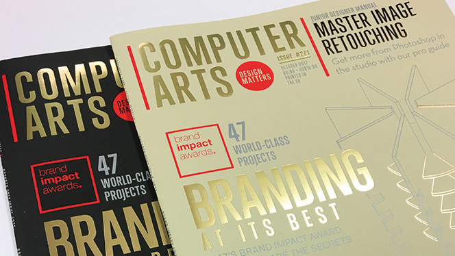
Print specialists Celloglas applied soft touch varnish and foils to issue 271 of Computer Arts magazine
"If you are fortunate enough to have a say in the final execution, this breadth of knowledge could really benefit you when it comes to initial idea generation and finishing specs. Many designers nowadays are too narrowly focused, and this vital breadth of knowledge can really help you stand out from the crowd.”
09. Problem-solving
We’ve already established that in 2018 it’s important for every designer to focus on specific software and technological skills. But Eckstein fears that some of the more important design skills may get lost along the way.
“I believe we are losing our ability to think expansively about problems in ways that accept uncertainty and paradox and raise new questions,” she says. “If we rely on data and measurability too much, we lose the deep understanding and insights that are at the core and essence of new thought.”
But if our problem solving skills are important, what can we do to hone and develop them?

As Steve Fisher puts it: “Design is about solutions, not visuals”
“Get uncomfortable, be humble and go out and experiment with something you have never done,” she recommends. “Create projects that will push your boundaries and that of the idea in your mind. See how far a concept can go, and then take it there! In my case I love collaborating with great thinkers, artists, architects etc, and I learn by doing.”
This article by Steve Fisher develops the theme that design is about solution, not visuals, while this article from the Interaction Design Foundation also provides some hints and tips to help you sharpen your problem solving skills.
10. Expansive thinking
Along with problem solving, Eckstein cites the "ability to think expansively" as a useful skill for designers to develop. Unlike other skills, which require formal study through books, courses or tutorials, this is more about constant and daily practice.
“It is not what you do but a way of seeing and relating to the world,” she explains. “It can begin by stimulating your senses and an awareness about what is happening within our profession, a space where D&AD had established itself as a leader for us all, as much as reading about very diverse subject matters and in many cases trying to analyse situations from different perspectives.“
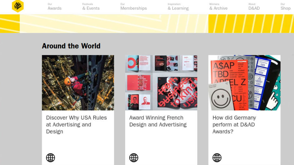
D&AD has established itself as a leader in disseminating information and advice about new trends within the profession
“It involves everything from constantly feeding our curiosity through art, poetry, architecture or being part of conversations happening in our communities, through to being involved in projects of social justice, for example,” she continues.
“Open yourself up to experiencing diversity versus falling into your usual patterns of actions and thoughts. At the core of thinking expansively lies the elasticity of our own minds.”
Read more:
7 hot web trends for 20195 huge illustration trends for 2019The best antivirus software for 2019


 According to a recent QuickBooks survey, the #1 reason freelancers go into business for themselves is because it lends them the freedom to shape their own career path.


