Get more from the Atom text editor

Original Source: http://feedproxy.google.com/~r/CreativeBloq/~3/jy8i-mSzxY4/get-more-atom-text-editor-21619396

Of all the text editors available, Atom is a favourite amongst designers and developers. Atom is developed by GitHub and was open sourced in early 2014. Since then, this web design tool has grown to have more than 500,000 monthly users. Out of the box Atom is Git-aware, includes Markdown previews, auto-complete and more. It is designed to be hackable to the core.

In addition to being open source, Atom is built using web technology: JavaScript, HTML and CSS. This makes Atom's core and extensibility options accessible to a wide range of developers.

In this article I'll share ways in which you can extend and customise Atom, from managing packages to adding custom behaviours.

atom landing page

Atom is built with JavaScript, HTML and CSS
Package ecosystem

At the time of writing, over 7,000 packages and more than 2,000 themes had been published for Atom. Atom itself is created by bundling the core app with dozens of packages for each default feature.

These packages do things like add Markdown preview support, display your directory's Git status, and control Find and Replace. They can be managed through the Settings view. Atom's Settings view sets it apart because it includes a package manager by default, giving you access to the packages you have installed, as well as the thousands created by the community. You can browse and install these from within Atom.

You can open the Settings view by clicking Packages > Settings View > Open in your menu bar or by using the cmd+, keyboard shortcut.

Packages

packages in Atom

Use packages to extend and customise Atom

With the Settings view open, you’ll find the Packages tab on the left. This will display all the packages you have installed, and their type:

Community packages: Packages written by people outside of GitHub's Atom teamCore packages: Developed by the Atom team and bundled with AtomDevelopment packages: Packages you have on your machine and use in Atom from local source

From the Packages view, you can manage your installed packages by selecting to install/uninstall or disable/enable them. Clicking on a package in this view takes you to the package's available settings (if any) as well as the README that describes the package. If you want to know more, you can click on the link and be taken to the package's repository or issue tracker.

Install packages

The Install tab in the Settings view connects you to the thousands of packages available for Atom. At the top you'll find featured packages, but you can also use the search bar to find the one you're looking for.

Packages are published to Atom using Atom Package Manager (APM), which is included with Atom. You'll find published Atom packages in the Install view, and they can also be found on Atom's website.

Just like in the Packages view, clicking on a single package displays the README, so you can see what it does before you install it. It also links to the package's code repository.

You can install new packages from the community in this view by clicking the Install button on a listed package. You can then manage packages from the Packages view.

Development packages

In order to use a package you’re developing locally in Atom before you publish it with APM, you can link it to Atom using the APM CLI. For instance, from within the package’s directory in Terminal or Bash, use the following command:

Linked packages will show up in the Development Packages section in the Packages view. You can see linked packages with this command:

Themes in Atom

In the Install view, toggle the search bar to Themes to search the available Atom themes. Once you have themes installed, you can manage and set them as the current theme in the Themes view.

UI and syntax themes

Atom has themes for both the UI and the code syntax. The syntax themes style how the code looks in the editor itself, and the UI themes style how the rest of Atom looks (e.g. the tabs and file tree).You can even make small changes to Atom without creating a complete theme or package.

Alternative customisation in Atom

The Settings tab in the Settings view provides your options for customising Atom, but you can go beyond the default options by adding JavaScript or CSS within your config. Every instance of Atom has a .atom directory that contains its configuration settings, where you can create custom behaviour or styles. 

To open your .atom configuration directory, click the ‘Open config folder' button on the left side of the Settings view.

Init.coffee file

The init.coffee file allows you to add custom behaviour to Atom every time a new window is launched. It's executed after packages are loaded and any previous editor state has been restored.

You can use CoffeeScript in this default file or create a new file, init.js, to use JavaScript. In init you can make use of the full Node.js API. For example, if each time you opened a window you wanted Atom to greet you with the version of Node.js it is using, you could add this to your init file:

To interact more with Atom, you can use the Atom API. Documentation on the API is available on the Atom site.

Styles.css

Just like the init.coffee file, styles.css is a file that is loaded after Atom starts up. The styles you add here will override or add onto Atom's existing styles, and they will take effect immediately upon saving. 

For example, you could change the editor's background colour by adding this CSS:

A quick way to find the property names in Atom is to make use of the fact that underneath Atom is Chromium, so you have access to DevTools. You can toggle DevTools on and off by pressing alt+cmd+I.

With DevTools open, you can use the magnifying glass to select elements in Atom and reveal their class or element names. Target them in your styles.css file to change their properties.

With Atom's package manager and configuration files you can customise your Atom environment right from within Atom. This introduction should get you well on your way, and if you have any questions, open an issue on the project.

This article originally appeared in issue 277 of net, the world's leading web design magazine. Subscribe here.

To improve your web design skills further, head to our conference Generate and experience a packed schedule of industry-leading speakers, workshops and valuable networking opportunities. Don't miss it! Get your Generate ticket now.

Related articles:

What to learn to upgrade your web design skillsBeware the cutting edge of web design13 best pieces of user testing software

UI Inspiration: This week's selections from Slava Kornilov, Hristo Hristov and more

Original Source: http://feedproxy.google.com/~r/abduzeedo/~3/XNbE8pXiflA/ui-inspiration-weeks-selections-slava-kornilov-hristo-hristov-and-more

UI Inspiration: This week’s selections from Slava Kornilov, Hristo Hristov and more

UI Inspiration: This week's selections from Slava Kornilov, Hristo Hristov and more

AoiroStudio
Jul 16, 2018

It’s that time of the week for our collection of UI/UX interactions to boost your UI inspiration. We are focusing on cool animations, layout designs, UX thinking and more. We are mixing it all from static, dynamic and even live prototypes, this might be a great weekly series to bookmark! This week, we are kicking it off with a very cool combination of colours and UI components designed by Slava Kornilov. You should check out another intuitive UI transition by Ning xiao dong about a Wallet App page. Hope this will give you some inspiration!

In this collection we are featuring the work from Slava Kornilov, Hristo Hristov, Adam Przybylski, Shaban Iddrisu™ and more.

More Links
For more, check out Dribbble
Follow my tweets @aoirostudio
Follow my pictures on Instagram
via Dribbble

UI Inspiration: This week's selections from Slava Kornilov, Hristo Hristov and moreDesign by Slava Kornilov

UI Inspiration: This week's selections from Slava Kornilov, Hristo Hristov and moreDesign by Hristo Hristov

UI Inspiration: This week's selections from Slava Kornilov, Hristo Hristov and moreDesign by Adam Przybylski

UI Inspiration: This week's selections from Slava Kornilov, Hristo Hristov and moreDesign by Shaban Iddrisu™

UI Inspiration: This week's selections from Slava Kornilov, Hristo Hristov and moreDesign by Yuanxu

UI Inspiration: This week's selections from Slava Kornilov, Hristo Hristov and moreDesign by Robert Felizardo

UI Inspiration: This week's selections from Slava Kornilov, Hristo Hristov and moreDesign by Ning xiao dong

UI Inspiration: This week's selections from Slava Kornilov, Hristo Hristov and moreDesign by Abdullah Un Noman

UI Inspiration: This week's selections from Slava Kornilov, Hristo Hristov and moreDesign by Veera

UI Inspiration: This week's selections from Slava Kornilov, Hristo Hristov and moreDesign by QiYang

UI Inspiration: This week's selections from Slava Kornilov, Hristo Hristov and moreDesign by Aleksandr Lunev

UI Inspiration: This week's selections from Slava Kornilov, Hristo Hristov and moreDesign by Netflayo

UI Inspiration: This week's selections from Slava Kornilov, Hristo Hristov and moreDesign by JUST Team

UI Inspiration: This week's selections from Slava Kornilov, Hristo Hristov and moreDesign by Josh Parenti

UI Inspiration: This week's selections from Slava Kornilov, Hristo Hristov and moreDesign by Christian Puga

UI Inspiration: This week's selections from Slava Kornilov, Hristo Hristov and moreDesign by Boja

UI Inspiration: This week's selections from Slava Kornilov, Hristo Hristov and moreDesign by Graphic Assets

UI Inspiration: This week's selections from Slava Kornilov, Hristo Hristov and moreDesign by Alexandr Kotelevets

UI Inspiration: This week's selections from Slava Kornilov, Hristo Hristov and moreDesign by Sunil kumar

UI Inspiration: This week's selections from Slava Kornilov, Hristo Hristov and moreDesign by Yolanda ju

UI Inspiration: This week's selections from Slava Kornilov, Hristo Hristov and moreDesign by Prometheus x GTR

UI Inspiration: This week's selections from Slava Kornilov, Hristo Hristov and moreDesign by Shekh Al Raihan ✪

UI Inspiration: This week's selections from Slava Kornilov, Hristo Hristov and moreDesign by JONDesigner

UI Inspiration: This week's selections from Slava Kornilov, Hristo Hristov and moreDesign by Giga Tamarashvili

UI Inspiration: This week's selections from Slava Kornilov, Hristo Hristov and moreDesign by Zahidul

UI Inspiration: This week's selections from Slava Kornilov, Hristo Hristov and moreDesign by Divan Raj

ui inspiration
UI/UX
ui design
interaction design


The Holy Grail Of Reusable Components: Custom Elements, Shadow DOM, And NPM

Original Source: https://www.smashingmagazine.com/2018/07/reusable-components-custom-elements-shadow-dom-npm/

The Holy Grail Of Reusable Components: Custom Elements, Shadow DOM, And NPM

The Holy Grail Of Reusable Components: Custom Elements, Shadow DOM, And NPM

Oliver Williams

2018-07-16T13:30:58+02:00
2018-07-16T17:29:08+00:00

For even the simplest of components, the cost in human-labour may have been significant. UX teams do usability testing. An array of stakeholders have to sign off on the design.

Developers conduct AB tests, accessibility audits, unit tests and cross-browser checks. Once you’ve solved a problem, you don’t want to repeat that effort. By building a reusable component library (rather than building everything from scratch), we can continuously utilize past efforts and avoid revisiting already solved design and development challenges.

A screenshot of Google’s material components website – showing various components.

Large preview

Building an arsenal of components is particularly useful for companies such as Google that own a considerable portfolio of websites all sharing a common brand. By codifying their UI into composable widgets, larger companies can both speed up development time and achieve consistency of both visual and user-interaction design across projects. There’s been a rise in interest in style guides and pattern libraries over the last several years. Given multiple developers and designers spread over multiple teams, large companies seek to attain consistency. We can do better than simple color swatches. What we need is easily distributable code.

Sharing And Reusing Code

Manually copy-and-pasting code is effortless. Keeping that code up-to-date, however, is a maintenance nightmare. Many developers, therefore, rely on a package manager to reuse code across projects. Despite its name, the Node Package Manager has become the unrivalled platform for front-end package management. There are currently over 700,000 packages in the NPM registry and billions of packages are downloaded every month. Any folder with a package.json file can be uploaded to NPM as a shareable package. While NPM is primarily associated with JavaScript, a package can include CSS and markup. NPM makes it easy to reuse and, importantly, update code. Rather than needing to amend code in myriad places, you change the code only in the package.

Getting workflow just right ain’t an easy task. So are proper estimates. Or alignment among different departments. That’s why we’ve set up “this-is-how-I-work”-sessions — with smart cookies sharing what works well for them. A part of the Smashing Membership, of course.

Explore features →

Smashing TV, with live sessions for professional designers and developers.

The Markup Problem

Sass and Javascript are easily portable with the use of import statements. Templating languages give HTML the same ability — templates can import other fragments of HTML in the form of partials. You can write the markup for your footer, for example, just once, then include it in other templates. To say there exists a multiplicity of templating languages would be an understatement. Tying yourself to just one severely limits the potential reusability of your code. The alternative is to copy-and-paste markup and to use NPM only for styles and javascript.

This is the approach taken by the Financial Times with their Origami component library. In her talk “Can’t You Just Make It More like Bootstrap?” Alice Bartlett concluded “there is no good way to let people include templates in their projects”. Speaking about his experience of maintaining a component library at Lonely Planet, Ian Feather reiterated the problems with this approach:

“Once they copy that code they are essentially cutting a version which needs to be maintained indefinitely. When they copied the markup for a working component it had an implicit link to a snapshot of the CSS at that point. If you then update the template or refactor the CSS, you need to update all versions of the template scattered around your site.”

A Solution: Web Components

Web components solve this problem by defining markup in JavaScript. The author of a component is free to alter markup, CSS, and Javascript. The consumer of the component can benefit from these upgrades without needing to trawl through a project altering code by hand. Syncing with the latest changes project-wide can be achieved with a terse npm update via terminal. Only the name of the component and its API need to stay consistent.

Installing a web component is as simple as typing npm install component-name into a terminal. The Javascript can be included with an import statement:

<script type=”module”>
import ‘./node_modules/component-name/index.js’;
</script>

Then you can use the component anywhere in your markup. Here is a simple example component that copies text to the clipboard.

See the Pen Simple web component demo by CSS GRID (@cssgrid) on CodePen.

A component-centric approach to front-end development has become ubiquitous, ushered in by Facebook’s React framework. Inevitably, given the pervasiveness of frameworks in modern front-end workflows, a number of companies have built component libraries using their framework of choice. Those components are reusable only within that particular framework.

A component from IBM’s Carbon Design System

A component from IBM’s Carbon Design System. For use in React applications only. Other significant examples of component libraries built in React include Atlaskit from Atlassian and Polaris from Shopify. (Large preview)

It’s rare for a sizeable company to have a uniform front-end and replatorming from one framework to another isn’t uncommon. Frameworks come and go. To enable the maximum amount of potential reuse across projects, we need components that are framework agnostic.

A screenshot from npmjs.com showing components that do that same thing built exclusively for particular javascript frameworks.

Searching for components via npmjs.com reveals a fragmented Javascript ecosystem. (Large preview)

A graph charting the popularity of frameworks over time. Ember, Knockout and Backbone have plunged in popularity, replaced by newer offerings.

The ever-changing popularity of frameworks over time. (Large preview)

“I have built web applications using: Dojo, Mootools, Prototype, jQuery, Backbone, Thorax, and React over the years…I would love to have been able to bring that killer Dojo component that I slaved over with me to my React app of today.”

— Dion Almaer, Director of Engineering, Google

When we talk about a web component, we are talking about the combination of a custom element with shadow DOM. Custom Elements and shadow DOM are part of both the W3C DOM specification and the WHATWG DOM Standard — meaning web components are a web standard. Custom elements and shadow DOM are finally set to achieve cross-browser support this year. By using a standard part of the native web platform, we ensure that our components can survive the fast-moving cycle of front-end restructuring and architectural rethinks. Web components can be used with any templating language and any front-end framework — they’re truly cross-compatible and interoperable. They can be used everywhere from a WordPress blog to a single page application.

The Custom Elements Everywhere project by Rob Dodson documents the interoperability of web components with various client-side Javascript frameworks.

The Custom Elements Everywhere project by Rob Dodson documents the interoperability of web components with various client-side Javascript frameworks. React, the outlier here, will hopefully resolve these issues with React 17. (Large preview)

Making A Web Component

Defining A Custom Element

It’s always been possible to make up tag-names and have their content appear on the page.

<made-up-tag>Hello World!</made-up-tag>

HTML is designed to be fault tolerant. The above will render, even though it’s not a valid HTML element. There’s never been a good reason to do this — deviating from standardized tags has traditionally been a bad practice. By defining a new tag using the custom element API, however, we can augment HTML with reusable elements that have built-in functionality. Creating a custom element is much like creating a component in React — but here were extending HTMLElement.

class ExpandableBox extends HTMLElement {
constructor() {
super()
}
}

A parameter-less call to super() must be the first statement in the constructor. The constructor should be used to set up initial state and default values and to set up any event listeners. A new custom element needs to be defined with a name for its HTML tag and the elements corresponding class:

customElements.define(‘expandable-box’, ExpandableBox)

It’s a convention to capitalize class names. The syntax of the HTML tag is, however, more than a convention. What if browsers wanted to implement a new HTML element and they wanted to call it expandable-box? To prevent naming collisions, no new standardized HTML tags will include a dash. By contrast, the names of custom elements have to include a dash.

customElements.define(‘whatever’, Whatever) // invalid
customElements.define(‘what-ever’, Whatever) // valid

Custom Element Lifecycle

The API offers four custom element reactions — functions that can be defined within the class that will automatically be called in response to certain events in the lifecycle of a custom element.

connectedCallback is run when the custom element is added to the DOM.

connectedCallback() {
console.log(“custom element is on the page!”)
}

This includes adding an element with Javascript:

document.body.appendChild(document.createElement(“expandable-box”)) //“custom element is on the page”

as well as simply including the element within the page with a HTML tag:

<expandable-box></expandable-box> // “custom element is on the page”

Any work that involves fetching resources or rendering should be in here.

disconnectedCallback is run when the custom element is removed from the DOM.

disconnectedCallback() {
console.log(“element has been removed”)
}
document.querySelector(“expandable-box”).remove() //”element has been removed”

adoptedCallback is run when the custom element is adopted into a new document. You probably don’t need to worry about this one too often.

attributeChangedCallback is run when an attribute is added, changed, or removed. It can be used to listen for changes to both standardized native attributes like disabled or src, as well as any custom ones we make up. This is one of the most powerful aspects of custom elements as it enables the creation of a user-friendly API.

Custom Element Attributes

There are a great many HTML attributes. So that the browser doesn’t waste time calling our attributeChangedCallback when any attribute is changed, we need to provide a list of the attribute changes we want to listen for. For this example, we’re only interested in one.

static get observedAttributes() {
return [‘expanded’]
}

So now our attributeChangedCallback will only be called when we change the value of the expanded attribute on the custom element, as it’s the only attribute we’ve listed.

HTML attributes can have corresponding values (think href, src, alt, value etc) while others are either true or false (e.g. disabled, selected, required). For an attribute with a corresponding value, we would include the following within the custom element’s class definition.

get yourCustomAttributeName() {
return this.getAttribute(‘yourCustomAttributeName’);
}
set yourCustomAttributeName(newValue) {
this.setAttribute(‘yourCustomAttributeName’, newValue);
}

For our example element, the attribute will either be true or false, so defining the getter and setter is a little different.

get expanded() {
return this.hasAttribute(‘expanded’)
}

// the second argument for setAttribute is mandatory, so we’ll use an empty string
set expanded(val) {
if (val) {
this.setAttribute(‘expanded’, ”);
}
else {
this.removeAttribute(‘expanded’)
}
}

Now that the boilerplate has been dealt with, we can make use of attributeChangedCallback.

attributeChangedCallback(name, oldval, newval) {
console.log(`the ${name} attribute has changed from ${oldval} to ${newval}!!`);
// do something every time the attribute changes
}

Traditionally, configuring a Javascript component would have involved passing arguments to an init function. By utilising the attributeChangedCallback, its possible to make a custom element that’s configurable just with markup.

Shadow DOM and custom elements can be used separately, and you may find custom elements useful all by themselves. Unlike shadow DOM, they can be polyfilled. However, the two specs work well in conjunction.

Attaching Markup And Styles With Shadow DOM

So far, we’ve handled the behavior of a custom element. In regard to markup and styles, however, our custom element is equivalent to an empty unstyled <span>. To encapsulate HTML and CSS as part of the component, we need to attach a shadow DOM. It’s best to do this within the constructor function.

class FancyComponent extends HTMLElement {
constructor() {
super()
var shadowRoot = this.attachShadow({mode: ‘open’})
shadowRoot.innerHTML = `<h2>hello world!</h2>`
}

Don’t worry about understanding what the mode means — its boilerplate you have to include, but you’ll pretty much always want open. This simple example component will just render the text “hello world”. Like most other HTML elements, a custom element can have children — but not by default. So far the above custom element we’ve defined won’t render any children to the screen. To display any content between the tags, we need to make use of a slot element.

shadowRoot.innerHTML = `
<h2>hello world!</h2>
<slot></slot>
`

We can use a style tag to apply some CSS to the component.

shadowRoot.innerHTML =
`<style>
p {
color: red;
}
</style>
<h2>hello world!</h2>
<slot>some default content</slot>`

These styles will only apply to the component, so we are free to make use of element selectors without the styles affecting anything else of the page. This simplifies writing CSS, making naming conventions like BEM unnecessary.

Publishing A Component On NPM

NPM packages are published via the command line. Open a terminal window and move into a directory that you would like to turn into a reusable package. Then type the following commands into the terminal:

If your project doesn’t already have a package.json, npm init will walk you through generating one.
npm adduser links your machine to your NPM account. If you don’t have a preexisting account, it will create a new one for you.
npm publish

NPM packages are published via the command line

Large preview

If all’s gone well, you now have a component in the NPM registry, ready to be installed and used in your own projects — and shared with the world.

An example of a component in the NPM registry, ready to be installed and used in your own projects.

Large preview

The web components API isn’t perfect. Custom elements are currently unable to include data in form submissions. The progressive enhancement story isn’t great. Dealing with accessibility isn’t as easy as it should be.

Although originally announced in 2011, browser support still isn’t universal. Firefox support is due later this year. Nevertheless, some high-profile websites (like Youtube) are already making use of them. Despite their current shortcomings, for universally shareable components they’re the singular option and in the future we can expect exciting additions to what they have to offer.

Smashing Editorial
(il, ra, yk)

30 books every graphic designer should read – Amazon Prime Day edition

Original Source: http://feedproxy.google.com/~r/CreativeBloq/~3/J32twDhakC4/books-graphic-designers-11135231

There are hundreds of fantastic graphic design books out there, offering words of wisdom, design inspiration, and refreshers on key principles and techniques. Whether you're looking to swot up on design theory or recharge your creative batteries, we've curated the best titles here, in this essential reading list.

And with Amazon Prime Day launching on the 16th and 17th July, it should be possible to find some bargains on select books, too. Our price comparison tool will show you all the best Prime Day deals on our favourite books in the guide below – or you can peruse more deals directly on Amazon:

See more Amazon Prime Day deals: US | UK | Australia | India

You'll find plenty of classic titles in this list from the great names of graphic design, but there are also plenty of books you might be less familiar with. Whether you'd like to know more about logos, go further with type, or get to know more about your favourite graphic designers, this list of great books for graphic designers has something for you.

Get Adobe Creative Cloud
Logo and branding books

Logo Modernism by Jens Müller

Taschen produces some truly spectacular books, and Logo Modernism is no different. Bringing together approximately 6000 trademarks, registered between 1940-80, Jens Müller examines the distillation of modernism in graphic design and how these attitudes and imperatives gave birth to corporate identity.

Müller includes a variety of logos, organised into three chapters – geometric, effect and typographic – in order to both educate you as well as provide a comprehensive index of inspirational logo designs to inform your own work.

———————–

Branding: In Five and a Half Steps by Michael Johnson

Leading graphic designer Michael Johnson demystifies the branding process in his latest book, Branding: In Five and a Half Steps. Dividing the process into five key steps – investigation, strategy and narrative, design, implementation and engagement – Johnson also acknowledges the non-linear nature of branding with a crucial half step, which marks the fluid relationship between strategy and design.

A no-nonsense, six-question model structures the first half of the book; the second analyses the design process, using over 1,000 contemporary brand identities from around the world.

This is the ultimate step-by-step visual guide to creating a successful brand identity. It’s an essential read for anyone in the branding industry, and a particularly valuable resource for students and new designers.

———————–

Typography books

The Elements of Typographic Style (v4) by Robert Bringhurst

First published in 1992, this history and guide to typography from Canadian typographer, poet and translator Robert Bringhurst has quickly become a major typographic resource. Leading typographers Jonathan Hoefler and Tobias Frere-Jones call it "the finest book ever written about typography" – and it isn’t difficult to see why.

The Elements of Typographic Style is a beautifully written manual combining practical, theoretical and historical information, while also sharing a deeper philosophy and understanding of the topic. If you’re looking for a book covering the finer points of type and typography, you’ll save a lot of money by starting with this one.

———————–

Just My Type by Simon Garfield

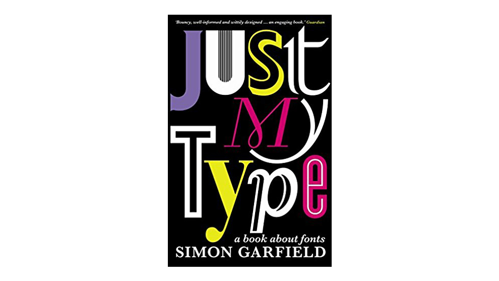
Graphic designers are trained to look at typefaces, but Simon Garfield's book Just My Type will encourage you to look even closer, taking in the rich history of fonts, as well as looking at their powers. 

A well-chosen font communicates to the reader on an almost subliminal level and it can make (or break) a design.

———————–

How to be a graphic designer

How to be a Graphic Designer Without Losing Your Soul by Adrian Shaughnessy

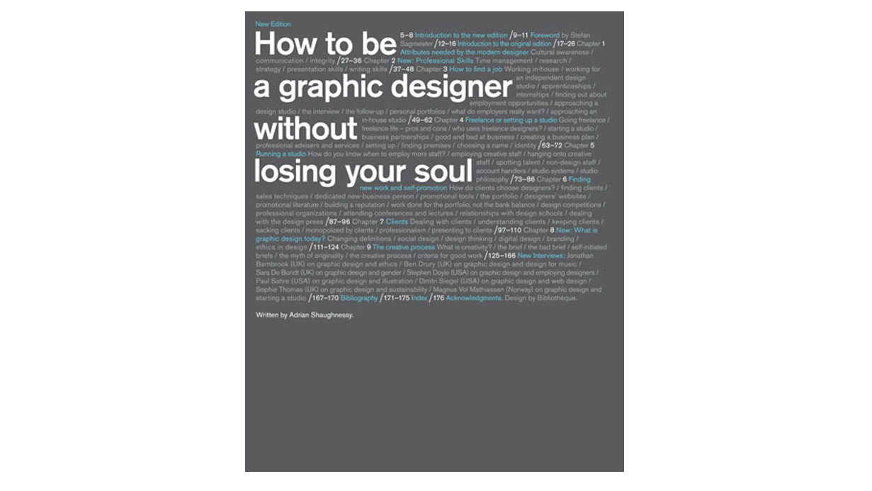
Sound advice from Adrian Shaughnessy on gaining employment, setting up as a freelancer, forming a company, dealing with clients, pitching and loads more fills this book.

As graphic design books go, How to be a Graphic Designer Without Losing Your Soul is insightful, intelligent, accessible and simply full of great advice, with the author calling on such luminaries as Neville Brody, Natalie Hunter, John Warwicker and Andy Cruz to help pull together his ideas.

———————–

How to... by Michael Bierut

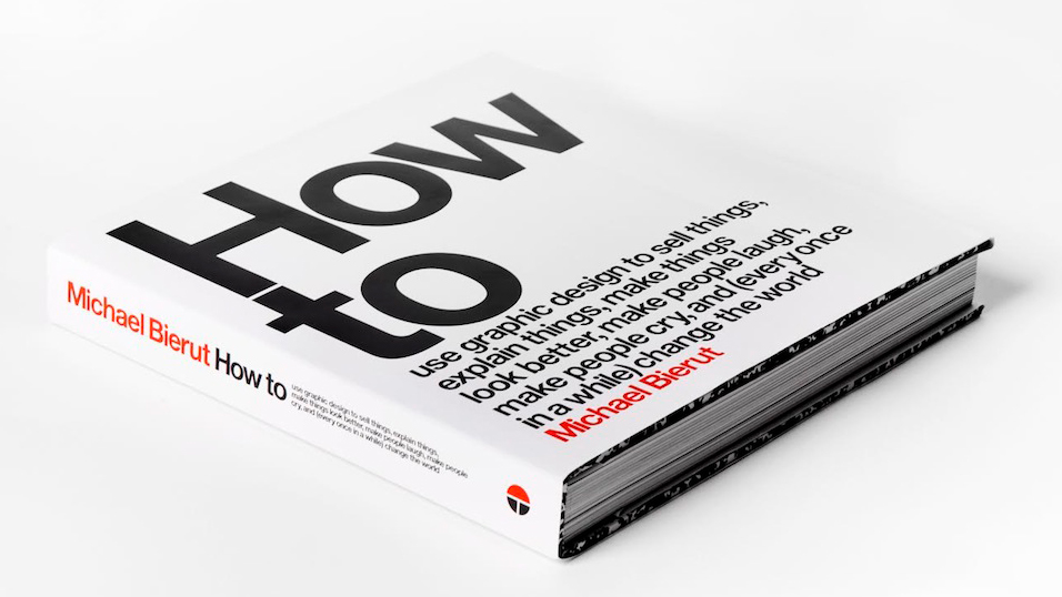
Veteran designer and Pentagram New York partner Michael Bierut released this inspiring, highly readable monograph, manual and manifesto in 2015. Featuring 35 projects, Bierut – who’s a protégé of design legend Massimo Vignelli – illustrates the varied role that graphic design plays in the modern world.

Rough sketches and rejected ideas sit alongside finished work. How To (full title How to Use Graphic Design to Sell Things, Explain Things, Make Things Look Better, Make People Laugh, Make People Cry, and (Every Once in a While) Change the World) is packed with insights into the creative process, making it a valuable resource to new and established designers alike.

———————–

Work for Money, Design for Love by David Airey

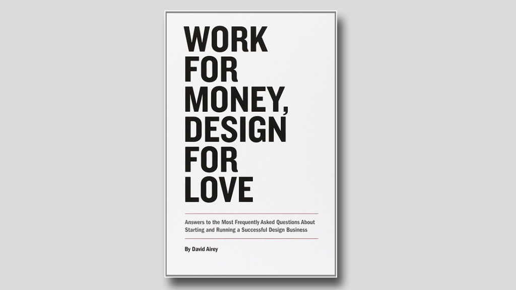
Inspired by the many questions that David Airey – author of Logo Design Love – receives on a daily basis, Work for Money, Design for Love is a refreshing, straightforward guide that tackles the essentials of starting your own design business.

Touching on everything from the mindset needed to be a designer and how to take that first step into being your own boss, to business basics, this is a must-have read for anyone thinking about going it alone.

———————–

The Art of Looking Sideways by Alan Fletcher

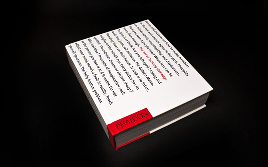
Alan Fletcher, the legendary co-founder of Pentagram, penned various thought-provoking tomes during his illustrious graphic design career, but The Art of Looking Sideways is perhaps the best known – questioning the way designers think about everything from colour to composition.

Once you've digested his seminal text, give Picturing and Poeting a go, exploring the link between imagery and meaning through a series of visual mind-teasers, games and visual puns, assembled from his personal notebooks and diaries. Another great work by Fletcher, Beware Wet Paint, is a more conventional monograph, looking back over 35 years of inspiring work and putting it all in the context of Fletcher's remarkable thought process.

———————–

A Designer's Art by Paul Rand

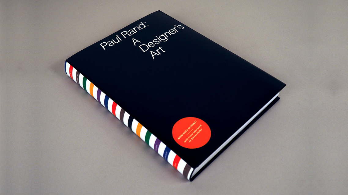
Heralded by many as one of the fathers of modern branding, Paul Rand has several inspiring books to his name. Design, Form and Chaos is unfortunately out of print, but if you can track down a copy it's worth it to immerse yourself in his talent for simplicity, and to explore the thinking behind some of his best-known identities.

A Designer's Art, meanwhile, probes more deeply into the process of graphic design in general: why it's important; the impact it can have on society; what works, what doesn't, and most importantly, why.

———————–

Perverse Optimist by Tibor Kalman

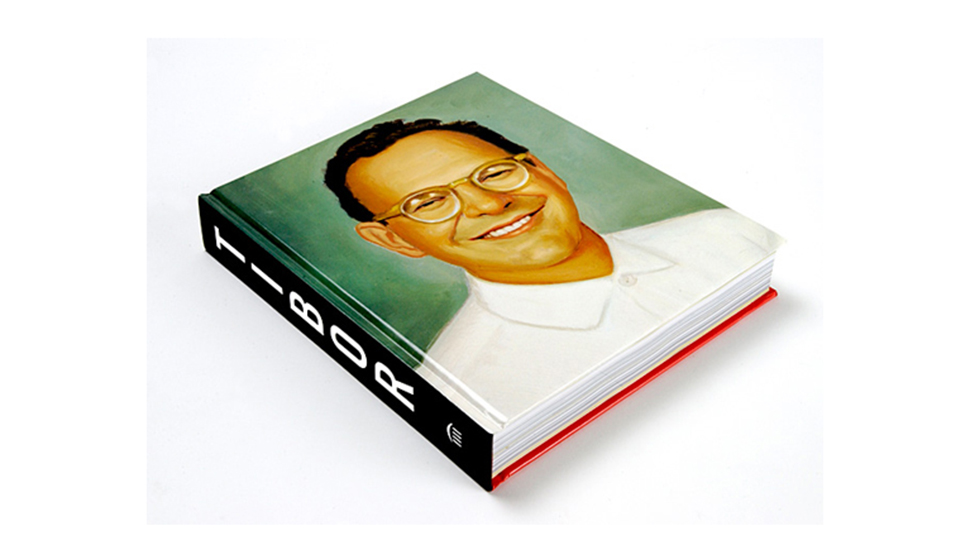
Written by Tibor Kalman and edited by Peter Hall and Michael Bierut, Perverse Optimist is another notoriously hard-to-obtain volume which, like Rand’s Design, Form and Chaos, is sadly out of print. But second-hand copies do appear…

Dedicated to the visionary editor-in-chief of Colors magazine and creative director of Interview, Perverse Optimist is a weighty tome by any standards, and packed with high-impact images and insightful analysis of the art direction process behind them.

———————–

Graphic Design: A User's Manual by Adrian Shaughnessy

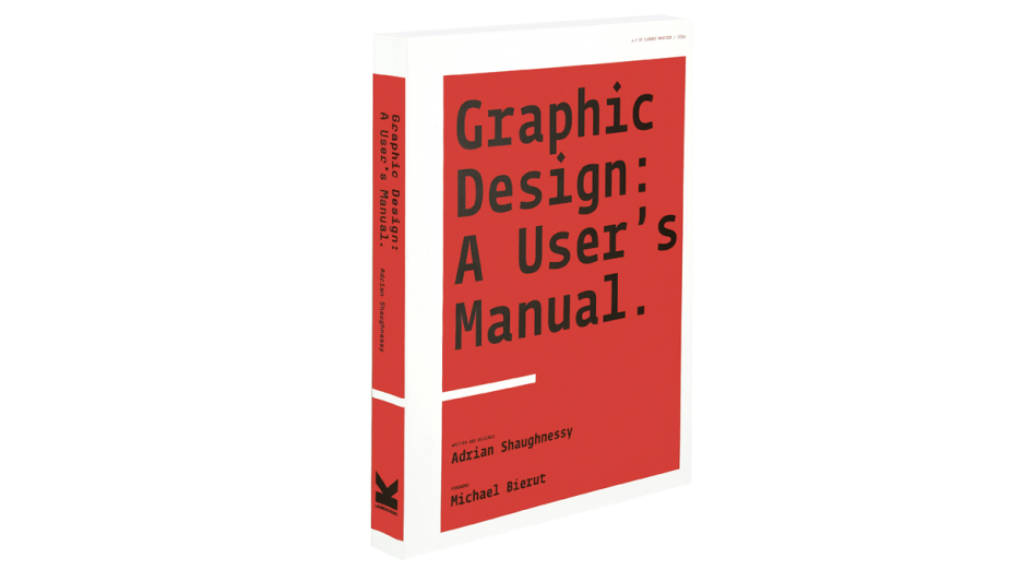
Another insightful resource from designer and industry commentator Adrian Shaughnessy, Graphic Design: A User's Manual brings you everything you need to know to survive and prosper in the complex, ever-shifting world of graphic design.

Organised from A-Z, topics include annual reports, budgeting, kerning, presenting, dealing with rejection and more. This is an entertaining and invaluable resource that’s packed with pro advice on all the things you won’t have been taught at design school.

———————–

Show Your Work! by Austin Kleon

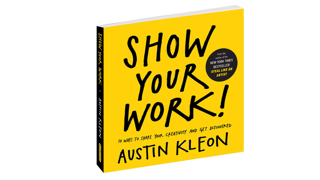
In his follow-up to New York Times best-seller, Steal Like An Artist (another must-read), author and writer Austin Kleon reveals what can be the most challenging part of your career as a designer – how to get your work seen. 

In Show Your Work! 10 ways to share your creativity and get discovered, Kleon is full of helpful hints and tips on how to become findable, how to appeal to the community and use the network to sell your work. If nothing else, it's a useful little pocket guide to remind you to be open, generous, brave and productive.

———————–

The Little Know-It-All: Common Sense for Designers

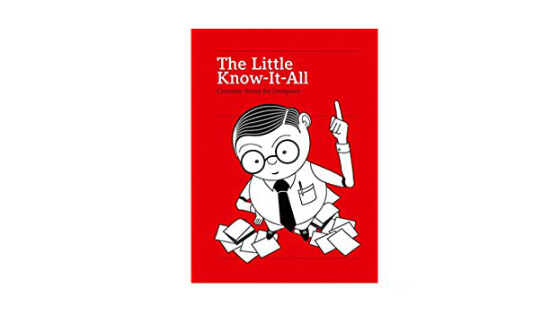
Don’t judge The Little Know-It-All: Common Sense for Designers by its cover or size – it’s possibly the most useful book you’ll own as a designer. Everything from light, colour and perspective to law and marketing are covered in succinct, beautifully carved chapters.

It’s the kind of book that you never stop reading once you start; the kind you’ll always refer back to, making it a winner on pretty much every level.

———————–

Design theory and history  

Grid Systems in Graphic Design: A Visual Communication Manual for Graphic Designers, Typographers and Three Dimensional Designers by Josef Mülller-Brockmann

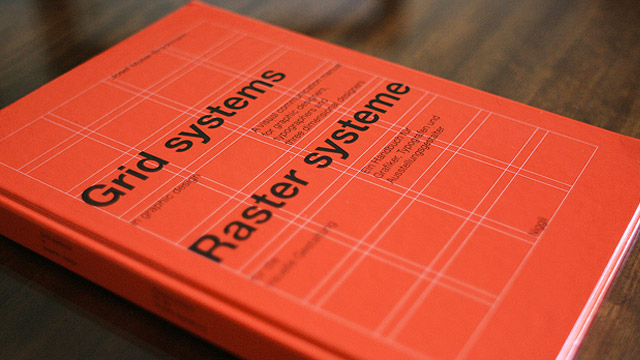
Grid Systems in Graphic Design remains the definitive word on using grid systems in graphic design. Written by legendary Swiss graphic designer Josef Mülller-Brockmann, this visual communication manual for graphic designers, typographers and 3D designers is packed with examples on how to work correctly at a conceptual level. 

It’s a must-read resource for any student or practising designer – regardless of whether you prefer the David Carson approach.

———————–

Interaction of Color by Josef Albers

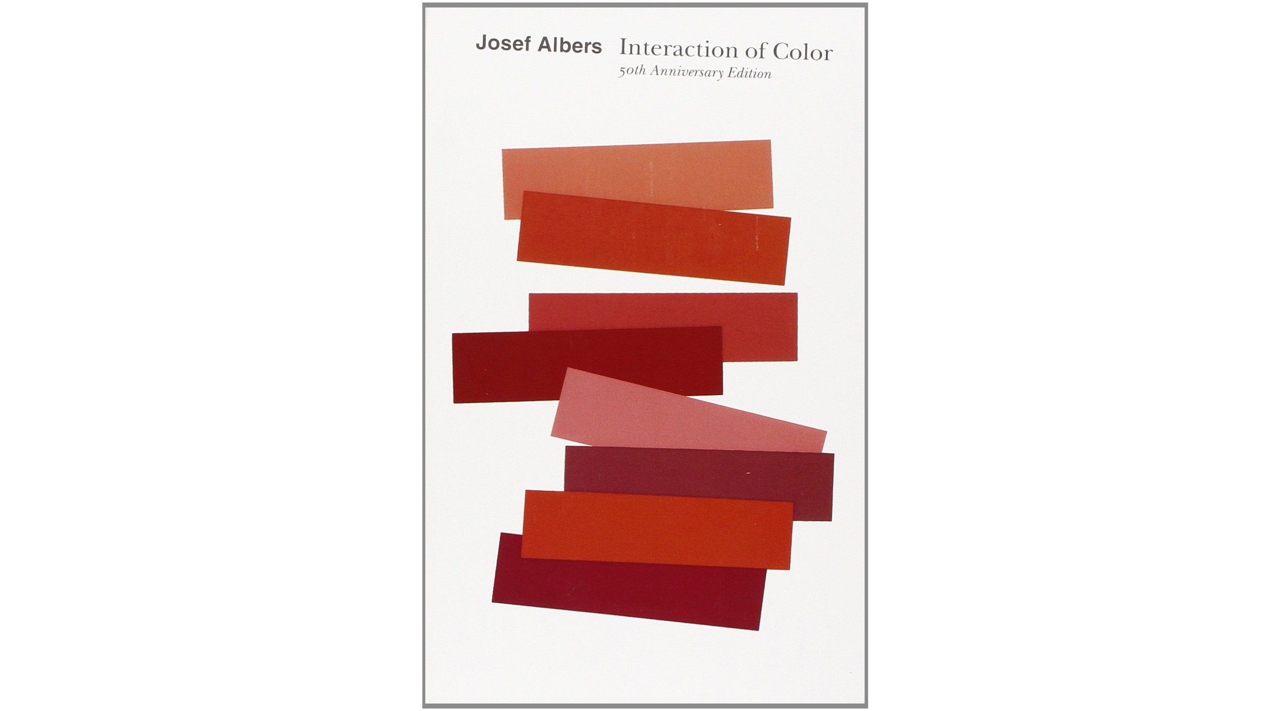
Conceived as a handbook and teaching aid for artists, instructors and students, Interaction of Color is an influential book that presents Josef Albers's singular explanation of complex colour theory principles.

It’s been over 50 years since this tome was first published, but it remains an essential resource on colour, demonstrating principles such as colour relativity, intensity and temperature; vibrating and vanishing boundaries; and the illusion of transparency and reversed grounds.

———————–

The graphic language of Neville Brody

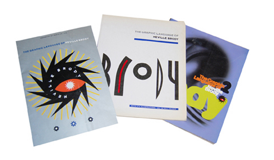
You'll find this book on the must-read list on every self-respecting graphic design course, and with good reason. Neville Brody may have been president of D&AD and head of Research Studios' global studio network, but it was arguably his 1980s heyday that had the biggest impact on contemporary graphic design.

First published in 1988, The graphic language of Neville Brody explores the thought process behind some of his best-known work, including his genre-defining art direction of The Face magazine.

———————–

Designed by Peter Saville

Like Brody, Peter Saville famously built his reputation in the 1980s with iconic album artwork for Factory Records-signed bands such as Joy Division and New Order – but this 2003 publication was the first to chronicle his career.

Starting in 1978, Designed by Peter Saville inevitably covers the Factory era in detail but also explores Saville's design and art direction for the fashion and advertising industries, taking in brands such as Dior, Stella McCartney and London's Whitechapel gallery.

———————–

The End of Print: The Grafic Design of David Carson

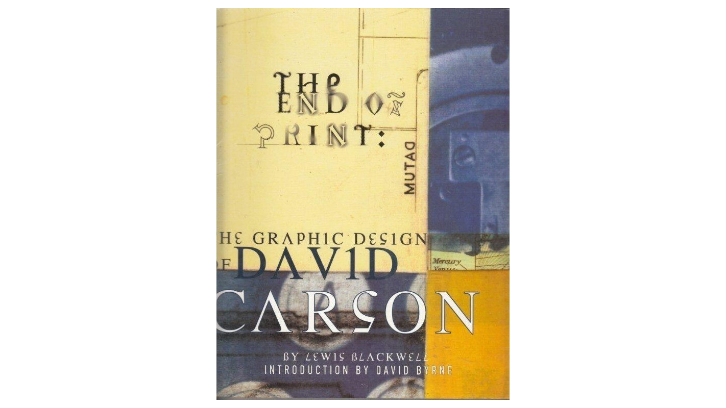
If Brody and Saville defined the 1980s, Carson conquered the 1990s with his unconventional approach to page design, using distorted type and fragmented imagery that played with notions of legibility – particularly during his tenure as art director of Ray Gun.

He went on to work with a stellar client list that includes Pepsi, Nike, Armani, Levi's, Sony and MTV. While the approach outlined in The End of Print: The Grafik Design of David Carson is very much of its time, the insight that the book provides into the iconic surfer/designer's process is unrivalled.

———————–

Left to Right: The Cultural Shift from Words to Pictures  by David Crow

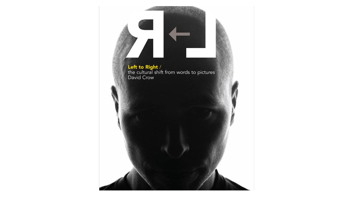
Visual communication rests on the power of semiotics, a concept that David Crow examines in expert detail within this seminal text. 

Dealing with the principles of written communication and its relationship to imagery, and rounded off with an examination of audience understanding, Left to Right is a valuable assessment of academic yet essential design theory.

———————–

Designer monographs

Two-Dimensional Man by Paul Sahre

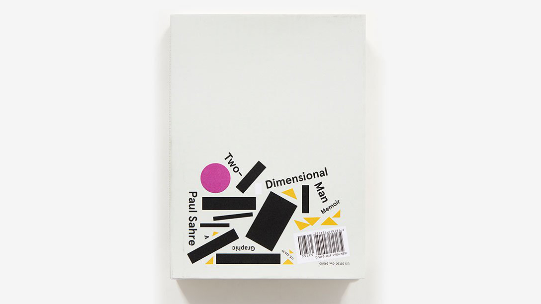
Paul Sahre is one of the most influential graphic designers of his generation and has operated his own design consultancy since 1997. Working out of his office in New York City, his clients have included The New York Times, Google and Marvel Comics and he lectures about graphic design all over the world.

His book, Two-Dimensional Man, is part monograph, part autobiography, part art book and part reflection on creativity. Combining personal essays discussing the realities of living creativity during his 30-year career, he proves that throughout highs and lows, humour can be a saving grace.

———————–

Things I Have Learned in My Life So Far by Stefan Sagmeister

Austria-born, New York-based designer Stefan Sagmeister has hit the headlines a couple of times in the few years with his nude promotional shenanigans, but his two monographs, published in 2008 and 2009, are all about his creative approach and output.

Things I Have Learned in My Life So Far revolves around 21 thought-provoking phrases, transformed into typographic works for various clients around the world and has been since updated. His second text, Made You Look, is fully illustrated with a red PVC slipcase and spans 20 years of his graphic design in depth. The two complement each other excellently.

———————–

Love Song by Non-Format

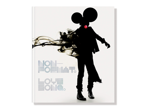
An iconic studio for the modern age, Non-Format is a fruitful transatlantic collaboration between Oslo-based Kjell Ekhorn and US-based Brit Jon Forss.

Their 2007 monograph, Love Song, is packed with awe-inspiring imagery and insight into the duo's creative process over five years between 1999 and 2003, from advertising work for Coke and Nike to stunning art direction for The Wire magazine.

———————–

Designer monographs: Pentagram: Marks

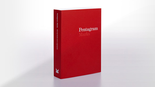
Unsurprisingly, given its status as arguably the world's most famous design agency, Pentagram has attracted its fair share of monographs over the decades: seven so far and still counting. 

Marks simply reproduces four hundred of the hugely diverse identities that the agency has created since 1972. An incredible cross-section of design history.

———————–

M to M of M/M (Paris) by Emily King

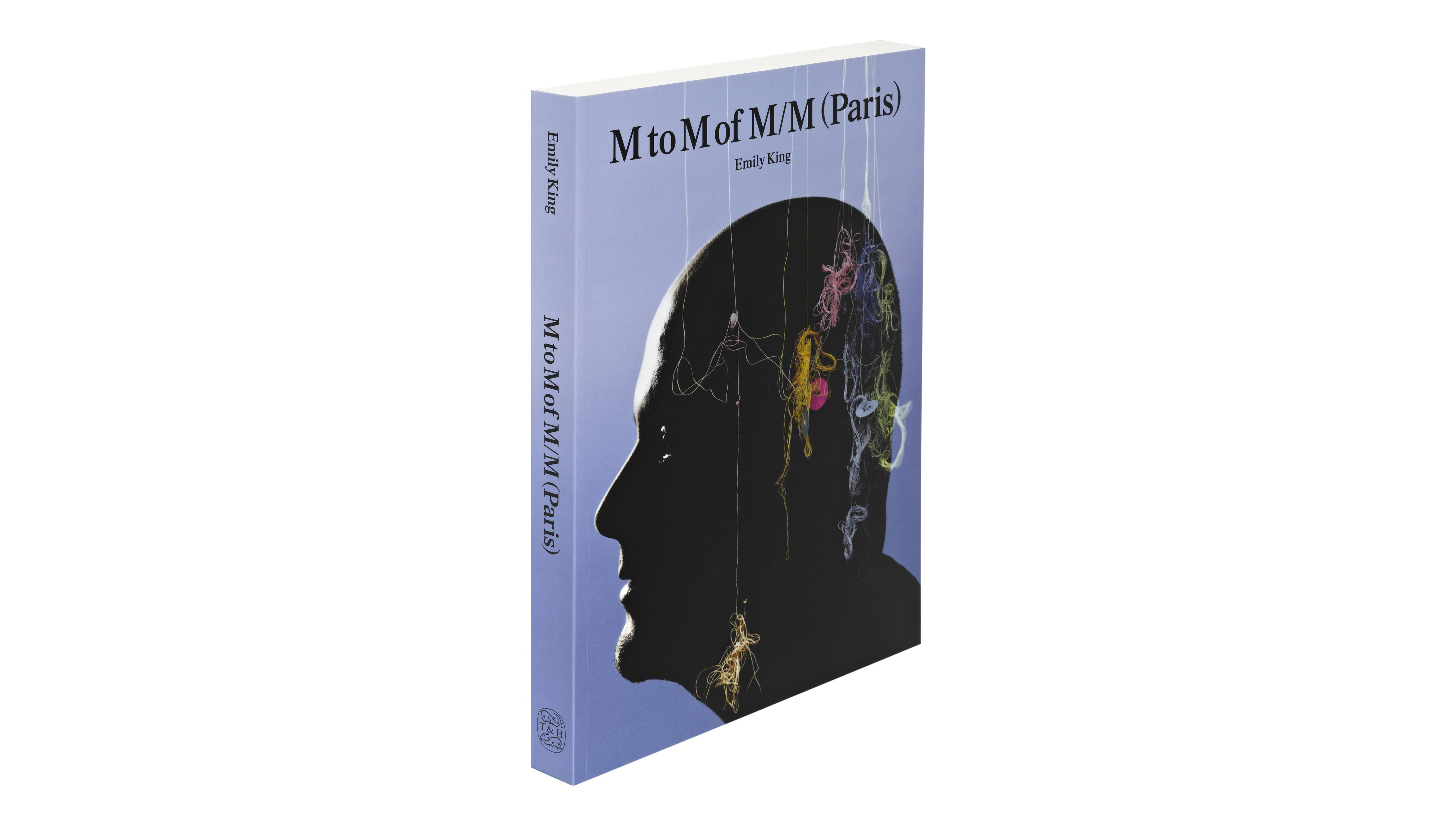
It was a long time coming, but this definitive 528-page monograph of the iconic Parisian duo Michaël Amzalag and Mathias Augustyniak, aka M/M (Paris), was worth the wait.

Chronicling two decades of stunning work spanning the worlds of music, fashion and fine art, M to M of M/M (Paris) is presented as a reshuffled alphabetical dictionary, starting and ending with M. The studio's highly distinctive, unique approach to type, print design, drawing and photography shines throughout.

———————–

Ideas and inspiration

The Graphic Design Idea Book: Inspiration from 50 Masters by Steven Heller and Gail Anderson

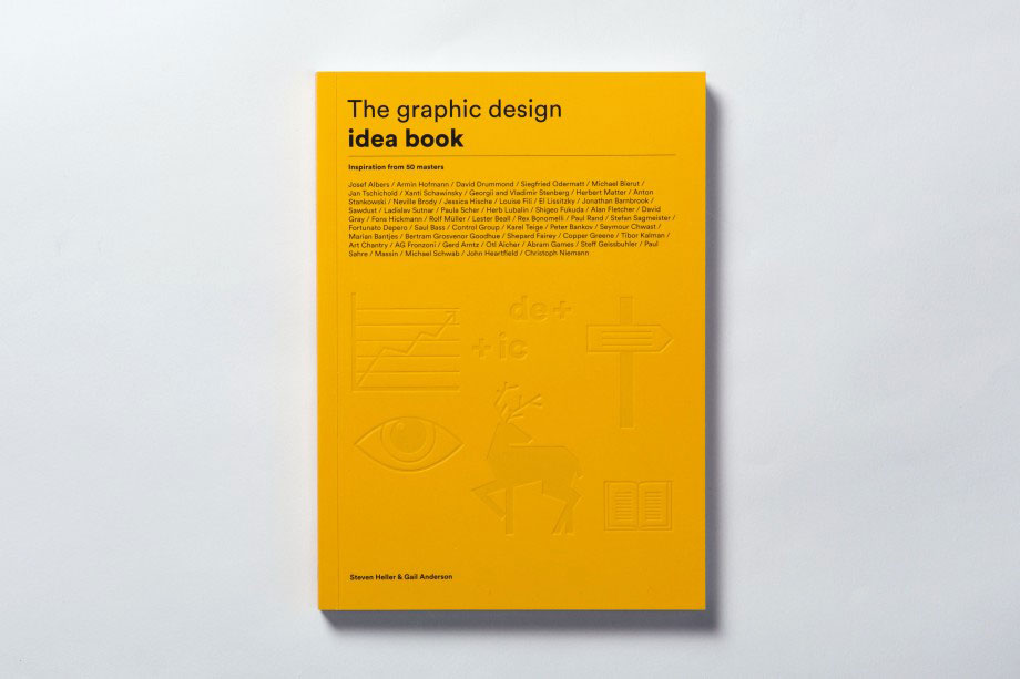
The Graphic Design Idea Book: Inspiration from 50 Masters covers all the key elements of great design, featuring seminal works from acclaimed designers such as Paul Brand, Neville Brody and Stefan Sagmeister. It's sure to spark inspiration and keep those creative juices flowing.

Honing in on those professional techniques, authors Steven Hiller and Gail Anderson refresh your knowledge on colour, narrative, illusion, humour, simplicity, ornaments and more.

———————–

Illustration Play by Victionary

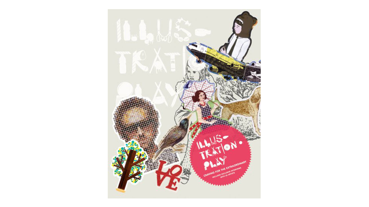
First up, Illustration Play has one of the most beautiful, special and intriguing covers you’ll see, each one being individually stickered by hand. 

This is to echo the explorative approach taken by all of the illustrators featured in the book – looking at new ideas and ways to realise concepts within contemporary illustration. A lovely object.

———————–

Graphics Alive 2 by Victionary

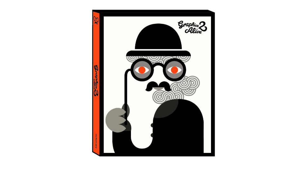
Exploring the omnipresent power of graphic design and illustration in today’s society, Graphics Alive 2 (the first book also being great) is not only beautifully designed in itself, but also packed full of highly inspirational T-shirt graphics, shoes, signs, wallpaper and other everyday objects and ephemera that top designers have lent their eye to. An intense, head-hurting experience.

———————–

Palette No 4: Neon, New Fluorescent Graphics by Victionary

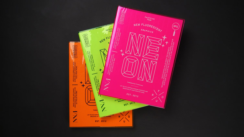
Picking the right colour palette for your design work is always a difficult decision. While some favour the more understated, others opt for the bold and bright. Palette No 4: Neon, New Fluorescent Graphics is a beautiful 296-page book (again by Victionary) showcasing the applications of fluorescent colours in the design world, examining where they work best.

Including branding, interior design, and fashion, a total of 110 loud and colourful projects by designers across the globe are featured.

———————–

A Logo for London by David Lawrence

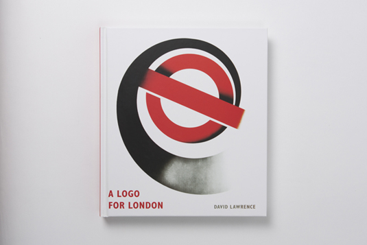
London's Underground system is over 150 years old, and this book by David Lawrence tells you all you need to know about the famous London Transport logo design.

A Logo for London celebrates the instantly recognisable bar and circle, also known as the bullseye. With 250 colour illustrations, this charming and informative tome charts the history and development of the symbol from the early 20th century to the present day.

———————–

Super Graphic: A visual guide to the comic book universe by Tim Leong

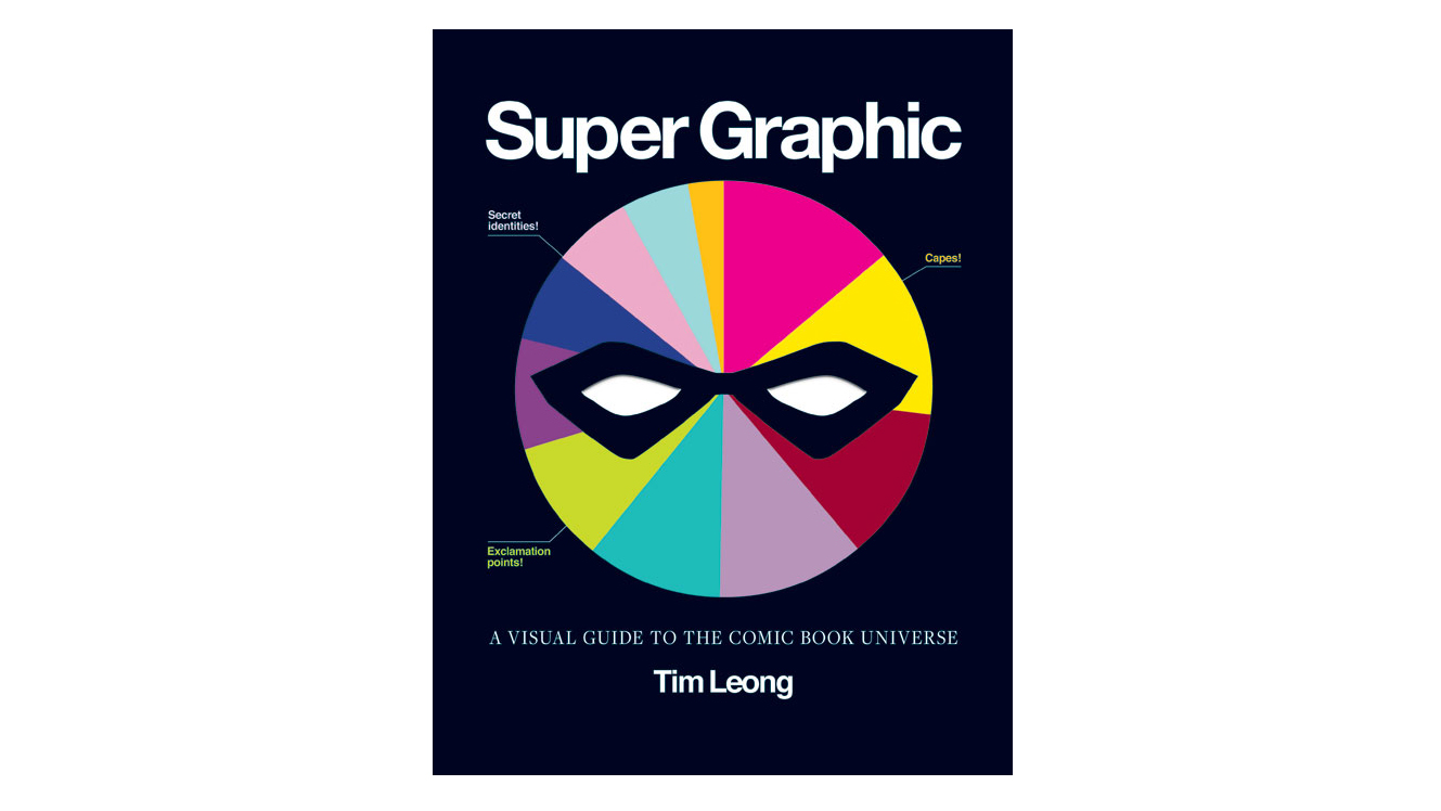
What is the Joker's favourite question for Batman? Are there more deaths by human or by zombie in The Walking Dead? Those are just some of the questions answered in this book via an array of inspirational infographics. 

Even if you're not a comic book fan, the variety of infographic styles on offer in Super Graphic: A Visual Guide to the Comic Book Universe by Tim Leong will bring you tons of inspiration.

Liked that? Then read these next:

Best free fonts for designers25 logo design tips from the experts10 top design-related movies

How to pick the perfect colour palette every time

Original Source: http://feedproxy.google.com/~r/CreativeBloq/~3/YE0lZ2Ep6Ho/how-to-pick-the-perfect-colour-palette-every-time

In the 1980s, colour psychologist Angela Wright revolutionised colour theory by identifying links between patterns of colour and patterns of human behaviour. She found that all colours can be classified into one of four tonal groups, and that mathematical relationships underpin the shades and tones within each group. In other words, Wright proved objective colour harmony.

She went on to develop the Colour Affects System, which identifies links between the four colour groups and four basic personality types, based on original research involving Aristotle, Newton and German writer Johann Wolfgang von Goethe.

If harnessed correctly, designers can use the Colour Affects System to control the message of their colour palettes and, crucially, kill subjective debate around colour in client meetings with evidence to back up their decisions. Here's how it works…

Colour Affects System: the basics  

Bp logo

BP uses group 1 colours: clear, delicate and warm

Every shade, tone or tint on the colour spectrum can be classified into one of four colour groups, based on how warm or cool it is. All colours within each group correlate mathematically and naturally harmonise, while colours combined from different families don't. 

There are also four basic personality types – ranging between extrovert and introvert – and each type has a natural affinity with one colour group. Universally, everyone will find a palette chosen with colours from the same group harmonious, but they'll find a palette drawn from their personality type's corresponding colour group even more attractive.

You'll find a breakdown of the different colour groups on the next page.

Dreams logo

Bedding firm Dreams uses elegant and timeless group 2 colours
Colour in harmony 

"Music and colour work in much the same way," explains Wright, who developed the Colour Affects System from her earlier research, The Wright Theory. She's provided colour palettes for clients ranging from Shell International Petroleum Company and Procter & Gamble to BT, Unilever, and more. 

"One musical note has its own properties, but it doesn't do much until you put it with other notes. There are no wrong notes, and there are no wrong colours, either. It's how you use them. If you put them together in harmony, they produce a positive response. But it only takes one bum note to throw the whole thing out."

Currently, Wright is working on a digital version of the Colour Affects System, which will be launching at the end of this year. The software enables users to select their starting colour – the dominant logo colour, for instance – and then classifies it into one of the four groups, removing all colours from the other three groups. Users are left with a huge, harmonious selection from which to then develop a brand's colour palette. 

McDonald's logo

McDonald’s corporate colours are mainly group 3: intense and fiery

"You pick the subsequent colours for your branding scheme in the same way as you do now," Wright explains. "You've got a large framework – there are millions of colours to choose from – except there are no bum notes, because there are mathematical correlations that underpin each colour," she adds. 

How effective is the Colour Affects System?

A few years ago, Wright was asked by a mail order company to adjust the colours of a leaflet selling an opera CD. "The in-house design team had created a leaflet and they wanted me to tweak the colours into harmony," she recalls. "The ones they'd used were okay – quite familiar – but they're weren't right, either psychologically or harmoniously."

texaco logo

Texaco uses a group 4 palette, suggesting efficiency, sophistication and excellence

Wright adapted the colours so that the chosen palette came from the same tonal family. "They sent out two identical mail shots, and they sold 560,000 more CDs with the tweaked leaflet than the original," she says. 

"And all I did was tweak the harmony after it had been designed – I didn't specify the colours used in the first place." It seems the right colours do sell.

Next page: the four colour groups revealed

Group 1: Type 1 personality

group 1 colours

Group 1 colours are often used for fun brands

Group 1 colours are clear, delicate and warm, and contain yellow, but no black. Examples include soft cream, turquoise and cobalt. "They're lively, sharp, fresh, clean and youthful – all about new beginnings," says Wright. 

"It's very common to use them in the branding of things like children's toys, PR, sales, sport, and fun sectors of anything." However, if misused, these colours can be perceived as frivolous and immature. 

Personalities that reflect these colours are "externally motivated and eternally youthful". Light on their feet, these people love to dance and are clever, but don't like being bogged down with academic debate.

Group 2: Type 2 personality

Group 2 colours

Group 2 colours reflect understated elegance and timelessness, but are seen as recessive

Group 2 colours are cool (they contain blue), mid range (most contain grey) and delicate, but not necessarily light – for example raspberry, maroon or sage green. Characteristics include understated elegance and timelessness.

"The personalities are cool, calm and collected," says Wright. "They're internally motivated, but very sensitive to how others are feeling. They don't want to be at the forefront of anything, but they'll be the power behind the throw. In branding terms, these colours are rarely – if ever – used, because they're very recessive," she explains.

Group 3: Type 3 personality

Group 3 colours

The Group 3 palette features quite flamboyant and unusual colours

Group 3 colours are warmer than group 1 (they contain more yellow-based hues), are intense and fiery, and contain black. Examples include olive green, burnt orange and aubergine. "They're quite flamboyant and unusual; you don't get many primaries in there," says Wright. "And the personalities are strong. Like type 1, they're externally motivated – but they're fiery, even if it isn't immediately apparent."

Friendly, traditional and reliable, these tones are popular in branding and work for well-established companies. However, they can convey bossiness or appear old-fashioned if they are misused.

Group 4: Type 4 personality

Group 4 colours

Group 4 suggests efficiency, sophistication and excellence, but also expense and unfriendliness

Group 4 colours contain blue and are cold rather than cool. They're pure and either very light, very dark or very intense. "The personalities are the same – very clear; everything's black and white," says Wright, adding that type 4 personalities are internally motivated, often very efficient and don't suffer fools.  

Containing black, white, magenta, lemon and indigo, this group's characteristics include efficiency, sophistication and excellence – but misused, the colours can be seen as unfriendly, materialistic and expensive.

This article originally appeared in Computer Arts, the world's leading graphic design magazine. Subscribe here.

Related articles:

21 outstanding uses of colour in branding5 unusual uses of colour in logo designThe designer's guide to using colour in branding

Collective #433

Original Source: http://feedproxy.google.com/~r/tympanus/~3/e1VmhUIvmjw/

C433_AffinityDesignerIpad

Our Sponsor
Affinity Designer for iPad

Take the full power of professional vector graphic design wherever you go. Available now at an introductory price $13.99/£13.99/14,99€.

Tell me more

C433_TermSheets

Term Sheets

With Term Sheets you can create animated terminal presentations and export them as SVG, animated GIF, or HTML with CSS.

Check it out

C433_malicous

Anatomy of a malicious script: how a website can take over your browser

In this interesting article, Paolo Mioni shows how to find and take apart a malicious script.

Read it

C433_v8n

V8N

A reusable JavaScript validation library with a simple API.

Check it out

C433_stiches

Stitches

A template generator with functional CSS by Amie Chen. Check out the GitHub repo here.

Check it out

C433_Guppy

Guppy

Guppy is an application manager and task runner for React.js.

Check it out

C433_lint

Postmortem for Malicious Packages Published on July 12th, 2018

Read about the incident with ESLint, where an attacker compromised the npm account of a maintainer and published malicious versions of two packages. Read the GitHub issue discussion here.

Read it

C433_CSS

CSS: A New Kind Of JavaScript

Heydon Pickering’s hilarious introduction to a new tool that will make styling so much easier!

Read it

C433_fontplayground

Font Playground

Wenting Zhang’s project will let you play with variable fonts.

Check it out

C433_track

Track

A musical WebVR experience built with WebGL, Houdini, and Three.js.

Check it out

C433_cubeform

3D Cube Form

A great rotating 3D cube form made by Clément Roche.

Check it out

C433_delay

First Input Delay

Learn how you can use First Input Delay (FID) in the Chrome UX Report to measures the time that it takes for a web page to respond to the first user interaction with the page.

Watch it

C433_didfile

did.txt file

Patrick Tran shows how to create an insanely simple “did” file accessible by terminal.

Read it

C433_Nucleardissent

Nuclear Dissent

A great documentary and web experience about the tragic fate of the victims of France’s terrible nuclear tests in French Polynesia.

Watch it

C433_font1

Free Font: Facón

A very dynamic looking font designed by Alejo Bergmann.

Get it

C433_webassembly

WebAssembly is more than the web

Steve Klabnik writes about the marvels of WebAssembly as a versatile embeddable language.

Read it

C433_cssgrid3d

Isometric eCommerce CSSGrid

Andy Barefoot’s experimental eCommerce grid layout made with CSS Grid.

Check it out

C433_ramd

ramd.js

A minimal JavaScript library for building TODO like web applications.

Check it out

C433_cssgridcomplex

How to build complicated grids using CSS grid

In case you missed it: Dan Webb shows how to pull off a real world grid layout.

Read it

C433_alaskafont

Free Font: Alaska

A great looking display typeface made by the team of Unblast.

Get it

C433_seedbank

Seedbank

Seedbank is a registry and search engine for Colab(oratory) notebooks for and around machine learning for rapid exploration and learning.

Check it out

C433_cool

coolHue

Great for your next design project: some new gradient hues and swatches were added to coolHue.

Check it out

Collective #433 was written by Pedro Botelho and published on Codrops.

So You Want to Persuade Users? Make Things Simple!

Original Source: https://www.smashingmagazine.com/2018/07/persuasion-user-experience-design/

So You Want to Persuade Users? Make Things Simple!

So You Want to Persuade Users? Make Things Simple!

Lyndon Cerejo

2018-07-17T16:15:38+02:00
2018-07-17T15:48:55+00:00

(This article is kindly sponsored by Adobe.) The persuasive design toolbox is filled with powerful tools based on psychology. These tools range from Cialdini’s set of six principles of persuasion to ten times that number of Persuasive Patterns. Presented with all these methods, it can be tempting to use all of them to cover all possible bases, using a shotgun approach, hoping that one will resonate with your target users.

However, applying persuasion principles and patterns in a haphazard manner just ends up being persuasive design clutter. Like user experience design, designing for everyone is designing for no one. Randomly thrown together persuasive techniques will also make users feel manipulated, not in control, making them abandon the site or experience. The key to persuading your users is to keep it simple: using focused persuasive techniques and tactics that will work for your users.

Persuasion Funnel

AIDA is an acronym used in marketing and advertising to describe the stages that a customer goes through in the purchase process. The stages of Attention, Interest, Desire and Action, generically follow a series of cognitive (thinking) and affective (feeling) stages culminating in a behavioral (doing e.g. purchase or trial) stage. This should sound familiar since this is what we do through design, especially persuasive design.

When it comes to persuasive design, users go through a few stages between Awareness and Action, and the design should guide them from one stage to the next. I don’t have a clever acronym for it (yet), but the stages the design has to take the users through are:

Awareness
Relevant
Credible
Usable
Desirable
Persuasive
Action

(Large preview)

When users are contemplating an action (like booking a hotel room), they have to be aware of your site, app, or experience. Once they begin their journey on your site, they quickly evaluate the experience and either proceed to the next step or leave and go elsewhere. With fewer users continuing to subsequent stages, the number of users at each stage begins to resemble the shape of a funnel as shown above.

Let’s peek inside what could be going on in hypothetical users’ minds as they go through the experience of booking a hotel room for New Year’s Eve in Times Square, and some of the reasons they may drop off in each stage.

Awareness

“Hmmm… Where do I start? Hotel chains promise the lowest rate if we book directly with them, but I won’t be able to see other hotel options around Times Square. Hotel… Maybe I should try an online travel agency like Trivago (looks like the Trivago guy / Trivago girl advertising works!) to find a wider range of hotels. I’m going to also quickly Google it to see if there are other options.”

Users have to be aware of your site, app or experience to use it — Duh!

Relevant

“I found HotelTonight on Google. It looks like a great way to get rooms last minute, but not this far in advance — it’s not relevant to me.”

If your experience is not relevant to the task they are trying to accomplish, users will leave and try elsewhere. If your products or services are relevant, but not findable by the user, work on your navigation, search, and content layout to ensure your products and services are visible. Everything does not have to be one click away, but if the user gets the scent of information, or cues that make them think they are on the right path, they will follow the trail to that information.

Credible

“This design looks like it hasn’t been updated since the [GeoCities era](http://www.arngren.net/).

— Warning bells go off in head —

I’m out of here.”

Users are aware of many of the risks available online and look for trust indicators including a known brand and domain, secure site, professional design, real-world contact information and third-party certificates or badges. Incorporate these elements to create a comfort level for the user.

Usable

“I can’t figure out where things are in the navigation, and the search results had hundreds of unhelpful results. The homepage has nice big images, but that meant I had to scroll before I could see any real content.”

Usability is surprisingly still an issue with many sites. Follow User Experience best practices during design, and test with users to validate that the design is usable.

Desirable

“This reminds me of Craigslist — it is usable, but the design does not make me want to stay and use it. I’ll try that other hotel website that provides an immersive, interactive experience as I search for hotels.”

As much as we like to believe it, users’ decisions are not always rational, and very often driven by emotion, and we can address that through design. Usability is about making it work well; this is about making it beautiful as well.

In his book Emotional Design, Don Norman explains: “Attractive things do work better — their attractiveness produces positive emotions, causing mental processes to be more creative, more tolerant of minor difficulties.” Don talks about the three different aspects of design: visceral, behavioral, and reflective. Visceral design is about appearance, behavioral about the pleasure and effectiveness of use, and reflective design involves the rationalization and intellectualization of a product.

Persuasive

“Oh, Wow! That’s a long list of hotels, with plenty of availability for New Year’s Eve. There’s no real reason to book now. I’ll just come back to book after Thanksgiving…”

The user was interested, able, and willing, but the design did not motivate him to take intended action. Use relevant persuasion techniques that apply to your user to move them toward the desired action.

Examples of persuasive methods while shopping on Travelocity for a hotel room for New Year’s Eve.

Examples of persuasive methods while shopping on Travelocity for a hotel room for New Year’s Eve. (Large preview)

Action

“Oh, Wow! 65% of hotels are already booked in this area for New Year’s Eve. I better make a reservation now. . This looks like a nice hotel, and it also offers free cancellation – I’m reserving it now!”

The user who made it to this stage was interested, able, and willing, and the design nudged him to take intended action of making a reservation before leaving the site.

Persuasion is not about applying all available principles and patterns to your designs, but systematically identifying how you can address users’ barriers and motivators during each step of the journey, and guiding your users through the funnel to take the desired action.

The KISS Approach

Most of us are familiar with the acronym KISS: “Keep It Simple, Stupid,” a principle advocating simplicity as a key goal in design by avoiding unnecessary complexity. Let’s borrow that acronym for a 4-step approach to persuasive design.

Know The Right Behavior To Target

The first step is knowing the behavior you would like to target, and identifying the simplest action that can lead to that behavior change. Take the example of term life insurance companies who, to put it very bluntly, stand to benefit if their policyholders are healthy and don’t die while the policy is active. While those companies have a long-term ambitious goal of helping their policyholders lead healthy lives (mutually beneficial), that could be broken down into a simpler target behavior of walking 10,000 steps daily. This behavior is simple to understand, achieve, measure, and contributes to the long-term goal of healthier policyholders.

One such insurance company is offering new policyholders the latest Apple Watch for a low initial down payment ($25). The ongoing monthly payments can be waived each month that the policyholder leads an active lifestyle and exercises regularly (e.g. walks about 10,000 steps a day). About half the people who participated have achieved monthly goals, despite potential privacy implications.

John Hancock Term Life Insurance Apple Watch offer targets walking about 10,000 steps a day.

John Hancock Term Life Insurance Apple Watch offer targets walking about 10,000 steps a day. (Large preview)

Identify Barriers And Motivators

User research for persuasive design digs below the surface thinking level to the feeling level, and moves beyond the rational to the emotional level, as shown below. Getting to know your users at a deeper level will help you use psychology to focus your design to get users to engage in the target behavior identified above. User interviews that focus on users’ feelings and emotions are used to uncover barriers and motivators they consciously or subconsciously face while trying to achieve the target behavior. This helps us identify which blocks we need to weaken, and which motivators we should strengthen, through persuasive design techniques and tactics.

Tip of the iceberg user research diagram

(Large preview)

Simplify The Experience

Simplify the design experience of the first stages of the funnel, as users go through the mental verifications of relevancy, credibility, and usability of the experience. This includes making it easy for the user to find what they are looking for, credibility indicators like professional design, contact information, and third-party certificates or badges, as well as addressing usability issues. As Steve Krug put it very succinctly: “Don’t Make Me Think”.

Select Appropriate Triggers

Users who have made it this far in the process are interested in something you have to offer. As a designer, you have to nudge them to take the desired action. A good starting point is Robert Cialdini’s, six key principles of persuasion:

Reciprocity
People are obliged to give something back in exchange for receiving something.
Scarcity
People want more of those things they can have less of.
Authority
People follow the lead of credible, knowledgeable experts.
Consistency
People like to be consistent with the things they have previously said or done.
Liking
People prefer to say yes to those that they like.
Consensus (Social Proof)
Especially when they are uncertain, people will look to the actions and behaviors of others to determine their own.

These principles can be applied through dozens of different persuasive design patterns and methods, some of which have been previously published on Smashing Magazine (patterns, triggers), or in the books listed in the resources at the end. As you may notice, many persuasive patterns are related to UI patterns, because part of persuasion is reducing friction and simplifying what the user needs to do at any given point in time. For example, the persuasive pattern of Limited Choice can be realized through UI Pattern of Progressive Disclosure.

Given that there are dozens of patterns and methods (depending on where you look), it is important to selectively use methods that will resonate with your users. Applying all design patterns in the hope of some working will result in persuasion clutter and overwhelm the user, possibly driving them away from your site.

Examining Persuasion

Let’s take a closer look at the earlier example of the term life insurance through the eyes of someone who is motivated (shopping for life insurance) and has the ability (to pay monthly life insurance cost). Like me, let’s assume that this user was made aware of this through a sponsored post on Facebook. During the stages of awareness and relevance, there are a few persuasive triggers as shown below that make the user click “Learn More”.

facebook

(Large preview)

Clicking the “Learn More” button takes the user to a landing page that we will examine in sections for a persuasive flow:

(Large preview)

The user’s primary motivation in shopping for term life insurance is: “Protect Family,” and a big barrier is “High Cost.”

Reputable Name (Credibility)
Even if you’ve not heard of this company, John Hancock is a famous person and the term used as a synonym in the United States for one’s signature. The company reinforces it’s longevity later on the page.
Toll-free Number (Credibility)
Established and legitimate organization.
Message Framing
Live healthy, is also reinforced by the image of a family enjoying outdoors.
“This life insurance product will help me live longer, lead a happy life like them, and protect my family in case something happens, and won’t cost much.”
People Like Me & Association
This family looks like mine (or the family next door) — I can see myself in this wide-open field (visceral and reflective triggers).
Extrinsic Reward
An Apple watch for $25 — that’s a bonus here!
Visual Cueing
The person in focus (stereotypical breadwinner) has his gaze directly focused at the form below, leading the user to the next step.
Foot In The Door
This quote won’t cost anything — zip, nada.
Computer As A Social Actor
The information takes a conversational tone and format, not the usual form in rows and columns. The information seems reasonable to generate a quote.
Commitment & Consistency
By filling this quick, easy, and free form, chances are that the user will act consistently and proceed when it comes to the next step (application), unless there’s another barrier (price, benefits, etc.)

(Large preview)

Control
The user has a choice of devices.
Extrinsic Rewards
More rewards to be earned.
Control
The user controls how much they pay (the more active, the less you’ll pay). Also, in case the user does is not active, the cost is framed as just $13 (for a month).
Credibility
The company reinforces longevity and protector of America.
Authority
Licensed Coverage Coach (not just a sales agent).
Flow
One way to keep users in the flow and not get distracted is by disabling the social media links (which could raise the question: why display them?).

That took longer to dissect and read than it does in real life, where most of this is processed consciously and subconsciously in a few seconds, often with a glance or two.

Apart from the methods establishing credibility, the persuasive methods are used to strengthen the primary motivator of “Protect Family” (get insurance, extrinsic reward will help me live longer for my family), and weaken the barrier of “High Cost” (low monthly cost, additional savings, no ongoing watch payments). Note how they work together and don’t conflict or clutter the experience.

Conclusion

Persuasion is all around us, in our everyday lives. As designers, we can use ethical persuasive design methods to get users to take some action. With plenty of persuasive methods available, we have to be selective about what we use. We can use the KISS approach to keep it simple:

Know the right behavior to target
Identify barriers and motivators
Simplify the experience
Select appropriate triggers

KISS also reminds us to Keep It Simple & Straightforward, by selecting a simple target behavior, simplifying the experience for the user, and by applying persuasive techniques that will lead to the target behavior without overwhelming the user.

Further Reading

“Neuro Web Design: What Makes Them Click?,” Susan Weinschenk
“Design for the Mind: Seven Psychological Principles of Persuasive Design,” Victor S. Yocco
“Influence: The Psychology of Persuasion, by Robert B. Cialdini
“Persuasive Technology: Using Computers to Change What We Think and Do,” B.J. Fogg
“Persuasive Design Patterns (scroll down the page),” UI-Patterns
“Persuasive Patterns Card Deck,” UI-Patterns

This article is part of the UX design series sponsored by Adobe. Adobe XD tool is made for a fast and fluid UX design process, as it lets you go from idea to prototype faster. Design, prototype, and share — all in one app. You can check out more inspiring projects created with Adobe XD on Behance, and also sign up for the Adobe experience design newsletter to stay updated and informed on the latest trends and insights for UX/UI design.

Smashing Editorial
(yk, il)

50 Fascinating Facts About Google You Probably Don’t Know

Original Source: https://www.hongkiat.com/blog/interesting-facts-about-google/

Google is the most visited website on the planet, but you already knew that, right? However, do you know that Google does 65k+ searches every second? And it is not the only fascinating fact about…

Visit hongkiat.com for full content.

Learning To Code By Writing Code Poems

Original Source: https://www.smashingmagazine.com/2018/07/writing-code-poems/

Learning To Code By Writing Code Poems

Learning To Code By Writing Code Poems

Murat Kemaldar

2018-07-11T14:00:32+02:00
2018-07-17T15:48:55+00:00

Back in 2008, I started studying design and clearly remember how the sheer sight of code just intimidated me. I had some coding classes, and without any prior coding experience, I had a tough time understanding the code I first got in touch with. Suddenly, the words that I was used to in the English language (such as “new,” “return” and “throw/catch”) took on a whole new meaning; the cryptic syntax, semicolons, brackets and completely new rules didn’t make things any easier for me.

If you are new to JavaScript and/or have struggles adding it to your skillset, I may have an approach for you to overcome those barriers. You are definitely not alone, and you have every right to think that learning to code is a tough nut to crack.

Why Is Learning To Code So Tough?

Here are some of the misconceptions about why I think people are having a hard time learning or getting interested in JavaScript (or any coding language):

Code is cryptic, purely functional and scary;
Code is meant for machines only, so people do not feel addressed or engaged;
Code is not treated as a language because it has a completely different use case and looks very different from anything they have seen before;
People think of stereotypes (evil hackers, maybe some Matrix dudes), and thus do not identify themselves with it.

Nope, we can’t do any magic tricks, but we have articles, books and webinars featuring techniques we all can use to improve our work. Smashing Members get a seasoned selection of magic front-end tricks — e.g. live designing sessions and perf audits, too. Just sayin’! 😉

Explore Smashing Wizardry →

Smashing Cat, just preparing to do some magic stuff.

A young and unexperienced student with a pacifier and pillow

Me, before any contact with code (Large preview)

As a developer, you are expected to treat code in a very specific way — even to think in a quite different (and highly logical) way. Coding languages are quite strict and intolerant; a single character can make the machine fail to understand what you mean and make applications crash. You are expected to ignore and override certain things you know from speaking and writing a human language (which is, by the way, also the case when learning a new human language).

But not all programming languages, documentations or tutorials on the web are made with this “human to programming language transition” in mind. Of course, they don’t have to. After all, the main purpose of code is to tell machines what to do.

Still, due to that purpose, a chance for comparison is simply missing and the languages you speak (vocabulary and rules) seem to be rendered useless for learning a programming language. There is no word for “love” in the JavaScript language, nor does it make sense to say “I love you.” A machine (or browser) simply does not know or care about love (yet?). This “completely new” and “don’t know where to start” feeling can be scary as hell.

 A student who is intimidated by coding languages

Me, after my first contact with code. (Large preview)

This is why I am here. I think that you can learn JavaScript in a much easier and artistic fashion, by holding on to your human language knowledge, and by treating JavaScript like any other human language. Let me demonstrate with a small example.

Fun fact: Some programming languages actually have the transition from one programming language to another in mind. This is why it is so much easier to learn a lot of programming languages — just by learning a single one.

A Small Example

In a lot of cases, when you want to execute JavaScript code, you want the “document” (basically the website, a user is downloading on each visit) to be ready so that you can interact with HTML elements, for example. In pure JavaScript, you may stumble over something this:

(function() {
// Your code goes here
})();

(Yuck! ? In this case, a function is defined in brackets, and then immediately called with another pair of brackets at the end. This is referred to as an IIFE.)

Or sometimes like this:

if (document.readyState === ‘complete’) {
// Your code goes here
}

The first snippet definitely requires an explanation, while with the second (and maybe some fantasy), one could comprehend that there is a condition which needs to be fulfilled so that something else happens just by just looking at it.

Imagine something like this, though:

onceUponATime(function () {
// Your code (story) goes here
})

“Once upon a time” is something (dare I say) even a child might understand. It addresses the developer (by referring to childhood memories), while theoretically doing the same thing. This is what I consider “having the human to coding language transition” in mind.

Quick note on “functions“: A function is basically a skill, which is dormant until you call upon it. “To read” is a skill function read() { … }, which is called upon when you are want to read something like this: read(). There is also something called “anonymous functions”, i.e. "function() { … } (has no name, like in the snippets above) which are basically “one-time / casual actions” that you wouldn’t consider to be a skill, such as “to push a button.”

Turning The Tables: From Message To Basics

So let’s take this idea a bit further. Let’s take the reasons and misconceptions above, and turn them upside-down:

A small poem.

Written in JavaScript.

Made for human beings.

About the love between two individuals.

// Love at first sight
if (me.getDistanceTo(you.position) < 200) {
me.setFeelings({
inLove: true,
});
}

It is not functional. It is currently not meant for machines. It is meant for you to read and understand.

If you got the message of the poem, you actually understood a piece of JavaScript code, which you might have compared to the English language.

Now you might ask yourself: I understand this, but why is it written like this? What are the rules (grammar) of this language? What is the meaning of “me” (in a technical sense), and why does this code look so similar to English?

Rules, Vocabulary, And Variables

One of the most important things to understand when learning a programming language is the concept of variables.

Every human language has its rules (grammar) and a lot of vocabulary (pre-defined). Obviously, both of these first need to be learned in order to be able to speak the language.

JavaScript, like many other programming languages, also comes with its own set of rules (e.g. the . between the words or how if statements are written) and its own vocabulary (if, document, window, Event, and so on). These keywords are reserved (or ‘pre-defined’) by JavaScript (and the browser), and each one of them has its specific purpose.

But like I mentioned earlier, a chance to compare the words and sentences you know from the English language is seemingly missing because there are no equivalents.

This is where variables come in; you (the developer) can (or even have to) define the variables in order to make machines and developers understand what something stands for. Variables can take a lot of forms (hence the name): They can be a chain of words and letters (strings), a number, an action (function), or even a collection (array). You name it.

In all languages, there is probably a word for love. You kinda know what it means, but not really, because it is so subjective. But still, there is a word for it.

But in JavaScript, there is no “love,” until you say there is. It can be whatever you want it to be.

var love = {
color: ‘red’,
duration: 365,
loveTarget: ‘cats’,
};
// a simple variable expression,
// where love is an object “{ … }”, a thing
// with some properties (color, duration, loveTarget).

const love2 = {
color: ‘purple’,
duration: ‘forever’,
loveTarget: ‘dogs’,
};

// also a variable expression, where love2 (a constant),
// cannot be redefined / overwritten completely:
// love2 = undefined; // => will not work

// (“undefined” is a pre-defined javascript keyword,
// basically saying “has no value”)

It is crucial to be able to distinguish between what is pre-defined in JavaScript (JavaScript rules and vocabulary), and what is actually custom defined by the developer (also known as ‘application logic’ or ‘business logic’).

Returning to the poem written above:

// Love at first sight
if (me.getDistanceTo(you.position) < 200) {
me.setFeelings({
inLove: true,
});
}

These expressions come from the following JavaScript vocabulary/ruleset:

if (…) { … }
// if statement: when … is met, do things in { … }

{
inLove: true,
}
// an “object” with some info, some thing in the world.
// can contain other info, and “skills” (functions).
// “inLove” is a custom property,
// “true” is pre-defined in javascript, (meaning: “yes”)
// and the value of “inLove”.

.
// needed to access an objects property “my name: me.name”

getDistanceTo()
// an expression to “call” a function (a “skill”).
// getDistanceTo is custom (not JavaScript), and a function,
// so it can be executed / called upon with the “()” after.
// sometimes you can pass arguments in those brackets (like “position”)
// to change the outcome of a function.

And these are the variables (where you have free reign over defining their names and behavior):

me // an object, some thing in the world
you // an object, some thing in the world
position // an info about “you”, accessed by the “.”
getDistanceTo // a skill of me, accessed by the “.”
getDistanceTo() // the skill, with javascript grammar telling: do it.
getDistanceTo(position) // same, but do it with “position”.
setFeelings // another skill of me, accessed by the “.”
setFeelings({ inLove: true }); // the skill, with some instructions (an object).

Let’s assume the poem is now human-readable. You might have understood the message, you also might see the difference between JavaScript language rules you need to follow, and the things you actually have to come up with yourself (the variables).

But what about the machine?

If the machine (the browser) were to read this poem, it would throw an error. The machine needs a definition of “me” and “you” because it tries to access its properties (via the . in me.getDistanceTo()). With the distinction ability mentioned above, you can actually engineer “me” and “you” to make the poem executeable/machine-readable, like this:

// This is how the definition of a being (me/you) could look like

var me = {
position: {x: 0, y: 0} // some coordinates, maybe
getDistanceTo: function(position) {
// calculate the distance, relative to own position
},
setFeelings: function(feelings) {
// handle those feelings…
}
}

var you = {
position: {x: 0, y: 0} // some coordinates, maybe
}

// the poem itself
if (me.getDistanceTo(you.position) < 200) {
me.setFeelings({
inLove: true,
});
}

So what happened here?

We read a JavaScript poem, written with JavaScript “grammar” with the only goal to be understood by human beings.
After understanding the message, we distinguished between rules, vocabulary, and variables, to understand the structure of the poem (grammar and basics of JavaScript).
With that distinction, we engineered the rest of the poems variables, with JavaScript rules in order to make it runnable by a machine (in the browser).

This was possible, because we treated JavaScript just like the English language.

A Bigger Example: Interactive Code Poetry

This is how my personal project LoveBits came to be. LoveBits is a code learning/storytelling experience.

Animated demonstration of the LoveBits projectLoveBits: Code poetry project in JavaScript (Large preview)

It tries to get people interested in JavaScript/coding by:

Putting readability and human language first;
Combining code with an art the reader might already be familiar with.

Storywise, it is about two Bits (rectangular beings); one of the Bits (blueBit) is the romantic one and writes JavaScript love poems to the other Bit (purpleBit).

When you start LoveBits, you can select one of the multiple love poems (written in JavaScript). Each poem has a code snippet which is written in a way that it is supposed to be understood by people who are not even familiar with programming. The only requirement is the English language.

“Love at first sight” (actually one of the LoveBits poems), for example, is about these two Bits in which the blueBit basically says, “If I get close enough to your position, I will ‘set my feelings’ to inLove: true.”

The special thing about these poems though is that you can “run” or “play” them simply by pressing the “play” button below. In the case of “Love at first sight,” you would see a blue and purple rectangle along with a number. As you might’ve already guessed, those are the two Bits mentioned in the poem, and the number below the blueBit is actually the distance between the blueBit and the purpleBit.

As the poem suggests, you may want to make the blueBit fall in love with the purpleBit by reducing the distance between them, right? So what can you do? You can interact and drag the blueBit around, and make it fall in love. But be careful, sometimes there is more than just one outcome.

One might actually say that you are the machine here. You’re the one who needs to interpret JavaScript code to be able to act and help two digital beings fall in love.

Where To Go From Here?

If you are a struggling developer, try treating JavaScript like a human language, and just understand what code snippets are supposed to do first instead of what they actually end up doing.

This is what I would recommend you to do next:

Always prefer going straight for examples and code for entire applications that combine rules, vocabulary, and variables together to form an application logic;
Application logic will tell the stories that will help you fill the gaps like in the code examples above. Code libraries and utilities such as lodash will only provide you with new vocabulary which will become helpful after being able to read and understand JavaScript code;
Review existing code, and try to break it down into small functions with names that reflect what they do. Write code which addresses humans and machines alike. Write code in such a way that it can be read like a sentence. Use comments wherever needed. Think about: How would I express this in a human language (to another developer)?

Conclusion

Learning to code can become easier once you start treating code as a human language and not as something aliens may have invented. Learning to distinguish between language features (built-ins) and variables/custom code for application logic is crucial. Being able to understand the application logic will put you in a powerful position to improve and change things, without even knowing language features.

Message before basics: Understand the message of any code snippet, and the basics of JavaScript will naturally follow. How many times have you heard someone say, “I understand the language, but I do not speak it yet”? It is a natural process, which can and maybe should be applied for learning both human and coding languages.

Also, always keep in mind that code has a clear functional purpose, but it does not always have to be like that. Even human languages were purely functional once, but then there came poems and even songs (JavaScript songs, anyone?), which connected people in entirely different ways. I think, or hope, that the same can apply here.

Always explore code projects, and perhaps even try writing a poem yourself (maybe even in another programming language you are familiar with)? I enjoyed creating the LoveBits project and would love to see some of your ideas in the comments below!

Further Reading

“If Hemingway wrote JavaScript,” Angus Croll
This is one of my favorite books which I actually stumbled upon after LoveBits. It’s about several famous poets and artists, and how they would have written JavaScript code snippets. It’s hilarious!

Smashing Editorial
(rb, ra, il)

Linkbuilding: The Citizen’s Field Guide

Original Source: https://www.smashingmagazine.com/2018/07/linkbuilding-the-citizens-field-guide/

Linkbuilding: The Citizen’s Field Guide

Linkbuilding: The Citizen’s Field Guide

Myriam Jessier & Stéphanie Walter

2018-07-18T13:35:07+02:00
2018-07-18T14:15:35+00:00

Before buying followers on Instagram was a common practice, before Russian trolls made fake news an Olympic sport, we had linkbuilding. Today, we still have linkbuilding, its just that you haven’t noticed it — or have you?

Welcome, to the Twilight Zone, dear folks. You are about to go through a linkbuilding crash course. This will help you preserve your website, detect potential problems in content or consider why you keep receiving strange emails from strangers wanting to get their links all over your content.

Rod Sterling in the Twilight Zone TV series.Rod Sterling in the Twilight Zone TV series.

Note: If you are a website owner, a marketer, a blogger, a social media specialist or a regular user of the internet (and everything else in between)…you should take the time to read this!

What Is Linkbuilding?

Links are basically a popularity contest. Linkbuilding is the process of gaining links to your online content in order to boost your visibility in search engines.

Through links, search engines can analyze popularity but also other vital metrics such as authority, spam, trust. Google uses links to establish which websites are popular with users, are trusted by users or are seen as spam by users.

Getting the process just right ain’t an easy task. That’s why we’ve set up ‘this-is-how-I-work’-sessions — with smart cookies sharing what works really well for them. A part of the Smashing Membership, of course.

Explore features →

Smashing TV, with live sessions for professional designers and developers.

Key Signals That Influence The Value Of a Link

You have the stock exchange, and then you have the link exchange. All links are not created equal. Some of you may get flooded with spammy requests while others are reading this article wondering why they’ve never heard of linkbuilding. Some websites are more valuable and thus more targeted than others by linkbuilding attempts. Here are some key metrics that help establish the value of a link:

Global Popularity

The more popular a website is, the more a link from that site will have value. Wikipedia or Huffington Post have a lot of websites pointing to them which is a signal for search engines that these websites are probably important or at least very popular. Here is an example of linkbuilders trying to sell links on well-known publications that may not be aware their platform is used to peddle paid links.

Large preview

Topical Or Local Popularity

Links that are topic-specific and highly related to your subject matter are worth more than links from general or off-topic sites. A link from a dog training business pointing to an SEO training website (like the one I run) will have less value than if Smashing Magazine (a website recognized for its topical authority on the web) will. Which means that placing a link on “SEO training website” would have been an amazing opportunity for me.

Placement In The Page

If a link is “editorially placed”, meaning that it looks like something the author placed in the content naturally, then Google will give it more credibility. If the link is something someone with a shady profile shared in the comments, the impact won’t be the same. The position of a link within a page is important. Most linkbuilders will always negotiate for a link at the beginning or in the middle of your main content. Links in footers and sidebars do not have the same value.1</sup

1 “The Skinny On Black Hat Link Building,” Link Building For SEO: The Definitive Guide (2018 Update), Backlinko

Types Of Links Matter

A text link tends to have more weight than an image link. Furthermore, most people forget to provide an ALT attribute for their images, which means that Google will have a hard time getting context regarding the link placed on the image. Links can also be placed in iframes.

Anchor Text

You know what would be an even better anchor than “SEO training website” for me? I would love to also push a local signal on top of a topical one with “SEO training in Montreal” Why is that better than placing a link on a random word like “platypus”? Well, because one of the strongest signals used by search engines is anchor text. What is anchor text? Anchor Text is the visible, clickable text in a hyperlink. For most of us, it’s the blue text that’s underlined, like the ones you see below. As you can see, Smashing Magazine has made it a mission to explain why links should never say “Click Here”.

Large preview

Trust Score

The internet is made up of a lot of spam. In order to stay relevant to users, search engines use systems that analyze link profiles and provide a trust score. Earning links from websites with a high Trust metric can boost your own scoring metric and impact your organic visibility. That’s why most SEO experts will favor non-profit organizations, universities or government websites. Those websites benefit from great Trust Score normally. I call the trust factor a trust score because each SEO tool has its own nomenclature (TrustRank, TrustFlow, etc.). This is the Trust Score of Smashing Magazine:

Large preview

So of course, you can imagine that this makes Smashing Magazine a very desirable website to have a link on. This leads to hilarious situations like this comical email by a link builder trying to buy a link from me:

Large preview

Link Neighborhood

The notion of a “link neighborhood” means that if a website is spammy and links to another website, Google will be suspicious that the other website is spammy as well. This is important because sometimes, websites are targeted by negative SEO attacks. One of the quickest ways to sabotage a competitor’s organic visibility is to have a lot of spammy websites pointing to its website. This is where the notion of link neighborhood becomes incredibly important.

Freshness And Pertinence

Link signals tend to decay over time. That’s why it’s important to keep earning new links over time. This helps establish the pertinence of a website. But you have to be careful: If you keep earning links from hype websites that aren’t necessarily trustworthy, your website could be seen as pertinent but not trustworthy. It’s a fine balance between authority and pertinence.

Social Sharing

Search engines treat socially shared links differently than any other type of link. The SEO community is still debating how strong of a signal social links are.

The Importance Of A Link

Getting a link from a website that is considered a reputable and expert source of information is a highly valuable asset. Let’s use this article to do some good and give a link to someone in Web that deserves it. Meet Nicolas Steenhout, a great accessibility consultant in Montreal doing great work. Bonjour Monsieur! I hope this link helps give your work more visibility!

Common Linkbuilding Tactics

Here is a quick recap of what happens to some of us on a daily basis:

We receive some type of communication trying to get us to put things on our websites for strange reasons we don’t understand.
Someone requests or demands, depending on how combative their writing style is, that we guest blog for free on platforms that we do not know, trust or like.
We get folks peddling SEO services. They use scare tactics to push you to pay them for their services.
Websites get hacked for links…or worse.

Here are some of common linkbuilding tactics you should be aware of:

Broken linkbuilding
If you notice a broken link in a quality website, you can email the owner and say what page the link is on and what could be a solid resource to replace the current webpage that’s no longer available. Of course, the replacement you offer just so happens to be from your own website that you want to rank in search engines.
Comment spam linkbuilding
There is a reason why strange spammy comments keep trying to peddle certain products or websites – it’s called linkbuilding.
Negative SEO
If you can’t be first because you are the best, then buy a bunch of links to make your competitors go down in Google. That’s basically what negative SEO is. Here is a real life case of negative SEO if you want to see how this can happen to any type of website owner, not just big startups or famous people.
Sponsored content linkbuilding
I have had many bloggers complain to me because they had been duped by agencies “buying” a sponsored article for a year on their blog. They discovered later on that what the company actually bought was a link that they could control.
Hacking websites
Oftentimes, websites will get hacked for SEO purposes. Because if you can’t rank honestly, then parasite good websites to rank no matter what! That’s the philosophy of some ruthless search engine optimization specialists. If you gain access to a website, you can place any link where you want, for as long as you want. As a website owner, it’s important that you secure your website and make sure nothing strange is going on in your content. Want to see what a hacked website can look like? I recently had a case where a very legitimate website in the IT sector was hacked to host and promote a discount NBA jersey store. This is the what the website looks like:

Large preview

However, what they were not aware of was that the website had been hacked. Upon analyzing their incoming links, it was clear that this IT focused website was known for “cheap NBA jerseys” and “wholesale NBA jerseys” than anything else. I wondered why, and found a lot of pages were receiving links:

Large preview

The wonderful developer team cleaned up the damage and made sure to patch any security breach they found. However, this specific hacker thrives in websites that have been hacked and are full of malware such as this one:

Large preview

Link outreach
If you get bombarded with emails asking you to review a product or add a link in your blog article, chances are that you have been targeted during a link outreach campaign. You can always decline or simply not answer this unsolicited email. On the flipside of the coin, if you get offers to place your links in some highly regarded publications, know that this is an offer the person is making you to place your links on certain website.
Guest blogging
If someone asks you to create an article on their platform, the often want free quality content with your notoriety to promote it in order to garner links. If on the other hand, someone offers you free content for your website, chances are that it is for linkbuilding purposes.
PBN
A Private Blog Network is a network of websites with great SEO metrics used to build links to a main website in order to help it rank higher in search engines. It means that someone usually ranks multiple websites high in Google in order to use them to place links that will boost the visibility of a chosen site. Google does not appreciate PBN efforts or link exchange efforts and routinely penalizes networks of websites.
Creating awesome content
There are many linkbuilding tactics that push for the creation of tools, content or other types of media that is so good, so useful and so relevant that they will naturally garner links from other website owners. We won’t detail them here but they usually work well because they provide something useful that deserves to be shared with others!

The Hidden Survival Guide To Linkbuilding

Read this part if you are a website owner, a UX, a customer, a visitor, a blogger, my friend Igor (hi Igor, please read this!) or anyone else using search engines regularly to find information. Let’s get started by giving you access to the official Google guidelines on the matter. Website guidelines vary from search engine to search engine. You can check each search engine’s guidelines but oftentimes, the broader concepts of what qualifies as a good website in terms of SEO are the same.

The Ugly Truth: Not All Linkbuilding Is Bad

Google clearly disagrees with paying for links or selling links. However, keep this in mind: not all linkbuilding efforts are bad. Earlier in this article, I gave a shout out to a friend of mine because I know that it will help give his website some visibility in search engines. Offering a link is a way to show your support for a product, an article, a tool, a website, a person. It is a vote of confidence in their favor. If you go out of your way to do it, technically, that counts as linkbuilding. Linkbuilding is also a way to make money. Some website owners may leverage linkbuilding to earn money despite legal regulations and Google’s guidelines.

If You See Something, Say Something!

You can signal bad links and anything strange going on that may be related to a hack, malware or even paid links to Google. You can report bad links very easily. If you want to review the entire list of what constitutes a bad practices in Google’s eyes, you can head on over to this official documentation.

Make It Clear If You Accept Or Refuse Linkbuilding Offers

If you are a blogger, make sure you are aware of your rights and responsibilities when it comes to linkbuilding efforts. Make sure to update your key pages to reflect your linkbuilding policy. This could be done in the about page, the services page if you offer services or the contact page.

Take the time to specify if you accept of refuse commercial or affiliate links in the content of a guest blog post for example. This will also help avoid nasty linkbuilding surprises in the future.

Nofollow: You Can Have Sponsored Content And Still Respect The Guidelines!

So what do you do if you realize that someone is using your website to place a link? Well, if this is something that was done legally, you can fix the situation by placing an attribute on your link that will signal to search engine bots not to follow the link. A nofollow link is a way to make sure that links from sponsored posts are not going against Google’s guidelines. This type of link cancels the linkbuilding benefits as Google gives them no love because the nofollow tag in the code signals “do not take this link into account.” Website owners and administrators should know how to make a link into a nofollow link as it can be done quickly and easily.

This is what a nofollow link looks like in the code:

Large preview

So, what do you do if you are asked for a link in exchange for a review?

This is the most common way most bloggers are approached in order to get links placed on their websites. Here are some guidelines for bloggers that receive free products in exchange for reviews.

If you think your website is hacked for links, you must first secure your website and do a security audit. The second step would entail cleaning up the links and the third step includes submitting a disavow file to Google that signals any shady domains that may be pointing to you because of hacker activity.

Red Flag #1 : You Start Seeing Your Organic Traffic Go Down

If you haven’t changed anything and you see your organic traffic go down, make sure it’s not a link issue. You could have suffered an attack. We recommend you use the Google Search Console tool available to all website owners and administrators. You must validate that you own the website and then, you will be able to receive an alert if Google detects something is very wrong with your website. Careful, if something is wrong with your website, it could mean a penalty and cause a substantial organic traffic drop. To know more about the types of penalties and alerts Google Search Console provides, you can read an article on this topic or check the official documentation.

Red Flag #2: Downloading A Premium Theme Or Plugin For Free

This is a very underhanded technique to obtain links. Some individuals will pay for a premium theme or plugin or software and offer it for free on torrent websites or forums where free or hacked versions of premium products are made available. When someone downloads the theme and uses it on a website, the doctored version of theme is used to place links in the website. Oftentimes, the owners never notice that their website is hosting parasite links.

Red Flag #3: You Start Getting Strange Feedback About Your Website Or See Strange Content Appear

If your readers, customers, visitors or even Google Search Console start telling you about strange content or links showing up on your website, this means that it’s time for an SEO audit and a security audit to assess the damage done to your website. Something tells me that Schneiters Gold did not plan on ever offering the BEST Online Viagra OFFERS…

Large preview

Red Flag #4: You Get A Google Search Console Warning

If you get an email from the Google Search Console team telling you about some spam issues or other problems that cause you to break their guidelines, you should investigate immediately the source of the problem and fix the issue fast or you could risk a penalty.

Red Flag #5: The Link Looks Like It Could Be A Hidden Affiliate Link Or A Redirect

Always check the links before placing them. Click the links and see where they lead. You could be provided a link that looks like a high-quality content but instead, it points to a spammy page.

Make sure to ask if a link is an affiliate link. Affiliate links are links that contain information that helps track a sale back to the person who promoted the product. These affiliate partners get a cut each sale that is attributed to them. Companies like Amazon and Forever21 among others have affiliate programs. You do not want someone promoting a product purely for money and you do not want to lose the trust of search engines and human visitors.

Advice For Linkbuilders, Growth Hackers And Anyone Looking to Gain More Visibility In Search Engines

Vet a website before getting in touch

Go ahead, click on the link and check out the website before you do anything else. Otherwise, you will end up contacting your competitors, unrelated blogs, spammy websites, etc.

Read the advertising page

Most websites have a page, it can be the contact, advertise or about page, that lists the specs and guidelines to collaborate with the websites. Respect what’s written on there! Do not bother folks that clearly said they do not want to be contacted for links. No, you are not the one that will make them change their minds. Yes, we’re sure.

Avoid metric blindness

My very good friend Igor, proud owner of Igor.io, gets contacted all the time by linkbuilding companies. Why? Because their website was once upon a time (before they removed their incredible archive of technical articles) had incredible metrics. For reference, Igor has a fully responsive, accessible website and it looks like this:

igor.io

Large preview

But Igor’s weblog’s metrics look like this (and they looked even more enticing to SEOs the last time I checked):

Large preview

This meant that a lot of companies wanted to contact the owner of a website that had more than 1000 high-quality websites referring to it. But if they had bothered to check out Igor’s website, they would have seen that nothing was on there. Back in the days, this website just read: igor’s weblog and the archive was hidden in the code. You had to know where to look for it… or you would find it very easily if you happened to be a bot. That’s why the metrics were the so high: only a bot and those in the know would discover and share Igor’s content.

Know who you are talking to

I get emails telling me to ask my boss if the company can place a link on my website. Now, quick reminder, if you go on myriamjessier.com and contact me, the person with an email that contains the words myriam + jessier, chances are that you are talking to the owner herself, right? Which leads me to another point: write my name correctly please and do not address me as sir, or dear, or dear sir. This is a common issue that Stéphanie Walter has as half of the Internet doesn’t seem to know how to spell her name.

Large preview

Not knowing or ignoring legal guidelines and Google’s guidelines

If you do not disclose why you are asking for a link and that there could be a risk to a website selling you a link, then you are not being transparent.

Bonus Tip

Don’t reach out to experts who do what you do for a living. I receive linkbuilding offers (buying and selling) from other search engine optimization “specialists” all the time. If you found me on the web and are offering to sell me links because my website isn’t visible enough, then maybe, just maybe, my SEO efforts are working no?

Conclusion

We hope that you learned a few things about linkbuilding. Here is a quick recap:

There’s money in the banana stand and in linkbuilding.
Not all links are equal, key metrics are : authority, freshness, placement, relevancy.
People will go to extremes to get links so if a “great deal” is offered to you, look for the hidden link in there!
Secure your website to avoid SEO problems. If you make it hard work for hackers, they will often give up and move on to an easier prey.
If you want to help someone out, make sure you give them a link with a good anchor! It really helps!

Smashing Editorial
(ra, yk, il)