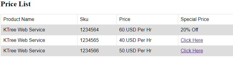
Exploring Dark and Gothic Trends in Web Design

Original Source: http://feedproxy.google.com/~r/1stwebdesigner/~3/LERhk9vkf-4/

In today’s web design world we see waves of minimalist, modern designs that often stick to light colors, standard fonts and lots of space. However, many industries and brands require an alternative approach.

For example, a gaming website might have a better effect with dark tones and gothic-style text. Dark web design can represent class, ruggedness or mystery. You can even see it used when someone is trying to communicate a sense of power. Both masculine and feminine designs use dark and gothic elements. While one website might want to show the strong side of being a man, another might want to display the elegance of being a woman. That’s not always going to be the case, but it works when implemented properly.

It’s important for designers to avoid getting stuck in the rut of only developing the same, “modern” white websites and apps. Because eventually, you’ll run into a client who craves something more sinister, elegant or strong. In that case dark, gothic web design comes in handy.

Therefore, we put together some examples of this type of design. This way, you can reference back to these excellent designs when you’re looking for some inspiration.

Gjezarian

Gjezarian

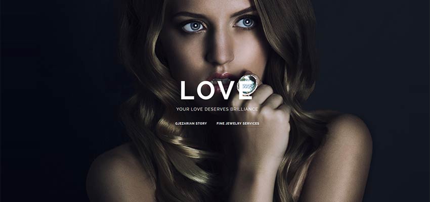
Here’s a great example of how darker designs often work for female-centric websites. Jewelry and clothing often make people feel richer or more elegant. Therefore, the darkness in a design like this mimics that of a classy, dark restaurant or club. It almost makes the user feel like they’re going to end up hanging out with celebrities if they buy the product.

Olly Moss

Olly Moss

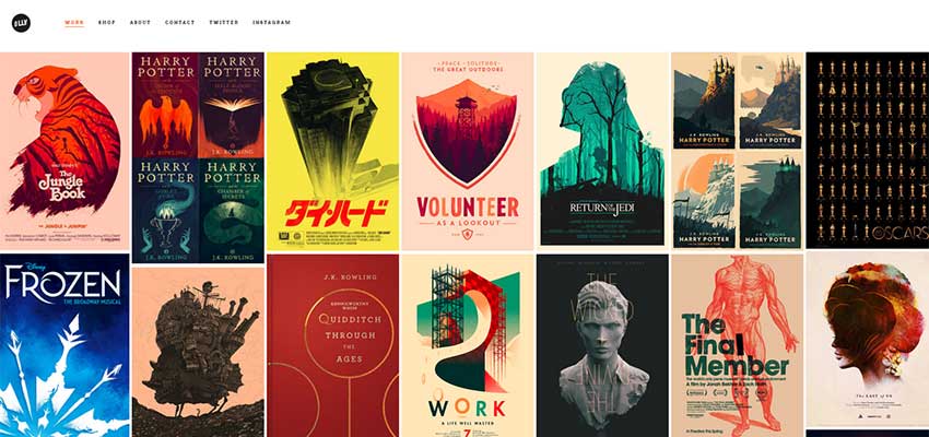
A gothic design doesn’t always mean that you have to make everything black. For instance, this portfolio-style website features a mainly white background. Combine that with the black font and logo and it lets off a feeling of robustness. Not only that, but the gallery pieces have their own gothic appearances.

Black Dog Films

Black Dog Films

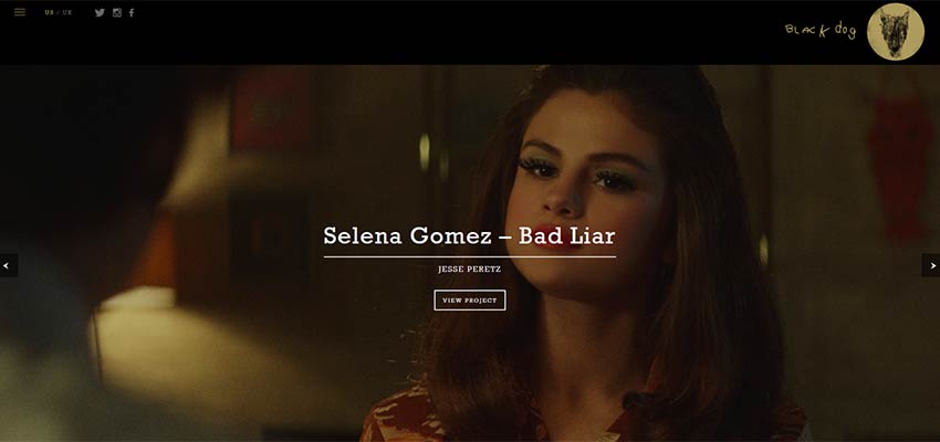
Black Dog Films takes its name and uses it to its advantage. The majority of the website has a black header, with shadows placed on the majority of images. You’ll also notice that the logo appears to be rigidly drawn, presenting a rugged, yet powerful, appearance.

Immortal Night

Immortal Night

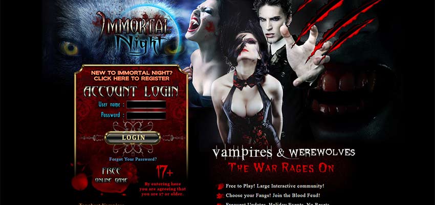
It’s rather common to see a dark, gothic design on a video game website. It’s especially common when that video game relates to something mythical like vampires or zombies. Notice how the bright red colors create contrast with the black background. This is essential for using darker colors effectively.

Department Creatif

Department Creatif

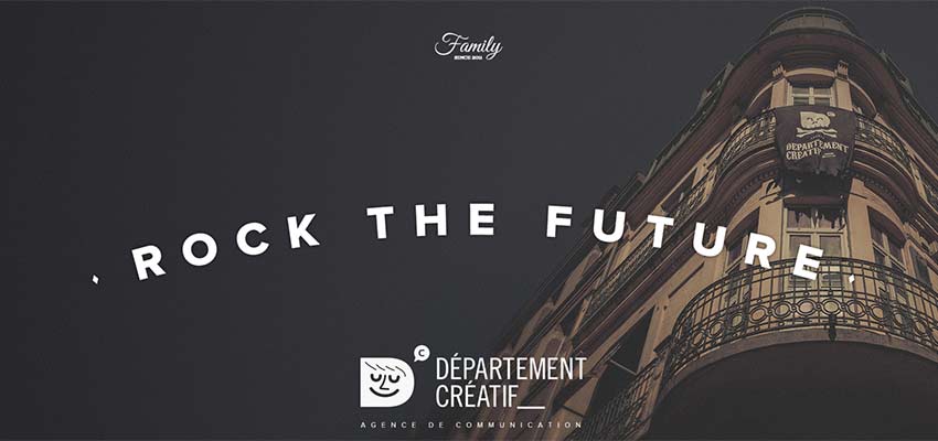
Here’s a website that merges the trend of retro typography and darkened themes. This is actually a very common way to create header images, where the background is dimmed quite a bit so the text placed on top of it can be viewed properly.

Tender to Art

Tender to Art

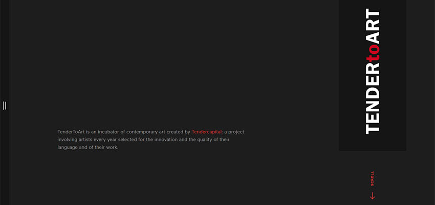
A dark design doesn’t have to be complicated. This incubator of contemporary art sticks to the modern layout, with bold typography, minimal content and interesting animations as you click through the website.

Ever and Ever

Ever and Ever

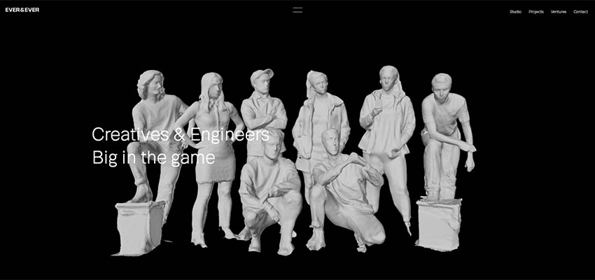
One of the great things about this design is the contrast we see with the white human figures. It almost looks as if the figures are statues from a long time ago, going along with the gothic theme and drawing the eye to those individuals as it sits right on top of the darkness.

Nerisson

Nerisson

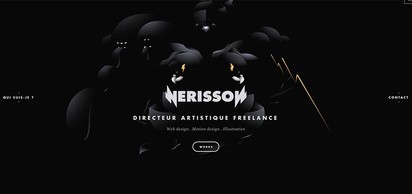
Working with darker designs means that you have the opportunity to create an ominous feeling with even more dark elements. The “Ever and Ever” example we saw above is the exact opposite of this one. Instead, we see minimal contrast, where the user has to almost squint to see what’s going on.

These are just a few examples of a darker, gothic web design style. We hope you’ve enjoyed them. And if you have any other examples you’d like to suggest, feel free to leave them in the comments below.


Collective #418

Original Source: http://feedproxy.google.com/~r/tympanus/~3/FWVNgdUEWZ8/

C418_WOTW

Inspirational Website of the Week: Aristide Benoist

A unique design with some fine artistic touches. Our pick this week.

Get inspired

C418_NW

This content is sponsored via Syndicate Ads
Northwestern’s Online MS in Information Design and Strategy

Learn how to translate information and data into meaningful visual forms, narratives, and interfaces.

Find out more

C418_bezier

Dynamic Bézier Curves

You’ll learn a lot in this fantastic Bézier curve deep-dive with Josh Comeau.

Read it

C418_coolbg

Cool Backgrounds

A great tool for creating nice looking backgrounds. Made by Moe Amaya.

Check it out

C418_videodev

Web performance made easy (Google I/O ’18)

Ewa Gasperowicz and Addy Osmani show you how to find and fix the most common web performance bottlenecks to improve your UX by using tools like Lighthouse and DevTools.

Watch it

C418_gutenberg

Learning Gutenberg: React 101

The fifth article in a series that will teach you Gutenberg, the new React-driven SPA editing experience in WordPress.

Read it

C418_tensorflow

Hello TensorFlow

A small example of using tensorflow.js explained by Monica Dinculescu.

Read it

C418_chromeext

Creating The Feature Queries Manager DevTools Extension

An article by Ire Aderinokun where she explains how developer tools extensions are built with the example of the Feature Queries Manager.

Read it

C418_winds

Winds 2.0

Winds 2.0 is an open source podcast and RSS reader created by Stream. Free desktop apps are available for OSx, Linux and Windows.

Check it out

C418_proposal

Supporting CSS selectors when navigating to a URL fragment

An interesting proposal to support CSS selectors in URL fragments for HTML documents. This could be useful when linking to some part of a page without an ID.

Read it

C418_cube

Encroachment (CSS-only)

A great CSS-only GIF recreation by Stephen Shaw.

Check it out

C418_pause

FacePause

An experimental Chrome extension that pauses YouTube videos when you look away.

Check it out

C418_flow

The biggest WTF in design right now

An illustrated guide on user flows by Alexander Handley.

Read it

C418_shame

GDPR Hall of Shame

A curated collection of GDPR shutdowns and horror stories.

Check it out

C418_lever

Skeuomorphic Lever Checkbox

A very realistic looking level checkbox made by Jon Kantner.

Check it out

C418_tokens2

117 Essential Tokens Set

A great set of versatile icons and objects, free for a subscription.

Get it

C418_abstract

Ethnic Abstract Textures

Some lovely hand-made abstract textures in high resolution with bonus AI and EPS files.

Get it

C418_algo

JavaScript Algorithms and Data Structures

Algorithms and data structures implemented in JavaScript with explanations and links to further readings.

Check it out

C418_ilalgebra

Immersive Linear Algebra

A fantastic tool for learning linear algebra with interactive figures.

Check it out

C418_clothes

40 Clothes & Shopping Vector Icons

Some modern icons related to fashion and shopping made by Kasra Design.

Get it

C418_watch

Pure CSS watch animation

An impressive watch demo by Grzegorz Witczak.

Check it out

C418_iubenda

The complete solution to comply with the GDPR

Make your organization compliant with the EU General Data Protection Regulation by using iubenda to generate a privacy and cookie policy for your site and app.

Check it out

Collective #418 was written by Pedro Botelho and published on Codrops.

Understand Web Development in Less than 1 Hour

Original Source: https://www.sitepoint.com/understand-web-development-less-1-hour/

This article was created in partnership with KTree. Thank you for supporting the partners who make SitePoint possible.

This article explains what web development is, by exploring how it started and how it evolved. This is not an exact chronicle of the web’s evolution, but focuses more on what the needs for this evolution were, so we can understand the technology.

It all started with information. Humans have always needed to find ways to share information with others. As you are aware, before the internet, information was shared via letters, newspapers, radio and television. Each had its own disadvantages, which allowed the internet’s information highway to come to the forefront.

1. What is the Web?

What if you can publish information in a place where whoever is interested can go and read that information? That’s exactly what the web does. You keep the information on a web server, and people can read that information using clients (browsers). This architecture is called ‘server-client architecture’.

Why HTTP?

Initially, this information was all stored as text — that’s why the name hyper-text transfer protocol has stuck even though now text, media and files are all exchanged via this protocol.

2. How Is Information Kept, Retrieved and Saved?

The most basic and long-lived way of storing information on the web is in HTML files. To better understand, let's take a simple example of company publishing its price information so its vendors can download and view the list, which consists of products with a price and effective date. This was kept as a HTML file on the server, which can be viewed using a web browser. The browser requests the file from the sever, and the server serves it up and closes the connection.

HTML is a standard markup language used to create web pages. In other words, it’s a simple text file with tags that help the browser figure out how to display the information.

<!DOCTYPE html>
<html>
<body>

<h2>Price List</h2>

<hr>

<table>
<tr>
<td>Product Name</td>
<td>Sku</td>
<td>Price</td>
</tr>
<tr>
<td>KTree Web Service</td>
<td>1234566</td>
<td>60.USD Per Hr</td>
</tr>
<tr>
<td>KTree Web Service</td>
<td>1234566</td>
<td>60.USD Per Hr</td>
</tr>
</table>

<hr>

</body>
</html>

CSS

Cascading Style Sheets (CSS) is a style sheet language used for describing the presentation of a document written in a markup language. Basic formatting and styling can be done via HTML, but it’s better to use CSS for this.

A web application contains many pages, either dynamic or static. If we use HTML tags for styling the information we have to repeat this information in every page. Suppose we want to change the background color — we have to edit the HTML for every page that is part of the site.

Instead, we can use CSS to store our style definitions in one location, and refer each HTML page to that location. By changing the CSS file, we can change the background color on every page that looks to the stylesheet for style defintions.

CSS does more than just setting the background color, of course: it allows us to set colors for all sorts of elements, fonts, page layouts, and much more.

We have styled our previous example using CSS. Let’s say we are using tables on different pages, but using the same CSS styles. We can move all this style information out to its own file.

<!DOCTYPE html>
<html>
<head>

<!–– for simplicity we have kept the CSS in inline in the HTML – you can keep the css in any file with a .css extension and include it using <link rel=”stylesheet” href=”styles.css”> –>

<style>
table {
font-family: arial, sans-serif;
border-collapse: collapse;
width: 100%;
}

td, th {
border: 1px solid #dddddd;
text-align: left;
padding: 8px;
}

tr:nth-child(even) {
background-color: #dddddd;
}
</style>

</head>
<body>
<h2>Price List</h2>

<table>
<tr>
<td>Product Name</td>
<td>Sku</td>
<td>Price</td>
</tr>
<tr>
<td>KTree Web Service</td>
<td>1234564</td>
<td>60.USD Per Hr</td>
</tr>
<tr>
<td>KTree Web Service</td>
<td>1234565</td>
<td>40.USD Per Hr</td>
</tr>
<tr>
<td>KTree Web Service</td>
<td>1234566</td>
<td>50.USD Per Hr</td>
</tr>
</table>
</body>
</html>

JavaScript

JavaScript is the third pillar of the web, alongside HTML and CSS, and it is normally used to make web pages interactive. To understand JavaScript (JS), we need to know what the DOM is.

The Document Object Model (DOM) is a language-independent application programming interface that turns the HTML document into a tree structure. The nodes of every document are organized in that tree structure, called the DOM tree, with the topmost node called the “Document Object.”

Sample DOM Tree (Source: Wikimedia Commons)

When an HTML page is rendered in the browser, the browser downloads the HTML into local memory and creates a DOM tree to display the page on screen.

Using JS, we can manipulate the DOM tree in several ways:

JS can modify the DOM tree by adding, changing, and removing all of the HTML elements and attributes in the page.
JS can change all of the CSS styles on the page.
JS can react to all of the existing events on the page.
JS can create new events within the page and then react to all of those events.

In our JavaScript example, we continue with our price list example by adding another column — Special Price — which is hidden by default. We’ll show it once the user clicks on it. In technical terms, we use a click event attached to the web element (anchor tag) and change the existing text of the web element, in other words manipulating the DOM. To do this, we have to use the browser’s accepted scripting language, which is always JavaScript.

<!DOCTYPE html>
<html>
<head>
<!–– for simplicity we have kept the CSS in inline in the HTML – you can keep the css in any file with a .css extension and include it using <link rel=”stylesheet” href=”styles.css”> –>

<style>
table {
font-family: arial, sans-serif;
border-collapse: collapse;
width: 100%;
}

td, th {
border: 1px solid #dddddd;
text-align: left;
padding: 8px;
}

tr:nth-child(even) {
background-color: #dddddd;
}

#specialprice {

}

</style>

</head>

<body>
<h2>Price List</h2>

<table>
<tr>
<td>Product Name</td>
<td>Sku</td>
<td>Price</td>
<td>Special Price</td>
</tr>
<tr>
<td>KTree Web Service</td>
<td>1234564</td>
<td>60.USD Per Hr</td>
<td id=”specialprice”> <a href=”” onclick=”return false;”> Click Here </a> </td>
</tr>
<tr>
<td>KTree Web Service</td>
<td>1234565</td>
<td>40.USD Per Hr</td>
<td id=”specialprice2″> <a href=”” onclick=”return false;”> Click Here </a> </td>
</tr>
<tr>
<td>KTree Web Service</td>
<td>1234566</td>
<td>50.USD Per Hr</td>
<td id=”specialprice3″> <a href=”” onclick=”return false;”> Click Here </a> </td>
</tr>
</table>

<script>
document.getElementById(“specialprice”).onclick = function() {myFunction()};

function myFunction() {
document.getElementById(“specialprice”).innerHTML = “20% Off”;
}
</script>

</body>
</html>

Forms

Up til now, we’ve only discussed getting data from the server. Forms are the other side of HTML, which allows us to send information to the server. We can use forms to either update existing information or add new information. The most commonly used methods in HTML forms are GET and POST.

Continue reading %Understand Web Development in Less than 1 Hour%

Photography: Hong Kong Ballet Campaign

Original Source: http://feedproxy.google.com/~r/abduzeedo/~3/5X65xpStTfQ/photography-hong-kong-ballet-campaign

Photography: Hong Kong Ballet Campaign

Photography: Hong Kong Ballet Campaign

AoiroStudio
May 28, 2018

Let’s tackle this Memorial Day with a colourful campaign for the Hong Kong Ballet, photography by Dean Alexander. Dean is working in the field of advertising/fashion photographer and film director/cinematographer. His work has taken him to over 50 countries and has won over 150 International Awards worldwide. What an accomplishment, the quality of this campaign is totally upscale. It looks like it was a fun client! It’s like the one thing they did care about was to give the creative a full “Carte Blanche” experience which judging by the results. It really paid off, beautifully!

Learn more about Dean Alexander
Photography
Photography: Hong Kong Ballet CampaignPhotography: Hong Kong Ballet CampaignPhotography: Hong Kong Ballet CampaignPhotography: Hong Kong Ballet CampaignPhotography: Hong Kong Ballet CampaignPhotography: Hong Kong Ballet CampaignPhotography: Hong Kong Ballet Campaign

photography
hong kong
dean alexander


20 Useful Firefox Sidebar Add-ons

Original Source: https://www.hongkiat.com/blog/20-useful-web-applications-for-firefox-sidebar/

Useful sidebar add-ons for Firefox browser that give you quick access to your most-used apps and service.

The post 20 Useful Firefox Sidebar Add-ons appeared first on Hongkiat.

Visit hongkiat.com for full content.

10 Inspiring Examples of Branding Presentation Design

Original Source: http://feedproxy.google.com/~r/1stwebdesigner/~3/KSMqeuQLEuM/

Presentations are a crucial aspect of any branding project. They allow you to present your finished designs in the best light possible, looking to make the greatest impact on the client.

It also helps them to understand the direction, as well as envisage how it would look in production. As a result, it’s crucial these branding presentations are designed with great care and fit perfectly with the project styling and direction.

In this article, we take a look at a selection of the most inspiring examples of branding presentation design.

Your Web Designer Toolbox
Unlimited Downloads: 500,000+ Web Templates, Icon Sets, Themes & Design Assets


DOWNLOAD NOW

Success Story

Success Story Branding Presentation Design inspiration

Mention’s branding presentation applies some vibrant and appealing overlay effects to the full-size imagery upon their cover designs. It allows them to maintain a consistent accent color throughout the presentation.

Rebranding B&H

Rebranding B&H Branding Presentation Design inspiration

This simple but effective rebranding project is presented perfectly through the design proposal and business card mockups.

Vertical

Vertical Branding Presentation Design inspiration

In one of the more detailed examples, this presentation is comprehensive in its detail but maintains a consistent color scheme and structure through the use of grid lines.

Branding Exploration Process

Branding Exploration Process Branding Presentation Design inspiration

Kickpush’s highly visual presentation design uses full-color and graphical backgrounds throughout. It contrasts with the content effectively and is high impact.

Twisto Brand Book

Twisto Brand Book Branding Presentation Design inspiration

This beautiful branding project continues the use of purple and green colors throughout the presentation. The repeating background patterns are a perfect addition and provide an example of how the branding can be applied in production.

Melissa

Melissa Branding Presentation Design inspiration

Melissa’s branding presentation is highly visual but with similarly detailed explanation throughout. It applies multiple instances of patterned imagery and related text to further expand upon her vision for the brand.

Branding Showcase Layout

Branding Showcase Layout Branding Presentation Design inspiration

This minimal branding presentation is succinct and allows the visuals to communicate without a great deal of explanation. It makes for an easy-to-understand approach which is described through mockups and photography.

Something New for Sidecar

Something New for Sidecar Branding Presentation Design inspiration

This presentation for PayTouch is inspiring in the way that it presents a unique slide for each branding concept. Each is carefully considered, and it presents a multitude of visions and approaches to the client.

One More Time

One More Time Branding Presentation Design inspiration

This beautiful dark theme is heavily reliant on visuals, with minimal use of typography. The red accent for the title text works perfectly against the maroon galaxy background.

uLikeIT Keynote Slides

uLikeIT Keynote Slides Branding Presentation Design inspiration

This Keynote branding presentation utilizes a master slide to apply consistent design elements across all slides. The color scheme is beautifully consistent throughout, as are the background visuals, despite differing image selections.


8 Design Elements That Could Impact Your Site’s Security

Original Source: http://feedproxy.google.com/~r/1stwebdesigner/~3/44dpaH-PLD4/

Usually, the matter of security is something web developers are concerned with. Vulnerabilities can be caused by poorly written code, software not updated by users, something malicious injected into the site, or hackers finding a way to break through the main login area. However a website gets compromised, you don’t often hear stories about a design gone rogue. As such, web designers might not be too concerned with security or what role their design elements play within it.

That said, there are certain design elements that could impact your site’s security. Understanding how those elements may be compromised and how they affect your site will help you make smarter choices when it comes to using them. It’s simply a matter of knowing what they are, so you can be on the lookout.

If it’s not a part of your process yet, then I’m going to suggest that web security become something you pay closer attention to. Not sure exactly how or why that should be? Let’s take a look at the 8 design elements that have the potential to affect your site’s security.

1. Compromised Themes

Whenever you use a third-party software in order to build or start a design, be extra careful in which ones you choose. Even if you download or purchase a theme from a trusted repository, you could still run into trouble. Their software is just as susceptible to a security breach as any other piece of software.

Unfortunately, it’s not always the theme that’s been compromised either. Take the TimThumb exploit, for example. An image resizing tool called TimThumb was included in a number of WordPress themes, which opened any user of that theme to attack.

2. Compromised Plugins

Third-party extensions are another tool designers often use to create advanced or complicated design elements on websites. Again, because software is particularly vulnerable to hackers, you have to be very careful in which ones you use and how you maintain them.

The image slider plugin, Slider Revolution (RevSlider), was one such case of an exploit introduced to websites by a third-party extension.

3. Compromised Components

For those of you who code design elements from-scratch, you’re not necessarily any safer than plugin and theme users are from security breaches. Especially if you utilize pre-written components like CSS or JavaScript snippets, libraries, or frameworks.

That’s not to say you can’t trust code from others, but you should, again, be mindful of the quality of component you hook into your design.

4. Malicious File Uploads

In order for a website to be successful in converting visitors to paying customers or subscribed members, there needs to be a way for it to actively engage with them. Contact forms and comments systems can be particularly troublesome when they’re not protected against spam. However, there are also design elements that can come from external users that cause issues with security.

Specifically, if your website accepts file uploads from users–for instance, if users upload visuals to guest-submitted content or submit images for a contest–you could be putting your site at risk. That doesn’t mean you shouldn’t accept media from other users; it just means having your developer implement ways to better vet those files and ensure it’s not a way to inject malicious code.

5. Malvertising

There are a number of ways to monetize a website. But if you want to do so with an element that more seamlessly integrates with your design, you would probably use a system like AdSense that places ad content on your site. Again, though, you have to trust that the third party behind the ad content doesn’t mean your site or its visitors any harm.

In 2015, AdSense made the news when malvertising campaigns were discovered on users’ websites. These ads seemed harmless in nature until visitors started being redirected to scam sites.

6. Phishing Pages

When you design a site, you’re very careful about including pages that are necessary for the user’s experience. Every now and again, you may build a landing page that exists outside of the navigation, but is there for the purposes of promoting something special. This is a commonly used marketing tactic.

However, hackers are well-aware of this, too, which is why some of them are able to get away with planting fake pages on legit websites. This is what’s known as a phishing page and it’s built with the purposes of installing malware on a visitor’s computer or directing them to a scam site.

7. Infected Images

Did you know that malware can be hidden inside of images, too? In 2011, this very problem was discovered within Google Images. In 2015, Saumil Shah gave a presentation at the HITB Security Conference where he discussed the Stegosploit hack.

Both of these examples demonstrate how hackers have learned to get around users’ growing awareness of malicious links and attachments. Now, they’ve found a way to compromise images.

8. Mixed Content

As the web moves towards a more secure place with the adoption of SSL certificates and HTTPS, some web designers run into trouble when media files aren’t properly shifted over to a secure address. This is what’s known as “mixed content”.

Basically, this is what happens when a website resides on a secure HTTP domain (HTTPS). However, when images remain sitting on the unsecured server (HTTP), they open the rest of the website up to the possibility of a breach.

Protect Your Design Elements

You’ve built a stunning design for your client, but worry now that your choice of design elements or third-party integrations may compromise the security of the site. While the probability of something like that happening might not be high, you don’t want to leave your design assets unprotected.

If you and your web developer haven’t done so yet, focus on setting up the following on your web server:

SSL certificate
Firewall
Malware and DDoS protection
Brute force protection
Scheduled software updates

And if you’re nervous about being able to secure these elements–as well as the rest of the site–on your own, then it’s time you considered moving to secure WordPress hosting. A managed WordPress hosting provider will take care of security, so you can focus strictly on the design piece of your clients’ websites.


Collective #420

Original Source: http://feedproxy.google.com/~r/tympanus/~3/7ZFEUgHU6OI/

C420_WOTW

Inspirational Website of the Week: Studio Regale

A very different kind of web experience with lots of interesting goodies. Our pick this week.

Get inspired

C420_Udemy

Our Sponsor
How far will $10.99 take you?

Find out with Udemy’s best of the best online courses in programming, design or app dev. Take top-rated courses from our master instructors, now at a special discount.

Pick your next course today

C420_time

UTC is Enough for Everyone, Right?

A brilliant write-up on time for programmers by Zach Holman.

Read it

C420_maps

From Beautiful Maps to Actionable Insights: Introducing kepler.gl, Uber’s Open Source Geospatial Toolbox

Shan He from Uber Engineering introduces kepler.gl for creating beautiful maps.

Check it out

C420_animations

Sculpting Software Animation

Pasquale D’Silva’s interesting guide to designing animations.

Read it

C420_proppy

Proppy

ProppyJS is a small JavaScript library for composing props (objects that components receive to render themselves) which can then be used in a components-based UI framework like React or Vue.js.

Check it out

C420_critters

Critters

A Webpack plugin to inline your critical CSS and lazy-load the rest.

Check it out

C420_wireframes

Whimsical Wireframes

Whimsical includes a rich library of configurable elements for fast mockup creation with collaboration in real-time.

Check it out

C420_goat

Goat

A private URL shortener just for your team.

Check it out

C420_frontend

Why is Front-End Development So Unstable?

Jimmy Breck-McKye analyses why front-end technology changes so quickly.

Read it

C420_deep

Jeeliz Face Filter

A face detection and tracking library in JavaScript based on WebGL deep learning.

Check it out

C420_uikit

Pawtastic UI Kit for Adobe XD

A beautiful UI Kit to get you started with Adobe XD.

Get it

C420_logo

Building a responsive image

A step-by-step guide for creating a responsive logo by Nils Binder.

Read it

C420_font

Free Font: Bedebah

A unique looking display typeface designed by Holis Majid.

Get it

C420_francine

Solving Life’s Problems with CSS

A great article where Diana Smith shares a nifty CSS technique she used for creating Francine.

Read it

C420_grid

Scantron Answer Sheet

A realistic looking Scantron answer sheet replication powered by CSS grid by Jon Kantner.

Check it out

C420_loader

Prerender-loader

Pre-rendering describes the process of rendering a client-side application at build time, producing useful static HTML that can be sent to the browser instead of an empty bootstrapping page.

Check it out

C420_buttons

Buttons falling apart

A playful shattering button demo by Mikael Ainalem.

Check it out

C420_code

code.xyz

An embeddable development environment for easily building APIs, webhooks, and workflow automation tasks that run atop StdLib infrastructure. Read more about it here.

Check it out

C420_deno

Deno

A secure TypeScript runtime on V8 that supports TypeScript 2.8 out of the box. By Ryan Dahl.

Check it out

C420_grids

Grid System Library

KK UI Store’s library of grid systems for iOS, Android and Bootstrap.

Check it out

C420_Bolsters

Bolsters Design Project

Some wonderful and inspiring UI design work by Tai Chen.

Check it out

C420_36

36 Days of Type Video

In case you missed it: Ben Huynh’s amazing compilation of this year’s creative type challenge.

Watch it

Collective #420 was written by Pedro Botelho and published on Codrops.

Exclusive Freebie: WORLD CUP FOOTBALL TEMPLATES by BrandPacks

Original Source: https://inspiredm.com/exclusive-freebie-world-cup-football-templates/

Score a hat trick with this trio of free World Cup football/soccer templates designed by BrandPacks. This collection features a free soccer flyer template, a rack card template (in two styles) and a poster template (in two styles). Each template boasts a sporty theme with vibrant colors and exciting photography, perfect for promoting football and soccer tournaments and related events!

The World Cup Football Brand Pack templates come in both Photoshop (PSD) and Illustrator (AI) formats, and all stock photos are included and free to use with the templates! More free templates like these can be found on the BrandPacks website. Free for personal and commercial use!

Download this awesome collection of football templates in PSD and AI here!

The post Exclusive Freebie: WORLD CUP FOOTBALL TEMPLATES by BrandPacks appeared first on Inspired Magazine.

Overflow – Turn Your Designs into Playable User Flow Diagrams That Tell a Story

Original Source: https://www.webdesignerdepot.com/2018/05/overflow-turn-your-designs-into-playable-user-flow-diagrams-that-tell-a-story/

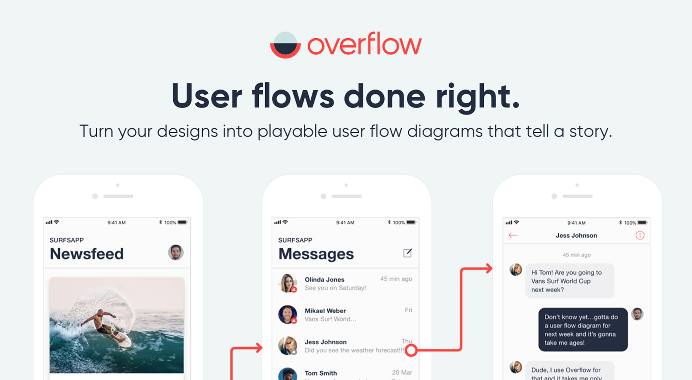
Designing the best user flow for your product is definitely not an easy task. It requires several iterations before getting it right. Creating and updating user flow diagrams has largely been considered a painful process for designers, with many of them skipping it entirely because of this. Presenting user flows to stakeholders and actually getting them to understand and follow the user’s journey might actually be the most challenging part.

Overflow helps you do exactly that. It empowers you to effectively communicate your work, while fully engaging your audience with an interactive user flow presentation.

Create User Flows in Minutes

Creating user flow diagrams with Overflow is a quick and enjoyable experience. You can connect and sync Overflow with your favorite design tool, maintaining all your layers and artboards. Easily drag magnets to create your connectors, add text, shapes and images to enrich your presentation. Customize the look using styles and themes to create a fully custom branded presentation that fits your designs and audience.

Present Your Designs

Presenting your designs with Overflow, will always make you look good. You can present your designs with an interactive flow presentation, navigating through your entire flow using arrow keys or clicking on the connectors. Show the big picture with a bird’s eye view of your flow, or zoom in to focus on specific details. If you want to present your flow screen by screen you can easily switch to the out of the box rapid prototype mode.

Share to Get Valuable Feedback

Share your user flow diagrams on Overflow Cloud and let your audience experience a magical journey on their web browser or mobile device. Export in PDF, PNG, or print your user flows and stick on walls.

So far more than 35,000 designers have tried Overflow, and they loved it. Overflow is currently in public beta and available to download, for free.

Add Realistic Chalk and Sketch Lettering Effects with Sketch’it – only $5!

Source

p img {display:inline-block; margin-right:10px;}
.alignleft {float:left;}
p.showcase {clear:both;}
body#browserfriendly p, body#podcast p, div#emailbody p{margin:0;}