20 Best New Portfolios, August 2018
Original Source: https://www.webdesignerdepot.com/2018/08/20-best-new-portfolios-august-2018/
 Ladies, Gentlemen, and Our Secret Reptilian Overlords, I asked for more color in last month’s article, and you have delivered. It’s August, now, and to distract myself from the oppressive heat, I have gathered some 20 of these more colorful designs together for your perusal.
So as you might guess, there’s a fair bit of variety this month. There’s still some good old monochromatic minimalism for those of you who like that, so never fear. There’s just a bit more balance, this time around.
Note: I’m judging these sites by how good they look to me. If they’re creative and original, or classic but really well-done, it’s all good to me. Sometimes, UX and accessibility suffer. For example, many of these sites depend on JavaScript to display their content at all; this is a Bad Idea , kids. If you find an idea you like and want to adapt to your own site, remember to implement it responsibly.
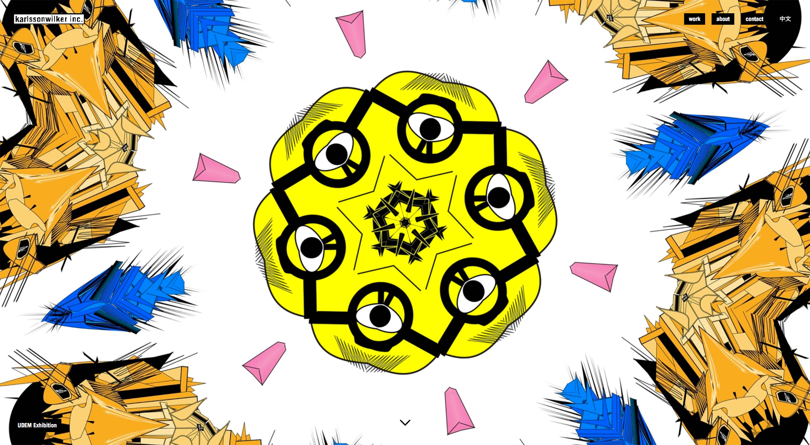
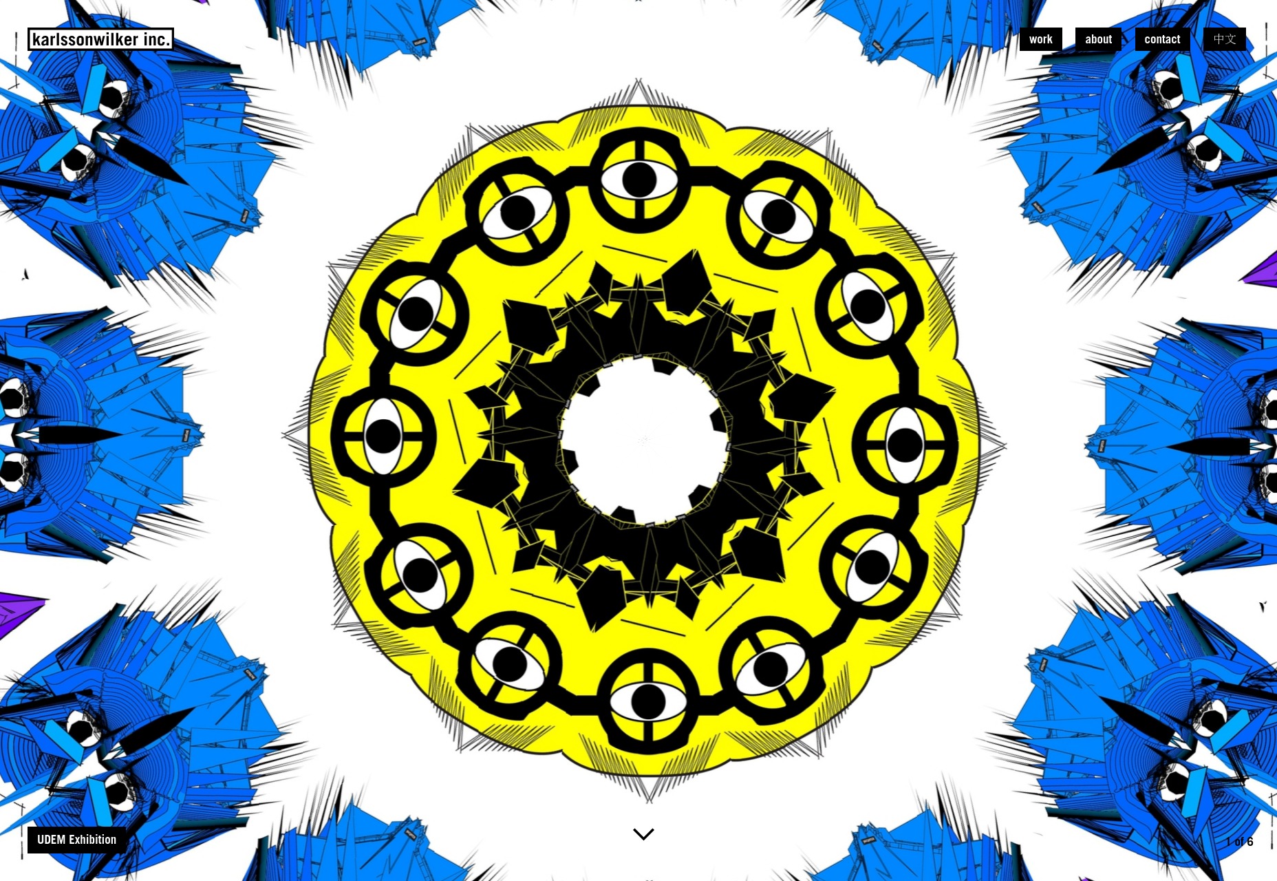
karlssonwilker
The karlssonwilker agency site is a blow to the eyeballs. Whether or not that’s a good thing is going to be down to personal taste; but I literally can’t remember the last time I saw an actual animated kaleidoscope effect used on the Web.
I definitely can’t remember the last time I saw one used this well. There’s also a rather interesting use of flowchart-style layout on the “About” page. Yeah. Flowcharts.
Platform: WordPress
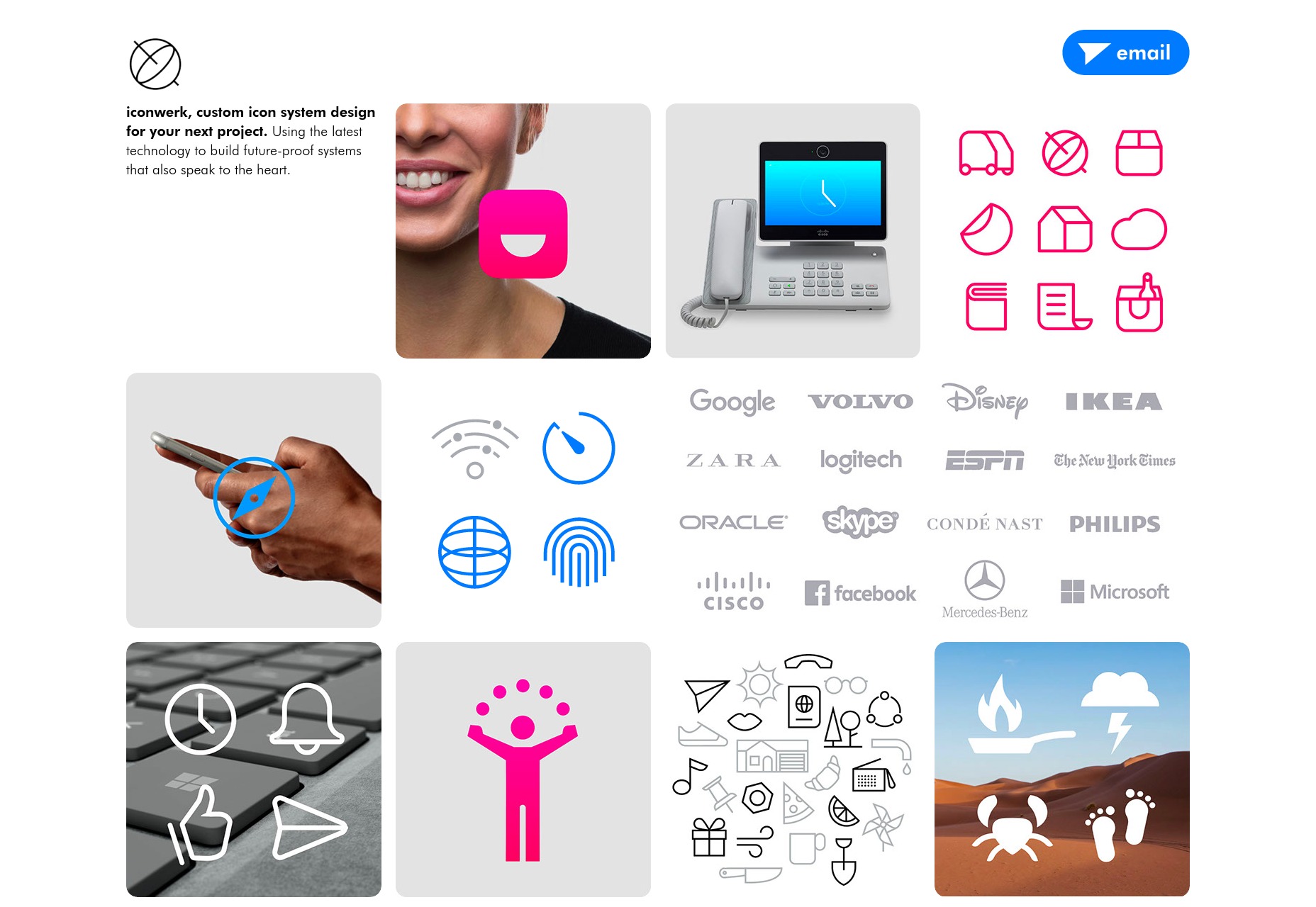
iconwerk
iconwerk is the first icon designer portfolio that I’ve seen in a while. It’s a meta work of genius. Before you can click on individual projects, you’re given a grid of images that contain icons, clients lists, and other snapshots of their work, but also kind of look like icons in their own right.
That’s right, they put icons in your icons, so you can look at icons while you look at icons.
Platform: Static Site
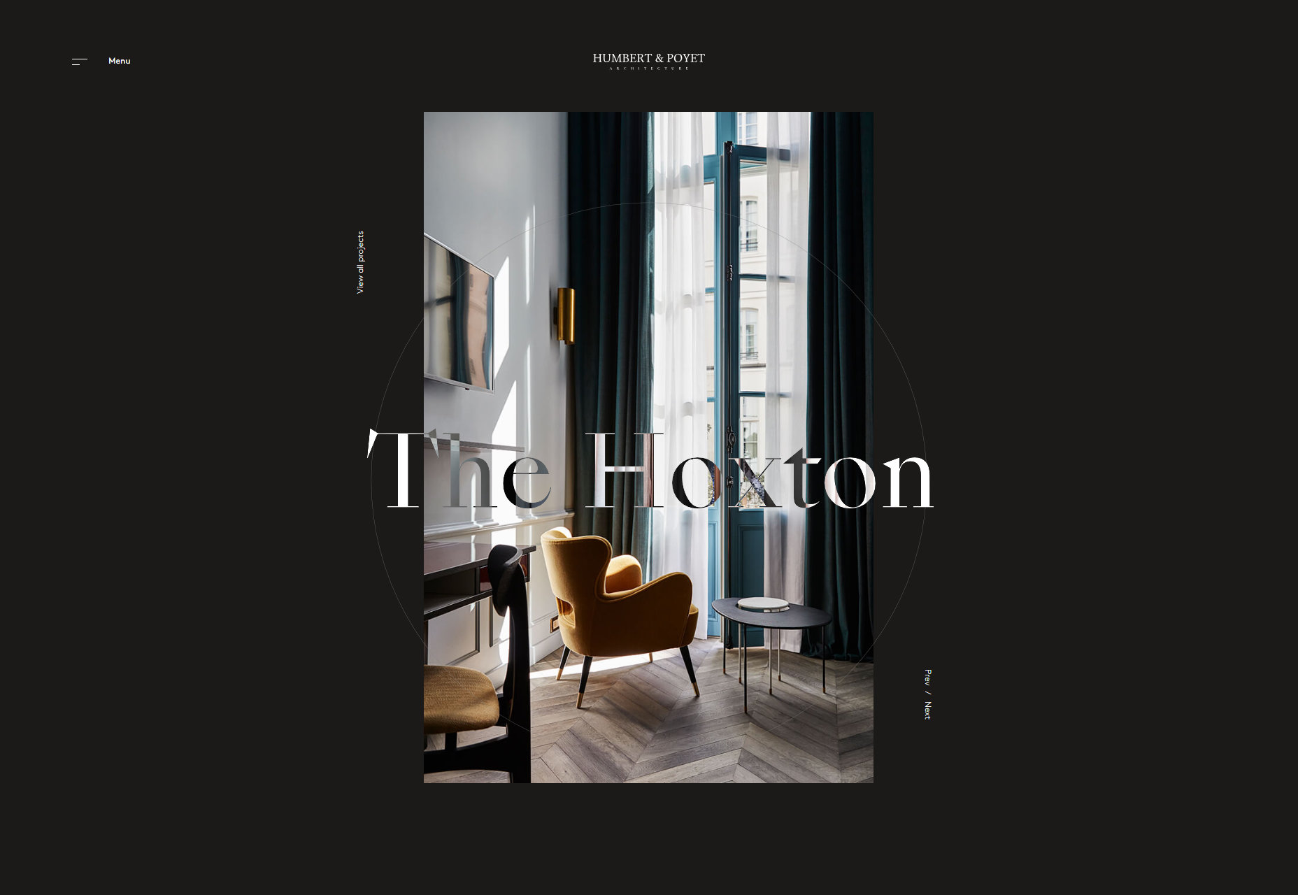
Humbert & Poyet
Humbert & Poyet is an architecture firm, so expect a lot of the usual: animation everywhere, elegant serif type, and text overlapping onto other elements. As is usual though, it’s all about how these elements are combined. In this case, the result is a visual treat that is greater than the sum of its parts.
Platform: Static Site
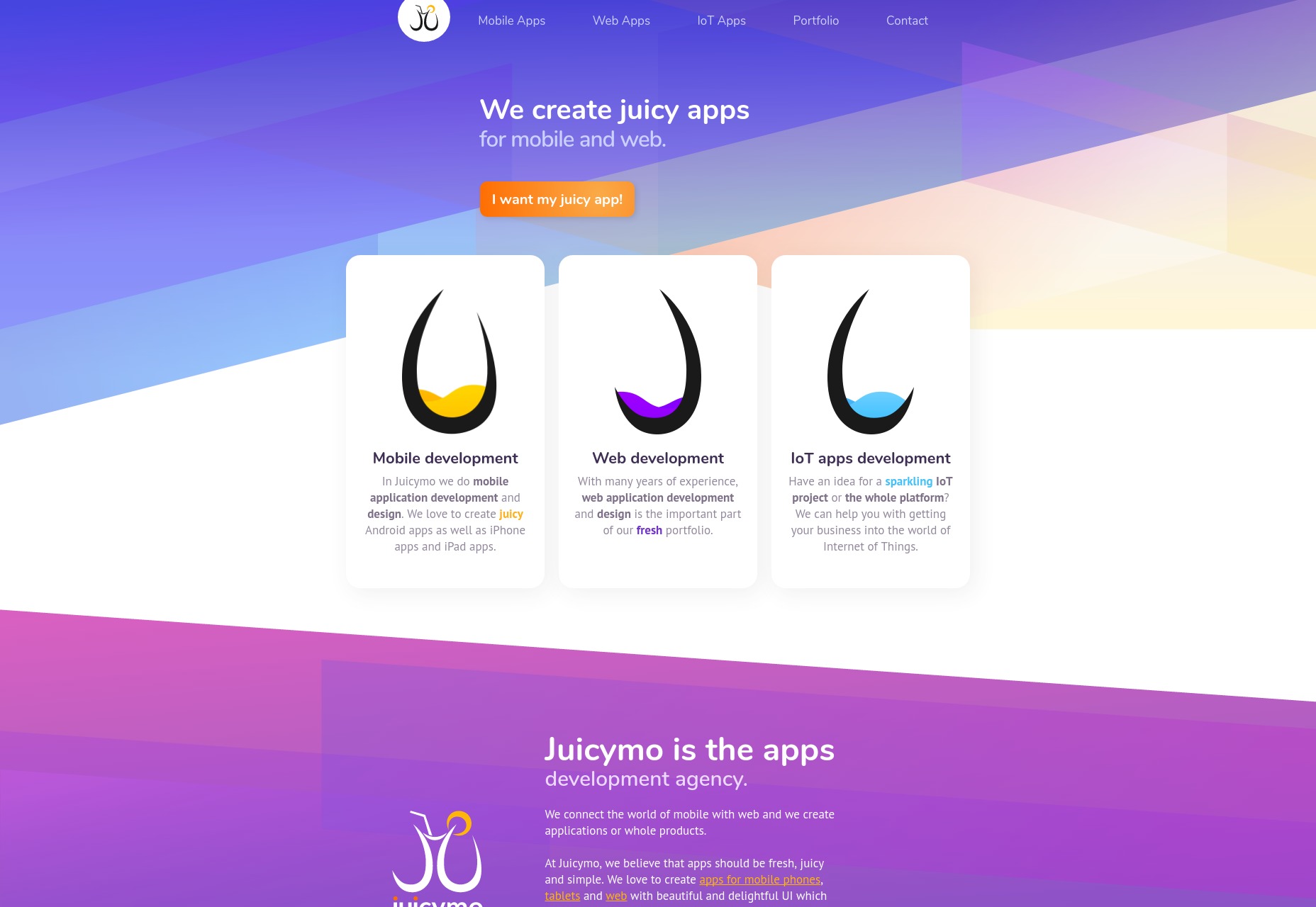
Juicymo
Juicymo is a mobile app developer, and their site goes all in on the flashy visuals you might expect from them. We get gradients galore, a lot of diagonal lines (a personal favorite of mine), rounded corners, and overall it’s just bright and colorful.
Really, it’s as if Web 2.0 and flat design had a baby. This makes it stand out, and I rather like it. Man, I never thought I’d miss rounded corners.
Platform: Static Site
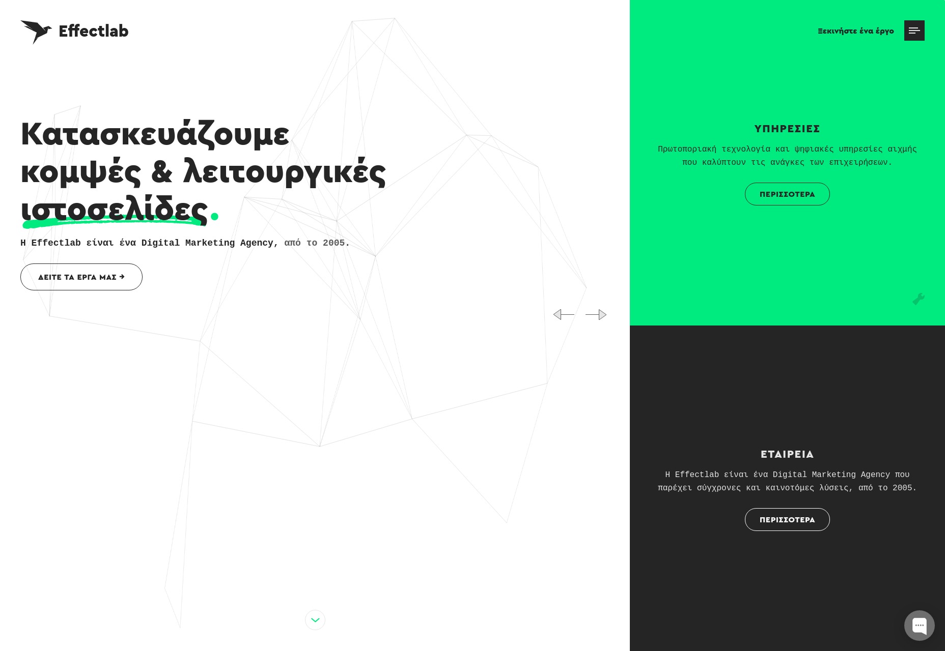
Effectlab
Effectlab brings us back to that good old flat design with strong type and animated geometry on the home page. Further in, we get some overlapping elements, and a strong use of their admittedly limited color scheme.
To bring us back to the typography, I haven’t seen a lot of Greek websites. But even so, the text feels beautifully rendered, and some of the more rune-like characters absolutely bring out the nerd in me.
Platform: Static Site
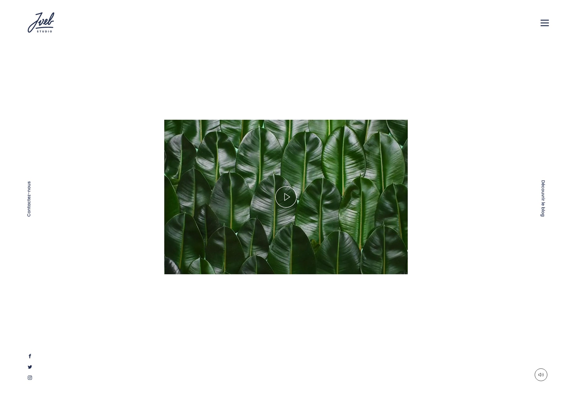
Jveb Studio
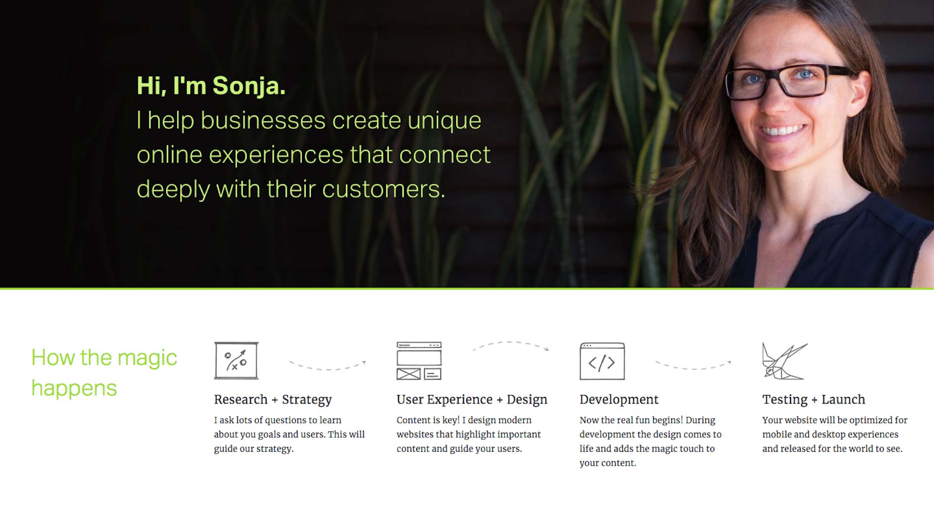
Jveb Studio uses light animation and background illustration to fantastic effect. With a clearly modern-yet-artistic style, this is a simple-looking site that nonetheless has a fair few moving parts under the hood. Give it a look.
Platform: WordPress
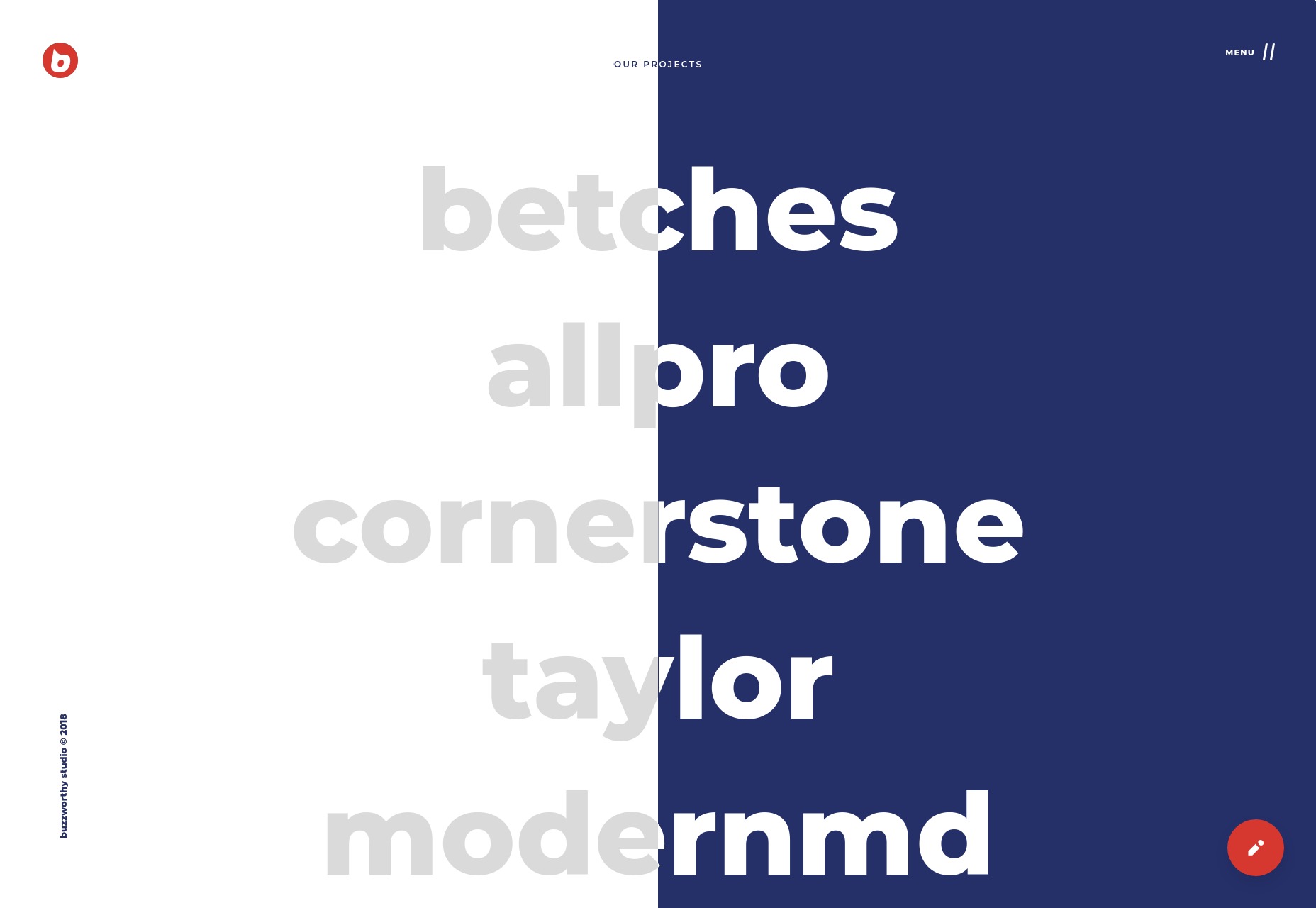
Buzzworthy Studio
Buzzworthy Studio showcases their projects with a list of names, like many sites do nowadays. Overall, their style is clean, playful, and very marketing-friendly, which works for them. Animations is clearly emphasized, but not overwhelming, and I particularly like the way they use color.
Platform: Static Site
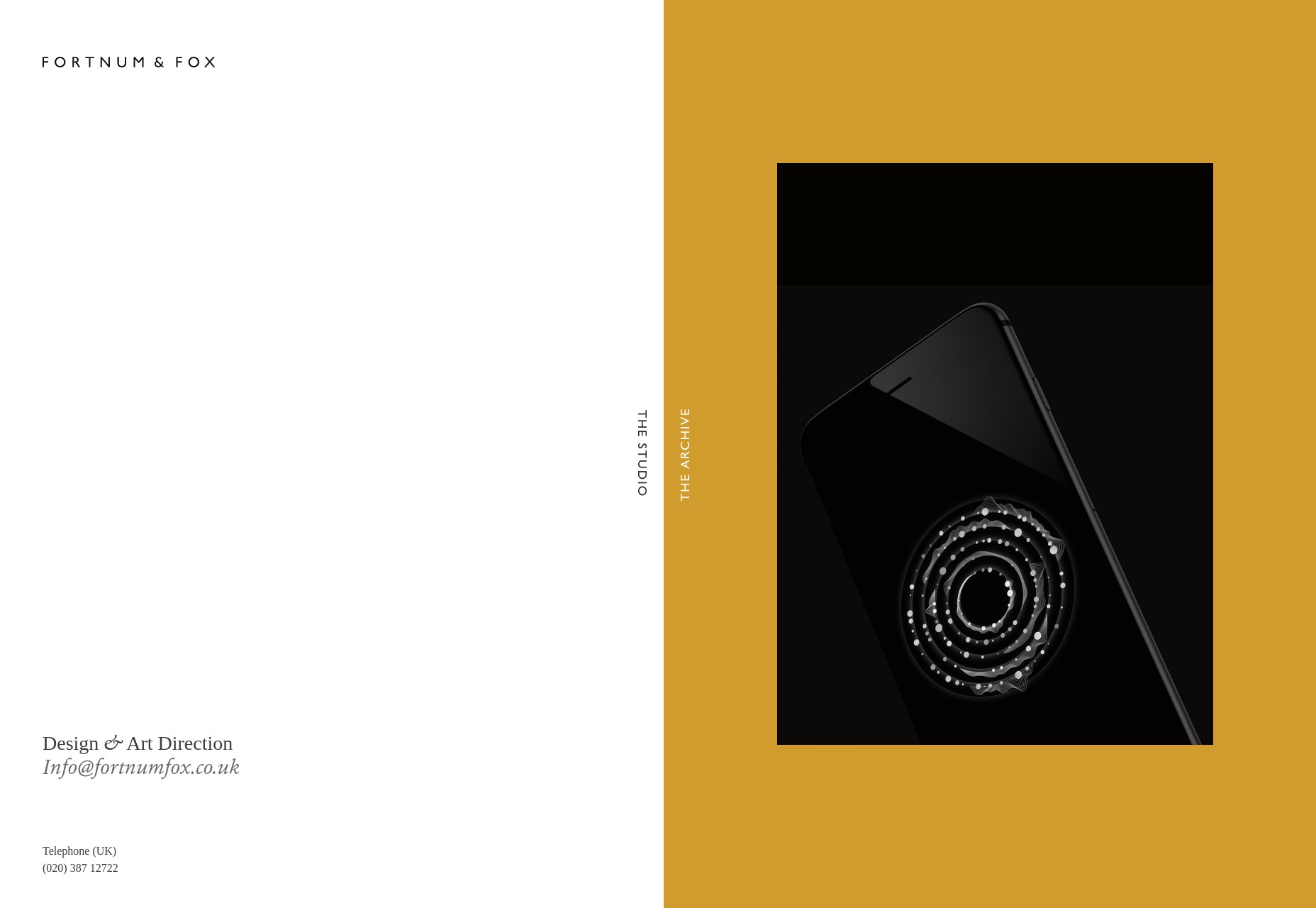
Fortnum & Fox
Fortnum & Fox also embrace the dual-color background, but takes more of an earth-tone approach for the most part. But instead of only using this theme on the home page, the site doubles down on the dual-background theme, featuring it prominently when displaying portfolio items.
As presentation sites go, it looks elegant and fancy. It takes some inspiration from print design, without feeling trapped by its inspiration.
Platform: WordPress
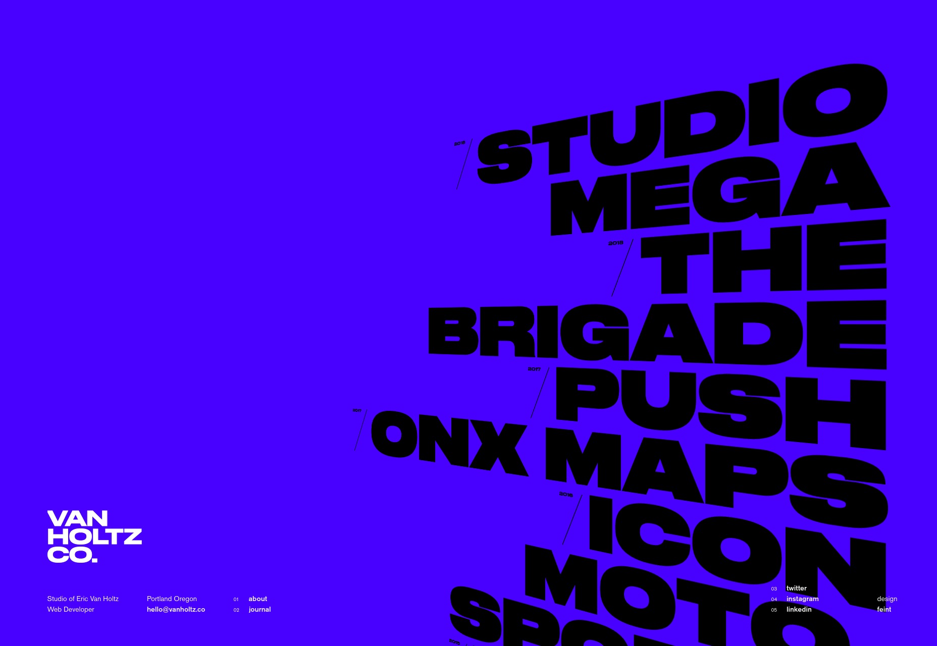
Eric Van Holtz
Eric Van Holtz’ portfolio goes big and bold with both color and type, combined with a light dash of animation, and a penchant for those diagonal lines I like so much. It’s a design that doesn’t hold back, and so is memorable.
Platform: Static Site
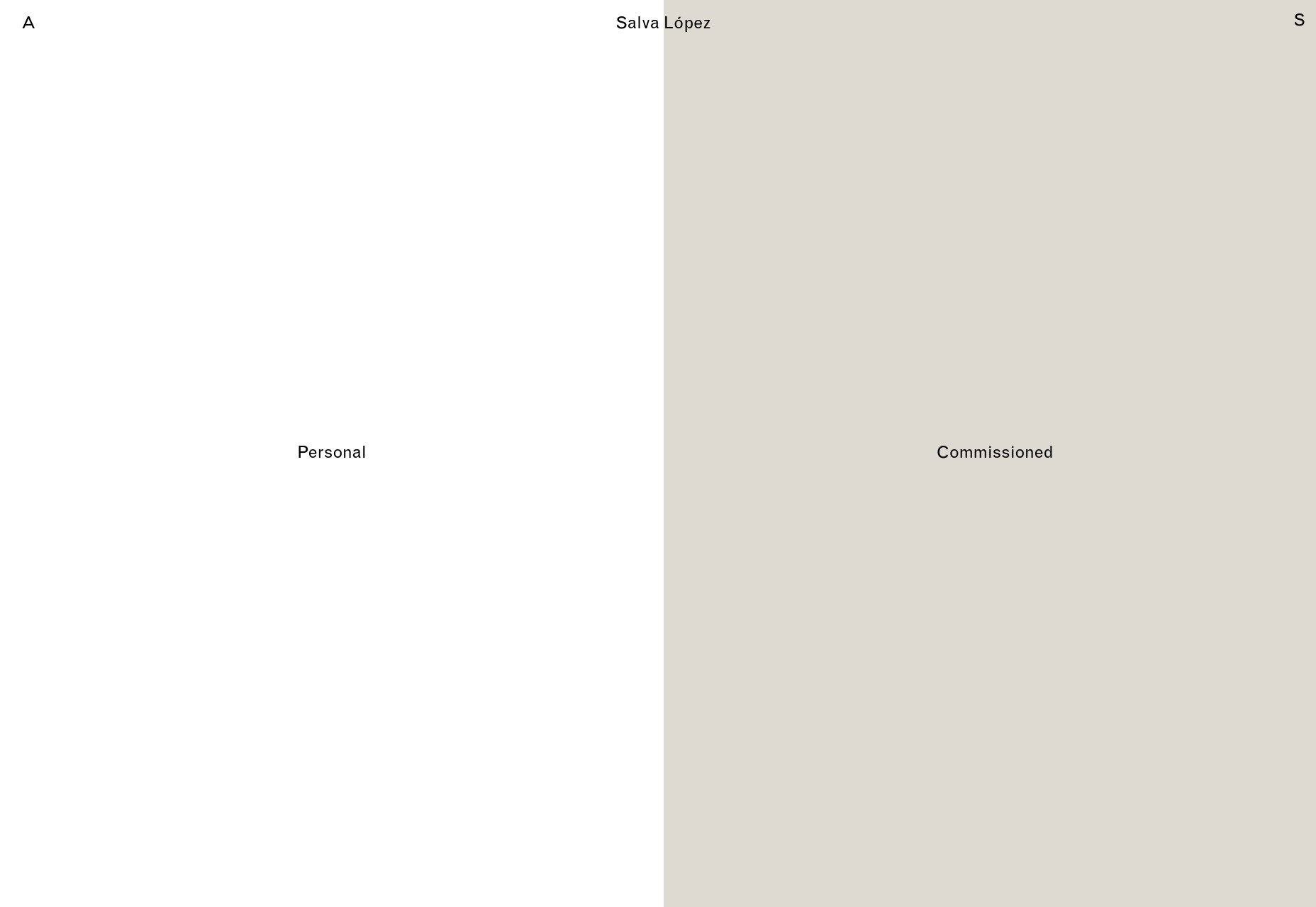
Salva Lopez
Salva Lopez’ portfolio seems to embrace the “split website” theme as well, with all of his photography organized in “personal” and “commissioned” categories. It’s a simple site with little text and lots of galleries, but that’s basically what you want from a photography portfolio, no?
Platform: WordPress
2xElliott
2xEllliott is a design consultancy, so their site’s aesthetic embraces that sort of corporate-elegant feel we’ve come to expect from that sort of agency. There’s a heavy emphasis on imagery, art direction, and not using more pages than you have to.
By that I mean that clicking on navigation items like “News” or “Contact” will open up a side panel to show that content, since there’s not enough of either to warrant their own pages. It’s a bit JS-dependent for my taste, but I otherwise like the approach.
Platform: WordPress

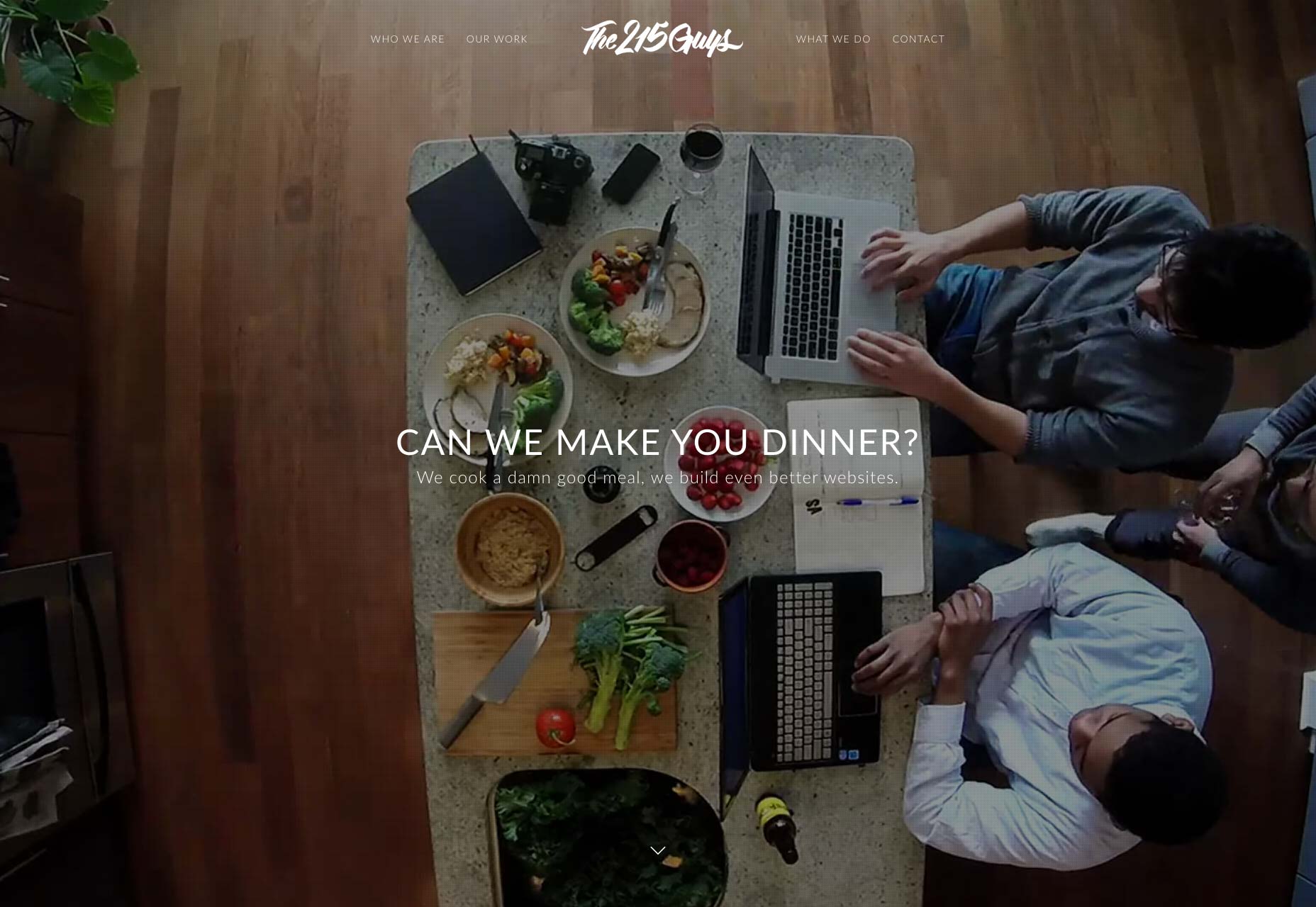
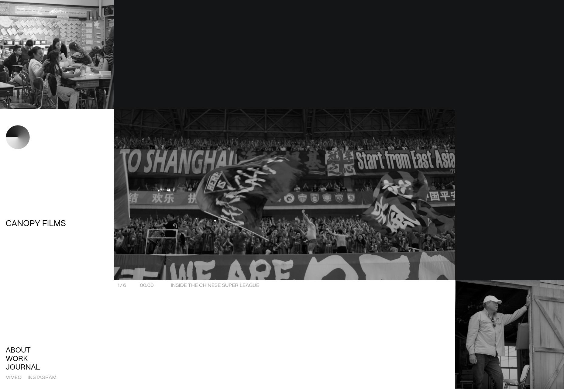
Canopy Films
Canopy Films’ site takes a highly grid-based approach to showing off its videos, and the grid itself is… animated? I’ll be honest, I’m not sure how that’s done; but it’s actually a pretty cool effect. And that’s coming from Mr. I-wish-sites-depended-less-on-animation. The rest of the site is fairly clean and modern, and is just generally worth a look.
Platform: Static Site
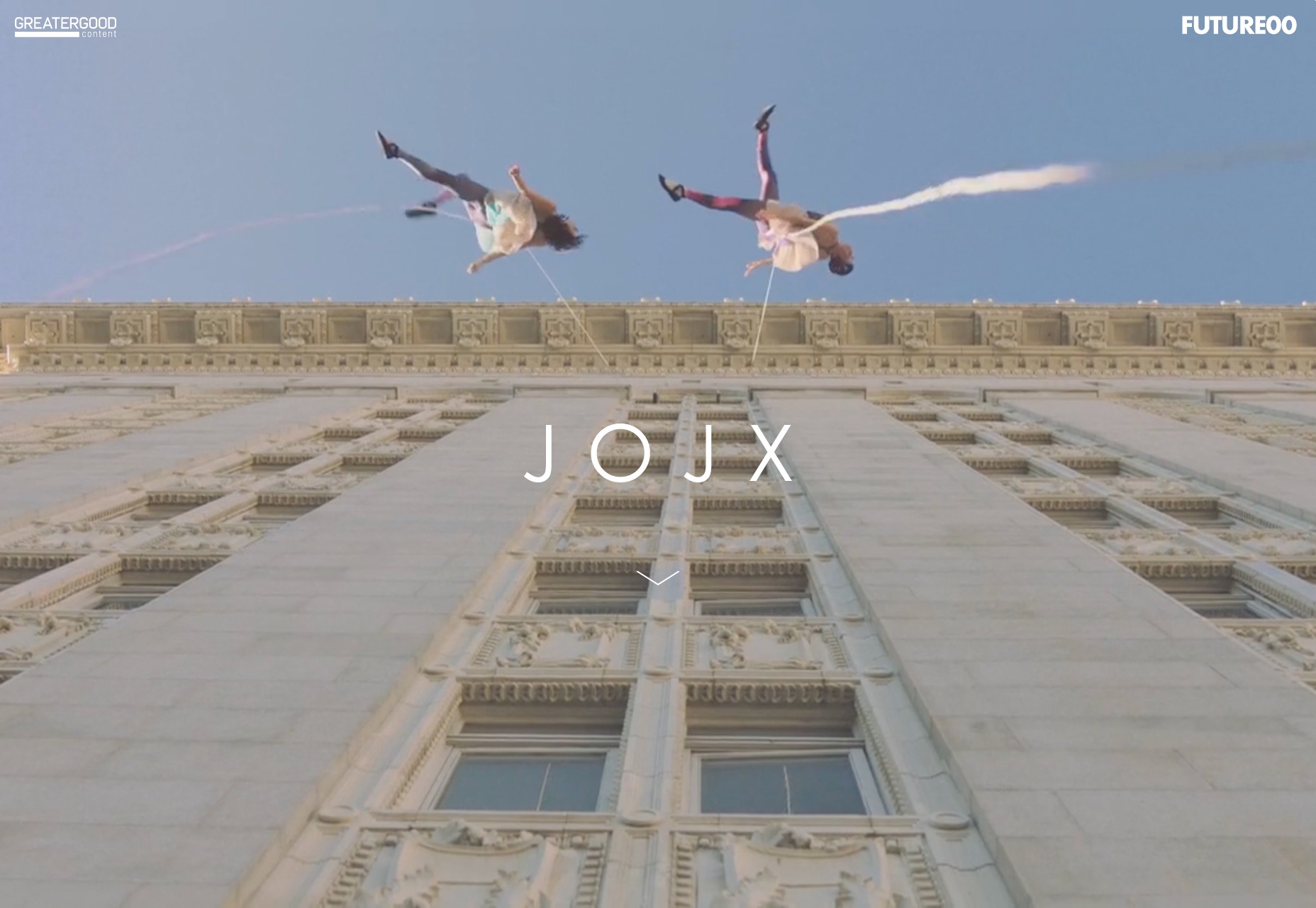
JOJX
JOJX goes for that dead-simple minimalism that was everywhere in last month’s article. Since it’s a portfolio site for directors, that works just fine. It’s just you, some navigation, a video, and a title. What more do you need?
Platform: WordPress
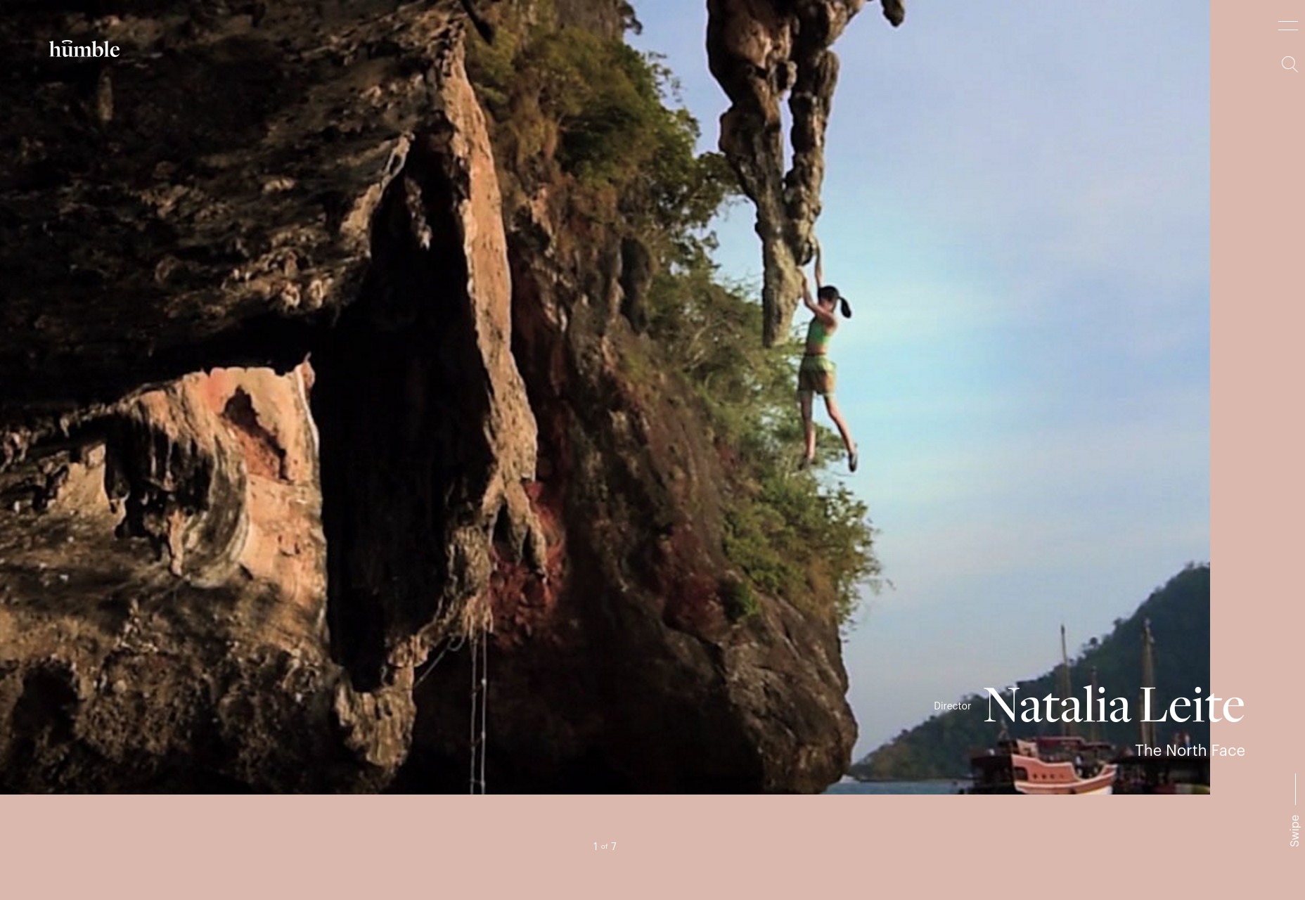
Humble
Humble takes much the same approach to showing off its video portfolio as JOJX, above. They use more color, though, with a bit of asymmetry and element overlap thrown in. It’s an excellent example of how two designs that are very similar on paper can have wildly different personalities.
Platform: WordPress
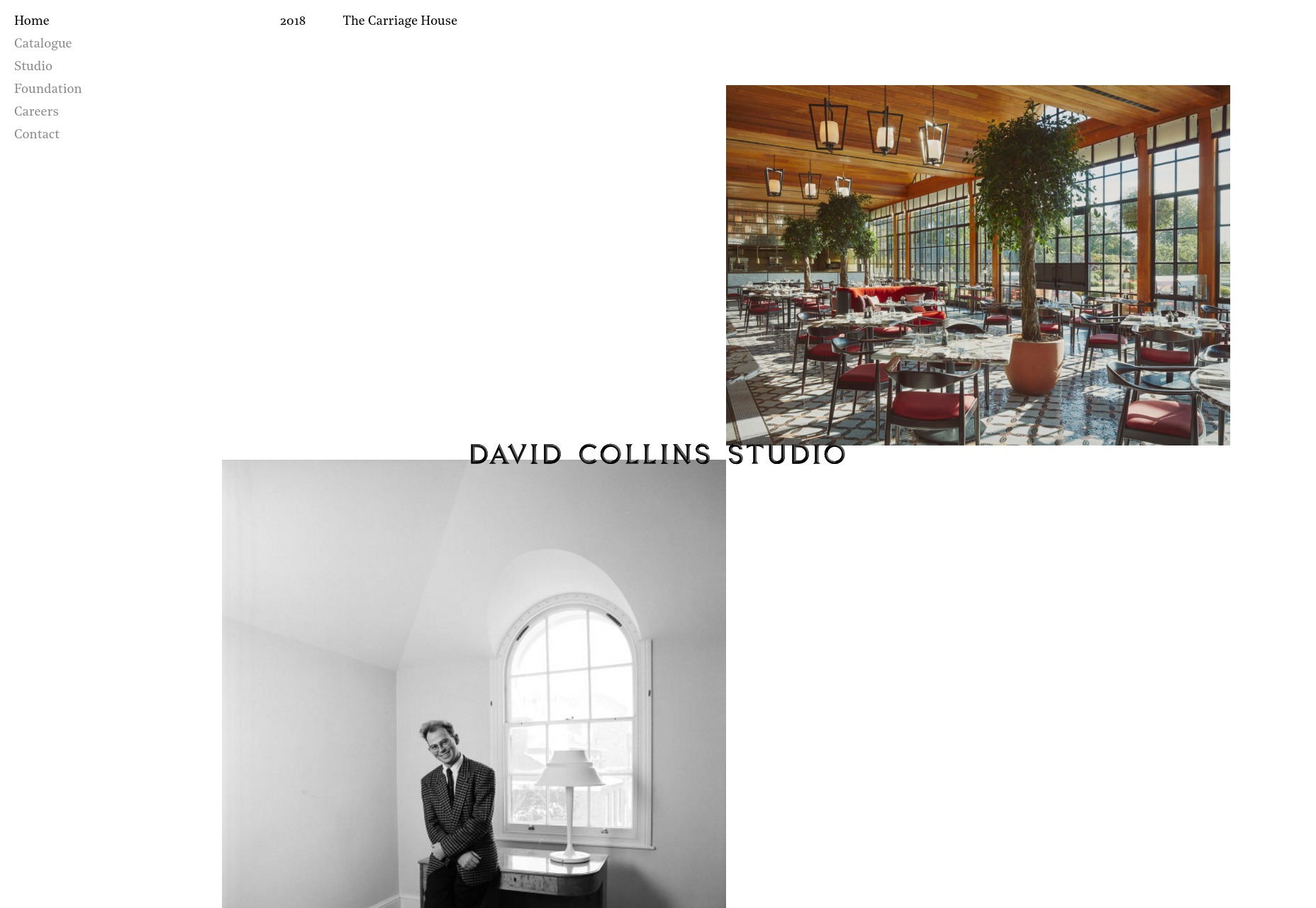
David Collins Studio
The David Collins Studio site takes me way back to like, a month or so ago, with its serif type, and minimalist collage approach to the art of the portfolio. It’s simple and elegant, and fairly effective.
Platform: Static Site (?)
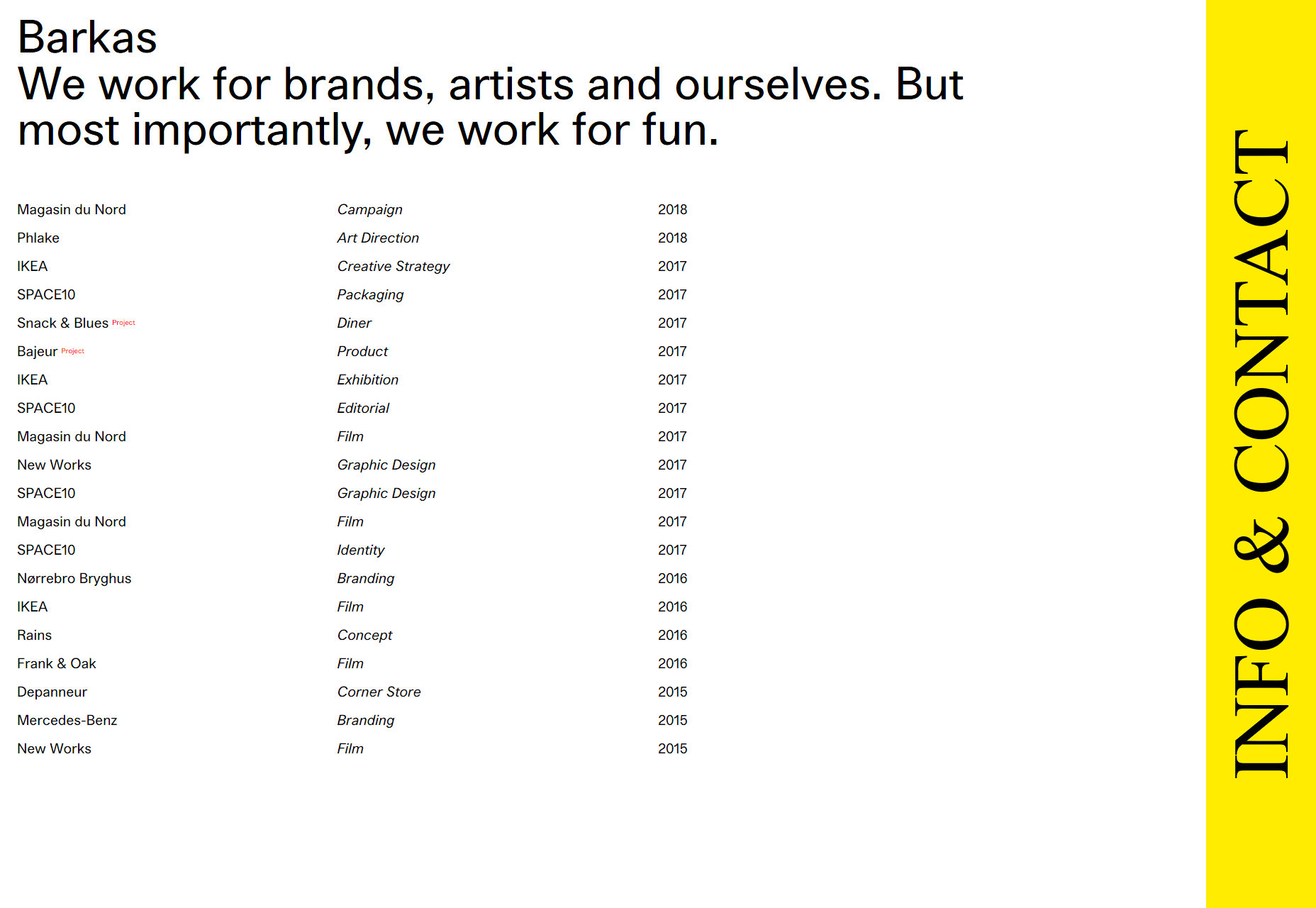
Barkas
When you first load this portfolio up, it kind of feels like a spreadsheet that’s much prettier than it ought to be. As someone who kind of likes spreadsheets to begin with, that’s actually a compliment.
I’m not a huge fan of the cursor change, but otherwise it’s a good-looking portfolio that gets straight to the point.
Platform: WordPress
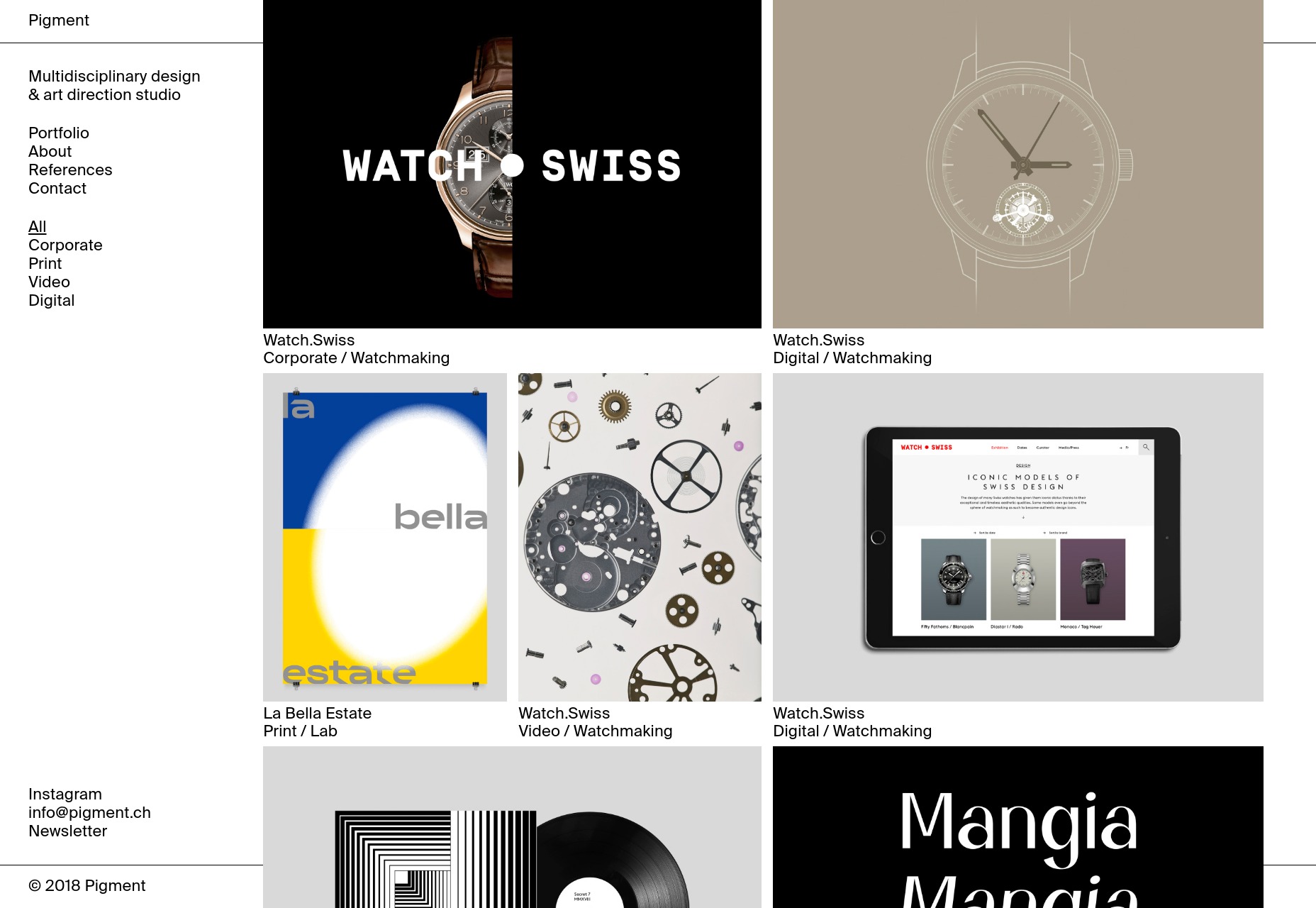
Pigment
Pigment shows off their work in a decidedly modernist fashion, with lots of white space and good old black borders. I do find their two-column approach to the actual portfolio items interesting. It looks like a good way to prioritize some of your work while not quite hiding the rest of it.
I also kind of like the way it looks like most of the content is “floating” above the rest of the page/background. It’s an effect you don’t often see in such a relatively flat design. It’s depth without any trace of skeuomorphism.
Platform: WordPress
Pierrick Calvez
Pierrick Calvez’ site is pretty much peak minimalism, but it’s good-looking for all that. I appreciate the way the zoom function works on individual portfolio images, and the typographical style of the whole thing.
Platform: Webflow
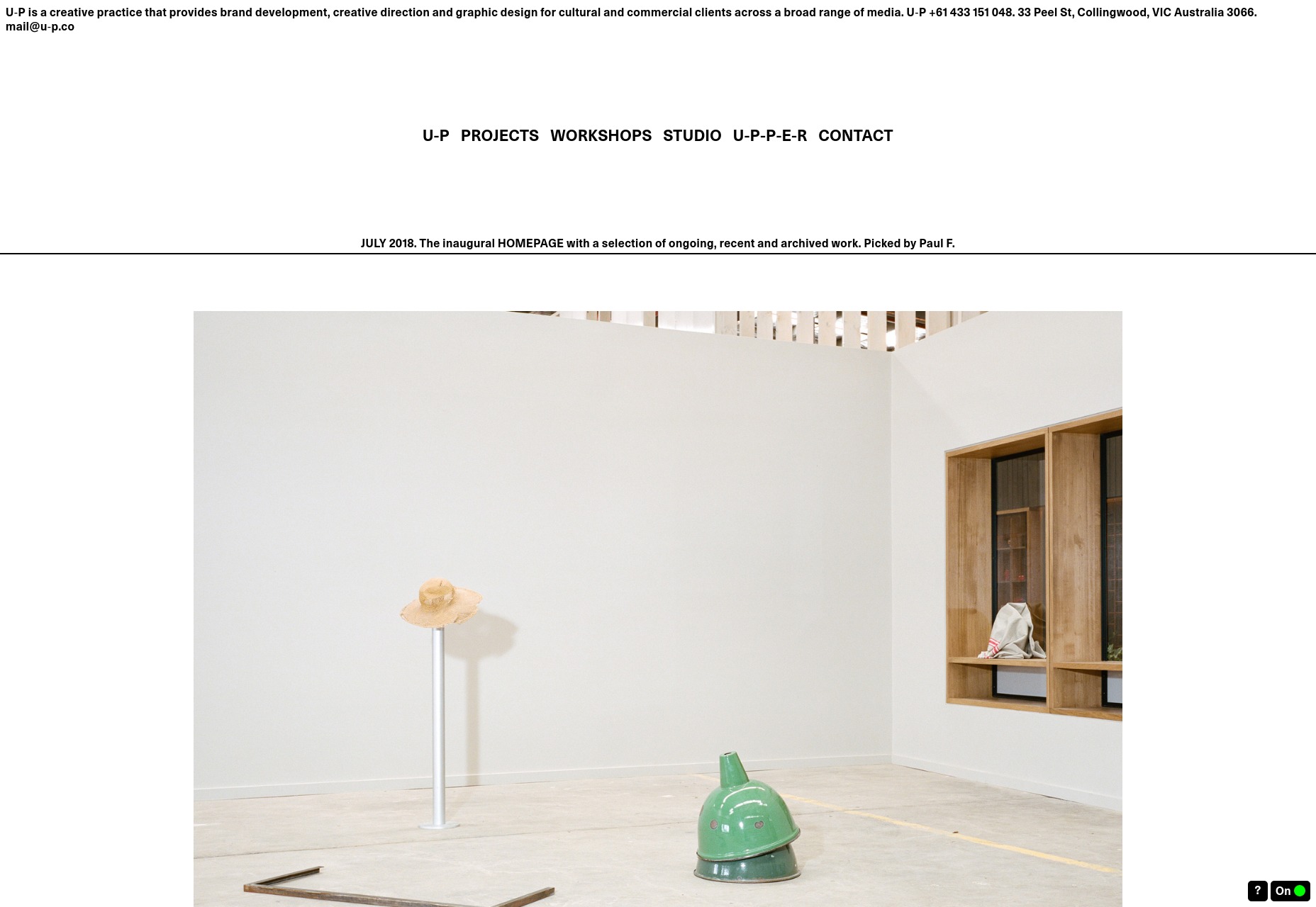
U-P
U-P is hard to classify. It’s so reminiscent of the Wild West days of the Internet that it’s almost brutalist. And yet, it looks good in a way that is sometimes a little cramped. Despite its design roots, it follows fairly modern usability conventions. It works, even if it sometimes seems like it shouldn’t.
That’s always impressive.
Platform: Static Site
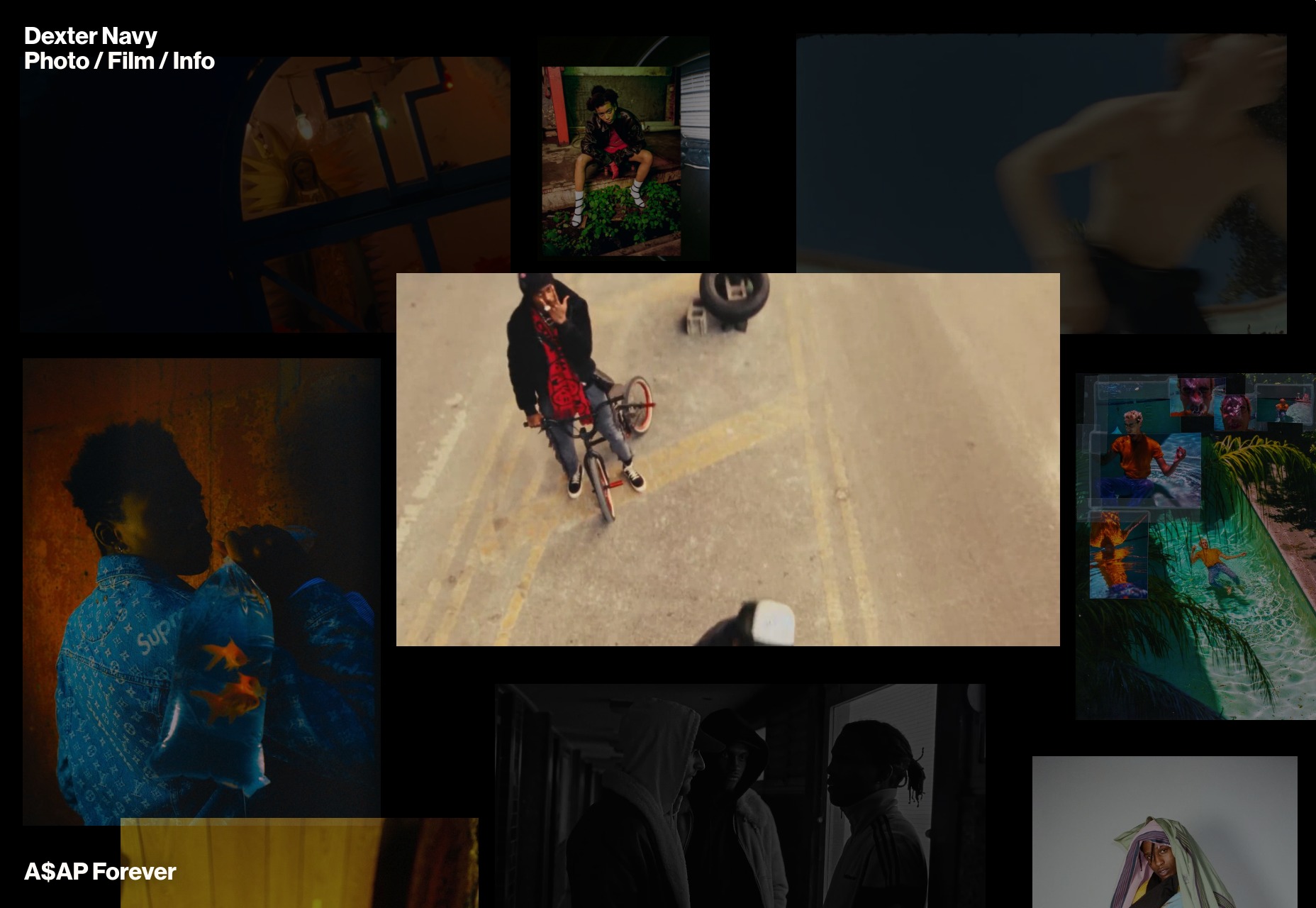
Dexter Navy
Dexter Navy’s site is an odd duck, and I quite like it. Some photographers and videographers have collage-style sites. Others do that “preview-on-hover-over-the-title” thing. This one manages to combine them both in a riot of color and movement that still manages to feel purposeful.
The photography and video are mixed together delightfully. I also quite like the horizintal-scrolling image galleries for each project.
Platform: Static Site
Add Realistic Chalk and Sketch Lettering Effects with Sketch’it – only $5!
![]()
Source
p img {display:inline-block; margin-right:10px;}
.alignleft {float:left;}
p.showcase {clear:both;}
body#browserfriendly p, body#podcast p, div#emailbody p{margin:0;}


 Web designers are some of the hardest working people I know. Which is why I don’t envy them having to design websites and other content for clients while managing their freelance design business and continually being on the lookout for new clients.