How to Build a Coach Holiday Showcase with WRLD

Original Source: https://www.sitepoint.com/how-to-build-a-coach-holiday-showcase-with-wrld/

This article was created in partnership with WRLD. Thank you for supporting the partners who make SitePoint possible.

Since the late 2000s, maps have been a staple of the web, and today are more ubiquitous than ever. They have a variety of uses, from complementing a company’s contact page to plotting places of interest across a geographic region. As computing power is becoming more affordable, 3D maps have gained popularity, demonstrating the scale of buildings and the nature of the surrounding terrain, adding a touch of novelty to such experiences, as well as providing practical benefits.

One such provider of 3D maps is WRLD. Major cities such as New York, London, Paris and Bangkok have been generated in 3D using real geographic data. This data can be used to author custom maps containing points of interest and other useful metadata, and thanks to their Leaflet-driven JavaScript library, it’s possible to drop them into a web page with a few lines of code; this workflow will be the focus of our article.

Using WRLD’s map designer, we will build a map for a coach holiday, which we will then integrate into a Node.js-powered website.

Getting Started

Before we can use WRLD’s map designer, we must register. Sign in once you’ve created and verified your account.

Navigate to the Map Designer. This page will list any maps that you have created, as well as allowing you to create new ones. Click on Create Map to launch the designer.

Together, we’re going to create a map for a Dundee food tour. Click New Map on the left and in the resultant New Map modal, enter a title of Dundee Food Tour and then hit Confirm New Map.

Specifying the map's title

Now that we’ve created our map, we need to choose a starting location. Click the menu button next to the search input, click Locations, and choose Dundee.

Selecting a location

Adding Our First Place

To add locations to our map, we have to use WRLD’s Places Designer, which facilitates the creation of place sets that can then be imported and reused.

On the right, click the place marker icon, followed by Manage Place Collections. This will open the designer at the same geographical location. Let’s add our first places collection by clicking New Places Collection. Set the title to Dundee Food Tour and then add a reference to our Dundee Food Tour app, which will link the places collection with our map. Finalise this with Confirm New Collection.

Creating a new place collection

Click New Place Marker next to the search box. A marker should appear on the Googleplex building, but it can be dragged into place if necessary. In the pane on the right, enter a title of Googleplex — this will save automatically.

Adding a new place marker

Add as many places as you’d like following this approach, and return to the Map Designer once you feel that you have enough. Our new collection should have been detected and automatically included in our map, but we can configure this manually by clicking the places marker on the right and selecting our place set.

Configuring our places collection for inclusion

Before we display the map on our website, we should set a starting point. Drag and zoom the map until you’ve found an optimal view, then, using the crosshair icon on the right, open the Opening Map View form and click Use Current Map View.

Setting the opening map view

Including the Map on a Website

Despite the impressively-detailed 3D modelling provided by WRLD, the real power of this platform is the ability to embed maps into websites and other applications. As well as exposing a variety of HTTP APIs for directly querying data, there are libraries for rendering maps on many platforms, including iOS, Android, and the web. We will use the wrld.js library, which is also available on npm.

Setting Up

The boilerplate website to which we will add our map can be found at GitHub. Please clone this repository and install the required dependencies:

git clone https://github.com/jamesseanwright/wrld-tours.git
cd wrld-tours
nvm install # this will install the version of Node.js found in .nvmrc. Make sure nvm is installed
npm i

To verify that the project works as expected, run npm run watch; this will start the project using nodemon, restarting automatically when any changes are made. Upon opening http://localhost:8001/trips in your browser, you should see a list of trips with a sole item.

Grabbing and Configuring your Developer Token

Our application will consume data from two of WRLD’s HTTP APIs, which are protected by developer tokens. To acquire your token, sign in and head over to the My Account section, and click the Developer Token tab; make sure you copy it.

Grabbing the developer token via the My Account page

In our app’s codebase, open config.json in the server directory, and paste your token as the value of devToken; this property will be used to make the aforemntioned API calls covered in the next step.

{
“devToken”: “insert your dev token here”
}

Calling WRLD’s HTTP APIs

Open the project in your editor, and head to the trips.json file in the server directory. This is a hash map of all of the available trips listed on our website, keyed by a hyphen-separated slug. These are accessible via the /trips route, so we can reach the Dundee Food Tour via /trips/dundee-food-tour. You’ll notice that the entry for the Dundee Food Tour has two empty properties, mapSceneId and poiSetId. We will return to this shortly.

Let’s take a look at the client-side code that fetches the map data. Open TripView.js (not TripViews.js) in the client/views directory and study the onNavigatedTo method. This calls two endpoints that are provided to the client by the server:

const [mapScene, poiSet] = await Promise.all([
callEndpoint(endpoints.mapScene),
callEndpoint(endpoints.poiSet),
]);

These don’t directly point to the WRLD APIs. Rather, they are exposed by our own server so that our developer token is not leaked to the browser. Let’s take a look at these routes in server/apiRouter.js:

router.get(‘/mapscenes/:id’, (req, res) => {
res.status(404).send();
});

router.get(‘/pois/:poiSetId’, (req, res) => {
res.status(404).send();
});

Currently, they behave as if they do not exist. To implement them, we can use the already-imported request module to forward our requests to the respective WRLD APIs and stream this back to the browser:

router.get(‘/mapscenes/:id’, (req, res) => {
request.get(`https://wrld.mp/v1.1/mapscenes/${req.params.id}?token=${config.devToken}`)
.pipe(res);
});

router.get(‘/pois/:poiSetId’, (req, res) => {
request.get(`https://poi.wrld3d.com/v1.1/poisets/${req.params.poiSetId}/pois/?token=${config.devToken}`)
.pipe(res);
});

Whenever the client-side JavaScript is evaluated for a trip, it will call these endpoints with the relevant IDs, keeping the developer token away from the browser.

Verifying Our Endpoints

To check that this has worked, we can call our own API endpoints directly. To get the respective IDs for our mapscene and place collection, we can call the WRLD APIs directory with our developer token, i.e.:

https://wrld.mp/v1.1/mapscenes/?token=[your dev token]
https://poi.wrld3d.com/v1.1/poisets/?token=[your dev token]

We can then take the id properties and pass them to our own local endpoints e.g. http://localhost:8001/api/mapscenes/10786 and http://localhost:8001/api/pois/4149. If we have implemented these routes correctly, then we should receive data from the WRLD APIs.

Updating the Trip Definition

Return to the trips.json file. Remember the two empty properties, mapSceneId and poiSetId? Set their respective values to the IDs you took for the mapscene and place collection e.g.:

“mapSceneId”: “10597”,
“poiSetId”: “4160”

Rendering the Map

We’re now ready to plot the API data onto a browser-rendered map. Let’s return to the TripView.js file.

The post How to Build a Coach Holiday Showcase with WRLD appeared first on SitePoint.

How to create a 3D effect with occlusion shadows

Original Source: http://feedproxy.google.com/~r/CreativeBloq/~3/c1Rs3-ufnn4/occlusion-shadows-121518571

occlusion main image

Occlusion shadows help to push the three-dimensional feeling of what you’re painting. Look for areas enclosed by surfaces and notice how the shadows are always darker there

When doing detailed lighting work I’ve gotten into the habit of simplifying each step of the painting process as much as possible. Focusing my attention on one aspect at a time helps to not become overwhelmed and almost always results in a much more thorough job.

One step in that process is concentrating on occlusion shadows, which occur where surfaces come together. A basic rule of thumb is that wherever areas are closed in by surfaces, shadows will occur. The inside of a mouth or an eye socket for instance will almost always be darker than the top of the nose or the forehead.

They’re a form of shadows best noticeable when there’s no directional light present. So you can paint them on a separate layer without having to worry about the direction of the overall lighting, and then set that layer to Multiply to have it distribute the shadows on the objects below. In my example however, I do have a lighting scheme in mind with directional lights and cast shadows, but these build upon the occlusion shadows rather than replacing them.

01. Start simple

occlusion layers step 1

 Every good painting starts with a good foundation. In this case it’s a quick line drawing that looks very simple, but has all the information in it I need to finish the painting. It shows the placing of all the facial features, but also where the cast shadows will fall and how the back lighting will push the silhouette forward.

02. Use occlusion layer

occlusion in photoshop

Built upon the previous sketch is the occlusion layer. You’ll notice that it’s a very bright layer with light greyish tones in it, and the reason for that is that we don’t want to overdo the shadows in the image. By keeping this layer light the Multiply layer won’t ‘burn’ my friendly-looking orc character below.

03. Build it up

building up occlusion layers

With the occlusion layer in Multiply I paint over the line drawing with larger strokes to erase the big lines while keeping the major volumes. The lines aren’t really needed since the layout of the elements is present in the occlusion layer, too. The heavy lifting is now mostly done and all that remains is adding colour and effects.

Words: Bram Sels

Bram is a freelance illustrator and concept designer. He has worked for companies such as Ubisoft, Axis Animation, 3DTotal and Wideshot Entertainment. This article originally appeared in ImagineFX issue 128.

Like this? Read these!

Free Photoshop brushes every creative must haveHow to create an orc in ZBrushHow to create dynamic lighting in Photoshop

Announcing the SitePoint Blockchain Newsletter!

Original Source: https://www.sitepoint.com/announcing-the-sitepoint-blockchain-newsletter/

Sign up here to receive the weekly blockchain dispatch on Friday mornings PST.

Blockchain Newsletter

Whether it’s being hailed as a game-changer or derided as hype, blockchain is everywhere these days. But it’s hard to get trustworthy, unbiased news and tutorials about the tech. If you’re trying to enter the blockchain dev world, there’s a high price of entry.

Blockchain technology is useful for more than just cryptocurrency, and this newsletter will highlight some of the more interesting and exciting developments in this emerging field, along with ways to get started yourself.

You’ll get a curated selection of links sourced by me, Adam. You may know me from weekly Back-end and Design newsletters, or from Versioning, my daily newsletter and membership publication focused on the bleeding-edge of web dev and design. Now I want to expand my knowledge to the blockchain world – and I want you to join me.

Every Friday, you’ll receive a newsletter full of curated links that I’ve found useful in my own research, along with links to useful tools, tutorials and projects I think are worthwhile. Also, no scams!

Sign up, and I promise it’ll be both on-the-chain and off-the-chain!

Continue reading %Announcing the SitePoint Blockchain Newsletter!%

Best Practices With CSS Grid Layout

Original Source: https://www.smashingmagazine.com/2018/04/best-practices-grid-layout/

Best Practices With CSS Grid Layout

Best Practices With CSS Grid Layout

Rachel Andrew

2018-04-16T13:35:19+02:00
2018-04-16T11:56:19+00:00

An increasingly common question — now that people are using CSS Grid Layout in production — seems to be “What are the best practices?” The short answer to this question is to use the layout method as defined in the specification. The particular parts of the spec you choose to use, and indeed how you combine Grid with other layout methods such as Flexbox, is down to what works for the patterns you are trying to build and how you and your team want to work.

Looking deeper, I think perhaps this request for “best practices” perhaps indicates a lack of confidence in using a layout method that is very different from what came before. Perhaps a concern that we are using Grid for things it wasn’t designed for, or not using Grid when we should be. Maybe it comes down to worries about supporting older browsers, or in how Grid fits into our development workflow.

In this article, I’m going to try and cover some of the things that either could be described as best practices, and some things that you probably don’t need to worry about.

The Survey

To help inform this article, I wanted to find out how other people were using Grid Layout in production, what were the challenges they faced, what did they really enjoy about it? Were there common questions, problems or methods being used. To find out, I put together a quick survey, asking questions about how people were using Grid Layout, and in particular, what they most liked and what they found challenging.

In the article that follows, I’ll be referencing and directly quoting some of those responses. I’ll also be linking to lots of other resources, where you can find out more about the techniques described. As it turned out, there was far more than one article worth of interesting things to unpack in the survey responses. I’ll address some of the other things that came up in a future post.

Nope, we can’t do any magic tricks, but we have articles, books and webinars featuring techniques we all can use to improve our work. Smashing Members get a seasoned selection of magic front-end tricks — e.g. live designing sessions and perf audits, too. Just sayin’! 😉

Explore Smashing Wizardry →

Smashing Cat, just preparing to do some magic stuff.

Accessibility

If there is any part of the Grid specification that you need to take care when using, it is when using anything that could cause content re-ordering:

“Authors must use order and the grid-placement properties only for visual, not logical, reordering of content. Style sheets that use these features to perform logical reordering are non-conforming.”

— Grid Specification: Re-ordering and Accessibility

This is not unique to Grid, however, the ability to rearrange content so easily in two dimensions makes it a bigger problem for Grid. However, if using any method that allows content re-ordering — be that Grid, Flexbox or even absolute positioning — you need to take care not to disconnect the visual experience from how the content is structured in the document. Screen readers (and people navigating around the document using a keyboard only) are going to be following the order of items in the source.

The places where you need to be particularly careful are when using flex-direction to reverse the order in Flexbox; the order property in Flexbox or Grid; any placement of Grid items using any method, if it moves items out of the logical order in the document; and using the dense packing mode of grid-auto-flow.

For more information on this issue, see the following resources:

Grid Layout and Accessibility – MDN
Flexbox and the keyboard navigation disconnect

Which Grid Layout Methods Should I Use?

”With so much choice in Grid, it was a challenge to stick to a consistent way of writing it (e.g. naming grid lines or not, defining grid-template-areas, fallbacks, media queries) so that it would be maintainable by the whole team.”

— Michelle Barker working on wbsl.com

When you first take a look at Grid, it might seem overwhelming with so many different ways of creating a layout. Ultimately, however, it all comes down to things being positioned from one line of the grid to another. You have choices based on the of layout you are trying to achieve, as well as what works well for your team and the site you are building.

There is no right or wrong way. Below, I will pick up on some of the common themes of confusion. I’ve also already covered many other potential areas of confusion in a previous article “Grid Gotchas and Stumbling Blocks.”

Should I Use An Implicit Or Explicit Grid?

The grid you define with grid-template-columns and grid-template-rows is known as the Explicit Grid. The Explicit Grid enables the naming of lines on the Grid and also gives you the ability to target the end line of the grid with -1. You’ll choose an Explicit Grid to do either of these things and in general when you have a layout all designed and know exactly where your grid lines should go and the size of the tracks.

I use the Implicit Grid most often for row tracks. I want to define the columns but then rows will just be auto-sized and grow to contain the content. You can control the Implicit Grid to some extent with grid-auto-columns and grid-auto-rows, however, you have less control than if you are defining everything.

You need to decide whether you know exactly how much content you have and therefore the number of rows and columns — in which case you can create an Explicit Grid. If you do not know how much content you have, but simply want rows or columns created to hold whatever there is, you will use the Implicit Grid.

Nevertheless, it’s possible to combine the two. In the below CSS, I have defined three columns in the Explicit Grid and three rows, so the first three rows of content will be the following:

A track of at least 200px in height, but expanding to take content taller,
A track fixed at 400px in height,
A track of at least 300px in height (but expands).

Any further content will go into a row created in the Implicit Grid, and I am using the grid-auto-rows property to make those tracks at least 300px tall, expanding to auto.

.grid {
display: grid;
grid-template-columns: 1fr 3fr 1fr;
grid-template-rows: minmax(200px auto) 400px minmax(300px, auto);
grid-auto-rows: minmax(300px, auto);
grid-gap: 20px;
}

A Flexible Grid With A Flexible Number Of Columns

By using Repeat Notation, autofill, and minmax you can create a pattern of as many tracks as will fit into a container, thus removing the need for Media Queries to some extent. This technique can be found in this video tutorial, and also demonstrated along with similar ideas in my recent article “Using Media Queries For Responsive Design In 2018.”

Choose this technique when you are happy for content to drop below earlier content when there is less space, and are happy to allow a lot of flexibility in sizing. You have specifically asked for your columns to display with a minimum size, and to auto fill.

There were a few comments in the survey that made me wonder if people were choosing this method when they really wanted a grid with a fixed number of columns. If you are ending up with an unpredictable number of columns at certain breakpoints, you might be better to set the number of columns — and redefine it with media queries as needed — rather than using auto-fill or auto-fit.

Which Method Of Track Sizing Should I Use?

I described track sizing in detail in my article “How Big Is That Box? Understanding Sizing In Grid Layout,” however, I often get questions as to which method of track sizing to use. Particularly, I get asked about the difference between percentage sizing and the fr unit.

If you simply use the fr unit as specced, then it differs from using a percentage because it distributes available space. If you place a larger item into a track then the way the fr until will work is to allow that track to take up more space and distribute what is left over.

.grid {
display: grid;
grid-template-columns: 1fr 1fr 1fr;
grid-gap: 20px;
}

A three column layout, the first column is wider

The first column is wider as Grid has assigned it more space.

To cause the fr unit to distribute all of the space in the grid container you need to give it a minimum size of 0 using minmax().

.grid {
display: grid;
grid-template-columns: minmax(0,1fr) minmax(0,1fr) minmax(0,1fr);
grid-gap: 20px;
}

three equal columns with the first overflowing

Forcing a 0 minimum may cause overflows

So you can choose to use fr in either of these scenarios: ones where you do want space distribution from a basis of auto (the default behavior), and those where you want equal distribution. I would typically use the fr unit as it then works out the sizing for you, and enables the use of fixed width tracks or gaps. The only time I use a percentage instead is when I am adding grid components to an existing layout that uses other layout methods too. If I want my grid components to line up with a float- or flex-based layout which is using percentages, using them in my grid layout means everything uses the same sizing method.

Auto-Place Items Or Set Their Position?

You will often find that you only need to place one or two items in your layout, and the rest fall into place based on content order. In fact, this is a really good test that you haven’t disconnected the source and visual display. If things pretty much drop into position based on auto-placement, then they are probably in a good order.

Once I have decided where everything goes, however, I do tend to assign a position to everything. This means that I don’t end up with strange things happening if someone adds something to the document and grid auto-places it somewhere unexpected, thus throwing out the layout. If everything is placed, Grid will put that item into the next available empty grid cell. That might not be exactly where you want it, but sat down at the end of your layout is probably better than popping into the middle and pushing other things around.

Is your pattern library up to date today? Alla Kholmatova has just finished a fully fledged book on Design Systems and how to get them right. With common traps, gotchas and the lessons she learned. Hardcover, eBook. Just sayin’.

Table of Contents →

Which Positioning Method To Use?

When working with Grid Layout, ultimately everything comes down to placing items from one line to another. Everything else is essentially a helper for that.

Decide with your team if you want to name lines, use Grid Template Areas, or if you are going to use a combination of different types of layout. I find that I like to use Grid Template Areas for small components in particular. However, there is no right or wrong. Work out what is best for you.

Grid In Combination With Other Layout Mechanisms

Remember that Grid Layout isn’t the one true layout method to rule them all, it’s designed for a certain type of layout — namely two-dimensional layout. Other layout methods still exist and you should consider each pattern and what suits it best.

I think this is actually quite hard for those of us used to hacking around with layout methods to make them do something they were not really designed for. It is a really good time to take a step back, look at the layout methods for the tasks they were designed for, and remember to use them for those tasks.

In particular, no matter how often I write about Grid versus Flexbox, I will be asked which one people should use. There are many patterns where either layout method makes perfect sense and it really is up to you. No-one is going to shout at you for selecting Flexbox over Grid, or Grid over Flexbox.

In my own work, I tend to use Flexbox for components where I want the natural size of items to strongly control their layout, essentially pushing the other items around. I also often use Flexbox because I want alignment, given that the Box Alignment properties are only available to use in Flexbox and Grid. I might have a Flex container with one child item, in order that I can align that child.

A sign that perhaps Flexbox isn’t the layout method I should choose is when I start adding percentage widths to flex items and setting flex-grow to 0. The reason to add percentage widths to flex items is often because I’m trying to line them up in two dimensions (lining things up in two dimensions is exactly what Grid is for). However, try both, and see which seems to suit the content or design pattern best. You are unlikely to be causing any problems by doing so.

Nesting Grid And Flex Items

This also comes up a lot, and there is absolutely no problem with making a Grid Item also a Grid Container, thus nesting one grid inside another. You can do the same with Flexbox, making a Flex Item and Flex Container. You can also make a Grid Item and Flex Container or a Flex Item a Grid Container — none of these things are a problem!

What we can’t currently do is nest one grid inside another and have the nested grid use the grid tracks defined on the overall parent. This would be very useful and is what the subgrid proposals in Level 2 of the Grid Specification hope to solve. A nested grid currently becomes a new grid so you would need to be careful with sizing to ensure it aligns with any parent tracks.

You Can Have Many Grids On One Page

A comment popped up a few times in the survey which surprised me, there seems to be an idea that a grid should be confined to the main layout, and that many grids on one page were perhaps not a good thing. You can have as many grids as you like! Use grid for big things and small things, if it makes sense laid out as a grid then use Grid.

Fallbacks And Supporting Older Browsers

“Grid used in conjunction with @supports has enabled us to better control the number of layout variations we can expect to see. It has also worked really well with our progressive enhancement approach meaning we can reward those with modern browsers without preventing access to content to those not using the latest technology.”

— Joe Lambert working on rareloop.com

In the survey, many people mentioned older browsers, however, there was a reasonably equal split between those who felt that supporting older browsers was hard and those who felt it was easy due to Feature Queries and the fact that Grid overrides other layout methods. I’ve written at length about the mechanics of creating these fallbacks in “Using CSS Grid: Supporting Browsers Without Grid.”

In general, modern browsers are far more interoperable than their earlier counterparts. We tend to see far fewer actual “browser bugs” and if you use HTML and CSS correctly, then you will generally find that what you see in one browser is the same as in another.

We do, of course, have situations in which one browser has not yet shipped support for a certain specification, or some parts of a specification. With Grid, we have been very fortunate in that browsers shipped Grid Layout in a very complete and interoperable way within a short time of each other. Therefore, our considerations for testing tend to be to need to test browsers with Grid and without Grid. You may also have chosen to use the -ms prefixed version in IE10 and IE11, which would then require testing as a third type of browser.

Browsers which support modern Grid Layout (not the IE version) also support Feature Queries. This means that you can test for Grid support before using it.

Testing Browsers That Don’t Support Grid

When using fallbacks for browsers without support for Grid Layout (or using the -ms prefixed version for IE10 and 11), you will want to test how those browsers render Grid Layout. To do this, you need a way to view your site in an example browser.

I would not take the approach of breaking your Feature Query by checking for support of something nonsensical, or misspelling the value grid. This approach will only work if your stylesheet is incredibly simple, and you have put absolutely everything to do with your Grid Layout inside the Feature Queries. This is a very fragile and time-consuming way to work, especially if you are extensively using Grid. In addition, an older browser will not just lack support for Grid Layout, there will be other CSS properties unsupported too. If you are looking for “best practice” then setting yourself up so you are in a good position to test your work is high up there!

There are a couple of straightforward ways to set yourself up with a proper method of testing your fallbacks. The easiest method — if you have a reasonably fast internet connection and don’t mind paying a subscription fee — is to use a service such as BrowserStack. This is a service that enables viewing of websites (even those in development on your computer) on a whole host of real browsers. BrowserStack does offer free accounts for open-source projects.

Screenshot of the download page

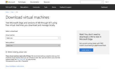
You can download Virtual Machines for testing from Microsoft.

To test locally, my suggestion would be to use a Virtual Machine with your target browser installed. Microsoft offers free Virtual Machine downloads with versions of IE back to IE8, and also Edge. You can also install onto the VM an older version of a browser with no Grid support at all. For example by getting a copy of Firefox 51 or below. After installing your elderly Firefox, be sure to turn off automatic updates as explained here as otherwise it will quietly update itself!

You can then test your site in IE11 and in non-supporting Firefox on one VM (a far less fragile solution than misspelling values). Getting set up might take you an hour or so, but you’ll then be in a really good place to test your fallbacks.

Unlearning Old Habits

“It was my first time to use Grid Layout, so there were a lot of concepts to learn and properties understand. Conceptually, I found the most difficult thing to unlearn all the stuff I had done for years, like clearing floats and packing everything in container divs.”

— Hidde working on hiddedevries.nl/en

Many of the people responding to the survey mentioned the need to unlearn old habits and how learning Layout would be easier for people completely new to CSS. I tend to agree. When teaching people in person complete beginners have little problem using Grid while experienced developers try hard to return grid to a one-dimensional layout method. I’ve seen attempts at “grid systems” using CSS Grid which add back in the row wrappers needed for a float or flex-based grid.

Don’t be afraid to try out new techniques. If you have the ability to test in a few browsers and remain mindful of potential issues of accessibility, you really can’t go too far wrong. And, if you find a great way to create a certain pattern, let everyone else know about it. We are all new to using Grid in production, so there is certainly plenty to discover and share.

“Grid Layout is the most exciting CSS development since media queries. It’s been so well thought through for real-world developer needs and is an absolute joy to use in production – for designers and developers alike.”

— Trys Mudford working on trysmudford.com

To wrap up, here is a very short list of current best practices! If you have discovered things that do or don’t work well in your own situation, add them to the comments.

Be very aware of the possibility of content re-ordering. Check that you have not disconnected the visual display from the document order.
Test using real target browsers with a local or remote Virtual Machine.
Don’t forget that older layout methods are still valid and useful. Try different ways to achieve patterns. Don’t be hung up on having to use Grid.
Know that as an experienced front-end developer you are likely to have a whole set of preconceptions about how layout works. Try to look at these new methods anew rather than forcing them back into old patterns.
Keep trying things out. We’re all new to this. Test your work and share what you discover.

Smashing Editorial
(il)

What’s New for Designers, April 2018

Original Source: https://www.webdesignerdepot.com/2018/04/whats-new-for-designers-april-2018/

Are you one of those designers who loves to test new stuff? Then this month’s collection of what’s new will be a treat! New tools and resources are everywhere this time of year, here are a few that you’re sure to enjoy.

If we’ve missed something that you think should have been on the list, let us know in the comments. And if you know of a new app or resource that should be featured next month, tweet it to @carriecousins to be considered!

FirstSiteGuide

FirstSiteGuide is a collection of resources, guides and tools to help you navigate first-time website ownership. Resources can help you start, run and grow an online presence even if you have never done it before. The neat lookup tool also allows you to learn what’s powering a certain website, just type in the URL and search.

There

There is a productivity app for remote teams. It keeps track of what time it is across time zones for team members so you don’t have to guess or spend time looking it up. Users and times pop up right on the screen.

AI Color Wheel

Here’s an AI application that’s a lot of fun to play with. The AI Color Wheel takes your flat image and colorizes it to generate color palettes. Just upload a design in grayscale, pick a color that appeals to you and get instant palette inspiration. (This is a great tool if you have a hard time selecting color palettes.)

Driver

Driver is a lightweight JavaScript engine to help move the user across the page in a design. It allows you to highlight elements, create feature introductions, and customize in a number of ways to cue up interactions.

Tabler

Tabler is a tool with all the source code you need to create a responsive dashboard template that looks great and can be customized by the project. It comes with plenty of components that are ready-made and the code is open-source so you can create a pull request for a feature. It’s built with Bootstrap and uses CSS3 form components.

Wormco

Wormco is a simple animated status indicator that is pure fun. Find it on CodePen.

UI Faces

UI Faces is an avatar aggregator featuring “live” faces for design mockups. The avatars come ready to use with information to make your mockups feel more real; just copy and paste, use the API or integrate the Sketch plugin.

Trueface

Trueface is an AI-powered identity verification system. Use it for OCR and data extraction, document verification, facial recognition and to validate users.

Storyboarder

Storyboarder helps you turn piles of sketches into an actual animated storyboard. It’s a quick and easy way to visualize and show off your ideas to others using a digital storyboard that can be shared. You can draw in-app or import graphics. You can also add dialogue and action to bring it to life. Storyboarder integrates with Photoshop for easy editing.

Egg Shape Background Gradients

There’s no such thing as too many gradients and Egg Shape Background Gradients is another gradient-picking tool. The gimmick here is that each sample is in an egg shape. Find one you like, copy the colors or CSS) and go.

Sheet2Site

Sheet2Site is a paid tool that allows you to turn a Google Sheet into a website without coding. It is a good option for simple or data-based web needs.

Crunch

Crunch might be a little slow but it makes up for it in functionality. The Mac tool optimizes PNG images. According to the developer: “It combines selective bit depth, color type, and color palette reduction with zopfli DEFLATE compression algorithm encoding using embedded versions of the pngquant and zopflipng PNG optimization tools. This approach leads to a significant file size gain relative to lossless approaches at the expense of a relatively modest decrease in image quality.”

Papaya

Papaya is a collection of landing page templates for a number of projects. What makes this collection unique is while every design is quick, responsive and customizable, you get to say how much you are willing to page for each landing page template.

Cloud Text-to-Speech

Google Cloud’s Text-To-Speech tool is open with a beta version that converts natural sounding speech with 30 voices in multiple languages. According to Google, “It applies DeepMind’s groundbreaking research in WaveNet and Google’s powerful neural networks to deliver the highest fidelity possible. With this easy-to-use API, you can create lifelike interactions with your users, across many applications and devices.”

Pixelify

Pixelify is an ever-updating collection of design assets that you can use. The site is a design-sharing community so you can upload and rate designs. There are assets available for personal and commercial use.

Site Palette

Site Palette is a Chrome browser extension that extracts color palettes from websites. You can create palettes, mix color options and download swatches.

Medical Icons Set

Medical Icons Set is a collection of 60 vector icons in PNG and SVG format. The set includes line and monochrome filled options for designs that need a medical icon set.

200 Vector Icons

Henrik Ostergaard created a set of 200 vector icons for Adobe Illustrator. The pack includes line-style element representations of common items and shapes.

Deck

InVision has a fun card-style UI kit available as a free download. Deck is a cross-platform UI kit for card-based interfaces. The kit is made with vector shapes for easy customization.

Bootstrap Templates & Themes

Need a theme or template for Bootstrap 4? This collection is packed with freebies from dashboards to page templates to carousels.

Tutorial: CSS Techniques and Effects for Knockout Text

Knockout text is a big trend in typography right now. (You can find more about it in the April collection of Essential Design Trends.) This tutorial from CSS-Tricks will help you create a super-trendy and modern layered text effect using CSS properties and even include transitions and animations.

Variable Fonts

A variable font is a single font that “behaves like multiple fonts.” Variable Fonts, in beta, is a resource to help you find variable font options that you can test and use. Each typeface description comes with a preview and information about the design, license and where to find it. Finding a variable font just got a lot easier.

Altero

Altero is an all-caps display typeface that’s free for commercial and personal use. The heavy block style also includes an outline version and the font download includes 505 characters.

Bimbo

Bimbo is a monoline script that has a distinct handwritten style. Use it for display. The set includes six weights and 300 characters.

East Border

East Border is a slab-style stencil typeface with a full uppercase character set, numerals and a few punctuation marks. It is best for display options.

Element 120

Element 120 is a rough display typeface with a full character set. The demo version (free) is somewhat limited.

Spring is Coming

Spring is Coming is a lightweight typeface that includes flower symbols. It has a handwriting style.

Add Realistic Chalk and Sketch Lettering Effects with Sketch’it – only $5!

Source

p img {display:inline-block; margin-right:10px;}
.alignleft {float:left;}
p.showcase {clear:both;}
body#browserfriendly p, body#podcast p, div#emailbody p{margin:0;}

Collective #407

Original Source: http://feedproxy.google.com/~r/tympanus/~3/U31XLU8EaZI/

C407_HelloSign

Our Sponsor
Everything IT requires and Developers love

With a robust SDK, amazing support, detailed documentation, and super clean dashboard, HelloSign API is sure to make your team happy.

Try it today

C407_scroll

Scroll to the future

Anna Selezniova and Andy Barnov take us on a tour of the latest CSS and JavaScript features that make navigating around a single page smooth, beautiful and less resource-hungry.

Read it

C407_frontendbook

Front-End Developer Handbook 2018

A guide written by Cody Lindley on the practice of front-end development, how to learn it and what tools are used.

Check it out

C407_length

Length.js

A useful JavaScript library for length units conversions.

Check it out

C407_eclipse

Eclipse

An interactive experiment made by Cameron Adams.

Check it out

C407_font2

Free Font: Jelani

A beautiful, creative font inspired by African folklore.

Get it

C407_vuepress

VuePress

A Vue-powered static site generator with a markdown-centered project structure.

Check it out

C407_mustard

Mustard UI

Mustard UI is a nice looking starter CSS framework made by Kyle Logue.

Check it out

C407_bigapps

Designing very large (JavaScript) applications

Malte Ubl’s transcript of his JSConf Australia talk on what he learned building large JavaScript applications.

Read it

C407_fechecklist

Front-End Design Checklist

An exhaustive list of optimal goals for a very complete front-end design project. By David Dias.

Check it out

C407_browser

Remote Browser

A library for controlling web browsers like Chrome and Firefox programmatically using JavaScript. Built on top of the Web Extensions API standard.

Check it out

C407_gridpractices

Best Practices With CSS Grid Layout

Rachel Andrew tries to answer the commonly asked question about CSS Grid best practices.

Read it

C407_gridfacts

Another Collection of Interesting Facts About CSS Grid

Once again Manuel Matuzovic shares his findings about interesting bits of CSS Grid.

Read it

C407_tentacles

Dot Tentacles

Magical dot tentacles with CSS variables made by Ana Tudor.

Check it out

C407_snap

Swipe Views with CSS Snap Points: Building a More Efficient Mobile Web Navigation

An interesting read on the usefulness of CSS Scroll Snap Points.

Read it

C407_d3

Learn D3.js for free

A step-by-step guide with 10 interactive tutorials to teach you D3.js. Read more about it in this article.

Check it out

C407_buttoncursor

Buttons shouldn’t have a hand cursor (part 2)

Adam Silver continues his analysis of the pointer cursor conventions.

Read it

C407_webrebuild

It’s time to rebuild the web

In case you missed it: an article by Mike Loukides on how the web needs to be rebuild to become open again.

Read it

C407_font1

Free Font: Medel

Ozan Karakoc designed this font with a unique touch.

Get it

C407_prefix

Getting rid of “grid-” prefix on CSS Grid Layout gutter properties

In case you missed it: an article about the unprefixing of grid layout gutter properties in Blink and WebKit. By Manuel Rego Casasnovas.

Read it

C407_distortionhover

From Our Blog
WebGL Distortion Hover Effects

A little library that can be used for creating WebGL powered distortion hover effects using displacement images.

Check it out

Collective #407 was written by Pedro Botelho and published on Codrops.

50+ Nice Clean CSS Tab-Based Navigation Scripts

Original Source: https://www.hongkiat.com/blog/50-nice-clean-css-tab-based-navigation-scripts/

Comprehensive list of clean and well-designed tab-based navigation scripts built on top of CSS and JavaScript.

The post 50+ Nice Clean CSS Tab-Based Navigation Scripts appeared first on Hongkiat.

Visit hongkiat.com for full content.

10 essential oil painting tips and techniques

Original Source: http://feedproxy.google.com/~r/CreativeBloq/~3/dTT1hoJ3H4o/oil-painting-techniques-10-essential-tips

When learning how to paint, virtually every student starts out afraid and overwhelmed by the unforgiving nature of painting in oils. But the transition to oils can be made much smoother by utilising some simple and practical painting techniques. 

In the video below, I demonstrate 10 great tips that will help get you started on the right path. (Spoiler alert: it all begins with the fundamentals!)

Now let's go through these 10 oil painting tips in more detail.

01. Hold the paintbrush in the right place!

Hold your brush at the end for maximum control

There are many different grips on the paintbrush that an artist can use while painting. However, there is one 'go-to' method that every artist should know: to get the most fluidity and sensitivity with your strokes, hold the brush handle as far back as you can. This might feel uncomfortable at first, but it offers the greatest degree of control because it allows you to paint with your whole arm rather than just your wrist. 

 02. Master your brush orientation

Using every angle of your brush adds to your versatility

During the process of painting, it can be very easy to forget that your brush has two sides or orientations! You’re not limited to always making wide strokes using the flat side of your brush, as every brush can be turned on its side for sharper lines or strokes. Learning to control your lines with your brush orientation will help you paint faster and with more versatility.

 03. Vary your pressure

By varying pressure, you’ll vary texture as well

Avoid having 'heavy hands' with your paintbrush. Sometimes the pressure that you apply with a stroke can make the difference between perfection and a mess. The heavier your pressure, the more your paints will blend and create ridges along the sides of your brushstrokes. Get familiar with how your light, medium, and heavy strokes look on the canvas and vary your pressure appropriately to achieve your desired effects. 

04. Harness the power of the painting medium

Painting mediums can modify your paint in amazing ways

Oil painting is not solely about the paint. An absolutely essential part of controlling paint is the artist’s use of a painting medium – typically a mixture of solvent and oil used to modify the paint and make it behave in different ways. Adding lots of medium will make your paint flat and transparent like a wash, whereas adding just a little medium will give your paint a mayonnaise-like consistency.

05. Keep your colours pure

Keep your brushes clean so you don’t contaminate your colour

Be careful when you grab from the paint piles on your palette. Make sure that your brushes are clean or you will taint the colours you want to use. It’s vital to preserve the intensity of the colours straight out of the tube so remember to clean your brushes regularly and often – even between strokes if necessary.

06. Use two-colour mixtures if possible

The fewer paints you mix, the more vibrant the resulting colour will be

Grabbing from every single pile while mixing will create a dull and less intense mixture. Practice mixing what you need using only two colours and white. By increasing your colour knowledge and getting better at mixing, you will paint much more efficiently and quickly and your work will benefit from it.

07. Don't over-mix

Only mix as much as necessary

When mixed colours first bump into one another, there are tiny inconsistencies in the mixture that help add vividness and interest to your paint. So, when you combine colours to create a mixture it’s important to make sure that you only mix them as much as necessary before applying the stroke. If you over-mix two colours, you will turn your interesting mixture into a flat and uninteresting pile of paint.

08. Don't skimp on paint

Use as much paint as necessary to realise your vision

Sometimes you want a thin wash, but other times you need a thick stroke in order to achieve your desired effect, so make sure that you're using enough paint to create the type of stroke you need. Don't hold back on the paint at the expense of your painting. If you find yourself constantly swirling a brush around a thin pool of paint on your palette, then it's probably time to remake that mixture.

09. Try wet-on-wet versus dry brush

Use wet versus dry effects to your advantage

Remember that you can paint directly onto a wet surface or wait for it to dry and put wet paint over that. Paints will blend on the canvas when working wet-in-wet, which is great for getting transitions or gradients. Painting with a dry brush will give you a more textural effect, which is perfect for painting brick or dirt.

10. Don't forget the palette knife

Sometimes, the best brush for the job is not a brush at all

The palette knife is not just a trowel that you use to mix paint! It can also be used quite effectively at times to make interesting strokes. A palette knife is particularly useful for making textural and unpredictable strokes – effects that you'd be hard-pressed to duplicate with a brush.

Related articles:

How to draw and paint – pro tips and tutorials7 must-know painting techniques for artistsThe secrets to painting like Matisse

Jump start your app career with this bundle

Original Source: http://feedproxy.google.com/~r/CreativeBloq/~3/xo1w0S9nrpg/jump-start-your-app-career-with-this-bundle

Knowing how to build for mobile is an invaluable skill with nearly endless opportunities. You can get your start in the mobile development field with the eduCBA Mobile App Development Lifetime Subscription Bundle. It's on sale now for 96 per cent off the retail price.

You'll learn the basics of the languages that make up the fundamentals of mobile. Whether you want to build for iOS or Android, you'll find a course in this bundle to get you on track. There are over 100 courses and 250 hours of content that will teach you how to design the user experience people want, build the apps and games people will love, and get your app to the top of the charts.

The eduCBA Mobile App Development Lifetime Subscription Bundle is valued at over $797, but you can save 96 per cent off the retail price. That means you’ll pay just $29 (approx. £20) for a bundle that could put you on the road to your next career.

Related articles:

How to make an appBuild apps that work offlineThe 34 best photo apps

Collective #406

Original Source: http://feedproxy.google.com/~r/tympanus/~3/hZ9d7MXF5P4/

C406_WOTW

Inspirational Website of the Week: Célia Lopez

A great design with some futuristic details and effects. Our pick this week.

Get inspired

C406_hellosign

Our Sponsor
Everything IT requires and Developers love

With a robust SDK, amazing support, detailed documentation, and super clean dashboard, HelloSign API is sure to make your team happy.

Try it today

C406_colorperception

Color: From Hexcodes to Eyeballs

Jamie Wong’s fantastic exploration of electromagnetic radiation, optical biology, colorimetry, and display hardware.

Read it

C406_keyframes

@keyframers 1.0.0

The @keyframers premier, where David Khourshid and Stephen Shaw live code an animation.

Watch it

C406_weather

Displaying the Weather With Serverless and Colors

Join Burke Holland in this fun project where he builds a weather bulb that shows a certain color based on the outside temperature.

Read it

C406_glide

Glide 3.0

The carousel library Glide has evolved into a dependency-free and light-weight script. Made by Jędrzej Chałubek.

Check it out

C406_brutalist

Brutalist design is the bad influence we all need

An interesting read by Maria Grilo where she explains Brutalist design.

Read it

C406_react-spring

Why React needed yet another animation library. Introducing: react-spring

Read all about react-spring, a new animation library for React. By Paul Henschel.

Read it

C406_font

Free Font: Quiapo Free

A great brush typeface inspired by the signs hanged behind the windshield of Filipino jeepneys. By Aaron Amar.

Free Font

C406_geofont

Geometric Letters

Alaa Alnuaimi designed this geometric font that reuses a small number of simple geometric shapes.

Check it out

C406_es6

ES6 Syntax and Feature Overview

An introduction to ES6 syntax and features, such as classes, Promises, constants, and destructuring, with one-to-one comparisons to older versions of JavaScript. By Tania Rascia.

Read it

C406_offline

Going Offline

Chapter 1 of Jeremy Keith’s new book “Going Offline”.

Read it

C406_webassembly

Sneak Peek at WebAssembly Studio

Learn about WebAssembly.Studio, an online IDE that helps you learn and teach others about WebAssembly.

Read it

C406_webanim

The State of Web Animation

Megan Zlock explores the current state of web animations in this two part series. Check out part 1, too.

Read it

C406_productivity

Productivity

A very interesting read on productivity by Sam Altman.

Read it

C406_fuzzball

Fuzzball

Great three.js fun with David Lenaerts’ Fuzzball.

Check it out

C406_editorial

Editorial Design and CSS Grid: Inspiration and examples

To illustrate (and celebrate) the approach between editorial design and web design, Ricardo Prieto has set out to design some pages of the 99U Quarterly Magazine with CSS Grid.

Read it

C406_cssrender

How CSS works: Parsing & painting CSS in the critical rendering path

Benjamin Johnson’s first article in a series where he takes a deep dive into exploring CSS as well as its attached ecosystem.

Read it

C406_moose

Moose

Great free stock photos that are made to fit together.

Check it out

C406_vscode

Top JavaScript VSCode Extensions for Faster Development

Arfat Salman lists some great VSCode extensions he uses on a day-to-day basis.

Read it

C406_atalanta

Free Font: Atalanta

A strong display typeface designed by Jose Manuel Vega.

Get it

C406_pattern

Memphis Space Seamless Patterns

Some gorgeous retro Memphis patterns made by Creative Veila.

Get it

Collective #406 was written by Pedro Botelho and published on Codrops.