Bring a brand to life with illustration
Original Source: http://feedproxy.google.com/~r/CreativeBloq/~3/nyKBIbc4vxE/bring-a-brand-to-life-with-illustration
Many brands choose to use illustration to do at least some of the talking for them, and if it’s true that an image speaks a thousand words, it’s easy to see why. Whether through content, style, implicit narrative or (likely) all three, an image can communicate what copy and typography often can’t, at once setting out a mood, tone of voice, target audience and attitude in a succinct visual.
The illustrator hotlist 2018
The idea of using illustration not just in a campaign, but as a core part of a brand’s visual identity is perhaps less common than it once was, and seems more aligned to certain sectors than others. Luxury food packaging design, for instance, especially on seasonal ranges: think high-end Christmas chocolate boxes. Or craft beer, a sector that’s seemingly indefatigable when it comes to both new variants and breweries.
An illustration route is straight to the point: it’s an instant emotional connection that can surpass language barriers
Chloe Templeman, Design Bridge
So what can illustration do that type, photography and copy alone can’t? For one, it shows a uniqueness, and in the right hands, it delivers on-shelf standout like few other approaches can. There’s far less chance, for instance, of a brand commissioning the same illustrator, style and image as there is of it using a similar typeface or colourway.
Broadly speaking, a brand commissioning illustration also subtly communicates a level of thought and attention. In a similar way to brands working with bespoke, hand-drawn typography, even digitally created illustration hints at a person behind a brand. This helps build its story and tells us that there’s more to the product than just ‘buy me’.
As Chloe Templeman, creative director at Design Bridge puts it, the notion of image as story is as, “old as cave paintings and hieroglyphics, and has come full circle to emojis. An illustration route is straight to the point: it’s an instant emotional connection that can surpass language barriers.”
Boozy illustration
Thirst Craft is a Glasgow-based branding and design agency specialising in the drinks sector, whose portfolio boasts no shortage of richly illustrated designs – including the design for Loch Lomond Brewery used as the headline image for this article. According to creative director Matt Burns, it’s little surprise that the craft beer sector in particular has latched onto illustration as the perfect conduit for communicating a brand’s attitude and uniqueness.
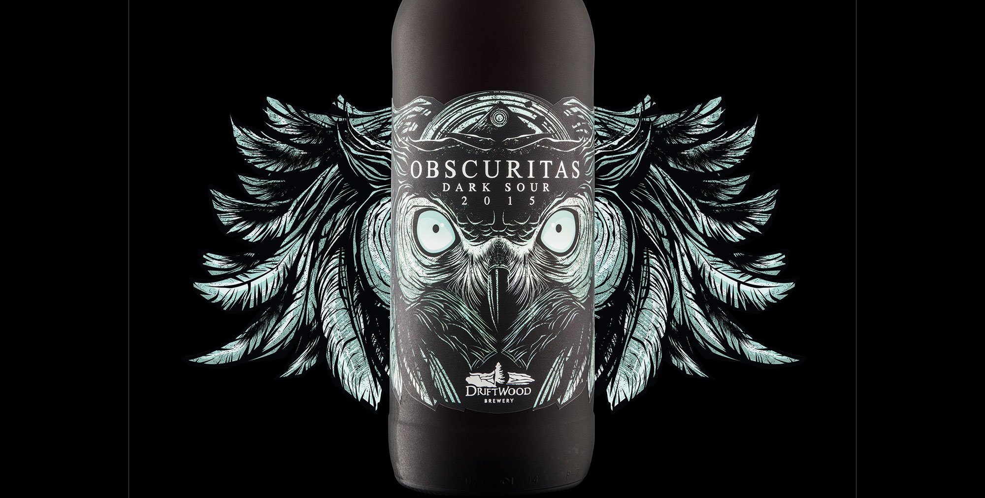
Hired Guns Creative created this packaging for Driftwood Brewery
“Illustration is created by the hand, and that hand-rendered touch lends itself nicely to craft beer, and the whole ‘brewed by hand’ story,” he says. “There’s something personable about illustration, so it’s a great way to communicate and tell a story of that brewery, but there’s also something kind of quite edgy and visually exciting about illustration, which is why it works well on pack.”
Burns adds that illustration is engaging and has a lot of energy, meaning that people can really relate to it. “It captures that level of excitement and emotion… rather than being a sales tool, it’s a piece of art. People want to keep the cans, and you don’t get that with other packaging.”
Hired Guns Creative is an agency based in British Columbia, Canada which, like Thirst Craft, has chosen to specialise in solely creating designs for alcohol, with most of its work across the craft beer sector and the majority of that work relying on illustration in one form or another. So why is craft beer such a rich font of illustrated packaging?
Rather than being a sales tool, it’s a piece of art
Matt Burns, Thirst Craft
“A lot of it comes down to trying to compete on shelf,” says managing partner Leif Miltenberger. “The craft beer market in North America and in the UK is exploding, so every product on that shelf is trying to scream as loud as it can for attention. Really bold, eye-catching illustration is a good way to stand out, and is difficult for other companies to emulate. A lot of craft beer companies have packaging design that’s very minimalist, and although you can stand out through typography, bright colours, or certain printing techniques, it’s easier for another company to come along and replicate that.”
For craft beer in particular, brands are selling an attitude as much as a liquid: “A lot of people in that space really try to align themselves with counterculture through their brand, and illustration is a great way to do that. You can design things for the craft beer guys that major beer or spirit brands would be too scared to do,” says Miltenberger. Somewhat unusually, Hired Guns chooses to create all its illustration in-house, mostly by creative director Richard Hatter.
Investing in craft
When a brand commissions illustration work, it’s not only a way of augmenting or creating a more cohesive brand world or message, it sends out a signal that it cares about its product, and the people that are buying it. A distinctive, characterful illustration is a symbol of uniqueness and distinction, immediately elevating it above nondescript system fonts or less ownable colour palettes.
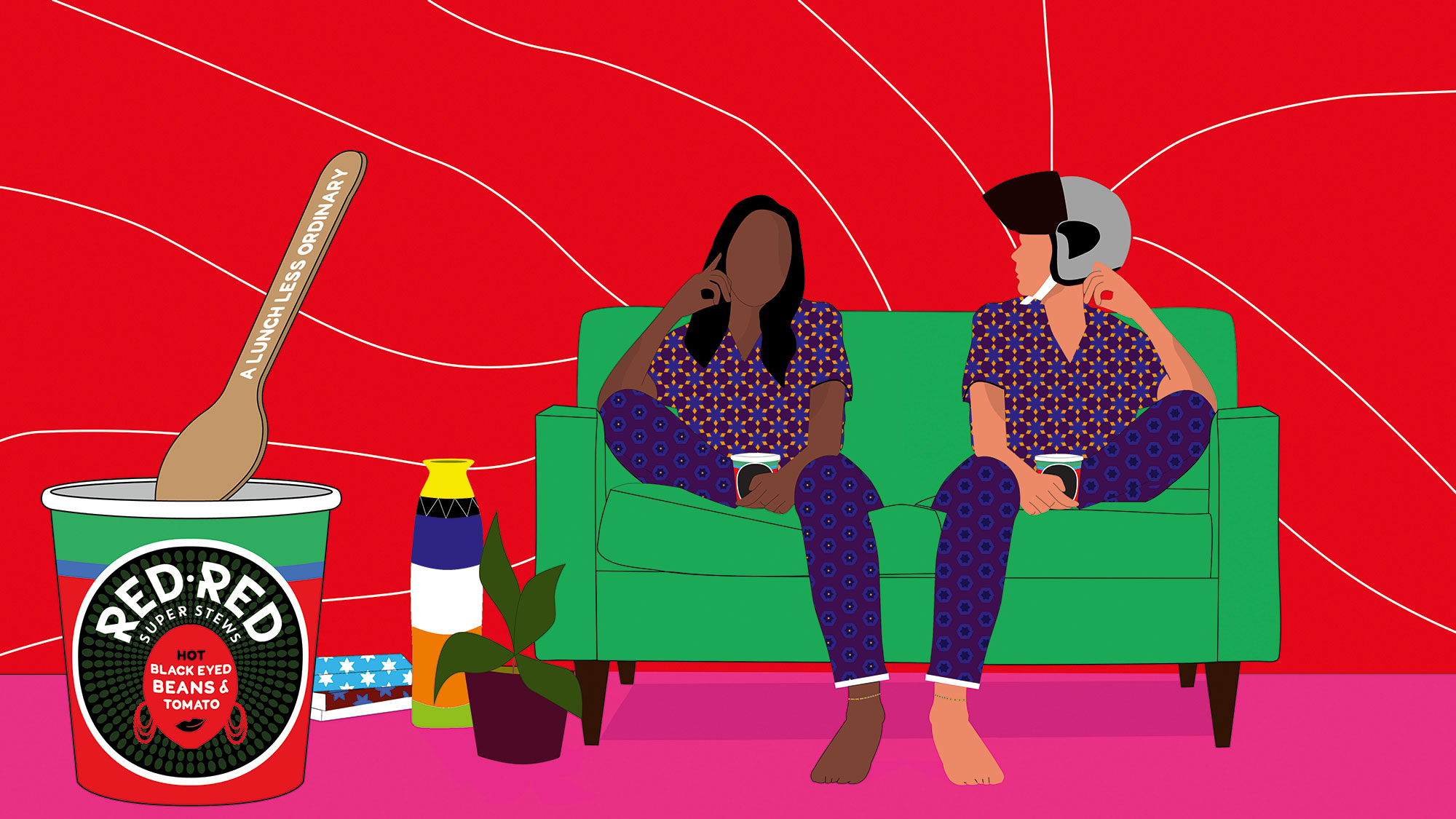
Silas Amos gave Red Red a surreal vibe with illustration
“It shows they value the appearance of the product as well as what’s inside,” says Miltenberger. “Some people think that if the product is good enough, it’ll be successful, but that’s not the case. It’s a super-competitive market. Sometimes you get the feeling from the illustration that they’re trying to target a certain demographic – maybe something hand-drawn to feel authentic and appeal to millennials or hipsters or whatever name they have on their demographic. But bigger corporations more and more are co-opting that approach: a hand-drawn gin label doesn’t mean its created in small batches by someone who cares.”
Being seen as a creative brand is priceless… The more avant-garde you are, the more you’re making a difference
Silas Amos
As Burns points out, such intricate packaging is also a crucial hook – especially within the craft beer sector: “The packaging is what makes people buy the first one, and the product makes them buy the second, third and fourth.”
Careful and considered commissioning also gives the sense of a brand being not just about product, but artistry. “Being seen as a creative brand is priceless,” says creative strategist and designer Silas Amos. “For brands, it’s about creating an aura around themselves. The more avant-garde you are or the more you visually snag, the more you’re making a difference.”
There’s also the question of how much a brand is seen to be investing in craft, continues Amos. “Craft is telling a story, and that tends to be whimsical – pictures are a good way to tell whimsical stories.”
One of the reasons we’ve recently seen a wave of illustration that hints at care, craft and heritage is the fact that so many brands are celebrating landmarks. Their 100th or 150th anniversary is a perfect chance to put their flag back in the ground, and show a world full of shiny start-ups that they’ve been in it for the long haul; they’re reliable, an institution.
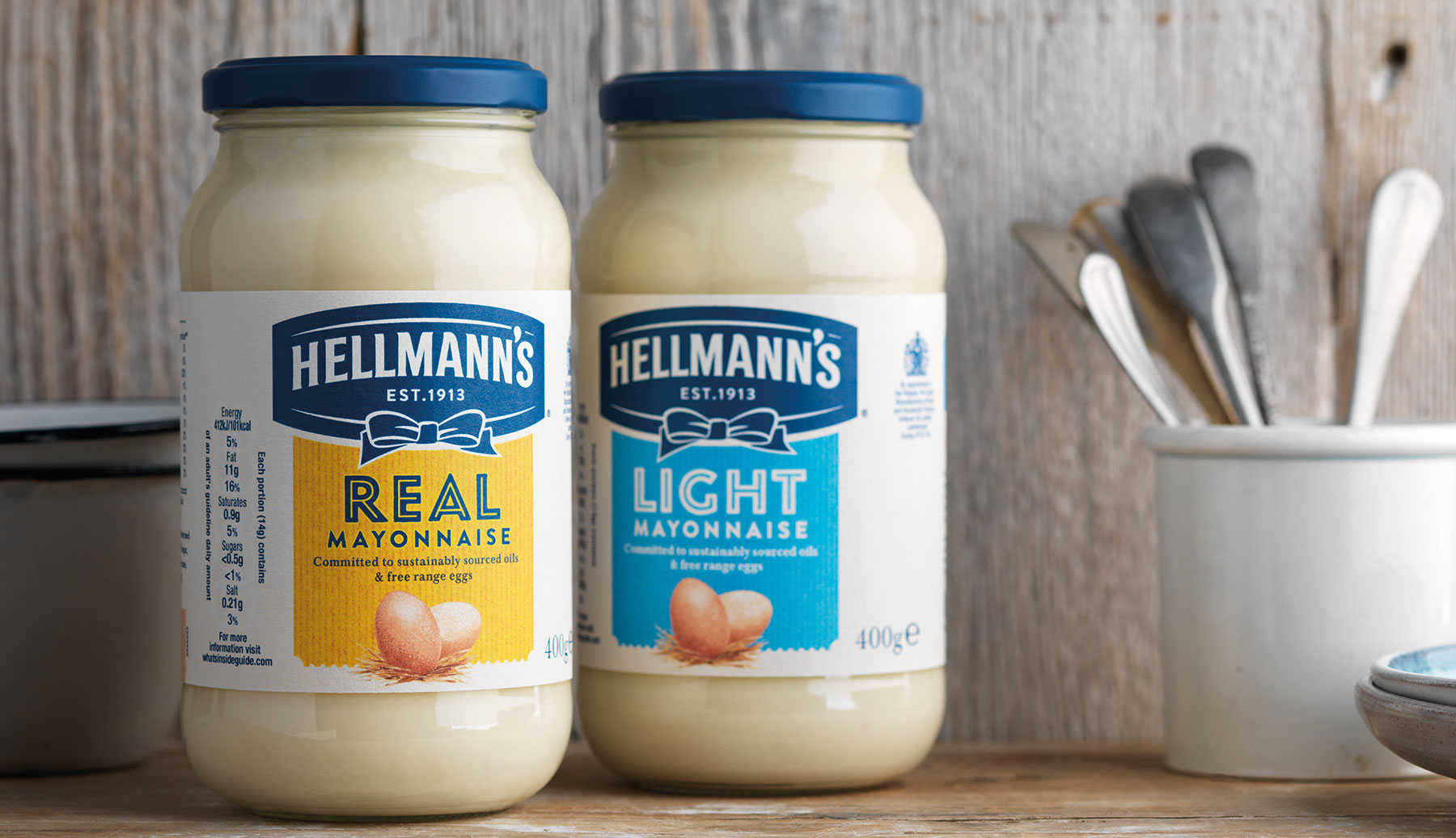
Design Bridge played on the heritage of Hellmann’s with this design
At the forefront of Design Bridge’s recent work for Hellmann’s Mayonnaise, for instance, was stripping the aesthetic away from synthetic-leaning imagery to usher in a new, softer, watercolour-like, hand-drawn style of illustration. “It feels like more love has been put into it,” says Templeman.
Brand storytelling
It’s that ability for illustration to convey narrative that brings London-based studio Together Design to draw on it (excuse the pun) for so many projects. As creative director and founder Heidi Lightfoot puts it, illustration is perfect for branding projects as it can communicate, “really big themes and messages that you just couldn’t sum up in a photograph.”
In a photograph, Lightfoot explains, you really have to feel some resonance to the people being featured. “But in illustration it’s often less personal, so we tend to find illustration really useful in communicating big themes that are part of a client’s message.”
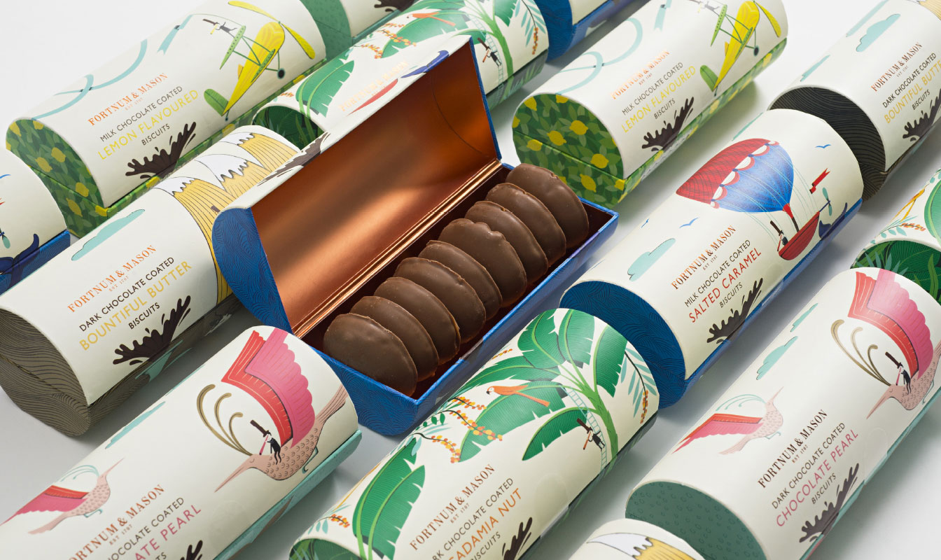
Together Design put together this packaging and illustration for Fortnum & Mason
That sense of illustration as a succinct and easily manipulated conduit for a brand’s message extends into what it says about the brand itself – again, what’s “inherent in a drawing is artistry and craft in a way that’s harder to communicate in other ways,” says Lightfoot.
“Type can feel quite cold, and photography can occasionally feel quite glossy, but with an illustration you usually see the hand of the artist. That artistry in craft communicates care, warmth and a bespoke quality, which is lovely for brands who want to communicate those attributes. Then if you’re using one style across different materials, it becomes part of the brand’s handwriting.”
Choosing the right collaborators
A few years back, the typical way for an agency to find the right illustrator for a project would have been through submitted physical portfolios or using agencies and organisations such as the AOI. Nowadays, it’s more a mix of good old-fashioned ‘who you know’ and trawling through online portfolios and social media, most notably Instagram, and for Together Design, sometimes Pinterest too.
For Burns, finding the best illustrator for the project is “more gut instinct than anything else,” and he warns against the temptation to simply hire the person who’s available at the right time, at the right price – especially when up against tighter deadlines and smaller product budgets.
For Amos, the process of hiring an illustrator to work on a brand is similarly instinctual. “There’s no hard and fast rule or set process [for commissioning], but as a designer, I think in pictures, so I’ve already got something in my head and I’m looking to translate that into a picture. Sometimes you see a person’s work and think ‘their style would be great’, and that informs the answer; but sometimes you have the answer and you’re looking for the style.”
The artist will always bring their own take on something and that brings a whole new angle
Heidi Lightfoot, Together Design
Of course, as Burns hints, you can’t always get what you want when it comes to your dream commission. You have to take into account budget, availability, and the opinions of any other stakeholders who might have a say in the final look and feel.
But what makes a person great to work with, should they fit all of those more pragmatic criteria? For Amos, the best sort of relationship is “a little bit of a ping-pong match,” and Lightfoot agrees that it’s vital to find someone willing to collaborate, and work through potentially numerous iterations with the designers.
“No matter how perfect the brief is, when you see the first rough there will always be ways to improve, or perhaps the emphasis on different elements has changed,” she says. “It’s nice to be able to have a conversation about that rather than one stage and one stage only, though that’s very rare as illustrators are usually very open to ideas from both sides. The artist will always bring their own take on something and that brings a whole new angle. It’s all about collaboration, not just telling people what to do.”
The key to that sort of working relationship is both clarity and flexibility: setting out a clear brief, but being willing and open to listen to new ideas and seeing an illustrator not as a gun for hire, but a crucial cog in the bigger creative machine.
When to illustrate
Of course, as with any other design communication tool – be it copy, typography, photography, pattern or colour – designers working with global brands have to do some careful research into any unexpected signifiers that might say something they don’t want to say in other countries.
When Design Bridge worked with Timorous Beasties on a set of highly illustrative packaging for Fortnum & Mason, for instance, the team soon discovered that moths are seen as unlucky for certain cultures; and had to take care with the shape and colouration of the butterflies that appeared in the work.
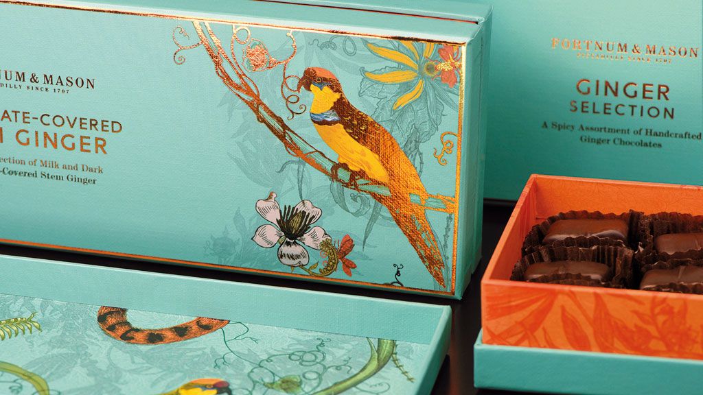
Design Bridge worked with Timorous Beasties on this packaging
As we’ve seen, illustration and craft beer are superbly comfortable bedfellows, and many food brands, too, use illustrative imagery to convey their message and create on-pack details. So are there any sectors where illustration wouldn’t work?
According to Lightfoot, not really. “There might be sectors or client types you wouldn’t think could use it, but illustration can disrupt in an exciting manner,” she says. “Even with a product where photography might be king – maybe with something like a tech brand – there’s always a way that illustration can play a part in the marketing, and I’m excited about brands that use it as part of their core messaging.”
Templeman agrees: “An illustration route goes straight to the point in conveying a brand’s message. It has so much stretch and there’s such a huge spectrum of different styles – from more linear, stripped-back work to infographics to beautiful artworks – that I can’t think of a brand that illustration would never be right for.”
This article was originally published in Computer Arts, the world's best-selling design magazine. Buy issue 279 or subscribe here.
Read more:
19 best painting and drawing apps for iPad8 up-and-coming designers to watch from D&AD New Blood7 biggest illustration trends of 2018

Leave a Reply
Want to join the discussion?Feel free to contribute!