What Even Is Web Design in 2022?

Original Source: https://www.webdesignerdepot.com/2022/05/what-even-is-web-design-in-2022/

The term “web design” refers to the process of planning, organizing, and editing content online. On the surface, it seems like a simple enough concept. However, the reality is what we consider “web design” can change over time, influenced by our perception of the “web.” 

In 2022, a professional web designer might create custom websites from scratch, but they may also be responsible for: 

UX Design: Creating elements focused on user experience
App design: Building digital components of a website or online experience.
Theme design: Creating visual tools for supplementing web design. 

Web design isn’t just about making a site look attractive anymore. The definition goes beyond the aesthetic to include a complete consideration of the functionality, performance, and abilities of countless assets we engage within the digital world.

What is Web Design? The Definition Today

Web design is the practice responsible for creating a website’s overall look and feel or web asset (such as web and mobile apps). It involves the process of planning and building elements of your project, from structure and layout choices to graphics and presentation. 

Web design has various components that work together to create the final “experience” of a website, including graphic design, interface design, user experience design, search engine optimization, content creation, etc. These elements determine how a web asset looks, feels and performs on various devices. 

Though the definition of web design in 2022 has evolved, it’s still different from web development, which refers to the actual coding which makes a website work. When you’re building a website, you’ll need web design and web development. 

Elements of Web Design in 2022 

When designing a website, modern designers need to consider two overlapping concepts: the overall appearance of the website and its functionality. The proper connection between these elements will maximize the site’s overall performance and usability, and make a design more memorable (for all of the right reasons). 

Let’s break down the elements of web design into its visual and functional components.

Visual Elements of Web Design

Visual elements of web design influence how a design looks. The various visual components of a design should still follow the basic principles of graphic design. In other words, designers should be thinking about contrast, balance, unity, and alignment simultaneously. The visual elements of web design include: 

Written copy and fonts: A website’s appearance and the text on the site often go hand in hand. Designers need to work together with content writers to ensure written copy makes sense structurally and uses the correct fonts for legibility. 
Colors: Colors for web design are usually chosen based on factors like color psychology, which demonstrates a color’s ability to affect how someone feels, and branding. Most brands have specific colors they use consistently throughout their visual assets; this helps create a sense of cohesion and unity in designs.
Layout and spacing: Layout and spacing influence how content is arranged in an app, website, or another visual asset. The right layout helps to create a visual hierarchy, guiding a viewer through a page and drawing their attention to the correct information in order. Spacing helps to separate components on a page and create legibility. 
Images, icons, and shapes: Images, icons, and shapes help convey significant amounts of information. The right ideas and icons can strengthen a brand message, direct a customer’s attention using a web app, and bring context to a design. 
Videos and animations: Videos and animations are becoming increasingly common in today’s web design strategies. Videos can include 360-degree videos, which help immerse someone in a space, video streams, and short content clips.

Functional Elements of Web Design

Functional elements in web design are the practical components designers need to consider to ensure websites and assets work as they’re supposed to. A website, app, or any other web asset needs to function correctly to be accessible to users.

Functional elements of web design may include:

Navigation: The navigation elements of a website or app are among the main components determining whether a site is functioning properly and ensuring a good user experience. Audiences need to be able to move around the app or website quickly. 
User interactions: Your site visitors may have multiple ways of communicating with your web app or website, depending on their device. You’ll need to make sure people can scroll and swipe on smartphones and tablets and click on desktops. If your website has VR or AR elements, you’ll also need to consider these immersive components in your design.
Speed and performance: While web development elements can also influence a web design’s speed or performance, it’s also essential for a designer to show elements of the composition don’t weigh down the functionality. Designs need to load quickly and correspond with the demands of browsers on various devices.
Structure: A website’s structure plays a critical role in user experience and SEO requirements. Users need to easily navigate through a website without encountering any issues like getting lost or ending up on broken pages.
Compatibility: A good design should look perfect on all devices, from a wide range of browsers to the various devices users might leverage today. 

What Does Good Web Design Look Like in 2022?

More than ever, achieving high-quality web design is crucial to success in any industry or landscape. More than half of the world’s population is active online. If you’re not appealing to this audience correctly, you’re missing out on endless opportunities.

Notably, while elements of good web design can be subjective, such as which themes or colors someone might prefer for their website, the underlying foundations of strong web design are the same for everyone in 2022.  

Good web design is any design that looks good, performs as it should, and delivers the best possible experience to your target audience. Effective web design should include components like:

Effective use of white space for organization and structure.
Clearly presented choices and navigation options for the user.
Clear calls to action to drive user activities from one page to another.
Limited distractions and a straightforward user journey. 
No clutter or unnecessary components irrelevant to the needs of the user. 
Responsive, flexible design accessible on any browser or device.
High-quality content and images are designed to hook a reader’s attention.
Appropriately sized fonts and legible typography.
A good balance between images and text on a page. 

Other elements like eye-catching imagery and professional photography can help your web design stand out. Using the right building blocks, like a strong color palette and the right shapes or icons in your design is helpful. 

Of course, there is some scope for variation in good web design. A web designer in 2022 needs to be able to adapt their use of the various essential elements of design to suit a specific target audience or the unique identity of a brand.

What Doesn’t Work for Web Design in 2022?

Just as web design elements seem to appear consistently in all excellent examples, there are also parts of web design we’ve left behind over the years. Simpler, more straightforward designs have replaced cluttered spaces, flashing images, and endless animations. 

The focus in 2022 is on creating an experience that’s simple, engaging, and intuitive, capable of speaking to the right audience without confusion or being visually overwhelming. In most cases, some of the top components to avoid include:

Clunky performance: Non-responsive website design, slow pages, and other examples of clunky functionality are a no-go in 2022. Websites need to be quick and responsive.
Distracting content: Flashing images, animations, and complex backgrounds are a thing of the past for a good reason. Websites today need to be clean, simple, and clear. Any elements which don’t add to the value of the design should be removed.
Generic content: Filler text, irrelevant stock photos, unclear buttons, and links can be removed from today’s website designs. A web design should be specific to the audience’s needs and the brand’s identity. Generic components don’t work.

Creating Web Designs in 2022

Today, the underlying definition of web design has a lot of similarities to the definition we’ve known for several years already. Creating a great website or web asset still requires focusing on user experience, aesthetic appeal, and functionality. However, today’s web designers generally have more components and different devices. 

Web design in 2022 is about creating high-quality experiences for customers that can support various environments and devices. The best web designs are aesthetically appealing, functionally reliable, and capable of adhering to the latest trends in web creation, like augmented reality, 360-degree video, and ultra-high resolution. 


Featured image via Pexels.

Source

p img {display:inline-block; margin-right:10px;}
.alignleft {float:left;}
p.showcase {clear:both;}
body#browserfriendly p, body#podcast p, div#emailbody p{margin:0;}

The post What Even Is Web Design in 2022? first appeared on Webdesigner Depot.

The Modern Way To Create And Host A WordPress Site

Original Source: https://smashingmagazine.com/2022/05/elementor-modern-way-create-host-wordpress-site/

What does it take to design a new website in 2022? Well, it’s possible to break this process into a few steps. You likely start with choosing a domain name for your website and buying it. Next, you will compare various hosting services and choose the one that satisfies your needs, and lastly, you will select a content management system (CMS) that fits your needs. After installing CMS on your hosting provider, you can start designing your website.

Sounds tedious, right? With so many tools available on the market right now, finding the right tools can take hours or even days, and there is no guarantee that you will have a decent solution in the end.

This proved to be the catalyst for Elementor’s latest solution: the Elementor Cloud Website. The Elementor team aimed to overcome this challenge. The Elementor Cloud Website is a new tool that will expand the WordPress website builder’s offerings with built-in hosting features. This hosting solution is based on the Google Cloud Platform, known for world-class security, scalability, and reliability. The platform offers 20 GB storage, 100 GB bandwidth, and 100K monthly visits which are enough for most types of websites. What it means is that with Elementor’s Cloud Website, web designers and developers can build and host their WordPress websites without the need to switch between different tools.

Creating A New Website With Elementor Cloud Website

The process of creating a new website with Cloud Website is simplified and faster. If you’re new to Elementor, you can visit the Elementor Cloud Website and click “Join Now” to create a new account. Once you’ve created a new account, you need to choose the option “Build & Publish a complete Hosted Elementor Website”.

If you are an Elementor user, you can log in to the Elementor admin panel where you will see a large button named “Create Cloud Website” at the top right corner of the page:

Once you click this button, you will be invited to provide basic information about your website step-by-step. You will provide the website’s name, domain name, and type of website.

All websites created using Elementor Cloud Website will be hosted on subdomain .elementor.cloud by default, but you can easily link your own with no extra costs.

You will be asked to specify the type of website you want to build. Elementor will use this information to suggest a relevant pre-designed website kit for your project.

Lastly, you will be asked to choose the visual kit for your website from the list of available options. You can always choose to design a website from scratch. For our example, I decided to use the Basic kit from the list suggested by Elementor.

Once you do that, Elementor will start building your website. The process of creating a new instance of your website will take a few minutes. Once it is done, you will see a shiny new instance of your website ready for use. Our instance is called WakeUp.

You may notice the badge “Site Lock is On.” When Site Lock is enabled, search engines won’t display your site, so you don’t need to worry that someone will have access to your unfinished website.

But what exactly comes with a newly created instance? You will have access to the WordPress dashboard, Elementor editor, and website settings.

Let’s click “Edit with Elementor” to start designing our website right away.

Modifying Page Layout With Elementor Editor

All front-end designs of your website can be done with the Elementor editor. Elementor offers a WYSIWYG (What You See Is What You Get) editor for your web pages. When you introduce changes to your web page, you immediately see the results of your changes. For example, when we want to change the text in the hero section, all we need to do is to click on the content block and modify the text in it.

If you want to add a new content section on your page, add a new section, choose the most relevant widget from the collection of 100+ widgets, and drag & drop it into this section. Elementor supports almost all types of content — from text to visuals.

But the process of editing is not limited to text or images. You can introduce fancy animated effects such as motion effects on scrolling. Such an effect can help you create a more dynamic scrolling experience and can convey a feeling that your website is alive.

For example, here, I defined the “Fade In” effect with a duration of 300 ms for the section that comes after the Hero section and describes features that our product offers:

The great thing about the Elementor editor is that you can check how your website looks on mobile or any other medium. Simply click “Responsive” Mode in the bottom left menu (next to the button “Update”) and click on the “Mobile” option. What you will see is how your website will look on mobile devices:

Managing The Website Using WordPress

Elementor Cloud Website provides access to full WordPress instances. It’s the same version of WordPress that you might download from the official WordPress website and install on your local or remote machine. Out of the box, this instance of WordPress comes with all essential features. You will have admin access to the CMS and be able to manage users who can access your website, import/export content, and install required plugins. But Elementor Cloud Website also offers a few neat benefits. WordPress comes with a pre-installed Elementor Pro plugin, Activity Log, which tells you what activities are taking place on your dashboard, and a collection of hundreds of visual themes that you can use for your website. Elementor Hello theme is already pre-installed as well.

Another vital thing about Elementor Cloud Website is that you have all ownership of your content. If you decide to move your website to another platform (i.e., switch from WordPress to any other CMS), you can export your website at any time.

Setting Backups And Connecting Domain

Once you finish designing your website, you need to do two things: create a backup and connect the domain name. There are two kinds of people: those who back up and those who have never lost all their data. With Elementor Cloud Website, setting up backups is easy. All you have to do is click the “Manage This Website” option and find the “Backups” section.

As you can see, Elementor creates automatic backups for your website every 24 hours, but you can also create your own backup at any other moment using the “Create new backup” section.

Next, you need to connect your domain name to this website. It can also be done on this page, in the Manage Domain section. Some web creation platforms charge extra for connecting a custom domain name, but Elementor Cloud Website does it at no additional cost.

You can notice that an SSL certificate is also enabled for our website. Elementor Cloud Website provides its users with a built-in free Secure Socket Layer (SSL) from Cloudflare. It gives you a couple of benefits — better search engine ranking (Google ranks SSL higher than non-SSL counterparts) and better user experience (if your website requires data input, site visitors will never see a “Not Secure connection” message in their browser). You can also install your own SSL certificate if required.

After a custom domain is connected, we can safely turn “Site Lock” off so search engines can discover our website. It also can be done in this section.

Measuring The Performance Of Our Newly Created Website

Website performance plays a crucial role in how users think and feel about our website. Nobody likes interacting with slow websites, and when it comes to web performance, every second counts (literally). With every second you make your users wait for the site to load, you increase the chance that they abandon your site.

Measuring performance should be a regular exercise for site owners, so let’s use a popular tool called PageSpeed Insights to see how our newly created website performs. As you can see, the website has a score of 94 out of 100, which is really good.

You may wonder, what might cause slow website performance? While many problems can be responsible for slow site loading, high latency and using heavy imagery are at the top of the list:

High latency.
Latency is the time it takes for data to pass from one point on a network to another. High latency can be caused by geographic location. For example, your website is located in the US, but your visitor accesses it from Europe.
Using many heavy imagery assets.
Rendering too many high-resolution images in raw formats such as PNG can be time-consuming.

But if you use Elementor Cloud Website, you are safe because it uses content delivery networks (CDNs) distributed worldwide. A CDN allows for the quick transfer of assets needed for loading, including images and videos. Your website content is stored in over 200 locations globally, so it responds quickly wherever your visitors are.

“Okay, this tool demonstrates solid performance when we test it for one visitor, but what happens when hundreds or thousands of visitors access it?”

Rest assured, you will be fine. Elementor Cloud Website harnesses the power of Kubernetes, an open-source system for the management and scaling of containerized applications. Kubernetes enables Elementor Cloud Website to scale its hosting both fast and reliably regardless of a website’s usage, whether it draws ten or ten thousand visitors.

How Much Does An Elementor Cloud Website Cost?

It took us less than an hour to create and publish a website using Elementor Cloud Website. You may assume that this tool will cost a lot of money. But in reality, this solution only costs $99.00/year (excluding VAT). For this sum, you will receive 100GB bandwidth for your website, 100K monthly unique visits, and 20GB of storage for all your content and assets. It’s important to note that Elementor Pro is thrown into the mix (a plan that costs $49 per year). There are no hidden costs. All those features are included at one price.

Conclusion

Web design should be fun and accessible for anyone. After all, when we build a new website, our primary goal is to share our idea, product, or service with the world, not to dive into solving technical problems. Elementor Cloud Website saves us from the tedious and monotonous work of comparing various web services and helps us to focus on what’s really important—sharing our vision with people we care about.

This article has been kindly supported by our dear friends at Elementor whose goal is to empower web creators to design, publish and manage powerful and beautiful WordPress websites using the most comprehensive all-in-one design solution. Thank you!

Pop Plant Branding and Visual Identity

Original Source: https://abduzeedo.com/pop-plant-branding-and-visual-identity

Pop Plant Branding and Visual Identity

abduzeedo0517—22

Pop Plant is an interior and exterior plantscaping business, specializing in inner city spaces. Originally established in 2012, Both Studio were tasked with creating a new branding and visual identity to better represent their evolving business and appeal to their clientele of architects, designers and other design-aware individuals.

Working with the Pop Plant team to clarify their place within the industry, we identified the unique balance in their approach; whereby both aesthetics and scientific knowledge are equally considered. It was this duality that led to the implementation of two harmonious but contrasting typefaces across the visual identity to represent the Pop Plant ethos.

Credits

Website: popplant.com.au
Folio Photography:  Shelley Horan
Plantscaping photography:Tom Ross

For more information make sure to check out both.studio or follow them on Instagram at @both.studio

AdScale Review: Everything You Need to Know

Original Source: https://ecommerce-platforms.com/articles/adscale-review

Are you looking for a cloud-based marketing automation solution for your business? Or, are you, like most ecommerce enterprises, wanting to make the best use of your customer data? Keep reading if you’re nodding your head in response to these questions.

There are many types of marketing automation solutions, but how do you identify the one that best fits your business needs? 

So, today, we’re unpicking one such solution: Adscale. More specifically, we’ll look at:

Adscale: A Brief OverviewAdscale products and solutionsAdscale integrationsAdscale pricingAdscale’s pros and consAdscale’s resources and reviewsFAQsOur final verdict on Adscale

There’s lots to cover, so let’s dive straight in:

Adscale Review: About Adscale

Adscale Review

With offices in the US, Netherlands, and Israel, Adscale is used by some big-name brands, including Converse, Speedo, Replay, and many more.

In short, Adscale is a cloud-based marketing, advertising, SMS messaging, E-mail campaigns, and data solution best suited to e-commerce marketing managers, ad agencies, private advertisers, and PPC managers (pay-per-click). 

It uses artificial intelligence (AI) and first party data to automate and better target marketing campaigns across major platforms, including Google Shopping,, Google Search, Facebook ads, Instagram, and Google Display Advertising. 

Users define their marketing and advertising goals. Then, AdScale gets to work by automatically assigning monies to campaigns, so your budget is fully optimized. It also provides recommendations on keyword optimization, landing page performance, ad optimization, etc. 

Adscale also takes images directly from your online store to create automated ads for these platforms. In addition, you can automate other campaign aspects, including budget management and campaign reporting.

Adscale’s dashboard is easy-to-view, providing all the information you need about your sales revenue, advertising, marketing, and ROI – all from the convenience of one place. More specific examples of advertising and marketing metrics include how much you’ve spent per advertising channel (SMS marketing, Instagram, Facebook, etc.), revenue generated per customer, per region, percentage of repeat customers, and more. 

Adscale Review: Adscale Solutions

Adscale offers four core products:

Advertising Cloud

Target your ideal customers on the optimum social media sites using business-intelligence-powered customer segments to target customers with the right products on the most fruitful channels (Facebook, Instagram,, Google Shopping, etc. 

Your AI-powered advertising plans are tailored to meet the needs of your eCommerce business across all channels. First, you set your goals, and then Adscale’s AI will continuously distribute your budgets between the different channels to get the best value for your spending. 

AI bid optimization uses historical performance, current market trends, and advanced prediction models to ensure you get the most bang for your buck.  

Messaging/SMS Cloud

Run customized SMS campaigns by sending customers BI-powered personalized messages for better engagement with your brand. 

You can also use Adscale’s embedded link shortener for accurate conversion tracking. In addition, you can choose from different SMS automation options to tailor SMS campaigns to different customer segments. 

Data Cloud

This solution offers data on your orders, customers, products and campaigns in one centralized place. More specifically, you can view data on repeat customers, high ticket customers, high AOV, etc. 

Here, you can also track your:

KPIsLearn customers’ lifetime value and purchase frequencyBuild customer segments based on customer behavior 

…with the above data to hand, you can create more targeted campaigns. 

Lastly, you can analyze product performance to identify your best-sellers, which new products are doing well, etc. 

Marketing Cloud

As fabulous as the three products above are, this review focuses on the Marketing Cloud solution. 

With Adscale, you can manage all your marketing in one place. This includes viewing data on which marketing channel is the most successful, for example, what percentage of sales come from Google Display, Google Shopping, email marketing, Instagram, SMS, and Facebook. With this info at your fingertips, you can focus your marketing efforts on what bears the most fruit. 

In addition, Adscale’s attribution technology matches conversions across channels with order IDs. As a result, you can rest easy knowing that you won’t encounter any discrepancies or accidentally double-count orders. In other words, you can be confident that the information you’re looking at is a true reflection of what’s going on. 

For example, you can see:

How much revenue each ad channel generatesHow many orders you receive per channelHow many site visitors you receive on each ad channelThe conversion rateThe number of ad clicks

…and more. 

Lastly, Adscale provides you with actionable tips on improving the success of your marketing campaigns.

All in all, staying abreast of your marketing campaigns can be challenging. However, with Adscale, everything is on one platform to help you save time. For example, you can centralize your marketing data, customer information, and business data all in one place. 

Adscale Review: Adscale’s Integrations

Adscale Review

Adscale integrates with ten major eCommerce platforms:

ShopifyShopify PlusWooCommerceBigCommerceKonimboMagentoMaropostOpen CartPrestashopWix

Adscale is the only app that makes it possible for eCommerce store owners to manage their SMS, E-mail, Google ads, and Facebook campaigns from one centralized location. 

As soon as you connect Adscale to your Shopify store, you can track your marketing campaign successes, including:

The number of sales madeRevenue generatedROAsCampaign cost

Also, all your historical data syncs automatically with Adscale, so you don’t lose valuable campaign and customer information. Also, each time you add new products to your store, Adscale automatically updates your ads.

Whichever of the above platforms you run your store from, when you start using Adscale, you can use ready-made flow templates created by Shopify Plus. These templates are basically Shopify themes designed with a clean and minimal look so you can put your products front and center page.

Adscale Review: Adscale Prices

Adscale Review

Adscale has separate price plans for each of its four main functions. Each package is based on your activity, e.g., ad spending, the number of SMSs you send, etc. In addition, each plan structure operates on a sliding scale. For example, in the Advertising Cloud, your minimum ad spending a month starts at $1,000, and the more you add to that, the more you pay. 

Looking more specifically at the Marketing Cloud price plan, there’s a 14-day free trial. Then after that, prices depend on the number of SMS messages you want to send and your budget for ad spending. 

The cheapest plan costs $299 a month. This is based on a maximum$1,000 a month ad spend and 5,000 SMS sent within the US region. If you want to send SMS to other regions, this price will differ according to location. There’s a drop-down menu on the pricing page to select which destination you want to send SMS messages to. SMS prices are based on 5,000 credits a month, with the first 100 SMS free during your free trial. Then after the first 5,000 SMS a month, costs increase with the more SMS you send. 

However, it’s worth noting that this 5,000 threshold rises in some countries. For example, for Brazil, it’s 6,019 SMS a month. One interesting aspect is that you can use them further down the line if you don’t use your entire SMS monthly allocation. However, you can’t accumulate more than five times your total SMS package. So, for example, if your plan includes 5,000 SMS credits, you can amass up to 25,000 SMS credits. 

Within this plan, you receive the following features:

Full access to business intelligence (BI) features, including:

Customer analysis and segment creationProduct analysis and segment creationInsights and recommendationsTrend analysisPerformance by Geo (information on your audience’s language and location)Inventory visibility

SMS features include:

Ready-to-use SMS campaignsTrigger/event-based campaignsYou can send personalized messagesAccess to embedded customer segmentationTimezone-based messagingROI-based reporting

Ad features include:

A data-driven advertising planAutomated campaign creationYou can launch Google Search, Shopping, and Display adsYou can launch Facebook and Instagram adsAutomated AI optimizationCross-channel budget optimization

At first glance, pricing can appear confusing, but a helpful FAQ on the pricing page may address some of these concerns.

Adscale Review: Adscale Pros and Cons

Now that we’ve covered the basics, let’s take a look at Adscale’s pros and cons:

Pros:

There’s a free 14-day plan with full access to all features. Integrates with most platforms inclulding Shopfiy, WooCommerce or Magento.It’s a time-saving solution that’s cheaper than the average agency.It’s an automated solution that uses images taken directly from your store to market your business on Google, Instagram, and Facebook.

Cons:

Fits only merchants with over 150 sales per monthPricing is confusing and opting for all of the products is very expensiveNo free plan, only free trial for 14 days.It’s a relatively new product, so there’s little information about it online.

Adscale Review: Adscale’s Resources and Reviews

Adscale Review

The Adscale website offers several self-help resources: a blog, a tutorial, and a help center. There’s also a demo video you can dip into. The blog dates back to 2018 and covers topics including Common eCommerce Mistakes, Should I Upgrade to Shopify Plus?, Website Traffic Generation Tips, and many others. 

However, there’s only one tutorial, and it’s on the topic of onboarding and creating your first campaign. At first glance, we’d say the tutorial goes pretty fast and assumes a level of knowledge newbies won’t have. Therefore, putting together a series of “How To” tutorials may be more beneficial. 

That said, there is an online Help Center with 26 articles at the time of writing. These cover a range of topics, including how to write ad copy, create an SMS campaign, different ad types, and how to set advertising goals. There’s also an email address: support@adscale.com for any questions you may have. On the Contact Us page, you can also see office phone numbers and sales team emails across its three locations. 

The Shopify App store also offers a good selection of positive four and 5-star reviews. Reviewers note its easy setup, how it’s much cheaper than using an agency, and noticeable increases in sales. However, some unhappy customers complained about slow dashboards and billing difficulties, and poor support response times. 

Adscale Review: Frequently Asked Questions

Hopefully, this review has given you more information about Adscale. However, we’ve added a little more information below about what to expect:

Can I migrate my store to Adscale? 

Yes. It’s possible to migrate your store and have campaigns up and running within half an hour. The Adscale support team walks you through the migration process. Once that’s successfully completed, it uses your first-party data and Google and Facebook data to create automated and optimized campaigns. 

Tell me more about how Adscale’s AI algorithms work? 

Adscale analyzes your store data, including product information, customers, and order history, and combines it with data from similar stores and products. This allows Adscale’s AI to create tailor-made marketing and ad campaigns for your store that targets relevant audiences and allocate budgets to the most suitable ad channels. In addition, Adscale’s AI is continuously reviewing this data to optimize your campaign performances.

How do I cancel my account? 

When you take out an account, you are under contract for an initial term of 30 days. After this period, your account will auto-renew for successive 30-day periods. If you want to cancel, you can do so, but you need to give 30 days’ notice. 

Adscale Review: Our Final Verdict

So there you have it. We’ve covered everything you need to know about using Adscale to improve your digital marketing campaigns. The beauty of Adscale is that it provides a comprehensive and easy-to-use campaign management software. As a result, you’ll save time and money on marketing with Adscale’s automation tools and be safe in the knowledge that your budget is allocated to campaigns that generate the most sales and revenue. 

Are you ready to start using Adscale? Do you think it could be the right advertising platform for you? Take a look at its free trial, and let us know how you get on.

The post AdScale Review: Everything You Need to Know appeared first on Ecommerce Platforms.

5 Great Ways To Get Inspired By Retro Design

Original Source: https://www.designsauthority.com/5-great-ways-inspired-retro-design/

Looking into the past for ideas on design is always a good plan, especially if you are looking back into the past 50 years or so, with an emphasis on the ‘50s, ‘60s and ‘70s. This is what is most often referred to as “retro,” and it is a design concept that is always in … Read more

The post 5 Great Ways To Get Inspired By Retro Design appeared first on Designs Authority.

How to Backup And Restore Windows 11 Registry

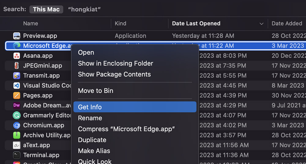
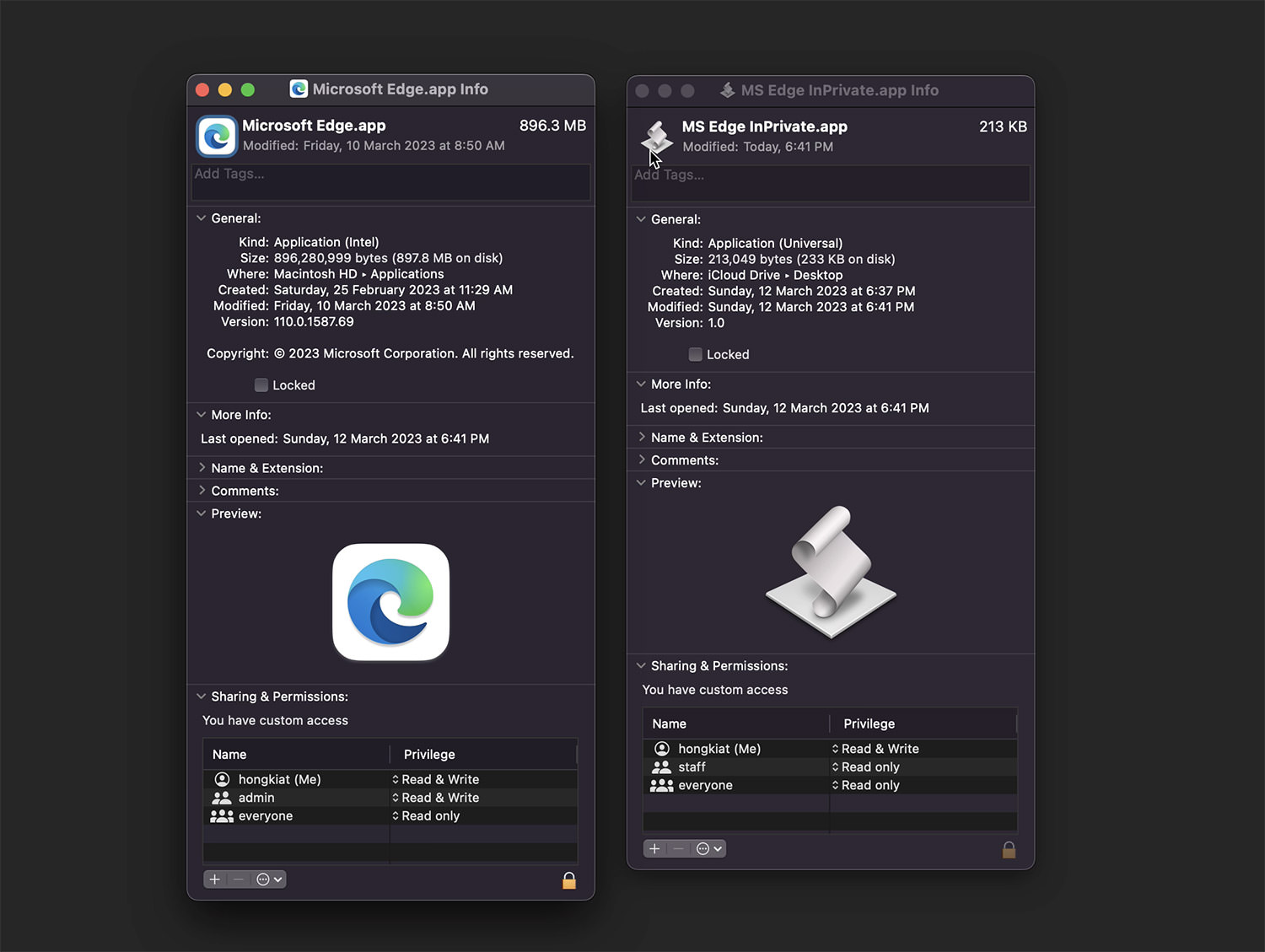
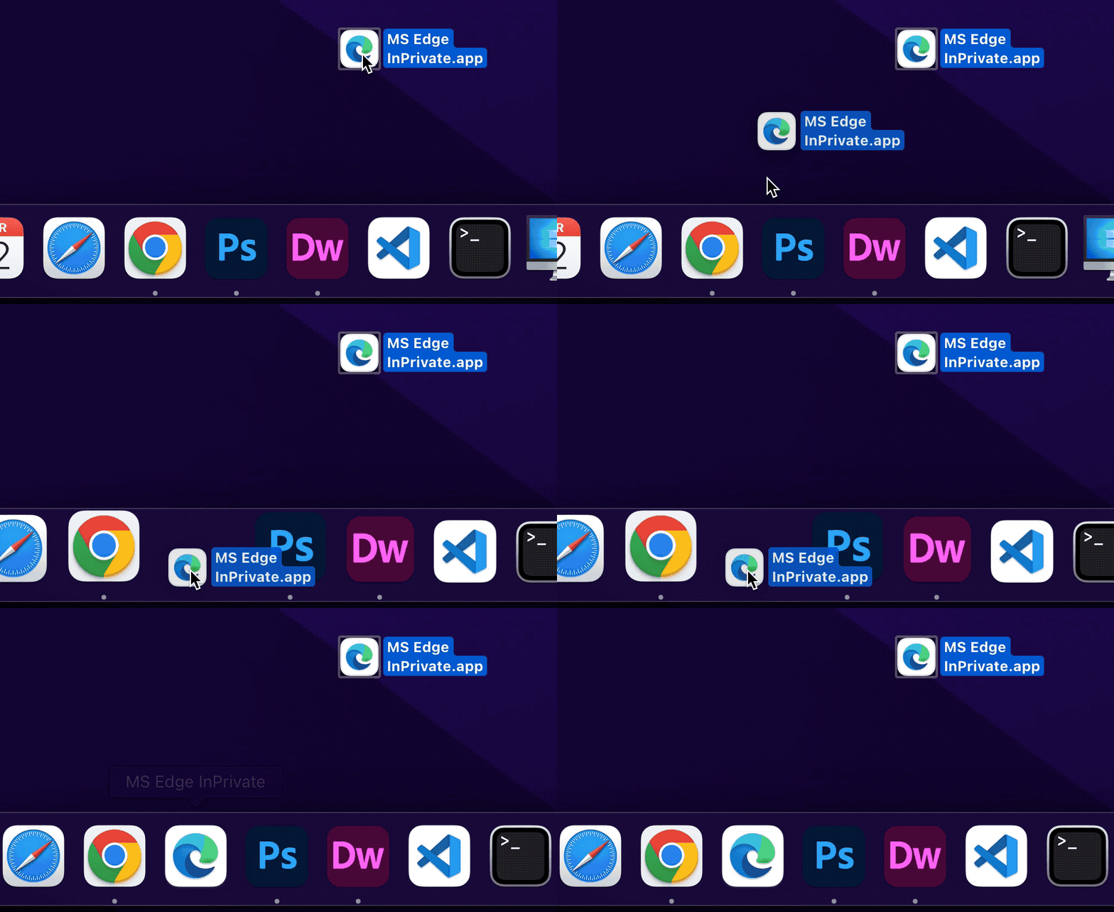
Original Source: https://www.hongkiat.com/blog/win11-backup-restore-reg-key/

The registry is a critical component of your Windows 11 operating system. It stores all the settings and options for your computer and is used by Windows to help it run smoothly. Over time, the…

Visit hongkiat.com for full content.

The Best Free Tailwind CSS Components For 2022

Original Source: https://1stwebdesigner.com/the-best-free-tailwind-css-components-for-2022/

If you’re a web developer/designer and haven’t already heard about or tried Tailwind CSS, it’s likely you have been living under a rock! First released as an alpha in 2017 and now in version 3, the utility-first CSS framework for rapidly building custom designs is all the rage these days. It seems we don’t see a day go by without at least one new article published about this unique offering in the world of web design (see some examples in our weekly roundups of articles).

One of the best parts of the Talwind CSS ecosystem is the components that can greatly speed up your development process by dropping them into your project and modifying as needed. You can find and use headings, navigation, data display, lists, forms, buttons, and even full page layouts, plus much more – all great starting points for various needs you will have in your projects.

In this post, we’re going to show you all of the free Tailwind CSS component resources we could find, to save you time next time you’re looking to include components in your projects.

Your Web Designer Toolbox
Unlimited Downloads: 500,000+ Web Templates, Icon Sets, Themes & Design Assets


DOWNLOAD NOW


Tailwindcomponents.com

Tailwindcomponents.com - Free Tailwind CSS components

A repository for community components and templates, easily searchable, beautifully designed and organized, and completely free!

gust ui

gust ui - Free Tailwind CSS Components

Responsive HTML & React components for your next web application. Make your Tailwind CSS apps even sleeker and faster to develop with our ever growing library of components, elements, and example pages.

Float UI

Float UI - Free Tailwind CSS Components

Interactive and different components with React and beautiful design using Tailwind CSS + pure CSS. Every component is fully responsive and carefully implemented to look great at any screen size. Beautifully designed, expertly crafted components that allow you to build a great UI/UX and are easy to customize.

Tail-kit

Tail-kit - Free Tailwind CSS Components

Tail-kit gives you access to over 250 free components and free templates, based on Tailwind CSS 2.0, all compatible with React, VueJS and Angular applications.

Tailwind Awesome

Tailwind Awesome

Tailwind Awesome is a curated list of the best Tailwind templates & UI kits in the internet. They say they are actively searching, and curating the coolest resources out there. They have all kinds of resources, along with a large section of free components.

Kometa UI Kit

Kometa UI Kit - Free Tailwind CSS Components

The folks at kitwind released this free UI kit with over 130 sections, all fully responsive and available in HTML, VueJS, and React.

Tailblocks

Tailblocks - Free Tailwind CSS Components

A collection of blocks built in Tailwind CSS, with HTML you can easily copy and paste into your own project.

Tailwind Toolbox

Tailwind Toolbox

Open source starter templates and components, a directory of handy building kits, generators, plugins and useful tools to kick start your Tailwind CSS project.

Mamba UI

Mamba UI - Free Tailwind CSS Components

Mamba UI is a free, open-source collection of 100+ UI components and templates based on Tailwind CSS. Everything is modular and customizable to fit your brand. From blogs to portfolios to online stores, you can quickly create a variety of layouts that look great on any screen.

HyperUI

HyperUI - Free Tailwind CSS Components

HyperUI is a collection of free Tailwind CSS components that can be used in your next project. With a range of components, you can build your next marketing website, admin dashboard, ecommerce store and much more.

Headless UI

Headless UI - Free Tailwind CSS Components

Completely unstyled, fully accessible UI components, designed to integrate beautifully with Tailwind CSS.

daisyUI

daisyUI - Free Tailwind CSS Components

daisyUI adds classes to Tailwind CSS for all common UI components, with low CSS specificity so you can customize everything using Tailwind CSS utility classes. Highly customizable.

Flowbite

Flowbite - Free Tailwind CSS Components

Flowbite is an open-source library of UI components based on the utility-first Tailwind CSS framework featuring dark mode support, a Figma design system, and more. It includes all of the commonly used components that a website requires, such as buttons, dropdowns, navigation bars, modals, but also some more advanced interactive elements such as datepickers.

Tailwind Starter Kit

Tailwind Starter Kit - Free Tailwind CSS Components

Tailwind Starter Kit is a free and open source extension. It does not change or add any CSS to the already one from Tailwind CSS. It features multiple HTML elements and it comes with dynamic components for ReactJS, Vue and Angular.

PostSrc

PostSrc - The Best Free Tailwind CSS Components For 2022

From alerts to avatars, badges to breadcrumbs, social share box to tabs, PostSrc has a nice collection of components ready to use for free.

Tailwind Elements


Tailwind Elements - The Best Free Tailwind CSS Components For 2022

Tailwind Elements are Bootstrap components recreated with Tailwind CSS, but with better design and more functionalities. Over 500+ UI components.

lofi ui

lofi ui - The Best Free Tailwind CSS Components For 2022

Lofi ui is a library of low fidelity web app components. The components are built to be as efficient as possible in their HTML structure and rely on only just enough CSS, via Tailwind CSS, to render them functional. Think of these components as head-start on building and styling a component exactly as you need.

Designers Should Code: Build an App From Scratch

Original Source: https://www.webdesignerdepot.com/2022/05/designers-should-code-build-an-app-from-scratch/

A breakdown of a simple app, from UI design to deployment, that shows off why coding is a magic tool for designers.

Figma, Adobe XD, Photoshop, Wacom Tablet, sketchbook… all tools for interfaces and web designers, yes? Take 2 minutes, and try to remember why you want to become a designer and why you enjoy designing stuff.

Chances are it’s because you like to create; you’re a creative person. Maybe you started with artistic experiences as a child, then turned that creative energy into problem-solving while continuing to express it visually: You became a designer, a creative problem solver.

Today, I’ll try to show you how coding is an underrated tool to express your creative problem-solving mindset by building a real SVG generator from scratch. So let’s get into it!

Step 1: Don’t get an idea; solve a problem

We didn’t go into deep business considerations here, but seeing problems you face and deciding to solve them yourself is a great way to start.

During client work, I needed some SVG waves for illustrations. So I looked for a wave generator: There were a ton of wavy colorful wave generators with parametric inputs but no simple, perfect sine waves generator. I decided to draw it on my math tool GeoGebra and then export it to SVG.

Okay, but not fast. And we like to get our jobs done quickly. But wait… Why don’t we create a perfect sine waves generator? Without equations & boring math software to open, just a curve and an export button. You got it, now let’s design it.

Quick tips: If you are looking for a problem, look for memes in your field. They always show a deep, painful, well-known problem.

Step 2: Design the solution simple as possible

Two main rules: First rule, think about who will use it; the second rule, predict what they expect from how it works. So who? Front-end developers. What are they waiting for? A curve that can be edited with direct feedback and an export button.

Wireframe design

High-Fi design

A quick tip: You can grab the Figma design of the app for more technical tips on the design.

Step 3: Build it for real

As a designer, stopping at step two is perfectly fine. But imagine if you could build what you design! You already know you can create everything you want.

You can see coding as a way to translate your UI that will surely end with a .com application that is usable by everyone. This is why “best languages” don’t matter; coding is just a tool to express your creativity and build stuff for others. And as a designer, a creative person, this might sound…interesting.

UI to functionnal app

UI to functional app

Every web app interface can be translated from UI design to code with HTML/CSS/JS. There is how we can see the role of each of those 3 “languages”:

HTML: I want a button.

CSS: I want my button to look rounded.

JS: I want something to happen when I click on my button.

To build our app, I’ll use Svelte. Svelte is a JavaScript compiler that allows us to use all those three “languages” in one place. So, let’s see how code can translate our UI to functional things.

HTML button code

“Hey web browser, I want a button named “exportButton” and everything in a function named “downloadSVGpath” to be carried out when someone clicks on the button 🙂 Thanks”

CSS style button code

“Hey web browser, I want you to apply these style rules to my basic HTML button: I want a beautiful rounded corner at 16px, a mouse pointer when we hover it, I don’t want any borders, but I want a cool color gradient as a background color. Then, I want the font inside the button to have its color set to #fcfcfc and use the Inter typeface (bold, please). Like my Figma design, I also want to center stuff in the button and add padding. Oh, and add a subtle shadow 🙂 Thanks.”

Drawing SVG curve function

“Hey, web browser, each time our slider moves, I want to run this function: I want you to draw a curve inside a frame that I have defined inside my HTML code. I also want my curve stroke to look rounded at each cap and have a color and width I’ve defined inside variables. You will take the sine function parameters from the stored values of the sliders. Finally, while your x variable hasn’t reached the total width in the x-axis of our frame, you will solve the y-axis point position of the sine equation and draw the curve 🙂 Thanks.”

Quick tips: You can grab the source code files of the app to explore them.

Summary

Coding is just a tool that allows us to translate our very visual metaphors into something that everybody can use. How cool is that?!
Coding helps us to envision our design goals and forces us to see beyond the visual range: how is my button will be supposed to work? How does it look when hovering? How my popup modal can be designed for mobile devices?
Coding allows us to create the weird idea we designed “just for fun” instead of pushing the design case study into our portfolio under the “personal project” tag.
Coding shows us how much work is required to achieve what we designed. So we can better understand our design clients’ needs, challenges, and resource management.
Coding is flexible. You can replicate the Netflix website pixel perfect with pure HTML/CSS, the Vue Framework, or any other Web framework.

Source

p img {display:inline-block; margin-right:10px;}
.alignleft {float:left;}
p.showcase {clear:both;}
body#browserfriendly p, body#podcast p, div#emailbody p{margin:0;}

The post Designers Should Code: Build an App From Scratch first appeared on Webdesigner Depot.

Create Stunning Infographic With These Great Tips And Tutorials

Original Source: https://www.designsauthority.com/infographic-tutorials-tips/

Infographics are where data and information meet design. These graphic visual representations are able to quickly and effectively share knowledge with your audience. In Today’s post, you will learn how to create a stunning infographics with these very useful tutorials and articles. They will arm you with all the latest techniques and information to help … Read more

The post Create Stunning Infographic With These Great Tips And Tutorials appeared first on Designs Authority.

How to Learn JavaScript Fast: Six Simple Mind Tricks

Original Source: https://www.sitepoint.com/how-to-learn-javascript-fast/?utm_source=rss

Learning always takes more time than we’d like. If you’re learning JavaScript, these six mental tricks will help you get there faster.

Continue reading
How to Learn JavaScript Fast: Six Simple Mind Tricks
on SitePoint.