What Can Be Learned From The Gutenberg Accessibility Situation?

Original Source: https://www.smashingmagazine.com/2018/12/gutenberg-accessibility-situation/

What Can Be Learned From The Gutenberg Accessibility Situation?

What Can Be Learned From The Gutenberg Accessibility Situation?

Andy Bell

2018-12-07T11:30:08+01:00
2018-12-11T08:59:38+00:00

So far, Gutenberg has had a very mixed reception from the WordPress community and that reception has become increasingly negative since a hard deadline was set for the 5.0 release, even though many considered it to be incomplete. A hard release deadline in software is usually fine, but there is a glaring issue with this particular one: what will be the main editor for a platform that powers about 32% of the web isn’t fully accessible. This issue has been raised many times by the community, and it’s been effectively brushed under the carpet by Automattic’s leadership — at least it comes across that way.

Sounds like a messy situation, right? I’m going to dive into what’s happened and how this sort of situation might be avoided by others in the future.

Further Context

For those amongst us who haven’t been following along or don’t know much about WordPress, I’ll give you a bit of context. For those that know what’s gone on, you can skip straight to the main part of the article.

WordPress powers around 32% of the web with both the open-source, self-hosted CMS and the wordpress.com hosted blogs. Although WordPress, the CMS software is open-source, it is heavily contributed to by Automattic, who run wordpress.com, amongst other products. Automattic’s CEO, Matt Mullenweg is also the co-founder of the WordPress open source project.

It’s important to understand that WordPress, the CMS is not a commercial Automattic project — it is open source. Automattic do however make lots of decisions about the future of WordPress, including the brand new editor, Gutenberg. The editor has been available as a plugin while it’s been in development, so WordPress users can use it as their main editor and provide feedback — a lot of which has been negative. Gutenberg is shipping as the default editor in the 5.0 major release of WordPress, and it will be the forced default editor, with only the download of the Classic Editor preventing it. This forced change has had a mixed response from the community, to say the least.

I’ve personally been very positive about Gutenberg with my writing, teaching and speaking, as I genuinely think it’ll be a positive step for WordPress in the long run. As the launch of WordPress 5.0 has come ever closer, though, my concerns about accessibility have been growing. The accessibility issues are being “fixed” as I write this, but the handling of the situation has been incredibly poor, from Automattic.

I invite you to read this excellent, ever-updating Twitter thread by Adrian Roselli. He’s done a very good job of collecting information and providing expert commentary. He’s covered all of the events in a very straightforward manner.

Right, you’re up to speed, so let’s crack on.

Web forms are such an important part of the web, but we design them poorly all the time. The brand-new “Form Design Patterns” book is our new practical guide for people who design, prototype and build all sorts of forms for digital services, products and websites. The eBook is free for Smashing Members.

Check the table of contents ↬

Form Design Patterns — a practical guide for anyone who needs to design and code web forms

What Happened?

For as long as the Gutenberg plugin has been available to install, there have been accessibility issues. Even when I very excitedly installed it and started hacking away at custom blocks back in March, I could see there was a tonne of issues with the basics, such as focus management. I kept telling myself, “This editor is very early doors, so it’ll all get fixed before WordPress 5.” The problem is: it didn’t. (Well, mostly, anyway.)

This situation was bad as it is, but two key things happened that made it worse. The accessibility lead, Rian Rietveld, resigned in October, citing political and codebase issues. The second thing is that Automattic set a hard deadline for WordPress 5’s release, regardless of whether accessibility issues were fixed or not.

Let me just illustrate how bad this is. As cited in Rian’s article: after an accessibility test round in March, the results indicated so many accessibility issues, most testers refused to look at Gutenberg again. We know that the situation has gotten a lot better since then, but there are still a tonne of open issues, even now.

I’ve got to say it how I see it, too. There’s clearly a cultural issue at Automattic in terms of their attitude towards accessibility and how they apparently compensate people who are willing to fix them, with a strange culture of free work, even from “outsiders”. Frankly, the company’s CEO, Matt Mullenweg’s attitude absolutely stinks — especially when he appears to be holding a potential professional engagement hostage over someone’s personal blog decision:

That's too bad was about to reach out to work with Deque on the audits.

— Matt Mullenweg (@photomatt) November 13, 2018

Allow me to double-down on the attitude towards accessibility for a moment. When a big company like Automattic decides to prioritize a deadline they pluck out of thin air over enabling people with impairments to use the editor that they will be forced to use it is absolutely shocking. Even more shocking is the message that it sends out that accessibility compliance is not as important as flashy new features. Ironically, there’s clearly commercial undertones to this decision for a hard deadline, but as always, free work is expected to sort it out. You’d expect a company like Automattic to fix the situation that they created with their own resource, right?

You’ll probably find it shocking that a crowd funding campaign has been put together to get an accessibility audit done on Gutenberg. I know I certainly do. You heard me correctly, too. The Gutenberg editor, which is a product of Automattic’s influence on WordPress who (as a company) were valued at over $1 Billion in 2014 are not paying for a much-needed accessibility audit. They are instead sitting back and waiting for everyone else to pay for it. Well, at least they were, until Matt Mullenweg finally committed to funding an audit on 29 November.

How Could This Mess Be Avoided?

Enough dragging people over coals (for now) and let us instead think about how this could have been avoided. Apart from the cultural issues that seem to de-prioritize accessibility at Automattic, I think the design process is mostly at fault in the context of the Gutenberg editor.

A lot of the issues are based around complexity and cognitive load. Creating blocks, editing the content, and maneuvering between blocks is a nightmare for visually impaired and/or keyboard users. Perhaps if accessibility was considered at the very start of the project, the process of creating, editing and moving blocks would be a lot simpler and thus, not a cognitive overload. The problem now is that accessibility is a fix rather than a core feature. The cognitive issues will continue to exist, albeit improved.

Another very obvious thing that could have been done differently would be to provide help and training on the JS-heavy codebase that was introduced. A lot of the accessibility fixing work seems to have been very difficult because the accessibility team had no React developers within it. There was clearly a big decision to utilize modern JavaScript because Mullenweg told everyone to “Learn JavaScript Deeply”. At that point, it would have made a lot of sense to help people who contribute a lot to WordPress for free to also learn JavaScript deeply so that they could have been involved way earlier in the process. I even saw this as an issue and made learning modern JavaScript and React a core focus in a tutorial series I co-authored with Lara Schenck.

I’m convinced that some foresight and investment in processes, planning, and people would have prevented a tonne of the accessibility issues from existing at all. Again, this points at issues with attitude from Automattic’s leader, in my opinion. He’s had the attitude that ignoring accessibility is fine because Gutenberg is a fantastic, empowering new editor. While this is true, it can’t be labeled as truly empowering if it prevents a huge number of users from managing content — in some cases, even doing their jobs. A responsible CEO in this position would probably write an incredibly apologetic statement that addressed the massive oversights. They would probably also postpone the hard deadline set until every accessibility issue was fixed. At the very least, they wouldn’t force the new editor on every single WordPress user.

Wrapping Up

I’ve got to add to this article that I am a massive WordPress fan and can see some unbelievably good opportunities for managing content that Gutenberg provides. It’s not just a new editor — it is a movement. It’s going to shape WordPress for years to come, and it should allow more designers and front-end developers into the ecosystem. This should be welcomed with open arms. Well, if and when it is fully accessible, anyway.

There are also a lot of incredible people working at Automattic and on the WordPress core team, who I have heaps of respect and love for. I know these people will help this situation come good in the end and will and do welcome this sort of critique. I also know that lessons will be learned and I have faith that a mess like this won’t happen again.

Use this situation as a warning, though. You simply can’t ignore accessibility, and you should study up and integrate it into the entire process of your projects as a priority.

Smashing Editorial
(dm, ra, il)

10 Free Invoice Templates for Creatives

Original Source: http://feedproxy.google.com/~r/1stwebdesigner/~3/pBTGASFSVcc/

Invoicing is a necessary task for independent and freelance creatives. While default invoices can often be underwhelming in terms of design, there are a number of ways to improve them and bring them up to the high standards we creatives set for ourselves.

One of these is to use a beautiful free invoice template, tailored toward individuals in the creative industry. From there, it’s quick and easy to customize them to fit your personal brand and desired design language. In turn, it should help to further impress upon clients and improve your overall personal brand.

In this article we are going to bring together ten of the most beautiful free invoice templates available for creatives.

Your Designer Toolbox
Unlimited Downloads: 500,000+ Web Templates, Icon Sets, Themes & Design Assets


DOWNLOAD NOW

Invoice Free Sketch Source

Invoice Free Sketch Source Beautiful Free Invoice Templates for Creatives

This free invoice template for Sketch uses a spacious layout with bold titles and a single primary color. The backside uses an impressive repeating pattern which could easily be customised to fit your personal brand.

Invoice Template

Beautiful Free Invoice Templates for Creatives

This invoice template is one of the more simplistic and minimal template designs. Swapping the logo and brand colors for your own would only take minutes and present you with a wonderfully polished design.

Invoice Template Free Sketch

Free Sketch Beautiful Free Invoice Templates for Creatives

This beautiful free invoice template is another minimal example which uses an abundance of white space and well-chosen typography alongside a splash of color.

Modern Invoice Template

Modern Beautiful Free Invoice Templates for Creatives

This perfectly presented invoice template makes use of the full page width and houses a well-structured and orderly design. The logo and colors are easily editable and allow you to have the invoice customised in minutes.

Invoice Free Template

Beautiful Free Invoice Templates for Creatives

This invoice template is one of the most visually impressive with beautiful header gradients and a bold green highlight color. It wouldn’t make for the most printer-friendly option, but in today’s climate the printing of invoices is fast becoming a rare occurrence.

Free Branding Identity

Free Branding Identity Beautiful Free Invoice Templates for Creatives

Another visually impressive option is formed as part of this branding identity set. It uses well spaced content alongside a single primary color and monochrome footer image.

Diamond Yellow Invoice

Beautiful Free Diamond Yellow Invoice Templates for Creatives

This simple grid-based invoice design is very printer-friendly and may suit best those creatives who need to offer paper copies of their invoices to clients.

Invoice Free Template

Beautiful Free Invoice Templates for Creatives

As one of the finest and most polished examples of an invoice design, this template is all but guaranteed to impress any client.It’s wonderfully presented and uses a unique two-tone design to separate the total due and due by date from the description list.

Free PSD Invoice Template

PSD Beautiful Free Invoice Templates for Creatives

Another simple design with a lot of merit. This free invoice template would be particularly good for printing and may also present the opportunity to code the template into an editable HTML-based invoice.

Elegant Invoice for Sketch

Elegant Sketch Beautiful Free Invoice Templates for Creatives

This free invoice template casts significant focus on the typography. It’s been executed elegantly and is ready to start using from the moment you download. There is great scope for customisation with this template design.


How To Build A Real-Time App With GraphQL Subscriptions On Postgres

Original Source: https://www.smashingmagazine.com/2018/12/real-time-app-graphql-subscriptions-postgres/

How To Build A Real-Time App With GraphQL Subscriptions On Postgres

How To Build A Real-Time App With GraphQL Subscriptions On Postgres

Sandip Devarkonda

2018-12-10T14:00:23+01:00
2018-12-10T20:10:46+00:00

In this article, we’ll take a look at the challenges involved in building real-time applications and how emerging tooling is addressing them with elegant solutions that are easy to reason about. To do this, we’ll build a real-time polling app (like a Twitter poll with real-time overall stats) just by using Postgres, GraphQL, React and no backend code!

The primary focus will be on setting up the backend (deploying the ready-to-use tools, schema modeling), and aspects of frontend integration with GraphQL and less on UI/UX of the frontend (some knowledge of ReactJS will help). The tutorial section will take a paint-by-numbers approach, so we’ll just clone a GitHub repo for the schema modeling, and the UI and tweak it, instead of building the entire app from scratch.

All Things GraphQL

Do you know everything you need to know about GraphQL? If you have your doubts, Eric Baer has you covered with a detailed guide on its origins, its drawbacks and the basics of how to work with it. Read article →

Before you continue reading this article, I’d like to mention that a working knowledge of the following technologies (or substitutes) are beneficial:

ReactJS
This can be replaced with any frontend framework, Android or IOS by following the client library documentation.
Postgres
You can work with other databases but with different tools, the principles outlined in this post will still apply.

You can also adapt this tutorial context for other real-time apps very easily.

A demonstration of the features in the polling app that is built in this tutorialA demonstration of the features in the polling app that we’ll be building. (Large preview)

As illustrated by the accompanying GraphQL payload at the bottom, there are three major features that we need to implement:

Fetch the poll question and a list of options (top left).
Allow a user to vote for a given poll question (the “Vote” button).
Fetch results of the poll in real-time and display them in a bar graph (top right; we can gloss over the feature to fetch a list of currently online users as it’s an exact replica of this use case).

Front-end is messy and complicated these days. That’s why we publish articles, printed books and webinars with useful techniques to improve your work. Even better: Smashing Membership with a growing selection of front-end & UX goodies. So you get your work done, better and faster.

Explore Smashing Membership ↬

Smashing Cat, just preparing to do some magic stuff.

Challenges With Building Real-Time Apps

Building real-time apps (especially as a frontend developer or someone who’s recently made a transition to becoming a fullstack developer), is a hard engineering problem to solve.

This is generally how contemporary real-time apps work (in the context of our example app):

The frontend updates a database with some information; A user’s vote is sent to the backend, i.e. poll/option and user information (user_id, option_id).
The first update triggers another service that aggregates the poll data to render an output that is relayed back to the app in real-time (every time a new vote is cast by anyone; if this done efficiently, only the updated poll’s data is processed and only those clients that have subscribed to this poll are updated):

Vote data is first processed by an register_vote service (assume that some validation happens here) that triggers a poll_results service.
Real-time aggregated poll data is relayed by the poll_results service to the frontend for displaying overall statistics.

Traditional design for a real-time poll app

A poll app designed traditionally

This model is derived from a traditional API-building approach, and consequently has similar problems:

Any of the sequential steps could go wrong, leaving the UX hanging and affecting other independent operations.
Requires a lot of effort on the API layer as it’s a single point of contact for the frontend app, that interacts with multiple services. It also needs to implement a websockets-based real-time API — there is no universal standard for this and therefore sees limited support for automation in tools.
The frontend app is required to add the necessary plumbing to consume the real-time API and may also have to solve the data consistency problem typically seen in real-time apps (less important in our chosen example, but critical in ordering messages in a real-time chat app).
Many implementations resort to using additional non-relational databases on the server-side (Firebase, etc.) for easy real-time API support.

Let’s take a look at how GraphQL and associated tooling address these challenges.

What Is GraphQL?

GraphQL is a specification for a query language for APIs, and a server-side runtime for executing queries. This specification was developed by Facebook to accelerate app development and provide a standardized, database-agnostic data access format. Any specification-compliant GraphQL server must support the following:

Queries for reads
A request type for requesting nested data from a data source (which can be either one or a combination of a database, a REST API or another GraphQL schema/server).
Mutations for writes
A request type for writing/relaying data into the aforementioned data sources.
Subscriptions for live-queries
A request type for clients to subscribe to real-time updates.

GraphQL also uses a typed schema. The ecosystem has plenty of tools that help you identify errors at dev/compile time which results in fewer runtime bugs.

Here’s why GraphQL is great for real-time apps:

Live-queries (subscriptions) are an implicit part of the GraphQL specification. Any GraphQL system has to have native real-time API capabilities.
A standard spec for real-time queries has consolidated community efforts around client-side tooling, resulting in a very intuitive way of integrating with GraphQL APIs.

GraphQL and a combination of open-source tooling for database events and serverless/cloud functions offer a great substrate for building cloud-native applications with asynchronous business logic and real-time features that are easy to build and manage. This new paradigm also results in great user and developer experience.

In the rest of this article, I will use open-source tools to build an app based on this architecture diagram:

GraphQL-based design for a real-time poll app

A poll app designed with GraphQL

Building A Real-Time Poll/Voting App

With that introduction to GraphQL, let’s get back to building the polling app as described in the first section.

The three features (or stories highlighted) have been chosen to demonstrate the different GraphQL requests types that our app will make:

Query
Fetch the poll question and its options.
Mutation
Let a user cast a vote.
Subscription
Display a real-time dashboard for poll results.

GraphQL elements in the poll app

GraphQL request types in the poll app (Large preview)

Prerequisites

A Heroku account (use the free tier, no credit card required)
To deploy a GraphQL backend (see next point below) and a Postgres instance.
Hasura GraphQL Engine (free, open-source)
A ready-to-use GraphQL server on Postgres.
Apollo Client (free, open-source SDK)
For easily integrating clients apps with a GraphQL server.
npm (free, open-source package manager)
To run our React app.

Deploying The Database And A GraphQL Backend

We will deploy an instance each of Postgres and GraphQL Engine on Heroku’s free tier. We can use a nifty Heroku button to do this with a single click.

Heroku buttonHeroku button

Note: You can also follow this link or search for documentation Hasura GraphQL deployment for Heroku (or other platforms).

Deploying app backend to Heroku’s free tier

Deploying Postgres and GraphQL Engine to Heroku’s free tier (Large preview)

You will not need any additional configuration, and you can just click on the “Deploy app” button. Once the deployment is complete, make a note of the app URL:

<app-name>.herokuapp.com

For example, in the screenshot above, it would be:

hge-realtime-app-tutorial.herokuapp.com

What we’ve done so far is deploy an instance of Postgres (as an add-on in Heroku parlance) and an instance of GraphQL Engine that is configured to use this Postgres instance. As a result of doing so, we now have a ready-to-use GraphQL API but, since we don’t have any tables or data in our database, this is not useful yet. So, let’s address this immediately.

Modeling the database schema

The following schema diagram captures a simple relational database schema for our poll app:

Schema design for the poll app

Schema design for the poll app. (Large preview)

As you can see, the schema is a simple, normalized one that leverages foreign-key constraints. It is these constraints that are interpreted by the GraphQL Engine as 1:1 or 1:many relationships (e.g. poll:options is a 1: many relationship since each poll will have more than 1 option that are linked by the foreign key constraint between the id column of the poll table and the poll_id column in the option table). Related data can be modelled as a graph and can thus power a GraphQL API. This is precisely what the GraphQL Engine does.

Based on the above, we’ll have to create the following tables and constraints to model our schema:

Poll
A table to capture the poll question.
Option
Options for each poll.
Vote
To record a user’s vote.
Foreign-key constraint between the following fields (table : column):

option : poll_id → poll : id
vote : poll_id → poll : id
vote : created_by_user_id → user : id

Now that we have our schema design, let’s implement it in our Postgres database. To instantly bring this schema up, here’s what we’ll do:

Download the GraphQL Engine CLI.
Clone this repo:
$ git clone clone https://github.com/hasura/graphql-engine

$ cd graphql-engine/community/examples/realtime-poll

Go to hasura/ and edit config.yaml:
endpoint: https://<app-name>.herokuapp.com

Apply the migrations using the CLI, from inside the project directory (that you just downloaded by cloning):
$ hasura migrate apply

That’s it for the backend. You can now open the GraphQL Engine console and check that all the tables are present (the console is available at https://<app-name>.herokuapp.com/console).

Note: You could also have used the console to implement the schema by creating individual tables and then adding constraints using a UI. Using the built-in support for migrations in GraphQL Engine is just a convenient option that was available because our sample repo has migrations for bringing up the required tables and configuring relationships/constraints (this is also highly recommended regardless of whether you are building a hobby project or a production-ready app).

Integrating The Frontend React App With The GraphQL Backend

The frontend in this tutorial is a simple app that shows poll question, the option to vote and the aggregated poll results in one place. As I mentioned earlier, we’ll first focus on running this app so you get the instant gratification of using our recently deployed GraphQL API , see how the GraphQL concepts we looked at earlier in this article power the different use-cases of such an app, and then explore how the GraphQL integration works under the hood.

NOTE: If you are new to ReactJS, you may want to check out some of these articles. We won’t be getting into the details of the React part of the app, and instead, will focus more on the GraphQL aspects of the app. You can refer to the source code in the repo for any details of how the React app has been built.

Configuring The Frontend App

In the repo cloned in the previous section, edit HASURA_GRAPHQL_ENGINE_HOSTNAME in the src/apollo.js file (inside the /community/examples/realtime-poll folder) and set it to the Heroku app URL from above:
export const HASURA_GRAPHQL_ENGINE_HOSTNAME = ‘random-string-123.herokuapp.com’;

Go to the root of the repository/app-folder (/realtime-poll/) and use npm to install the prequisite modules and then run the app:
$ npm install

$ npm start

Screenshot of the live poll app

Screenshot of the live poll app (Large preview)

You should be able to play around with the app now. Go ahead and vote as many times as you want, you’ll notice the results changing in real time. In fact, if you set up another instance of this UI and point it to the same backend, you’ll be able to see results aggregated across all the instances.

So, how does this app use GraphQL? Read on.

Behind The Scenes: GraphQL

In this section, we’ll explore the GraphQL features powering the app, followed by a demonstration of the ease of integration in the next one.

The Poll Component And The Aggregated Results Graph

The poll component on the top left that fetches a poll with all of its options and captures a user’s vote in the database. Both of these operations are done using the GraphQL API. For fetching a poll’s details, we make a query (remember this from the GraphQL introduction?):

query {
poll {
id
question
options {
id
text
}
}
}

Using the Mutation component from react-apollo, we can wire up the mutation to a HTML form such that the mutation is executed using variables optionId and userId when the form is submitted:

mutation vote($optionId: uuid!, $userId: uuid!) {
insert_vote(objects: [{option_id: $optionId, created_by_user_id: $userId}]) {
returning {
id
}
}
}

To show the poll results, we need to derive the count of votes per option from the data in vote table. We can create a Postgres View and track it using GraphQL Engine to make this derived data available over GraphQL.

CREATE VIEW poll_results AS
SELECT poll.id AS poll_id, o.option_id, count(*) AS votes
FROM (( SELECT vote.option_id, option.poll_id, option.text
FROM ( vote
LEFT JOIN
public.option ON ((option.id = vote.option_id)))) o

LEFT JOIN poll ON ((poll.id = o.poll_id)))
GROUP BY poll.question, o.option_id, poll.id;

The poll_results view joins data from vote and poll tables to provide an aggregate count of number of votes per each option.

Using GraphQL Subscriptions over this view, react-google-charts and the subscription component from react-apollo, we can wire up a reactive chart which updates in realtime when a new vote happens from any client.

subscription getResult($pollId: uuid!) {
poll_results(where: {poll_id: {_eq: $pollId}}) {
option {
id
text
}
votes
}
}

GraphQL API Integration

As I mentioned earlier, I used Apollo Client, an open-source SDK to integrate a ReactJS app with the GraphQL backend. Apollo Client is analogous to any HTTP client library like requests for python, the standard http module for JavaScript, and so on. It encapsulates the details of making an HTTP request (in this case POST requests). It uses the configuration (specified in src/apollo.js) to make query/mutation/subscription requests (specified in src/GraphQL.jsx with the option to use variables that can be dynamically substituted in the JavaScript code of your REACT app) to a GraphQL endpoint. It also leverages the typed schema behind the GraphQL endpoint to provide compile/dev time validation for the aforementioned requests. Let’s see just how easy it is for a client app to make a live-query (subscription) request to the GraphQL API.

Configuring The SDK

The Apollo Client SDK needs to be pointed at a GraphQL server, so it can automatically handle the boilerplate code typically needed for such an integration. So, this is exactly what we did when we modified src/apollo.js when setting up the frontend app.

Making A GraphQL Subscription Request (Live-Query)

Define the subscription we looked at in the previous section in the src/GraphQL.jsx file:

const SUBSCRIPTION_RESULT = `
subscription getResult($pollId: uuid!) {
poll_results (
order_by: option_id_desc,
where: { poll_id: {_eq: $pollId} }
) {
option_id
option { id text }
votes
}
}`;

We’ll use this definition to wire up our React component:

export const Result = (pollId) => (
<Subscription subscription={gql`${SUBSCRIPTION_RESULT}`} variables={pollId}>
{({ loading, error, data }) => {
if (loading) return

Loading…</p>;
if (error) return

Error :</p>;
return (
<div>
<div>
{renderChart(data)}
</div>
</div>
);
}}
</Subscription>
)

One thing to note here is that the above subscription could also have been a query. Merely replacing one keyword for another gives us a “live-query”, and that’s all it takes for the Apollo Client SDK to hook this real-time API with your app. Every time there’s a new dataset from our live-query, the SDK triggers a re-render of our chart with this updated data (using the renderChart(data) call). That’s it. It really is that simple!

Final Thoughts

In three simple steps (creating a GraphQL backend, modeling the app schema, and integrating the frontend with the GraphQL API), you can quickly wire-up a fully-functional real-time app, without getting mired in unnecessary details such as setting up a websocket connection. That right there is the power of community tooling backing an abstraction like GraphQL.

If you’ve found this interesting and want to explore GraphQL further for your next side project or production app, here are some factors you may want to use for building your GraphQL toolchain:

Performance & Scalability
GraphQL is meant to be consumed directly by frontend apps (it’s no better than an ORM in the backend; real productivity benefits come from doing this). So your tooling needs to be smart about efficiently using database connections and should be able scale effortlessly.
Security
It follows from above that a mature role-based access-control system is needed to authorize access to data.
Automation
If you are new to the GraphQL ecosystem, handwriting a GraphQL schema and implementing a GraphQL server may seem like daunting tasks. Maximize the automation from your tooling so you can focus on the important stuff like building user-centric frontend features.
Architecture
As trivial as the above efforts seem like, a production-grade app’s backend architecture may involve advanced GraphQL concepts like schema-stitching, etc. Moreover, the ability to easily generate/consume real-time APIs opens up the possibility of building asynchronous, reactive apps that are resilient and inherently scalable. Therefore, it’s critical to evaluate how GraphQL tooling can streamline your architecture.

Related Resources

You can check out a live version of the app over here.
The complete source code is available on GitHub.
If you’d like to explore the database schema and run test GraphQL queries, you can do so over here.

Smashing Editorial
(rb, ra, yk, il)

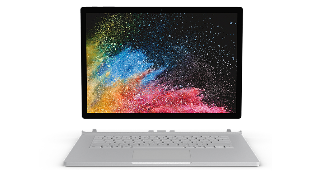
The best mouse of 2018: 6 top computer mice for designers

Original Source: http://feedproxy.google.com/~r/CreativeBloq/~3/ZnD_lObYNNQ/mice-4132486

So, you've got your laptop and monitor sorted, and but that's not all you need for the perfect computer setup. You'll also need the best mouse you can afford to keep your workflow smooth and efficient. It's one of the most important tools you use each day, so it's essential to find a model that's both responsive and comfortable. 

So how do you find the right mouse for you? After all, there are thousands of variations of computer mouse out there – including trackpads. Here we list six of the best mouse options out there to help you find the ideal device for your creative work. 

Logitech MX Master

Logitech produces some of the most responsive computer mice on the market, which is pretty handy when you need a tool with precision. Its cordless MX Master model is designed to fit comfortably in your hand over a long period of time, and includes a super-responsive scroll wheel that lets you browse web pages or documents at your own speed, depending on how fast you flick the wheel.

Buttons located on the side of the mouse also let you flit between windows without having to use the usual alt+Tab, and can easily program your shortcuts. The only downside to the MX Master is the pretty hefty RRP price tag of around £80 – but you there are deals to be had, so don't despair (above you'll find the best prices currently available).

Prefer a new model? The Logitech MX Master 2S Wireless Bluetooth Mouse works with Mac and Windows. It boasts high-precision tracking, a rechargeable battery (that lasts a long time between charges) and customisable buttons. 

Apple Magic Mouse 2

Apple was late to join the innovative mouse party then it created the Magic Mouse. Its replacement, the imaginatively titled Magic Mouse 2, has a super-light design and laser-tracking capabilities that make it easy to flick between InDesign CC pages and make even the smallest changes on practically any surface.

However, the downside is that it’s perhaps a little over-sensitive at times. The multi-touch area on the top of the mouse, which lets you scroll in any direction, can sometimes become frustrating when you want to keep your finger in the same place for a long period of time. But for Magic Mouse evangelists, there is nothing that comes close to this mouse.

Alternatively, a lot of designers prefer the Apple Magic Trackpad 2, which brings Force Touch pressure-sensitive technology (as seen in the screen of the Apple Watch) and the trackpad of the 2015 12-inch MacBook. Or for a cheaper option, try the older Apple Magic Trackpad. 

03. Anker Vertical Ergonomic Optical Mouse

Anker Vertical Ergonomic Optical Mouse

Sure, the Anker Vertical Ergonomic Optical Mouse looks weird. It’s vertically aligned to encourage healthy, neutral 'handshake' wrist and arm. But once you get used to it, it’s a cheap and very comfortable way to avoid RSI. If you're a digital creative that spends a lot of time using a mouse for work, then having one that is comfortable to use is essential. After all, if you injure yourself and cannot work, it could mean you lose money. That makes this odd-looking mouse a very wise investment, which is why we think it's the best ergonomic mouse for digital creatives.

Logitech MX Ergo Wireless

The MX Ergo Wireless is a distinctly retro-looking mouse thanks to its trackball. While many mice-makers have ditched trackballs in favour of optical laser mice, Logitech has continued to release trackball mice, and for that we're thankful. For many people, the tactile trackball makes working on creative projects much more intuitive and comfortable, and the MX Ergo Wireless can be used flat or at a 20-degree angle.

Razer DeathAdder Chroma

Just like designers, gamers need a mouse that is sensitive and accurate, so it stands to reason that gaming mice are a good option for designers too. And the Razer range of gaming mice is one of the most responsive out there.

Razer mice have three types of sensors – dual, laser and optical – and an ergonomic shape designed to support the flow of your hand. The Razer Deathadder mouse is the bestseller (as well as the cheapest), and features an optical sensor and rubber side grips. It also syncs with all of your mouse settings stored in the Cloud.

Microsoft Bluetooth Mobile Mouse 3600

Microsoft's Bluetooth Mobile Mouse 3600 is, in our view, the best budget mouse money can buy these days. Although it has a rock-bottom price, it has impressive build quality and is very reliable. This is because Microsoft isn't just a software company – it also makes some very good peripherals, such as this mouse. It's small enough to easily carry around with you as well, which is handy if you do a lot of work on the road.

Related articles:

The best drawing tabletThe best keyboards for designersThe best monitor calibrators for designers

10 iPhone Cases that Offer More than Protection

Original Source: https://www.hongkiat.com/blog/alternative-iphone-6-plus-cases/

With your shiny new iPhone, the first thing you think of buying is a phone case. When getting a case for your iPhone, people either go for a good-looking one or something that can better protect the…

Visit hongkiat.com for full content.

Best Examples Of Read More Buttons For Web Designers And Bloggers

Original Source: http://feedproxy.google.com/~r/Designrfix/~3/r64KbO8SU2s/read-more-buttons

Web designers and bloggers alike all understand how difficult it is to entice potential site visitors to stick around for a while. We only have a few seconds to attract a visitors’ attention and the persistent awareness that it could be lost at any moment. There are many factors that go into grabbing and holding a […]

The post Best Examples Of Read More Buttons For Web Designers And Bloggers appeared first on designrfix.com.

90% Off: Get The Complete VR Development Bundle for Only $34

Original Source: http://feedproxy.google.com/~r/Designrfix/~3/4HGpf6wyHBw/complete-vr-development-bundle

Virtual reality isn’t entirely new. In fact, this concept was first introduced in 1995. Yes, 22 years ago. If I remember it clearly, there was a television show called “VR5”, which focused on virtual reality and the entire cyber experience. Although VR didn’t quite pick up at that time, it certainly has now. If you’re […]

The post 90% Off: Get The Complete VR Development Bundle for Only $34 appeared first on designrfix.com.

Caching Smartly In The Age Of Gutenberg

Original Source: https://www.smashingmagazine.com/2018/12/caching-smartly-gutenberg/

Caching Smartly In The Age Of Gutenberg

Caching Smartly In The Age Of Gutenberg

Leonardo Losoviz

2018-12-05T13:00:15+01:00
2018-12-05T19:37:50+00:00

Caching is needed for speeding up a site: instead of having the server dynamically create the HTML output for each request, it can create the HTML only after it is requested the first time, cache it, and serve the cached version from then on. Caching delivers a faster response, and frees up resources in the server. When optimizing the speed of our sites from the server side, caching ranks among the most critical tasks to get right.

When generating the HTML output for the page, if it contains code with user state, such as printing a welcome message “Hello {{User name}}!” for the logged in user, then the page cannot be cached. Otherwise, if Peter visits the site first, and the HTML output is cached, all users would then be welcomed with “Hello Peter!”

Hence, caching plugins, such as those available for WordPress, will generally offer to disable caching when the user is logged in, as shown below for plugin WP Super Cache:

Disabled caching for known users in WP Super Cache

WP Super Cache recommends to disable caching for logged in users. (Large preview)

Disabling caching for logged in users is undesirable and should be avoided, because even if the amount of HTML code with user state is minimal compared to the static content in the page, still nothing will be cached. The reason is that the entity to be cached is the page, and not the particular pieces of HTML code within the page, so by including a single line of code which cannot be cached, then nothing will be cached. It is an all-or-nothing situation.

Our new book, in which Alla Kholmatova explores
how to create effective and maintainable design systems to design great digital products. Meet Design Systems, with common traps, gotchas and the lessons Alla has learned over the years.

Table of Contents →

To address this, we can architect our application to avoid rendering HTML code with user state on the server-side, and render it on the client-side only, after fetching its required data through an API (often based on REST or GraphQL). By removing user state from code rendered on the server, that page can then be cached, even if the user is logged in.

In this article, we will explore the following issues:

How do we identify those sections of code that require user state, isolate them from the page, and make them be rendered on the client-side only?
How can it be implemented for WordPress sites through Gutenberg?

Gutenberg Is Bringing Components To WordPress

As I explained in my previous article Implications of thinking in blocks instead of blobs, Gutenberg is a JavaScript-based editor for WordPress (more specifically, it is a React-based editor, encapsulating the React libraries behind the global wp object), slated for release in either November 2018 or January 2019. Through its drag-and-drop interface, Gutenberg will utterly transform the experience of creating content for WordPress and, at some later stage in the future, the process of building sites, switching from the current creation of a page through templates (header.php, index.php, sidebar.php, footer.php), and the content of the page through a single blob of HTML code, to creating components to be placed anywhere on the page, which can control their own logic, load their own data, and self-render.

To appreciate the upcoming change visually, WordPress is moving from this:

The page contains templates with HTML code

Currently pages are built through PHP templates. (Large preview)

To this:

The page contains autonomous components

In the near future, pages will be built by placing self-rendering components in them. (Large preview)

Even though Gutenberg as a site builder is not ready yet, we can already think in terms of components when designing the architecture of our site. As for the topic of this article, architecting our application using components as the unit for building the page can help implement an enhanced caching strategy, as we shall see below.

Evaluating The Relationship Between Pages And Components

As mentioned earlier, the entity being cached is the page. Hence, we need to evaluate how components will be placed on the page as to maximize the page’s cacheability. Based on their dependence on user state, we can broadly categorize pages into the following 3 groups:

Pages without any user state, such as “Who we are” page.
Pages with bits and pieces of user state, such as the homepage when welcoming the user (“Welcome Peter!”), or an archive page with a list of posts, showing a “Like” button under each post which is painted blue if the logged in user has liked that post.
Pages naturally with user state, in which content depends directly from the logged in user, such as “My posts” of “Edit my profile” pages.

Components, on the other side, can simply be categorized as requiring user state or not. Because the architecture considers the component as the unit for building the page, the component has the faculty of knowing if it requires user state or not. Hence, a <WelcomeUser /> component, which renders “Welcome Peter!”, knows it requires user state, while a <WhoWeAre /> component knows that it does not.

Next, we need to place components on the page, and depending on the combination of page and component requiring user state or not, we can establish a proper strategy for caching the page and for rendering content to the user as soon as possible. We have the following cases:

1. Pages Without Any User State

These can be cached with no issues.

Page is cached => It can’t access user state.
Components, none of them requiring user state, are rendered in the server.

Page without user state

A page without user state can only contain components without user state. (Large preview)

2. Pages With Bits And Pieces Of User State

We could make the page either require user state or not. If we make the page require user state, then it cannot be cached, which is a wasted opportunity when most of the content in the page is static. Hence, we’d rather make the page not require user state, and those components requiring user state which are placed on the page, such as <WelcomeUser /> on the homepage, are made lazy-load: the server-side renders an empty shell, and the component is rendered instead in the client-side, after getting its data from an API.

Following this approach, all static content in the page will be rendered immediately through server-side rendering (SSR), and those bits and pieces with user state after some delay through client-side rendering (CSR).

Page is cached => It can’t access user state.
Components not requiring user state are rendered in the server.
Components requiring user state are rendered in the client.

Page with bits of user state

A page with bits of user state contains CSR components with user state, and SSR components without user state. (Large preview)

3. Pages Naturally With User State

If the library or framework only enables client-side rendering, then we must follow the same approach as with #2: do not make the page require user state, and add a component, such as <MyPosts />, to self-render in the client.

However, since the main objective of the page is to show user content, making the user wait for this content to be loaded on a 2nd stage is not ideal. Let’s see this with an example: a user who has not logged in yet accesses page “Edit my profile”. If the site renders the content in the server, since the user is not logged in the server will immediately redirect to the login page. Instead, if the content is rendered in the client through an API, the user will first be presented a loading message, and only after the response from the API is back will the user be redirected to the login page, making the experience slower.

Hence, we are better off using a library or framework that supports server-side rendering, and we make the page require user state (making it non-cacheable):

Page is not cached => It can access user state.
Components, both requiring and not requiring user state, are rendered in the server.

Page with user state

A page with user state contains SSR components both with and without user state. (Large preview)

From this strategy and all the combinations it produces, deciding if a component must be rendered server or client-side simply boils down to the following pseudo-code:

if (component requires user state and page can’t access user state) {
render component in client
}
else {
render component in server
}

This strategy allows to attain our objective: implemented for all pages in the site, for all components placed in each page, and configuring the site to not cache pages which access the user state, we can then avoid disabling caching any page whenever the user is logged in.

Rendering Components Client/Server-Side Through Gutenberg

In Gutenberg, those components which can be embedded on the page are called “blocks” (or also Gutenblocks). Gutenberg supports two types of blocks, static and dynamic:

Static blocks produce their HTML code already in the client (when the user is interacting with the editor) and save it inside the post content. Hence, they are client-side JavaScript-based blocks.
Dynamic blocks, on the other hand, are those which can change their content dynamically, such as a latest posts block, so they cannot save the HTML output inside the post content. Hence, in addition to creating their HTML code on the client-side, they must also produce it from the server on runtime through a PHP function (which is defined under parameter render_callback when registering the block in the backend through function register_block_type.)

Because HTML code with user state cannot be saved in the post’s content, a block dealing with user state will necessarily be a dynamic block. In summary, through dynamic blocks we can produce the HTML for a component both in the server and client-side, enabling to implement our optimized caching strategy. The previous pseudo-code, when using Gutenberg, will look like this:

if (block requires user state and page can’t access user state) {
render block in client through JavaScript
}
else {
render (dynamic) block in server through PHP code
}

Unfortunately, implementing the dual client/server-side functionality doesn’t come without hardship: Gutenberg’s SSR is not isomorphic, ie it does not allow a single codebase to produce the output for both client and server-side code. Hence, developers would need to maintain 2 codebases, one in PHP and one in JavaScript, which is far from optimal.

Gutenberg also implements a <ServerSideRender /> component, however it advices against using it: this component was not thought for improving the speed of the site and rendering an immediate response to the user, but for providing compatibility with legacy code, such as shortcodes.

As it is explained in the documentation:

“ServerSideRender should be regarded as a fallback or legacy mechanism, it is not appropriate for developing new features against.

“New blocks should be built in conjunction with any necessary REST API endpoints, so that JavaScript can be used for rendering client-side in the edit function. This gives the best user experience, instead of relying on using the PHP render_callback. The logic necessary for rendering should be included in the endpoint, so that both the client-side JavaScript and server-side PHP logic should require a minimal amount of differences.”

As a result, when building our sites, we will need to decide if to implement SSR, which boosts the site’s speed by enabling an optimal caching experience and by providing an immediate response to the user when loading the page, but which comes at the cost of maintaining 2 codebases. Depending on the context, it may be worth it or not.

Configuring What Pages Require User State

Pages requiring (or accessing) user state will be made non-cacheable, while all other pages will be cacheable. Hence, we need to identify which pages require user state. Please notice that this applies only to pages, and not to REST endpoints, since the goal is to render the component already in the server when accessing the page, and calling the WP REST API’s endpoints implies getting the data for rendering the component in the client. Hence, from the perspective our our caching strategy, we can assume all REST endpoints will require user state, and so they don’t need to be cached.

To identifying which pages require user state, we simply create a function get_pages_with_user_state, like this:

function get_pages_with_user_state() {

return apply_filters(
‘get_pages_with_user_state’,
array()
);
}

Upon which we implement hooks with the corresponding pages, like this:

// ID of the pages, retrieved from the WordPress admin
define (‘MYPOSTS_PAGEID’, 5);
define (‘ADDPOST_PAGEID’, 8);

add_filter(‘get_pages_with_user_state’, ‘get_pages_with_user_state_impl’);
function get_pages_with_user_state_impl($pages) {

$pages[] = MYPOSTS_PAGEID;

// “Add Post” may not require user state!
// $pages[] = ADDPOST_PAGEID;

return $pages;
}

Please notice how we may not need to add user state for page “Add Post” (making this page cacheable), even though this page requires to validate that the user is logged in when submitting a form to create content on the site. This is because the “Add Post” page may simply display an empty form, requiring no user state whatsoever. Then, submitting the form will be a POST operation, which cannot be cached in any case (only GET requests are cached).

Disabling Caching Of Pages With User State In WP Super Cache

Finally, we configure our application to disable caching for those pages which require user state (and cache everything else.) We will do this for plugin WP Super Cache, by blacklisting the URIs of those pages in the plugin settings page:

WP Super Cache settings to disable caching for blacklisted strings

We can disable caching URLs containing specific strings in WP Super Cache. (Large preview)

What we need to do is create a script that obtains the paths for all pages with user state, and saves it in the corresponding input field. This script can then be invoked manually, or automatically as part of the application’s deployment process.

First we obtain all the URIs for the pages with user state:

function get_rejected_strings() {

$rejected_strings = array();
$pages_with_user_state = get_pages_with_user_state();
foreach ($pages_with_user_state as $page) {

// Calculate the URI for that page to the list of rejected strings
$path = substr(get_permalink($page), strlen(home_url()));
$rejected_strings[] = $path;
}

return $rejected_strings;
}

And then, we must add the rejected strings into WP Super Cache’s configuration file, located in wp-content/wp-cache-config.php, updating the value of entry $cache_rejected_uri with our list of paths:

function set_rejected_strings_in_wp_super_cache() {

if ($rejected_strings = get_rejected_strings()) {

// Keep the original values in
$rejected_strings = array_merge(
array(‘wp-.*\\.php’, ‘index\\.php’),
$rejected_strings
);

global $wp_cache_config_file;
$cache_rejected_uri = “array(‘”.implode(“‘, ‘”, $rejected_strings).”‘)”;
wp_cache_replace_line(‘^ *$cache_rejected_uri’, “$cache_rejected_uri = ” . $cache_rejected_uri . “;”, $wp_cache_config_file);
}
}

Upon execution of function set_rejected_strings_in_wp_super_cache, the settings will be updated with the new rejected strings:

WP Super Cache settings to disable caching blacklisted strings

Blacklisting the paths from pages accessing user state in WP Super Cache. (Large preview)

Finally, because we are now able to disable caching for the specific pages that require user state, there is no need to disable caching for logged in users anymore:

Disabled caching for known users in WP Super Cache

No need to disable caching for logged in users anymore! (Large preview)

That’s it!

Conclusion

In this article, we explored a way to enhance our site’s caching — mainly aimed at enabling caching on the site even when the users are logged in. The strategy relies on disabling caching only for those pages which require user state, and on using components which can decide if to be rendered on the client or on the server-side, depending on the page accessing the user state or not.

As a general concept, the strategy can be implemented on any architecture that supports server-side rendering of components. In particular, we analyzed how it can be implemented for WordPress sites through Gutenberg, advising to assess if it is worth the trouble of maintaining two codebases, one in PHP for the server-side code, and one in JavaScript for the client-side code.

Finally, we explained that the solution can be integrated into the caching plugin through a custom script to automatically produce the list of pages to avoid caching, and produced the code for plugin WP Super Cache.

After implementing this strategy to my site, it doesn’t matter anymore if visitors are logged in or not. They will always access a cached version of the homepage, providing a faster response and a better user experience.

Smashing Editorial
(rb, ra, yk, il)

Get the eBook Self-Publishing Bundle for Only $25

Original Source: http://feedproxy.google.com/~r/Designrfix/~3/cafF0uGeRd8/ebook-self-publishing-bundle-sale

Decades ago, authors who were interested in getting their books published wool have to talk to different publishers, send them their manuscript, and then hope that someone would appreciate their work. Today, however, you don’t need a publisher to get your books out there. In fact, authors now have the option to publish their own […]

The post Get the eBook Self-Publishing Bundle for Only $25 appeared first on designrfix.com.

It’s Beginning To Look A Lot Like&hellip; December (2018 Wallpapers Edition)

Original Source: https://www.smashingmagazine.com/2018/11/desktop-wallpaper-calendars-december-2018/

It’s Beginning To Look A Lot Like&hellip; December (2018 Wallpapers Edition)

It’s Beginning To Look A Lot Like&hellip; December (2018 Wallpapers Edition)

Cosima Mielke

2018-11-30T09:01:00+01:00
2018-12-04T17:38:33+00:00

What are you looking forward to in December? Spending time with family and friends during the holidays, watching the birds gather in your snowy backyard, or celebrating “Bathtub Party Day” maybe? These are just some of the things that inspired artists and designers to create their desktop wallpapers this month.
All wallpapers in this post come in versions with and without a calendar for December 2018 and can be downloaded for free — as it has been our monthly tradition since more than nine years already. To cater for an extra bit of December joy, we also collected some wallpaper favorites from past years at the end of the post. Happy December and happy holidays!

Further Reading on SmashingMag:

60 Beautiful Christmas Photoshop Tutorials
Winter- And Holiday-Inspired Icon Sets
How To Draw A Cartoon In Illustrator
How To Create Dramatic Vector Illustrations

Please note that:

All images can be clicked on and lead to the preview of the wallpaper,
You can feature your work in our magazine by taking part in our Desktop Wallpaper Calendar series. We are regularly looking for creative designers and artists to be featured on Smashing Magazine. Are you one of them?

Meet Smashing Book 6 — our brand new book focused on real challenges and real front-end solutions in the real world: from design systems and accessible single-page apps to CSS Custom Properties, CSS Grid, Service Workers, performance, AR/VR and responsive art direction. With Marcy Sutton, Yoav Weiss, Lyza D. Gardner, Laura Elizabeth and many others.

Table of Contents →

Christmas Wreath

“Everyone is in the mood for Christmas when December starts. Therefore I made this Christmas wreath inspired wallpaper. Enjoy December and Merry Christmas to all!” — Designed by Melissa Bogemans from Belgium.

Christmas Wreath

preview
with calendar: 320×480, 640×480, 800×480, 800×600, 1024×768, 1024×1024, 1152×864, 1280×720, 1280×800, 1280×960, 1280×1024, 1400×1050, 1440×900, 1600×1200, 1680×1050, 1680×1200, 1920×1080, 1920×1200, 1920×1440, 2560×1440
without calendar: 320×480, 640×480, 800×480, 800×600, 1024×768, 1024×1024, 1152×864, 1280×720, 1280×800, 1280×960, 1280×1024, 1400×1050, 1440×900, 1600×1200, 1680×1050, 1680×1200, 1920×1080, 1920×1200, 1920×1440, 2560×1440

Cardinals In Snowfall

“During Christmas season, in the cold, colorless days of winter, Cardinal birds are seen as symbols of faith and warmth! In the part of America I live in, there is snowfall every December. While the snow is falling, I can see gorgeous Cardinals flying in and out of my patio. The intriguing color palette of the bright red of the Cardinals, the white of the flurries and the brown/black of dry twigs and fallen leaves on the snow-laden ground, fascinates me a lot, and inspired me to create this quaint and sweet, hand-illustrated surface pattern design as I wait for the December 2018 snowfall in my town!” — Designed by Gyaneshwari Dave from the United States.

Cardinals In Snowfall

preview
with calendar: 640×960, 768×1024, 1280×720, 1280×1024, 1366×768, 1920×1080, 2560×1440
without calendar: 640×960, 768×1024, 1280×720, 1280×1024, 1366×768, 1920×1080, 2560×1440

Cozy

“December is all about coziness and warmth. Days are getting darker, shorter and colder. So a nice cup of hot cocoa just warms me up.” — Designed by Hazuki Sato from Belgium.

Cosy

preview
with calendar: 320×480, 640×480, 960×560, 1024×768, 1280×960, 1440×900, 1600×1200, 1920×1080, 1920×1200, 2560×1440
without calendar: 320×480, 640×480, 960×560, 1024×768, 1280×960, 1440×900, 1600×1200, 1920×1080, 1920×1200, 2560×1440

Sweet Snowy Tenderness

“You know that warm feeling when you get to spend cold winter days in a snug, homey, relaxed atmosphere? Oh, yes, we love it too! It is the sentiment we set our hearts on for the holiday season, and this sweet snowy tenderness is for all of us who adore watching the snowfall from our windows. Isn’t it romantic?” — Designed by PopArt Studio from Serbia.

Sweet Snowy Tenderness

preview
with calendar: 320×480, 640×480, 800×480, 800×600, 1024×768, 1024×1024, 1152×864, 1280×720, 1280×800, 1280×960, 1280×1024, 1366×768, 1400×1050, 1440×900, 1600×1200, 1680×1050, 1680×1200, 1920×1080, 1920×1200, 1920×1440, 2560×1440
without calendar: 320×480, 640×480, 800×480, 800×600, 1024×768, 1024×1024, 1152×864, 1280×720, 1280×800, 1280×960, 1280×1024, 1366×768, 1400×1050, 1440×900, 1600×1200, 1680×1050, 1680×1200, 1920×1080, 1920×1200, 1920×1440, 2560×1440

’Tis The Season Of Snow

“The tiny flakes of snow have just begun to shower and we know it’s the start of the merry hour! Someone is all set to cram his sleigh with boxes of love as kids wait for their dear Santa to show up! Rightly said, ’tis the season of snow, surprise and lots and lots of fun! Merry Christmas!” — Designed by Sweans Technologies from London.

’Tis The Season Of Snow

preview
with calendar: 320×480, 640×480, 800×480, 800×600, 1024×768, 1024×1024, 1152×864, 1280×720, 1280×800, 1280×960, 1280×1024, 1366×768, 1400×1050, 1440×900, 1600×1200, 1680×1050, 1680×1200, 1920×1080, 1920×1200, 1920×1440, 2560×1440
without calendar: 320×480, 640×480, 800×480, 800×600, 1024×768, 1024×1024, 1152×864, 1280×720, 1280×800, 1280×960, 1280×1024, 1366×768, 1400×1050, 1440×900, 1600×1200, 1680×1050, 1680×1200, 1920×1080, 1920×1200, 1920×1440, 2560×1440

Bathtub Party Day

“December 5th is also known as Bathtub Party Day, which is why I wanted to visualize what celebrating this day could look like.” — Designed by Jonas Vanhamme from Belgium.

Bathtub Party Day

preview
with calendar: 320×480, 640×480, 800×480, 800×600, 1024×768, 1280×720, 1280×800, 1280×960, 1400×1050, 1600×1200, 1680×1200, 1920×1080, 1920×1200, 1920×1440, 2560×1440, 2560×1600
without calendar: 320×480, 640×480, 800×480, 800×600, 1024×768, 1280×720, 1280×800, 1280×960, 1400×1050, 1600×1200, 1680×1200, 1920×1080, 1920×1200, 1920×1440, 2560×1440, 2560×1600

Cold Days, Warm Feelings

“Everything that reminds me of the cold days of December. I’ve tried to put everything in one illustration, the snow, hot coffee, mountains, snowman. Also my illustration is blue, it’s a cold color, so this give the illustration more of a winter effect.” — Designed by Dennis van den Heuvel from Belgium.

Cold Days, Warm Feelings

preview
with calendar: 800×480, 1024×768, 1280×960, 1680×1200, 1920×1440
without calendar: 800×480, 1024×768, 1280×960, 1680×1200, 1920×1440

Oh Deer, It’s Cold!

“December brings more than Christmas only. It brings Winter. It brings the cold.” — Designed by Ellen Theuwen from Belgium.

Oh Deer, It’s Cold!

preview
with calendar: 640×480, 800×480, 800×600, 1024×768, 1024×1024, 1152×864, 1280×720, 1280×800, 1280×960, 1280×1024, 1366×768, 1400×1050, 1440×900, 1600×1200, 1680×1050, 1680×1200, 1920×1200, 1920×1440, 2560×1440
without calendar: 640×480, 800×480, 800×600, 1024×768, 1024×1024, 1152×864, 1280×720, 1280×800, 1280×960, 1280×1024, 1366×768, 1400×1050, 1440×900, 1600×1200, 1680×1050, 1680×1200, 1920×1200, 1920×1440, 2560×1440

Portland Snow Globe

Designed by Mad Fish Digital from the USA.

Portland Snow Globe

preview
with calendar: 320×480, 1024×1024, 1280×720, 1680×1200, 2560×1440
without calendar: 320×480, 1024×1024, 1280×720, 1680×1200, 2560×1440

Another Christmas

“‘Christmas waves a magic wand over this world, and behold, everything is softer and more beautiful.’ (Norman Vincent Peale)” — Designed by Suman Sil from India.

Another Christmas

preview
with calendar: 1280×720, 1280×800, 1280×960, 1280×1024, 1366×768, 1400×1050, 1440×900, 1600×1200, 1680×1050, 1920×1080, 1920×1200, 1920×1440, 2560×1440
without calendar: 1280×720, 1280×800, 1280×960, 1280×1024, 1366×768, 1400×1050, 1440×900, 1600×1200, 1680×1050, 1920×1080, 1920×1200, 1920×1440, 2560×1440

A December To Remember

“Of all the months of the year, there is not a month so welcome to the young or so full of happy associations as this last month of the year. A month of giving, celebrations, and holidays. Christmas month is here. Make this last month of the year special for you and the ones around you.” — Designed by Procurement Software from India.

A December To Remember

preview
with calendar: 320×480, 640×480, 800×480, 800×600, 1024×768, 1024×1024, 1152×864, 1280×720, 1280×800, 1280×960, 1280×1024, 1366×768, 1440×900, 1600×1200, 1680×1050, 1680×1200, 1920×1080, 1920×1200, 1920×1440, 2560×1440
without calendar: 320×480, 640×480, 800×480, 800×600, 1024×768, 1024×1024, 1152×864, 1280×720, 1280×800, 1280×960, 1280×1024, 1366×768, 1440×900, 1600×1200, 1680×1050, 1680×1200, 1920×1080, 1920×1200, 1920×1440, 2560×1440

December Music

“Have you ever noticed how people have characteristic (or weird) poses playing instruments? It was my inspiration for drawing very simple and funny stick-figure musicians. Over the years I have drawn everything from violinists to pipa players (Chinese instrument) and from electric guitarists to tubaists. I never get bored of drawing new instrumentalists, ensembles or, in this case, a Christmas band. I wish you a very happy December with lots of music!” — Designed by Franke Margrete from The Netherlands.

December Music

preview
with calendar: 320×480, 360×480, 376×668, 768×1024, 1024×1024, 1280×720, 1280×800, 1280×1024, 1366×768, 1366×1050, 1440×900, 1536×864, 1600×900, 1920×1080, 1920×1440, 2560×1440, 2560×1600, 3840×2160, 5120×2880
without calendar: 320×480, 360×480, 376×668, 768×1024, 1024×1024, 1280×720, 1280×800, 1280×1024, 1366×768, 1366×1050, 1440×900, 1536×864, 1600×900, 1920×1080, 1920×1440, 2560×1440, 2560×1600, 3840×2160, 5120×2880

The Mountains Shout Freedom

“December is that time of the year where snows starts to fall. It’s from this moment that we can go skiing and snowboarding again. It’s the best time of the year.” — Designed by Jasper Bogaert from Belgium.

The Mountains Shout Freedom

preview
with calendar: 960×540, 1440×810, 1920×1080, 2880×1620, 3840×2160, 5760×3240
without calendar: 960×540, 1440×810, 1920×1080, 2880×1620, 3840×2160, 5760×3240

Meeeh

“December is when winter begins, so I decided to go for some nice, cold, pastel colors and a wintery scenario. The ram is a family-related symbol and it’s cute, so I named it Meeeh.” — Designed by Ana Matos from Portugal.

Meeeh

preview
with calendar: 320×480, 800×600, 1280×1024, 1440×900, 1680×1050, 1920×1080, 2560×1440
without calendar: 320×480, 800×600, 1280×1024, 1440×900, 1680×1050, 1920×1080, 2560×1440

Snow & Flake

“December always reminds me of snow and being with other people. That’s why I created two snowflakes Snow & Flake who are best buddies and love being with each other during winter time.” — Designed by Ian De Lantsheer from Belgium.

Snow & Flake

preview
with calendar: 320×480, 640×480, 800×480, 800×600, 1024×768, 1024×1024, 1152×864, 1280×720, 1280×800, 1280×960, 1280×1024, 1366×768, 1400×1050, 1440×900, 1600×1200, 1680×1050, 1680×1200, 1920×1080, 1920×1200, 1920×1440, 2560×1440
without calendar: 320×480, 640×480, 800×480, 800×600, 1024×768, 1024×1024, 1152×864, 1280×720, 1280×800, 1280×960, 1280×1024, 1366×768, 1400×1050, 1440×900, 1600×1200, 1680×1050, 1680×1200, 1920×1080, 1920×1200, 1920×1440, 2560×1440

Midnight Aurora

“I was inspired by beautiful images of the Aurora that I saw on the internet.” — Designed by Wannes Verboven from Belgium.

Midnight Aurora

preview
with calendar: 320×480, 640×480, 800×480, 800×600, 1024×768, 1024×1024, 1152×864, 1280×720, 1280×800, 1280×960, 1280×1024, 1366×768, 1400×1050, 1440×900, 1600×1200, 1680×1050, 1680×1200, 1920×1080, 1920×1200, 1920×1440, 2560×1440
without calendar: 320×480, 640×480, 800×480, 800×600, 1024×768, 1024×1024, 1152×864, 1280×720, 1280×800, 1280×960, 1280×1024, 1366×768, 1400×1050, 1440×900, 1600×1200, 1680×1050, 1680×1200, 1920×1080, 1920×1200, 1920×1440, 2560×1440

Enlightened By The Christmas Spirit

“Christmas is the most wonderful time of the year! Once we’ve had our fill of turkey and welcomed the holiday season, we’re constantly encouraged to get into the spirit of the festive season.” — Designed by Mobile App Development from India.

Enlightened By The Christmas Spirit

preview
with calendar: 320×480, 640×480, 800×480, 800×600, 1024×768, 1024×1024, 1152×864, 1280×720, 1280×800, 1280×960, 1280×1024, 1366×768, 1400×1050, 1440×900, 1600×1200, 1680×1050, 1680×1200, 1920×1080, 1920×1200, 1920×1440, 2560×1440
without calendar: 320×480, 640×480, 800×480, 800×600, 1024×768, 1024×1024, 1152×864, 1280×720, 1280×800, 1280×960, 1280×1024, 1366×768, 1400×1050, 1440×900, 1600×1200, 1680×1050, 1680×1200, 1920×1080, 1920×1200, 1920×1440, 2560×1440

All Of Them Lights

“I created this design in honour of the 9th of December, the day of lights.” — Designed by Mathias Geerts from Belgium.

All Of Them Lights

preview
with calendar: 320×480, 640×480, 800×480, 800×600, 1024×768, 1024×1024, 1152×864, 1280×720, 1280×800, 1280×960, 1280×1024, 1366×768, 1400×1050, 1440×900, 1600×1200, 1680×1200, 1920×1080, 1920×1200, 1920×1440, 2560×1440
without calendar: 320×480, 640×480, 800×480, 800×600, 1024×768, 1024×1024, 1152×864, 1280×720, 1280×800, 1280×960, 1280×1024, 1366×768, 1400×1050, 1440×900, 1600×1200, 1680×1200, 1920×1080, 1920×1200, 1920×1440, 2560×1440

Brrrr…!

Designed by Oumayma Jamali from Belgium.

Brrrr...!

preview
with calendar: 320×480, 800×600, 1600×1200, 1920×1080, 2560×1440
without calendar: 320×480, 800×600, 1600×1200, 1920×1080, 2560×1440

Christmas House

Designed by Antun Hiršman from Croatia.

Christmas House

preview
with calendar: 800×600, 1280×720, 1440×900, 1680×1200, 1920×1080, 1920×1440, 2560×1440
without calendar: 800×600, 1280×720, 1440×900, 1680×1200, 1920×1080, 1920×1440, 2560×1440

Christmas December

Designed by Think 360 Studio from India.

Christmas December

preview
with calendar: 1366×768, 1440×900, 1920×1080, 2560×1440
without calendar: 1366×768, 1440×900, 1920×1080, 2560×1440

Separate Holidays

“My parents are divorced so I don’t really like the holidays because it feels like I always have to choose between my mum and dad.” — Designed by Micheline Van Looveren from Belgium.

Separate Holidays

preview
with calendar: 320×480, 640×480, 800×480, 800×600, 1024×768, 1024×1024, 1152×864, 1280×720, 1280×800, 1280×960, 1280×1024, 1366×768, 1400×1050, 1440×900, 1600×1200, 1680×1050, 1680×1200, 1920×1080, 1920×1200, 1920×1440, 2560×1440
without calendar: 320×480, 640×480, 800×480, 800×600, 1024×768, 1024×1024, 1152×864, 1280×720, 1280×800, 1280×960, 1280×1024, 1366×768, 1400×1050, 1440×900, 1600×1200, 1680×1050, 1680×1200, 1920×1080, 1920×1200, 1920×1440, 2560×1440

Human Rights Month

“December is Human Rights Month, so I decided to design a wallpaper for this special month.” — Designed by Jonas Vanhamme from Belgium.

Human Rights Month

preview
with calendar: 320×480, 640×480, 800×480, 800×600, 1024×768, 1280×720, 1280×800, 1280×960, 1400×1050, 1600×1200, 1680×1200, 1920×1080, 1920×1200, 1920×1440, 2560×1440, 2560×1600
without calendar: 320×480, 640×480, 800×480, 800×600, 1024×768, 1280×720, 1280×800, 1280×960, 1400×1050, 1600×1200, 1680×1200, 1920×1080, 1920×1200, 1920×1440, 2560×1440, 2560×1600

Winter Morning

“Early walks in the fields when the owls still sit on the fences and stare funny at you.” — Designed by Bo Dockx from Belgium.

Winter Morning

preview
with calendar: 320×480, 640×480, 800×480, 800×600, 1024×768, 1024×1024, 1152×864, 1280×720, 1280×800, 1280×960, 1280×1024, 1366×768, 1400×1050, 1440×900, 1600×1200, 1680×1050, 1920×1080, 1920×1200, 1920×1440, 2560×1440
without calendar: 320×480, 640×480, 800×480, 800×600, 1024×768, 1024×1024, 1152×864, 1280×720, 1280×800, 1280×960, 1280×1024, 1366×768, 1400×1050, 1440×900, 1600×1200, 1680×1050, 1920×1080, 1920×1200, 1920×1440, 2560×1440

Homeless Christmas

“December automatically brings to mind the Christmas spirit, the smell of delicious food, and the joy of opening beautiful presents. A couple of years ago I volunteered in a homeless shelter for a while. I even spent New Years’ Eve at the shelter. And ever since, Christmas also reminds me that a lot of others are much less fortunate than me…” — Designed by Kim Haesen from Belgium.

Homeless Christmas

preview
with calendar: 1024×1024, 1280×960, 1280×1024, 1400×1050, 1440×900, 1600×1200, 1680×1050, 1680×1200, 1920×1080, 1920×1200, 1920×1440, 2560×1440
without calendar: 1024×1024, 1280×960, 1280×1024, 1400×1050, 1440×900, 1600×1200, 1680×1050, 1680×1200, 1920×1080, 1920×1200, 1920×1440, 2560×1440

Christmas Feelings

Designed by Lieselotte Philips from Belgium.

Christmas Feelings

preview
with calendar: 320×480, 640×480, 800×480, 800×600, 1024×768, 1024×1024, 1152×864, 1280×720, 1280×800, 1280×960, 1440×900, 1600×1200, 1680×1050, 1680×1200, 1920×1080, 1920×1200, 1920×1440, 2560×1440
without calendar: 320×480, 640×480, 800×480, 800×600, 1024×768, 1024×1024, 1152×864, 1280×720, 1280×800, 1280×960, 1440×900, 1600×1200, 1680×1050, 1680×1200, 1920×1080, 1920×1200, 1920×1440, 2560×1440

Merry Christmas

“‘Christmas gives us the opportunity to pause and reflect on the important things around us.’ (David Cameron)” — Designed by Pinki Ghosh Dastidar from India.

Merry Christmas

preview
with calendar: 1280×720, 1280×800, 1280×960, 1280×1024, 1366×768, 1400×1050, 1440×900, 1600×1200, 1680×1050, 1920×1080, 1920×1200, 1920×1440, 2560×1440
without calendar: 1280×720, 1280×800, 1280×960, 1280×1024, 1366×768, 1400×1050, 1440×900, 1600×1200, 1680×1050, 1920×1080, 1920×1200, 1920×1440, 2560×1440

International Tea Day

“December 15 is International Tea Day, so I thought to design a cup of tea, which also represents the cold weather during the winter.” — Designed by Hannah De Wachter from Belgium.

International Tea Day

preview
with calendar: 320×480, 800×600, 1024×1024, 1152×864, 1280×720, 1280×1024, 1440×900, 1600×1200, 1680×1050, 1920×1080, 2560×1440
without calendar: 320×480, 800×600, 1024×1024, 1152×864, 1280×720, 1280×1024, 1440×900, 1600×1200, 1680×1050, 1920×1080, 2560×1440

Money Doesn’t Grow On Trees

“I wanted to emphasize people who do not have enough money to celebrate Christmas like everyone else in the world.” — Designed by Angelique Buijzen from Belgium.

Money Doesn’t Grow On Trees

preview
with calendar: 320×480, 640×480, 800×600, 1024×768, 1024×1024, 1280×720, 1280×800, 1280×960, 1280×1024, 1366×768, 1400×1050, 1440×900, 1600×1200, 1680×1050, 1920×1080, 1920×1200, 1920×1440, 2560×1440
without calendar: 320×480, 640×480, 800×600, 1024×768, 1024×1024, 1280×720, 1280×800, 1280×960, 1280×1024, 1366×768, 1400×1050, 1440×900, 1600×1200, 1680×1050, 1920×1080, 1920×1200, 1920×1440, 2560×1440

Explore The World

“‘We must go beyond textbooks, go out into the bypaths and untrodden depths of the wilderness and travel and explore and tell the world the glories of our journey.’ (John Hope Franklin)” — Designed by Dipanjan Karmakar from India.

Explore The World

preview
with calendar: 1280×800, 1280×960, 1280×1024, 1400×1050, 1440×900, 1680×1050, 1920×1080
without calendar: 1280×800, 1280×960, 1280×1024, 1400×1050, 1440×900, 1680×1050, 1920×1080

Oldies But Goodies

Ready for a trip back in time? Here’s a collection of December goodies from past years that are too good to be forgotten. Please note that these wallpapers don’t come with a calendar.

’Tis The Season To Be Happy

Designed by Tazi from Australia.

'Tis The Season To Be Happy

preview
without calendar: 320×480, 640×480, 800×600, 1024×768, 1152×864, 1280×720, 1280×960, 1600×1200, 1920×1080, 1920×1440, 2560×1440

Christmas Cookies

“Christmas is coming and a great way to share our love is by baking cookies.” — Designed by Maria Keller from Mexico.

Christmas Cookies

preview
without calendar: 320×480, 640×480, 640×1136, 750×1334, 800×480, 800×600, 1024×768, 1024×1024, 1152×864, 1242×2208, 1280×720, 1280×800, 1280×960, 1280×1024, 1366×768, 1400×1050, 1440×900, 1600×1200, 1680×1050, 1680×1200, 1920×1080, 1920×1200, 1920×1440, 2560×1440, 2880×1800

The House On The River Drina

“Since we often yearn for a peaceful and quiet place to work, we have found inspiration in the famous house on the River Drina in Bajina Bašta, Serbia. Wouldn’t it be great being in nature, away from the civilization, swaying in the wind and listening to the waves of the river smashing your house, having no neighbors to bother you? Not sure about the Internet, though…” — Designed by PopArt Studio from Serbia.

Christmas Wallpaper — The House On The River Drina

preview
without calendar: 640×480, 800×600, 1024×1024, 1152×864, 1280×720, 1280×960, 1280×1024, 1366×768, 1400×1050, 1440×900, 1600×1200, 1680×1200, 1920×1080, 1920×1200, 1920×1440, 2560×1440

Christmas Woodland

Designed by Mel Armstrong from Australia.

Christmas Woodland

preview
without calendar: 320×480, 640×480, 800×480, 800×600, 1024×768, 1024×1024, 1152×864, 1280×720, 1280×800, 1280×960, 1280×1024, 1366×768, 1400×1050, 1440×900, 1600×1200, 1680×1050, 1680×1200, 1920×1080, 1920×1200, 1920×1440, 2560×1440

Getting Hygge

“There’s no more special time for a fire than in the winter. Cozy blankets, warm beverages, and good company can make all the difference when the sun goes down. We’re all looking forward to generating some hygge this winter, so snuggle up and make some memories.” — Designed by The Hannon Group from Washington D.C.

Getting Hygge

preview
without calendar: 320×480, 640×480, 800×600, 1024×768, 1280×960, 1440×900, 1600×1200, 1680×1050, 1680×1200, 1920×1080, 1920×1440, 2560×1440

Joy To The World

“Joy to the world, all the boys and girls now, joy to the fishes in the deep blue sea, joy to you and me.” — Designed by Morgan Newnham from Boulder, Colorado.

Joy To The World

preview
without calendar: 320×480, 640×480, 800×480, 800×600, 1024×768, 1024×1024, 1152×864, 1280×720, 1280×800, 1280×960, 1280×1024, 1400×1050, 1440×900, 1600×1200, 1680×1050, 1680×1200, 1920×1080, 1920×1200, 1920×1440, 2560×1440

Winter Wonderland

“‘Winter is the time for comfort, for good food and warmth, for the touch of a friendly hand and for a talk beside the fire: it is the time for home.’ (Edith Sitwell) — Designed by Dipanjan Karmakar from India.

Christmas Wallpaper — Winter Wonderland

preview
without calendar: 1280×720, 1280×800, 1280×960, 1280×1024, 1366×768, 1400×1050, 1440×900, 1600×1200, 1680×1050, 1680×1200, 1920×1080, 1920×1440, 2560×1440

December Through Different Eyes

“As a Belgian, December reminds me of snow, cosiness, winter, lights and so on. However, in the Southern Hemisphere it is summer at this time. With my illustration I wanted to show the different perspectives on December. I wish you all a Merry Christmas and Happy New Year!” — Designed by Jo Smets from Belgium.

Christmas Wallpaper — December Through Different Eyes

preview
without calendar: 320×480, 800×480, 1280×800, 1280×1024, 1920×1080, 2560×1440

’Tis The Season (To Drink Eggnog)

“There’s nothing better than a tall glass of Golden Eggnog while sitting by the Christmas tree. Let’s celebrate the only time of year this nectar of the gods graces our lips.” — Designed by Jonathan Shears from Connecticut, USA.

’Tis The Season (To Drink Eggnog)

preview
without calendar: 1024×768, 1152×864, 1280×960, 1440×1080, 1680×1260, 1920×1440, 2048×1536, 2560×1440

Gifts Lover

Designed by Elise Vanoorbeek from Belgium.

Gifts Lover

preview
without calendar: 800×480, 800×600, 1024×768, 1024×1024, 1152×864, 1280×800, 1280×960, 1280×1024, 1366×768, 1400×1050, 1440×900, 1600×1200, 1680×1050, 1680×1200, 1920×1080, 1920×1200, 1920×1440, 2560×1440

The Southern Hemisphere Is Calling

“Santa’s tired of winter (and the North Pole) and is flying to the South part of the globe to relax a little bit. He deserves a little vacation, don’t you think?” — Designed by Ricardo Gimenes from Sweden.

The Southern Hemisphere Is Calling

preview
without calendar: 320×480, 640×960, 1024×768, 1024×1024, 1280×800, 1280×960, 1280×1024, 1366×768, 1400×1050, 1440×900, 1600×1050, 1600×1200, 1680×1050, 1680×1200, 1920×1080, 1920×1200, 1920×1440, 2560×1440, 2880×1800

Have A Minimal Christmas

“My brother-in-law has been on a design buzzword kick where he calls everything minimal, to the point where he wishes people, “Have a minimal day!” I made this graphic as a poster for him.” — Designed by Danny Gugger from Madison, Wisconsin, USA.

Have a Minimal Christmas

preview
without calendar: 750×1334, 1080×1920, 1136×640, 1280×960, 1920×1080, 2560×1440, 5210×2880

Christmas Time!

Designed by Sofie Keirsmaekers from Belgium.

Christmas time!

preview
without calendar: 320×480, 1024×1024, 1280×1024, 1440×900, 1920×1200, 2560×1440

Happy Holidays

Designed by Bogdan Negrescu from the United States.

Happy Holidays

preview
without calendar: 320×480, 1024×768, 1280×800, 1280×1024, 1440×900, 1920×1080, 2560×1440

It’s In The Little Things

Designed by Thaïs Lenglez from Belgium.

It's in the little things

preview
without calendar: 640×480, 800×600, 1024×768, 1280×1024, 1440×900, 1600×1200, 1680×1050, 1920×1080, 1920×1200, 2560×1440

Join In Next Month!

Please note that we respect and carefully consider the ideas and motivation behind each and every artist’s work. This is why we give all artists the full freedom to explore their creativity and express emotions and experience throughout their works. This is also why the themes of the wallpapers weren’t anyhow influenced by us, but rather designed from scratch by the artists themselves.

Thank you to all designers for their participation. Join in next month!