Infographic: The Future of E-Commerce

Original Source: https://www.webdesignerdepot.com/2018/09/infographic-the-future-of-e-commerce/

Worldwide, retail e-commerce sales totaled $2.29 trillion last year. By the end of this year they’ll have reached $2.8 trillion. If the trend continues apace, e-commerce sales will reach a whopping $4.479 trillion by 2021.

The message is clear: Consumers love the convenience of e-commerce; the reduced prices compared to real world stores, with their real world overheads; the greater range of products.

With a simple click, or tap, you can buy or subscribe to almost any product or service. Never has impulse buying been so easy.

It’s clear that e-commerce will continue to grow as a sector. But what exactly will it look like in the coming months and years?

Add Realistic Chalk and Sketch Lettering Effects with Sketch’it – only $5!

Source

p img {display:inline-block; margin-right:10px;}
.alignleft {float:left;}
p.showcase {clear:both;}
body#browserfriendly p, body#podcast p, div#emailbody p{margin:0;}

Collective #450

Original Source: http://feedproxy.google.com/~r/tympanus/~3/AW-4rz7Tynw/

C450_WOTW

Inspirational Website of the Week: KIKK Festival 2018

This year’s Kikk festival page has a vibrant design and some beautiful effects. Our pick this week.

Get inspired

C450_Pendo

This content is sponsored via Syndicate Ads
Art + Science of Product Design

?A picture is worth a thousand words. Learn why design should be every product person’s superpower. Watch the webinar!

Check it out

C450_tree

Project Explorer

A CLI tool to create an annotated tree visualization of any project. By Sarah Drasner.

Check it out

C450_pullrequests

GitHub Pull Requests in Visual Studio Code

Now you can review and manage GitHub pull requests right from VS Code.

Read it

C450_Bellwoods

Bellwoods

A beautiful audio-visual art game made by Matt DesLauriers.

Check it out

C450_Highway

Highway

Highway is a lightweight and flexible library for AJAX-based website transitions.

Check it out

C450_beerslider

Beer Slider: Responsive & Accessible Before-After Slider

PeHaa Hetman shares this great JavaScript library of a responsive “before-after” slider.

Check it out

C450_copyright

Today, Europe Lost The Internet. Now, We Fight Back.

Read about the terrible proposal the European Parliament adopted regarding the new Copyright Directive.

Read it

C450_taskrunner

Drome

A task runner that lets you define tasks with command line statements and Node.js APIs.

Check it out

C450_access

The Importance Of Manual Accessibility Testing

Read how automated accessibility tests don’t just magically make your site accessible. An article by Eric Bailey.

Read it

C450_cssvars

Updating a CSS Variable with JavaScript

A useful snippet for dynamically updating CSS variables. By Chris Coyier.

Check it out

C450_Houdini

Houdini Spellbook

An interactive introduction to CSS Houdini. Made by Sam Richard.

Check it out

C450_Froma

Free Font: Forma

A pixel-style Memphis-inspired geometric type. Licensed under CC BY 4.0.

Get it

C450_VueToolbox

Vue Toolbox

The best Vue.js libraries in one place. Created by Tiago Alves and Filipe Pina.

Check it out

C450_emojitown

3D Emoji Town (Pure CSS)

George W. Park created this wonderful little Emoji town just with CSS.

Check it out

C450_PeterWolf

Peter and the Wolf

A Progressive Web App audio player experiment made by Koen van Gilst.

Check it out

C450_momentjs

You don’t (may not) need Moment.js

A list of date-fns or native functions which you can use to replace moment.js.

Check it out

C450_500

500 Error

A hypnotizing 505 error page animation made by Liam Egan.

Check it out

C450_doodleaddicts

Doodle Addicts

A fantastic community site for discovering art and artists.

Check it out

C450_wedding

Wedding Icons

A hand-drawn wedding themed icon set including 24 icons in various formats.

Get it

C450_trendy

Trendy Palettes

A curated collection of beautiful hand picked color palettes.

Check it out

C450_morph

HyperMorph 3000™

Andreas Borgen’s fantastic demo of image morphing.

Check it out

C450_scrollbars

Taste Your Scroll

A tool that will help you customize the scroll bars of your project.

Check it out

C450_paravel

Color Cycling with Workers

Read about the process that lead to the animation on the new Paravel site. By Dave Rupert.

Read

C450_pwc

PWC

A continuous collection of papers with code.

Check it out

Collective #450 was written by Pedro Botelho and published on Codrops.

83% Off: Get the Smartphone Photography Basics Bundle for Only $19

Original Source: http://feedproxy.google.com/~r/Designrfix/~3/85j4tfDP-Ug/smartphone-photography-basics-bundle

Not too long ago, people invest in fancy cameras in order to take good quality photos. Some even hire professional photographers just to capture their life’s precious moments. Today, however, you no longer need to spend a huge sum of money on top-of-the-line equipment in order to take decent quality photos. In fact, your smartphone […]

The post 83% Off: Get the Smartphone Photography Basics Bundle for Only $19 appeared first on designrfix.com.

iPhone XS and XR Pre-order Dates and Prices in Singapore

Original Source: https://www.hongkiat.com/blog/iphonexs-xr-preorder-dates-prices-in-singapore/

iPhone XS, XS Max, XR prices and pre-registration dates/links with Singtel, Starhub, and M1

The post iPhone XS and XR Pre-order Dates and Prices in Singapore appeared first on Hongkiat.

Visit hongkiat.com for full content.

Smashing Book 6 Is Here: New Frontiers In Web Design

Original Source: https://www.smashingmagazine.com/2018/09/smashing-book-6-release/

Smashing Book 6 Is Here: New Frontiers In Web Design

Smashing Book 6 Is Here: New Frontiers In Web Design

Vitaly Friedman

2018-09-13T13:25:00+02:00
2018-09-13T15:20:36+00:00

Imagine you were living in a perfect world. A world where everybody has fast, stable and unthrottled connections, reliable and powerful devices, exquisite screens, and capable, resilient browsers. The screens are diverse in size and pixel density, yet our interfaces adapt to varying conditions swiftly and seamlessly. What a glorious time for all of us — designers, developers, senior Webpack configurators and everybody in-between — to be alive, wouldn’t you agree?

Well, we all know that the reality is slightly more nuanced and complicated than that. That’s why we created Smashing Book 6, our shiny new book that explores uncharted territories and seeks to discover new reliable front-end and UX techniques. And now, after 10 months of work, the book is ready, and it’s shipping. Jump to table of contents and get the book right away.

Smashing Book 6: New Frontiers in Web Design

eBook

Hardcover

eBook$19Get the eBook

PDF, ePUB, Kindle. Free for Smashing Members.

Hardcover$39Get the Print (incl. eBook)

Printed, quality hardcover. Free airmail shipping worldwide.

About The Book

Finding your way through front-end and UX these days is challenging and time-consuming. But frankly, we all just don’t have time to afford betting on a wrong strategy. Smashing Book 6 sheds some light on new challenges and opportunities, but also uncovers new traps and pitfalls in this brave new front-end world of ours.

Our books aren’t concerned with short-living trends, and our new book isn’t an exception. Smashing Book 6 is focused on real challenges and real front-end solutions in the real world: from accessible apps to performance to CSS Grid Layout to advanced service workers to responsive art direction. No chit-chat or theory. Things that worked, in actual projects. Jump to table of contents.

Smashing Book 6

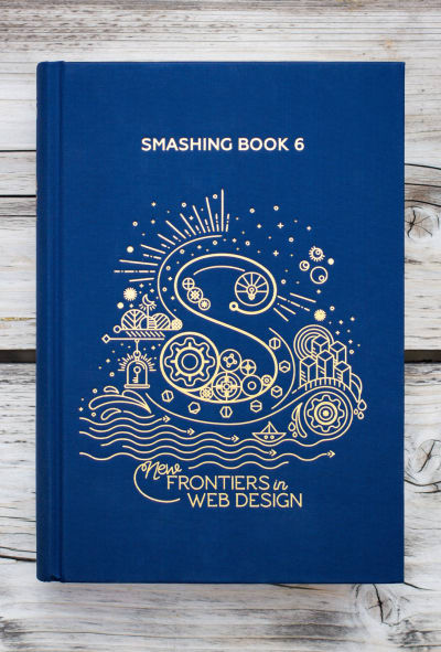
The Smashing Book 6, with 536 pages on real-life challenges and opportunities on the web. Photo by our dear friend Marc Thiele. (Large preview)

In the book, Laura and Marcy explore strategies for maintainable design systems and accessible single-page apps with React, Angular etc. Mike, Rachel and Lyza share insights on using CSS Custom Properties and CSS Grid in production today. Yoav and Lyza take a dive deep into performance patterns and service workers in times of Progressive Web Apps and HTTP/2.

Inner design of the Smashing Book 6.

Inner design of the Smashing Book 6. Designed by one-and-only Chiara Aliotta. Large view.

Ada, Adrian and Greg explore how to design for watches and new form factors, as well as AR/VR/XR, chatbots and conversational UIs. The last chapter will guide you through some practical strategies to break out of generic, predictable, and soulless interfaces — with dozens of examples of responsive art direction. But most importantly: it’s the book dedicated to headaches and solutions in the fragile, inconsistent, fragmented and wonderfully diverse web we find ourselves in today.

Table Of Contents

Want to peek inside? Download a free PDF sample (PDF, ca. 21 MB) with a chapter on bringing personality back to the web by yours truly. Overall, the book contains 10 chapters:

Making Design Systems Work In Real-Life
by Laura Elizabeth
Accessibility In Times Of Single-Page Applications
by Marcy Sutton
Production-Ready CSS Grid Layouts
by Rachel Andrew
Strategic Guide To CSS Custom Properties
by Mike Riethmueller
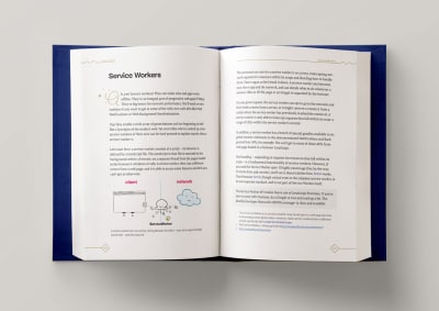
Building An Advanced Service Worker
by Lyza Gardner
Loading Assets On The Web
by Yoav Weiss
Conversation Interface Design Patterns
by Adrian Zumbrunnen
Building Chatbots And Designing For Watches
by Greg Nudelman
Cross Reality And The Web (AR/VR)
by Ada Rose Cannon
Bringing Personality Back To The Web (free PDF sample, 21MB)
by Vitaly Friedman

.c-garfield-the-cat img {
border-radius: 11px;
}
@supports (display: grid) {
.smb6-authors {
display: grid;
grid-template-columns: repeat(auto-fit, 130px);
grid-gap: 1em;
}
.smb6-authors figcaption {
grid-column: 1 / -1;
}
.smb6-authors::before {
display: none;
}
}

Laura Elizabeth
Marcy Sutton
Rachel Andrew
Mike Riethmuller
Lyza Danger Gardner
Yoav Weiss
Adrian Zumbrunnen
Greg Nudelman
Ada Rose Edwards
Vitaly Friedman
From left to right: Laura Elizabeth, Marcy Sutton, Rachel Andrew, Mike Riethmuller, Lyza D. Gardner, Yoav Weiss, Adrian Zumbrunnen, Greg Nudelman, Ada Rose Edwards, and yours truly.

536 pages. Quality hardcover + eBook (PDF, ePUB, Kindle).
Published late September 2018.
Written by and for designers and front-end developers.
Designed with love from Italy by Chiara Aliotta.
Free airmail worldwide shipping from Germany.
Check delivery times for your country.
If you are a Smashing Member, don’t forget to apply your Membership discount.
Good enough? Get the book right away.

Smashing Book 6: Covers of Chapter 1 and Chapter 10

eBook

Hardcover

eBook$19Get the eBook

PDF, ePUB, Kindle. Free for Smashing Members.

Hardcover$39Get the Print (incl. eBook)

Printed, quality hardcover. Free airmail shipping worldwide.

About The Designer

Chiara Aliotta
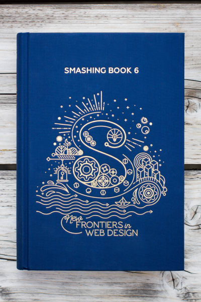
The cover was designed with love from Italy by one-and-only Chiara Aliotta. She founded the design studio Until Sunday and has directed the overall artistic look and feel of different tech companies and not-for-profit organizations around the world. We’re very happy that she gave Smashing Book 6 that special, magical touch.

Behind The Scenes Of The Design Process

We asked Chiara to share some insights into the design process of the cover and the interior design and she was very kind to share some thoughts with us:

“It all started with a few exchanges of emails and a Skype meeting where Vitaly shared his idea of the book and the general content. I had a lot of freedom, which is always exciting and scary at the same time. The only bond (if we want to call it like this) was that the “S” of Smashing Magazine should be the main protagonist of the cover, reinvented and creatively presented as per all the other previous Smashing Books.

The illustration on paper. The cover sketched on paper. Also check the close-up photo. (Large preview)

I worked around few keywords that Vitaly was using to describe the book during our meetings and then developed an idea around classical novels of adventure where the main hero leaves home, encounters great hazards, risks, and then eventually returns wiser and/or richer than he/she was before.

So I thought of Smashing Book 6 as a way to propose this basic and mythic structure under a new light: through the articles of this book, the modern web designer will be experiencing true and deep adventures.

I imagined the “S” as an engine, the starting point of this experience, from where different worlds were creating and expanding. So the cover was the map of these uncharted territories that the book explores.

Every element on the cover has a particular meaning that constructs the S
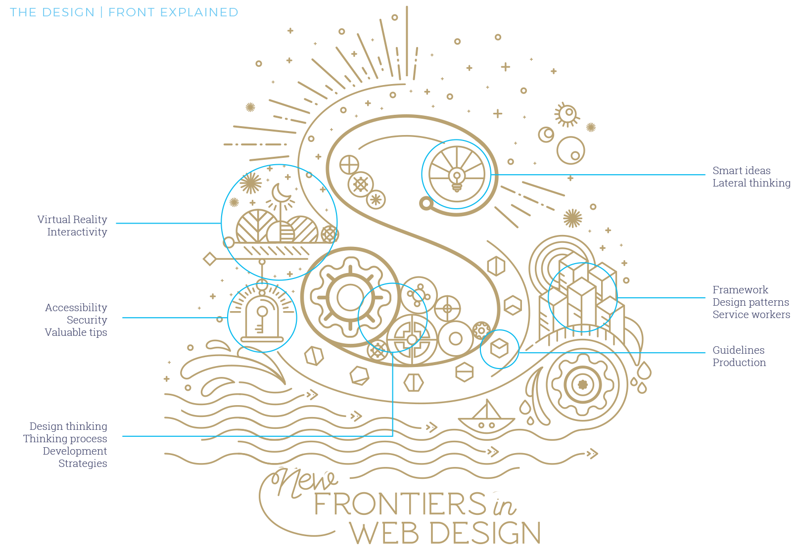
Every element on the cover has a particular meaning that constructs the S. Large view.

I am a person who judges books by its cover and having read some of the chapters and knowing some of the well-established writers, I wanted to honour its content and their work by creating a gorgeous cover and chapter illustrations.

For this edition of Smashing Book, I imagined a textile cover in deep blue, where the graphic is printed using a very old technique, the hot gold foil stamping.

Together with Markus, part of the Smashing Magazine team and responsible for the publishing of all the Smashing Books, we worked closely to choose the final details of the binding and guarantee an elegant and sophisticated result, adding a touch of glam to the book.

Smashing Book 6 comes wrapped with a little bookmark. Photo by our dear friend Marc Thiele.

As a final touch, I added a paper wrap around the book that invites the readers to “unlock their adventure”, suggesting a physical action: the reader needs to tear off the paper before starting reading the book.
And for this only version, we introduced a customise Smashing Magazine bookmark, also in printed on gold paper. Few more reasons to prefer the paperback version over the digital ones!”

A huge round of applause to Chiara for her wonderful work and sharing the thoughts with us. We were remarkably happy with everything from design to content. But what did readers think? Well, I’m glad that you asked!

Sketches for chapter illustrations. (Large preview)

Feedback and Testimonials

We’ve sent the shiny new book to over 200 people to peek through and read, and we were able to gather some first insights. We’d love to hear your thoughts, too!

“Web design is getting pretty darned complicated. The new book from SmashingMag aims to bring the learning curve down to an accessible level.”

— Aaron Walter, InVision

“Just got the new Smashing Book 6 by SmashingMag. What a blast! From CSS Grid Layout, CSS Custom Properties and service workers all the way to the HTTP/2 and conversational interfaces and many more. I recommend it to all the people who build interfaces.”

— Mihael Tomić, Osijek, Croatia

“The books published by SmashingMag and team are getting better each time. I was thrilled to be able to preview it… EVERY CHAPTER IS GOOD! Having focused on a11y for much of my career, Marcy Sutton’s chapter is a personal favorite.”

— Stephen Hay, Amsterdam, Netherlands

Smashing Book 6, a thank-you page

The Smashing Book 6, with 536 pages on real-life challenges and solutions for the web. Huge thank-you note to the smashing community for supporting the book and out little magazine all these years. (Large preview)

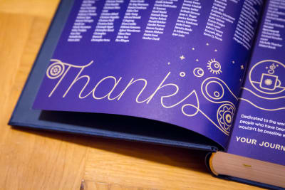
Thank You For Your Support!

We’re very honored and proud to have worked with wonderful people from the industry who shared what they’ve learned in their work. We kindly thank all the hard-working people involved in making this book reality. We kindly thank you for your ongoing support of the book and our little magazine as well. It would be wonderful if you could mention the book by any chance as well in your social circles and perhaps link to this very post.

We’ve also prepared a little media kit .zip with a few photos and illustrations that you could use if you wanted to — just sayin’!

We can’t wait to hear your thoughts about the book! Happy reading, and we hope that you’ll find the book as useful as we do. Just have a cup of coffee (or tea) ready before you start reading, of course, stay smashing and… meow!

Smashing Book 6: New Frontiers in Web Design

eBook

Hardcover

eBook$19Get the eBook

PDF, ePUB, Kindle. Free for Smashing Members.

Hardcover$39Get the Print (incl. eBook)

Printed, quality hardcover. Free airmail shipping worldwide.

Smashing Editorial
(ra, il)

Scroll Snap in CSS: Controlling Scroll Action

Original Source: https://www.sitepoint.com/scroll-snap-in-css/

The following is a short extract from Tiffany’s upcoming book, CSS Master, 2nd Edition, which will be available shortly.

As the web platform grows, it has also gained features that mimic native applications. One such feature is the CSS Scroll Snap Module. Scroll snap lets developers define the distance an interface should travel during a scroll action. You might use it to build slide shows or paged interfaces―features that currently require JavaScript and expensive DOM operations.

Scroll snap as a feature has undergone a good deal of change. An earlier, 2013 version of the specification — called Scroll Snap Points at the time — defined a coordinates-and-pixels-based approach to specifying scroll distance. This version of the specification was implemented in Microsoft Edge, Internet Explorer 11, and Firefox.

Chrome 69+ and Safari 11+ implement the latest version of the specification, which uses a box alignment model. That's what we'll focus on in this section.

Warning:
Many of the scroll snap tutorials currently floating around the web are based on the earlier CSS Scroll Snap Points specification. The presence of the word “points” in the title is one sign that the tutorial may rely on the old specification. A more reliable indicator, however, is the presence of the scroll-snap-points-x or scroll-snap-points-y properties.

Since scroll snap is really well-suited to slide show layouts, that's what we'll build. Here's our markup.

<div class="slideshow">
<img src="avocado-and-bacon-salad.jpg" alt="avocado and bacon salad">
<img src="salad-eggs-and-scallops.jpg" alt="salad topped with hard boiled eggs and seared scallops">
<img src="seafood-and-noodles.jpg" alt="seafood stew over noodles">
<img src="grilled-salmon-and-side-salad.jpg" alt="grilled salmon steak with avocado and side salad">
<img src="avocado-toast-with-egg.jpg" alt="avocado toast with egg">
</div>

That's all we need. We don't need to have an outer wrapping element with and an inner sliding container. We also don't need any JavaScript.

Now for our CSS:

* {
box-sizing: border-box;
}

html, body {
padding: 0;
margin: 0;
}

.slideshow {
scroll-snap-type: x mandatory; /* Indicates scroll axis and behavior */
overflow-x: auto; /* Should be either `scroll` or `auto` */
display: flex;
height: 100vh;
}

.slideshow img {
width: 100vw;
height: 100vh;
scroll-snap-align: center;
}

Adding scroll-snap-type to .slideshow creates a scroll container. The value for this property, x mandatory describes the direction in which we'd like to scroll, and the scroll snap strictness. In this case, the mandatory value tells the browser that it must snap to a snap position when there is no active scroll operation. Using display: flex just ensures that all of our images stack horizontally.

Now the other property we need is scroll-snap-align. This property indicates how to align each image's scroll snap area within the scroll container's snap port. It accepts three values: start, end, and center. In this case, we've used the center which means that each image will be centered within the viewport as shown below.

How scroll-snap-align: center aligns images within a scroll container, in Chrome 70 for Android

For a more comprehensive look at Scroll Snap, read Well-Controlled Scrolling with CSS Scroll Snap from Google Web Fundamentals guide.

The post Scroll Snap in CSS: Controlling Scroll Action appeared first on SitePoint.

How to Download and Delete Everything Google Knows About You

Original Source: https://www.hongkiat.com/blog/download-and-delete-everything-google-knows-about-you/

A detailed guide on how to check and delete your data collected and stored by Google on its servers.

The post How to Download and Delete Everything Google Knows About You appeared first on Hongkiat.

Visit hongkiat.com for full content.

Get Free Art and Design Critiques With Critiquer

Original Source: https://www.hongkiat.com/blog/get-free-art-design-critiques-with-critiquer/

Perhaps the toughest part of improving your design skills is learning what you’re doing wrong. It helps if you have great taste and objectively compare your work to the works of others. But…

Visit hongkiat.com for full content.

Integrating MongoDB and Amazon Kinesis for Intelligent, Durable Streams

Original Source: https://www.sitepoint.com/integrating-mongodb-and-amazon-kinesis-for-intelligent-durable-streams/

This article was originally published on MongoDB. Thank you for supporting the partners who make SitePoint possible.

You can build your online, operational workloads atop MongoDB and still respond to events in real time by kicking off Amazon Kinesis stream processing actions, using MongoDB Stitch Triggers.

Let’s look at an example scenario in which a stream of data is being generated as a result of actions users take on a website. We’ll durably store the data and simultaneously feed a Kinesis process to do streaming analytics on something like cart abandonment, product recommendations, or even credit card fraud detection.

We’ll do this by setting up a Stitch Trigger. When relevant data updates are made in MongoDB, the trigger will use a Stitch Function to call out to AWS Kinesis, as you can see in this architecture diagram:

What you’ll need to follow along

An Atlas instance
If you don’t already have an application running on Atlas, you can follow our getting started with Atlas guide here. In this example, we’ll be using a database called streamdata, with a collection called clickdata where we’re writing data from our web-based e-commerce application.
An AWS account and a Kinesis stream
In this example, we’ll use a Kinesis stream to send data downstream to additional applications such as Kinesis Analytics. This is the stream we want to feed our updates into.
A Stitch application
If you don’t already have a Stitch application, log into Atlas, and click Stitch Apps from the navigation on the left, then click Create New Application.

Create a Collection

The first step is to create a database and collection from the Stitch application console. Click Rules from the left navigation menu and click the Add Collection button. Type streamdata for the database and clickdata for the collection name. Select the template labeled Users can only read and write their own data and provide a field name where we’ll specify the user id.

Figure 2. Create a collection

Configuring Stitch to Talk to AWS

Stitch lets you configure Services to interact with external services such as AWS Kinesis. Choose Services from the navigation on the left, and click the Add a Service button, select the AWS service and set AWS Access Key ID, and Secret Access Key.

Figure 3. Service Configuration in Stitch

Services use Rules to specify what aspect of a service Stitch can use, and how. Add a rule which will enable that service to communicate with Kinesis by clicking the button labeled NEW RULE. Name the rule “kinesis” as we’ll be using this specific rule to enable communication with AWS Kinesis. In the section marked Action, select the API labeled Kinesis and select All Actions.

Figure 4. Add a rule to enable integration with Kinesis

Write a Function that Streams Documents into Kinesis

Now that we have a working AWS service, we can use it to put records into a Kinesis stream. The way we do that in Stitch is with Functions. Let’s set up a putKinesisRecord function.

Select Functions from the left-hand menu, and click Create New Function. Provide a name for the function and paste the following in the body of the function.

Figure 5. Example Function - putKinesisRecord

exports = function(event){
const awsService = context.services.get(‘aws’);
try{
awsService.kinesis().PutRecord({
Data: JSON.stringify(event.fullDocument),
StreamName: “stitchStream”,
PartitionKey: “1”
}).then(function(response) {
return response;
});
}
catch(error){
console.log(JSON.parse(error));
}
};

Test Out the Function

Let’s make sure everything is working by calling that function manually. From the Function Editor, Click Console to view the interactive javascript console for Stitch.

The post Integrating MongoDB and Amazon Kinesis for Intelligent, Durable Streams appeared first on SitePoint.

4 Best Practices for Designing Mega-Footers

Original Source: https://www.webdesignerdepot.com/2018/09/4-best-practices-for-designing-mega-footers/

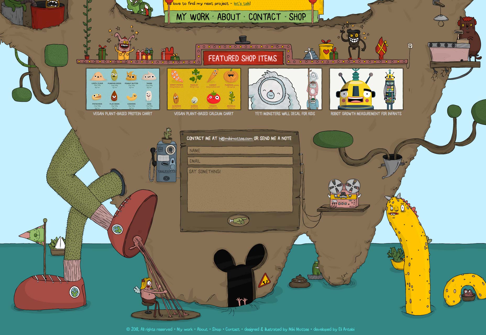
Have you ever visited a website, looked around for a bit, and then headed straight to the footer to find the information you were looking for?

You’re not the only one.

Footers are unique pieces of screen real estate that offer a number of benefits. They house important information (like contact details and copyright statements) and navigation options that make it easier for users to find what they’re looking for.

In this article, we’ll talk about the importance of website footers and how you can use them to help your website’s visitors easily find what they’re looking for. We’ll also walk through some of the best practices you should keep in mind when designing mega-footers—the footer equivalent of the mega-menu.

Why Footers Are Important

We’re inclined to put a lot of effort into designing everything that’s above the fold thinking that it’ll be seen by everyone who lands on the website. So much so that we forget that footers are also highly visible.

In fact, a study that looked at 25 million websites found that visitors scrolled down thousands of pixels all the time. And many of the visitors were found to have started scrolling before the page had fully loaded.

What we can take from this is that your website’s footer is just as important as its header. It’s highly visible and getting its design right could benefit you in a number of different ways. It’s all about deciding what you want to include in the limited space the footer has to offer with the purpose of facilitating your site’s visitors while making sure your goals are met.

Depending on what type of website you’re creating and what your goals are, you might consider including any of the following elements in your site’s footer:

Sitemap;
Copyright statement;
A link to the Terms of Use page;
Privacy policy statement;
Contact information;
A map or address;
Social icons;
Social media widgets;
Email signup;
A search bar;
Your mission statement;
Tags and categories;
Awards and certifications;
Association memberships;
Testimonials;
Latest articles;
Upcoming events;
An explainer video;
Audio;
Call to action.

There are so many important elements you can add to your website’s footer and each one serves a unique purpose. If you wanted to get your visitors to stay on your website longer and check out your blog, you might add a Popular Posts widget to your site’s footer. And if your goal was to increase conversions, you could include a call to action and email signup form in it.

The problem is that traditionally footers are small, with a bare minimum of content (probably copyright and social media icons). Like giant site mega-menus, that offer users more navigation options, the solution to the footer conundrum is mega-footers.

4 Best Practices for Designing Big Website Footers

The possibilities are seemingly endless when you decide to go with a mega-footer on your website. You can add branding elements to reinforce your brand in your visitors’ minds. You can add navigation links to all of your important pages which visitors might miss otherwise. You can even add a contact form in your footer!

With this in mind, let’s step through some best practices for designing mega-footers that don’t just look good but are also incredibly functional.

1. Include Branding Elements

Your site’s footer is often an overlooked opportunity to reinforce your brand image in the visitor’s mind. You can use this space to communicate brand value.

Using images, graphics, icons, or logos in your footer is a great way to remind visitors what website they’re on and give them something to remember it by. Alternatively, you can use colors, patterns, or icons that you have already used in your website’s design to achieve the same result.

Miki Mottes’ mega-footer is a work of art. It uses graphics and animation incorporating a lot of visual elements. You will notice that it also uses a different version of its site’s logo in the footer to reinforce their brand. It’s a not-so-subtle reminder for visitors that Miki Mottes is an illustrator, animator, and designer.

Hustle Panda is the perfect example of how you can keep things simple by using the same color palette and playing around with different logo sizes. The repeated use of their panda mascot reminds visitors about their brand message.

2. Gather Leads

Building an email list can be pretty difficult especially when you’re just starting out. From a design perspective, a lot of it has to do with how well your signup form fits in with the rest of the website’s design. Your website’s mega-footer is the perfect place to gather leads for your business. It gives you one last chance of getting your call to action across and then serving up a signup form.

Zoyo Yogurt displays a large signup form that blends in with the rest of the footer’s design. It gives visitors an opportunity to take in everything they have to offer and then signup to receive emails about events and special offers.

3. Add Social Media Buttons

Studies indicate that nearly 75% of marketing websites include social media icons in their site’s footer instead of the header. Why? As website owners, our goal is to keep visitors on our website instead of heading over to a social media page. Because once they land on a social media platform, it’s pretty difficult to get them to come back.

For this reason, it’s better to place your social media buttons in your site’s footer instead of its header. This way, you can rest assured that your site’s visitors will have (at least) reached the bottom of your homepage before heading over to Facebook or Twitter.

Capsicum Mediaworks neatly embeds its social media buttons into its site’s design. They blend in with the color palette and immediately captivate your attention. It’s an excellent example of mega-footers getting branding and social media icons right.

Holiday Harold takes a minimal approach in its footer with simple links to its social media pages placed directly above the graphics.

4. Create Navigation Hierarchies

One of the best things you can do with mega-footers is including links to your site’s most popular content.

For starters, you can organize links to your site’s most popular pages or categories into columns. Bonus points for categorizing them under appropriate headings and titles.

Keep in mind that sometimes your visitors find themselves at the bottom of your page because they weren’t able to find what they were looking for up until that point. So, before they bounce off, you have one last chance to give them a few more options. And your footer makes this possible.

TrueCar’s footer is organized into four columns – each column with a category title. This makes it easy to quickly scan for what you’re looking for. You will also notice that the headings of each column are more prominent which makes them easily noticeable.

GitHub does the same thing by organizing their most important pages into columns. And by giving each column an appropriate title, they make it easy for visitors to find the page they were looking for.

Conclusion

Even though the footer is located at the very bottom of the page, it’s one of the most visible elements of your website.

We listed out some of the different elements you can include in your site’s footer and shared some best practices to give you a good starting point. It’s a good idea to identify your goals and objectives and then add the right elements to your big website footer that help you achieve those goals.

Add Realistic Chalk and Sketch Lettering Effects with Sketch’it – only $5!

Source

p img {display:inline-block; margin-right:10px;}
.alignleft {float:left;}
p.showcase {clear:both;}
body#browserfriendly p, body#podcast p, div#emailbody p{margin:0;}