10 Simple CSS Snippets for Creating Beautiful Blockquotes

Original Source: http://feedproxy.google.com/~r/1stwebdesigner/~3/Y1YMa9qWQv4/

Why reinvent the wheel designing elements that already have free designs online? Blockquotes remain a staple of text-heavy websites and they come in so many distinct styles.

I’ve curated my top picks for the best free blockquotes you can find. Every one of these designs uses pure CSS code so they’re easy to replicate.

Circular Quote

Perhaps the most unique and stylish quote of this entire post is this literature circular quote.

It rests on a bright orange background so this may not be practical for your typical layout. But with some minor color adjustments it would look nice on a white background regardless of the layout.

The most spectacular part is that every element is created with pure CSS including the rounded circle pattern. It’s a truly pragmatic blockquote that also pushes the boundaries of CSS.

BQ Patterns

For tamer examples check out these blockquote patterns created by developer Derek Wheelden.

This again relies purely on CSS3 with different classes for each blockquote. The last of the 3 has the footer element to cite the quote source. It’s an optional feature that some people like, certainly not necessary for a simple website though.

It goes to show how much you can achieve with unique fonts and some minor CSS tweaks.

Notepaper

It might be hard to believe but this notepaper blockquote is created entirely with CSS3 code. No background images, no vectors, just CSS gradients and transforms.

I can’t say how many people would find this design useful. It’s a fantastic notecard that really does replicate the style of paper. But regardless of how it can be used, this design is beyond incredible and it proves how far CSS has come.

The HTML is fully semantic with modern blockquotes and this should work in all modern browsers. A magical use of web technology if I’ve ever seen it.

Classy Blockquotes

Sometimes it makes sense to include a photo of the person being quoted. This may sound tough but you can clone these blockquotes by Andrew Wright to get this effect on your site.

Andrew’s pen uses placeholders for images so they do look a little… basic. But there’s nothing to stop you from changing some colors, updating the fonts, and adding a photo to spice up your quotes.

A very simple design and pretty easy to restyle on your own.

Simple Block

This is by far my favorite blockquote because it really can work on any website. Developer Harm Putman uses the cite attribute from the blockquote to populate a citation at the bottom.

I really like the dividing bars that clearly separate the blockquote from the rest of the content. This includes a small quotation mark icon fixed in the middle to let the user know this is a clearly a quote.

Sleek, elegant, and simple. Three traits that work well in any website.

Greyed Block

For a darker approach check out this greyed blockquote that can double as a pullquote if resized.

It has a pretty clean design using Font Awesome blockquotes and lively text. I think it’d look a lot better with a stronger font but it’s certainly legible with anything you use.

I consider this as a solid “base” for building on top of and styling your own blockquote from there.

Automatic Quotes

This design by Luke Watts is more of a pullquote than a blockquote. The quoted text pulls to the side of the body text, but it still draws attention with bright colors and quotation marks.

It’s called an automatic quote because it adds the quote marks into the design via CSS. So you can just wrap your text in the proper tag and it’ll automatically style it with quotations. Pretty sweet!

However as a blockquote this would be fairly basic. I think this works best as a pull quote and does its job well.

Raised Blockquote

You can do a lot with CSS box shadows to create depth and clarity. This raised blockquote by Lukas Dietrich is pretty simple and real easy to clone.

It has one background color and a pretty clear box shadow near the bottom. This also uses a custom Google font called Bitter for the upright quotation marks.

If you have a darker layout or if you’re willing to adjust the drop shadow a bit then this quote style can fit almost any web project.

Alternating Quotes

These alternating quotes by Tommy Hodgins prove that you don’t need much to create fantastic blockquotes.

By adding a small grey border to one side you separate the text from the rest of the page. It will clearly stand out against the page body which and makes browsing any page a whole lot easier.

Plus the alternating styles let you add these with any orientation you like.

Material Design Blockquote

Last but not least I found this cool material blockquote using similar colors and styles from Google’s material design rules.

The background icon is what really makes this stand out and feel like a true blockquote. I do think the font color is a tad light, but this can always be adjusted for use in your own website.

This is the coolest material-style blockquote you’ll find and it’s totally free.

All of these blockquote styles are fantastic but certainly not the only ones. You can find many more online with lots of variety to pick from. So if you’re looking to browse more check out the blockquote tag on CodePen to see what else is out there.


Join the Creative Bloq Contributor Network!

Original Source: http://feedproxy.google.com/~r/CreativeBloq/~3/tUNYgrhOYvA/write-creative-bloq-contributor-network-612326

On Creative Bloq we're always on the lookout for talented writers to join our network of contributors. If you're a great writer with a passion for all things creative (or, if you're a graphic designer, illustrator, web designer or 3D artist who wants to share their expertise), then we want to hear from you. Here's what you need to know if you're interested in joining our Creative Bloq contributor network.

What are you looking for?

Creative Bloq is all about making design entertaining, inspiring and accessible to as many people as possible. We're the online face of a number of different design magazines: Computer Arts, net, ImagineFX, Web Designer and 3D World. That means we cover a wide range of different types of design, and we need passionate experts to share their knowledge and expertise. 

We want to provide a platform for writers that share our passion to get published. Here are some types of content that we cover:

Features exploring key issues or trends in the industryTutorials that help designers solve a specific problemTips articles to help creatives expand their skillsReviews of the hottest new kit and appsNews about the freshest projects from agencies, designers and, artists
How do I join this Network?

If you think you have what it takes, send an email to contact@creativebloq.com. Outline where your interests and knowledge lie, and please include some examples of posts or articles you've written.

It's a great idea to approach us with a few ideas (or just one, well-formed idea!) about what you want to write for us. Take a good look around the site for ideas of articles that might fit, and make sure you're not suggesting something we've already published.

We look forward to hearing from you! And if you know someone else that fits the bill, please share this amongst your friends.

Note that due to the volume of emails we receive we are not able to reply to all pitches. If you haven't heard back from us, then please assume that we're not interested at the moment, though feel free to suggest a different idea in the future.


20 Best New Portfolios, September 2018

Original Source: https://www.webdesignerdepot.com/2018/09/20-best-new-portfolios-september-2018/

Hello Readers. It’s September, so as soon as your kids are off to school, maybe you can finally have a five-minute power nap. Take that power nap with equal parts gusto and relief, dear Reader. You’ve earned it.

Last month, one of you asked for less “ultra-modern” designs, and the design gods have seen fit to provide. We still have some of that ultra-modern goodness — because apparently now that it’s been started, we can’t make it stop — but I managed to find and sprinkle in a few more classic-feeling designs. Enjoy.

Note: I’m judging these sites by how good they look to me. If they’re creative and original, or classic but really well-done, it’s all good to me. Sometimes, UX and accessibility suffer. For example, many of these sites depend on JavaScript to display their content at all; this is a Bad Idea™, kids. If you find an idea you like and want to adapt to your own site, remember to implement it responsibly.

45royale

45royale is one of those sites that combines minimalism with a healthy love of gradients.The layouts are simple, and the type is good, but it’s the use of color that truly makes this site stand out.

Platform: WordPress

RedElegant

RedElegant embraces a classic and more corporate-client-friendly aesthetic with just a touch of that material design feel. It’s the sort of design you’d expect to see at a bank.

Interesting side note, the WordPress theme used seems to be a heavily customized version of the Twenty Seventeen default WordPress theme. The extent of the customization makes this site impressive, as I would never have guessed this if I hadn’t looked at the source.

Platform: WordPress

5e Rue

5e Rue combines a fairly minimalist and classical feel with light hints of more modern artistic flourish, and a bold use of blue. The serif heading type overlaps with illustration-style bits in a way that creates a beautiful yet staid experience. It puts me in mind of a classic Parisian café, and not just because the studio itself is in Paris, okay?

Platform: Static Site

Co-Partnership

Co-Partnership has gone for the solid background with the big sans-serif text, and just a little bit of asymmetry. Well, there’s nothing at all wrong with using a tried and true formula.

I particularly like what they do with their logotype. The ever-shifting branding is a nice touch of art direction on an otherwise very simple site.

Platform: WordPress

Object

Object goes hard on the use of color as art direction. Just about every page has a different palette, and the overall effect is quite pleasing. While I’ll admit that the “hero” section on their home page is a bit of an eye-gouger, the overall effect is a pleasant one.

Platform: WordPress

60fps

60fps specializes in motion design, so it’s to be expected that their site will be a bit JavaScript-heavy. Even so, the animation used feels understated, even while making its presence known so clearly. With unique-feeling layouts and good typography, the whole experience is one of the better ones I’ve seen in the “presentation site” category.

I just wish they would stop with the scroll-jacking. I’m not a fan.

Platform: Static Site

Hochburg

Hochburg uses a very light touch with animation and a very simple, minimalist, and grid-based look. One thing I do rather like about the home page is this very light animated static effect to highlight portfolio pieces when you hover on them. It’s just a good-looking plain old dark layout, and I love it.

Platform: Contao CMS

Rimini Berlin

Rimini Berlin is interesting for in that the entire site is an accordion element. Sure, the implementation is a bit too JS-dependent for my taste, but it does preserve navigational context on this one-page site in a fairly clever way. Give me a pure CSS implementation, or at least some simple fallbacks, and I’d have nothing to complain about.

Platform: WordPress

ED.

ED. goes for full minimalism, and a classic three-ish-column approach. In fact, I’m kind of a fan of the way the columns shift around a bit when you click on a project, even if I’m unsure about this trend of letting your branding clip onto the content of your site. It’s a simple effect, but it works, and allows for a certain flexibility in this simple layout.

Platform: WordPress

Intervaro

Intervaro goes for full minimalism with a touch of material design, by which I guess I mean drop shadows and a fixed navigation bar. That’s Material Design, right? And Material Design is the new corporate aesthetic?

Whatever, it’s a simple and good-looking portfolio site. Bonus points: they implemented a rather fantastic-looking dark mode for users who find that easier on their eyes.

Platform: WordPress

Modest Department

I find myself fascinated by the choices made on Modest Department’s portfolio site because they went with very intentionally small thumbnails for everything. Is it to fit with the name? Is it to save people’s bandwidth? Either way, it does both.

The small thumbnails and wide spacing naturally draw the eye in and make you really look at what they’re showing you. It would be inadvisable for an extended browsing experience, but it’s great for a quick portfolio. It’s not great for those with visual impairments, but they could zoom in, and clicking on a thumbnail gets you a full-sized video in any case.

Platform: WordPress

Koto

Koto’s studio portfolio has gone with a one-column portfolio site, relying on their use of color and branding to help them stand out. And it works. Every element feels very intentionally placed despite the almost extreme simplicity. And I can’t fault the way they use illustration-style elements.

Platform: WordPress

Jane Studios

With all of the comparably simple sites on this list so far, we were due for another artsy one. Enter Jane Studios, a site so minimalist, artsy, and generally PowerPoint-like, we might have reached peak modern design. I’ll never be a fan of that in-all-the-corners navigation, but the rest of the site is an excellent example of its kind,

Platform: WordPress

Raxo

Raxo gets a spot on this list only partly because I’m a sucker for horizontal layouts like the one they have on their home/landing page. The rest of the site is a fairly simple and business-like affair with a strong but not overwhelming use of solid red.

Once again, I’m going to complain a bit about the navigation, though. Hamburger icons are bad enough on a desktop site, but it’s not even a hamburger icon anymore. It’s a circle. Come on. The rest is pretty good, though.

Platform: Static Site

RubyAnne Designs

RubyAnne Designs, which is abbreviated very awesomely as “RAD”, is an architecture firm. Unlike many architecture sites, this one skips a lot of the fluff and just shows you the houses already. The aesthetic is nearly brutalist, but don’t let that stop you from checking it out. It’s a fantastic example of a simple, clean, and not at all overdone architecture portfolio.

Platform: SquareSpace

Robin Mastromarino

Robin Mastromarino is an interaction designer, which means you should expect lots of animation. The animation is fairly low-key, though, and doesn’t detract from this delightfully clean and well-structured site.

The click-and-drag slideshow probably works better on mobile than it does on the desktop. Well, mobile is a huge market, so that works.

Platform: Static Site

Célia Lopez

Célia Lopez’ portfolio lands squarely in artsy territory with lots of 3D-ish graphics and that aesthetic form that’s just so “modern” that I feel like inventing a new word for it. Supermodern? Anyway, as presentation sites go, this one looks absolutely lovely. I love the heading type, especially.

Platform: JS App(?)

Hamish Stephenson

Hamish Stephenson’s flim and photography portfolio is dark, simple, and… smooth? Look, it feels smooth. Maybe that’s just because Samuel L. Jackson stares out at you from the portrait section of the site, but it just looks “cool”, in that dark and honey-voiced narrator sense of the word. Like old jazz.

Man, blurry background elements have never gotten so much praise, but here we are.

Platform: WordPress

Sebastian Chen Speier

Sebastian Chen Speier’s one-page portfolio is fairly post-modern, minimalist, and basically defines the phrase “dead simple”. It does that whole hover-over-text-to-see-a-preview thing, but with a twist: click, and you’ll get different preview images. It’s not the most intuitive setup, but it’s worth checking out for the novelty alone.

Platform: Static Site

Helder

The Helder agency site is of that school of thought that holds bold text in high regard. It’s all bold. All of it. Then there’s the strong color changes (that still somehow work), the stark imagery… it’s just a design that doesn’t hold back. And yet, it still looks kind of reserved for all that.

Platform: WordPress

Add Realistic Chalk and Sketch Lettering Effects with Sketch’it – only $5!

Source

p img {display:inline-block; margin-right:10px;}
.alignleft {float:left;}
p.showcase {clear:both;}
body#browserfriendly p, body#podcast p, div#emailbody p{margin:0;}

7 Reasons Why You Should Be a Graphic Designer

Original Source: http://feedproxy.google.com/~r/Designrfix/~3/JF8tA9VyhHI/7-reasons-why-you-should-be-a-graphic-designer

In a working world where the threat of automation hangs large, there’s at least one sector of the market that can still offer job security for decades to come: the creative industry. Imagination is a human trait that can’t be copied, making a career in the creative world all the more appealing for job hunters. […]

The post 7 Reasons Why You Should Be a Graphic Designer appeared first on designrfix.com.

Seven Tips that Will Help Your Start-Up Graphic Design Company be a Huge Success

Original Source: http://feedproxy.google.com/~r/Designrfix/~3/0ztP1spuOq4/seven-tips-that-will-help-your-start-up-graphic-design-company-be-a-huge-success

The field of graphic design is one that has completely exploded and flourished over the past decade. With an emphasis on websites, social media, and online marketing, graphic designers have never been so in demand. Even for companies that don’t have a dedicated in-house graphic design department, many are using outside consultants and companies to […]

The post Seven Tips that Will Help Your Start-Up Graphic Design Company be a Huge Success appeared first on designrfix.com.

Get the Entrepreneur’s Launch Pad Bundle for Only $19.99

Original Source: http://feedproxy.google.com/~r/Designrfix/~3/0OAL5lmSKd0/entrepreneurs-launch-pad-bundle

  Running a business is no easy task. This is especially true if you are running a startup. Not having enough funds to hire manpower, they often wear several hats. They manage their social media accounts, answer queries, make sure their website is working perfectly etc. Staying on top of everything is one of the […]

The post Get the Entrepreneur’s Launch Pad Bundle for Only $19.99 appeared first on designrfix.com.

Adsense and AdWords – why use them?

Original Source: https://www.sitepoint.com/adsense-and-adwords-why-use-them/

Overview There are a lot of different ways that savvy people monetise the web, of which AdSense is only one. For perfect clarity, where we are talking ‘Adsense’ we’re really talking about Adsense for content, contextual ads on the Google Adsense network that that can be utilised on blogs, websites or any other web-based properties  […]

The post Adsense and AdWords – why use them? appeared first on SitePoint.

Collective #446

Original Source: http://feedproxy.google.com/~r/tympanus/~3/6clciyWLQ1M/

C446_WOTW

Inspirational Website of the Week: Robin Mastromarino

Some interesting distortion effects and a dynamic design. Our pick this week.

Get inspired

C446_HotJar

This content is sponsored via Syndicate Ads
See how people are really using your website

?Hotjar is everything your team needs to get ‘in-the-moment’ visual feedback and better understand how people are really using your site.

Try it free

C446_aijs

aijs.rocks

A curated collection of inspirational AI-powered JavaScript apps.

Check it out

C446_shimport

Shimport

An experimental shim for import and export that allows you to use JavaScript modules in all browsers.

Check it out

C446_cssgrid

Super-Powered Grid Components with CSS Custom Properties

Michelle Barker shows how to use CSS Grid with variables at a component level.

Read it

C446_mondrian

Piet Mondrian

A tutorial on how to code a nice recreation of a Mondrian-like art piece. By Tim Holman.

Read it

C446_talk

Solving Container Queries Today

A great talk by Greg Whitworth at CSS Day 2018.

Watch it

C446_dubai

The Fall of NeoDubai

An experimental WebGL cyberpunk 3D music clip made by Martin Laxenaire.

Check it out

C446_codesplitting

Reduce JavaScript Payloads with Code Splitting

An article by Jeremy Wagner and Addy Osmani where you can learn all about how code splitting can help with your site’s performance.

Check it out

C446_font

Free Font: Sanös

A beautiful handwritten brush font by WildOnes Design.

Get it

C446_PWA

Progressive Web-First Apps

Dion Almaer writes about why it makes sense to start with a PWA experience for your new idea.

Read it

C446_MIT

The MIT license (with personal exceptions)

Jamie Kyle’s modified MIT license that excludes certain companies.

Check it out

C446_GenArt

Why Love Generative Art?

A wonderful article on the beauty and importance of generative art. By Jason Bailey.

Read it

C446_rss

RSSHub

In case you didn’t know about it yet: RSSHub is a lightweight and extensible RSS feed aggregator that can generate feeds from pretty much anything.

Check it out

C446_editor

Tiptap

A renderless rich-text editor for Vue.js based on Prosemirror.

Check it out

C446_webgraphic

Web Graphic Experiments

In case you didn’t see them yet: All web graphic experiments by Keita Yamada in one place.

Check it out

C446_instruments

Magic Instruments

These instruments you can play with other people on the web. By Sara Viera.

Check it out

C446_formprogr

Progressive Disclosure with CSS

Ricardo Prieto shows how to make a CSS-powered form with progressive disclosure.

Read it

C446_forms

Best Practices For Mobile Form Design

Nick Babich offers useful advice for better mobile form design.

Read it

C446_spacing

Create Your Design System, Part 4: Spacing

Sebastiano Guerriero shows how to set a spacing system in CSS, and how to take advantage of relative units to handle responsiveness.

Read it

C446_git2

How to use Git efficiently

Some helpful advice on making the best use of Git. By Aditya Sridhar.

Read it

Collective #446 was written by Pedro Botelho and published on Codrops.

Building Digital Credibility for Better UX

Original Source: http://feedproxy.google.com/~r/1stwebdesigner/~3/pCNVVLKeob0/

The design of your website does more than offer a way for people to find you on the web – it builds the credibility of your brand. Your website’s UX creates brand associations to gain traction with your customers.

In today’s technological society, it takes more than a pretty website to turn the heads of consumers – though a pretty website helps. Your site must contain credible content, have reliable navigation, and feature structured layouts to have a competitive edge and stay relevant in your industry.

The UX Designer Toolbox
Unlimited Downloads: 500,000+ Wireframe & UX Templates, UI Kits & Design Assets


DOWNLOAD NOW

Know What Consumers Are Looking For

When determining if your site is credible to your consumers, you must have an understanding of your target audience.

Deliver products and experiences that meet their needs to be seen as trustworthy. Define your target audience, then design a website interface that meets their needs.

Create a Great First Impression

In a world filled with instant gratification, we make quick judgments about people, products, and experiences. Current research suggests users form their first impressions of your website in just .05 seconds!

This is where your visual appeal is most important. The other factors come into play after you have captured their initial attention.

The design of your website and the first look your users receive upon arrival tells the story of your business. You must catch your users’ attention in a way that feels personal to establish credibility. Your consumers need to have faith in the story you are telling and the products you are offering.

To give them that faith, spend some time thinking about the details – color, navigation, and font size all make a difference for user experience.

Color schemes have a huge effect on the perceived value and credibility of your business, so spend some time considering the colors of your site. Your favorite colors may look cool to you, but if they come off as unprofessional, they could cost you business. Conversely, if colors seem too old school and your target audience is millennials, you may be seen as out of the loop.

Your navigation bar – regardless of your target audience – should be clear and easy to navigate. If your users are older, ensure that there can be no confusion when navigating the site. Keep your font type and size in mind, too. Curly fonts can lack gravitas, and fonts that are too small are frustrating.

Offer Credible Content

One of the most important ways to be credible to your readers is by providing them with reliable and meaningful content. Consumers who are visiting your website want to read about your products and how they have helped or served people in their community, but they don’t want to feel like they are stuck on a used car lot, so don’t be overly salesy.

Include content that relates to your business but doesn’t feel overly promotional. Offer something of value on your site – consumers are giving you time, give them something in return. It’s a win for you in more ways than one – you’re seen as a thought-leader in your industry, and the higher engagement time on the website means better rankings.

Article by Ruslan Siiz

Up-to-date content shows consumers you are maintaining your website and the information on it. If a user can tell your site has not been updated in months, they won’t stay long. Presenting new information to your users shows you are committed to giving them the latest information regarding your business. It builds trust that you will deliver for them in the future.

Your credible content doesn’t stop at what is written on your site. Photos need to be relevant to your business and set the tone for what you stand for. Appealing photos say a lot about the quality of your business and can make your users feel confident about your brand.

Going out of your way to find images to match your brand and values builds trust. Choosing stock images is easy and doesn’t require much thought – that thoughtlessness shows.

Improve Navigation and Usability

Confusing or malfunctioning navigation is one of the most frustrating things you can encounter on a website. And, at this point in the tech race, users don’t have to put up with it. If your navigation is confusing, you can bet there’s a competitor whose site navigation is clear. Making users work to navigate your site is just asking them to leave.

One way to make your site look professional is to make its usability seamless. When it isn’t, it suggests other aspects of your business might be flawed or created lazily. When users have an easy experience navigating your website, they have a better overall image of you as a professional in your industry.

Navigation Ideas by Oykun Yilmaz

Provide Answers through Effective Layouts

The layout of your website can do even more than just provide effective navigation; it gives users a guide for finding the answers and information they need. Consistency matters from page to page – it should feel like an extension of the identity you’ve created with your brand.

F&W UI Kit by Scott Wakefield

Backgrounds, color choices, navigation tools, and your content’s voice should all have a common feel. Keeping this information consistent can build a positive UX, encouraging users to trust and return to your business.

You may want to tuck away certain aspects of your site, but don’t try to tidy the site up so much that users can’t find what they came to the site to see. Don’t make users click too many times to find important information.

Like a newspaper, the top left corner is the most prominent area – use that precious real estate wisely. National Geographic does a great job with their layout design – consider how clear the info is and how nothing crucial is hidden.

Maintain Information and Links

One of the fastest ways to lose credibility is by having outdated information on your website or links that don’t work. Want to diminish your chances of being a valuable resource? Offer what looks like value with a broken link. Not only will it drive away users, your reputation takes a hit – along with your rankings.

Wrong information tells your users you don’t care enough to keep the information on your website up-to-date, which may make them believe your brand will not provide them with a good experience.

Design Work Is Never Done

With the never-ending development of technology and responsive website elements, you must always stay on top of your design. If your website begins to seem old or isn’t providing enough to your consumers, they will lose trust in your company.

Creating design elements and building your brand to be credible and trustworthy takes more than good intentions and caffeine. Website building and design is business building – create a brand identity using your site, and it will increase your reputation and help you with you every aspect of your business.


How to Launch Your E-Commerce Empire for $100 (or Less)

Original Source: https://www.webdesignerdepot.com/2018/08/how-to-launch-your-e-commerce-empire-for-100-or-less/

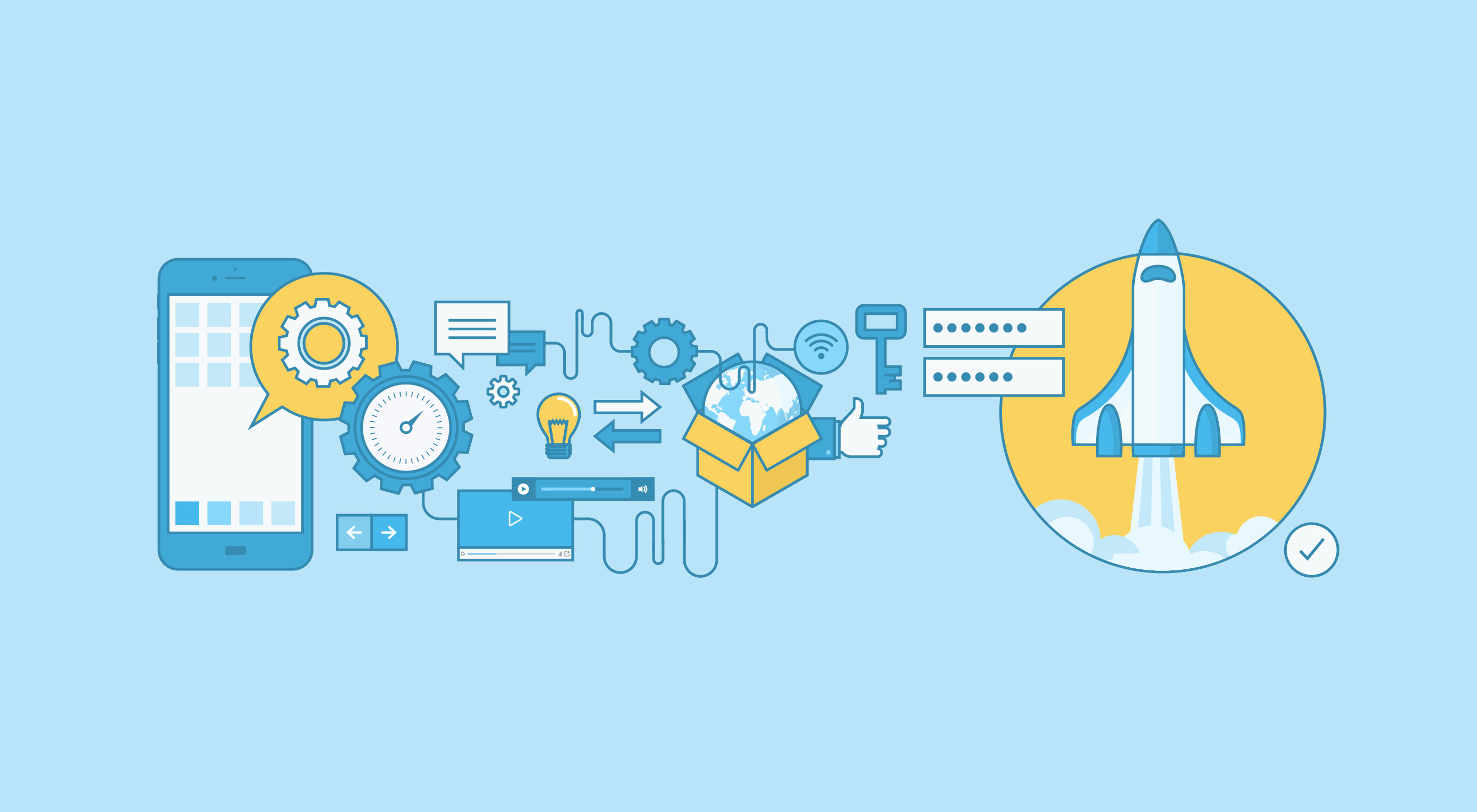
No, it’s not a clickbait title and yes, starting with $100 can get you an actual running store.

In this article I’ll go through every step you need to take to get your store up and running and explain the costs involved.

Granted, to keep the costs down you’ll do all the heavy lifting but hey, nothing worthwhile ever comes easy so let’s dive right in…

1. The Product

It might feel odd for some that I would go about explaining how to launch a $100 store and start with the product but truth is, the site, domain, logo everything needs to be tailored to fit the product you are trying to sell. The success or failure of your business will rely on your ability to select the correct product and the right market so don’t skip over this step.

Here’s a quick way to validate your idea: Go to Google Trends and type in a word that describes your product, eg: “phone case” or “headlights”. You’ll see in a graph below how much interest there is in a particular region like the US. Keep in mind you can also see the results of Worldwide searches but if you are going to target a particular region I’d advise you look there. Look for trends going up or have a steady above 40 interest. That’s what you are looking for.

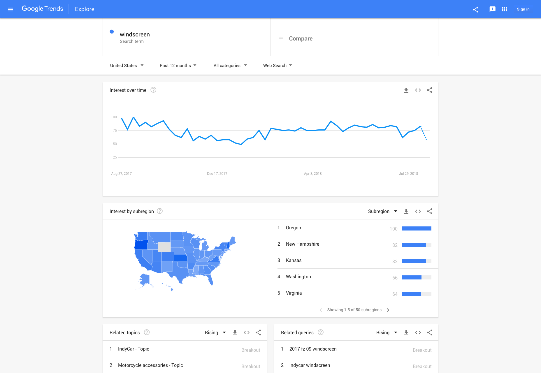
A couple of years ago I launched a business selling baby and toddler related toys, clothes, etc. When I looked at Google Trends I remember doing around 40 different searches and seeing what my audience was looking for to get a proper understanding of what my target audience looks for and what types of products I need to add to the store.

A second, yet just as important step here is to look for what your competition does, how they address their customers and look for negative feedback from their users. See what they do wrong and aim to improve on those aspects specifically.

Cost: $0

2. The Domain

So you found your product and market. Good for you. Now you need to get the domain that will bring in your flock of loyal customers and though it might sound irrelevant, the domain can really hurt you if you don’t get the right one.

So what makes a good domain name?

Good question. It’s hard to decide if you want to get something brandable or get some keywords in the domain name. If you end up using keywords in the domain name you’d give your viewers a clear idea of they’ll be getting when seeing your store but what if you want to pivot? What if you find out 6 months in, that the store is selling more than just whatever your keyword in the domain is. If your aim is to build a strong brand, then by all means, put your brand name in the domain.

In regards to the TLD (Top-level domain) you choose, get a “.com” if your audience is worldwide, and go local if you are targeting a specific country. It’s as simple as that.

Other than that, keep your domain name short, be unique and unless you have no other choice, avoid hyphens.

As far as providers go I usually stick to Godaddy.com or namecheap.com, both are great services with good service and solid support.

Cost: $10

3. The Platform (Self-Hosted Solution vs SaaS)

I could probably talk for the next hour on why you should pick one CMS or another, why you can go serverless or use a traditional hosting or even if you should go for a SaaS option or not, but I won’t go into that much detail. Instead, I’ll touch briefly on each subject and only talk about the main “players” in each category.

We’ve seen, the past few years, an explosion of E-commerce SaaS options, some better than others yet the fact that almost every week you hear about a new SaaS in this segment makes me think there’s still room for innovation.

What are the benefits of having a SaaS? Basically, you get to launch your store exponentially faster. You basically signup, add your products, set up payments and delivery options and you are good to go.

Before I get swarmed by angry mobs yelling at me for not talking about their favorite e-commerce platform provider, I want to point out that I’ll limit this article to only two SaaS platforms, that I think, are different enough to give you a wider perspective on how far you can actually go choosing an e-commerce SaaS.

SaaS

Number 1: the king of e-commerce SaaS: Shopify, an easy to use platform that will make sense for most people needing a simple shop with no need for a whole lot of customization. There’s a ton of support for it, themes, plugins and customizing your shop is really easy.

Number 2: a newer player in the SaaS space, yet special: Blugento, a simple to use SaaS, similar to Shopify in this regards, the difference being that behind the curtains, there a fully functioning Magento platform doing the heavy lifting. (I’ll talk about Magento as a self-hosted platform below.) The main benefit of Blugento is the scalability of the store, something lacking from all other providers and an aspect that’s incredibly important.

Self-hosted solutions are dime a dozen and they differ from one another by a number of differences but perhaps the most important one is the community surrounding it. This is a crucial factor for you and your store. Since you are reading a “$100 e-commerce site” article you probably can’t rely on a big team of in-house developers that you can breed, educate, and have lying around until that inevitable time when your site will go down.

And it will. It will crash in the most unexpected way at the most inconvenient time…

Cost: around $50/month

Self-Hosted CMS

…that’s why I’m going to only talk about the two biggest platforms, Magento and WooCommerce. They are both immensely popular with crazy big communities around them, testing, developing and pushing the platform to the limits.

Number 1: Magento has been around since 2008 and it quickly became a favorite amongst developers even if, at the time, there were bigger and more popular e-commerce CMS. Magento is not going to be for everyone, hosting costs are going to be higher, development is more complicated but in return, you get a versatile store with a lot of room for customization and it scales gracefully so when your business grows, your store can grow with it handling hundreds of thousands of products without a problem.

Number 2: WooCommerce is on the other side of the spectrum, easy to install, development is easy and you get a ton of free plugins and themes. Since it runs on top of WordPress development is cheap and it’s relatively easy to find developers to work on the store adding extra features. Compared to Magento, the management of inventory and orders is faster and easier but after about 50K products added to your store, you’ll have to think about upgrading to something like Magento.

Both self-hosted options described above will need a hosting company before they can see the light of day. I personally recommend going with hostgator.com or siteground.com but there are a ton of great choices out there.

Installing either platform is easy as both hosting providers offer tools for installing Magento or WordPress through a simple point and click wizard. No more messing with the console, creating databases and editing confusing PHP files.

Cost: $0 for the platforms, between $10 – $25 / month for hosting

Serverless

I’d be remiss not to mention serverless in this discussion as this is something that has been talked a lot about in the recent months and we’ve seen big names in E-commerce move their operations to the cloud, companies like Zalora.

Zalora moved everything to AWS, website, mobile apps, warehouse operations, everything is running off of EC2, S3, Lambda, and RedShift. They are the biggest retailer in Asia with over 20 million users and yet, their entire infrastructure development team is composed of 3 people, which for anyone understanding the difficulties running such a large website can say it’s amazing!

This is done through AWS Lambda, a service launched by Amazon that lets you upload small pieces of code that work as microservices, called functions—hence the term Functions as a Service or FaaS. They basically do a very specific task that your website triggers, returning a simple result. The technology behind it promises to allow developers to build websites and apps without having to worry about the backend or the infrastructure, all while keeping the costs at an all-time low.

There are three big reasons for switching to a serverless framework: cost, development speed and scalability. There are companies saving tens of thousands of dollars a month after switching to serverless and an average of 77% faster delivery speed of the products. Check out this case study on how serverless saves money in comparison to traditional hosting solutions.

Poor website performance is now measured in terms of lost customers and revenues

– Tom Lounibos, CEO, SOASTA

4. Branding

If I’d were to say branding is important I’d be grossly understating it. I will say that a solid logo and branding will make up the foundation of your successful store. So how can you build one that reflects your company’s image while still looking professional? Well, the easy way would be to throw money at it, but we don’t roll like that, so we’ll be doing this ourselves.

The first place to start is to look for inspiration and you do this by going through design and branding websites looking at the current trends, tutorials and any tips or tricks that will help you in this endeavor. My suggestion would be to start with sites like hipsthetic.com or designoholic.com and then try to expand your search to Pinterest.

Alright, you now have an idea of what you need but you aren’t going to pay a couple of hundred dollars per month for Photoshop because that will blow the entire budget we’ve set for ourselves. So what we do is we sign up with Canva.com. It’s free and it will get you started quite fast. After watching a 1-minute tutorial you’ll be ready to start creating your first logo.

Don’t stop at one. Make two or three and show them to a couple of friends to get feedback. After picking the winner get back to Canva.com and make a few more: one that has transparency; one that is all black; and one that is all white. You can use the color one for your website and the rest you’ll use to watermark catalog images (I don’t really recommend using watermarks on product images but if you absolutely have to, place them in a corner somewhere) business cards, social media posts, etc. You get the point.

Cost $0

5. First Marketing Steps

Alright, we almost made it. There’s only one little step ahead of us. And by little I actually mean the most important thing you’ll end up doing for your business.

SEO

Let’s start with something basic: on page SEO, sounds easy enough, right? Well, not exactly. There are a lot of moving parts when it comes to SEO and I won’t have time to go into much detail but I will let you with this awesome infographic that will teach you pretty much all you need.

Social Media

You probably know this by now, SM is a tool that you can leverage to get in front of the right customers. Start posting on a regular basis but be careful not to alienate your readers with overzealous posts promoting products. I recommend people use the 8 + 2 rule. You provide 8 pieces of useful content, regardless if it’s on your site or not. Content like tutorials, tips and tricks, peer reviews, etc. Don’t be afraid to test the water with this strategy, find out what your users like and with that type of content they interact and start sharing.

Content Marketing

This will be your bread and butter for the next few months. It’s crucial to have a blog where you can share your experiences and knowledge with your peers. As part of the content marketing efforts, you’ll have to do guest posts. Find like minded people who own blogs and start pitching ideas for guest posts. Most blog owners are fairly easy to reach and communicate with so I highly advise you do this. Guest blogging on small blogs is a great way to reach new audiences but perhaps even better than that would be to go on Medium.com. It’s a great platform to publish content, with a ton of viewers, so I’d strongly suggest you try it out.

6. Advertising

So if my math is correct after getting set up with your website domain and host you’d be left with $30 to $40. I’d advise you drop a few dollars in Facebook ads. It’s easy to do, you don’t need to spend money on a consultant and Facebook has a bunch of tutorials on this. What I’d suggest you do is select the best products you have in your store and create a carousel. Have at least 4 products in there. Select a small audience with the demographic that fits your niche and place a $5 limit on the ad spending. You’ll have around a week to tweak the ad and if you have the right combination of audience and product, chances are you’ll have made your first sell by now.

The Grand Total

If you do the math, going with a self-hosted solution will cost around $50 to host ( for a 5 or 6 month period), add to that $ 10 for the domain and you get to $ 60. You’ll have to host it yourself, do all the maintenance and configuration but you get to have about 6 months to make up your investment.

Going with a SaaS will cost around $60 but you will be done and ready to go in a couple of days which is great if you don’t want to spend time learning to code or set up a CMS. The downside here is that your $50 will cover only that first month which adds to the pressure of making a few sells (which shouldn’t be a problem).


Featured image via Depositphotos.

Add Realistic Chalk and Sketch Lettering Effects with Sketch’it – only $5!

Source

p img {display:inline-block; margin-right:10px;}
.alignleft {float:left;}
p.showcase {clear:both;}
body#browserfriendly p, body#podcast p, div#emailbody p{margin:0;}