Original Source: http://feedproxy.google.com/~r/CreativeBloq/~3/Du0sr5LXYvE/photoshop-actions-912784
Adobe's flagship image editing software Photoshop has a powerful programming language built in that allows you to record tasks as an 'action' and replay the steps to complete the task automatically. Not only can you record your own but you can also import actions, opening up a whole range of effects and time-saving options.
Get Adobe Creative Cloud now
So to add to our collections of Photoshop plugins and Photoshop brushes (not to mention our best laptops for Photoshop buying guide), here are some great Photoshop actions that are free to download and install, for photographers, graphic designers, game artists and more.
You can jump to the section you want right now from the drop-down menu above, but you should definitely bookmark the entire list to check out the rest later – who knows where inspiration will strike.
Photo filters
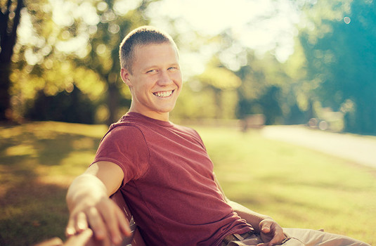
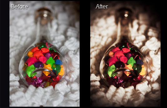
01. Mystical Light
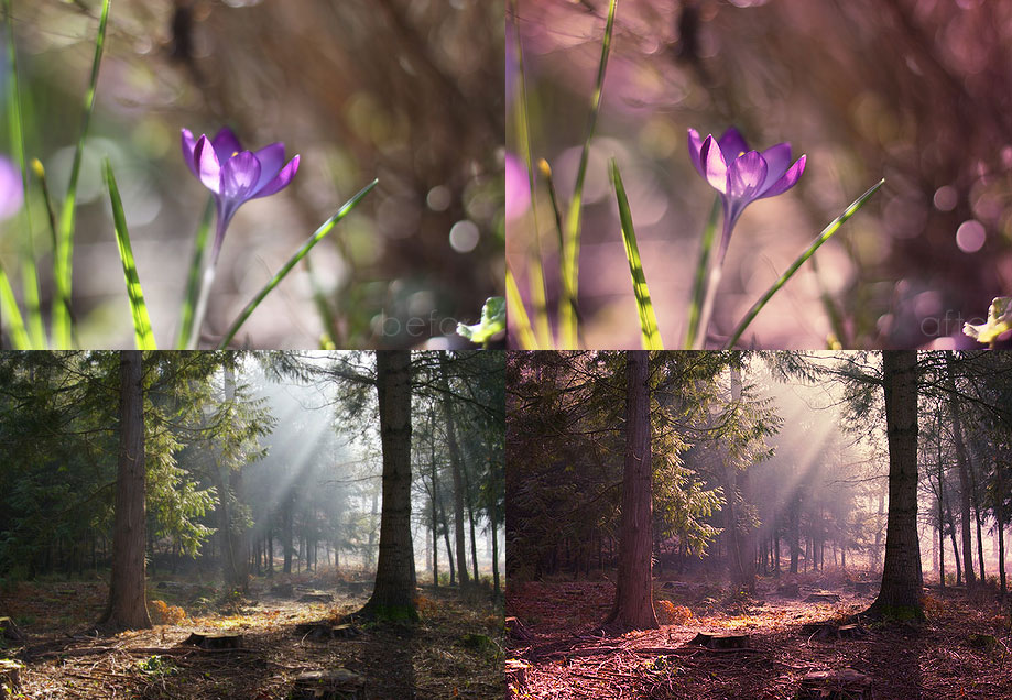
‘scuse me while I kiss the sky
Give your photos an other-worldly air with this Photoshop action from Megan Joy. It'll infuse landscapes with a magical purple haze, enlivening any shot with an ethereal purple haze and giving any location the atmosphere of a mysterious fairy dell.
02. Instant Hipster
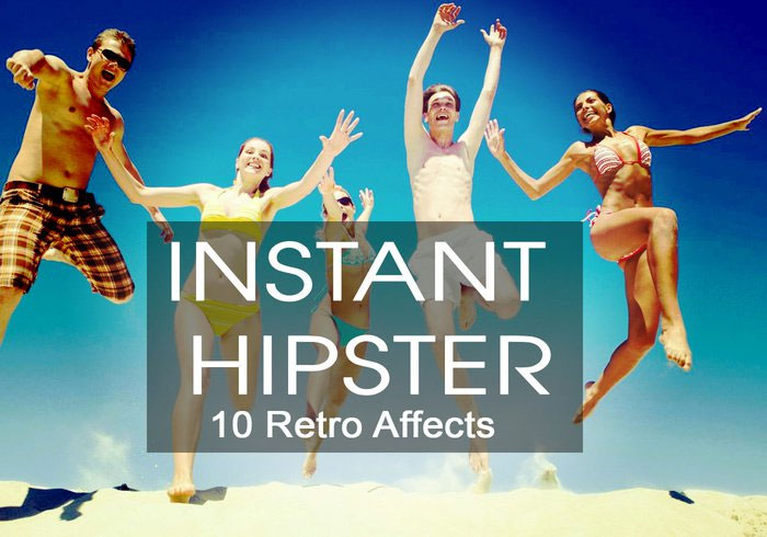
Get those trendy effects you love with one click
For those times you want to give your photos a one-click Instagram effect, Instant Hipster's the perfect solution. It comes with 10 ready-made filters – Amaro, Mayfair, Hudson, Valencia, X-Pro II, Willow, Sutro, Hefe, Nashville and 1977 – so you can find just the retro effect you need in seconds.
03. Nightmare
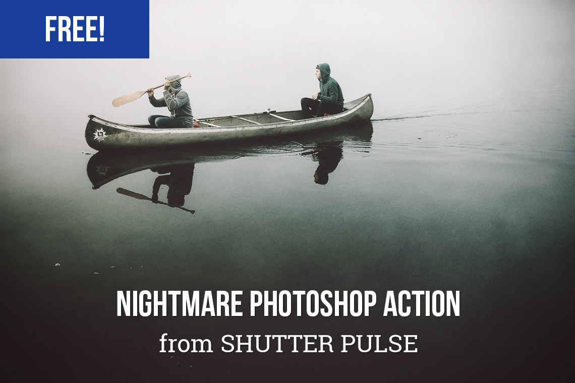
…and they were never seen again
If your photos just aren't sinister enough for your liking, this free action should make things a little more unsettling. It's designed to let you easily give your photos a dark, haunting effect. Perfect for creating the impression that you're permanently about to stumble into mortal danger.
04. Cold Nightmare
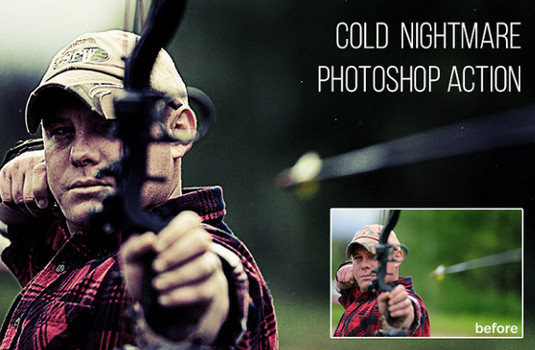
Damn it, stand still when I’m trying to skewer you
This amusingly-titled action will transform a photo of a perfectly innocent scenario into a window into a dark world. In this example image, the archer probably shooting at a target takes on the look of someone who is definitely trying to kill a human. It’s amazing what some shadows can do.
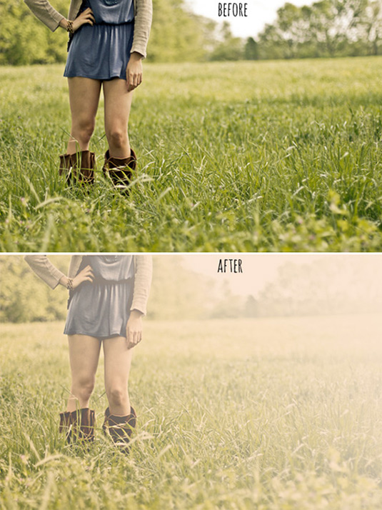
05. Summer Haze
Get that summer feeling again
If you'd prefer to cheer up your images, take a sunny shot and make it intensely summery with this great turquoise haze effect. Outdoor portraits taken in natural light are most suitable for this filter.
06. Hazy Afternoon
Hazy Afternoon adds a soft gradient colour layer
Perfect for outdoor pictures, the Hazy Afternoon action certainly lives up to its name by creating a soft gradient colour layer. You can use this free action on black and white or colour images, plus you can easily adjust the gradient until you get the exact look you're after.
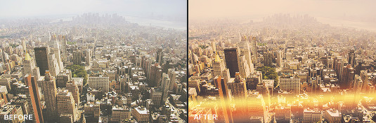
07. Sun Kissed
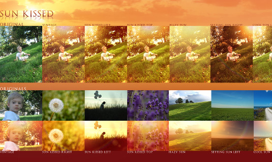
Sun Kissed will brighten and tone even the drabbest landscape
Light up any image with this comprehensive collection of sunlight effects that'll brighten and tone even the drabbest landscape. Simply add a bit of a warm tone, or go the whole hog and throw in a setting sun complete with a lens flare effect; it's all there.
08. HDR Action
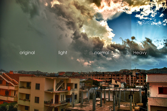
Ramp up your HDR contrast with these actions
Remove the lack of contrast that comes with HDR photography with this set of four actions; HDR fix Light, Normal, Heavy, and Clicker.
09. Strong HDR Effect
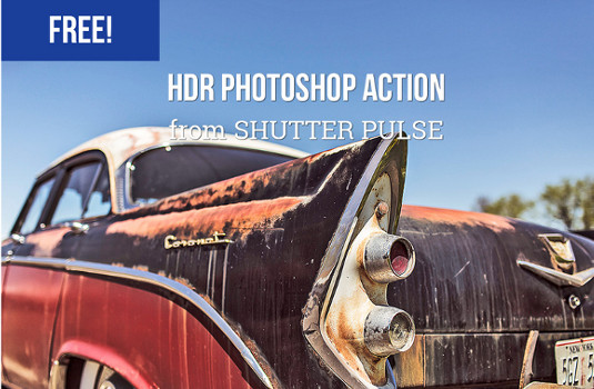
Get vibrant colour effects with this free HDR filter
Alternatively, try getting vibrant colour effects with this free HDR filter from Shutter Pulse. If it works well for you but you’d like more options, it’s part of a set of 30 HDR actions that you can buy for $13.
10. Blue Evening
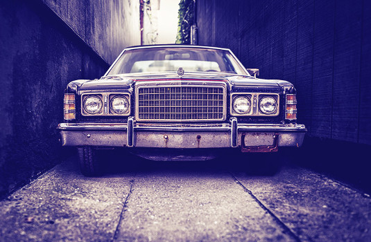
Add a mysterious atmosphere to your shots with Blue Evening
Blue Evening is the free component of a paid-for set called Touch of Drama, which gives you various ways to add a mysterious atmosphere to your shots. The strength of the blue cast depends on your starting colours, so click through to see a good selection of examples.
11. Night to Twilight
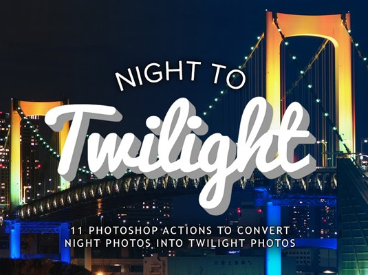
Turn your nighttime images into twilight photos
This set of 11 actions convert your nighttime images into twilight photos by introducing a colour cast and lightening the sky. The effect is rendered using layers, so you can adjust the degree of twilight by reducing the layer’s opacity, making it nice and flexible.
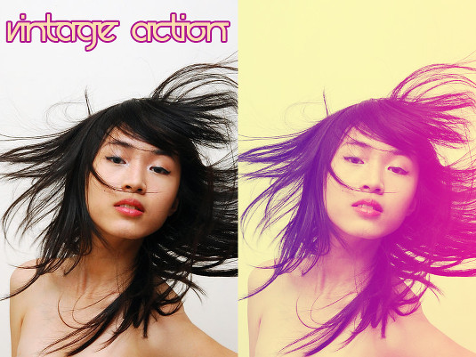
12. Purple Contrast
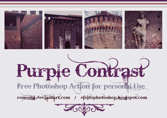
A bit of purple can give your photographs a dramatically downbeat look
This free Photoshop action washes out some of the colour from an image and gives it a purpley hue. It's a good way to give your photographs a dramatically downbeat look.
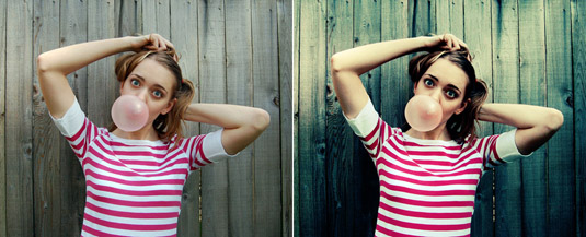
13. Bella
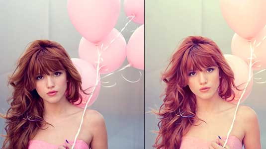
Create a romantic, nostalgic feel with a pink cast
This action adds a beautiful warmth to your photographs, bringing out rich tones in hair and skin, and softening colours with a pink cast that creates a romantic, nostalgic feel.
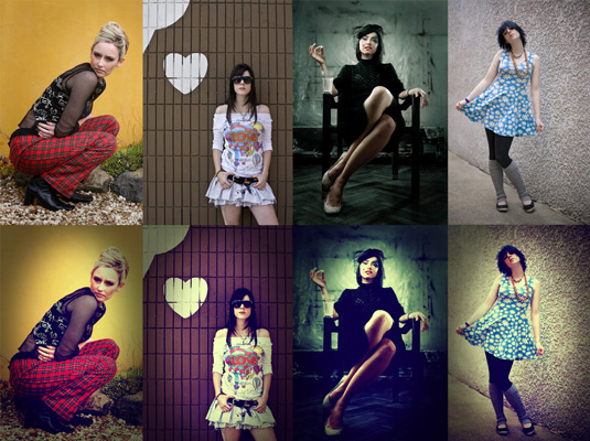
14. Wedding Enhancers kit
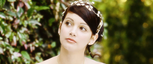
These actions are ideal for fixing wedding photography
Photoshop actions are extremely useful for wedding photographers dealing with a huge number of shots. Here you get a set of 11 actions that automatically create common portrait effects, especially around the theme of wedding photography. The set includes skin smoothing and soft filter effects as well as black and white conversion.
15. Photoshop Color actions
Here’s a handy collection of colour treatments
A nice range of colour treatments including rich, grainy black-and-white, bleach bypass, and some heavy casting effects. Great for experimentation.
Next page: Vintage photo filters
16. Vintage Light Leak
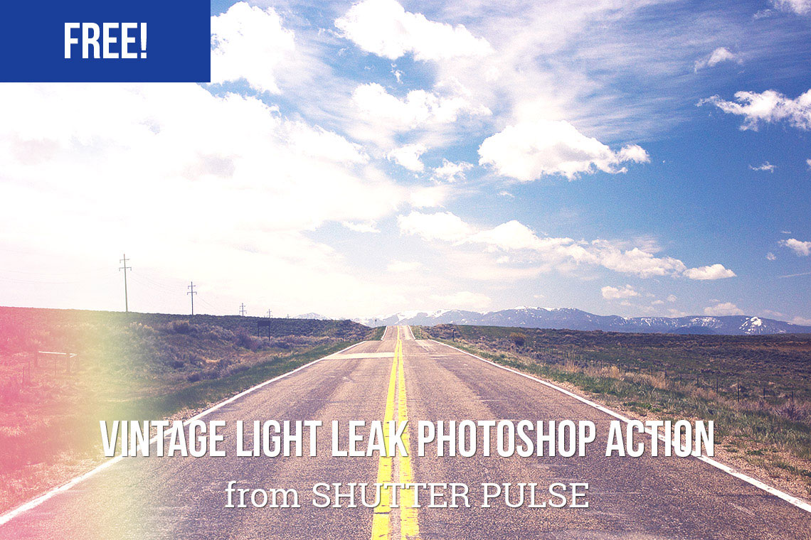
Get that knackered old Box Brownie look for free
Sometimes you don't want your photographs to look too good; a little imperfection can add to a shot's charm, and this vintage light leak action is one way to achieve that effect. Send it into action and you can turn any top-end DSLR shot into something that looks like it was taken on an antique camera.
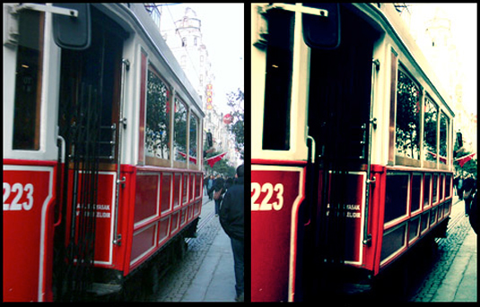
17. Cross-processing ATN
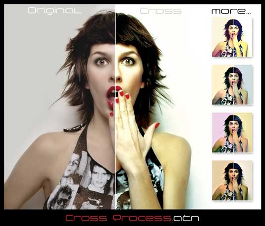
This action lets you cross-process without all the mess
Cross-processing is a traditional photographic technique involving deliberate processing of one type of film in a chemical solution intended for another, resulting in oddly skewed colours and increased contrast and saturation. This free Photoshop action gives you a way to recreate the effect digitally, and is available free for personal use.
18. Cross Processed
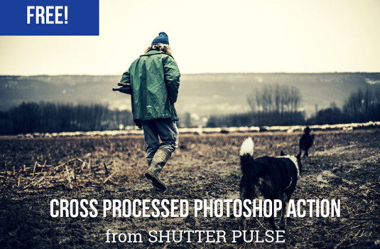
Add drama and vivid colour effects to your images
This action adds drama and vivid colour effects to your images by deepening shadows and making colours more saturated. It’s especially good for stormy skies, landscapes, buildings and ocean scenes.
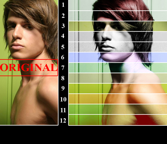
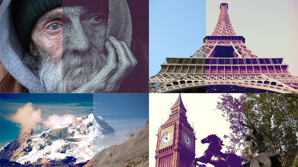
19. Color 024
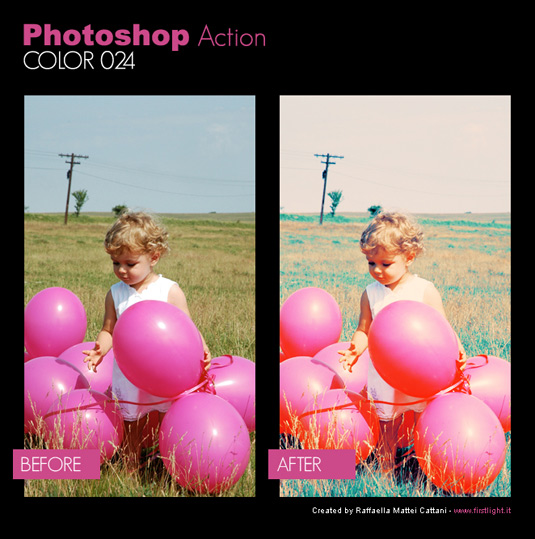
Create rich, sun-bleached photos that still retain a high level of detail
Digital pictures are crisp and precise, but sometimes they can lack that nostalgic glow of a film photograph. By downloading this free action, you can adjust the colour saturation and create rich, sun-bleached photos that still retain a high level of detail.
20. 2-strip Technicolor
This action simulates the 2-strip look without damaging the original image
Recreate the look of 2-strip Technicolor film by downloading this free action. Popular in the 20s and 30s, 2-strip technicolor film exposed black and white film behind a green filter and a red filter. By merging the green and blue channels in different layers, this action simulates the 2-strip look without damaging the original image.
21. Light Leaks
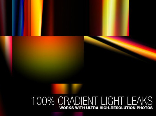
These gradients are ideal for adding non-destructive vintage effects to your images
This handy selection of light leaks has been created using gradients, making it very flexible for adding non-destructive vintage effects to your images. The free version includes five high-quality leaks, all featuring support for 16-bit colour so you can achieve brighter-than-white highlights. And they work with video, too!
22. Hard Lomo
If you like your lomo action hard, look no further
Deviant Art is a great place to find Photoshop actions, as this example from BlackLaceStock demonstrates. Included here is a set of actions that add a classic lomo-look to your images, akin to applying an Instagram effect.
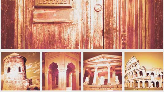
23. Retro Style filters
These 35mm-inspired effects include some lovely gritty options as well as colour treatments
Chris Spooner is well known for his excellent Photoshop tutorials and giveaways, and he doesn’t disappoint with this new selection of 10 free retro-style Photoshop actions. Each of the effects is inspired by 35mm film and processing techniques, and includes some lovely gritty options as well as colour treatments.
24. Polanoid Generator
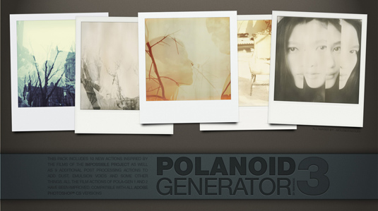
Polanoid’s one of those Photoshop actions you’ll use again and again
Turn any image into a Polaroid instantly with one of 10 different effects. It includes colour treatments and shadows automatically, and it's one of those Photoshop actions you'll use again and again.
25. The Mini Collection
There’s plenty to play with in this taster selection
Featuring some impressive retro Photoshop actions, plus a kit of light leaks and some vintage Photoshop brushes, the Mini Collection from FilterGrade is a free taster of its larger $49 FilterGrade bundle.
26. Old Photo
Add colour and contrast with this old photo action
Want to make your images look like they’ve through a time warp? Then get experimenting with this old photo action, which adds colour and contrast.
27. Portrait
Create a vintage effect with a spot of desaturation
Desaturate the colour in your photography with this portrait action, which creates a gorgeous vintage effect.
28. Split Toning
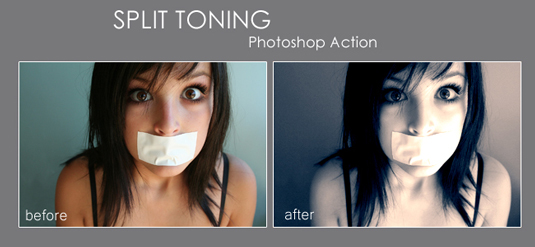
Make those ransom notes really pop!
The area between greyscale and colour is split toning, and adding this slight change to your photos can have a dramatic effect. You can also create retro and abstract images with this technique.
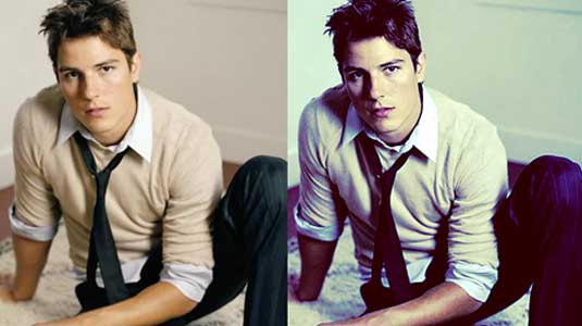
29. Amatorka
Get the action movie look with Amatorka
Create an instant action movie-style colour treatment with a blue-green cast, rich saturation and increased contrast.
30. Set14
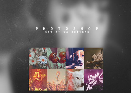
Fill your boots with these vintage actions
If you're after a vintage effect for your photography but you're not entirely sure what, nab this collection from DeviantArt user Yeonseb. It contains 14 assorted vintage actions, so you're bound to find something to your liking.
31. Thinking of You
Add a filmic, green-cast and heavily saturated shadow effect
This is another stylised photographic treatment that adds a filmic, green-cast and heavily saturated shadow effect. The end result feels very fashion-orientated.
32. Unspoken
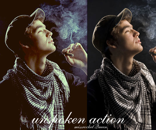
Use Unspoken to heighten details and increase contrast
This simple action creates a beautiful blockbuster film look, heightening details in your photographs and increasing contrast, while introducing a blue/green tint.
33. Vintage
Turn lowlights into colourful highlights with this Vintage action
This simple filter give your photos a tinted, washed-out look with an extra neon touch that'll turn lowlights into colourful highlights.
34. HipstaRev
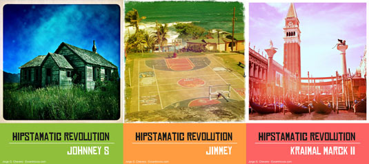
Get the Hipstamatic look in Photoshop
This set of actions creates Hipstamatic-style images inside Photoshop. The download includes three actions, each of which creates a recognisable treatment including borders and noise.
Next page: Monochrome photo filters
35. Bold B&W HDR
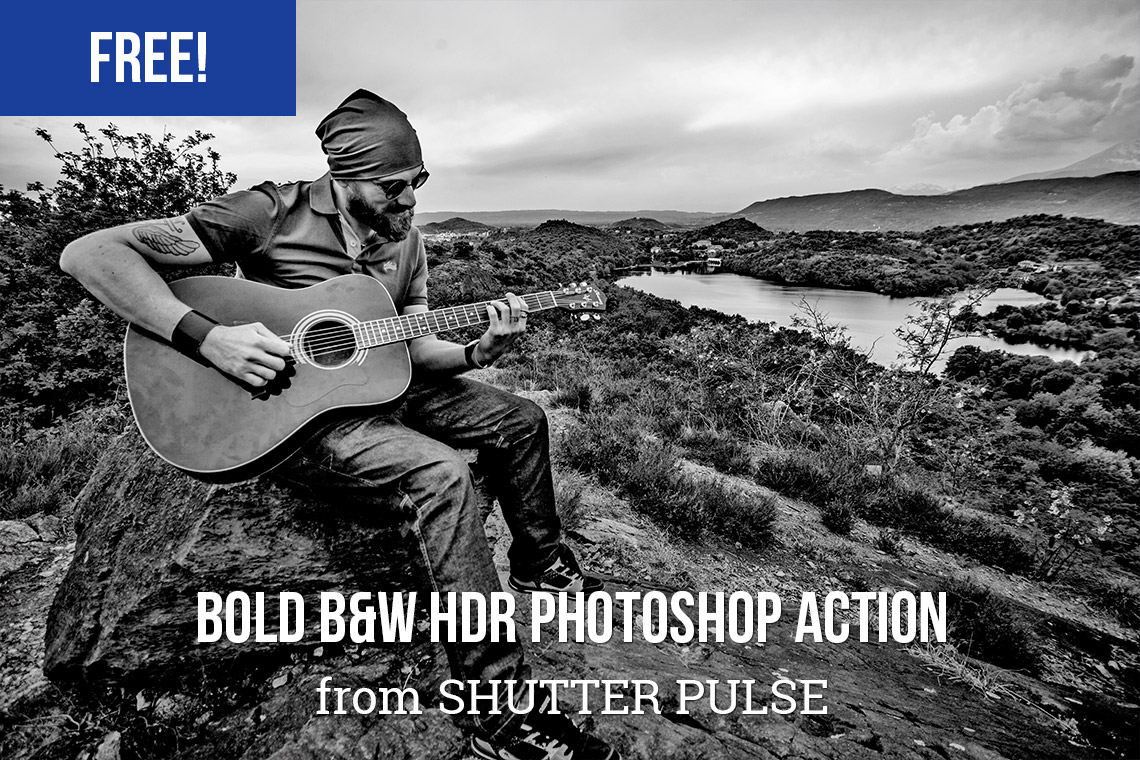
Why should colour pictures get all the HDR fun?
It's not just colour photos that you can apply the HDR treatment to. With this free action you can give any photo a bold, black and white, HDR-style look that'll make it really stand out.
36. Infrared Photography
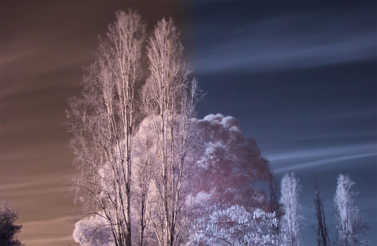
Add some infrared chill to your pictures
Add the eerie touch of a cool infrared chill to your pictures with this free Photoshop action. This action creates two adjustment layers inside a layer group, allowing you to change the red and blue balance, as well as the contrast.
37. High Key
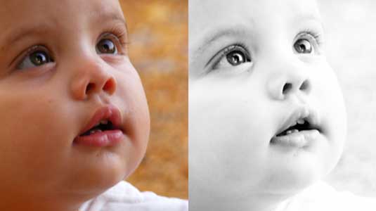
Turn any photo into a stunning high-key portrait
This action requires a credit if you use it, but offers a very simple way to convert a regular photograph into a stunning high-key portrait with clean lines and an almost dreamy finish, without compromising essential areas of contrast.
38. Lithprint
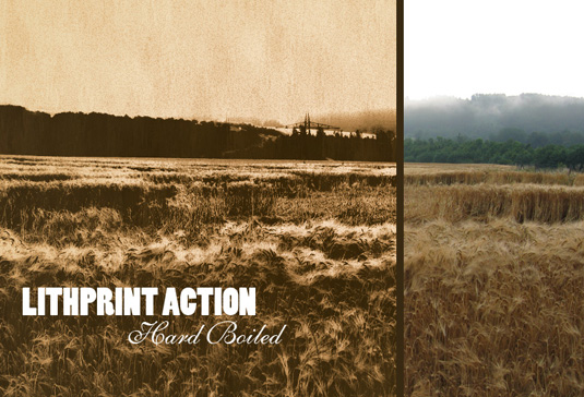
Lithprint turns photographs into striking lithograph-style images
Create a lithograph-style image from your raw photos. This works best on larger images that have already been given a medium-contrast treatment.
39. Gum Bichromate Print
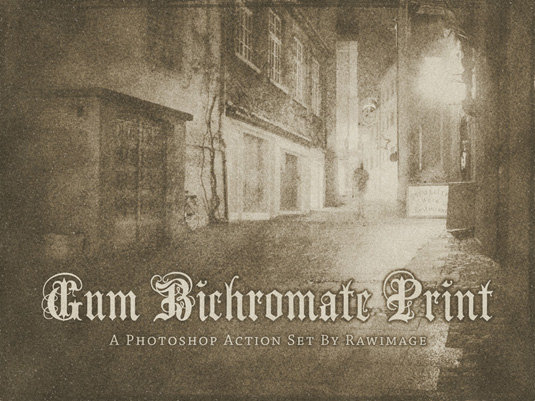
Emulate the early days of photography with this action
Emulate 19th century gum bichromate prints with this straightforward action that produces beautiful textured effects.
40. Black and White
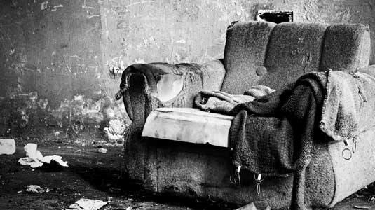
Get a grainy black and white look that’s heavy on the black
This action adds a punchy, high-contrast black and white effect to your photographs. It produces a nice grittiness with heavy grain and over-saturated blacks. Great for creating a stylised image.
41. Dramatic Sepia
Dramatic Sepia’s contrast curve gives a slightly more refined version of the standard sepia effect
This superb action offers a slightly more refined version of the standard sepia effect by adding a contrast curve to age the final result so that it feels like a faded photograph. Dramatic Sepia offers a great way to communicate a sense of age.
Next page: Touch-up techniques
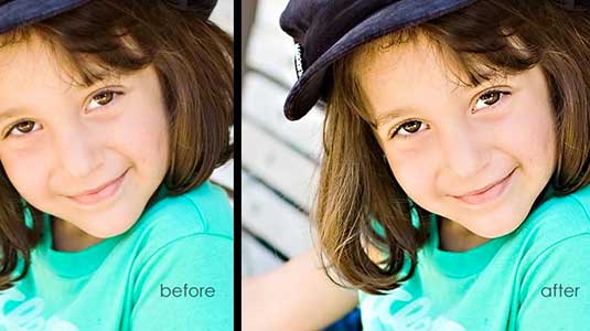
42. 5 Skin Retouching actions
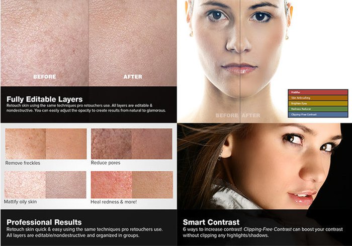
Sort out your skin the easy way
Want to retouch skin like a boss? This set of retouching actions will give you a head-start, enabling you to heal, mattify and airbrush skin with one click, and also enabling you to brighten eyes and increase their contrast.
43. Express Eye Bright
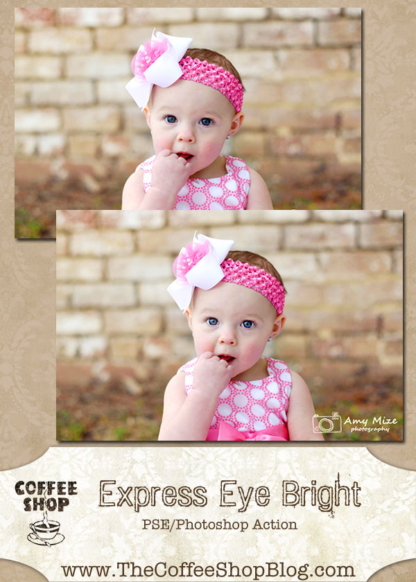
Brighten up dull eyes with this quick and easy enhancement
Quickly put a bit of sparkle into dull, dark eyes with this easy eye enhancement action. Simply click on the background layer (or the layer with the eyes you want to sharpen), run the action, and paint on the layer mask to sharpen and brighten the eyes.
44. Teeth Whitening
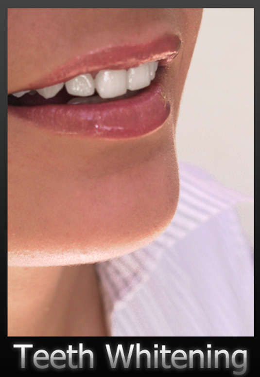
Alternatively, just brush your teeth properly, for pity’s sake
Teeth aren't naturally a dazzling white, but sometimes they can appear grey or yellow in photographs, depending on the lighting. This useful action can easily brighten up the smiles of family and friends by giving their teeth a clean, white finish.
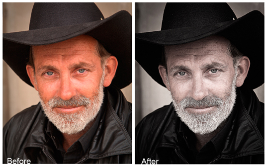
45. Bright Eyes
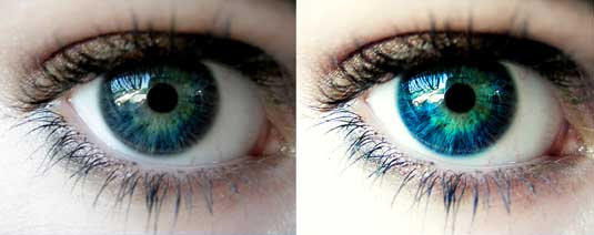
Another way to bring dull eyes to life
This free Photoshop action gives an intense look to blue eyes, as shown above. A great effect for extreme closeups.
46. High Definition Sharpening
This action offers a simple one-click solution to sharpening
The final stage of image preparation should be to sharpen your images according to the final delivery method (you sharpen differently for print or screen). This free action from MCP Actions offers a simple one-click solution to sharpening, with the ability to control the degree of sharpening that’s been applied after the fact by adjusting the opacity and masking of layers.
47. Soft Skin Tones
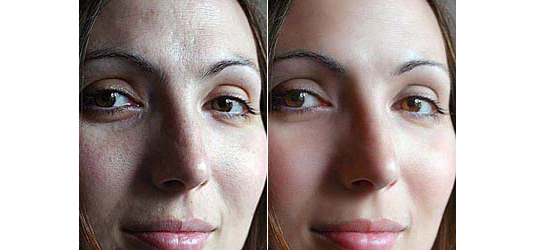
Smooth skin while retaining textures and colouring
Used in combination with an existing selection or mask, this smooths skin while retaining textures and colouring, saving clean-up time.
48. Remove White Background
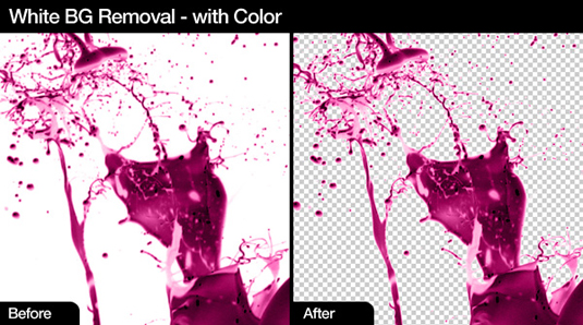
Get rid of white backgrounds with these actions
Automatically remove white backgrounds with this suite of three actions that allow for different automated processes to strip out the background of your isolated images.
Next page: Special effects
49. Vectorize Me Babe
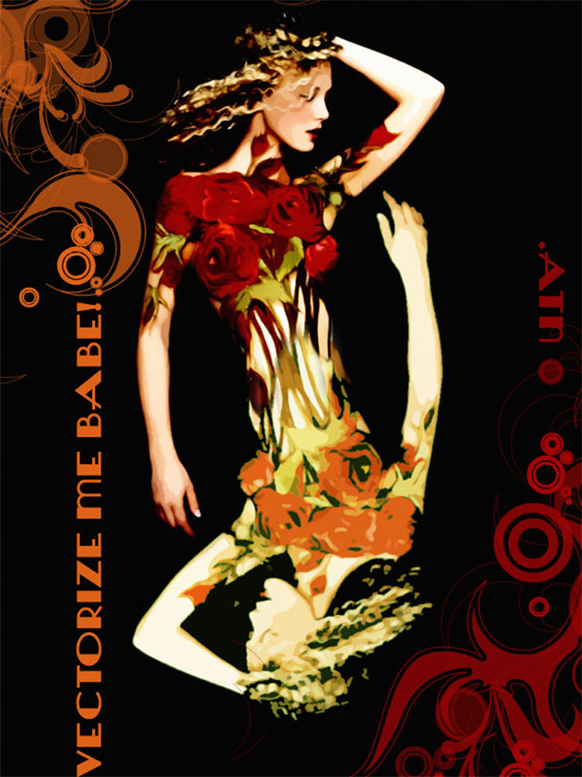
Get a vector look without Live Trace
Giving photos a vector look can be hard work; the obvious thing to do is paste them into Ilustrator and use Live Trace, but getting the effect you want can take a lot of fiddling with settings. Instead, use Vectorize Me Babe; put it into action and you'll get an instant vector effect, which you can amplify by simply running the action again.
50. Glitch Effect
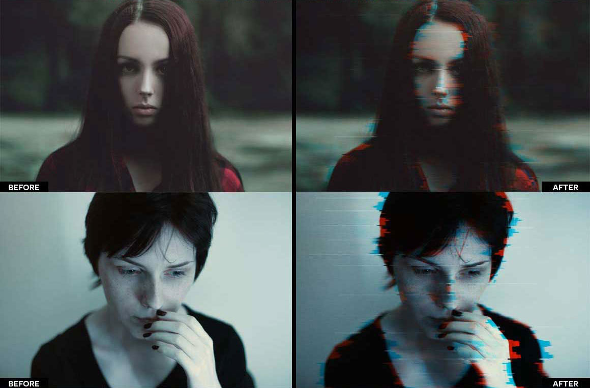
Get your glitch on with this fabulous free action
You can't beat the look of stuff recorded onto a knackered old VHS tape, and this free action by Syed Faraz Ahmad does a pretty good job of recreating it, with plenty of glitches and colour smearing.
51. Plexiglass
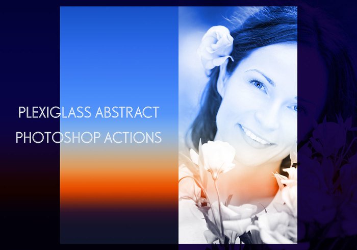
Plexiglass makes it a doddle to add abstract effects to your photos
Transform your photos into posters, covers or backgrounds for text with Plexiglass, a set of Photoshop actions that make it easy to add abstract effects and borders to any image with a single click.
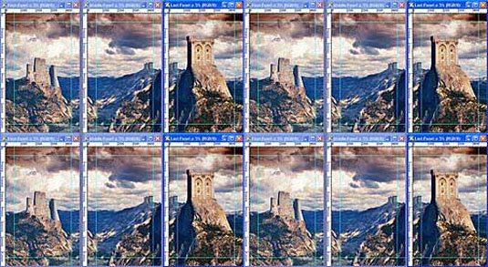
52. 3D Isometric Map
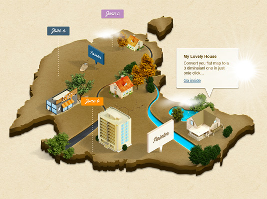
Why bother with flat maps when you could have an isometric 3D map?
A brilliant action that converts a flat vector map into an isometric 3D map mockup. There are three different styles of map available: sand, ice and grass, and the action also allows you to drop in your choice of buildings, trees, landscape elements and signs.
53. Pencil Draw
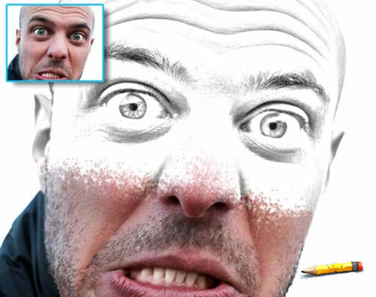
Quickly turn a colour photo into a pencil sketch
This action uses contrast to find the edges in your image and automatically render a pencil sketch effect. Start from a full-colour image with no need to convert to black and white first.
54. Stickers and Tapes
Stickers and tape in one package!
Create round stickers with a curl in the corner, or polaroid-style images with clear sticky tape holding them in place. This site requires you to register for free before you can download the action.
55. 1930s Glitter Text
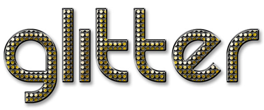
Get a bit of glam with this snazzy effect
Automatically convert your text into a snazzy 1930s-style retro treatment with shiny sequins and a nice 3D effect. It’s also easy to adjust after running the action, as all the layers are retained.
56. Stamp Generator
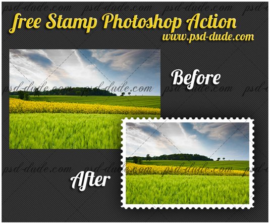
Please don’t use this to forge postage stamps
Turn an image into a stamp automatically using an included Photoshop brush to define how the frill will sit along the edge of the final artwork.
57. Denim & Leather
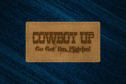
If you’re planning your own range of jeans, this is a must
This Photoshop action automatically generates a blue denim texture, 'sews' on a leather patch and embosses your own artwork onto the leather. The nice, simple and effective output could be adapted for a variety of purposes.
58. Spotlight
Make details stand out with this virtual spotlight
Make the focal point of an image really stand out with this action from Christopher Fowler, which will train a virtual spotlight on your picture.
59. Fold Paper
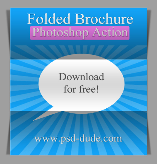
Turn artwork into a virtual mockup with this neat effect
Automatically render your artwork onto a trifold paper design in pseudo-3D, complete with shadows and shading on the image. Ideal for rendering paper designs ahead of presenting them on-screen to clients.
60. Long Shadow
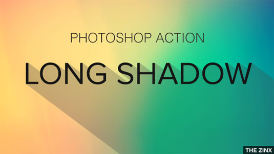
Still doing flat design? Here’s the cherry for your flat cake
This free Photoshop action allows you to create a long shadow from your text content, and you can tweak the shadow’s opacity.
61. Triptych Generator
Create standard triptych panels for print
Generate standard triptych panels for print, with a 3D effect visual triptych generator also available. Print sizes include 1000x600mm, 1300×800, 1600×1000 with 50mm depth at 288dpi.
62. Action 3D
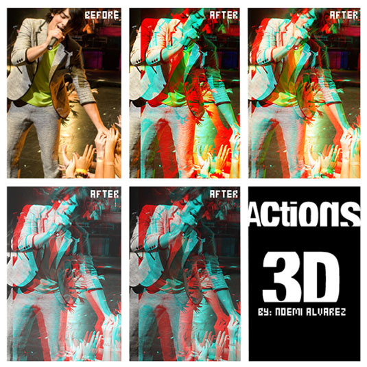
Get a fake 3D effect with this channel-juggling action
This quirky action from JonasFan93 creates a pseudo 3D anaglyphic image by separating out colour channels within your image and offsetting them. This freebie offers a number of different styles that are more suitable for use in printed brochures and website design where you’re aiming for a stylised effect.
63. Outer space
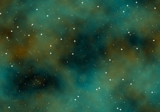
Finally! The final frontier
Create an outer space background automatically complete with space dust and nebulous gases. This action randomly colours the scene to produce a different effect every time.
Related posts:
The 60 best free Photoshop brushesBest free fonts for designersTop Photoshop tutorials


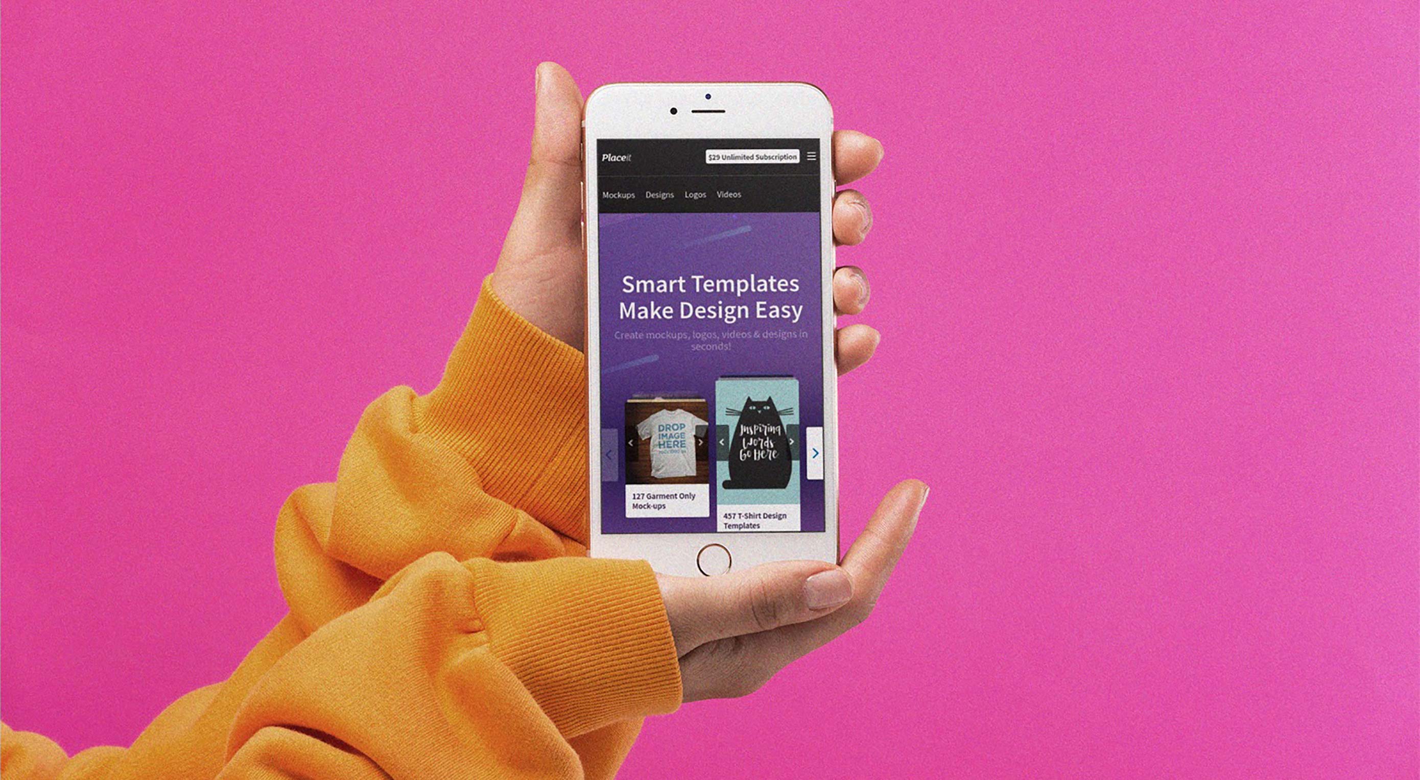 Placeit offers thousands of smart templates which you can customize by simply clicking a few options, while still keeping a professional layout. You won’t have to worry about resolution, dimensions or proportions. We promise your designs will always look sharp since there’s no way you can mess it up.

 CSS Grid and CSS Flexbox are complimentary web layout technologies that have been hotly anticipated for years. However, despite some superficial similarities they are actually used for very different tasks; they each solve a very different set of problems.