UX for emerging experiences
Original Source: http://feedproxy.google.com/~r/CreativeBloq/~3/gXjVXQFPctg/ux-for-emerging-experiences
As the web landscape changes so does user experience and to stay competitive you need to embrace the new. One thing that doesn't change is the user. If they have a poor user experience they will simply look elsewhere. So what are the emerging experiences that you need to consider today?
The theory of UX
These are the seven key themes that you should be designing for: inclusivity and accessibility, immersion, trust and transparency, coherence, conversation, collaboration and efficiency. Alongside these key themes we reveal the tools that you will need to ensure design success.
Design for inclusivity
Sometimes referred to as 'Universal Design', inclusive design considers as many people's needs and abilities as possible, instead of a 'one size fits all' approach to the experience.
As designers it can be easy to unwittingly design for those that are just like us, or prioritise these considerations due to tight budgets or deadlines. As designers we should be aiming to include people with varying ranges of cognitive or physical disability, rather than exclude them. Designers should do this by removing the barriers that create extra effort and separation, enabling the end user of your product or service to have the confidence to participate equally, and without support.

Tech For Good also has a podcast
Over the next year, expect to see inclusive and ethical design become an expected part of the UX Design process. Fortunately, there are plenty of other people getting involved in the digital community, with social movements such as The A11Y Project, AXSChat and Tech For Good gathering rapid momentum over the past 12 months. These groups provide a supportive space for designers to learn more about the inclusive design process and the problems that different people face when using technology.
Inclusive design shouldn’t be confused with accessible design.
Inclusive design shouldn't be confused with accessible design. Products and services are usually made accessible as an afterthought; for example, a watch might be retrospectively made accessible for blind people by including braille numbering on top of the watch face. This modification to a device designed for those with sight may solve one technical problem, but introduce many more issues for those that are blind. Inclusive design seeks to fundamentally redesign a product from scratch, removing barriers from the start. Inclusive design is proactive, not reactive.
When starting any new project, one of the most important questions UX designers should ask themselves at all stages of the design process is, 'Who will this design exclude?'
Top tools
Funkify Disability Simulator
Funkify is an extension for Chrome that helps you experience the web and interfaces through the eyes of users with different abilities and disabilities. Funkify is created by a team of usability and accessibility experts in Sweden. Stark
The colour-blind simulator and contrast checker for Sketch. Simulate the various forms of colour-blindness by quickly previewing your Sketch designs and make adjustments as needed.Contrast
A macOS app that provides access to WCAG colour contrast ratios. The entire app UI updates instantly when picking colours, making it easy to get the colour contrast information you need to make informed decisions about the colour of your text.
Design for immersion
Traditionally, UX designers had a clear separation of realities to design for: real life, and the experience delivered on screen by the person's device. Now the lines have been well and truly blurred with Augmented Reality (AR) and Virtual Reality (VR) entering into mainstream use. It's not enough to design for screens, pages and offline touchpoints anymore, now the concept of multiple dimensions opens up a plethora of ways to enhance the experience.
A whole host of interactions can be incorporated into designs, such as picking up, pinching, pushing and pulling, facial expressions, and even air tapping for Microsoft's HoloLens. To get them to do this, you must also think about the cues you will give users that are used to interacting with flat screens, how will you encourage them to look around in the space?
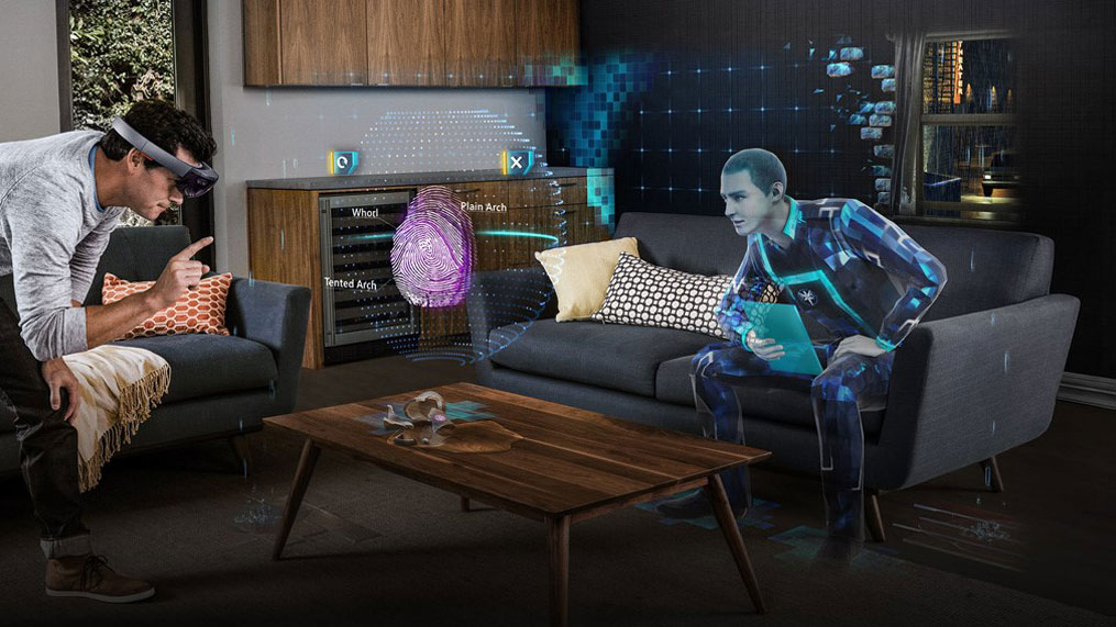
Microsoft HoloLens brings holograms into the real world
With new immersive technologies you can now use audio to grab attention, or display elements just off screen to prompt them to move left and right. This new technology also gives you the opportunity to play around with objects in a 3D space, so it's important that designers become comfortable in how shadow and light can be used to create the illusion of depth and mass for objects in the interface.
Designers also need to be conscious of the right context to use these interactions. As a user interacting with an Augmented Reality app whilst driving would be entirely inappropriate, and it might be that a voice interaction is more suitable in this type of scenario. Thorough research and testing is required of the UX practitioner to find and understand these contexts and user goals.
Overall, expect the prevalence of AR and VR to increase rapidly over the next few years as businesses and organisations find ways for this technology to fit their business models.
Top tools
A-Frame
A-Frame is a web framework for building VR experiences. Originally developed by Mozilla, it is an independent open source project. A-Frame is HTML, making it simple to get started.Microsoft HoloLens
Microsoft's 'mixed-reality' product, HoloLens, is the first self-contained, holographic computer, enabling you to engage with your digital content and interact with holograms in the world around you.
Design for collaboration
As UX Designer and its many permutations become more ubiquitous as a role, teams are growing and they have a bigger seat at the table. As a result, more business stakeholders are interested in knowing – or even being involved – in what you're doing.
The UX role has now matured, and there are plenty of online communities, tools, conferences, and books aimed specifically for the UX designer. To complete the perfect storm, the digital marketplace is also saturated with multiple offerings for a single type of product, and organisations are more willing to invest the time in creating unique user experiences to make them stand out in a fiercely competitive crowd. Suddenly, UX practitioners find they not only have a voice, but are influential in navigating a product or service to market.
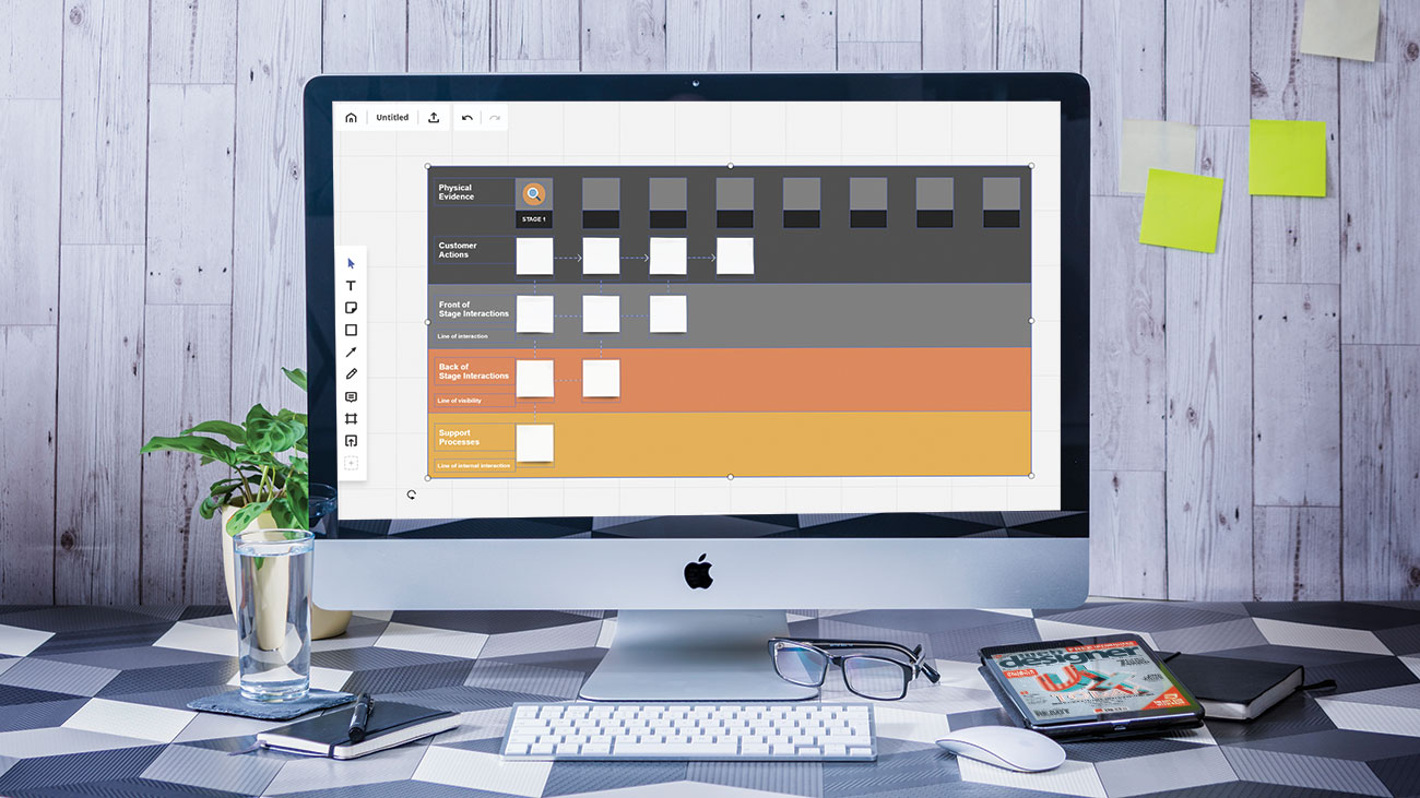
Use RealtimeBoard to design journey maps, personas and other planning canvases
Superior soft skills are the secret weapon behind superior UX teams. This includes communication, listening, empathy, workshop facilitation, teamwork and storytelling. These provide the foundation that all other deliverables are based on. How do you know if the prototype you are testing will meet a user need if you have not listened properly in the research phase of the project?
These skills are not an innate talent and need to be practised just like any other skill. Not only that, but developing your soft skills as a team enables you all to communicate properly with one another, forming a common strategy so you can all aim for the same goal. There are many good UX practitioners, but great ones have exceptional soft skills to help them do their job.
Collaborating with the customer or client is also essential to a smooth-running project. There are many tools such as Marvel, InVision and Axure that will enable you to quickly prototype up your work to show them the 'Promised Land', instead of sending emails back and forth you can now make your solutions come alive. The benefit of this approach is increased buy-in from clients and customers, and frictionless collaboration.
Some of the biggest obstacles to collaboration come from people not understanding what UX activities entail.
Some of the biggest obstacles to collaboration on a project can come from other business stakeholders and departments not understanding what UX activities entail. The solution here is to be as transparent and as open as possible. As a team you can pique people's interest by creating exciting areas of wall space in high traffic areas where deliverables such as personas, journey maps and wireframes can be displayed to spark conversations between different people within the business.
Even the rise of remote working and distributed teams is a waning threat to any UX team. There's a tool for every stage of the process, and you don't even need to be in the same room as each other. Project planning and management can be organised through tools such as Slack or Flock or Asana. Visual deliverables can be taken care of using collaborative whiteboards such as RealtimeBoard. Teams can work simultaneously to create fully fledged prototypes using one of the new generation of tools like Figma or InVision.
Top tools
Figma
Figma is a browser-based design tool that makes it easier for teams to create software. Present and prototype in the same tool as you design. Version control your team designs.Float
Float enables you to visualise your team's project assignments, overtime and time off in one place. Collaborate on project plans and resolve conflicts with real-time drag-and-drop scheduling.Loop11
Loop11 is integrated with JustInMind.com and is used to create prototypes that can then be used to run online usability tests, with the results shown in detailed reports and in-test videos.
Design for trust
Trust is a human emotion that can be designed for, and can make or break the user's experience, but why is it so hard? Well, there's a lot out there to put off even the most savvy digital user, with dark UX patterns, fake news and clickbait rife. Emerging technologies such as blockchain and self-driving vehicles will put the majority of UX designers' skills to the test.
In recent years trust has shifted from being controlled from the top-down by the business or organisation, to being collectively controlled by users via social media about how trustworthy (or untrustworthy) their experiences with a brand have been. It's fair to say that companies are not in control of this aspect of how they are viewed anymore, and so it's imperative that a brand's actions speak louder than its words.
To gain the trust of the user, the experience must become as transparent as possible, with businesses being open about their motives, beliefs and activities. Designers can enable that relationship by not hiding away this information from the user, removing any anxieties they may have.
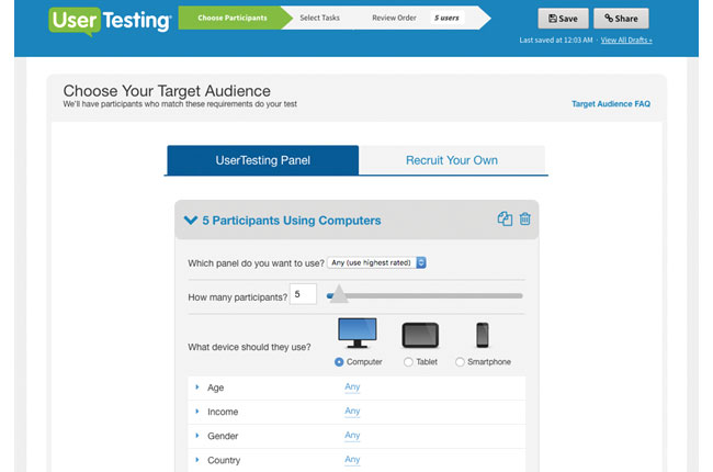
UserTesting.com is a great online tool for unmoderated testing
When a customer takes a leap of faith and invests their time, and possibly their money in your product or service, you suddenly have a social responsibility to make good on that relationship. So despite all that, how can trust be designed for? Thankfully there are a few techniques UX designers can use to instil confidence in the end user throughout their journey.
We all judge a book by its cover, and it's also well known that a user is more likely to trust a site that is more aesthetically pleasing. This is called the aesthetic-usability effect, and is described as us perceiving beautiful things as easier to use over ugly ones (even if that is not the case). Included in the look and feel of the site aesthetic should be the tone of voice and type of imagery that are used to convey a professional, reliable impression of the business or organisation.
Of course, the ultimate indicator of trust should always be in the user testing results, along with observations of the user's reactions to sites. Subjective measures like trust can also be captured at the end of tests. Moderated user testing will always provide much greater insights, but there are tools online to run unmoderated tests such as UserTesting.com.
Top tools
Dark Patterns
Dark Patterns are tricks used in websites and apps that make you buy or sign up for things that you didn't mean to. The purpose of the Dark Pattern Library site is to spread awareness and to document the companies that use such techniques.Government Research Consent Guidelines
The UK government website contains an entire manual on service design and the consent forms you need signed to ensure you can be trusted with a person's data gathered during user research.
Design for coherence
With more and more touchpoints emerging, organisations are in danger of their user's journey becoming so heavily fragmented that it could become an incoherent mess. To add to the omnichannel experience there are now chatbots and other voice interfaces to consider in the user's journey, so the experiences and conversations people have with them need carefully designing.
Planning is key, taking a 'helicopter view' of the entire user's journey with the business. This should include doing as much user research as possible to make sure the touchpoints you design align with their goals, and what they're doing in real life. Turning this research into user journey maps and personas will help guide designers on which touchpoints should be used for different audiences. Many tools exist for supporting these activities; Smaply caters for all of the above, and Xtensio can be used to create simple personas and diagrams, but there are also more traditional offline tools such as Axure that you can use to get the job done.
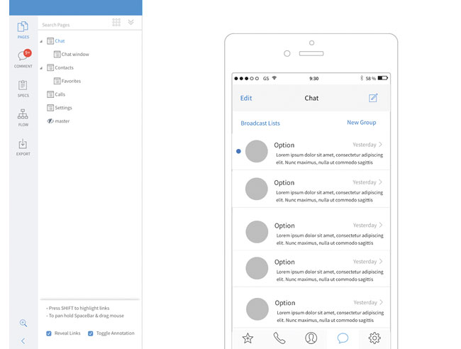
With MockFlow you can plan and create better user interfaces
It's also important to consider which touchpoints shouldn't be designed for, especially if it is discovered during the research that it would be inappropriate to use certain methods to contact certain audiences. For example, on a digital experience dealing with a homeless person registering for support services, would it be appropriate to ask for an address?
Designing a coherent experience means not just designing for screens and apps anymore, but every means of contact the customer has with that organisation, so that a unified message can be delivered, regardless of the type of touchpoint. It's imperative that this key message is decided on from the start. The entire UX team should know from research what message to deliver.
It's a common belief that the more material you present to the user, the greater chance that some of it will be remembered. It's the old adage of throwing a load of mud in the hope some will stick, but this isn't true. Your audience will end up confused about the message you are trying to deliver.
Top tools
Axure
Create simple click-through diagrams or highly functional, rich prototypes with conditional logic, dynamic content, animations, math functions, and data-driven interactions. Use Axure Share to upload content to share with your team.Asana
Asana is an online project management tool, designed to help teams track their work. Asana gives you everything you need to stay in sync, hit deadlines, and reach your goals.MockFlow
MockFlow provides a full solution for design teams, which includes wireframing, sitemaps, UI spec systems, design workflow and more. Enables you to plan and create better user interfaces together within a single suite.Storyboard That
Storyboards are a fun and engaging way to relay research findings and user journeys to stakeholders. Use the extensive image library and flexible templates to create storyboards of this information.Smaply
This website has an online editor which enables you to integrate basic service design tools into your daily work, such as user journey maps, stakeholder maps and personas. Your designs can be downloaded as PDFs and image files.
Design for efficiency
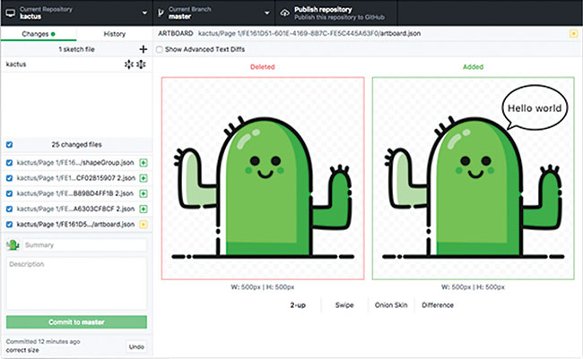
With Kaktus you can implement version control without having to learn a new set of tools
As UX teams grow, there are smarter ways of managing the multitude of design assets created by a team. No more naming your work 'homepage_wireframe_finalFinal14.pdf', or taking it in turns to work on the same document in your team. Thankfully now there are tools aimed specifically at design teams to version control design work. The majority are based on Git, the same technology used by developers to manage their application code.
There are so many advantages to using this sort of software to manage your designs. Not only can multiple designers work on the same project at the same time, but you can roll back to a previous version if needed. Although you will only see the current version of a file, a full version history is kept and reviewing the changes made between versions of a file are even possible. These features of version control mean problems like losing work when a file is accidentally overwritten, or two people decide to make changes to the same thing are now a thing of the past.
Once changes are made, many tools let you communicate those changes to the team. This is a step forward in terms of productivity and efficiency, enabling projects to be completed as quickly as possible. Lots of the larger web-based design tools like Figma and UXPin provide this as part of the subscription, but there are standalone tools like Kaktus, Abstract and Folio for Mac.
Design for conversation
The rise of chatbots and other conversational devices such as Amazon Alexa and Google Home has been all pervasive over the past few years, and many companies are still trying to work out where this new technology can be inserted into their strategy with customers. But where does traditional experience design fit in, especially when there will be no physical interface to design? This is a new frontier for service design, with endless possibilities for designing intuitive and human-centred experiences that people love.
Conversations between human beings are intricate, complex and heavily nuanced. Not to mention the cultural and semantic differences that are commonly observed in humans across the world. How do you anticipate and plan for the vast array of possible questions and reactions a human being might have? Designers will need to spend time designing all the possible flows and outcomes these conversations might take. And the more human the experience can be the better, but how can you make a machine appear human? How do you build a relationship with a machine? These are questions the UX designer must consider to create an effective outcome for the end user.
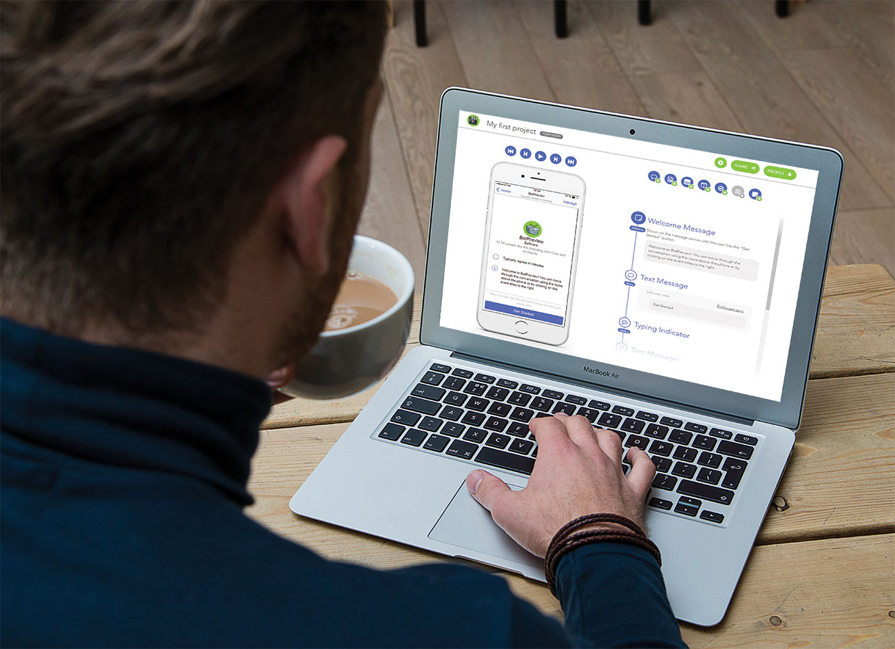
Conversational interfaces bring a whole new set of challenges with them
Understanding the context that your designs will be used in is also important, so rigorous and in-depth research is essential. Would your target audience use a voice interface walking down the street? Would it be usable if it was a noisy street? All this can be answered by spending time understanding your users and capturing what their goals are.
Another essential part of the UX practitioner's role will be in planning for and testing these conversational interfaces. This will be very different to traditional testing of apps and sites, and will require much more rigorous planning of scripts and testing sessions.
There are a few tools for designing the proposed chatbot conversations and also the UI, such as BotPreview and Botsociety, which then enable you to go and test these conversations out on real people before you release your chatbot or conversational UI. As a result of this frenzied focus given to this emerging technology, expect to see new roles created as offshoots of the standard UX Designer and – relatively new – UX Writer titles, such as 'Conversational Designer' (catering for research, testing, behaviours and personality of the interface) and 'Conversational Strategist' (a niche role dedicated to designing the flows and logic of the conversations).
Top tools
BotPreview
Sketch and design your own chatbot interactions using the BotPreview online editor and share them or export as static HTML or MP4/GIF video, without writing a single line of code.Botsociety
Design voice and chat interfaces using the online web editor by quickly building a high-fidelity preview of your next chatbot or voice assistant. Botsociety takes care of the appearance, the platform limitations, the preview, the export and the user testing for you.Botmock
Botmock uses a drag-and-drop editor with templates to build prototypes of conversational design. Map out the customer's journey, and create a live preview that can be exported to GIF and video.Bots UI Kit for Sketch
A simple and fully customisable Sketch UI kit to help you design and showcase your Facebook Messenger Bots. All elements are turned into new branded Sketch symbols, so prototyping has never been easier.Walkie
This tool is especially for Slack users to help design slack bot dialogues. It provides an easy way to write and test bot dialogues, which include buttons and also attachments.
This article was originally published in issue 274 of creative web design magazine Web Designer. Buy issue 274 here or subscribe to Web Designer here.
Related articles:
New skills in UX designWhat are the main barriers to good UX today?Why graphic designers need to master UX


Leave a Reply
Want to join the discussion?Feel free to contribute!