5 Ways to Design for Large Viewports
Original Source: https://www.webdesignerdepot.com/2019/01/5-ways-to-design-for-large-viewports/
 Web designers have typically always been big-picture people, in that they like having really big screens in front of them. It’s convenient, and it makes you feel very professional. At this point in my life, I don’t think I could go back to having just one monitor, either. And yet, I find that many websites don’t live up to the potential promised by big darned screens, or even that presented by phones with HD resolutions.
This is because we live in a mobile-first world, with mobile-first people. They go to far off and exotic places like “outside”, so they have to carry their screens around with them. Outside people pretty much pay our bills—whether directly or indirectly—and we have to make websites they can actually use on those small screens.
That is all well and good, and it’s not going to change any time soon. But big screens aren’t going anywhere, either. People still work in offices, at home, and in coffee shops with laptops and desktops. People still have “the family computer” at home. PC gamers exist, and they’re buying some of the biggest screens, right alongside photographers and videographers.
These people are often left with experiences designed for mid-range to small screens. This likely doesn’t break the experience for them, but why shouldn’t they have an experience tailored to their needs? Besides, what is all that extra screen space there for, if not to play with it? Here are a few ways to take advantage of the bigger screens, along with some examples:
1. Literal Big Pictures
One of the most common ways people try to use up the empty space is to put pictures in it. We’ve all seen the ten-trillion websites (I may be exaggerating) that use some stock photo as a background, particularly in the “hero” section on the home page. This is everywhere. You’ve done it, most likely, and God knows I’ve done it.
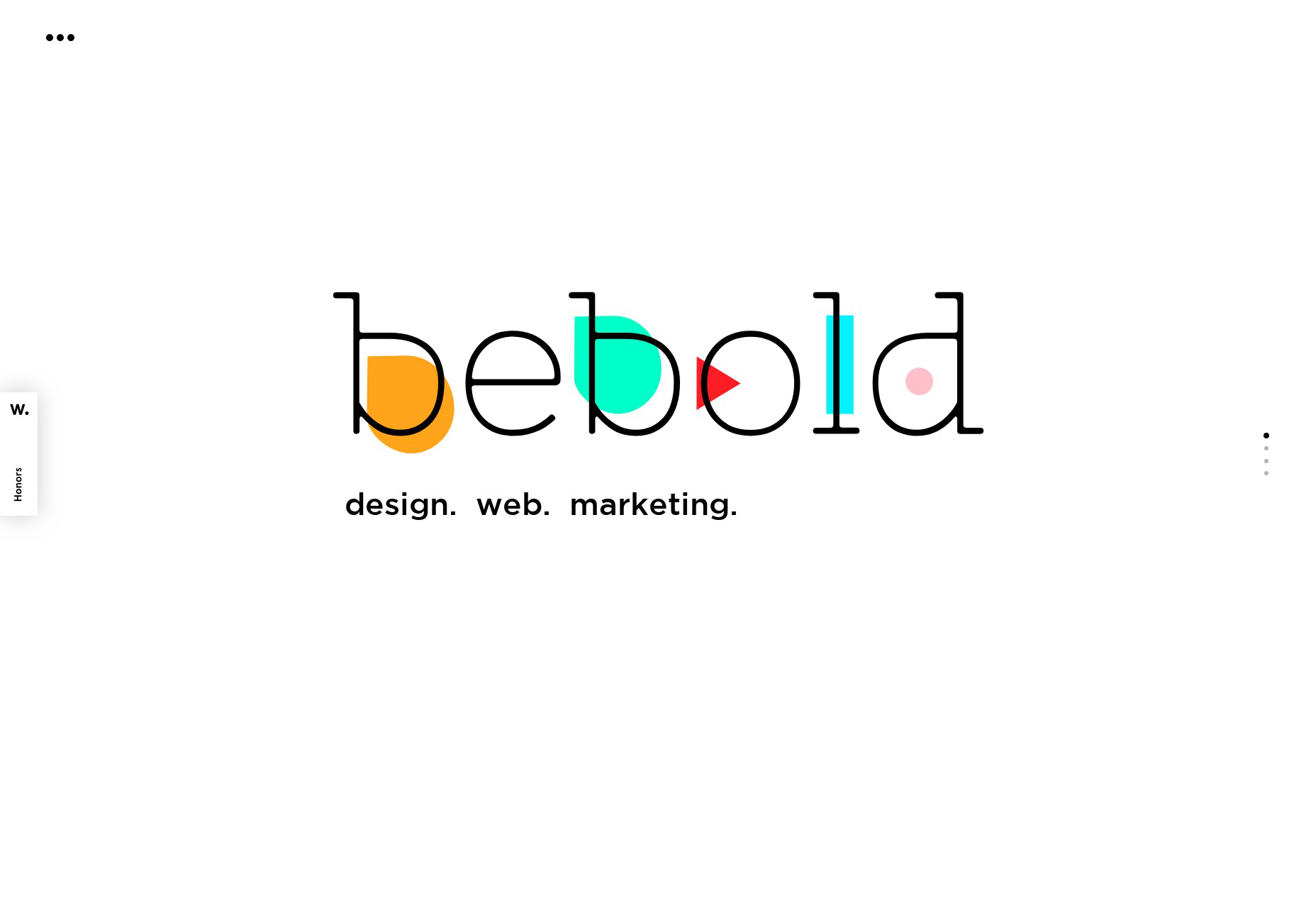
It is not altogether the worst way to go about it, and it’s not the best. While image compression is getting better and better, those images will still hit you in the bandwidth, caching or no caching. If you want to save you and your CDN some trouble, go with SVG. I know, I keep saying this, but it really works, and it works wonders. See bebold for a picture-perfect (heh) example of how to use simple SVG imagery to fill up some space while keeping the bandwidth and rendering costs light.
2. Scaling the Layout
So we all know how responsive design works, right? Well, it’s gotten a lot easier with CSS Grid. I’ve been experimenting with it for personal projects, and goddamn but it truly changes everything. Those Magazine-type layouts that front-end developers have been trying to make work for decades? They’re easy now. Easy. Go read a tutorial already.
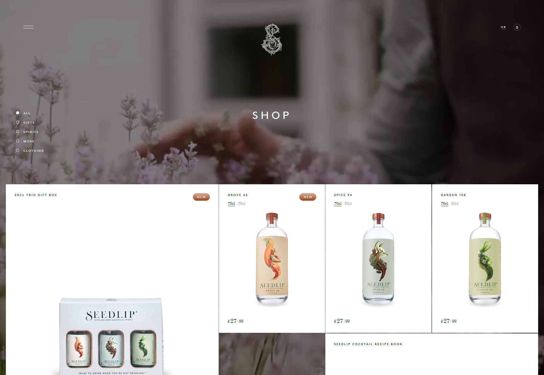
With all that time you have left over, why not see what you can do when you let the central wrapping div go wider than 1,200 pixels? It could be fun. For an absolutely gorgeous (if somewhat bandwidth-heavy) example, see Seedlip.
3. Responsive Type
But hey, sometimes you don’t want to bother so much with pictures. Maybe you just want big darned text. We’ve had various iterations on the responsive layout for years, though. What has been harder is scaling our typography up and down by screen resolution in a way that seems natural and fluid. Sure, you can do it with a few dozen media queries (or like two, if you’re lazy like me), but the CSS calc function has us covered if we want to do it the easy way.
Sure, Chris Coyier has been writing about this since 2012, but the browser support hasn’t always been up to par. I quite like the technique used by Mike Foskett’s Fluid-responsive font-size calculator, which allows you to specify a maximum font-size, and can calculate everything in rems and ems, if that’s the way you want to go.
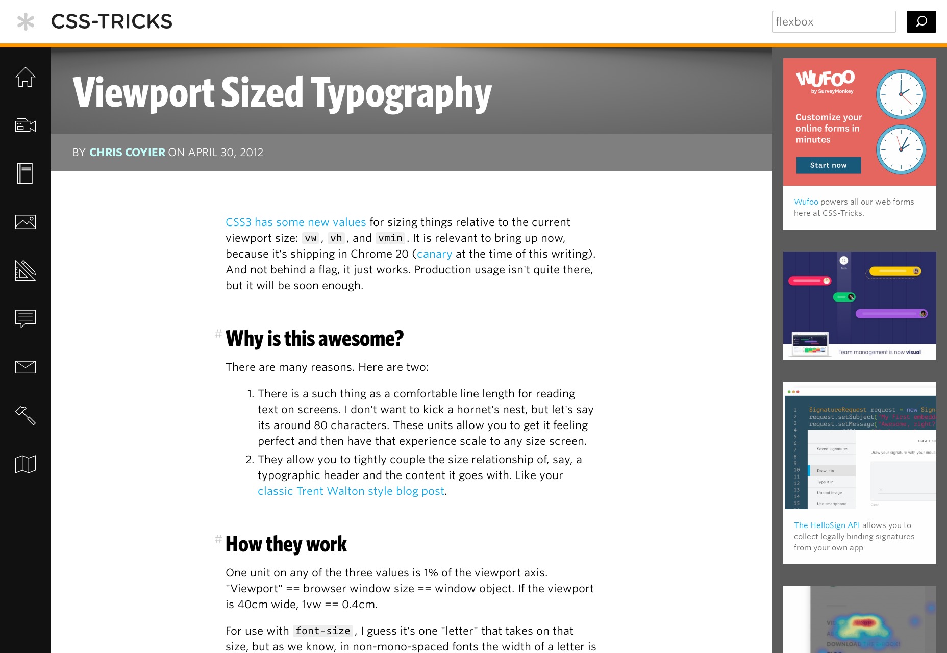
For an example of the technique in action see any article on CSS-Tricks.
4. Just put More Stuff on the Screen
As an avowed minimalist, I’m not a huge fan of just bombarding the user with information in general. However, there are times when this is exactly what they want and need. The clearest use cases for this approach are in dashboard-style user interfaces, and plain old e-commerce. In either of these cases, if you’re not using the maximum potential space for functionality and/or products, you’re actually slowing the user down when they may not want to be slowed down.
Most dashboard designers are already, well…on board. However, I’m seeing more and more ecommerce site templates trying to cram products into small areas on big screens, and that makes little sense to me.
Example: I dunno… Amazon? I’m not going to link that. They’re going to get our traffic eventually in any case. Actually, the aforementioned Seedlip works very well for this section, too.
Now where I object to this approach is on news sites, and generally they seem to agree with me. Although some are still using up the full screen, they make the content big enough that there’s not too much in the viewport at any one time, encouraging you to scroll down and really pick and choose your articles. Sure, they do it to display more ads, but this might be one of the few times ads have actually helped to improve an experience. Kind of.
5. Video
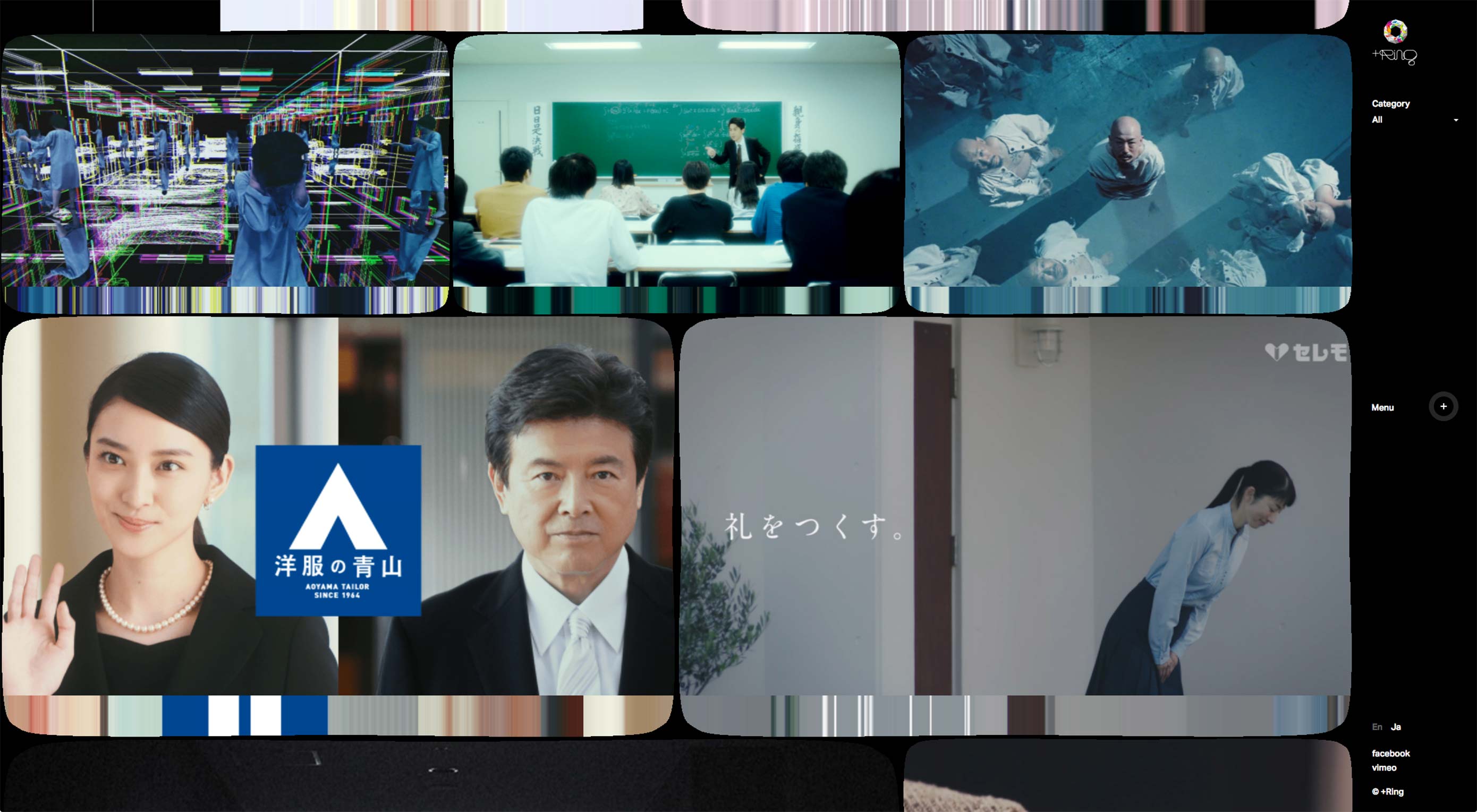
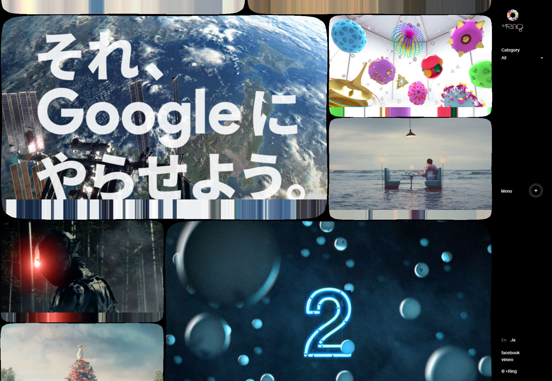
And lastly, a real no-brainer. I’m not actually sure anyone’s doing this one wrong. Still… if you’re going to use video extensively on your site anyway, and you’re not too fussed about bandwidth, go big. It’s video, that’s what it’s for. If nothing else, at least give people the option to watch your videos in full-screen mode. For examples of this tip in action, see just about any filmmaker’s site. Here’s one: +Ring.
Add Realistic Chalk and Sketch Lettering Effects with Sketch’it – only $5!
Source
p img {display:inline-block; margin-right:10px;}
.alignleft {float:left;}
p.showcase {clear:both;}
body#browserfriendly p, body#podcast p, div#emailbody p{margin:0;}


Leave a Reply
Want to join the discussion?Feel free to contribute!