Gatsby Headaches And How To Cure Them: i18n (Part 1)

Original Source: https://smashingmagazine.com/2023/06/gatsby-headaches-i18n-part-1/

Internationalization, or i18n, is making your content understandable in other languages, regions, and cultures to reach a wider array of people. However, a more interesting question would be, “Why is i18n important?”. The answer is that we live in an era where hundreds of cultures interact with each other every day, i.e., we live in a globalized world. However, our current internet doesn’t satisfy its globalized needs.

Did you know that 60.4% of the internet is in English, but only 16.2% percent of the world speaks English?

Source: Visual Capitalist

Yes, it’s an enormous gap, and until perfect AI translators are created, the internet community must close it.

As developers, we must adapt our sites’ to support translations and formats for other countries, languages, and dialects, i.e., localize our pages. There are two main problems when implementing i18n on our sites.

Storing and retrieving content.
We will need files to store all our translations while not bloating our page’s bundle size and a way to retrieve and display the correct translation on each page.
Routing content.
Users must be redirected to a localized route with their desired language, like my-site.com/es or en.my-site.com. How are we going to create pages for each locale?

Fortunately, in the case of Gatsby and other static site generators, translations don’t bloat up the page bundle size since they are delivered as part of the static page. The rest of the problems are widely known, and there are a lot of plugins and libraries available to address them, but it can be difficult to choose one if you don’t know their purpose, what they can do, and if they are compatible with your existing codebase. That’s why in the following hands-on guide, we will see how to use several i18n plugins for Gatsby and review some others.

The Starter

Before showing what each plugin can do and how to use them, we first have to start with a base example. (You can skip this and download the starter here). For this tutorial, we will work with a site with multiple pages created from an array of data, like a blog or wiki. In my case, I choose a cooking blog that will initially have support only for English.

Start A New Project

To get started, let’s start a plain JavaScript Gatsby project without any plugins at first.

npm init gatsby

cd my-new-site

For this project, we will create pages dynamically from markdown files. To be able to read and parse them to Gatsby’s data layer, we will need to use the gatsby-source-filesystem and gatsby-transformer-remark plugins. Here you can see a more in-depth tutorial.

npm i gatsby-source-filesystem gatsby-transformer-remark

Inside our gatsby-config.js file, we will add and configure our plugins to read all the files in a specified directory.

// ./gatsby-config.js

module.exports = {
//…
plugins: [
{
resolve: `gatsby-source-filesystem`,
options: {
name: `content`,
path: `${__dirname}/src/content`,
},
},
`gatsby-transformer-remark`,
],
};

Add Your Content

As you can see, we will use a new ./src/content/ directory where we will save our posts. We will create a couple of folders with each recipe’s content in markdown files, like the following:

├── src
│ ├── content
| | ├── mac-and-cheese
| | | ├── cover.jpg
| | | ├── index.en.md
| | ├── burritos
| | | ├── cover.jpg
| | | ├── index.en.md
| | ├── pizza
| | | ├── cover.jpg
| | | ├── index.en.md
│ ├── pages
│ ├── images

Each markdown file will have the following structure:


slug: “mac-and-cheese”
date: “2023-01-20”
title: “How to make mac and cheese”
cover_image:
image: “./cover.jpg”
alt: “Macaroni and cheese”
locale: “en”

Step 1
Lorem ipsum…

You can see that the first part of the markdown file has a distinct structure and is surrounded by — on both ends. This is called the frontmatter and is used to save the file’s metadata. In this case, the post’s title, date, locale, etc.

As you can see, we will be using a cover.jpg file for each post, so to parse and use the images, we will need to install the gatsby-plugin-image gatsby-plugin-sharp and gatsby-transformer-sharp plugins (I know there are a lot 😅).

npm i gatsby-plugin-image gatsby-plugin-sharp gatsby-transformer-sharp

We will also need to add them to the gatsby-config.js file.

// ./gatsby-config.js

module.exports = {
//…
plugins: [
{
resolve: `gatsby-source-filesystem`,
options: {
name: `content`,
path: `${__dirname}/src/content`,
},
},
`gatsby-plugin-sharp`,
`gatsby-transformer-sharp`,
`gatsby-transformer-remark`,
`gatsby-plugin-image`,
],
};

Querying Your Content

We can finally start our development server:

npm run develop

And go to http://localhost:8000/___graphql, where we can make the following query:

query Query {
allMarkdownRemark {
nodes {
frontmatter {
slug
title
date
cover_image {
image {
childImageSharp {
gatsbyImageData
}
}
alt
}
}
}
}
}

And get the following result:

{
“data”: {
“allMarkdownRemark”: {
“nodes”: [
{
“frontmatter”: {
“slug”: “/mac-and-cheese”,
“title”: “How to make mac and cheese”,
“date”: “2023-01-20”,
“cover_image”: {
/* … */
}
}
},
{
“frontmatter”: {
“slug”: “/burritos”,
“title”: “How to make burritos”,
“date”: “2023-01-20”,
“cover_image”: {
/* … */
}
}
},
{
“frontmatter”: {
“slug”: “/pizza”,
“title”: “How to make Pizza”,
“date”: “2023-01-20”,
“cover_image”: {
/* … */
}
}
}
]
}
}
}

Now the data is accessible through Gatsby’s data layer, but to access it, we will need to run a query from the ./src/pages/index.js page.

Go ahead and delete all the boilerplate on the index page. Let’s add a short header for our blog and create the page query:

// src/pages/index.js

import * as React from “react”;
import {graphql} from “gatsby”;

const IndexPage = () => {
return (
<main>
<h1>Welcome to my English cooking blog!</h1>
<h2>Written by Juan Diego Rodríguez</h2>
</main>
);
};

export const indexQuery = graphql`
query IndexQuery {
allMarkdownRemark {
nodes {
frontmatter {
slug
title
date
cover_image {
image {
childImageSharp {
gatsbyImageData
}
}
alt
}
}
}
}
}
`;

export default IndexPage;

Displaying Your Content

The result from the query is injected into the IndexPage component as a props property called data. From there, we can render all the recipes’ information.

// src/pages/index.js

// …
import {RecipePreview} from “../components/RecipePreview”;

const IndexPage = ({data}) => {
const recipes = data.allMarkdownRemark.nodes;

return (
<main>
<h1>Welcome to my English cooking blog!</h1>
<h2>Written by Juan Diego Rodríguez</h2>
{recipes.map(({frontmatter}) => {
return <RecipePreview key={frontmatter.slug} data={frontmatter} />;
})}
</main>
);
};

// …

The RecipePreview component will be the following in a new directory: ./src/components/:

// ./src/components/RecipePreview.js

import * as React from “react”;
import {Link} from “gatsby”;
import {GatsbyImage, getImage} from “gatsby-plugin-image”;

export const RecipePreview = ({data}) => {
const {cover_image, title, slug} = data;
const cover_image_data = getImage(cover_image.image.childImageSharp.gatsbyImageData);

return (
<Link to={/recipes/${slug}}>
<h1>{title}</h1>
<GatsbyImage image={cover_image_data} alt={cover_image.alt} />
</Link>
);
};

Creating Pages From Your Content

If we go to http://localhost:8000/, we will see all our recipes listed, but now we have to create a custom page for each recipe. We can do it using Gatsby’s File System Route API. It works by writing a GraphQL query inside the page’s filename, generating a page for each query result. In this case, we will make a new directory ./src/pages/recipes/ and create a file called {markdownRemark.frontmatter__slug}.js. This filename translates to the following query:

query MyQuery {
allMarkdownRemark {
nodes {
frontmatter {
slug
}
}
}
}

And it will create a page for each recipe using its slug as the route.

Now we just have to create the post’s component to render all its data. First, we will use the following query:

query RecipeQuery {
markdownRemark {
frontmatter {
slug
title
date
cover_image {
image {
childImageSharp {
gatsbyImageData
}
}
alt
}
}
html
}
}

This will query the first markdown file available in our data layer, but to specify the markdown file needed for each page, we will need to use variables in our query. The File System Route API injects the slug in the page’s context in a property called frontmatter__slug. When a property is in the page’s context, it can be used as a query variable under a $ followed by the property name, so the slug will be available as $frontmatter__slug.

query RecipeQuery {
query RecipeQuery($frontmatter__slug: String) {
markdownRemark(frontmatter: {slug: {eq: $frontmatter__slug}}) {
frontmatter {
slug
title
date
cover_image {
image {
childImageSharp {
gatsbyImageData
}
}
alt
}
}
html
}
}
}

The page’s component is pretty simple. We just get the query data from the component’s props. Displaying the title and date is straightforward, and the html can be injected into a p tag. For the image, we just have to use the GatsbyImage component exposed by the gatsby-plugin-image.

// src/pages/recipes/{markdownRemark.frontmatter__slug}.js

const RecipePage = ({data}) => {
const {html, frontmatter} = data.markdownRemark;
const {title, cover_image, date} = frontmatter;
const cover_image_data = getImage(cover_image.image.childImageSharp.gatsbyImageData);

return (
<main>
<h1>{title}</h1>
<p>{date}</p>
<GatsbyImage image={cover_image_data} alt={cover_image.alt} />
<p dangerouslySetInnerHTML={{__html: html}}></p>
</main>
);
};

//…

The last thing is to use the Gatsby Head API to change the page’s title to the recipe’s title. This can be easily done since the query’s data is also available in the Head component.

// src/pages/recipes/{markdownRemark.frontmatter__slug}.js

//…

export const Head = ({data}) => <title>{data.markdownRemark.frontmatter.title}</title>;

Summing all up results in the following code:

// src/pages/recipes/{markdownRemark.frontmatter__slug}.js

import * as React from “react”;
import {GatsbyImage, getImage} from “gatsby-plugin-image”;
import {graphql} from “gatsby”;

const RecipePage = ({data}) => {
const {html, frontmatter} = data.markdownRemark;
const {title, cover_image, date} = frontmatter;
const cover_image_data = getImage(cover_image.image.childImageSharp.gatsbyImageData);

return (
<main>
<h1>{title}</h1>
<p>{date}</p>
<GatsbyImage image={cover_image_data} alt={cover_image.alt} />
<p dangerouslySetInnerHTML={{__html: html}}></p>
</main>
);
};

export const recipeQuery = graphqlquery RecipeQuery($frontmatter__slug: String) {
markdownRemark(frontmatter: {slug: {eq: $frontmatter__slug}}) {
frontmatter {
slug
title
date
cover_image {
image {
childImageSharp {
gatsbyImageData
}
}
alt
}
}
html
}
};

export default RecipePage;

export const Head = ({data}) => <title>{data.markdownRemark.frontmatter.title}</title>;

Creating Localized Content

With all this finished, we have a functioning recipe blog in English. Now we will use each plugin to add i18n features and localize the site (for this tutorial) for Spanish speakers. But first, we will make a Spanish version for each markdown file in ./src/content/. Leaving a structure like the following:

├── src
│ ├── content
| | ├── mac-and-cheese
| | | ├── cover.jpg
| | | ├── index.en.md
| | | ├── index.es.md
| | ├── burritos
| | | ├── cover.jpg
| | | ├── index.en.md
| | | ├── index.es.md
| | ├── pizza
| | | ├── cover.jpg
| | | ├── index.en.md
| | | ├── index.es.md
│ ├── pages
│ ├── images

Inside our new Spanish markdown files, we will have the same structure in our frontmatter but translated to our new language and change the locale property in the frontmatter to es. However, it’s important to note that the slug field must be the same in each locale.

gatsby-plugin-i18n

This plugin is displayed in Gatsby’s Internationalization Guide as its first option when implementing i18n routes. The purpose of this plugin is to create localized routes by adding a language code in each page filename, so, for example, a ./src/pages/index.en.js file would result in a my-site.com/en/ route.

I strongly recommend not using this plugin. It is outdated and hasn’t been updated since 2019, so it is kind of a disappointment to see it promoted as one of the main solutions for i18n in Gatsby’s official documentation. It also breaks the File System API, so you must use another method for creating pages, like the createPages function in the Gatsby Node API. Its only real use would be to create localized routes for certain pages, but considering that you must create a file for each page and each locale, it would be impossible to manage them on even medium sites. A 20 pages site with support for five languages would need 100 files!

gatsby-theme-i18n

Another plugin for implementing localized routes is gatsby-theme-i18n, which will be pretty easy to use in our prior example.

We will first need to install the gatsby-theme-i18n plugin and the gatsby-plugin-react-helmet and react-helmet plugins to help add useful language metadata in our <head> tag.

npm install gatsby-theme-i18n gatsby-plugin-react-helmet react-helmet

Next, we can add it to the gatsby-config.js:

// ./gatsby-config.js

module.exports = {
//…
plugins: [
//other plugins …
{
resolve: `gatsby-theme-i18n`,
options: {
defaultLang: `en`,
prefixDefault: true,
configPath: require.resolve(`./i18n/config.json`),
},
},
],
};

As you can see, the plugin configPath points to a JSON file. This file will have all the information necessary to add each locale. We will create it in a new ./i18n/ directory at the root of our project:

[
{
“code”: “en”,
“hrefLang”: “en-US”,
“name”: “English”,
“localName”: “English”,
“langDir”: “ltr”,
“dateFormat”: “MM/DD/YYYY”
},

{
“code”: “es”,
“hrefLang”: “es-ES”,
“name”: “Spanish”,
“localName”: “Español”,
“langDir”: “ltr”,
“dateFormat”: “DD.MM.YYYY”
}
]

Note: To see changes in the gatsby-config.js file, we will need to restart the development server.

And just as simple as that, we added i18n routes to all our pages. Let’s head to http://localhost:8000/es/ or http://localhost:8000/en/ to see the result.

Querying Localized Content

At first glance, you will see a big problem: the Spanish and English pages have all the posts from both locales because we aren’t filtering the recipes for a specific locale, so we get all the available recipes. We can solve this by once again adding variables to our GraphQL queries. The gatsby-theme-i18n injects the current locale into the page’s context, making it available to use as a query variable under the $locale name.

index page query:

query IndexQuery($locale: String) {
allMarkdownRemark(filter: {frontmatter: {locale: {eq: $locale}}}) {
nodes {
frontmatter {
slug
title
date
cover_image {
image {
childImageSharp {
gatsbyImageData
}
}
alt
}
}
}
}
}

{markdownRemark.frontmatter__slug}.js page query:

query RecipeQuery($frontmatter__slug: String, $locale: String) {
markdownRemark(frontmatter: {slug: {eq: $frontmatter__slug}, locale: {eq: $locale}}) {
frontmatter {
slug
title
date
cover_image {
image {
childImageSharp {
gatsbyImageData
}
}
alt
}
}
html
}
}

Localizing Links

You will also notice that all Gatsby links are broken since they point to the non-localized routes instead of the new routes, so they will direct the user to a 404 page. To solve this, gatsby-theme-i18n exposes a LocalizedLink component that works exactly like Gatsby’s Link but points to the current locale. We just have to switch each Link component for a LocalizedLink.

// ./src/components/RecipePreview.js

+ import {LocalizedLink as Link} from “gatsby-theme-i18n”;
– import {Link} from “gatsby”;

//…

Changing Locales

Another vital feature to add will be a component to change from one locale to another. However, making a language selector isn’t completely straightforward. First, we will need to know the current page’s path, like /en/recipes/pizza, to extract the recipes/pizza part and add the desired locale, getting /es/recipes/pizza.

To access the page’s location information (URL, HREF, path, and so on) in all our components, we will need to use the wrapPageElement function available in the gatsby-browser.js and gatsby-ssr.js files. In short, this function lets you access the props used on each page, including a location object. We can set up a context provider with the location information and pass it down to all components.

First, we will create the location context in a new directory: ./src/context/.

// ./src/context/LocationContext.js

import * as React from “react”;
import {createContext} from “react”;

export const LocationContext = createContext();

export const LocationProvider = ({location, children}) => {
return <LocationContext.Provider value={location}>{children}</LocationContext.Provider>;
};

As you can imagine, we will pass the page’s location object to the provider’s location attribute on each Gatsby file:

// ./gatsby-ssr.js & ./gatsby-browser.js

import * as React from “react”;
import {LocationProvider} from “./src/context/LocationContext”;

export const wrapPageElement = ({element, props}) => {
const {location} = props;

return <LocationProvider location={location}>{element}</LocationProvider>;
};

Note: Since we just created the gatsby-ssr.js and gatsby-browser.js files, we will need to restart the development server.

Now the page’s location is available in all components through context, and we can use it in our language selector. We have also to pass down the current locale to all components, and the gatsby-theme-i18n exposes a useful useLocalization hook that let you access the current locale and the i18n config. However, a caveat is that it can’t get the current locale on Gatsby files like gatsby-browser.js and gatsby-ssr.js, only the i18n config.

Ideally, we would want to render our language selector using wrapPageElement so it is available on all pages, but we can’t use the useLocazication hook. Fortunately, the wrapPageElement props argument also exposes the page’s context and, inside, its current locale.

Let’s create another context to pass down the locale:

// ./src/context/LocaleContext.js

import * as React from “react”;
import {createContext} from “react”;

export const LocaleContext = createContext();

export const LocaleProvider = ({locale, children}) => {
return <LocaleContext.Provider value={locale}>{children}</LocaleContext.Provider>;
};

And use it in our wrapPageElement function:

// ./gatsby-ssr.js & ./gatsby-browser.js

import * as React from “react”;
import {LocationProvider} from “./src/context/LocationContext”;
import {LocaleProvider} from “./src/context/LocaleContext”;

export const wrapPageElement = ({element, props}) => {
const {location} = props;
const {locale} = element.props.pageContext;

return (
<LocationProvider location={location}>
<LocaleProvider locale={locale}>{element}</LocaleProvider>
</LocationProvider>
);
};

The last thing is how to remove the locale (es or en) from the path (/es/recipes/pizza). Using the following simple but ugly regex, we can remove all the /en/ and /es/ at the beginning of the path:

/(/e(s|n)|)(/*|)/

It’s important to note that the regex pattern only works for the en and es combination of locales.

Now we have to create our LanguageSelector.js:

// ./src/components/LanguageSelector

import * as React from “react”;
import {useContext} from “react”;
import {useLocalization} from “gatsby-theme-i18n”;
import {Link} from “gatsby”;
import {LocationContext} from “../context/LocationContext”;
import {LocaleContext} from “../context/LocaleContext”;

export const LanguageSelector = () => {
const {config} = useLocalization();
const locale = useContext(LocaleContext);
const {pathname} = useContext(LocationContext);

const removeLocalePath = /(/e(s|n)|)(/*|)/;
const pathnameWithoutLocale = pathname.replace(removeLocalePath, “”);

return (
<div>
{config.map(({code, localName}) => {
return (
code !== locale && (
<Link key={code} to={`/${code}/${pathnameWithoutLocale}`}>
{localName}
</Link>
)
);
})}
</div>
);
};

Let’s break down what is happening:

Get our i18n config through the useLocalization hook.
Get the current locale through context.
Get the page’s current pathname through context, which is the part that comes after the domain (like /en/recipes/pizza).
We remove the locale part of the pathname using a regex pattern (leaving just recipes/pizza).
We want to render a link for each available locale except the current one, so we will check if the locale is the same as the page before rendering a common Gatsby Link to the desired locale.

Now inside our gatsby-ssr.js and gatsby-browser.js files, we can add our LanguageSelector:

// ./gatsby-ssr.js & ./gatsby-browser.js

import * as React from “react”;
import {LocationProvider} from “./src/context/LocationContext”;
import {LocaleProvider} from “./src/context/LocaleContext”;
import {LanguageSelector} from “./src/components/LanguageSelector”;

export const wrapPageElement = ({element, props}) => {
const {location} = props;
const {locale} = element.props.pageContext;

return (
<LocationProvider location={location}>
<LocaleProvider locale={locale}>
<LanguageSelector />
{element}
</LocaleProvider>
</LocationProvider>
);
};

Redirecting Users

The last detail to address is that now the non-i18n routes like http://localhost:8000/ or http://localhost:8000/recipes/pizza are empty. To solve this, we can redirect the user to their desired locale using Gatsby’s redirect in gatsby-node.js.

// ./gatsby-node.js

exports.createPages = async ({actions}) => {
const {createRedirect} = actions;

createRedirect({
fromPath: `/*`,
toPath: `/en/*`,
isPermanent: true,
});

createRedirect({
fromPath: `/*`,
toPath: `/es/*`,
isPermanent: true,
conditions: {
language: [`es`],
},
});
};

Note: Redirects only work in production! Not in the local development server.

With this, each page that doesn’t start with the English or Spanish locale will be redirected to a localized route. The wildcard * at the end of each route says it will redirect them to the same path, e.g., it will redirect /recipes/mac-and-cheese/ to /en/recipes/mac-and-cheese/. Also, it will check for the specified language in the request’s origin and redirect to the locale if available; else, it will default to English.

react-intl

react-intl is an internationalization library for any React app that can be used with Gatsby without any extra configuration. It provides a component to handle translations and many more to format numbers, dates, times, etc. Like the following:

FormattedNumber,
FormattedDate,
FormattedTime.

It works by adding a provider called IntlProvider to pass down the current locale to all the react-intl components. Among others, the provider takes three main attributes:

message
An object with all your translations.
locale
The current page’s locale.
defaultLocale
The default page’s locale.

So, for example:

<IntlProvider messages={{}} locale=”es” defaultLocale=”en” >
<FormattedNumber value={15000} />
<br />
<FormattedDate value={Date.now()} />
<br />
<FormattedTime value={Date.now()} />
<br />
</IntlProvider>,

Will format the given values to Spanish and render:

15.000

23/1/2023

19:40

But if the locale attribute in IntlProvider was en, it would format the values to English and render:

15,000

1/23/2023

7:42 PM

Pretty cool and simple!

Using react-intl With Gatsby

To showcase how the react-intl works with Gatsby, we will continue from our prior example using gatsby-theme-i18n.

We first will need to install the react-intl package:

npm i react-intl

Secondly, we have to write our translations, and in this case, we just have to translate the title and subtitle on the index.js page. To do so, we will create a file called messajes.js in the ./i18n/ directory:

// ./i18n/messages.js

export const messages = {
en: {
index_page_title: “Welcome to my English cooking blog!”,
index_page_subtitle: “Written by Juan Diego Rodríguez”,
},
es: {
index_page_title: “¡Bienvenidos a mi blog de cocina en español!”,
index_page_subtitle: “Escrito por Juan Diego Rodríguez”,
},
};

Next, we have to set up the IntlProvider in the gatsby-ssr.js and gatsby-browser.js files:

// ./gatsby-ssr.js & ./gatsby-browser.js

import * as React from “react”;
import {LocationProvider} from “./src/context/LocationContext”;
import {LocaleProvider} from “./src/context/LocaleContext”;
import {IntlProvider} from “react-intl”;
import {LanguageSelector} from “./src/components/LanguageSelector”;
import {messages} from “./i18n/messages”;

export const wrapPageElement = ({element, props}) => {
const {location} = props;
const {locale} = element.props.pageContext;

return (
<LocationProvider location={location}>
<LocaleProvider locale={locale}>
<IntlProvider messages={messages[locale]} locale={locale} defaultLocale=”en”>
<LanguageSelector />
{element}
</IntlProvider>
</LocaleProvider>
</LocationProvider>
);
};

And use the FormattedMessage component with an id attribute holding the desired translation key name.

// ./src/pages/index.js

// …
import {FormattedMessage} from “react-intl”;

const IndexPage = ({data}) => {
const recipes = data.allMarkdownRemark.nodes;

return (
<main>
<h1>
<FormattedMessage id=”index_page_title” />
</h1>
<h2>
<FormattedMessage id=”index_page_subtitle” />
</h2>
{recipes.map(({frontmatter}) => {
return <RecipePreview key={frontmatter.slug} data={frontmatter} />;
})}
</main>
);
};

// …

And as simple as that, our translations will be applied depending on the current user’s locale. However, i18n isn’t only translating all the text to other languages but also adapting to the way numbers, dates, currency, and so on are formatted in the user’s regions. In our example, we can format the date on each recipe page to be formatted according to the current locale using the FormattedDate component.

// ./src/pages/recipes/{markdownRemark.frontmatter__slug}.js

//…
import {FormattedDate} from “react-intl”;

const RecipePage = ({data}) => {
const {html, frontmatter} = data.markdownRemark;
const {title, cover_image, date} = frontmatter;
const cover_image_data = getImage(cover_image.image.childImageSharp.gatsbyImageData);

return (
<main>
<h1>{title}</h1>
<FormattedDate value={date} year=”numeric” month=”long” day=”2-digit” />
<GatsbyImage image={cover_image_data} alt={cover_image.alt} />
<p dangerouslySetInnerHTML={{__html: html}}></p>
</main>
);
};

//…

As you can see, we feed the component the raw date and specify how we want to display it. Then the component will automatically format it to the correct locale. And with the year, month, and day attributes, we can further customize how to display our date. In our example, the date 19-01-2023 will be formatted the following way:

English: January 19, 2023

Spanish: 19 de enero de 2023

If we want to add a localized string around the date, we can use react-intl arguments. Arguments are a way to add dynamic data inside our react-intl messages. It works by adding curly braces {} inside a message.

The arguments follow this pattern { key, type, format }, in which

key is the data to be formatted;
type specifies if the key is going to be a number, date, time, and so on;
format further specifies the format, e.g., if a date is going to be written like 10/05/2023 or October 5, 2023.

In our case, we will name our key postedOn, and it will be a date type in a long format:

// ./i18n/messages.js

export const messages = {
en: {
// …
recipe_post_date: “Written on {postedOn, date, long}”,
},
es: {
// …
recipe_post_date: “Escrito el {postedOn, date, long}”,
},
};

// ./src/pages/recipes/{markdownRemark.frontmatter__slug}.js

//…
import {FormattedMessage} from “react-intl”;

const RecipePage = ({data}) => {
const {html, frontmatter} = data.markdownRemark;
const {title, cover_image, date} = frontmatter;
const cover_image_data = getImage(cover_image.image.childImageSharp.gatsbyImageData);

return (
<main>
<h1>{title}</h1>
<FormattedMessage id=”recipe_post_date” values={{postedOn: new Date(date)}} />
<GatsbyImage image={cover_image_data} alt={cover_image.alt} />
<p dangerouslySetInnerHTML={{__html: html}}></p>
</main>
);
};
//…

Note: For the date to work, we will need to create a new Date object with our date as its only argument.

Localizing The Page’s Title

The last thing you may have noticed is that the index page’s title isn’t localized. In the recipes pages’ case, this isn’t a problem since it queries the already localized title for each post, but the index page title doesn’t. Solving this can be tricky for two reasons:

You can’t use Gatsby Head API directly with react-intl since the IntlProvider doesn’t exist for components created inside the Head API.
You can’t use the FormattedMessage component inside the title tag since it only allows a simple string value, not a component.

However, there is a workaround for both problems:

We can use react-helmet (which we installed with gatsby-theme-i18n) inside the page component where the IntlProvider is available.
We can use react-intl imperative API to get the messages as strings instead of the FormmatedMessage component. In this case, the imperative API exposes a useIntl hook which returns an intl object, and the intl.messages property holds all our messages too.

So the index component would end up like this:

// ./src/pages/index.js

// …
import {FormattedMessage, useIntl} from “react-intl”;
import {Helmet} from “react-helmet”;

const IndexPage = ({data}) => {
const intl = useIntl();

const recipes = data.allMarkdownRemark.nodes;

return (
<main>
<Helmet>
<title>{intl.messages.index_page_title}</title>
</Helmet>
<h1>
<FormattedMessage id=”index_page_title” />
</h1>
<h2>
<FormattedMessage id=”index_page_subtitle” />
</h2>
{recipes.map(({frontmatter}) => {
return <RecipePreview key={frontmatter.slug} data={frontmatter} />;
})}
</main>
);
};

// …

react-i18next

react-i18next is a well-established library for adding i18n to our react sites, and it brings the same and more features, hooks, and utils of react-intl. However, a crucial difference is that to set up react-i18next, we will need to create a wrapper plugin in gatsby-node.js while you can use react-intl as soon as you install it, so I believe it’s a better option to use with Gatsby. However, there already are plugins to set up faster the react-i18next library like gatsby-plugin-react-i18next and gatsby-theme-i18n-react-i18next.

Conclusion

The current state of Gatsby and especially its plugin is precarious, and each year its popularity goes lower, so it’s important to know how to handle it and which plugins to use if you want to work with Gatsby. Despite all, I still believe Gatsby is a powerful tool and is still worth starting a new project with npm init gatsby.

I hope you found this guide useful and leave with a better grasp of i18n in Gatsby and with less of a headache. In the next article, we will explore an in-depth solution to i18n by creating your own i18n plugin!

How to Add Testimonials to Your Shopify Store (Updated for 2023)

Original Source: https://ecommerce-platforms.com/articles/how-to-add-testimonials-to-your-shopify-store

While trying to improve conversion rates for an online store, you often hear about A/B testing, speeding up the checkout, or displaying customer reviews.

But what about testimonials? They’re like online reviews, except your business has more control over them, and they come from real customers, providing an extraordinary look into what customers can expect from your products and company.

In this article, you’ll learn how to add testimonials to your Shopify store, while also diving into why you should include testimonials, and the best locations to put them on your Shopify website.

What’s a Shopify Testimonial?

A testimonial is:

A written or recorded statement explaining your brand’s expertise and credibility, or anything positive about the business, like its exceptional customer support or high-quality products.

From a previous or current customer, allowing you to boost the effectiveness of the message and show the value and quality of your products. Depending on the message, a testimonial can also come from another company you do business with, or a reputable name in the industry.

Something meant to strengthen the reputation (social proof) of your business upon first glance. It shows that other people trust your brand and its products, giving potential customers the confidence to proceed with a purchase.

The great thing about testimonials is that you have the flexibility to customize where they’re presented on your website.

You can also play with the testimonial formatting (video, written text, including a picture of the testimonial giver, etc.) for a more effective message.

How to Add Testimonials to Your Shopify Store

It’s possible to add testimonials to a Shopify store using several methods. The simplest way is to find a Shopify template that already has a section for testimonials on its homepage, then swap out the demo content for your own.

Another way is to simply add a text section in the Shopify builder and paste the testimonials in there. Other formatting options include adding pictures, videos, and headlines, all of which are available as building blocks in Shopify.

Another way to go about it is to utilize an app to add testimonials to your Shopify store. This way, you open up other customization opportunities, and a simplified design process for displaying your testimonials.

Shopify testimonial apps also bring about the potential for quickly adding video testimonials, or more advanced formats like those with pictures and icons and headlines ready to go, all without formatting and designing them yourself.

In this tutorial, we’ll guide you through two options:

Adding testimonials to Shopify from scratch (using the Shopify Editor)

Using an app to add testimonials to Shopify

Let’s get started.

Manually Adding Testimonials Using the Shopify Editor

In your Shopify Admin, go to Sales Channels > Online Store > Themes. Click on the Customize button to proceed. This brings you to the Shopify visual editor, which presents the frontend of your online store on the right side, along with building block tools and customization options to the left.

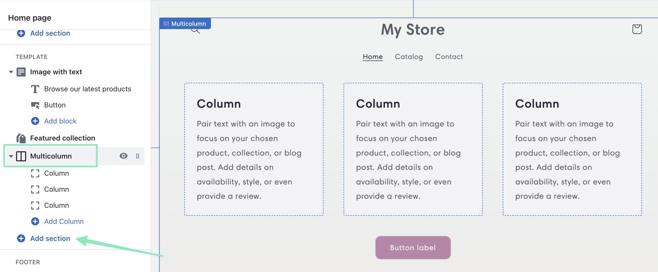
With your desired theme in place, click the Add Section button near the area in which you’d like to place the testimonials. Although there are many other ways to design testimonials, this is by far the most familiar format. Choose to insert the Multicolumn section. This provides three columns to write in multiple testimonials. And you can add more if needed.

how to add testimonials to Shopify with a section

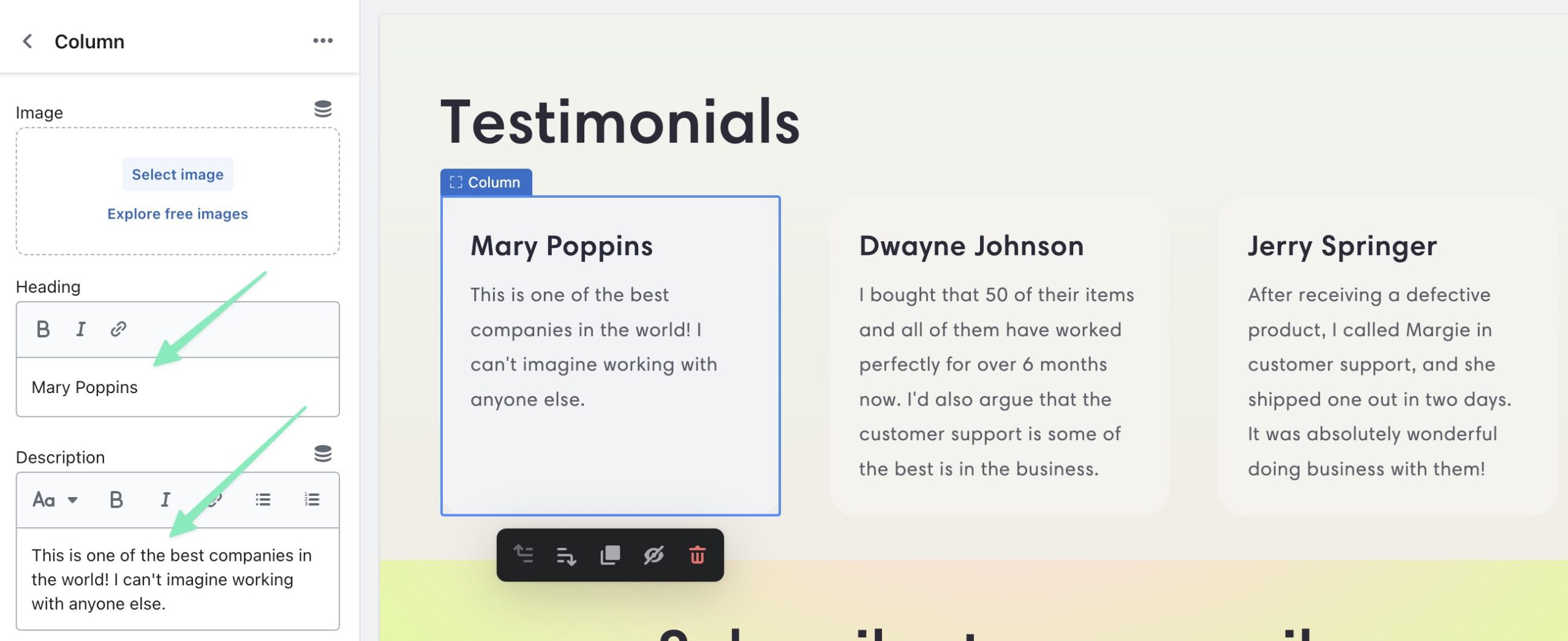
Thereafter, click the multicolumn section to the right in the visual editor. This reveals the settings for each column available. You can add a Heading, and Description. There are various ways to display your testimonials, but a good starting point is to have the name of the person as the Heading, then the actual written testimonial as the Description.

heading and description for how to add testimonials to Shopify

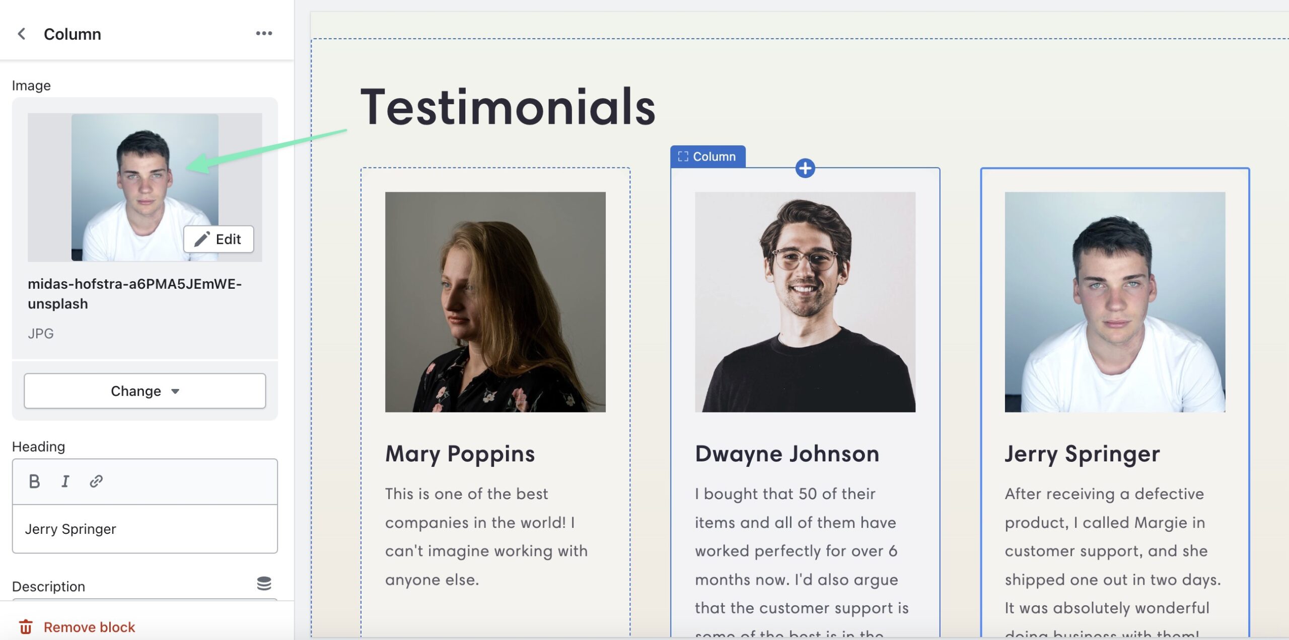
To offer more visual testimonials, the Multicolumn section also offers an Image field to upload a picture of each person who gave the testimonials.

how to add testimonials to Shopify with images

And that’s how you add a testimonial! We recommend exploring other section types, or using widgets, pricing modules, HTML, or product review blocks for suitable formatting for testimonials. You might even find that some Shopify themes already have a testimonial page or testimonial section to showcase customer feedback from happy customers.

Using an App to Add Testimonials to Shopify

One route to take to add testimonials to Shopify is by installing an app. There are pros and cons to this approach: like how apps may cost money, but they often provide more advanced functionality for showing things like video testimonials and testimonial slideshows.

The Shopify page builder is usually enough for making beautiful testimonials, there’s just more customization involved. For instance, you can still make a video testimonial without an app, but you have to build it from scratch in Shopify. Apps, on the other hand, may provide templates for a more plug and play solution.

Here are the best Shopify apps for testimonials:

Customer Testimonials Showcase: offers premade designs and user-friendly layouts for showing testimonials in a grid or photo slider

Testimonials Master: has various styles to quickly add testimonials to Shopify, along with options to collect testimonials from customers on the frontend of your website

Reputon Testimonials Slider: show testimonials in a carousel, as video reviews, photo testimonials, sliders, or feedback modules; this is one of the best testimonial slider apps

Vidial UGC Video Testimonial: this is a way to prompt people to make user-generated content in the form of testimonials; ask them to send in visual testimonials, then automatically approve or decline them for display online

TestimonialHub: this, along with some other apps from Reputon, allow you to automatically pull reviews about your company from all around the internet; you can grab reviews from social media and directory sites like Google, Yelp, and Facebook then display them as testimonials on your ecommerce site

how to add testimonials to Shopify with testimonial hub

We encourage you to try the free trials from some of these plugins, then consider upgrading if you like one with a premium version. This way, you have the perfect testimonials solution instead of having to design something from scratch.

Not to mention, many of the apps listed above pull from external sources, keeping your list of testimonials fresh. Having a stagnant page you made 2 years ago through the regular Shopify page builder requires more maintenance.

Go to the top

illustration of a cat climbing a ladder

Why It’s Essential to Add Shopify Testimonials to Increase Sales

Testimonials, along with customer reviews, deliver an extraordinary amount of power when communicating with potential customers. The stats show that displaying testimonials and reviews can increase business conversions by 270%.

Not only that, but you’re actively hurting your potential for sales if you neglect to include testimonials and reviews on your website, because 80% of consumers are less likely to purchase an item if it doesn’t have any testimonials or reviews. And the percentages go even higher when we’re talking about younger consumers.

It’s also worth mentioning that, although text-based testimonials are rather effective, you should consider visual testimonials, like those that use video or are even complemented by a picture of the customer giving the testimonial.

The reason people like seeing visuals is that they know the customer actually had something to do with the testimonial being placed on your site. They had to give your company a picture, or provide a video read for the testimonial. In fact, 37% of consumers find video testimonials more effective since they appear more authentic than your business’ pitch.

With all the knowledge in mind, now it’s time to learn the best locations to place Shopify testimonials.

Go to the top

illustration of a cat climbing a ladder

Best Locations to Add Shopify Testimonials

The idea behind a testimonial is to display it where potential customers are deciding whether to proceed onto the next step of the sales funnel. A testimonial drives them further down the sales funnel, so it’s essential to decide on the perfect places for testimonials.

In terms of ecommerce, the best locations to add Shopify testimonials are:

The Home page

Product pages

On the Checkout page

It’s also optional to include testimonials after checkout, seeing as how it could restrengthen a customer’s confidence in their purchase and drive them to purchase more in the future. Another option is within follow-up email marketing campaigns like abandoned cart messages and defunct customer emails.

Go to the top

illustration of a cat climbing a ladder

Conclusion

Testimonials are possible with the default features you receive from Shopify, but you can up your game with many Shopify apps. That’s particularly true if you want simplicity in adding testimonials, the ability to pull reviews from elsewhere online, or unique functionality, like for adding and managing video testimonials.

With that said, any testimonial is better than no testimonial! Do you use testimonials on your Shopify store? If so, share how you do it in the comments section below!

The post How to Add Testimonials to Your Shopify Store (Updated for 2023) appeared first on Ecommerce Platforms.

10 Instagram Tools for Businesses, Influencers and Creators

Original Source: https://www.hongkiat.com/blog/instagram-tools-businesses-influencers-creators/

Every successful business, influencer, and creator is backed by a collection of tools that streamline their operations. These tools range from those that aid in creating captivating content to those that facilitate monitoring of campaign performance. We’ve compiled a comprehensive list of everything you need to transform your social media profile into a thriving business.

Regardless of whether you’re a brand, influencer, or creator, you likely have a multitude of tasks to manage. Utilizing the appropriate Instagram tools can provide an opportunity to find clients on social media, thereby fostering your business growth.

Quintly
QuintlyQuintly

Quintly is a powerful analytics platform designed to empower you with comprehensive insights into your social media profiles’ performance. The tool is user-friendly enough so that anyone can gain a deep understanding of their social media metrics across all platforms.

The tool allows users to track key performance indicators (KPIs) such as engagement rates, follower growth, reach, and audience demographics. This valuable information will enable you to identify trends and make data-driven decisions.

Without a tool like Quintly, you’ll have to switch through different campaign dashboards per channel, making it difficult to have a holistic view of your overall online performance. Quintly consolidates everything into a single, intuitive dashboard, enabling you to spot areas for improvement and optimize your content.

You’ll also have access to social media management features, including scheduling, team collaborations, and competitor analysis.

Social Pilot
Social pilotSocial pilot

Social Pilot is a social media management tool designed to help entrepreneurs, influencers, and creators manage their online presence effectively. The tool enables you to publish, schedule, and analyze content all in one place.

A favorite feature is its content calendar, which allows users to plan and schedule posts across multiple social media platforms. This saves you time and effort and lets you focus on the most critical aspect of social media success – content creation. Of course, you’ll also have a suite of analytics tools to help you track and monitor your performance.

You can also access advanced features such as Client Management, Team Collaboration, and RSS Feeds Automation, making it perfect for businesses or creators who manage multiple channels.

Determ
Social pilotSocial pilot

Determ is a media monitoring software that automates the process of tracking all media and public mentions about your brand in any language. Having a tool like Determ enables you to understand the general sentiment about your brand or business and analyze competitors so that you can achieve business growth and make informed decisions.

Unlike other monitoring tools that focus mainly on the major social media platforms, Determ can cover other sources like news portals, forums, comments, and blogs.

It also has a feature called Spike Alerts that notifies you of any sudden increase in mentions so that you can stay on top of your reputation and act quickly. Determ is an excellent tool for any growing business, influencer, or public persona, not just for managing their reputation but also for staying updated about relevant industry news.

Keyhole
KeyholeKeyhole

Keyhole is a social media analytics and listening tool that provides valuable insights into your brand and audience. With its real-time monitoring capabilities, you can track conversations, mentions, and sentiments. This enables you to engage more effectively with your audience and create content that resonates with them.

The tool employs advanced machine learning to identify emerging trends and keywords gaining traction. This foresight allows you to stay ahead of the conversation and leverage this knowledge to create impactful campaigns.

Keyhole also offers an impressive influencer tracking feature. It generates visually stunning reports and data visualizations, assisting marketers in identifying the best influencers to collaborate with. You can request a list of relevant creators, ranked by engagement and following. This feature is useful for pre-engagement, ongoing campaigns, and post-campaign reviews.

Animaker
AnimakerAnimaker

Video is the most popular content today. However, video editing and animation can be expensive and time-consuming. With Animaker, anyone can create visually stunning videos in a few minutes. Its drag-and-drop editor is easy to use and customizable.

The platform comes ready with templates, filters, visual effects, voiceovers, and even characters so you have everything you need to produce any type of video for your business or personal brand. Plus, you have millions of stock videos and photos to choose from.

Animaker has an instant resizer tool that ensures all your videos are optimized for your social media platform of choice.

Jasper AI
JasperJasper

Aside from visual content, brand tone of voice is one thing that can set you apart from competitors. Brand tone of voice can be seen in any written content, such as captions, blogs, and scripts, which can take a ton of time to create. Jasper AI is a customizable copywriting AI that can do that and more for you.

You can teach Jasper AI to write in your brand’s tone of voice by uploading existing content and brand guidelines, sending a URL to your website, or simply telling it about you. Once it learns all about you, you’re assured that everything remains consistently on-brand with minimal effort.

50+ Useful AI Writing Tools to Know (2023)

.no-js #ref-block-post-64715 .ref-block__thumbnail { background-image: url(“https://assets.hongkiat.com/uploads/thumbs/250×160/ai-writing-tools.jpg”); }

50+ Useful AI Writing Tools to Know (2023)

AI writing tools generate content based on the keywords or prompt provided by users. You can then improve… Read more

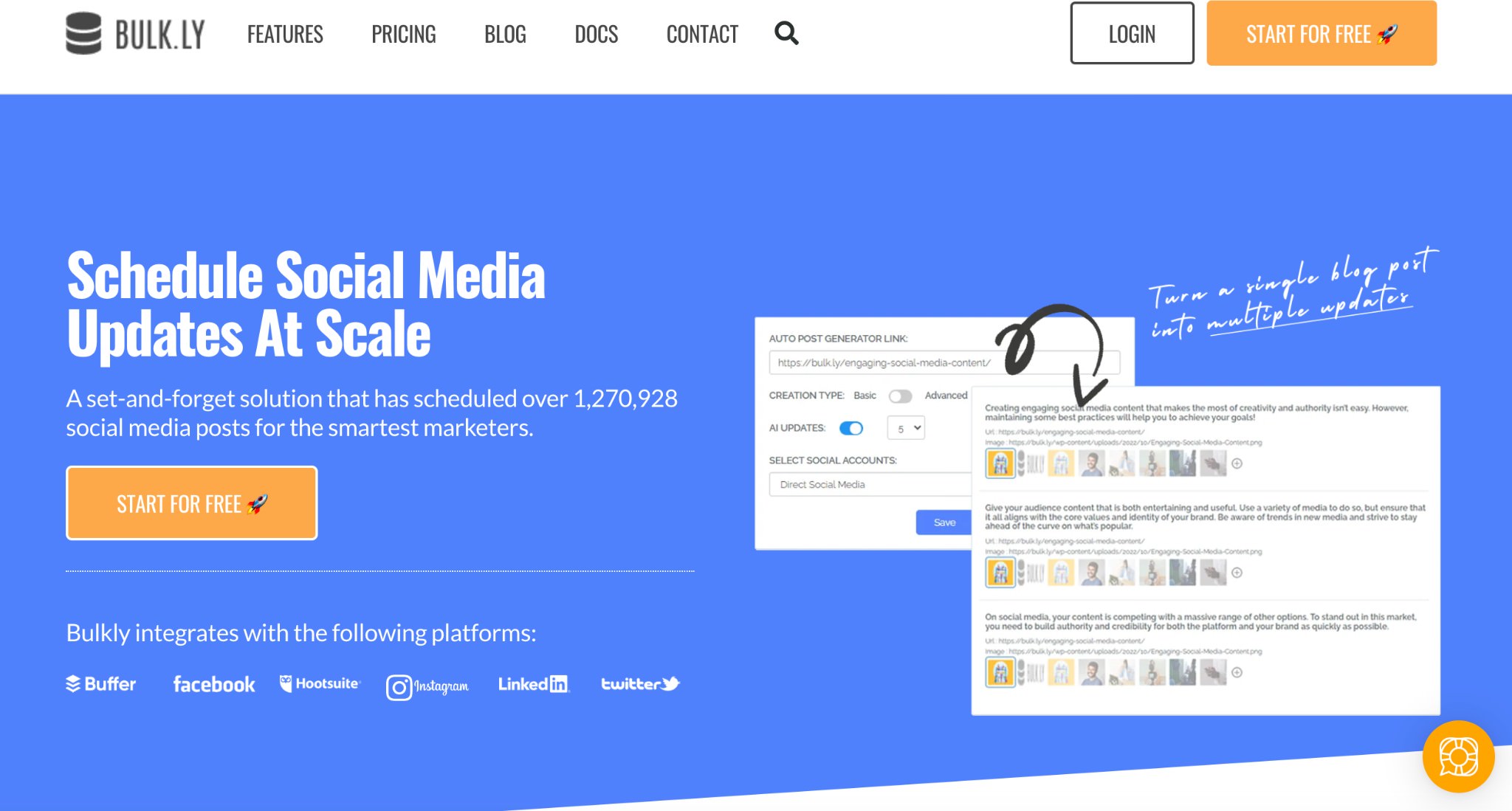
Bulk.ly
bulkbulk

Having Bulk.ly in your arsenal of tools can simplify and enhance your social media management experience. Automate the time-consuming process of scheduling and content calendar creation for your various profiles so that you can focus on brainstorming content.

Other features include Hashtag Assignment, Recycle Posts, and RSS Automation. If you have a website or blog, Bulk.ly can automatically generate social media posts every time you have an update. It also has a drip scheduling feature that ensures you have regular updates on your social pages, whether throughout the day, week, or month.

Bulk.ly automates the tedious stuff so you can concentrate on building your businesses or online brand.

Planable
PlanablePlanable

Planable is the perfect tool for teams as it allows you to upload content, gather feedback, and get approval in one place and in real time. It’s handy for businesses with marketing teams who experience bottlenecks in the approval process and for creators collaborating with brands.

Planable allows you to visualize how your content will look once it’s live on your chosen social media platform to avoid surprise hiccups. You can even tweak captions and add emojis or hashtags within the platform.

Workspace owners can give collaborators different permission levels, allowing relevant team members to leave comments, make edits, and clear it for publishing. You can also keep different workspaces, which is excellent for businesses with multiple ongoing campaigns and creators with various brand partnerships.

Unfold
unfoldunfold

Unfold is a mobile app and creative toolkit made for businesses and content creators who are always on the go. The app has hundreds of eye-catching templates, filters, and effects you can edit and adjust to your liking.

Unfold shortens the creative process as you never have to start from scratch – just import your photo or video, choose from the curated designs, and customize as needed. What’s best is that the app is incredibly user-friendly, so you don’t need any design experience to produce professional-grade content.

One of the app’s most useful features is the Feed Planner, which allows you to plan and visualize your Instagram feed in advance.

The app is free to download on the App Store and Google Play Store, but there are also paid versions, Unfold+ or Pro, which unlock premium features.

GRIN
GRINGRIN

GRIN is a creator management platform that can turn businesses into top-selling brands with the help of partnerships with the right content creators. The platform can find ideal creators you otherwise wouldn’t have known about and provide you with the tools to build deeper connections with them.

GRIN has a tab where you can find all creator-made and user-generate (UGC) content in one place without using Monday.com alternatives for team communication, It makes it easy to repurpose and put all winning content to good use. Plus, you’ll find all your campaign stats and metrics in one dashboard where you can view and compare KPIs.

What’s best is that it also takes care of the tedious contracts needed when working with creators and influencers. GRIN ensures you’re free to share, edit, and reuse all creator-produced content.

Since GRIN is all about building authentic relationships, one of its highlighted features is Relationship Management. Every message between you and your partners – whether sent through email or Slack – can be found in a single Communications Hub.

Conclusion

Having the right set of tools can be instrumental in driving the success of your brand, whether you’re a business, influencer, or content creator.

From analytics dashboards and social media management tools to AI language and design platforms – every tool we mentioned plays a unique role in supercharging your brand in the ever-evolving digital world.

Use one tool or a handful and see a boost in productivity and campaign performance in no time.

The post 10 Instagram Tools for Businesses, Influencers and Creators appeared first on Hongkiat.

Hexeon: revitalizing branding with Rithmm

Original Source: https://abduzeedo.com/hexeon-revitalizing-branding-rithmm

Hexeon: revitalizing branding with Rithmm

abduzeedo0607—23

Rithmm, a small team of senior designers boasting a combined 15+ years of design experience, recently undertook a branding and visual identity project that has caught the attention of industry experts. Led by the award-winning Logo Specialist & Brand Designer, Kwaku Amprako, Rithmm collaborated with Hexeon™, an AI cybersecurity company specializing in advanced threat detection and prevention solutions.

Hexeon™ prides itself on its cutting-edge technology, utilizing artificial intelligence to provide robust security measures for businesses and organizations. Recognizing the need to showcase the efficiency and effectiveness of Hexeon’s approach, Rithmm set out to create an identity system that would embody trust, security, and efficiency.

The creative direction set by Kwaku Amprako and his team focused on developing a visual language that would resonate with Hexeon’s target audience. The result is a compelling brand identity that reflects the company’s innovative spirit and commitment to safeguarding digital assets.

The logo created for Hexeon™ captures the essence of cybersecurity, blending sleek, geometric shapes with a hint of futuristic appeal. The clean lines and contemporary typography exude professionalism and expertise, while the choice of colors—predominantly deep blues and vibrant greens—conveys a sense of trust and reliability.

In addition to the logo, Rithmm crafted a comprehensive visual identity system for Hexeon™, including a versatile color palette, typography guidelines, and accompanying graphic elements. The cohesive design elements across all brand touchpoints—website, marketing collateral, and digital assets—create a consistent and memorable experience for Hexeon’s customers.

The collaboration between Rithmm and Hexeon™ has been a resounding success, with the visual identity project earning praise from both industry peers and the client. The resulting brand identity not only reinforces Hexeon’s position as a leading AI cybersecurity company but also establishes a strong foundation for their future growth and success in the competitive market.

As Rithmm continues to make waves with their impressive design work, their partnership with Hexeon™ serves as a testament to their expertise in creating impactful and visually captivating brand identities.

Branding and visual identity

branding cybersecurity artificial intelligence security brand identity Minimalism logo Logo Design visual design visual identitybranding cybersecurity artificial intelligence security brand identity Minimalism logo Logo Design visual design visual identitybranding cybersecurity artificial intelligence security brand identity Minimalism logo Logo Design visual design visual identitybranding cybersecurity artificial intelligence security brand identity Minimalism logo Logo Design visual design visual identitybranding cybersecurity artificial intelligence security brand identity Minimalism logo Logo Design visual design visual identitybranding cybersecurity artificial intelligence security brand identity Minimalism logo Logo Design visual design visual identitybranding cybersecurity artificial intelligence security brand identity Minimalism logo Logo Design visual design visual identitybranding cybersecurity artificial intelligence security brand identity Minimalism logo Logo Design visual design visual identitybranding cybersecurity artificial intelligence security brand identity Minimalism logo Logo Design visual design visual identitybranding cybersecurity artificial intelligence security brand identity Minimalism logo Logo Design visual design visual identitybranding cybersecurity artificial intelligence security brand identity Minimalism logo Logo Design visual design visual identitybranding cybersecurity artificial intelligence security brand identity Minimalism logo Logo Design visual design visual identitybranding cybersecurity artificial intelligence security brand identity Minimalism logo Logo Design visual design visual identitybranding cybersecurity artificial intelligence security brand identity Minimalism logo Logo Design visual design visual identitybranding cybersecurity artificial intelligence security brand identity Minimalism logo Logo Design visual design visual identitybranding cybersecurity artificial intelligence security brand identity Minimalism logo Logo Design visual design visual identitybranding cybersecurity artificial intelligence security brand identity Minimalism logo Logo Design visual design visual identitybranding cybersecurity artificial intelligence security brand identity Minimalism logo Logo Design visual design visual identitybranding cybersecurity artificial intelligence security brand identity Minimalism logo Logo Design visual design visual identitybranding cybersecurity artificial intelligence security brand identity Minimalism logo Logo Design visual design visual identitybranding cybersecurity artificial intelligence security brand identity Minimalism logo Logo Design visual design visual identitybranding cybersecurity artificial intelligence security brand identity Minimalism logo Logo Design visual design visual identitybranding cybersecurity artificial intelligence security brand identity Minimalism logo Logo Design visual design visual identity

For more information check out Rithmm.io website or follow them on Behance or Instagram.

Exquisite branding and visual identity for Tanner Bates

Original Source: https://abduzeedo.com/exquisite-branding-and-visual-identity-tanner-bates

Exquisite branding and visual identity for Tanner Bates

abduzeedo0606—23

London-based design studio Stylo Design has brought its creative expertise to the forefront with a remarkable branding and visual identity project for Tanner Bates, a renowned traditional leather working company based in Devon. With a team of skilled artisans and a commitment to using oak bark tanned leather from Europe’s only remaining oak bark tannery, Tanner Bates stands as a testament to the preservation of traditional craftsmanship.

As Tanner Bates sets its sights on new markets, innovative designs, and the integration of modern digital technology with time-honored techniques and materials, they recognized the need for an updated identity and marketing collateral that would resonate with today’s discerning consumers.

Stylo Design rose to the challenge and devised a solution that perfectly encapsulates the essence of Tanner Bates. Classic typography takes center stage in the branding, evoking a sense of timeless elegance. Paired with this, a captivating logo marque was crafted, drawing inspiration from the iconic leather working saddlers knife and the scenic countryside that provides the raw materials for Tanner Bates’ creations.

Leather making and working are deeply ingrained in our national heritage, and Tanner Bates remains one of the few companies upholding these rich traditions. Their craftsmanship and utilization of the finest quality leather have earned them a prestigious reputation worldwide.

Stylo Design’s branding and visual identity project pays homage to Tanner Bates’ legacy while paving the way for a vibrant future. The marriage of classic typography and a thoughtfully designed logo perfectly represents the fusion of tradition and innovation that defines the company.

With their updated identity, Tanner Bates is well-equipped to venture into new territories, captivating a wider audience who appreciates the harmonious blend of craftsmanship and contemporary sensibilities. Stylo Design’s creative prowess has elevated Tanner Bates’ brand image, ensuring they remain a beacon of excellence in the world of traditional leather working.

Branding and visual identity artifacts

brand branding identity visual language  brand branding identity visual language  brand branding identity visual language  brand branding identity visual language  brand branding identity visual language  brand branding identity visual language  brand branding identity visual language  brand branding identity visual language

brand branding identity visual language  brand branding identity visual language  brand branding identity visual language  brand branding identity visual language  brand branding identity visual language

brand branding identity visual language  brand branding identity visual language  brand branding identity visual language  brand branding identity visual language  brand branding identity visual language

For more information make sure to check out Stylo Design’s website or follow them on Behance and Instagram.

How to Make Mac Run Faster Again (10 Steps)

Original Source: https://www.hongkiat.com/blog/make-mac-faster/

Is your Mac not performing as it used to? Are you missing the days when everything ran smoothly and applications launched in the blink of an eye? If so, you’re in the right place. This comprehensive guide is designed to help you breathe new life into your Mac, restoring its speed and efficiency.

speed up macOSspeed up macOS

Over time, it’s natural for computers to slow down due to accumulated files, outdated software, and hardware wear. But don’t worry, there’s no need to start thinking about a replacement just yet. With a few simple tweaks and optimizations, you can significantly enhance your Mac’s performance and make it run like new again.

In this guide, we’ll walk you through a series of proven strategies to boost your Mac’s performance, from clearing cache files and managing startup items, to optimizing storage and reducing visual effects. We’ll also discuss potential hardware upgrades for those who want to take their Mac’s performance to the next level.

So, whether you’re using your Mac for work, creative projects, or everyday tasks, these tips will help you make the most of your machine. Let’s dive in and start optimizing your Mac for speed and efficiency!

1. Clear Cache Files

Cache files are temporary data stored by your system and apps to speed up certain processes. Over time, these files can accumulate and take up significant storage space, potentially slowing down your Mac. Here’s how you can clear them:

Manually Clearing Cache Files

System Cache: Open Finder and select “Go to Folder” in the Go menu. Type in /Library/Caches and press enter. You’ll see a bunch of folders, each corresponding to an app on your Mac. You can go into each folder and delete the files inside, but do not delete the folders themselves.
finder clear system cachefinder clear system cache

User Cache: This is similar to the system cache but is specific to your user profile. You can access it by going to ~/Library/Caches (the tilde represents your user directory).
Browser Cache: Each web browser will have its own method of clearing cache. For example, in Safari, you can clear the cache by choosing “Clear History” from the History menu, then selecting “all history“.
safari clear historysafari clear history

Using Third-Party Tools

There are several third-party tools that can simplify the process of clearing cache files. Here are a few examples:

CleanMyMac X: This is a popular Mac cleaning tool that can help you remove system junk, including cache files, with just a few clicks. It also offers other features like malware removal and optimization. Learn more on removing leftover apps with CleanMyMac X.
OnyX: OnyX is a multifunction utility for macOS that allows you to verify the startup disk and the structure of its system files, run miscellaneous tasks of system maintenance, configure some hidden parameters of the Finder, Dock, Safari, and more.
CCleaner: CCleaner is another well-known cleaning tool that’s available for Mac. It can help you clean up cache files and other system junk.

Note: It’s important to be careful when deleting system files. If you’re not sure about something, it’s best to leave it alone or use a trusted third-party tool. Always make sure you have a current backup of your data before making these kinds of changes.

2. Uninstall Unnecessary Applications

Over time, you may accumulate applications that you no longer use. These applications can take up valuable storage space and potentially slow down your system. Here’s how you can uninstall them:

Manually Uninstalling Applications

Using the Trash: Open Finder and go to the Applications folder. Find the application you want to uninstall, click and drag it to the Trash, then empty the Trash. Note that this method may leave behind some associated files.
Using Launchpad: If you downloaded the app from the App Store, you can use Launchpad to uninstall it. Open Launchpad, click and hold on the app until it starts to jiggle, then click the “X” that appears on the app.
uninstall app launchpaduninstall app launchpad

Using Third-Party Tools

Manually uninstalling applications can sometimes leave behind associated files, such as preferences and support files. Third-party uninstaller tools can help ensure these files are removed along with the application. Here are a few examples:

AppCleaner: AppCleaner is a small application which allows you to thoroughly uninstall unwanted apps. You just need to drag and drop an application onto the AppCleaner window, it will find all the related files and you can delete them by clicking “Remove“.
CleanMyMac X: In addition to cleaning up system junk, CleanMyMac X also has an uninstaller feature. It can help you remove applications and their associated files. Learn how to show all installed apps with CleanMyMac X.
AppZapper: AppZapper is another popular uninstaller tool for Mac. It allows you to confidently uninstall virtually any application as easily as it was installed — just drag and drop.

Note: Always make sure you have a current backup of your data before making these kinds of changes.

3. Manage Startup Items

Startup items, also known as login items, are applications, documents, shared volumes, or other items that automatically open or start running when you boot up your Mac. While these can be convenient, having too many can slow down your startup time. Here’s how you can manage them:

Manually Managing Startup Items

System Preferences: Open “System Settings” and go to “General” > “Login Items”. You’ll see a list of items that open when you log in. To remove an item, select it and click the “–” button.
login itemslogin items

Application Settings: Some applications might set themselves as startup items within their own settings. Check the preferences or settings of your applications to see if this is the case.

Using Third-Party Tools

While managing startup items manually is straightforward, there are also third-party tools that can help. These tools often provide additional features, like the ability to delay startup items or manage hidden items. Here are a few examples:

CleanMyMac X: CleanMyMac X has a feature called “Optimization” that allows you to manage your startup items. It also provides options to improve system performance and speed up your Mac.
CCleaner: CCleaner for Mac includes a startup manager in its “Tools” section. This can help you see and manage all the items that start up with your Mac.

Note: Be careful when managing startup items. Some items might be necessary for certain applications or system functions to work properly. If you’re not sure about an item, it’s best to leave it alone or do some research before removing it. As always, make sure you have a current backup of your data before making these kinds of changes.

4.Update Your Software

Keeping your software up to date is crucial for the smooth operation of your Mac. Updates often include bug fixes, security patches, and performance improvements. Here’s how you can update your software:

Manually Updating Software

MacOS Updates: You can check for system updates by going to “System Settings” > “General” > “Software Update”. If an update is available, you can click “Update Now” to install it. You can also check the box to automatically keep your Mac up to date.
mac software updatemac software update

App Store Updates: If you have apps that were downloaded from the Mac App Store, you can update them by going to the App Store and clicking on the “Updates” tab. If updates are available, you can click “Update” next to each app, or “Update All” to update all apps.
Third-Party App Updates: For apps that were not downloaded from the Mac App Store, you’ll usually find an option to check for updates within the app itself, often in the app’s menu bar or within its preferences or settings.

Using Third-Party Tools

While most software updates need to be managed individually, there are some tools that can help you keep track of updates for all your apps in one place. Here are a couple of examples:

CleanMyMac X: CleanMyMac X has an “Updater” feature that shows you all available updates for your apps, whether they’re from the App Store or directly from the developer.
MacUpdate Desktop: MacUpdate Desktop is a tool that can automatically track updates for all your apps. It can notify you when updates are available and install them for you.

Note: It’s always a good idea to back up your data before installing any major updates, just in case something goes wrong.

5. Optimize Storage

Optimizing storage can help free up space on your Mac by storing content in the cloud and removing files you don’t use. Here’s how you can use it:

Manually Optimizing Storage

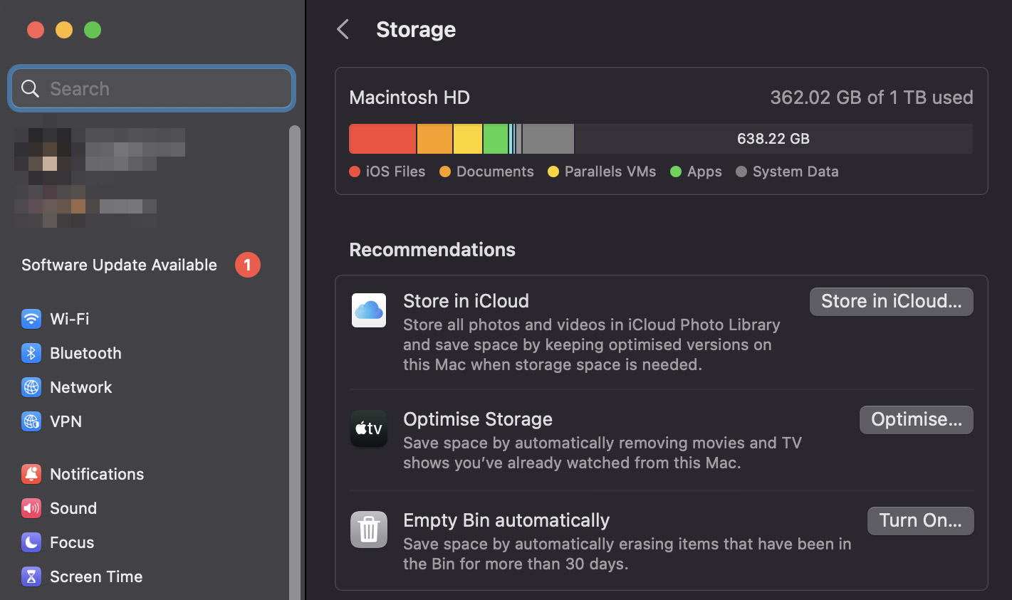
You can access this tool by going to “System Settings” > “General” > “Storage”. Here you’ll see several options:

Store in iCloud: This option moves photos and text messages to iCloud when storage is needed. Only recent files will be kept on your Mac to be readily accessible.
Optimize Storage: This option removes TV shows and movies you’ve already watched and only keeps recent email attachments.
Empty Trash Automatically: This option automatically removes items that have been in the Trash for more than 30 days.

mac optimize storagemac optimize storage
Using Third-Party Tools

While the built-in Optimize Storage tool can be very helpful, there are also third-party tools that offer more features and flexibility. Here are a few examples:

CleanMyMac X: CleanMyMac X has a feature called “Space Lens” that helps you visualize and clear out large and old files. It also has tools for cleaning up system junk, mail attachments, and more. Learn how to find out space-hogging files with CleanMyMac X.
DaisyDisk: DaisyDisk gives you a visual representation of your disk, allowing you to see what’s taking up space. You can then delete unnecessary files directly within the app.
Gemini 2: Gemini 2 is a tool specifically designed to find and remove duplicate files, which can take up a lot of space over time.

Note: Always make sure you have a current backup of your data before making these kinds of changes.

6. Reindex Spotlight

Spotlight is a system-wide desktop search feature on your Mac that helps you find documents, emails, apps, and other files. Sometimes, Spotlight might not work properly, and reindexing it can help solve the problem. Here’s how you can do it:

Manually Reindexing Spotlight

System Preferences: Go to “System Settings” > “Siri & Spotlight”, then click on “Spotlight Privacy” at the bottom. Here, you can add a folder or disk that you want to prevent Spotlight from searching. To reindex a folder or disk, you can add it to the list, then remove it. When you remove the folder or disk, Spotlight will reindex it.
mac spotlight privacymac spotlight privacy

Terminal: You can also reindex Spotlight using Terminal. Open Terminal and type sudo mdutil -E / then press Enter. You’ll be asked for your password. This command will erase and rebuild the index for your main hard drive.

Using Third-Party Tools

While reindexing Spotlight is generally straightforward, there are some third-party tools that can help if you’re having trouble. Here are a few examples:

OnyX: OnyX is a multifunction utility for macOS that allows you to verify the startup disk and the structure of its system files, run miscellaneous tasks of system maintenance, configure some hidden parameters of the Finder, Dock, Safari, and more. It also has a feature to rebuild Spotlight’s index.
Alfred: Alfred is an alternative to Spotlight with more features and customization options. If you’re having ongoing issues with Spotlight, you might consider trying Alfred instead.

Note: Reindexing Spotlight can take some time, and your Mac might run slowly while indexing is in progress. It’s best to do this when you don’t need to use your Mac for a while. As always, make sure you have a current backup of your data before making these kinds of changes.

7. Reset SMC and PRAM

The SMC and PRAM are parts of your Mac that control certain hardware functions. If you’re experiencing issues with things like your Mac’s display, battery, or sleep functions, you might need to reset the SMC or PRAM. Here’s how you can do it:

Resetting the SMC

The method to reset the SMC depends on the type of Mac you have:

Desktop Macs (including Mac Pro, Mac Mini, and iMac): Shut down your Mac, then unplug the power cord. Wait 15 seconds, then plug the power cord back in. Wait another 5 seconds, then turn on your Mac.
MacBooks with non-removable batteries (most MacBooks 2009 and later): Shut down your Mac, then press and hold the left Shift, Control, and Option keys while also pressing the power button for 10 seconds. Release all keys, then press the power button to turn on your Mac.
MacBooks with removable batteries: Shut down your Mac and remove the battery. Press and hold the power button for 5 seconds, then reinsert the battery and turn on your Mac.

Resetting the PRAM

To reset the PRAM, turn off your Mac, then turn it on and immediately press and hold the Option, Command, P, and R keys. Release the keys after about 20 seconds. Your Mac might appear to restart during this process.

Using Third-Party Tools

While resetting the SMC and PRAM is generally straightforward, there are some third-party tools that can help if you’re having trouble. However, due to the nature of these resets affecting low-level system functionality, they are typically performed manually as described above.

Note: Resetting the SMC and PRAM can change certain system settings, so you might need to reconfigure things like your time zone, display resolution, or startup disk selection. As always, make sure you have a current backup of your data before making these kinds of changes.

8. Run Disk Utility

Disk Utility is a built-in tool on your Mac that can find and repair issues with your Mac’s disk. It can also help you manage your storage and perform other disk-related tasks. Here’s how you can use it:

Using Disk Utility

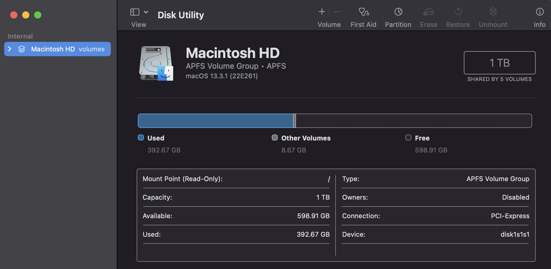
First Aid: Open Disk Utility (you can find it in “Applications” > “Utilities”, then select your startup disk in the sidebar. Click the “First Aid” button, then click “Run”. Disk Utility will check the disk and attempt to repair any issues it finds.
Disk Cleanup: Disk Utility can also help you manage your storage. You can use it to erase free space, delete volumes, or erase entire disks (be careful with this one!).
Disk Images: Disk Utility can create and manage disk images. This can be useful for backing up your data or moving files.

mac mac disk utilitymac mac disk utility
Using Third-Party Tools

While Disk Utility is a powerful tool, there are also third-party tools that offer more features and flexibility. Here are a few examples:

TechTool Pro: TechTool Pro is a robust tool for maintaining, troubleshooting, and optimizing your Mac. It includes features for testing and repairing disks, recovering data, and more.
DriveDx: DriveDx is an advanced drive health diagnostic and monitoring utility. It can help you check the health of your disk and predict drive failures.
DiskWarrior: DiskWarrior is a tool focused on repairing and rebuilding corrupted disk directories.

Note: Always make sure you have a current backup of your data before making these kinds of changes, especially when working with disk utilities. Disk-related tasks can potentially erase data, so it’s important to be careful.

9. Reduce Visual Effects

macOS uses some visual effects like motion and transparency. These can slow down older Macs or Macs with less powerful hardware. Here’s how you can reduce these effects:

Manually Reducing Visual Effects

Reduce Transparency: Go to “System Settings” >”Accessibility”> “Display”, then check the box for “Reduce transparency“. This will reduce the transparency effects used throughout the system, such as in the Dock and menu bar.
mac reduce transparencymac reduce transparency

Reduce Motion: In the same “Accessibility” > “Display settings”, you can also check the box for “Reduce motion“. This will reduce the motion effects used in the system, such as when opening Mission Control or switching between apps.
Dock Preferences: Go to “System Settings” > “Desktop & Dock”, then check the box for “Minimize windows using: Scale effect“. This will change the animation used when minimizing windows to a simpler effect.
mac dock genie effectmac dock genie effect

Using Third-Party Tools

While most visual effects can be reduced using the built-in system preferences, there are also third-party tools that can provide more customization. Here are a few examples:

TinkerTool: TinkerTool is an application that gives you access to additional system settings Apple has built into macOS. This includes the ability to disable or enable animation effects.
OnyX: OnyX is a multifunction utility for macOS that allows you to tweak the system’s hidden parameters, which includes disabling some animations.

Note: These changes will alter the look and feel of your Mac’s interface. If you find that you don’t like the changes, you can easily revert them by unchecking the boxes in the system preferences. As always, make sure you have a current backup of your data before making these kinds of changes.

10. Upgrade Your Hardware

Upgrading your hardware can significantly improve the performance of your Mac, especially if it’s older. Here are a few upgrades you might consider:

Hardware Upgrades

RAM (Memory): Adding more RAM can help your Mac handle more tasks at once. This is especially helpful if you often have many applications open at the same time or use memory-intensive applications like video editing software.
SSD (Solid State Drive): If your Mac has a traditional hard drive, upgrading to an SSD can significantly improve performance. SSDs are much faster than traditional hard drives, which means your Mac can read and write data more quickly.
CPU (Processor): Upgrading the processor can also improve performance, but this is a much more complex upgrade that is often not possible on most Macs due to the CPU being soldered onto the motherboard.

Using Third-Party Tools

While upgrading hardware is typically a manual process, there are tools and services that can help:

OWC (Other World Computing): OWC offers a wide range of hardware upgrades for Macs, including memory and SSD upgrades. They also provide detailed installation videos and customer support.
Crucial: Crucial’s website offers a tool that can help you find compatible memory and SSD upgrades for your Mac.
Apple Store or Authorized Service Provider: If you’re not comfortable upgrading your Mac’s hardware yourself, you can take it to an Apple Store or an Apple Authorized Service Provider. They can perform upgrades and ensure everything is installed correctly.

Note: Upgrading hardware can be risky and may void your warranty. Always make sure you have a current backup of your data before making these kinds of changes. If you’re not comfortable performing these upgrades yourself, it’s best to seek professional help.

The post How to Make Mac Run Faster Again (10 Steps) appeared first on Hongkiat.

Improved Attribution Models: What Digital Marketers Need To Know

Original Source: https://www.sitepoint.com/improved-attribution-models-what-digital-marketers-need-to-know/?utm_source=rss

Improved Attribution Models: What Digital Marketers Need To Know

Learn how marketing attribution models play a key role in identifying the most important touchpoints for success during the buyer journey.

Continue reading
Improved Attribution Models: What Digital Marketers Need To Know
on SitePoint.

Pass Pro: a branding and UI/UX case study

Original Source: https://abduzeedo.com/pass-pro-branding-and-uiux-case-study

Pass Pro: a branding and UI/UX case study

abduzeedo0601—23

Pass Pro is a podcast that takes you behind the scenes of the music industry. Hosted by Mélodie Gambin, a music industry veteran with over 10 years of experience, Pass Pro features interviews with artists, managers, and other industry insiders about their experiences and insights. The Pass Pro team wanted to create a branding and UI/UX experience that was both visually appealing and informative.

For this project they worked with the design agency AB Projets Studio to create a brand identity that was both modern and stylish. The resulting identity features a custom typeface, a bold color palette, and a dynamic layout.

The UI/UX of the Pass Pro app was also carefully designed to make it easy for users to find and listen to episodes. The app features a clean and intuitive interface, as well as a number of features that make it easy to discover new content. For example, users can browse episodes by genre, artist, or guest. They can also create custom playlists and save episodes for offline listening.

The Branding

The Pass Pro branding is based on the idea of a “pass” that grants access to the inner workings of the music industry. The logotype features a custom typeface that is both modern and stylish. The typeface is used throughout the branding, including on the website, social media, and app.

The color palette for Pass Pro logo is black and white, but there are bold and vibrant auxiliary colors. The colors are used to create a sense of energy and excitement. The colors are also used to differentiate between different sections of the branding, such as the website, social media, and app.

The layout of the branding is dynamic and engaging. The use of negative space helps to create a sense of movement and excitement. The layout is also used to highlight the key features of the Pass Pro brand, such as the podcast episodes, the guests, and the music industry insights.

The UI/UX

The Pass Pro UI/UX is clean and intuitive. The app features a simple navigation system that makes it easy for users to find and listen to episodes. The app also features a number of features that make it easy to discover new content, such as the ability to browse episodes by genre, artist, or guest. Users can also create custom playlists and save episodes for offline listening.

The Pass Pro UI/UX works. The app has been praised for its clean and intuitive design, as well as its ability to make it easy for users to find and listen to content.

The Pass Pro branding and UI/UX are simple and efficient. The branding is both visually appealing and informative, while the UI/UX is clean and intuitive. The result is a podcast experience that is both enjoyable and informative.

Brand Design branding  festival logo music podcast Social media post type design Typeface typography  Brand Design branding  festival logo music podcast Social media post type design Typeface typography  Brand Design branding  festival logo music podcast Social media post type design Typeface typography  Brand Design branding  festival logo music podcast Social media post type design Typeface typography  Brand Design branding  festival logo music podcast Social media post type design Typeface typography  Brand Design branding  festival logo music podcast Social media post type design Typeface typography  Brand Design branding  festival logo music podcast Social media post type design Typeface typography  Brand Design branding  festival logo music podcast Social media post type design Typeface typography  Brand Design branding  festival logo music podcast Social media post type design Typeface typography  Brand Design branding  festival logo music podcast Social media post type design Typeface typography  Brand Design branding  festival logo music podcast Social media post type design Typeface typography  Brand Design branding  festival logo music podcast Social media post type design Typeface typography  Brand Design branding  festival logo music podcast Social media post type design Typeface typography  Brand Design branding  festival logo music podcast Social media post type design Typeface typography  Brand Design branding  festival logo music podcast Social media post type design Typeface typography  Brand Design branding  festival logo music podcast Social media post type design Typeface typography  Brand Design branding  festival logo music podcast Social media post type design Typeface typography  Brand Design branding  festival logo music podcast Social media post type design Typeface typography  Brand Design branding  festival logo music podcast Social media post type design Typeface typography  Brand Design branding  festival logo music podcast Social media post type design Typeface typography  Brand Design branding  festival logo music podcast Social media post type design Typeface typography  Brand Design branding  festival logo music podcast Social media post type design Typeface typography  Brand Design branding  festival logo music podcast Social media post type design Typeface typography  Brand Design branding  festival logo music podcast Social media post type design Typeface typography  Brand Design branding  festival logo music podcast Social media post type design Typeface typography  Brand Design branding  festival logo music podcast Social media post type design Typeface typography  Brand Design branding  festival logo music podcast Social media post type design Typeface typography  Brand Design branding  festival logo music podcast Social media post type design Typeface typography  Brand Design branding  festival logo music podcast Social media post type design Typeface typography  Brand Design branding  festival logo music podcast Social media post type design Typeface typography  Brand Design branding  festival logo music podcast Social media post type design Typeface typography  Brand Design branding  festival logo music podcast Social media post type design Typeface typography

For more information make sure to check out AB Projets Studio’s website or follow them on Behance and Instagram.