Collective #741

Original Source: https://tympanus.net/codrops/collective/collective-741/

Inspirational Website of the Week: Unseen Studio

A beautiful, immersive web experience with stunning animations. Our pick this week.

Get inspired


This content is sponsored via BuySellAds

Practical, no-nonsense UI design tips

The Design Hacks newsletter will help you create better designs (even if you’re not artsy). Over 50,000 readers.

Check it out

The large, small, and dynamic viewport units

Learn all about the new CSS units that account for mobile viewports with dynamic toolbars in this article by Bramus Van Damme.

Check it out

Color Formats in CSS

In this tutorial, Josh W Comeau takes you on a tour of all the different color options in CSS.

Read it

The easiest way to get started with CSS Grid

A simple, straightforward guide to CSS Grid using grid-template-areas property to visually set the grid structure.

Check it out

GenCup

A generative art project that combines graphic design, football, and data. Using the statics of FIFA World Cup games to generate abstract compositions. Every match is a new poster.

Check it out

D2

D2 is a domain-specific language (DSL) that stands for Declarative Diagramming where you describe what you want diagrammed and it generates the image.

Check it out

gpu-io

A GPU-accelerated computing library for physics simulations and other mathematical calculations. Read more in this thread and check out the examples.

Check it out

Inkbase: Programmable Ink

What would be possible if hand-drawn sketches were programmable like spreadsheets? An amazing project shows what can be achieved.

Check it out

Little Languages Are The Future Of Programming

Learn what “Little Languages” are, why they matter and how they will shape the future of programming.

Read it

What Is the Open Web?

A working definition of an Open Web and what we can strive for to building an open and sustainable internet.

Read it

The BBC’s 15 Web Principles – 15 years later

Back in 2007 the BBC published a document showing their 15 Web Principles. Terence Eden takes a look at how they stack up today.

Read it

FFmpeg – Ultimate Guide

This guide covers the ins and outs of FFmpeg starting with fundamental concepts and moving to media transcoding and video and audio processing along with practical example.

Read it

Score

Score is an open source, platform-agnostic, container-based workload specification.

Check it out

You don’t need HTML!

Sir Tim lied to you, you only need Unicode! 😉

Check it out

Infisical

An open source, end-to-end encrypted tool that lets you securely sync secrets and environment variables across your team and infrastructure.

Check it out

Llama

A simple and minimalistic terminal file manager.

Check it out

Act

Run your GitHub Actions locally for fast feedback and replacing your makefile.

Check it out

Sekisui House Fact Book 2022

A beautiful interactive web experience with creative transitions powered by Three.js.

Check it out

Three.js and Sobel

Jesper Vos explains how he coded very interesting portal effect.

Check it out

Three CSS tips for working with inconsistently sized logos

Some super useful CSS to work with logos that are of a different size. By Wes Bos.

Check it out


From Our Blog

Sketchy Pencil Effect with Three.js Post-Processing

A tutorial where you’ll learn how to create a pencil effect with a sketchy look using Three.js post-processing.

Read it

Bypassing Google Lock on Any Samsung Phones with UnlockGo

Original Source: https://www.hongkiat.com/blog/remove-samsung-frp-unlockgo/

Google Account Verification, also known as the FRP (Factory Reset Protection), is vital in preventing unauthorized access to your phone. However, it is also a double-edged sword; if you forget your password, you will, too, be locked out of your phone.

To prevent the latter from happening, you must guard yourself with the knowledge of how to regain access to your phone again.

In this post, I’m going to share some tips on bypassing FRP on your Samsung model Android phone shall you forget your password and get locked out.

Google FRP lock after factory resetGoogle FRP lock after factory reset

Image: Google FRP lock after factory reset

Features of iToolab UnlockGo for Android

AFAIK Samsung hasn’t developed a tool to help bypass FRP, and if you are to regain access to your locked phone, a 3rd party app could be your solution.

Enter iToolab’s UnlockGo for Android.

This app works without requiring any root permission from your device. Within clicks – literally five – it removes Google’s lock entirely.

Here are more features of this app that make it a great Samsung FRP unlocker:

It has 99.3% effectiveness in bypassing Google FRP lock on Samsung devices from android version 5 to 12.
it is compatible with most Samsung phone and tablet models.
It is easy to use for novice users.
Completes job fast.

How to Unlock Samsung Phone with UnlockGo (Android)?

Below is a step-by-step guide to using iToolab UnlockGo to bypass the Samsung FRP lock. If you are not into reading, there’s a video guide too.

Step 1: Download UnlockGo on Your PC

Download the UnlockGo app from its official website. Install and run the app. UnlockGo is available for both Windows and Mac.

Download iToolab UNlockGo (Android)

Step 2: Start the Process

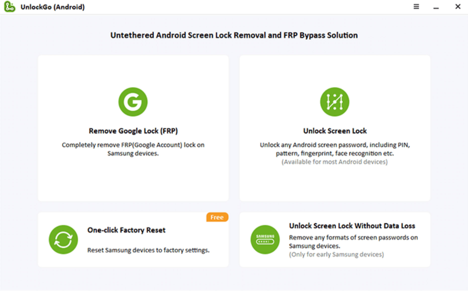
Connect the locked Samsung device to your PC via a USB cable. Click “Remove Google Lock (FRP)” and then “Start” to continue.

Remove Google lock with Samsung FRP bypass toolRemove Google lock with Samsung FRP bypass tool

Image: Remove Google lock with Samsung FRP bypass tool

Select “All Android Versions” on the next screen, then click “Next”.

One-click Samsung FRP bypass solution for all modelsOne-click Samsung FRP bypass solution for all models

Image: One-click Samsung FRP bypass solution for all models

Step 3: Open Samsung Diagnostics Menu

A pop-up window will appear with instructions on how to enter the Samsung Diagnostic menu. Follow the on-screen instructions, then click “Next” to enable “USB Debugging” on your device.

Enter Samsung DiagnosticsEnter Samsung Diagnostics

Image: Enter Samsung Diagnostics menu with FRP lock

Step 4: Remove Google FRP

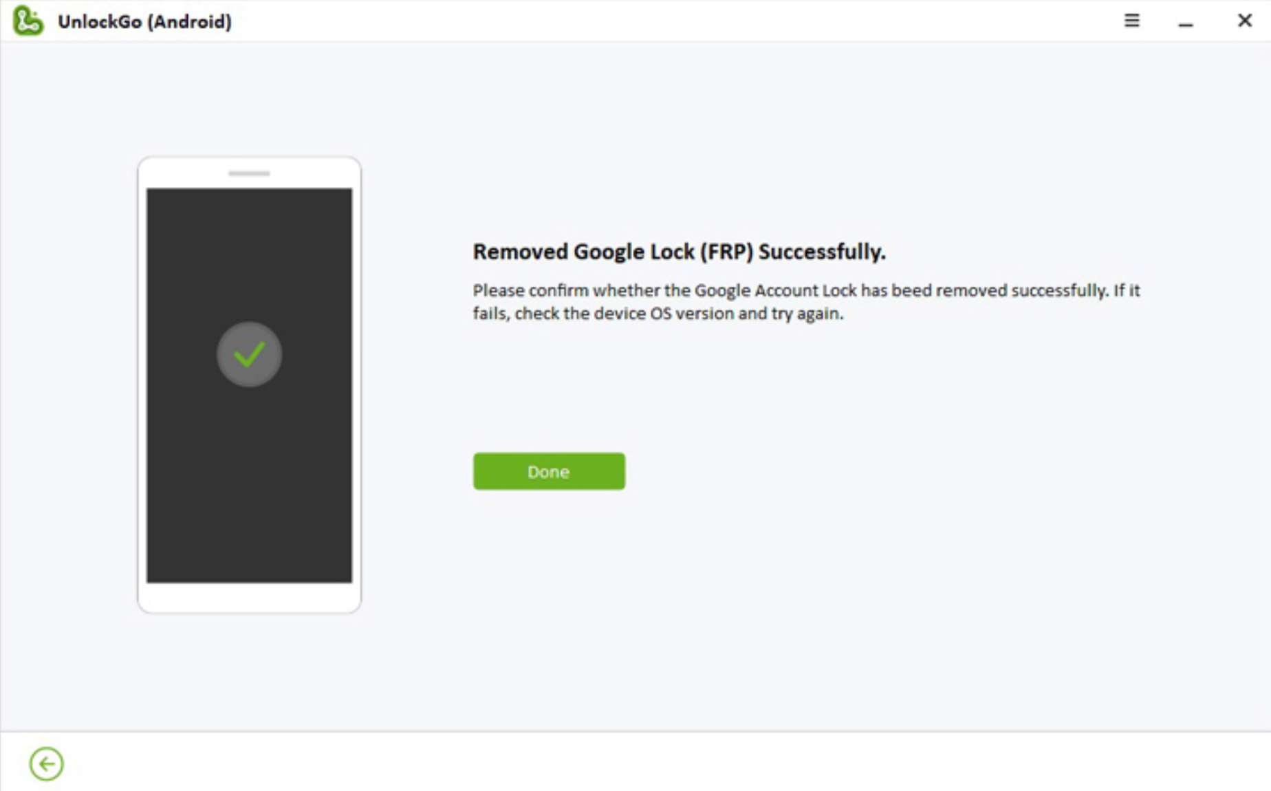
The app will take a couple of seconds to bypass, and the device will be rebooted once the process is complete.

Remove Google lockRemove Google lock

Image: Remove Google lock

Unlocking Samsung Phone w/o Password or Google Account

Additionally, the UnlockGo app provides a simple way to unlock your android phone without needing a password.

Here’s how it’s done:

Step 1: Connect Your Device

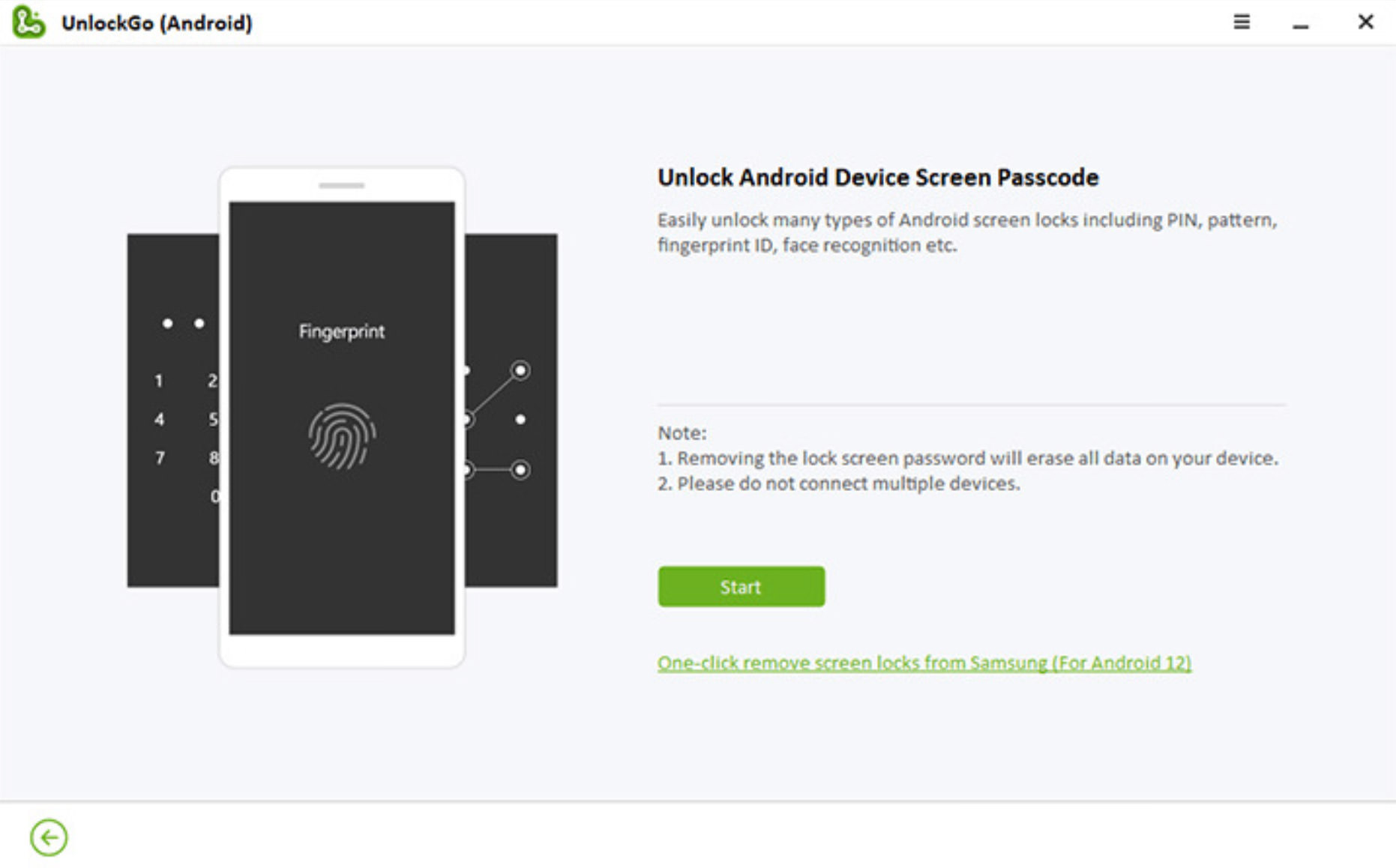
Connect your Samsung device to your PC or Mac via a USB cable. Click on the “Unlock Screen Lock”, then click “One-click remove screen lock from Samsung”.

Unlock Samsung phones without password or Google accountUnlock Samsung phones without password or Google account

Image: Unlock Samsung phones without password or Google account

Step 2: Unlock Your Device

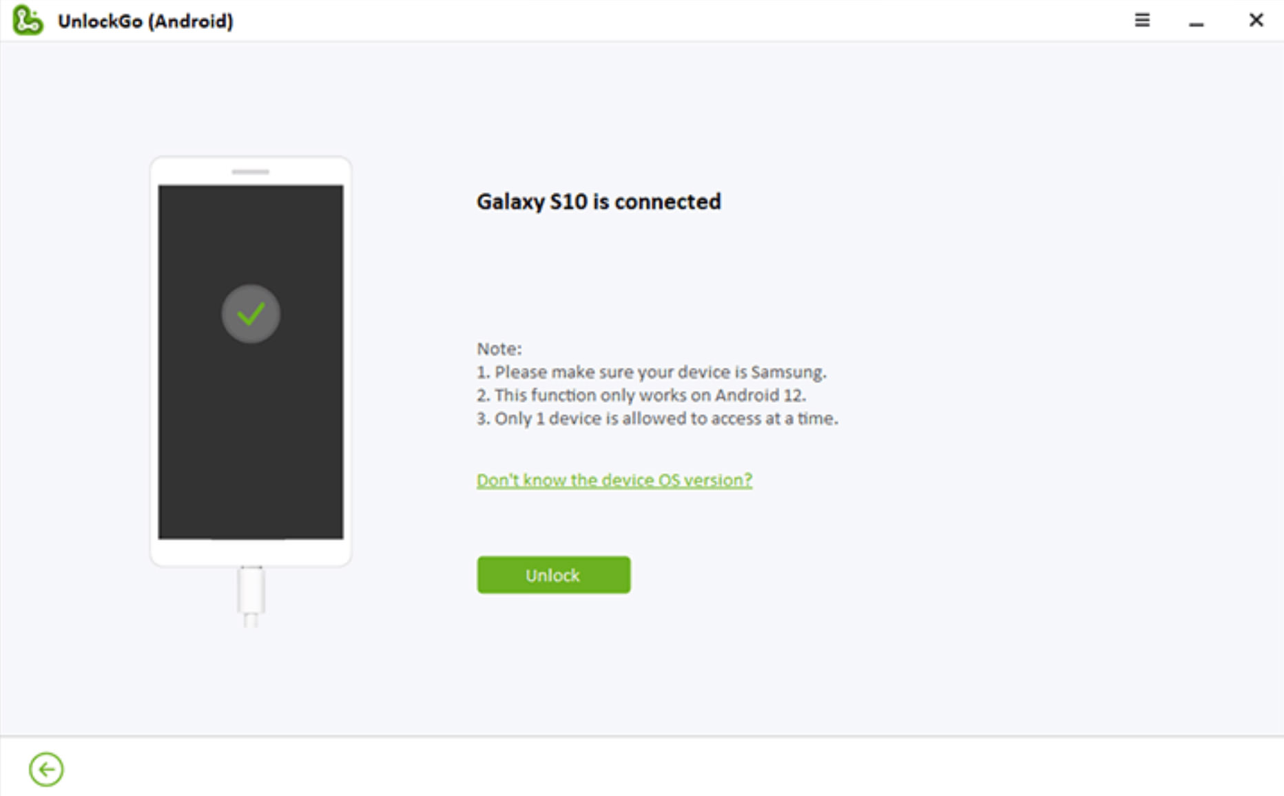
Follow the on-screen instructions and click the “Unlock” button to continue. The lock screen then goes away, and your device will restart.

Samsung screen locksSamsung screen locks

Image: Unlock Samsung screen locks

When Bypassing Google Lock is Needed?

I’ve shown you the how; now let’s take a look at the when. Here are some possible scenarios when you will need to bypass Google lock on your Samsung device.

1. Selling a Samsung device, but forgot the password

You can’t and shouldn’t sell your current Samsung device without removing your Google account. If you intend to sell but forgot the password to your Google account, then the bypassing operation will be needed.

2. Bought a pre-owned locked Samsung device

If you have unfortunately sold a locked Samsung device from a merchant or seller, then bypassing it yourself may save you a lot of hassle.

3. Running a phone buyback and re-selling business

If you are in the buyback and pre-owned phone-selling business, you will encounter various problems with the phones you acquire. And the Google FRP problem is definitely one of the most common ones. The ability to bypass FRP yourself should be one of the knowledge you should know.

Bonus: Prevention

Last but not least, if you want to avoid being locked-out entirely, it is recommended that you remove the Google account first before performing a factory reset. And to do that:

Go to “Settings” > “Accounts and Backup”
Tap “Manage Accounts”, then select your Google account
Select “Remove Account”, then confirm it.
When prompted, verify your identity and get rid of the Samsung FRP lock.

The post Bypassing Google Lock on Any Samsung Phones with UnlockGo appeared first on Hongkiat.

Sketchy Pencil Effect with Three.js Post-Processing

Original Source: https://tympanus.net/codrops/2022/11/29/sketchy-pencil-effect-with-three-js-post-processing/

In this tutorial, you’ll learn how to create a sketchy, pencil effect using Three.js post-processing. We’ll go through the steps for creating a custom post-processing render pass, implementing edge detection in WebGL, re-rendering the normal buffer to a render target, and tweaking the end result with generated and imported textures.

This is what the end result looks like, so let’s get started!

Post-processing in Three.js

Post-processing in Three.js is a way of applying effects to your rendered scene after it has been drawn. In addition to all the out-of-the-box post-processing effects provided by Three.js, it is also possible to add your own filters by creating custom render passes.

A custom render pass is essentially a function that takes in an image of the scene and returns a new image, with the desired effect applied. You can think of these render passes like layer effects in Photoshop—each applies a new filter based on the previous effect output. The resulting image is a combination of all the different effects.

Enabling post-processing in Three.js

To add post-processing to our scene, we need to set up our scene rendering to use an EffectComposer in addition to the WebGLRenderer. The effect composer stacks the post-processing effects one on top of the other, in the order in which they’re passed. If we want our rendered scene to be passed to the next effect, we need to add the RenderPass post-processing pass is passed first.

Then, inside the tick function which starts our render loop, we call composer.render() instead of renderer.render(scene, camera).

const renderer = new THREE.WebGLRenderer()
// … settings for the renderer are available in the Codesandbox below

const composer = new EffectComposer(renderer)
const renderPass = new RenderPass(scene, camera)

composer.addPass(renderPass)

function tick() {
requestAnimationFrame(tick)
composer.render()
}

tick()

There are two ways of creating a custom post-processing effect:

Creating a custom shader and passing it to a ShaderPass instance, or

Creating a custom render pass by extending the Pass class.

Because we want our post-processing effect to get more information than just uniforms and attributes, we will be creating a custom render pass.

Creating a custom render pass

While there isn’t much documentation currently available on how to write your own custom post-processing pass in Three.js, there are plenty of examples to learn from already inside the library. A custom pass inherits from the Pass class and has three methods: setSize, render, and dispose. As you may have guessed, we’ll mostly be focusing on the render method.

First we’ll start by creating our own PencilLinesPass that extends the Pass class and will later implement our own rendering logic.

import { Pass, FullScreenQuad } from 'three/examples/jsm/postprocessing/Pass'
import * as THREE from 'three'

export class PencilLinesPass extends Pass {
constructor() {
super()
}

render(
renderer: THREE.WebGLRenderer,
writeBuffer: THREE.WebGLRenderTarget,
readBuffer: THREE.WebGLRenderTarget
) {
if (this.renderToScreen) {
renderer.setRenderTarget(null)
} else {
renderer.setRenderTarget(writeBuffer)
if (this.clear) renderer.clear()
}
}
}

As you can see, the render method takes in a WebGLRenderer and two WebGLRenderTargets, one for the write buffer and the other for the read buffer. In Three.js, render targets are basically textures to which we can render the scene, and they serve to send data between passes. The read buffer receives data in from the previous render pass, in our case that is the default RenderPass. The write buffer sends data out to the next render pass.

If renderToScreen is true, that means we want to send our buffer to the screen instead of to a render target. The renderer’s render target is set to null, so it defaults to the on-screen canvas.

At this point, we’re not actually rendering anything, not even the data coming in through the readBuffer. In order to get things rendered, we’ll need to create a FullscreenQuad and a shader material that will take care of rendering. The shader material gets rendered to the FullscreenQuad.

To test that everything is set up correctly, we can use the built-in CopyShader that will display whatever image we put into it. In this case, in this case the readBuffer‘s texture.

import { Pass, FullScreenQuad } from 'three/examples/jsm/postprocessing/Pass'
import { CopyShader } from 'three/examples/jsm/shaders/CopyShader'
import * as THREE from 'three'

export class PencilLinesPass extends Pass {
fsQuad: FullScreenQuad
material: THREE.ShaderMaterial

constructor() {
super()

this.material = new THREE.ShaderMaterial(CopyShader)
this.fsQuad = new FullScreenQuad(this.material)
}

dispose() {
this.material.dispose()
this.fsQuad.dispose()
}

render(
renderer: THREE.WebGLRenderer,
writeBuffer: THREE.WebGLRenderTarget,
readBuffer: THREE.WebGLRenderTarget
) {
this.material.uniforms['tDiffuse'].value = readBuffer.texture

if (this.renderToScreen) {
renderer.setRenderTarget(null)
this.fsQuad.render(renderer)
} else {
renderer.setRenderTarget(writeBuffer)
if (this.clear) renderer.clear()
this.fsQuad.render(renderer)
}
}
}

Note: we’re passing the uniform tDiffuse to the shader material. The CopyShader already has this uniform built in and it represents the image to be displayed on the screen. If you’re writing your own ShaderPass, this uniform will be passed in to your shader automatically.

All that’s left is to hook the custom render pass into the scene by adding it to the EffectComposer—after the RenderPass of course!

const renderPass = new RenderPass(scene, camera)
const pencilLinesPass = new PencilLinesPass()

composer.addPass(renderPass)
composer.addPass(pencilLinesPass)

View the Codesandbox example

Scene with a custom render pass and the CopyShader

Now that we have everything set up, we can actually get started with creating our special effect!

Sobel operator for creating outlines

We need to be able to tell the computer to detect lines based on our input image, in this case the rendered scene. The kind of edge detection we’ll be using is called the Sobel operator, and it only consists of a few steps.

The Sobel operator does edge detection by looking at the gradient of a small section of the image—essentially how sharp the transition from one value to another is. The image is broken down into smaller “kernels”, or 3px by 3px squares where the central pixel is the one currently being processed. The image below shows what this might look like: the red square in the center represents the current pixel being evaluated and the rest of the squares are its neighbors.

3px by 3px kernel

The weighted value for each neighbor is then calculated by taking the pixels value (brightness) and multiplying it by a weight based on its position relative to the pixel being evaluated. This is done with weights biasing the gradient horizontally and vertically. The average of both values is taken, and if it passes a certain threshold, we consider the pixel to represent an edge.

The horizontal and vertical gradients for the Sobel operator

While the implementation for the Sobel operator follows the image representations above almost directly, it still takes time to grasp. Thankfully we don’t have to implement our own as Three.js already provides us with working code for one in the SobelOperatorShader. We’ll copy this code over into our shader material.

Implementing the Sobel operator

Instead of the CopyShader, we’ll now need to add our own ShaderMaterial so that we have control over the vertex and fragment shaders, as well as the uniforms sent to those shaders.

// PencilLinesMaterial.ts
export class PencilLinesMaterial extends THREE.ShaderMaterial {
constructor() {
super({
uniforms: {
// we'll keep the naming convention here since the CopyShader
// also used a tDiffuse texture for the currently rendered scene.
tDiffuse: { value: null },
// we'll pass in the canvas size here later
uResolution: {
value: new THREE.Vector2(1, 1)
}
},
fragmentShader, // to be imported from another file
vertexShader // to be imported from another file
})
}
}

We’ll get to the fragment and vertex shaders soon, but first we need to use our new shader material in the scene. We do this by swapping out the CopyShader. Don’t forget to pass the resolution—the canvas size—as a the shader’s uniform. While outside the scope of this tutorial, it’s also important to update this uniform when the canvas resizes.

// PencilLinesPass.ts
export class PencilLinesPass extends Pass {
fsQuad: FullScreenQuad
material: PencilLinesMaterial

constructor({ width, height }: { width: number; height: number }) {
super()

// change the material from to our new PencilLinesMaterial
this.material = new PencilLinesMaterial()
this.fsQuad = new FullScreenQuad(this.material)

// set the uResolution uniform with the current canvas's width and height
this.material.uniforms.uResolution.value = new THREE.Vector2(width, height)
}
}

Next, we can start on the vertex and fragment shaders.

The vertex shader doesn’t do much except set the gl_Position value and pass the uv attribute to the fragment shader. Because we’re rendering our image to a FullscreenQuad, the uv information corresponds to the position on the screen of any given fragment.

// vertex shader
varying vec2 vUv;

void main() {

vUv = uv;

gl_Position = projectionMatrix * modelViewMatrix * vec4( position, 1.0 );
}

The fragment shader is a fair bit more complicated, so let’s break it down line by line. First we want to implement the Sobel operator using the implementation already provided by Three.js. The only difference is that we want to control how we calculate the value at each pixel, since we’ll be introducing line detection of the normal buffer as well.

float combinedSobelValue() {
// kernel definition (in glsl matrices are filled in column-major order)
const mat3 Gx = mat3(-1, -2, -1, 0, 0, 0, 1, 2, 1);// x direction kernel
const mat3 Gy = mat3(-1, 0, 1, -2, 0, 2, -1, 0, 1);// y direction kernel

// fetch the 3×3 neighbourhood of a fragment

// first column
float tx0y0 = getValue(-1, -1);
float tx0y1 = getValue(-1, 0);
float tx0y2 = getValue(-1, 1);

// second column
float tx1y0 = getValue(0, -1);
float tx1y1 = getValue(0, 0);
float tx1y2 = getValue(0, 1);

// third column
float tx2y0 = getValue(1, -1);
float tx2y1 = getValue(1, 0);
float tx2y2 = getValue(1, 1);

// gradient value in x direction
float valueGx = Gx[0][0] * tx0y0 + Gx[1][0] * tx1y0 + Gx[2][0] * tx2y0 +
Gx[0][1] * tx0y1 + Gx[1][1] * tx1y1 + Gx[2][1] * tx2y1 +
Gx[0][2] * tx0y2 + Gx[1][2] * tx1y2 + Gx[2][2] * tx2y2;

// gradient value in y direction
float valueGy = Gy[0][0] * tx0y0 + Gy[1][0] * tx1y0 + Gy[2][0] * tx2y0 +
Gy[0][1] * tx0y1 + Gy[1][1] * tx1y1 + Gy[2][1] * tx2y1 +
Gy[0][2] * tx0y2 + Gy[1][2] * tx1y2 + Gy[2][2] * tx2y2;

// magnitude of the total gradient
float G = (valueGx * valueGx) + (valueGy * valueGy);
return clamp(G, 0.0, 1.0);
}

To the getValue function we pass in the offset from the current pixel, thus identifying which pixel in the kernel we are looking at to get that value. For the time being, only the value of the diffuse buffer is being evaluated, we’ll add the normal buffer in the next step.

float valueAtPoint(sampler2D image, vec2 coord, vec2 texel, vec2 point) {
vec3 luma = vec3(0.299, 0.587, 0.114);

return dot(texture2D(image, coord + texel * point).xyz, luma);
}

float diffuseValue(int x, int y) {
return valueAtPoint(tDiffuse, vUv, vec2(1.0 / uResolution.x, 1.0 / uResolution.y), vec2(x, y)) * 0.6;
}

float getValue(int x, int y) {
return diffuseValue(x, y);
}

The valueAtPoint function takes any texture (diffuse or normal) and returns the grayscale value at a specified point. The luma vector is used to calculate the brightness of a color, hence turning the color into grayscale. The implementation comes from glsl-luma.

Because the getValue function only takes into account the diffuse buffer, this means that any edge in the scene will be detected, including edges created by both cast shadows and core shadows. This also means that edges which we would intuit, such as the outlines of objects, could get missed if they blend in too well with their surroundings. To capture those missing edges, we’ll add edge detection from the normal buffer next.

Finally, we call the Sobel operator in the main function like this:

void main() {
float sobelValue = combinedSobelValue();
sobelValue = smoothstep(0.01, 0.03, sobelValue);

vec4 lineColor = vec4(0.32, 0.12, 0.2, 1.0);

if (sobelValue > 0.1) {
gl_FragColor = lineColor;
} else {
gl_FragColor = vec4(1.0);
}
}

View the Codesandbox example

Rendered scene with edge detection using the Sobel operator

Creating a normal buffer rendering

For proper outlines, the Sobel operator is often applied to the normals of the scene and the depth buffer, so the outlines of objects are captured, but not lines within the object. Omar Shehata describes such a method in his excellent How to render outlines in WebGL tutorial. For the purposes of a sketchy pencil effect, we don’t need complete edge detection, but we do want to use normals for more complete edges and for sketchy shading effects later.

Since the normal is a vector that represents the direction of an object’s surface at each point, it often gets represented with a color to get an image with all the normal data from the scene. This image is the “normal buffer.”

In order to create a normal buffer, first we need a new render target in the PencilLinesPass constructor. We also need to create a single MeshNormalMaterial on the class, since we’ll be using this to override the scene’s default materials when rendering the normal buffer.

const normalBuffer = new THREE.WebGLRenderTarget(width, height)

normalBuffer.texture.format = THREE.RGBAFormat
normalBuffer.texture.type = THREE.HalfFloatType
normalBuffer.texture.minFilter = THREE.NearestFilter
normalBuffer.texture.magFilter = THREE.NearestFilter
normalBuffer.texture.generateMipmaps = false
normalBuffer.stencilBuffer = false
this.normalBuffer = normalBuffer

this.normalMaterial = new THREE.MeshNormalMaterial()

In order to render the scene inside the pass, the render pass actually needs a reference to the scene and to the camera. We’ll need to send those through the constructor of the render pass as well.

// PencilLinesPass.ts constructor
constructor({ …, scene, camera}: { …; scene: THREE.Scene; camera: THREE.Camera }) {
super()
this.scene = scene
this.camera = camera

}

Inside the pass’s render method, we want to re-render the scene with the normal material overriding the default materials. We set the renderTarget to the normalBuffer and render the scene with the WebGLRenderer as we normally would. The only difference is that instead of rendering to the screen with the scene’s default materials, the renderer renders to our render target with the normal material. Then we pass the normalBuffer.texture to the shader material.

renderer.setRenderTarget(this.normalBuffer)
const overrideMaterialValue = this.scene.overrideMaterial

this.scene.overrideMaterial = this.normalMaterial
renderer.render(this.scene, this.camera)
this.scene.overrideMaterial = overrideMaterialValue

this.material.uniforms.uNormals.value = this.normalBuffer.texture
this.material.uniforms.tDiffuse.value = readBuffer.texture

If at this point you were to set the gl_FragColor to the value of the normal buffer with texture2D(uNormals, vUv); this would be the result:

Normal buffer of the current scene

Instead, inside the custom material’s fragment shader, we want to modify the getValue function to include the Sobel operator value from the normal buffer as well.

float normalValue(int x, int y) {
return valueAtPoint(uNormals, vUv, vec2(1.0 / uResolution.x, 1.0 / uResolution.y), vec2(x, y)) * 0.3;
}

float getValue(int x, int y) {
return diffuseValue(x, y) + normalValue(x, y);
}

The result will look similar to the previous step, but we will be able to add additional noise and sketchiness with this normal data in the next step.

View the Codesandbox example

Sobel operator applied to the diffuse and normal buffers

Adding generated and textured noise for shading and squiggles

There are two ways to bring noise into the post-processing effect at this point:

By procedurally generating the noise within the shader, or

By using an existing image with noise and applying it as a texture.

Both providing different levels of flexibility and control. For the noise function, I’ve gone with Inigo Quilez’s gradient noise implementation, since it provides nice uniformity in the noise when applying to the “shading” effect”.

This noise function is called when getting the value of the Sobel operator and is specifically applied to the normal value, so the getValue function in the fragment shader changes like so:

float getValue(int x, int y) {
float noiseValue = noise(gl_FragCoord.xy);
noiseValue = noiseValue * 2.0 – 1.0;
noiseValue *= 10.0;

return diffuseValue(x, y) + normalValue(x, y) * noiseValue;
}

The result is a textured pencil line and stippled effect on object curves where the normal vector values change. Notice that flat objects, like the plane, do not get these effects, since they don’t have any variation in normal values.

The next and final step of this effect is to add distortion to the lines. For this I used a texture file created in Photoshop using the Render Clouds effect.

Generated clouds texture created in Photoshop

The cloud texture is passed to the shader through a uniform, the same way that the diffuse and normal buffers are. Once the shader has access to the texture, we can sample the texture for each fragment and use it to offset the location we’re reading from in the buffer. Essentially, we get the squiggled line effect by distorting the image we’re reading from, not by drawing to a different place. Because the texture’s noise is smooth, the lines don’t come out jagged and irregular.

float normalValue(int x, int y) {
float cutoff = 50.0;
float offset = 0.5 / cutoff;
float noiseValue = clamp(texture(uTexture, vUv).r, 0.0, cutoff) / cutoff – offset;

return valueAtPoint(uNormals, vUv + noiseValue, vec2(1.0 / uResolution.x, 1.0 / uResolution.y), vec2(x, y)) * 0.3;
}

You can also play around with how the effect is applied each buffer individually. This can lead to lines being offset from one another, giving an even better hand-drawn effect.

View the Codesandbox example

Final effect including normal buffer based “shading” and line distortion

Conclusion

There are many techniques to create hand-drawn or sketchy effects in 3D, this tutorial lists just a few. From here, there are multiple ways to go forward. You could adjust the line thickness by modulating the threshold of what is considered an edge based on a noise texture. You could also apply the Sobel operator to the depth buffer, ignoring the diffuse buffer entirely, to get outlined objects without outlining shadows. You could add generated noise based on lighting information in the scene instead of based on the normals of the objects. The possibilities are endless, and I hope this tutorial has inspired you to pursue them!

5 Ways to Make Your JavaScript More Functional

Original Source: https://www.sitepoint.com/make-javascript-functional/?utm_source=rss

5 Ways to Make Your JavaScript More Functional

We explain what functional programming is, with five examples of how you can make your JavaScript more functional in style.

Continue reading
5 Ways to Make Your JavaScript More Functional
on SitePoint.

LearnDash Review (Nov 2022): An Introduction to Learndash

Original Source: https://ecommerce-platforms.com/articles/learndash-review

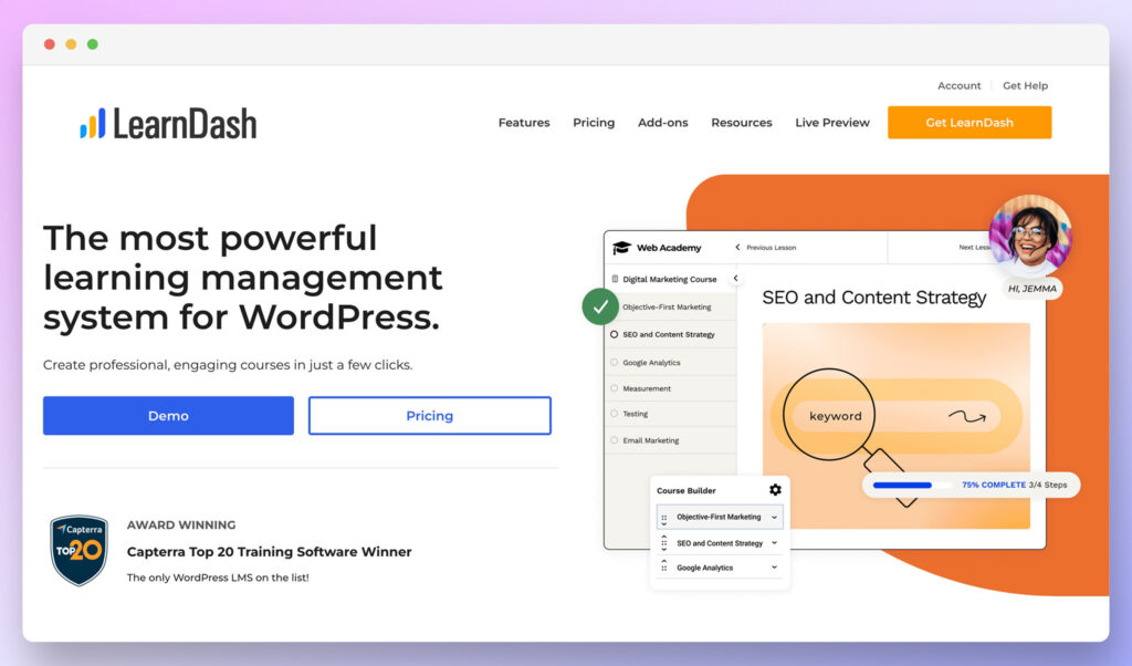
In this LearnDash review, we’ll be exploring why the WordPress plugin has emerged as one of the most popular tools for educators hoping to share their knowledge online. Though relatively streamlined and simple for beginners to use, LearnDash benefits from a huge variety of features intended to empower today’s online educators.

LearnDash is an award-winning application for the WordPress ecosystem, targeted at anyone who wants to publish a course online quickly and effectively. You can choose whether you want to add some simple educational resources to your existing website, or design a full learning platform with quizzes and immersive training experiences.

Because it’s a plugin for WordPress, LearnDash is a fantastic choice for those who have already begun to build their online presence using the world’s most popular CMS. What’s more, the diverse tool integrates easily with a range of tools already used by business leaders, including Slack, WooCommerce, Stripe, Mailchimp, ConvertKit and many others.

Let’s take a closer look at what LearnDash can do.

LearnDash Review: What is LearnDash

learndash review - homepage

Let’s start by exploring what LearnDash actually is. Introduced in 2013, and created by the Liquid Web company, LearnDash is a comprehensive all-in-one tool for learning management, specifically designed to plug into your WordPress site. This means content creators and educators don’t have to build a new site from scratch if they’re already using WordPress.

The tool provides everything business leaders need to produce an online course, including a drag-and-drop builder, so you can quickly organize content without the need for any coding experience. LearnDash has a rich feature set, which focuses on producing a compelling and engaging learning experience for students, helping you market and sell your courses, and ensuring you can manage your entire workflow in one place.

LearnDash competes with other well-known course creation tools like Udemy, LifterLMS, Teachable, and many others, by giving creators the option to design unlimited courses with their own custom pricing plans, and unique components. You can even integrate with other tools if you want to link your website to webinars, email marketing tools, and other features for training organizations.

There are simple payment integrations with PayPal already available, as well as options to connect to third-party solutions for memberships, subscriptions, and discount courses. Plus, LearnDash also has a fantastic selection of “add-ons” available, so you can expand your functionality whenever you choose.

Go to the top

illustration of a cat climbing a ladder

LearnDash Review: Features

As mentioned above, LearnDash has quite a comprehensive feature set. On the one hand, this means you should be able to create pretty diverse learning experiences using the platform. However, it could also indicate you’ll need to spend a little extra time learning to use all the features.

Let’s take a quick look at the various features you can explore:

Go to the top

illustration of a cat climbing a ladder

LearnDash Learning Experience Features

larndash review - features

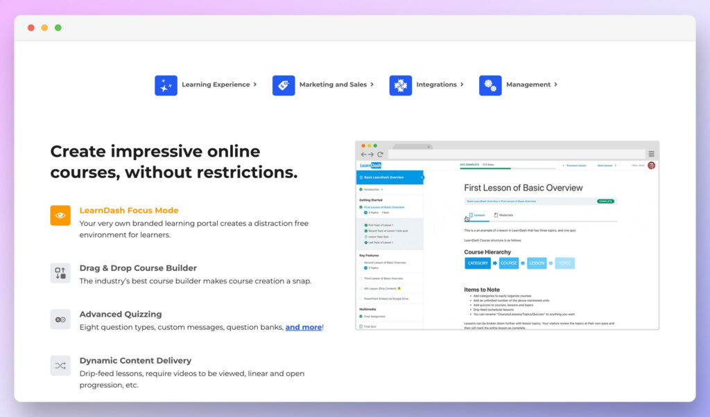
The features offered by LearnDash to enhance the “learning experience” for students are intended to boost your relationship with your learners, and make it easier to engage online customers. Business leaders and educators can create comprehensive online courses using the drag-and-drop ecosystem within WordPress, and there’s no limit on how many courses you can create.

The drag-and-drop interface is fantastic for beginners, as it means you don’t need any coding or programming knowledge to get started. You can simply pull the modules and features you need into the right place, and add your content wherever you see fit.

LearnDash also allows content creators to build their own unique learning portal via focus mode, which means you can provide your students with a distraction-free environment for their education. Dynamic content delivery means you can drip-feed your lessons to students at the pace that makes the most sense, and even require certain videos to be viewed before someone starts a new section.

There’s the option to switch between linear and open progression options, and you can set prerequisites for your courses too. For instance, you might allow some students to only access one course after they’ve completed another.

Perhaps the most compelling feature offered to enhance the learning experience on LearnDash is the dynamic quizzing solution. The quiz and assessment components allow you to switch between 8 question types, create dedicated question banks, and insert video, audio and images to both question and answer choices. Other features include:

Flexible question display, so you can show questions however you like

Randomize to allow you display different questions in different ways

Limits on the number of attempts a students can make to answer correctly

Blocked progression so students have to pass one quiz to start another

Time limits and tracking to see how long customers spend on quizzes

Hints with video, text, and image inserts.

Leader boards for gamification

Certificates and levels upon quiz completion

Answer statistics and dynamic results displays

Question reviews and category scoring

Email results

Compatibility with any WordPress theme

The versatile feature set included with LearnDash also ensures you can keep your students engaged every step of the way. There’s the option to design your own discussion forum where customers can interact about courses, as well as various badges, certificates, leader boards, and course points for gamification among your students.

Go to the top

illustration of a cat climbing a ladder

LearnDash Marketing and Sales Features

LearnDash doesn’t just make it easy to create your courses and engage your learners, it also ensures you can attract new students to your content too. With this plugin, course creators can choose exactly how they want to promote and sell each course. There’s the option to set one-time purchasing prices, and integrate PayPal, Stripe or 2Checkout into your course for an immediate transaction.

If you need help convincing your customers to buy, you can offer free samples of your content, to provide students with an insight into what they can expect. If you’re offering a range of educational content pieces, or you want to keep students coming back for longer, you can also create subscriptions with recurring payment options. You’ll be able to create course bundles, or apply subscriptions to each course individually, depending on your needs.

Other sales features include:

Custom shopping carts: You can add a shopping cart to your online courses with a free WordPress integration like Easy Digital Downloads or WooCommerce. This allows you to use just about any payment gateway you like, as well as adding coupons, sales, course bundles, tax rules, sales funnels, and custom receipts into the mix.

Memberships: For your most loyal customers, you can create membership accounts in different tiers. Different members will be able to access specific courses and resources. You can also choose to sell memberships for a one-time price, or charge a monthly subscription fee. This gives you more freedom on how you’re going to make a profit.

Course bundles: If you have various courses available with related information, you’ll be able to combine them together into bundles. There’s also the option to run flash sales for different bundles, to give customers access to more tools, or provide them with a discount when they buy multiple courses at the same time.

Bulk access controls are also available, so you can allow customers to purchase licenses in bulk, and grant access to staff members. This is ideal if you’re going to be selling your courses on a B2B basis. There’s even access to built-in reporting, so business leaders can track the progress of their staff.

From a marketing perspective, LearnDash ensures you can attract and nurture your audiences through a range of integrations with leading tools. You can use MailChimp or Convertkit to send automated emails to your customers every step of the way. Plus, you’ll be able to create landing pages so you can collect as many contact details as possible for potential customers.

Go to the top

illustration of a cat climbing a ladder

LearnDash Administrative and Management Features

LearnDash also makes managing your courses as straightforward and convenient as possible. A comprehensive backend environment means you can track all kinds of information about your learners and courses in one convenient place. You can segment users into groups and sub-groups, and even bring other members of your team into the ecosystem.

You’ll have complete control over how courses and assignments are distributed to each individual user. Plus, your students can log in and check out which courses they can access with their own unique member account. You and your team will be able to approve quizzes, comment on assignments, and even award points to different users based on their progress.

There’s also automated syncing with the LearnDash quiz and assignments tools, and manual grading functionality available for more complex lessons, though this does require users to pay extra.

Detailed reporting tools are also built into the back-end, so you can gather insights into things like how many people are enrolling in your courses, and whether they’re making suitable progress. You’ll also be able to see which of your students are making the most progress, and you can share reports with business leaders accessing your courses for their teams too.

Go to the top

illustration of a cat climbing a ladder

LearnDash Review: User Experience

LearnDash is great for beginners and all kinds of course creators. First of all, the plugin works seamlessly with WordPress, regardless of what theme you’re using, so it’s easy to get your whole system up and running with no custom coding.

Once you’ve installed LearnDash, you’ll be able to find it within your WordPress sidebar, so there’s no need to jump back and forth between different tools.

There’s integration available with page builders like Elementor, Divi, and BeaverBuilder, so you can quickly customize components of your website and course experience. Plus, built-in editing tools allow you to choose the colors, logos, course display options, and lesson experiences most appealing to your audience. A REST API also allows those with developer knowledge to create custom functionality whenever necessary.

For true beginners, the LearnDash site is packed full of useful documentation, FAQs and guides to get you started. The instructional content will give you a better understanding of exactly how the plugin works and what you can do with it. The plugin also naturally embeds some tutorial videos into your WordPress dashboard to get you started too, and there’s a Facebook group if you want to discuss the experience with other users.

As soon as you launch LearnDash, you’ll gain a link to a mini boot camp, which guides you through the key steps of configuring the plugin and creating your first course. There are videos available to help you understand the features of LearnDash, as well as tips on how to access customer support.

Go to the top

illustration of a cat climbing a ladder

LearnDash Review: Creating and Configuring Courses

The LearnDash course builder makes it as simple and straightforward as possible to start teaching students in the digital world. You can organize your course content however you choose with the drag-and-drop builder, and add e-learning lessons into the mix whenever. It’s even possible to create the structure for your course then add the lessons later.

Users on LearnDash can use site-wide course creation tools to apply specific settings to every course in their library. For instance, you can decide whether all of your courses require users to have a membership before they can access them.

It’s also easy to implement specific settings for different courses. For instance, the Learndash plugin allows you to define course prerequisites for each lesson, choose who can access the course, and even assign certificates to those who complete the experience successfully. The course points feature also means you can distribute points to customers every time they take a new lesson. The points your users earn can dictate their enrolment options for other courses, so you can ensure people finish certain topics before taking the next step in their online learning journey.

If all this seems like a lot, there’s also the option to allow free access to all of your courses, regardless of your user’s existing points or subscriptions. Other control options include tools which allow you to set how long a user will have access to a course after their enrolment date, and whether their data will be deleted after a certain time.

Lesson Building

The lesson-building tools are extremely user-friendly too. You can choose a template for each lesson, give it a description, and start configuring it through the settings tab, using the same tools you would use for managing your course. Because everything is designed to work with your WordPress website, it only takes a matter of minutes to add new lessons to courses. While building your lessons, you can add all kinds of content, from written text to video, and more.

Plus, you can configure how users move through your courses, by adding forced timers to pages to prevent customers from moving on too quickly, and drip-feeding new lessons to members at specific times, with automated email notifications.

Overall, the various Learndash features available within the plugin, combined with the drag-and-drop course builder ensure anyone can jump into creating an online course with minimal effort.

Advanced Quizzing

One of the best ways to enhance any LearnDash course is with quizzes. As mentioned above, Learndash gives you a number of options for how to set up and deliver your quizzes. You’ll be able to choose from a range of quiz types, then access the “settings” tab to define how the quiz will work.

Aside from setting prerequisites for who can access the quiz, you can also set a passing score, and define whether users will receive points and certificates when they finish a new course.

Each quiz template comes with its own set of questions, and you can choose between multiple-choice, fill-in-the-blank, and essay-style answer options. The LearnDash membership plugin also makes it straightforward to rapidly publish your courses, quizzes, and lessons to your WordPress site, with minimal effort, so you can update your system as often as you like.

Go to the top

illustration of a cat climbing a ladder

LearnDash Pricing: Your Options

learndash review - pricing

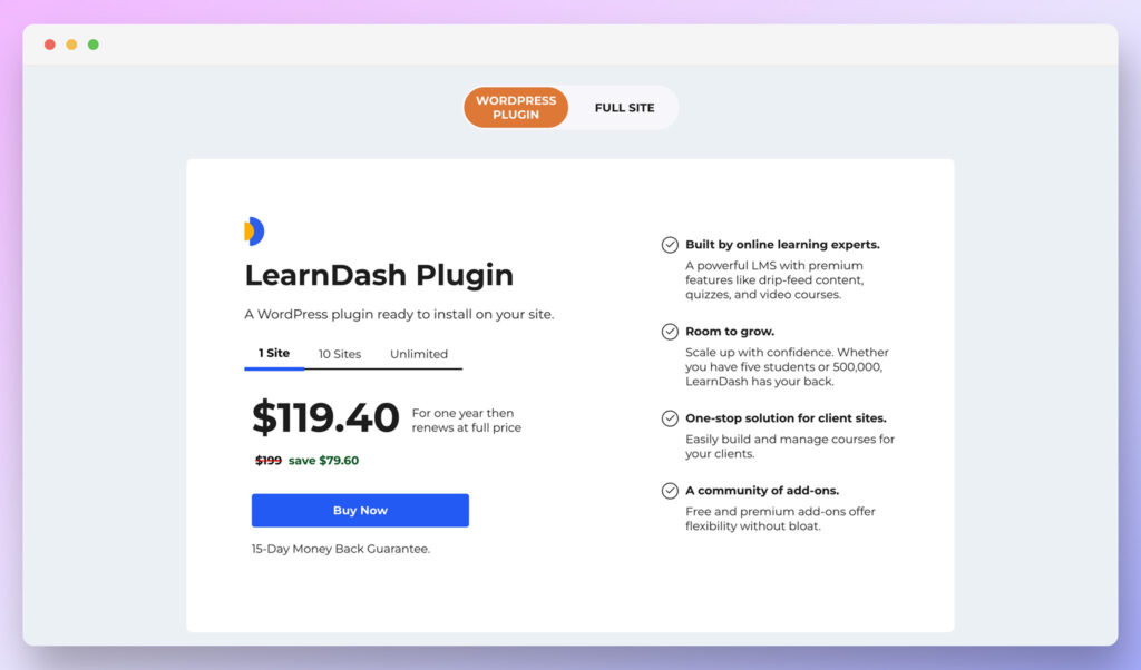
To create a LearnDash course, you’ll need to access a subscription package. There are two options available. You can either purchase the LearnDash WordPress plugin, or use LearnDash “Cloud” to design an entire website with LearnDash already built-in.

LearnDash Cloud is $29 per month with a 15-day money-back guarantee, and comes with domain and hosting included, as well as 15 templates for your website, with various customization tools. The package also includes ProPanel, so you can monitor enrolment and student progress with advanced reporting capabilities. This could be an excellent option if you want to access all the best features of WordPress and LearnDash at once, without paying separately.

If you already have a WordPress site, there are 3 packages available for the LearnDash plugin. All of these also include the 15-day money-back guarantee:

1 Site: $199 per year (access to all features)

10 sites: $399 per year (access to all features)

Unlimited: $799 per year (access to all features)

Go to the top

illustration of a cat climbing a ladder

LearnDash Review: Verdict

If you’re looking for a convenient way to create your own courses online, while still accessing all the benefits of WordPress for custom site creation, LearnDash is a great choice. The LearnDash LMS environment is brimming with easy-to-use functionality, making it easy for people from any background to start sharing their knowledge online.

New features are also constantly being introduced, so you’re sure to see updates to how LearnDash works to help you engage and empower your learners in the years to come. For full educational institutions, standalone teachers, or freelancers, Learndash is one of the best WordPress plugins around. Thanks to an amazing range of features, you can design a custom front-end experience for all of your students, without much of a learning curve.

However, do keep in mind that while LearnDash does boast excellent ease of use, its varied capabilities could take a while to get used to.

The post LearnDash Review (Nov 2022): An Introduction to Learndash appeared first on Ecommerce Platforms.

Varchar vs Nvarchar Sql Server | Difference & Comaparison

Original Source: https://designrfix.com/blog/varchar-vs-nvarchar-sql-server

Varchar and Nvarchar are data types in SQL Server. The main difference between varchar and narchar is that the narchar …

Read more

A PageCloud Review: What You Need to Know About This Lesser Known Platform

Original Source: https://ecommerce-platforms.com/articles/pagecloud-review

The search for the best website builder continues. Sometimes, to truly understand what the industry staples offer, one has to go off the beaten track to explore some of the lesser-known options. Often these boast very similar capabilities and occasionally surprise us with nifty innovations.

So, today we’re looking at PageCloud, a website builder and ecommerce platform that’s been around for some time but maybe hasn’t attracted quite as much attention. We’ll review what PageCloud is all about, whether it’s worth its price tag, and what features you can expect from this intuitive tool.

Let’s get started!

PageCloud Review: About PageCloud

PageCloud Review

PageCloud was launched in May 2015. While this tool hasn’t captured the public’s eye as much as its competitors like Wix and Squarespace, it has a fair few features to offer and comes with a good deal of customization freedom.

Like other website builders of its kind, PageCloud presents itself as a no-code option empowering beginners to create a website quickly and easily. One thing worth noting is that PageCloud is praised by its customer base for offering frequent updates. As such, the platform is constantly improving and making strides to become a more competitive option. 

Go to the top

illustration of a cat climbing a ladder

PageCloud Review: The Key Features

Here’s a quick overview of PageCloud’s most noteworthy features:

Website Builder

PageCloud Review

PageCloud makes it easy to design your website. First, you can choose from 69 website templates. These are excellent starting points for your web design. Then, once you’ve picked a template, you can add pre-designed sections to expand your site. For this purpose, there’s a whole library of sections to choose from. 

Alternatively, you can choose one of three wireframes. These blank or very simplistic templates enable you to build your website from scratch.

You can drag-and-drop stylable elements such as stock images, shapes, buttons, icons, forms, navigations, (and more) to populate your pages. There are also a wide variety of good-looking gallery options. In addition, you can upload custom fonts, add borders or shadows to elements, and design page layouts using columns, guides, groups, and auto-groups.

You can also access your site’s source code for fine-tuned control. But, of course, you’ll need some coding smarts to make the most out of this!

PageCloud includes various animation effects, like slide-ins, bounces, fade, scale, zoom, jiggle, and more. These are great for drawing attention to a specific part of your website.

All in all, in terms of web design customizability, it offers a service similar to Wix, though maybe not quite as intuitively. That said, one downside is that PageCloud templates aren’t automatically responsive. As a result, you have to create a mobile-specific version of your site, which is time-consuming.  

Marketing and SEO

PageCloud Review

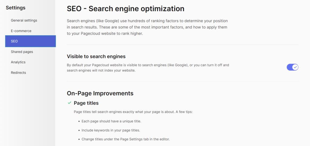
You can optimize your website content for search engines thanks to PageCloud’s lightning-fast load times. You can also customize your URLs, page titles, meta information, heading tags, and redirects. 

PageCloud also partners with SemRush for keyword research. Here you can search for keywords to optimize your content for and compare keywords by volume, difficulty, and cost per click. While it’s convenient to do this from within the app, you’ll still need your own Semrush account. There’s a free version of Semrush, which limits you to five keyword searches daily.

When it comes to branding and marketing, you can connect your own custom domain and use PageCloud forms to capture email addresses to grow your mailing list. 

PageCloud also offers valuable analytics to help you track your site performance. On top of that, for further insights, it integrates with Google Analytics and Tag Manager.

Blogging

PageCloud Review

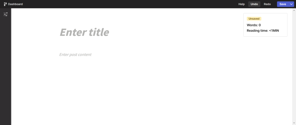
You can build a multi-user blog, making it easy to write as a team. A dedicated writing mode helps you focus on your task without distractions. Other handy blogging features include a word counter, read-time estimator, post scheduling, the ability to edit page titles and meta information, and the option to organize blog content into categories and tags.

Alternatively, you can import your WordPress or Squarespace blog into PageCloud, including all your posts, tags, images, and videos.

Ecommerce

PageCloud Review

According to PageCloud, you can set up your eCommerce store in just five minutes. You just pick a template, list your products, and PageCloud will handle the cart and checkout for you. 

You can create coupons and discounts, manage your inventory, and calculate real-time shipping estimates. pageCloud is also compatible with over 40 payment gateways, including Visa, Mastercard, American Express, Apple Pay, and more.

If you want to sell services, PageCloud offers contact, booking, and estimation forms. You can also sell digital goods, though it’s worth noting that on the cheaper plans, file sizes are severely limited to only 2MB.

Lastly, you can connect your store to Facebook, Amazon, and eBay for multi-channel selling.

Linkin.Bio

PageCloud provides a free Linkin.Bio tool so you can build a simple link to a page that you can add to your social accounts like TikTok and Instagram! 

You can choose a template and edit the design in just a few clicks, including images, social icons, and buttons for all your favorite apps.

You can even display your most popular products directly on your linkin.bio page. However, this requires a PageCloud eCommerce subscription.

Apps and Integrations

PageCloud Review

Integrate with popular apps to increase the functionality of your PageCloud website. There are widgets for adding images, advanced galleries, video players, social integrations, music players, event management, and more. 

Overall there are more than 70 apps, including:

Giphy

Google and Adobe fonts

Google Maps

Google Sheets

Mailchimp

Aweber

Shopify

Shoprocket

Zendesk Chat

WhatsApp

Facebook Chat

Google Analytics

Facebook Pixel

Meetup

Eventbrite

Soundcloud 

Spotify

Instagram, Facebook, Pinterest, LinkedIn, Tumblr

EmbedReviews

Twitch, YouTube, Wistia, and Vimeo

Go to the top

illustration of a cat climbing a ladder

PageCloud Review: Ease of Use

PageCloud is pretty simple to use. Its intuitive drag-and-drop interface allows you to drag elements like text, images, and buttons onto your pages. 

You can choose from automatic or manual layouts; with the former, your content snaps into pre-defined columns. Alternatively, you can place items more freely wherever you want. 

While editing, you’re presented with helpful video tutorials and a checklist of what’s left to complete on your site. This is great for beginners that need more of a helping hand.

Go to the top

illustration of a cat climbing a ladder

PageCloud Review: Pricing

PageCloud Review

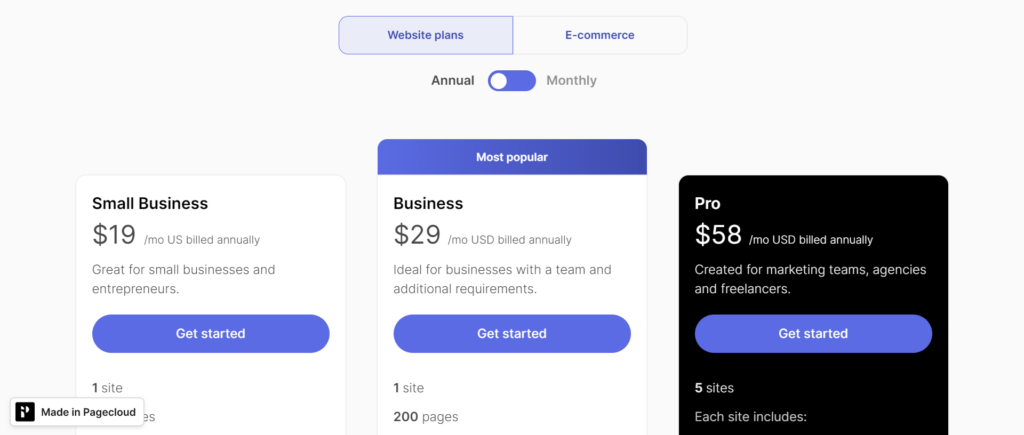
PageCloud comes with two types of plans. Website plans and eCommerce plans. Within each, there are several pricing tiers that you can either pay for either monthly or annually. We’ll display annual pricing here, as you’ll benefit from a slight discount:

All premium plans include:

A blog

Over 100 app intgerations

Customizable forms

Source code access

SEO features

Hosting and SSL security

Access to templates and the section library for building and designing your website

The first website plan is the Small Business Plan for $19 per month. This allows you to build one site with up to 100 pages and comes with the following:

Two team members

1,000 form submissions per month

A free custom domain for a year

A free Google workspace for one year

Expert chat support

The Business plan costs $29 per month and allows you to create up to 200 pages on your site. It also unlocks 5,000 form submissions per month and 10 team members.

Next, the Pro plan costs $59 per month and allows you to build five sites instead of one, up to 200 pages each. You’ll also get 1TB of bandwidth per month and priority support. Site migration on this plan is available for an additional price, and you can add other sites for an extra $19 per month.

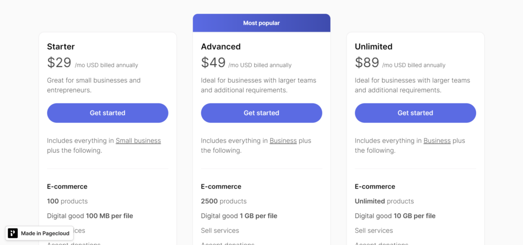
The eCommerce plans add eCommerce functionality for a higher monthly price. The Starter plan costs $29 per month and comes with the following:

PageCloud Review

Up to 100 products

The ability to accept donations and sell services

No transaction fees

A free SSL certificate

Gift cards (with 2% commission)

Digital goods with up to 100MB per file

The Advanced Plan for $49 per month unlocks:

2500 Products

1GB storage per digital file

Gift cards can be sold at a 1% commission

Integrations with Mailchimp and automated email marketing

You can sell on Amazon and eBay

You can schedule order pick-ups

Automatic abandoned cart recovery

Product filters and variations

Wholesale pricing groups

Discounts for specific customer groups

Multilingual catalog

You can edit and create orders

Finally, the Unlimited Plan for $89 per month offers everything above, plus:

Unlimited products

10GB per digital file

No fees on gift cards

Point of sale with Square, Clover, or Alice

Go to the top

illustration of a cat climbing a ladder

PageCloud Review: Customer Support

PageCloud Review

If you want to contact PageCloud’s team, you can do so via their ticketing system or live chat. Only Pro users get access to priority support which secures faster response times. Chat is available from 9 am to 4.30 pm.

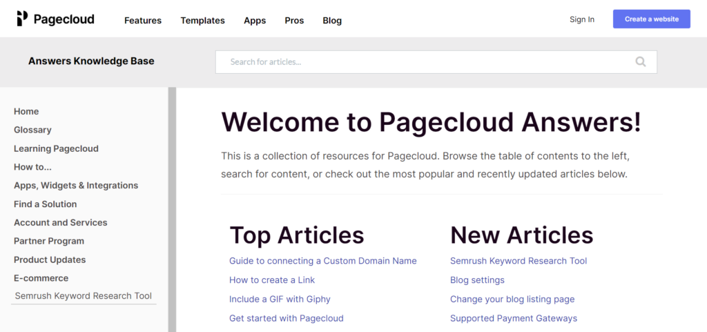
PageCloud has separate help centers for its website builder and eCommerce. Both include articles on its features and guides for getting set up. In the eCommerce help center, you’ll find additional guides on promoting your products, selling on the go with the mobile app, etc.,

There’s also an option to hire a PageCloud pro to build your website for you – you can browse the directory of professionals by location, language, and price. 

Go to the top

illustration of a cat climbing a ladder

PageCloud Review: Pros and Cons

Before we wrap up, here are PageCloud’s most notable advantages and disadvantages.

Pros 👍
Cons 👎

Pros 👍

Your website is entirely customizable, with thousands of pre-designed segments and an intuitive drag-and-drop editor.
Multiple people can work on your site at any given time
You can build up to five websites with the more expensive plan
The templates are relatively plentiful and quite good-looking
PageCloud is frequently updated with new features
Support is, according to customer reviews, quick to respond and very helpful.
You get access to a free linkin.bio tool, which is an excellent addition to your social strategy

Cons 👎

PageCloud severely limits some of its plans, even as the pricing gets more expensive. For instance, you have to upgrade to unlock more pages for your site. Even basic eCommerce features like product variations only become available on the Advanced eCommerce plan.
PageCloud’s templates aren’t automatically mobile-responsive. You might mess up your mobile view if you edit elements manually rather than trusting its automatic column layout.
Most add-ons require you to set up accounts with third-party services. For example, the keyword research feature requires a Semrush account.

Go to the top

illustration of a cat climbing a ladder

PageCloud Review: Final Verdict

Now that we’ve taken a close look at PageCloud, it’s time to make our recommendations. Overall, PageCloud is a promising, easy-to-use website builder with good customization, a user-friendly interface, and reportedly excellent support.

However, its pricing is more expensive than some competitors, including Wix and Squarespace’s more basic plans. Moreover, all of its eCommerce plans are just as expensive as Shopify. As such, we have to ask ourselves if PageCloud is more worthy of your attention than any other service. Unfortunately, we can’t really find what makes PageCloud special. While it does what it sets out to do quite well, it isn’t particularly rich in features, especially where eCommerce is concerned.

Basic eCommerce features like decent digital file storage or product variations only become available on higher-tier plans. Also, while the editor is intuitive, we think Wix still does drag-and-drop a little better.

As such, we can’t recommend PageCloud; when for the same or even a lower price, you might find another solution with a more robust set of features. For example, if eCommerce is your primary goal, you could get basic Shopify for the same price. Similarly, if you want ease of use and plenty of customization freedom, Wix has some cheaper plans with similar functionality. 

Perhaps PageCloud will make more of a name for itself in the future. But, for now, we think there’s a reason other website builders take up more of the market.

Let us know in the comments below what you think. Have you used PageCloud and loved it? If so, tell us why – speak soon!

The post A PageCloud Review: What You Need to Know About This Lesser Known Platform appeared first on Ecommerce Platforms.

Game Development: The Best Programming Languages for Building Games

Original Source: https://www.sitepoint.com/best-programming-language-for-game-development/?utm_source=rss

Game Development: The Best Programming Languages for Building Games

Coding languages for gaming have become extremely advanced. We explore the best programming languages for game development in 2022. Read more.

Continue reading
Game Development: The Best Programming Languages for Building Games
on SitePoint.

TouchBistro POS Review: Is This The Right POS For You?

Original Source: https://ecommerce-platforms.com/epos-reviews/touchbistro-pos-reviews

If you’ve ever worked in a restaurant, you’ll know that serving diners can be much more hectic than other forms of retail. Your staff has to handle multiple meals, tables, and customers, while working alongside online orders and deliveries, keep the restaurant in order, and offer outstanding service. 

…so not too much to balance, right? (note the sarcasm)

Getting orders wrong can cause lots of frustration for customers. However, anyone who has worked in a restaurant knows how easy it is to lose track of an order, a missing ingredient, a special deal, etc.

This is where a reliable POS (point of sale) system for restaurants can be a game changer – especially one that enables your team to access all information from one screen. 

TouchBistro is one such POS. Its features help front and back of house staff stay on top of orders and work more efficiently. So with that said, this TouchBistro review will closely examine what this restaurant POS offers, how much it costs, and where its advantages and disadvantages lie.

There’s lots to discuss, so let’s hit the ground running!

About TouchBistro

TouchBistro POS Review

As hinted at in the intro, TouchBistro is a POS system specifically designed for restaurants and other establishments in the food industry. More specifically, this point of sale system is ideal for the following:

Quick service restaurants

Family restaurants

Fine dining

Coffee shops and cafés

Food trucks

Breweries and wineries

Bars and clubs

Catering

Bakeries

It provides everything these restaurateurs need to streamline orders, manage tables, deliver online services, and improve customer engagement. 

At the time of writing, TouchBistro powers over 29,000 businesses worldwide – so they must be doing something right!

Go to the top

illustration of a cat climbing a ladder

TouchBistro POS Review: TouchBistro’s Core POS Features

TouchBistro’s POS software is an all-in-one restaurant management system offering many features. You can run the app on iPads with the iOS6 operating system (or higher). Unfortunately, TouchBistro is exclusive to iOS, so if you’re an Android user, you’ll have to look elsewhere.

Below we’ve listed its core features:

Payment Processors

For the convenience of your customers, you can accept various payment types, including cash, credit cards, debit cards, and digital wallets like Google Pay, Apple Pay, and Samsung Pay. Best of all, its offline mode allows you to take payments without an internet connection. 

TouchBistro’s payment partners integrate seamlessly to reduce errors. It integrates with Chase, Moneris, Square, Barclaycard, Worldpay, and TSYS. It also accepts payments from all major credit cards and digital wallets like Apple Pay, Google Pay, and Samsung Pay.

Tableside Ordering

Servers can enter customer orders on handheld devices allowing them to spend more time chatting with diners without delaying orders from getting to the kitchen. Servers can easily send orders from their device. They can also receive prompts to highlight upsells and promotions and access features to simplify bill-splitting. Servers can quickly join and split seats, bills, and items in just a few seconds.

Floor Plans and Table Management

Table management software enables your front-of-house staff to monitor where orders are going, which tables are free, and where reservations are placed. In addition, you can build your restaurant floor plan into TouchBistro POS by adding walls, tables, sections, and dining rooms in just a few simple clicks. 

If diners wish to switch tables, no problem! You can do so without losing track of who’s having what. These floor plan and table management features enable you to monitor table turnover time to better manage your waitlist. This info also helps you to organize front-of-house staff by assigning servers to busy tables/sections. 

Menu Management

You can easily organize your drinks and dishes into a menu inside your POS. This includes categorizing items into premium offers, promotions, and takeout orders. You can even color-code menus to remind staff to highlight specific promotions or upsells.

It’s easy to view takeout and delivery orders separately from dine-in orders. Plus, you can add non-food items like branded merchandise to your menu!

You can also add detailed menu descriptions to help servers answer customer questions. On top of that, servers can accommodate special requests with custom dish modifiers. For example, if a customer specifies they want no salt on their fries, you can add that as a special request. 

Staff Management

Staff can clock in and out with just a few taps. On top of that, each team member can have their own login – however, you maintain control access. For instance, you can restrict actions, like menu changes and payouts, to managers or senior employees.

Conversely, managers can track employee activity from anywhere, thanks to data being synced in the cloud. You can also optimize labor costs based on reports on expenses, overtime hours, staff sales performance, and more. 

You can also assign customizable staff types. This makes it quick and easy to set different payroll details, simplifying payday. For example, next to a staff member’s name, you can assign job roles, such as:

Manager

Admin

Busser

Bartender

Multiple staff types (for someone who fills numerous roles). 

Inventory Management

To help manage your inventory, you can log the recipes your kitchen uses. Then, all menu items containing those ingredients are updated automatically once you edit your inventory after new shipments. 

Real-time reporting on stock levels also helps you see which items are going out of date, how much you ordered from each vendor and more. Tracking inventory in real-time also enables you to inform guests before they order if a specific dish isn’t available. This comes in handy for managing customer expectations. 

Reporting and Analytics

You can access a wide range of real-time data to make informed business decisions. You can see the following:

Which dishes and drinks are the most popular

Staff performance

The success of promotions

Revenue

The number of customers

Table turnover

…and much more.

Go to the top

illustration of a cat climbing a ladder

TouchBistro Review: Integrations

TouchBistro integrates with a few other business tools that might be relevant to your restaurant. Its native integrations number 23 and include the following:

Worldpay

Deliverect

Bevchek

Craftable

Freepour

Wisk

marginEdge

Avero

QuickBooks

Shogo

Xero

SageIntact

Go to the top

illustration of a cat climbing a ladder

TouchBistro Review: Customer Engagement

Above, we’ve listed the features included with TouchBistro’s standard POS system. But it’s worth noting that the company also offers a range of customer engagement tools for more established restaurants.

These come at an additional cost, as discussed in the pricing section.

That said, below, we’ve listed and outlined all these add-ons:

Gift Cards

The gift card add-on allows you to create digital and physical gift cards. Digital gift cards enable diners to redeem discounts from their smartphones. They are easy for customers to forward as gifts to friends and family.

The gift card add-on integrates seamlessly with TouchBistro’s base POS system. So, for instance, you can monitor your gift card’s popularity and revenue generated through POS analytics.

Furthermore, you can make gift cards applicable to specific restaurant locations, customize gift cards with your logo, and adopt different designs for various special occasions, like birthdays or holidays.

Lastly, suppose you combine this add-on with the online ordering add-on (more on this in a sec). In that case, customers can apply digital gift cards to online orders in just a few clicks.

Marketing

The marketing add-on empowers you to create custom email and SMS marketing campaigns. 

You can build marketing emails using a drag-and-drop interface and customizable email templates. You can run promotions for first-time guests, lapsed regulars, loyal customers, etc. You can tag customers to target them with offers. For example, you could segment regular fans of brunch and then send them a special brunch offer.

Other campaigns you could launch include enticing diners by sending them a special offer via SMS or email on their birthday (free dessert, free drink, and so on). You should also ping all your customers a 2-for-1 offer redeemable on days you know your restaurant is quiet. Of course, these are just a few of the many campaigns you could design, but hopefully, you get the idea!

This same add-on also permits you to launch a custom-branded web app where guests can subscribe to emails, leave feedback, review promotions, and more. 

Finally, you can track the success of promotions by monitoring metrics like revenue, clicks, open rates, and more. 

Loyalty

This add-on combines CRM and loyalty features to track your most dedicated customers. With this information, you can reward VIPs with special discounts and promotions to thank them for their continued loyalty. 

Diners can automatically earn loyalty points and rewards based on the items they purchase and how much they spend. Where CRM features are concerned, you can record customer details, including more nuanced facts like food preferences, visit history, birthdays, and more. 

Reservations

Benefit from a booking system that lets you see who’s coming for dinner and prepare on time. You can accept bookings through your website, the Google waitlist widget, or tbdine.com. The latter refers to TouchBistro Dine. This is a website and iOS and Android app that diners can use to find restaurants wherever they are. In addition, customers can customize their dining preferences (e.g., Thai, Pizza, etc.) and see which restaurants have availability that night. 

The reservation software also monitors table status, making managing your waitlist much easier. You can also reduce no-shows by sending reminders of upcoming reservations (with two-way communication), so they can notify you if their plans change.

Lastly, you can add customized reservation notes about individual customers to keep track of special occasions, dining preferences, and allergies. 

Online Ordering

As we’ve already hinted, you can add online ordering capabilities to TouchBistro to enable customers to order through your restaurant’s website or social channels. In addition, you can accept scheduled or immediate orders for pickup and/or delivery.

You’ll receive a notification on your POS hardware whenever an order comes in, enabling you to respond immediately. 

Go to the top

illustration of a cat climbing a ladder

TouchBistro Review: Pricing

TouchBistro POS Review

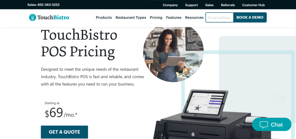
TouchBistros’ pricing consists of the initial software fee starting at $69 per month for up to two registers.

Depending on your restaurant’s needs, additional fees and hardware costs may apply. Exact prices depend partly on the size of your business, whether you’re a new restaurant or already established, and how quickly you need your TouchBistro POS system set up.

All POS software plans include the following:

Menu management

Reporting and analytics

Floor plan and table management

Staff management

Integrations

Tableside ordering

The prices for the add-ons mentioned above are as follows:

Online ordering, starting at $50 per month

Marketing, starting at $99 per month

Loyalty programs, starting at $99 per month

Gift Cards, starting at $25 per month

Reservations, starting at $229 per month

On top of this, TouchBistro sells hardware systems explicitly designed for restaurants, including a modern iPad and accessories like a terminal, router, kitchen printer, cash drawer, and more. Unfortunately, pricing is only available at a customized quote, and TouchBistro offers no payment plans on hardware.

With so many elements of TouchBistro’s pricing structure, the exact fees remain somewhat ambiguous. So, we advise getting in touch to receive a quote on the services you’re interested in, as well as the cost of hardware.

Go to the top

illustration of a cat climbing a ladder

TouchBistro POS Review: Customer Support

TouchBistro POS Review

TouchBistro’s support team is available 24/7, all year round. Phone support is available with lines in North America, the UK, and South America. Or you can fill out a support request online for general queries. There’s also a help center with articles on TouchBistro’s various features and quick references for front-of-house staff and administrators.

TouchBistro Review: Pros and Cons

Let’s summarize the key takeaways from this review. Here are the main advantages and disadvantages of using TouchBistro’s POS:

TouchBistro Pros

TouchBistro offers a broad, comprehensive set of restaurant management features, including seating plans, which similar systems often neglect.

TouchBistro offers 24/7 phone support.

The software operates on local networks, so it doesn’t require a robust internet connection to function consistently.

It’s user-friendly, which makes onboarding new team members quick and easy.

Various add-ons allow for even more features.

This POS is designed explicitly with restaurants in mind.

TouchBistro Cons

Pricing isn’t very transparent on the website, and we can’t find the cost of hardware systems. You need to get in touch for a quote on nearly everything Touchbistro offers to get a clear idea of how the price might compare to alternatives.

Add-ons quickly render the software much more expensive.

There isn’t a free plan.

TouchBistro is exclusive to iOS.

Go to the top

illustration of a cat climbing a ladder

TouchBistro Review: FAQs

We’ve covered lots of ground, but you might still have questions. So we’ll endeavor to answer some of the most frequently asked questions about TouchBistro:

Does TouchBistro Come With Hardware?

You can source hardware through TouchBistro or elsewhere for an additional price. 

TouchBistro is compatible with Apple devices above iOS6. In addition, you can mix and match POS equipment like cash drawers, receipt printers, card readers, and more. 

TouchBistro offers hardware setups for small businesses and large venues alike. However, if you buy hardware through the company, you’ll enjoy the convenience of support for your POS hardware and software from one source. 

In Which Countries Does TouchBistro Work?

TouchBistro is used in over 100 countries, including Canada, the US, the UK, and Mexico.

Do TouchBistros Plans Impose Long Contracts?

You can pay for TouchBistro monthly and not commit to contracts longer than that. 

Go to the top

illustration of a cat climbing a ladder

TouchBistro Review: Our Final Verdict

Suppose you’re a restaurant owner looking for the best POS system. In that case, TouchBistro offers lots of features suited to your industry. 

While add-ons can make the software a lot pricier, we like the variety of products to expand the software according to your needs.

Overall, TouchBistro comes packed with handy tools for restaurants. So, if you’re already operating on iPads, we recommend giving it a go or requesting a demo. Then, get in touch with the TouchBistro team for a quote and more information, and let us know in the comments below how you get on!

The post TouchBistro POS Review: Is This The Right POS For You? appeared first on Ecommerce Platforms.

How to Negotiate Competitive Freelance Rates

Original Source: https://1stwebdesigner.com/how-to-negotiate-competitive-freelance-rates/

If you’re a freelancer, then you know that one of the most important aspects of your business is getting paid what you’re worth. But negotiating competitive freelance rates can be daunting-especially when you don’t have much experience doing it.

There can be a lot of trepidation when it comes to asking clients for a fair rate, but it’s important to remember that you provide a valuable service and that you deserve to be compensated accordingly.

In this article, we’ll walk you through some tips and strategies for negotiating better freelance rates with your clients, so that you can feel more confident and secure in your work. Keep reading to learn more!

The Freelance Designer Toolbox

Unlimited Downloads: 500,000+ Web Templates, Icon Sets, Themes & Design Assets
All starting at only $16.50 per month


DOWNLOAD NOW

Know Your Worth

Before you can start negotiating with clients, you need to have a good understanding of your own value. What are your skills and experience worth in the marketplace?

Payscale - How to Negotiate Competitive Freelance Rates

You can use online resources like PayScale or Paysa to research average rates for freelancers with your skill and experience level. Once you have a benchmark to work with, you can start thinking about what you’re willing to accept.

Do Your Research

In addition to knowing your own worth, it’s also helpful to do some research on the client themselves. What is their budget for this project? Are they known for going above market value or below with their contractors?

The more information you have going into the negotiation, the better. Try to find out as much as you can about the client and their history with paying freelancers.

Ask As Many Questions About the Project As You Can

When you’re first approached about a project, it’s important to ask as many questions as possible. The more details you have about the scope of freelance work, the better equipped you’ll be to give an accurate quote.

Some key questions to ask include:

What is the expected timeline for the project?
How many revisions will be needed?
What format do you need the final deliverables in?
Will I be working with anyone else on the project?
What is the project budget?

By getting as much information up front, you can avoid any unpleasant surprises later on.

Start High

When you’re finally ready to start negotiating rates with a client, it’s important to start high. Remember, you can always come down in price, but it’s much harder to go up once you’ve already quoted a lower rate.

If the client counters with a lower offer, then you can begin to negotiate from there. But by starting high, you give yourself some room to work with and you’re more likely to end up at a rate that you’re happy with.

Ask About Expenses

In addition to your hourly or project rate, don’t forget to factor in any expenses that you may incur while working on the project. These could include things like travel costs, software licenses, or stock photography.

Be sure to ask the client if they will be reimbursing you for any out-of-pocket expenses before you agree to take on the project.

Be Professional

Throughout the negotiation process, it’s important to remain professional and courteous. This is true even if the client is being difficult to work with.

Keep your cool and don’t get too emotional about the situation. Maintain a positive attitude and be confident in the value that you bring to the table. If you do this, then chances are good that the client will come around and meet you at a fair rate.

Be Prepared to Walk Away

If the client isn’t willing to meet you at a rate that you’re comfortable with, then be prepared to walk away from the project. It’s not worth your time and energy to work for someone who isn’t going to pay you what you’re worth.

There are plenty of other clients out there who will be happy to pay you a fair rate for your work. So don’t sell yourself short just to land a project.

Get Everything in Writing

Contract

Once you’ve reached an agreement with the client, it’s important to get everything in writing. This way, there’s no confusion about what was agreed upon and you have a contract to fall back on if the client tries to cut costs later on.

Make sure that all of the details are included in the contract, such as the agreed-upon rate, the scope of work, and the timeline for the project. Once everything is signed off on, then you can start working and get paid what you’re worth.

Include a Contingency Rate

If you’re working on a project that could potentially go over the agreed-upon scope, then it’s a good idea to include a contingency rate in your contract. This way, if the project does take longer than expected, you’ll still be compensated for your time.

Including a contingency rate is a good way to protect yourself and make sure that you’re fairly compensated for any unforeseen circumstances.

Let the Negotiations Begin

Negotiating better rates with your freelance clients doesn’t have to be a nightmare. By following these tips, you can approach the conversation with confidence and walk away with the pay that you deserve.