How to Apply CSS3 Transforms to Background Images

Original Source: https://www.sitepoint.com/css3-transform-background-image/?utm_source=rss

How to Apply CSS3 Transforms to Background Images

CSS transformations are great, but they don’t (yet?) apply to background images. This article presents a workaround for those times when you really do want to rotate a background image, or to keep a background image fixed while its container element is rotated.

This article was updated in 2020.

Scaling, skewing, and rotating any element is possible with the CSS3 transform property. It’s supported in all modern browsers without vendor prefixes.

#myelement {
transform: rotate(30deg);
}

Great stuff. However, this rotates the whole element — its content, border and background image. What if you only want to rotate the background image? Or what if you want the background to remain fixed while the content is rotated?

There’s no W3C CSS proposal for background-image transformations. It would be incredibly useful, so perhaps one will appear eventually, but that doesn’t help developers who want to use similar effects today.

One option would be to create a new background image from the original, say rotated by 45 degrees. This could be achieved using:

a server-side image manipulation process
a client-side canvas-based image handling code, or
APIs provided by some image-hosting CDN services.

But all these require additional effort, processing, and costs.

Fortunately, there’s a CSS-based solution. In essence, it’s a hack which applies the background image to a ::before or ::after pseudo element rather than the parent container. The pseudo element can then be transformed independently of the content.

The post How to Apply CSS3 Transforms to Background Images appeared first on SitePoint.

Customize Your WooCommerce Website with Hooks

Original Source: http://feedproxy.google.com/~r/1stwebdesigner/~3/Smp75T6y8A0/

Among the top reasons to sell products or services online with WooCommerce is the WordPress plugin’s extensibility. Developers have extended it in all manner of ways. Everything from the look of your eCommerce shop to the types of products you sell can be changed and improved. And that’s just scratching the surface.

If you possess slightly more advanced development skills, there is a whole world of tweaks you can implement. They take place under the hood, so-to-speak, in your theme’s functions.php file or via custom plugins you can write yourself.

We’re talking about WordPress hooks. These are built in ways that you can interact with what a specific plugin, or WordPress itself, is doing. They’re highly useful for adding additional functionality or even changing the output of what’s displayed on the screen.

Luckily, WooCommerce has an extensive set of hooks available. You can use them to customize the shopping cart and tweak the user experience to match your needs.

Today, we’ll take a look at a few basic examples of how hooks can make WooCommerce that much better. But first, let’s explore why they’re often the best way to make customizations.

Why Use Hooks?

WordPress is nothing if not flexible. Thus, there are usually a number of different ways to accomplish the same thing. The same is true of WooCommerce.

For example, WooCommerce provides developers with the ability to override the various templates that the plugin utilizes. It might be a product page, a product category or even the checkout screen. If you need to add a custom bit of code, this is an easy enough way to do so.

However, the core versions of these templates are updated over time. If the particular template you’ve overridden is updated, you’ll need to reconcile that with any customizations. Otherwise, you run the risk of display errors or even the loss of functionality.

Hooks, on the other hand, don’t require you to directly edit a template. Instead, they allow you to insert code at a specific location and time. Since they are stored either in your theme’s functions.php file or a custom plugin, they remain largely unaffected by new versions of templates.

The sheer number of hooks built into WooCommerce often makes it a more effective and easier to maintain path to customization.

WooCommerce Hook Examples

Now that we know a bit more about why hooks are the preferred way to customize your cart, let’s take a look at a few examples of what they can do.

The following are basic code snippets that demonstrate the potential of hooks. They can add helpful information and functionality that improve the user experience. What’s more, these items can be added across the board or just in specific situations.

Add a Message to Product Pages

Imagine that you’re running an online store and you’re preparing for the holiday shopping season. You want to make sure that your customers know when the ordering deadline is for Christmas delivery.

While you could add a message to every individual product through the WordPress back end, that wouldn’t be very efficient. Instead, a hook could do the job in one shot.

Here’s the code, which goes into your theme’s functions.php file or a custom plugin:

What It Does
The hook, woocommerce_before_single_product, will place your code at the very top of each product’s page. Our custom function, my_product_notice_function, is the code that is added in and contains the special message.

Going Further
The above example would apply to ALL products within your shop. But what if you wanted to target only products within a specific category? There is a way accomplish that:

Now, we’ve managed to target just the products in the “Toys” category. Of course, there are a number of other possibilities here. You could, for example, display different messages based on a product’s category by adding in some conditional tags. Hooks really can be customized to match your exact needs.

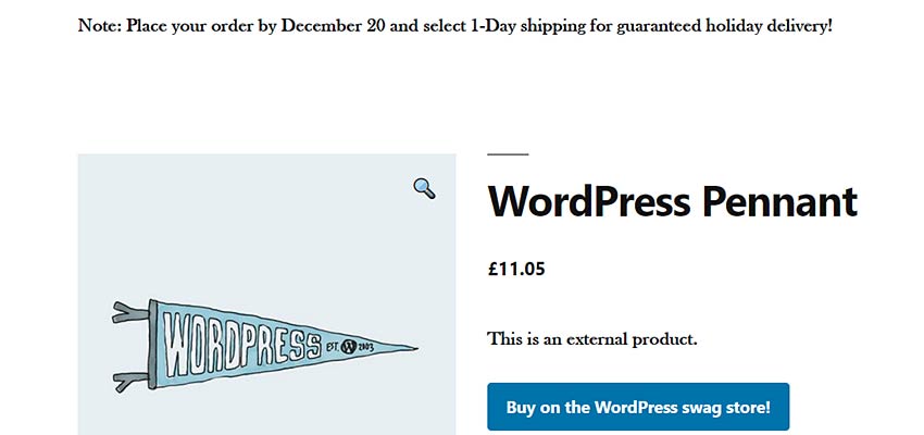
A special message displayed on a WooCommerce product page.

Remove Related Products

By default, WooCommerce will show a listing of related products at the bottom of your product pages. But there may be times when you’d rather not show this information. A super-simple hook can take care of it.

Once again, the following code goes into your theme’s functions.php file or a custom plugin:

What It Does
As the name indicates, the remove_action() function is used to remove the function (woocommerce_output_related_products) attached to the specific hook (woocommerce_after_single_product_summary) we’re targeting.

Also note the number 20 in the code. This is the priority of our function and determines when it runs. The default priority is 10, so, the higher number indicates that it will run after the default. This ensures that the hook won’t be overridden by WooCommerce itself.

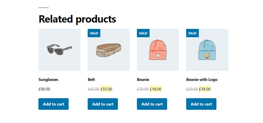
A listing of WooCommerce Related Products.

Rename a Product Tab

Hooks can also change the default output of WooCommerce. In this example from the WooCommerce Snippet Library, a filter will rename each of the three default tabs shown on product pages.

This code (you guessed it) should be placed into your theme’s functions.php file or a custom plugin:

What It Does
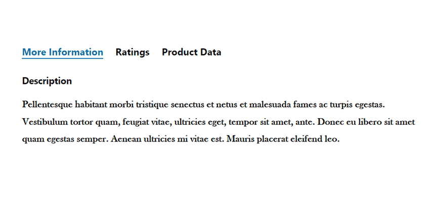
This function retrieves the title of each product tab (“Description”, “Reviews”, “Additional Information”) and changes their titles to “More Information”, “Ratings” and “Product Data”, respectively. You could, of course, change any of those titles to match your needs.

Renamed WooCommerce Product Tabs.

Creating a Better Shopping Experience

Just about every WooCommerce shop could benefit from some customizations. Each business is different and a default install simply can’t reflect all of the potential nuances.

Hooks are what can take a website from generic to a true reflection of a company’s brand and way of doing business. They allow us to add those little details that make for a unique user experience.

And, you don’t have to be a master developer to start using them. The examples above, basic as they are, can provide a great starting point. The best way to learn is often to take what’s already been done and experiment. Soon, you’ll find all sorts of situations where a hook can be just the thing your project needs.


Retro gaming stamps are an 8-bit nostalgia hit

Original Source: http://feedproxy.google.com/~r/CreativeBloq/~3/8onPb8Wzcq0/retro-gaming-stamps

It's very rare that we get particularly excited about stamps, but the latest set of designs from the Royal Mail seems to have been laser-targeted directly at the soul of anyone who grew up within reach of a home computer within the past 30 or 40 years. 

This new set of pixel art stamps celebrates the golden age of UK video games in the 1980s and 1990s with designs based on some classic games from the era, and there's certain to be something in there that'll tickle your retro fancy. 

The stamps were designed by Supple Studio and Bitmap books and there are 12 in total; four of them dedicated to the Tomb Raider series that ruled the gaming roost from the mid-90s onwards, plus another eight stamps celebrating a selection of 8- and 16-bit gaming classics from the olden days. 

The 10 best stamp designs inspired by TV and movies

Royal Mail retro gaming stamps: Tomb Raider

The original Tomb Raider was great, but the series spent a long time being a bit rubbish

The trouble with putting together a list of just eight titles is that you're going to annoy just about everyone on the internet who doesn't agree with every single pick on the list. However, this is a pretty strong selection with some great titles represented.

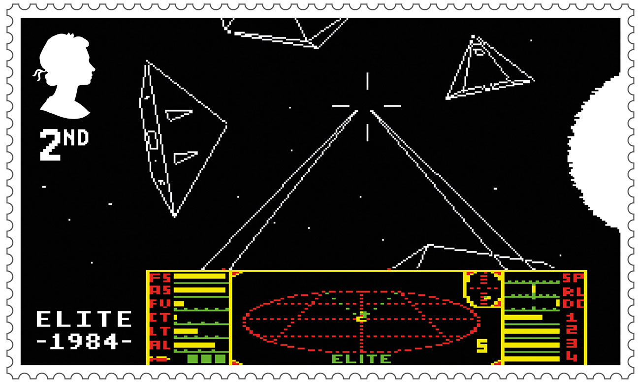
The list kicks off back in 1984 with a gaming brand that's still going strong today: Elite, an epic game of space exploration, trading and combat set across a massive procedurally-generated galaxy. Its wireframe looks may not have aged well, but this was cutting-edge stuff back in the day, and we're pleased to note that the Royal Mail has used a shot of the original version on the BBC Micro.

Royal Mail retro gaming stamps: Elite

Elite: first class gaming on a second class stamp

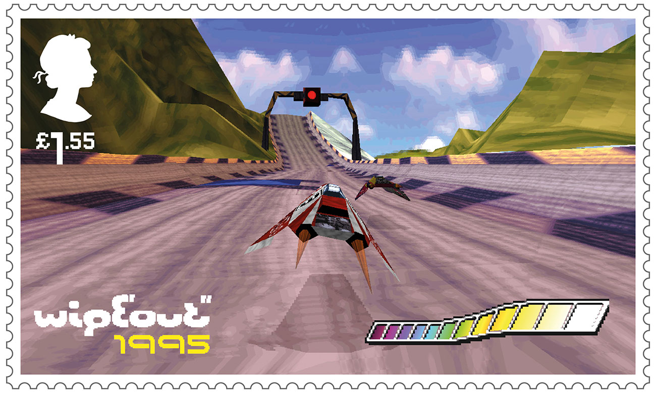
Other stone-cold classics in the collection include the all-conquering Lemmings, which arguably sowed the seeds of the Scottish games industry, and Wipeout, a high-speed racer for the Playstation that instantly established the platform's street cred with a thumping dance soundtrack and an impeccable visual identity crafted by The Designers Republic.

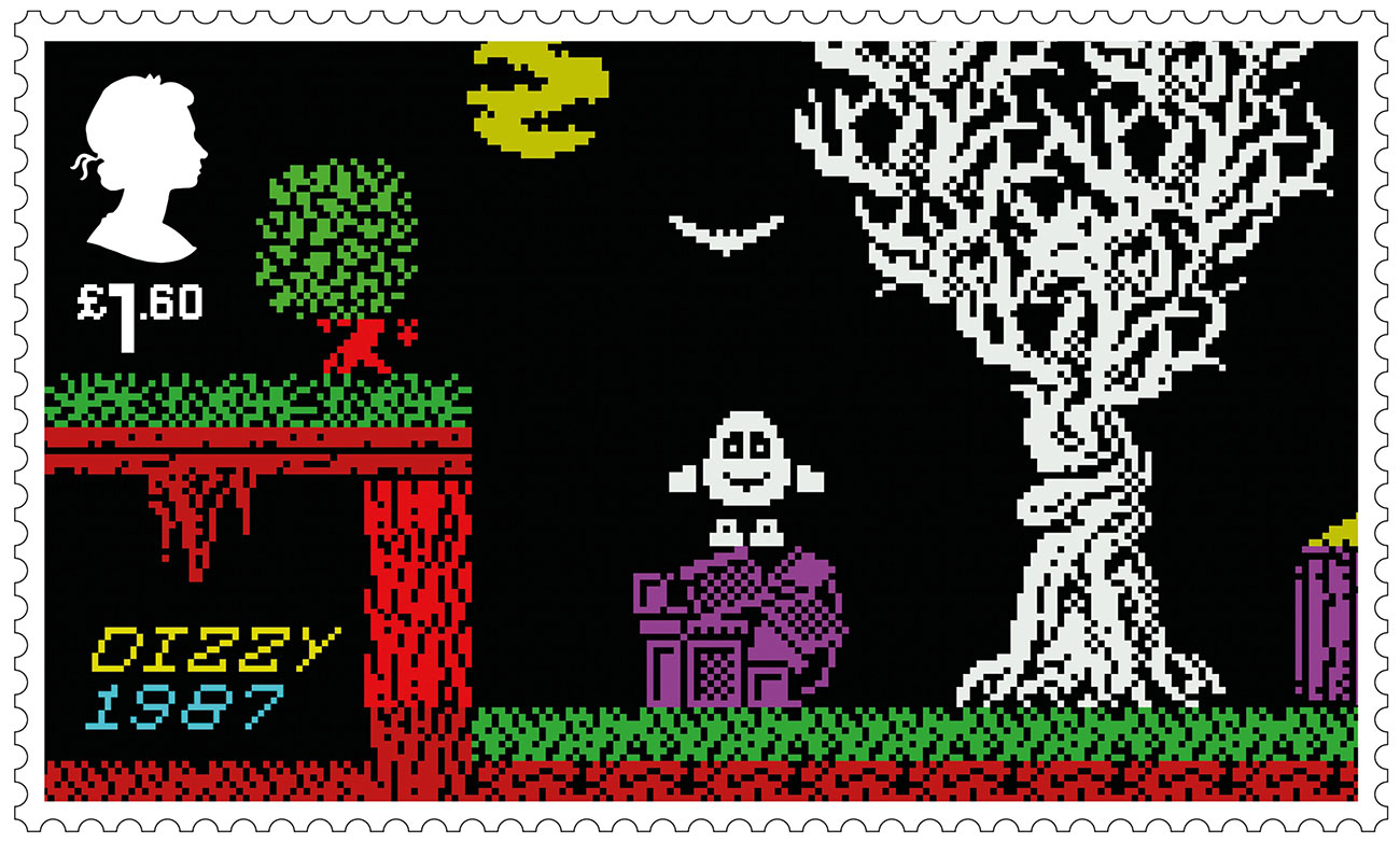
Also represented are Populous, the first title from UK games legend Peter Molyneux, ace kickabout Sensible Soccer, adorable mini-racer Micro Machines, plus the surprisingly durable Worms and bafflingly successful egg-based effort, Dizzy. They can't all be zingers.

Royal Mail retro gaming stamps: Dizzy

We won’t eggs-actly be scrambling to pay £1.60 for this

While we could happily sit and bore you in the pub for hours about the outrageous omission of titles from companies such as Ultimate Play The Game, Llamasoft and Ocean, on the whole this is a pretty good selection, with strong imagery and fat, chunky pixels accurately conveying the experience of playing games way back in the mists of time. It's a shame that the silhouette of the Queen isn't pixellated, but we imagine there are special rules about that sort of thing.

Our only real argument with the look of these stamps is with Wipeout, which definitely looks like it was taken on an emulator running at a much higher resolution than the original Playstation. But Wipeout's a game that looks much better in motion than it does as a static image, so we'll let that one pass.

Royal Mail retro gaming stamps: Wipeout

No way is that running on a PS1

These brilliantly retro stamps go on sale on 21 January; to find out more and pre-order all manner of special presentation packs, head for the Royal Mail's video games page. And if all this retro gaming talk has inspired you to try out some old-school gaming, the Internet Archive has a huge collection of titles you can play in the browser; head this way for a whole stack of ZX Spectrum classics.

Related articles:

Sleek new-age Game Boy looks better than the originalHow to break into pixel artThe 8 best retro gaming consoles

Take Off With Aviationstack’s Real-Time Flight API

Original Source: https://www.webdesignerdepot.com/2020/01/take-off-with-aviationstacks-real-time-flight-api/

In our increasingly global world, people travel by airplane…a lot. With rapid turnaround times, unpredictable weather, and unexpected delays, airlines both domestic and international frequently adjust their flight schedules to keep us moving.

If you’re building a website, a progressive web app, or even a native app that involves any kind of travel, the last thing you want to do is give users out-of-date information, and when it comes to air travel, information is out of date almost as soon as its published. Turbulence en route to Bangkok, can have a devastating impact on queues in Denver. A reliable flight tracker should be one of the first must-haves on your feature list.

aviationstack is an incredibly powerful API that delivers comprehensive data about flights worldwide

Of course, any flight tracker is only as useful as the data that powers it. The minimum standard is access to a dataset that covers the information you need, reports data accurately, and boasts a solid uptime.

For those reasons, if you’re looking to introduce flight data to your site, then one of the best ways to go about it, is integrating with aviationstack.

aviationstack is an incredibly powerful API that delivers comprehensive data about flights worldwide, in a simple-to-use format.

Why Track Flights

Let’s say you’re building a ride-booking app, you absolutely want to be able to track flights in order to minimise disruption, coordinate with drivers right across the fleet, and maximise your profits. Or imagine you’re building a website for a train operator, wouldn’t it be nice to let passengers know whether they’re going to make their connecting flight. And of course, if you’re operating an airline it’s common sense that your users will benefit from this kind of rich data.

But companies that service airline customers aren’t the only ones that benefit from tracking airplanes. If you’re running any kind of business that people may travel to, whether that’s a hotel in Madrid, or a tech conference in Las Vegas, showing people their flight options is one way to remove friction when potential attendees are deciding whether to purchase a ticket.

Sometimes, people need to travel at a moment’s notice, and on unfamiliar routes. It may be that there are unexpectedly great waves off the coast of Big Sur; it might be that a bird, previously thought extinct has been spotted in Iceland; it might be that you’ve accidentally left your son Kevin at home in Chicago while you flew to Paris for the holidays. Whatever niche-interest your site or app caters to, if travel’s involved, then a flight tracker is essential.

Why Use aviationstack

If you’re comparing flight data APIs, then here are a few of the reasons we think aviationstack deserves to be at the top of your shortlist:

more than 13,000 airlines are represented across over 10,000 airports

Firstly, aviationstack’s data is amongst the most extensive available, because it’s drawn from high-quality sources. Using aviationstack you can easily look up flights across airports, cities, and countries; you can check historical flight data; you can even check live flights in real-time. The API covers over 9,000 cities in more than 250 countries; over 19,000 airplanes are divided into more than 300 different types; more than 13,000 airlines are represented across over 10,000 airports. For comprehensive data, aviationstack is hard to beat.

Secondly, aviationstack’s data is accurate to the minute. Many of us get a little anxious when we travel, not least when we’re rushing to catch a connecting flight. When your app or site is providing advice and information to potentially fraught customers, accurate information is invaluable, and can often transform a stressful situation into an exceptional user experience that wins you a loyal customer for life.

Thirdly, aviationstack is built on an incredibly reliable infrastructure. It’s owned and operated by apilayer, one of the best-known names in APIs, which means you can be confident that the API won’t buckle under the pressure. The API is incredibly simple to access, with code examples provided in PHP, Python, Go, Ruby, Nodejs, and even jQuery. It’s so simple that even novice front-end coders will get it up and running quickly, without any difficulty.

Last, and by no means least, aviationstack offers an entirely free plan that grants you 500 requests to the API per month, with full aviation, and real-time flight data. Which means you can try it out with zero risk. Once you’re happy, subscriptions start from just $39.99 (billed annually) and you can cancel at any time.

Head over to aviationstack.com today to see the API in action, and claim your free API key.


[– This is a sponsored post on behald of aviationstack –]

Source

p img {display:inline-block; margin-right:10px;}
.alignleft {float:left;}
p.showcase {clear:both;}
body#browserfriendly p, body#podcast p, div#emailbody p{margin:0;}

How to Easily Animate Website Elements on Scroll Using the Free AOS Library

Original Source: http://feedproxy.google.com/~r/1stwebdesigner/~3/5K3FvBKVLCo/

On-scroll animations can add quite the elegant effect to your website. A little animated polish can go a long way towards making your site look well-rounded and complete. With JavaScript and CSS, you can make elements fade, slide, or even spin as they appear when you scroll down a page.

And you don’t even have to code it all yourself! Thanks to the free AOS Library, beautifying your website is as simple as adding a script. Just use a CDN or a package manager to install the JavaScript and CSS files, and insert a few lines of code. Then crafting animations will be a breeze.

We’ll show you how to set up the AOS library right here, plus give you some awesome examples of AOS experiments in action.

UNLIMITED DOWNLOADS: Email, admin, landing page & website templates

DOWNLOAD NOW

Setting Up AOS

Installing AOS to your site is a simple process if you’re using a CDN or package manager, which host all the files for you and install them properly. If you don’t want to do that, you’ll need to download the files and set them up yourself.

With a package manager, all you need to do is input a code into the command line/terminal of the server you installed it on. npm is one popular solution, and it comes automatically bundled with Node.js too. Just use this command:

npm install –save aos@next

There’s also Bower, which requires npm. While it’s a deprecated tool, it’s still maintained and is used by many. If you have it installed, launch this script:

bower install aos –save

Finally, there’s Yarn, a popular alternative to Bower. This is the code you’ll need:

yarn add aos@next

If you prefer to use a CDN, these scripts will install the files and stylesheets you’ll need to get started. Make sure to include both of them or it won’t work properly.

The CSS scripts:

<link href=”https://unpkg.com/aos@2.3.1/dist/aos.css” rel=”stylesheet”>

The JS scripts:

<script src=”https://unpkg.com/aos@2.3.1/dist/aos.js”></script>

Whichever method you used, the last step is to initialize AOS with this code and complete the setup process:

<script>
AOS.init();
</script>

Then it’s just a matter of creating the animations! Check out this table of animation controls, and these predefined animations you can use. It’s up to you to craft the perfect effects that fit your unique website. If you get stuck, try this in-depth tutorial written by the developer. It has plenty of helpful examples.

AOS Experiments and Examples

The best way to learn a new library is by seeing the code in action, and that’s why sites like CodePen are so valuable. Check out the snippets below, and you’ll be able to see working AOS JavaScript alongside the output. You can even tweak the code in real time. Then use the knowledge you gain to build your own awesome animations!

Model

See the Pen
Model by Ricardo Pires (@skeezrocco)
on CodePen.

AOS Animate On Scroll Library

See the Pen
AOS Animate On Scroll Library by Oltika (@oltika)
on CodePen.

AOS – animations

See the Pen
AOS – animations by Snik (@michalsnik)
on CodePen.

AOS – anchor

See the Pen
AOS – anchor by Snik (@michalsnik)
on CodePen.

AOS – anchor & anchor-placement

See the Pen
AOS – anchor & anchor-placement by Snik (@michalsnik)
on CodePen.

AOS – custom animations

See the Pen
AOS – custom animations by Snik (@michalsnik)
on CodePen.

Animate on Scroll Examples – Disable Animations

See the Pen
Animate on Scroll Examples – Disable Animaions by SitePoint (@SitePoint)
on CodePen.

AOS JS

See the Pen
AOS JS by manufufu (@WAWI)
on CodePen.

Movie

See the Pen
Movie by Artem (@Artem91)
on CodePen.

Scroll Effects Made Easy

Thanks to JavaScript libraries like AOS, creating websites with beautiful animations isn’t such a huge deal. It might take a bit to learn the ins and outs of a library, especially if you’re a beginner, but it makes the whole process a lot more accessible to new web developers. And it means that you don’t have to create it yourself from scratch.

If you’re looking for a library that makes elegant scroll effects a breeze to implement, definitely consider trying AOS. It’s simple to install and even easier to learn, so you can have on-scroll animations up and running in a snap.


Branding Inspiration: Lisbon School of Design

Original Source: http://feedproxy.google.com/~r/abduzeedo/~3/2lfxIehFdXA/branding-inspiration-lisbon-school-design

Branding Inspiration: Lisbon School of Design

abduzeedoJan 07, 2020

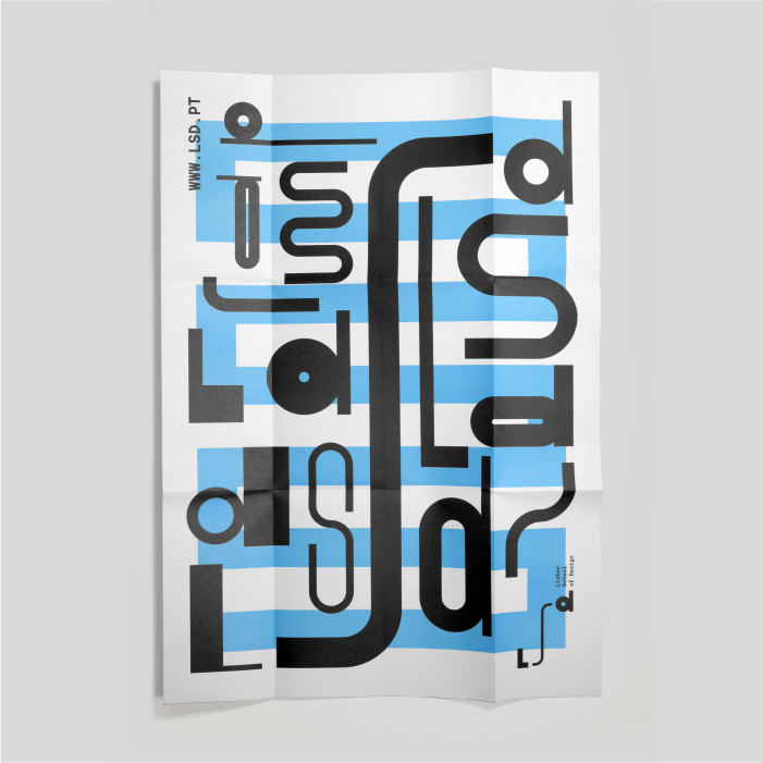
UMA Brand Studio published an amazing new branding project for the Lisbon School of Design. This is a brand project with the ambition to inspire all students to be creative. With a changeable path concept represented by the S of School, which translates to the different design courses, the diversity of its students and of course, creativity.

Branding and Visual Identity


Abstract Digital Art: Tech Styleframes

Original Source: http://feedproxy.google.com/~r/abduzeedo/~3/OT6ZCPwzl-A/abstract-digital-art-tech-styleframes

Abstract Digital Art: Tech Styleframes

abduzeedoJan 07, 2020

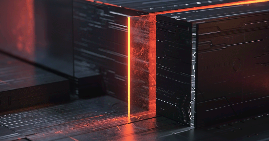
Luca Genovese shared an incredible digital art project titled Tech Styleframes – Exploration. He used Cinema 4D and JSplacement to create a series of abstract images that look like computer motherboards and electronics. The outcome is simply beautiful, full of light effects and different perspectives. Honestly, I would love to have some of those as desktop and mobile wallpapers.

Digital Art

Details

Image may contain: lightImage may contain: green, outdoor and streetImage may contain: skyscraper, screenshot and building


16 essential tools for graphic designers in 2020

Original Source: http://feedproxy.google.com/~r/CreativeBloq/~3/5viPRuctSck/tools-every-graphic-designer-should-have-6133208

In this guide, we've rounded up the hardware, software and other graphic design tools that will help creatives of all levels work more effectively. Whether you're starting from scratch or looking to upgrade a specific piece of equipment, our recommendations will help you pick the best option.

Reliably equipment doesn't have to be expensive (take a look at our guide to the best free graphic design software if your budget it particularly tight), but here we've hand-picked the very best kit that money can buy. We wouldn't hesitate to recommend each item to our own friends and colleagues. Some might be a big investment, but all will be worthwhile in the long run.

We've split the products here into four sections: hardware (covering everything from workstations to extra storage); creative software; creative tools (think sketchpads and Pantone books); and home office items. You'll find our list of essential graphic design books elsewhere on the site.

Here are 16 must-have graphic design tools for starters…

01. Laptop
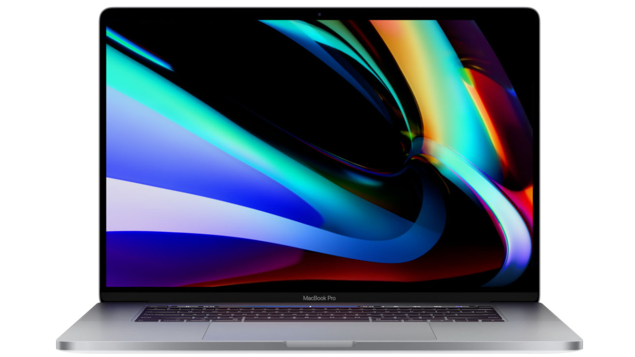
Apple MacBook Pro 16-inch (2019)

Apple's most powerful laptop to date, the 16-inch MacBook Pro is the perfect tool for graphic designers, whether you're working on the move or at home.

When creating the new MacBook Pro, Apple's stated aim was to give fans "more of what they love", and it did exactly that. The most obvious feature is the new, larger screen, which is ideally suited to design work. It's also improved the keyboard; gone are the troublesome Butterfly switches that plagued earlier models, replaced with more responsive scissor switches, as found on the Magic Keyboard.

Battery life is exceptional too, which is particularly impressive considering this laptop's powerful components. It can be configured with up to 64GB RAM (a first for a MacBook) and up to 8TB storage so you don't need to rely on an external hard drive. 

Of course, all this doesn't come cheap, and the highest specifications command particularly high prices, but if you're looking for a laptop that'll keep performing flawlessly for years and will never hold you back, this is an excellent investment.

Also read: The best laptops for graphic design

02. Desktop
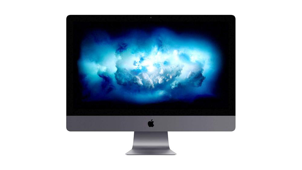
Apple iMac Pro

A desktop powerhouse created with professionals in mind, the iMac Pro remains the gold standard for graphic designers. It features a true 5K Retina display, and can be configured with an astonishing 256GB RAM, an 18-core Intel Xeon W processor and Radeon Pro Vega 64X graphics with 16GB of HBM2 memory.

As with the MacBook Pro above, this kind of power comes at a price, but for resource-intensive work like rendering 3D models, video editing and animation, the cost will be well worth the time saved.

Despite some serious upgrades under the hood, Apple has maintained the iMac Pro's signature look, with a chassis that's just 5mm thick and weighs a mere 700G, keeping your desk clear and clutter-free.

We've yet to get our hands on the new (and even more powerful) Mac Pro, but until then, this is the best desktop machine a graphic designer can buy.

Also read: The best desktops for graphic design

03. Monitor calibrator
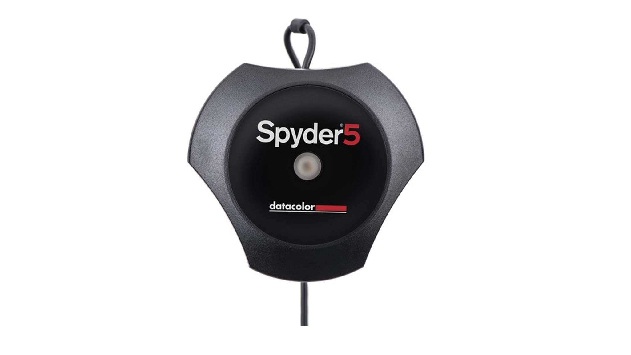
Datacolor Spyder5ELITE

A properly calibrated monitor is essential for making sure your screen displays colours as accurately as possible. Windows and macOS both include their own calibration tools, but for the best results you can't beat a hardware calibrator like the superb Datacolor Spyder5ELITE.

This calibrator is a particularly choice if you need to calibrate several displays to a single target configuration, whether they're laptops, desktop monitors or a mix. It features both wizard and expert settings for different levels of experience.

You also get a 90-day trial of the Adobe Creative Cloud Photography Plan thrown in, so you can put your newly calibrated screens to work.

Also read: The best monitor calibrators for creatives

04. Reliable hard drive
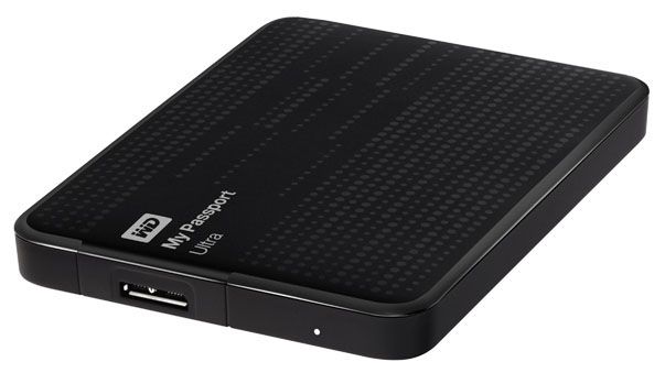
Western Digital My Passport Ultra

The Western Digital My Passport Ultra is a neat external drive that gives you up to 5TB for your most important files. The optional WD SmartWare Pro software (available for Windows and macOS) lets you easily configure automatic backups, so you never need to worry about losing a client's work.

The My Passport Ultra is fast too, with impressive read and write speeds for quick transfers (essential for large image and video files). This is made possible by its USB-C connectivity, though it comes with a USB 3.1 adaptor for older devices too (albeit at slower rates).

At just 231g, it's ideal for carrying on the move, and fits neatly into a backpack, satchel or pocket in its own cloth carry bag.

Also read: The best external hard drives

05. Graphics tablet and stylus
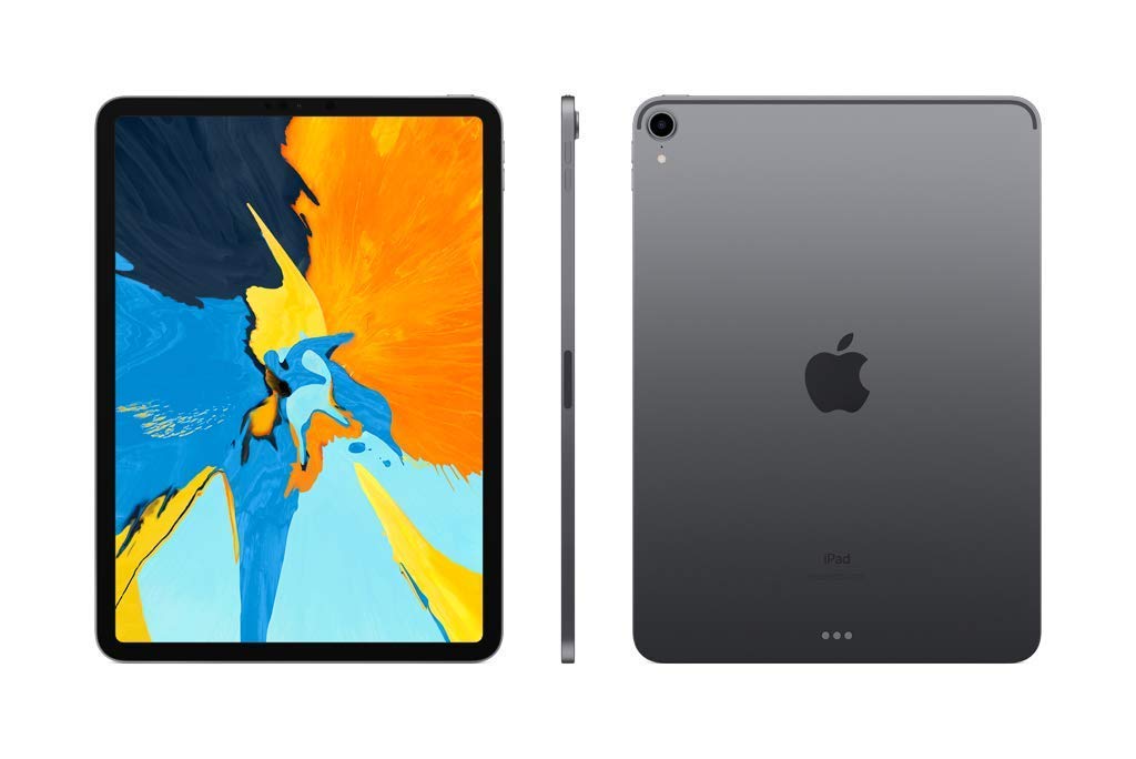
iPad Pro 11

Only a couple of years ago, the name Wacom was synonymous with graphics tablets for professionals, but the iPad Pro and Apple Pencil have now stolen the crown – particularly for designers who struggle to justify a tool that's tied to their desk. The iPad Pro is a superb device for digital drawing, but does far more besides.

Whether you opt for the 11-inch or 12.9-inch model, the latest iPad Pro borrows the nearly bezel-free design of recent iPhones, giving you an expanse of smooth glass to work on. Apple's Smart Keyboard transforms it into a powerful laptop, and the new Apple Pencil makes it even more versatile. 

Apple has dropped the Lightning connector in favour a magnetic function, so the Pencil now snaps smartly onto the top of a new iPad Pro for pairing, charging and storage. What's more, gesture support has also been added, allowing you to switch between app tools with a quick double tap, for example. 

We're likely to see a new iPad Pro later in 2020, with even more impressive specifications, but either of the current models is an excellent choice for digital drawing, wherever you happen to be.

Of course, some designers and artists will prefer the precise pressure sensitivity and control you can only get with a dedicated graphics tablet. If you're among them, the Wacom Cintiq 22 is our tablet of choice, providing a great balance of screen, size, ergonomics and value. If your budget will stretch a little further, the Wacom Intuos Pro is an even more powerful option, and is available in a choice of sizes (with prices to match).

Also read: The best drawing and graphics tablets

06. Top-end smartphone

Samsung Galaxy S10 Plus

The iPhone 11 Pro Max might be the most sought-after flagship phone of 2020, but our handset of choice is the Samsung Galaxy S10 Plus. The Snapdragon 855 processor makes it one of the fastest Android phones around, but there's a lot more here for designers to take note of.

The S10 Plus is slightly larger than the regular S10, giving you a full 6.4 inches of Super AMOLED screen to work with. Colour reproduction is excellent, and there's impressive dynamic range.

The trio of rear-facing cameras (for normal, telephoto and wide-angle photos) are superb, too. The main camera's dual-aperture lens captures sharp images, even in low light, and the wide-angle lens captures a 123-degree field of view. Even Google can't match that. Videos benefit from image stabilisation, and this is the first Samsung phone able to record video in HDR.

The battery will last a whole day in typical conditions, and you can even use the S10 Plus to charge other devices wirelessly.

Also read: The best smartphones for designers

07. Studio camera
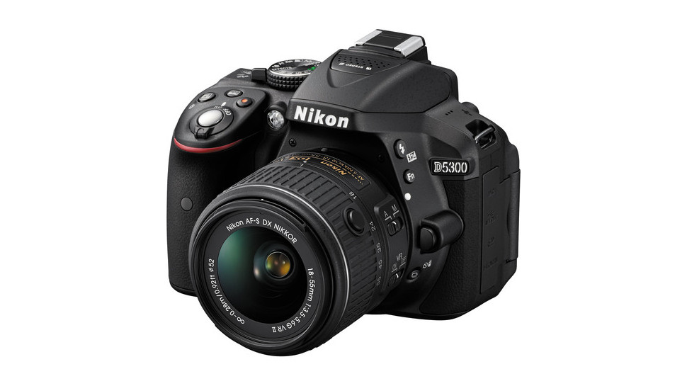
Nikon D5300

The Nikon D5300 is an ideal DSLR if you're looking for something that will perform well and provide many years of reliable service. Together with a versatile lens kit, it'll help you achieve great shots without breaking the bank.

This is definitely an entry-level DSLR, and can't record video in 4K, but its still images are super crisp (partly due to the absence of an anti-aliasing filter) and the new EXPEED 4 processing engine means noise is well controlled, even in dark images.

The camera's chassis is made from a single piece of polycarbonate, meaning there are fewer joints, seams and potential weak points. It's also unusually light, making it easier to carry when you need to leave the studio. It's a shame there's no touchscreen, so you'll have to navigate the camera's many menus using physical buttons, but the interface is pretty straightforward and shouldn't present much of a barrier to you achieving professional quality images.

Also read: The best cameras for creatives

08. High-res monitor
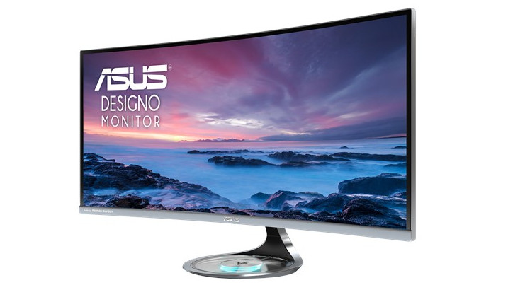
Asus Designo Curve MX38VC

Unlike many ultra-wide monitors, the Asus Designo Curve MX38VC is designed with creatives rather than gamers in mind and eschews flashy design for a smart frameless look and practical features. Of course, the main attraction here is the huge 38-inch panel, which gives you masses of workspace without the need for multiple monitors. 

It's designed to be kind to your eyes, too, minimising glare and flicker to help avoid strain and discomfort when you're putting in long hours. It doesn't offer the fastest refresh rates around, but the viewing angles are excellent and its unusual height means it doesn't feel as compressed as some ultra-wide monitors.

Its connectivity is excellent, with DisplayPort, USB-C and two HDMI connections at your disposal, plus Bluetooth. It even features a built-in Qi wireless charger, so you can simply set your phone down underneath your screen and pick it up later, fully powered up.

Also read: The best monitors right now

Back to top
09. Creative software

Adobe’s Creative Cloud

Adobe’s Creative Cloud is the industry standard for design professionals

Adobe Creative Cloud is the industry standard for design professionals – the range and depth in its suite of tools is unrivalled by any other company. But it comes at a cost, and even if you can snap it up during one of Adobe's occasional sales, an all-apps subscription represents a big investment.

Still, you get Photoshop, Illustrator, InDesign, After Effects and loads more. If you’re looking to be truly multi-disciplined and regularly share a workflow with other designers, go for it. But if your work revolves purely around vector design and photo-editing/manipulation, it's not the only choice.

Affinity Designer and Affinity Photo are both excellent tools from Serif – even topping Photoshop and Illustrator in some areas – and cost around £50 each, outright, with free updates. Superb file compatibility means you can collaborate with Photoshop and Illustrator users too. You could also check out these 6 amazing free Adobe CC alternatives.

If you own an iPad, the newly released Adobe Fresco is well worth considering, It aims to recreate the feeling of drawing and painting with traditional media on a tablet, and has been created with professional designers and artists in mind (though it's also accessible enough to pick up quickly).

10. Antivirus software
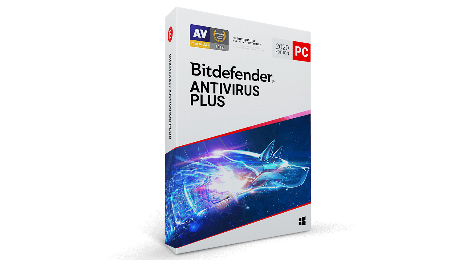
Bitdefender Antivirus Plus 2020

It's all too easy to fall victim to a virus or malware. You don't even need to be doing anything particularly risky; simply opening a PDF that appears to be a client invoice could be enough to infect your computer, encrypting or deleting your extremely valuable work. If you've made regular backups, this could be extremely frustrating; if you haven't, it could be catastrophic.

Bitdefender Antivirus Plus 2020 is a full security suite that can protect up to 10 devices, including Windows PCs, Macs and Android phones. It provides real-time protection from viruses and malware, plus phishing attempts (when a person tries to trick you into entering usernames, passwords and financial details into a fake website). Even if it hasn't come across a particular threat before, the software can identify suspicious programs based on their behaviour and quarantine them before they have the chance to cause harm.

Bitdefender Antivirus Plus 2020 also comes with a super-secure browser specifically for online banking and shopping, to help keep your card and account details secure. There's also a file shredder if you need to delete any confidential information from a client so it can't be recovered.

Bitdefender often runs special offers, so if you're lucky you'll be able to save a considerable amount off the regular asking price, which is great value already.

Also read: The best antivirus software for designers

11. VPN software
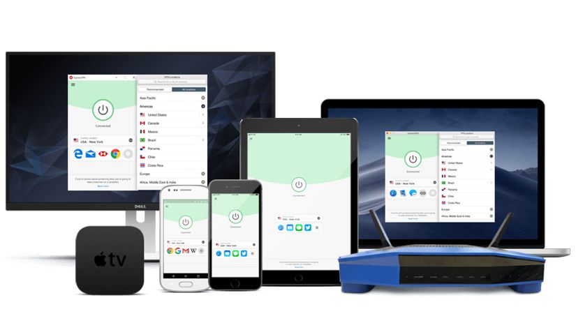
ExpressVPN

A VPN can be essential if you're travelling, and not just for countries like China where tools like Google Docs are blocked by a national firewall. ExpressVPN will also protect you when you're using public Wi-Fi hotspots in cafes and shared workspaces, preventing any would-be crooks from snooping on your online activity.

It does this by using an encrypted connection to redirect your web traffic through one of 160 servers, spread throughout 94 countries. If that sounds intimidating, don't worry; ExpressVPN's interface makes it all easy to use and understand, and if you do happen to get stuck there's live support available 24/7.

It doesn't just work with laptop and desktop computers, either; there are mobile apps for your smartphone and tablet too, and you can even install ExpressVPN on many routers to secure every device on your home Wi-Fi network.

Unlike many VPN services, ExpressVPN also gives a 30-day money-back guarantee, so you won't be left out of pocked if you discover it's not the right service for you.

Also read: The best VPN deals

12. Productivity software
Google docs

In 2020, Google Docs is much more than a web-based version of classic productivity suites like Microsoft Office, and has come along in bounds and strides since it first appeared as a free service.

Apart from making your documents, spreadsheets and slides accessible from any browser (as well as supremely easy to collaborate on with other users), the online suite employs an intuitive interface that even integrates Google's vast search features when you need them.

There's a range of quality templates ready for you to use, plus third-party add-ins available that offer features you'd normally find in Microsoft Office, like mail merge and a more advanced equation editor. You can also use Google Translate to convert one of your documents into another language. And if you want more collaboration features, you can always plump for the subscription-based version of Google Docs, now called G Suite.

Back to top
13. Quality sketchbook or notebook
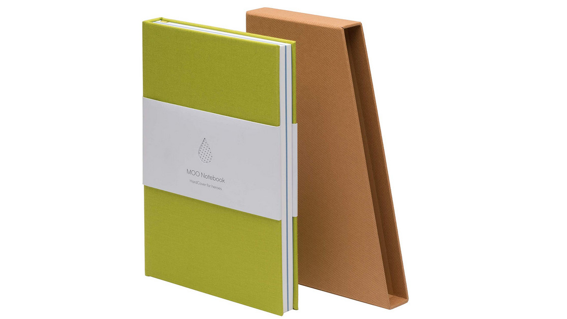
MOO Hardcover Notebook

MOO is a brand best known for its made-to-order business cards, but it also produces some of the best notebooks for designers. It might sound unlikely but the MOO Hardcover Notebook was created by the company's in-house designers, and their expertise really shows. It features non-glare ruled paper, plus 16 sheets of shaded paper in the middle for sketches, and can be laid completely flat on your desk for easier working.

If you need an unruled notebook, a Moleskine Classic is still impossible to beat. It comes in a huge variety of shapes, styles and paper types, but whichever one you opt for, the quality is consistently excellent. The company also makes some of the world's best sketchbooks, including the Moleskine Art Collection Sketchbook. Its paper has enough tooth for most dry media while still being pleasantly smooth, and its price is very reasonable for 240-page pad.

14. Pantone swatch book
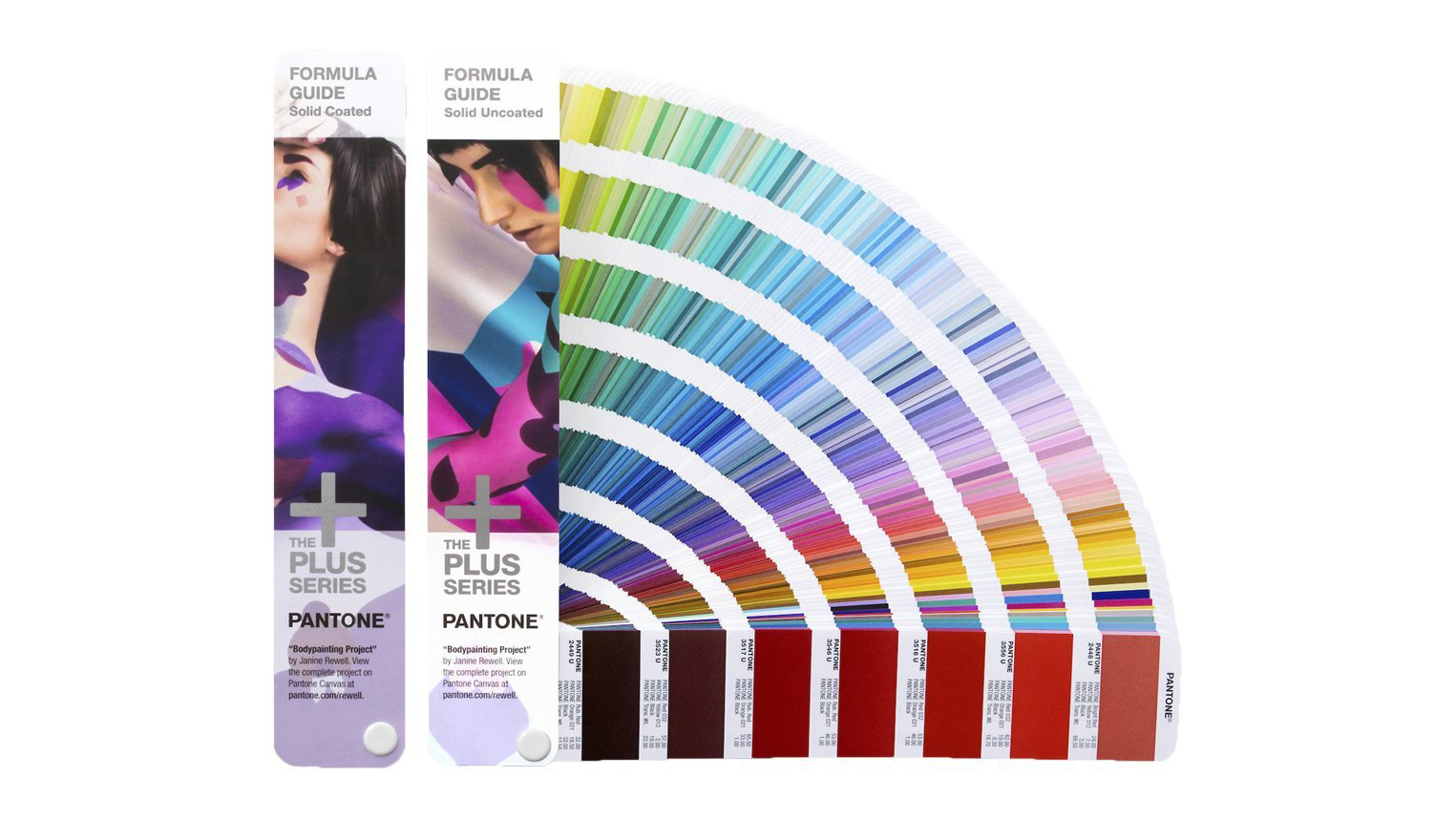
Pantone Plus ColorBridge: Coated and Uncoated

When you're working in print, you need to know exactly how spot colours are going to look. The only way to do that is to invest in a Pantone swatch book, and while they aren't cheap, they are invaluable. 

Before making a purchase, consider exactly which swatches you actually need. Neons and metallics are particularly hard to simulate on-screen, so dedicated swatch books for these are a good choice. Alternatively, a five-part Pantone Plus Solid Guide Set will cost you £288/$329, and will cover both.

For more versatile day-to-day use, the Pantone Plus Color Bridge Set presents the spectrum of spot-colours alongside their closest CMYK match – ideal where your client’s budget doesn’t stretch to a fifth colour for a certain job. Books of Pantone 'chips' are also available, which are great to pin to printers' proofs to ensure everyone's on the same page, colour-wise.

If you specialise in quality print and packaging work, and spot colours are a significant part of your daily workflow, it may be worth investing in the full-blown Pantone Reference Library for your studio to have the entire range at your fingertips, complete with fetching display stand. But you'll be paying £1,179/$1,620 for the privilege, so make sure you really need it.

Back to top
15. Variable desk
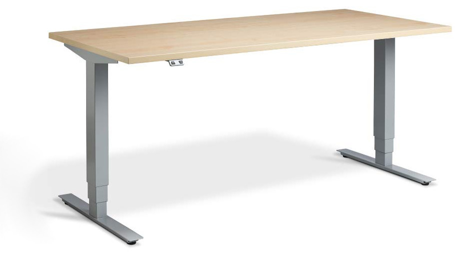
Flytta

A standing desk can encourage you to be less sedentary, help reduce back pain and even decrease your risk of illness. With the Flytta 2 you have the option to switch between sitting and standing whenever you want, and adjust the level of the work surface to suit your height.

There's no need to fiddle with crank handles; the desk is raised and lowered smoothly by a pair of powerful motors, and can store your preferred height settings for quick access in future. Collision detection helps you avoid bumped knees, and the 120kg lift capacity means even heavy desktop computers won't be a problem.

16. Ergonomic chair
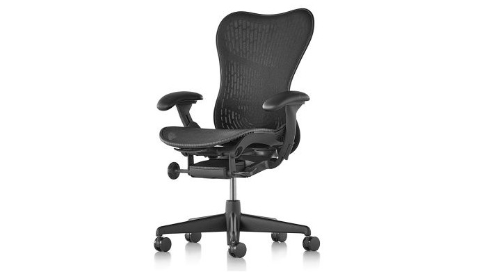
Herman Miller Mirra 2

If there's one item that's really worth investing in, it's a high quality chair, and the Herman Miller Mirra 2 is our number one choice for keeping you comfortably supported all day. It's a little more affordable than the iconic Aeron chair, and features 10 different adjustment systems so you can customise it for the perfect sitting position.

The posture support is superb, helping you avoid back problems down the line, and alleviating any issues you may already have. The mesh design also helps regulate temperature, so there's no risk of getting hot and sweaty while working at your desk all day.

Back to top

Read more:

The best computer for graphic design10 productivity tools you can't be withoutThe best travel laptops right now

Collective #578

Original Source: http://feedproxy.google.com/~r/tympanus/~3/oJy4h4RzvKk/

Collective item image

Front-End Performance Checklist 2020

A front-end performance checklist with everything you need to know to create fast experiences on the web today.

Check it out

Collective item image

Kinesis

Kinesis lets you easily create interactive animations with Vue.js.

Check it out

Divi Freelancer

Our Sponsor
Start your own freelance business

Learn how to develop websites with the most popular WordPress theme in the world and secure your success as a freelancer.

Start learning now

Collective item image

Min and Max Width/Height in CSS

A practical dive into min-width and min-height in CSS by Ahmad Shadeed

Check it out

Collective item image

Sampling bias, FDR, and The State of JS

A very insightful article on sampling bias and why the results of the State of JS survey should be taken with a grain of salt.

Read it

Collective item image

Excalidraw

Excalidraw is a whiteboard tool that lets you easily sketch diagrams that have a hand-drawn feel to them.

Check it out

Exifer

A lightweight JavaScript image meta-data reader that can extract EXIF, GPS, XMP & IPTC data.

Check it out

Collective item image

2019: Projects of the Year

A collection of the most beautiful projects made with Readymag.

Check it out

Collective item image

A short history of body copy sizes on the Web

An interesting article on the history of body copy font sizes and the challenges that come with responsiveness.

Read it

Collective item image

Jesper Landberg Portfolio

The fantastic portfolio of creative front-end developer Jesper Landberg.

Check it out

Collective item image

Line Through Effect

A great video tutorial on how to create a cool line through effect with CSS and JavaScript.

Watch it

Collective item image

Get Moving (or not) with CSS Motion Path

Dan Wilson explores some possibilities with the new CSS Motion Path properties.

Read it

Collective item image

Instagram Font Generator

Pick, preview, copy and paste fancy text to use on Instagram and other social networks.

Check it out

Collective item image

Understanding CSS Grid: Creating A Grid Container

In a new series, Rachel Andrew breaks down the CSS Grid Layout specification and takes a detailed look at what happens when you create a grid container.

Read it

Collective item image

Craft.js

A React Framework for building extensible drag and drop page editors.

Check it out

Collective item image

Snowflake painter

A fantastic snowflake creator made by Yoksel.

Check it out

Collective item image

“Watercolor” effect in WebGL

A fantastic WebGL demo made by Robin Delaporte.

Check it out

Collective item image

Another Damn ToDo App in Vue.js

Raymond Camden shares how he built the classic ToDo app in Vue.js.

Check it out

Collective item image

Getting Started with Front End Testing

Amy Kapernick showcases different tests for accessibility, visual regression and end-to-end testing as well as linting.

Read it

Collective item image

Sscaffold

Sscaffold is a modern, lightweight CSS library that builds on Milligram, Skeleton and Normalize.

Check it out

Collective Item image

Beautiful React Hooks

A collection of useful React hooks to speed-up your components and hooks development.

Check it out

Collective item image

What is the JAMstack?

A January series of compact articles on JAMstack.

Check it out

Collective item image

The Hidden Treasures of Object Composition

As part of the “Composing Software” series on learning functional programming and compositional software techniques in JavaScript ES6+, Eric Elliott explores the topic of object composition.

Read it

Collective item image

Awesome Mobile Security

An effort to build a single place for all useful Android and iOS security related resources.

Check it out

Collective #578 was written by Pedro Botelho and published on Codrops.

How To Decide Which PWA Elements Should Stick

Original Source: https://www.smashingmagazine.com/2020/01/mobile-pwa-sticky-bars-elements/

How To Decide Which PWA Elements Should Stick

How To Decide Which PWA Elements Should Stick

Suzanne Scacca

2020-01-02T12:30:00+00:00
2020-01-02T22:08:46+00:00

As the number of website visitors and shoppers grows on mobile, it’s important to consider how small additions to your design will encourage them to do more than just research and browse. One of the elements I think mobile designers — for PWAs and mobile websites — need to do more with is the sticky bar.

What exactly do I mean by “more”? Well, I mean using the fixed navigation bar at the top or bottom of a mobile site for more than just navigation or branding.

Today, I’m going to show you some creative uses for sticky elements in mobile design, so you can help more of your visitors to take action.

Sticky Element Inspiration For Mobile Design

Think about the main challenge we face when it comes to mobile. While users are more than willing to take their first steps on a website or PWA from their mobile devices, conversion often happens on desktop (if they remember to do it at all).

When used properly, fixed elements can encourage more mobile visitors to take action right where they are. And this works for all kinds of websites.

1. Make the Top Sticky Bar Useful

The sticky bar at the top of your mobile site shouldn’t just be there for branding.

That said, I get that it can be tricky using that space when the logo may end up comprising a good chunk of that space. But if you design it thin enough, you can stack another banner beside it. Just make sure it’s useful.

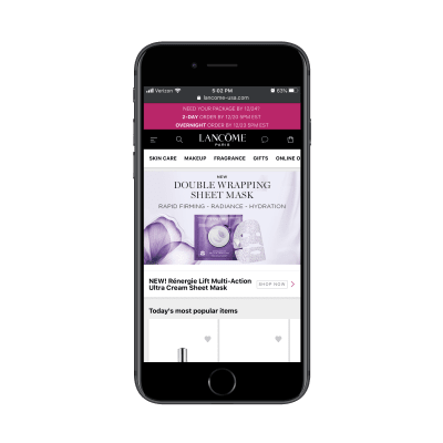
The Lancome PWA is an interesting example because it simultaneously does this well and poorly:

Lancome sticky bars

Lancome has three sticky bars at the top of its PWA. (Source: Lancome) (Large preview)

There are three sticky bars at the top of the PWA:

A banner promoting a special offer,
A standard navigation bar,
A secondary navigation bar with shop categories.

The two navigation bars are great. Together, they don’t take up too much space and they make it much easier for users to find what they’re looking for and to complete their purchases. However, that promotional banner is not very well executed.

For starters, it’s too big and demands too much attention. Secondly, there’s no way to dismiss the message. It just stays there, stuck to the top of the PWA, no matter where the visitor goes.

If you’re going to use a sticky bar to promote an offer — no matter its size — give your users the option to move it out of the way if it’s irrelevant or if they’ve already collected the pertinent details from it.

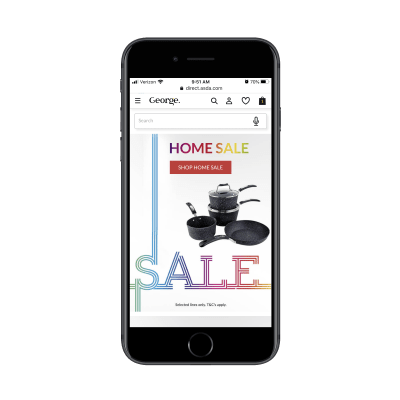
George.com is another e-commerce web app that takes advantage of the top sticky bar. This one, however, doesn’t waste the space with distracting elements.

George.com sticky navigation and search

George.com uses a standard navigation bar and sticky search bar on its PWA. (Source: George.com) (Large preview)

On the home page, George.com attaches a sticky and voice-enabled search bar to the top of the page. This is great as it caters to a number of visitor types:

Visitors that prefer to use the standard navigation from the menu.
Visitors that prefer to type a quick search to the exact item they need.
Visitors that want to use their voice to search for something.

It checks off all the boxes.

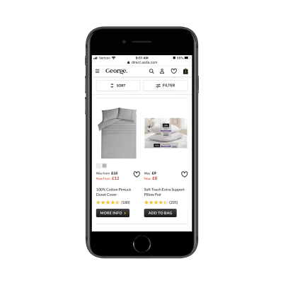
In addition to providing a great search experience for its store, George.com also customizes this sticky element as visitors go deeper into the site:

George.com sticky Sort and Filter

George.com provides shoppers with a sticky Sort and Filter bar. (Source: George.com) (Large preview)

As shoppers peruse product pages, the sticky search bar becomes a Sort and Filter bar that follows them down the page. For big online stores, this is a useful tool so mobile users don’t have to scroll all the way to the top to adjust their search results.

The top sticky bar isn’t just useful for e-commerce stores as you’ll see in the rest of the examples in this article. However, when it comes to mobile, there’s a greater opportunity for e-commerce sites to pack extra value into this space, so take advantage of it.

2. Add a Bottom Navigation Bar with Quick-Tap Actions

Okay, so we’ve established what makes for a good sticky top bar. But what about a bottom bar? Is it even necessary?

One of the benefits of designing a PWA instead of a mobile site is that we can give it the top and bottom wrapper. But it’s not always needed. I’d say as a general rule of thumb to include a bottom bar when there are commonly used actions you want users to have easy access to.

Let’s start with an example that’s a mix of the good and the eh: Twitter.

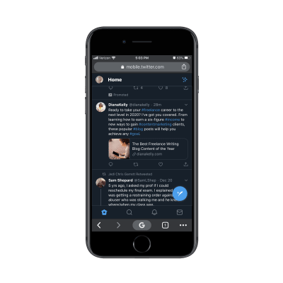
Twitter sticky bottom navigation bar

Twitter places its sticky navigation bar on the bottom of the PWA. (Source: Twitter) (Large preview)

Twitter has chosen a different placement for its navigation bar. While the sticky bar at the top provides a place to access user settings, the bottom is for:

Visiting one’s news feed;
Searching for posts, people, hashtags, etc.;
Checking on notifications and direct messages.

For a social media app, this design makes a lot of sense. It’s not as though users are going to spend much time updating their settings, so why not put it out of the thumb zone and keep the regularly used elements within reach?

The issue I take with Twitter’s sticky elements is the click-to-tweet button (the big blue button in the bottom-left). While it’s not high enough to cover content being read at the top of the page, it does cover part of it down below.

It’s awfully reminiscent of those floating social icons that used to cover content on mobile. You don’t really see that anymore and I think it was for that exact reason.

If you’re thinking about adding a free-standing sticky element of your own to your site, make sure it doesn’t cover any content. Twitter may be able to get away with it, but your brand might not.

As for other examples of bottom bars, let’s turn our attention to the Weather Channel PWA:

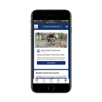
Weather Channel PWA sticky bars

The Weather Channel PWA uses both a sticky top and bottom bar. (Source: Weather Channel) (Large preview)

What’s nice about the top bar, in particular, is that it prioritizes the user experience instead of its own branding. Once a visitor enters their location, the rest of the site’s content is personalized, which is great.

As for the bottom navigation, Weather Channel has done a really nice job with this. Similar to how Twitter places commonly used buttons in its bottom bar, the same idea is present here. After all, it’s not as though Weather Channel visitors are coming to the site to read about Dover Federal Credit Union. They want to get precise predictions for upcoming weather.

Now, the two examples above show you how to use the bottom navigation bar as a permanent fixture on a mobile site. But you can also use it as a custom feature on your internal pages as job search site The Muse does:

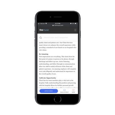
The Muse bottom sticky bar

The Muse uses a sticky bar to shortcut various actions visitors might want to take. (Source: The Muse) (Large preview)

This bottom sticky bar appears only on job listings pages. Notice how it doesn’t just say “Apply”.

I’m willing to bet The Muse designer spent time studying its user journey and how frequently job seekers actually apply for a position the first time they see it. By including “Email Myself” and “Save” buttons in this action bar, it addresses the fact that job seekers might need time to mull the decision over or to prepare the application before filling it out.

So, while you can certainly use a sticky bottom bar as a type of secondary navigation for commonly-clicked pages, I’d also suggest looking at it the way The Muse has: by designing a sticky bar that’s tailor-made for your own user’s journey.

3. Simplify Order Customization with Sticky Elements

Remember the days when you’d have to call up your local restaurant to place an order for delivery or when, gulp, you had to actually visit a store to buy something? Online ordering is an amazing thing — but it could be even better if we set up our mobile sites and PWAs the right way for it.

Again, I want to start with an example that kinda gets it right.

This is the PWA for MINI USA:

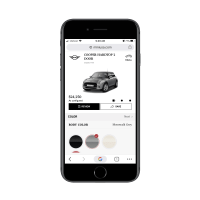
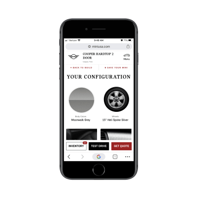
MINI USA PWA car customization

Users customize their Mini Cooper on a page with an oversized sticky element. (Source: MINI USA) (Large preview)

This is what users go through when they want to customize their car before purchasing. Looking at it from this screenshot, it looks nice. You can see the car in its customized state along with the updated price.

However, that entire section — down to the “Review” and “Save” buttons — is fixed. That means that all customization takes place on about a third to a quarter of the screen down below. It’s not an easy customization experience, to say the least.

While the customization screen needs some work, it’s the final Review screen that is done nicely:

MINI USA sticky action bar

The MINI USA Review page adds a sticky action bar to the bottom. (Source: MINI USA) (Large preview)

Here the top bar has gone back to a normal size while a new action bar has been added to the bottom. This is similar to what The Muse does to streamline the next steps with job applicants. In this case, MINI gives potential customers the ability to choose one of a number of options, even if they don’t lead to an immediate sale.

There are other types of PWAs and mobile sites that can and should simplify the online ordering process. Like MINI, Uber Eats uses custom sticky elements to help users put together their orders.

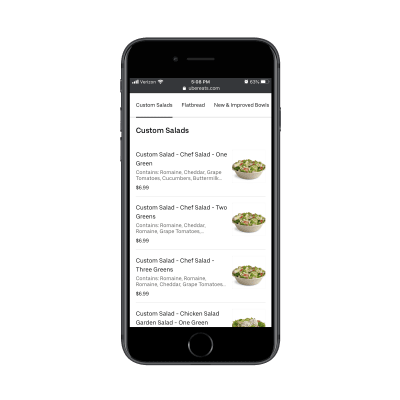
Uber Eats sticky menu

Uber Eats includes a top menu navigation bar in its PWA. (Source: Uber Eats) (Large preview)

When a user has selected a restaurant to order from, a sticky menu bar appears at the top of the page. This is especially useful for lengthy menus as well as to help users quickly navigate to the kind of food they’re jonesing for.

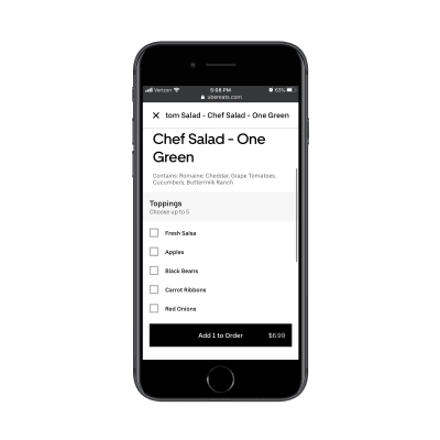
Assuming the user has found an item they want, the next page removes the top sticky bar and adds an “Add to Order” button/bar instead.

Uber Eats “Add to Order” button

Uber Eats places an “Add to Order” button at the bottom of its web app. (Source: Uber Eats) (Large preview)

This way, the distraction of other menu categories is gone and now the user only has to focus on customizing the selected item before placing it in the cart.

Again, what this comes down to is being able to predict your users’ steps before they even get there. You can use either the top or bottom navigation to aid in this process, but it’s best to place initial steps in a sticky top bar and later steps at the bottom as they near conversion.

4. Display “Sidebar” Widgets On Digital Publications

Without a sidebar on mobile, you might try to tuck the widgets that would otherwise be there at the bottom of your content. But unless you know that your content is going to be read all the way through and that visitors will keep scrolling for more, there’s no guarantee they’ll see anything you put down there.

So, when it makes sense to do so, use sticky bars to add only the most essential sidebar-esque content.

Let’s take Inc., for example.

nc.’s sticky bars and elements

Inc.’s PWA comes with a sticky subscription bar, banner ad and secondary hamburger menu. (Source: Inc.) (Large preview)

There are three sticky elements that appear around Inc.’s articles:

A subscription form (which can be dismissed),
A banner ad (which cannot),
A floating hamburger menu.

The first two elements are fine since at least one of them is dismissible. However, the floating hamburger menu is problematic since it covers part of the content. Considering this is a content-centric site, it’s probably not a good idea to cover any part of the page.

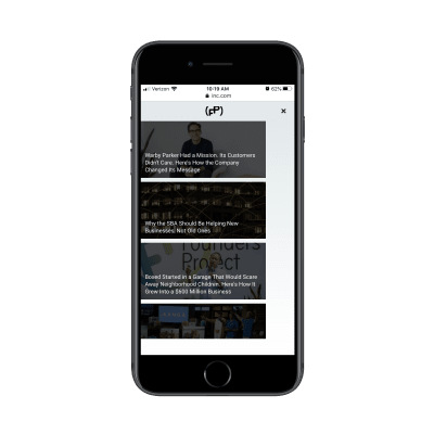
The only way we might be able to excuse the placement of this fixed element is if it were to add extra value to the content. However, all it does is give readers more articles to read:

Inc. floating hamburger menu

Inc.’s floating hamburger menu contains more articles to read. (Source: Inc.) (Large preview)

The goal on any content website is to get visitors to actually read the content. But if you’re presenting them with other options straight away, you’re only giving them more content to get distracted by.

The concept of this floating menu is a good one, but the execution isn’t great. I’d recommend displaying it as visitors get at least 75% of the way down the page. That way, it only comes into view when they should be looking for related content to read.

As for publications that get the sticky elements right, look for ones that keep it simple.

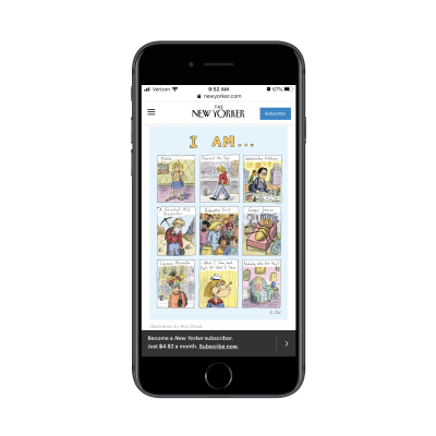
The New Yorker, for instance, does a nice job of using the sticky navigation bar and a darker, less distracting bottom bar to promote its subscriptions:

The New Yorker sticky bars

The New Yorker uses sticky bars to promote its paid subscriptions. (Source: The New Yorker) (Large preview)

If it’s important to you to get subscribers for your publication — especially paid ones — this is a good way to make use of the fixed bars on mobile.

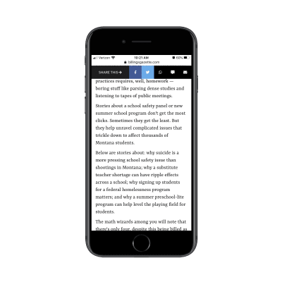
If, instead, you’re more focused on getting the word out about your content, then a sticky bar like the one The Billings Gazette uses would be better:

The Billings Gazette sticky social bar

The Billings Gazette prioritizes sharing over subscribing of its content. (Source: The Billings Gazette) (Large preview)

This is really well done. Social media sharing options are limited to the ones that make the most sense for mobile users. The same goes for the other share options here: WhatsApp, text, and email. When clicked, the corresponding app opens, so readers don’t have to use their browser sharing options or copy-and-paste the link.

In all honesty, I’m not sure it should be an either/or. I think you could use the top bar to promote your subscription so long as it’s easy to dismiss. Then, the bottom bar could be used for sharing links. Just make sure one of the bars moves out of the way so you can maximize the reading space.

Wrapping Up

Bottom line? It’s time to start using your sticky mobile elements for more than just storage of a logo, hamburger menu or search bar.

As we’ve seen here today, the key is to figure out what your users need most from you. Then, use your sticky elements to build a shortcut that makes a difference in their experience.

Smashing Editorial
(ra, yk, il)