How to design the perfect sticker for your brand

Original Source: http://feedproxy.google.com/~r/Designrfix/~3/LuebWSaeoQQ/how-to-design-the-perfect-sticker-for-your-brand

Stickers are one of the many tools you can use to increase brand awareness. They’re cost-effective and get your name out there – wherever you want. To make the perfect sticker for your brand, you need to think about what it’s for, and where it’s going to be used. Then you can figure out the […]

The post How to design the perfect sticker for your brand appeared first on designrfix.com.

Introduction to Utility-first CSS for Web Developer

Original Source: https://www.hongkiat.com/blog/utility-first-css-for-developers/

CSS is an easy language to learn (and to implement) for creating a beautiful website. However, when it comes to implementing CSS at scale, it’s not that simple. For large scale websites and…

Visit hongkiat.com for full content.

Twitter tests Fleets – its new disappearing Stories

Original Source: http://feedproxy.google.com/~r/CreativeBloq/~3/mKScGYmRc50/twitter-fleets

Twitter has started testing its own version of Stories – Fleets. These fleeting tweets disappear after 24 hours, bringing Twitter in line with other apps that have a disappearing Story feature – namely Snapchat, Facebook and Instagram. Fleets will be primarily text-based, but can include videos, GIFs or photos.

The feature is currently being tested in Brazil and may be rolled out across the rest of the world depending on user feedback. Unlike with normal tweets, users won't be able to retweet, like or comment on a Fleet, although they will be able to send a DM or emoji. Twitter hopes that those who normally feel that tweeting is too public feel more comfortable with Fleeting (we're not sure it's a capitalised verb yet, but we'll go with it).

On the day after the announcement, Fleets are already trending on Twitter, but perhaps not in the way Twitter anticipated. The hashtag #RIPTwitter has taken off, with people posting various savage memes about how they don't want Twitter Stories. We can't say yet just how fleeting this anger will be. 

For a social media trick that's available right now, read our post on how to change the font in your Instagram bio.

Do we really need Twitter Stories (sorry, we mean, Fleets)? Well, the answer is of course, no. But that doesn't mean that Fleets won't take off, and we do love the name. However, Fleets may end up being one of those features that most people basically ignore – a bit like Instagram TV or Facebook Watch (yes, we had to look that one up), and not at all like Instagram Dark Mode, which everyone seems to love.

From a content creator's point of view, Fleets will either be another way to reach your audience, or another way for your audience to ignore you. The addition of Fleets could also mean that people will stop scrolling through other users' Twitter feeds in an attempt to find something racist, or offensive to call them out on. Might there be an increase in screenshots, perhaps?

All potentially offensive views – okay, all views – can now have their own disappearing platform, just like they do on other social media networks. We can only imagine what politicians will do with these Fleets if they do eventually roll out across the globe. Just imagine the press briefings. 

You can read the blog announcement from Twitter here (in Portuguese).

Read more:

10 must-know Instagram tips for creativesDisney character 3D fossils are strangely adorableEverybody hates new Twitter

Design for Browser Inconsistency With Lambdatest

Original Source: https://www.webdesignerdepot.com/2020/03/design-for-browser-inconsistency-with-lambdatest/

When the web was young, a 56k connection was fast, CSS was new, and Flash was but a glint in Macromedia’s eye, there was a phrase that graced half of all splash screens: Best viewed in IE6.

You see, back in the early 00s, the web was a lot less competitive. It was perfectly possible to ignore 40% of your users and still turn a profit. In fact, given the expense of maintaining a different codebase for every browser, it was often financially inviable to build for more than a single browser.

front-end code still renders very differently in different browsers

Over the years, the web became far more competitive, and developers serious about building profitable sites looked for ways to code sites for a wider audience; web standards began to emerge.

It’s difficult to envisage how we would have coped with the exponential growth of the mobile web without the backbone of web standards. However, web standards have fed the misconception that browsers display code consistently; The truth is that front-end code still renders very differently in different browsers.

Why Aren’t Browsers Consistent?

Despite near-industry wide commitment to web standards, browsers still render web pages very differently. There are a few reasons for this:

Evolving Web Standards

Releasing a new feature of CSS3, HTML5, and especially ECMAScript takes a long time. From initial proposal to recommendation there are hundreds of revisions and amendments.

The problem is that early-adopters frequently find themselves going to production with an out-dated version of the specification.

Take CSS’s Flexbox, which enjoys excellent support across all major browsers, officially, even IE; Unfortunately Microsoft coded in an older version of the specification and anyone who still needs to support IE will find they need to run backwards compatible code.

Scope for Interpretation

Web standards deliberately leave a lot of scope for interpretation. There are numerous properties that are rendered differently because the specification refers to a default setting, without defining that default.

While is may be frustrating, there’s a solid reason for this flexibility: Compare a select element on macOS’s Safari browser, with the same select on iOS’ Safari browser; Not only is the select styled differently — as it would be on Edge, or Chrome — it’s an entirely different UI element!

Bugs, Legacy Code, and Hacks

Like all coders, the engineers that build browsers aren’t perfect. They work with the same pressures, deadlines, and marketing departments that the rest of us contend with. The result is patchy code that’s often buggy, especially in edge cases.

There’s a classic browser bug that only appears in Chrome: Input fields with placeholder text, rotated 180 degrees on the Y axis, unexpectedly override the backface-visibility property. The reason? Somewhere down the line, someone working on Chrome’s engine (probably in an effort to speed up rendering) chose to toggle visibility instead of detecting the current current state.

Designing for Inconsistency

We’re lucky that the browser wars are far behind us. But for the reasons listed above, developers must embrace the fact that in subtle, but unmistakable ways, browsers are inconsistent.

Naturally, websites don’t need to look the same on every browser and device — one of the reasons that there are multiple browsers is that different users have different preferences — but a site must function, and be familiar (especially across mobile and desktop) however the user chooses to access it.

One way of testing sites is to buy 10–20 computers, and 20–30 mobile devices, install multiple browsers onto each one, and painstakingly test on each one, every time you tweak your code.

The smarter way is to use a cross-browser testing app like Lambdatest.

Designing with Lambdatest

Lambdatest is a SaaS that enables testing on a huge range of devices from the comfort of your development machine. You don’t need any special equipment, just log into the site for a range of different testing options:

Cross Browser Testing

Lambdatest lets you perform live, and interactive testing across over 2000 different browsers installed on numerous devices. These aren’t simulators, they’re real browser instances that you access remotely.

Through an intuitive UI you can navigate through the top browsers on macOS, iOS, Windows, and Android. Compare inconsistencies, and even use the screenshot and video options to record problem areas as buggy.

This manual approach to testing is flexible, and ideal for checking individual components of your build. It’s great for checking that bug-fixes are fully resolved. But for really comprehensive testing a manual test is too labor intensive, for that Lambdatest provides automated testing.

Automated Testing

Where Lambdatest really comes into its own is with automated testing. Automation allows you to test your design against up to 2000+ browser implementations. Simply select your OS and the browsers you want to test on, run the automated screenshot process, and review the results in your dashboard.

For ongoing testing during development you probably only want to compare your target browsers, but for any build milestones it’s worth testing as comprehensively as possible.

Using the restful API you can automate logs, test metadata, and hunt down bugs at world-record pace, saving you time, money, and reputation.

Third-Party Integration

As well as manual testing, and automation, Lambdatest also integrates with a wide range of third-party tools including Jira, GitLab, and Trello. This means you can test your site thoroughly, without ever leaving the safety of your existing workflow.

There are also a Chrome extension, and a WordPress plugin. Both allow you to take a screenshot of your site, on 2000+ browsers, with a single click either in your browser, or in the WordPress admin panel.

Smart Comparison Testing

Perhaps the feature we like the best, is the Smart UI testing feature. What this innovative feature does is automatically detect when something’s gone wrong. It’s great for designers and developers working remotely, who don’t have a colleague’s fresh pair of eyes to borrow to check changes.

Simply pull up one of the screenshots from Lambdatest’s automated testing to use as a baseline, then run the Smart Comparison Testing tool, and it will flag up any notable differences.

It’s a fantastic tool for when you’re rapidly fixing bugs, and need to double-check your fix didn’t break something else. Given that the vast majority of bugs in code are introduced when hacking around browser inconsistencies, it’s always wise to check that the solutions you introduce aren’t bringing with them a host of all-new problems.

Why Choose Lambdatest

The number of different browsers and devices you need to test on, just to cover the more popular brands on the market, is prohibitively expensive for most teams. Not to mention the constant demand to keep updating. Lambdatest eliminates this cost and brings comprehensive testing within reach of every web professional. Without the cross-browser testing that Lambdatest enables, it’s all but impossible to design and build a modern website.

What we love about Lambdatest is that it’s a flexible way to work comprehensive and reliable testing into your existing workflow. There are other apps that allow you to test across different browsers, but they typically force a new way of working on you, Lambdatest doesn’t.

You can try Lambdatest for free by taking advantage of the freemium plan that gives you 6 x 10 minutes of testing, 10 sessions of screenshots, and 10 sessions of responsive tests. Once you’re happy that Lambdatest is right for you and your team, plans start at just $15/month.


[– This is a sponsored post on behalf of Lambdatest –]

Source

p img {display:inline-block; margin-right:10px;}
.alignleft {float:left;}
p.showcase {clear:both;}
body#browserfriendly p, body#podcast p, div#emailbody p{margin:0;}

The Objective of a Profitable Email Marketing Campaign

Original Source: http://feedproxy.google.com/~r/Designrfix/~3/WotKyDi9X0Q/the-objective-of-a-profitable-email-marketing-campaign

Email marketers are in a never-ending quest to send emails that have a great impact and produce tremendous results. They tirelessly design the excellent message and fine-tune tactics for breaking through inbox clutter. Then they scrutinize results for ideas on how to improve in the next round.  However, no matter how much is learned in […]

The post The Objective of a Profitable Email Marketing Campaign appeared first on designrfix.com.

Superstar artist Loish reveals why making 'bad art' matters

Original Source: http://feedproxy.google.com/~r/CreativeBloq/~3/DUJmI52s9Dw/loish-interview

Loish is a Dutch artist, illustrator and animator based in Utrecht, but it’s probably more accurate to describe her as a phenomenon. Over 15 years working as an artist, she’s steadily built up an immense online following, from sharing her early work on oekaki boards, then Deviant Art and finally Instagram, where she now has 1.8million followers. And a visit to Vertex last Friday showed exactly how passionate that following can be, as hoards of adoring fans queued up to meet her after her talk.

Loish remained gracious and smiling throughout, and it’s that generosity of spirit, combined with her amazing talent, that makes Loish a huge draw at events worldwide. She’s recently taken her relationship with her fans to the next level by launching on Patreon, allowing herself to step back from client work and focus more on crafting the personal work, which she describes as "colourful girly art". Yet her career hasn't all been plain sailing, as our interview revealed…

For practical tips on creating your own art, see our how to draw tutorials, or our sketching tips.

Girl with green dreadlocks holding fish

Being funded by Patreon has allowed Loish to focus more on her personal art 

You said that at school, people told you you couldn’t be an artist. Why do you think they were so discouraging?  

I had very encouraging art teachers, but they didn’t get overly involved. They really wanted you to figure it out yourself. I think my parents were similar, they wanted me to figure what I liked to do for myself. I come from a family where there aren’t a lot of creative people. I have an aunt who's dabbled in drawing, but that's about it. My parents also didn’t go to college, they went straight into work, so they didn’t know a lot about what that would look like. And I also didn’t know about the industry. 

You eventually began working as a commercial illustrator. When did you realise that you’d "made it"?

There was a point when I realised I’d become financially stable. As a freelancer, your income fluctuates every year. So I always thought when I had a good year financially, this is not going to last. I always thought the bubble would burst. But finally I realised, "Oh wow, my income isn’t going to go down, it’s remained stable". It was a really big thing for me. 

You've recently launched on Patreon. What took you so long?

I’ve known about Patreon for a long time, and so many people have told me to try it. But I didn’t want to go there. I wanted to keep doing what I’m doing, which was to keep using social media to get in touch with clients and do client work. I always felt that client work was a safe path.

With Patreon, I felt like I wouldn’t have the time. And also, working with clients is very transactional. I make something, for the fee we agree on, and I get the fee. It's a proper business relationship, which always felt safer to me than asking people, 'Will you support me?' Who knows if they’ll be happy? Patreon is highly personal, which to me felt intimidating.

When I decided to take the plunge, it helped that I could ask for a small contribution, $5, so I didn’t have to make an insane amount of stuff. For that small amount, it felt less intrusive on my life, so that worked for me.

Also read: How to get more from Patreon

Dark-skinned girl with bright white hair

Loish says she’s her own harshest critic

You've now got over 1,200 patrons. What’s the feedback been like so far?

I’ve had super-positive feedback. Everyone is super-happy and they say it exceeds their expectations. This has been a pattern for me: I’m always overestimating what’s expected of me, because I’m the hardest on myself. So now I need to recognise that people like it, it’s okay.

Visit Loish's Patreon page here

What’s the balance in your workload now?

I try to schedule my Patreon work in the same way as client work. So every month I have two weeks set aside for Patreon: making art, and I’m also getting into making process videos. And alongside that I speak at events, and do some client work.

Patreon allows you to draw or paint whatever you want. How do you decide what to create?

I absorb inspiration from around me. So I see drawings, or scenery, I take photos, and I see little things around me that spark an idea for a painting or a drawing. And I have a pictures board where I collect inspirational material. So if I don't have any ideas, I’ll just go look at what’s there. 

Sometimes I’ll sit down and make a bunch of rough digital paintings in one sitting, get those ideas out. Often, a colour will be an inspirational factor. Like, I saw this colour combination or I saw this sunset and it had an impact, it evoked a mood that I want to recreate. And so I’ll make three or four rough paintings and gradually finish them off. 

I don’t really come up with stories, I just think about moods, and what I call ‘creative spark bubbles’, where I look at something and it sparks a feeling and I think I want to draw something. The painting may turn out quite different, because I have an intuitive workflow, but that spark is what gets me started. 

How many of your drawings end up in the trash?

I almost always finish them. I feel like everything has value. So even if it’s not my best drawing, I’m not going to completely leave it. Maybe somebody else will, maybe it will resonate with others in a way it doesn’t with me. It’s a step in my process. When I feel frustrated with my art, that’s also a really important part. It’s an opportunity to think: which skill am I missing right now? Why is this frustrating me? What is the way I’m going to get past this? 

So I always try to finish it and take a lesson out of it. I’m not really someone who wants it to be perfect. And I won’t go and take something out of my portfolio. I want to keep it all there so people can see it.

Girl with long flowing hair in front of red flower

Loish is considering a third art book, and wants it to contain a self-help element

Across the last 15 years, how much of your work have you kept?

I’ve kept all of my art, well as much as I've been able to, including all the old pixel-ly stuff. I think it’s really important to share that. Because that’s what I was missing when I was in high school. I was looking at all these artists that I admired and thinking: 'Where do they come from? How did they get to that stage?' 

I drew Powerpuff Girls, I drew really bad fan art, and it’s often kind of embarrassing to look back on, but it needs to be shown. Every artist has that; every artist goes through a stage where they don’t know what they’re doing, and they’re absorbing styles and ideas, and I want people to see that. 

How do you plan to develop your art in the future?

I’m going with the flow in my career. That’s the reason my early stuff works and allowed me to develop; I didn’t know where it was going to lead. If you know that what you’re doing will have an impact 20 years from now, you’ll do it with a lot more anxiety. So I try to keep things as open as I can. 

For instance, I don’t know what will happen with social media. Are there going to be new platforms? Are we all going to be living in VR? So I always advise artists: don’t put all your eggs in one basket. Create a brand, a style, an identity that you can translate into whatever context. 

We love your books. Any more on the horizon?

Yes, I’m thinking about doing a third in the series. In The Art of Loish, I really tried to put my voice in there: you know, 'This is how I think, this is what I’m about.' And people who bought it felt they really connected with me. So it became a really important way for me to connect with my fans. 

The first one was quite easy because it’s just ‘Art of’. Like, who am I as an artist? But now I’m starting to think what can I add. So I’m having to go deeper. I’m really into the psychology of drawing, so I’m thinking about how do you maintain a positive mindset? How do you make an exciting art blog? What do you do to maintain your mental health? Because drawing is like looking in a mirror: you always see your own flaws, and they can be really tough, and drag you down. 

So I see it as super-important to maintain your mental health, and keep a positive attitude. Having that healthy balance of forcing yourself to grow but also enjoying it. Because it’s okay. I always felt guilty for enjoying it, and that psychological aspect is something I really want to share. I want to have a self-help theme to the book, while it still being an art book. So that will be a real challenge, to get that balance right. 

Don't miss out on Vertex 2021: register your interest today

Read more:

8 mind-boggling facts about the making of Toy Story 4How to get a job at ILMTop Marvel concept artist shares 6 tips for success

Why Are We Talking About CSS4?

Original Source: https://www.smashingmagazine.com/2020/03/css4-pros-cons-discussion/

Why Are We Talking About CSS4?

Why Are We Talking About CSS4?

Rachel Andrew

2020-03-04T11:30:00+00:00
2020-03-04T13:07:05+00:00

There has been some discussion recently about whether there should be a CSS4, as in a defined “next version” of CSS. In this article, I take a look at the discussions around this, the pros and cons of creating a feature release for CSS, and the potential problems in deciding what goes into it.

I’m using the term CSS4 as that is how the discussion was started, and not attempting to discuss what the naming should actually be, should this approach be taken forward. Bikeshedding naming is an excellent distraction from the discussion of whether we should do this at all, so I will use CSS4 as a placeholder for the version of CSS we are proposing to define, and CSS5 for the next one along the line.

The Issue

A discussion around whether we should define a CSS4 has been raised in the community, and Jen Simmons then raised a CSS Working Group issue which neatly rounds up some of that existing debate. Outside of the actual issue that we are discussing, it is fantastic to see so many people who are not part of the CSS WG replying on this thread, and I hope that having commented once, people will be happy to come and comment on some of our other issues.

In order to understand why there is no CSS4, we need to look at a little bit of web platform history. The initial versions of CSS were as a single, monolithic specification. These specifications contained every possible CSS property and value. This worked well as there wasn’t a lot of CSS to detail. CSS1 mostly covered features for formatting text documents, additional features and clarifications were added to CSS2 and CSS2.1 however CSS was still a relatively small specification.

CSS3

At the point the CSS Working Group began work on CSS3, it was decided to split the big spec into modules. These modules would each cover part of CSS. Not all of CSS was immediately placed into a new module. Many things remained defined in CSS2.1 as there were no changes or additions to them. For this reason, you will still find links to the CSS2 specification in modern modules, if the thing that is being referenced is still defined in CSS2. However, any new CSS is created in separate modules. This modularization continues today as new CSS is being created. For example, several of the features that make up the Box Alignment specification initially started life in the Flexbox spec. Once it became apparent that they could apply to other layout methods such as Grid Layout, they were moved into a new module to be defined for that other method too.

We stopped referring to new specifications as CSS3 Specifications, partly because it didn’t make a lot of sense. The way that modules are versioned is that the modules which were a progression of CSS2, for example Selectors, became a Level 3 module. Brand new CSS, for example CSS Grid Layout, did not exist at all in CSS2 and so start life as a Level 1 module. Some of those initial modules are now at Level 4 or even Level 5. Therefore, calling all new CSS CSS3 doesn’t map to the level numbers anymore, and is potentially rather confusing.

Specification Maturity Levels

In addition to specification levels, each individual level goes through a staged process from the initial draft to becoming a W3C Recommendation, the steps in the process are referred to as Maturity Levels. A W3C Recommendation is what you might think of as a “web standard”, however many of the things we use daily in our work are defined in specifications that are not at that maturity level yet. You can see the list of specifications and their status on the CSS WG Current Work page.

Explaining The Missing CSS4

Many of us involved with the process saw the confusion about CSS3 or the apparent lack of progress to CSS4 and began to write articles, post videos, and try to help people understand a bit about how the process actually worked. That said, while it was important to share this information so that people teaching CSS would explain it correctly, I am not sure how much this information matters to the average web developer. What level a specification is at, or the internal W3C process of specification maturity, is far less important to a web developer than the issue of what CSS can actually be used in browsers.

“There Is No Such Thing As CSS4,” Tab Atkins-Bittner
“Why There Is No CSS4: Explaining CSS Levels,” Rachel Andrew
“Where Is CSS4? When Is It Coming Out?,” Layout Land (video)

What Are The Benefits Of Versioning CSS?

Looking through the responses to the issue, and the discussion around the web, there are certainly some potential benefits of having a clear version number for CSS.

As a writer of books and a producer of educational materials, I would probably benefit from CSS version numbers. It’s an excuse to publish an updated book that covers the latest and greatest version of CSS. On the other side of that, it is a way for the purchasers of books and courses to be sure that what they are buying is reasonably up to date – although the publishing date is arguably a better indication of that than anything else.

One thing we did lose by moving away from a version number of all of CSS, was the ability to do something like the Acid Test. The Acid 1 Test tested for support of CSS1, Acid 2 for support of CSS2.1. These tests were reasonably well known and seen as a good benchmark for browser support of web standards. A version 3 test was developed, however, it tested for a range of features and was less tightly tied to the Level 3 CSS Modules than previous tests had been to CSS1 and 2.1. A definite line drawn around a set of features would allow for user agents to declare their level of support for those features.

Some commenters on the issue have mentioned that a version would allow them to push for dropping of older browser versions because they “don’t support CSS4”.

“[…] perhaps CSS4 could help to push their mindset towards a more secure and better web. During pitch meeting, it’s hard to tell them we can’t support IE10 because we want CSS Variables and Grid Layout. Stakeholders do not know and do not care. They just want to support as many browsers as they could (very typical FOMO mindset) and they have the dollars to throw.

However, if we could tell them we can’t support IE10 because it doesn’t have the latest CSS4 technology and throw them the “Are you sure you want your newly created website to be behind your competitors because of that?” question, that might ponder them (of course, on top of the fact that IE10 is completely obsolete and vulnerable).”

There is an argument that defining a version gives developers a clear set of things to learn. In opening the issue on the CSS WG Jen Simmons said,

“I see a lot of resistance to learning the CSS that came after CSS3. People are tired and overwhelmed. They feel like they’ll never learn it all, never catch up, so why try, or why try now? If the CSSWG can draw a line around the never-ending pile of new, and say ‘Here, this. This part is ready. This part is done. This part is what you should take the time to learn. You can do this. It’s not infinite.’ I believe that will help tremendously.”

What Are The Problems Of Versioning CSS?

The first issue is that any collection of “ready for the primetime” CSS, is not as straightforward as selecting a set of specifications. Many specifications are partially implemented, with great support for some properties and none for others. There are features which many web developers would see as mature, sat in specifications still at Working Draft status alongside features which are still being debated and clarified in the Working Group.

If we take Multiple-column Layout as an example. The majority of properties have had widespread browser implementation for many years. However, the column-span property has only recently been implemented in Firefox, and there are a number of features that have recently been clarified, such as column-fill.

We could decide to ignore specifications altogether and look at properties. That isn’t straightforward either due to the fact that we have partial implementations across layout methods. The Box Alignment Properties are an excellent example. These are defined for all layout methods, where the property makes sense in that layout method. However support for Box Alignment is currently only seen in Grid and Flexbox. Therefore is justify-self, which is defined for block-level boxes, absolutely-positioned boxes, and grid items stable? Yes in a Grid context, no in a Block Layout context.

Box Sizing is another area, we have support for the intrinsic sizing value fit-content() in CSS Grid Layout for track sizing, yet not as a value for width. Then, none of the intrinsic sizing keywords are implemented for flex-basis by browsers other than Firefox.

Finally, if we return to multicol, many of the problems people have with multicol are nothing to do with the properties themselves, but are to do with poor support of fragmentation across browsers. This makes multicol seem to behave badly despite there being excellent support of the various properties. Disentangling all of these dependencies to come up with a set of features is going to be quite a difficult job.

CSS Is Not Just For Web Browsers

As I and one other commenter have mentioned, CSS is not just for web browsers. There are a whole raft of user agents that take CSS and HTML and output printed documents by way of creating a print-ready PDF. They typically have excellent support for the Paged Media specification, fragmentation and so on. However, they often lag behind browsers in terms of implementing newer CSS, for example Grid Layout. How do they fit into CSS4?

People Expect A Feature Release To Include Currently Non-Existent Features

Something interesting that has happened in the discussion on the issue, is that a number of people have commented saying that their expectations of a CSS4 are that it would contain certain features that are not yet part of CSS at all. Joshua Lindquist, in his excellent roundup of the comments notes that,

“When discussing authors that do not keep up with the latest developments, I think this approach will be simple to understand. Everything will feel like it’s brand new to them, even though some of these features, like Grid and Flexbox, have been in browsers for years.

But anyone who does keep up will likely be confused about why there is a ‘new’ specification full of things that are actually old.”

Who Would Decide What Makes The Cut?

Given the fact that the features that would make up CSS4 are not completely straightforward, someone is going to have to make the decision as to what is included.

The CSS Working Group has criteria for stability via the Maturity Levels already discussed. Once a spec has two implementations of each feature it can progress from Candidate Recommendation Status to become a Recommendation. However, as detailed above, it can take some time for that to happen, and while we are waiting for some features in a spec to have implementations, other may have widespread and stable browser support. If we were to say that CSS4 was only those specifications that were at Recommendation Status it would include:

CSS Color Level 3
CSS Namespaces
Selectors Level 3
CSS Level 2 Revision 1
Media Queries
CSS Style Attributes
CSS Fonts Level 3
CSS Writing Modes Level 3
CSS Basic User Interface Level 3
CSS Containment Level 1

So, no Grid, Flexbox, Box Alignment, and many more specifications that most of us are using.

If we are going to define a version of CSS, that is separate to the existing specification levels and maturity that we already have as part of the W3C process, then there needs to be a group with the time and resources to work on this. That group not only needs to define CSS4, but needs to do that as part of developing a framework to make these decisions this time, and for the next n versions of CSS. Otherwise, we will be having this discussion again in another two years, about the fact that no-one has shipped CSS5. I don’t believe the CSS Working Group is the right venue for that, even if only that there is other work that the WG needs to be doing to actually develop and define new CSS. There are already more jobs to be done than we have time to do. In addition, having another consideration when working on specifications will make decisions around each spec harder. Currently, we have situations where parts of a spec are marked as at-risk if their inclusion might prevent the spec from progressing to a Recommendation. It was for this reason that subgrid was bumped to Level 2 of Grid. If we have this additional level of abstraction, which doesn’t really fit into the process, will this just be another thing to consider and thus delay work on specifications?

What Problem Are We Trying To Solve?

In many of the responses to this issue, web developers brought up browser support as being key to what should be included in a CSS4, and I think that the issue we face is less one of CSS versioning and more of web developers being clear as to which collection of features should generally be considered usable in their projects.

“One of the advantages of a CSS4 approach is that it signals two things. First, that there’s a significant bundle of new CSS features that have been developed after CSS3 and which are ready for use and second, that they are ready for use. Not experimental or implemented by Chrome but no one else, but ready for broad adoption.”

— Rick Gregory

The fact that browser support comes up so frequently in this discussion makes me wonder if a better place to be defining this would be somewhere like MDN. MDN is already contributed to by all browser vendors, it already has support data for these features in a way that allows us to see partial implementations of things like Box Alignment. MDN is the documentation for the web platform, so we could sidestep the issue of print implementations, or any other implementations of CSS, scoping the feature set to the web alone.

I remain unconvinced that a CSS4, or whatever we choose to call a version of CSS, will actually make any difference to the perception of CSS outside of a relatively small community. Nor do I think it will help to solve the problems that web developers have in terms of convincing their bosses and clients to upgrade browsers. If Microsoft, who provides the software, is telling companies to upgrade and companies are not upgrading, I fail to see what the carrot of supporting CSS4 will do. And, I’ve been doing this a long time and know that back when we did have versions of CSS, people still didn’t upgrade their browsers. However, I think it will make it easier to talk about a particular chunk of functionality in a less abstract way, but I think that it needs to happen outside of the CSS Working Group and the specification process, and be based on what is usable as opposed to what is well specified.

“However, I must agree with several others that major marketing versions only have meaning in a compatibility situation. If we announce that CSS5 is finally here, it must mean all major browsers have full or near-full support.

Without this compatibility condition met, I think some developers will be cynical, and return to feature or module based thinking, the current status quo.”

— Ferdy Christant

What Do You Think?

I wanted to bring the discussion to Smashing Magazine as I think that many of our readers won’t have noticed this discussion. I’d be interested in what you think. Are there ways in which declaring a version of CSS would help you, that I haven’t mentioned here? Would checking to see what was in this version be something you would do, or would you be more inclined to check Can I Use, or MDN to find out what is supported? Do you think the average web developer cares about this stuff? Let us know in the comments, post to the original issue, or join the new Community Group set up to discuss this.

Smashing Editorial
(il)

Awesome Demos Roundup #14

Original Source: http://feedproxy.google.com/~r/tympanus/~3/afgBmfRBCCo/

These past few weeks we’ve collected some really nice web experiments: from Shader magic to SVG filter trickery, interactive poetry and particle madness — there’s something for every creative coder’s heart.

We hope you enjoy this collection and find it inspiring!

Stacking Cards Effect

by Claudia Romano

Bouncing Balls

by Meto Trajkovski

Starfields GLShader

by Paul J Karlik

verlet

by Kitasenju Design

Spring pagination

by Mikael Ainalem

Turbulence

by Janxalot

Flight

by Mat Sz

ThreeJS Maths of Heart

by TheFrost

Calm Spikes

by Anna the Scavenger

Editable Neumorphic Text

by Adam Kuhn

Care Bear NEEDS Love (mousedown/touchstart)

by Jhey Tompkins

Curl Simulation

by Daniel Velasquez

Banksy – Valentine’s Day

by David Fitzgibbon

Wavy Color Cube

by Ryan Mulligan

intimacy

by Thibaud Goiffon

What’s behind ?

by Kevin Levron

threejs-nuxt-sample

by Misaki Nakano

The Three Graces (React App)

by Paul Henschel

Wind field – How To

by Louis Hoebregts

Pure CSS Claw Crane

by Jon Kantner

void-merge-2048

by Arthur

Corgo’s with Jason

by Mandy Michael

Pixel Dust

by Paul Neave

Pure CSS Responsive Browser Template

by Adam Marsden

Random, Cos and Sin

by Kevin Levron

Diagonal Layouts in 2020

by Nils Binder

r3f cannon instanced physics

by Paul Henschel

Liquid Grid

by by Kevin Levron

Memphis Beauty

by Anna the Scavenger

Tower Time

by Adrian Rampy

shader moire

by masuwa

Isometric City w/ Airplane

by Adam Kuhn

Awesome Demos Roundup #14 was written by Mary Lou and published on Codrops.

How to Design for Screen Readers with Adobe XD CC

Original Source: https://www.sitepoint.com/how-to-design-for-screen-readers-with-adobe-xd-cc/?utm_source=rss

Designing for Screen Readers with the Help of Adobe XD CC

When it comes to accessibility, designers tend to focus on colors (i.e. contrast) and UX copy (i.e. wording), whereas developers tend to focus on ARIA attributes (i.e. code that makes websites more accessible). This is due to the fact that, often enough, thick lines are drawn between “who does what”.

Also, because creating accessible apps and websites isn’t considered to be exciting, this line is hardly ever questioned.

Accessibility is still a black sheep, even in 2020.

So, since UX copy is the responsibility of the designer and ARIA attributes are the responsibility of the developer, exactly whose responsibility is it to cater for screen readers? Since:

Screen reader UX copy is expressed as Braille or dictation (so how do we communicate this when our UI tools are visual?)
Implementation is developer territory (so can we really shift the responsibility of writing UX copy to developers?)

As you can see, it’s a two-person job — and yet, the tools simply don’t exist to facilitate this. I mean, make no mistake, some aspects of accessibility design are one-sided (for example, UI designers can very easily take care of color contrast by themselves). However, other aspects such as designing for screen readers requires collaboration between designers and developers.

This is where Adobe XD CC’s design handoff and voice prototyping features come in handy. In this article, we’ll discuss what to consider when designing for screen readers, and we’ll also walk through how to use the features mentioned above.

What Are Screen Readers?

A screen reader is a type of assistive technology that communicates what’s happening on the screen (for those with visual impairments). Screen reader software can be used in combination with the keyboard (for example, users will tab and enter as opposed to using the mouse), but it can also be used in combination with screen reader hardware, which allows for more efficient navigation and also caters for users that use Braille.

If you’re an Apple user, for example, you’ll be somewhat aware of Apple VoiceOver, which is the native Apple dictation software that acts as a screen reader. Windows users, however, commonly use either JAWS or NVDA, since there aren’t any native screen reader tools in the Windows operating system.

Let’s dive in.

1. Use Headings

Screen readers often use headings as a way of deciphering a website’s structure, and if we think too visually we run the risk of leaving out these headings. In the example below, the omission of the “Chapters” heading causes screen readers to assume that the list of chapters is a continuation of the content on the left-hand side, which it obviously isn’t.

"Chapters" needs to be a heading

As a result, screen-reader users won’t be able to skip to “Chapters”, and they might not discover the information within.

While there are code workarounds available (such as the aria-label attribute), having a visible heading inclusively offers a clearer experience for everybody, whether disabled or not.

Of course, the section is very obviously a list of chapters, as we can infer from the context (i.e. the content). However, those using screen readers very rarely have the luxury of context. It’s like trying to find an object in storage where none of the boxes are labeled. Our designs need these labels and headings.

On the technical side, the rule is that every section (as defined by a <section> or <article> tag) should have not only a heading, but an explicit heading that conflicts with no other heading. As an example, if the highest level heading within a section is an <h2>, then there should be no other <h2> heading within that section. Otherwise, screen readers are clueless as to which heading is the label for the section.

The same heading for like sections

The post How to Design for Screen Readers with Adobe XD CC appeared first on SitePoint.

How to Build a File Upload Form with Express and DropzoneJS

Original Source: https://www.sitepoint.com/file-upload-form-express-dropzone-js/?utm_source=rss

How to Build a File Upload Form with Express and DropzoneJS

Let’s face it, nobody likes forms. Developers don’t like building them, designers don’t particularly enjoy styling them, and users certainly don’t like filling them in.

Of all the components that can make up a form, the file control could just be the most frustrating of the lot. It’s a real pain to style, it’s clunky and awkward to use, and uploading a file will slow down the submission process of any form.

That’s why a plugin to enhance them is always worth a look, and DropzoneJS is just one such option. It will make your file upload controls look better, make them more user-friendly, and by using AJAX to upload the file in the background, it will at the very least make the process seem quicker. It also makes it easier to validate files before they even reach your server, providing near-instantaneous feedback to the user.

We’re going to take a look at DropzoneJS in some detail. We’ll show how to implement it. and look at some of the ways in which it can be tweaked and customized. We’ll also implement a simple server-side upload mechanism using Node.js.

As ever, you can find the code for this tutorial on our GitHub repository.

Introducing DropzoneJS

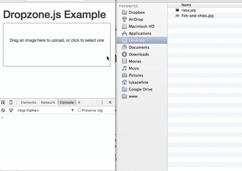
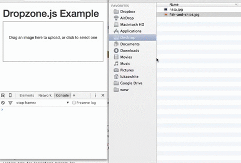
DropzoneJS allows users to upload files using drag and drop. Whilst the usability benefits could justifiably be debated, it’s an increasingly common approach and one which is in tune with the way a lot of people work with files on their desktop. It’s also pretty well supported across major browsers.

DropzoneJS isn’t simply a drag and drop based widget, however. Clicking the widget launches the more conventional file chooser dialog approach.

Here’s an animation of the widget in action:

The DropzoneJS widget in action

Alternatively, take a look at this most minimal of examples.

You can use DropzoneJS for any type of file, though the nice little thumbnail effect makes it ideally suited to uploading images in particular.

Features

To summarize some of the plugin’s features and characteristics, DropzoneJS:

can be used with or without jQuery
has drag and drop support
generates thumbnail images
supports multiple uploads, optionally in parallel
includes a progress bar
is fully themeable
includes extensible file validation support
is available as an AMD module or RequireJS module
comes in at around 43KB when minified and 13KB when gzipped

Browser Support

Taken from the official documentation, browser support is as follows:

Chrome 7+
Firefox 4+
IE 10+
Opera 12+ (Version 12 for macOS is disabled because their API is buggy)
Safari 6+

There are a couple of ways to handle fallbacks for when the plugin isn’t fully supported, which we’ll look at later.

Getting Set Up

The simplest way to get started with DropzoneJS is to include the latest version from a CDN. At the time of writing, this is version 5.5.1.

Alternatively, you can download the latest release from the project’s GitLab page. There’s also a third-party package providing support for ReactJS.

Then, make sure you include both the main JavaScript file and the CSS styles in your page. For example:

<!DOCTYPE html>
<html lang=”en”>
<head>
<meta charset=”UTF-8″>
<title>File Upload Example</title>
<link
rel=”stylesheet”
href=”https://cdnjs.cloudflare.com/ajax/libs/dropzone/5.5.1/min/dropzone.min.css”>
</head>
<body>

<script src=”https://cdnjs.cloudflare.com/ajax/libs/dropzone/5.5.1/min/dropzone.min.js”></script>
</body>
</html>

Note that the project supplies two CSS files — a basic.css file with some minimal styling, and a more extensive dropzone.css file. Minified versions of dropzone.css and dropzone.js are also available.

Basic Usage

The simplest way to implement the plugin is to attach it to a form, although you can use any HTML such as a <div>. Using a form, however, means fewer options to set — most notably the URL, which is the most important configuration property.

You can initialize it simply by adding the dropzone class. For example:

<form id=”upload-widget” method=”post” action=”/upload” class=”dropzone”></form>

Technically, that’s all you need to do, though in most cases you’ll want to set some additional options. The format for that is as follows:

Dropzone.options.WIDGET_ID = {
//
};

To derive the widget ID for setting the options, take the ID you defined in your HTML and camel-case it. For example, upload-widget becomes uploadWidget:

Dropzone.options.uploadWidget = {
//
};

You can also create an instance programmatically:

const uploader = new Dropzone(‘#upload-widget’, options);

Next up, we’ll look at some of the available configuration options.

Basic Configuration Options

The url option defines the target for the upload form, and is the only required parameter. That said, if you’re attaching it to a form element then it’ll simply use the form’s action attribute, in which case you don’t even need to specify that.

The method option sets the HTTP method and again, it will take this from the form element if you use that approach, or else it’ll simply default to POST, which should suit most scenarios.

The paramName option is used to set the name of the parameter for the uploaded file. If you’re using a file upload form element, it will match the name attribute. If you don’t include it, it defaults to file.

maxFiles sets the maximum number of files a user can upload, if it’s not set to null.

By default, the widget will show a file dialog when it’s clicked, though you can use the clickable parameter to disable this by setting it to false, or alternatively you can provide an HTML element or CSS selector to customize the clickable element.

Those are the basic options, but let’s now look at some of the more advanced options.

Enforcing Maximum File Size

The maxFilesize property determines the maximum file size in megabytes. This defaults to a size of 1000 bytes, but using the filesizeBase property, you could set it to another value — for example, 1024 bytes. You may need to tweak this to ensure that your client and server code calculate any limits in precisely the same way.

Restricting to Certain File Types

The acceptedFiles parameter can be used to restrict the type of file you want to accept. This should be in the form of a comma-separated list of MIME types, although you can also use wildcards.

For example, to only accept images:

acceptedFiles: ‘image/*’,

Modifying the Size of the Thumbnail

By default, the thumbnail is generated at 120x120px. That is, it’s square. There are a couple of ways you can modify this behavior.

The first is to use the thumbnailWidth and/or the thumbnailHeight configuration options.

If you set both thumbnailWidth and thumbnailHeight to null, the thumbnail won’t be resized at all.

If you want to completely customize the thumbnail generation behavior, you can even override the resize function.

One important point about modifying the size of the thumbnail is that the dz-image class provided by the package sets the thumbnail size in the CSS, so you’ll need to modify that accordingly as well.

Additional File Checks

The accept option allows you to provide additional checks to determine whether a file is valid before it gets uploaded. You shouldn’t use this to check the number of files (maxFiles), file type (acceptedFiles), or file size (maxFilesize), but you can write custom code to perform other sorts of validation.

You’d use the accept option like this:

accept: function(file, done) {
if (!someCheck()) {
return done(‘This is invalid!’);
}
return done();
}

As you can see, it’s asynchronous. You can call done() with no arguments and validation passes, or provide an error message and the file will be rejected, displaying the message alongside the file as a popover.

We’ll look at a more complex, real-world example later, when we look at how to enforce minimum or maximum image sizes.

Sending Additional Headers

Often you’ll need to attach additional headers to the uploader’s HTTP request.

As an example, one approach to CSRF (cross-site request forgery) protection is to output a token in the view, then have your POST/PUT/DELETE endpoints check the request headers for a valid token. Suppose you outputted your token like this:

<meta name=”csrf-token” content=”CL2tR2J4UHZXcR9BjRtSYOKzSmL8U1zTc7T8d6Jz”>

Then, you could add this to the configuration:

headers: {
‘x-csrf-token’: document.querySelector(‘meta[name=csrf-token]’).getAttributeNode(‘content’).value,
},

Alternatively, here’s the same example but using jQuery:

headers: {
‘x-csrf-token’: $(‘meta[name=”csrf-token”]’).attr(‘content’)
},

Your server should then verify the x-csrf-token header, perhaps using some middleware.

Handling Fallbacks

The simplest way to implement a fallback is to insert a <div> into your form containing input controls, setting the class name on the element to fallback. For example:

<form id=”upload-widget” method=”post” action=”/upload” class=”dropzone”>
<div class=”fallback”>
<input name=”file” type=”file” />
</div>
</form>

Alternatively, you can provide a function to be executed when the browser doesn’t support the plugin using the fallback configuration parameter.

You can force the widget to use the fallback behavior by setting forceFallback to true, which might help during development.

Handling Errors

You can customize the way the widget handles errors by providing a custom function using the error configuration parameter. The first argument is the file, the error message the second, and if the error occurred server-side, the third parameter will be an instance of XMLHttpRequest.

As always, client-side validation is only half the battle. You must also perform validation on the server. When we implement a simple server-side component later, we’ll look at the expected format of the error response, which when properly configured will be displayed in the same way as client-side errors (illustrated below).

Displaying errors with DropzoneJS

Overriding Messages and Translation

There are a number of additional configuration properties which set the various messages displayed by the widget. You can use these to customize the displayed text, or to translate them into another language.

Most notably, dictDefaultMessage is used to set the text which appears in the middle of the dropzone, prior to someone selecting a file to upload.

You’ll find a complete list of the configurable string values — all of which begin with dict — in the documentation.

Events

There are a number of events you can listen to in order to customize or enhance the plugin.

There are two ways to listen to an event. The first is to create a listener within an initialization function:

Dropzone.options.uploadWidget = {
init: function() {
this.on(‘success’, function(file, resp){

});
},

};

This is the alternative approach, which is useful if you decide to create the Dropzone instance programatically:

const uploader = new Dropzone(‘#upload-widget’);
uploader.on(‘success’, function(file, resp){

});

Perhaps the most notable aspect is the success event, which is fired when a file has been successfully uploaded. The success callback takes two arguments: the first a file object, and the second an instance of XMLHttpRequest.

Other useful events include addedfile and removedfile, for when a file has been added or removed from the upload list; thumbnail, which fires once the thumbnail has been generated; and uploadprogress, which you might use to implement your own progress meter.

There are also a bunch of events which take an event object as a parameter and which you could use to customize the behavior of the widget itself — drop, dragstart, dragend, dragenter, dragover and dragleave.

You’ll find a complete list of events in the relevant section of the documentation.

The post How to Build a File Upload Form with Express and DropzoneJS appeared first on SitePoint.