5 Tips for Working with Clients When You’Re at Home

Original Source: https://www.webdesignerdepot.com/2020/05/5-tips-for-working-with-clients-when-youre-at-home/
For those of you working from home right now (willingly or unwillingly), you can’t allow your surroundings to have an effect on your work and, more importantly, your client relationships. Clients don’t care where you are. They just want you to get the job done, and get it done it well.

By that same token, you can’t allow your interactions with clients to have a trickle-down effect on your home life. There needs to be a clear separation between work and home when working with remote clients.

Below are some tips for web designers and other freelancers trying to get a better handle on client management and relationships when they work from home.

1. Power Up Your Internet Speeds

When working from an office, you have the luxury of milking your employer’s or cowork space’s Internet as much as possible. But at home? You’re probably not too excited about paying for super-high-speed Internet when it comes with a hefty monthly cost and it’s only needed for eight or so hours a day.

Look at it this way:

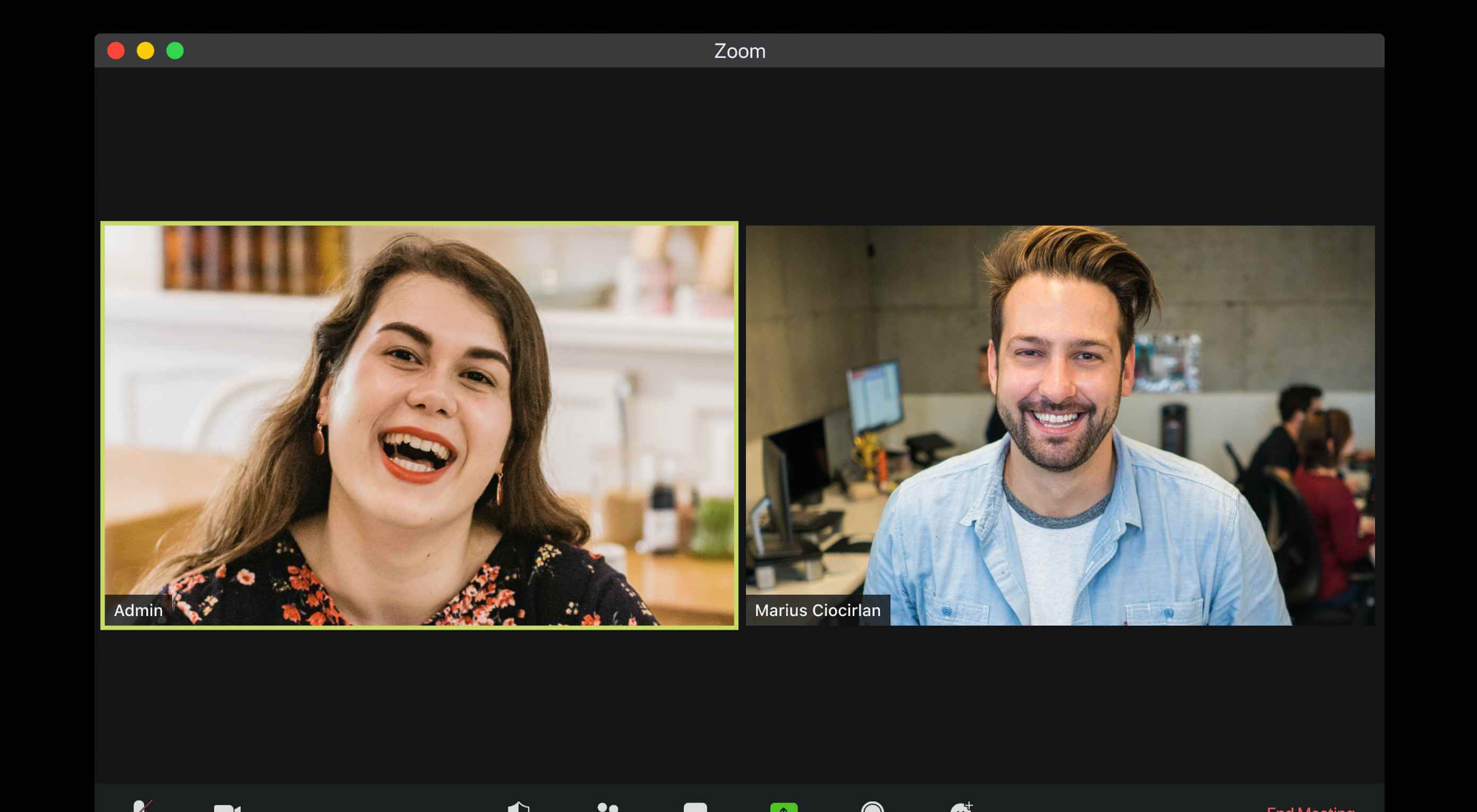
The faster your Internet is, the more quickly you’ll be able to get work done. Plus, healthy Internet speeds are essential for streaming — and I’m not talking about streaming a funny YouTube video. I’m referring to those Zoom meetings you’re going to have with your clients (more on that below).

Keep in mind that Internet costs can be deducted on your taxes. Specifically, you can write off the amount you actually use each day for work purposes. So, some of that money will go back into your pocket come tax time.

2. Dedicate Specific Hours to Client Communication

It’s really important to avoid interruptions when you’re working. And clients present a huge opportunity for interruption and distraction if you let them.

A study out of the University of California discovered the following about interrupted work:

When people are constantly interrupted, they develop a mode of working faster… to compensate for the time they know they will lose by being interrupted. Yet working faster with interruptions has its cost: people in the interrupted conditions experienced a higher workload, more stress, higher frustration, more time pressure, and effort.

By dedicating an hour or two to client communication every day — and communicating this policy to clients — you can keep those distractions to a minimum.

Oh, and make sure anyone at home with you is aware of this.

It might’ve been funny when this BBC News interview was interrupted by kids in the background, but clients won’t be happy if you’ve given them a small timeframe to communicate, only for it to be interrupted.

3. Empower Clients to Schedule Meetings

Even if it’s only you running the show, you want to give off the impression that everything is being handled as well as it would if you had a team behind you. So, this is where your choice of software and your system of automations comes into play.

For starters, your website needs to have a meeting schedule link to empower prospective clients to schedule meetings with you. That’s going to save you time trying to coordinate schedules, setting up meeting details, collecting pertinent details, and so on.

Here’s how I’ve done it on my website:

I first ask prospects to fill in a short questionnaire. This allows me to gather important details to prepare for our meeting.

I then ask them to schedule a call through Calendly:

My Calendly scheduler is connected to my Gmail calendar and Zoom. Once a request has been submitted, the software sets everything up without my having to do a single thing.

By setting the stage with self-scheduling, prospects who become clients already know how they can get in touch with me when they want to chat. To make it even easier for them and myself, I have a separate calendar that allows them to schedule meetings with me during my dedicated client hours.

Of course, you still want to control the flow of your project, so make sure your process includes meetings at key milestones — like the client kickoff, reviewing design mockups, and website handoff. That’ll lessen the likelihood that clients need to meet unexpectedly.

4. Use a Client-friendly Video Conferencing Tool

When you’re working from home, it’s important to have face-to-face conversations with clients. It’s not like every call requires a face-to-face meetup, but it’s nice to do it every once in a while, especially if you’re going to be sharing your screen anyway (like for a website walk-through).

There are a number of video conferencing tools you can use. Zoom is a popular video conferencing solution that you can use for free. If you’re a paying G Suite user, you can opt for Google Meet.

Either of these tools would work well for these purposes as they’re well-known and easy for clients to get the hang of (i.e. they don’t require them to download or install anything). Zoom is the one I would recommend though.

As I mentioned before, it integrates with Calendly (and other online schedulers), which makes setting up meetings a breeze. Also, you can change up your background. This is helpful if:

a) You don’t want clients seeing into your home like software engineer Andrew Eckel who used a luxury apartment photo as a backdrop.

b) You want to have a little fun with your clients like video producer Dan Crowd did when he created this joke background:

Today I made a Zoom background of myself accidentally walking in on myself in a Zoom meeting. pic.twitter.com/Rl2AsjfZ7V

— Dan Crowd (@itsdancrowd) April 3, 2020

c) You want to feel like you’re working from anywhere but your home.

5. Choose the Right Channel to Communicate Through

There are many different ways you can communicate with clients these days. Email. A phone call. Text. Slack message. Zoom video. Asana message feeds. Google Doc comments.

But you need to be careful with this. There’s a time and a place to use each of these channels, so make sure you get it right. If you use them the right way, then your clients will be less likely to abuse or misuse these channels. You know how it goes. First, they email you with a question. Then panic-call you hours later when they haven’t heard back. And then, as a last resort, bombard you with texts until they hear back.

Here are some suggestions for picking the right communication channels:

Email:

Confirmation emails;
Templated messages;
Short responses that aren’t time sensitive;
Moving Google Doc questions or comments out into a larger space to answer.

Phone or Zoom calls:

Client kickoff;
Milestone check-ins;
Website handoff;
Any time you have to share your screen;
Whenever there is an issue or disagreement.

Text:

Unless you have a dedicated phone for business, don’t do it.

Slack messages or Asana (task manager) messages:

Progress check-ins;
Milestone delivery notifications;
Light brainstorming.

It Doesn’t Have to Be Difficult Working with Remote Clients

No matter how long you’ve worked from home, it’s always a good idea to reassess and strengthen your client management strategy. Even if you only tweak things a little bit, you might find it easier to get work done as well as to keep clients happy.


Featured image via Unsplash.

Source

p img {display:inline-block; margin-right:10px;}
.alignleft {float:left;}
p.showcase {clear:both;}
body#browserfriendly p, body#podcast p, div#emailbody p{margin:0;}

Adaptive vs. Responsive Web Design

Original Source: http://feedproxy.google.com/~r/1stwebdesigner/~3/Ct5xTPNH1uQ/

Modern websites need to look and function well on every screen. That’s not exactly a newsflash, as web designers have been told this for years. But there is more than one way to go about accomplishing it, such as adaptive design and responsive design, which we will discuss in this article.

There can be some confusion when it comes to the terminology used to describe these techniques. As with so many aspects of design and development, we are inundated with buzzwords. Sometimes they become so mixed up that we (mistakenly) use them interchangeably. True, both adaptive and responsive design share a similar end goal: to ensure a great user experience on large screens, small screens and everything in-between. But they take very different approaches to get there.

Today, we’ll dig into those differences in an effort to help you choose the right solution for your projects.

What is Responsive Design?

The more commonly-used of the two techniques, responsive design rearranges content based on browser size.

CSS media queries are used to set one or more breakpoints – viewport resolutions at which selected elements of a website adjust accordingly. Breakpoints are often set to mimic the screen sizes of popular mobile devices, including phones and tablets.

One common example of this would be responsive navigation. Think of a full-width navigation bar displaying on larger screens (laptops and desktops). As the viewport shrinks, the menu could conceivably be set to adjust any number of ways to make use of the space available. Then, on the smallest of mobile screens, that same navigation is then hidden beneath a “hamburger” menu.

Responsive multi-column layouts are also quite popular. Designers often configure them to “stack” on top of each other on smaller screens. On mid-sized screens such as tablets, columns may remain in-tact or partially stack. The feature is actually built into CSS specifications such as Flexbox, which automatically adjusts columns according to screen real estate.

Advantages of Responsive Design

Perhaps the biggest advantage of using responsive design techniques is that users get essentially the same website on every device. That continuity allows frequent visitors to more easily find what they’re looking for.

In addition, adding responsive elements to CSS is relatively straightforward. It’s a matter of taking what’s on the big screen and adjusting accordingly for various breakpoints. Even older websites designed before the smartphone revolution can be retrofitted without too much trouble.

Lastly, since the content and URL of a given page is the same throughout the full spectrum of viewports, a responsive design is better for SEO. Thanks to that consistency, search engines tend to handle these websites a bit better.

Disadvantages

Going responsive is not all good news. Some website layouts may be fine on a big screen, but are more difficult to manage on smaller viewports.

Massive amounts of scrolling might be necessary – even if that isn’t quite as taboo as it used to be. Also, some interactive or code-heavy elements may simply be too slow and cumbersome to use on a phone.

A mobile phone - Adaptive vs. Responsive Web Design

What is Adaptive Design?

Adaptive design, also referred to as “progressive enhancement”, is the process of creating several fixed layouts for various screen sizes. In essence, a designer could create completely different experiences for phones, tablets and desktops.

The idea is that you start with something very basic and then “enhance” the experience for larger screens. The more screen real estate a user has, the more bells and whistles will become available.

One way to visualize the difference between adaptive and responsive design: observe how a given website reacts as you resize your web browser on a desktop device.

A responsive website will continually adjust content as you reach specific breakpoints. Columns may stack, containers and typography may scale.

With an adaptive website, there is an absence of a constantly-shifting layout. Instead, new breakpoints may bring completely new layouts – and thus, even some potential differences in content. For example, some items deemed unnecessary on a phone may be removed altogether.

Advantages of Adaptive Design

Implementing an adaptive design means really putting users first. By crafting a separate experience for a specific screen size, designers can limit the pain points that often come with responsive sites.

Mobile users, for instance, will see only the design and content elements that are relevant to them. The website should, in theory, be easier to navigate and content easier to digest on that smaller, touch-enabled screen.

Then, as more screen size and computing power come into play, those extra features are added in. Adaptive design is understanding that the web is not one-size-fits-all.

Disadvantages

Because you’re creating separate experiences, implementing adaptive design techniques can be very time-consuming. This is especially of concern for projects that are on a tight budget, deadline or both.

Then there is also the potential for an inconsistent user experience. Attention to detail is incredibly important here, as a website will need to provide a separate-but-similar look, feel and functionality. Missing a detail or making a few poor decisions in the design process could hamper the ability to use the website on one or more devices.

Speaking of devices, new ones are being released all the time. Some have unique viewports and could conceivably be served the “wrong” layout. Therefore, it may require routine checks to ensure your site is working with the latest technology.

SEO is also a concern for sites that serve up mobile-only editions using “m.yoursite.com” and the like. That won’t come into play in every situation, but still worth considering if your project is affected.

A desk with design tools - Adaptive vs. Responsive Web Design

Choosing the Right Design Technique

How do you know which technique is the best fit for your project? In many cases, it may be a matter of time and money. To that end, responsive designs are quicker and cheaper to implement.

If you’re using third-party products like WordPress themes – which often come with responsive styles –  that decision has already been made for you.

However, adaptive design still has its place. For larger websites that have the budget and time resources, designers can craft an outstanding experience for every device using adaptive techniques.

Either way, the bottom line is ensuring that your website works well for every user. Thankfully, there are two highly-proven methods to make it a reality: adaptive or responsive design.


Unmissable Surface Pro 7 deal: $260 off while stocks last at Best Buy

Original Source: http://feedproxy.google.com/~r/CreativeBloq/~3/ZsgroEo-s7s/surface-pro-deal-may-2020

Last week, Microsoft unveiled a range of new Surface products, which means there's now some great deals surfacing (sorry) on the older but still brilliant models. The best one we've seen so far is this deal from Best Buy, which knocks a whopping $260 off a Surface Pro 7 and black Type Cover. That means this powerful combo can now be yours for just $699!

The Surface Pro 7 has become a hugely popular option for creatives in recent years. Its power and stylish and super-portable design of the Surface Pro has earned it a firm spot in our pick of the best tablets with a stylus. Being able to run the full-fat version of Windows means it can also run popular creative software programs, like Adobe Photoshop and Illustrator, with ease. 

Apple sale: 13-inch MacBook Pro gets a HUGE $400 price cut

We're not sure how long this great deal will last, so if you've been thinking about investing in a Surface Pro 7, now's the time to buy. And if you're still on the look out for fantastic deals, stay up to date with all announcements for the upcoming Amazon Prime Day. 

There's savings across the pond in the UK too, albeit more modest. Here is the best deal on the Surface Pro 7 in the UK right now:

Not in the UK or US? You can still take advantage of some great Surface Pro 7 deals. Here are the best prices in your area:


Tips for Being Productive While Working from Home

Original Source: http://feedproxy.google.com/~r/1stwebdesigner/~3/mHsqDL507q8/

These days, lots of people have found themselves working from home for the first time. Some have had to quickly transition from a traditional office to a remote one. With that can come a number of challenges.

Just carving out a space of your own can be tough. Then there are the struggles associated with scheduling, communication and trying not to alienate your household. It’s uncharted territory for sure.

But just because working from home is novel to you doesn’t mean you get a pass on productivity. There are still things that need to get done and bills to pay.

Today, we’ll share some tips to help you get the most out of that new home office.

The Freelance Designer Toolbox

Unlimited Downloads: 500,000+ Web Templates, Icon Sets, Themes & Design Assets
All starting at only $16.50 per month


DOWNLOAD NOW

Declare Your Space

The first part of the equation is in finding a place to work. This depends so much on your living situation.

Ideally, you’d already have an office setup or at least a spare room. Even a basement or an attic will do, provided they have the amenities you need.

In these cases, working from home becomes that much easier. A little bit of isolation can be a good thing as it helps you to focus on work without interruption. But this is not the case for everyone.

You might instead be stuck trying to write code at the kitchen table (complete with kids and pets running about). What then?

It’s going to be tough, but you have to make the best of the situation. You’ll have to claim some space for work purposes – at least during working hours. Set some guidelines for others and (kindly) help them understand your needs.

The important thing to remember is that this isn’t going to be perfect. Adjusting to a new working space is a process and will take some time. Eventually, it will start to feel more comfortable.

A person with their feet up on a table - Working from Home

Set a Schedule, Create a Routine

Because you’re now working in a completely different environment, your daily rituals are bound to be thrown into disarray. The more distractions at home, the more wayward your schedule becomes.

Still, you’ll want to dedicate blocks of time exclusively to getting things done. It may not be the same as what you were used to. You might even have to split your workday into multiple shifts to accommodate children. There’s absolutely no shame in it. Clients and colleagues alike are probably facing similar situations.

Flexibility is going to be key in this area. Staying rigid and expecting things to go exactly as they did in your old office is going to be stressful. Instead, focus on what works best for you and your family. If you have to take a couple of hours off in the middle of the day, so be it.

That being said, look to establish consistency where you can. That means doing the same things at the same time each day, when possible. This will at least get you into a daily rhythm – which is a huge help when you have a job that requires creativity.

A person with a clock covering their face - Working from Home

Stock up on Supplies

Web design and development can be done from just about anywhere. Yet, transitioning to a home-based office may require some sacrifices when it comes to hardware and software.

If you work for an agency, they may provide you with a powerhouse desktop computer and all the high-end apps you need. Out of the office, you might well be on your own to some degree.

This is actually a pretty big deal. We often set up our workflows in very specific ways. A disruption here means using unfamiliar tools with less-powerful devices to run them. There’s a certain amount of frustration that goes along with the territory.

Therefore, workflow may be the one area where mimicking your physical office makes the most sense. Even if you don’t necessarily have access to the same level of hardware, grab as many of your go-to apps as possible.

The familiarity will help you accomplish tasks without having to search out completely new methods.

Computer equipment on a desk.

Let the Positives Inspire You

Well, maybe you are stuck working on your couch and it’s far from ideal. But what are the bright spots? Perhaps your pet is by your side. Or your little one is drawing you a picture. There are still reasons to smile.

Sometimes, it’s all too easy to dwell on how we think things should be. That doesn’t lend itself to productivity, though.

Instead, look for the good things about your situation – no matter what they are. Something as simple as getting to listen to the music you want can stir up creative energy. The same can be said for taking the laptop out into the backyard.

Working from home is actually a pretty great opportunity. It’s a way to look at things through a different lens. And you may just find out why so many web designers prefer it to a brick-and-mortar office. There’s a certain freedom that you can’t get anywhere else.


Collective #603

Original Source: http://feedproxy.google.com/~r/tympanus/~3/DrsiM3zL76w/

Collective item image

Inspirational Website of the Week: Houses Of

A great design with wonderful colors and great typography. Our pick this week.

Check it out

Collective item image

Our Sponsor
Start your own freelance business by becoming a Divi expert

Learn how to develop websites with the most popular WordPress theme in the world and secure your success as a freelancer.

Start learning now

Collective item image

Gallery

A touch-friendly, responsive and performant JavaScript gallery made by Benjamin DeCock.

Check it out

Collective item image

Different Approaches to Responsive CSS Motion Path

An article by Michelle Barker on the workarounds needed for responsive motion paths.

Read it

Collective item image

How We Built a Playful WebGL Experience for 100 FWA Wins

Jam3 commemorates 100 FWA wins by creating a fantastic WebGL experience. Learn how they did it in this article.

Read it

Collective item image

CSS for internationalisation

A great first article by Chen Hui Jing on styling related to language in CSS.

Read it

Collective item image

Spacing in CSS

A great guide on spacing in CSS by Ahmad Shadeed.

Read it

Collective item image

The Cost of JavaScript Frameworks

Tim Kadlec’s analysis of the potential negative impact of using JavaScript frameworks.

Read it

Collective item image

Pseudo-Randomly Adding Illustrations with CSS

Eric Meyer shares a CSS technique on how to add an illustration to a page in a nearly random way.

Check it out

Collective item image

Solar.css

A wonderful CSS based solar system with lots of nice details.

Check it out

Collective item image

The joy of pixeling and building pixel tools with HTML5 canvas and JavaScript

Christian Heilmann shares his passion for creating pixel tools.

Read it

Collective item image

The Quest for the Perfect Dark Mode

Josh Comeau’s scintillating exploration of color themes in Gatsby.

Read it

Collective item image

98.css

A design system for building faithful recreations of old UIs like the Windows 98 UI.

Check it out

Collective item image

markmap-lib

Markmap is a combination of Markdown syntax and mindmap.

Check it out

Collective item image

Styled System Revisited

Varun Vachhar shares his insight on building Rangle’s open-source design system kit, Radius.

Read it

Collective item image

40 Free HTML landing page templates

A great collection by Davide Pacilio of free landing page templates.

Check it out

Collective item image

pattern.css

A CSS-only library to fill an empty background with beautiful patterns.

Check it out

Collective item image

67 Free device icons

A free set of 67 device icons in multiple file formats (SVG, EPS, PNG, Ai).

Check it out

Collective item image

Listboxes vs. Dropdown Lists

Anna Kaley defines listboxes and dropdown lists and discuss when to use each element, and cases where either will suffice

Check it out

Collective item image

Themer

Addy Osmani’s tip: themer takes a set of colors and generates themes for your development environment (editors, terminals, wallpapers, and more). Check it out if you didn’t know it yet.

Check it out

Collective item image

How To Create A Particle Trail Animation In JavaScript

In this article, Anna Prenzel explains how you can to easily program a small trail of particles with anime.js.

Read it

Collective item image

The Decline of Usability

Carl Svensson points out how UIs got worse during the last couple of years.

Read it

Collective item image

Turning Vue components into reusable npm packages

How can you reuse Vue.js components across your projects? Learn how to automated the process of bundling, testing, documenting and publishing Vue components.

Read it

Collective item image

From Our Blog
Awesome Demos Roundup #15

A fresh collection of the most intriguing coding experiments from around the web.

Check it out

Collective #603 was written by Pedro Botelho and published on Codrops.

Why students can be good at social media marketing

Original Source: http://feedproxy.google.com/~r/Designrfix/~3/tmkSuoiDTHE/why-students-can-be-good-at-social-media-marketing

Social media marketing isn’t just chatting on Facebook and posting cool pictures on Instagram. It is a modern discipline that demands particular skills and knowledge. And the students happen to possess the right skill set that develops naturally. Let’s see what it is! 1. Online communication culture Students, especially those who use distant learning a […]

The post Why students can be good at social media marketing appeared first on designrfix.com.

5 Best Fitness Apps for Android Wear Smartwatches

Original Source: https://www.hongkiat.com/blog/android-wear-fitness-apps/

Metrics and progress tracking goes a long way to helping one try to stay fit and healthy. For those who opt to this with the help of an Android smartwatch, they have plenty of fitness apps to help…

Visit hongkiat.com for full content.

7 Collaborative Coding Tools for Remote Pair Programming

Original Source: https://www.sitepoint.com/collaborative-coding-tools-for-remote-pair-programming/?utm_source=rss

Remote Pair Programming Tools

Fifteen years ago, most online collaboration and remote work involved email threads, Skype calls, and endlessly re-zipping projects for sharing after each iteration.

Things have changed a lot — many for the better (Google Docs!) and some things for worse (always-on messaging). Either way, it’s fair to say that a lot of the friction has been removed from remote work.

While other tools have moved ahead, real-time code collaboration has been a point of contention and viable solutions have only recently arrived on the scene. Developers working on the world’s top code editors have put forward their solutions, and they’re pretty good.

You might work on a distributed team and need collaborative coding tools to serve you every day — a category that suddenly includes most of us, thanks to COVID-19. Or perhaps you just need something for the occasional problem-solving session with a friend. Either way, you’ll find something you can use here.

1. Visual Studio Live Share

Visual Studio Live Share

Visual Studio Live Share is Microsoft’s own real-time collaborative development solution for Visual Studio and Visual Studio Code.

Live Share allows teams to collaborate on a shared codebase, while maintaining the ability of each collaborator to navigate and work independently. While many code collaboration tools are bound to the host’s perspective, Microsoft’s entrant allows each person to navigate between files and make changes to code on their own terms.

Live Share can share your workspace, terminal, and local servers, and you can communicate over voice from within the tool. This is a polished option with other useful touches, like group debugging and a focus-and-follow feature that allows you to draw the attention of your collaborators. With a price tag of free, this choice is a no-brainer — particularly if you’re already a Visual Studio Code user.

While you’re at it, check out our Visual Studio Code power user’s guide and our VS Code extension recommendations for JavaScript developers.

2. Teletype for Atom

Teletype for Atom

Teletype for Atom, an early entrant among real-time code collaboration tools, allows Atom users to share their workspace with team members.

While Live Share users can move around a project freely, Teletype is a little more host-centric. After the host opens a “portal”, their active tab becomes a shared workspace, and collaborators follow the host as they move between files. Teletype is well-suited to the pair programming use-case — with its driver and navigator model — but not as robust for all purposes as Live Share’s open-ended collaborative development environment.

Continue reading
7 Collaborative Coding Tools for Remote Pair Programming
on SitePoint.

Studio Ghibli Museum offers exclusive access – and it’s as wonderful as we imagined

Original Source: http://feedproxy.google.com/~r/CreativeBloq/~3/1tG2zf-PPUI/studio-ghibli-museum-tours

Like countless museums and galleries across the world, the Studio Ghibli Museum in Mitaka, Japan, was recently forced to close its doors in response to the spread of Coronavirus. But now, for the first time ever, you can take a peek inside the museum from the comfort of your own home by embarking on one of its new virtual tours on YouTube. 

While several closed museums are now offering virtual tours, what makes the Studio Ghibli Museum's so exciting is that the institution is famously elusive, with photography completely banned. Even the museum's website contains no photos of its rooms or exhibitions. For many, these new videos will be their first glimpse of what to expect at the museum. It looks like a truly inspiring place (and if you find yourself compelled to pick up your own pencil afterwards, our how to draw tutorials will be here for you).

The first video (above) features the building’s main entrance, adorned with stunning My Neighbor Totoro-themed stained glass doors, while another (below) enters the Space of Wonder room, with trees reaching up towards a smiling sun in the centre of the ceiling. 

While it can't possibly compare with visiting in person, it's a rare treat to experience the museum online – and fans are certainly appreciating the gesture. "This made me cry a little," one YouTuber comments. "I booked tickets for this museum months ago as it's one of my dreams to go. This gave me a little happiness!"

You can find more virtual tours over on Studio Ghibli Museum's YouTube channel. And if you're itching for even more Studio Ghibli (let's be honest – its weird and wonderful worlds are a welcome distraction from our own right now), the studio's entire output is now available on Netflix. And that's not all – an unmissable documentary on the studio's co-founder Hayao Miyazaki is now free to stream online. That's the rest of the month sorted, then. 

Related articles:

Studio Ghibli Blu-ray case concept just won the internetIs it possible to turn your iPad into a 3D studio?11 animation tools for digital artists

A set of key visuals for Nike Shanghai

Original Source: http://feedproxy.google.com/~r/abduzeedo/~3/k9IrXTwYI1A/set-key-visuals-nike-shanghai

A set of key visuals for Nike Shanghai

AoiroStudioMay 06, 2020

I think this is going to break our visual pattern but this is totally worth it. This is the work from How Wei Zhong who art directed this massive campaign for Nike Shanghai in collaboration with the folks from ILoveDust. It’s quite refreshing since first of all it’s collaborative participation and obviously the end-result that is just purely vibrant and amazing. To share a little bit of background on this project (in their words). “Qiang Diao” is Chinese for confidence, swagger and game.

And in a city as image and style conscious as Shanghai, Qiang Diao is something many people want for themselves. Nike wanted Shanghai athletes to know that sports can offer you more than fitness. We created OOH celebrating Shanghainese athletes well-known for their strong personalities and, of course, having Qiang Diao.

About How Wei Zhong

How Wei Zhong is an art director at W+K Shanghai based in Kuala Lumpur, Malaysia. You should definitely check his work, it’s filled with incredible works for brands. Give him some love.

Personal Site
Behance