Proven Free Trial Approaches for Growing Your SaaS

Original Source: https://www.webdesignerdepot.com/2020/06/proven-free-trial-approaches-for-growing-your-saas/

If a free trial model is executed well, it can become your new secret weapon for lowering your CAC (Customer Acquisition Cost) and increasing conversion rates. However, that level of success doesn’t come without its fair share of challenges. What if you lose money? How do you avoid freeloaders? Which free trial model should you choose? 

If you’re looking to dive deeper into the free trial models that have swept across the SaaS industry, look no further. Here are the 4 top free trial models for SaaS and how to overcome common roadblocks related to them: 

1. Full Access Free Trial (No Credit Card Required)

You might’ve heard this explained as an opt-in free trial.

It’s one of the most popular free trial models that exist today. It’s when the customer is given full access to the software for a limited amount of time. Free trial lengths usually range from 7 to 30 days. During this time, the user has time to poke around and check out all the nooks and crannies of the software with no limitations.

A full access free trial can be a great fit if you’re confident in your product and sales funnel. From a user’s perspective, it’s comforting to know that they can try the software before committing to purchasing it. According to data from Totango, there’s more potential for higher end-to-end conversion rates. That means higher free trial conversion, higher paid user conversions, and higher retention rates.

However, beware of freeloaders! If your SaaS product is something someone will only use once or twice, then a full access free trial would give them no reason to upgrade. In this case, a freemium model might be more fitting, which I’ll dive into a bit later.

For web designers, an opt-in free trial model is your chance to create a fully seamless registration process. Juicer is a social media aggregator that serves as a great example for an easy free trial conversion. All that’s required to get started is an email and password.
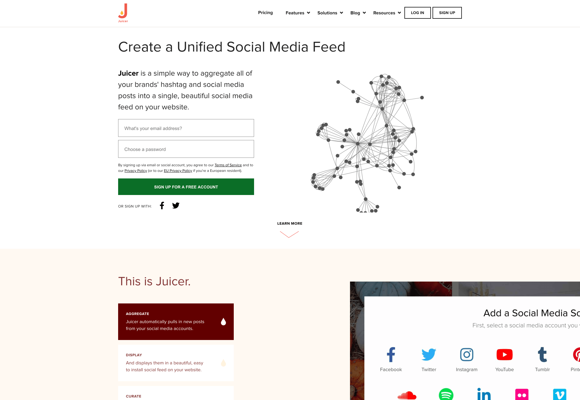
It can be tempting to try and capture all of your customer’s data like their birthday, company name, and reason for signing up, but just remember that each extra step adds friction to the sign up process.

2. Full Access Free Trial (Credit Card Required)  

Similar to the previous free trial model, except this one requires a credit card. This is also known as an opt-out free trial.  

If your SaaS business is struggling with free trial to paid conversions, it can be tempting to require leads to enter their credit card details before starting their free trial. I get it, but just be aware that it can be a challenge to get free trial conversions if you choose this method. 

Trust is a huge factor here. For example, potential leads might not trust a relatively unknown SaaS company with their credit card details. More well known brands or websites that prominently display social trust signals might have better luck in the trust department with new website visitors. 

Even social trust signals aren’t likely to be enough, though. Be prepared to invest heavily into inbound marketing if you choose this method. While both the opt-in and opt-out methods will require inbound marketing to be successful, you’ll probably need to spend more time educating your audience first if you want them to give you their credit card details. With the opt-in method, you have a bit more time to educate potential customers once they’ve started their free trial.

Additionally, your marketing communication and user experience has to be on point. If you choose this option, you’ll have to be extremely careful to make the cancellation process as seamless as possible.  

3. Live Demo Free Trial

Some SaaS products might not benefit from an opt-in or opt-out free trial. These might include products with complex processes, those that require implementation before the product can be used, the need for training, or any other sort of convoluted process that requires specialised knowledge. Not everyone has time to learn how to use your product, so you may overwhelm users if you allow them to explore your product on their own.
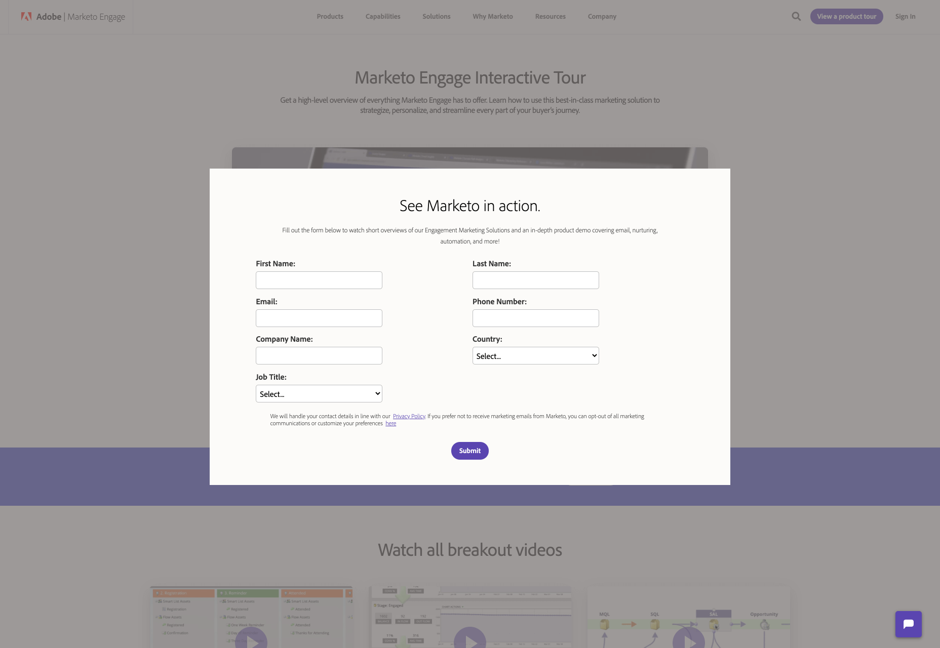
Complicated SaaS products may benefit from a live demo free trial. Companies can offer a free demonstration of the product, like Marketo does. Sometimes a live demo is paired with a “sandbox demo” which allows users to play around in the software in a controlled setting. 

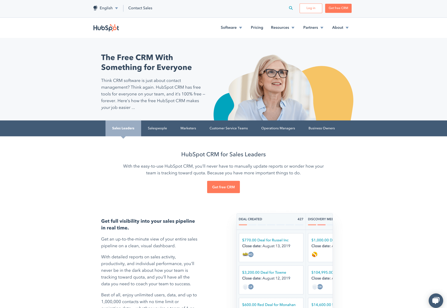
Alternatively, companies can offer a choice between a demo and a free trial, like Hubspot. It’s also worth noting that Hubspot features a vast learning center and top-tier support which gives them the flexibility to offer their complicated software as a free trial DIY version. 
Along with the live demo or blended demo model, you can offer other ways to engage potential customers with a complex SaaS product. You can try: 

Email courses 
Explainer videos 
Q&A sessions 
Webinars

4. Freemium 

The freemium model is a great way to mitigate some of the concerns with full access free trials. For example, you can restrict access to certain features if you’re concerned about giving too much value away in a full access free trial. Here are some of the most popular types of freemium models for SaaS:

Limited Features

Limited feature freemium models are what most people are referring to when they say “free forever” models. These types of freemium models offer certain features for free.

Many email marketing platforms offer limited access to their product for free, and Mailchimp does this exceptionally well. 
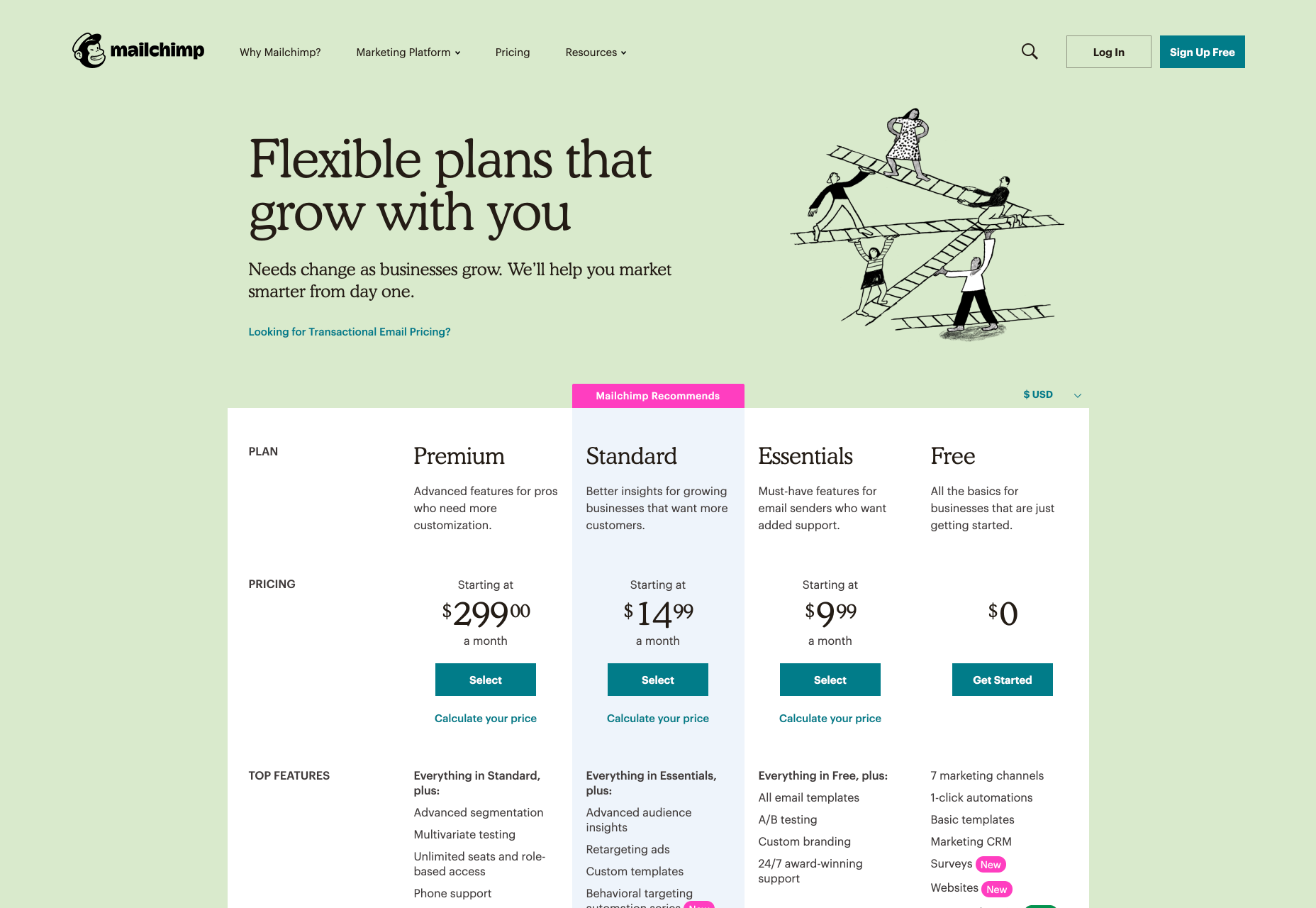
With a quick glance, you can see a free plan is available with a variety of different plans also available for upgrade. If you scroll down their website, you’ll find the features of each plan clearly explained. The logistics of how this works will be different for every business, so you’ll have to decide which features you’ll offer for free. 

For example, is your product mainly used by teams? If so, you could consider offering 1 account for free with more accounts available with an upgrade. This allows one core team member to try out your product and report back their findings to their team before making a purchase. 

Usage Limitations & Credit Systems

Usage limitations and credit system freemium models are essentially the same. They involve either limiting usage or providing credits for limited usage. It comes down to a difference in customer-facing language. For example: 

Usage Limitation: Get 3 Free Audiobooks!
Credit System: Get 9 Free Audiobook Credits (Worth 3 Audiobooks)!

Companies like Dropbox and PDF Pro operate from a usage limitation freemium model. With Dropbox, you get a certain amount of storage space before you have to pay; with PDF Pro, you can create, edit, and/or convert 3 PDF files for free before paying for more. 
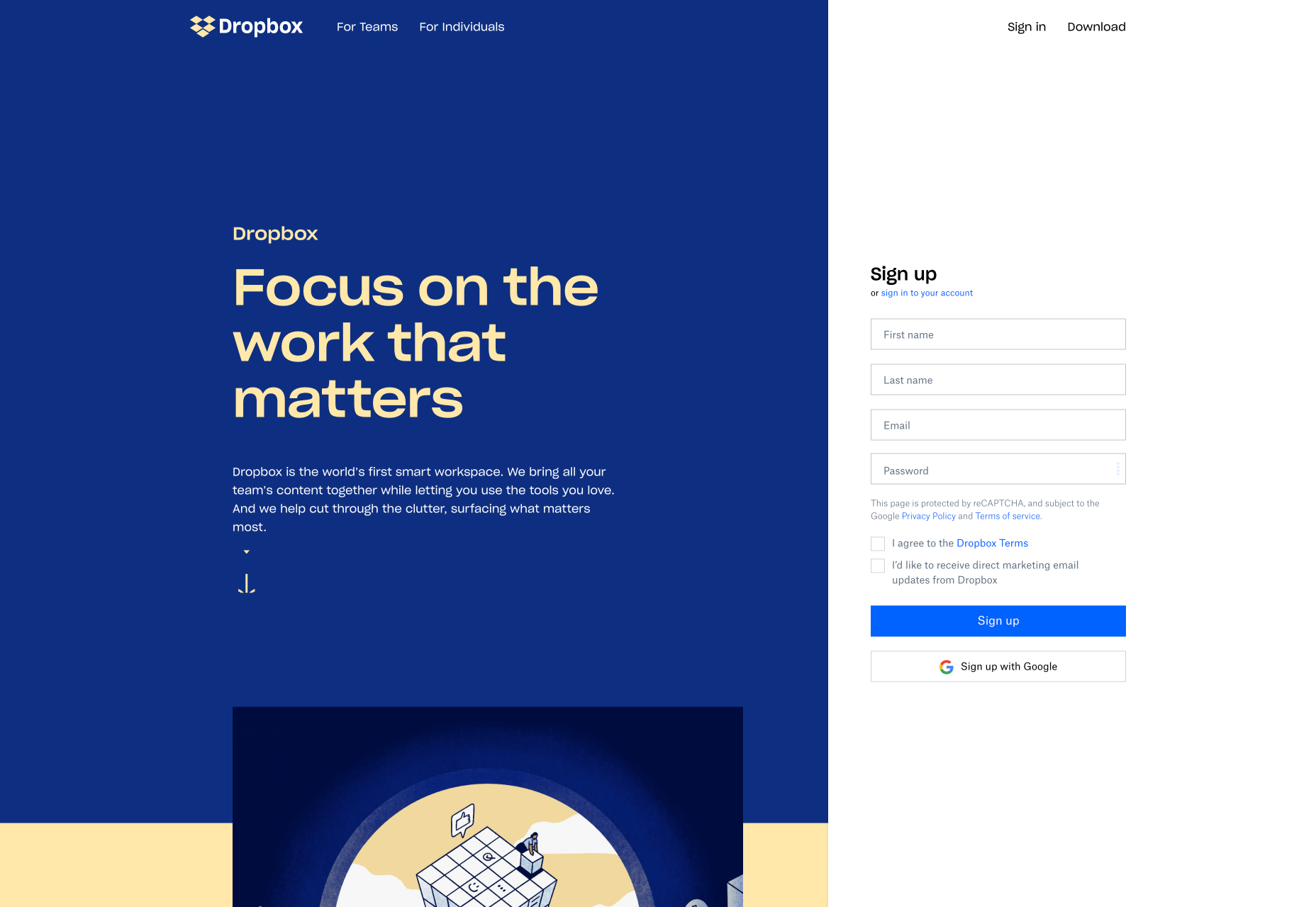
Usage limitation freemium models are generally straightforward and can allow for a great user experience. Just make sure that it’s communicated from the get-go that the user gets a certain amount of access to the product for free, but has to pay for more. Popular buzz terms like “free forever” can attract users, but ultimately lead to wrong assumptions later down the line.

Like the limited feature model, this is a great freemium model for SaaS products that need to strike a delicate balance between giving away too much and too little. 

Advertisement Removal 

Upgrading to remove ads is a popular freemium model with mobile games, entertainment services, blogs, and news sites. Some upgrades simply involve removing ads from the sidebar so you don’t have to see them. Other upgrades include removing the ads from interrupting the user experience. For example, a game that requires you to watch 30 seconds of an advertisement every 2 minutes would interfere with your experience playing the game.   

You’ll have to be especially careful here if you want to ensure a pleasant experience for all users. Readers who visit a news website but are asked to pay in order to view the content might just leave the website and never come back. Mobile game players who are constantly plagued by ads might uninstall the game altogether. As with the rest of the freemium models, you’ll want to strike a balance between free and paid features that’s both fair and enjoyable.  

Fully Functional 

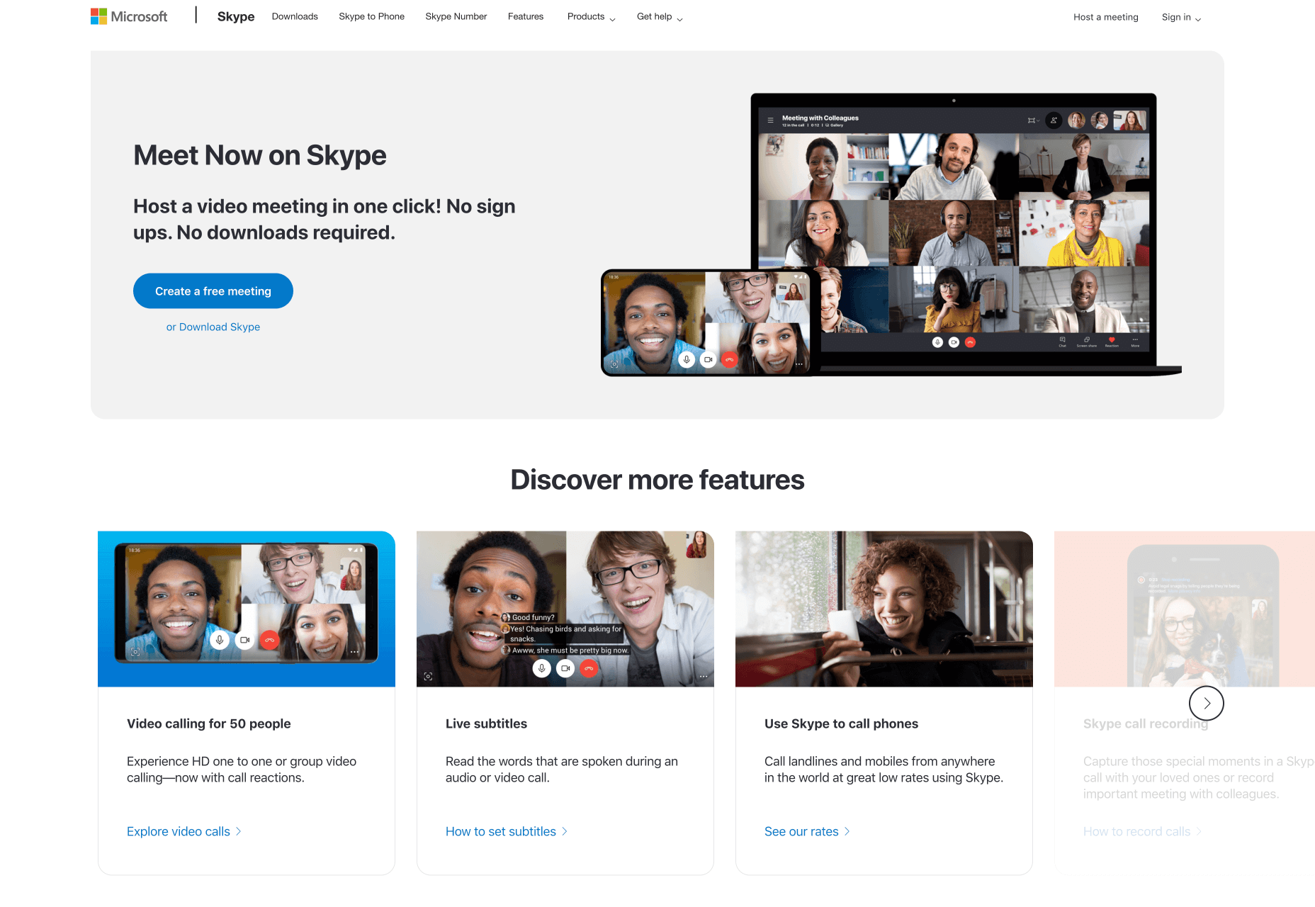
Sometimes companies toe the line between freeware and freemium. A great example of a fully functional freemium product is Skype. The core product is fully functional and requires no upgrade to use its full functionality. However, their business model is built around offering upgrades such as Skype credits and monthly subscriptions. Skype’s add-ons are not upgrades which detract from the main use of their product. Also, their add-ons are not heavily promoted to free users unless they’re looking for extra features.
Don’t feel locked into any of these boxes when it comes to choosing a freemium model for SaaS products. Blend credit systems with limited features. Try pairing opt-in free trials with demos if it makes sense. Feel free to try whatever works for your business.  

Common Roadblocks with Free Trial Models

There are multiple ways free trial models can go haywire. Think something along the line of angry customers wanting a refund to a sudden drop in conversion rates. The goal here is to not panic, re-evaluate your situation, and make changes as necessary. Avoid making drastic changes as soon as you encounter the slightest issue. New systems take a while to work out all of the kinks. This is not meant to be one-size-fits-all advice, so test what works for your SaaS business.   

Free Trial Users Aren’t Upgrading

There are a variety of reasons why your paid conversions might not be up to snuff. Before you panic, answer these two questions: 

Did you ask for the sale? 
Did you make it as easy as possible for the sale to happen?  

If you answered no to either of those questions, try to remedy these problems before making drastic changes. It’s common to be hesitant to ask directly for an upgrade in fear of coming across pushy or aggressive. Sometimes this even flows over into design elements subconsciously. Things like small “Upgrade” buttons can easily be missed by users. Be bold, but not annoying. Don’t hesitate to let your users know what you offer and how it can help them!   

It’s also possible that free trial users simply don’t know the benefits of upgrading. Have the benefits been displayed prominently on relevant web pages or delivered through an email campaign?

It should go without saying that you shouldn’t make it hard for your customers to upgrade. Customers should be able to upgrade in a matter of 2-3 clicks. Unless you’re dealing with a complicated SaaS product that requires a personal sales hand-off or an additional demo, try to keep the process as simple as possible.

Lastly, be aware that it is possible to give away too much value in a free trial. If users don’t see any reason to upgrade, then they won’t. It’s a balancing act between choosing enough to give away to encourage sign ups and keeping enough behind the paywall so that upgrading is worth it.

Too Many Customers Are Demanding a Refund 

Again, there are many reasons customers could demand a refund. Maybe you’re targeting the wrong customers or underdelivering what you’ve promised to them.

Another culprit is confusion due to poor communication. Here’s an example: 

You’re using an opt-out free trial method. On the 14th day of the free trial, the customer’s card is charged. Unfortunately, your customer was extremely surprised to wake up one morning and find your subscription fee charged to their credit card. Rage ensues. Angry customer support messages are received. No one is happy. 

Of course, you’ll always have people that aren’t 100% happy with your service, and that’s okay! However, if you’re using the opt-out model, you’ll want to revisit all of your marketing communications and ensure it’s crystal clear when the customer’s card will be charged and how long they have to cancel if they wish to avoid a charge on their credit card. Emails work great here. So does prominent copy and reminders on the checkout pages and the customer’s account page. You’ll also want to make sure that it’s easy for your customers to cancel. No one wants to jump through hoops and talk to 5 different customer support agents before finally cancelling their account. 

Don’t forget that ex-customers can be evangelists of your product too, so make sure every touchpoint is pleasant for your customers.

As a side note, make sure your refund terms are clear beforehand. Will you offer refunds, credits, free services, or no refunds at all? If the words “risk-free” or “guarantee” appear on your website, then be aware that people may associate those words with a refund guarantee.

Free Trial Conversions Are Down

So you bit the bullet and implemented a free trial model…but what happens when no one is signing up for a free trial?

If you have a live demo free trial or freemium model, then consider what’s actually included in your free trial. It might simply be the case that you’re not offering features which are compelling enough to potential users. If you want to find out which features are most sought-after, there are a variety of things you can do:

A quick competitor analysis could give you some insight
Try surveying your email subscribers to ask them for their input 
Switch around which features you offer for free 
Extend the free trial
Build out more robust inbound marketing campaigns 
Ensure the benefits of the product are prominently displayed on the website
Consider a different free trial or freemium model 

Which Free Trial Method Should You Choose?  

In addition to everything we’ve covered above, here are some additional points to consider when it comes to free trial and freemium models.

Consider Your Product & Current Marketing Campaigns

For example, if your product is complicated and built for enterprise, you might want to consider a live demo model. Look at your customer sales cycles and current campaigns. Do you have the ability to educate potential customers about your product prior to a free trial? What are your product’s strengths and weaknesses? Is it something that people use a couple times and then don’t need anymore or is it solving a recurring need? This will help guide the type of free trial or freemium model you choose.

How Much Would a Stranger Trust Your SaaS Product? Enough to Give You Their Credit Card Information?

What kinds of social trust signals does your website display? Have you been featured in any trusted media? Look at all sorts of things that convey trustworthiness and feature them on the website and marketing materials. Case studies, reviews, and media mentions are all great examples of trust factors. If you can get your hands on relevant video testimonials from happy customers, those are great for sharing on social media.

Can You Handle Change?

As you work out the kinks with a new free trial model, you might need to make changes quickly. Customer communication will also need to be prioritised. Prompt and thoughtful responses to customer complaints can turn a frustrated customer into a happy one. Things like updated copy on your website and testing different email marketing messages might need to be tweaked quickly.

If it takes your company weeks to implement simple changes or they’re lacking in the customer support department, then be aware this can impact the effectiveness of your free trial model.

One last word of advice…realise how valuable your free users are, regardless of their decision to upgrade or not. In fact, Harvard Business Review found that a free user is typically worth 15% to 25% as much as a paid user. Even though they may not pay directly for your product, they pay dividends in the form of referrals if you treat them with care. Keep your customers at the forefront of your mind when creating and designing free trial experiences for your users.


Featured image via Unsplash.

Source

p img {display:inline-block; margin-right:10px;}
.alignleft {float:left;}
p.showcase {clear:both;}
body#browserfriendly p, body#podcast p, div#emailbody p{margin:0;}

Pure CSS Animation of Blog Post Excerpt on Hover

Original Source: http://feedproxy.google.com/~r/1stwebdesigner/~3/eNrrY-4_q_E/

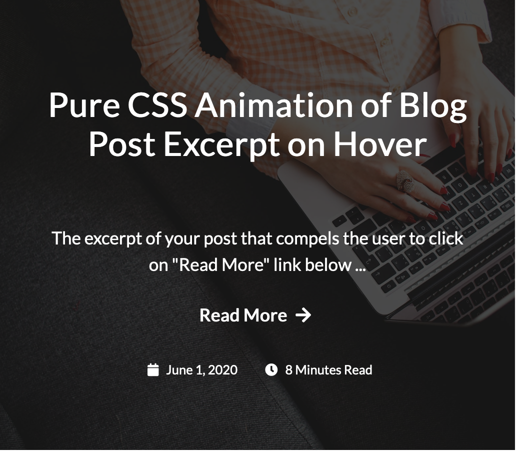
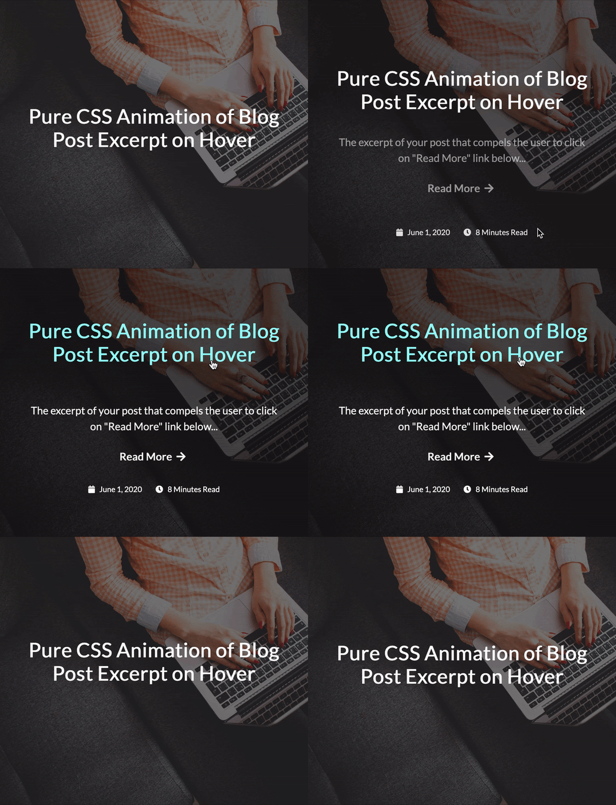
In this tutorial, we’ll make this cool animation of revealing the blog post excerpt on hover using pure CSS and no JavaScript. The GIF below shows what you will be able to create by the end of this. You should have basic knowledge of HTML and CSS to follow the tutorial.


Pure CSS Animation


This is a simple and neat animation that can be used on a page that lists blog posts. Each post on the list (or grid) shows only the featured image with the title at first. When you hover anywhere on the image, the background zooms in and the title slowly moves up revealing the excerpt, a “read more” link, the published date and time to read. Let’s get started!

Your Web Designer Toolbox

Unlimited Downloads: 500,000+ Web Templates, Icon Sets, Themes & Design Assets
Starting at only $16.50/month!


DOWNLOAD NOW

Setting up

Create a blank HTML document and name it index.html. Add the basic HTML skeleton. If you use Visual Studio Code, all you need to do is type “!” and hit enter. You will end up with this.

<!DOCTYPE html>
<html lang="en">
<head>
<meta charset="UTF-8">
<meta name="viewport" content="width=device-width, initial-scale=1.0">
<title>Document</title>
</head>
<body>

</body>
</html>

Create your stylesheet and name it styles.css. Link the stylesheet to your HTML document below the <title> tag using

<link rel="stylesheet" href="styles.css" type="text/css">

I have used ‘Lato’ font for the text and ‘Font Awesome’ for the icons. So add the following two lines below the title tag, before your stylesheet line to be able to use these fonts.

<link href="https://fonts.googleapis.com/css2?family=Lato&display=swap" rel="stylesheet">
<link href="https://cdnjs.cloudflare.com/ajax/libs/font-awesome/5.12.0-2/css/all.min.css" rel="stylesheet">

HTML & CSS

Each developer has a different way of working. Some developers create the complete HTML first and then get started with CSS. However I prefer to do both simultaneously because it helps me see the result taking shape bit by bit. To make it easier for you, I’ve split the next process into two parts.

Part 1

In the first part, we will achieve these:

Create a blog post item
Set the background image
Zoom the image on hover
Add a dark background overlay on the image which darkens more on hover

HTML

First add a div within the opening and closing body tags with a class “wrapper”. This acts as a container. Within that comes a single blog post item in an article tag. Give it a class name “post”.

<div class="wrapper">

<article class="post">

</article>

</div>

The background image cannot be added to this article element directly because we need to apply the zoom effect. Hence let’s create an empty div inside the article just for this.

<div class="post-bg"></div>

If you open this up on your browser, you will see nothing yet! So, it’s time for some CSS.

CSS

Add these basic styles into styles.css:

body{
font-family: ‘Lato’,sans-serif;
line-height: 1.5;
}
a{
color: #fff;
text-decoration: none;
}
a:hover{
color: #b1fffa; /* A bright green color */
}
.wrapper{
margin: auto; /* This is to center the content on page */
width: 1100px; /* You can change this value for smaller screens using media queries */
padding: 40px;
}

Next, add styles to the article element:

article.post{
position: relative;
width: 515px; /* You can change this value for smaller screens using media queries */
height: 450px; /* Height is required */
overflow: hidden;
}

The position property needs to be set because we will be absolutely positioning its child elements – the title, excerpt and other text. overflow: hidden is to make sure that this block doesn’t expand when the child background div is transformed to give the zoom effect. You will understand this in just a minute.

We need to now add styles to the div we placed for our background image.

.post-bg{
width: 100%;
height: 100%;
background-image: url(‘https://images.pexels.com/photos/267569/pexels-photo-267569.jpeg?auto=compress&cs=tinysrgb&dpr=2&h=750&w=1260’);
background-position: center;
background-size: cover;
transition: all .7s;
}

I have used a direct link of an image from pexels.com. You can use your own image. The CSS transition property is used to set the properties that need to animate (in our case it is all) and the time for transition ( we have set it to 0.7 seconds). Refer to CSS transitions on w3schools.com for a more detailed explanation.

Here comes the code snippet used for the zoom effect:

.post:hover .post-bg,
.post:focus .post-bg {
transform: scale(1.1);
}

Now check your browser. And if you got everything right, you will see the blog post image and when you take your mouse on it, the image zooms.

Pure CSS Animation of Blog Post Excerpt on Hover

As you can see in the CSS above, we are actually just increasing the size (using transform) of .post-bg div by 1.1 times when it’s parent element is hovered/focused. But since the parent’s overflow property is set to hidden, you feel the image is being zoomed.

Next, if you observe carefully, there’s a dark background overlay over this image. And on mouse hover, the overlay darkens further. To add this overlay, we need to use ::after to create a pseudo element and give styles as follows.

.post-bg::after {
content: ”;
background: rgba(0, 0, 0, 0.5);
width: 100%;
height: 100%;
position: absolute;
top: 0;
left: 0;
transition: all .7s;
}

The position:absolute along with width and height of 100% makes this pseudo element cover the image completely. The background color is black with 0.5 opacity. Again, the transition property is for animation.

Add the below code to increase the opacity when the parent element .post is hovered/focused.

.post:hover .post-bg::after,
.post:focus .post-bg::after {
background: rgba(0, 0, 0, 0.7);
}

Opacity of 0.5 is changed to 0.7. This works!

Part 2

We have our background all set. Now let’s achieve the following:

Add the title, excerpt, read more link, published date and time to read
Place the above elements in their respective positions
Display only the title in the center at first (Hide the other elements)
Animate the title and reveal the other elements simultaneously

HTML

After the .post-bg div, let’s add all the required elements. The HTML part is mostly self-explanatory.

<h2 class="post-title">
<a href="#">Pure CSS Animation of Blog Post Excerpt on Hover</a>
</h2>

The excerpt of your post that compels the user to click on "Read More" link below

<a class="post-read-more" href="#">
Read More
<i class="fa fa-arrow-right"></i>
</a>

<div class="post-date-time">
<span class="post-icon-text">
<i class="fa fa-calendar"></i>
June 1, 2020
</span>
<span class="post-icon-text">
<i class="fa fa-clock"></i>
8 Minutes Read
</span>
</div>

If you check your browser now, you cannot see any changes at all. Where have all the elements gone? You can use the inspector tool of your browser and check. They have been pushed down by the .post-bg div and are not visible because the overflow property of .post is set to hidden. Let’s work on the CSS.

CSS

The best way to get each of these in place is by setting position property to absolute and using the top, left and right properties for alignment.

.post-title, .post-excerpt, .post-read-more, .post-date-time {
position: absolute;
top: 20%;
left: 8%;
right: 8%;
text-align: center;
overflow: hidden;
}

Of course, now you will see that everything overlaps. Let’s give different values to top property and space them out correctly – the way we want to see them once revealed.

.post-title{
top: 15%;
}
.post-excerpt{
top: 46%;
}
.post-read-more{
top: 67%;
}
.post-date-time{
top: 80%;
}

This sets the position of elements, but we need some additional styling to get the font sizes and spacing right. Replace the above code with this:

.post-title{
top: 15%;
max-height: 120px; /* This is to make sure that longer titles are truncated */
}
.post-title a{
font-size: 1.4em;
line-height: 1;
}
.post-excerpt{
top: 46%;
max-height: 82px; /* This is to make sure that longer excerpts are truncated */
font-size: 1.1em;
}
.post-excerpt:after{
content: ‘…’;
}
.post-read-more{
top:67%;
font-weight: bold;
font-size: 1.1em;
}
.post-date-time{
top: 80%;
font-size: 0.8em;
}
.post-icon-text {
padding: 0 10px;
}
i.fa{
padding: 0 5px;
}

This looks perfect!

Pure CSS Animation of Blog Post Excerpt on Hover

Let’s hide all the elements except for the title, simply by setting the opacity to 0.

.post-excerpt, .post-read-more, .post-date-time {
opacity: 0;
}

Change the top value of .post-title to 35% – to make it appear in the center. Also, the top value of .post-date-time to 90% because the date and time slide up from bottom.

You have come really far! The only part remaining now is the actual animation – which is simple. First, set the transition property to all the four elements:

.post-title, .post-excerpt, .post-read-more, .post-date-time {
transition: all 0.5s;
}

Now let’s set the properties of each element on hover.

The top property of .post-title on .post hover

.post:hover .post-title{
top: 15%;
}

The opacity of .post-excerpt and .post-read-more

.post:hover .post-excerpt, .post:hover .post-read-more{
opacity: 1;
}

The top and opacity properties of .post-date-time

.post:hover .post-date-time{
top: 80%;
opacity: 1;
}

And there you go! You did it.

You now know how to create a zoom effect on a background image, how to add an overlay on a background image, and how to animate various elements using pure CSS animation. Just in case you didn’t get the expected output, I’ve got you covered. Download the full source code here and compare yours with this one.

Source Code


UI Interactions & Animations Roundup #6

Original Source: http://feedproxy.google.com/~r/tympanus/~3/fXbOPrnlXyg/

We are very happy to share our sixth UI interactions and animations roundup with you today! Lots of creativity has flown into these amazing works and it’s a pleasure to watch each and every one of them unfold their incredible imagination.

We hope you enjoy this collection and that it will spark some fresh inspiration in you!

Insidemind Motion Concept

by Nathan Riley

Motion exercise N?003

by Bastien Allard

Book event ios mobile app interaction

by Taras Migulko

Starlink Website Design

by Shakuro

Playful Creative Collective

by Zhenya Rynzhuk

Virtual Run | Landing Page

by Minh Pham

Memories Of A Geisha

by K?vin Lagier

Photographer Portfolio Interactions

by K?vin Lagier

Outpost – Concept Exploration

by Sean Hobman

Berluti Editorial Landing Page

by Francesco Zagami

Octane Material

by Matthew Hall

PanPan – Dog Treats UI

by Daniel Tan

Neural Network Website

by Max Gedrovich

Online Museums

by Viacheslav Olianishyn

Format web site design interaction

by Taras Migulko

Nana Asia Site of the Day on CSS Design Awards

by Cuberto

Kalli – Responsive HTML Templates II

by Anton Tkachev

Kati Forner Featured Projects Animation

by Zhenya Rynzhuk

X SEE

by Slava Kornilov

MUUTO Lookbook

by Nicholas.design

Interior Design Project Webpage Animation

by tubik

Play with Magic Motion

by Edoardo Mercati

The post UI Interactions & Animations Roundup #6 appeared first on Codrops.

Mirage JS Deep Dive: Understanding Timing, Response And Passthrough (Part 3)

Original Source: https://www.smashingmagazine.com/2020/06/mirage-javascript-timing-response-passthrough/

Mirage JS Deep Dive: Understanding Timing, Response And Passthrough (Part 3)

Mirage JS Deep Dive: Understanding Timing, Response And Passthrough (Part 3)

Kelvin Omereshone

2020-06-10T12:30:00+00:00
2020-06-10T17:34:03+00:00

Mirage JS was built to give frontend developers the ability to simulate actual backend API calls. So far, we have seen how we can create records with Mirage, intercept API requests via route handlers and, last but not least, how the shape of the data returned to us from Mirage is affected.

In this part of the series, we will see Mirage mechanism for simulating other aspects of an actual backend server like slow network, HTTP status code response, and also making requests to an actual backend even though Mirage is intercepting your frontend requests.

Let’s begin by simulating slow network requests.

Timing

When developing your frontend application that relies on a backend API, it’s useful to see how your application behaves under slow networks (think about testing loading messages and loaders). This test is important because requests to backend API are asynchronous in nature. What this means is that we can’t make assumptions about when we will get the response so we need to write our code as if it might come immediately, or there might be a delay.

A common reason for a delay in response is a slow Internet connection. It is then really important to know how your app would behave in such circumstances. Mirage caters to this need by making available a timing option which is a property passed to a route handler that tells the handler to wait for a particular duration specified by the timing option (in milliseconds) before returning a response whenever the route it is handling is called.

Note: By default, Mirage is setting a 400ms delay for the server during development and 0 during testing so your tests can run faster (no one really enjoys slow tests).

We now know in theory how to customize Mirage’s server response time. Let’s see a couple of ways to tweak that response time via the timing option.

timing On routes()

As earlier stated, Mirage sets a default delay for the server response time to be 400ms during development and 0 for tests. You could override this default on the routes method on the Server instance.

In the example below, I am setting the timing option to 1000ms in the routes method to artificially set the response delay for all routes:

import { Server } from ‘miragejs’

new Server({
routes() {
this.routes = 1000
}
})

The above tells Mirage to wait for 1000 milliseconds before returning a response. So if your front-end make a request to a route handler like the one below:

this.get(‘/users’, (schema) => {
return schema.users.all();
});

Mirage will take 1000 milliseconds to respond.

Tip: Instead of directly using the schema object, you could use ES 6 object restructuring to make your route handler cleaner and shorter like below:

this.get(‘/users’, ({ users }) => {
return users.all()
}

timing For Individual Routes

Although the this.timing property is useful, in some scenarios you wouldn’t want to delay all your routes. Because of this scenario, Mirage gives you the ability to set the timing option in a config options object you could pass at the end of a route handler.
Taking our above code snippets, let’s pass the 1000ms response delay to the route itself as opposed to globally setting it:

this.get(‘/users’, ({ users }) => {
return users.all();
}, { timing: 1000 });

The result is the same as globally assigning the timing. But now you have the ability to specify different timing delays for individual routes. You could also set a global timing with this.timing and then override it in a route handler. Like so:

this.timing = 1000

this.get(‘users’, ( { users } ) => {
return users.all()
})

this.get(‘/users/:id’, ({ users }, request) => {
let { id } = request.params;
return users.find(id);
}, { timing: 500 });

So now when we make a request to /users/1, it will return the below user JSON in half of the time (500ms) it would take for every other route.

{
“user”: {
“name”: “Kelvin Omereshone”,
“age”: 23,
“id”: “1”
}
}

Passthrough

Route handlers are the Mirage mechanism for intercepting requests your frontend application makes. By default, Mirage will throw an error similar to the one below when your app makes a request to an endpoint that you haven’t defined a Route handler for in your server instance.

Error: Mirage: Your app tried to GET ‘/unknown’, but there was no route defined to handle this request. Define a route for this endpoint in your routes() config. Did you forget to define a namespace?

You can, however, tell Mirage that if it sees a request to a route that you didn’t define a route handler for, it should allow that request to go through. This is useful if you have an actual backend and you want to use Mirage to test out endpoints that haven’t been implemented yet in your backend. To do this, you would need to make a call to the passthrough method inside the routes methods in your Mirage server instance.

Let’s see it in code:

import { Server } from ‘miragejs’

new Server({
routes() {
// you can define your route handlers above the passthrough call
this.passthrough()
}
})

Note: It is recommended keeping the call to passthrough at the bottom in order to give your route handlers precedence.

Now when Mirage sees requests to a route that you didn’t define in Mirage, it would let them “passthrough”. I really find this useful because it makes Mirage play nicely with an actual backend. So a scenario would be, you are ahead of your backend team and you want to make a request to an endpoint that you don’t have in your production backend, you could just mock out that endpoint in mirage and because of the passthrough option, you wouldn’t need to worry about other parts of your app making requests failing.

Using passthrough To Whitelist Route

passthrough takes in options to allow you to have more control over routes you want to whitelist. So as opposed to calling passthrough without any option and allowing routes not present in mirage to passthrough, you can pass in one or more strings of the routes you want to whitelist to passthrough. So if we want to whitelist /reviews and /pets we can do that using passthrough like so:

this.passthrough(‘/reviews’, ‘/pets)

You can also do multiple calls to passthrough:

this.passthrough(‘/reviews’)
this.passthrough(‘/pets’)

Note: I find passing multiple route strings to passthrough cleaner as opposed to making multiple calls. But you are free to use whatever feels natural to you.

Using passthrough On A Set Of HTTP Verbs

The above passthrough we defined will allow all HTTP verbs (GET, POST, PATCH, DELETE) to passthrough. If your use case requires you to allow a subset of the HTTP verbs to passthrough, Mirage provides an options array on the passthrough method wherein you pass the verbs you want Mirage to whitelist on a particular route. Let’s see it in code:

// this allows post requests to the /reviews route to passthrough
this.passthrough(‘/reviews’, [‘post’]);

You could also pass multiple strings of routes as well as the HTTP verbs array like so:

// this allows post and patch requests to /reviews and /pets routes to passthrough

this.passthrough(‘/pets’, ‘reviews’, [‘post’, ‘patch’])

Response

Now you see the level of customization Mirage gives you with both the timing option and passthrough method, it feels only natural for you to know how to customize the HTTP status code Mirage sends for the requests you make. By default, Mirage would return a status of 200 which says everything went fine. (Check out this article for a refresher on HTTP status code.) Mirage, however, provides the Response class which you can use to customize the HTTP status code as well as other HTTP headers to be sent back to your frontend application.

The Response class gives you more control over your route handler. You can pass in the following to the Response class constructor:

The HTTP status code,
HTTP Headers,
Data (a JSON payload to be returned to the frontend).

To see how the Response class works, we would start on an easy note by rewriting our previous route handler using the Response class. So we would take the below route handler:

this.get(‘users’, ( { users } ) => {
return users.all()
})

and then reimplement using the Response class. To do this we first need to import the Response class from Mirage:

import { Response } from ‘miragejs’

We would then rewrite our route handler using the Response class:

this.get(‘/users’, ({ users }) => {
return new Response(200, {}, users.all());
});

Note: We are passing an empty {} to the header argument because we are do not want to set any header values for this response.

I believe we can infer that Mirage under the hood uses the Response class when we previously returned users.all() because both implementations would act the same way and return the same JSON payload.

I will admit the above use of Response is a little bit verbose because we are not doing anything special yet. However, the Response class holds a world of possibility to allows you to simulate different server states and set headers.

Setting Server States

With the Response class, you can now simulate different server states via the status code which is the first argument the Response constructor takes. You can now pass in 400 to simulate a bad request, 201 to simulate the created state when you create a new resource in Mirage, and so on. With that in mind, let’s customize /users/:id route handler and pass in 404 to simulate that a user with the particular ID was not found.

this.get(‘/users/:id’, (schema, request) => {
let { id } = request.params;
return new Response(404, {}, { error: ‘User with id ${id} not found’});
});

Mirage would then return a 404 status code with the error message similar to the below JSON payload:

{
“error”: “User with id 5 not found”
}

Setting Headers

With the Response class, you can set response headers by passing an object as the second argument to the Response constructor. With this flexibility, you can simulate setting any headers you want. Still using our /users/:id route, we can set headers like so:

this.get(‘/users/:id’, (schema, request) => {
let { id } = request.params;
return new Response(404, {“Content-Type” : “application/json”, author: ‘Kelvin Omereshone’ }, { error: `User with id ${id} not found`});
});

Now when you check Mirage logs in your browser console, you would see the headers we set.

Wrapping Up

In this part of the Mirage JS Deep Dive series, I have expounded three mechanisms that Mirage exposes to its users in order to simulate a real server. I look forward to seeing you use Mirage better with the help of this article.

Stay tuned for the next and final part of the series coming up next week!

Part 1: Understanding Mirage JS Models And Associations
Part 2: Understanding Factories, Fixtures And Serializers
Part 3: Understanding Timing, Response And Passthrough

Smashing Editorial
(ra, il)

How to Create a Motion Hover Effect for a Background Image Grid

Original Source: http://feedproxy.google.com/~r/tympanus/~3/L_wR_kj8R2Q/

If you follow our UI Interactions & Animations Roundups, you might have spotted this beautiful grid designed by the folks of tubik:

Previously, Zhenya Rynzhuk also designed this wonderful layout with a similar interaction:

It’s not too complicated to implement this. I wanted to try it and in the following I’ll walk you through the relevant markup and code.

The markup and style for the grid

The markup is simply a grid of items that have background images. I like to use this structure because it allows me to control the sizes of the images by setting their position in the grid.

<div class=”grid”>
<div class=”grid__item pos-1″>
<div class=”grid__item-img” style=”background-image:url(img/1.jpg);”></div>
</div>
<div class=”grid__item pos-2″>
<div class=”grid__item-img” style=”background-image:url(img/2.jpg);”></div>
</div>
<div class=”grid__item pos-3″>
<div class=”grid__item-img” style=”background-image:url(img/3.jpg);”></div>
</div>

</div>

The grid is stretched to be a bit bigger than its parent because we want to move the items and create the illusion of an infinite plane of images.

.grid {
pointer-events: none;
position: absolute;
width: 110%;
height: 110%;
top: -5%;
left: -5%;
display: grid;
grid-template-columns: repeat(50,2%);
grid-template-rows: repeat(50,2%);
}

.grid__item {
position: relative;
}

.grid__item-img {
position: relative;
width: 100%;
height: 100%;
background-size: cover;
background-position: 50% 50%;
}

The grid is divided into 50 cells for the rows and columns. With this layout density, the position of each image element can be set precisely.

/* Shorthand grid-area: grid-row-start / grid-column-start / grid-row-end / grid-column-end */

.pos-1 {
grid-area: 10 / 1 / 26 / 7;
}

.pos-2 {
grid-area: 1 / 18 / 9 / 27;
}

.pos-3 {
grid-area: 1 / 36 / 14 / 42;
}

Note that I use the double division structure for the possibility of moving the inner element with the background image to create the motion effect seen in demo 3. For that case, I define some extra styles:

/* If we want to move the inner image */

.grid–img .grid__item {
overflow: hidden;
display: flex;
align-items: center;
justify-content: center;
will-change: transform;
}

.grid–img .grid__item-img {
flex: none;
width: calc(100% + 100px);
height: calc(100% + 100px);
will-change: transform;
}

The JavaScript

Now, let’s have a look at the JavaScript part. I’m using GSAP by GreenSock. We start by creating a Grid class to represent the grid of pictures:

export default class Grid {
constructor(el) {
this.DOM = {el: el};
this.gridItems = [];
this.items = […this.DOM.el.querySelectorAll(‘.grid__item’)];
this.items.forEach(item => this.gridItems.push(new GridItem(item)));

this.showItems();
}

}

const grid = new Grid(document.querySelector(‘.grid’));

There should be an initial animation where the grid items scale up and fade in. We can add a method to the class for that. We also want the items to start at different times and for that we use the GSAP stagger option. The items will start animating from the center of the grid:

showItems() {
gsap.timeline()
.set(this.items, {scale: 0.7, opacity: 0}, 0)
.to(this.items, {
duration: 2,
ease: ‘Expo.easeOut’,
scale: 1,
stagger: {amount: 0.6, grid: ‘auto’, from: ‘center’}
}, 0)
.to(this.items, {
duration: 3,
ease: ‘Power1.easeOut’,
opacity: 0.4,
stagger: {amount: 0.6, grid: ‘auto’, from: ‘center’}
}, 0);
}

Now, let’s make the items move as we move the mouse around. Each grid item will be represented by a GridItem class:

class GridItem {
constructor(el) {
this.DOM = {el: el};
this.move();
}

}

The position of each item in both axes should be mapped with the mouse position. So, the mouse can move from position 0 to the width or height of the window. As for the item, it’ll move in a range of [start, end] that we need to specify. We’ll be assigning random values for the start/end value so that each item moves differently from each other.

Let’s add the move method to the GridItem class:

move() {
// amount to move in each axis
let translationVals = {tx: 0, ty: 0};
// get random start and end movement boundaries
const xstart = getRandomNumber(15,60);
const ystart = getRandomNumber(15,60);

// infinite loop
const render = () => {
// Calculate the amount to move.
// Using linear interpolation to smooth things out.
// Translation values will be in the range of [-start, start] for a cursor movement from 0 to the window’s width/height
translationVals.tx = lerp(translationVals.tx, map(mousepos.x, 0, winsize.width, -xstart, xstart), 0.07);
translationVals.ty = lerp(translationVals.ty, map(mousepos.y, 0, winsize.height, -ystart, ystart), 0.07);

gsap.set(this.DOM.el, {x: translationVals.tx, y: translationVals.ty});
requestAnimationFrame(render);
}
requestAnimationFrame(render);
}

And that’s it!

I hope you find this helpful and please let me know your feedback via @codrops. Thank you for reading!

The post How to Create a Motion Hover Effect for a Background Image Grid appeared first on Codrops.

Web Design Trends for Gaming Sites: Then and Now

Original Source: http://feedproxy.google.com/~r/Designrfix/~3/8_6mSeGYJfs/web-design-trends-for-gaming-sites-then-and-now

With each new leap in the development of technology, it is becoming increasingly difficult to imagine that only about three decades ago, the Internet did not exist in principle. The appearance of the first online casino site dates back to 1995, when Microgaming launched its first online project. There was nothing on this website other than text, […]

The post Web Design Trends for Gaming Sites: Then and Now appeared first on designrfix.com.

Inspirational Websites Roundup #15

Original Source: http://feedproxy.google.com/~r/tympanus/~3/NodCHe9J0cE/

With our roundups we want to share the most interesting design trends around the web with you. Every collection is our personal selection of what we consider to be the most inspirational and trend-setting designs.

This collection is no different: we think these are the finest and most intriguing web experiences that were released in the past weeks. They are not the only ones though, of that I’m sure! So if you stumble upon some great designs, please share them with us @codrops.

We hope you enjoy this special set of really nice designs!

Madies

Rino & Pelle

Stone & Style

LM Chabot

Dash Dash

Henrik & Sofia

Muteza

Voeux Adveris 2020

Powerhouse Company

CUSP

Mixlegno

Kontrapunkt Type

Waka Waka

Houses Of

Corentin Bernadou

LEGO Ventures

Polygon

Edoardo Smerilli

Kati Forner

DEGENESIS

Kelly Milligan

Henge

Cassiom

thePenTool

Rogier de Boev?

Tiffanie Mazellier

100 DAYS OF POETRY

Olivier Gillaizeau

Guillaume Gouessan

GOODFISH

Ruud Luijten

Alan Menken

Rodolfo Sarno

Stephanie Jeong

The post Inspirational Websites Roundup #15 appeared first on Codrops.

20 Unmissable Websites, June 2020

Original Source: https://www.webdesignerdepot.com/2020/06/20-unmissable-websites-june-2020/

Every month we publish a roundup of the 20 most unmissable websites newly launched, or updated in the previous four weeks.

In June’s edition you’ll find everything from corporate sites for global power-houses, to personal sites for innovative designers. This month we’re seeing a lot of flamboyance, a lot of passion, and the color of the moment is (hooray!) yellow. Enjoy!

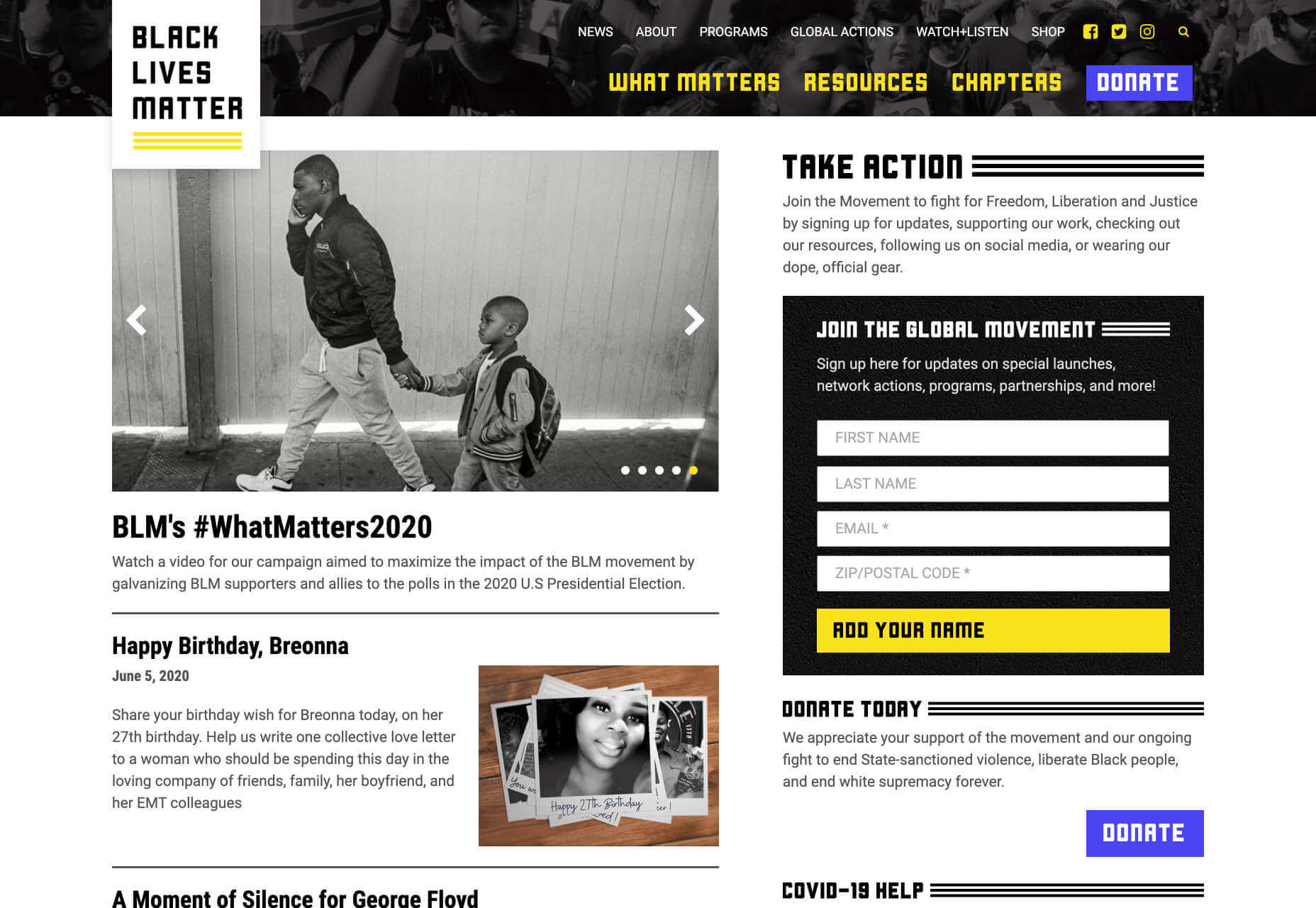
Black Lives Matter

In recent weeks there have been protests in the US and beyond in response to alleged police brutality directed at people of color. The Black Lives Matter website is a central hub for news, resources, and information on civil rights campaigns in 38 countries.

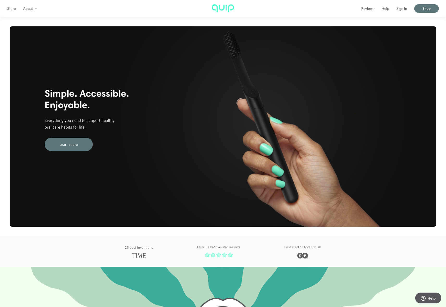
Quip

Quip is a site focused on helping us build, and maintain healthy oral care habits. Centred around its innovative products, this site mixes images, illustration, and motion effortlessly to create a healthcare brand that’s highly appealing.

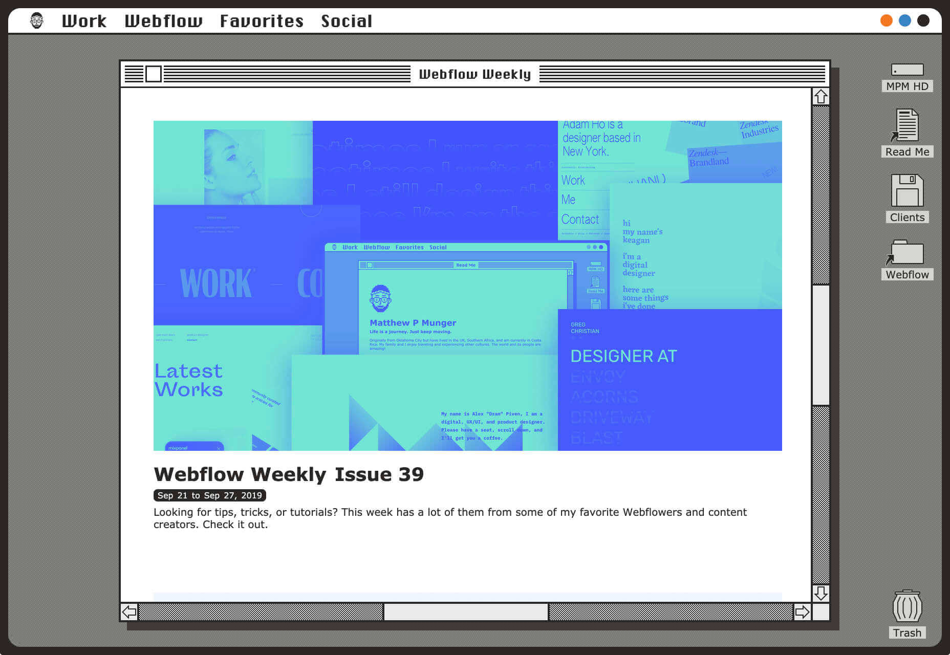
Matthew P Munger

This portfolio site for Matthew P Munger is a delightful jaunt through a Mac OS of yesteryear. What we really enjoyed is that despite being presented in this early-90s style, the UI manages to adapt itself responsively.

Moooi

There’s a maximal feel to Moooi’s site, layers of illustration enlarge so you feel like Alice falling down the rabbit hole. But the real excellence of this site is the tiny UI details, like the draggable bar that reveals the product videos.

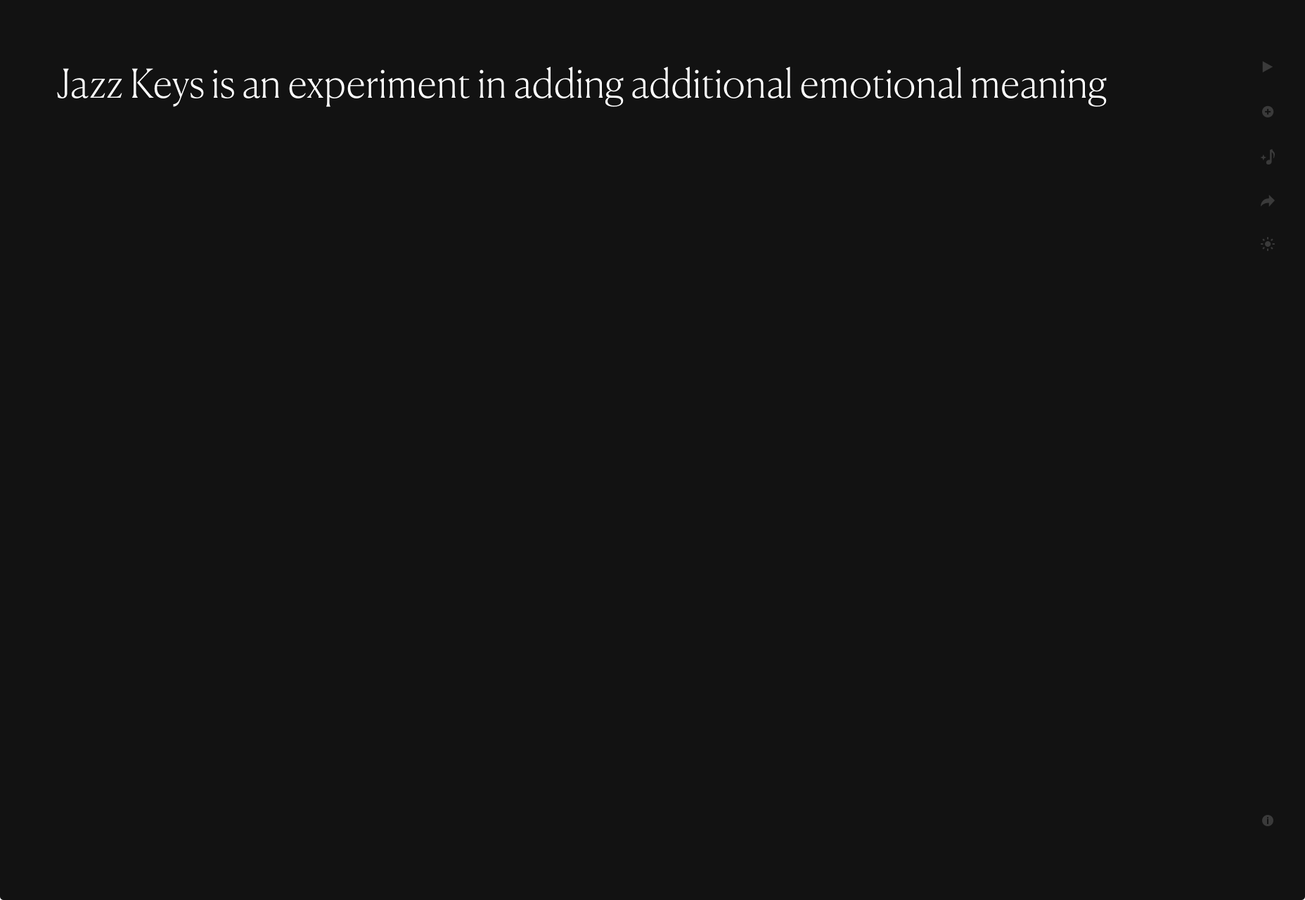
Jazz Keys

Jazz Keys is an experiment in adding extra emotional meaning to the often impersonal messages we send digitally. Type your message and hear it play in sound. You can send your message to anyone, and let them hear your words.

AIAIAI

There’s a brutally cool black and white aesthetic to AIAIAI’s site. The dark, low-contrast product photography’s absence of color punctuated by some shocking neon, and the occasional golden shine of a plug.

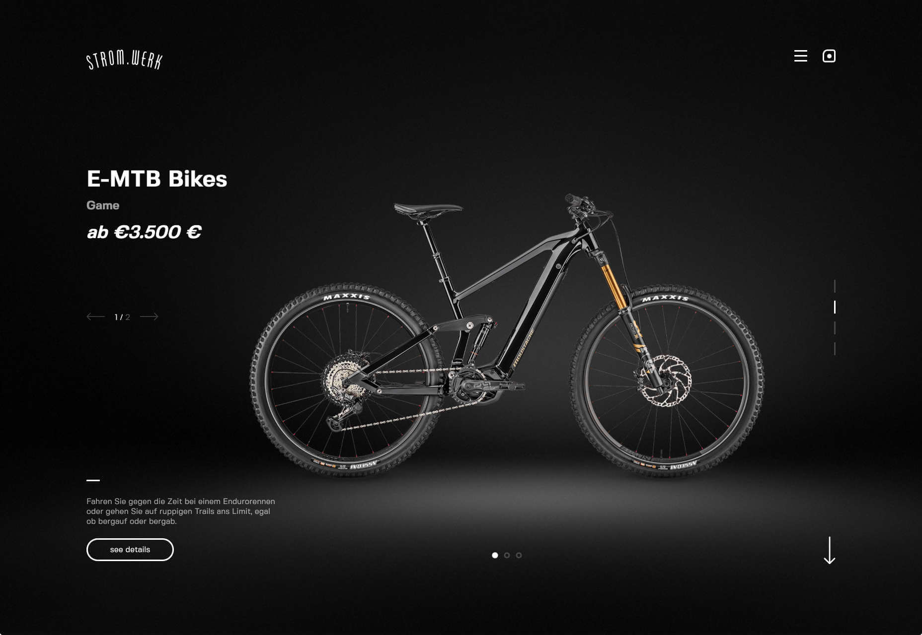
Stromwerk

Cycling is taking over the world, and one of the biggest new trends is for e-bikes. Stromwerk’s site does an excellent job of taking something that seems a bit like cheating, and transforming it into something rugged and cool.

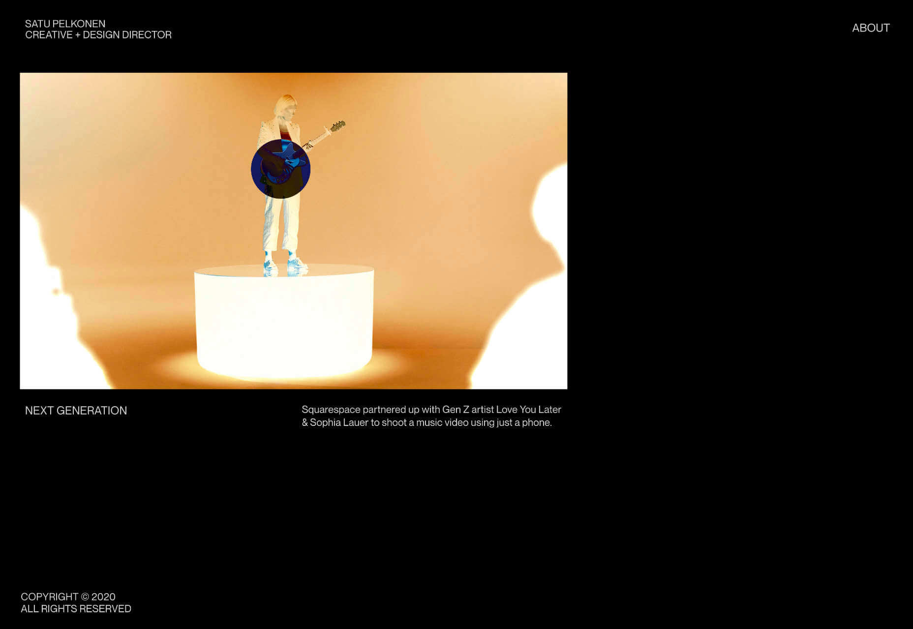
Satu Pelkonen

Satu Pelkonen is a NY-based creative director who joined Squarespace in 2019. His site features a really cool custom cursor that inverts the thumbnail it’s hovering over, creating a delightful, simple interaction.

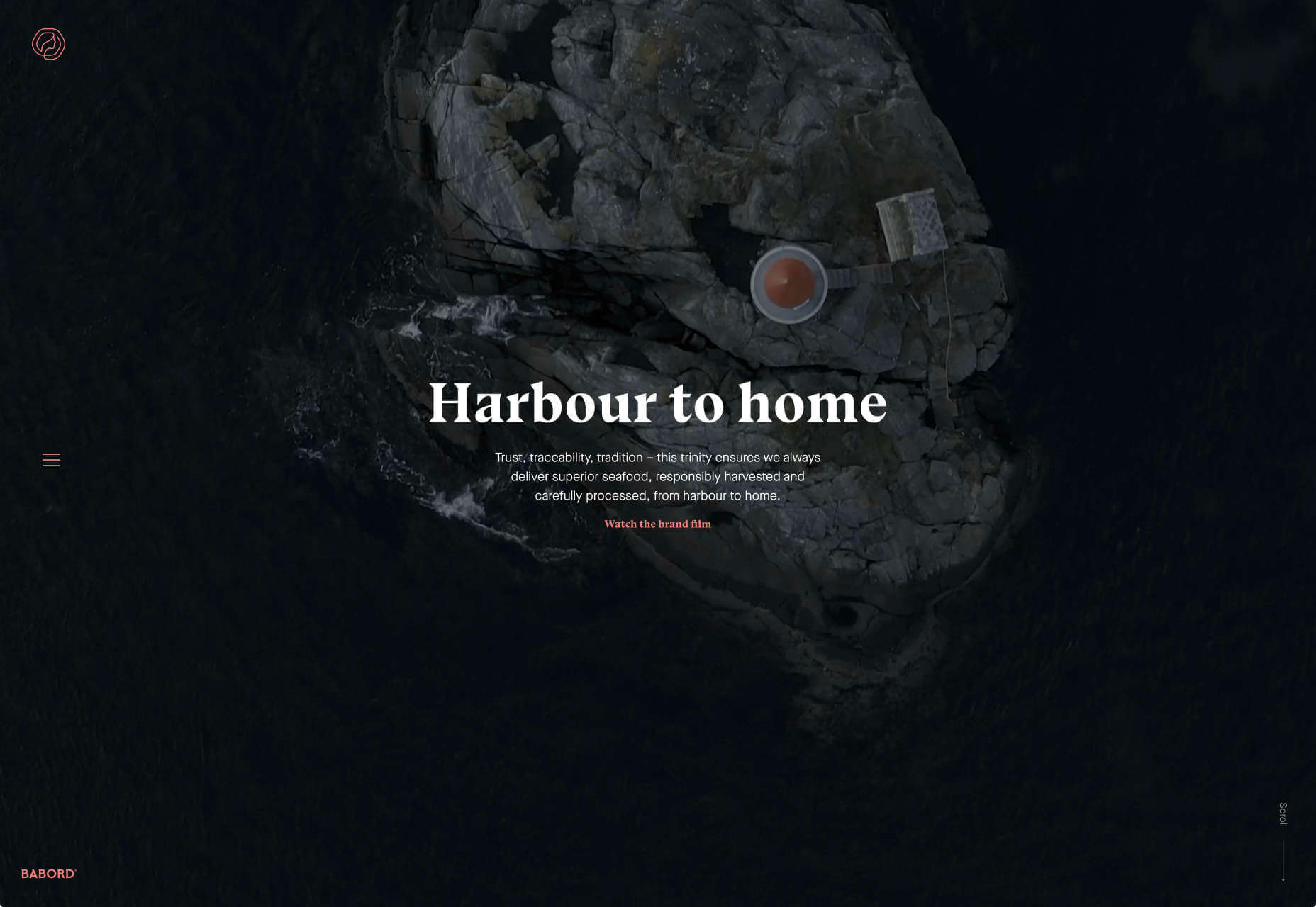
Babord

Babord is a Norwegian seafood supplier. The relationship Norwegian’s have with the sea is evident, and the site transforms simple fishing into an almost mystical experience. Plus that brand font is fantastically daring.

Yuko Higuchi x Gucci

Guggi has a history of expansive and ambitious marketing campaigns. This latest micro-site from Italy allows you to play a fun, tile-slide game based around the fashion label’s new kids collection.

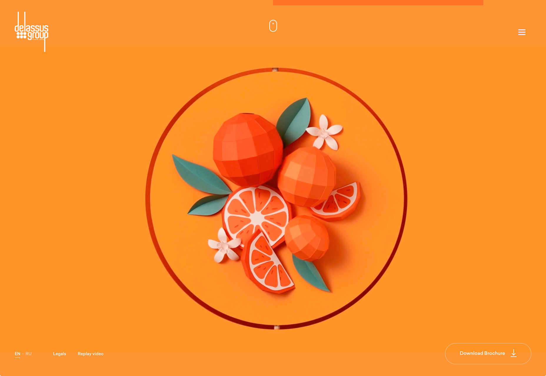
Delassus

Delassus is a Moroccan company that grows ingredients from citrus fruits to avocados. Its whole site is a cornucopia of 3D design, with models of its products, and humorous typography. Bold, and fun, and practical too.

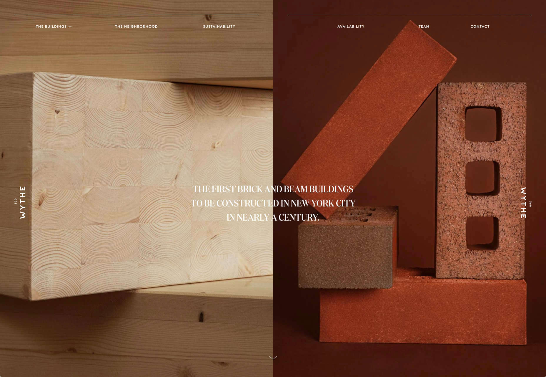
320 and 360 Wythe

Who would think that bricks and timber could look so glamorous? That’s what this site for two new buildings in Brooklyn achieves. The colors, the mockups, and the old-timey photography give these new builds a much needed heritage.

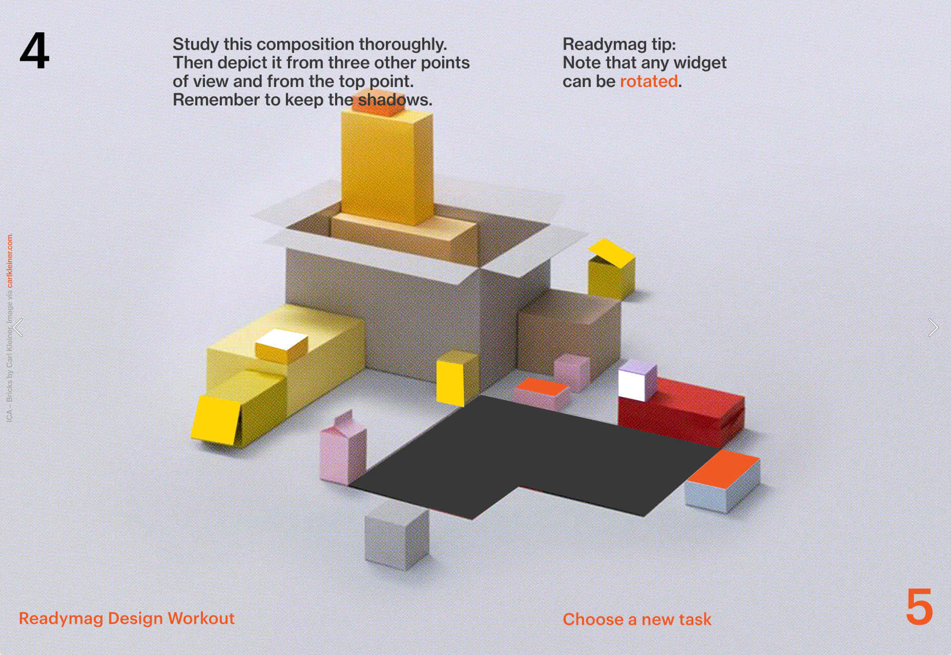
Readymag Design Workout

To keep you creative during the pandemic, Readymag has created this daily training program to hone your design skills and help you with decision making. It’s a drag and drop playground, with real world tasks to challenge you.

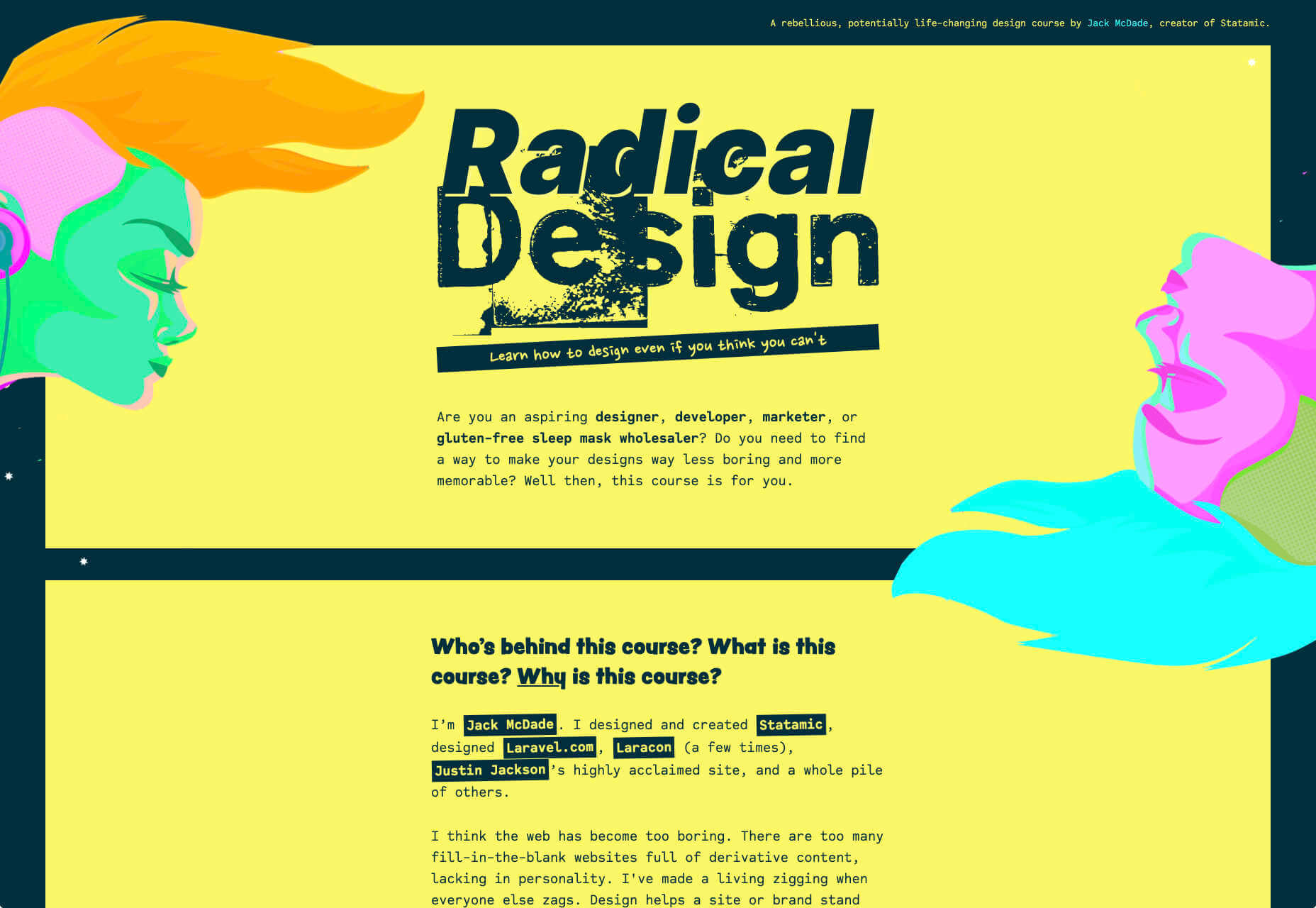
Radical Design Course

If you think that web design’s just too samey, then you’ll appreciate the launch page for the upcoming Radical Design course. It features tons of yellow, engaging typography, and some super-cute illustrations.

Bastarda

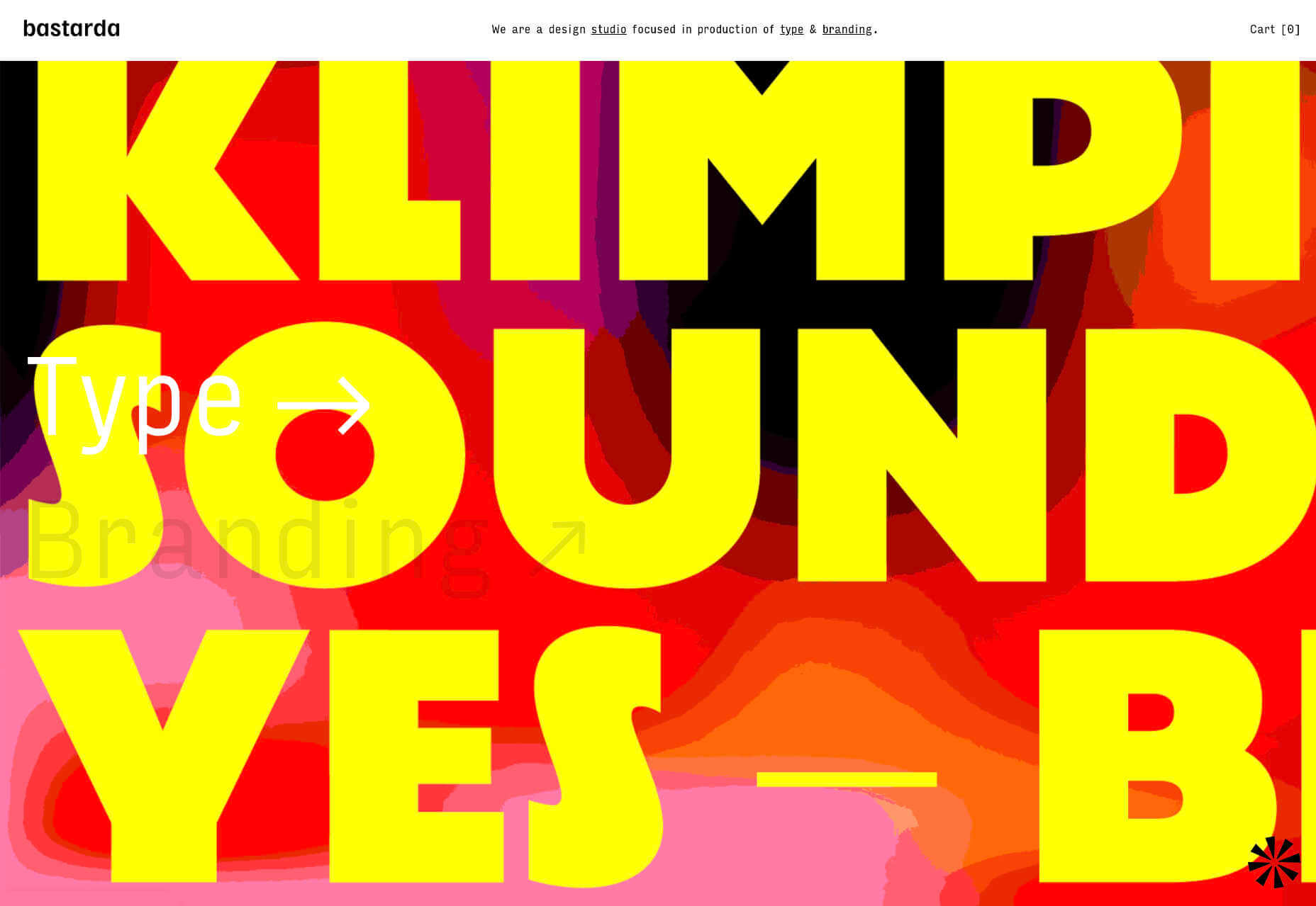
Bastarda is a type and branding design studio from Bogotá, Colombia. It has managed to create a sense of both simple, structured minimalism, and energy and excitement with hovers on its main links that trigger awesome reels.

Jens Nielsen

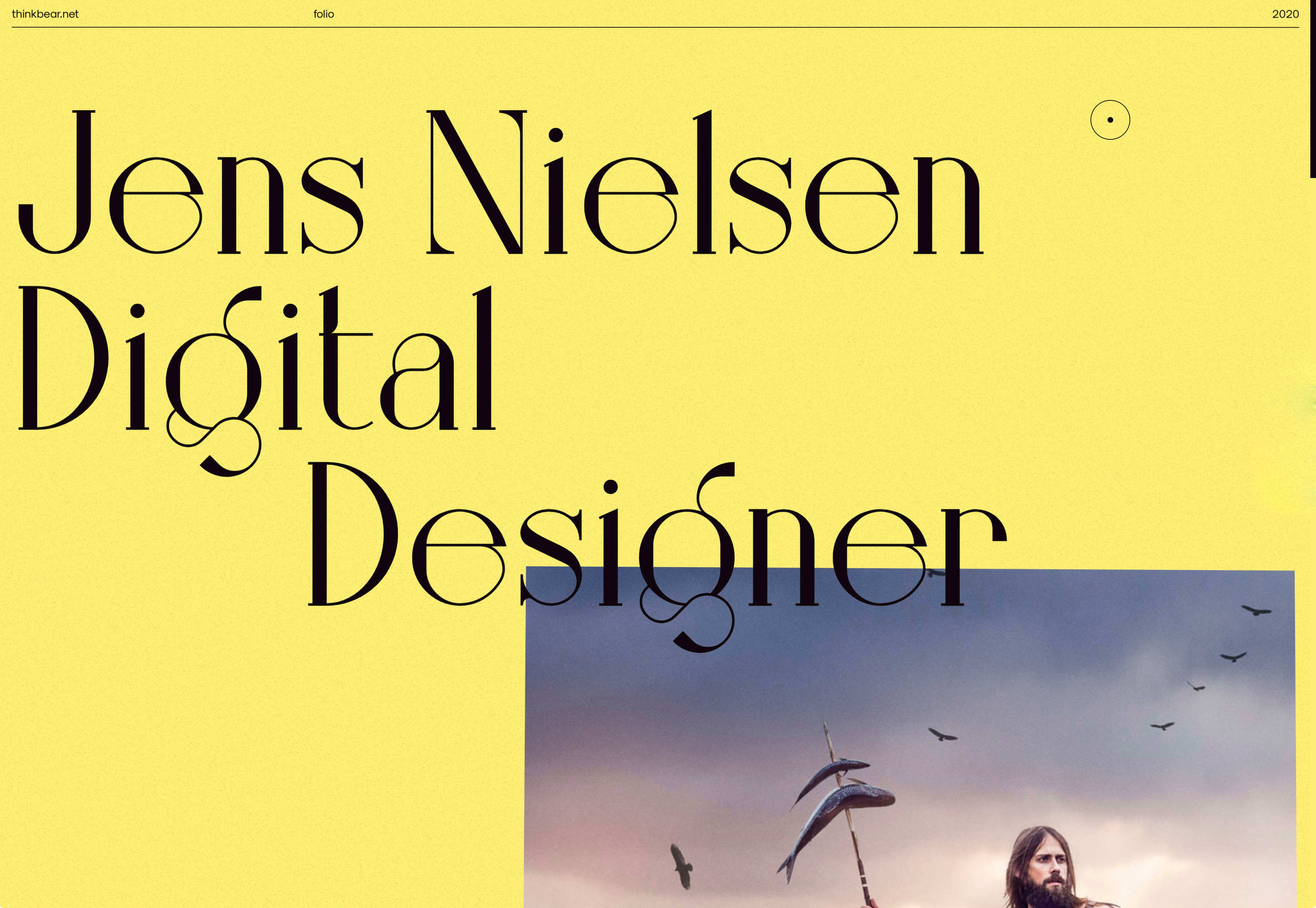
This awesome portfolio for Jens Nielsen features some great artwork, a super-brave choice of font, and some really cool mouse overs that flash up thumbnails of work that’s all linked up on Dribbble.

POC

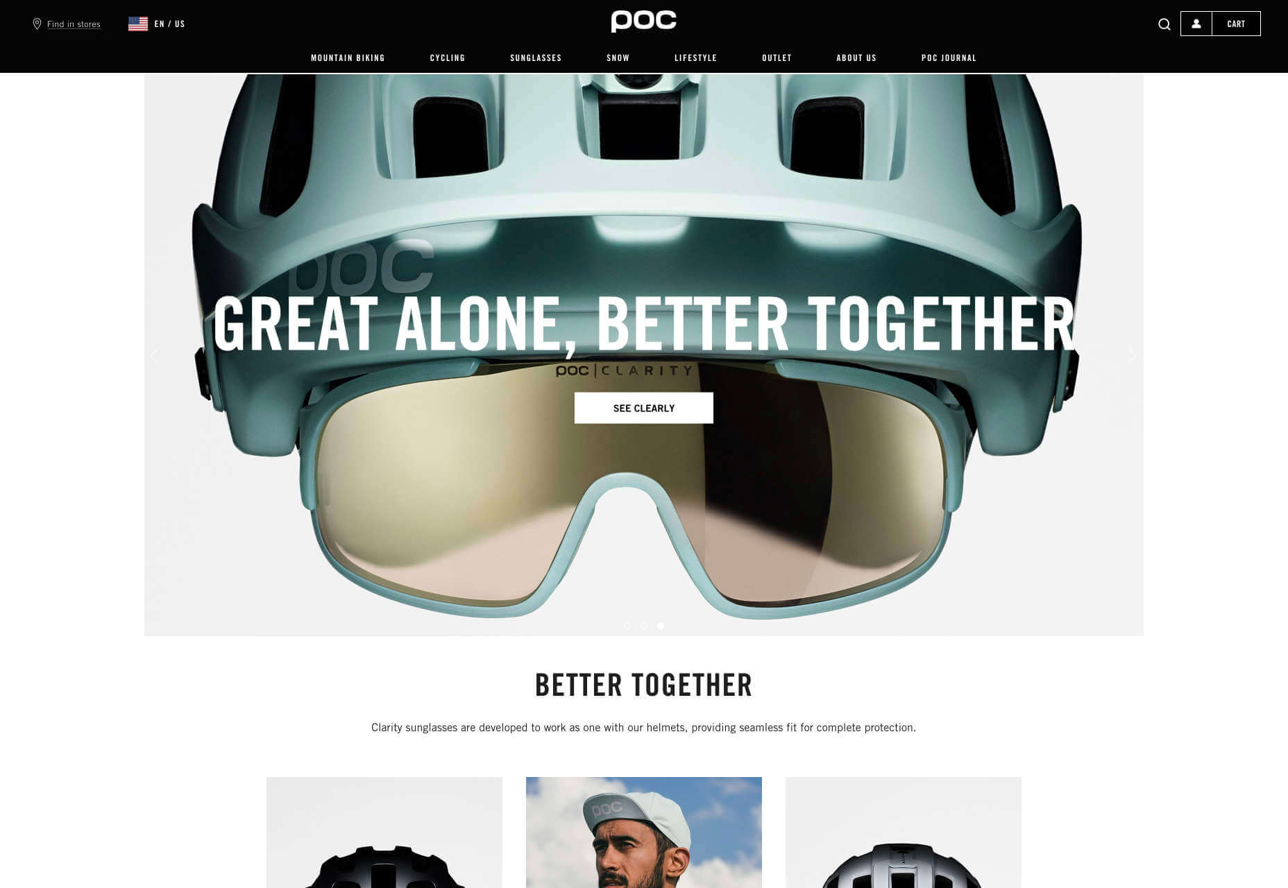
More cycling this month curtesy of POC, makers of cycling helmets and apparel. This site does an awesome job of balancing lifestyle imagery, and a clean, practical e-commerce site that is easy to explore.

Stefanie Nelson Dancegroup

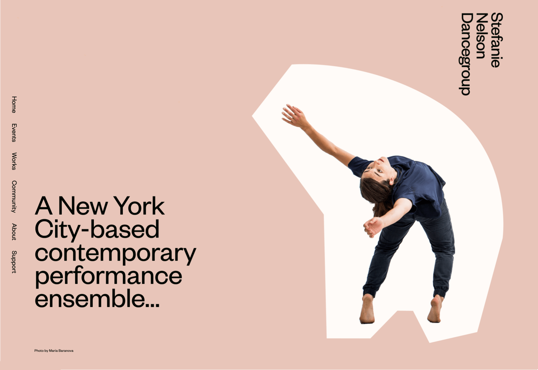
Some of the most striking design of the last century can be found on the radical covers of jazz albums. The Stefanie Nelson Dancegroup site follows a similar path with abstract shapes on the site mimicking body movements.

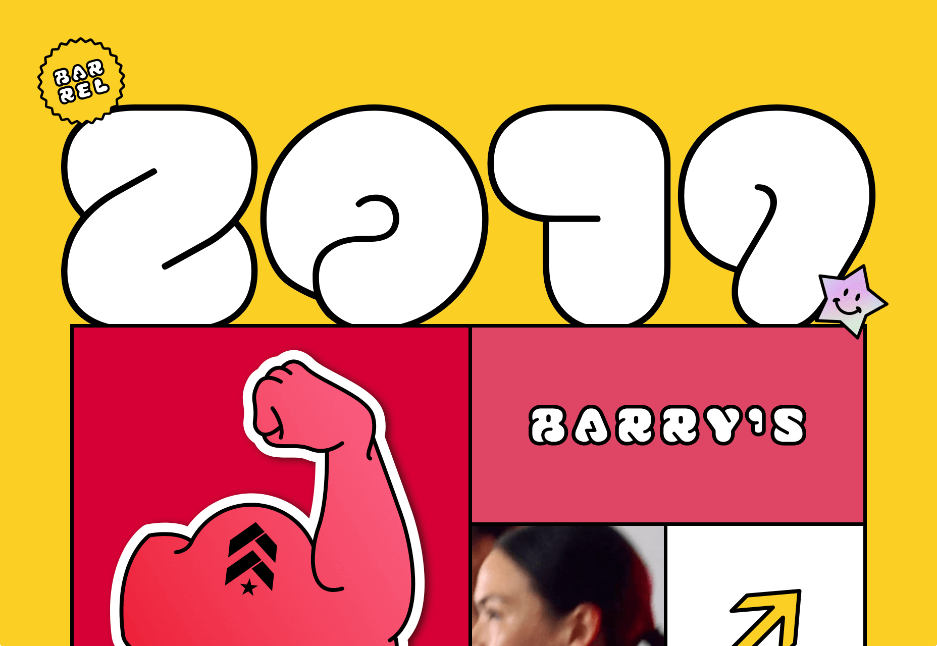
Barrel 2019

Barrel is a design studio that specialises in wellness brands, from workout products to the vitamins you take. This recap of their work from last year is fun, colorful, and a great opportunity for them to break away from their usual style.

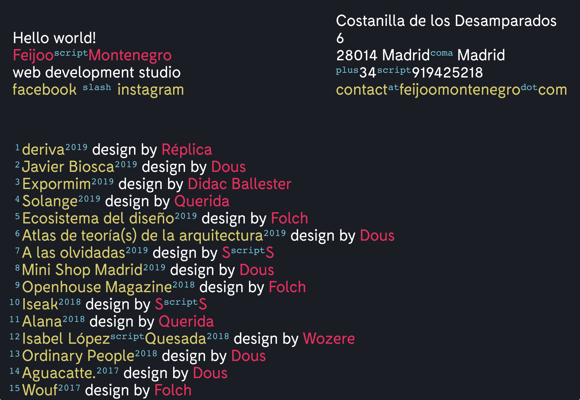
Feijoo

I have a soft-spot for all-text sites, and this simple list one-pager by Feijoo is right up their with my favorites. Perhaps is reminds me of my Sublime Text theme. Either way, I love the details like the numerals being replaced by words.

Source

p img {display:inline-block; margin-right:10px;}
.alignleft {float:left;}
p.showcase {clear:both;}
body#browserfriendly p, body#podcast p, div#emailbody p{margin:0;}

Tips on How to Design an Outstanding Website

Original Source: http://feedproxy.google.com/~r/Designrfix/~3/EbOgn7f_dtA/tips-on-how-to-design-an-outstanding-website

Today we will talk about how online casino site should look like for Australian players. We will take as an example Casinonic.com website. Creating your own site for online gambling Australia is actually the second option for earning in this niche. First option is to make gambling related site with reviews of online casinos and the second […]

The post Tips on How to Design an Outstanding Website appeared first on designrfix.com.

Collective #606

Original Source: http://feedproxy.google.com/~r/tympanus/~3/8YD1dJTqSKA/

Collective Item Image

Inspirational Website of the Week: Ivan Toma

A fitting design that shouts elegance and sophistication. Our pick this week.

Get inspired

Our Sponsor
Start your own freelance business by becoming a Divi developer

Learn how to develop websites with the most popular WordPress theme in the world and secure your success as a freelancer.

Start learning now

Collective Item Image

WebGL guide

Maxime Euzi�re’s complete, summarized WebGL tutorial, with tiny interactive demos in each chapter.

Check it out

Animated Sparkles in React

Learn how to animate sparkle text in React in this tutorial by Josh W Comeau.

Read it

Collective Item Image

Beginner’s Guide to Eleventy [Part II]

In this second article of a four part series, Tatiana Mac shows you how to install Eleventy step-by-step.

Read it

Collective Item Image

Best Practices in JavaScript Array Iteration

Violet Pe�a invites you to take a look at four essential Array methods and how to use them.

Read it

Collective Item Image

Minimalist HTML

An HTML document by Ryan Jacobs that shows a minimal example of HTML5.

Check it out

Collective Item Image

Thinking About The In-between Design Cases

Ahmad Shadeed writes about those often neglected in-between design cases of a responsive website.

Read it

Collective Item Image

Neon Mode: Building a new Dark UI

Max B�ck explains how the dark mode with extra features was implemented on Codista.

Read it

Collective Item Image

An introduction to accessible data visualizations with D3.js

Sarah L. Fossheim’s series on data visualizations and accessibility.

Read it

Collective Item Image

Runme.io

Run your application from any public GitHub repo with one click.

Check it out

Collective Item Image

The Third Age of JavaScript

Some interesting thoughts on the future of JavaScript by Shawn Wang.

Read it

Collective Item Image

How to Use Object Destructuring in JavaScript

Dmitri Pavlutin explains how to use object destructuring in JavaScript really well in this article.

Read it

Collective Item Image

The Kawaiization of product design

Tobias van Schneider’s thoughts on the “cutification” of product design.

Read it

Collective Item Image

new.css

A classless CSS framework to write modern websites using only HTML.

Check it out

Collective Item Image

DOM diffing with vanilla JS

Previously, Chris Ferdinandi explains how to build reactive, state-based components with vanilla JS and in this article he shows how to add DOM diffing to a component.

Read it

Collective Item Image

Ghost at the Disco

Anna the Scavenger’s beautiful animated scene.

Check it out

Collective Item Image

The Fastest Google Fonts

Harry Roberts’ exploration of how to design some fairly resilient measures for faster Google Fonts loading.

Read it

Collective Item Image

In defense of the modern web

Rich Harris thoughts on the article “Second-guessing the modern web” by Tom MacWright.

Read it

Collective Item Image

Release 4.0.0 of reveal.js

This update of the great HTML presentation framework brings some important changes.

Check it out

Collective Item Image

This Word Does Not Exist

This Word Does Not Exist uses an artificial intelligence model named GPT-2 to invent new English words with a definition.

Check it out

Collective Item Image

SEO Cheat Sheet

A sorted list that provides technical On-Page SEO best practices.

Check it out

Collective Item Image

Painter

A subtly animated illustration by Ricardo Oliva Alonso.

Check it out

Collective Item Image

From Our Blog
UI Interactions & Animations Roundup #6

A hand-picked collection of superb UI inspiration from the past weeks.

Check it out

Collective Item Image

From Our Blog
Inspirational Websites Roundup #15

A new roundup that consists of a special collection of the latest web design trends and inspiration.

Check it out

The post Collective #606 appeared first on Codrops.