Pure CSS Animation of Blog Post Excerpt on Hover
Original Source: http://feedproxy.google.com/~r/1stwebdesigner/~3/eNrrY-4_q_E/
In this tutorial, we’ll make this cool animation of revealing the blog post excerpt on hover using pure CSS and no JavaScript. The GIF below shows what you will be able to create by the end of this. You should have basic knowledge of HTML and CSS to follow the tutorial.
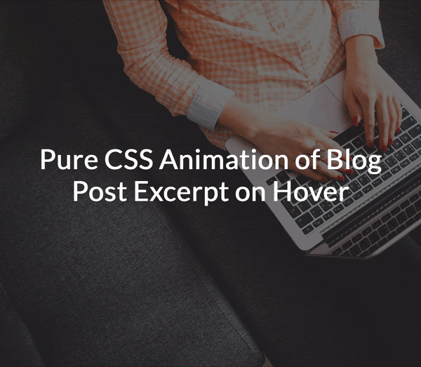
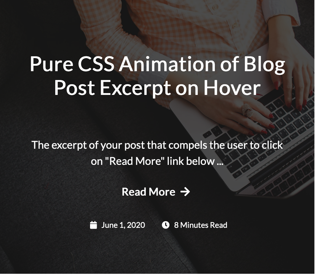
This is a simple and neat animation that can be used on a page that lists blog posts. Each post on the list (or grid) shows only the featured image with the title at first. When you hover anywhere on the image, the background zooms in and the title slowly moves up revealing the excerpt, a “read more” link, the published date and time to read. Let’s get started!
Your Web Designer Toolbox
Unlimited Downloads: 500,000+ Web Templates, Icon Sets, Themes & Design Assets
Starting at only $16.50/month!

DOWNLOAD NOW
Setting up
Create a blank HTML document and name it index.html. Add the basic HTML skeleton. If you use Visual Studio Code, all you need to do is type “!” and hit enter. You will end up with this.
<!DOCTYPE html>
<html lang="en">
<head>
<meta charset="UTF-8">
<meta name="viewport" content="width=device-width, initial-scale=1.0">
<title>Document</title>
</head>
<body>
</body>
</html>
Create your stylesheet and name it styles.css. Link the stylesheet to your HTML document below the <title> tag using
<link rel="stylesheet" href="styles.css" type="text/css">
I have used ‘Lato’ font for the text and ‘Font Awesome’ for the icons. So add the following two lines below the title tag, before your stylesheet line to be able to use these fonts.
<link href="https://fonts.googleapis.com/css2?family=Lato&display=swap" rel="stylesheet">
<link href="https://cdnjs.cloudflare.com/ajax/libs/font-awesome/5.12.0-2/css/all.min.css" rel="stylesheet">
HTML & CSS
Each developer has a different way of working. Some developers create the complete HTML first and then get started with CSS. However I prefer to do both simultaneously because it helps me see the result taking shape bit by bit. To make it easier for you, I’ve split the next process into two parts.
Part 1
In the first part, we will achieve these:
Create a blog post item
Set the background image
Zoom the image on hover
Add a dark background overlay on the image which darkens more on hover
HTML
First add a div within the opening and closing body tags with a class “wrapper”. This acts as a container. Within that comes a single blog post item in an article tag. Give it a class name “post”.
<div class="wrapper">
<article class="post">
</article>
</div>
The background image cannot be added to this article element directly because we need to apply the zoom effect. Hence let’s create an empty div inside the article just for this.
<div class="post-bg"></div>
If you open this up on your browser, you will see nothing yet! So, it’s time for some CSS.
CSS
Add these basic styles into styles.css:
body{
font-family: ‘Lato’,sans-serif;
line-height: 1.5;
}
a{
color: #fff;
text-decoration: none;
}
a:hover{
color: #b1fffa; /* A bright green color */
}
.wrapper{
margin: auto; /* This is to center the content on page */
width: 1100px; /* You can change this value for smaller screens using media queries */
padding: 40px;
}
Next, add styles to the article element:
article.post{
position: relative;
width: 515px; /* You can change this value for smaller screens using media queries */
height: 450px; /* Height is required */
overflow: hidden;
}
The position property needs to be set because we will be absolutely positioning its child elements – the title, excerpt and other text. overflow: hidden is to make sure that this block doesn’t expand when the child background div is transformed to give the zoom effect. You will understand this in just a minute.
We need to now add styles to the div we placed for our background image.
.post-bg{
width: 100%;
height: 100%;
background-image: url(‘https://images.pexels.com/photos/267569/pexels-photo-267569.jpeg?auto=compress&cs=tinysrgb&dpr=2&h=750&w=1260’);
background-position: center;
background-size: cover;
transition: all .7s;
}
I have used a direct link of an image from pexels.com. You can use your own image. The CSS transition property is used to set the properties that need to animate (in our case it is all) and the time for transition ( we have set it to 0.7 seconds). Refer to CSS transitions on w3schools.com for a more detailed explanation.
Here comes the code snippet used for the zoom effect:
.post:hover .post-bg,
.post:focus .post-bg {
transform: scale(1.1);
}
Now check your browser. And if you got everything right, you will see the blog post image and when you take your mouse on it, the image zooms.

As you can see in the CSS above, we are actually just increasing the size (using transform) of .post-bg div by 1.1 times when it’s parent element is hovered/focused. But since the parent’s overflow property is set to hidden, you feel the image is being zoomed.
Next, if you observe carefully, there’s a dark background overlay over this image. And on mouse hover, the overlay darkens further. To add this overlay, we need to use ::after to create a pseudo element and give styles as follows.
.post-bg::after {
content: ”;
background: rgba(0, 0, 0, 0.5);
width: 100%;
height: 100%;
position: absolute;
top: 0;
left: 0;
transition: all .7s;
}
The position:absolute along with width and height of 100% makes this pseudo element cover the image completely. The background color is black with 0.5 opacity. Again, the transition property is for animation.
Add the below code to increase the opacity when the parent element .post is hovered/focused.
.post:hover .post-bg::after,
.post:focus .post-bg::after {
background: rgba(0, 0, 0, 0.7);
}
Opacity of 0.5 is changed to 0.7. This works!
Part 2
We have our background all set. Now let’s achieve the following:
Add the title, excerpt, read more link, published date and time to read
Place the above elements in their respective positions
Display only the title in the center at first (Hide the other elements)
Animate the title and reveal the other elements simultaneously
HTML
After the .post-bg div, let’s add all the required elements. The HTML part is mostly self-explanatory.
<h2 class="post-title">
<a href="#">Pure CSS Animation of Blog Post Excerpt on Hover</a>
</h2>
The excerpt of your post that compels the user to click on "Read More" link below
<a class="post-read-more" href="#">
Read More
<i class="fa fa-arrow-right"></i>
</a>
<div class="post-date-time">
<span class="post-icon-text">
<i class="fa fa-calendar"></i>
June 1, 2020
</span>
<span class="post-icon-text">
<i class="fa fa-clock"></i>
8 Minutes Read
</span>
</div>
If you check your browser now, you cannot see any changes at all. Where have all the elements gone? You can use the inspector tool of your browser and check. They have been pushed down by the .post-bg div and are not visible because the overflow property of .post is set to hidden. Let’s work on the CSS.
CSS
The best way to get each of these in place is by setting position property to absolute and using the top, left and right properties for alignment.
.post-title, .post-excerpt, .post-read-more, .post-date-time {
position: absolute;
top: 20%;
left: 8%;
right: 8%;
text-align: center;
overflow: hidden;
}
Of course, now you will see that everything overlaps. Let’s give different values to top property and space them out correctly – the way we want to see them once revealed.
.post-title{
top: 15%;
}
.post-excerpt{
top: 46%;
}
.post-read-more{
top: 67%;
}
.post-date-time{
top: 80%;
}
This sets the position of elements, but we need some additional styling to get the font sizes and spacing right. Replace the above code with this:
.post-title{
top: 15%;
max-height: 120px; /* This is to make sure that longer titles are truncated */
}
.post-title a{
font-size: 1.4em;
line-height: 1;
}
.post-excerpt{
top: 46%;
max-height: 82px; /* This is to make sure that longer excerpts are truncated */
font-size: 1.1em;
}
.post-excerpt:after{
content: ‘…’;
}
.post-read-more{
top:67%;
font-weight: bold;
font-size: 1.1em;
}
.post-date-time{
top: 80%;
font-size: 0.8em;
}
.post-icon-text {
padding: 0 10px;
}
i.fa{
padding: 0 5px;
}
This looks perfect!
Let’s hide all the elements except for the title, simply by setting the opacity to 0.
.post-excerpt, .post-read-more, .post-date-time {
opacity: 0;
}
Change the top value of .post-title to 35% – to make it appear in the center. Also, the top value of .post-date-time to 90% because the date and time slide up from bottom.
You have come really far! The only part remaining now is the actual animation – which is simple. First, set the transition property to all the four elements:
.post-title, .post-excerpt, .post-read-more, .post-date-time {
transition: all 0.5s;
}
Now let’s set the properties of each element on hover.
The top property of .post-title on .post hover
.post:hover .post-title{
top: 15%;
}
The opacity of .post-excerpt and .post-read-more
.post:hover .post-excerpt, .post:hover .post-read-more{
opacity: 1;
}
The top and opacity properties of .post-date-time
.post:hover .post-date-time{
top: 80%;
opacity: 1;
}
And there you go! You did it.
You now know how to create a zoom effect on a background image, how to add an overlay on a background image, and how to animate various elements using pure CSS animation. Just in case you didn’t get the expected output, I’ve got you covered. Download the full source code here and compare yours with this one.
Source Code


Leave a Reply
Want to join the discussion?Feel free to contribute!