Collective #618

Original Source: http://feedproxy.google.com/~r/tympanus/~3/PcafsWd9Rcs/

Collective 618 Item Image

Inspirational Website of the Week: Chris Wilcock

An outstanding class act that incorporates fresh typography with a plethora of inspiring and fluid animations.

Get inspired

Collective 618 Item Image

Elder.js

Elder.js is an opinionated static site generator and web framework for Svelte built with SEO in mind.

Check it out

Collective 617 item image

Our Sponsor
Build websites with the most popular WordPress theme in the world

With the Divi Layout Packs you’ll get world-class designs ready to be used for your client projects.

Start building

Collective 618 Item Image

Changing World, Changing Mozilla

Mozilla wants to become something “that excites people and shapes the agenda of the internet”. But sadly at the cost of letting go approximately 250 people from Firefox devtools, MDN, WebXR/Firefox Reality and more.

Read it

Collective 618 Item Image

How To Configure Application Color Schemes With CSS Custom Properties

In this article, Artur Basak introduces a modern approach on how to set up CSS Custom Properties that respond to the application colors by dividing colors into three levels.

Read it

Collective 618 Item Image

Vertical text alignment in buttons and inputs

Learn how to center text vertically in buttons and input elements using the padding and line-height CSS properties.

Read it

Collective 618 Item Image

Device Motion Depth

A really cool mobile demo that simulates depth with device motion by Marco Ludovico Perego.

Check it out

Collective 618 Item Image

Gradient angles in CSS, Figma & Sketch

Learn how gradient angles in graphics programs differ from gradients created with CSS. By Nils Binder.

Check it out

Collective 618 Item Image

Layout Shift GIF Generator

A Cumulative Layout Shift (CLS) visualiser that helps identify problematic layout shifts in the viewport on mobile and desktop.

Check it out

Collective 618 Item Image

Supercharging <input type=number>

Kilian Valkhof shows how to build a better number input type.

Read it

Collective 618 Item Image

Different versions of your site can be running at the same time

An interesting article by Jake Archibald on the problems of different live site versions and their solutions.

Read it

Collective 618 Item Image

1Keys – How I Made a Piano in only 1kb of JavaScript

Frank Force shares how he coded a 1kb piano, the winner of the JS 1024 competition.

Read it

Collective 618 Item Image

Pixeltrue

SVG illustrations and Lottie animations, available for free for personal and commercial use (MIT License).

Check it out

Collective 618 Item Image

Building a Design System Library

Some fundamental things that everyone should consider when designing a shared library within Figma.

Read it

Collective 618 Item Image

10 great open source games from GMTK Game Jam 2020

The staff picks from the GMTK Jam 2020 with source code to play, hack on, or learn from.

Check it out

Collective 618 Item Image

The Endless Doomscroller

Benjamin Grosser made an endless stream of doom, without all the specifics that can “… offer up an opportunity for mindfulness about how we’re spending our time online and about who most benefits from our late night scroll sessions”.

Check it out

Collective 618 Item Image

Previewed

Choose from ready-made templates to generate mockups, screenshots and video previews and for your app.

Check it out

Collective 618 Item Image

PDF: Still Unfit for Human Consumption, 20 Years Later

Interesting article: Research spanning 20 years proves PDFs are problematic for online reading.

Read it

Collective 618 Item Image

Serverless: I’m a big kid now

Learn about the different flavors of Serverless, and the pros and cons of each.

Read it

Collective 618 Item Image

Let’s build a Full-Text Search engine

In case you missed it: Artem Krylysov shows how to build a FTS engine for searching across millions of documents in less than a millisecond.

Read it

Collective 618 Item Image

Chrome Music Lab

Chrome Music Lab is a website that makes learning music more accessible through fun, hands-on experiments.

Check it out

Collective 618 Item Image

How I Structure My CSS (for Now)

Matthias Ott shares his current take on CSS structure.

Read it

Collective 618 Item Image

Generative Logo Design

Some great insight into the journey of creating a generative logo for Components AI.

Read it

Collective 618 Item Image

Form design best practices

Andrew Coyle provides some best practices that serve to provide a shorthand when designing forms.

Read it

Collective 618 Item Image

Some more CSS comics

Some more CSS comics by Julia Evans.

Check it out

The post Collective #618 appeared first on Codrops.

Accessibility In Chrome DevTools

Original Source: https://www.smashingmagazine.com/2020/08/accessibility-chrome-devtools/

Accessibility In Chrome DevTools

Accessibility In Chrome DevTools

Umar Hansa

2020-08-13T07:00:00+00:00
2020-08-13T17:34:35+00:00

I spend a lot of time in DevTools, and in doing so, I’ve come to learn about some of the more ‘hidden’ features in DevTools and would love to share some of them with you in this article — specifically around accessibility.

This article uses Google Chrome since it’s a browser I use and feel comfortable with. That being said, Firefox, Safari, and Edge have all made great strides in their developer tools, and they definitely have some great accessibility-related features of their own.

You might already be familiar with DevTools, but here’s a quick reminder how to inspect an element on a webpage:

Open a webpage you are interested in inspecting, in Google Chrome
Use the shortcut Cmd + Shift + C (Ctrl + Shift + C on Windows)
Your pointer is in Inspect Element mode, go ahead and click an element on the webpage

Just like that, you’ve opened up DevTools and have begun inspecting elements. The different panels correspond to different features, e.g. around JavaScript debugging, performance, and so on.

There are accessibility-related features scattered throughout, so let us explore what they do, where they live, and how to use them.

Contrast Ratio

This is a feature to check whether the inspected text has a satisfactory color contrast against the background color.

Typically, a high level of contrast between the text color and underlying background color means more legible text for users of different abilities. In addition, it helps support users reading your text in a variety of environmental conditions, consider these examples which can impact how a user perceives text legibility:

Looking at a screen while outside with lots of sunlight
A mobile device has lowered its screen brightness all the way down to preserve battery life

“The intent is to provide enough contrast between text and its background so that it can be read by people with moderately low vision.”

— Understanding Success Criterion 1.4.3: Contrast (Minimum)

Using the contrast ratio tool can give us an immediate yes/no answer to the question: does this text meet the minimum contrast standard. Using this tool can help influence the design and color scheme of your website, which can lead to more readable content for users with low vision.
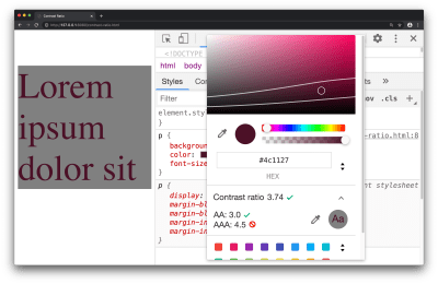
Contrast ratio in the color picker tool

Contrast ratio in the color picker tool (Large preview)

Available in the color picker tool, the contrast ratio feature can inform you on whether a minimum contrast requirement has been met. To access this feature:

Inspect a text element with the DevTools
Find the color property in the Styles pane, and click the small colored square to bring up the color picker tool
Click on the text which says ‘Contrast ratio’ which presents further information on this subject

The three ratios represent:

Your current contrast ratio
The minimum contrast ratio (AA)
The enhanced contrast ratio (AAA)

As an exercise for yourself: drag the circular color picker tool across the color spectrum and observe the points at which the minimum contrast and enhanced contrast ratios are satisfied.

This feature can also be reported to you through a Lighthouse Report, covered in Lighthouse section of this article.

Accessibility Inspector

This refers to a DevTools pane which lets you view various accessibility properties and ARIA information for DOM nodes.

ARIA refers to a collection of properties, typically used in HTML, which in turn makes your website more accessible to individuals of different abilities. It’s absolutely worth using on your own websites, but it does require understanding the fundamentals of web accessibility to ensure you’re using it in a way which will help your users.

For example consider the following piece of HTML:

<p class=”alert” role=”alert”>
That transaction was successful
</p>

An assistive device, such as a screen reader, can use the role="alert" property to announce such information to the user. The Accessibility pane within DevTools can cherry-pick such a property (role) and present it to you, so it’s clear what accessibility-related properties an element has.

Validating the information you see in this pane can help answer the question: “Am I coding accessibility incorrectly”, whether it’s syntactically or structurally, just keep in mind, applying accessibility techniques with the correct syntax, and having an accessible website, are two different things!
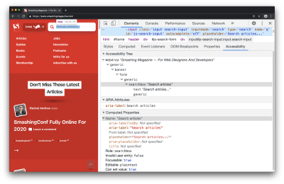
The accessibility pane in use on the Smashing Magazine website

The accessibility pane within the Elements Panel (Large preview)

To start using this, you can open up the Accessibility pane with an inspected element:

Inspect any element on the page, e.g. a hyperlink or search box
Open up the Accessibility pane which is found in the Elements Panel
Bonus tip: rather than having to locate the pane (it’s not open by default), I search for ‘Show Accessibility’ in the Command Menu (Cmd + Shift + P).

You’ll find a bunch of information here, such as:

An accessibility tree (a subset of the DOM tree)
ARIA attributes
Computed accessibility properties (e.g. is something focusable, is it editable, does it pass form validation)

Depending on the inspected element, some of this information may not be applicable, for example, maybe an element legitimately does not need ARIA attributes.

As with most features in DevTools, what you see in this pane is ‘live’ — changes you make in the Elements Panel DOM Tree are reflected back to this pane immediately, making it helpful for correcting a misspelled ARIA attribute for example.

If you’re confident in your use of Accessibility, possibly because you’re using an alternative automated testing tool such as axe, then you may not use this pane very often, and that’s okay.

If you’re interested in learning more while looking at real-world websites, I’ve made a 14-minute video on Accessibility debugging with Chrome DevTools.

Video on Accessibility debugging with Chrome DevTools

Lighthouse

Lighthouse is an automated website checker that can scan for best practices, accessibility, security, and more.

If you’ve done some reading on accessibility theory, and you want to learn how to effectively apply it to your own website, this is a great tool to use since it’s quite literally a point-and-click interface — no installation required. In addition, all of its audits are very instructional, informing you what failed, and why something failed.

Following the suggestions from this tool will almost certainly help improve the accessibility of your site.
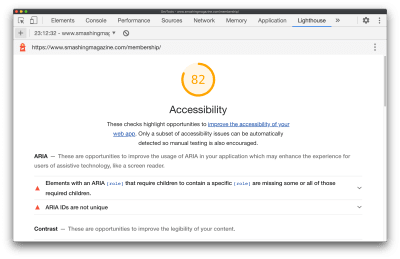
A Lighthouse audit report which shows a score of 82 for accessibility

A Lighthouse audit report (Large preview)

While checking for security, general web best practices, performance is helpful. Let’s focus on how to run an accessibility audit in Lighthouse:

Navigate to the Lighthouse panel in DevTools
Uncheck all categories, but keep ‘Accessibility’ checked
Click ‘Generate Report’
In the resulting report, click through the different suggestions to learn more about them
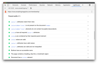
A Lighthouse audit report which shows 21 passed audits

Passed audits are still a good learning opportunity (Large preview)

If you want to learn more about Accessibility (I certainly do!), clicking through failed, but even passed audits are a great way to learn since almost each audit links off to dedicated web developer documentation on the audit itself, and why it’s important.

For the most part, the audit documentation pages are extremely succinct and I highly recommend them. Let’s take a look at the audit documentation for ensuring a <title> element is present. It specifies:

How the Lighthouse title audit fails
How to add a title
Tips for creating great titles
Example of a title not to use, along with a title worth using

And in the case of the document title documentation, it only took 300 words to explain those 4 points above.

One interesting thing to note, unlike the Accessibility pane, Lighthouse Audits are very instructional by default, making the Lighthouse panel a great place to visit when you’re just getting started out.

A single audit result which has been expanded to reveal more details

The ‘Learn more’ link opens a new window to well written documentation (Large preview)

As you become more advanced with building accessible pages, you may move away from pre-defined audits and spend more time in the accessibility pane.

Emulate Vision Deficiencies

This is a DevTools feature to apply vision deficiencies, such as blurred vision, to the current page.

“Globally, approximately 1 in 12 men (8%) and 1 in 200 women have color vision deficiencies.”

— Accessibility Requirements for People with Low Vision

You’ll want to use this feature to help ensure your website meets the needs of your users. If your website is displaying an important image, you may discover that this image is difficult to comprehend for someone with tritanopia (impaired blue and yellow vision), or is even difficult to comprehend for someone with blurred vision.

“Some low visual acuity can be corrected with glasses, contact lenses, or surgery — and some cannot. Therefore, some people will have blurry vision (low visual acuity) no matter what.”

— Accessibility Requirements for People with Low Vision

For example, in the case of an image, you may find that there is a higher resolution image available for download while emulating blurred vision via DevTools, rather than a user with blurred vision can use and in turn comprehend what the image is showing. This will require some design/UX based problem-solving skills — possibly from you/your colleagues — but it can be the difference between meeting the needs of your users, or not meeting their needs.

?️ Please note: The following image is partially blurred, to demonstrate the ‘Blurred vision’ emulation feature of DevTools.
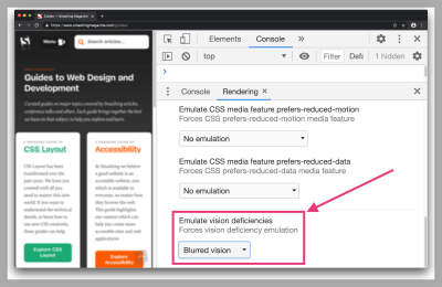
A demonstration of emulating blurred vision on the Smashing Magazine website. The feature is toggled on from the Rendering pane

Blurred vision doesn’t affect colors on the page, but the other deficiencies do (Large preview)

You can try this feature out with the following steps:

Open the Command Menu (Cmd + Shift + P or Ctrl + Shift + P on Windows)
Search for and select ‘Show rendering’
Select a vision deficiency such as ‘Blurred vision’ from the Emulate vision deficiencies section in the Rendering Pane.

Here are a few examples of vision deficiencies you can apply via DevTools:

Blurred vision
Where vision is less precise
Protanopia
Color blindness resulting from insensitivity to red light
Tritanopia
Impaired blue and yellow vision

Emulation features like this will not fully account for subtle differences in how such deficiencies manifest themselves with individuals, let alone the wide range of vision deficiencies out there. That being said, this feature can still help us as web developers with understanding and improving the accessibility of our pages.

Inspect Element Tooltip

This feature refers to an improved tooltip which now surfaces accessibility-related information when you use the ‘Inspect Element’ feature. It’s a subtle, yet still very important feature since it can inform you of how accessible elements are, at a quick glance.

I say it’s important because in the case of the four other features mentioned in this article, they require intentional action on our part (click the generate report button, navigate to the Accessibility pane, open the color picker tool, and so on). However, for this feature, it surfaces in one of the most common actions of DevTools while inspecting an element.

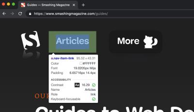
As a short challenge for yourself, take a look at the following two screenshots. They demonstrate the enhanced DevTools Inspect Element tooltip which now has an accessibility section on there. Can you identify what the properties in that section represent?
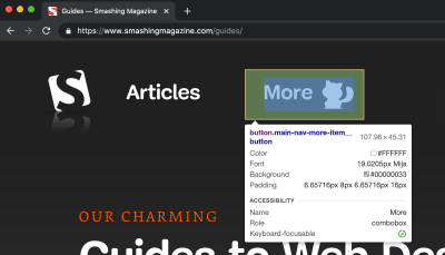
The Inspect Element tooltip appearing for an inspected button element. The tooltip shows various element properties, such as padding and role

(Large preview)

The Inspect Element tooltip appearing for an inspected anchor element. The tooltip shows various element properties, such as font, color, contrast ratio, and others

(Large preview)

You may notice that these are the exact same pieces of information we saw earlier — as part of the Contrast Ratio section and the Accessibility Inspector. They’re the same properties but surfaced in a (hopefully) simpler way.

Note: There’s also a “Keyboard-focusable” property in that tooltip (the very last item). This indicates whether or not the item is keyboard accessible. If true, this will typically suggest the element in question can be focussed by tabbing to it.

The way I see it: Inspect Element is an extremely common use case within browser DevTools, so cherry-picking useful accessibility-related properties for the Inspect Element tooltip can serve as a helpful reminder, and prompt us as web developers to investigate further and ensure what we’re building is accessible.

Conclusion

Web developer tooling to improve accessibility has improved rapidly over the years, but sometimes these tools are hidden away or simply undocumented. In this article, we explored some of those features which can hopefully help us when applying accessibility best practices to the websites we build.

Here’s a reminder of what we covered:

Contrast ratio
Check whether the inspected text element has a satisfactory contrast ratio.
Accessibility Inspector
View various accessibility properties and ARIA information.
Lighthouse
A website checker that covers best practices, accessibility, and more.
Emulate vision deficiencies
A tool to apply vision deficiencies (such as blurred vision) to the page.
Inspect Element Tooltip
An improved tooltip which surfaces accessibility-related information.

I make the Dev Tips mailing list if you want to keep up to date with over 200 web development tips! I also post loads of bonus web development resources on my Twitter.

That’s it for now! Thank you for reading.

Smashing Editorial
(ra, il)

SVG 101: What Is SVG?

Original Source: https://www.sitepoint.com/svg-101-what-is-svg/?utm_source=rss

Though it was conceived back in the late 1990s, SVG is in many ways the “ugly duckling” file format that grew up to become a swan. Poorly supported and largely ignored for most of the 2000s, since around 2017 all modern web browsers have been rendering SVG without serious issues, and most vector drawing programs have been offering the option to export SVG, which has unquestionably become a widely used graphic format on the Web.

This hasn’t happened by chance. Although traditional raster graphic file formats like JPGs and PNGs are perfect for photographs or very complex images, it turns out that SVG is the one graphic format that most closely meets current web development demands of scalability, responsiveness, interactivity, programmability, performance, and accessibility.

SVG 101 Header

So, What Is SVG and Why Should You Use It?

SVG is an eXtensible Markup Language (XML)-based vector graphic format for the Web and other environments. XML uses tags like HTML, although it’s stricter. You cannot, for example, omit a closing tag since this will make the file invalid and the SVG will not be rendered.

To give you a taste of what SVG code looks like, here’s how you would draw a white circle with a black border:

<circle cx=”100″ cy=”100″ r=”50″ stroke-width=”4″ stroke=”#000″ fill=”#fff” />

As you can see, under the hood, SVG documents are nothing more than simple plain text files that describe lines, curves, shapes, colors, and text. As it’s human-readable, easily understandable and modifiable, when embedded in an HTML document as an inline SVG, SVG code can be manipulated via CSS or JavaScript. This gives SVG a flexibility and versatility that can’t ever be matched by traditional PNG, GIF or JPG graphic formats.

SVG is a W3C standard, which means that it can inter-operate easily with other open standard languages and technologies including JavaScript, DOM, CSS, and HTML. As long as the W3C sets the global industry standards, it’s likely that SVG will continue to be the de facto standard for vector graphics in the browser.

The awesomeness of SVG is that it can solve many of the most vexing problems in modern web development. Let’s breeze through some of them.

Scalability and responsiveness

Under the hood, SVG uses shapes, numbers and coordinates rather than a pixel grid to render graphics in the browser, which makes it resolution-independent and infinitely scalable. If you think about it, the instructions for creating a circle are the same whether you’re using a pen or a skywriting plane. Only the scale changes.

With SVG, you can combine different shapes, paths and text elements to create all kinds of visuals, and you’ll be sure they’ll look clear and crisp at any size.

In contrast, raster-based formats like GIF, JPG, and PNG have fixed dimensions, which cause them to pixelate when they’re scaled. Although various responsive image techniques have proved valuable for pixel graphics, they’ll never be able to truly compete with SVG’s ability to scale indefinitely.

Programmability and interactivity

SVG is fully editable and scriptable. All kinds of animations and interactions can be added to an inline SVG graphic via CSS and/or JavaScript.

Accessibility

SVG files are text-based, so when embedded in a web page, they can be searched and indexed. This makes them accessible to screen readers, search engines and other devices.

Performance

One of the most important aspects impacting web performance is the size of the files used on a web page. SVG graphics are usually smaller in size compared to bitmap file formats.

Continue reading
SVG 101: What Is SVG?
on SitePoint.

17 Open Source Fonts You’ll Actually Love

Original Source: https://www.webdesignerdepot.com/2020/08/17-open-source-fonts-youll-actually-love/

The right typeface can make or break your website. As designers, we will always be naturally drawn towards the premium fonts such as Circular, DIN, or Maison Neue; Before you know it, your website is racking up a font bill larger than your hosting bill.

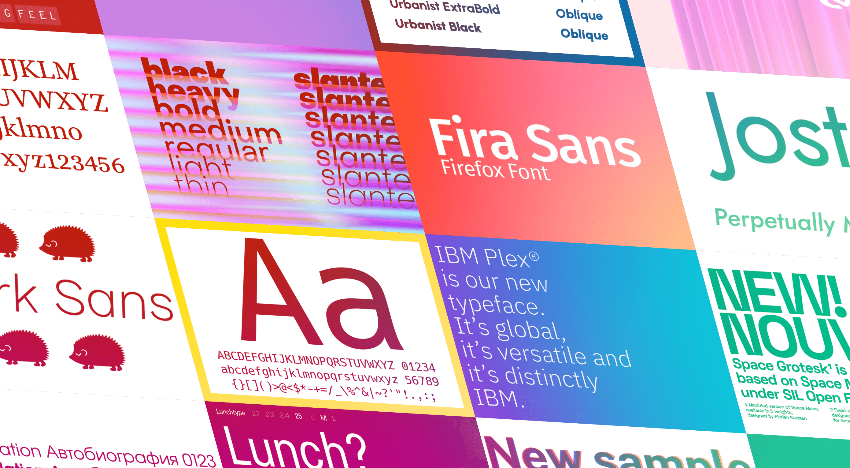
We’ve put together a list of open-source fonts that will rival your fancy fonts, and might even persuade you to switch them out. All the fonts listed here are completely open-source, which means they’re free to use on both personal and commercial projects.

Manrope

Manrope has sprung onto the font circuit in style, with a website better than most early startups. It’s a variable font, which means you have a flexible range of font weights to choose from in a single font file. Manrope is a personal favorite of mine, it has every ligature you could want, and is fully multi-lingual. It’s a lovely bit of everything as it states on the website: it is semi-condensed, semi-rounded, semi-geometric, semi-din, semi-grotesque.

Gidole

DIN – the font we all love, the font that looks great at every size, and the font that costs quite a bit, especially with a large amount of traffic. Gidole is here to save the day, it’s an open-source version of our favorite – DIN. It’s extremely close to DIN, but designers with a keen eye will spot very few minor differences. Overall, if you’re looking to use DIN, try Gidole out before going live. (There is also a very passionate community around the font on Github)

Inter

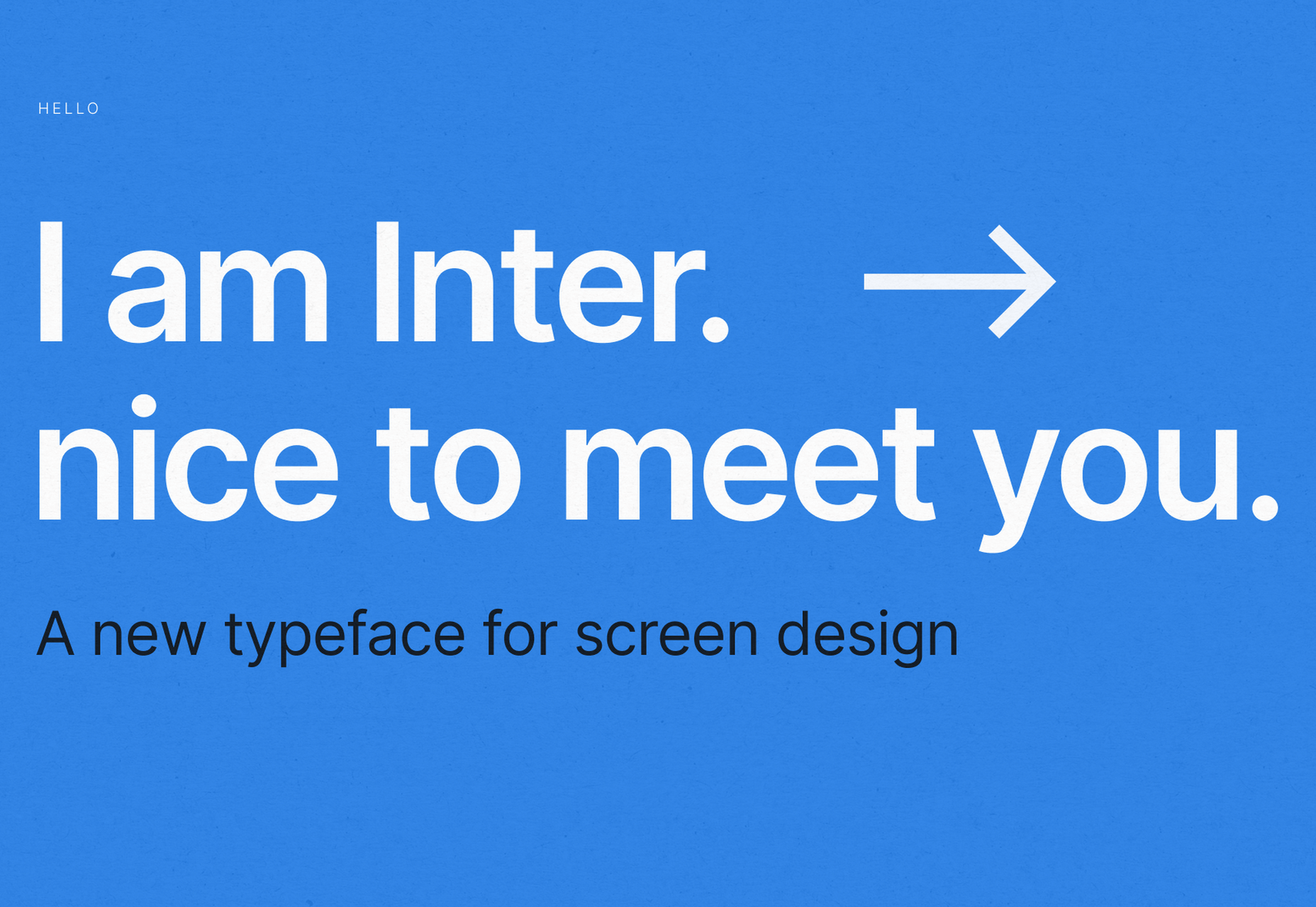
Inter is now extremely popular, but we wanted to include it as it’s become a staple in the open-source font world — excellent releases, constant updates, and great communication. If you’re looking for something a bit fancier than Helvetica and something more stable than San Francisco, then Inter is a great choice. The font has now even landed on Google Fonts, making it even easier to install. As of today: 2500+ Glyphs, Multilingual, 18 Styles, and 33 Features… do we need to say more?

Overpass

Overpass was created by Delvefonts and sponsored by Redhat, it was designed to be an alternative to the popular fonts Interstate and Highway Gothic. It’s recently cropped up on large ecommerce sites and is growing in popularity due to its large style set and ligature library. Did we mention it also has a monospace version? Overpass is available via Google Fonts, KeyCDN, and Font Library.

Public Sans

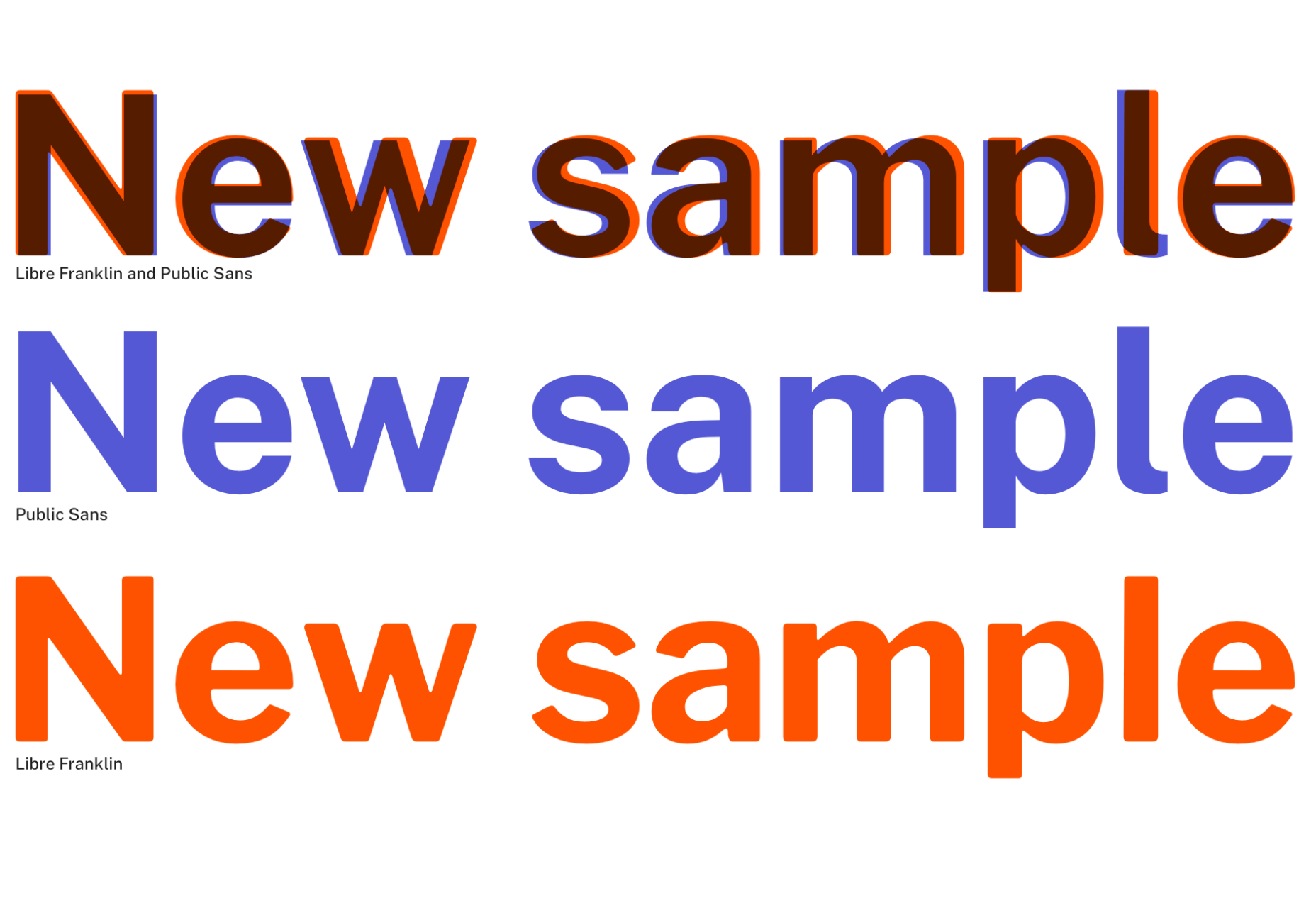
Public Sans is a project of the United States Government, it’s used widely on their own department websites and is part of their design system. The font is based on the popular open-source font Libre Franklin. Public Sans has great qualities such as multilingual support, a wide range of weights, and tabular figures. The font is also available in variable format but this is currently in the experimental phase of development.

Space Grotesk

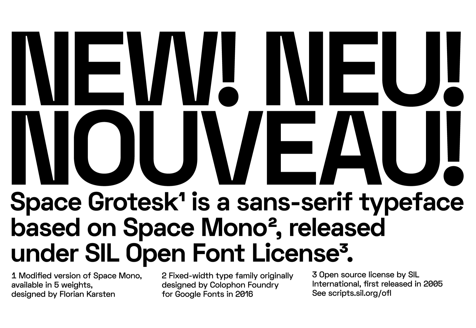
Space Grotesk isn’t widely known yet, but this quirky font should be at the forefront of your mind if you’re looking for something “less boring” than good old Helvetica. Space Grotesk has all the goodies you can expect from a commercial font such as multiple stylistic sets, tabular figures, accented characters, and multilingual support.

Alice

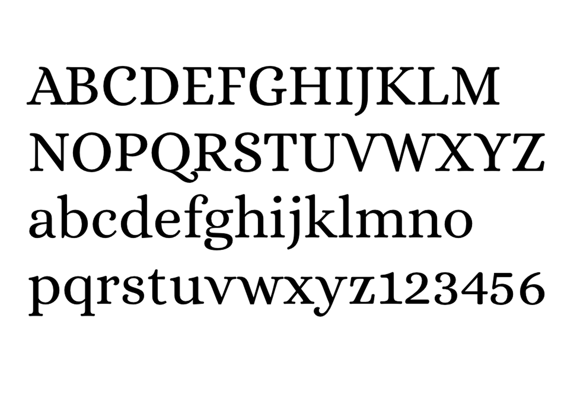
Alice is a quirky serif font usually described as eclectic and quaint, old-fashioned — perfect if you’re looking to build a website that needs a bit of sophistication. Unfortunately, it only has one weight, but it is available on Google Fonts.

Urbanist

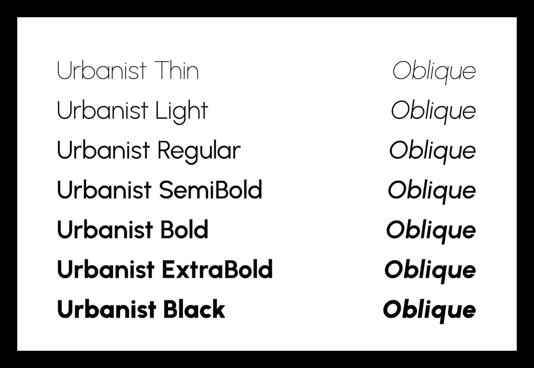
Urbanist is an open-source variable, geometric sans serif inspired by Modernist typography. Designed from elementary shapes, Urbanist carries intentional neutrality that grants its versatility across a variety of print and digital mediums. If you’re looking to replace the premium Sofia font, then Urbanist is your best bet.

Evolventa

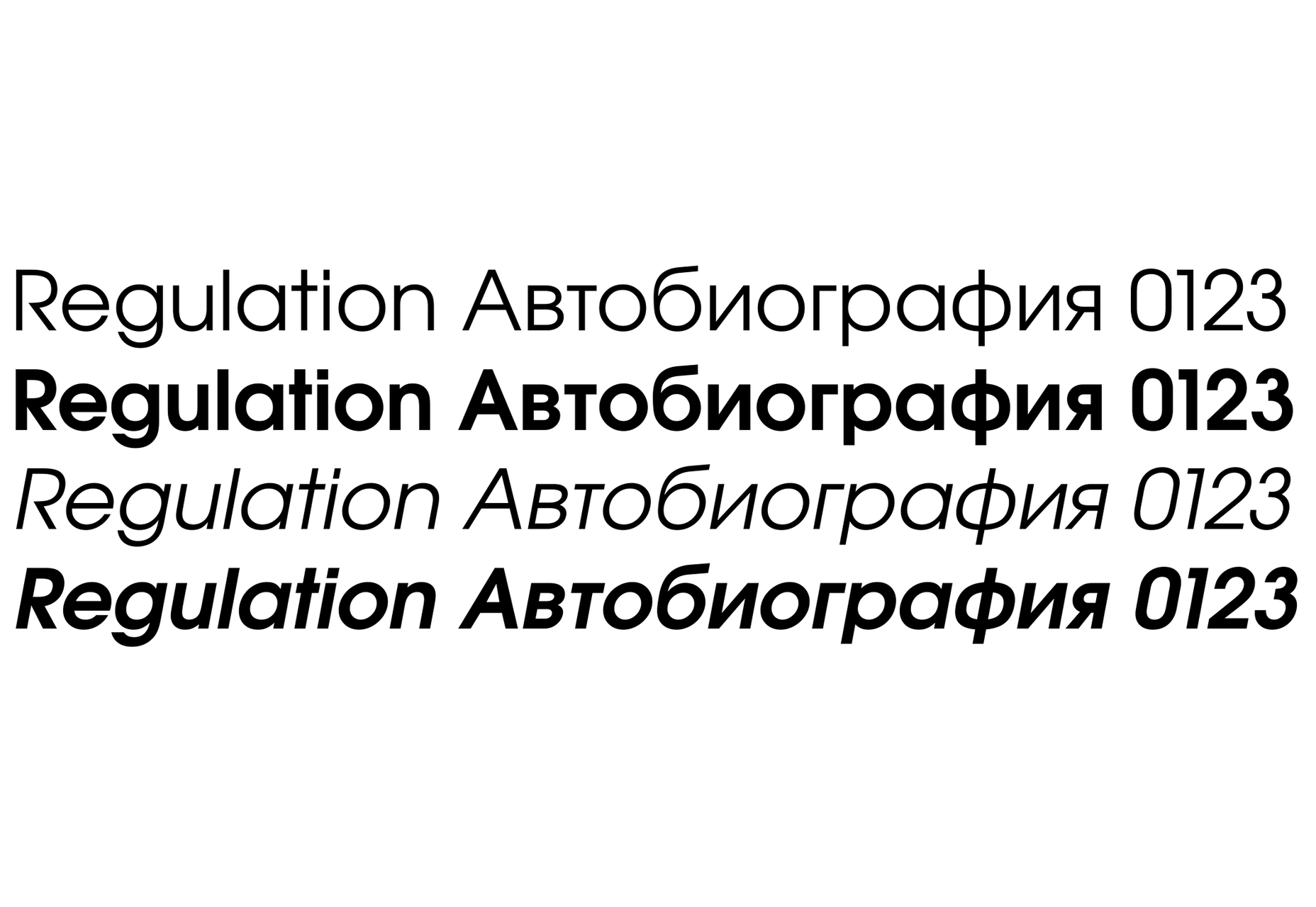
Evolventa is a Cyrillic extension of the open-source URW Gothic L font family. It has a familiar geometric sans-serif design and includes four faces. Evolventa is a small font family, generally used across the web for headlines and bold titles.

Fira Sans

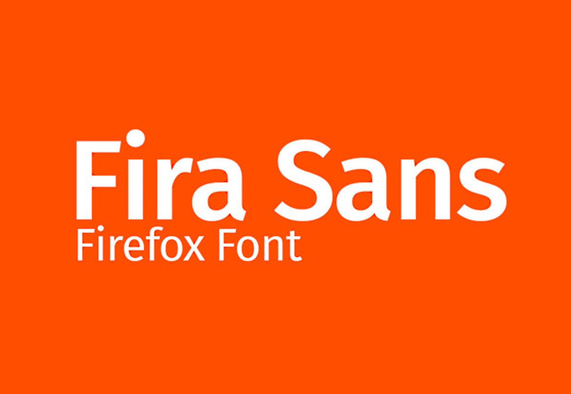
Fira Sans is a huge open source project, brought to you, and opened sourced by the same team that makes Firefox. It’s Firefox’s default browser font and the font they use on their website. The font is optimized for legibility on screens. (And it’s on Google Fonts!)

Hack

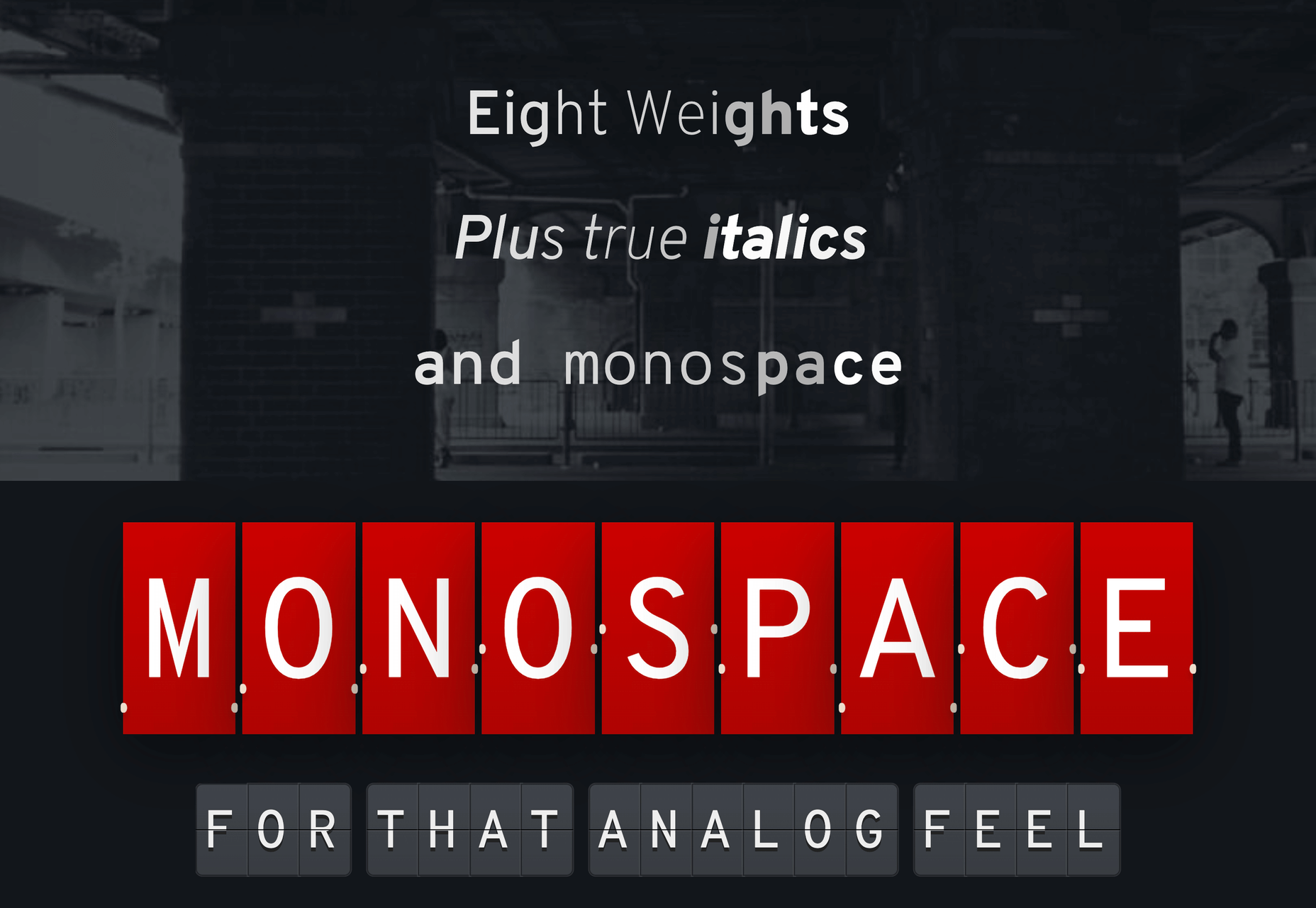
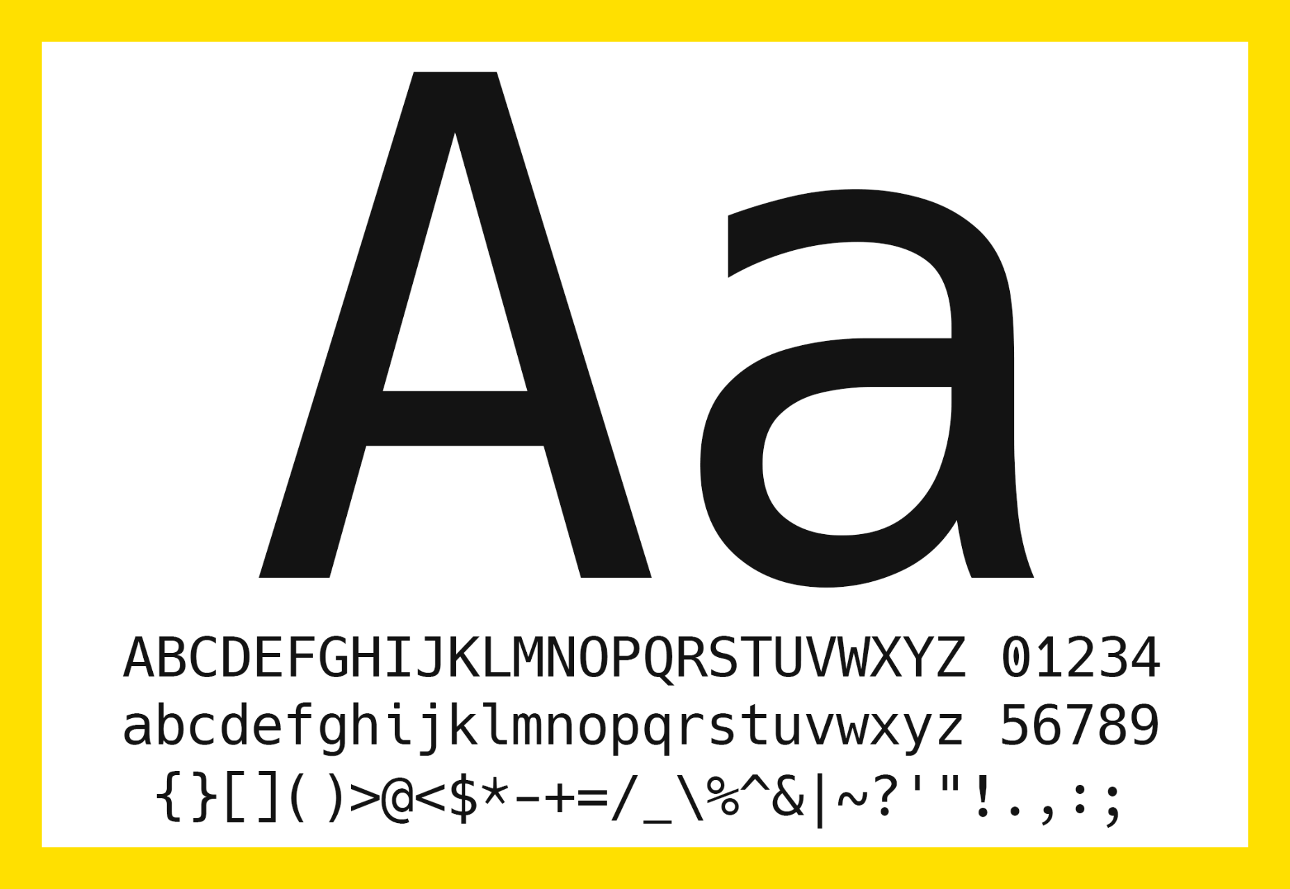
Building a development website, or need a great code font to style those pesky code-blocks? Then Hack is the font for you. Super lightweight and numerous symbols and ligatures. The whole font was designed for source code and even has a handy Windows installer.

IBM Plex

IBM needs no introduction. Plex is IBM’s default website font and is widely used around the web in its numerous formats Mono, Sans, Serif, Sans-Serif, and Condensed – it has everything you’d need from a full font-family. The whole font family is multi-lingual, perfect for multi-national website designs. (It’s fully open-source!)

Monoid

Another great coding font, Monoid is a favorite of mine for anything code. The clever thing about Monoid is that it has font-awesome built into it, which they call Monoisome. This means when writing code, you can pop a few icons in there easily. Monoid looks just as great when you’re after highly readable website body text.

Object Sans

Object Sans (formally known as Objectivity) is a beautiful geometric font family that can be used in place of quite a few premium fonts out there. The font brings together the top qualities of both Swiss neo-grotesks and geometric fonts. The font works beautifully as large headings but can be used for body content as well.

Lunchtype

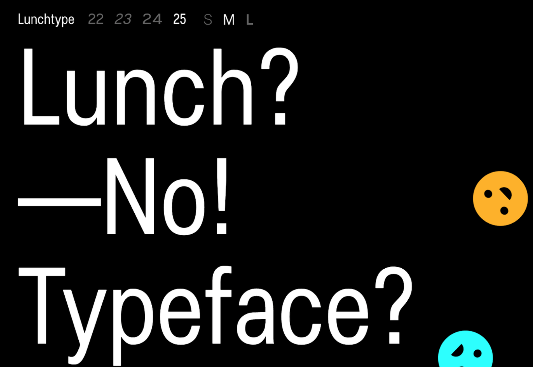
Lunchtype has a very interesting back-story, originally designed during the creator’s daily lunchtime during a 100-day project. If you’re looking for something a bit “jazzier” than the typical Helvetica for your project, then Lunchtype is a perfect choice. The family comes with numerous weights as well as a condensed version — enough to fill any lunchbox.

Jost

Inspired by the early 1920’s German sans-serif’s, Jost is a firm favorite in the open-source font world. Jost brings a twist to its closest web designer favorite Futura. When you want a change from the typical Futura, then Jost is a great option with its variable weighting as well as multilingual support.

Work Sans

Work Sans is a beautiful grotesk sans with numerous little eccentricities that may delight or annoy some designers. The font has variable weighting, multilingual support and is optimized for on-screen text use but works perfectly well for print also.

Source

p img {display:inline-block; margin-right:10px;}
.alignleft {float:left;}
p.showcase {clear:both;}
body#browserfriendly p, body#podcast p, div#emailbody p{margin:0;}

Choose Your Own Adventure with the Parsons Web Design and Development Certificate

Original Source: https://www.webdesignerdepot.com/2020/08/choose-your-own-adventure-with-the-parsons-web-design-and-development-certificate/

Many people dream of a career in web design, but it may actually be more attainable than you think.

There are countless online courses, of variable quality, with little to no academic structure; self-learning is an option, but it doesn’t come with a curriculum. Without a professional structure and a comprehensive curriculum your dream career might never be more than that.

But there is a practical, fast-track option to making a career in web design a reality, and that’s the Parsons Web Design and Development Certificate.

Built around the innovative teaching approach that Parsons is known for, you’ll learn human-centered design, explore the latest tools, evaluate techniques and approaches, and uncover the secrets of UX. The certificate even offers two distinct tracks, one for designers, and one for developers, so you can take control of your own future.

It’s one of the most creative approaches to a formal design education in the world, and what’s more, because it’s entirely online you can study from anywhere.

What Will I Learn?

Parsons offers a flexible curriculum to suit both designers and developers. There are two core courses, followed by three specialist courses.

learn human-centered design, explore the latest tools, evaluate techniques and approaches, and uncover the secrets of UX

The core courses cover the essentials of web and mobile design, plus JavaScript for designers. Each of the core courses lasts nine weeks. When you’ve completed them, you can opt for a design specialism or a development specialism. (You don’t have to make your choice until you’ve completed the core courses!)

If you prefer design work, you’ll spend a total of 21 further weeks learning mobile design patterns, studying emerging platforms, working with interactive typography, and mastering design systems.

If development is more your thing, then on the 21 week development track you’ll cover advanced HTML, CSS, and JavaScript, learn how to work with APIs, and finish up with experimental JavaScript.

To earn the Web Design and Development Certificate you need to complete the two core courses, plus three specialist courses within two years — a total of 39 weeks of study. Parsons recommend that you take two courses per semester, but it’s possible to complete the entire certificate program in one year.

Is This Really For Me?

Parsons Web Design and Development Certificate is a recognized qualification from a reputable institution that will stand you in good stead in future job interviews. But what’s more important, is the knowledge and experience you’ll gain from the course.

Thanks to the creative, flexible approach to learning, the certificate is suitable for designers and developers at any stage of their career

Thanks to the creative, flexible approach to learning, the certificate is suitable for designers and developers at any stage of their career.

If you’re just starting out, the certificate is a superb way of exploring the field, all the while building skills that will make you stand out to employers.

If you’re a print designer, or a programmer, the Web Design and Development Certificate is a great way to supplement your existing skills and make a lateral move into web work.
And if you’re a grizzled industry professional with decades of experience, you’ll benefit from the track you know least well; designers studying development, developers studying design. Not only will it open up new creative avenues to you, but you’ll find project management easier with a broader outlook on the web.
The best thing about the Parsons Web Design and Development Certificate is that because it’s made up of modules, you can still work part-time as you tick off the courses.

Why Choose Parsons?

Parsons College of Design is part of The New School, a New York-based university. Open Campus, the platform that will run the certificate, is the New School’s online system for pre-college, professional, and continuing education courses.

Thanks to Covid-19, most learning institutions are planning online-only courses for at least the next 12 months, so why not enroll in a program run by an institution that already excels at online teaching.

Innovative courses, underpinned by the creative approach to teaching that Parsons College of Design is renowned for, mean the design education you embark on this fall will be second to none.

Individual courses cost between $577 and $850, with the entire Web Design and Development Certificate costing just $3,704.


[– This is a sponsored post on behalf of Parsons College of Design –]

Source

p img {display:inline-block; margin-right:10px;}
.alignleft {float:left;}
p.showcase {clear:both;}
body#browserfriendly p, body#podcast p, div#emailbody p{margin:0;}

Build a Terminal Weather App in Deno

Original Source: https://www.sitepoint.com/build-a-terminal-weather-app-in-deno/?utm_source=rss

Build a Terminal Weather App in Deno

If you’ve been following along with our introductory articles on Deno, you’re probably interested in having a go at writing your first program. In this article, we’re going to walk through installing the Deno runtime, and creating a command-line weather program that will take a city name as an argument and return the weather forecast for the next 24 hours.

To write code for Deno, I’d highly recommend Visual Studio Code with the official Deno plugin. To make things a little more interesting, we’re going to be writing the app in TypeScript.

Installing Deno

Firstly, let’s get Deno installed locally so we can begin writing our script. The process is straightforward, as there are installer scripts for all three major operating systems.

Windows

On windows, you can install Deno from PowerShell:

iwr https://deno.land/x/install/install.ps1 -useb | iex

Linux

From the Linux terminal, you can use the following command:

curl -fsSL https://deno.land/x/install/install.sh | sh

macOS

On a Mac, Deno can be installed with Brew:

brew install deno

After installing

Once the install process is finished, you can check that Deno has been correctly installed by running the following command:

deno –version

You should now see something similar to this:

deno 1.2.0
v8 8.5.216
typescript 3.9.2

Let’s create a folder for our new project (inside your home folder, or wherever you like to keep your coding projects) and add an index.ts file:

mkdir weather-app
cd weather-app
code index.ts

Note: as I mentioned above, I’m using VS Code for this tutorial. If you’re using a different editor, replace the last line above.

Getting User Input

Our program is going to retrieve the weather forecast for a given city, so we’ll need to accept the city name as an argument when the program is run. Arguments supplied to a Deno script are available as Deno.args. Let’s log this variable out to the console to see how it works:

console.log(Deno.args);

Now run the script, with the following command:

deno run index.ts –city London

You should see the following output:

[ “–city”, “London” ]

Although we could parse this argument array ourselves, Deno’s standard library includes a module called flags that will take care of this for us. To use it, all we have to do is add an import statement to the top of our file:

import { parse } from “https://deno.land/std@0.61.0/flags/mod.ts”;

Note: the examples in the docs for standard library modules will give you an unversioned URL (such as https://deno.land/std/flags/mod.ts), which will always point to the latest version of the code. It’s good practice to specify a version in your imports, to ensure your program isn’t broken by future updates.*

Let’s use the imported function to parse the arguments array into something more useful:

const args = parse(Deno.args);

We’ll also change the script to log out our new args variable, to see what that looks like. So now your code should look like this:

import { parse } from “https://deno.land/std@0.61.0/flags/mod.ts”;

const args = parse(Deno.args);

console.log(args);

Now, if you run the script with the same argument as before, you should see the following output:

Download https://deno.land/std@0.61.0/flags/mod.ts
Download https://deno.land/std@0.61.0/_util/assert.ts
Check file:///home/njacques/code/weather-app/index.ts
{ _: [], city: “London” }

Whenever Deno runs a script, it checks for new import statements. Any remotely hosted imports are downloaded, compiled, and cached for future use. The parse function has provided us with an object, which has a city property containing our input.

Note: if you need to re-download the imports for a script for any reason, you can run deno cache –reload index.ts.

We should also add a check for the city argument, and quit the program with an error message if it’s not supplied:

if (args.city === undefined) {
console.error(“No city supplied”);
Deno.exit();
}

Continue reading
Build a Terminal Weather App in Deno
on SitePoint.

Collective #617

Original Source: http://feedproxy.google.com/~r/tympanus/~3/F3fFviHmVkM/

Collective 617 item image
Inspirational Website of the Week: Ali Ali

Sheer elegance and slickness combined with the right typography. Our pick this week.

Get inspired

Collective 617 item image
content-visibility: the new CSS property that boosts your rendering performance

Vladimir Levin and Una Kravets introduce a new CSS property that can be used to improve initial load time by skipping the rendering of offscreen content.

Read it

Collective 617 item image
Our Sponsor
Build websites with the most popular WordPress theme in the world

With the Divi Layout Packs you’ll get world-class designs ready to be used for your client projects.

Check it out

Collective 617 item image
Infinite Scroll without Layout Shifts

Addy Osmani looks at how patterns for loading long lists can impact the Core Web Vitals with some recommended fixes.

Read it

Collective 617 item image
Understanding Arrow Functions in JavaScript

Learn about the differences between traditional function expressions and arrow function expressions in this great guide by Tania Rascia.

Read it

Collective 617 item image
Simulating Object Collisions With Canvas

Josh Bradley’s tutorial on how to simulate object collisions as a way to learn the basics of HTML canvas and physics simulation.

Read it

Collective 617 item image
Online Workshops on Front-End & UX

Boost your design skills online and learn practical insights from experts in the industry, live. Use a friendly code CODROPS to save $50 off the price!

Check it out

Collective 617 item image
Take Me On

A beautiful immersive web experiment by Adam Kuhn.

Check it out

Collective 617 item image
#s3e32 ALL YOUR HTML, Particles on a sculpture

Yuri Artyukh’s great video tutorial where you’ll learn how to create a cool particle effect on a sculpture.

Watch it

Collective 617 item image
Modern CSS grid solutions to common layout problems

Learn how to overcome media-query fatigue by using CSS grid for responsive layouts. Kevin Pennekamp explores three useful layout implementations.

Check it out

Collective 617 item image
Tailwind CSS: From Side-Project Byproduct to Multi-Million Dollar Business

A great article about the story of Tailwind CSS by Adam Wathan.

Read it

Collective 617 item image
Three.js mesh modifiers

A Three.js mesh morph modifier, including nearly ten modifiers, such as Bend, Bloat, Noise, Skew, Taper and more.

Check it out

Collective 617 item image
Naming layout components

Andy Clarke shares why he’s not fond of frameworks and explains what approach he uses instead for designing layouts.

Read it

Collective 617 item image
r3f-bubbles

A very interesting react-three-fiber and drei demo.

Check it out

Collective 617 item image
Offline first with service workers and vanilla JS

The third article of a series on service workers by Chris Fernandi.

Read it

Collective 617 item image
Brick

Brick is a lightweight platform for creating small sites.

Check it out

Collective 617 item image
Developing and Deploying Micro-Frontends With Single-Spa

Tyler Hawkins shows how to develop an app composed of micro-frontends using single-spa and deploy it to Heroku.

Read it

Collective 617 item image
Drop-Shadow: The Underrated CSS Filter

Michelle Barker shows what you can do with drop-shadow, the CSS filter.

Read it

Collective 617 item image
Turning pages with CSS

Amit Sheen created this fun demo of a CSS book.

Check it out

Collective 617 item image
Optimizing CSS for faster page loads

Tomas Pustelnik shares how to impove loading times of a website by optimizing its CSS.

Read it

Collective 617 item image
blogit

A personal blog based on Github Pages and issues. By Dmitriy Derepko.

Check it out

Collective 617 item image
Digging Into the Flex Property

Ahmad Shadeed demystifies the flex property and shows how to use it.

Read it

Collective 617 item image
CSS Vocabulary

A nice visual explainer of CSS terms.

Check it out

Collective 617 item image
Papercups

Papercups is an open source live customer chat web app.

Check it out

Collective 617 item image
The Girl With A CSS Earring

Louise Flanagan created this CSS masterpiece.

Check it out

Collective 617 item image
How I Build Scalable Modern Web Applications for Real Users

An article that details the languages, libraries, and tools that Trey Huffine used to build Skilled.dev, a platform to prepare developers to succeed in coding interviews.

Read it

Collective 617 item image
RevKit

A free design system UI kit for Sketch App, Figma, and XD.

Check it out

Collective 617 item image
moment-guess

A utility package for guessing date formats.

Check it out

Collective 617 item image
From Our Blog
Magnetic Buttons

A small set of magnetic buttons with some fun hover animations. Inspired by the button animation seen on Cuberto.

Check it out

Collective 617 item image
UI Interactions & Animations Roundup #9

A fresh set of inspirational UI interactions and animations from the past couple of weeks.

Check it out

The post Collective #617 appeared first on Codrops.

Buy face masks in the UK: Why you should be wearing one, and where to get them

Original Source: http://feedproxy.google.com/~r/CreativeBloq/~3/3Pk40En3SqU/face-mask-uk

Following recent government announcements on face masks, you're probably eager to get yourself some quality face coverings, especially if you're going back to work. Well, here we've put together some essential information, and selected a range of trusted retailers who can provide you with the quality face masks you need. 

As of this week, it will be mandatory to wear face masks on any public transport in England, with anyone not doing so liable to a fine or refusal to board. Aside from public transport, UK government guidelines for face masks state 'people should aim to wear a face covering in enclosed spaces where social distancing is not always possible'. The bottom line is, wearing face masks will become more common, especially as lockdown continues to ease. 

But if you don't have one, don't worry – there are an increasing number of retailers that are producing them, and we've listed our favourites down below. If none of the designs listed take your fancy, check out our how to make a face mask article, which details three simple ways (two with no sewing required) to make a face mask at home. And parents can head over to our guide of where to buy kids' face masks.

Where to buy kids' face masks
Where to buy a face mask in the UK: quick links
Etsy.co.uk – artist face masks from just £3.99ASOS – fashionable designs at low prices Vistaprint – quality, stylish face masks for kids and adults from £13Ebay.co.uk – washable face masks at a bargain priceHYPE – get three face masks for £24.99 with 100% of profits to the NHSSamuel Johnston – Adult and kids' face masks for £5.99 (10% off first orders)Go Outdoors – get Buff face masks, which can also be used as a scarfCotswold Outdoor – get Buff's merino wool patterned face coveringWowcher – A mixture of kid and adult designs at super-low prices
Where to buy a face mask in the UK

The 20 best wireframe tools

Original Source: http://feedproxy.google.com/~r/CreativeBloq/~3/7D0ZuP5w-kk/top-wireframing-tools-11121302

Creating a website is made easier by using the best wireframe tools. They visually strip the product down and enable all involved to focus purely on user interactivity and functions. Wireframe tools will enable your clients to understand how your proposed app or website will work, much more comprehensively than simply explaining. Not having to rely on imagination to understand suggested functions lessens the room for error.

Finding those tools, however, can be an arduous process as there is now such a variety available, all offering different levels of functionality. We've found the best tools around right now to take the hard work out of it. 

If you want to create an app from scratch, our step-by-step tutorial on how to make an app will be just what you need.

Create the perfect website layout

Taking advantage of trial downloads or free software to find the one that fits in with the way you work is the best way of finding out which one is right for you. So here are our top wireframe tools choices. Enjoy…

01. Miro

Wireframe tools: Miro

Miro includes collaboration as well as wireframing tools

Platform: MacOS, iOS, WindowsPrice: From free / $8 (team)Download here

Miro is a collaboration system that creates a hub for remote teams to work within. With impressive tools such as an infinite whiteboard, widgets and prebuilt templates, it claims to standardise the digital workspace to make it feel like everyone is in the same room. 

It presents an entire toolkit for wireframing, user story or customer journey maps, as well as brainstorming processes. Miro also integrates with over 20 applications including Slack, Jira, Google Drive and Sketch, creating a seamless experience. With over two million users worldwide, it's definitely hitting the right mark.

02. Justinmind

Wireframe tools: Justinmind

Justinmind offers a library of UI elements and custom styling for use in your wireframes

Platform: Mac OS, WindowsPrice: $19/monthDownload here

Web-based Justinmind includes a library of UI elements, from buttons and forms to generics shapes and a range of widgets for iOS, SAP and Android. Custom styling is included, so you can add rounded corners, cropped images or colour gradients, or import graphics by dragging them into the browser. Prototypes can be exported as HTML.

03. Wireframe.cc

Wireframe tools: Wireframe cc

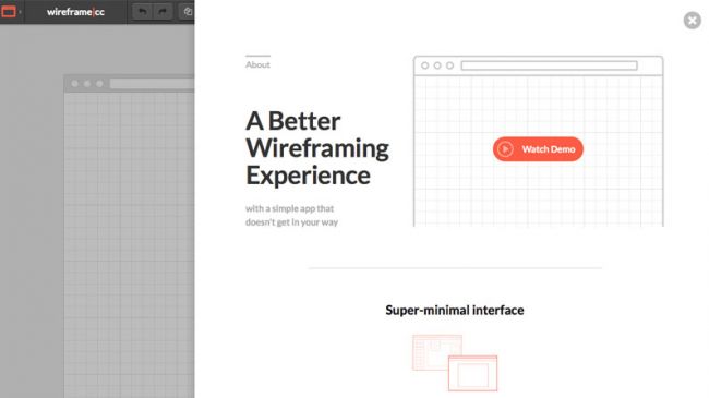
Wireframe.cc offers a clean, minimal interface

Platform: Web browserPrice: From free / $16 (solo) Download here

Wireframe.cc offers a simple interface for sketching your wireframes that eschews the toolbars and icons of a typical drawing app and has therefore made it to our best wireframe tools list.

There's a limited colour palette to help you avoid that particular avenue of procrastination, and UI elements are context-sensitive and only appear when you need them. Whether or not you enjoy this is a matter of personal taste.

04. Adobe Xd

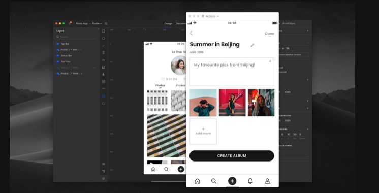
Wireframe tools: Adobe Xd

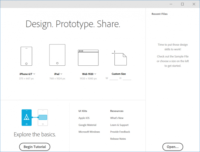
Adobe’s Xd is a powerhouse of wireframing and prototyping 

Platform: MacOS, WindowsPrice: From free to $19.99 per month as part of Adobe Creative CloudDownload here

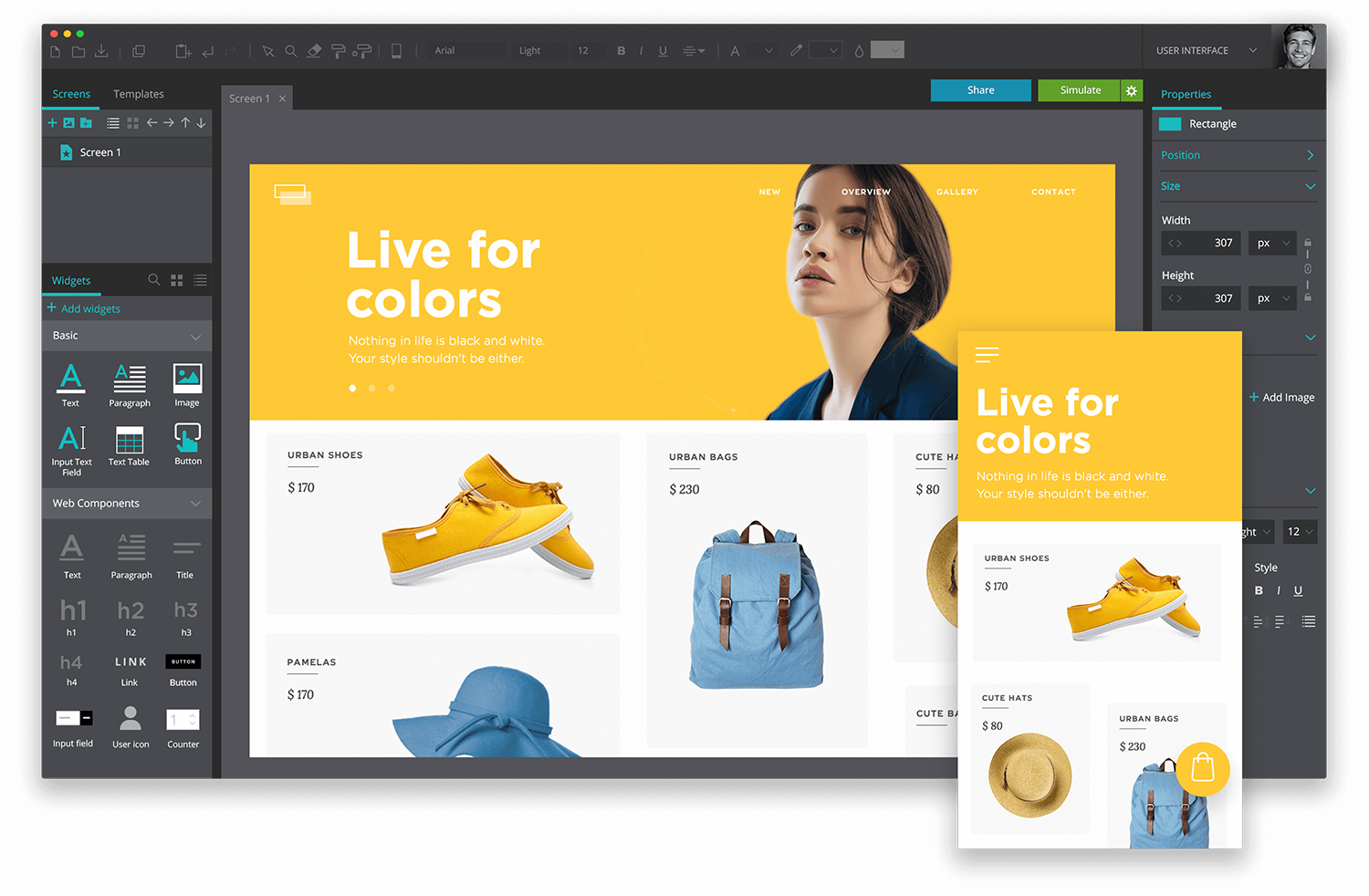
Adobe Xd allows you to wireframe as just part of its suite of prototyping tools, which takes you through the whole process of sketching wireframes; collaboration with your team; creating site maps, flowcharts and storyboards; building functional prototypes; and much more. You can try Adobe Xd out for free but as usual you need a Creative Cloud subscription to take full advantage of Xd's incredible smorgasbord of features.

05. UXPin

Wireframe tools: UXPin

Quick tutorials show you how to build advanced animations in the UXPin editor
Platform: Web browserPrice: From free (basic) / from $24 per user per month (premium)Download here

You can put together wireframes in UXPin at top speed by dragging and dropping custom elements. There are regularly updated libraries for Bootstrap, Foundation, iOS and Android, and your wireframes can be quickly converted to high-fidelity mockups. From there you can create fully interactive and animated prototypes of your final product. 

Alternatively, you can also start your designs in Photoshop CC or Sketch and import into UXPin for prototyping. To support the full UX process, you can then create and pin documentation to your prototypes and auto-generate specs and style guides for developers.

06. Fluid UI

Wireframe tools: Fluid

Each project generates a QR code you can scan to get the prototype working on your phone

Platform: Web browser and desktop client on Mac/Windows/Linux, plus Android/IOS app to preview designsPrice: From $8.25 (solo)Download here

Fluid UI has built-in libraries with over 2000 builti components for iOS, Android, Windows and more, and pages are created by dragging in elements from these libraries. 

This system provides a great way for you to map out your projects visually by creating links to join screens, forming a diagram of how everything fits together. Hovering over a link gives you the option to change the kind of transition you're using.

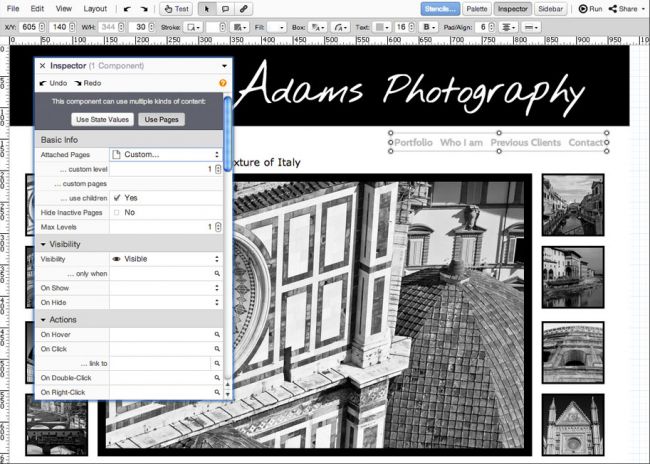
07. Balsamiq Mockups

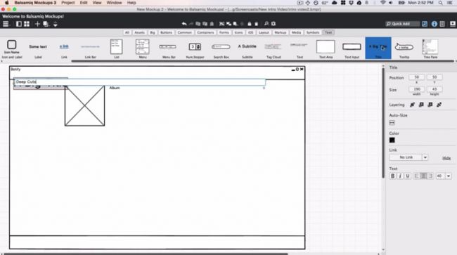
Wireframe tools: Balsamiq Mockups

Balsamiq Mockups aims to replicate the experience of sketching on a whiteboard
Platform: MacOS, Windows, web browserPrice: From $9 (2 projects) per monthDownload here

Balsamiq Mockups includes several drag-and-drop elements, from buttons to lists, each styled as a hand-drawing. The basic premise behind this wireframing tool is to keep the mock-ups 'intentionally rough and low fidelity', to encourage as much feedback as possible.

08. Axure RP

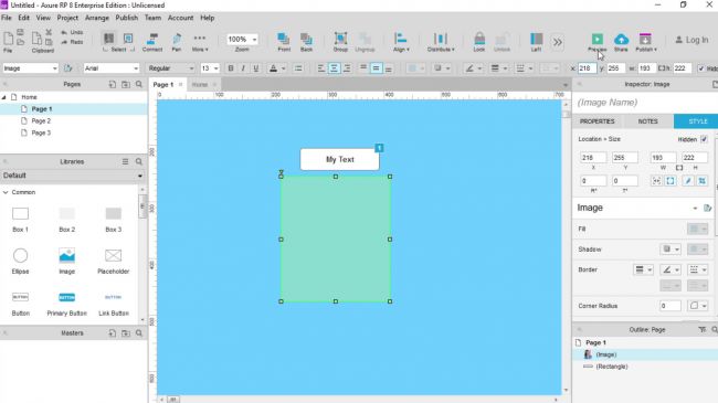
Wireframe tools: Axure RP

Axure RP lets you create interactive HTML mockups for websites and apps

Platform: MacOS, WindowsPrice: From $29 (pro) per user per monthDownload here

As well as creating mockups, Axure RP allows you to add functionality to your layout and create an interactive prototype. Features of this wireframing tool include sitemaps and various widgets in the form of various UI elements. 

Interactive HTML mockups (see more about website mockups here) can be created for both websites and apps, and you can even view your app design on your phone with a built-in share function.

09. Pidoco

Wireframe tools: Pidoco

Pidoco includes a handy library of drag-and-drop interface elements
Platform: Web browser and Android/IOS app to test prototypesPrice: From freeDownload here

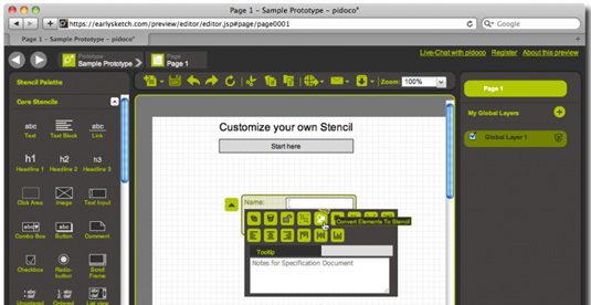
Pidoco is similar to Axure in that it includes library of various drag-and-drop interface elements, as well as the ability to add multiple pages and layers. 

Your prototypes can be shared online with clients, and includes functions for collaborative feedback and discussion. Viewing your prototypes on your phone is as easy as downloading the Pidoco app.

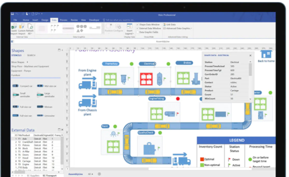
10. Visio

Wireframe tools: Visio

Visio’s interface will be familiar if you’re used to using Microsoft Word or Excel

Platform: WindowsPrice: $5 (simple) / $15 (pro) per user per monthDownload here

Viseo's real strength lies in technical diagrams rather than wireframing; however, for those already accustomed with other Microsoft apps such as Word or Excel, the interface will be very familiar. Although quite clunky, Viseo does offer add-on tools such as Swipr, which allows you to create and export a usable HTML prototype.

11. InDesign CC

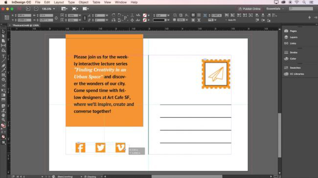
Wireframe tools: InDesign

InDesign lets you use animations and videos in your wireframes
Platform: MacOS, WindowsPrice: From $19.99/month as part of Adobe Creative CloudDownload here

By including animations, video and object states, InDesign can be used to create an interactive PDF that acts as a wireframe for your website or app. 

The software also includes the ability to create libraries of page elements, so you can create collections of various reusable interface graphics.

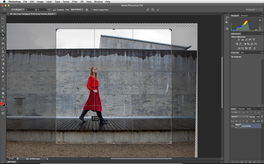
12. Photoshop CC

Wireframe tools: Photoshop CC

Never thought of Photoshop as a wireframing tool? Think again!
Platform: MacOS, WindowsPrice: From $19.99 per month as part of Adobe Creative CloudDownload here

Photoshop doesn’t offer libraries of interface elements, but for straightforward, fast wireframing, it is a very easy choice for designers. 

If you're familiar with Adobe products, it's simple to sketch out quick ideas, group various elements and layers, and build an effective wireframe. Check out our article Photoshop for web design: 20 pro tips for more.

Next page: More wireframe tools for designers

13. Protoshare

Wireframe tools: Protoshare

Protoshare puts the emphasis on online collaboration
Platform: Web browserPrice: From $29 (standard) per person per month (30 day free trial included as standard)Download here

Protoshare is an online tool with a focus on collaboration and sharing. It includes a library of drag-and-drop elements, a sitemap, and the ability to use custom CSS and insert your own elements. 

Due to the emphasis on online collaboration, unlike some other tools, it can't export as a PDF, however it is worth considering for its prototyping features.

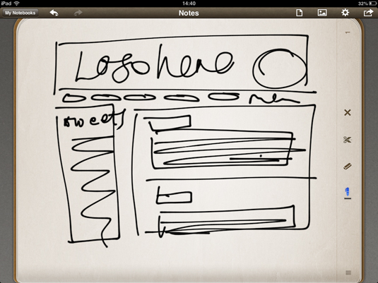
14. Penultimate

Wireframe tools: Penultimate

Wireframing for an iPad app? Then use an iPad tool!
Platform: iOS (iPad only)Price: FreeDownload here

If you're working purely for iPad design, sketching out ideas directly within the device itself is the perfect way to ensure you’re working to the right ratio and with well-sized active areas. 

With Penultimate from Evernote, sketches and ideas can be easily saved and sent to clients for approval.

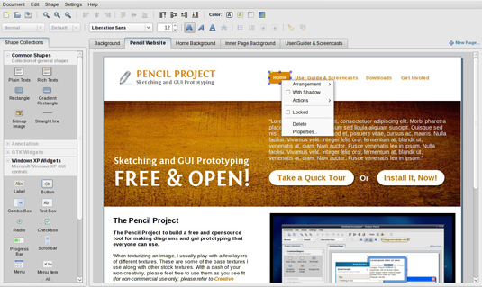
15. Pencil Project

Wireframe tools: Pencil Project

Pencil is free, open source and comes with a variety of templates
Platform: MacOS, Windows, LinuxPrice: FreeDownload here

Pencil is a free, open source wireframing tool available for Windows, Linux and Mac. Features include multi-page documents, external object import, as well as aligning, z-ordering, scaling and rotation. 

Various templates are included as well as the ability to export to HTML, PNG, Openoffice.org document, Word document, and PDF.

16. OmniGraffle
Platform: MacOS, iOSPrice: From $49.99 (standard iOS) Download here

OmniGraffle is effectively an ideas tool that enables you to quickly bash together website wireframes, diagrams, process charts or page layouts. 

You select a document type, and OmniGraffle makes context-sensitive joins between separate elements, automatically linking lines in diagrams and aligning shapes and elements in wireframes or page layouts.

17. Gliffy

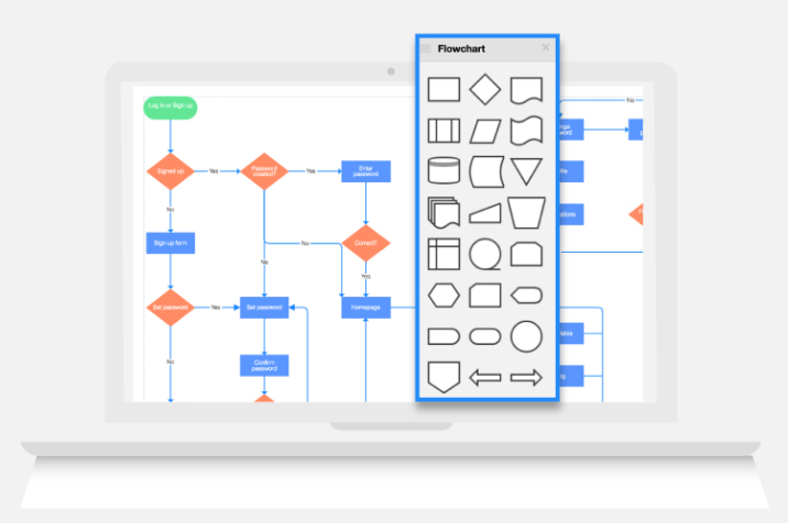
Wireframe tools: Gliffy

Gliffy aims to ‘make diagramming a team sport’
Platform: Web browserPrice: $4.99 (team) / $7.99 (personal) per user per monthDownload here

Gliffy is a tool that enables you to collaborate with other team members on flowcharts, network diagrams and more. It includes drag and drop components, online collaboration, image export and version tracking. 

18. MockFlow

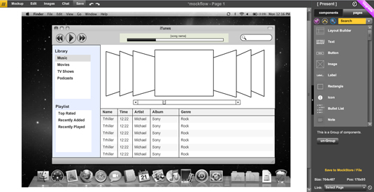
Wireframe tools: MockFlow

MockFlow is another great wireframe tool
Platform: Web browser/desktop app for Windows and MacPrice: From free (basic)Download here

Mockflow enables you to create working prototypes, and has an emphasis on collaboration and sharing. It includes features such as a sitemap creator for pages and folders, version tracking, image and component collections, chat, and HTML5 export.

19. HotGloo

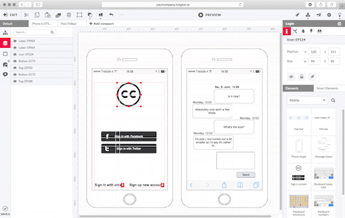
Wireframe tools: HotGloo

Wireframing tool HotGloo offers a rich range of features
Platform: Web browser/mobile optimised for testing and editingPrice: From $13 (4 users) (7 day trial included in all plans)Download here

HotGloo's prototyping alone offers a rich range of features that goes far beyond simple clickable buttons. For example, users can change displayed elements depending on whether or not a user is logged in.

20. Moqups

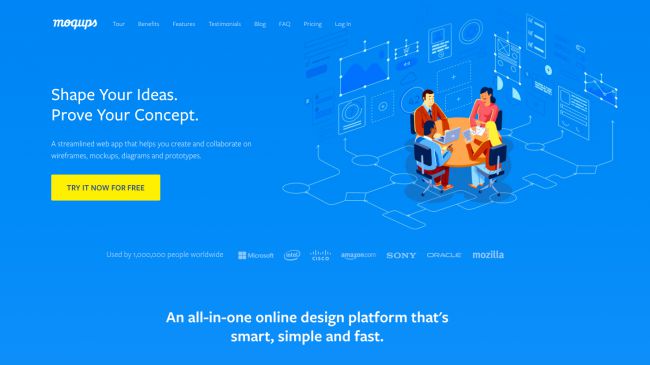
Wireframe tools: moqups

Work collaboratively on wireframes, mockups, prototypes and more

Platform: Web browserPrice: Free / €13 (personal) / €20-€149 (team) per monthDownload here

This tool is designed to take you through the whole process of roughly sketching your wireframes; collaborating on them with others; creating site maps, flowcharts and storyboards; and building functional prototypes. 

21. Pen and paper

Wireframe tools: Pen and paper

There’s nothing quicker than grabbing a pen and paper

Yes. An actual pen. And some real made-from-wood paper. OK, so these don’t allow you to make a prototype, and there are no built-in elements. But, if you feel more comfortable using a more traditional approach, why not get your ideas down on paper first and refine them in software later?

Related articles:

The best website builders in 202011 amazing graphical JavaScript frameworksWrite HTML code faster

Is Your Website Pleasant to Use?

Original Source: http://feedproxy.google.com/~r/Designrfix/~3/_F0wSEmHGDU/is-your-website-pleasant-to-use

Image Source: Pexel Using the internet means browzing various websites for important information. Or, if you’re one of those people who like to browse Youtube or play games finding what you’re looking for is just as important. Finding what you’re looking for doesn’t start with a Google search; you also need to navigate someone’s website […]

The post Is Your Website Pleasant to Use? appeared first on designrfix.com.