What Should You Do When A Web Design Trend Becomes Too Popular?
Original Source: https://www.smashingmagazine.com/2020/03/web-design-trend-popular/
What Should You Do When A Web Design Trend Becomes Too Popular?
What Should You Do When A Web Design Trend Becomes Too Popular?
Suzanne Scacca
2020-03-31T11:30:00+00:00
2020-03-31T21:06:37+00:00
I read an interesting article on Forbes recently about language saturation. Here’s the problem:
Consumers don’t always understand the technicalities of what businesses do or the solutions they’ve created for them. So, copywriters use jargon that translates something like “Internet-connected devices with computing capabilities” into “smartphones”, “smart watches” and “smart speakers”.
Some of these buzzwords spread like wildfire and it soon becomes impossible to find a brand or website that doesn’t use them. When that happens, the words — and the associated product or service — become meaningless in the minds of consumers because everyone is saying the same thing.
The same thing happens when design trends become too popular. This is something Vitaly Friedman talked about last year with regards to cookie consent notices and banner blindness.
But what choice do you have? Are you supposed to hop on the design bandwagon anyway so your website doesn’t get left behind? Today, we’re going to look at what your options are.
What Should You Do with Too-Popular Design Trends?
To be clear, I’m not suggesting that you ignore any and all rising design trends.
There are certain trends that we absolutely need to adopt across the board. Like minimalism and mobile-first design. When there’s substantial, quantifiable proof that a design technique is needed, please don’t ignore it.
What I’m talking about are design trends that aren’t aimed at strengthening the web. Instead, they’re solely about driving up engagement on websites.
Brutalism. Facebook Messenger pop-ups. Home page hero sliders. The second that popular websites begin to adopt these trends and once writers and designers start including them in design trend roundups, it’s only a matter of months before consumers are inundated with them. And this is when banner blindness kicks in.
So, what are your options when you learn about a new design trend that promises big results?
Option 1: Ignore It and Stick with What Works
There are a few reasons you should consider going with this option:
You work on short-term website projects.
For those of you who build websites, hand them over to clients and then wish them luck as you move onto the next, it’s probably not a good idea to play around with fad-like design trends.
You know how quickly design trends change, so why put your client in a position where they have a website with an outdated design? One of three things is going to happen:
They’ll leave the outdated feature as is and have no idea that it’s costing them conversions.
They’ll ask you for help in removing the feature not too long after launch and won’t be happy about needing a rework so soon.
They’ll ask another designer for help because they’re upset you put them in this less than ideal position.
Unless your client has a very good reason why they need to exploit a passing design trend, try to dissuade them from it. If they understand the fleeting nature of some of these trends, as well as how banner blindness develops from oversaturation, they should be onboard with you sticking to what works.
You’re designing (or redesigning) a site for a very well-established company.
When building a website for a company that has a long-standing reputation with its audience as well as a tried-and-true formula for success, adopting a passing trend could be risky.
Take Zillow, for example.
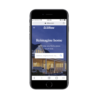
The homepage for Zillow on mobile (Image source: Zillow) (Large preview)
This is the mobile homepage as it stands today. It’s simple, sleek and intuitive by nature.
Can you imagine what would happen if the designer decided to add a video background to the hero banner? Or to interrupt the property browsing experience with a pop-up advertising a free ebook download?
You have to really think about what disruptions to the expected design would do to the flow of things. So, when building something for a brand that’s known for its consistency and convenience, it’s best to ignore passing trends.
This doesn’t mean that a website like this shouldn’t be redesigned. Like I said before, lasting design “trends” can’t be ignored as they enable us to move websites in the right direction (like responsive design). For example, this was Zillow in 2017:

The mobile homepage for the Zillow website in 2017 (Image source: Zillow) (Large preview)
See how far we’ve come in terms of making websites mobile responsive and mobile-first in just a few years? These are the kinds of popular changes that don’t require debating.
The company’s goal is to build relationships; not to increase sales.
I realize that every website needs conversions in order to survive. However, many business models can’t sustain with just one-off sales. It costs too much money to constantly market to new customers, which is why some businesses focus on building long-term relationships with their customer base.
And that’s why you need to steer clear of conversion-boosting design trends on these kinds of websites.
Take, for instance, Gary Vaynerchuk’s website:

The mobile website for Gary Vaynerchuk is free of passing design trends and elements. (Source: Gary Vaynerchuk) (Large preview)
Remember when every website seemed to have a pop-up containing two buttons — one of which would be super-positive like “Yes, I want to change my life!” and the other which was meant to shame the visitor with something like “No, I like living in squalor.”
How do you think Vaynerchuk’s always-growing loyal following would feel if the site displayed one of those pop-ups? Not only would they be annoyed by the disruption keeping them from the content, but they’d probably be upset that he’d use such a shameless ploy to bully them into signing up.
If the brand you’re building a website for is on a similar mission — to build long-lasting and meaningful relationships — you don’t want to sully that with bad design decisions.
Option 2: Adopt the Trend But Keep an Eye on Market Saturation
Patrick Ward, the author of the Forbes article mentioned above, explained that many writers in the fintech space have had to pivot towards a simpler style of writing:
“At first, new startups used jargon and buzzwords to highlight their brand new tech and give themselves a competitive edge.”
I think this is a good lesson for designers as well. It’s not always a bad thing to hop on a design trend’s bandwagon — especially if it’s proven to work and it’s still in the very early stages of public awareness.
So, while there are clear cases where it makes sense to avoid design fads, I think there are times when it makes sense to take advantage of them. The only thing is, you can’t just implement the design and then leave it be.
For instance, this is the 15 Finches website on desktop:
 A walk-through of the animation on the 15 Finches website on desktop. (Source: 15 Finches) (Large preview)
Now let’s compare this same animated experience to what users get on their mobile devices:
 A walk-through of the 15 Finches website on mobile with layering errors and no animation. (Source: 15 Finches)(Large preview)
There are a number of design choices made on this mobile site that should’ve been long phased out.
The vertical typography in the background should go. It might add texture to the desktop site, but it’s just a confusing distraction on mobile.
The animation on the desktop site doesn’t translate to mobile. To present visitors with a consistent experience, the designer should commit to mobile-first design.
There are also layering errors all over the mobile site, with text often covering other bits of text as well as missing call-to-action buttons.
As I said, there are some sites where it’s okay to adopt short-term design trends. Just keep an eye on them.
For example, the Hubspot site design is always changing, but any design trends it adopts never seem to overstay their welcome. Hubspot tends to cut out just before they become too much. And that’s a key thing to remember.
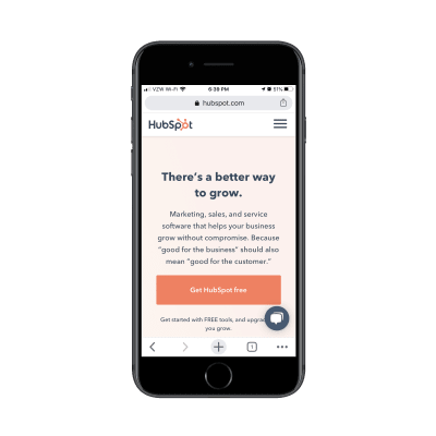
Hubspot’s mobile site continues to use a chatbot widget to guide prospective customers in the right direction. (Image ource: Hubspot) (Large preview)
As you can see, the mobile site still uses a chatbot widget. For a business that sells sales and marketing software, it’s an important element to retain even if other sites have since ditched theirs.
That said, I’m positive that Hubspot keeps close tabs on its user data so it probably has confirmation that the element continues to work well. This is just one of the things you should be mindful of when monitoring a trend.
If you want to utilize popular design trends, you need to be in it for the long haul with your clients. That way, the second you start to notice:
Oversaturation in the market,
The trend has gone completely stale,
Or your users aren’t responding positively to it.
You can immediately move the website to safer ground.
Option 3: Go in a Similar But Different Direction
When a design technique or element immediately and universally becomes popular, there’s more value to it than just its ability to increase conversions or create a prettier design.
Take a look at why it’s caught on the way it has. If you understand what’s driving the popularity of the fad, you can leverage the strongest parts of it, make it your own and have something with real staying power.
Do you remember the New York Times’ Snow Fall article in 2012? This was shortly after parallax scrolling started to pick up speed in web design. And despite some websites utilizing the trend, it was the way the NYT creatively integrated it along with interactive and animated images that really blew people away — so much so that it won a number of journalism awards for it.
Notice that the NYT didn’t try to redesign its website with parallax scrolling or interactivity. It took the basic principles gaining in popularity and applied it to one groundbreaking story. By considering how the trend could be best used for maximum impact, the NYT turned a short-term fad into something that would make its story memorable.
If you understand what’s driving the popularity of the fad, you can leverage the strongest parts of it, make it your own and have something with real staying power.
“
Let’s take a look at a more recent example of a site using this approach.
You’re all familiar with the trend of split-screen design, right? It worked really well on desktop, both in its static form as well as when one half of the screen would remain put while the other moved. But on mobile? It wasn’t so great.
While we’ve seen a lot of split screen designs get phased out, EngineThemes has made the trend its own:
 EngineThemes has put a playful twist on the once-trendy split screen design. (Source: EngineThemes) (Large preview)
Upon entering the site, it’s a look we’re familiar with as consumers. But it doesn’t take long to realize that this is going to be a different experience.
For starters, the bobbing bird and red double-headed arrow are something you don’t see much of, if at all, on other sites. I can’t imagine many visitors scroll past this banner without engaging with it.
Secondly, there are no words in this banner on mobile. (There are on the desktop website.)
One of the reasons why this design trend doesn’t work anymore is because it can’t be used on mobile sites — there just isn’t enough space to split the screen and fit enough words in there. Or is there?

EngineThemes has hidden a message in its animated, split screen graphic. (Image source: EngineThemes) (Large preview)
Eagle-eyed visitors will notice that there’s a message carefully hidden in the bird graphic when the arrow is moved to the right. Granted, the text should be bigger, but mobile visitors can zoom in if they’re struggling to read it.
It’s a string of code that reads:
“EngineThemes provides effective business solutions with simple and powerful WordPress app themes.”
But do you see what I mean? When a design trend suddenly becomes popular — for a short or long while, too — it doesn’t necessarily mean you need to use the same exact version of it like everyone else. This is why oversaturation quickly turns once great-looking websites stale.
By taking what’s so innovative about a design trend and making it your own, though, you can give the trend real staying power while making your site a standout in the process.
Wrapping Up
When we overdo it by leveraging the same design trends as everyone else, we put our websites at risk of becoming redundant or, worse, invisible. So, how do we establish a cutting edge if we can’t make use of design “jargon”?
The truth is, there’s no one clear-cut answer. You need to be able to read the room, so to speak, and figure out which approach is best for you. You could leave the passing trend alone, you could adopt it temporarily or you could make it your own.
Further Reading on SmashingMag:
What Does A Foldable Web Actually Mean?
Table Design Patterns On The Web
Designing The Perfect Slider
Bottom Navigation Pattern On Mobile Web Pages: A Better Alternative?

(ra, il)

 Since mankind first crawled out of its cave, looked at a block of stone, and wondered if it wouldn’t roll better if it were round, human beings have been looking at technology and trying to make it better.


 When the time has come to make some changes to your website-building toolkit there’s no shortage of tools or services you could use to smooth out your workflow, save money, add to website capabilities, or put bigger smiles on your clients’ faces.







 Have you ever heard of disaster recovery and business continuity? Basically, they’re processes that enable businesses to survive a crisis — no matter what it’s caused by: a natural disaster, economic downturn, personal emergency, or something else.

