Visual Studio Live Share Can Do That?

Original Source: https://www.smashingmagazine.com/2018/09/visual-studio-live/

Visual Studio Live Share Can Do That?

Visual Studio Live Share Can Do That?

Burke Holland

2018-09-19T13:30:17+02:00
2018-09-19T16:36:17+00:00

A few months ago, Microsoft released its free Visual Studio (VS) Live Share service. VS Live Share is Google Docs level collaboration for code. Multiple developers can collaborate on the same file at the same time without ever leaving their own editor.

After the release of Live Share, I realized that many of us have resigned ourselves to being isolated in our code and we’re not even aware that there are better ways to work with a service like VS Live Share. This is partly because we are stuck in old habits and partly because we just aren’t aware of what all VS Live Share can do. That last part I can help with!

In this article, we’ll go over the features and best practices for VS Live Share that make developer collaboration as easy as being an “Anonymous Hippo.”

list of anonymous animals in Google Docs

Google Docs has an interesting way of handling anonymous participants (Large preview)

Share Your Code

Live Share comes as an extension for both Visual Studio and Visual Studio Code (VS Code). In this article, we’re going to focus on VS Code.

vs code live share extension readme page

(Large preview)

You can also install it via the VS Live Share Extension Pack, which includes the following extensions, all of which we are going to cover in this article…

VS Live Share
VS Live Share Audio
Slack Chat extension

Front-end is messy and complicated these days. That’s why we publish articles, printed books and webinars with useful techniques to improve your work. Even better: Smashing Membership with a growing selection of front-end & UX goodies. So you get your work done, better and faster.

Explore Smashing Membership ↬

Smashing Cat, just preparing to do some magic stuff.

Once the extension is installed, you will need to log in to the VS Live Share service. You can do that by opening the Command Palette Ctrl/Cmd + Shift + P and select “Sign In With Browser”. If you don’t log in and you try and start a new sharing session, you will be prompted to log in at that time.
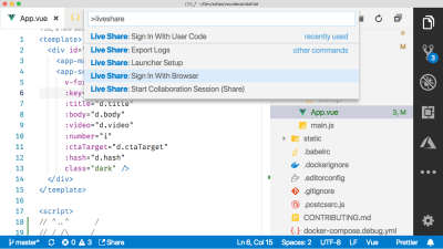
vs code command palette showing option to sign in with browser

Use the VS Code Command Palette to start a new Live Share session (Large preview)

There are several ways to kick off a VS Live Share session. You can do it from the Command Palette, you can click that “Share” button in the bottom toolbar, or you can use the VS Live Share explorer view in the Sidebar.
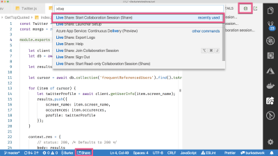
vs code with boxes drawn around the different parts of the UI that can be used to start a live share session

There are a myriad of ways to start a new VS Live Share session (Large preview)

A link is copied to your clipboard. You can then send that link to others, and they can join your Live Share session — provided they are using VS Code as well. Which, aren’t we all?

Now you can collaborate just like you were working on a regular old Word document:

The other person can not only see your code, but they can edit it, save it, execute it and even debug it. For you, they show up as a cursor with a name on it. You show up in their editor the same way.

The VS Live Share Explorer

The VS Live Share explorer shows up as a new icon in the Action Bar — which is that bar of icons on the far right of my screen (the far left of yours for default Action Bar placement). This is a sort of “ground zero” for everything VS Live Share. From here, you can start sessions, end them, share terminals, servers, and see who is connected.

vs live share viewlet

The VS Live Share Explorer is a heads-up view of all things Live Share (Large preview)

It’s a good idea to bind a keyboard shortcut to this VS Live Share Explorer view so that you can quickly toggle between that and your files. You can do this by pressing Ctrl/Cmd + K (or Ctrl/Cmd + S) and then searching for “Show Live Share”. I bound mine to Ctrl/Cmd + L, which doesn’t seem to be bound to anything else. I find this shortcut to be intuitive (L for Live Share) and easy to hit on the keyboard.

the keyboard binding screen in vs code with a binding created for the vs live share viewlet

You can create a binding for the VS Live Share Explorer viewlet (Large preview)

Share Code Read-Only

When you start a new sharing session, you will be notified thusly and asked if you would like to share your workspace read-only. If you select read-only, people will be able to see your code and follow your movements, but they will not be able to interact.
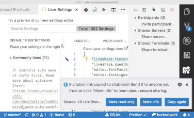
vs code notification prompting user to choose read-only sharing

Sharing sessions are read-write by default, but you can make them read-only (Large preview)

This mode is useful when you are sharing with someone that you don’t necessarily trust — maybe a vendor, partner or an estranged ex.

It’s also particularly useful for instructors. Note that at the time of this writing, VS Live Share is locked to 5 concurrent users. Since you probably are going to want more than that in read-only mode, especially if you’re teaching a group, you can up the limit to 30 by adding the following line to your User Settings file: Ctrl/Cmd + ,.

“liveshare.features”: “experimental”

Change The Default Join Behavior

Anyone with the link can join your Live Share session. When they join, you’ll see a pop-up letting you know. Likewise, when they disconnect, you get notified. This is the default behavior for VS Live Share.

vs code notification with the name of the person who has joined the live share session

VS Code will alert you whenever someone joins your session (Large preview)

It’s a good idea to change this so that you have to manually approve someone before they can join your session. This is to protect you in the case where you go to lunch and forget to disconnect your session. Your co-workers can’t log back in, change one letter in your database connection string and then laugh while you spend the next four hours trying to figure out how your life has gone so horribly wrong.

To enable this, add the following line to your User Settings file Ctrl/Cmd + ,.

“liveshare.guestApprovalRequired”: true

Now you’ll be prompted when someone wants to join. If you block someone, they are blocked for the duration of the session. If they try to join again, you won’t be notified and they will be unceremoniously rejected by VS Live Share.

Go and enjoy your lunch. Your computer is safe.

Focus Followers

By default, anyone who joins your Live Share session is “following” you. That means that their editor will load up whatever file you are in and scroll whenever you scroll. Even if you switch files, participants will see exactly what you see.

The second that a person makes changes to a file, they are no longer following you. So if you are both working on a file together, and then you go to a different file, they won’t automatically go with you. That can lead to a lot of confusion with you talking about code in the file you’re in while the other person is looking at something entirely different.

Besides just telling each other where you are (which works, btw), there is a handy command called “Focus Participants” that is in the Command Palette Ctrl/Cmd + Shift + P.

vs code command palette showing live share focus command

Access the “focus” command from the VS Code Command Palette (Large preview)

You can also access it as an icon in the VS Live Share Explorer view.

vs code live share explorer focus icon

Send a follow request by clicking the follow icon in the VS Live Share Explorer viewlet (Large preview)

This will focus your participants on the next thing you click on or scroll to. By default, VS Live Share focus requests are accepted implicitly. If you don’t want people to be able to focus you, you can add the following line to your User Settings file.

“liveshare.focusBehavior”: “prompt”

Also note that you can follow participants. If you click on their name in the VS Live Share Explorer view, you will begin to follow them.

Because following is turned off as soon as the other person begins editing code, it can be tough to know exactly when people are following you and when they aren’t. One place you can look is in the VS Live Share Explorer view. It will tell you the file that a person is in, but not whether or not they are following you.

A good practice is to just remember that focus is always changing so people may or may not see what you see at any given time.

Debug As A Team

Participants can share any debug sessions that you run. If you start a debug session, they will get the exact same experience that you do. If it breaks on your side, it breaks on theirs, and they get the full debug view into all of your code.

They can step in, out, over, add watches, evaluate in the Debug Console; any debugging that you can do, they can do too, and they can control it.

Debugging can also be launched by participants. Be default, though, VS Code does not allow your debugger to be started remotely. To enable this, add the following line to your User Settings file Ctrl/Cmd + ,:

“liveshare.allowGuestDebugControl”: true

Share Your Terminal

A lot of the work we do as developers isn’t in our code; it’s in the terminal. Some days it seems like I spend about as much time on my terminal as I do in my editor. This means that if you have an error on your terminal or need to type some command, it would be nice if your participants in VS Live Share can see your terminal in addition to your code.

VS Code has an integrated terminal, and you can share it with VS Live Share.

vs code command palette with share terminal selected

Access the “Share Terminal” command from the VS Code Command Palette (Large preview)

When you do this, you have the opportunity to share your terminal as read-only, or as read-write.

vs code prompting to share terminal as read-only or read-write

Always share your terminal read-only unless you absolutely have to share it with write access (Large preview)

By default, you should be sharing your terminal as read-only. When you share your terminal read-write, the user can execute arbitrary commands directly on your terminal. Let that sink in for a moment. That’s heavy.

It goes without saying that having remote write access to someone’s terminal comes with a lot of trust and responsibility. You should only ever share your terminal read-write with people that you trust implicitly. Estranged ex’s are probably off the table.

Sharing your terminal read-only safely allows the person on the other end of the line to see what you are typing and your terminal output in real time, but restricts them from typing anything into that terminal.

Should you find yourself in a scenario where it would be quicker for the other person to just get at your terminal instead of trying to walk you through some wacky command with a ton of flags, you can share your terminal read-write. In this mode, the other person has full remote access to your terminal. Choose your friends wisely.

Share Your localhost

In the video above, the terminal command ends with a link to a site running on http://localhost:8080. With VS Live Share, you can share that localhost so that the other person can access it just like it was their own localhost.

If you are running a shared debug session, when the participant hits that localhost URL on their end, it will break for both of you if a breakpoint is hit. Even better, you can share any TCP process. That means that you can share something like a database or a Redis cache. For instance, you could share your local Mongo DB server. Seriously! This means no more changing config files or trying to get a shared database up. Just share the port for your local Mongo DB instance.

Share The Right Files The Right Way

Sometimes you don’t want collaborators to see certain files. There are likely private keys and passwords in your project that are not checked into source control and not suitable for public viewing. In this case, you would want to hide those files from anyone participating in your Live Share session.

By default, VS Live Share will hide any file that is specified in your .gitignore. If there is a file that you want to hide, just add it to your .gitignore. Note though, that this only hides the file in the project view. If you are in a shared debugging session and you step into a file that is in the .gitignore, it is still loaded up in the editor and your collaborators will be able to see it.

You can get more fine-grained control over how you share files by creating a .vsls.json file.

For instance, if you wanted to make sure that any files that are in the .gitignore are never visible, even during debugging, you can set the gitignore property to exclude.

{
“$schema”: “http://json.schemastore.org/vsls”,
“gitignore”:”exclude”
}

Likewise, you could show everything in your .gitignore and control file visibilty directly from the .vsls.json file. To do that, set the gitignore to none and then use the excludeFiles and hideFiles properties. Remember — exclude means never visible, and hide means “not visible in the file explorer.”

{
“$schema”: “http://json.schemastore.org/vsls”,
“gitignore”:”none”,
“excludeFiles”:[
“*.env”
],
“hideFiles”: [
“dist”
]
}

Sharing And Extensions

Part of the appeal of VS Code to a lot of developers is the massive extensions marketplace. Most people will have more than a few installed. It’s important to understand how extensions will work, or not work, in the context of VS Live Share.

VS Live Share will synchronize anything that is specific to the context of the project you are sharing. For instance, if you have the Vetur extension installed because you are working with a Vue project, it will be shared across to any participants — regardless of whether or not they have it installed as well. The same is true for other context-specific things, like linters, formatters, debuggers, and language services.

VS Live Share does not synchronize extensions that are user specific. These would be things like themes, icons, keyboard bindings, and so on. As a general rule of thumb, VS Live Share shares your context, not your screen. You can consult the official docs article on this subject for a more in-depth explanation of what extensions you can expect to be shared.

Communicate While You Collaborate

One of the first things people do on their inaugural VS Live Share experience is to try to communicate by typing in code comments. This seems like the write (get it?) thing to do, but not really how VS Live Share was designed to be used.

VS Live Share is not meant to replace your chat client of choice. You likely already have a preferred chat mechanism, and VS Live Share assumes that you will continue to use that.

If you’re already using Slack, there is a VS Code extension called Slack Chat. This extension is still a tad early in its development, but it looks quite promising. It puts VS Code in split mode and embeds Slack on the right-hand side. Even better, you can start a Live Share session directly from the Slack chat.
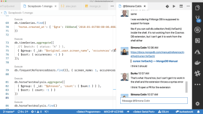
vs code slack chat extension

The Slack Chat extension puts Slack inside of your editor (Large preview)

Another tool that looks quite interesting is called CodeStream.

CodeStream

While VS Live Share looks to improve collaboration from the editor, CodeStream is aiming to solve that same problem from a chat perspective.

The CodeStream extension allows you to chat directly within VS Code and those chats become part of your code history. You can highlight a chunk of code to discuss and it goes directly into the chat so there is context for your comments. These comments are then saved as part of your Git repo. They also show up in your code as little comment icons, and these comments will show up no matter which branch you are on.

When it comes to VS Live Share, CodeStream offers a complimentary set of features. You can start new sessions directly from the chat pane, as well as by clicking on an avatar. New sessions automatically create a corresponding chat channel that you can persist with the code, or dispose of when you are done.

If chatting isn’t enough to get the job done, and you need to collaborate like it’s 1999, help is just a phone call away.

VS Live Share Audio

While VS Live Share isn’t trying to reinvent chat, it does re-invent your telephone. Kind of.

With the VS Live Share Audio extension, you can call someone directly and do voice chat from within VS Code.

vs code command palette showing start audio call option

Make audio calls from VS Code using the VS Live Share Audio extension (Large preview)

The other person will then get a prompt to join your call.

vs code notification asking if you would like to join the audio call

VS Code will ask you if you want to join an audio call that is in process (Large preview)

You will see a speaker icon in the bottom status bar when you are connected to a call. You can click on that speaker to change your audio device, mute yourself, or disconnect from the call.

vs code options showing options like mute and disconnect for live share audio extension

You have full control over audio settings when in a VS Live Share Audio call (Large preview)

The last tip I’ll give you is probably the most important, and it’s not a fancy feature or obscure setting you didn’t know existed.

Change Your Muscle Memory

We’ve got years of learned behavior when it comes to getting help or sharing our code. The state of developer collaboration tools has been so bad for so long that we are conditioned to paste code into Slack, start an awkward Skype calls that consist mostly of “tell me when you can see my screen”, or crowd around a monitor and point excessively, i.e. stock photo style.

a group of people pointing at a computer screen

(Large preview)

The most important thing you can do to get the most out of VS Live Share is to actually use VS Live Share. And it will have to be a “conscious” effort.

Your brain is good at patterns. You are constantly recognizing and classifying the world around you based on patterns you have identified, and you are so good at it, you don’t even realize you are doing it. You then develop default responses to these patterns. You form instincts. This is why you will default to the old ways of collaboration without even thinking about what you are doing. Before you know it you will be on a Skype call with someone sharing your screen — even if you have Live Share installed.

I’ve written a lot about VS Code and people will ask me from time to time how they can get more productive with their editor. I always say the same thing: the next time you reach for the mouse to do something, stop. Can you do that something with the keyboard instead? You probably can. Look up the shortcut and then make yourself use it. At first it’s going to be slower, but if you are willing to deliberately adopt a different behavior, you will be astonished at how fast your brain will default to the more productive way of doing something.

The same goes for Live Share. You will be on a call sharing your screen when it occurs to you that you could be using Live Share. At that moment, stop; click that “Share” button in the bottom of VS Code.

Yes, the person on the other end may not have the extension installed. Yes, it may take a moment to set it up. But if you work on establishing this behavior now, the next time you go to do this, it will “just work” and it won’t be long before you don’t even have to think about it, and at that point, you will finally have achieved that “Anonymous Hippo” level of collaboration.

More Resources

VS Live Share Extension Pack
VS Code Live Share Docs
Extensions and Ecosystem Support
Getting Started With VS Live Share

Smashing Editorial
(rb, ra, il)

20 Freshest Web Designs, September 2018

Original Source: https://www.webdesignerdepot.com/2018/09/20-freshest-web-designs-september-2018/

Welcome to our roundup of the best websites launched (or relaunched with major updates) in the last four weeks. September marks the beginning of Fall in the northern hemisphere, and reflecting that change, we’re seeing fewer light, airy, minimal designs, and more rich, warm, comforting designs.
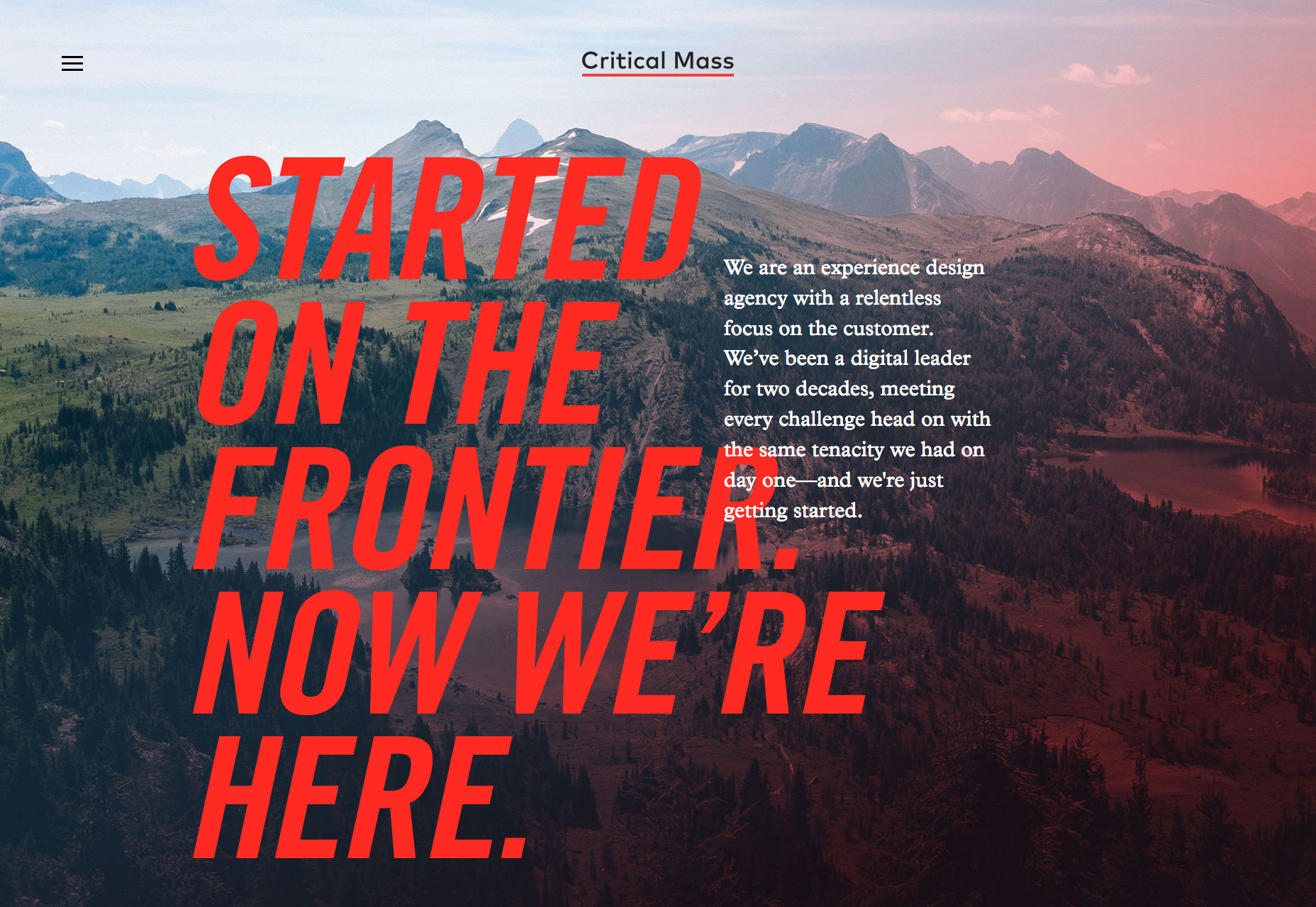
There’s been a flood of new design agency sites, and a ton of new season fashion sites launched this month—we’ve included the best. You’ll also find some great photography and lots for lovers of typography. Enjoy!

Critical Mass

Critical Mass is one of those design agencies you’d just love to work for. Their new site is a homage to themselves, telling a success story from their roots in Calgary, to 11 different offices around the world, with some exceptional work along the way.

Genesis

Genesis is a London eatery specializing in organic, healthy food. Their site is ever so slightly bizarre. Entirely black and white, with mystic-inspired illustrations, the site definitely makes me want to eat there, at least once.

Libratone

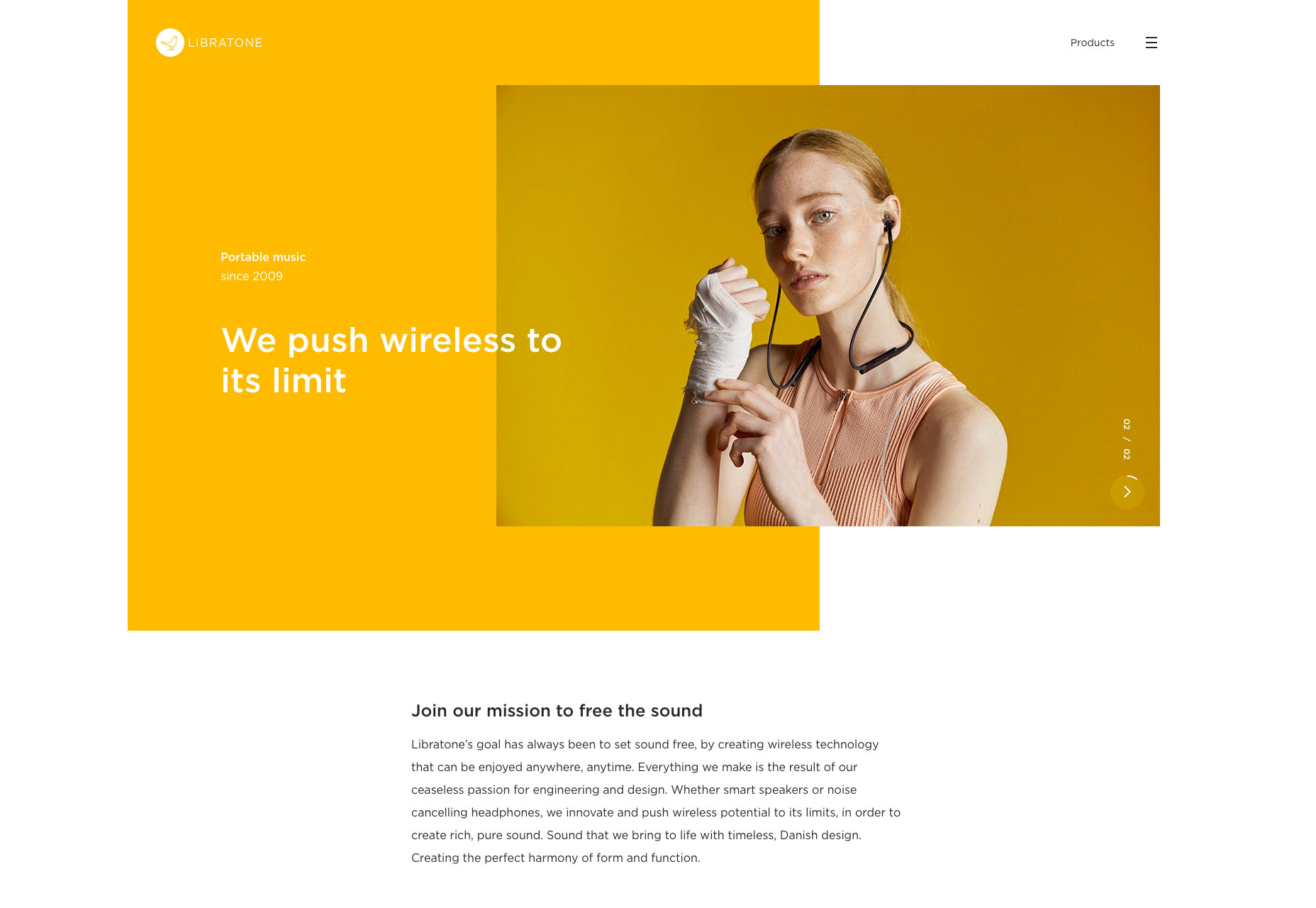
With bold color blocking, an unconventional grid, and one of the more interesting slideshows you’ll see, Libratone’s site is walking the walk by exuding confidence, sophistication, and a sense of freedom. A great site the perfectly encapsulates its brand identity.

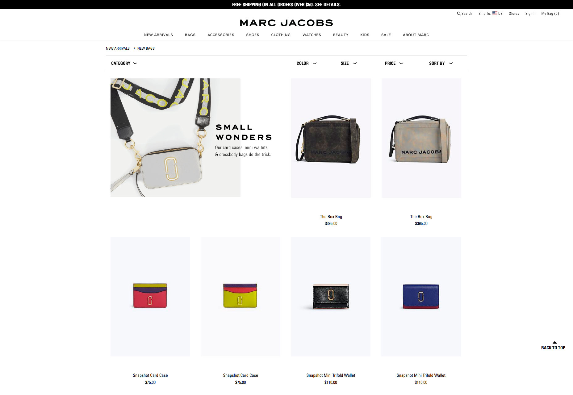
Marc Jacobs

Marc Jacobs is one of the world’s most productive fashion labels, selling a dizzying array of products through this site. Despite the vast range of goods, there’s still time for careful details if you look, check out the animated bag for example.

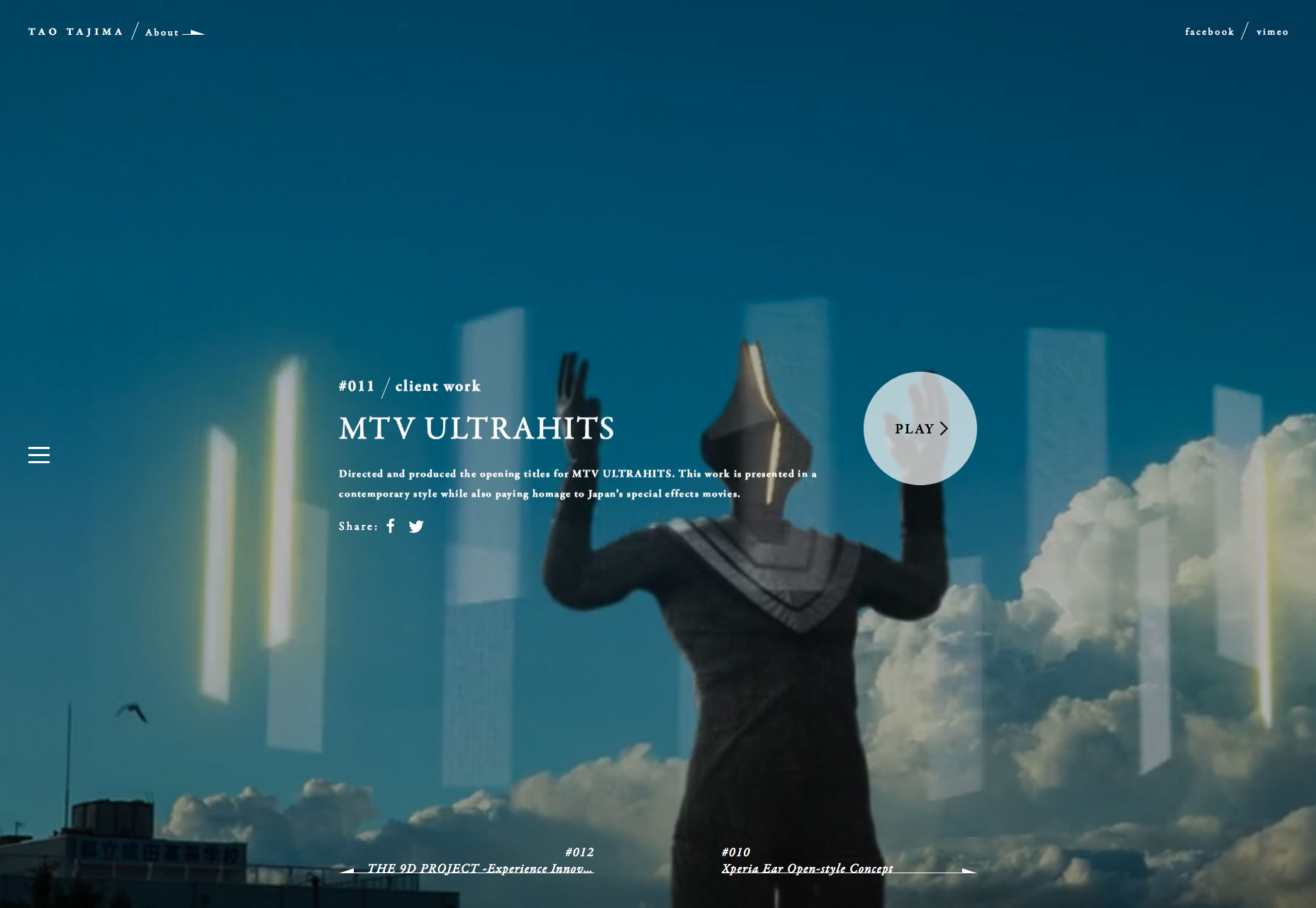
Tao Tajima

Filmmaker Tao Tajima’s site features fullscreen clips of his work. What makes this site stand out is the liquid-style transition that segues between projects as you scroll. The way the video flexes is a magical effect perfectly in keeping with Tajima’s work.

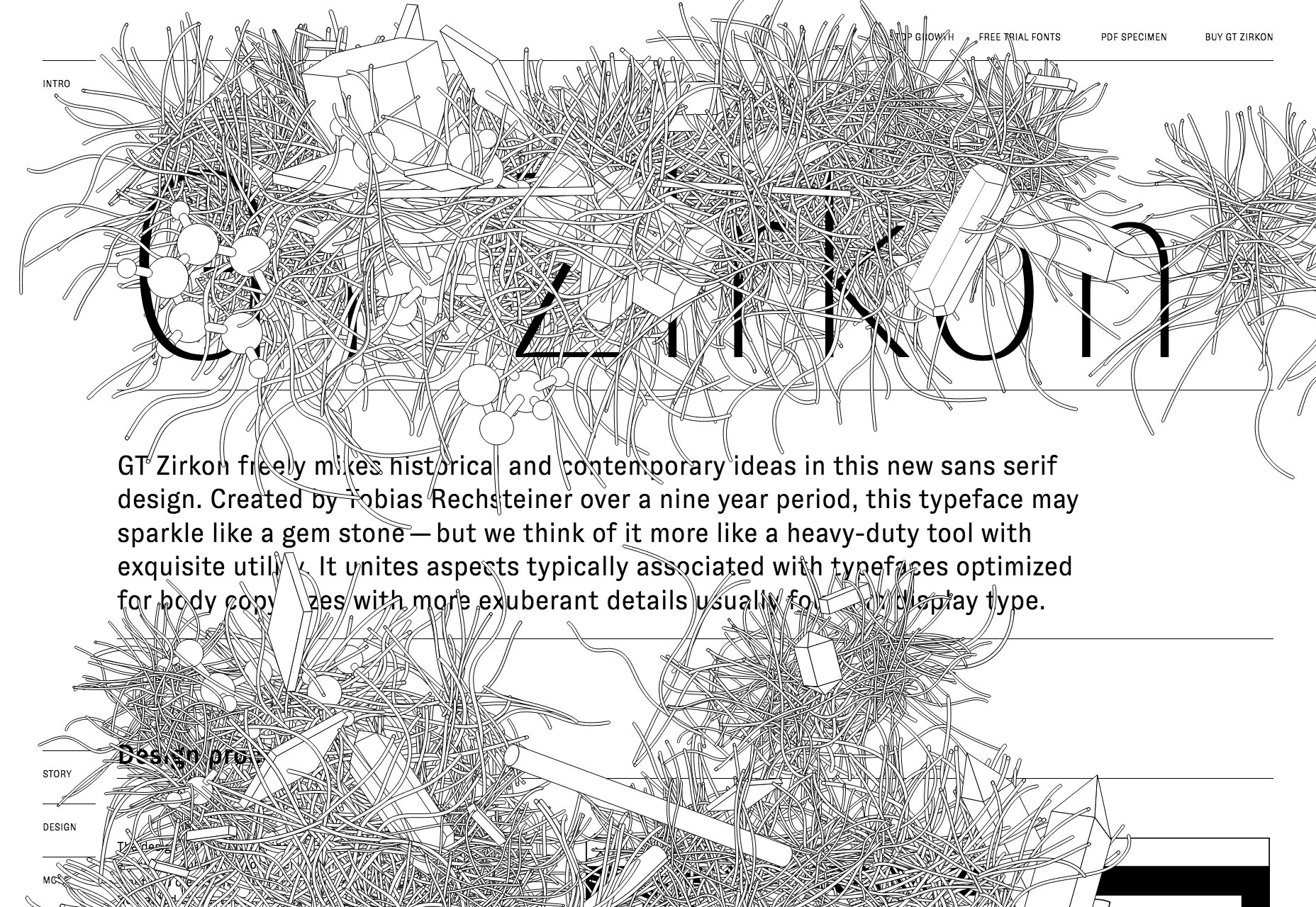
GT Zirkon

Following the fashion for typefaces to get their own websites, GT Zirkon is a fantastic deep-dive into the design features of this sans-serif typeface. Entirely black and white, the animated noodle details continue to grow, creating a unique sense of time.

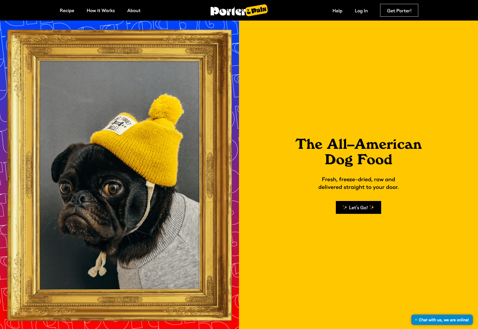
Porter & Pals

Feeding our dogs a healthy diet is super important to all owners. Porter & Pals wants you to trust them with your pooch’s diet, they’re different, and they want you to know it. Not convinced? Just keep refreshing the homepage for some hilarious pictures.

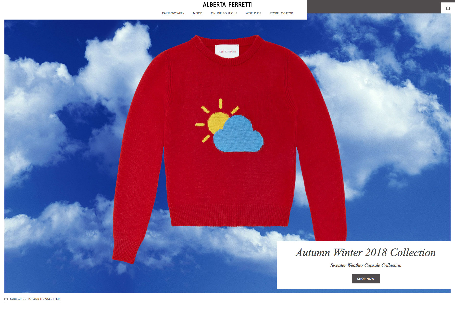
Alberta Ferretti

At first glance, Alberta Ferretti’s site looks much the same as any other minimal, grid-based fashion site. Where this site stands out is the playful use of the grid to create unexpected shapes and counter-intuitive alignment.

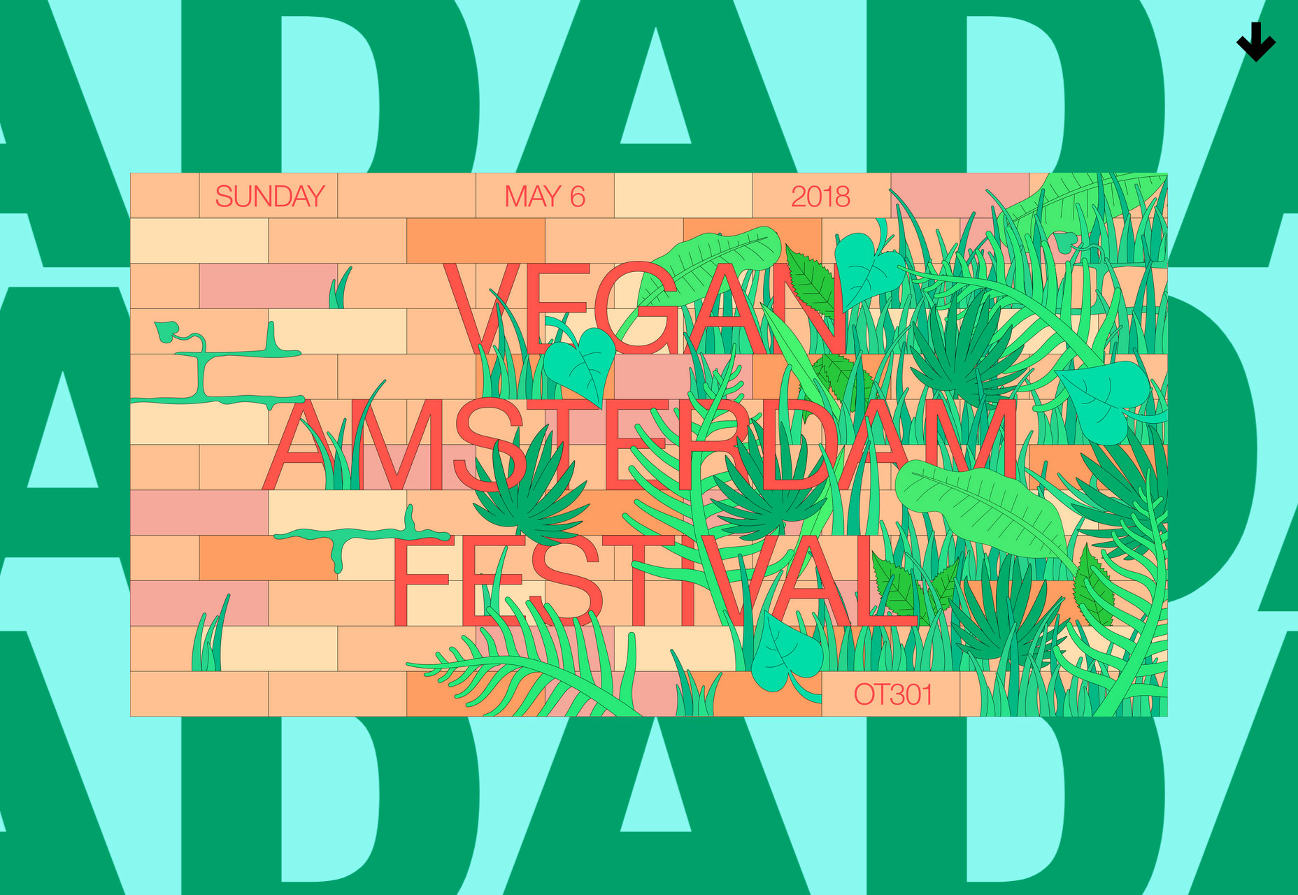
DAD

Dad is a design agency based in the Netherlands. Scroll through its colorful site and the work scrolls vertically, while the background type scrolls horizontally. Somehow, it works. If they don’t win a D&AD award there really is no poetry in the world.

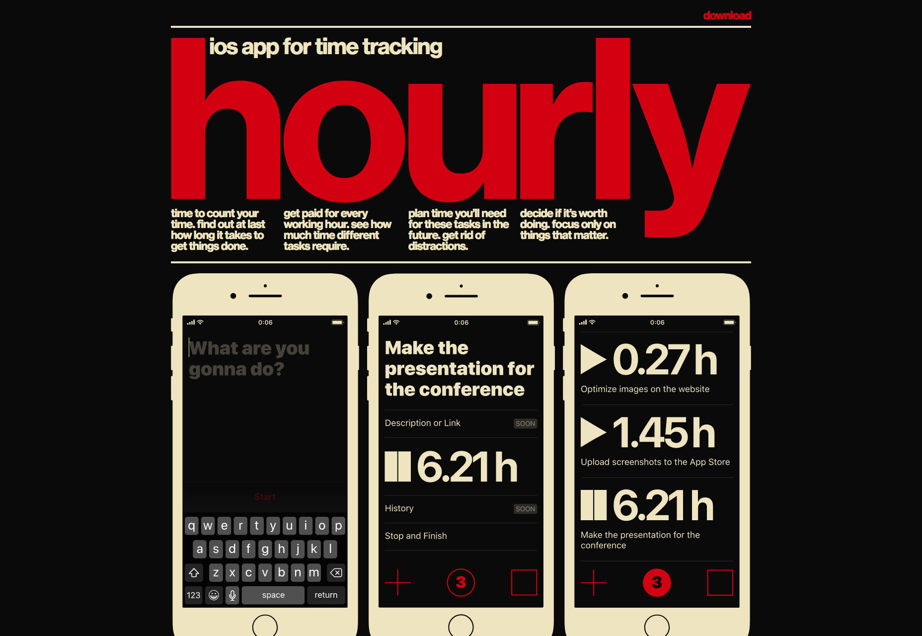
Hourly App

Hourly is yet another time-tracking app for iOS, so far, so dull. But what sets Hourly apart is the 80s style typography and color palette. The bold choice is reflected in the app’s site, and delivers an impactful, and ultimately individual design.

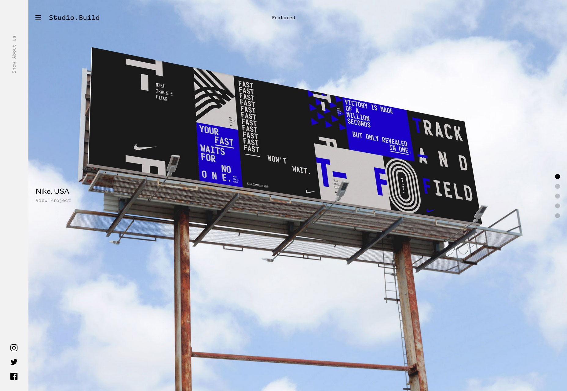
Studio.Build

Studio.Build is a creative digital and branding agency that believes in big statements made simply. The site features a slideshow of selected work to scroll through, but click-through to the full portfolio for some exceptional design work.

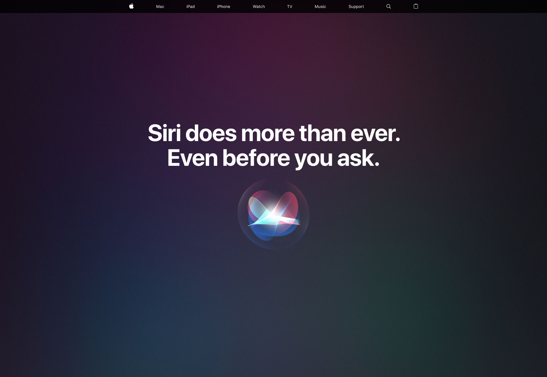
Siri

Apple’s brand new site for its flagship AI product is predictably Apple-like, with a whole ton of mysterious black, gigantic sized type, and some lovely subtle gradients. Rarely does color-coding sections feel so exclusive.

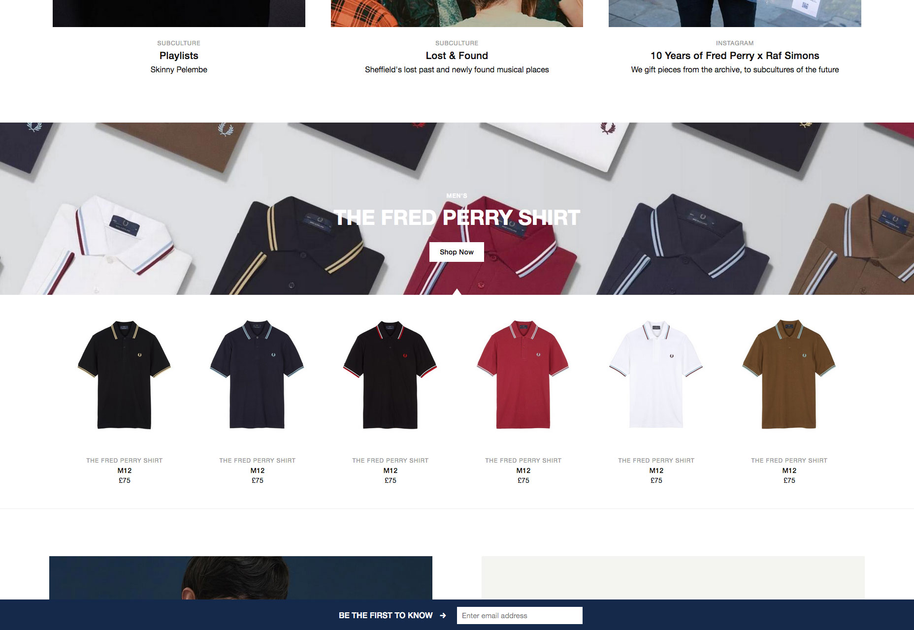
Fred Perry

Fred Perry’s site is a perfect demonstration of how to do parallax right. Used to highlight the size of the product range, and the free shipping options, rather than simply to add interest, it’s an engaging effect on this site.

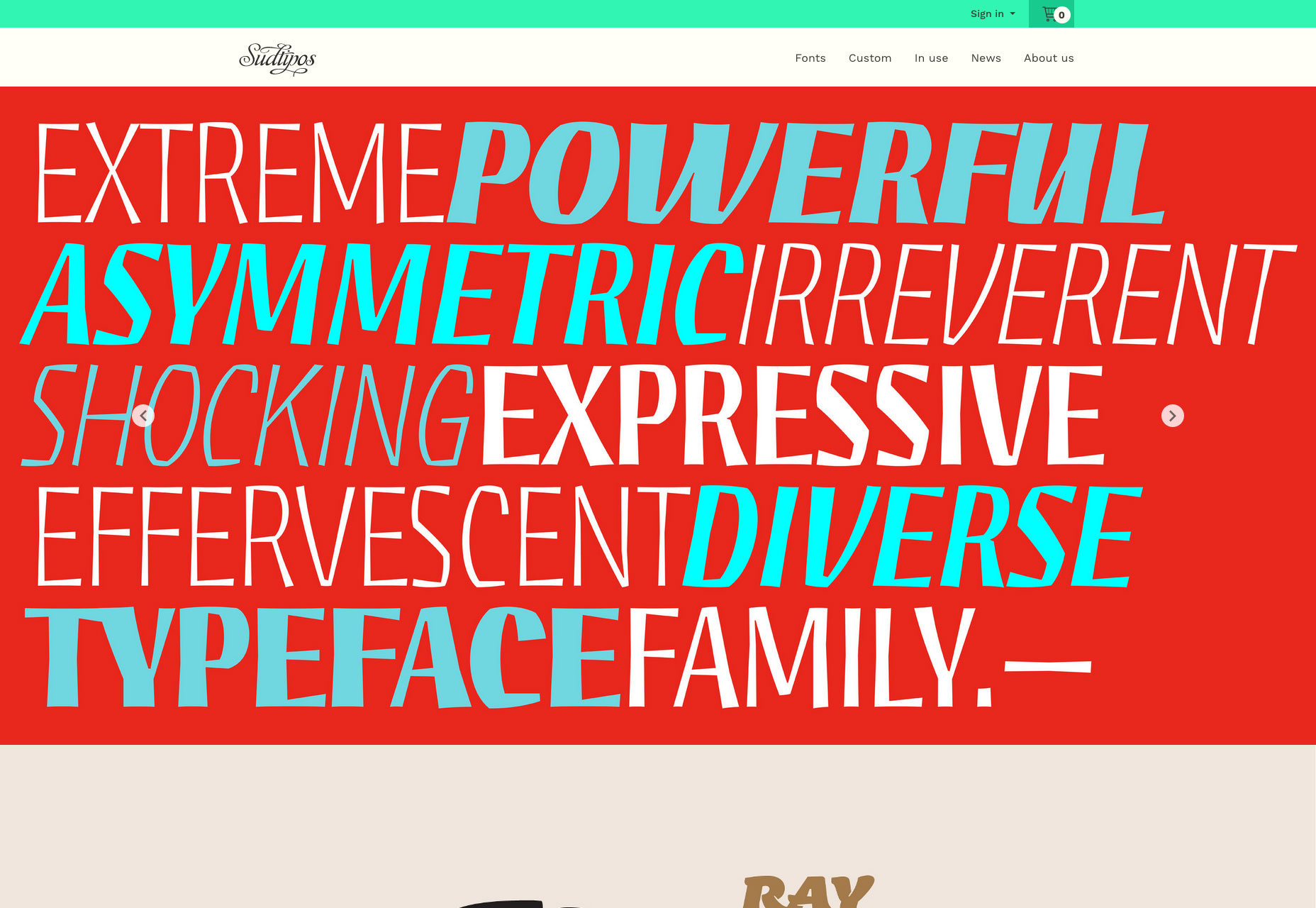
Sudtipos

Some type foundries focus on black and white to pull us in. Sudtipos have gone in completely the other direction, draping their site in colors inspired by their native Argentina. It’s a fitting approach for a colorful design collective.

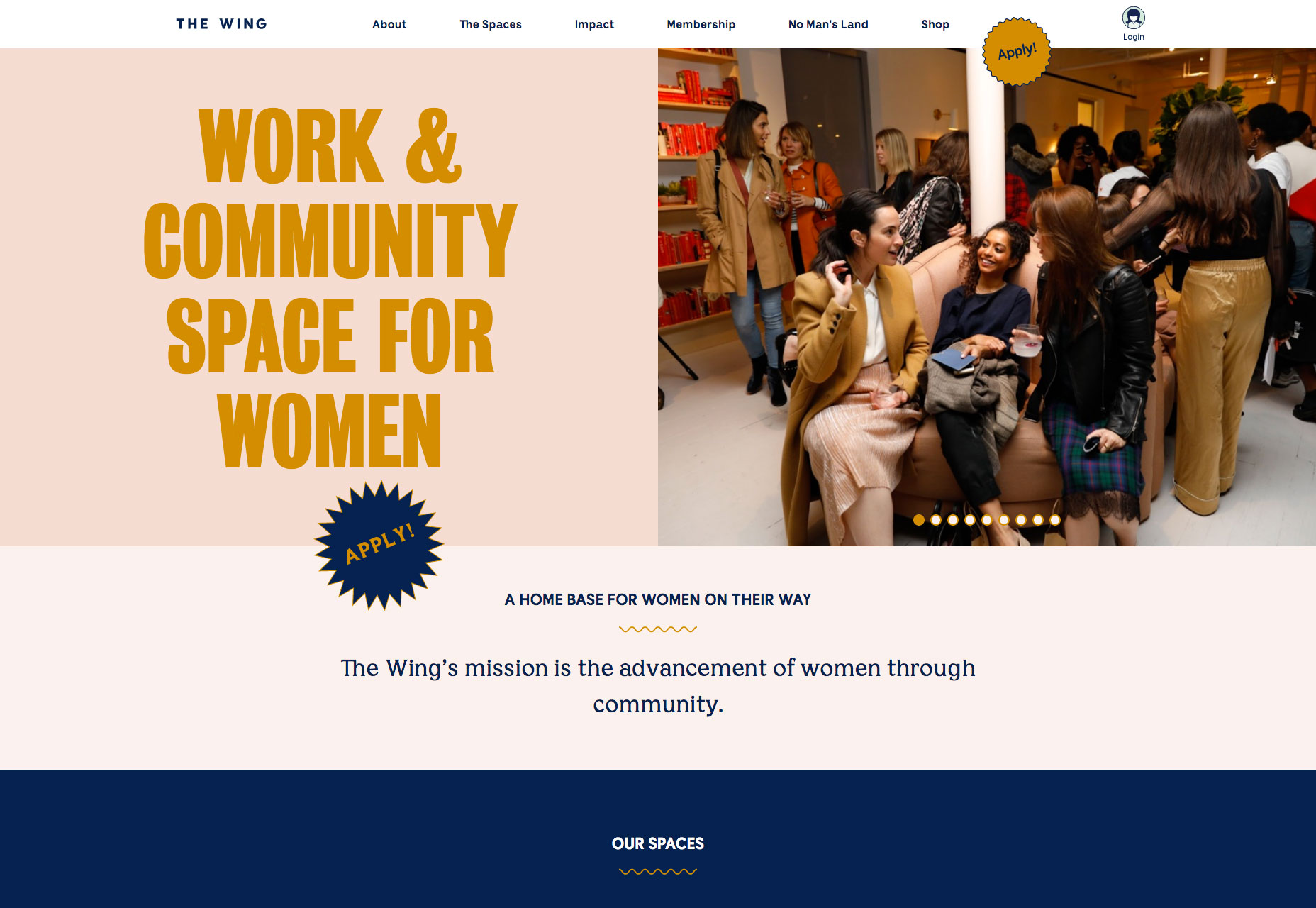
The Wing

The Wing is a co-working space with a difference: it’s women-only. With its roots in community activism in the 19th and 20th centuries, The Wing has four spaces in NY and DC, and has plans for six more. It’s a site targeting women, with none of the clichés.

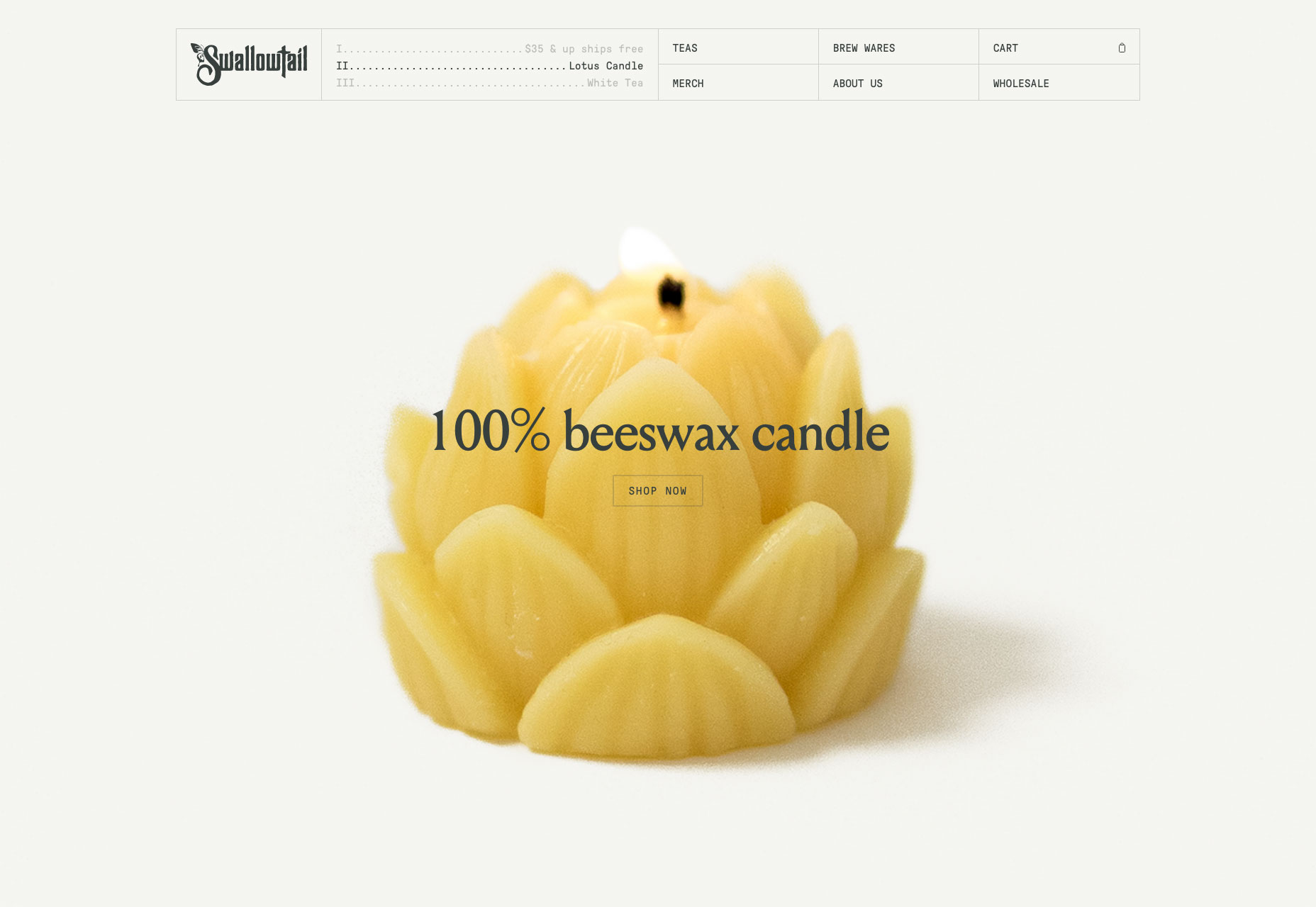
Swallowtail Tea

Swallowtail Tea’s art direction features heavy use of Photoshop’s noise filter, giving the site a nostalgic feel—plus the added benefit of much smaller image files, delivering a faster, more pleasant browsing experience.

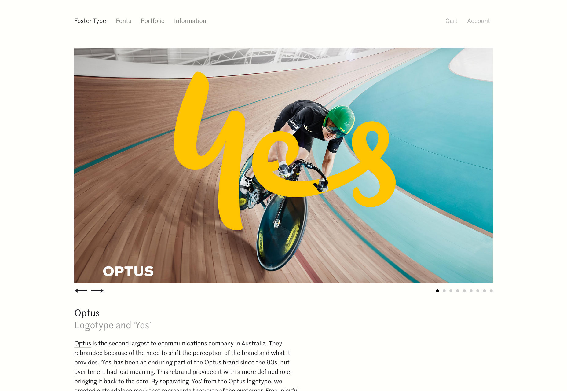
Foster Type

Fittingly for a site showcasing type and lettering design, the online portfolio of Dave Foster features some exceptionally well-set type. For lovers of detailed design, it’s a pleasure to browse through and admire.

The Disconnect

The Disconnect is a unique approach to publishing on the web, they want you to disconnect in order to view the content. Just browse over and then turn off your wi-fi. Only on its second issue, it’s great, distraction-free journalism.

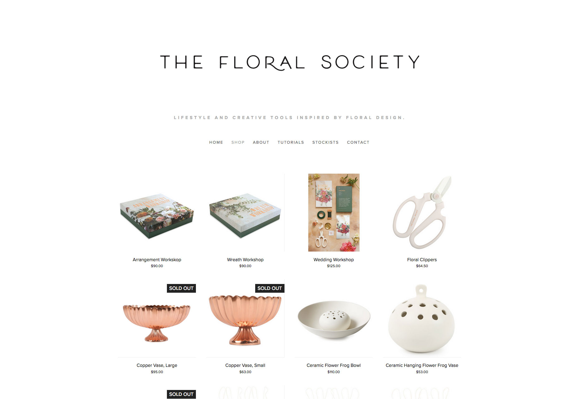
The Floral Society

Who doesn’t love flowers? The Floral Society sells high-quality products for amateur florists. From a Christmas wreath workshop, to DIY wedding flowers. It’s a delightful site put together on Squarespace, proving that anyone really can design a website.

The D. E. Shaw Group

A superlative example of an animation that transforms as you scroll, the D. E. Shaw Group’s site is a modern, abstract depiction of investment banking. As a way to illustrate a non-tangible product, it’s difficult to beat.

Add Realistic Chalk and Sketch Lettering Effects with Sketch’it – only $5!

Source

p img {display:inline-block; margin-right:10px;}
.alignleft {float:left;}
p.showcase {clear:both;}
body#browserfriendly p, body#podcast p, div#emailbody p{margin:0;}

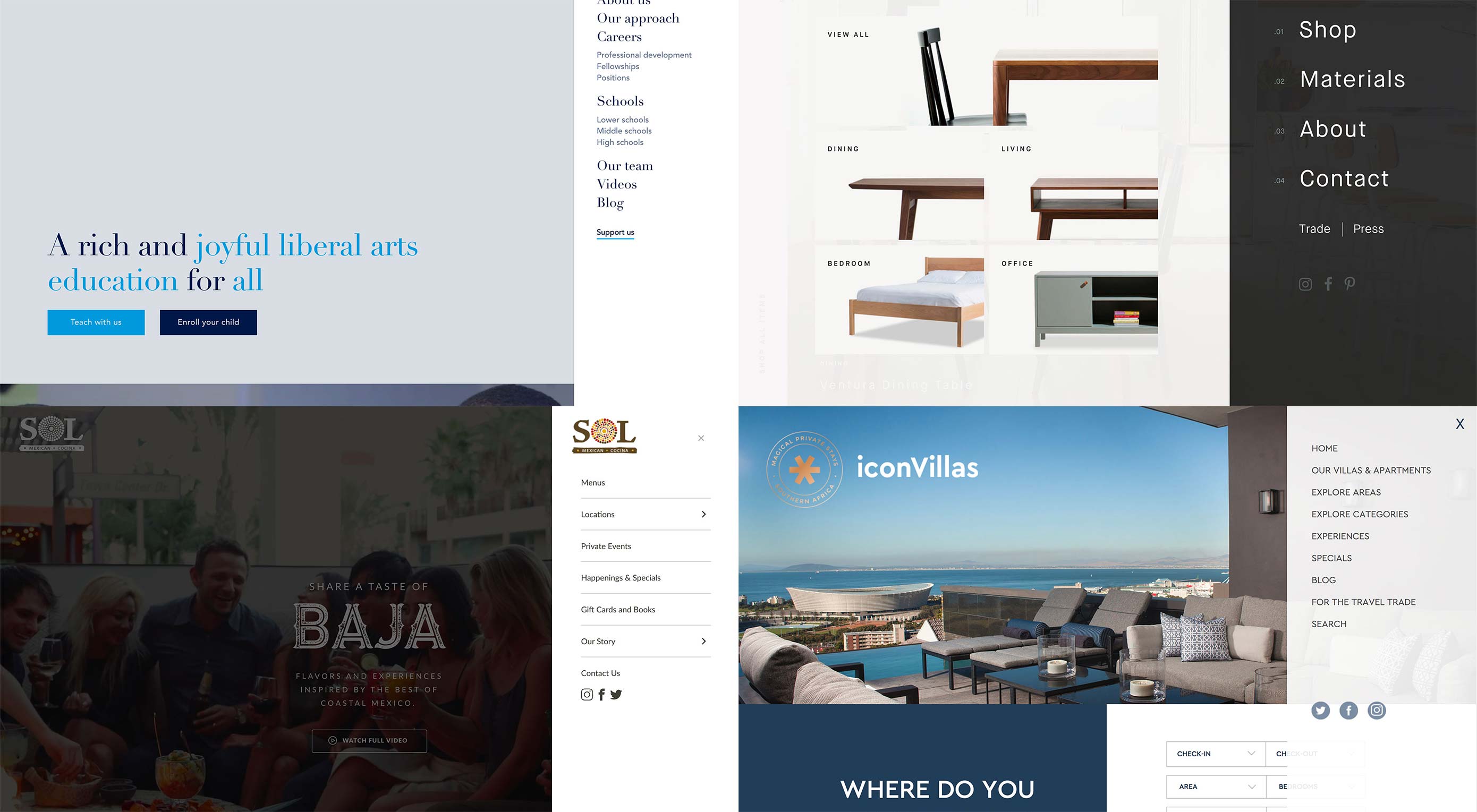
Loving & Hating the Hamburger Icon

Original Source: https://www.webdesignerdepot.com/2018/09/loving-hating-the-hamburger-icon/

I love the hamburger menu. I hate the hamburger menu.


I am constantly contradicting myself about this tiny website element; whether I think it works beautifully…or just makes a mess.

And I’m not alone. While this icon has exploded in popularity, there’s still significant debate as to whether it is the right choice for tucking navigation menus into websites. It’s a debate I have with myself (and team) every time we approach a new project as well.

Because while I love the simplicity of the hamburger menu and the clean canvas it provides, there are some lurking usability issues that just keep nagging me. That’s why I have a distinct love-hate relationship with the hamburger menu.

Love: Clean Design Canvas

The extra space provided by using a hamburger menu icon can create a cleaner, sleeker, more modern feel to the design. I love the look of a minimal design without clutter and layers of elements piled on top of each other.

This design element can encourage your team to actually think about and make certain content and usability decisions as well. Because the hamburger icon doesn’t contain the space to expand to those all-encompassing mega menus that were popular for a while, you have to determine what’s important enough to be a part of the main navigation. And this is an important discussion to have.

Having a limited amount of space for navigation can help the team focus on website goals and what users are doing and what you want them to do. (Gotta love that!)

Hate: Challenging for Some Users

That tiny little icon with three stacked lines still isn’t wholly familiar to some users. If you manage or are building a website with a distinctly older audience or one that’s not so mobile savvy, a hamburger icon can be confusing.

This segment might not ever click or tap the icon, leading to abandonment of the website.

While this tool tends to work well with more “techie” audiences, it’s not for every user group. If the primary users of your website are on desktop devices, it’s worth reconsidering.

Love: Acceptance as a Mobile User Pattern

It’s fun to watch something happen before your eyes. When the first few websites started using hamburger icons, many of us thought it would never catch on.

The opposite has been true.

On mobile devices, use of the hamburger icon to signal hidden navigation is generally accepted. Most mobile users understand what it is and how it works.

This user pattern also solved a problem with mobile navigation – those tiny little words were difficult to tap. With pop- or slide-out navigation from the hamburger icon, designers are leaving more space around each element and even designing individual navigation links to have the look of buttons, making the style highly usable.

Hate: There’s a Tendency to “Overstuff” Them

Because navigation from a hamburger icon looks and feels like its own page, there’s this tendency to overstuff it with information.

This drives me crazy! I don’t want to scroll in your navigation page. Pick a few important navigation elements, show them to users and move on. Don’t overstuff the navigation because you don’t want to make content and goal decisions.

Every website should have a few pages that are a priority for users to find and visit. Those should be in navigation that opens from the hamburger menu.

Love: Easy and Direct Access to Key Links

Elements in hamburger navigation provide direct access to content.

According to the Nielsen Norman Group, direct access allows users to click or tap right to a “preferred item, instead of forcing users to go through your content in serial order.” The alternative is sequential access, where users have to see multiple elements before getting to the one they want (think carousels for navigation or multi-level mega menus).

Direct access is important because it makes it quick and easy for users to get where they want in the website architecture. Fewer clicks to access information is a good thing.

I know what you are thinking: I already recommended that menus be streamlined to the most important information, so how is this quicker and easier for all users?

Simple: Include search in your navigation if you can’t highlight everything you need to. If users don’t see exactly what they are looking for, there’s a way to find it.

Hate: Lack of Immediate Information

One of the things I hate about hamburger menus is that they can hide some of the context of a website. A good navigation menu provides cues about the content of a website right away with keywords and information at the top of the screen.

It’s not always the case – especially if the design is well planned – but often these cues are missing when navigation is tucked inside a hamburger.

It’s important that the design doesn’t lose this context with that information written into the visible copy on pages.

Love: Extra Real Estate on the Hamburger Screen

The pop- or slide-out nature of the hamburger icon navigation screen gives designers an extra space and bit of real estate to be creative.

Take advantage of that space to do something that will delight users. I absolutely love clicking that icon and getting something special that contributes to my overall user experience.

Use that space to provide extra information, re-emphasize an important fact or create a delightful interaction.

Hate: It Takes Multiple Clicks to Discover New Things

Is your attention span as short as mine? If I have to click all over the place to find things on a website, I tend to just check out.

Sometimes a hamburger icon can lead to “multiple click/tap fatigue.” Navigation elements are hidden. You have to click to find them. What you are looking for isn’t there. You have to click somewhere else to search. You have to click into and out of the navigation.

All of this clicking can get tedious – even if it does happen in a matter of seconds. (And the average attention span isn’t getting any longer.)

Wrapping Up

So what’s the verdict? Do I love or hate the hamburger menu icon?

It’s both. I’ll continue to love and hate it until a better solution comes along. How do you feel about it?

Add Realistic Chalk and Sketch Lettering Effects with Sketch’it – only $5!

Source

p img {display:inline-block; margin-right:10px;}
.alignleft {float:left;}
p.showcase {clear:both;}
body#browserfriendly p, body#podcast p, div#emailbody p{margin:0;}

Using SVG with Media Queries

Original Source: https://www.sitepoint.com/using-svg-with-media-queries/

The following is a short extract from Tiffany’s upcoming book, CSS Master, 2nd Edition, which will be available shortly.

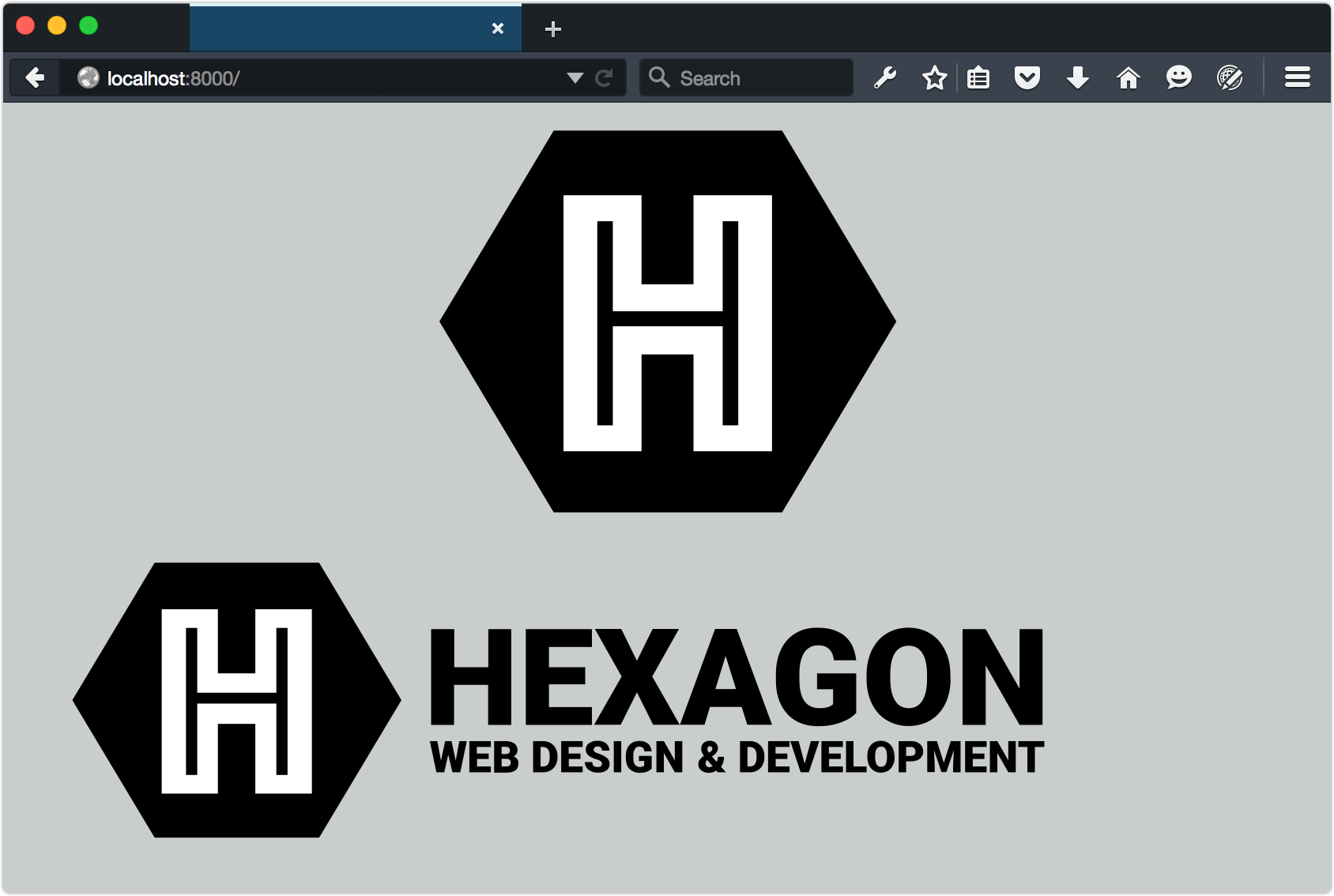
With HTML documents, we might show, hide, or rearrange parts of the page based on the conditions of the viewport. If the browser window is 480 pixels wide, for example, we might shift our navigation from a horizontal one to a vertical, collapsible list. We can do something similar with media queries and SVG documents. Consider a logo, such as that of the fictitious Hexagon Web Design & Development below.

A very real logo for a fictitious company

Without media queries, this SVG logo would simply stretch or shrink to fit the viewport or its container. But with media queries, we can do more clever things.

Let’s distinguish between the HTML document viewport and the SVG document viewport. When SVG is inline, the HTML viewport and the SVG viewport are one and the same. The SVG document behaves like any other HTML element. On the other hand, when an SVG document is linked—as with the object or img elements—we’re dealing with the SVG document viewport.

Media queries work in both cases, but when the SVG document is linked, its viewport is independent of its HTML document. In that case, the size of the browser window doesn’t determine the size of the SVG viewport. Instead, the viewport size is determined by the dimensions of the object, iframe, or img element. Take the (abridged) SVG document that follows as an example:[^4]

<svg version="1.1" id="HexagonLogo" xmlns="http://www.w3.org/2000/svg" xmlns:xlink="http://www.w3.org/1999/xlink" x="0px" y="0px" viewBox="0 0 555 174" xml:space="preserve">
<defs>
<style type="text/css">
/* CSS goes here */
</style>
</defs>
<g id="hex">
<polygon id="hexagonbg" points="55.2,162 10,86.5 55.2,11 145.5,11 190.7,86.5 145.5,162 "/>
<path id="letterH" fill="#FFFFFF" d="M58,35.5h33v35.2h18.4V35.5 h33.2v103.4h-33.2v-38.3H91v38.3H58V35.5z M77.5,126.5V87.3h45.6v39.2h4V47.9h-4v35.6H77.5V47.9h-4v78.6H77.5z"/>
</g>

<g id="word-mark">
<g id="hexagon-word">

</g>
<g id="web-design-and-dev">

</g>
</g>
</svg>

In smaller viewports, let’s show just the H in a hexagon symbol:

@media (max-width: 20em) {
[id=word-mark] {
display: none;
}
}

In smaller viewports, let’s show just the H in a hexagon symbol:

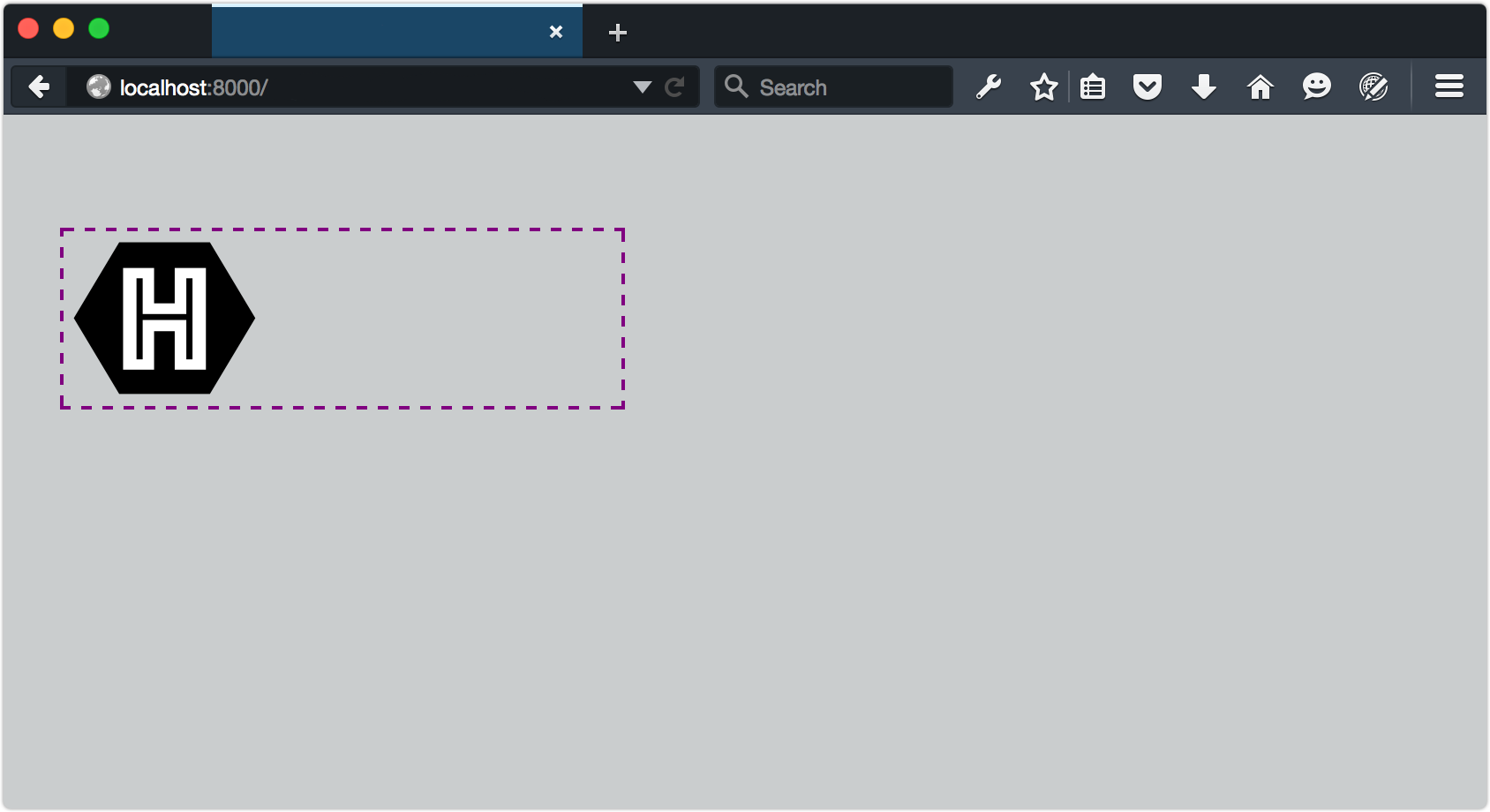
Now, whenever our SVG’s container is less than or equal to 20em, only the symbol portion of our logo will be visible, as indicated below.

Showing/hiding elements based on the SVG viewport size

To trigger this view from the HTML document, set the width of the SVG container:

<object data="hexlogo.svg" type="image/svg+xml" style="width: 20em;"></object>

As you may have noticed from looking at the image above, our SVG image retains its intrinsic dimensions even though part of it has been hidden. This, unfortunately, is a limitation of SVG. To fix it, we need to change the viewBox attribute of the SVG document, but only when the viewport is below a certain size. This is a great use case for matchMedia.

The viewBox attribute, as its name suggests, determines the viewable area of an SVG element. By adjusting it, we can determine which part of an SVG image fills the viewport. What follows is an example using matchMedia and a media query to update the viewBox attribute:

<script type="text/javascript">
var svg, originalViewBox, max20em, mq, updateViewBox;

svg = document.querySelector('svg');

/* Store the original value in a variable */
originalViewBox = svg.getAttribute('viewBox');

/* Define our media query and media query object */
mq = matchMedia("(max-width: 20em)");

/* Define the handler */
updateViewBox = function(){
if (mq.matches) {
/* Change the viewBox dimensions to show the hexagon */
svg.setAttribute('viewBox', "0 0 200 174");
} else {
svg.setAttribute('viewBox', originalViewBox);
}
}

/* Fire on document load */
// WebKit/Blink browsers
svg.onload = updateViewBox;

// Firefox & IE
svg.addEventListener('SVGLoad', updateViewBox, true);

/* Fire if the media condition changes */
mq.addListener(updateViewBox);

</script>

Note: Browsers are a little bit of a mess when it comes to handling the SVGLoad event. In my tests, addEventListener worked most consistently with Firefox. For best results in Chrome and Safari, use the onload event attribute. Microsoft Edge also works best with onload, but only when used as an attribute of the <svg> tag. In other words, <svg onload="updateViewBox">.

Now, whenever the SVG container is 20em or less, the value of viewBox will be "0 0 200 174". When it exceeds 20em, viewBox will be restored to its initial value as represented below.

Adjusting the viewBox attribute based on the viewport’s width

Note: For a fuller primer on creating interactive SVG documents, read the “Dynamic SVG and JavaScript” chapter of An SVG Primer for Today’s Browsers from the W3C.

Since this technique uses either the onload event attribute or the SVGLoad event, it’s a good idea to embed our CSS and JavaScript within the SVG file. When CSS is external, the SVGLoad event may fire before its associated CSS finishes loading.

The post Using SVG with Media Queries appeared first on SitePoint.

70 best tattoo designs

Original Source: http://feedproxy.google.com/~r/CreativeBloq/~3/uKkjFiGVg-4/best-tattoo-designs

Getting a tattoo is a big deal. Whether it’s a classic or unique design you simply love or a picture or symbol that marks a meaningful event in your life, bagging the best tattoo design is a long and sometimes difficult process. Here, we’ve pulled together some inspiration that’ll help you choose the tattoo design that’s right for you.

To make things simple, we've split the article into themes: flower tattoos (this page), tribal tattoos, mandala tattoos, dragon tattoos, cross tattoos, skull tattoos, geometric tattoos, anchor tattoos, animal tattoos, and couples' tattoos. (If you'd like a slightly different take, check out these incredible examples of watercolour tattoos).
Each of the categories contains more traditional tattoo designs, as well as quirky original ideas. You can navigate to the section you want using the drop-down menu above. Click on the images to see more of each tattoo artists' work.

Doodle art: 52 great examples
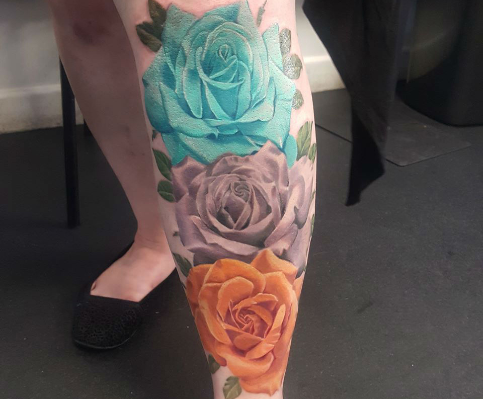
01. Rainbow roses tattoo

rose tattoo

By Morag at Purple Rose Tattoo

This rose tattoo steers away from the standard red colouring, marking it as a classic design but with a modern twist. The intricate shading and delicate leaves add to its realistic execution.

02. Monochrome tattoo

monochrome rose tattoo

By Hannah Louise Kyle

This black and white rose tattoo again steers away from the classic red, offering up an elegant black-and-white design. The heavy line work keeps it to a traditional tattoo style.

03. Pink rose tattoo

pink rose tattoo design

By Esme Loasby

The bright colours is what makes this flower tattoo design stand out, especially when you look closely at the clever colour gradient. Adding more than one flower always makes for a special piece.

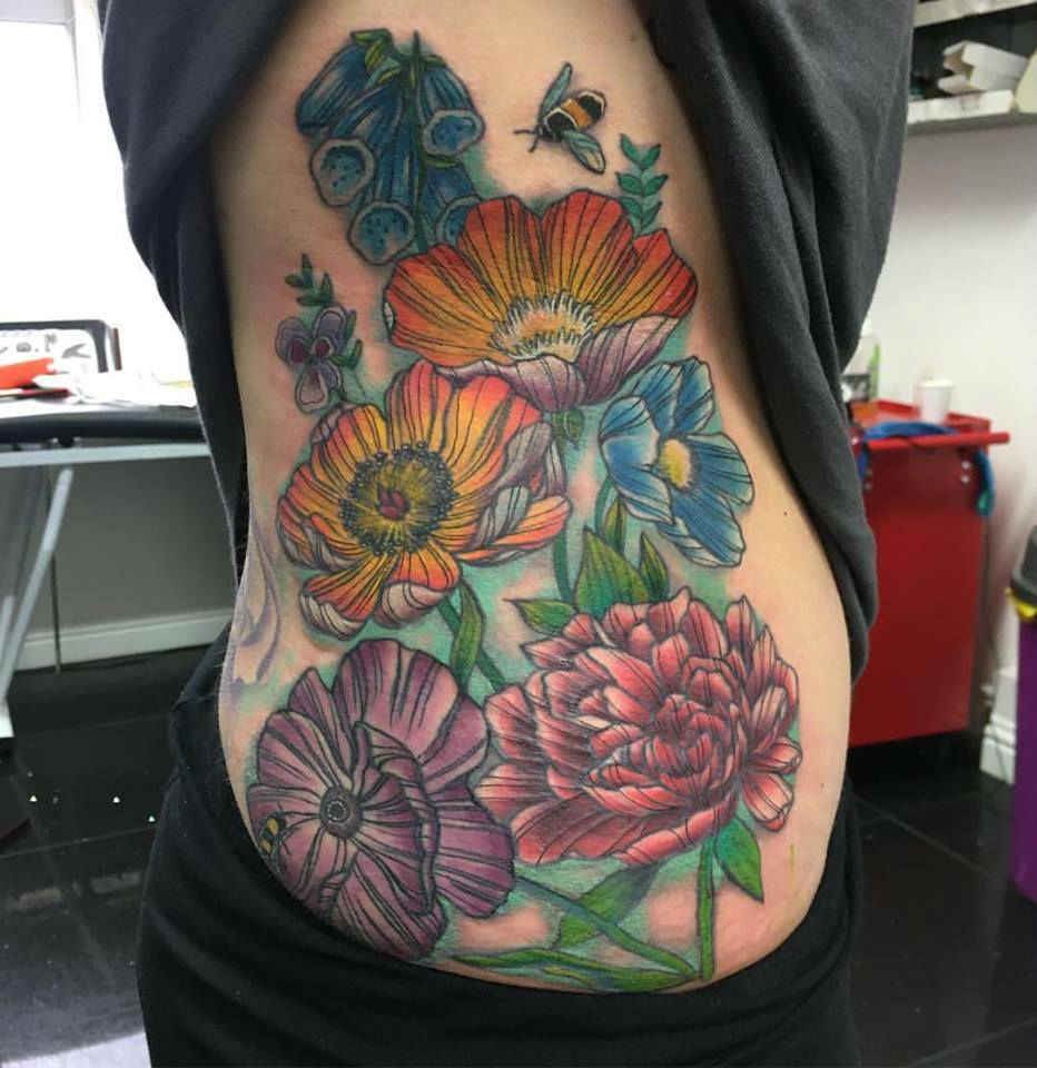
04. Wildflowers tattoo

wild flowers tattoo

By Esme Loasby

Speaking of choosing more than one type for your flower tattoo, this beautiful botanical creation proves that you can put a lot of elements into one piece and it’ll still work, provided you use a tattoo artist who knows what they're doing.

05. Rose and dagger tattoo

Rose and dagger tattoo

By Tom Butts

If you’re looking for a more traditional design, this rose tattoo could be just the inspiration you’re looking for. The inclusion of the dagger adds an edge and makes it a bold, stand-out piece.

06. Red rose tattoo

red rose tattoo on head

By Sascha Roth

A bolder choice is this rose tattoo design, with clever colour work placed just away from the careful lining. Including so much black might not work for some tattoo designs, or tattooees, but it does here.

07. Geometric peonies tattoo

Geometric peonies tattoo

By Mark Jelliman

The linework on this trio of peonies is crafted with such elegance, it makes a real statement. It just goes to show that keeping things simple can often be the best approach when it comes to tattoo design.

Next page: Tribal tattoo designs

These great tattoo designs are all inspired by tribal artworks from around the world. Some of these stick to common themes from native American tribal art, for example, while others give them a contemporary twist. 

As before, click on the image to go to the tattoo artist's website or Instagram page.

08. Tribal mask-inspired tattoo

Tribal mask-inspired tattoo

By Manu Dermagrafics

This stunning leg piece was crafted freehand, and with its bold shapes, colour-blocking and seamless line work, it’s a tribal tattoo worth showing off. The shape itself complements the shape of the leg, too.

09. Subtle shading tribal tattoo

 Subtle shading tribal tattoo

By Paxii

What makes this tribal tattoo design stand out is that through the thick line work and colour-filled shapes, there’s a subtle shading that brings it to life, adding new dimensions.

10. Thick framed tribal tattoo

Thick framed tribal tattoo

By Mike Schwalger

This custom Polynesian tribal tattoo sleeve is able to include a variety of different shapes and lines without making it look too busy. The thick line framing adds a more artistic flair.

11. Pared-back tribal tattoo

Pared-back tribal tattoo

By Leo Braz

Sometimes tribal tattoos can be simple. This piece signifies the serpent in the Marajoara tribe, with the back placement proving to be the perfect place to show it off. 

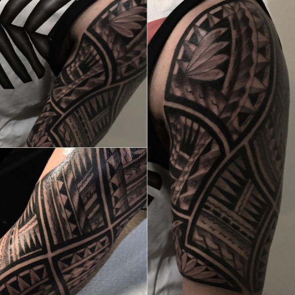
12. Repeat pattern tattoo

Repeat pattern tattoo

By Sunset Tattoo

Keeping with the simple theme, this half-sleeve tribal tattoo offers an intricate yet uncomplicated design. And with such a clean design, the pattern is as mesmerising as it is timeless. 

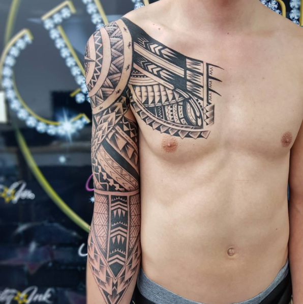
13. Tribal collar tattoo

Tribal collar tattoo

By Margaret River

Tribal tattoo designs often demand a bold placement and this visayan tribal collar is a breathtaking example of how simple line work and intricate patterns can make a statement. 

14. Modern twist

Modern twist

By Daniel Matsumoto

This work, by Daniel Matsumoto, manages to put a modern twist on the classic tribal tattoo design. Mixing thin lines with block colour is a simple but unique way to make it pop. 

Next page: Mandala Tattoos

Mandalas are peaceful, spiritual symbols in both the Hindu and Buddhist faiths. With their intricate, nature-inspired patterns, it's no wonder they're a popular choice for tattoos.

As before, click on the image to go to the tattoo artist's website or Instagram page.

15. Pointillist mandala tattoo

Pointillist mandala tattoo

By Ricky Williams

With its circular shape, placing a Mandala tattoo around the ear is a great way to make impact. The pointillism aspect in this design is stunning.

16. Hidden mandala tattoo

Hidden mandala tattoo

By Ricky Williams

Mandala tattoos come in all sizes and this delicate design could be just the kind of thing you’re after. Sleek, delicate work that gradually moves into darker colour is a special touch.

17. Bold mandala tattoo

Bold mandala tattoo

By Jayne Rogers

The thick lines on this half-Mandala tattoo design make it the perfect way to go if you want to make a statement. Choosing to do a half design is also an option if placed around the ear.

18. Layered mandala tattoo

Layered mandala tattoo

By Niky Brown

Opting for a layering effect on this Mandala tattoo design enables it to take on a more 3D-design effect. Adding some point work really makes this one inspiring. 

19. Colourful mandala tattoo

Colourful mandala tattoo

By Mors Tattoo

Taking on a more classic style, the colour work enables the Mandala tattoo to make more of a statement. Adding colour to the leaf exterior makes for a seamless execution.

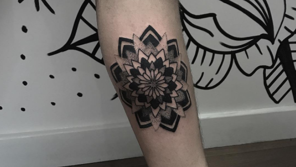
20. Shaded mandala tattoo

Shaded mandala tattoo

By Renette Hammer

Mandala tattoos circular shape enable them to be placed almost anywhere, but the chest provides a nice canvas to really show them off. Pointillism is also a great way to add depth and subtlety.

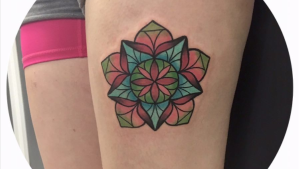
21. Stained glass mandala tattoo

Stained glass mandala tattoo

By Skylar Rose Wasserman

If you’re after a Mandala tattoo design with a more colourful, unexpected twist, you could go for something like this. The stained glass window colour effect allows shades to blend into each other. 

Next page: Dragon tattoos

Dragon tattoos might show the world how brave and fiery you are, they might celebrate your cultural heritage, or they might just exist because you think dragons are really cool (you're not wrong). Whatever your reason for wanting a dragon tattoo, check out these designs for inspiration and click on the image to go to the artist's website or Instagram page.

22. Whimsical dragon tattoo

Whimsical dragon tattoo

By Alice Badger

Sometimes, it’s best to look to the world of TV and movies for your tattoo design inspiration. This one featuring Haku from anime classic Spirited Away is a great place to start.

23. Fierce dragon tattoo

Fierce dragon tattoo

By Lydia Bruno

Dragons are also the perfect way to start off a sleeve, thanks to the variety in which they can be presented. This colourful example leaves room all around for more designs.

24. Oriental dragon tattoo

Oriental dragon tattoo

By HH Orlando Tattoo

Speaking of sleeves, this Japanese style dragon tattoo offers colourful inspiration. The detail on the scales is a particularly nice touch, as are the juxtaposing, delicate flowers underneath.

25. Symmetrical dragon tattoo

Symmetrical dragon tattoo

By Joe Fletcher

If you love the idea of a dragon tattoo but you’re wary of getting the whole form tattooed onto, opting for the head could be a great way to show your beast appreciation.

26. Linework dragon tattoo

Linework dragon tattoo

By Heritage Tattoos

A dragon's serpentine body can make it a great option for a head tattoo. This simple, black-and-white linework tattoo design offers elegant inspiration if you’re willing to take the leap.

27. Abstract dragon tattoo

Abstract dragon tattoo

By Dámaris Argüelles Pérez

A more experimental tattoo design could be just the dragon you’re looking for. This puzzle-like piece keeps it modern while also harking back to more traditional tattoo styles.

28. Etchwork dragon tattoo

Etchwork dragon tattoo

By Byron Barker

This etchwork dragon tattoo design harks back to a neo-traditional style of tattooing and works best when placed on the side of the body, allowing lots of detail.

Next page: Cross tattoo designs

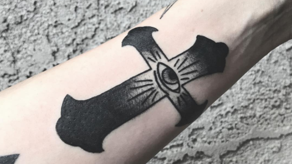
Meaningful and beautiful, cross tattoos also come in a variety of styles. Choose a style that's right for you with these great designs. As before, click on an image you like to go to the artist's website or Instagram page.

29. Botanical cross tattoo

Botanical cross tattoo

By Reny Tattoos

Cross tattoo designs don’t always need to be in a standard, straight line. This example shows that cross tattoos can be moulded with another style to create something really beautiful. 

30. Pretty cross tattoo

Pretty cross tattoo

By Bruno Diego

Another way to amp up a cross tattoo design is with layering. This delicate design incorporates illustrations of love hearts in an elegant and original way, making for a special piece.

31. Symbolic cross tattoo

Symbolic cross tattoo

By Hegotme

This clever cross tattoo design references the crucifixion in a minimal but impactful manner. Adding the nails into the design is a great way to do this.

32. Curvy cross tattoo

Curvy cross tattoo

By Kelly Kossuth

Maybe you’re looking for a bolder cross tattoo design? This one from Kelly Kossuth shows how you can be both bold and minimal, thanks to thick line work.

33. Minimal cross tattoo

Minimal cross tattoo

By Tattooist Uzi

If minimal is more your style, this delicate cross tattoo design could be just the inspiration you need. Delicate line work and zero colour can still make an impact.

34. Shaded cross tattoo

Shaded cross tattoo

By Slicecrust

This classic cross tattoo design works well thanks to neat shading work and clean, thick lines. It’s a perfect design if you want one placed on your arm.

35. Artistic cross tattoo

Artistic cross tattoo

By Steven Gilliard

If you want to combine your love of being a designer or artist with your cross tattoo, then this clever piece could be right up your street. The dot work makes it pop.

Next page: Skull tattoo designs

If dragons weren't tough enough for you, how about a skull tattoo? Some of these skull designs are pretty scary, but others are actually really beautiful, and even cute. We're sure they'll all serve to inspire your skull tattoo design.

36. Skull and rose tattoo

Skull and rose tattoo

By Phatt German

Sometimes you want to add a bit more depth to a skull tattoo design. This skull, which has a rose design incorporated into its cap, does this very effectively.

37. Multi-layered skull tattoo

Multi-layered skull tattoo

By Charlotte’s Web Tattoos

Another way to incorporate depth into a skull tattoo is this half-dead design, which sees a skull merged with a crying face. The addition of a clock makes it extra creepy.

38. Mexican skull tattoo

Mexican skull tattoo

By Barbie Lowenberg

If you’re wanting something a little less creepy, this cute skull tattoo – complete with floral decoration, in the style of Mexican Día de Muertos (Day of the Dead) skull masks and decorations – is the perfect way to show off your love of the dead.

39. Delicate skull tattoo

Delicate skull tattoo

By Uvethekid

Sticking with the floral theme, this skull design offers a more freehand approach, with wavy lines. The difference in line thickness and the dotted shading is what makes it great.

40. Gruesome skull tattoo

Gruesome skull tattoo

By Kelly Violet

If you’re looking for something truly bold, a half-sleeve skull tattoo design is one of the options you could go for. This one, illustrated with medieval weaponry, is jaw-dropping.

41. Baroque skull tattoo

Baroque skull tattoo

By Siren1

Sometimes, two skulls is better than one, and this detail tattoo design effortlessly places them together without looking crowded. It's perfect on the arm.

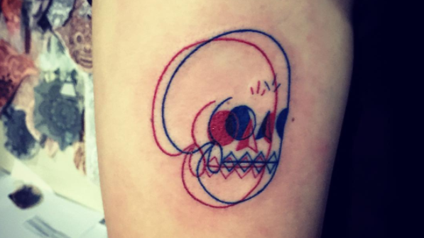
42. 3D-effect skull tattoo

3D-effect skull tattoo

By Bali Namaste Tattoo Studio

This small skull tattoo takes a different approach when blending two skulls together, giving off a 3D effect with a minimal and cute design, which is perfect for small areas.

Next page: Geometric tattoo designs

For something a bit different, why not get an interesting tattoo featuring geometric shapes and patterns? They can be as colourful or as big as you like, as these great designs show.

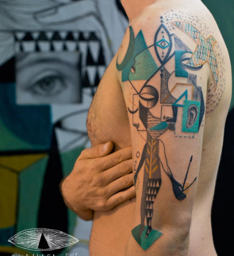
43. Artistic geometric tattoo

Artistic geometric tattoo

By Expanded Eye

Expanded Eye is a duo known for its incredible geometric tattoo designs. With splashes of colour, clever shading and breathtaking structure, this is the perfect geometric tattoo design inspiration.

44. Prisms tattoo

Prisms tattoo

By Malvina Maria Wisniewska

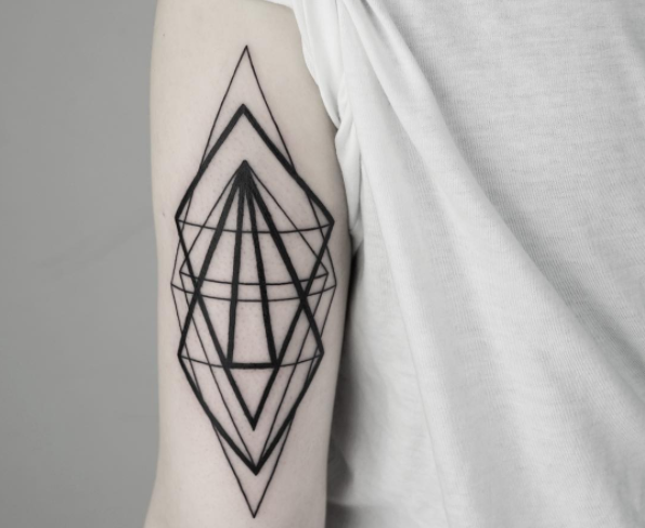
The great thing about geometric tattoos is they can be formed of simple structures but with a detailed execution. The interweaving line thickness on this design is a great example of that. 

45. Honeycomb tattoo

Honeycomb tattoo

By Miriam Frank

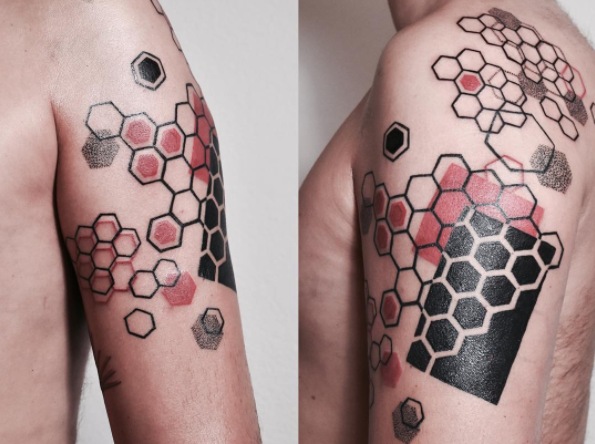
Mixing shapes and colours into your geometric tattoo design can make for a pretty amazing final piece. By adding just the red to this piece, it ensures the design doesn’t go overboard.

46. Golden Ratio tattoo

 Golden Ratio tattoo

By Michele Volpi

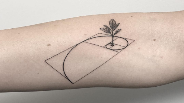
The Golden Ratio describes the perfectly symmetrical relationship between two proportions; this geometric tattoo design is a gorgeous and clever way to pay tribute to its perfections. 

47. Pared-back geometric tattoo

Pared-back geometric tattoo

By Sarah Lu

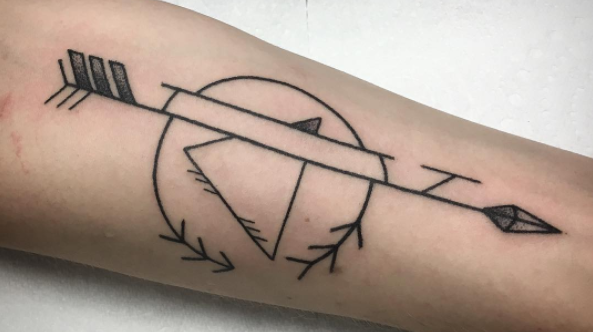
The simplicity of geometric tattoos also means that the hand poking technique can work really well. This simple but effective design puts a different spin on the arrow. 

48. Kaleidoscopic tattoo

Kaleidoscopic tattoo

By Diego Favaretto

If you’re wanting a larger geometric piece, this tattoo is a great example of one that works well when placed on the back. The never-ending detail on this one is particularly impressive.

49. Colourful geometric tattoo

Colourful geometric tattoo

By Sasha Unisex

Of course we couldn’t feature geometric tattoo designs without mentioning Sasha Unisex – the tattoo artist who has become renowned across the world for her stunning, colourful geometric work.

Next page: Anchor tattoo designs

Anchor tattoos are about as traditional as tattoo designs get, and are currently enjoying a retro resurgence. But, as these designs prove, a traditional theme doesn't have to result in a stale old-fashioned design. Click on any image to discover the tattoo artist behind the innovative design.

50. Anchor and heart tattoo

Anchor and heart tattoo

By Patryk Hilton

If you’re after a classic tattoo staple, an anchor design is one of the best options. This traditional style piece is a great way to make a statement.

51. Exotic anchor tattoo

Exotic anchor tattoo

By Sam Ricketts

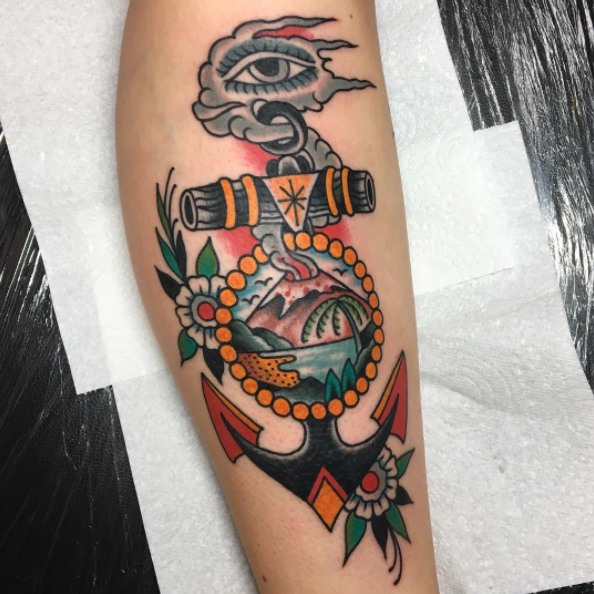
Anchors can also act as a frame for a tattoo design, with this example proving particularly impressive. By using a simple anchor as your base, you can embellish it to your heart’s content.

52. Anchor and bird tattoo

Anchor and bird tattoo

By Sami Tutch

You can always embellish your anchor tattoo design but in a more subtle, sweet way. This little anchor features cartoonish characters that make it perfect for a cute arm piece.

53. Watercolour anchor tattoo

Watercolour anchor tattoo

By Tracy Burton

If you want a splash of colour on your anchor tattoo design, adding in wave-like watercolour is a great way to include your love of anchors in the sea.

54. Sketchy anchor tattoo

Sketchy anchor tattoo

By Elena Aiello

Continuing the watery theme is this cute anchor tattoo design, which adds splashes of colour in a simple, hand-drawn style. The heart is also perfectly incorporated in the design.

55. Monochrome anchor tattoo

Monochrome anchor tattoo

By Ecke Wunderland

The detail on this tiny anchor tattoo design is so perfectly executed, it almost deserves more space. The inclusion of the paper boat is a delightful touch, finishing off the piece beautifully.

56. Geometric anchor tattoo

Geometric anchor tattoo

By Aracely Ramírez Ponce

If you want the colour to be the main focus of your anchor tattoo design, this watercolour, geometric anchor is a great way to show it off. 

Next page: Animal tattoo designs

Another popular choice, animal tattoos might honour a beloved pet, serve as a reminder of a great experience, or show part of your personality through your choice of a favourite animal. 

These animal tattoos again vary wildly in style, so if you find an art style that you like, click on the image to go through to the artist's website or Instagram page to see more.

57. Fox tattoo

Fox tattoo

By Lotte Vanns

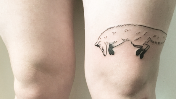
This simple, hand-poked design is the perfect way to pay tribute to your favourite animal. Because of this fox's long body, placing it around the knee is a great way to show it off. 

58. Greyhounds tattoo

Greyhounds tattoo

By Daemon Rowanchilde

These racing greyhounds are stunning in their own right – thanks mostly to their meticulously drawn anatomy – but by placing them within another design, the whole piece becomes pretty breathtaking.

59. Dinosaur tattoo

Dinosaur tattoo

By Kimsany

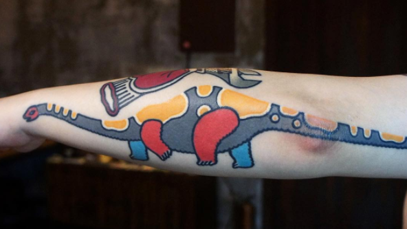
The cartoonish colour-blocking on this brachiosaurus makes it truly unique. Complete with intricate line work and the perfect long arm placement, this is one way to get noticed.

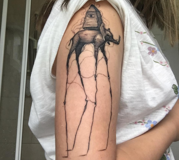
60. Elephant tattoo

Elephant tattoo

By Adrián Desgracia

This sketchy design is great if you want to go for a sleeve design with a difference. The surrealist aspect of the elephant is also reminiscent of Salvador Dali’s work. 

61. Whale tattoo

Whale tattoo

By Raphael

Not sure what style to go for in your animal tattoo design? This is one solution: this unique killer whale design combines two different styles in one, with the animal's middle section drawn as shaded scales. 

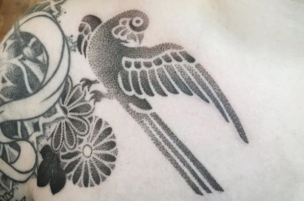
62. Bird tattoo

Bird tattoo

By Jason Corbett

Pointillism is a beautiful option when it comes to bird tattoo designs. This one, perched just on the shoulder, keeps it simple with minimal detail and colour.

63. Dog tattoo

Dog tattoo

By Ricardo Romero Rios

Lots of people get their best pal tattooed on them. This one, depicting man’s best friend, is a cute way to illustrate your love for your furry friend – and there's a sweet Up reference to boot.

Next page: Couples' tattoo designs

Not just the preserve of drunken nights out, matching tattoos are a popular way to mark your commitment to your other half. While some of these designs go sickeningly all-out on the slush factor, others are more subtle, fun, and perhaps even  tasteful enough to dodge the laser should you break up (not that you will, obviously).

64. Pizza tattoos

Pizza tattoos

By justinsams

There’s no better way of combining your love of your partner with your love of pizza. This cute design may be a little cheesy for some.

65. Sun and moon tattoos

 Sun and moon tattoos

By Jessica Leigh Ozimek

If you’re getting married, you might want to make things even more permanent with ring finger tattoos. This sun and moon tattoo design is a sweet way to show off your love.

66. Chatty tattoos

Chatty tattoos

By Dream Tattoo

Your best pal is always there to listen when you need it most. When you’re far away from each other, this simple tattoo design will remind you that they’re always there.

67. King and queen tattoos

King and queen tattoos

By B9 Tattoo Studio

Be the king and queen of all couples with these minimalist playing-card inspired tattoo designs. It’s best to keep it simple, especially when placed on the hands or wrists. 

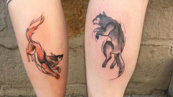
68. Fox tattoos

Fox tattoos

By Farbenfroh Tattoo Art

These playful partner tattoos are great if you’re thinking of getting a couples' tattoo on your leg. The hand-drawn, sketchy style and clever shading make these particularly beautiful. 

69. Colour mode tattoos

Colour mode tattoos

By NYC Adorned

If you’re looking for something with a designer twist, you couldn’t opt for anything better than these cute colour mode pieces (you might recognise these as belonging to Jessica Hische and Russ Maschmeyer). If you're screen-based, go for RBG, while print designers are more likely to favour CMYK.

70. Heart tattoos

Heart tattoos

By First Class Tattoo Studio

How about combining your couples tattoo design with your favourite show? This Game of Thrones-inspired piece is a great way to show off two of the things you love.

Read more:

3 tips for designing tattoosWhat happens when tattoo design meets illustration13 incredible examples of watercolour tattoo art

93% Off: Get the Complete Full Stack Developer eBook Bundle for Only $29

Original Source: http://feedproxy.google.com/~r/Designrfix/~3/lz0VpLWXPvM/full-stack-developer-ebook-bundle

Over the years, we’ve seen an immense growth in demand for developers. Now more than ever, many companies are looking at hiring full stack developers, who are comfortable working with front-end web technologies and back-end databases.  In fact, full stack developer is one of the most in demand positions in enterprise this year. Don’t get […]

The post 93% Off: Get the Complete Full Stack Developer eBook Bundle for Only $29 appeared first on designrfix.com.

How to Deploy Your Secure Vue.js App to AWS

Original Source: https://www.sitepoint.com/deploy-your-secure-vue-js-app-to-aws/

This article was originally published on the Okta developer blog. Thank you for supporting the partners who make SitePoint possible.

Writing a Vue app is intuitive, straightforward, and fast. With low barriers to entry, a component-based approach, and built-in features like hot reloading and webpack, Vue allows you to focus on developing your application rather than worrying about your dev environment and build processes. But, what happens when you are ready to deploy your app into production? The choices can be endless and sometimes unintuitive.

As an AWS Certified Solutions Architect, I am frequently asked how to deploy Vue apps to AWS. In this tutorial, I will walk you through building a small, secure Vue app and deploying it to Amazon Web Services (AWS). If you’ve never used AWS, don’t worry! I’ll walk you through each step of the way starting with creating an AWS account.

About AWS

Amazon Web Services (AWS) is a cloud platform that provides numerous on-demand cloud services. These services include cloud computing, file storage, relational databases, a content distribution network, and many, many more. AWS came into existence not as a retail offering, but rather Amazon’s internal answer to the growing complexity of the infrastructure that was responsible for powering Amazon.com and their e-commerce operations. Amazon quickly realized their cloud-based infrastructure was a compelling, cost-effective solution and opened it to the public in 2006.

At the time of writing this article, AWS is worth an estimated $250B (yes, that’s a B for BILLION) and used by thousands of companies and developers worldwide.

AWS Products

What You Will Build

I feel the best way to learn is by doing. I’ll walk you through building a small, Vue app with an Express REST server. You will secure your app using Okta’s OpenID Connect (OIDC) which enables user authentication and authorization with just a few lines of code.

You will begin by building the Vue frontend and deploy it to Amazon S3. Then you will leverage Amazon CloudFront to distribute your Vue frontend to edge servers all around the world. Lastly, you will create an Express API server and deploy it with Serverless. This API server will contain a method to fetch “secure data” (just some dummy data) which requires a valid access token from the client to retrieve.

The goal of this article is to show you how to leverage multiple AWS services rather than just spinning up a single EC2 instance to serve your app. With this services-based approach, you have a limitless scale, zero maintenance, and a cost-effective way to deploy apps in the cloud.

What is Okta?

Okta is a cloud service that allows developers to manage user authentication and connect them with one or multiple applications. The Okta API enables you to:

Authenticate and authorize your users
Store data about your users
Perform password-based and social login
Secure your application with multi-factor authentication
And much more! Check out our product documentation

Register for a free developer account, and when you’re done, come on back so we can learn more deploying a Vue app to AWS.

Bootstrap Frontend

You are going to build the Vue frontend to your secure app first and deploy it to Amazon S3 and Amazon CloudFront. Amazon S3 (Simple Storage Service) is a highly redundant, object-based file store that is both powerful and featureful. In the scope of this article, we will focus on one of the best features S3 provides: Static website hosting.

To get started quickly, you can use the scaffolding functionality from vue-cli to get your app up and running quickly. For this article, you can use the webpack template that includes hot reloading, CSS extraction, linting, and integrated build tools.

To install vue-cli run:

npm install -g vue-cli@2.9.6

Next up is to initialize your project. When you run the following vue init command, accept all the default values.

vue init webpack secure-app-client
cd ./secure-app-client
npm run dev

The init method should also install your app’s dependencies. If for some reason it doesn’t, you can install them via npm install. Finally, open your favorite browser and navigate to http://localhost:8080. You should see the frontend come alive!

Welcome to Your Vue.js App

About Single Page Applications

When you create an application with Vue, you are developing a Single Page Application (or “SPA”). SPAs have numerous advantages over traditional multi-page, server-rendered apps. It’s important to understand the difference between SPAs and multi-page web applications — especially when it comes to deploying.

A SPA app is often referred as a “static app” or “static website.” Static, in this context, means that your application compiles all its code to static assets (HTML, JS, and CSS). With these static assets, there is no specialized web server required to serve the application to your users.

Traditional web applications require a specialized web server to render every request to a client. For each of these requests, the entire payload of a page (including static assets) is transferred.

Conversely, within an SPA there is only an initial request for the static files, and then JavaScript dynamically rewrites the current page. As your users are navigating your app, requests to subsequent pages are resolved locally and don’t require an HTTP call to a server.

SPA versus Traditional Web Server

Vue-router and Creating Additional Routes

The component of an SPA that is required to rewrite the current page dynamically is commonly referred to as a “router”. The router programmatically calculates which parts of the page should mutate based off the path in the URL.

Vue has an official router that is aptly named vue-router. Since you used the vue-cli bootstrap, your app has this dependency and a router file defined (./src/router/index.js). Before we can define additional routes, we need to create the pages (or components) that you want the router to render. Create the following files in your project:

Homepage: ./src/components/home.vue

<template>
<div>
<h1>Home</h1>
<div>
<router-link to=”/secure”>Go to secure page</router-link>
</div>
</div>
</template>

Secure Page (not secured… yet!) ./src/components/secure.vue

<template>
<div>
<h1>Secure Page</h1>
<div>
<router-link to=”/”>Go back</router-link>
</div>
</div>
</template>

Using vue-router, you can inform the application to render each page based on the path.

Modify ./src/router/index.js to match the following code snippet:

import Vue from ‘vue’
import Router from ‘vue-router’
import Home from ‘@/components/home’
import Secure from ‘@/components/secure’

Vue.use(Router)

let router = new Router({
routes: [
{
path: ‘/’,
name: ‘Home’,
component: Home
},
{
path: ‘/secure’,
name: ‘Secure’,
component: Secure
}
]
})

export default router

Try it out! Tab back to your browser, and you should see the new home screen. If you click on the “Go to secure page” link you will notice the page (and URL) change, but no request was sent to a server!

Understand Hash History

As you navigated between the two pages above, you might have seen that the URL looks different than expected (do you noticed the “#/” at the beginning of the path?)

http://localhost:8080/#/ and http://localhost:8080/#/secure

The reason the URL looks like is because vue-router’s default mode is hash mode. Hash mode simulates a new URL change without instructing the browser to reload the page. This behavior is what allows SPA’s to navigate pages without forcing your browser to make any additional HTTP requests. Vue-router listens for changes in the hash portion of the URL (everything after the “#”) and responds accordingly based on the routes configured.

You can change the mode of vue-router to leverage history mode which will give your app “pretty URLs” like:

http://localhost:8080/secure

But, this comes with a significant drawback — especially when you are deploying. Since your SPA compiles to a static assets, there is just one single entry point index.html. If you try to access a page direction that is not index.html page (i.e.; http://localhost:8080/secure) the web server will return a 404 error. Why? The browser is sending a GET /secure request to the server and trying to resolve to the filesystem “/secure” (and the file doesn’t exist). It does work when you navigate to /secure from the homepage because vue-router prevents the default behavior of the browsers and instructs the router instance to fire in any mode.

By using history mode, you have to take additional steps to make sure page refreshes work correctly. You can read more about HTML5 History Mode. To keep things easy, I will show you a simple trick to ensure your refreshing works with AWS CloudFront.

Enable history mode by modifying ./router/index.js with the following setting.

let router = new Router({
mode: ‘history’,
})

Note: The dev server (npm run dev) automatically rewrites the URL to index.html for you. So the behavior you see locally is how it should work in production.

Building Your Single Page Application

Now that you have a simple, two-page frontend working locally, it’s time to build your app and get it deployed to AWS!

Because you used vue-cli scaffolding, a single call to the included build script is all you need. From your project root, run npm run build and webpack will build your application into the target ./dist directory. If the dev server is still running in your console, you can press CTRL+C.

If you open the ./dist folder and you should see the results of the build process:

./index.html – This is the entry point of your SPA. It’s a minified HTML document with links to the apps CSS and JS.
./static – This folder contains all your compiled static assets (JS and CSS)

During the build, you might have noticed the following notification: Tip: built files are meant to be served over an HTTP server. Opening index.html over file:// won’t work. If you want to test your newly compiled application locally, you can use serve (install via npm install -g serve). Run serve ./dist and it will output a URL for you to load into your browser.

This also gives you to have a hands-on experience with the major caveat of history mode with vue-router. After running serve ./dist, click on the “Go to secure page”. You should see a 404 error.

404 Error

Getting Started with AWS

You will need an AWS account to continue beyond this point. If you already have an AWS account, you can skip ahead. If you don’t, it’s a simple process that only takes a few minutes.

Navigate to the Amazon Web Services home page
Click Sign Up (or if you have signed into AWS recently choose Sign In to the Console)
If prompted, you can select “Personal” for account type
Complete the required information, add a payment method, and verify your phone number
After your account is created, you should receive a confirmation email
Log in!

Note: Amazon requires you to enter a payment method before you can create your account. All the services discussed in this article are covered under AWS Free Tier which gives you 12 months FREE.

Host Your App on Amazon S3

Since your SPA is comprised of only static assets, we can leverage Amazon S3 (Simple Storage Service) to store and serve your files.

To get started, you will need to create a bucket. Buckets are a logical unit of storage within S3, and you can have up to 100 buckets per AWS account by default (if you are studying for the AWS Certified Solutions Architect exam, you should know this!). Each bucket can have its own configuration and contain unlimited files and nested folders.

After you log in to your AWS Console, navigate to the S3 console (you can do this under AWS services search for “S3”).

Click “Create Bucket” and enter a Bucket name. Important: Bucket names are unique across the entire AWS platform. I chose bparise-secure-app-client for this article, but you might need to be creative with your naming!
Click “Create” in the bottom left.

Create S3 Bucket

You should now see your bucket listed. Next, let’s configure it for static website hosting.

Click your Bucket name and then choose the “Properties” tab.
Click on “Static website hosting” box
Choose “Use this bucket to host a website” and add “index.html” as the index document. Click “Save”.

Static website hosting

At the top of the Static website hosting box, you should see a URL for “Endpoint”. This is the publicly accessible URL to view your static website. Open the link into a new browser window, and you should see this:

403 Forbidden

Access Denied and S3 Bucket Policies

Yes, you should see a 403 Forbidden error! By default, S3 bucket permissions are deny all. To access your bucket’s contents, you must explicitly define who can access your bucket. These bucket permissions are called a Bucket Policy.

To add a Bucket Policy, click on the “Permissions” tab and click “Bucket Policy” button at the top. The following policy allows anyone to read any file in your bucket. Make sure to replace “YOUR-BUCKET-NAME” with your actual bucket name.

{
“Version”: “2012-10-17”,
“Statement”: [
{
“Sid”: “PublicReadAccess”,
“Effect”: “Allow”,
“Principal”: “*”,
“Action”: “s3:GetObject”,
“Resource”: “arn:aws:s3:::YOUR-BUCKET-NAME/*”
}
]
}

Bucket Policies can be quite complex and powerful. But, the main parts of the policy that you should be aware of are:

“Effect”: “Allow”
“Principal”: “*” – Who the policy covers (“*” implies everyone)
“Action”: “s3:GetObject” – The action allowed (s3:GetObject allows read-only access to all objects in your bucket)
“Resource”: “arn:aws:s3:::YOUR-BUCKET-NAME/*” – Which bucket and objects the policy is about.

Click “Save” on the Bucket Policy editor. You should notice a new error is displayed if you set up the policy correctly:

This bucket has public access

This warning is good advice and a rule of thumb for all S3 buckets. But, since our bucket is exclusively used to host a static website, we don’t have to worry about anyone accessing a file within the bucket they shouldn’t.

Tab back to your browser and refresh the endpoint. You should now see a 404 Not Found error. This error is much easier to resolve because you don’t have any files in your bucket yet.

404 index.html not found

Deploy to AWS with aws-cli

Now that you have a bucket created and permissions correctly set, it’s time to upload your static assets. Although you can do this manually through the interface by using the “Upload” button, I feel using the aws-cli is more efficient.

Installing asw-cli is different based on your OS. Choose one:

The post How to Deploy Your Secure Vue.js App to AWS appeared first on SitePoint.

Collective #451

Original Source: http://feedproxy.google.com/~r/tympanus/~3/2fFgcmFmDmM/

C451_keyframers

Apple Watch Scroll Border Animation

A great coding session by the keyframers, David Khourshid and Stephen Shaw, where they show how to code the scroll border animation as seen on the Apple Watch site.

Watch it

C451_HelloSign

This content is sponsored via Syndicate Ads
HelloSign API: Everything IT requires and Developers love

With a robust SDK, amazing support, detailed documentation, and super clean dashboard, HelloSign API is sure to make your team happy.

Try it free

C451_noscript

Chrome’s NOSCRIPT Intervention

Tim Kadlec digged through Blink issues to find out more about the intervention that would disable JavaScript altogether on slow networks.

Read it

C451_gradient

Making colour gradients

Monica Dinculescu made a demo that shows how to darken, lighten or blend colors in JavaScript.

Check it out

C451_icons

Ikonate

A versatile and accessible vector icon set that can be customized easily.

Check it out

C451_ios

Force restart on any iOS device with just CSS

Developer Sabri shows how to cause a restart on iOS devices using loads of nested divs and the backdrop filter. Ouch!

Check it out

C451_genart

Generative Art Finds Its Prodigy

Read about generative artist Manolo Gamboa Naon and his inspiring works in this article by Jason Bailey.

Read it

C451_posters

Minimalistic Geometry: Poster Templates

A beautiful set of poster templates by Pixelbuddha.

Get it

C451_transformorigin

Transform-origin illustration

A demo that visualizes the transform-origin property. By Stephen Shaw.

Check it out

C451_beam

Colour Beam

A great demo by Chris Gannon.

Check it out

C451_chrome

Redesigning Chrome: An interview with Chrome’s lead designer

Read about how Google Chrome was redesigned to focus more on web content.

Read it

C451_vuegsap

Vue.js + GSAP = &#x1F525 Animations

Read how to integrate the GSAP animation library in your Vue.js project.

Read it

C451_uber

Uber Rebrand 2018

A nice presentation of how the Uber brand was redesigned.

Check it out

C451_500

500 Error – Animated text fill

A text fill animation for a 500 error page. Made by Mansoour.

Check it out

C451_conical

New in Chrome 69: building <progress> doughnut charts with conical gradients

Facundo Corradini shows how you can build conical gradients for the first supportive version of Chrome.

Read it

C451_font

Free Font: Kielo

A free uppercase headline font designed by Mikko Nuuttila.

Get it

C451_capacitor

Capacitor (Beta)

In case you didn’t know about it: Capacitor is a cross-platform API and code execution layer that makes it easy to call Native SDKs from web code. By Ionic.

Check it out

C451_Basic

WWWBasic

WWWBasic is an implementation of BASIC for web pages.

Check it out

C451_https

How HTTPS Works

If you missed it: A side project from DNSimple where HTTPS is explained in fun comics.

Check it out

C451_libre

From Our Blog
Freebie: “Libre” Web App Template

Libre is a responsive single page app template that was designed for developers who want to create collection management-like projects.

Check it out

Collective #451 was written by Pedro Botelho and published on Codrops.

Infographic: The Future of E-Commerce

Original Source: https://www.webdesignerdepot.com/2018/09/infographic-the-future-of-e-commerce/

Worldwide, retail e-commerce sales totaled $2.29 trillion last year. By the end of this year they’ll have reached $2.8 trillion. If the trend continues apace, e-commerce sales will reach a whopping $4.479 trillion by 2021.

The message is clear: Consumers love the convenience of e-commerce; the reduced prices compared to real world stores, with their real world overheads; the greater range of products.

With a simple click, or tap, you can buy or subscribe to almost any product or service. Never has impulse buying been so easy.

It’s clear that e-commerce will continue to grow as a sector. But what exactly will it look like in the coming months and years?

Add Realistic Chalk and Sketch Lettering Effects with Sketch’it – only $5!

Source

p img {display:inline-block; margin-right:10px;}
.alignleft {float:left;}
p.showcase {clear:both;}
body#browserfriendly p, body#podcast p, div#emailbody p{margin:0;}

Collective #450

Original Source: http://feedproxy.google.com/~r/tympanus/~3/AW-4rz7Tynw/

C450_WOTW

Inspirational Website of the Week: KIKK Festival 2018

This year’s Kikk festival page has a vibrant design and some beautiful effects. Our pick this week.

Get inspired

C450_Pendo

This content is sponsored via Syndicate Ads
Art + Science of Product Design

?A picture is worth a thousand words. Learn why design should be every product person’s superpower. Watch the webinar!

Check it out

C450_tree

Project Explorer

A CLI tool to create an annotated tree visualization of any project. By Sarah Drasner.

Check it out

C450_pullrequests

GitHub Pull Requests in Visual Studio Code

Now you can review and manage GitHub pull requests right from VS Code.

Read it

C450_Bellwoods

Bellwoods

A beautiful audio-visual art game made by Matt DesLauriers.

Check it out

C450_Highway

Highway

Highway is a lightweight and flexible library for AJAX-based website transitions.

Check it out

C450_beerslider

Beer Slider: Responsive & Accessible Before-After Slider

PeHaa Hetman shares this great JavaScript library of a responsive “before-after” slider.

Check it out

C450_copyright

Today, Europe Lost The Internet. Now, We Fight Back.

Read about the terrible proposal the European Parliament adopted regarding the new Copyright Directive.

Read it

C450_taskrunner

Drome

A task runner that lets you define tasks with command line statements and Node.js APIs.

Check it out

C450_access

The Importance Of Manual Accessibility Testing

Read how automated accessibility tests don’t just magically make your site accessible. An article by Eric Bailey.

Read it

C450_cssvars

Updating a CSS Variable with JavaScript

A useful snippet for dynamically updating CSS variables. By Chris Coyier.

Check it out

C450_Houdini

Houdini Spellbook

An interactive introduction to CSS Houdini. Made by Sam Richard.

Check it out

C450_Froma

Free Font: Forma

A pixel-style Memphis-inspired geometric type. Licensed under CC BY 4.0.

Get it

C450_VueToolbox

Vue Toolbox

The best Vue.js libraries in one place. Created by Tiago Alves and Filipe Pina.

Check it out

C450_emojitown

3D Emoji Town (Pure CSS)

George W. Park created this wonderful little Emoji town just with CSS.

Check it out

C450_PeterWolf

Peter and the Wolf

A Progressive Web App audio player experiment made by Koen van Gilst.

Check it out

C450_momentjs

You don’t (may not) need Moment.js

A list of date-fns or native functions which you can use to replace moment.js.

Check it out

C450_500

500 Error

A hypnotizing 505 error page animation made by Liam Egan.

Check it out

C450_doodleaddicts

Doodle Addicts

A fantastic community site for discovering art and artists.

Check it out

C450_wedding

Wedding Icons

A hand-drawn wedding themed icon set including 24 icons in various formats.

Get it

C450_trendy

Trendy Palettes

A curated collection of beautiful hand picked color palettes.

Check it out

C450_morph

HyperMorph 3000™

Andreas Borgen’s fantastic demo of image morphing.

Check it out

C450_scrollbars

Taste Your Scroll

A tool that will help you customize the scroll bars of your project.

Check it out

C450_paravel

Color Cycling with Workers

Read about the process that lead to the animation on the new Paravel site. By Dave Rupert.

Read

C450_pwc

PWC

A continuous collection of papers with code.

Check it out

Collective #450 was written by Pedro Botelho and published on Codrops.