How To Build A News Application With Angular 6 And Material Design

Original Source: https://www.smashingmagazine.com/2018/10/news-application-with-angular-and-material-design/

How To Build A News Application With Angular 6 And Material Design

How To Build A News Application With Angular 6 And Material Design

Rachid Sakara

2018-10-03T12:00:26+02:00
2018-10-03T10:16:38+00:00

Are you looking to combine Google’s material design with Angular applications? Well, look no further!

In this tutorial, we’re going to build a news application using two of the most powerful and popular resources out there, Angular 6 and material design. You’ll learn how to incorporate Google’s material design components into Angular application templates to change and style your application in a professional way. The tutorial also serves as a reminder of how to make HTTP requests to bring live news articles to an application using the News API.

Before we get started building the app, let’s quickly review the resources we’re going to use, Angular and material design, and see why we’ve paired them to build this application?

A news application with Angular 6 and Material Design

A news application with Angular 6 and Material Design. (Large preview)

What Is Angular?

Angular — according to the official documentation — is described as follows:

“Angular is a platform that makes it easy to build applications with the web. Angular combines declarative templates, dependency injection, end-to-end tooling, and integrated best practices to solve development challenges. Angular empowers developers to build applications that live on the web, mobile, or the desktop.”

In short, it’s the most powerful JavaScript framework for building highly interactive and dynamic web applications.

“As mentioned, Angular is powerful, but also popular, which is why companies such as Upwork, Freelancer, Udemy, YouTube, Paypal, Nike, Google, Telegram, Weather, iStockphoto, AWS, Crunchbase are using it.”

Front-end is messy and complicated these days. That’s why we publish articles, printed books and webinars with useful techniques to improve your work. Even better: Smashing Membership with a growing selection of front-end & UX goodies. So you get your work done, better and faster.

Explore Smashing Membership ↬

Smashing Cat, just preparing to do some magic stuff.

What Is Google’s Material Design?

Material design is a design language introduced by Google in the summer of 2014 for Android’s new OS. Although its initial focus was touch-based mobile apps, now its functionality has been extended to reach the web design world.

It’s an adaptable system of guidelines, components, and tools that support the best practices of user interface design. It’s also backed by open-source code and supported by a large community of designers and developers who are collaborating together to build beautiful products.

Why Angular And Google’s Material Design Specifically?

It’s a matter of choice. No JavaScript framework is better than another. It’s all about what your project needs. The same goes for programming languages.

Now, I’m not going to outline the benefits and features of Angular. Instead, I’m going to share with you why I’ve picked Angular specifically to build a news application.

As is always the case with any news application, communicating with back-end services over the HTTP protocol is a crucial part. This is where the newer Angular HttpClient module, which is an improved version of the old Http, can help us easily interact with the service API.

The model-view-viewmodel (MVVM) of Angular will be handy when it comes to binding the remote data that will be stored in objects into our application template, where the component plays the part of the controller/viewmodel and where the template represents the view. This is what we call the Angular template language.

The two-way binding system, which means that any changes in the application’s state will be automatically reflected into the view, and vice versa. You’ll notice that when selecting the news resources from the side menu, that will change the state of our news article.

What I like most about Angular is the SPA technology. Loading only the part of the page that needs to be changed will definitely help our application load and perform more quickly and smoothly.

Of course, there are many other benefits and features of Angular, which you can look up with a quick online search.

What About The Visual Aspect?

We’ve chosen material design because its language is a suitable fit for Angular, and it’s easy to implement.

It’s also a very popular visual language; it’s responsive, and most Google apps are built with it. We want our app to look as much like a Google app as possible.

As an introduction, that’s all we need. It’s time to look at the project overview and then jump into the build process.

Project Overview
Prerequisites
Setting Up An Angular Project
Installing Dependencies
Acquiring Free API Key
Working On Components
Defining Material Default Style
Define A Template
Conclusion

Project Overview

“Getting the latest live news articles from a range of sources, including BBC News, CNN, TechCrunch, Huffington Post and more, along with different categories, like technology, sports, business, science and entertainment.”

This is how your application will look when you finish it:
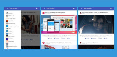
A news application overview

Project overview. (Large preview)

That should get you excited, shouldn’t it? Let’s start by building the app.

Prerequisites

This is what you’re going to need in order to follow along with this tutorial:

Node.js and npm installed on your machine;
Angular CLI installed on your machine;
A basic understanding of Angular.

Once that stuff is out of the way, we can proceed.

Setting up the Angular Project

In this section, we’re going to use the Angular command line interface (CLI) to generate a new Angular project. To do so, head over to the CLI and run this:

ng new news-app

Next, point your command line to the project’s root folder by running the following:

cd news-app

Installing Dependencies

To set up our dependencies, we’re going to install, with just one command, all of the dependencies necessary for this tutorial. Don’t worry, I’ll explain this in a second:

npm install –save @angular/material @angular/animations @angular/cdk

We have three packages being installed with this command.

@angular/material

This is the official material design package for the Angular framework.

@angular/animations

Installing the Angular animation package separately from the Angular core library is necessary. Certain material components need access to the animation libraries, which is why we’re installing it here.

@angular/cdk

The CDK part stands for “component dev kit”, which provides us with high-quality predefined behaviors for your components, since modern web development is all about components.

It is recommended to include the Angular CDK any time you want to link Google’s material design to an Angular application.

To find out more about Angular CDK, check out this article.

Let’s run our app to see that everything works just fine. You can start a development server by running the following command:

ng serve

Now, if you visit http://localhost:4200/ in a browser, you should see the following page:
Welcome to news app

Running the Angular project on development server. (Large preview)

Now, in your code editor, navigate to the file /src/app/app.module.ts, and add the following packages that we’ve just installed:

… Other imports …
import { BrowserAnimationsModule } from ‘@angular/platform-browser/animations’;
import { MatButtonModule, MatCardModule, MatMenuModule, MatToolbarModule, MatIconModule, MatSidenavModule, MatListModule } from ‘@angular/material’;

It is important to understand what’s going on here. First, we’re importing the animations package to animate our application a bit.

The next import is what’s unique to Angular material. Before, we just included a single material module. Now, we have to import each material component that we intend to use.

As you can see, we’ve added seven different modules here for material buttons, cards, menus, lists toolbars, side navigation, and icons.

After adding those packages to your app.module.ts file, make sure that your file matches the following:

import { BrowserModule } from ‘@angular/platform-browser’;
import { NgModule } from ‘@angular/core’;
import { HttpClientModule } from ‘@angular/common/http’;
import { NewsApiService } from ‘./news-api.service’;

import { BrowserAnimationsModule } from ‘@angular/platform-browser/animations’;
import { MatButtonModule, MatCardModule, MatMenuModule, MatToolbarModule, MatIconModule, MatSidenavModule, MatListModule } from ‘@angular/material’;

import { AppComponent } from ‘./app.component’;

@NgModule({
declarations: [
AppComponent
],
imports: [
BrowserModule,
BrowserAnimationsModule,
HttpClientModule,
MatButtonModule,
MatMenuModule,
MatCardModule,
MatToolbarModule,
MatIconModule,
MatSidenavModule,
MatListModule,
],
providers: [NewsApiService],
bootstrap: [AppComponent]
})
export class AppModule { }

Note: The statement import { HttpClientModule } from @angular/common/http in the file above wasn’t generated automatically, but rather added manually. So, make sure you do that, too. And don’t worry about the NewsApiService service provider because we’re going to take care of that later on.

You might be wondering, though, how did I know the names of the modules to import? The official Angular material documentation gives you the exact code needed to import each module.

If you click on any of the components in the left menu and then click on the “API” tab, it provides you with the exact import line that you need to use.

API reference for Angular Material Components

API reference for Angular Material Component. (Large preview)

In terms of setup, that’s all we need to do before we actually begin using and integrating material components in our templates.

You just have to remember to import each unique component that you plan to use.

Acquiring Free API Key

We’re going to use the News API to feed us some news headlines as JSON data, which we’ll implement in the application template.

What is the News API service?

The News API is a simple HTTP REST API for searching and retrieving live articles from all over the web.

Now that you know what the News API is, the next step is to get a free API Key, which will help us make some call requests to the server and grab the news articles.

You can sign up for just 30 seconds. You’ll only need to provide your first name, email address, and password. That’s all.

After signing up, you’ll find the API key already generated for you in the dashboard. Just save it in a text file somewhere on your desktop; because we’ll use it in the next chapter.

Working On The Components

To start working on the components, you need to create a service provider to manage the interaction with the News API service.

Creating The Service Provider

Enter this command to generate a new service provider:

ng generate service NewsApi

After that, go to the generated /src/app/news-api.service.ts file, and add the following code to it:

import { Injectable } from ‘@angular/core’;
import { HttpClient } from ‘@angular/common/http’;

@Injectable({
providedIn: ‘root’
})
export class NewsApiService {

api_key = ‘PUT_YOUR_API_KEY_HERE’;

constructor(private http:HttpClient) { }
initSources(){
return this.http.get(‘https://newsapi.org/v2/sources?language=en&apiKey=’+this.api_key);
}
initArticles(){
return this.http.get(‘https://newsapi.org/v2/top-headlines?sources=techcrunch&apiKey=’+this.api_key);
}
getArticlesByID(source: String){
return this.http.get(‘https://newsapi.org/v2/top-headlines?sources=’+source+’&apiKey=’+this.api_key);
}
}

It’s time to use our API Key. Just paste it where it says, “Put_YOUR_API_KEY_HERE”.

We’ve imported HttpClient, which will be responsible for making API calls to our endpoints and fetching news headlines for us.

Now, for the initSources function, we simply prepare our left-side menu with some news resources. After that, we’ve created another function, initArticles which retrieves the first articles from TechCrunch once the application gets started.

As for the last function, getArticlesByID, it’s going to simply bring some articles for the passing parameter.

The Main Component

The service provider is done. Let’s move to the /src/app/app.component.ts file and add this code:

import { Component } from ‘@angular/core’;
import { NewsApiService } from ‘./news-api.service’;

@Component({
selector: ‘app-root’,
templateUrl: ‘./app.component.html’,
styleUrls: [‘./app.component.css’]
})
export class AppComponent {

mArticles:Array;
mSources:Array;

constructor(private newsapi:NewsApiService){}

ngOnInit() {
//load articles
this.newsapi.initArticles().subscribe(data => this.mArticles = data[‘articles’]);
//load news resources
this.newsapi.initSources().subscribe(data=> this.mSources = data[‘sources’]);
}

searchArticles(source){
this.newsapi.getArticlesByID(source).subscribe(data => this.mArticles = data[‘articles’]);
}
}

We’re defining two properties here: mArticles, for holding news articles, and mSources, for holding news resources. Both are defined as an array.

In the constructor, we’re simply creating a NewsAPIService instance.

Next, we’re using that instance on the ngOnInit() function to initialize our two properties.

For the searchArticles function, it will be triggered whenever the user selects a specific resource from the left-side menu. Then we’re passing this parameter to the getArticlesByID service provider function to retrieves articles for it.

Defining Material’s Default Style

In our /src/styles.css file, which is generated by the Angular CLI, let’s add the following:

@import ‘~@angular/material/prebuilt-themes/indigo-pink.css’;
body {
padding: 2em 23em;
background:lightgray;
}

Based on your preference, you can change indigo-pink.css to:

deeppurple-amber.css
indigo-pink.css
pink-bluegrey.css
purple-green.css

I’m also adding some CSS to the body tag, only to demonstrate this layout. This helps it look more like an app, even on desktop.

Let’s also add two lines to our /src/index.html file just before the closing head tag:

<link href=”https://fonts.googleapis.com/icon?family=Material+Icons” rel=”stylesheet”>
<link rel=”stylesheet” href=”https://fonts.googleapis.com/css?family=Roboto:300,400,500,700,400italic”>

The first line imports the material design icon font, and the second one is the Roboto font, which is used by the material design team.

Defining A Template

Let’s start off by adding the following template in the /src/app/app.component.html file:

<mat-toolbar color=”primary”>
<button mat-button (click)=”sidenav.open ()” ><mat-icon>menu</mat-icon></button>
<span>News Headlines</span>
<span class=”example-spacer”></span>
<button mat-button [matMenuTriggerFor]=”appMenu”><mat-icon>settings</mat-icon></button>
</mat-toolbar>
<mat-menu #appMenu=”matMenu”>
<button mat-menu-item> Settings </button>
<button mat-menu-item> Help </button>
</mat-menu>
<mat-sidenav-container class=”example-container”>

<mat-sidenav #sidenav class=”example-sidenav”>
<mat-list class=”list-nav”>
<mat-list-item class=”list-item” *ngFor=”let source of mSources” (click)=”searchArticles(source.id);sidenav.close();”>

<div mat-card-avatar [ngStyle]=”{‘background-image’: ‘url(../assets/images/’+ source.id +’.png)’}” class=”example-header-image”></div>

<span class=”source-name”> {{source.name}}</span>

</mat-list-item>
</mat-list>
</mat-sidenav>
<mat-card class=”example-card” *ngFor=”let article of mArticles”>
<mat-card-header>
<div mat-card-avatar [ngStyle]=”{‘background-image’: ‘url(../assets/images/’+ article.source.id +’.png)’}” class=”example-header-image”></div>
<mat-card-title class=”title”>{{article.title}}</mat-card-title>
<mat-card-subtitle>{{article.source.name}}</mat-card-subtitle>
</mat-card-header>
<img mat-card-image class=”img-article” src={{article.urlToImage}} alt=””>
<mat-card-content>
<p>
{{article.description}}
</p>
</mat-card-content>
<mat-card-actions class=”action-buttons”>
<button mat-button color=”primary”><mat-icon>thumb_up_alt</mat-icon> 12 Likes</button>
<button mat-button color=”primary”><mat-icon>comment</mat-icon> Comments</button>
<button mat-button color=”primary”><mat-icon>share</mat-icon> Share</button>
<a mat-button color=”primary” href={{article.url}} target=”_blank” ><mat-icon>visibility</mat-icon> More</a>
</mat-card-actions>
</mat-card>
</mat-sidenav-container>

So, what have we done here?

First, we define a toolbar with a left-side menu, along with the application’s main title and the settings’ right menu.

Next, we’re using *ngFor for both sources and articles, and in doing so, our left-side menu will hold the news resources, and the main contents will hold the news articles.

One thing to notice is that on the click event of our list items, we’ve added two functions because that event executes any JavaScript code. The first function is searchArticles, which we’ve already explain, and the second one is sidenav.close() which will automatically close our left-side menu once the user has selected a resource.

Styling Our Component

The last thing to do with the components is to visit the /src/app.component.css file and paste the following code in it:

.example-spacer {
flex: 1 1 auto;
}

.example-card{
margin-top: 4px;
}

.example-header-image {
background-size: cover;
}

.title{
font-weight: bold;
}

.img-article{
height: 350px;
}

.action-buttons{
text-align: center;
}

.example-container {
width: 100%;
height: auto;
border: 1px solid rgba(111, 111, 111, 0.50);
}

.example-sidenav-content {
display: flex;
height: 75%;
align-items: center;
justify-content: center;
}

.example-sidenav {
padding: 20px;
}

.source-name {
margin-left:5px;
}

.list-item:hover{
cursor: pointer;
background-color: #3f51b5;
color: white;
}

Set Up Images For News Resources

Move to the /src/assets directory, and create a new folder named images. Then, download these images either from a Google Drive link or the GitHub repository.

They are the logos of our news resources. Once you download them, copy and paste all of the image files into the images folder that you just created.

Once everything is complete, run this:

ng serve

Now, your app should look like the screenshot below. Pretty awesome, huh!
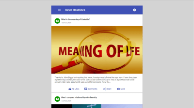
the news application final product

Launching the app after everything is complete. (Large preview)

Note that when the news snippets are loaded on the main page, a “More” button (as you can see in the picture above) takes the user to read the whole story.

Conclusion

There you have it! I hope this tutorial was useful and that you’ve enjoyed building this application. If so, feel free to leave your feedback and comments below. In the meantime, the Angular Material documentation is pretty cool. It provides you with an overview of each component, an API and an example.

The entire source code of this app is available on GitHub. You can also check out this website, which already implements the service API used in this tutorial.

Smashing Editorial
(ra, al, yk, il)

AWS, Azure & Google Cloud Backup Solutions Compared

Original Source: https://www.sitepoint.com/aws-azure-google-cloud-backup-solutions-compared/

Cloud backup is a form of cloud storage where data is stored and then retrieved from different distributed and interconnected cloud-based resources. Cloud-based backup solutions allow businesses and enterprises as well as individuals to safely store their data on the internet via a storage service provider.

This cloud-based storage solution can be used instead of storing data locally on a physical disk like a hard drive. Cloud backup also allows users to access the provider's services remotely via a secure client login application. This can be used to back up files either from the user's computer or data center onto the online storage server by way of a secure and encrypted connection.

In this article, we're going to dig deep into various characteristics of cloud pricing. We'll primarily focus on the top three cloud platforms – Google, Azure and AWS. We'll have a look at some of the factors like their features and capabilities, pricing, support and documentation etc.

Features and Capabilities

All the cloud vendors offer a large array of features and backup solutions. Let's have a look at what the top three offer.

Microsoft Azure

Microsoft Azure backup can be used to backup, protect as well as restore your data in the Microsoft Cloud. It replaces any existing on-premise, local or off-site backup solution by deploying a cloud-based reliable and secure solution.

Microsoft Azure has a number of different components that can be downloaded and deployed either on the appropriate server or computer or in the cloud. Irrespective of what you want to protect, all backup components provide users with the ability to back up data to a Recovery Services vault provided by Azure.

Some of Microsoft Azure's key features include:

Automatic Storage Management
Unlimited Scaling
Multiple Storage Options
Unlimited Data Transfer
Data Encryption
Application-Consistent Backup, and
Long-Term Retention

Amazon Web Services S3

Amazon S3 or Simple Storage Service was designed keeping developers in mind and with the aim to help them build cloud computing tools.

Among the different cloud storage services available, only few can compare with the number of data center regions globally as Amazon S3 – 14. This is because AWS S3 shares the same infrastructure being used by Amazon's shopping platform.

Given the global presence of its data center regions, AWS S3 allows users to select a region near them or a region close to where most of their web traffic originates. The benefit here is that it enables quicker transfers to and from the cloud.

Some of AWS S3's key features include:

Durability and Availability
Flexibility and Scalability
Cost Effectiveness
Security
Compliance
Flexible Data Transfer
Largest Partner Ecosystem, and
Additional Backup and Restore Resources

Google Cloud Storage

Google Cloud Storage is an enterprise-focused public cloud storage platform where users can store large unstructured data sets. Organizations can purchase storage for either primary or infrequently required data.

As a service within the Google Cloud Platform, Google Cloud Storage allows unified object storage for live as well as archived data. Objects that have been stored here are grouped into buckets or containers within the cloud and can be individually assigned to different storage classes.

Users can access their data via a web browser or a command line interface. Similar to AWS S3, Google Cloud Storage also gives users the option to select the geographical location where they prefer their data stored.

Some of Google Cloud Storage's key features include:

Single API across storage classes
High availability across all storage classes
Ability to scale to exabytes of data
Time to first byte measured in milliseconds
Strongly consistent listing, and
Designed for 99.99% durability

Which one should you choose?

AWS is the most popular choice for cloud backup solutions. It provides temporary storage which is allocated when an instance is started and is destroyed when the instance is terminated. It also provides Block Storage which is equivalent to hard disks, i.e., you have the choice to either attach it to any instance or keep it separate.

Additionally, AWS also provides object storage as part of its S3 Service as well as archiving services with Glacier.

Service Provider
Temporary Storage
Block Storage
Object Storage

Amazon S3
Yes
EBS
S3

Microsoft Azure
Temporary Storage – D Drive
Page Blobs
Block Blobs and Files

Google Cloud Storage
Yes
Persistent Disks
Google Cloud Storage

Cloud Pricing

Each of the three services offers outstanding scalability and use the monthly cost-per-GB model. This makes comparisons between the three extremely easy. There are a certain amount of variations among the services mainly coming from the complexity of the different storage classes involved and how storing data in one class vs. another can impact rates. Here is a little more detail on the pricing front for each of the three service providers.

Microsoft Azure

Microsoft Azure's storage rates are based on the amount of storage you need, your geographical location, how frequently you need to access the stored data and the kind of data redundancy you choose. Though sophisticated, Azure's pricing model allows users to control costs when appropriately managed.

The table below illustrates the prices for blob storage for a data center located in the Eastern United States –

LRS – Cool
LRS – Hot
GRS – Cool
GRS – Hot

First 50 TB per month
$0.0152
$0.0208
$0.0334
$0.0458

Next 450 TB per month
$0.0152
$0.0200
$0.0334
$0.0440

Over 500 TB per month
$0.0152
$0.0192
$0.0334
$0.0422

*LRS – Local Redundant Storage. LRS allows for multiple and synchronous copies of your data to be stored in a single data center.

**GRS – Geographically Redundant Storage. GRS is used to store a second synchronized set of your data in a different data center hundreds of miles away from the first. The benefit is that GRS provides an additional layer of redundancy enabling quicker access times for users in a different geographical location.

If you want to cut down pricing, there are third-party vendors for the Azure platform that offers low priced backup solutions that are optimized for a category of users. Nimble, HPE and NetApp are popular in that regard.

Amazon S3

Amazon S3 provides a lot of the similar flexibility for scaling storage as Azure. Users are charged for storage used with no upfront costs or termination fees.

The most substantial difference between Amazon S3 and Microsoft Azure lies in the fact that, unlike Azure, Amazon S3 does not have multi-regional storage. However, S3 does provide a middle tier class between standard and archival storage. This is known as 'Standard-Infrequent Access.'

The table below illustrates the prices for storage in the Eastern United States (North Virginia) region:

Tier
Standard per gigabyte
Standard – infrequent access per gigabyte

First 50 TB / month
$0.023
$0.0125

Next 450 TB / month
$0.022
$0.0125

Over 500 TB / month
$0.021
$0.0125

Note: Costs may differ slightly by region, either intra-country or inter-country. However, intra-country cost differences usually amount to within a few cents.

The third-party AWS backup solutions offer low-priced storage volumes that you can deploy in a region of your choice. You can also set up VPC network for all your AWS resources. Some of the popular vendors for AWS backup include CyberDuck, CloudBerry and N2WS.

Google Cloud

With Google Cloud, users get the benefit of a nice mix of the different storage class options that Microsoft Azure and Amazon S3 offer. This makes Google Cloud fairly more scalable than the other two. The combination provided by Google includes multi-regional as well as regional options, a mid-range option known as 'nearline' and an archival option similar to Glacier, known as 'coldline'.

Here's a look at the costs that Google Cloud Storage charges:

Multi-regional per GB
Regional per GB
Nearline per GB
Coldline per GB

General pricing
$0.026
$0.020
$0.010
$0.007

Tokyo pricing
N/A
$0.023
$0.016
$0.010

An important aspect to keep in mind here is that Google Cloud Storage takes an approach similar to Microsoft Azure and Amazon S3 in that it does away with the option of variable pricing by region as well as tier based pricing per total GB stored.

The post AWS, Azure & Google Cloud Backup Solutions Compared appeared first on SitePoint.

macOS Mojave’s Stacks: Everything You Need to Know

Original Source: https://www.hongkiat.com/blog/macos-mojave-stacks-everything-you-need-to-know/

This post explains how to use macOS Mojave’s Stacks feature to its fullest to achieve clutter-free desktop.

The post macOS Mojave’s Stacks: Everything You Need to Know appeared first on…

Visit hongkiat.com for full content.

Learn How to Draw for Only $39

Original Source: http://feedproxy.google.com/~r/CreativeBloq/~3/NHDDvrHY-j4/learn-how-to-draw-for-only-dollar39

You don't have to enrol in an expensive art institution in order to become an artist. Now, you can learn how to draw online using The Fundamentals of Drawing Bundle.

You'll learn how to create dynamic superheroes that are worthy of comic books; you'll master the art of figure, portrait, and animal drawing through step-by-step training, and you can learn at your own pace. There's also time to practise shading in order to truly bring your artwork to life.

Get The Fundamentals of Drawing Bundle for just $39 – that's 94 per cent off the regular price, and much cheaper than art school.

Related articles:

How to draw: the best drawing tutorialsHow to draw a faceHow to begin a figure drawing

20 Useful WooCommerce WordPress Plugins for Your Online Business

Original Source: https://www.hongkiat.com/blog/20-useful-woocommerce-wordpress-plugins-for-your-online-business/

WooCommerce powers about one-third of all the online stores and is as capable as any other e-commerce platform. However, like WordPress, you can enhance its functionality to utilize its full…

Visit hongkiat.com for full content.

Collective #455

Original Source: http://feedproxy.google.com/~r/tympanus/~3/XkZ1Hg3Aqho/

C455_solid

One Small Step for the Web…

Tim Berners-Lee introduces Solid, an open-source project to restore the power and agency of individuals on the web.

Read it

C455_Divi

Our Sponsor
Real Time Design in WordPress

Divi is powered by the Divi Builder, an insanely fast and incredibly intuitive front end editor like nothing you have seen before. It will change the way you build websites forever.

Check it out

C455_vue

Plans for the Next Iteration of Vue.js

Evan You provides an in-depth overview of what’s coming in the next major version of Vue.

Read it

C455_content

Content and Design Are Inseparable Work Partners

A great article by Jared M. Spool on the importance of a holistic view on content and design.

Read it

C455_zipsell

Zipsell

Zipsell is a free, open source and self-hosted platform for selling digital downloads.

Check it out

C455_rxjs

Reactive Programming in JavaScript with RxJS

Learn how to program using RxJS, the JavaScript library for transforming, composing and querying asynchronous streams of data.

Read it

C455_slang

Slang

Slang is a simple audio programming language that was created to explore implementing a programming language entirely in the browser. By Kyle Stetz.

Check it out

C455_cursor

Ink Cursor

A fantastic ink cursor demo made by Ricardo Mendieta.

Check it out

C455_motion

Motion design doesn’t have to be hard

A great article by Jonas Naimark where he shares some tips and tricks for motion design.

Read it

C455_stencilfont

Free Font: Modernist Milk

A lovely stencil font made by New Tropical Design.

Get it

C455_flocking

Flocking

A great article by Drew Cutchins on how to create flocking behavior in code.

Read it

C455_privacy

Privacy By Design: How To Sell Privacy And Make Change

Joe Toscano explains why changing the way privacy is handled is critical to the success of businesses.

Read it

C455_falling

Falling

A mesmerizing demo by Yuan Chuan.

Check it out

C455_wordpress

You Don’t Need WordPress

A simple CMS that integrates directly with Google Drive so that you can create a blog with Google Docs only.

Check it out

C455_sql

sqlfmt: an [opinionated] online SQL formatter

Read about sqlfmt, an online tool for beautifully formatting SQL statements. By Matt Jibson.

Read it

C455_W3c

Representing Web Developers In The W3C

Rachel Andrew writes about her involvement with the CSS Working Group, and why she feels it is important that web developers understand what is being worked on in CSS, and have a way to offer feedback.

Read it

C455_miscrosoft

Designing for Scale and Complexity

Read how the Fluent Design System was implemented across Microsoft Azure to improve usability, consistency, and accessibility for a highly complex and evolving cloud. By Joe Hallock and Leon Welicki.

Read it

C455_fontdesign

From idea to typeface: How are fonts designed?

An interesting read by Johannes Neumeier on the font creation process.

Read it

C455_Azonix

Free Font: Azonix

A sci-fi inspired sans-serif typeface made by Mixo.

Get it

C455_piehole

Mmm… Pi-hole…

An interesting article on Pi-hole and how to use it to block nasty domains and ads.

Read it

C455_Skip

Skip

Skip is an experimental programming language developed at Facebook from 2015-2018.

Check it out

C455_Chromium

Ungoogled-chromium

More relevant than ever, in case you didn’t know about it: Modifications to Google Chromium for removing Google integration and enhancing privacy, control, and transparency.

Check it out

Collective #455 was written by Pedro Botelho and published on Codrops.

Pay What You Want for the Project Management Mastery Bundle

Original Source: http://feedproxy.google.com/~r/Designrfix/~3/GV7nCJUgwkw/project-management-mastery-bundle

Do you think it is time to move ahead in your career? Now may be the best time to take a leap to a leadership role. Becoming a project manager may be the next big step for you. In this case, the Project Management Mastery Bundle will help you on your career journey. Project Management […]

The post Pay What You Want for the Project Management Mastery Bundle appeared first on designrfix.com.

The New Framer X: Initial Impressions

Original Source: https://www.smashingmagazine.com/2018/10/new-framer-x-initial-impressions/

The New Framer X: Initial Impressions

The New Framer X: Initial Impressions

Lachezar Petkov

2018-10-01T13:30:03+02:00
2018-10-01T11:38:55+00:00

The Framer team recently released a new prototyping tool, Framer X, and I was lucky enough to be able to test it during the beta phase. In this article, I’d like to share my thoughts about this new tool and its features. I’ll make a comparison with the “legacy” Framer app as well as other tools, and I’ll discuss its brand new features such as Stacks and Scroll, and its new Code and Design components.

This article is intended for UI and UX designers who would like to learn more about Framer X’s prototyping abilities. Since it is (in many ways) a brand new product, you don’t need to be familiar with the older Framer application to read along. However, a little bit of familiarity with HTML, CSS, React, JavaScript and Node.js are beneficial.

For the purpose of this tutorial, I have also created a prototype which is a Material exploration of the Khan Academy’s app for Android.

Note: I’m in no way affiliated with Khan Academy; I just thought this would make a cool experiment — I hope you’ll agree.

Intro To Framer X

Framer X goes a few steps further than its predecessor in trying to bridge the gap between interface design and software development. Here’s how:

Dear Designers, Meet React

The key difference between the old and the new applications in this regard is the introduction of React and JavaScript / TypeScript, as opposed to using CoffeeScript for programming microinteractions and animations, loading data, and so on.

Framer X and React logos

Framer X’s most important feature: It integrates tightly with ReactJS. (Large preview)

During the beta phase, people wrote some React components that I think show us the potential of how far the tool can take us. For example, you can embed actual media players (that actually stream and play music and video) within your prototypes. Or, you can embed graphs with real-time stock market data. Or how about a component that can translate your prototype’s UI into other languages. And that’s not all: Things are just getting started.

Meet SmashingConf New York 2018 (Oct 23–24), focused on real challenges and real front-end solutions in the real world. From progressive web apps, Webpack and HTTP/2 to serverless, Vue.js and Nuxt — all the way to inclusive design, branding and machine learning. With Sarah Drasner, Sara Soueidan and many other speakers.

Check all topics and speakers ↬

Smashing TV, with live sessions for professional designers and developers.

The same React code you write for a Framer X prototype could — at least hypothetically — be used in a production environment after the design phase. This can be especially useful for teams that do a lot of web development in React (and perhaps for teams who write mobile apps in React Native). Personally, I shudder at the thought of me, a designer, writing any code that goes into production, but that might work for others.

“Framer X is more like Unity than like Photoshop. An IDE for design, if you will.”

—The Framer X documentation

The Framer X Interface

If you are already a Framer user, the first thing you’d notice is that the integrated code editor is gone. Instead, if you want to write any code, you can use an editor of your choice. Most people (including myself) seem to go with VS Code.

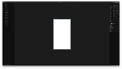
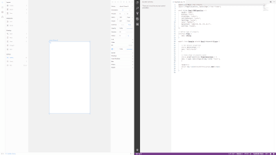
Framer X screenshot

Framer X (Large preview)

There are four tabs in the sidebar:

Tools
Opens all the layout and drawing tools everyone’s familiar with (shapes, path, text, frames) as well as three new toys we’ll discuss a little later: Stacks, Link, and Scroll.
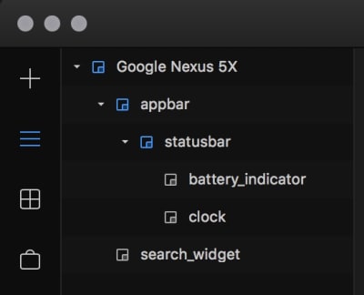
Layers
Contains, well, the layers of the selected frame, as well as its properties (color, position, border, shadow and so on). This bit is essentially the same as in the old Framer, and very similar to Sketch and Figma.

The Framer X layers panel

The Framer X Layers panel. (Large preview)

Components
This is for any Design or Code components you may have in the file you’ve opened.
Store
A new, huge feature in Framer X. It allows users to publish their creations — be it icons and illustrations or interactive code components for others to use. Currently, all components are free of charge, but I’d imagine people will be able to sell their stuff at the store in the future.

The Framer X Store

The Framer X Store (Large preview)

The Preview and Live Preview buttons are up at the top right corner. As with legacy Framer, you can preview your prototypes within a device picture for more realism, or preview them directly on an actual device, or in a browser.

Recommended reading: Learning Framer By Creating A Mobile App Prototype

Prototyping With Framer X

A Few Thoughts On The Prototype We’ll Create

The Khan Academy Android app isn’t a Material app, so let’s explore how it might look and behave if it was. I want to think of this as if it were a real-world project, so here are a couple of considerations that we’ll see how to handle in Framer X:

The product’s goal is to provide free education for everyone, thus it must be able to run on old and cheap devices. What this means for the design of the prototype is, it has to work on 320dp wide screens.
The design must adapt well when the app is translated into a language more verbose than English.

The first thing I’m going to do is mock up the Home screen. There are four things I want to be prominent:

A search input;
Something that will show me my most recent activity;
Something that will show me my Missions;
Something to notify me if there’s a new Mastery Challenge.

Let’s begin.

Installing Components From The Store

The first two elements I want to have here are the Android status bar and navigation bar. Instead of drawing them myself, I’ll quickly install a component bundle from the store called “Android Kit”. It contains all sorts of (static, not programmed in this case) elements like buttons, cards, switches, bars, keyboards and so on. I got my status bar and my nav bar in seconds:

Adding a component from the Store

Note: Each component is installed per-project.

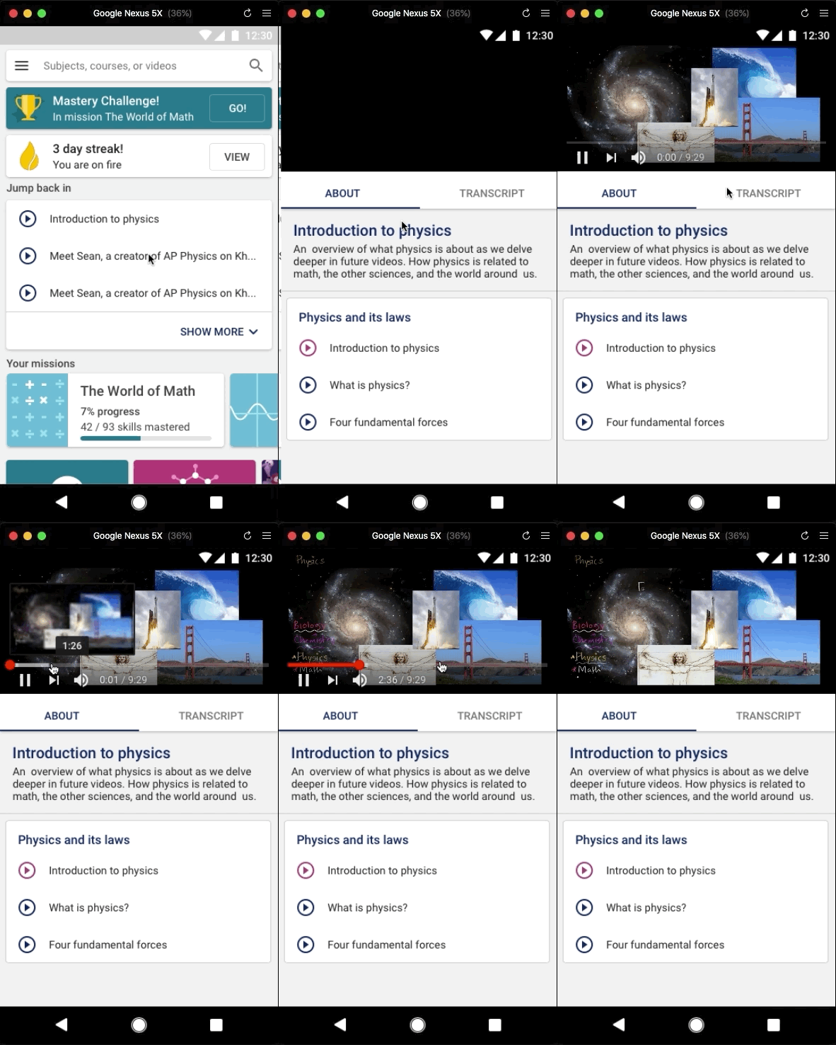
The Interactive Scroll Tool

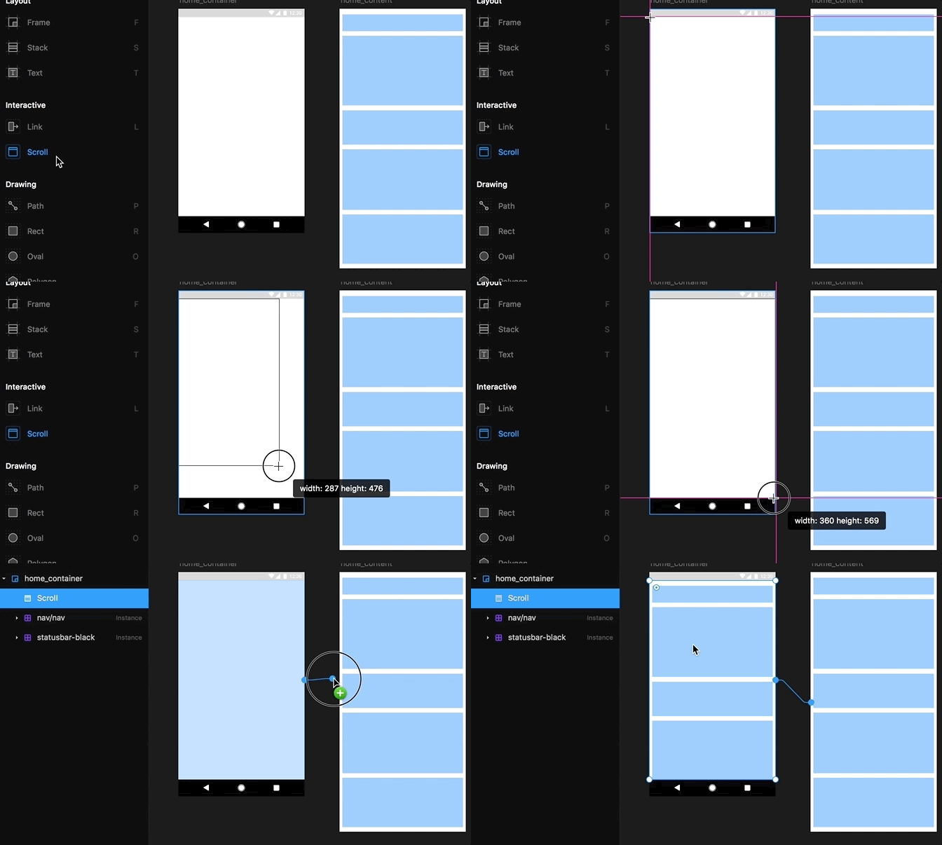
Now, if I were doing this in Sketch, I’d continue mocking up the rest of the elements on the same artboard, and if it can’t fit all elements, I’d make it taller. In Framer X, however, things work a little differently. I’ll have the content of the Home screen within a separate frame (screen/artboard) and link that frame so it scrolls beneath the navigation and status bars of the home screen:

Using the Scroll tool

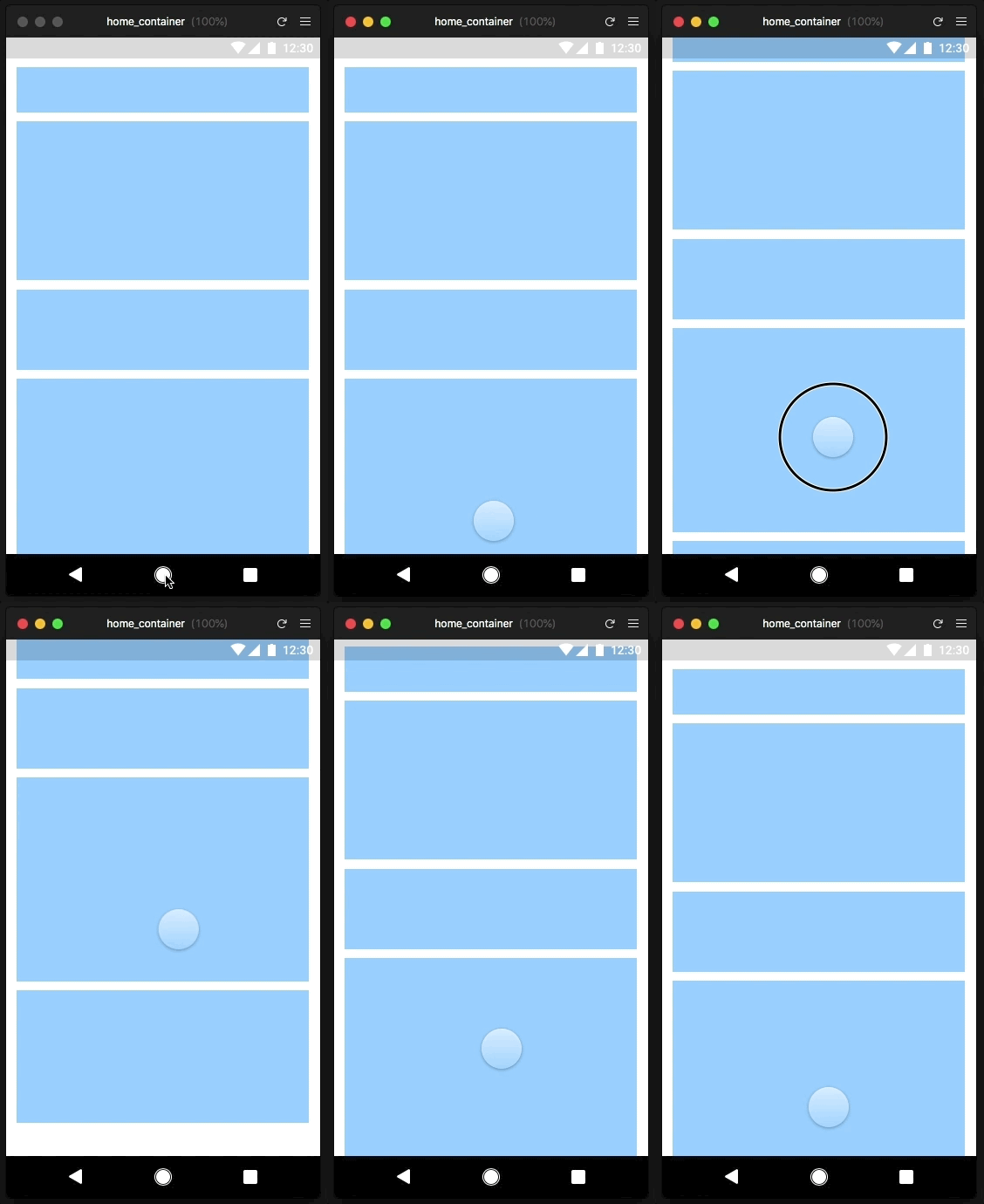
Now when I run a preview, my content is scrollable:

The Scroll tool in action

Awesome! With the underlying work out of the way, I’m ready to increase the fidelity a little bit. First, I want the general style of the app to be soft and welcoming, so I’ll use 4dp (display points) border-radius for my cards and buttons, and the rounded Material icons.

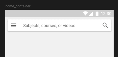
Since having an actual search input is super important for this screen, I don’t want the regular Android App bar and search icon experience. I’ll go for an actual input with a CTA message along with a hamburger icon ala Google Maps.

The app bar and search input for this prototype

The app bar and search input for this prototype (Large preview)

If I were to go deeper here, I’d make this bar a code component and write it so it expands to full width on scroll, like this:

The app bar, expanded on scroll

The app bar, expanded on scroll (Large preview)

I won’t do that for the purpose of this article, but I have to say I think something as simple would be easier to do in legacy Framer compared to Framer X — at least in this first version.

Linking

Let’s add some basic interactivity to this thing! When I tap on the search input, I want it to pull out a keyboard from the bottom. When I tap on the menu icon, however, I want to pull out a Navigation drawer from the left side.

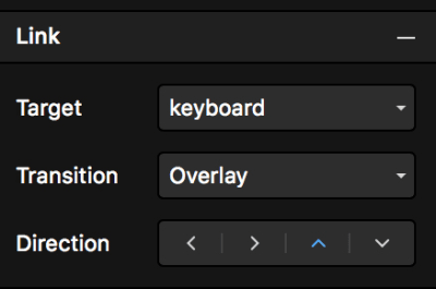
Whereas in legacy Framer I’d have to write a FlowComponent for this type of thing, it’s now super easy in Framer X and with its new Link tool! It’s similar to other prototyping applications in which I’d select a UI element, link it to a frame, and choose the type of transition I want. I imported the keyboard from the Android Kit component and linked to it from the search input. I set the transition to Overlay and the direction to bottom.

The Links panel

Once you link two frames, you can configure the link through the Links panel. (Large preview)

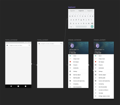
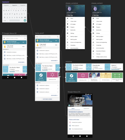
Because I have too many items in the navigation drawer to fit on a screen, I had to split it into two frames just like the Home screen: one container with a scroll layer linked to a frame with the actual content inside. Here’s how that looks:

Linked frames

The ‘Birdseye’ view of all linked frames in the prototype so far (Large preview)

Interacting with the prototype

Neat! There is a problem with this approach, though, that the Framer team will hopefully fix. When the transition of a frame is set to Overlay, it covers and dims everything beneath it. This isn’t quite what we want when we prototype for Android: The nav bar and status bar have to be above all other screen elements — including the overlays.

Same goes for the Search interface: I don’t want any screen dimming if I want to have filtering options and/or a list of recent queries when the keyboard is pulled out. Hopefully, we’ll see some fixes for these issues in future Framer X versions.

Pinning, Positioning, And Responsiveness

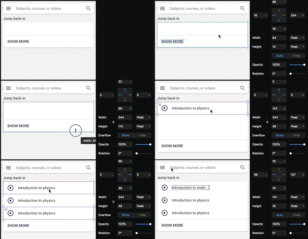
Back to the Home screen of the prototype. Below the search input, I want a list with my recent activity. Just as in legacy Framer and other design tools, you can pin elements within frames so they move and scale exactly as you want them to. Framer X also shows you distances and gaps between elements, snaps them together for you, and so on. Have a look:

Once my frames are pinned appropriately, designing responsively is very easy.
Design Components

I want to add a few more things to the prototype home screen: A Mastery Challenge prompt, a streak counter, list of missions, bookmarks and some UI that allows the user to explore content they might find cool or useful.

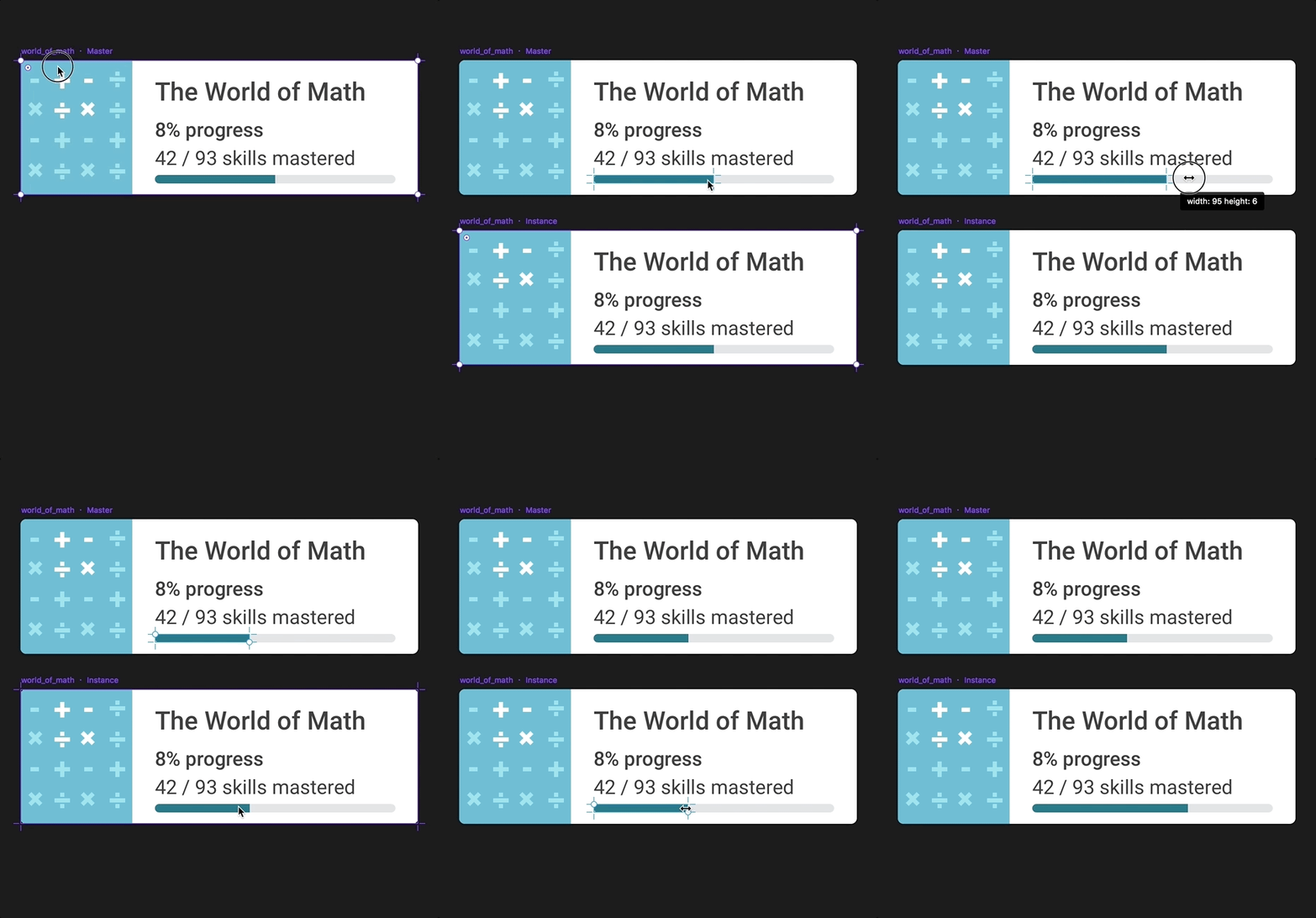
Since the recent missions and the bookmarks are going to be cards with very similar content, the best solution Framer X has for me is to use design components. I already mentioned them above (the Material Kit component bundle). Framer X’s design components work similarly to Sketch’s symbols and Figma’s components.

To convert a frame to a component, simply press Cmd + K. This creates a Master from which you can create as many instances as you want:

A Master component and its instance: Any changes applied to the Master are applied to the Instance, but not the other way around.
Anything you do to a Master component will affect its instances, but whatever you do to the instances won’t affect the Master. You can also nest Master components and go as crazy as you like.

So, here are my Recent missions and Explore sections:

Horizontally scrollable frames

Recent missions and Explore sections as horizontally scrollable frames. (Large preview)

Each section is a frame, connected to its own scroll component, and populated with components. The text strings (as well as the bitmap images in the instances) are overrides.

Stacks

Now, what if I’m not sure how to position and distribute all these cards? Well, Framer X’s Stacks feature comes into play here:

I only had to make sure that all items I wanted into a Stack are organized into frames. It works surprisingly well, and you can have components within a stack, as well as a stack within another stack, and so on. It’s huge for anyone mocking up and prototyping lists often!

Drawing Icons And Illustrations

The drawing tools in Framer X are pretty much the same as in legacy Framer. They’re good enough to do a lot, but still somewhat lagging behind Sketch’s: There are no rulers; you can’t convert strokes to outlines; you can’t flatten shapes; there’s no scissors tool.

Code Components

Creating A Simple Code Component

Finally, let’s take a closer look at the code components. Again, these are regular React components (both Stateless and Class) that can be written in either JavaScript or TypeScript (up to you). You can also install third-party libraries to use within your components in Framer.

Let’s try and use the popular styled-components library. This will allow us to style our component using actual CSS syntax within the .tsx file.

First, go to the Components tab → New Component → from Code. After you name your component and confirm, your default system editor (in my case, VS Code) will open an example Framer X component file.

Now go to File → Show project folder, open a terminal in that same folder, install yarn if you haven’t already and add styled-components to your Framer project:

$>yarn add styled-components

The library and its dependencies will be added to your package.json and you’re ready to go.

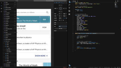
Here’s the source for my styled-components button, after I replaced the default code in my component’s .tsx file:

The Go button code component and its source

The Go button as a code component and its source (Large preview)

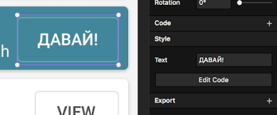
Note that the button label is customizable directly through the Framer X interface (because of the Framer library’s PropertyControls feature). Having my button written in code obviously has many advantages. It is customizable, responsive, and interactive. Along with the responsive paddings, it’s super easy to test if the design breaks in other languages.

The responsive Go button, translated quickly by changing the Text property directly in the Framer X UI.

The responsive Go button, translated quickly by changing the Text property directly in the Framer X UI. (Large preview)

Importing A Code Component From The Store

There’s a lot of video content on Khan Academy, so for my prototype, I want to open a video lesson. Instead of mocking up a ‘fake’ video player, I can directly embed an actual YouTube player in my prototype. There’s already a component in the Store for this purpose:

Playing a Khan Academy video in a Khan Academy prototype
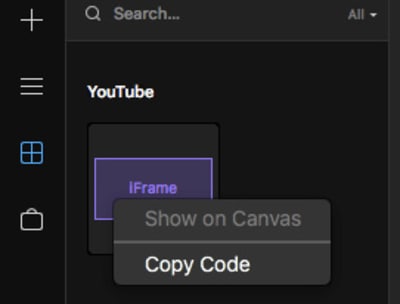
You can fork the code of any Store component and edit it as you like. For now, the only way to do this is to right-click on it in the sidebar, copy its code and paste it in a newly created components’ file.

Copying a Store component’s code.

You can copy every Store component’s code and play with it. (Large preview)

Code Overrides And The Framer library

The Framer JavaScript library has now been ported to work with Framer X and React. As with the legacy Framer library, it provides us with tools (helper functions) to animate our designs and to listen to events (simple things like onClick and onMove, but also advanced events like pinch, whether the device has been rotated or whether an animation has ended, and more).

Code Overrides are bits of code (JS functions) that allow you to change any frame’s or component’s properties. Static changes such as color are applied before you run the preview, directly within the Framer app, and the animations/interactions can be seen in the Preview window or on your preview device.

Let’s have a quick look at one of the simplest and default examples. I drew this simple champions cup illustration for one of the prototype cards, and I decided to animate it:

The static Mastery Challenge card

The static Mastery Challenge card (Large preview)

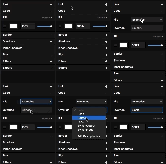
To add an override, I have to select my target frame (in this case the illustration) and click on the Code menu item in the right sidebar. Now I need to select the override I want from Exampels (selected by default in the drop down):

The Scale code override will provide me with a fun scale animation. I can edit it’s code and adjust as I like.

Remember, overrides are just blocks of code, therefore, they can live in any file within your project. What I just selected was the Examples.tsx file which contains multiple functions for Scale, Rotation, Fade, and so on. I can create my own file and write my own Override functions, or include them in my code components source code — just as long as I keep in mind to use the Override type specifier when I export them.

Here’s the source code for the Scale override I chose:

export const Scale: Override = () => {
return {
scale: data.scale,
onTap() {
data.scale.set(0.6)
animate.spring(data.scale, 1)
},
}
}

In plain English: Set the initial scale value of the frame down to 0.6, then animate the scale to 1 with spring curve. Finally, export it with name Scale and specify that it is an Override.

Once applied, this is the result:

The Mastery Challenge card with some animation
Design Responsiveness

As I mentioned in the beginning, it is essential for this particular prototype to work on small device screens (320dp). This is very easy to test in Framer X (considering you’ve pinned your UI elements properly, as described above). Simply set the Preview mode to Canvas – Responsive:

Framer X makes it easy to test my designs for different screens.

This is super helpful — I am now aware of what problems my designs have on smaller screens, and I’m ready to come up with fixes for the next iteration!

Day And Night Modes

Finally, in Framer you have two themes: Light, called “Day” mode:

 Framer X  day (light) mode

Framer X during the day (Large preview)

And dark, called “Night” mode:

Framer X  dark (night) mode

Framer X at night (Large preview)

You can switch the two from the Window menu.

Protoype: Final Result

Here are all my frames linked together:

All my frames linked together

All my frames linked together (Large preview)

And here’s the prototype in action:

What I Like About Framer X

The application performs fast (though the beta choked a little with large project files) and it feels well designed. It’s a new tool, yet at the same time, it feels familiar. It also does give me that sense of it being a ‘design IDE’ and I think the Framer team is taking things in a very interesting direction.

Framer X makes mundane things like linking screens and scrolling fast and easy, as they should be. Though I hope to see even more of that type of thing in the future: prototyping is supposed to be a quick and dirty process, after all. To spend too many hours on a prototype is to miss the point of prototyping.

Having a Components Store is a great idea, and will certainly speed up my design process. I no longer have to spend time hunting down the plugins I need. I can imagine a couple of years from now there will be thousands of components with basically everything I need to put something relatively advanced together — relatively quickly. It may need some moderation in the future, though. I can see people uploading too many simple buttons, each a fork of the other, just because they can.

I like the focus on design systems through the components and the Private Store features. We all know, many teams struggle to collaborate meaningfully and tools like these are an immense help.

What I’m Not Sure I Like About Framer X

What worries me a little is that part of the “super easy playground for experimentation” experience of the original Framer tool is somewhat gone. The new features in X make it very easy to quickly prototype any “standard” feature or screen: you have all you need in the Store. But it is arguably more difficult to explore crazy and weird ideas for custom interactions — at least with this initial product release.

Learning React will be more intimidating to a lot of us, math and logic-impaired designers. For me personally, code reuse is not an option, since none of the projects I’m currently working on are built using web technologies. But even if it was an option, I’m thinking about programming in terms of it being a tool to express my design ideas. I’m not an engineer; using my code for anything but a prototype is not exactly a terrific idea.

Having said that, there’s a lot more documentation on JavaScript and React than on CoffeeScript. There’re also more people to help out, and the React community seems pretty welcoming. I’m very curious to see how Framer X will help designers and engineers collaborate more — if at all.

Framer X In My Toolset

I’ll definitely be using Framer X in production, but I can’t see it completely replacing Sketch for me just yet. In my organization, each designer is allowed to use their favorite tool, as long as it integrates with Zeplin, and Framer X doesn’t. Other things it lacks compared to Sketch (for now) are the pages, the crazy amount of plugins, and the more powerful drawing tools.

I will continue to use the original Framer for custom interactions — at least for the foreseeable future. When prototyping, things need to be done fast, and I also still have much to learn about React.

Smashing Editorial
(mb, ra, yk, il)

The Cleanest Font In The World – Typography made from trash

Original Source: http://feedproxy.google.com/~r/abduzeedo/~3/kc5axqRtEIw/cleanest-font-world-typography-made-trash

The Cleanest Font In The World – Typography made from trash

The Cleanest Font In The World – Typography made from trash

abduzeedo
Oct 01, 2018

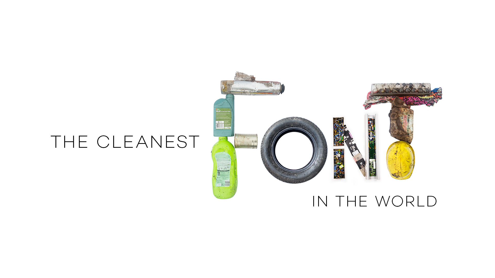
On a World cleanup day, 15th of September Slovenians didn’t just clean their country but also created an original typography from garbage.

Futura DDB and Ecologist without borders together with volunteers created the actual typeface from a waste they have collected on a respectable event held this Saturday, 15th of September. The cleanest font in the world can now be used as a reminder that every piece of trash can be RECYCLED AND REUSED – even as art. It is also vectorized so anyone can leave or type a message in a font made from real garbage.

the cleanest font

The font includes all the letters of the Slovenian alphabet and was made by numerous volunteers from around the country when they finished with cleaning. It was made out of different sort of waste found in nature – from old cans, batteries, bottles, tires, helmets, jackets, furniture, etc.

The result: the cleanest font in the world will be published online and free to use for any NGO or individual who would like to raise awareness on any kind of problematic environmental topic. Either in full colors, as it was made and photographed from garbage or in black and white vectorized form where the user can simply install it on a computer or preferred electronic device and start typing an ecological initiative or message.

alphabet

World cleanup day connected everyone in the world in an attempt to clean nature from trash left behind by the irresponsible ones. Slovenia wanted to go a step further and leave a special message to its residents and the whole world that would remind people that garbage doesn’t belong in the greens of nature.

“We want to encourage people to learn and understand the importance of the right behavior towards nature and proper waste management. That´s why we were extremely happy that we were able to create something memorable from trash together with hundreds of volunteers collecting it. Now we can finally write and send a clean message to the world as there are more appropriate places for trash than nature” stated Urša Zgojznik, The Ecologist without borders president.

If would like to find out more about the product, watch the presentation movie:

Credits

Ecologists without borders

Ecologists without Borders is a non-profit founded in 2009 and one of the leading Slovenian NGOs dedicated to improving the state of our environment — focusing on efficient resource use and active citizenship. Most of its activities deal with waste at its source, but not all are limited to Slovenia. We’re an active member of Zero Waste Europe, Let’s do it world!, Break Free From Plastic and some other networks. More at www.ebm.si/eng

Futura DDB Ljubljana

Futura DDB is one of the leading Slovenian agencies for integrated communication solutions. The company was founded in 1986 as a design studio that in 1989 became a full-service agency. Futura Group was formed throughout the two decades. Futura’s mission is to be a strategic partner of those who believes in creativity and innovation as the most powerful marketing tools to build brands. We believe that in a connected world only customer-centric brands can be influential. More at www.futura.si

Creative Director: Robert Bohinec
Art Director: Marusa Kozelj, Ana Kogovsek
Account Director: Meta Pavlin Avdic
Designer: Miha Avsenik
Event managers: Mojca Praznik Matic, Patricija Premrov
Photographer: Neza Plestenjak, Jure Novak
Additional credits: Aljaz Habot, Marjan Bozic

Try it out at http://www.fontspace.com/the-cleanest-font/the-cleanest-font-in-the-world


Typography


Collective #454

Original Source: http://feedproxy.google.com/~r/tympanus/~3/XP_FMUwAy0w/

C454_WOTW

Inspirational Website of the Week: Nagoya Estate

Super creative card animations make this design unique. Our pick this week.

Get inspired

API_Ads-2-factor-authentication-300×355

This content is sponsored via Syndicate Ads
HelloSign API: Everything IT Requires and Developers Love

HelloSign API’s robust SDK, amazing support, detailed documentation, and super clean dashboard is sure to make your entire team happy.

Check it out

C454_lazy

The Complete Guide to Lazy Loading Images

Rahul Nanwani’s deep dive into lazy loading images on websites.

Read it

C454_generativeart

Intro to Generative Art

A great practical introduction to generative art by Ali Spittel and James Reichard.

Read it

C454_logolab

Logo Lab

A testing tool for logos with some tips for improving the design.

Check it out

C454_power

How to Build a Low-tech Website?

Read about the making of a low-tech, self-hosted, and solar-powered version of Low-tech Magazine.

Read it

C454_icons

75+ Free Baseline Icons

Luboš Volkov created this fine set of icons.

Get it

C454_rover

JPL’s Open Source Build-It-Yourself Rover

A great web experience and a great project by NASA’s Jet Propulsion Laboratory.

Check it out

C454_fieldset

The State of Fieldset Interoperability

Read about Bocoup’s work and proposal to resolve the interoperability problems of fieldset.

Read it

C454_animationmoney

Visualizing money: how we explained a complex financial product using animation

Read the story of how the captivating animations and illustrations were done for bZx’s website. By Turischev Sasha.

Read it

C454_testing

How to Test React Components using Jest and Enzyme

Linh Nguyen My’s guide on testing React components using Jest and Enzyme.

Read it

C454_cors

Do You Really Know CORS?

In this article, Grzegorz Mirek explains what problem CORS really solves.

Read it

C454_table

Lissajous Table – Pannable

Jacob Foster created this fascinating demo.

Check it out

C454_templates

Free Startup Templates

Some great free landing page designs made by Pasquale Vitiello and Davide Pacilio.

Check it out

C454_candela

Candela Loader

Adam Kuhn coded this fantastic lava-like loader demo based on a design by Vitaly Silken.

Check it out

C454_layout

Accurately measuring layout on the web

Nolan Lawson shows some techniques for accurately measuring website rendering.

Read it

C454_gittweet

gitbird

Trun your git commits into tweets automatically with this tool.

Check it out

C454_gantt

React-gantt-timeline

A component built to display and manage calendar gantt charts with virtual rendering. By Guillermo Quiros.

Check it out

C454_oldlogos

If modern internet companies existed in 1970s – early 1990s

Fantastic retro style animated intros for today’s modern internet companies.

Watch it

C454_layoutmethods

New Tools for CSS Layout

Rachel Andrew’s presentation at a W3C Workshop in Tokyo, Japan.

Check it out

Collective #454 was written by Pedro Botelho and published on Codrops.