The New Framer X: Initial Impressions
Original Source: https://www.smashingmagazine.com/2018/10/new-framer-x-initial-impressions/
The New Framer X: Initial Impressions
The New Framer X: Initial Impressions
Lachezar Petkov
2018-10-01T13:30:03+02:00
2018-10-01T11:38:55+00:00
The Framer team recently released a new prototyping tool, Framer X, and I was lucky enough to be able to test it during the beta phase. In this article, I’d like to share my thoughts about this new tool and its features. I’ll make a comparison with the “legacy” Framer app as well as other tools, and I’ll discuss its brand new features such as Stacks and Scroll, and its new Code and Design components.
This article is intended for UI and UX designers who would like to learn more about Framer X’s prototyping abilities. Since it is (in many ways) a brand new product, you don’t need to be familiar with the older Framer application to read along. However, a little bit of familiarity with HTML, CSS, React, JavaScript and Node.js are beneficial.
For the purpose of this tutorial, I have also created a prototype which is a Material exploration of the Khan Academy’s app for Android.
Note: I’m in no way affiliated with Khan Academy; I just thought this would make a cool experiment — I hope you’ll agree.
Intro To Framer X
Framer X goes a few steps further than its predecessor in trying to bridge the gap between interface design and software development. Here’s how:
Dear Designers, Meet React
The key difference between the old and the new applications in this regard is the introduction of React and JavaScript / TypeScript, as opposed to using CoffeeScript for programming microinteractions and animations, loading data, and so on.

Framer X’s most important feature: It integrates tightly with ReactJS. (Large preview)
During the beta phase, people wrote some React components that I think show us the potential of how far the tool can take us. For example, you can embed actual media players (that actually stream and play music and video) within your prototypes. Or, you can embed graphs with real-time stock market data. Or how about a component that can translate your prototype’s UI into other languages. And that’s not all: Things are just getting started.
Meet SmashingConf New York 2018 (Oct 23–24), focused on real challenges and real front-end solutions in the real world. From progressive web apps, Webpack and HTTP/2 to serverless, Vue.js and Nuxt — all the way to inclusive design, branding and machine learning. With Sarah Drasner, Sara Soueidan and many other speakers.
Check all topics and speakers ↬

The same React code you write for a Framer X prototype could — at least hypothetically — be used in a production environment after the design phase. This can be especially useful for teams that do a lot of web development in React (and perhaps for teams who write mobile apps in React Native). Personally, I shudder at the thought of me, a designer, writing any code that goes into production, but that might work for others.
“Framer X is more like Unity than like Photoshop. An IDE for design, if you will.”
—The Framer X documentation
The Framer X Interface
If you are already a Framer user, the first thing you’d notice is that the integrated code editor is gone. Instead, if you want to write any code, you can use an editor of your choice. Most people (including myself) seem to go with VS Code.
Framer X (Large preview)
There are four tabs in the sidebar:
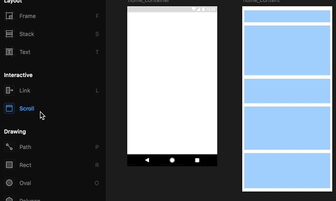
Tools
Opens all the layout and drawing tools everyone’s familiar with (shapes, path, text, frames) as well as three new toys we’ll discuss a little later: Stacks, Link, and Scroll.
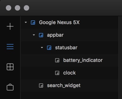
Layers
Contains, well, the layers of the selected frame, as well as its properties (color, position, border, shadow and so on). This bit is essentially the same as in the old Framer, and very similar to Sketch and Figma.
The Framer X Layers panel. (Large preview)
Components
This is for any Design or Code components you may have in the file you’ve opened.
Store
A new, huge feature in Framer X. It allows users to publish their creations — be it icons and illustrations or interactive code components for others to use. Currently, all components are free of charge, but I’d imagine people will be able to sell their stuff at the store in the future.

The Framer X Store (Large preview)
The Preview and Live Preview buttons are up at the top right corner. As with legacy Framer, you can preview your prototypes within a device picture for more realism, or preview them directly on an actual device, or in a browser.
Recommended reading: Learning Framer By Creating A Mobile App Prototype
Prototyping With Framer X
A Few Thoughts On The Prototype We’ll Create
The Khan Academy Android app isn’t a Material app, so let’s explore how it might look and behave if it was. I want to think of this as if it were a real-world project, so here are a couple of considerations that we’ll see how to handle in Framer X:
The product’s goal is to provide free education for everyone, thus it must be able to run on old and cheap devices. What this means for the design of the prototype is, it has to work on 320dp wide screens.
The design must adapt well when the app is translated into a language more verbose than English.
The first thing I’m going to do is mock up the Home screen. There are four things I want to be prominent:
A search input;
Something that will show me my most recent activity;
Something that will show me my Missions;
Something to notify me if there’s a new Mastery Challenge.
Let’s begin.
Installing Components From The Store
The first two elements I want to have here are the Android status bar and navigation bar. Instead of drawing them myself, I’ll quickly install a component bundle from the store called “Android Kit”. It contains all sorts of (static, not programmed in this case) elements like buttons, cards, switches, bars, keyboards and so on. I got my status bar and my nav bar in seconds:
 Adding a component from the Store
Note: Each component is installed per-project.
The Interactive Scroll Tool
Now, if I were doing this in Sketch, I’d continue mocking up the rest of the elements on the same artboard, and if it can’t fit all elements, I’d make it taller. In Framer X, however, things work a little differently. I’ll have the content of the Home screen within a separate frame (screen/artboard) and link that frame so it scrolls beneath the navigation and status bars of the home screen:
 Using the Scroll tool
Now when I run a preview, my content is scrollable:
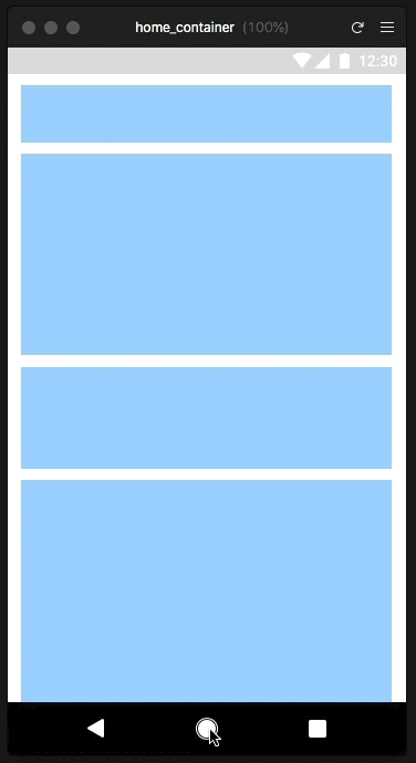 The Scroll tool in action
Awesome! With the underlying work out of the way, I’m ready to increase the fidelity a little bit. First, I want the general style of the app to be soft and welcoming, so I’ll use 4dp (display points) border-radius for my cards and buttons, and the rounded Material icons.
Since having an actual search input is super important for this screen, I don’t want the regular Android App bar and search icon experience. I’ll go for an actual input with a CTA message along with a hamburger icon ala Google Maps.
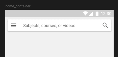
The app bar and search input for this prototype (Large preview)
If I were to go deeper here, I’d make this bar a code component and write it so it expands to full width on scroll, like this:
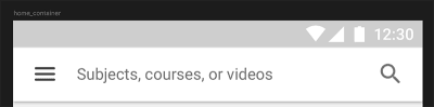
The app bar, expanded on scroll (Large preview)
I won’t do that for the purpose of this article, but I have to say I think something as simple would be easier to do in legacy Framer compared to Framer X — at least in this first version.
Linking
Let’s add some basic interactivity to this thing! When I tap on the search input, I want it to pull out a keyboard from the bottom. When I tap on the menu icon, however, I want to pull out a Navigation drawer from the left side.
Whereas in legacy Framer I’d have to write a FlowComponent for this type of thing, it’s now super easy in Framer X and with its new Link tool! It’s similar to other prototyping applications in which I’d select a UI element, link it to a frame, and choose the type of transition I want. I imported the keyboard from the Android Kit component and linked to it from the search input. I set the transition to Overlay and the direction to bottom.
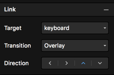
Once you link two frames, you can configure the link through the Links panel. (Large preview)
Because I have too many items in the navigation drawer to fit on a screen, I had to split it into two frames just like the Home screen: one container with a scroll layer linked to a frame with the actual content inside. Here’s how that looks:
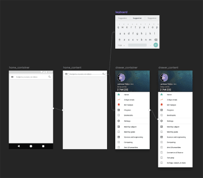
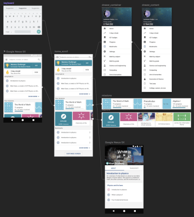
The ‘Birdseye’ view of all linked frames in the prototype so far (Large preview)
Interacting with the prototype
Neat! There is a problem with this approach, though, that the Framer team will hopefully fix. When the transition of a frame is set to Overlay, it covers and dims everything beneath it. This isn’t quite what we want when we prototype for Android: The nav bar and status bar have to be above all other screen elements — including the overlays.
Same goes for the Search interface: I don’t want any screen dimming if I want to have filtering options and/or a list of recent queries when the keyboard is pulled out. Hopefully, we’ll see some fixes for these issues in future Framer X versions.
Pinning, Positioning, And Responsiveness
Back to the Home screen of the prototype. Below the search input, I want a list with my recent activity. Just as in legacy Framer and other design tools, you can pin elements within frames so they move and scale exactly as you want them to. Framer X also shows you distances and gaps between elements, snaps them together for you, and so on. Have a look:
 Once my frames are pinned appropriately, designing responsively is very easy.
Design Components
I want to add a few more things to the prototype home screen: A Mastery Challenge prompt, a streak counter, list of missions, bookmarks and some UI that allows the user to explore content they might find cool or useful.
Since the recent missions and the bookmarks are going to be cards with very similar content, the best solution Framer X has for me is to use design components. I already mentioned them above (the Material Kit component bundle). Framer X’s design components work similarly to Sketch’s symbols and Figma’s components.
To convert a frame to a component, simply press Cmd + K. This creates a Master from which you can create as many instances as you want:
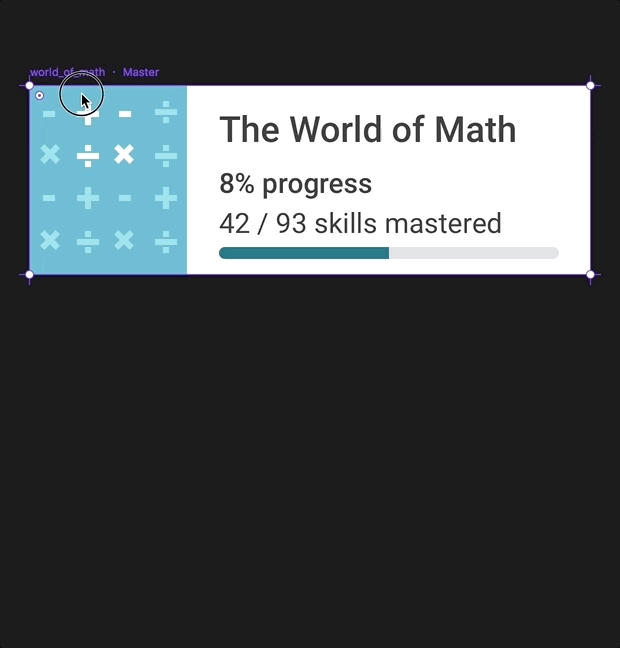 A Master component and its instance: Any changes applied to the Master are applied to the Instance, but not the other way around.
Anything you do to a Master component will affect its instances, but whatever you do to the instances won’t affect the Master. You can also nest Master components and go as crazy as you like.
So, here are my Recent missions and Explore sections:

Recent missions and Explore sections as horizontally scrollable frames. (Large preview)
Each section is a frame, connected to its own scroll component, and populated with components. The text strings (as well as the bitmap images in the instances) are overrides.
Stacks
Now, what if I’m not sure how to position and distribute all these cards? Well, Framer X’s Stacks feature comes into play here:
I only had to make sure that all items I wanted into a Stack are organized into frames. It works surprisingly well, and you can have components within a stack, as well as a stack within another stack, and so on. It’s huge for anyone mocking up and prototyping lists often!
Drawing Icons And Illustrations
The drawing tools in Framer X are pretty much the same as in legacy Framer. They’re good enough to do a lot, but still somewhat lagging behind Sketch’s: There are no rulers; you can’t convert strokes to outlines; you can’t flatten shapes; there’s no scissors tool.
Code Components
Creating A Simple Code Component
Finally, let’s take a closer look at the code components. Again, these are regular React components (both Stateless and Class) that can be written in either JavaScript or TypeScript (up to you). You can also install third-party libraries to use within your components in Framer.
Let’s try and use the popular styled-components library. This will allow us to style our component using actual CSS syntax within the .tsx file.
First, go to the Components tab → New Component → from Code. After you name your component and confirm, your default system editor (in my case, VS Code) will open an example Framer X component file.
Now go to File → Show project folder, open a terminal in that same folder, install yarn if you haven’t already and add styled-components to your Framer project:
$>yarn add styled-components
The library and its dependencies will be added to your package.json and you’re ready to go.
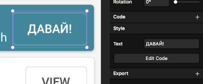
Here’s the source for my styled-components button, after I replaced the default code in my component’s .tsx file:
The Go button as a code component and its source (Large preview)
Note that the button label is customizable directly through the Framer X interface (because of the Framer library’s PropertyControls feature). Having my button written in code obviously has many advantages. It is customizable, responsive, and interactive. Along with the responsive paddings, it’s super easy to test if the design breaks in other languages.
The responsive Go button, translated quickly by changing the Text property directly in the Framer X UI. (Large preview)
Importing A Code Component From The Store
There’s a lot of video content on Khan Academy, so for my prototype, I want to open a video lesson. Instead of mocking up a ‘fake’ video player, I can directly embed an actual YouTube player in my prototype. There’s already a component in the Store for this purpose:
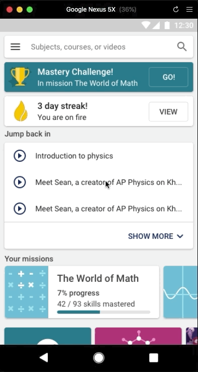 Playing a Khan Academy video in a Khan Academy prototype
You can fork the code of any Store component and edit it as you like. For now, the only way to do this is to right-click on it in the sidebar, copy its code and paste it in a newly created components’ file.
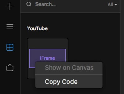
You can copy every Store component’s code and play with it. (Large preview)
Code Overrides And The Framer library
The Framer JavaScript library has now been ported to work with Framer X and React. As with the legacy Framer library, it provides us with tools (helper functions) to animate our designs and to listen to events (simple things like onClick and onMove, but also advanced events like pinch, whether the device has been rotated or whether an animation has ended, and more).
Code Overrides are bits of code (JS functions) that allow you to change any frame’s or component’s properties. Static changes such as color are applied before you run the preview, directly within the Framer app, and the animations/interactions can be seen in the Preview window or on your preview device.
Let’s have a quick look at one of the simplest and default examples. I drew this simple champions cup illustration for one of the prototype cards, and I decided to animate it:

The static Mastery Challenge card (Large preview)
To add an override, I have to select my target frame (in this case the illustration) and click on the Code menu item in the right sidebar. Now I need to select the override I want from Exampels (selected by default in the drop down):
 The Scale code override will provide me with a fun scale animation. I can edit it’s code and adjust as I like.
Remember, overrides are just blocks of code, therefore, they can live in any file within your project. What I just selected was the Examples.tsx file which contains multiple functions for Scale, Rotation, Fade, and so on. I can create my own file and write my own Override functions, or include them in my code components source code — just as long as I keep in mind to use the Override type specifier when I export them.
Here’s the source code for the Scale override I chose:
export const Scale: Override = () => {
return {
scale: data.scale,
onTap() {
data.scale.set(0.6)
animate.spring(data.scale, 1)
},
}
}
In plain English: Set the initial scale value of the frame down to 0.6, then animate the scale to 1 with spring curve. Finally, export it with name Scale and specify that it is an Override.
Once applied, this is the result:
 The Mastery Challenge card with some animation
Design Responsiveness
As I mentioned in the beginning, it is essential for this particular prototype to work on small device screens (320dp). This is very easy to test in Framer X (considering you’ve pinned your UI elements properly, as described above). Simply set the Preview mode to Canvas – Responsive:
Framer X makes it easy to test my designs for different screens.
This is super helpful — I am now aware of what problems my designs have on smaller screens, and I’m ready to come up with fixes for the next iteration!
Day And Night Modes
Finally, in Framer you have two themes: Light, called “Day” mode:
Framer X during the day (Large preview)
And dark, called “Night” mode:
Framer X at night (Large preview)
You can switch the two from the Window menu.
Protoype: Final Result
Here are all my frames linked together:
All my frames linked together (Large preview)
And here’s the prototype in action:
What I Like About Framer X
The application performs fast (though the beta choked a little with large project files) and it feels well designed. It’s a new tool, yet at the same time, it feels familiar. It also does give me that sense of it being a ‘design IDE’ and I think the Framer team is taking things in a very interesting direction.
Framer X makes mundane things like linking screens and scrolling fast and easy, as they should be. Though I hope to see even more of that type of thing in the future: prototyping is supposed to be a quick and dirty process, after all. To spend too many hours on a prototype is to miss the point of prototyping.
Having a Components Store is a great idea, and will certainly speed up my design process. I no longer have to spend time hunting down the plugins I need. I can imagine a couple of years from now there will be thousands of components with basically everything I need to put something relatively advanced together — relatively quickly. It may need some moderation in the future, though. I can see people uploading too many simple buttons, each a fork of the other, just because they can.
I like the focus on design systems through the components and the Private Store features. We all know, many teams struggle to collaborate meaningfully and tools like these are an immense help.
What I’m Not Sure I Like About Framer X
What worries me a little is that part of the “super easy playground for experimentation” experience of the original Framer tool is somewhat gone. The new features in X make it very easy to quickly prototype any “standard” feature or screen: you have all you need in the Store. But it is arguably more difficult to explore crazy and weird ideas for custom interactions — at least with this initial product release.
Learning React will be more intimidating to a lot of us, math and logic-impaired designers. For me personally, code reuse is not an option, since none of the projects I’m currently working on are built using web technologies. But even if it was an option, I’m thinking about programming in terms of it being a tool to express my design ideas. I’m not an engineer; using my code for anything but a prototype is not exactly a terrific idea.
Having said that, there’s a lot more documentation on JavaScript and React than on CoffeeScript. There’re also more people to help out, and the React community seems pretty welcoming. I’m very curious to see how Framer X will help designers and engineers collaborate more — if at all.
Framer X In My Toolset
I’ll definitely be using Framer X in production, but I can’t see it completely replacing Sketch for me just yet. In my organization, each designer is allowed to use their favorite tool, as long as it integrates with Zeplin, and Framer X doesn’t. Other things it lacks compared to Sketch (for now) are the pages, the crazy amount of plugins, and the more powerful drawing tools.
I will continue to use the original Framer for custom interactions — at least for the foreseeable future. When prototyping, things need to be done fast, and I also still have much to learn about React.
(mb, ra, yk, il)


Leave a Reply
Want to join the discussion?Feel free to contribute!