Webfonts And Performance: SmashingConf Videos

Original Source: https://www.smashingmagazine.com/2018/07/smashingconf-videos-web-fonts-performance/

Webfonts And Performance: SmashingConf Videos

Webfonts And Performance: SmashingConf Videos

The Smashing Editorial

2018-07-20T14:35:35+02:00
2018-07-20T15:29:44+00:00

Webfonts are difficult to get right. An often overlooked and disruptive piece of web performance, webfonts can slow down your site and leave your visitors confused and agitated. No one wants agitated visitors.

Webfonts Are ▢▢▢ Rocket Science

Recorded at our special web performance themed SmashingConf in London, Zach Leatherman demystifies webfonts in order that we can avoid font-related performance issues. He takes us through a detailed guide to best practices when using webfonts, so you can use beautiful fonts without sacrificing performance. If you have ever asked, “What is the best way to load webfonts?” then you need to hear this talk. Zach breaks down the various approaches in a straightforward way, so you should feel able to make the best decisions for your own use of webfonts.

In addition to this video, you can take a look at Zach’s “Comprehensive Guide To Font Loading Strategies,” and subscribe to his newsletter fontspeed.io.

Fontastic Web Performance

Another great introduction to font loading was made by Monica Dinculescu at SmashingConf Barcelona. She spoke about which new platform features are here to help us deliver pretty (but also!) fast experiences to everyone.

In her talk, Monica also mentions the following resources — in addition to Zach’s work:

“Type is Your Right,” by Helen Holmes
“Minimising Font Downloads,” by Jake Archibald
Type With Pride
Axis Praxis
Fontastic

We also find Monca’s Font Style Matcher tool really useful, helping you find a font that matches your webfont closely to prevent a jarring shift between the sizes.

Enjoyed listening to these talks? There are many more SmashingConf videos on Vimeo, and we’re getting ready for the upcoming SmashingConf in New York — see you there? 😉

With so much happening on the web, what should we really pay attention to? At SmashingConf New York 2018 ?? we’ll explore everything from PWAs, font loading best practices, web performance and eCommerce UX optimization, to refactoring CSS, design workflows and convincing your clients. With Sarah Drasner, Dan Mall, Sara Soueidan, Jason Grigsby, and many other speakers. Oct 23–24.

Check the speakers →

SmashingConf New York 2018, with Dan Mall, Sara Soueidan, Sarah Drasner and many others.

Smashing Editorial
(ra, il)

Turn Your Website Into a Money-Making Machine Using These Tips

Original Source: http://feedproxy.google.com/~r/Designrfix/~3/OIOiWMJyMGI/turn-your-website-into-a-money-making-machine-using-these-tips

Having a money-making website is the bomb! Not only will you be able to generate truckloads of money while you’re off somewhere sipping margaritas, but you’ll also be able to create strategic partnerships that can bring you even more cash. If that’s what you’ve been trying to accomplish these past few years — yet you’re […]

The post Turn Your Website Into a Money-Making Machine Using These Tips appeared first on designrfix.com.

19 free resume templates

Original Source: http://feedproxy.google.com/~r/CreativeBloq/~3/lJs3xgqCqa8/free-resume-templates-111517854

There isn't always time to craft your creative resume from scratch. If you're facing a tight deadline, one option is to get ahead by choosing a free resume template and customising it into a bespoke design.

We've had a search around and found these striking free resume templates, each of which offers something a little different. Download one of these templates and wing your way to a job interview for the role or client of your dreams.

01. Material design resume
Resume and CV templates

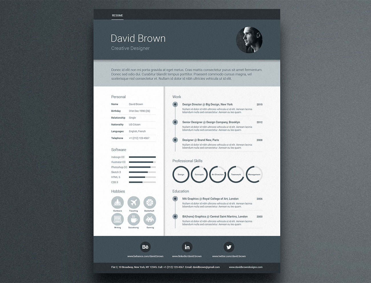
Turn heads with a resume that has an irresistible dash of Material Design cool

For a stand-out resume with an on-trend look, this template, inspired by Google's Material Design framework, is a shoe-in. It includes areas for professional profile, work experience, education, skill circles, skill bars, social media icons and images, and it's supplied in A4-size format for Adobe Illustrator, InDesign and Photoshop. It uses free fonts, and if you'd like a covering letter and portfolio template to go with your resume, there's a premium version that also includes new colour options plus matching business card templates and custom icons.

02. Stylish infographic resume
Resume and CV templates

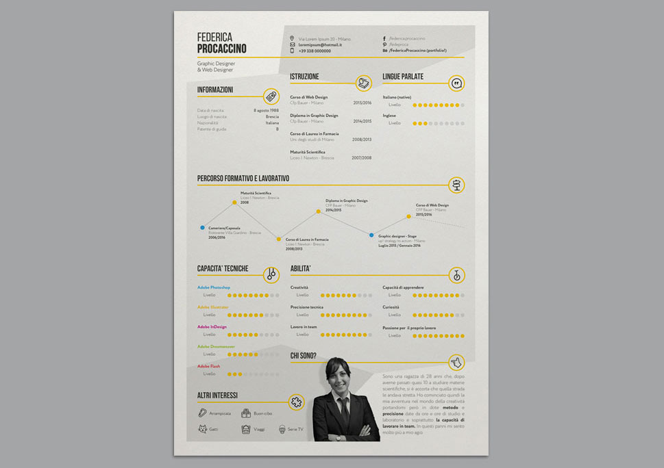
Why not tell your career story with a swish infographic?

Want to get all your relevant information across in an eye-friendly, graphical way? Why, you'll be wanting some kind of infographic, then! And this stylish template by Federica Procaccino delivers just that, enabling you to get your message across on a single page without overwhelming everyone with text.

03. Creative resume
Resume and CV templates

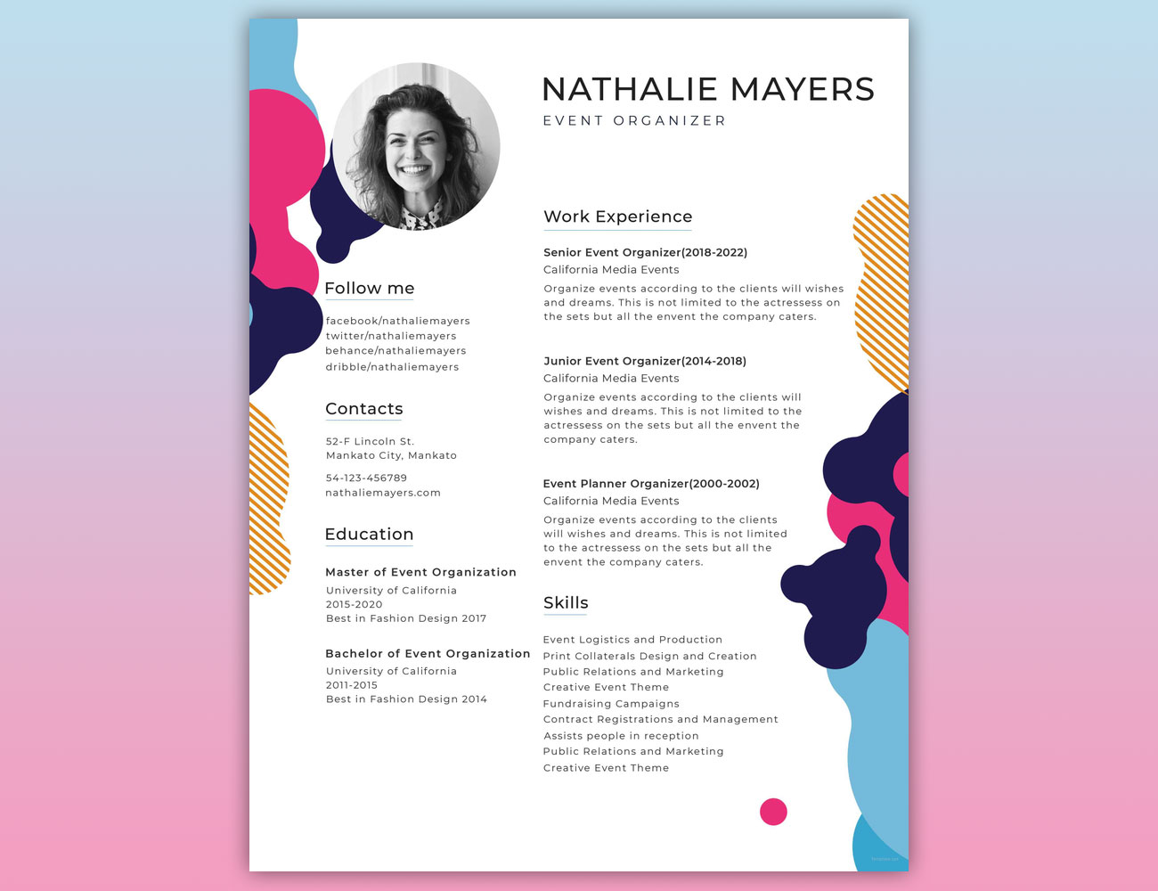
Give yourself a colourful leg-up with attention-grabbing template

Catch any potential employer's eye with this fun one-page template. It's ready to edit in just about any package you care to imagine, it has plenty of room for all the important bullet points that you'll want people to know about, and the colourful splashes along the edges mean that it won't get lost among a pile of other applicants.

04. Modern resume
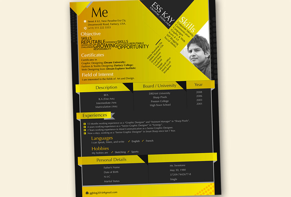
Edit this template in Illustrator to make it your own

If you know your way around Adobe Illustrator and don't mind getting your hands dirty, then this template is prefect for producing a great-looking resume that you can customise to your personal taste. You can either use it as-is, changing the text and adding a photograph, or you can spend time editing the colours and tweaking the layout until you have something that more accurately reflects your personality.

05. YA resume
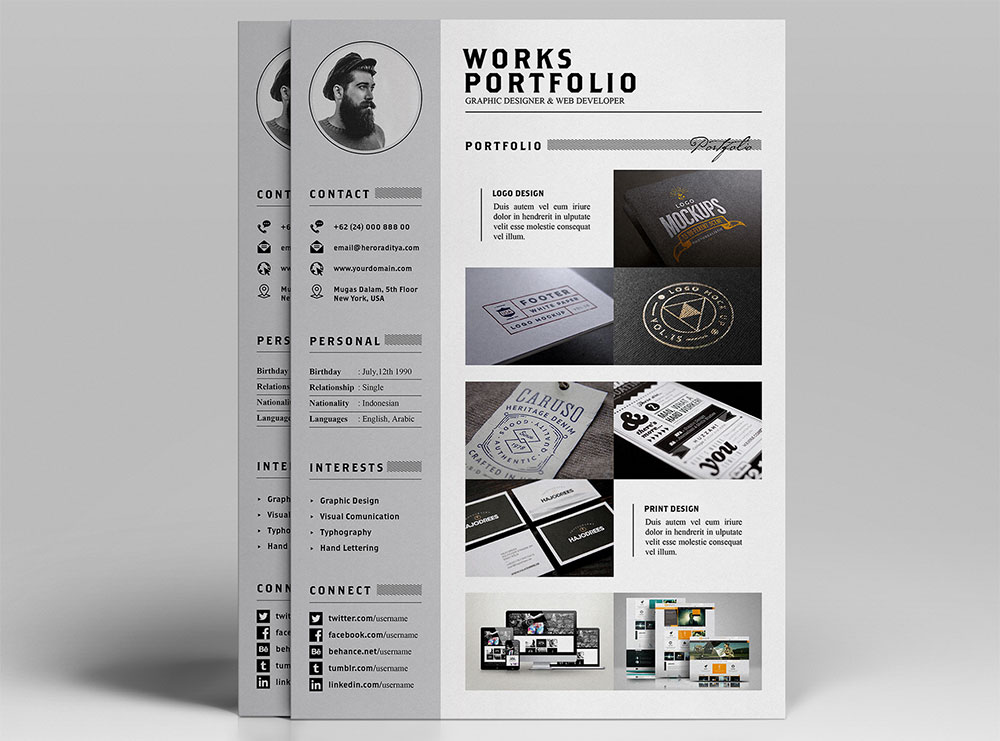
Whether you’re a graphic designer or a sea captain, this template will see you right

Created by Indonesian graphic designer Angga Baskara, this elegant template covers all the bases with three sections – a main CV info page featuring eye-catching progress bars to illustrate your main skills, a covering letter and a portfolio section where you can add a selection of your work in the form of images and short descriptions.

06. Graphical resume
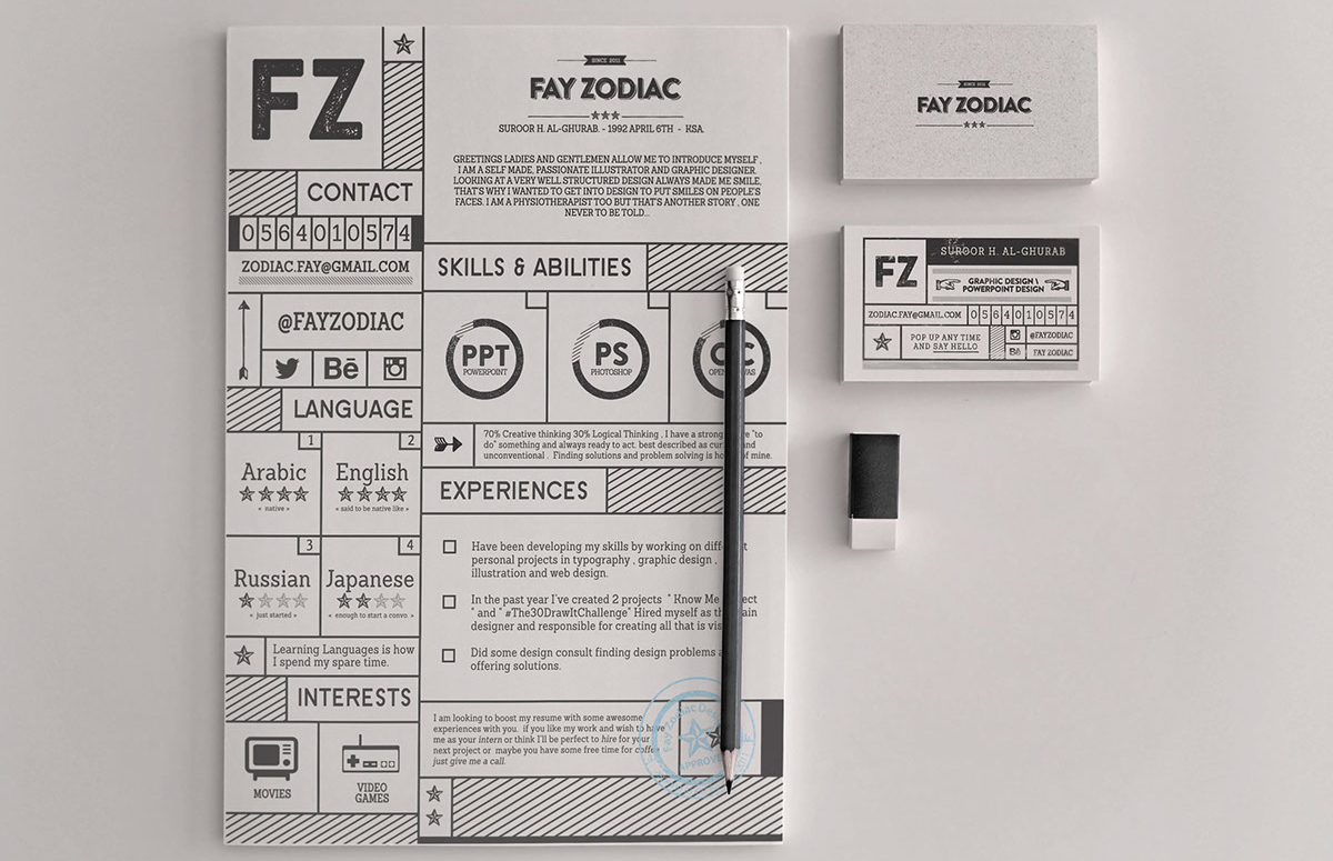
Fay Zodiac’s template is bold

This resume template by Fay Zodiac isn't one for the faint-hearted. Its bold letterpress-styled icons, patterns and text certainly pack a punch, and will ensure your CV jumps out from the pile. You'll just need the confidence in the job interview to back up your loud resume design. It comes with the fonts and icons, as well as the Photoshop resume template, and is fully editable.

07. Colourful resume
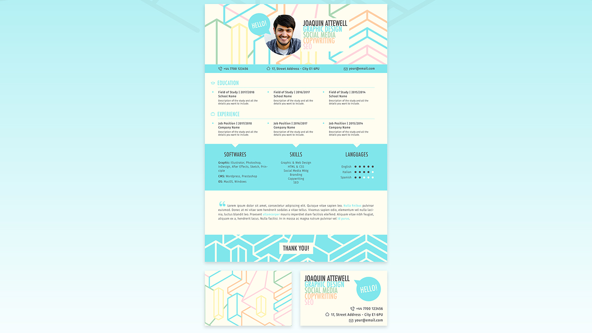
Riccardo Rivieccio’s template comes with matching business cards

As any designer knows, colour sells. Riccardo Rivieccio's free resume templates come in a choice of six colour schemes with attention-grabbing patterns in the header. And to further sweeten the deal, he's also designed matching business cards. These Illustrator files are fully editable, too, so have fun with colour.

08. Creative Vintage Resume
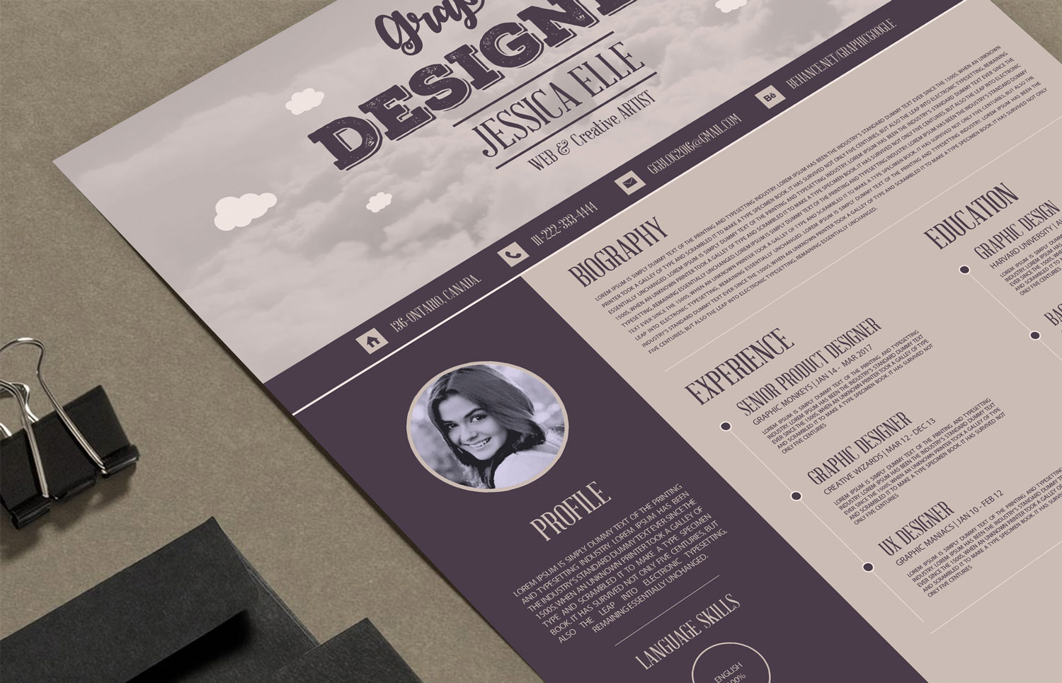
This wonderfully retro template comes in gorgeous earthtones

This is a splendidly vintage-looking resume template in deliciously earthy tones, and it comes as an .AI file so that you can adjust it to your heart's content. Be aware, though, that the fonts aren't included, so you'll either have to hunt them down yourself (they're all free fonts, luckily) or substitute your own.

09. Creative Designer Resume Template
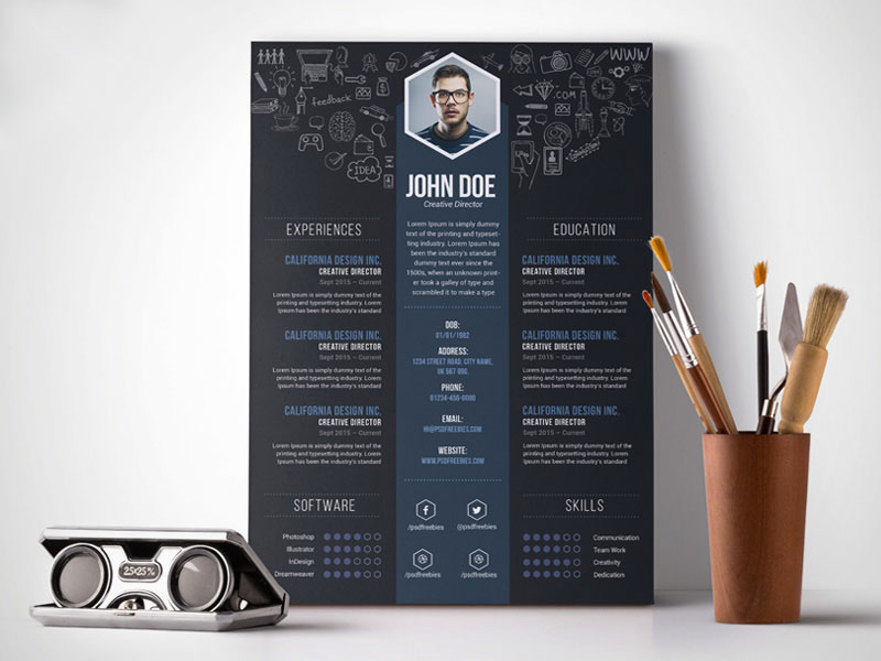
Make an instant impression with this visually-focused template

Fully layered and well organised to keep customisation nice and easy, this bold and punchy visual template enables you to get yourself and your skills across quickly, without any messing around. It comes as a print-ready 300dpi A4 PSD, ready for editing in Photoshop.

10. Project-based resume
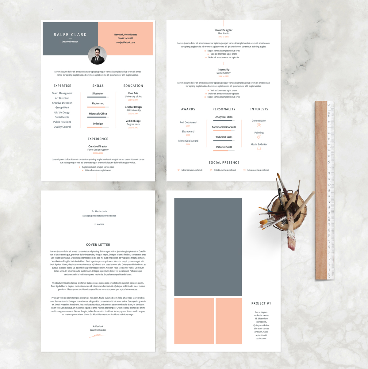
A centre-aligned layout with space for images

Depending on the type of application process you're dealing with, it may be appropriate to include samples of your work within your CV. This template, Velli, is great if you have images of visual work that you'd like to form part of your resume, and there's also space for a cover letter. 

11. Two-column layout
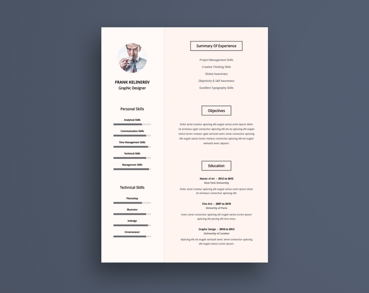
A two-tone layout with two columns

Fitting a lot of information onto your first page can help to a grab a recruiter's attention, and a two-column layout is a good way to achieve that without making your page look cluttered. 

12. Timeline resume
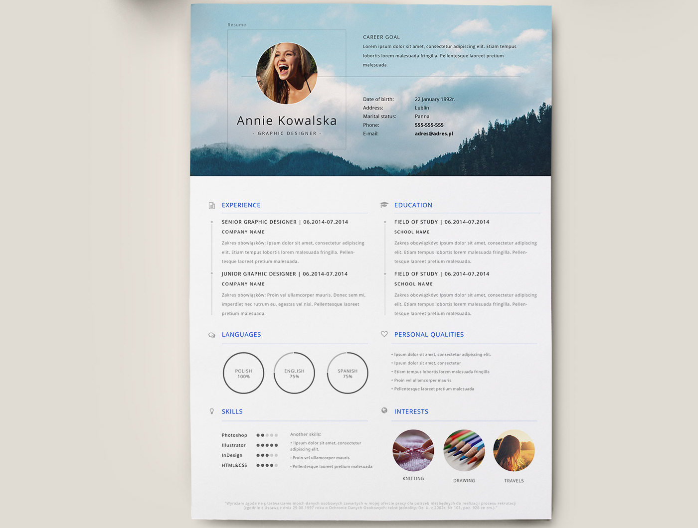
Create a good first impression with this free timeline resume template

This free timeline-based resume template was created by graphic designer Patryk Korycki. An AI file, the design features typeface Open Sans, with various fields available to enter education details, skills, interests and much more.

13. Stylish resume
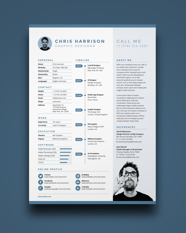
Resume and CV templates

A stylish resume template that includes a timeline of your employment history

This subtle yet stylish CV template features all the details you need to include, along with a neat sidebar holding a profile and references and a timeline – in which you can list your employment history. There’s also an online profile section to show just how social media-savvy you are and a software skills bar graph so you can show your exact skills. It’s supplied in PSD, AI and INDD formats.

14. Resume for icon fans
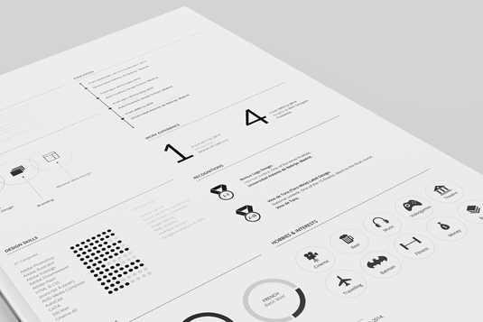
Resume and CV templates

This resume template has some super-stylised icons included

If icons are your thing, check out this free template from designer Fernando Báez. A sectionalised design, complete with stylish type and icons included (you get the CV in AI format and the icons in PSD), this resume is perfect for customising with your own icons to represent your interests and achievements.

15. Resume for type fans
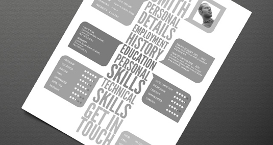
Resume and CV templates

A central typographic column enables you to list your skills

Sure, this may not be to everyone's taste – but it's certainly impactful. A central typographic column bursts out to boxes in which you can add your details. The resume is supplied in AI format so you can easily export a PDF – and comes in black and white so you can get creative with colours.

16. Simple resume
Resume and CV templates

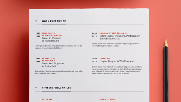
This simple resume template uses colour

Simplicity is the key in this type-based CV that puts your profile at the top, then lists experience and education in simple boxes. There's also a professional skills section enabling you to give yourself a percentage score on languages and professional skills. The Illustrator file makes the most of colour to aid its simplicity.

17. Clean resume
Resume and CV templates

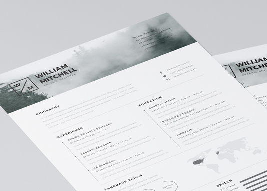
The Smart Object header makes it a cinch to add your own graphic to this resume

This highly customisable resume template comes in PSD and AI formats, and has a Smart Object header, meaning you can quickly and easily link in an image of your choice. It's A4, 300dpi, with 3mm bleed – so completely print-ready. Just add your logo, bio, experience and so on, and you're ready to print and send.

18. Hadi Reda
Resume and CV templates

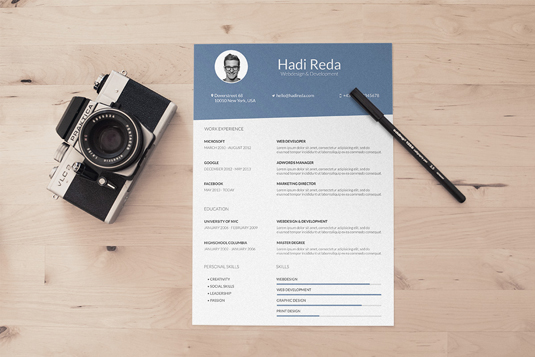
Super-minimal with a neat icon style, this resume is ace for designers

Keep it super-minimal with this resume template. Once again there's a bar graph for your skills (which we're still not sure about but some employers may like) along with a neat icon style to represent your social media profiles and software competence. It's supplied in layered PSD format.

19. Resume that makes a statement
Resume and CV templates

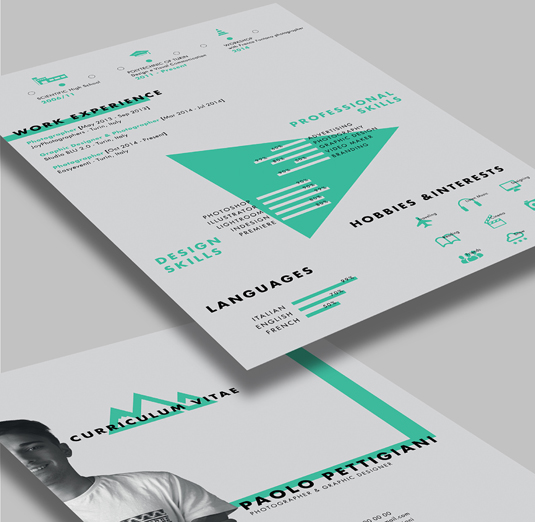
It’s definitely worth experimenting with this contemporary resume template by Paolo Pettigiani

Maybe you’re looking to make more of a statement with your one-pager – in which case this typographic template by Paolo Pettigiani may be just the ticket. Easy to customise and available in AI format with all the necessary fonts and icons, it’s definitely worth experimenting with.

Related articles:

10 beautiful paper portfolios to inspire you30 brilliantly creative resumes5 quick ways to improve your portfolio dramatically

E-book Readers & Managers – Best of

Original Source: https://www.hongkiat.com/blog/ebook-reader-manager/

Some of the best e-book readers along with their positive and negative features.

The post E-book Readers & Managers – Best of appeared first on Hongkiat.

Visit hongkiat.com for full content.

10 ace design magazines to add to your reading list

Original Source: http://feedproxy.google.com/~r/CreativeBloq/~3/jpYun4xTn2s/10-ace-design-magazines-to-add-to-your-reading-list

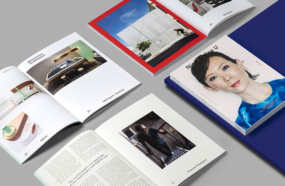
Design magazines have a number of functions: they let you know what's going on in the industry, inspire you, offer advice you can apply to your own design portfolio, provide you with insights from design superstars, go behind the scenes on the biggest and most experimental design projects – all that stuff. But design magazines are also obliged to look dead cool while artfully stacked up on your coffee table.

We've picked out a selection of design magazines from around the world; titles with the best writing and photography, the coolest designs, and the top production values. We looked at big-selling design magazines that have been around for decades, and smaller, independent titles that dare to be different.

Wallpaper*

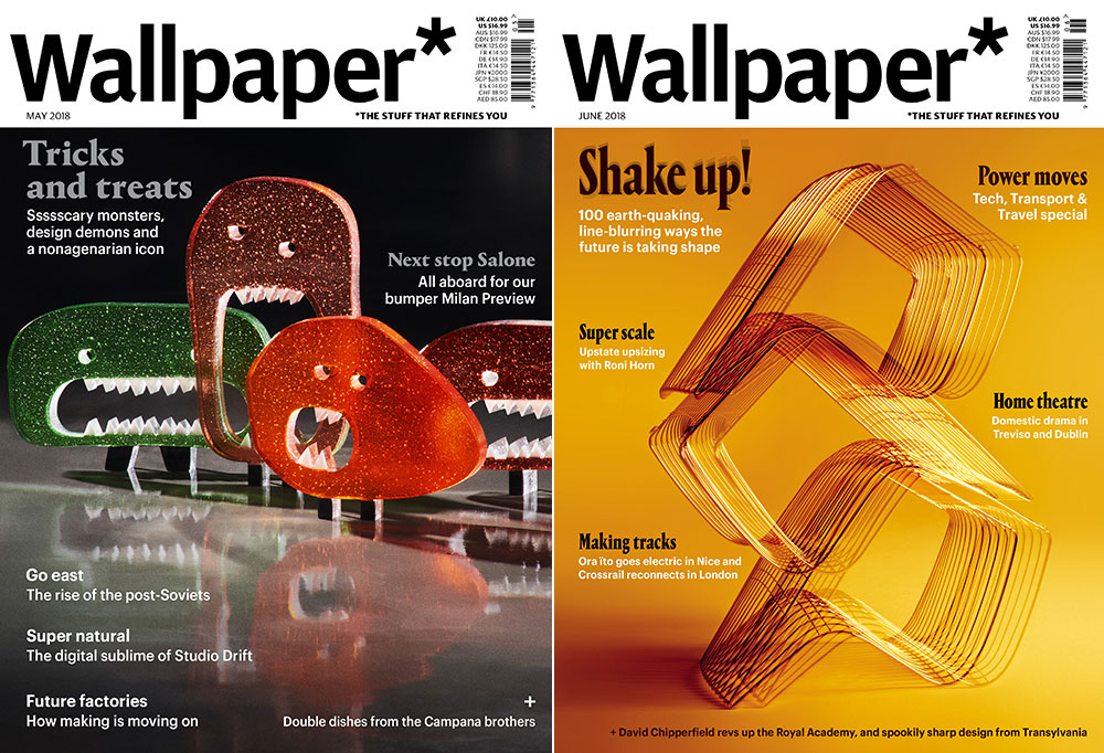
Wallpaper* magazine covers

For interiors inspo, Wallpaper* can’t be beaten

The first of our heavyweight titles is Wallpaper*: 'the world's most important design and lifestyle magazine brand’. The monthly mag has readers in 100 countries, the majority employed in the creative industries, so it covers design from around the world in all its forms. You might see a story about Frida Kahlo next to one about Paris Fashion Week, something on wearable football kits beside a piece about a new bar in Buenos Aires. It's no good for Photoshop tips, but can't be beaten for #apartmentgoals. 

Computer Arts

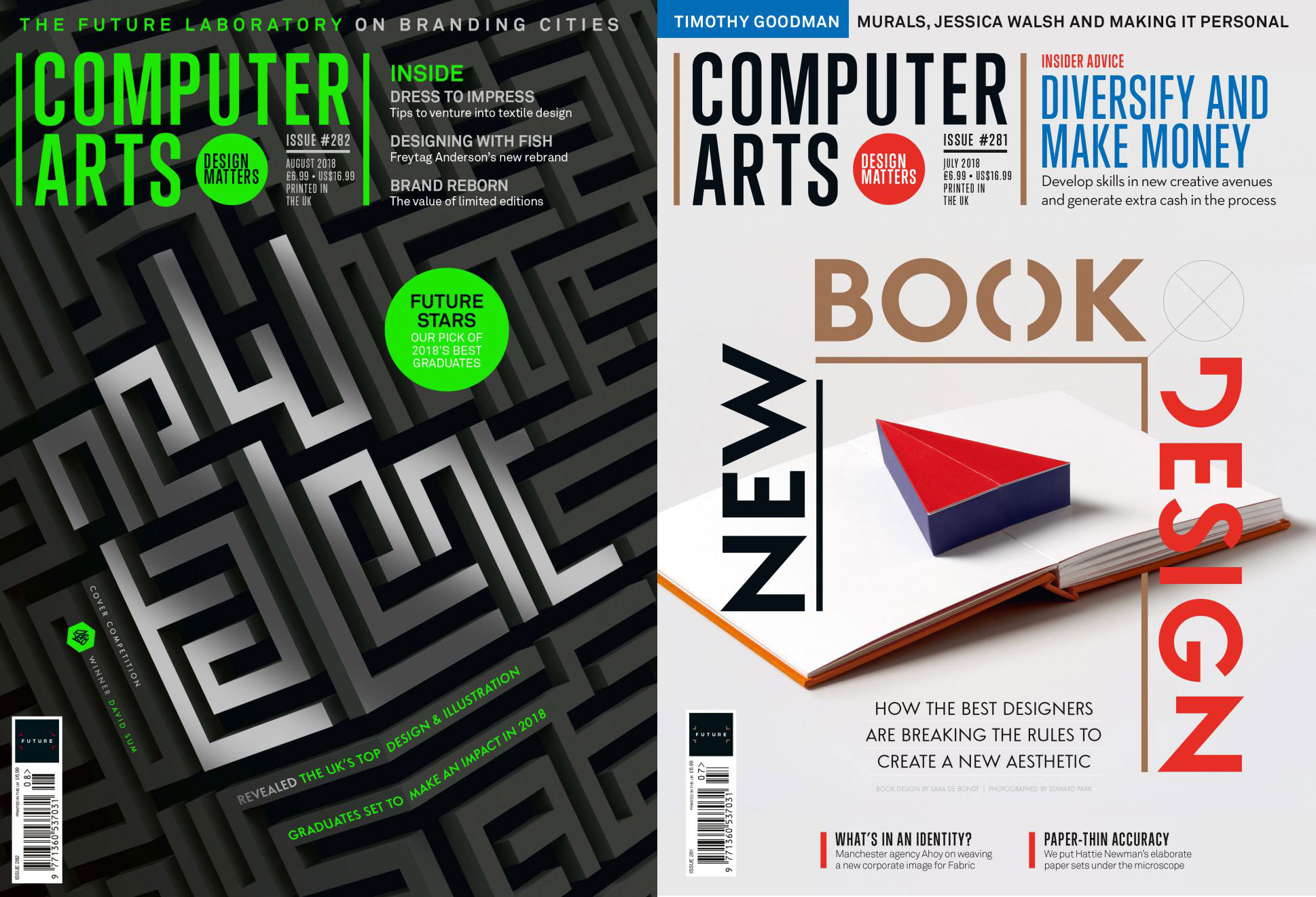
For practical advice, you can’t beat Computer Arts

Whatever stage of your career you're at – student or studio boss – Computer Arts is a cornerstone magazine. The monthly title champions graphic design, branding and illustration. It interviews the world's best studios and individual designers, but also regularly celebrates fresh new talent. The magazine goes behind the scenes on big projects to see how they're put together.

It's one of our sister magazines, so we're a little biased, but where Computer Arts really comes into own is with career tips and advice: how to upgrade your skills, tips for making it as a freelancer, and what to do if you decide to quit your job. 
The covers always look super-smart too. A particular highlight is Computer Arts' annual cover design competition, run in association with D&AD New Blood. It's a chance for fledgling designers to show off their skills, and for industry pros to take a look at the best upcoming talent. You can see 2018's winning entry on the issue on sale now. Pick up a copy to check out the full shortlist, or check out last year's winners.

Creative Review

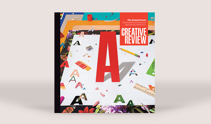
Creative Review magazine

CR has been running since 1980

Our final big title is Creative Review: 'We celebrate the work that matters. And we dig into how and why it gets made. We challenge and champion the industry we love.' Since 1980, the title has been covering all quarters of the creative industries – not just art and design but advertising, film and TV, too. It interviews big-name creatives and analyses high-profile projects, looks at how things are made and why, inspires you to go and make your own stuff, and offers practical advice on how to run your own studio. 

Eye

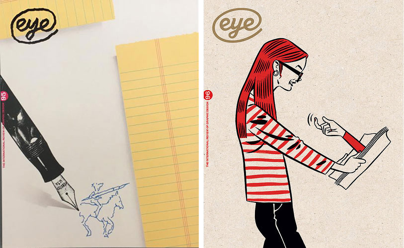
Eye magazine

Eye has great coffee table appeal

Eye calls itself 'the world’s most beautiful and collectable graphic design journal' – and it might just be. Aside from always having a killer front cover (this is definitely one to leave artfully stacked on the coffee table), the quarterly magazine offers some of the best writing around on design and 'visual culture' in general. For a taste of what to expect, a recent issue includes stories on Estonian design, the anatomy of a magazine, and an interview with the design director at the New York Times. Eye also does some pretty good student subscription deals. 

99U

99U magazines

99U is made by Adobe, so you know you’re in safe hands

Another one of the best-looking magazines around is 99U. It’s aimed at everyone from designers and engineers to educators, marketers, artists and CEOs: ‘If you approach your work creatively, 99U’s goal is to help you find the inspiration to build an incredible career'. It's made by Adobe so you know you're in safe hands. The current quarterly issue covers Pentagram's Natasha Jen, an insider's tour of Berlin, and 10 designers sharing how they upset the status quo – firing their best client, good stuff like that.

Communication Arts

communication arts magazine

This US-focused mag is aimed at creative professionals

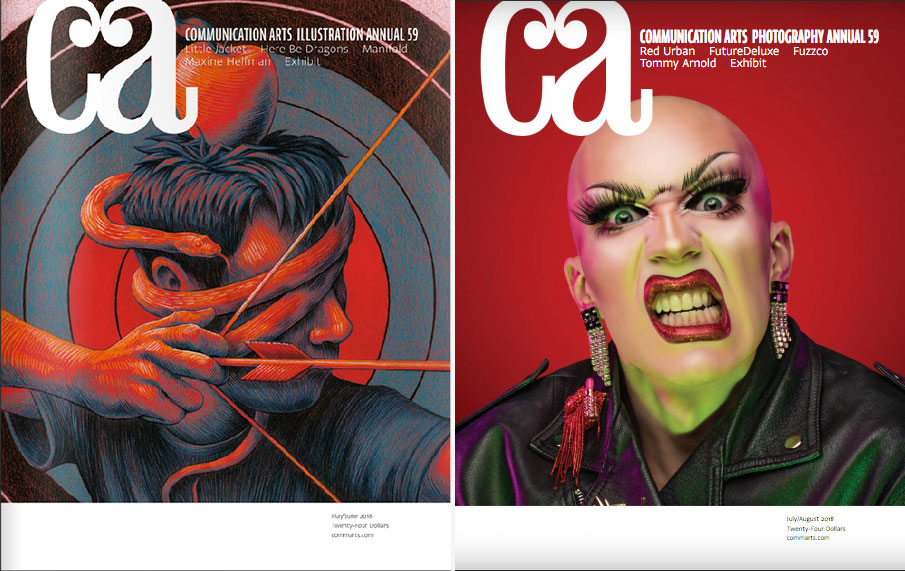
Communication Arts covers design, illustration, typography and photography, as well as advertising and interactive fields. It's US-focused and is for people in the industry more than general hobbyists. The bimonthly magazine is at its best when interviewing designers and design studios – the Surrealist photographer from Portland; the experimental marketing agency in San Francisco – about the work they make. 

The Great Discontent

The Great Discontent magazine

TGD specialises in longform, in-depth interviews

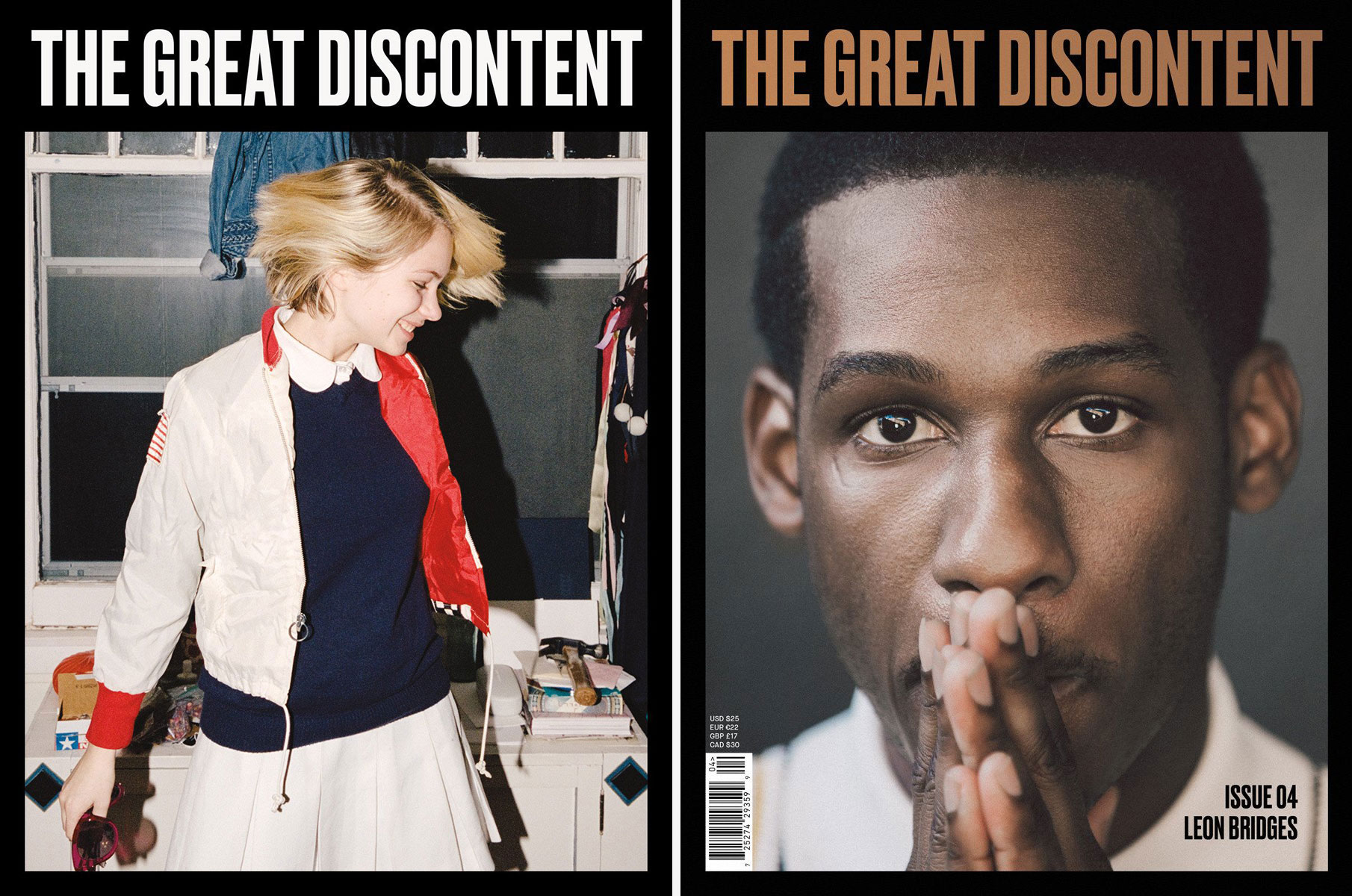
The Great Discontent started out online but it's definitely even better in print. The title specialises in big, proper, longform interviews – in the tradition of literary magazine the Paris Review – with artists, writers, graphic designers, photographers… people from all corners of the arts. You even get the odd musician. It attracts big names like Michael Bierut and Stefan Sagmeister, but the detailed mix of biography and practical advice makes every interview worth your time. The magazine itself is quality, too – and is available in hardcover, as a magazine, or as a travel-sized version.

B magazine 

B magazine

Each issue of B focuses entirely on one specific company

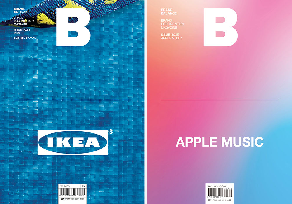
Strictly speaking, B isn't a design magazine. Instead, each bimonthly issue focuses on one specific company, and the 'untold stories behind a brand … its sentiment and culture.' It's a good mix too: there are companies like Netflix, Airbnb and Google, alongside notebook-maker Moleskine, footwear specialist Danner, and outdoor clothing brand Patagonia. 

Patagonia, for example, based in California, lets its people to go surfing when the waves are up, and make up the time later. The system apparently increases productivity. It's this level of detail that makes the magazine a good read for studio bosses or anyone interested in brand marketing and management. 

FORM

form magazine

Each biannual issue of FORM has a particular theme 

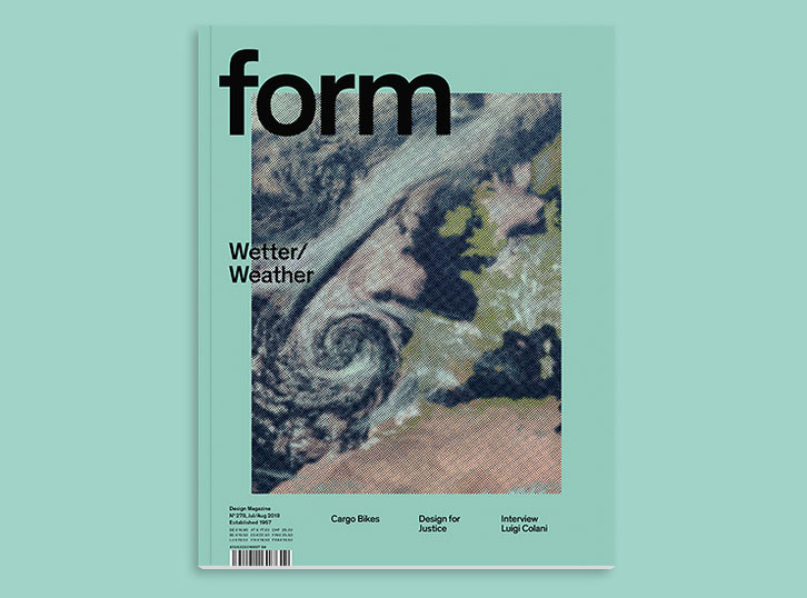
Leading design writer Steven Heller called FORM the best design magazine in the world, 'for its holistic coverage of industrial, product, graphic, and hybrid designs.' The magazine prides itself on being a print title first and foremost, so it does all the things that print titles do best: in-depth, long-form articles alongside quality photographs and illustrations. The covers are always exceptional, and it’s bilingual too: German and English. Each biannual issue has a theme. It could be a country (Mexico, South Korea), a topic (sport, designing protest), or something more abstract (danger, failure). 

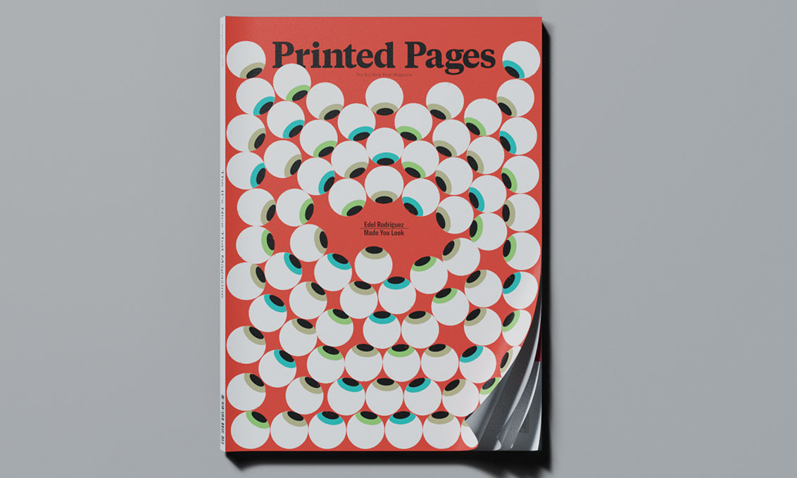
Printed Pages

Printed Pages magazine

Printed Pages is exceptionally well put-together

Printed Pages is a biannual magazine that covers all areas of art and design, and presents a 'curated view of the best creative work we’ve seen in the past six months’ as well as ‘a host of feature interviews with a list of names who are currently making their mark on the creative world’.  

The current issue's recurring theme is activism and using creativity as a voice for positive change. It includes interviews with designers Sagmeister & Walsh, artists Gilbert and George, and street photographer Joel Meyerowitz. Exceptionally put-together, this one also passes the coffee table test with flying colours.

Read more:

10 ways to make your magazine cover stand out66 brilliant print advertsCreate special print finishes in InDesign

The Ten Best Examples of Minimalist Business Cards to Make a Lasting Impression

Original Source: http://feedproxy.google.com/~r/Designrfix/~3/faRTiMgMWRg/minimalist-business-cards

How you present yourself to the world has always been important. You learned this at an early age from your parents, your family, and the kids on the school bus. They all made it very apparent that life is about appearances and presentation. Throughout school, the right impression could win you popularity, friends, and a […]

The post The Ten Best Examples of Minimalist Business Cards to Make a Lasting Impression appeared first on designrfix.com.

Popular Design News of the Week: July 16, 2018 – July 22, 2018

Original Source: https://www.webdesignerdepot.com/2018/07/popular-design-news-of-the-week-july-16-2018-july-22-2018/

Every week users submit a lot of interesting stuff on our sister site Webdesigner News, highlighting great content from around the web that can be of interest to web designers. 
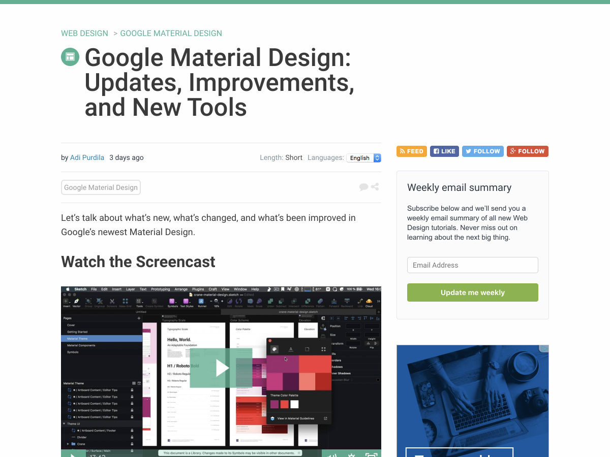
The best way to keep track of all the great stories and news being posted is simply to check out the Webdesigner News site, however, in case you missed some here’s a quick and useful compilation of the most popular designer news that we curated from the past week.

Note that this is only a very small selection of the links that were posted, so don’t miss out and subscribe to our newsletter and follow the site daily for all the news.

Google Material Design: Updates, Improvements, and New Tools


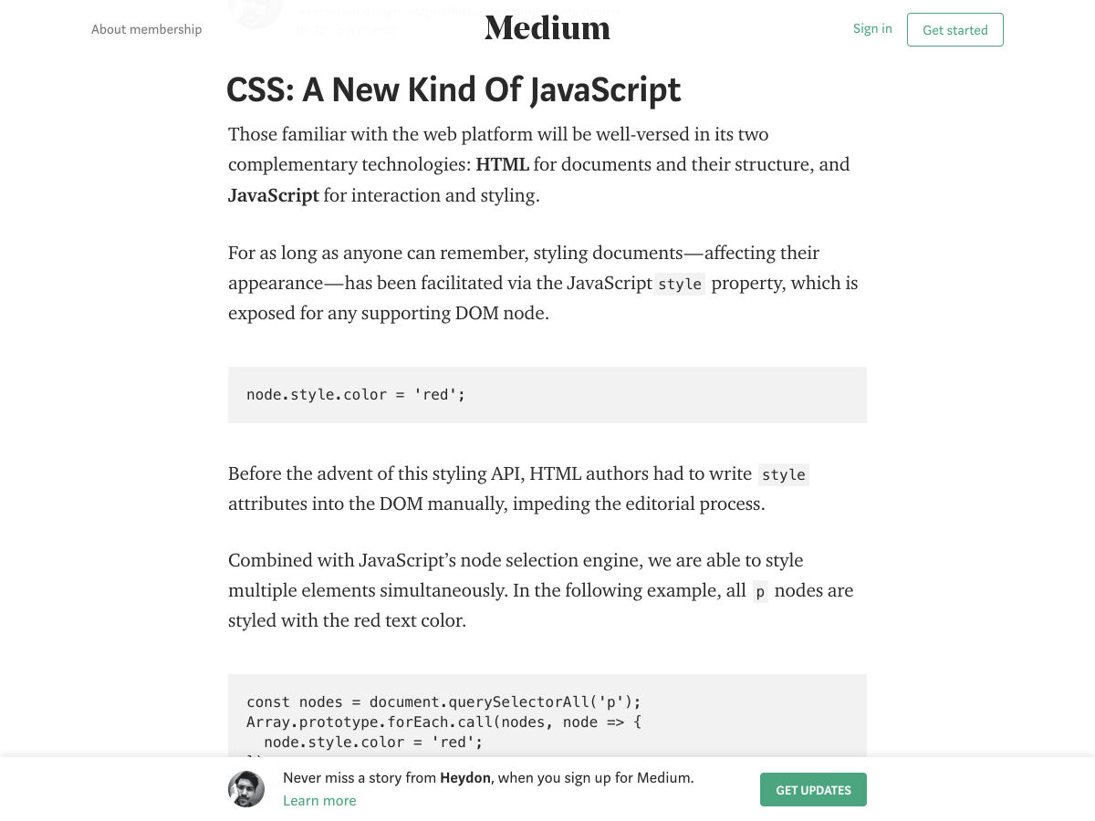
CSS: A New Kind of JavaScript


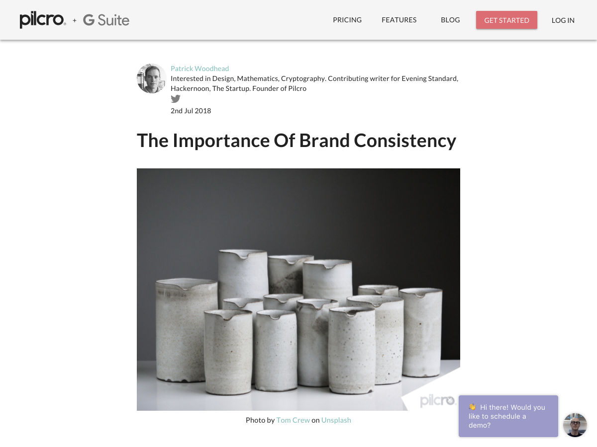
The Importance of Brand Consistency


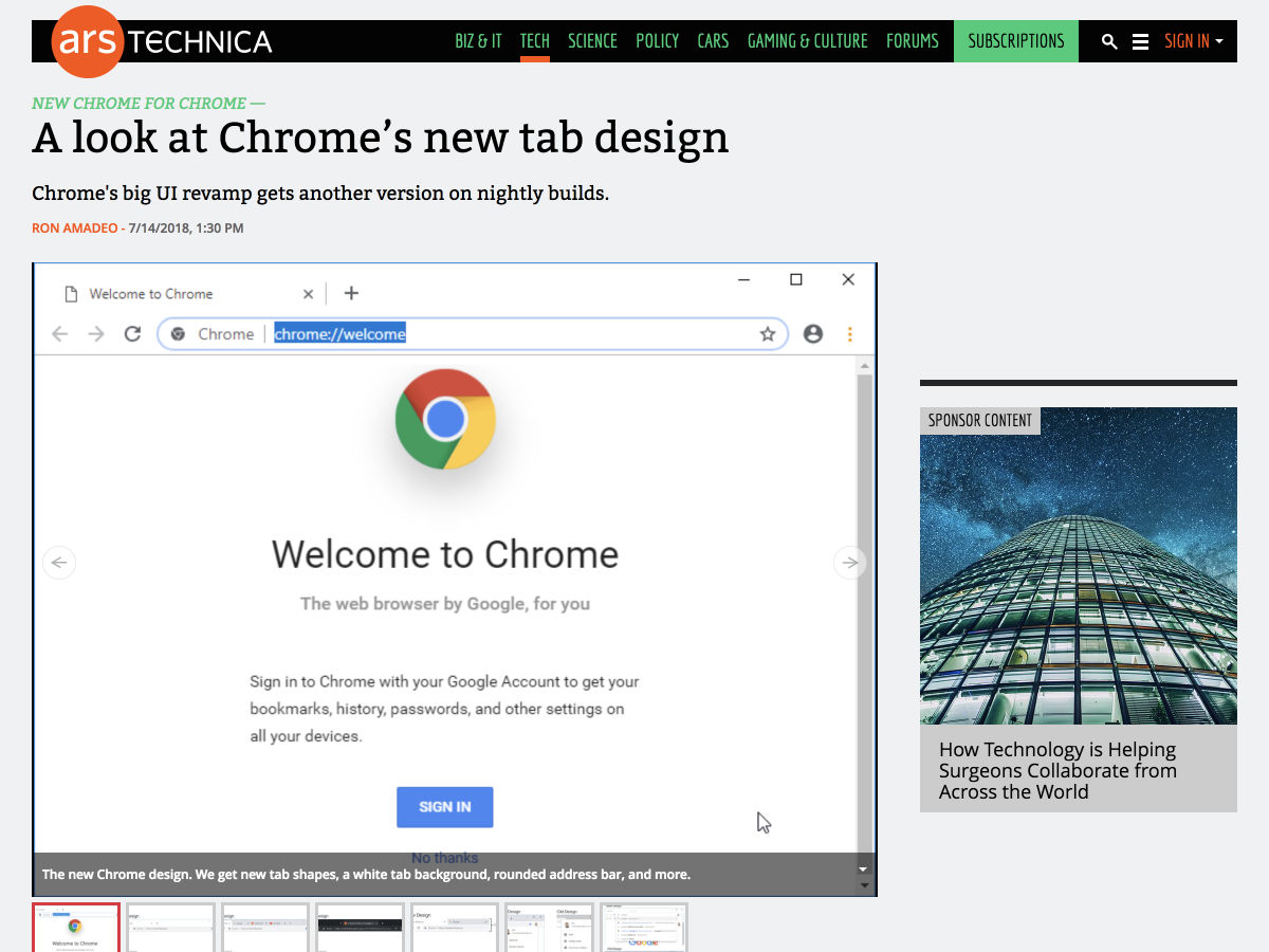
A Look at Chrome’s New Tab Design


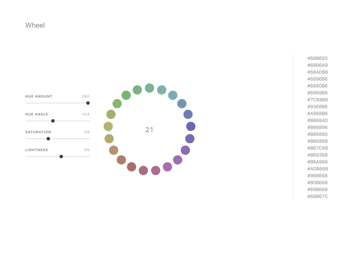
Wheel


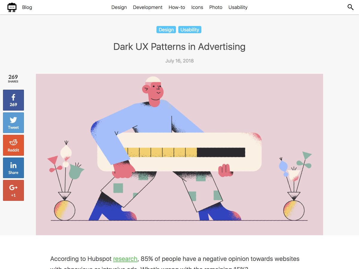
Dark UX Patterns In Advertising


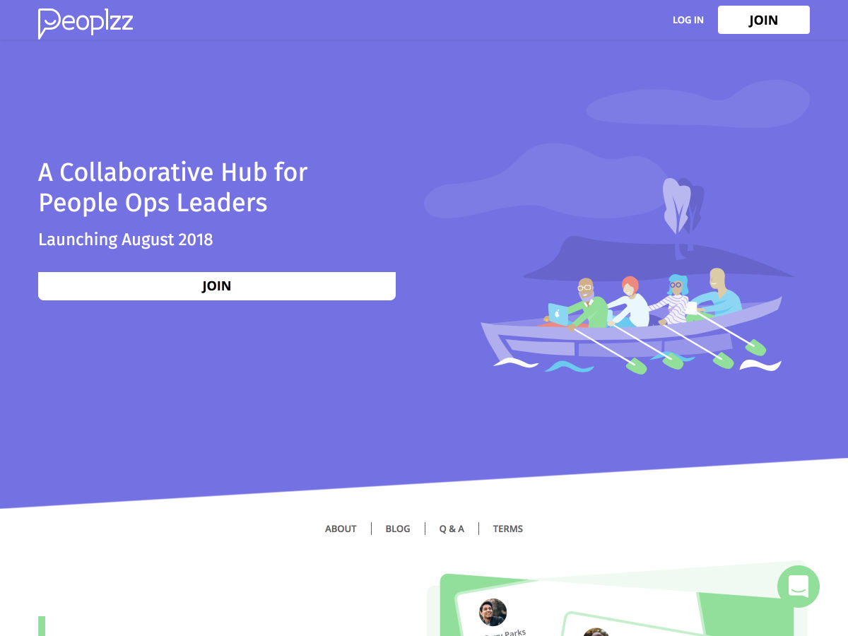
Peoplzz – A Collaborative Hub for Company Culture Builders


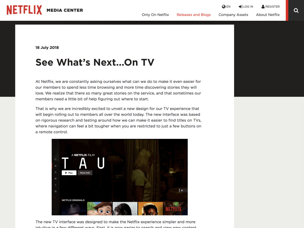
New Netflix TV Interface


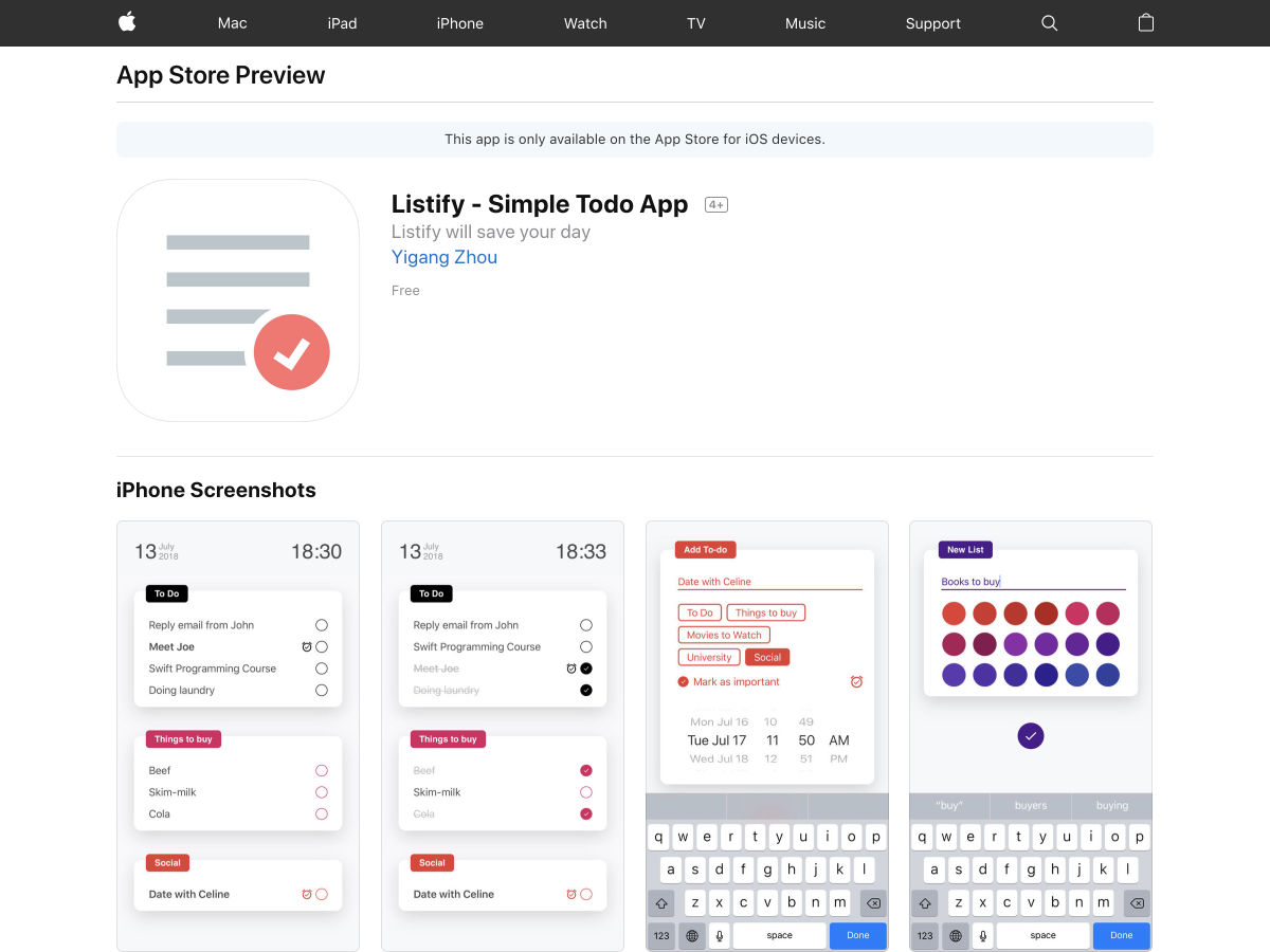
Listify – A Minimal Space for your To-dos, Tasks & Reminders


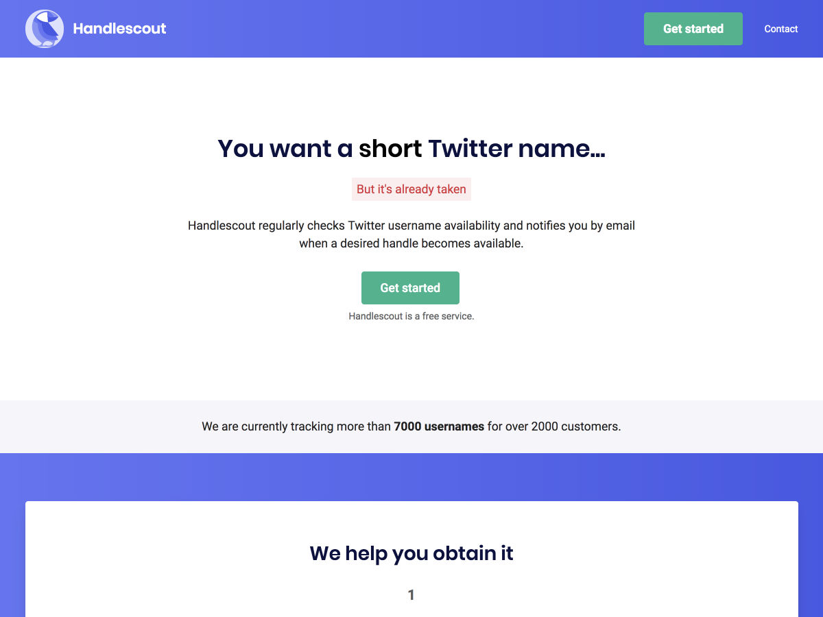
Handlescout – Get Notified When a Twitter Username Becomes Available


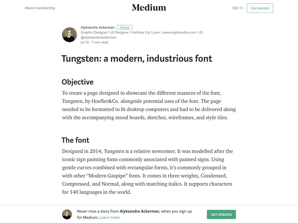
Tungsten: A Modern, Industrious Font


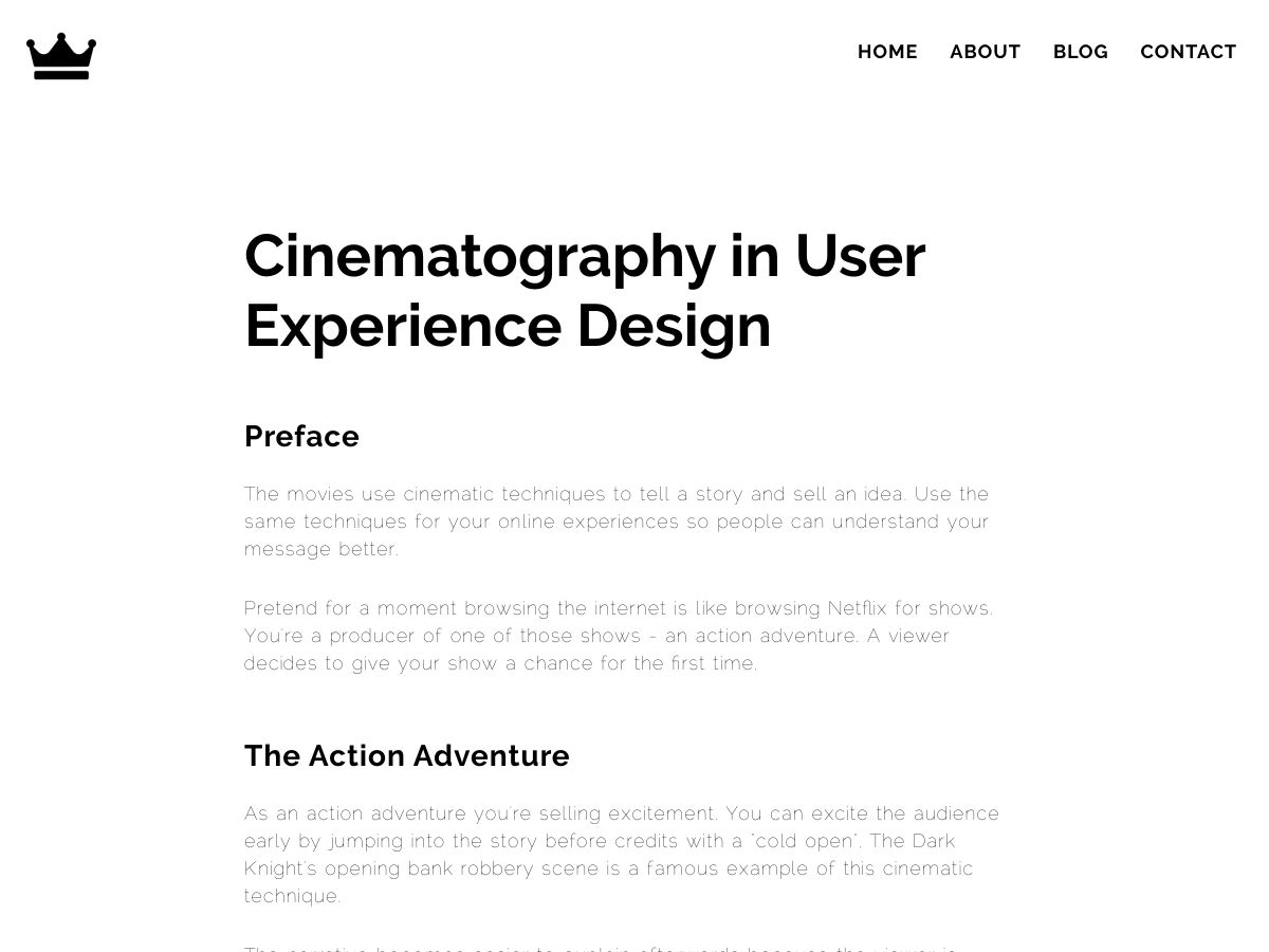
Cinematography in User Experience Design


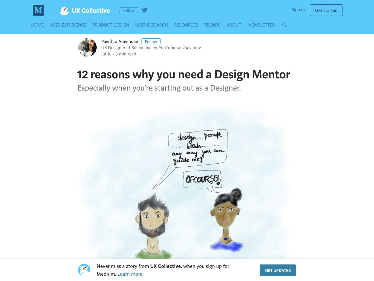
12 Reasons Why You Need a Design Mentor


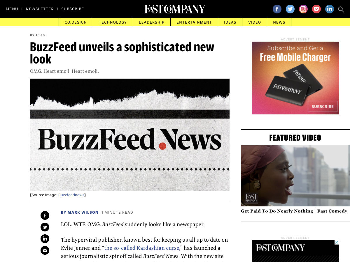
BuzzFeed Unveils a Sophisticated New Look


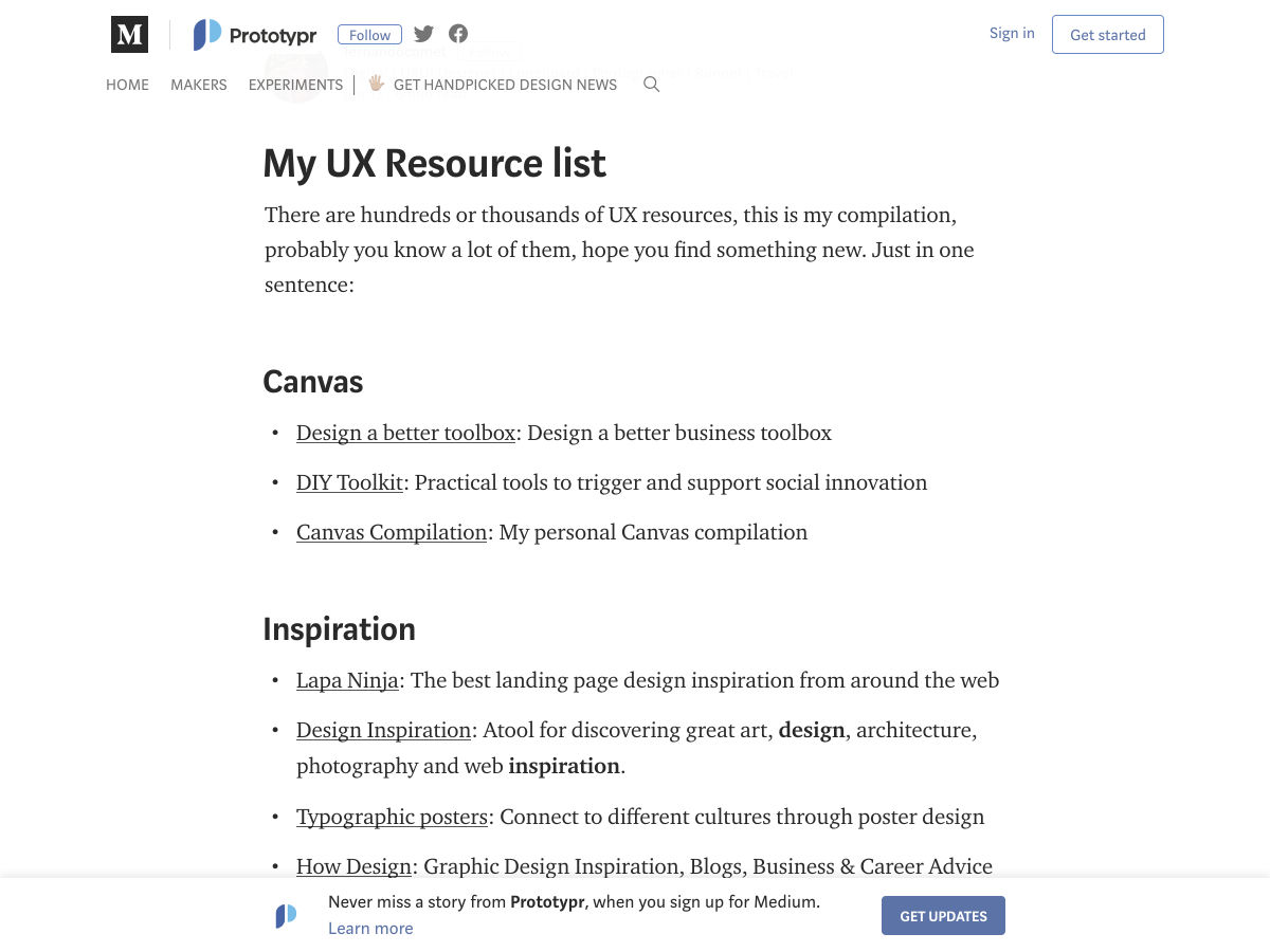
My UX Resource List


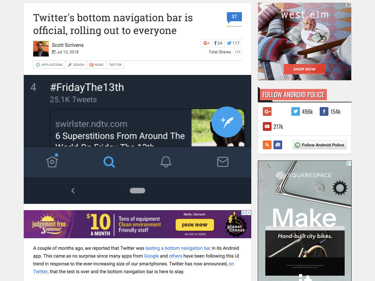
Twitter’s Bottom Navigation Bar is Official, Rolling Out to Everyone


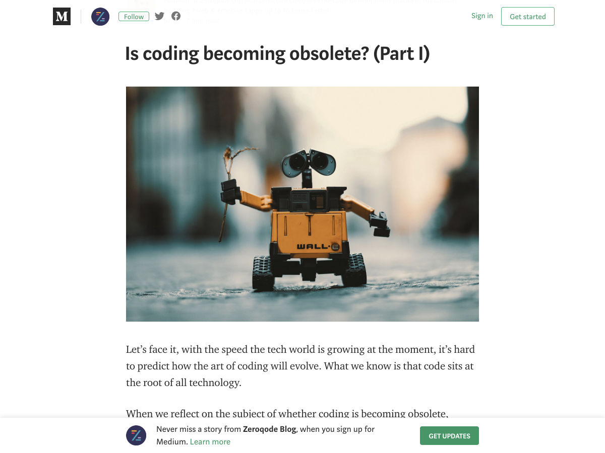
Is Coding Becoming Obsolete?


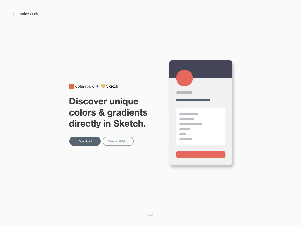
ColorSpark for Sketch – Discover Unique Colors and Gradients Directly in Sketch


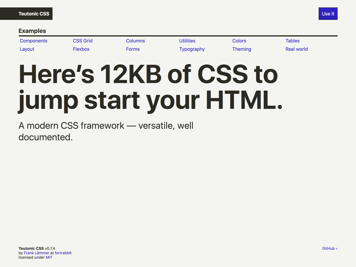
Teutonic CSS — a Modern CSS Framework with Style


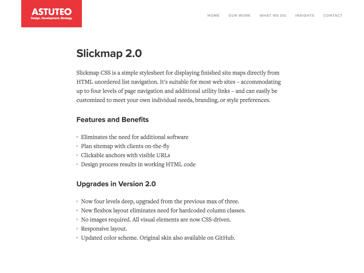
SlickMap CSS: A Visual Sitemapping Tool for Web Developers


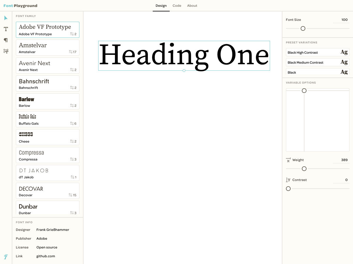
Font Playground


How One Typeface Took Over Movie Posters


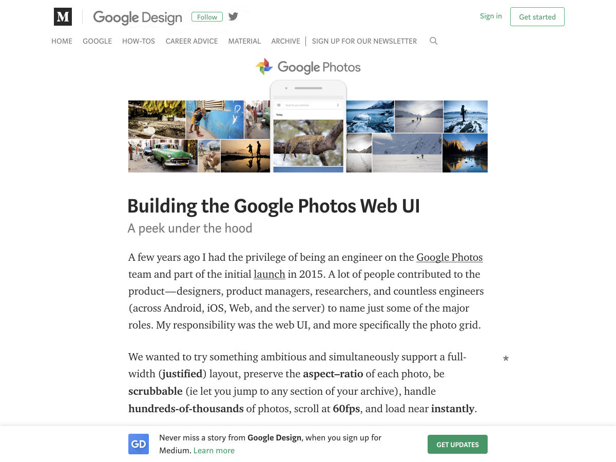
Building the Google Photos Web UI


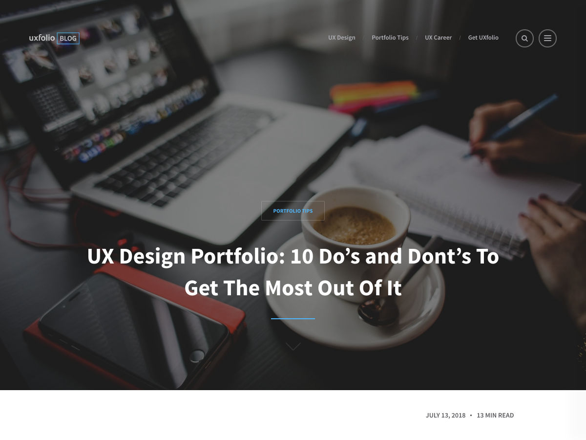
10 Do’s and Dont’s to Get the Most Out of your UX Design Portfolio


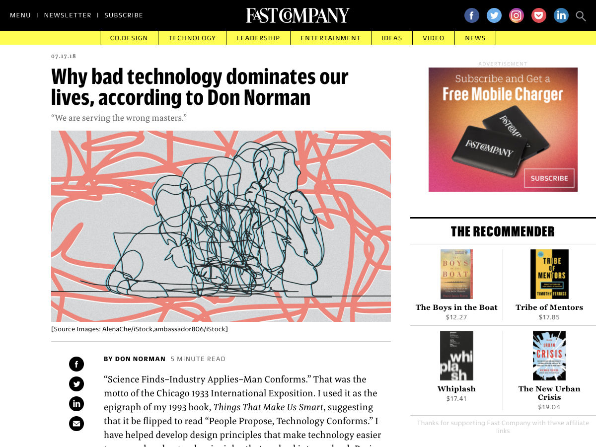
Why Bad Technology Dominates Our Lives, According to Don Norman


Want more? No problem! Keep track of top design news from around the web with Webdesigner News.

Add Realistic Chalk and Sketch Lettering Effects with Sketch’it – only $5!

Source

p img {display:inline-block; margin-right:10px;}
.alignleft {float:left;}
p.showcase {clear:both;}
body#browserfriendly p, body#podcast p, div#emailbody p{margin:0;}

20 Freshest Web Designs, July 2018

Original Source: https://www.webdesignerdepot.com/2018/07/20-freshest-web-designs-july-2018/

Welcome to our roundup of the best websites launched (or significantly updated) this month. July is a strange time to launch a site with the Summer slowdown in full effect, but these intrepid entrepreneurs have done so. We’ve got examples of great ecommerce, a couple of agency sites that we couldn’t resist, and lots of incredible art direction.
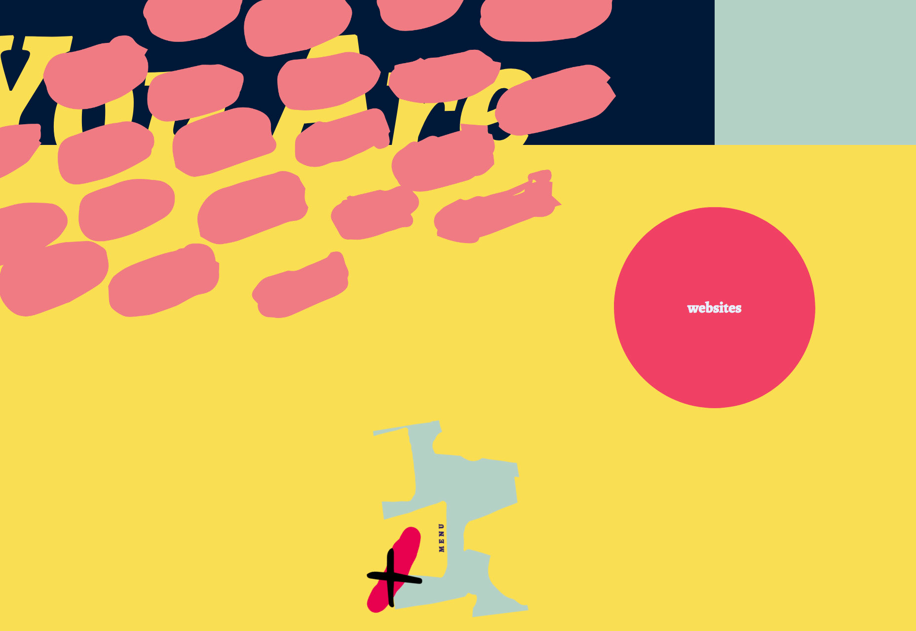
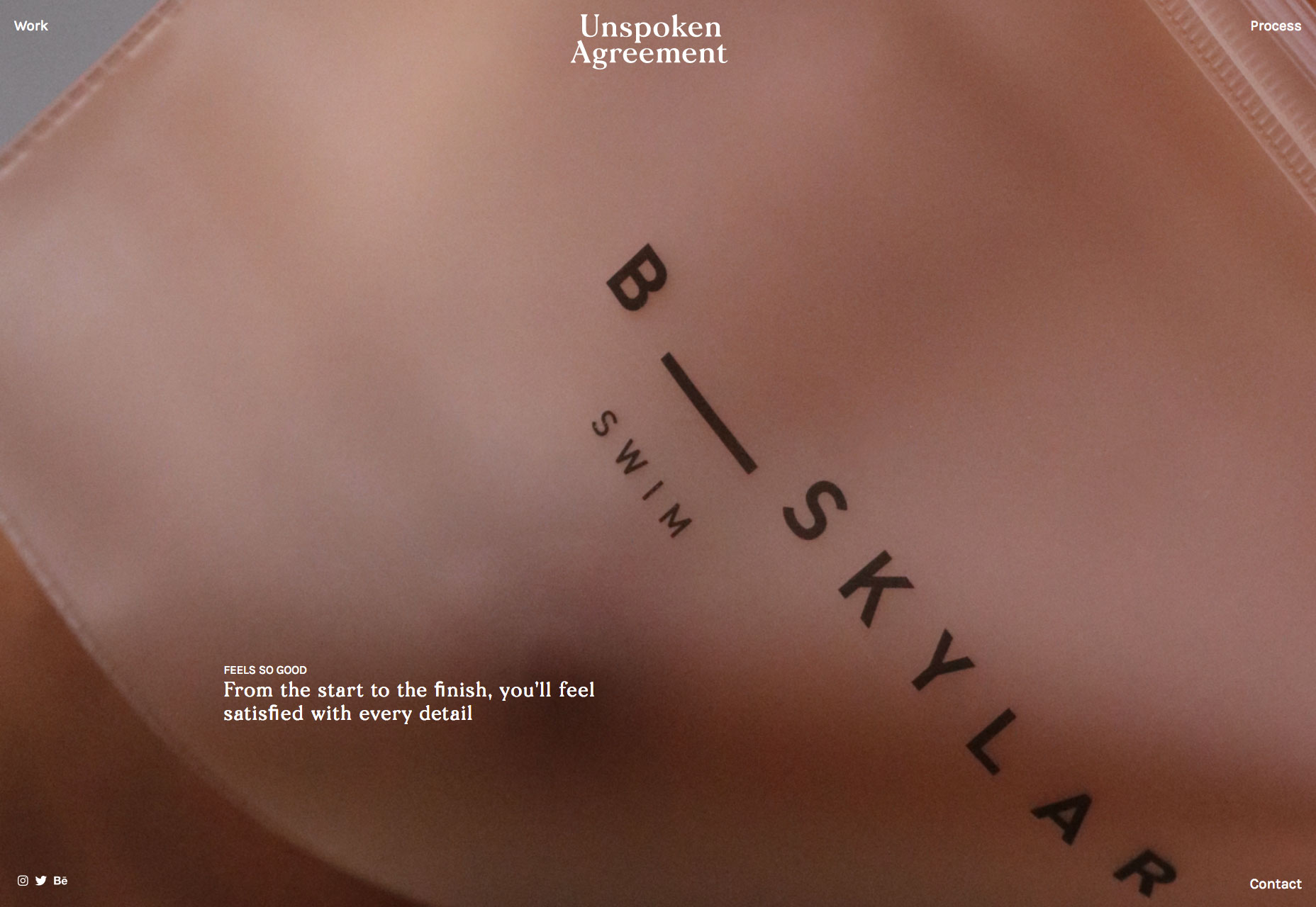
This month sees a big trend in compass navigation (a link in every corner of the page), and parallax is definitely still a big deal. Whether it’s inspired by the World Cup, or Le Tour, there’s a subtle gallic feel to a lot of sites this month…savourer!

Drift

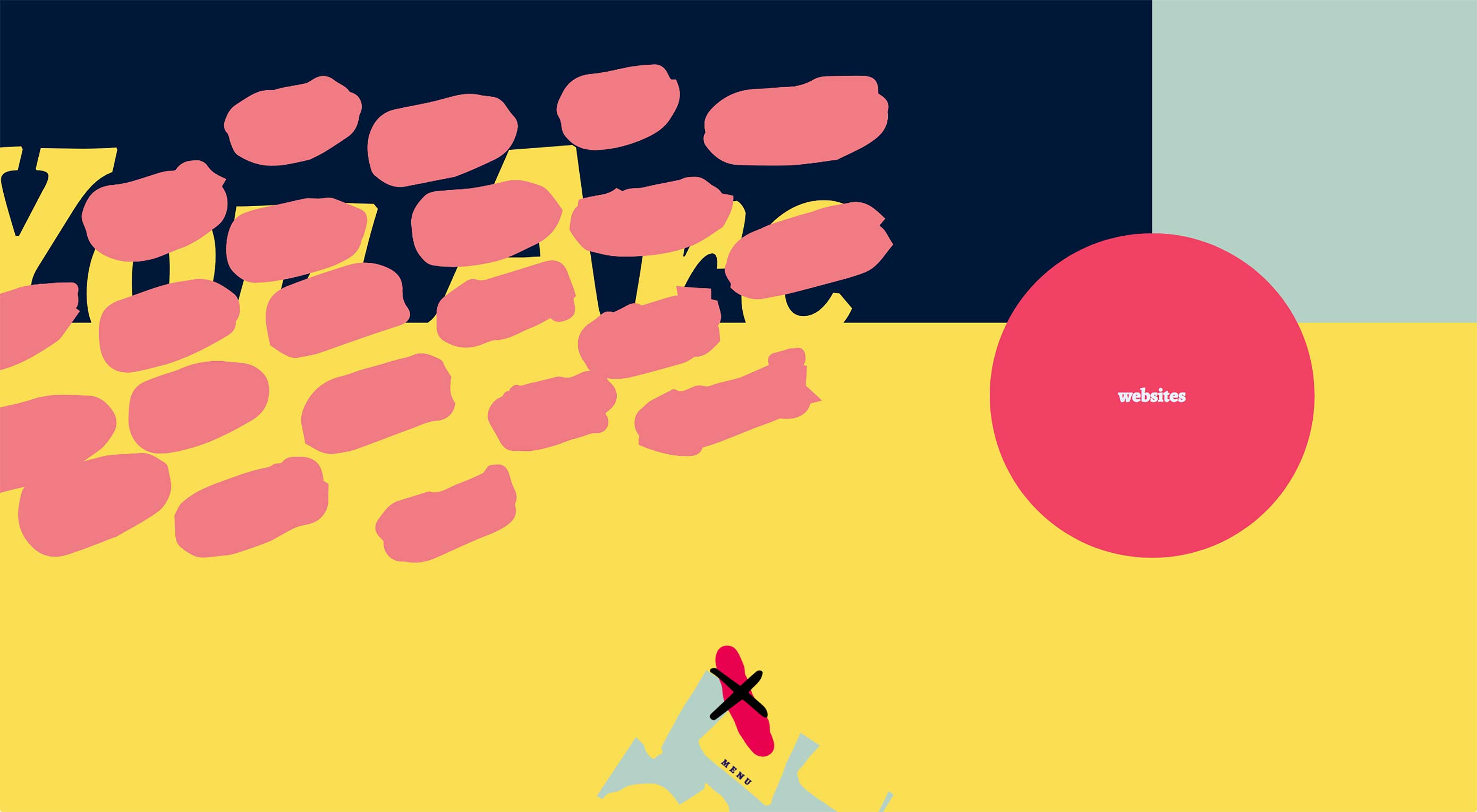
Drift is a creative agency with some chops. Rejecting the minimalism that seemingly every other agency opts for, they’ve put together a charmingly animated, hand-made site. Not too functional, unless your aim is to communicate creative courage—they stand out.

Unspoken Agreement

Unspoken Agreement is a creative agency that believes in beauty. Its landing page is a schooling in art direction, and the simple bold copy is persuasive. I’m not sold on the compass navigation, but you can’t have everything.

2018 Foosball World Cup

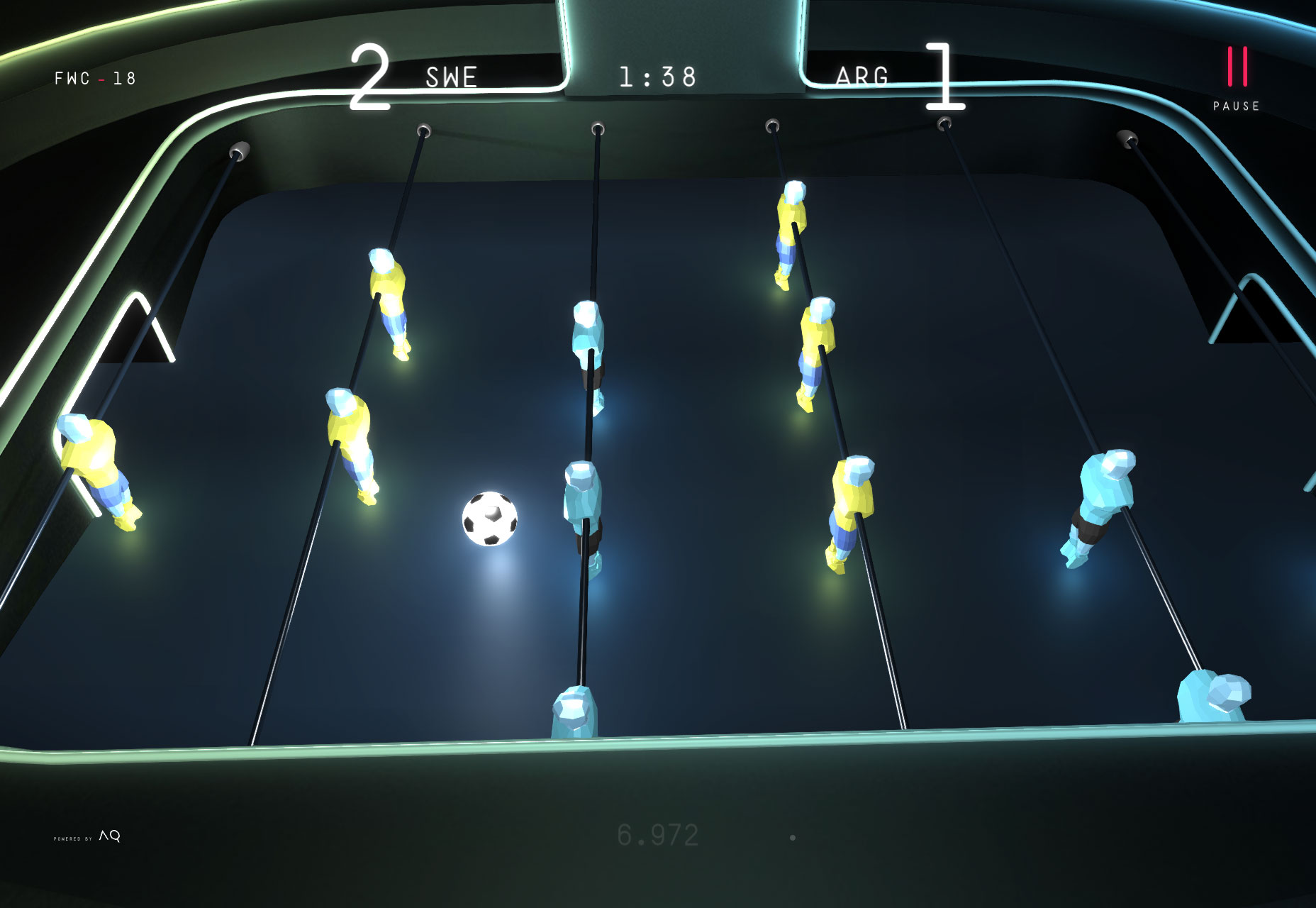
As the final whistle is blown on the Fifa World Cup 2018, this awesome site gives you the chance to relive this Summer’s big sporting event from the comfort of your desktop. Pick a team, and click and scroll your way to victory. No spinning those bars!

Pittori di Cinema

The site designed to promote a book about film artists, Pittori di Cinema, is a suitably bold site with masses of color and strong lettering. Simple to use, it features that compass navigation again. But the graphics are something to behold.

Blackbird

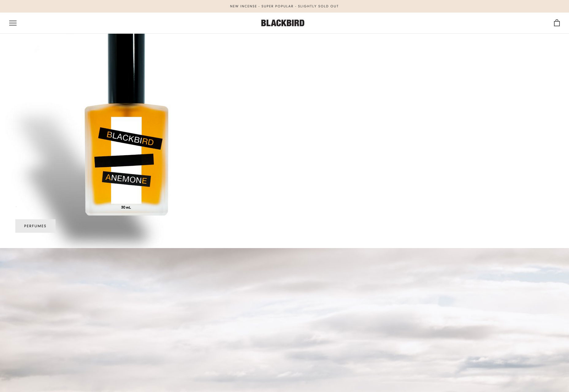
Blackbird is an beautifully minimal Shopify site selling perfume. The site is a great example of how effective parallax can still be, if used effectively. I have no idea what that weird frog video is for, but it’s intriguing nonetheless.

Copenhagen Bike Company

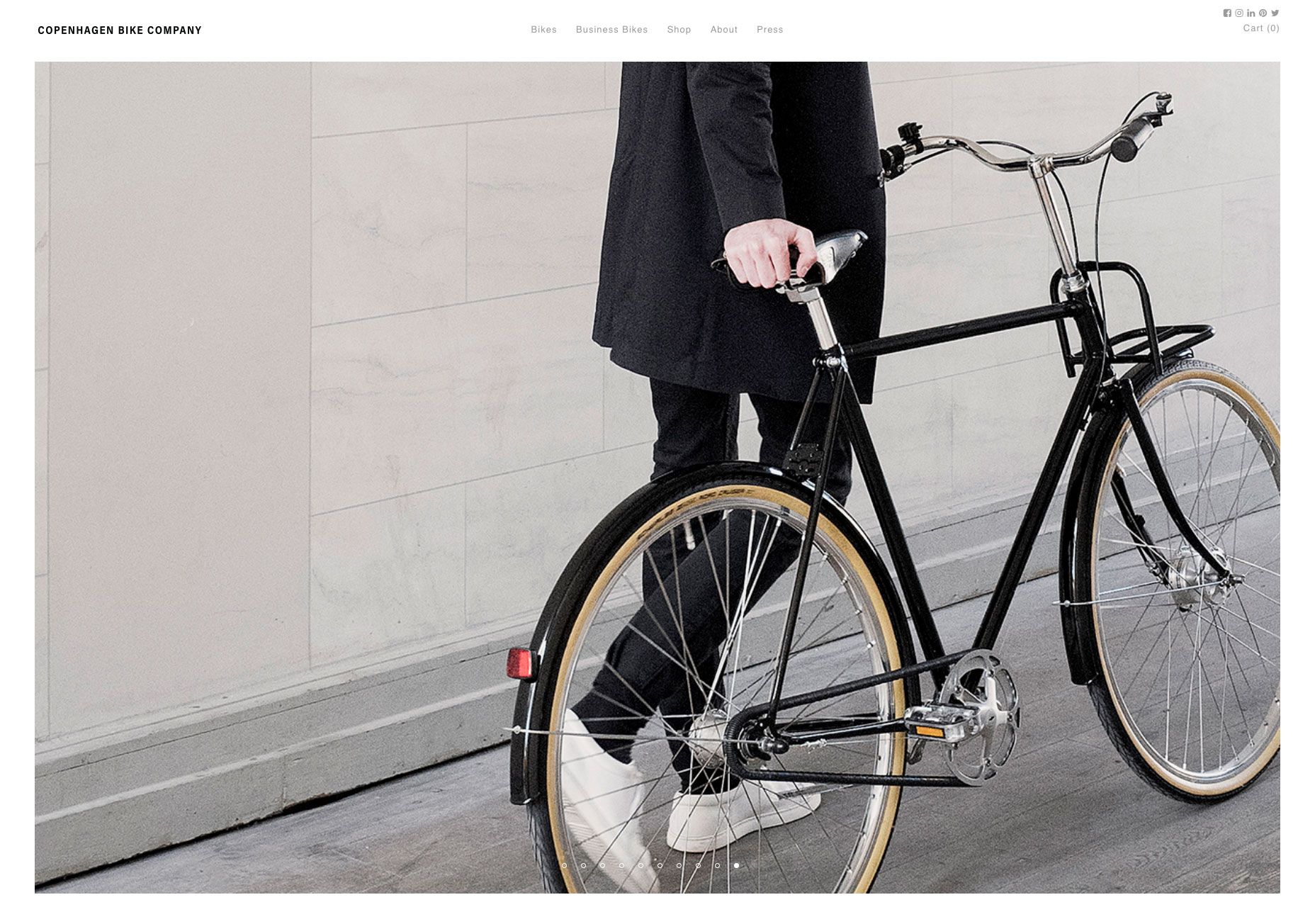
If Le Tour is making you feel like cycling, but you don’t quite have the energy to make it up the Pyrenees, wander north to discover a cooler, more laid back approach to cycling. The site for the Copenhagen Bike Company features on-brand art direction, smooth UI details, and high-end minimalism.

Care Cards

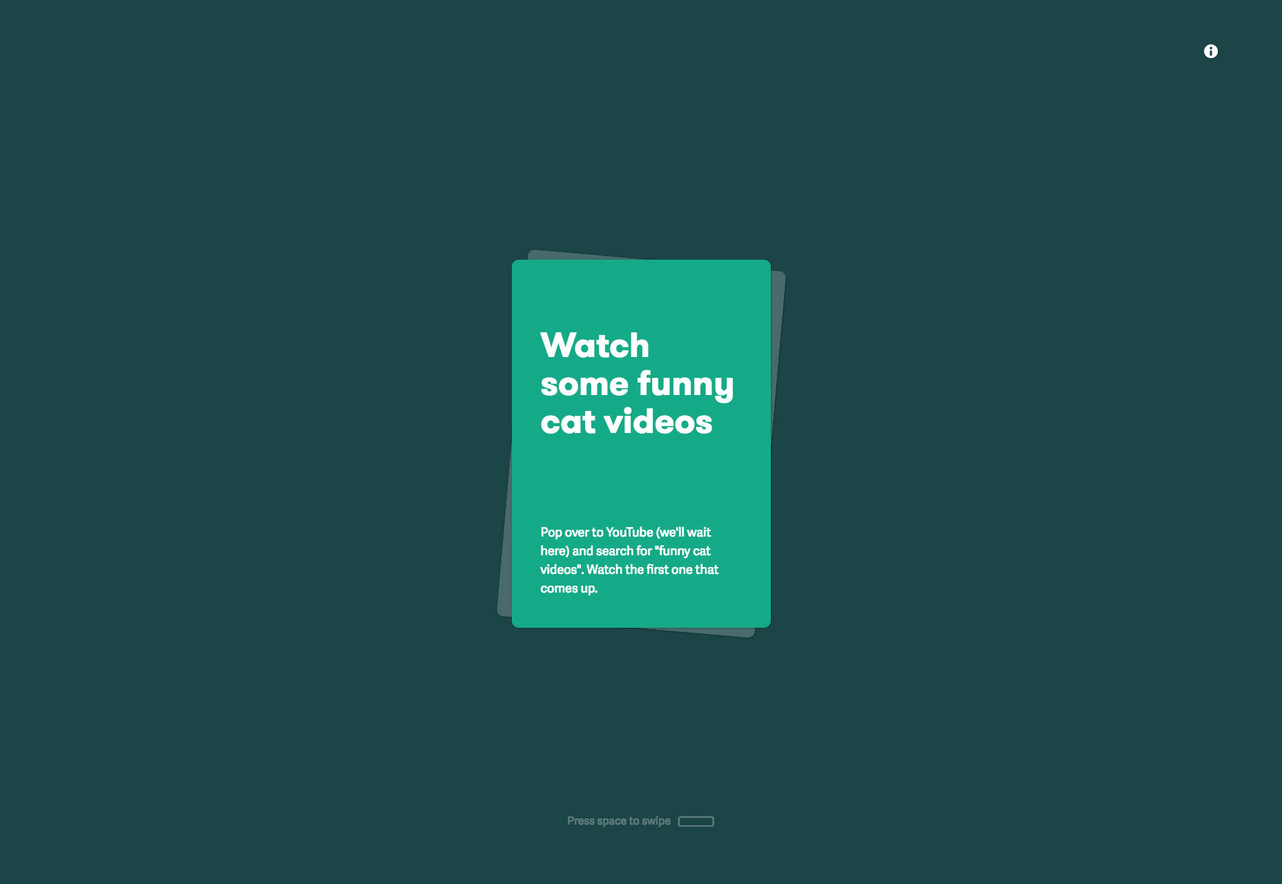
We all get a little stressed from time to time, it’s OK to admit it. Care Cards is a progressive web app with over 80 kind tips to help you cope with the rigors of modern life. Just open it up on your phone (or notebook) and swipe through the gems of wisdom. I love this site.

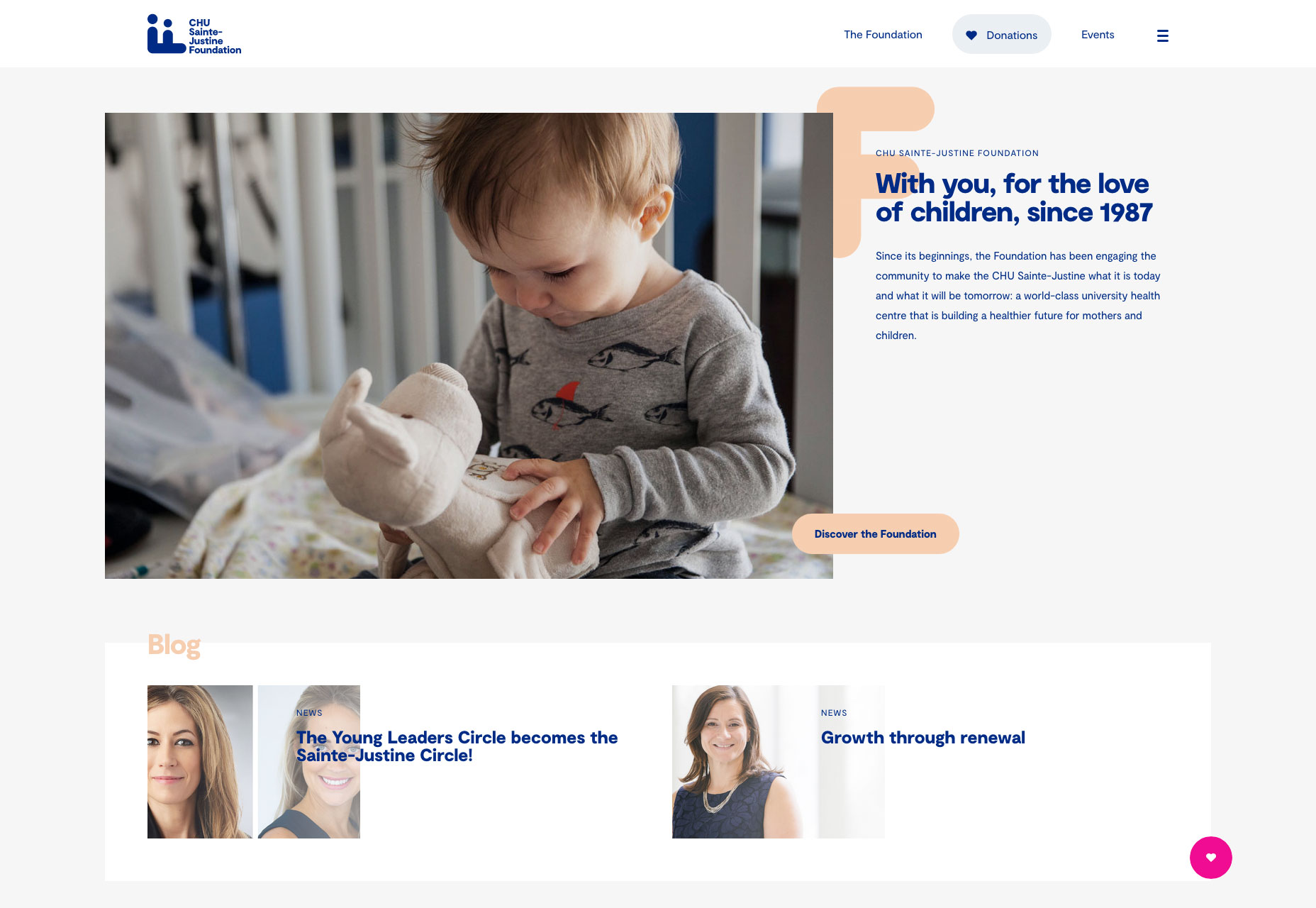
CHU Sainte-Justine Foundation

Promoting fundraising for Canada’s premier hospital for the pre- and post-natal care of mothers and children. The strong grid layout, coupled with smart brand choices and subtle animation is a winning combination for this important cause.

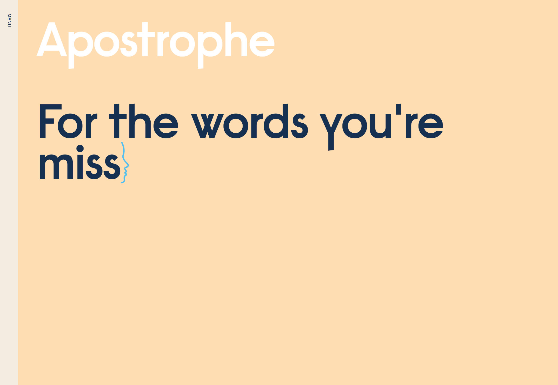
Apostrophe

It’s always hard to design a site for copywriters, but this site does so beautifully. Hooking up the leading animation to the scroll of the page is an excellent device for driving home exactly what this minimal site is promoting.

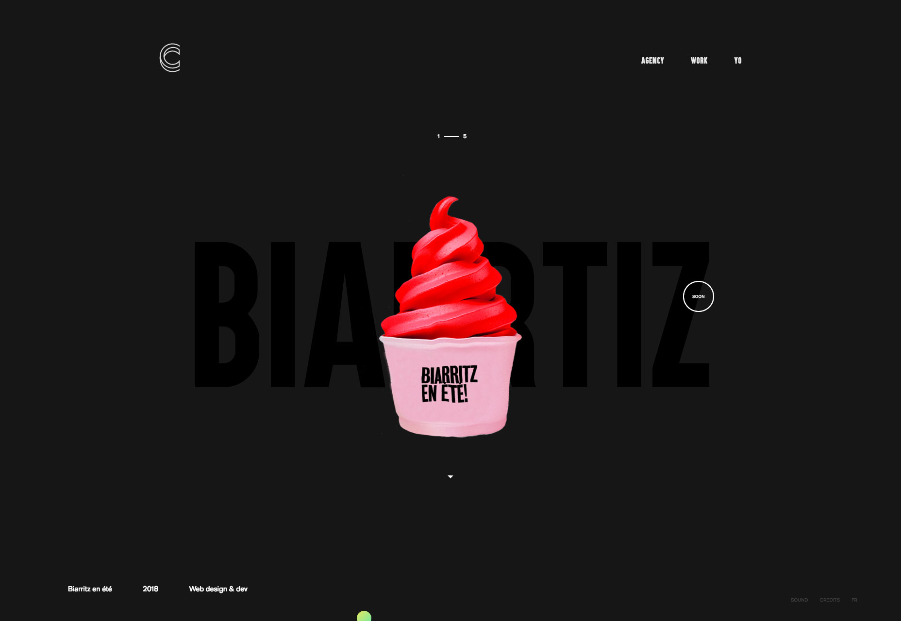
Contemple

Another design agency showing us something special, this time it’s an amazing ripple effect on their slideshow as you scroll through the featured projects on their landing page. Click through to the case studies and there’s some awesome work on display.

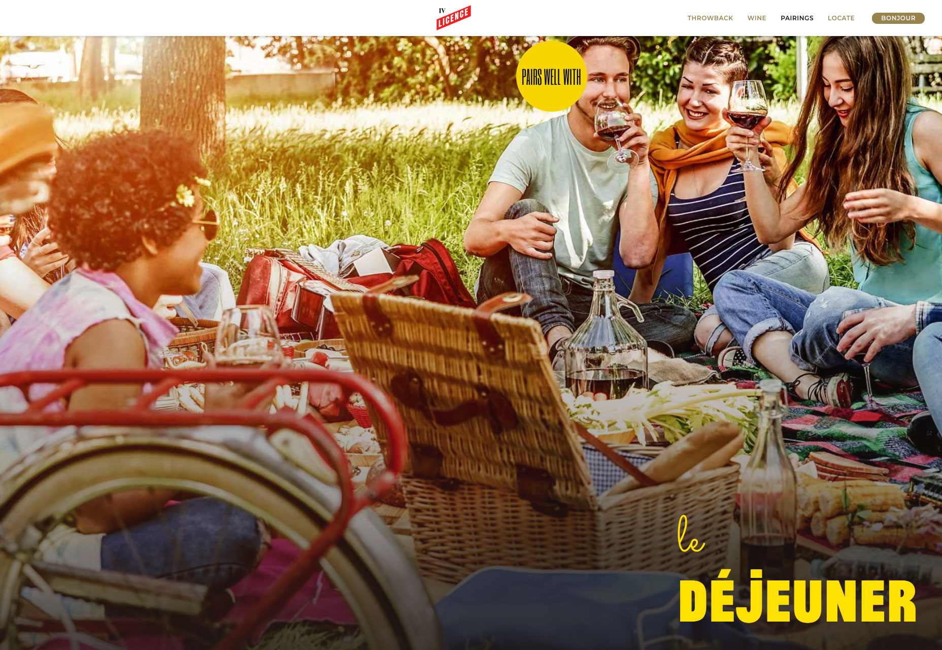
License IV Wine

This simple one-page site sells a wine brand perfectly, by capturing the spirit of community around a good bottle of French wine. The License IV wine label is bringing French savoir faire to wine drinkers in the USA with this charming site.

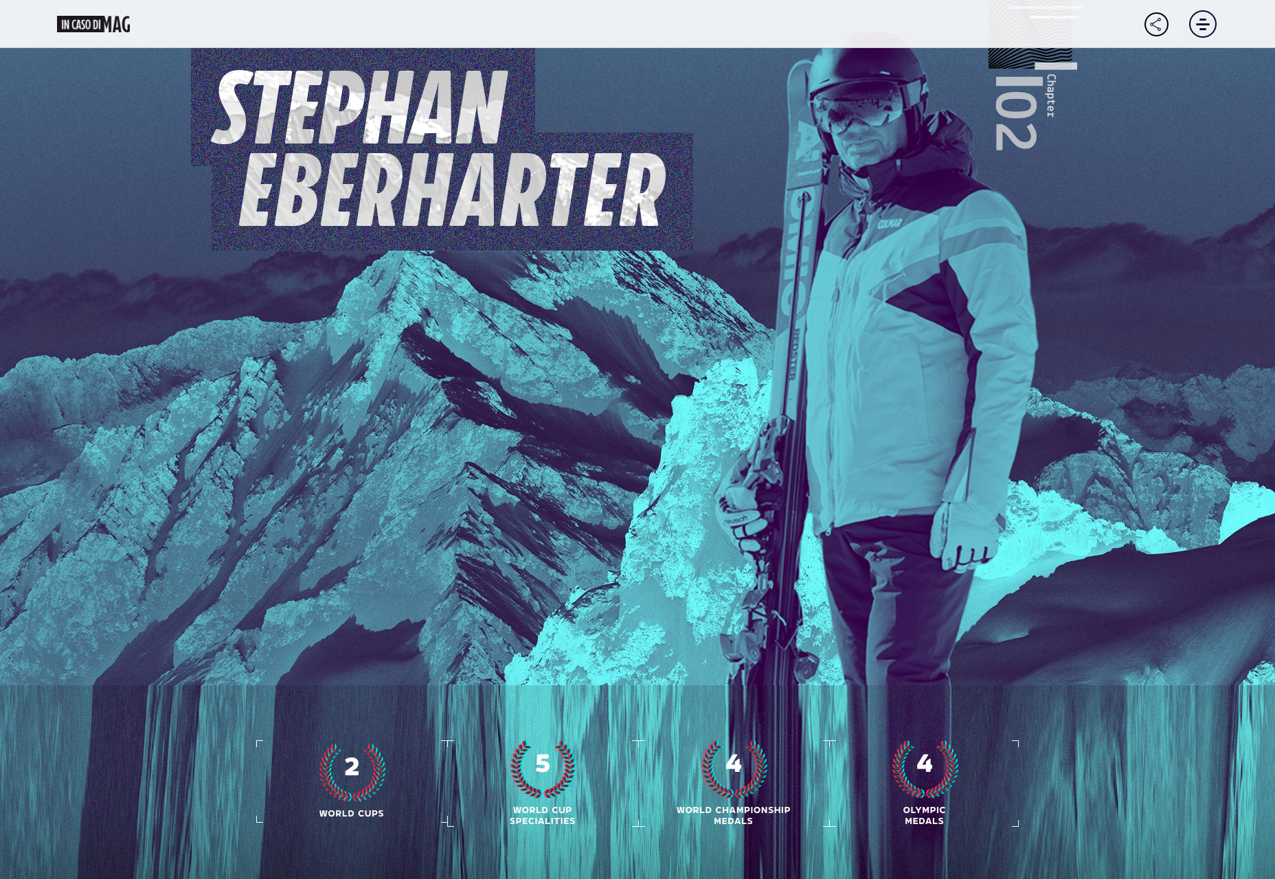
In Caso di Mag: Kitzbühel

Kitzbühel is the latest in an ongoing series of craftily designed travelogues around the world’s best ski resorts. Each location gets its own page, with custom art direction capturing the spirit of each place. I love the attention to detail.

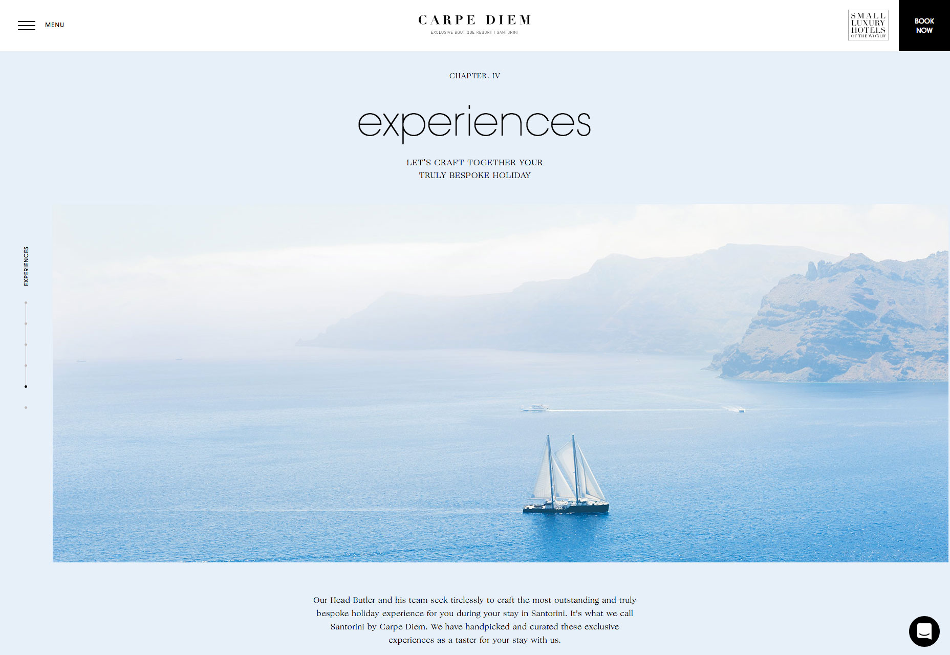
Carpe Diem Santorini

If there’s one place I’d love to spend some time, it’s among the cycladic minimalism of Santorini. The tiny Greek island is world famous for the beauty of its sunsets, and this enchanting site sells the romance of the destination perfectly.

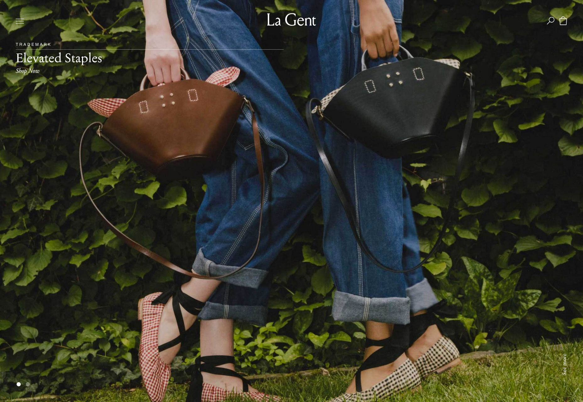
La Gent

Who doesn’t love quality, independent brands that put timelessness ahead of fashion. La Gent’s site is designed for browsing. I love the fact that their slider has just two items, enough for variety but not so much that you get lost.

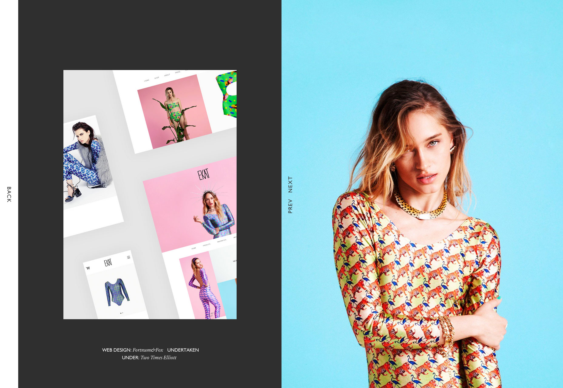
Fortnum&Fox

Another design agency with a flair for art direction, the site for Fortnum&Fox features an exceptional split screen design showing off an impressive back-catalogue of work. I particularly like how cohesive and simple the whole experience feels.

Maman Corp

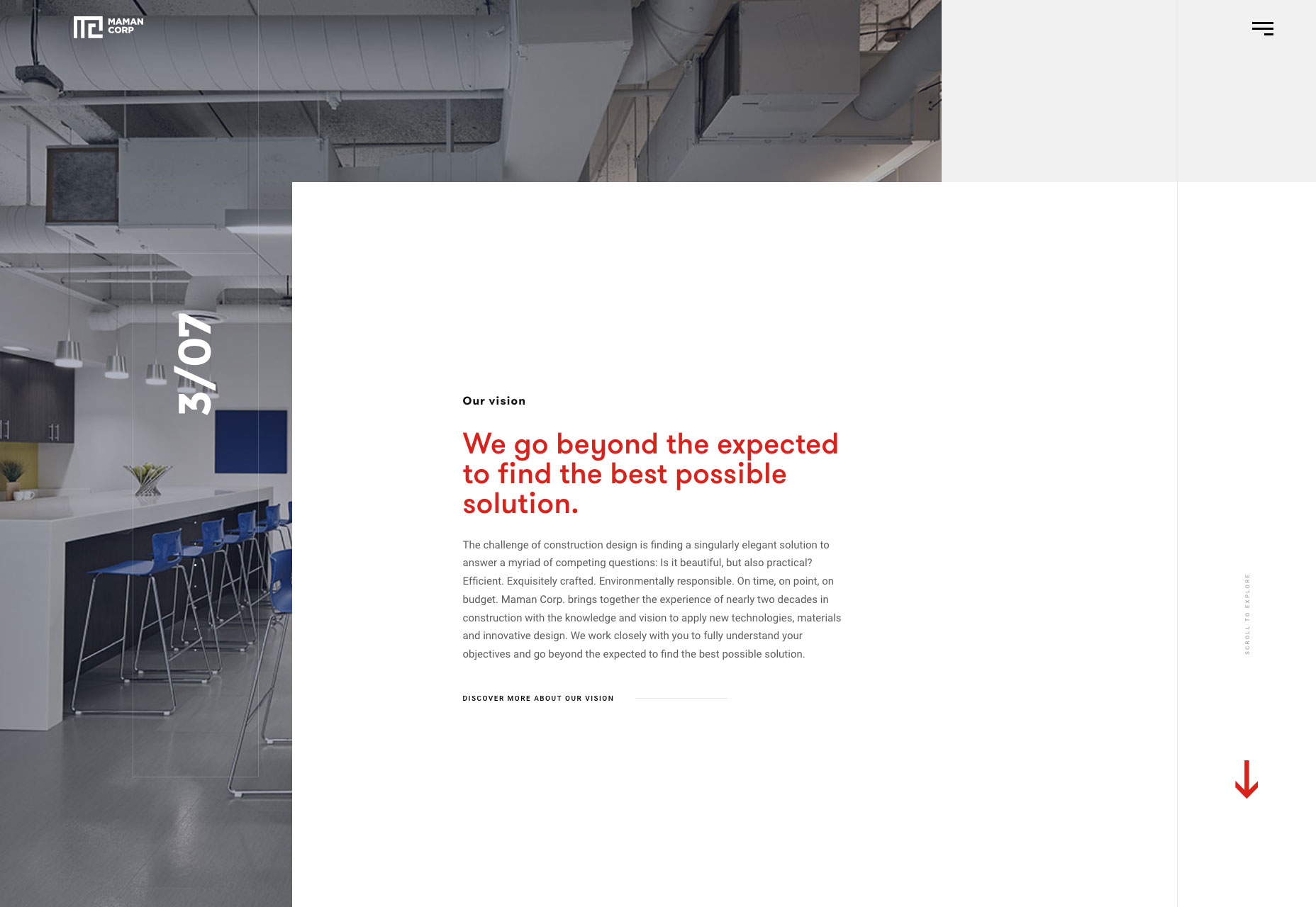
Maman Corp is a construction company and their site reflects this with a grid-based layout and animation that feels like the site is being constructed before your eyes. I love the full-screen video and beautiful typography.

Twill

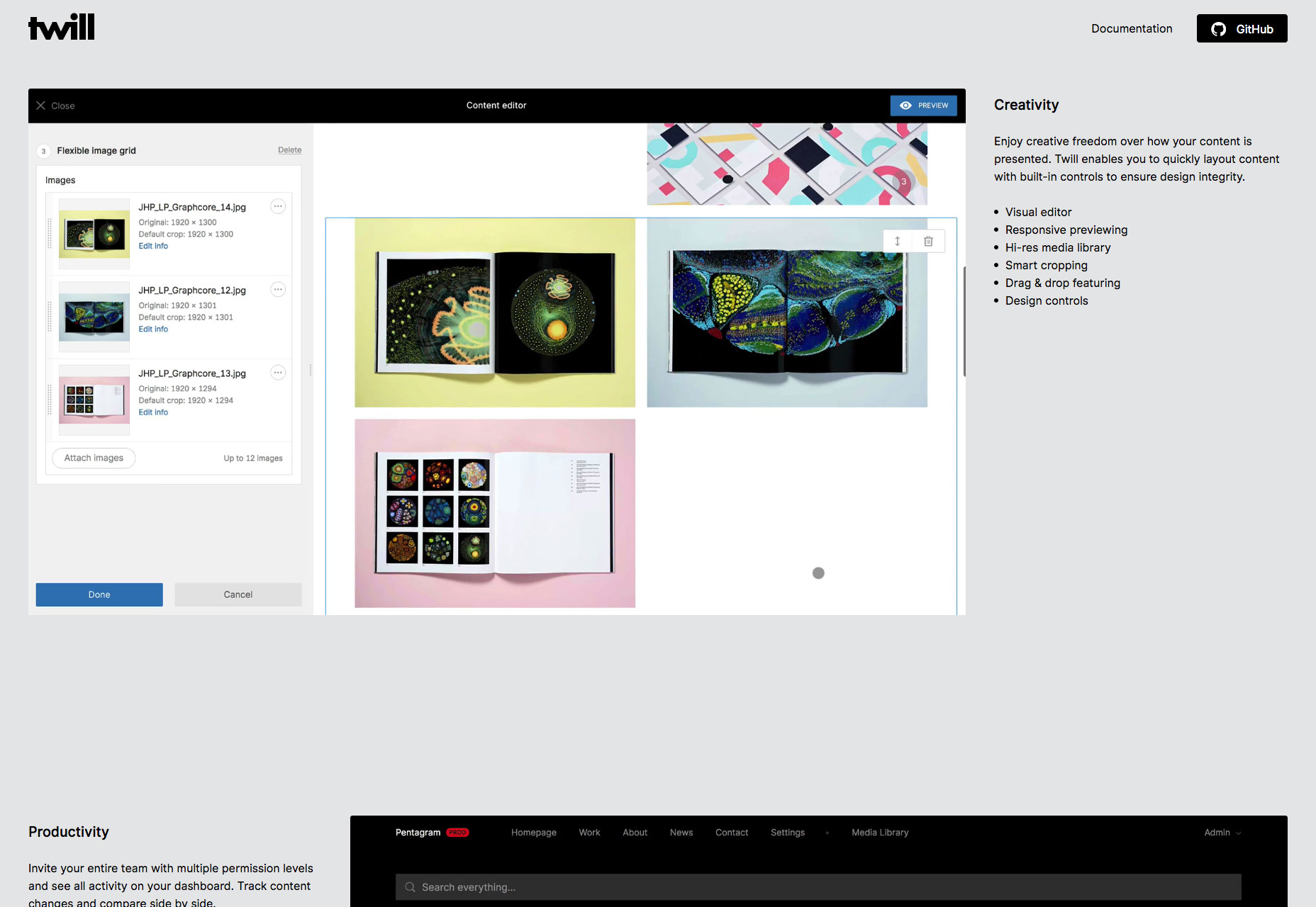
Twill is an open-source CMS kit for Laravel, offering increased productivity and more control. It’s promoting itself to developers, and that’s never an easy task, but breaking down the benefits in this one-page site it’s clearly worth checking out.

Knight Associates

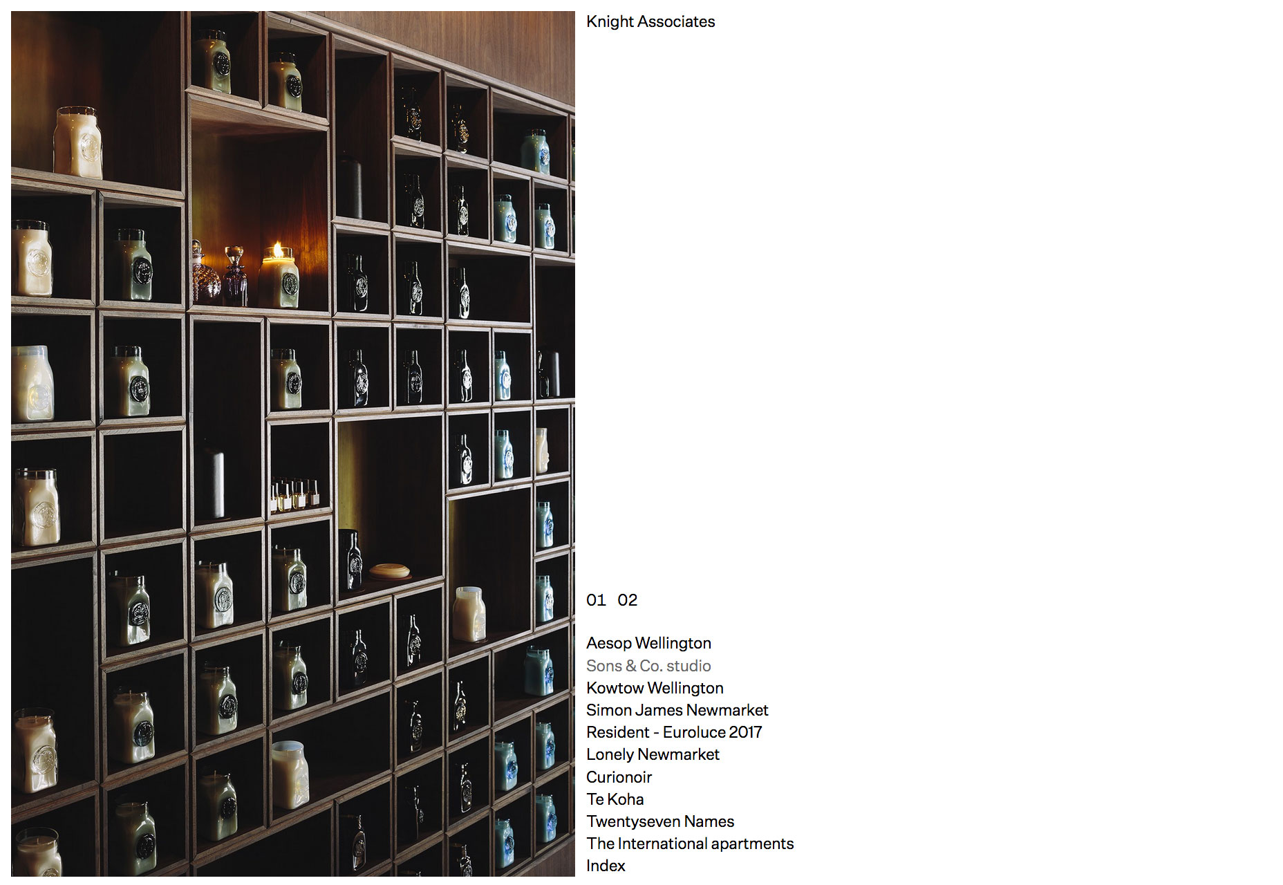
You don’t get more minimal than this site for a New Zealand-based interior design firm. A simple list of projects click through to case studies. It’s a exercise in restraint from the design team than fans of simplicity will love.

Bang & Olufsen SS18

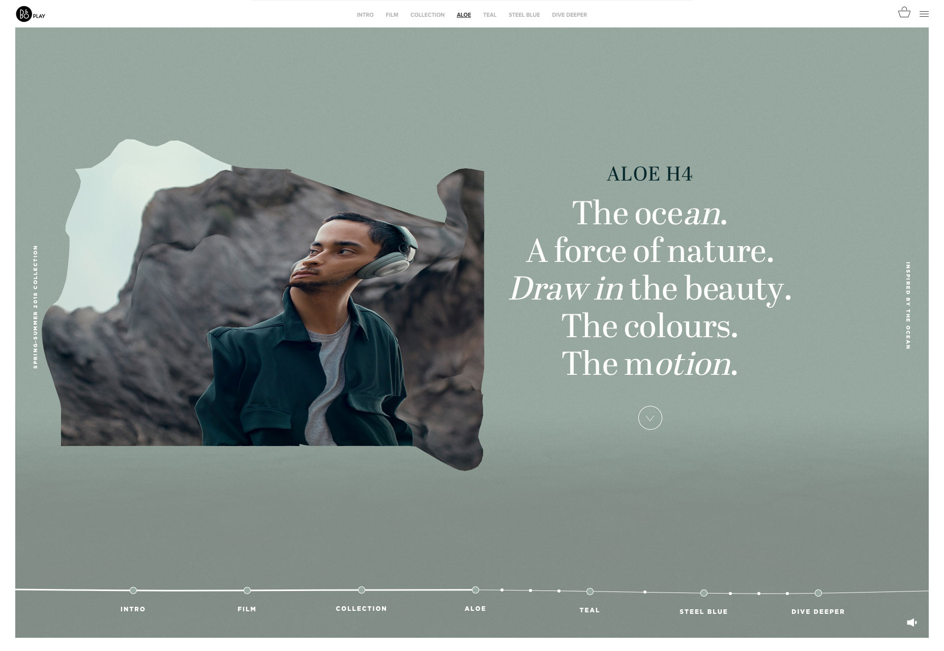
Bang & Olufsen’s spring and summer collection features aloe, teal, and steel blue hues inspired by the ocean. The whole microsite feels like its floating in water, and there’s a great liquid hover effect on the images.

Harris Farm

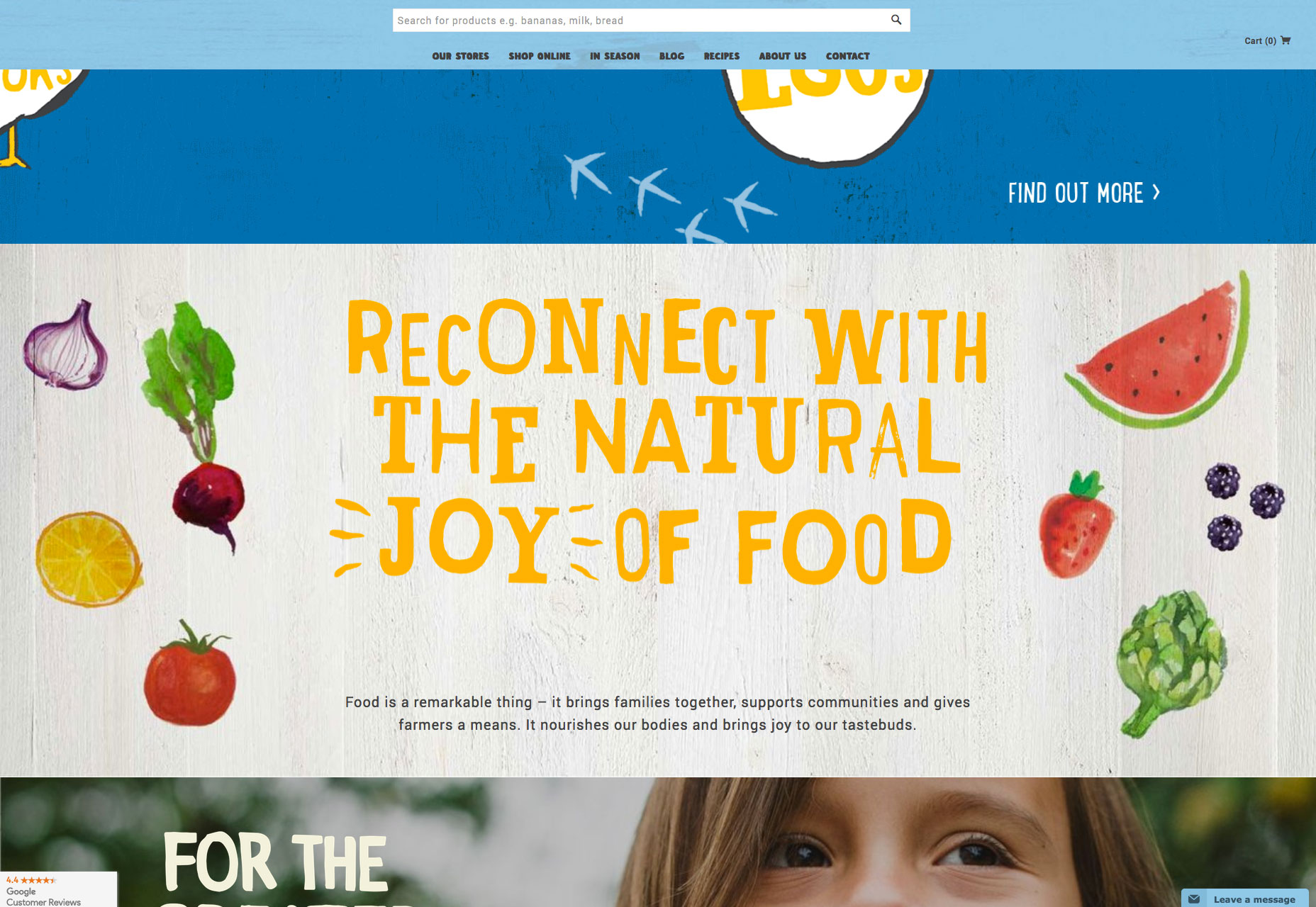
If you’ve had your fill of minimalism for this month, then browse over to Harris Farm. The positive feeling site is packed with illustrations and lettering that capture the spirit of this healthy, food-loving Australian company.

Add Realistic Chalk and Sketch Lettering Effects with Sketch’it – only $5!

Source

p img {display:inline-block; margin-right:10px;}
.alignleft {float:left;}
p.showcase {clear:both;}
body#browserfriendly p, body#podcast p, div#emailbody p{margin:0;}

What It Takes to Be a Graphic Designer in 2018

Original Source: http://feedproxy.google.com/~r/Designrfix/~3/vU0-fKAWLaw/what-it-takes-to-be-a-graphic-designer-in-2018

Dubai gives unmatched opportunities to entrepreneurs who want to make their career in graphic designing. In the competitive industry of graphic designing, it is difficult to make a brand name. However, if one is creative and can come up with fantastic ideas for graphic designing, then Dubai would be a paradise for them. Graphic designers […]

The post What It Takes to Be a Graphic Designer in 2018 appeared first on designrfix.com.

How To Drive More Quality Traffic To Your Website

Original Source: http://feedproxy.google.com/~r/Designrfix/~3/LvFJvIKYfyQ/drive-more-quality-traffic

Driving more potential customers to your website can have a major impact on your bottom line. Netting more traffic takes a combination of web design, user experience, marketing, and outreach. In fact, the top five traffic driving assets include email marketing, landing pages, content marketing, search optimization, and social media.   More quality traffic, the […]

The post How To Drive More Quality Traffic To Your Website appeared first on designrfix.com.