BeTheme: The WordPress Theme that Follows the Latest Design Trends

Original Source: https://www.sitepoint.com/betheme-the-wordpress-theme-that-follows-the-latest-design-trends/

This article was created in partnership with BAWMedia. Thank you for supporting the partners who make SitePoint possible.

2018 may be one of the greatest years yet for web design and web designers. There are web designers who are looking to stay relevant by keeping up with the latest trends. They certainly have their work cut out for them. After all, it takes some time to get acquainted and comfortable with new trends. It also takes more time to find ways to incorporate them into website designs.

To make things worse, the latest trends have succeeded in raising the competitive bar. They have made the designer's work just that much more difficult.

Fortunately, there is a WordPress theme that has kept up with the latest in design. Here are examples of the 8 most stunning trends. BeTheme has incorporated them into their more than 330 pre-built websites.

8 Creative Design Trends BeTheme has Already Put to Use
Design Trend #1: Illustration & Graphic Art

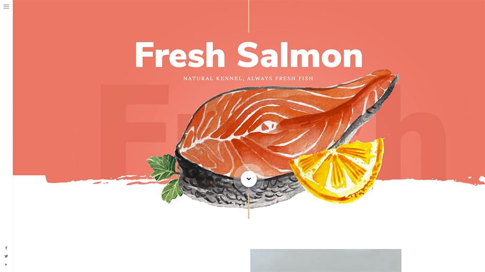
Custom art is currently all the rage in web design – and it doesn't appear to be going away any time soon. Eye-catching vintage watercolor illustrations have caught on. They bring that sense of nostalgia that makes people feel relaxed and comfortable.

BeSalmon

BeTea2

Notice the use of bold fonts (complete with serifs in the second example). It attracts attention without detracting from the illustrations.

Design Trend #2: Light, Shadow & Smoke

Playing with lights and shadows has always been a popular web design technique. When you add smoke to the mix the design trend takes on a whole new look with a different vibe, especially when it comes to music and dance.

The right mix of light, shadow, and smoke lead to a soft, romantic look:

BeMusician

Or a something a bit more dramatic:

BeHipHop

Or a perfect combination of sultry and classy…

BePole

Design Trend #3: Gradients aka Color Transitions

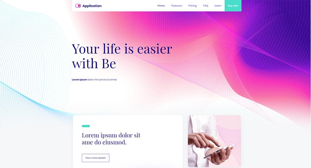
Gradients are hot. Even hotter than last year's use of bold colors. Gradients, or color transitions, work especially well with pastel colors. When they are allowed to clash with other design trends, the results can be surprising.

BeMusic2

BeApp3

Design Trend #4: 3D “Moving” Stills

Creating a 3D "moving" still can be tough, but when done right it can be a genuine eye-catcher. Maybe it's because the illusion of the movement often attracts us more than movement itself. Here's a pair of examples where you can see the results for yourself – a 3D image that appears to flow.

BeStone

BeDigital

There's so much you can do with images like this. Give them any texture, play with light and shadow, make use of gradients or negative space. 3D moving stills combine nicely with many of the other trends to produce unique results.

Design Trend #5: 2018 Still Life

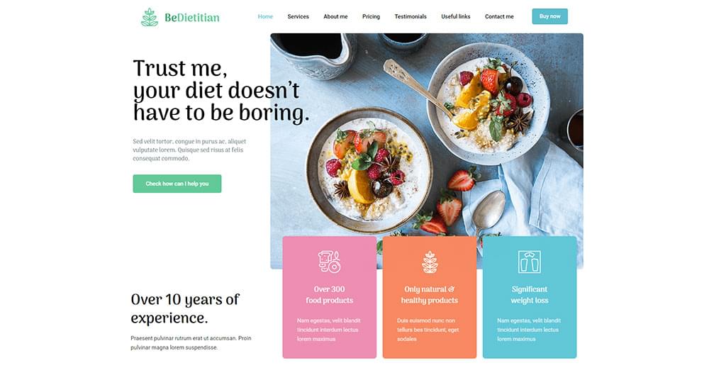
Still life has been popular for a long time. It's a trend that could likely go on forever, but that doesn't mean it can't be improved upon. The most popular form of modern still life is – you guessed it – 3D.

BeDietitian

You can also use photography (or a 3D-photo combo). Here's a pair of examples that make extraordinary use of white space:

Continue reading %BeTheme: The WordPress Theme that Follows the Latest Design Trends%

Collective #415

Original Source: http://feedproxy.google.com/~r/tympanus/~3/EPZ1NYoTNKE/

C415_warriorjs

Warrior.js

An interactive JavaScript coding game that will put your skills to the test.

Check it out

C415_WP

Our Sponsor
Must Have WordPress Plugins for Designers and Developers

We’ve done the search for you and here are nine of the top plugins on the market that you need to know about.

Check them out

C415_math

Math and front-end: Context is so much more important than degree of difficulty

Chen Hui Jing takes a look at some of the aspects of web development where math can come in handy.

Read it

C415_unicodepatterns

Unicode Patterns

Yuan Chuan explores some amazing Unicode and CSS powered patterns.

Read it

C415_stopwatch

Free Font: Stopwatch

Alex Townsend created this interesting typeface as a typographic experiment.

Get it

C415_morse

Morse Typing Trainer for Gboard

A fun Android web app for learning Morse code on Gboard.

Check it out

C415_designer25

A 25-Step Program for Becoming a Great Designer

Jon Moore shares some great, down-to-earth tips on becoming a better designer.

Read it

C415_logos

Record Label Logos

Reagan Ray’s gigantic collection of record label logos.

Check it out

C415_noise

Leaving Out Particularities

Super cool Perlin Noise demo by Gerard Ferrandez.

Check it out

C415_vue

Learning Vue

In this CSS-Tricks screencast you’ll learn some useful Vue.js coding with Sarah Drasner and Chris Coyier.

Watch it

C415_bulma

Learn Bulma CSS for free

Learn how to build three beautiful websites in less than an hour with Bulma. Read more about it in this article.

Check it out

C415_websites

Make Frontend Shit Again

Sara Vieira’s Hackatron project: a reminder how “fun” websites once were.

Check it out

C415_figmamaterial

Material Design + Figma Styles = Hot

Thomas Lowry took on the challenge to make a Material kit that could leverage soon to be released Figma features.

Read it

C415_click

Google YOLO

An interesting read on clickjacking use cases.

Read it

C415_ScrollHint

ScrollHint

A little JavaScript library to suggest that elements are scrollable horizontally.

Check it out

C415_tiat

Tiat

A simple but performant image organizer that does not create redundant files.

Check it out

C415_fbdata

You Can’t Handle the Truth About Facebook Ads, New Harvard Study Shows

Fantastic read on a very interesting study about ad clicking behavior by Sam Biddle.

Read it

C415_googleNN

Google Duplex: An AI System for Accomplishing Real-World Tasks Over the Phone

Read all about Google Duplex, a new technology for conducting natural conversations to carry out “real world” tasks over the phone.

Read it

C415_eqio

Eqio

A compact alternative to element/container queries by Matt Stow.

Check it out

C415_duo

The Artist Font Duo

A beautiful font duo with extended multilingual support.

Get it

C415_jsconcepts

JavaScript Symbols, Iterators, Generators, Async/Await, and Async Iterators – All Explained Simply

A great explanation of some inter-related JavaScript concepts.

Read it

C415_functional

Conversations with a six-year-old on functional programming

Fantastic read on how Brent Yorgey started to play a functional programming game with his son.

Read it

C415_dark

Learning to See in the Dark

A Tensorflow implementation for processing low-light images, based on end-to-end training of a fully convolutional network.

Check it out

Collective #415 was written by Pedro Botelho and published on Codrops.

Google I/O Developer Roundup: What’s New?

Original Source: https://www.smashingmagazine.com/2018/05/google-io-2018/

Google I/O Developer Roundup: What’s New?

Google I/O Developer Roundup: What’s New?

Rachel Andrew

2018-05-11T12:30:47+02:00
2018-05-14T13:47:25+00:00

The Google I/O keynote opened with an animation asking us to “Make Good Things Together,” and in this article, I’m going to round up some of the things announced in the Keynote and Developer Keynote, that are of interest to Smashing readers. The announcements in the keynote were backed up by sessions during the event, which were recorded. To help you use the things announced, I’ll be linking to the videos of those sessions plus any supporting material I’ve been able to find.

I would love to know which of these announcements you would like to find out more about — please do leave a comment below. Also, if you are an author with experience to share on any of these then why not drop us a line with an outline?

The Keynotes

The main announcements were all covered in the keynote presentations. If you want to watch all of the keynotes, you can find them on YouTube along with some condensed versions:

The main Keynote led by CEO Sundar Pichai (here’s a condensed ten-minute version of the most important points),
The Developer Keynote led by Jason Titus (here’s a five-minute version of the important points covered in the Developer Keynote).

What if there was a web conference without… slides? Meet SmashingConf Toronto 2018 ?? with live sessions exploring how experts work behind the scenes. Dan Mall, Lea Verou, Sara Soueidan, Seb Lee-Delisle and many others. June 26–27. With everything from live designing to live performance audits.

Check the speakers →

SmashingConf Toronto 2018, with Dan Mall, Sara Soueidan, Lea Verou and many others.

Google I/O And The Web

I was attending Google I/O as a Web GDE (Google Developer Expert), and I/O typically has a lot of content which is more of interest to Android Developers. That said, there were plenty of announcements and useful sessions for me.

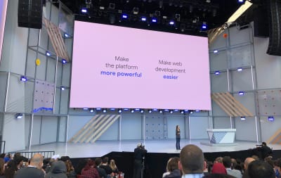
Slide saying Make the platform more powerful, make web development easier

The Web State of the Union session covered announcements and information regarding Lighthouse, PWAs, Polymer 3.0, Web Assembly and AMP. In addition to the video, you can find a write-up of this session on the Chromium Blog.

What’s New in Chrome DevTools covered all of the new features that are available or coming soon to DevTools.

Progressive Web Apps were a big story through the event, and if you have yet to build your first PWA, the PWA Starter Kit presentation can help you get started using Polymer. To look more deeply into Polymer, you could continue with Web Components and the Polymer Project: Polymer 3.0 and beyond. The Polymer site is now updated with the documentation for Polymer 3.0.

Angular wasn’t left out, watch the What’s New in Angular session for all the details.

Headless Chrome is a subject that has interested me lately, as I’m always looking for interesting ways to automate tasks. In the session The Power of Headless Chrome and Browser Automation, you can find out about using Headless Chrome and Puppeteer. If you are wondering what sort of things you could achieve, there are some examples of things you might like to do on GitHub.

Also, take a look at:

“Building A Seamless Web” by Dru Knox
“Web Performance Made Easy” by Addy Osmani and Ewa Gasperowicz
“Make Your WordPress Site Progressive” by Alberto Medina
“The Future Of The Web Is Immersive” by Brandon Jones
“Build The Future Of The Web With Modern JavaScript” by Mathias Bynens and Sathya Gunasekaran
“Build The Future Of The Web With Web Assembly And More” by Thomas Nattestad

Android Developer News

I’m not an Android developer, but I was surrounded by people who are. I’ve tried to pick out some of the things that seemed most exciting to the crowd. The session, “What’s New In Android,” is a great place to go to find out all of the key announcements. The first of which is the fact that Android P Beta is now available, and many of the features announced will be available as part of that beta. You can check to see if your device is supported by the Beta here.

Android Jetpack is a set of libraries, tools, and architectural guidance to help make it quick and easy to build great Android apps. The IDEs are integrated with Android Studio, and this seems to be an attempt to streamline the developer experience of common tasks. You can find out more information about Android Jetpack in the session video on What’s New In Android Support Library.

The ability to create Actions in Apps is something that is now in Beta and enables developers to create interactions that cross from Voice to displays — be that your watch, phone or the new Smart Screens that will be introduced later this year.

Slices are an interactive snippet of an App UI, introduced in Android P. To find out more, take a look at this I/O Session from which you can learn how to build a slice and have it appear as suggestions in search results.

Watch the session Design Actions for the Google Assistant Beyond Smart Speakers by Sada Zaidi,
Explore the Conversational Design website,
Read more about Actions,
Bookmark the Actions Playlist from Google Developers on YouTube.

Having looked at a few specific announcements for the Web and Android, I’ll now take a look at some of the bigger themes covered at the event and how these might play out for developers.

Audience and stage

7,000 people attended Google I/O

Artificial Intelligence, Augmented Reality, And Machine Learning

As expected, the main keynote as well as the Developer keynote both had a strong AI, AR, and ML theme. This theme is part of many Google products and announcements. Google is leveraging the huge amount of data that they have collected in order to create some incredible products and services, many of which bring with them new concerns on privacy and consent as the digital and real world merge more closely.

Google Photos is getting new AI features which will help you improve your photographs, by giving suggestions as to how to fix brightness or offer suggested rotations.

A new version of Google News will use AI to present to users a range of coverage on stories they are interested in.

One of the demos that achieved a huge round of applause was when Google Lens was demonstrated being pointed at a section of text in a book, and that text was then able to be copied and pasted into the phone.

"What if you could copy and paste stuff from a real world thing into your phone?"
We've never been this excited about copy and paste before. #io18 #googlelens pic.twitter.com/BjOYS3gfUi

— Android Authority (@AndroidAuth) 8. Mai 2018

If you are interested in using AI then you might like to watch the session AIY: Do It Yourself Artificial Intelligence. Also,

Lead designers at Google on “Design, Machine Learning And Creativity,”
“Bringing AI And Machine Learning Innovations To Healthcare” by Lily Peng and Jessica Mega,
“Exploring AR Interaction” by Chris Kelley, Elly Nattinger, and Luca Prasso
“AR Apps: Build, Iterate And Launch” by Tim Psiaki and Tom Salter

Maps

When traveling, I know the all-too-common scenario of coming out of a train station with maps open and having no idea which direction I am facing and which street is which. Google is hoping to solve this issue with augmented reality, bringing street view photographs and directions to the screen to help you know which direction to start walking in.

Google Maps are also taking more of a slice of the area we might already use FourSquare or Yelp for, bring more recommendations based on places we have already visited or reviewed. In addition, a feature I can see myself using when trying to plan post-conference dinners, the ability to create a shortlist of places and share it with a group in order to select where to go. Android Central have an excellent post on all of the new maps features if you want to know more. These features will be available on the Android and iOS versions of the Google Maps app.

For developers, a roundup of the changes to the Maps API can be found in the session Google Maps Platform: Ready For Scale.

Introducing ML Kit

While many of us will find the features powered by Machine Learning useful as consumers of the apps that use them, if you are keen to use machine learning in your apps, then Google is trying to make that easier for you with ML Kit. ML Kit helps you to bring the power of machine learning to your apps with Google APIs. The five ready-to-go APIs are:

Text Recognition
Face Detection
Barcode Scanning
Image Labeling
Landmark Recognition

Two more APIs will be ready in the coming months: A smart reply API allowing you to support contextual messaging replies in your app, and a high-density face contour addition to the face detection API.

You can read more about ML Kit in this Google Developers post Introducing ML Kit and in the session video ML Kit: Machine Learning SDK For Mobile Developers.

Google Duplex

The most talked about demo of the keynote was Google Duplex, with a demo of Google Assistant having a conversation with a restaurant and hairdresser in order to make a reservation and book an appointment. The demo drew gasps from the crowd as the conversation was so natural, the person on the other end of the phone did not recognize they were not talking to a person.

It didn’t take long for people to move from “*That’s cool!*” to “*That’s scary!*” and there are obvious concerns about the ethics of a robot not declaring that it is not a real person when engaging with someone on the phone.

The recordings that were played during the keynote can be found in Ethan Marcotte’s post about the feature, in which he notes that “Duplex was elegantly, intentionally designed to deceive.” Jeremy Keith wisely points out that the people excited to try this technology are not imagining themselves as the person at the end of the phone.

In addition to Duplex, there were a number of announcements around Google Assistant including the ability to have continued conversation, a back-and-forth conversation that doesn’t require saying “Hey, Google” at the beginning of each phrase.

Accessibility

As a layperson, I can’t help but think that many of the things Google is working on could have hugely positive implications in terms of accessibility. Even the controversial Duplex could enable someone who can’t have a voice call to more easily deal with businesses only contactable by phone. One area where Google technology will soon have an impact is with the Android App Google Lookout which will help visually impaired users understand what is around them, by using the phone camera and giving spoken notifications to the user.

There were several sessions bringing a real focus on accessibility at I/O, including the chance for developers to have an accessibility review of their application. For web developers, Rob Dodson’s talk What’s New In Accessibility covers new features of DevTools to help us build more accessible sites, plus the Accessibility Object Model which gives more control over the accessibility of sites. For Android Developers What’s New In Android Accessibility details the features that will be part of Android P. With the focus on AR and VR, there was also a session on what we need to think about in this emerging area of technology: Accessibility For AR And VR.

Linux Apps Are Coming To Chrome OS

An interesting announcement was the fact that Linux Apps will be installable on Chrome OS, making a ChromeBook a far more interesting choice as a developer. According to VentureBeat, Google is using Debian Stretch, so you’ll be able to run apt and install any software there is a Debian package for. This would include things like Git, VS Code, and Android Studio.

Material Design

The material.io website has been updated for the new version of Material Design; the big announcement for that being Theming, which will allow developers using Material to create their own themes making their apps look a little less like a Google property. Gallery will then allow teams to share and collaborate on their designs.

Also announced was the Material Theme Editor which is a plugin for Sketch, making it Mac only. The website does say that it is “currently available for Sketch” so perhaps other versions will appear in due course.

You can find a write-up of how to create a Material theme on the material.io website. The design.google site is also a useful destination for Material and other Google design themes. From the sessions, you can watch:

“Customize Material Components For Your Product” by Richard Fulcher, Rachel Been, and Josh Estelle
“Code Beautiful UI With Flutter And Material Design” by Mary Via and Will Larche
“Build Great Material Design Products Across Platforms” by Jonathan Chung, Nick Butcher, and Will Larche

Is your pattern library up to date today? Alla Kholmatova has just finished a fully fledged book on Design Systems and how to get them right. With common traps, gotchas and the lessons she learned. Hardcover, eBook. Just sayin’.

Table of Contents →

Digital Wellbeing

Announced at the keynote was the new Google Digital Wellbeing site, along with a suite of features in Android P, and also on YouTube aimed at helping people to disconnect from their devices and reduce stress caused by things such as alerts and notifications. You can explore all of the features at wellbeing.google/. Most of these will require Android P, currently in Beta, however, the YouTube features will be part of the Youtube app and therefore available to everyone.

As a developer, it is interesting to think about how we can implement similar features in our own applications, whether for web or mobile applications. Things like combining notifications into one daily alert, as will be enabled on Youtube, could help to prevent users being overloaded by alerts from you, and able to properly engage with them at a scheduled time. It has become easier and easier to constantly be asking our users to look at us, perhaps we should try to instead work with our users to be available when they need us, and quietly hide away when they are doing something else.

For more information on building a more humane technology ecosystem, explore the Center For Humane Technology website.

News Roundup

Every news site has been posting their own reviews of I/O, so I’ll wrap up with some of the best coverage I’ve seen. As an attendee of the event, I felt it was slickly managed, good fun, yet it was very clear that Google has well-rehearsed and clear messages they want to send to the developer communities who create apps and content. Every key announcement in the main keynotes was followed up by sessions diving into the practical details of how to use that technology in development. There was so much being announced and demonstrated that it is impossible to cover everything in this post — or even to have experienced it all at the event. I know that there are several videos on the I/O playlist that I’ll be watching after returning home.

TechCrunch has an excellent roundup, with individual articles on many of the big announcements,
There’s also a coverage of the event from CNET,
The Verge has a story stream of their content reporting on the announcements.

If you were at I/O or following along with the live stream, what announcements were most interesting to you? You can use the comments to share the things I didn’t cover that would be your highlights of the three days.

Smashing Editorial
(il)

The best cheap Apple Pencil deals of 2018

Original Source: http://feedproxy.google.com/~r/CreativeBloq/~3/uMZ3y40-WKo/best-cheap-apple-pencil-deals

Finding a good Apple Pencil deal isn't always easy. Certainly, you’re unlikely to see a cheap Apple Pencil on sale in the Apple Store. But there are savings to be had, if you know where to look.

Apple’s sophisticated digital stylus is perhaps the most amazing consumer stylus ever designed. It’s fantastic to use, with pressure and tilt sensitivity making it quick and easy to sketch ideas, create stunning images, take notes and more. 

However, if you’re already part of the Apple ecosystem, you’ll know that nothing comes cheap. That includes the Apple Pencil, which only comes bundled with the new iPad: if you want one for your iPad Pro you'll need to buy it separately. 

Fortunately, we can help. We’ve compared prices from all over the world to bring you the very best Apple Pencil deals and discounts available right now. 

9 iPad Pro apps that make the most of Apple Pencil
What is the Apple Pencil used for?

Image: Malika Favre and Sarah Clifford for Apple

The Apple Pencil is a versatile digital stylus pen that lets you take notes, sketch ideas, create illustrations and paintings, edit spreadsheets, annotate or mark up documents and more. 

It operates like a traditional pencil, letting you vary line weight, create realistic and subtle shading, and produce a wide range of artistic effects with impressive accuracy. Drawing feels natural, with no lag to ruin the illusion – and setup is incredibly easy. Just pop the cap off to reveal a Lightning connector, and plug it into your iPad Pro. (That's also how you charge it.) 

The Apple Pencil works with a range of art and design iOS apps including Adobe Draw and Sketch, Procreate, Affinity Photo and more.

Related articles:

The 90 best iPad appsApple launches iPad with Pencil supportThe best drawing tablet

Building Mobile Apps Using React Native And WordPress

Original Source: https://www.smashingmagazine.com/2018/05/building-mobile-apps-using-react-native-wordpress/

Building Mobile Apps Using React Native And WordPress

Building Mobile Apps Using React Native And WordPress

Muhammad Muhsin

2018-05-11T15:15:56+02:00
2018-05-14T13:47:25+00:00

As web developers, you might have thought that mobile app development calls for a fresh learning curve with another programming language. Perhaps Java and Swift need to be added to your skill set to hit the ground running with both iOS and Android, and that might bog you down.

But this article has you in for a surprise! We will look at building an e-commerce application for iOS and Android using the WooCommerce platform as our backend. This would be an ideal starting point for anyone willing to get into native cross-platform development.

A Brief History Of Cross-Platform Development

It’s 2011, and we see the beginning of hybrid mobile app development. Frameworks like Apache Cordova, PhoneGap, and Ionic Framework slowly emerge. Everything looks good, and web developers are eagerly coding away mobile apps with their existing knowledge.

However, mobile apps still looked like mobile versions of websites. No native designs like Android’s material design or iOS’s flat look. Navigation worked similar to the web and transitions were not buttery smooth. Users were not satisfied with apps built using the hybrid approach and dreamt of the native experience.

Fast forward to March 2015, and React Native appears on the scene. Developers are able to build truly native cross-platform applications using React, a favorite JavaScript library for many developers. They are now easily able to learn a small library on top of what they know with JavaScript. With this knowledge, developers are now targeting the web, iOS and Android.

Nope, we can’t do any magic tricks, but we have articles, books and webinars featuring techniques we all can use to improve our work. Smashing Members get a seasoned selection of magic front-end tricks — e.g. live designing sessions and perf audits, too. Just sayin’! 😉

Explore Smashing Wizardry →

Smashing Cat, just preparing to do some magic stuff.

Furthermore, changes done to the code during development are loaded onto the testing devices almost instantly! This used to take several minutes when we had native development through other approaches. Developers are able to enjoy the instant feedback they used to love with web development.

React developers are more than happy to be able to use existing patterns they have followed into a new platform altogether. In fact, they are targeting two more platforms with what they already know very well.

This is all good for front-end development. But what choices do we have for back-end technology? Do we still have to learn a new language or framework?

The WordPress REST API

In late 2016, WordPress released the much awaited REST API to its core, and opened the doors for solutions with decoupled backends.

So, if you already have a WordPress and WooCommerce website and wish to retain exactly the same offerings and user profiles across your website and native app, this article is for you!

Assumptions Made In This Article

I will walk you through using your WordPress skill to build a mobile app with a WooCommerce store using React Native. The article assumes:

You are familiar with the different WordPress APIs, at least at a beginner level.
You are familiar with the basics of React.
You have a WordPress development server ready. I use Ubuntu with Apache.
You have an Android or an iOS device to test with Expo.

What We Will Build In This Tutorial

The project we are going to build through this article is a fashion store app. The app will have the following functionalities:

Shop page listing all products,
Single product page with details of the selected item,
‘Add to cart’ feature,
‘Show items in cart’ feature,
‘Remove item from cart’ feature.

This article aims to inspire you to use this project as a starting point to build complex mobile apps using React Native.

Note: For the full application, you can visit my project on Github and clone it.

Getting Started With Our Project

We will begin building the app as per the official React Native documentation. Having installed Node on your development environment, open up the command prompt and type in the following command to install the Create React Native App globally.

npm install -g create-react-native-app

Next, we can create our project

create-react-native-app react-native-woocommerce-store

This will create a new React Native project which we can test with Expo.

Next, we will need to install the Expo app on our mobile device which we want to test. It is available for both iOS and Android.

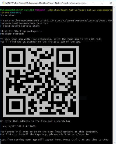
On having installed the Expo app, we can run npm start on our development machine.

cd react-native-woocommerce-store

npm start

Starting a React Native project through the command line via Expo. (Large preview)

After that, you can scan the QR code through the Expo app or enter the given URL in the app’s search bar. This will run the basic ‘Hello World’ app in the mobile. We can now edit App.js to make instant changes to the app running on the phone.

Alternatively, you can run the app on an emulator. But for brevity and accuracy, we will cover running it on an actual device.

Next, let’s install all the required packages for the app using this command:

npm install -s axios react-native-htmlview react-navigation react-redux redux redux-thunk

Setting Up A WordPress Site

Since this article is about creating a React Native app, we will not go into details about creating a WordPress site. Please refer to this article on how to install WordPress on Ubuntu. As WooCommerce REST API requires HTTPS, please make sure it is set up using Let’s Encrypt. Please refer to this article for a how-to guide.

We are not creating a WordPress installation on localhost since we will be running the app on a mobile device, and also since HTTPS is needed.

Once WordPress and HTTPS are successfully set up, we can install the WooCommerce plugin on the site.

Installing the WooCommerce plugin to our WordPress installation. (Large preview)

After installing and activating the plugin, continue with the WooCommerce store setup by following the wizard. After the wizard is complete, click on ‘Return to dashboard.’

You will be greeted by another prompt.

Adding example products to WooCommerce. (Large preview)

Click on ‘Let’s go‘ to ‘Add example products’. This will save us the time to create our own products to display in the app.

Constants File

To load our store’s products from the WooCommerce REST API, we need the relevant keys in place inside our app. For this purpose, we can have a constans.js file.

First create a folder called ‘src’ and create subfolders inside as follows:

Create the file ‘Constants.js’ within the constans folder. (Large preview)

Now, let’s generate the keys for WooCommerce. In the WordPress dashboard, navigate to WooCommerce → Settings → API → Keys/Apps and click on ‘Add Key.’

Next create a Read Only key with name React Native. Copy over the Consumer Key and Consumer Secret to the constants.js file as follows:

const Constants = {
URL: {
wc: ‘https://woocommerce-store.on-its-way.com/wp-json/wc/v2/’
},
Keys: {
ConsumerKey: ‘CONSUMER_KEY_HERE’,
ConsumerSecret: ‘CONSUMER_SECRET_HERE’
}
}
export default Constants;

Starting With React Navigation

React Navigation is a community solution to navigating between the different screens and is a standalone library. It allows developers to set up the screens of the React Native app with just a few lines of code.

There are different navigation methods within React Navigation:

Stack,
Switch,
Tabs,
Drawer,
and more.

For our Application we will use a combination of StackNavigation and DrawerNavigation to navigate between the different screens. StackNavigation is similar to how browser history works on the web. We are using this since it provides an interface for the header and the header navigation icons. It has push and pop similar to stacks in data structures. Push means we add a new screen to the top of the Navigation Stack. Pop removes a screen from the stack.

The code shows that the StackNavigation, in fact, houses the DrawerNavigation within itself. It also takes properties for the header style and header buttons. We are placing the navigation drawer button to the left and the shopping cart button to the right. The drawer button switches the drawer on and off whereas the cart button takes the user to the shopping cart screen.

const StackNavigation = StackNavigator({
DrawerNavigation: { screen: DrawerNavigation }
}, {
headerMode: ‘float’,
navigationOptions: ({ navigation, screenProps }) => ({
headerStyle: { backgroundColor: ‘#4C3E54’ },
headerTintColor: ‘white’,
headerLeft: drawerButton(navigation),
headerRight: cartButton(navigation, screenProps)
})
});

const drawerButton = (navigation) => (
<Text
style={{ padding: 15, color: ‘white’ }}
onPress={() => {
if (navigation.state.index === 0) {
navigation.navigate(‘DrawerOpen’)
} else {
navigation.navigate(‘DrawerClose’)
}
}
}> (
<Text style={{ padding: 15, color: ‘white’ }}
onPress={() => { navigation.navigate(‘CartPage’) }}
>
<EvilIcons name=”cart” size={30} />
{screenProps.cartCount}
</Text>
);

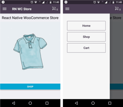
DrawerNavigation on the other hands provides for the side drawer which will allow us to navigate between Home, Shop, and Cart. The DrawerNavigator lists the different screens that the user can visit, namely Home page, Products page, Product page, and Cart page. It also has a property which will take the Drawer container: the sliding menu which opens up when clicking the hamburger menu.

const DrawerNavigation = DrawerNavigator({
Home: {
screen: HomePage,
navigationOptions: {
title: “RN WC Store”
}
},
Products: {
screen: Products,
navigationOptions: {
title: “Shop”
}
},
Product: {
screen: Product,
navigationOptions: ({ navigation }) => ({
title: navigation.state.params.product.name
}),
},
CartPage: {
screen: CartPage,
navigationOptions: {
title: “Cart”
}
}
}, {
contentComponent: DrawerContainer
});

#

Left: The Home page (homepage.js). Right: The open drawer (DrawerContainer.js).

Injecting The Redux Store To App.js

Since we are using Redux in this app, we have to inject the store into our app. We do this with the help of the Provider component.

const store = configureStore();

class App extends React.Component {
render() {
return (
<Provider store={store}>
<ConnectedApp />
</Provider>
)
}
}

We will then have a ConnectedApp component so that we can have the cart count in the header.

class CA extends React.Component {
render() {
const cart = {
cartCount: this.props.cart.length
}
return (
<StackNavigation screenProps={cart} />
);
}
}

function mapStateToProps(state) {
return {
cart: state.cart
};
}

const ConnectedApp = connect(mapStateToProps, null)(CA);

Redux Store, Actions, And Reducers

In Redux, we have three different parts:

Store
Holds the whole state of your entire application. The only way to change state is to dispatch an action to it.
Actions
A plain object that represents an intention to change the state.
Reducers
A function that accepts a state and an action type and returns a new state.

These three components of Redux help us achieve a predictable state for the entire app. For simplicity, we will look at how the products are fetched and saved in the Redux store.

Is your pattern library up to date today? Alla Kholmatova has just finished a fully fledged book on Design Systems and how to get them right. With common traps, gotchas and the lessons she learned. Hardcover, eBook. Just sayin’.

Table of Contents →

First of all, let’s look at the code for creating the store:

let middleware = [thunk];

export default function configureStore() {
return createStore(
RootReducer,
applyMiddleware(…middleware)
);
}

Next, the products action is responsible for fetching the products from the remote website.

export function getProducts() {
return (dispatch) => {
const url = `${Constants.URL.wc}products?per_page=100&consumer_key=${Constants.Keys.ConsumerKey}&consumer_secret=${Constants.Keys.ConsumerSecret}`

return axios.get(url).then(response => {
dispatch({
type: types.GET_PRODUCTS_SUCCESS,
products: response.data
}
)}).catch(err => {
console.log(err.error);
})
};
}

The products reducer is responsible for returning the payload of data and whether it needs to be modified.

export default function (state = InitialState.products, action) {
switch (action.type) {
case types.GET_PRODUCTS_SUCCESS:
return action.products;
default:
return state;
}
}

Displaying The WooCommerce Shop

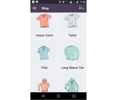
The products.js file is our Shop page. It basically displays the list of products from WooCommerce.

class ProductsList extends Component {

componentDidMount() {
this.props.ProductAction.getProducts();
}

_keyExtractor = (item, index) => item.id;

render() {
const { navigate } = this.props.navigation;
const Items = (
<FlatList contentContainerStyle={styles.list} numColumns={2}
data={this.props.products || []}
keyExtractor={this._keyExtractor}
renderItem={
({ item }) => (
<TouchableHighlight style={{ width: ‘50%’ }} onPress={() => navigate(“Product”, { product: item })} underlayColor=”white”>
<View style={styles.view} >
<Image style={styles.image} source={{ uri: item.images[0].src }} />
<Text style={styles.text}>{item.name}</Text>
</View>
</TouchableHighlight>
)
}
/>
);
return (
<ScrollView>
{this.props.products.length ? Items :
<View style={{ alignItems: ‘center’, justifyContent: ‘center’ }}>
<Image style={styles.loader} source={LoadingAnimation} />
</View>
}
</ScrollView>
);
}
}

this.props.ProductAction.getProducts() and this.props.products are possible because of mapStateToProps and mapDispatchToProps.

Products listing screen. (Large preview)

mapStateToProps and mapDispatchToProps

State is the Redux store and Dispatch is the actions we fire. Both of these will be exposed as props in the component.

function mapStateToProps(state) {
return {
products: state.products
};
}
function mapDispatchToProps(dispatch) {
return {
ProductAction: bindActionCreators(ProductAction, dispatch)
};
}
export default connect(mapStateToProps, mapDispatchToProps)(ProductsList);

Styles

In React, Native styles are generally defined on the same page. It’s similar to CSS, but we use camelCase properties instead of hyphenated properties.

const styles = StyleSheet.create({
list: {
flexDirection: ‘column’
},
view: {
padding: 10
},
loader: {
width: 200,
height: 200,
alignItems: ‘center’,
justifyContent: ‘center’,
},
image: {
width: 150,
height: 150
},
text: {
textAlign: ‘center’,
fontSize: 20,
padding: 5
}
});

Single Product Page

This page contains details of a selected product. It shows the user the name, price, and description of the product. It also has the ‘Add to cart’ function.

Single product page. (Large preview)

Cart Page

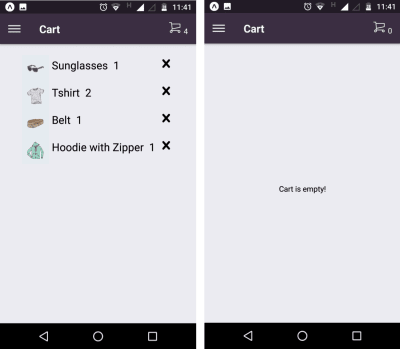
This screen shows the list of items in the cart. The action has the functions getCart, addToCart, and removeFromCart. The reducer handles the actions likewise. Identification of actions is done through actionTypes — constants which describe the action that are stored in a separate file.

export const GET_PRODUCTS_SUCCESS = ‘GET_PRODUCTS_SUCCESS’
export const GET_PRODUCTS_FAILED = ‘GET_PRODUCTS_FAILED’;

export const GET_CART_SUCCESS = ‘GET_CART_SUCCESS’;
export const ADD_TO_CART_SUCCESS = ‘ADD_TO_CART_SUCCESS’;
export const REMOVE_FROM_CART_SUCCESS = ‘REMOVE_FROM_CART_SUCCESS’;

This is the code for the CartPage component:

class CartPage extends React.Component {

componentDidMount() {
this.props.CartAction.getCart();
}

_keyExtractor = (item, index) => item.id;

removeItem(item) {
this.props.CartAction.removeFromCart(item);
}

render() {
const { cart } = this.props;
console.log(‘render cart’, cart)

if (cart && cart.length > 0) {
const Items = <FlatList contentContainerStyle={styles.list}
data={cart}
keyExtractor={this._keyExtractor}
renderItem={({ item }) =>
<View style={styles.lineItem} >
<Image style={styles.image} source={{ uri: item.image }} />
<Text style={styles.text}>{item.name}</Text>
<Text style={styles.text}>{item.quantity}</Text>
<TouchableOpacity style={{ marginLeft: ‘auto’ }} onPress={() => this.removeItem(item)}><Entypo name=”cross” size={30} /></TouchableOpacity>
</View>
}
/>;
return (
<View style={styles.container}>
{Items}
</View>
)
} else {
return (
<View style={styles.container}>
<Text>Cart is empty!</Text>
</View>
)
}
}
}

As you can see, we are using a FlatList to iterate through the cart items. It takes in an array and creates a list of items to be displayed on the screen.

#

Left: The cart page when it has items in it. Right: The cart page when it is empty.

Conclusion

You can configure information about the app such as name and icon in the app.json file. The app can be published after npm installing exp.

To sum up:

We now have a decent e-commerce application with React Native;
Expo can be used to run the project on a smartphone;
Existing backend technologies such as WordPress can be used;
Redux can be used for managing the state of the entire app;
Web developers, especially React developers can leverage this knowledge to build bigger apps.

For the full application, you can visit my project on Github and clone it. Feel free to fork it and improve it further. As an exercise, you can continue building more features into the project such as:

Checkout page,
Authentication,
Storing the cart data in AsyncStorage so that closing the app does not clear the cart.

Smashing Editorial
(da, lf, ra, yk, il)

A Strategy Guide To CSS Custom Properties

Original Source: https://www.smashingmagazine.com/2018/05/css-custom-properties-strategy-guide/

A Strategy Guide To CSS Custom Properties

A Strategy Guide To CSS Custom Properties

Michael Riethmuller

2018-05-14T13:30:38+02:00
2018-05-14T13:47:25+00:00

CSS Custom Properties (sometimes known as ‘CSS variables’) are now supported in all modern browsers, and people are starting to use them in production. This is great, but they’re different from variables in preprocessors, and I’ve already seen many examples of people using them without considering what advantages they offer.

Custom properties have a huge potential to change how we write and structure CSS and to a lesser extent, how we use JavaScript to interact with UI components. I’m not going to focus on the syntax and how they work (for that I recommend you read “It’s Time To Start Using Custom Properties”). Instead, I want to take a deeper look at strategies for getting the most out of CSS Custom Properties.

How Are They Similar To Variables In Preprocessors?

Custom Properties are a little bit like variables in preprocessors but have very some important differences. The first and most obvious difference is the syntax.

With SCSS we use a dollar symbol to denote a variable:

$smashing-red: #d33a2c;

In Less we use an @ symbol:

@smashing-red: #d33a2c;

Custom properties follow a similar conventions and use a — prefix:

:root { –smashing-red: #d33a2c; }
.smashing-text {
color: var(–smashing-red);
}

One important difference between custom properties and variables in preprocessors is that custom properties have a different syntax for assigning a value and retrieving that value. When retrieving the value of a custom property we use the var() function.

Nope, we can’t do any magic tricks, but we have articles, books and webinars featuring techniques we all can use to improve our work. Smashing Members get a seasoned selection of magic front-end tricks — e.g. live designing sessions and perf audits, too. Just sayin’! 😉

Explore Smashing Wizardry →

Smashing Cat, just preparing to do some magic stuff.

The next most obvious difference is in the name. They are called ‘custom properties’ because they really are CSS properties. In preprocessors, you can declare and use variables almost anywhere, including outside declaration blocks, in media rules, or even as part of a selector.

$breakpoint: 800px;
$smashing-red: #d33a2c;
$smashing-things: “.smashing-text, .cats”;

@media screen and (min-width: $breakpoint) {
#{$smashing-things} {
color: $smashing-red;
}
}

Most of the examples above would be invalid using custom properties.

Custom properties have the same rules about where they can be used as normal CSS properties. It’s far better to think of them as dynamic properties than variables. That means they can only be used inside a declaration block, or in other words, custom properties are tied to a selector. This can be the :root selector, or any other valid selector.

:root { –smashing-red: #d33a2c; }

@media screen and (min-width: 800px) {
.smashing-text, .cats {
–margin-left: 1em;
}
}

You can retrieve the value of a custom property anywhere you would otherwise use a value in a property declaration. This means they can be used as a single value, as part of a shorthand statement or even inside calc() equations.

.smashing-text, .cats {
color: var(–smashing-red);
margin: 0 var(–margin-horizontal);
padding: calc(var(–margin-horizontal) / 2)
}

However, they cannot be used in media rules, or selectors including :nth-child().

There is probably a lot more you want to know about the syntax and how custom properties work, such as how to use fallback values and can you assign variables to other variables (yes), but this basic introduction should be enough to understand the rest of the concepts in this article. For more information on the specifics of how custom properties work, you can read “It’s Time To Start Using Custom Properties” written by Serg Hospodarets.

Dynamic vs. Static

Cosmetic differences aside, the most significant difference between variables in preprocessors and custom properties is how they are scoped. We can refer to variables as either statically or dynamically scoped. Variables in preprocessors are static whereas custom properties are dynamic.

Where CSS is concerned static means that you can update the value of a variable at different points in the compilation process, but this cannot change the value of the code that came before it.

$background: blue;
.blue {
background: $background;
}
$background: red;
.red {
background: $background;
}

results in:

.blue {
background: blue;
}
.red {
background: red;
}

Once this is rendered to CSS, the variables are gone. This means that we could potentially read an .scss file and determine it’s output without knowing anything about the HTML, browser or other inputs. This is not the case with custom properties.

Preprocessors do have a kind of “block scope” where variables can be temporarily changed inside a selector, function or mixin. This changes the value of a variable inside the block, but it’s still static. This is tied to the block, not the selector. In the example below, the variable $background is changed inside the .example block. It changes back to the initial value outside the block, even if we use the same selector.

$background: red;
.example {
$background: blue;
background: $background;
}

.example {
background: $background;
}

This will result in:

.example {
background: blue;
}
.example {
background: red;
}

Custom properties work differently. Where custom properties are concerned, dynamically scoped means they are subject to inheritance and the cascade. The property is tied to a selector and if the value changes, this affects all matching DOM elements just like any other CSS property.

This is great because you can change the value of a custom property inside a media query, with a pseudo selector such as hover, or even with JavaScript.

a {
–link-color: black;
}
a:hover,
a:focus {
–link-color: tomato;
}
@media screen and (min-width: 600px) {
a {
–link-color: blue;
}
}

a {
color: var(–link-color);
}

We don’t have to change where the custom property is used — we change the value of the custom property with CSS. This means using the same custom property, we can have different values in different places or context on the same page.

Global vs. Local

In addition to being static or dynamic, variables can also be either global or local. If you write JavaScript, you will be familiar with this. Variables can either be applied to everything inside an application, or their scope can be limited to specific functions or blocks of code.

CSS is similar. We have some things that are applied globally and some things that are more local. Brand colors, vertical spacing, and typography are all examples of things you might want to be applied globally and consistently across your website or application. We also have local things. For example, a button component might have a small and large variant. You wouldn’t want the sizes from these buttons to be applied to all input elements or even every element on the page.

This is something we are familiar with in CSS. We’ve developed design systems, naming conventions and JavaScript libraries, all to help with isolating local components and global design elements. Custom properties provide new options for dealing with this old problem.

CSS Custom Properties are by default locally scoped to the specific selectors we apply them to. So they are kinda like local variables. However, custom properties are also inherited, so in many situations they behave like global variables — especially when applied to the :root selector. This means that we need to be thoughtful about how to use them.

So many examples show custom properties being applied to the :root element and although, this fine for a demo, it can result in a messy global scope and unintended issues with inheritance. Luckily, we’ve already learned these lessons.

Global Variables Tend To Be Static

There are a few small exceptions, but generally speaking, most global things in CSS are also static.

Global variables like brand colors, typography and spacing don’t tend to change much from one component to the next. When they do change this tends to be a global rebranding or some other significant change that rarely happens on a mature product. It still makes sense for these things to be variables, they are used in many places, and variables help with consistency. But it doesn’t make sense for them to be dynamic. The value of these variables does not change in any dynamic way.

For this reason, I strongly recommend using preprocessors for global (static) variables. This not only ensures that they are always static, but it visually denotes them within the code. This can make CSS a whole lot more readable and easier to maintain.

Local Static Variables Are OK (Sometimes)

You might think given the strong stance on global variables being static, that by reflection, all local variables might need to be dynamic. While it’s true that local variables do tend to be dynamic, this is nowhere near as strong as the tendency for a global variable to be static.

Locally static variables are perfectly OK in many situations. I use preprocessors variables in component files mostly as a developer convenience.

Consider the classic example of a button component with multiple size variations.

buttons

My scss might look something like this:

$button-sml: 1em;
$button-med: 1.5em;
$button-lrg: 2em;

.btn {
// Visual styles
}

.btn-sml {
font-size: $button-sml;
}

.btn-med {
font-size: $button-med;
}

.btn-lrg {
font-size: $button-lrg;
}

Obviously, this example would make more sense if I was using the variables multiple times or deriving margin and padding values from the size variables. However, the ability to quickly prototype different sizes might be a sufficient reason.

Because most static variables are global, I like to differentiate static variables that are used only inside a component. To do this, you can prefix these variables with the component name, or you could use another prefix such as c-variable-name for component or l-variable-name for local. You can use whatever prefix you want, or you can prefix global variables. Whatever you choose, it’s helpful to differentiate especially if converting an existing codebase to use custom properties.

When To Use Custom Properties

If it is alright to use static variables inside components, when should we use custom properties? Converting existing preprocessor variables to custom properties usually makes little sense. After all, the reason for custom properties is completely different. Custom properties make sense when we have CSS properties that change relative to a condition in the DOM — especially a dynamic condition such as :focus, :hover, media queries or with JavaScript.

I suspect we will always use some form of static variables, although we might need fewer in future, as custom properties offer new ways to organise logic and code. Until then, I think in most situations we are going to be working with a combination of preprocessor variables and custom properties.

It’s helpful to know that we can assign static variables to custom properties. Whether they are global or local, it makes sense in many situations to convert static variables, to locally dynamic custom properties.

Note: Did you know that $var is valid value for a custom property? Recent versions of Sass recognize this, and therefore we need to interpolate variables assigned to custom properties, like this: #{$var}. This tells Sass you want to output the value of the variable, rather than just $var in the stylesheet. This is only needed for situations like custom properties, where a variable names can also be a valid CSS.

If we take the button example above and decide all buttons should use the small variation on mobile devices, regardless of the class applied in the HTML, this is now a more dynamic situation. For this, we should use custom properties.

$button-sml: 1em;
$button-med: 1.5em;
$button-lrg: 2em;

.btn {
–button-size: #{$button-sml};
}

@media screen and (min-width: 600px) {
.btn-med {
–button-size: #{$button-med};
}
.btn-lrg {
–button-size: #{$button-lrg};
}
}

.btn {
font-size: var(–button-size);
}

Here I create a single custom property: –button-size. This custom property is initially scoped to all button elements using the btn class. I then change the value of –button-size above 600px for the classes btn-med and btn-lrg. Finally, I apply this custom property to all button elements in one place.

Don’t Be Too Clever

The dynamic nature of custom properties allows us to create some clever and complicated components.

With the introduction of preprocessors, many of us created libraries with clever abstractions using mixins and custom functions. In limited cases, examples like this are still useful today, but for the most part, the longer I work with preprocessors the fewer features I use. Today, I use preprocessors almost exclusively for static variables.

Custom properties will not (and should not) be immune from this type of experimentation, and I look forward to seeing many clever examples. But in the long run, readable and maintainable code will always win over clever abstractions (at least in production).

I read an excellent article on this topic on the Free Code Camp Medium recently. It was written by Bill Sourour and is called “Don’t Do It At Runtime. Do It At Design Time.” Rather than paraphrasing his arguments, I’ll let you read it.

One key difference between preprocessor variables and custom properties is that custom properties work at runtime. This means things that might have been borderline acceptable, in terms of complexity, with preprocessors might not be a good idea with custom properties.

One example that illustrated this for me recently was this:

:root {
–font-scale: 1.2;
–font-size-1: calc(var(–font-scale) * var(–font-size-2));
–font-size-2: calc(var(–font-scale) * var(–font-size-3));
–font-size-3: calc(var(–font-scale) * var(–font-size-4));
–font-size-4: 1rem;
}

This generates a modular scale. A modular scale is a series of numbers that relate to each other using a ratio. They are often used in web design and development to set font-sizes or spacing.

In this example, each custom property is determined using calc(), by taking the value of the previous custom property and multiplying this by the ratio. Doing this, we can get the next number in the scale.

This means the ratios are calculated at run-time and you can change them by updating only the value of the –font-scale property. For example:

@media screen and (min-width: 800px) {
:root {
–font-scale: 1.33;
}
}

This is clever, concise and much quicker than calculating all the values again should you want to change the scale. It’s also something I would not do in production code.

Although the above example is useful for prototyping, in production, I’d much prefer to see something like this:

:root {
–font-size-1: 1.728rem;
–font-size-2: 1.44rem;
–font-size-3: 1.2em;
–font-size-4: 1em;
}

@media screen and (min-width: 800px) {
:root {
–font-size-1: 2.369rem;
–font-size-2: 1.777rem;
–font-size-3: 1.333rem;
–font-size-4: 1rem;
}
}

Similar to the example in Bill’s article, I find it helpful to see what the actual values are. We read code many more times than we write it and global values such as font scales change infrequently in production.

The above example is still not perfect. It violates the rule from earlier that global values should be static. I’d much prefer to use preprocessor variables and convert them to locally dynamic custom properties using the techniques demonstrated earlier.

It is also important to avoid situations where we go from using one custom property to a different custom property. This can happen when we name properties like this.

Change The Value Not The Variable

Change the value not the variable is one of the most important strategies for using custom properties effectively.

As a general rule, you should never change which custom property is used for any single purpose.
It’s easy to do because this is exactly how we do things with preprocessors, but it makes little sense with custom properties.

In this example, we have two custom properties that are used on an example component. I switch from using the value of –font-size-small to –font-size-large depending on the screen size.

:root {
–font-size-small: 1.2em;
–font-size-large: 2em;
}
.example {
font-size: var(–font-size-small);
}
@media screen and (min-width: 800px) {
.example {
font-size: var(–font-size-large);
}
}

A better way to do this would be to define a single custom property scoped to the component. Then using a media query, or any other selector, change its value.

.example {
–example-font-size: 1.2em;
}
@media screen and (min-width: 800px) {
.example {
–example-font-size: 2em;
}
}

Finally, in a single place, I use the value of this custom property:

.example {
font-size: var(–example-font-size);
}

In this example and others before it, media queries have only been used to change the value of custom properties. You might also notice there is only one place where the var() statement is used, and regular CSS properties are updated.

This separation between variable declarations and property declarations is intentional. There are many reasons for this, but the benefits are most obvious when thinking about responsive design.

Responsive Design With Custom Properties

One of the difficulties with responsive design when it relies heavily on media queries is that the no matter how you organize your CSS, styles relating to a particular component become fragmented across the stylesheet.

It can be very difficult to know what CSS properties are going to change. Still, CSS Custom Properties can help us organize some of the logic related to responsive design and make working with media queries a lot easier.

If It Changes It’s A Variable

Properties that change using media queries are inherently dynamic and custom properties provide the means to express dynamic values in CSS. This means that if you are using a media query to change any CSS property, you should place this value in a custom property.

You can then move this, along with all the media rules, hover states or any dynamic selectors that define how the value changes, to the top of the document.

Separate Logic From Design

When done correctly, separation of logic and design means that media queries are only be used to change the value of custom properties. It means all the logic related to responsive design should be at the top of the document, and wherever we see a var() statement in our CSS, we immediately know that this property that changes. With traditional methods of writing CSS, there was no way of knowing this at a glance.

Many of us got very good at reading and interpreting CSS at a glance while tracking in our head which properties changed in different situations. I’m tired of this, and I don’t want to do this anymore! Custom properties now provide a link between logic and its implementation, so we don’t need to track this, and that is incredibly useful!

The Logic Fold

The idea of declaring variables at the top of a document or function is not a new idea. It’s something we do in most languages, and it’s now something we can do in CSS as well. Writing CSS in this way creates a clear visual distinction between CSS at the top of the document and below. I need a way to differentiate these sections when I talk about them and the idea of a “logic fold” is a metaphor I’ve started using.
Above the fold contains all preprocessor variables and custom properties. This includes all the different values a custom property can have. It should be easy to trace how a custom property changes.

CSS below the fold is straightforward and highly declarative and easy to read. It feels like CSS before media queries and other necessary complexities of modern CSS.

Take a look at a really simple example of a six column flexbox grid system:

.row {
–row-display: block;
}
@media screen and (min-width: 600px) {
.row {
–row-display: flex;
}
}

The –row-display custom property is initially set to block. Above 800px the display mode is set to flex.

Below the fold might look like this:

.row {
display: var(–row-display);
flex-direction: row;
flex-wrap: nowrap;
}
.col-1, .col-2, .col-3,
.col-4, .col-5, .col-6 {
flex-grow: 0;
flex-shrink: 0;
}
.col-1 { flex-basis: 16.66%; }
.col-2 { flex-basis: 33.33%; }
.col-3 { flex-basis: 50%; }
.col-4 { flex-basis: 66.66%; }
.col-5 { flex-basis: 83.33%; }
.col-6 { flex-basis: 100%; }

We immediately know –row-display is a value that changes. Initially, it will be block, so the flex values will be ignored.

This example is fairly simple, but if we expanded it to include a flexible width column that fills the remaining space, it’s likely flex-grow, flex-shrink and flex-basis values would need to be converted to custom properties. You can try this or take a look at a more detailed example here.

Custom Properties For Theming

I’ve mostly argued against using custom properties for global dynamic variables and hopefully implied that attaching custom properties to the :root selector is in many cases considered harmful. But every rule has an exception, and for custom properties, it’s theming.

Limited use of global custom properties can make theming a whole lot easier.

Theming generally refers to letting users customize the UI in some way. This could be something like changing colors on a profile page. Or it might be something more localized. For example, you can choose the color of a note in the Google Keep application.
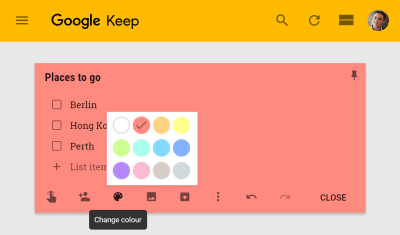
Google Keep App

Theming usually involves compiling a separate stylesheet to override a default value with user preferences, or compiling a different stylesheet for each user. Both of these can be difficult and have an impact on performance.

With custom properties, we don’t need to compile a different stylesheet; we only need to update the value of properties according to the user’s preferences. Since they are inherited values, if we do this on the root element they can be used anywhere in our application.

Capitalize Global Dynamic Properties

Custom properties are case sensitive and since most custom properties will be local, if you are using global dynamic properties, it can make sense to capitalize them.

:root {
–THEME-COLOR: var(–user-theme-color, #d33a2c);
}

Capitalization of variables often signifies global constants. For us, this is going to signify that the property is set elsewhere in the application and that we should probably not change it locally.

Avoid Directly Setting Global Dynamic Properties

Custom properties accept a fallback value. It can be a useful to avoid directly overwriting the value of a global custom properties and keep user values separate. We can use the fallback value to do this.

The example above sets the value of –THEME-COLOR to the value of –user-theme-color if it exists. If –user-theme-color is not set, the value of #d33a2c will be used. This way, we don’t need to provide a fallback every time we use –THEME-COLOR.

You might expect in the example below that the background will be set to green. However, the value of –user-theme-color has not been set on the root element, so the value of –THEME-COLOR has not changed.

:root {
–THEME-COLOR: var(–user-theme-color, #d33a2c);
}
body {
–user-theme-color: green;
background: var(–THEME-COLOR);
}

Indirectly setting global dynamic properties like this protects them from being overwritten locally and ensures user settings are always inherited from the root element. This is a useful convention to safeguard your theme values and avoid unintended inheritance.

If we do want to expose specific properties to inheritance, we can replace the :root selector with a * selector:

:root {
–THEME-COLOR: var(–user-theme-color, #d33a2c);
}
body {
–user-theme-color: green;
background: var(–THEME-COLOR);
}

Now the value of –THEME-COLOR is recalculated for every element and therefore the local value of –user-theme-color can be used. In other words, the background color in this example will be green.

You can see some more detailed examples of this pattern in the section on Manipulating Color With Custom Properties.

Updating Custom Properties With JavaScript

If you want to set custom properties using JavaScript there is a fairly simple API and it looks like this:

const elm = document.documentElement;
elm.style.setProperty(‘–USER-THEME-COLOR’, ‘tomato’);

Here I’m setting the value of –USER-THEME-COLOR on the document element, or in other words, the :root element where it will be inherited by all elements.

This is not a new API; it’s the same JavaScript method for updating styles on an element. These are inline styles so they will have a higher specificity than regular CSS.

This means it’s easy to apply local customizations:

.note {
–note-color: #eaeaea;
}
.note {
background: var(–note-color);
}

Here I set a default value for –note-color and scope this to the .note component. I keep the variable declaration separate from the property declaration, even in this simple example.

const elm = document.querySelector(‘#note-uid’);
elm.style.setProperty(‘–note-color’, ‘yellow’);

I then target a specific instance of a .note element and change the value of the –note-color custom property for that element only. This will now have higher specificity than the default value.

You can see how this works with this example using React. These user preferences could be saved in local storage or in the case of a larger application perhaps in a database.

Manipulating Color With Custom Properties

In addition to hex values and named colors, CSS has colors function such as rgb() and hsl(). These allow us to specify individual components of a color such as the hue or lightness. Custom properties can be used in conjunction with color functions.

:root {
–hue: 25;
}
body {
background: hsl(var(–hue), 80%, 50%);
}

This is useful, but some of the most widely used features of preprocessors are advanced color functions that allow us to manipulate color using functions like lighten, darken or desaturate:

darken($base-color, 10%);
lighten($base-color, 10%);
desaturate($base-color, 20%);

It would be useful to have some of these features in browsers. They are coming, but until we have native color modification functions in CSS, custom properties could fill some of that gap.

We’ve seen that custom properties can be used inside existing color functions like rgb() and hsl() but they can also be used in calc(). This means that we can convert a real number to a percentage by multiplying it, e.g. calc(50 * 1%) = 50%.

:root {
–lightness: 50;
}
body {
background: hsl(25, 80%, calc(var(–lightness) * 1%));
}

The reason we want to store the lightness value as a real number is so that we can manipulate it with calc before converting it to a percentage. For example, if I want to darken a color by 20%, I can multiply its lightness by 0.8. We can make this a little easier to read by separating the lightness calculation into a locally scoped custom property:

:root {
–lightness: 50;
}
body {
–lightness: calc(var(–lightness * 0.8));
background: hsl(25, 80%, calc(var(–lightness) * 1%));
}

We could even abstract away more of the calculations and create something like color modification function in CSS using custom properties. This example is likely too complex for most practical cases of theming, but it demonstrates the full power of dynamic custom properties.

Simplify Theming

One of the advantages of using custom properties is the ability to simplify theming. The application doesn’t need to be aware of how custom properties are used. Instead, we use JavaScript or server-side code to set the value of custom properties. How these values are used is determined by the stylesheets.

This means once again that we are able to separate logic from design. If you have a technical design team, authors can update stylesheets and decide how to apply custom properties without changing a single line of JavaScript or backend code.

Custom properties also allow as to move some of the complexity of theming into the CSS and this complexity can have a negative impact on the maintainability of your CSS, so remember to keep it simple wherever possible.

Is your pattern library up to date today? Alla Kholmatova has just finished a fully fledged book on Design Systems and how to get them right. With common traps, gotchas and the lessons she learned. Hardcover, eBook. Just sayin’.

Table of Contents →

Using Custom Properties Today

Even if you’re supporting IE10 and 11, you can start using custom properties today. Most of the examples in this article have to do with how we write and structure CSS. The benefits are significant in terms of maintainability, however, most of the examples only reduce what could otherwise be done with more complex code.

I use a tool called postcss-css-variables to convert most of the features of custom properties into a static representation of the same code. Other similar tools ignore custom properties inside media queries or complex selectors treating custom properties much like preprocessor variables.

What these tools cannot do is emulate the runtime features of custom properties. This means no dynamic features like theming or changing properties with JavaScript. This might be OK in many situations. Depending on the situation, UI customization might be considered a progressive enhancement and the default theme could be perfectly acceptable for older browsers.

Loading The Correct Stylesheet

There are many ways you can use postCSS. I use a gulp process to compile separate stylesheets for newer and older browsers. A simplified version of my gulp task looks like this:

import gulp from “gulp”;
import sass from “gulp-sass”;
import postcss from “gulp-postcss”;
import rename from “gulp-rename”;
import cssvariables from “postcss-css-variables”;
import autoprefixer from “autoprefixer”;
import cssnano from “cssnano”;

gulp.task(“css-no-vars”, () =>
gulp
.src(“./src/css/*.scss”)
.pipe(sass().on(“error”, sass.logError))
.pipe(postcss([cssvariables(), cssnano()]))
.pipe(rename({ extname: “.no-vars.css” }))
.pipe(gulp.dest(“./dist/css”))
);

gulp.task(“css”, () =>
gulp
.src(“./src/css/*.scss”)
.pipe(sass().on(“error”, sass.logError))
.pipe(postcss([cssnano()]))
.pipe(rename({ extname: “.css” }))
.pipe(gulp.dest(“./dist/css”))
);

This results in two CSS files: a regular one with custom properties (styles.css) and one for older browsers (styles.no-vars.css). I want IE10 and 11 to be served styles.no-vars.css and other browsers to get the regular CSS file.

Normally, I’d advocate using feature queries but IE11 doesn’t support feature queries and we’ve used custom properties so extensively that serving a different stylesheet makes sense in this case.

Intelligently serving a different stylesheet and avoiding a flash of unstyled content is not a simple task. If you don’t need the dynamic features of custom properties, you could consider serving all browser styles.no-vars.css and using custom properties simply as a development tool.

If you want to take full advantage of all the dynamic features of custom properties, I suggest using a critical CSS technique. Following these techniques, the main stylesheet is loaded asynchronously while the critical CSS is rendered inline. Your page header might look something like this:

<head>
<style> /* inlined critical CSS */ </style>
<script> loadCSS(‘non-critical.css’); </script>
</head>

We can extend this to load either styles.css or styles.no-vars.css depending on whether the browser supports custom properties. We can detect support like this:

if ( window.CSS && CSS.supports(‘color’, ‘var(–test)’) ) {
loadCSS(‘styles.css’);
} else {
loadCSS(‘styles.no-vars.css’);
}

Conclusion

If you’ve been struggling to organize CSS efficiently, have difficulty with responsive components, want to implement client-side theming, or just want to start off on the right foot with custom properties, this guide should tell you everything you need to know.

It comes down to understanding the difference between dynamic and static variables in CSS as well as a few simple rules:

Separate logic from design;
If a CSS property changes, consider using a custom property;
Change the value of custom properties, not which custom property is used;
Global variables are usually static.

If you follow these conventions, you will find that working with custom properties is a whole lot easier than you think. This might even change how you approach CSS in general.

Further Reading

“It’s Time To Start Using Custom Properties,” Serg Hospodarets
A general introduction to the syntax and the features of custom properties.
“Pragmatic, Practical, And Progressive Theming With Custom Properties,” Harry Roberts
More useful information on theming.
Custom Properties Collection, Mike Riethmuller on CodePen
A number of different examples you can experiment with.

Smashing Editorial
(ra, yk, il)

10 Sleek Apple-Style Code Projects From CodePen

Original Source: http://feedproxy.google.com/~r/1stwebdesigner/~3/v91bae7rM8Y/

Apple is well-known for their incredible design prowess and easy-to-use products. Their technology is a designer’s best friend, so it’s no surprise that we often follow in their footsteps.

It’s also why you can find so many re-creations of Apple’s style on the web. Use the code snippets in this collection for both inspiration and to further your learning.

Menu Redesign

See the Pen Apple menu redesign by Daniel Gooß (@daniel_gooss) on CodePen.

The Apple.com menu is well known by even the youngest web designers. It’s been around for years and has always had such a unique style.

This snippet takes the Apple navigation menu and restyles it using CSS3.

The design is mostly the same, but it includes some different hover features and a custom search menu. But since this is a demo, the links don’t actually work. You’d have to do some editing on this one to make it fully functional.

Messages Waiting Animation

See the Pen Apple Messages “Waiting” Animation by Maxwell Antonucci (@max1128) on CodePen.

Anyone who’s used the Apple messaging app should be familiar with the speech bubble icon. It pops up whenever someone is typing and it’s got a pretty slick animation.

Developer Maxwell Antonucci rebuilt this animation in full with just pure HTML and CSS. You can see the final result in this pen.

Note that this does use Pug for HTML compiling and Sass instead of CSS. But you can always compile down if you can’t read those frameworks.

Either way, this is a brilliant snippet for learning how to design animated graphics using CSS.

Apple-Style Mobile Menu

See the Pen Apple style mobile menu by Andy Leverenz (@justalever) on CodePen.

Beyond the main desktop navigation is Apple’s mobile responsive menu.

This uses the typical hamburger icon and it’s found on most all devices. If you want to re-create this in HTML5, have a look at this free snippet written by Andy Leverenz.

If you click the hamburger icon you get a neat little animation effect, plus the menu actually slides down onto the page. How cool is that!

iOS iMessage in HTML5

See the Pen iOS9 iMessage Responsive HTML5 by Jojo Jonah old (@jojojonahold) on CodePen.

Earlier I mentioned the speech bubble animation from Apple’s messenger app. But with this snippet you can actually build the entire iMessage mobile app using HTML5 and some raw JavaScript.

All of the JS code runs on jQuery – so it’s super easy to edit. Not to mention that the final demo is so darn sleek and really does feel like the real iMessage app.

While I can’t imagine that this would be useful outside of a practice project, it’s still fun to play with.

MacOS + Browser

See the Pen MacOS + Browser by Liam (@Lierrmm) on CodePen.

Speaking of fun practice projects: get a load of this one replicating a full MacOS dashboard in your browser.

You can hover the dock icons to get that traditional Apple animation, or even click the Chrome app icon to open up a mock browser window.

And somehow this pen only uses 55 lines of JavaScript to get it all working.

This is definitely a sweet project that you’ll really appreciate in full view.

Apple Watch Radial Chart

See the Pen Apple Watch Radial Chart by Mark (@xna2) on CodePen.

Apple’s smartwatch broke new ground in the tech space. It also created a whole new interface for consumers to learn.

If you like the Apple Watch animations, then have a look at this snippet on CodePen. It features a custom animated watch face with the radial chart design.

These are fairly common features with many Watch apps, but you never see them in the browser. Well, until now.

Apple Style Toggle

See the Pen Apple Style Toggle by Adrien Bachmann (@AdrienBachmann) on CodePen.

Ah, the classic on/off switch. This first gained popularity thanks to iOS and it really stuck around thanks to Apple’s original design.

In this pen by Adrien Bachmann, you’ll find a basic switch design with HTML/CSS code. It runs completely free of any JavaScript, which is a huge accomplishment by itself.

Not to mention that this snippet is clean and truly does match the Apple-style of animation. You can change the size, color and animation style with ease.

It’s a brilliant way to bring some Apple design into your own web project.

Pure CSS Apple Keyboard

See the Pen Re: Apple Keyboard in pure CSS. by Joey Anuff (@januff) on CodePen.

While this snippet may not be as useful on a real website, it’s certainly a fun project to study.

Developer Joey Anuff created a full CSS-only keyboard modeled after the Apple keyboard.

It does use some JavaScript to support click events dynamically. So you could delete the JS and still have the exact same keyboard in your browser.

This was designed as part of a CSS coding challenge and I have to say that Joey hit this one out of the park.

Search Boxes

See the Pen Search Box inspired by apple by M. Mulia Maulana (@molenmaulana) on CodePen.

We’ve all seen the Apple search box on their main website and in the mobile App Store. It’s got a common theme with rounded corners and a single magnifying glass icon.

This snippet on CodePen recreated the Apple search bar in full.

You’ll notice that there’s actually a couple variations here: a light one and a dark one. These stand out on their own and you can use them to blend into practically any website.

History of Apple.com’s Navbar

See the Pen The History of Apple.com’s Nav Bar in CSS by DBM (@dbm) on CodePen.

This last one is quite a doozy and a fun trip down memory lane.

Take a look at this pen and scroll through some of the designs. You’ll find a huge compilation of every Apple navigation menu dating back to the late 90s.

So many designs, so many crazy gradients. All from one tech company that has left quite a mark on the design space.


5 Steps to Installing WordPress with LEMP on Alibaba Cloud

Original Source: https://www.sitepoint.com/5-steps-to-installing-wordpress-with-lemp-on-alibaba-cloud/

This article was created in partnership with Alibaba Cloud. Thank you for supporting the partners who make SitePoint possible.

WordPress is one of the most popular content management systems (CMS) in the market, owing to the fact that it is completely free to use and extremely versatile. Typically, you would deploy WordPress on a LAMP stack, regardless of the type of website, as WordPress is based on MySQL and PHP.

In this article however, we will discover how to deploy a WordPress website on a LEMP stack. We have chosen NGINX as our web server instead of the more popular Apache because it is much faster, more scalable and secure for a single site.

By completing the steps in this article, you should expect a fresh WordPress site running on an Alibaba Cloud Elastic Compute Service (ECS) instance, running a highly performant LEMP Stack.

This article assumes that you already have an account on Alibaba Cloud. If you don't have one yet, just sign up and enjoy the $300 new user free credit.

Step 1: Provision and Secure an Ubuntu 16.04 Server

In the first step, we will create an Alibaba Cloud ECS instance running Ubuntu 16.04. This step is pretty straightforward, it mostly involves purchasing an ECS instance from the Alibaba Cloud console, selecting your preferred configurations, and running some Linux commands.

However, to improve security, we will also be securing the server by creating a superuser and disabling root login. We will then configure the Ubuntu UFW (Uncomplicated FireWall) on the server.

Read the detailed steps here.

This provides a versatile foundation upon which we will complete our LEMP stack, which we will do in the next step.

Step 2: Completing the LEMP Stack

In this step, we will complete a modern LEMP stack for our WordPress website. Specifically, we will be setting up our LEMP stack with a highly-performant combination of NGINX, MariaDB, and PHP7. This setup is widely regarded as the optimum foundation for a modern WordPress site.

Read the detailed steps here.

At present, we can only visit our site by entering the server IP address in a web browser, so we will fix that in the next step by configuring a domain name to serve our site, and securing everything with an SSL certificate. After that, we will move on to installing WordPress on our LEMP stack.

Step 3: Configuring a Domain and Let's Encrypt SSL

In the third step, we will run through Domain Management for our site, adding DNS records, and installing a Let’s Encrypt SSL certificate. In the previous two steps, we provisioned and secured our Ubuntu 16.04 server installation, and then completed the LEMP stack with NGINX, MariaDB, and PHP7. However, we will need to configure a domain to make our server publicly accessible. Additionally, we will secure our WordPress site with an SSL certificate so it can only be accessed via HTTPS.

Read the detailed steps here.

Your ECS instance should now have a secured and highly performant LEMP stack installed, with a domain configured, and a secure SSL certificate protecting visitors' information.

Step 4: Installing WordPress on Your Alibaba Cloud ECS Instance

In the fourth step, we will be installing WordPress via both by using wget/curl and the WordPress Command Line (WP-CLI). This is where you have a decision to make, as this tutorial is going to show you two different ways to install WordPress.

Continue reading %5 Steps to Installing WordPress with LEMP on Alibaba Cloud%

Collective #416

Original Source: http://feedproxy.google.com/~r/tympanus/~3/FG5PVrVKyE8/

C416_WOTW

Inspirational Website of the Week: Hypergiant

An awesome retro design with a great flow and nice details. Our pick this week.

Get inspired

C416_mobilitymodernization

Our Sponsor
Want Enterprise Mobile Auth Simplified?

With 5 minutes and a few bits of config, you can build an app connected to OpenID, Active Directory, OAuth2 or SAML.

Learn more

C416_customprop

A Strategy Guide To CSS Custom Properties

A fantastic guide for getting the most out of CSS Custom Properties by Michael Riethmuller.

Read it

C416_cereal

Working Type

A case study that shows how a new typeface was introduced to Airbnb’s UI.

Read it

C416_yourown

Build your own X

A repo that collects all kinds of “build your own” tutorials. By Daniel Stefanovic.

Check it out

C416_lash

Free Font: Lash

Mehmet Reha Tugcu designed this display font with a distressed look.

Get it

C416_language

12 Languages Icon Set

A lovely set of language character vector icons designed by Max Panchyk.

Get it

C416_crypto

Crypto App iOS UI Kit

A crypto currency management app UI kit designed by Kishore.

Get it

C416_screely

Screely

Screely instantly turns your screenshot or design into a beautiful image.

Check it out

C416_smarthome

Visualizing Your Smart Home Data with the Web of Things

James Hobin shows how to do a great mashup app for visualizing smart home data.

Read it

C416_reactcomp

Building Reusable React Components

How to build reusable components in React along with some of the best practices to follow.

Read it

C416_thermo

Smart Home Temperature Slider

A thermometer concept for a smart home by Chris Gannon.

Check it out

C416_bash

Safe ways to do things in bash

Some valuable advice on how to do things safely in bash and avoid common pitfalls.

Read it

C416_resptables

Responsive tables, revisited

Lea Verou explores text-shadow and element() for responsive tables without duplicating content.

Read it

C416_pattern

Wallpaper Generator

A tileable pattern generator with different options made by Tim Severien.

Check it out

C416_backdrop

The backdrop-filter CSS property

Robin Rendle takes a look at the magical backdrop-filter property and shows what can be done with it.

Read it

C416_EasyToggle

Easy Toggle State

A tiny JavaScript library to easily toggle the state of any HTML element and its targets.

Check it out

C416_dumbreact

Dumb React

Dumb React is a collection of React components used to create a static (dumb) website screen. By Brad Frost.

Check it out

C416_backward

The Slow Death of Internet Explorer and the Future of Progressive Enhancement

An article by Oliver Williams where he argues that we shouldn’t break the backward compatibility of the web.

Check it out

C416_Rotcircles

Rotating Circles with Canvas2D

Yoichi Kobayashi created this nice canvas demo.

Check it out

C416_vuetemplate

Compile Vue.js templates on the Fly with v-runtime-template

Alex Jover Morales introduces v-runtime-template, a Vue component that makes it easy to compile and interpret a Vue.js template at runtime by using a v-html-like API.

Read it

C416_boilerplate

Naperg

A boilerplate for a fullstack GraphQL app with React and Prisma including authentication.

Get it

C416_abster

Free Font: Abster

A great looking minimal font designed by Rachel Manch.

Read it

Collective #416 was written by Pedro Botelho and published on Codrops.

11 best video game character designs

Original Source: http://feedproxy.google.com/~r/CreativeBloq/~3/zsQAT6Hasl8/10-best-character-designs-games-21619313

The world of games is full of weird and wonderful characters. Everyone has a favourite video game character, right? From Lara Croft to Master Chief, there's arguably no better way to immerse yourself in a game than with the perfect protagonist (or a cracking baddie).

Here are 11 of the best video game character designs and why they're still winning the show. The following creations combine impressive 3D art skills and some clever character design touches.

01. Trico – The Last Guardian

Taking care of Trico can be a real test of your patience, but it’s worth the effort

While your character in Fumito Ueda's The Last Guardian is an unnamed boy, the star of the show is Trico, a giant baby half-bird half-mammal creature that you're trying to guide to safety. Immensely powerful yet ungainly, vulnerable and easily spooked, Trico takes a lot of looking after and can veer wildly between completely adorable and utterly infuriating.

Trico can be encouraged to perform certain actions, but it's like herding a ten-ton kitten; he has his own personality and it's often at odds with the tasks you're trying to accomplish, driving you to distraction but ultimately making success feel all the more rewarding.

02. Abe – Oddworld

Abe was created by Oddworld co-founder Lorne Lanning in 1997

When we're first introduced to Abe, his comical appearance and dim-witted voice make him seem wilfully unprepared for his mission. Undeniable funny, cunning and sneaky, this surprising juxtaposition of appearance to abilities is what gives the player the drive to take Mudokon Pops off the menu for good.

03. Lara Croft – Rise of the Tomb Raider

Best character designs in games

Lara Croft has become an iconic character since she first appeared in the 1996 video game Tomb Raider

Lara Croft is a refreshing step away from the male-centric character design in the original Tomb Raider but still keeps the universal truths that make her iconic. She would be nothing without her gymnastic abilities and utility belt.

04. Alyx Vance – Half-life 2 

Best character designs in games: Alyx Vance

The 2004 design of Alyx was based on the looks of actress Jamil Mullen

Based on the looks of actress Jamil Mullen, the design of Alyx was impressively uncanny. Similar to the evolution of Lara Croft, Alyx as a character is well written and individualistic rather than gender centric.

05. Vaas Montenegro – Far Cry 3 

Best character designs in games: Vaas Montenegro

Vaas is a guy you wouldn’t want to mess with

Surrounded by drugs, guns and paradise has made this 2012 character slightly insane. Although he is never seen directly in the game, his cut scenes are some of the best acted and most memorable. Couple that with the great first person camera work, he really was a fantastic example of a guy you wouldn't want to mess with.

06. GlaDOS – Portal series

Best character designs in games: GlaDOS

Genetic Lifeform and Disk Operating System is a fictional artificially intelligent computer system from 2007

All she wants to do is carry on testing. She doesn’t see it as a bad thing and can’t understand why you, the test subject, doesn’t want to stay locked up in a research facility until the end of time. You can’t help feeling sorry for her whilst listening to her lie and deceive to keep you there. Plus there is cake… So that’s a bonus.

07. Master Chief and Cortana – Halo series

Best character designs in games: Master Chief and Cortana

Cortana and Master Chief’s continuously developing relationship that makes them some of gaming’s most iconic characters

Halo (2001) was the game that defined the early days of Microsoft's Xbox, and has continued to do so since. The story is only as good as its characters, and Bungie created two classic figures – Master Chief, the Spartan soldier leading the battle against the Covenant Armada, and Cortana, the sharp witted artificial intelligence that guides the Chief through the games. 

It's their banter and continuously developing relationship that makes them some of gaming's most iconic characters.

08. Joel and Ellie – The Last of Us 

Best character designs in games: Joel and Ellie - The Last of Us

The relationship between Joel and Ellie is extremely well executed

This game (2013) has some the best characterisation in a video game or in any media, the relationship between Joel and Ellie is so well executed that this game is about as close to playing a movie as you can get. 

Ellie in particular was designed to remain close to the player and to echo their experience in the game's world. The design also built to foster a relationship between Ellie and Joel, as she was created to lead him to cover when needed, whilst he naturally puts his arm around her, creating a relationship between the two.

09. Prince of Persia – The Sands of Time 

Best character designs in games: Prince of Persia

The Prince’s amazing agility forces players to utilise new ways to get around
From $7.99/From £3.96

The Sands of Time (2003) featured some great animation and characterisation that felt and looked like a cool cartoon. This was especially highlighted with the Prince's amazing agility in the game, forcing the player to utilise new ways to get from point to point.

10. Ida and Ro – Monument Valley 2 

Ida and her mum’s designs are simple, but very effective

The original Monument Valley charmed us with its interactions between Ida and the Totem, and while Totem makes an appearance in the more recent Monument Valley 2, this outing focuses more on the relationship between Ida and her mother, Ro, who teaches her daughter how to navigate the game's strange worlds and gives the game plenty of new emotional beats.

11. Mario – Super Mario Bros 

A list of top gaming characters just wouldn’t be complete without Mario

We couldn't talk about video game characters without mentioning Mario. Designed to make it easy for new players to understand the game, Mario's character was engineered to engage and excite fans in the game, using subtle design attributes to achieve this. For example, making Mario small so that he can then become big which left players feel more content.

Mario has been through many iterations since he first graced our computer screens in 1981, but the original 8-bit version remains our firm favourite.

Related articles:

How to choose the right drawing toolsHow to improve your character drawingDesign a playable avatar for a video game