Collective #400

Original Source: http://feedproxy.google.com/~r/tympanus/~3/Jz4FM567jTw/

C400_WOTW

Inspirational Website of the Week: Mustafa Çelik

Beautiful liquid effects and great typography. Our pick this week.

Get inspired

C400_NW

This content is sponsored via Syndicate Ads
Northwestern’s Online MS in Information Design & Strategy

Build skills to translate data into compelling visuals and narratives and learn how research and analytics can drive communication strategies and tactics.

Find out more

C400_optbuild

Machine Learning-Driven Bundling. The Future of JavaScript Tooling.

Learn about the early implementations of zero-configuration build tools which are powered by machine learning to create the most optimal build. By Minko Gechev.

Read it

C400_graphqlcss

GraphQL CSS

A blazing fast CSS-in-GQL library that converts GraphQL queries into styles for your components.

Check it out

C400_amp

How Fast Is Amp Really?

Tim Kadlec takes a closer look at how fast AMPs really are considering different contexts.

Check it out

C400_midi

Getting Started With The Web MIDI API

Peter Anglea shows how to interact with digital musical instruments using the Web MIDI API.

Read it

C400_layoutanim

Behind the Illusions – Impossibly High-Performance Layout Animations

David Khourshid’s fantastic presention on the tricky art of performant layout animations.

Check it out

C400_loop

Looperepool

Jaume Sanchez implemented this great tool for creating looperinos.

Check it out

C400_soundscapes

Imaginary Soundscape

A great project: a web-based sound installation for creating soundscapes for Google Street View can now be tried online with any image.

Check it out

C400_week

Design Your Week

David Khourshid’s smooth implementation of Gal Shir’s popular Dribbble shot.

Check it out

C400_reacttest

React-testing-library

Simple and complete React DOM testing utilities that encourage good testing practices.

Check it out

C400_motion

Flow Field

A WebGL powered motion field webcam based particles system made by Dorian Lods.

Check it out

C400_research

Designing for Research

Jeremy Wagner shares how he designed and developed an image quality survey which now goes into round two.

Read it

C400_pathslider

Animating More Elements Along SVG Paths with JavaScript (Part 2)

Luis Manuel shows how to do more awesome animations with the PathSlider library.

Read it

C400_css

CSS: The bad bits (and how to avoid them)

Joe Forshaw shares his thoughts on what’s bad in CSS and how to keep sane when writing it.

Read it

C400_tram

From Design to Code: Creating and Animating Images with CSS

José Rosário shows how he created an animated HTML/CSS tram.

Read it

C400_caramella

Caramella

In case you missed it: a new kind of blogging platform with over 80 styled templates for individual blog post looks.

Check it out

C400_filam

Imaging-heap

A command line tool to measure the efficiency of your responsive image markup across viewport sizes and device pixel ratios.

Check it out

C400_expl

Mesh Line Explosion

A fantastic Three.js demo by Jack Rugile.

Check it out

C400_deck

Deck: A Free Card-Style UI Kit

A cross-platform UI kit for designing card-based interfaces and media websites. By the team of InVision.

Check it out

C400_vuecookbook

Vue.js: The Cookbook

The beta release of a new, practical section of the Vue.js documentation.

Check it out

C400_mario

Super Mario World made only with CSS gradients

Alcides Queiroz shows how he created a short Super Mario World animation without any images or JavaScript.

Read it

C400_invision

The Design Genome Project

InVision’s new project to find out what powers great design.

Check it out

C400_font

Free Font: Particle

A clean and minimalistic font designed by Jeremy Vessey.

Get it

Collective #400 was written by Pedro Botelho and published on Codrops.

Super Editorial Web Design for Exposure

Original Source: http://feedproxy.google.com/~r/abduzeedo/~3/99CE9L80QnI/super-editorial-web-design-exposure

Super Editorial Web Design for Exposure

Super Editorial Web Design for Exposure

abduzeedo
Mar 16, 2018

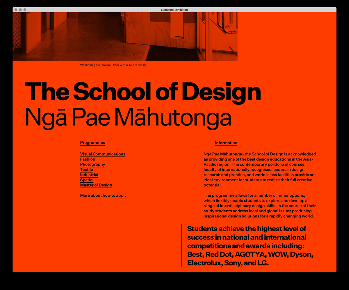
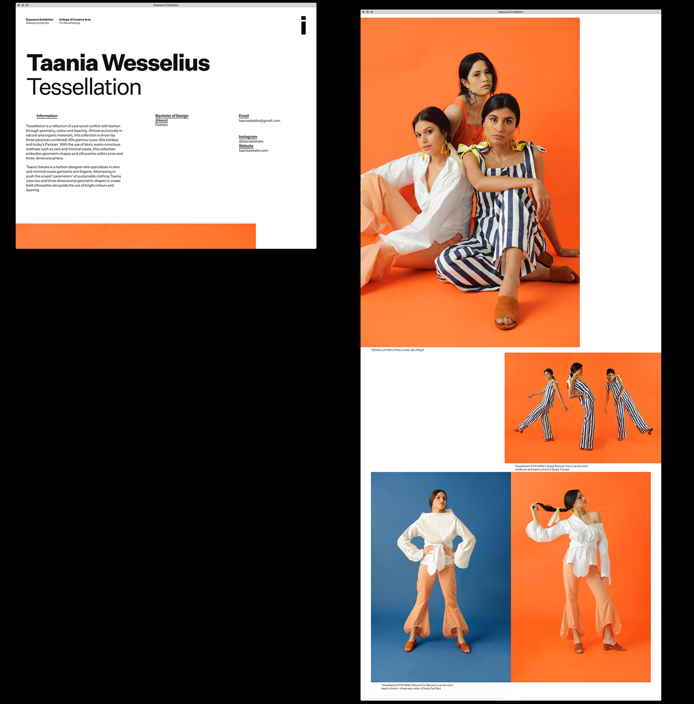
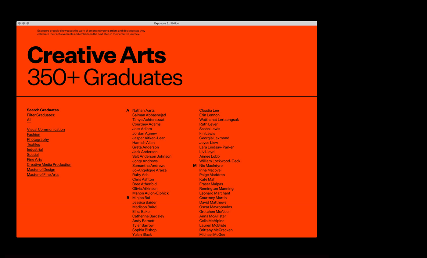
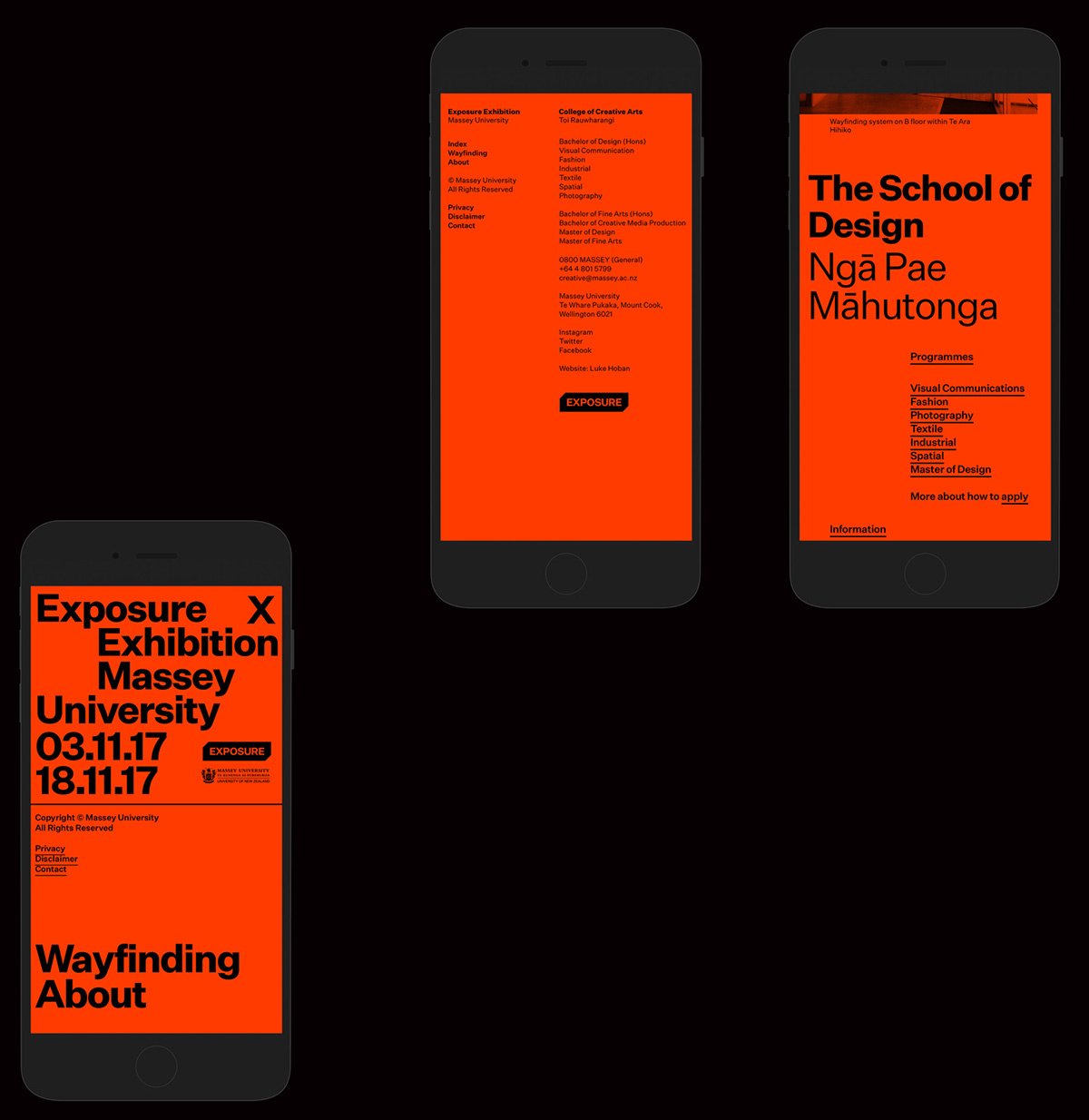
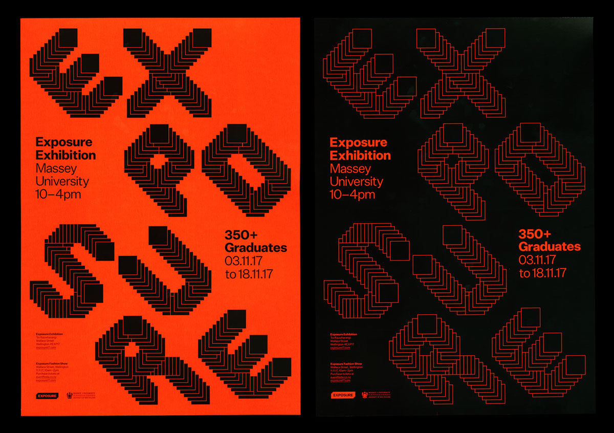
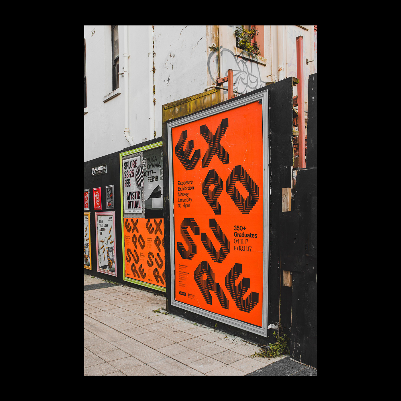
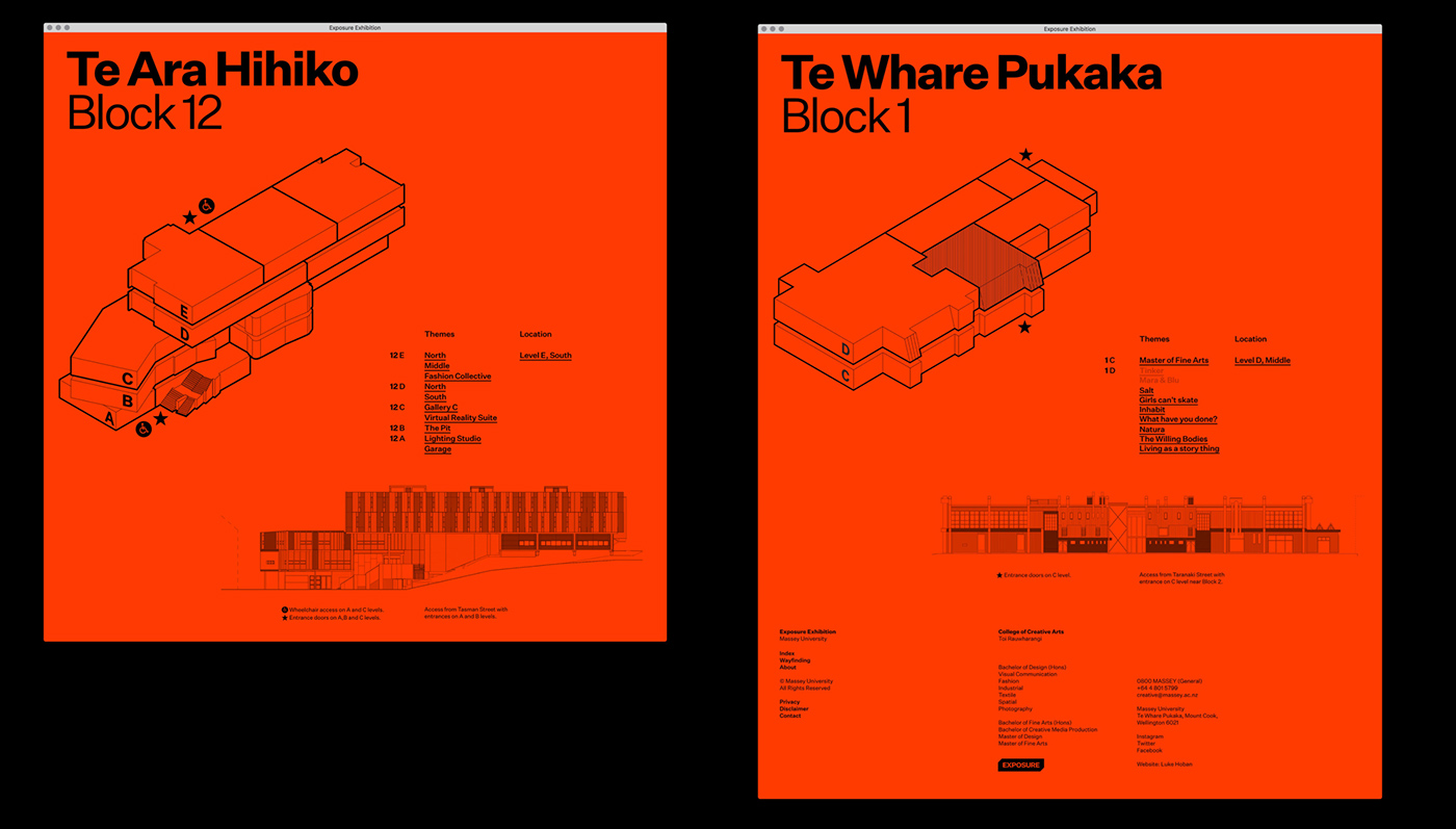
Luke Hoban, Jeremy Hooper and Raphael Roake shared an amazing web design project on their Behance profile. It’s for Exposure, a digital publication proudly showcases the work of emerging young artists and designers as they celebrate their achievements and embark on the next step in their creative journey.

Exposure is the premier showcase for graduating creative arts students from Massey University College of Creative Arts in Wellington. The exhibition includes work by undergraduate students across all subject areas, from industrial to spatial design, photography to fine art, and by students from our Master of Design and Master of Fine Arts programs. This year the exhibition will also include work by the first cohort of students to graduate from the Bachelor of Creative Media Production degree. All of our students, who began their journeys at kitchen tables, or in high school or workplace studios all over the world, are very excited to show you their extraordinary talents and achievements.

Web design

Exposure proudly showcases the work of emerging young artists and designers as they 

exposure17.com

web design


Detailed CSS Inspector on Every Site with CSSPeeper for Chrome

Original Source: https://www.hongkiat.com/blog/csspeeper-chrome-extension/

The regular Chrome DevTools panel is crazy powerful. It lets anyone dive deep into any page to study a site’s layout, CSS, and even HTTP headers if needed. You can do a lot with the DevTools…

Visit hongkiat.com for full content.

Glitch Effect Slideshow

Original Source: http://feedproxy.google.com/~r/tympanus/~3/MviO1OHOTbU/

After playing with an experimental CSS Glitch Effect for images and text, one of the first questions we got was “how can this be used in a slideshow”? The animations we used for the glitch effect were tuned to run infinitely, so the keyframes were adjusted to that. In a slideshow we have a different scenario: we want to apply the glitch effect at a specific moment and exchange the image with the new one of the next slide. This kind of animation can also be used for hover effects.

GlitchSlideshow_featured

This slideshow does exactly that: it transitions to the next slide using the glitch effect. Under the hood, it exchanges the glitch layers one by one and stops glitching once the last image is switched.

The demo is kindly sponsored by: GitLab 10.1 which now allows you to manage your visual assets like you manage your code. If you would like to sponsor one of our demos, find out more here.

Attention: Please note that the CSS clip-path property does not work in IE or Edge.

GlitchSlideshow_01

GlitchSlideshow_02

GlitchSlideshow_03

We hope you enjoy this slideshow and find it useful!

References and Credits

imagesLoaded by Dave DeSandro
Images by Unsplash

Glitch Effect Slideshow was written by Mary Lou and published on Codrops.

5 tips for choosing the right typeface

Original Source: http://feedproxy.google.com/~r/CreativeBloq/~3/vXpMl8ygjAM/tips-choosing-typeface-31514399

How to choose the right font

When it comes to picking a typeface, you can’t rely on gut alone

There are thousands of paid-for and free fonts available for creatives to choose from. However, when it comes to picking a typeface, you can't rely on gut alone. Making the right choice depends on function, context and a whole host of other factors. But how do you ensure you're going about it the right way? With these pointers, you won't go far wrong…

01. Think function

Always think about function as well as form. There’s no point finding a typeface that ticks the creative boxes, testing it and wowing your client with it, only to discover that it won’t actually work for the project because it lacks key technical features. Consider these from the start.

02. Follow foundries

Type should be in your consciousness, not something you only think about when you need to use it. Try following some foundries like Dalton Maag, Monotype, Hoefler & Co, Font Bureau and Commercial Type, on social networking sites, read typography blogs or simply keep your eyes peeled for good and bad examples of type you see out in the world. The more you notice, the more you'll know.

03. Test rigorously

Always test your type in ways that are relevant to the project. You don’t know if a typeface will work until you’ve seen it at the right size and tested whether the spacing works. You need a realistic idea of how it’s going to look – which you often won’t get from fake Latin.

04. Think effectively

Like any design decision, typeface selection needs to be the result of effective thinking. The fact that you like a typeface doesn’t necessarily mean it’s going to convey the right brand messages to your target audience. You may convince your client, but the design won’t do its job.

05. Pair up properly

If you’re trying to pair two typefaces, start by defining what you want to achieve: are you aiming for harmony or contrast? Are you looking for complementary typefaces with corresponding curves, for example? Be careful not to let things get too uniform. Done wrong, this can be as inadvisable as double denim. To get it right, read our article on how to find the perfect font pairing.

The tips are taken from an article that originally appeared in Computer Arts issue 237.

Words: Anne Wollenberg

Like this? Read these!

Download fonts from these top resourcesSee some stunning examples of kinetic typographyThese retro fonts will add a touch of nostalgia

Taking the Photography in Your Web Design to the Next Level

Original Source: http://feedproxy.google.com/~r/Designrfix/~3/YQxZdKpXIdE/photography-web-design-level

Everyone knows that the internet is a visual medium, but not everyone knows how to get the most out of their images. Used well, the photography in your website design can evoke a strong response in your viewers, whether it be of comfort, recognition, pleasure, or even “Wow!” It’s these emotional responses that will keep […]

The post Taking the Photography in Your Web Design to the Next Level appeared first on designrfix.com.

Quickly Create Simple Yet Powerful Angular Forms

Original Source: https://www.sitepoint.com/angular-forms/

Forms are an essential part of many web applications, being the most common way to enter and edit text-based data. Front-end JavaScript frameworks such as Angular, often have their own idiomatic ways of creating and validating forms that you need to get to grips with to be productive.

Angular allows you to streamline this common task by providing two types of forms that you can create:

Template-driven forms – simple forms that can be made rather quickly.
Reactive forms – more complex forms that give you greater control over the elements in the form.

In this article, we’ll make a simple example form with each method to see how it’s done.

Prerequisites

You do not need to know all the details of how to create an Angular application to understand the framework’s usefulness when it comes to forms. However, if you want to get a better grasp of Angular, you can take a look at this SitePoint article series on building a CRUD app with Angular.

Requirements

We will use Bootstrap in this tutorial. It is not an integral part of an Angular application, but it will help us streamline our efforts even further by providing ready-made styles.

This is how you can add it to your application:

Open the command prompt and navigate to the folder of your project

Type npm install bootstrap@next. This will add the latest version of bootstrap to the project

Edit the .angular-cli.json file and add a link to the Bootstrap CSS file

“apps”: [
“styles”: [
“../node_modules/bootstrap/dist/css/bootstrap.css”
]
]

We will not use the Bootstrap JavaScript file in this application.

Both template-driven Forms and Reactive Forms require the FormsModule. It should be added to the application in app.module:

import { FormsModule } from ‘@angular/forms’;
@NgModule({
imports: [
BrowserModule,
FormsModule
]
})

With that out of the way, we can proceed with the forms themselves.

Template-Driven Forms

Let us assume you want to create a simple form as quickly as possible. For example, you need a company registration form. How can you create the form?

The first step is to create the <form> tag in your view.

<form #companyForm=”ngForm”>

We need to modify this tag in two ways in order to submit the form and use the information from the input fields in our component:

We will declare a template variable using the ngForm directive.
We will bind the ngSubmit event to a method we will create in our component

<form #companyForm=”ngForm” (ngSubmit)=”submitCompany(companyForm.form);”>

We will create the submitCompany method in the component a bit later. It will be called when the form is submitted and we will pass it the data from the form via companyForm.form.

We also need a submit button, regardless of the content of the form. We will use a few Bootstrap classes to style the button. It is good practice to disable the button before all the data validation requirements are met. We can use the template variable we created for the form to achieve this. We will bind the disabled property to the valid property of the companyForm object. This way the button will be disabled if the form is not valid.

<button class=”btn btn-primary” [disabled]=”!companyForm.valid”>Submit</button>

Let us assume our simple form will have two fields – an input field for the name of the company and a drop-down field for the company’s industry.

Creating form inputs

First, we create an input field for the name:

<input type=”text”
class=”form-control”
name=”company-name”>

Right now we have a standard input with the type, name and class attributes. What do we need to do to use the Angular approach on our input?

We need to apply the ngModel directive to it. Angular will create a control object and associate it with the field. Essentially, Angular does some of the work for you behind the scenes.

This is a good time to mention that ngModel requires the input field to have a name or the form control must be defined as standalone in ngModelOptions. This is not a problem because our form already has a name. Angular will use the name attribute to distinguish between the control objects.

In addition, we should specify a template variable for the input: #nameField in this case. Angular will set nameField to the ngModel directive that is applied to the input field. We will use this later for the input field’s validation. This variable will also allow us to perform an action based on the value of the field while we are typing in it.

Now our input looks like this:

<input type=”text”
class=”form-control”
name=”company-name”
ngModel
#nameField=”ngModel”>

It is almost the same, but with a few key changes.

Validation

Let us assume we want the company name field to be required and to have a minimum length of 3 characters. This means we have to add the required and minlength attributes to our input:

<input type=”text”
class=”form-control”
name=”company-name”
ngModel
#nameField=”ngModel”
required
minlength=”3″>

Sounds simple enough, right? We will also need to display an error message if any of these two requirements are not met. Angular allows us to check the input’s value and display the appropriate error message before the form is submitted.

We can perform such a check while the user is typing in the form. First of all, it is a good idea to display an error only after the user has started to interact with the form. There is no use in displaying an error message right after we load the page. This is why we will insert all the error messages for this input inside the following div:

<div *ngIf=”nameField.touched && nameField.errors”></div>

The ngIf directive allows us to show the div only when a specific condition is true. We will use the nameField template variable again here because it is associated with the input. In our case, the div will be visible only, if the input has been touched and there is a problem with it. Alright, what about the error messages themselves?

We will place another div inside the aforementioned one for each error message we want. We will create a new div for the error message and use the nameField template variable again:

<div class=”alert alert-danger”
*ngIf=”nameField.errors.required”>
The company name is required
</div>

We are using the “alert alert-danger” bootstrap classes to style the text field. The nameField variable has the property errors, which contains an object with key-value pairs for all the current errors. The ngIf directive allows us to show this error message only when the ‘required’ condition is not met. We will use the same approach for the error message about the minimum length.

Continue reading %Quickly Create Simple Yet Powerful Angular Forms%

Web Design Inspiration for the Week

Original Source: http://feedproxy.google.com/~r/abduzeedo/~3/8-C6uvb6R-I/web-design-inspiration-week

Web Design Inspiration for the Week

Web Design Inspiration for the Week

abduzeedo
Mar 12, 2018

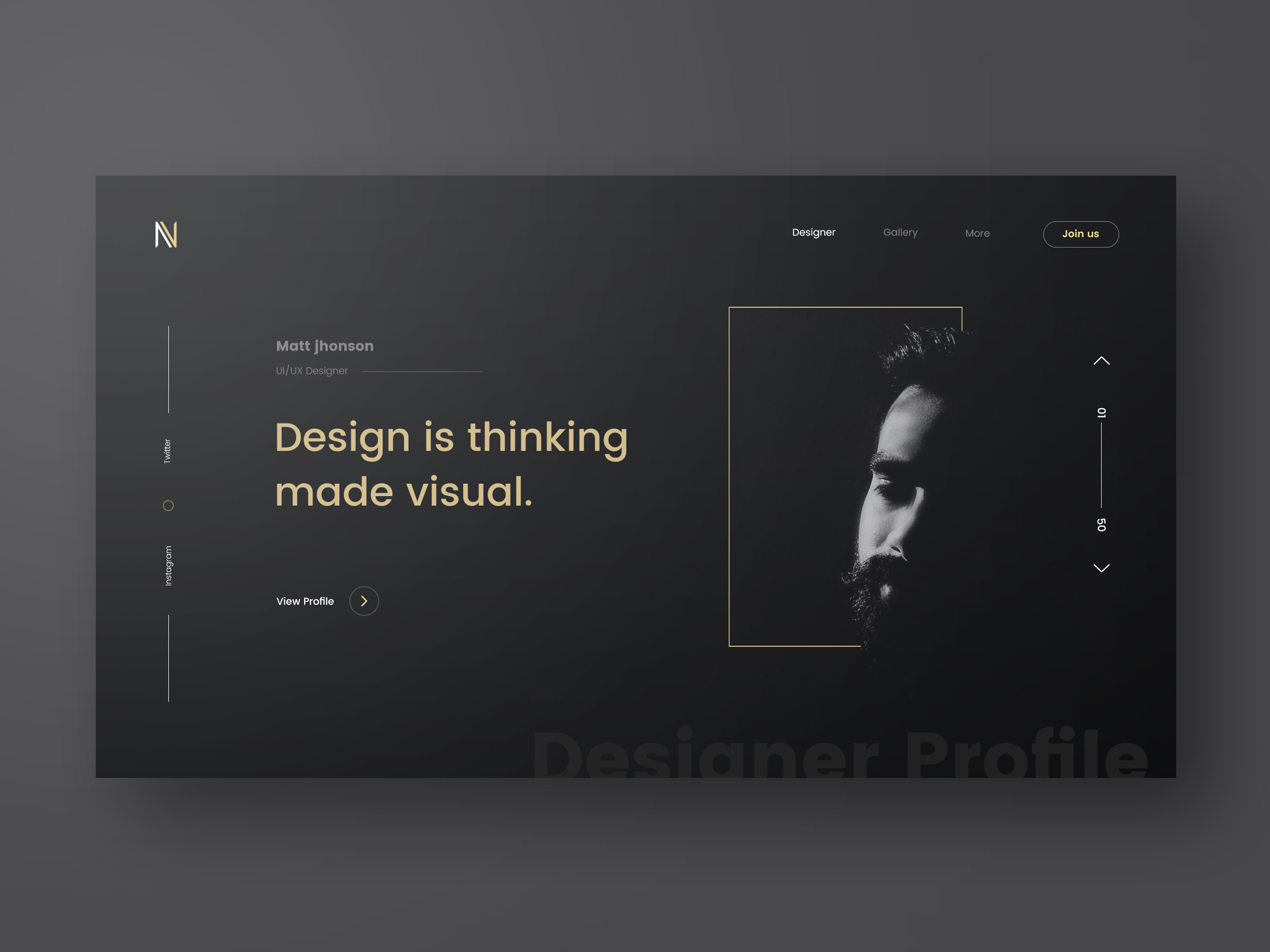
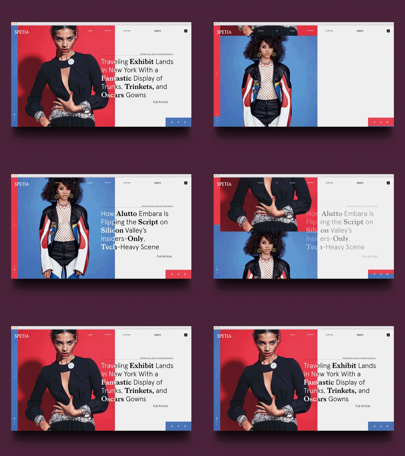
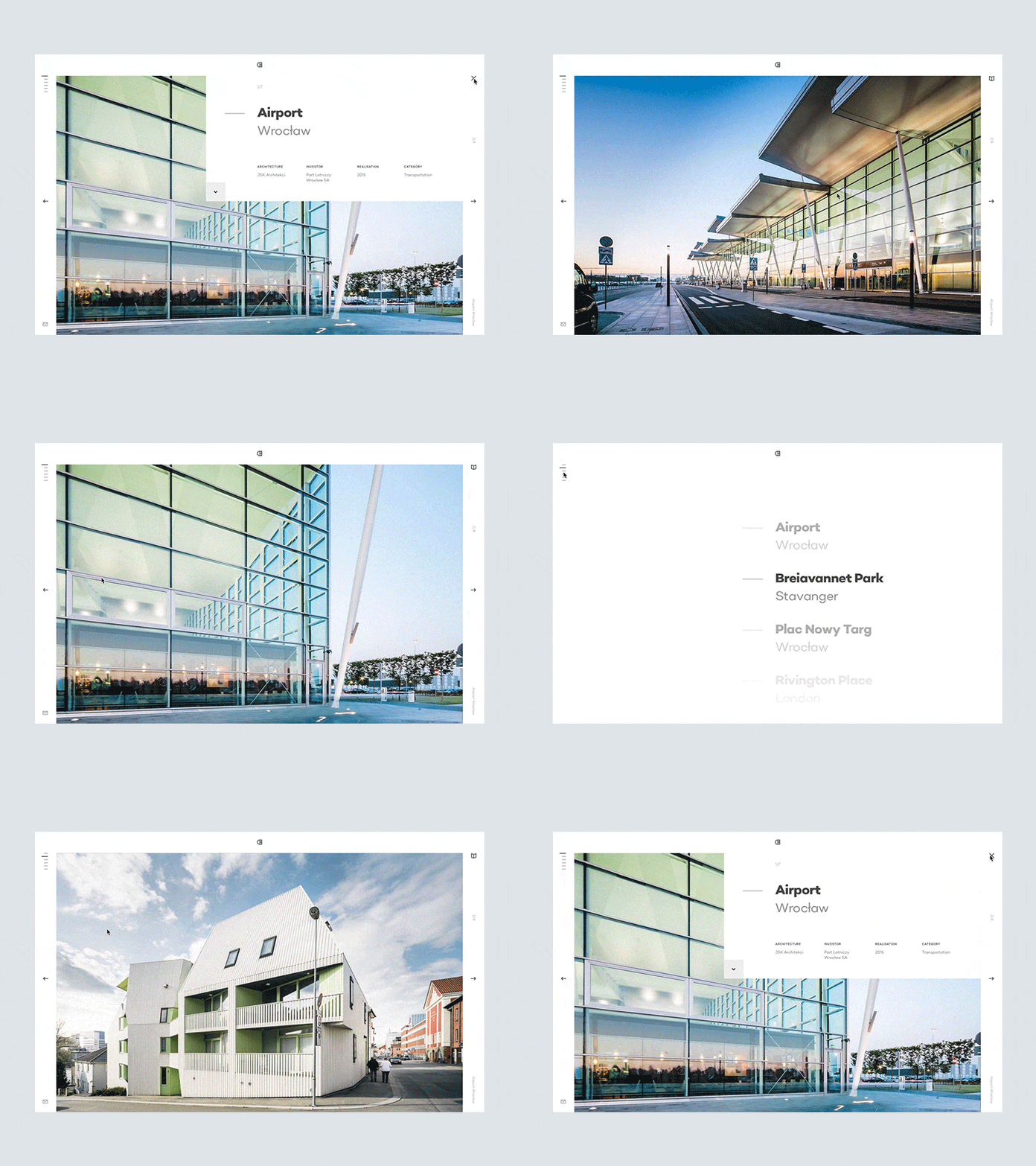
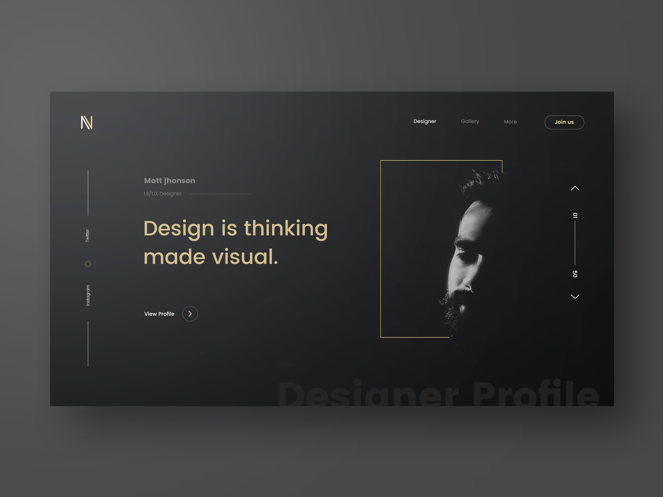
We tend to focus most of our efforts on mobile design because, we carry those devices with us all the time and it is probably the first experience we will have with most of digital content. However I feel that the desktop web design might come back stronger, at least in terms of design. I have seen beautiful designs coming from sites like Dribbble and Behance. The biggest constraint the web has is the monetization. Till today the best way to do that is by including advertising on the pages. Those can add clutter and break the purity of the designs. I’d love to propose a challenge for who design the best concepts that include ads. Maybe that could be the next ABDZ challenge, what do you think?

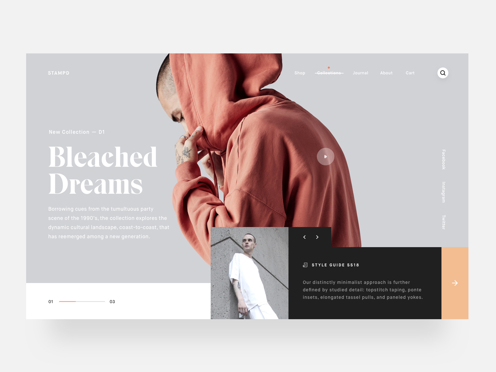
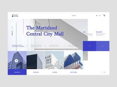
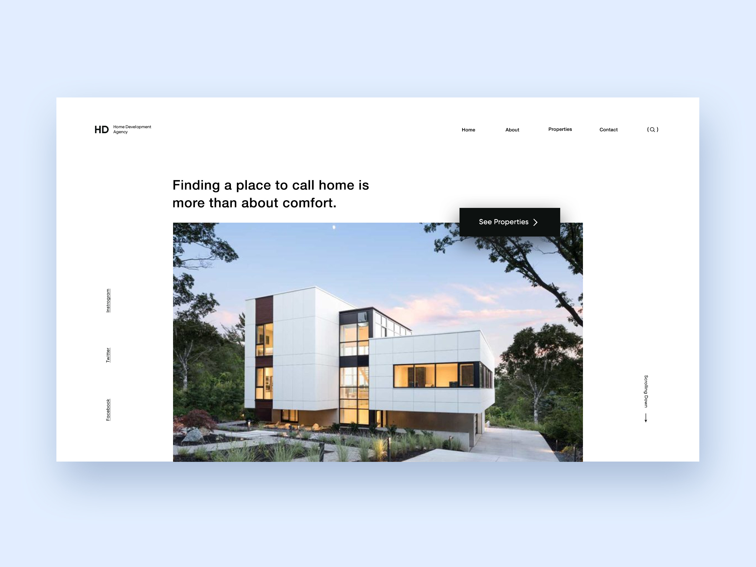
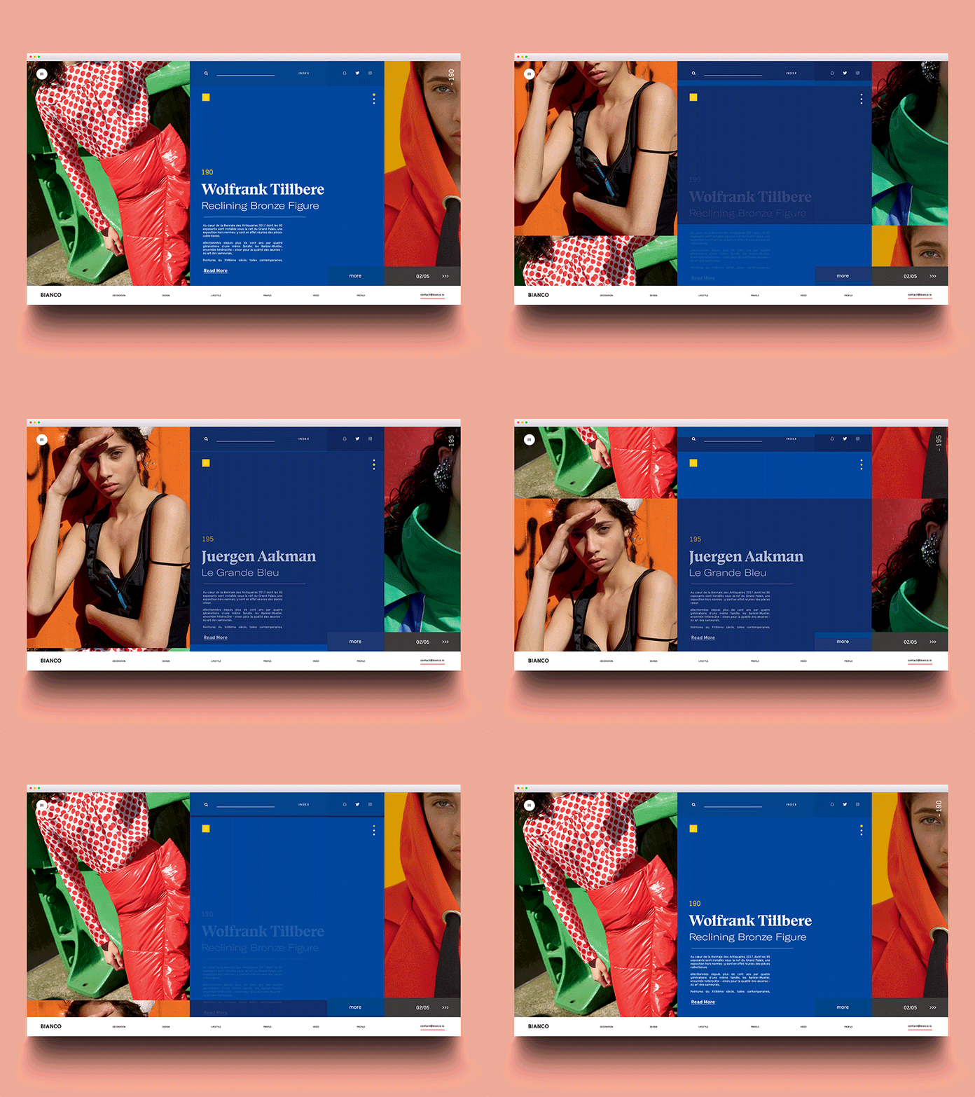
For this post I will share some web design concepts I captured during my daily visit to Dribbble. Check out and see if you can spot a new emerging pattern.

Web design

ArchBetraydan stampdHumble Buildings ArchitectureHome development agencyBianco2S p e t i aFoto2Designer profile full viewRecently Added

web design


Building a New Parse Server & MongoDB Atlas-Based Application

Original Source: https://www.sitepoint.com/building-new-parse-server-mongodb-atlas-based-application/

This article was originally published on mongoDB. Thank you for supporting the partners who make SitePoint possible.

Whether you’re migrating from the deprecated Parse.com (api.parse.com) or building a new application, the Parse Server community is alive and strong, and since Parse Server version 2.1.11, there is support for MongoDB 3.2 which makes MongoDB Atlas an ideal back-end for Parse Server based applications.

Existing hosted Parse / api.parse.com users can migrate their back-end using Parse’s Database Migration tool directly to MongoDB Atlas using a connection string like the following (with bold items replaced with your details):

[code language=”bash”]
mongodb://username:password@node1.mongodb.net:27017,node2.mongodb.net:27017,node3.mongodb.net:27017/applicationDbName?replicaSet=clusterName-shard-0&ssl=true&authSource=admin
[/code]

We will learn in this blog post:

How to deploy a MongoDB Atlas cluster
How to deploy the Parse Server (in our case we will show how to do so using AWS Elastic Beanstalk quick start, but updated to use the newest version of Parse Server)
How to configure Parse Server to connect to MongoDB Atlas
How to confirm connectivity

How to Set Up A New Sample Parse Server Application with A MongoDB Atlas Back End

Deploy MongoDB Atlas cluster
Consider sizing options but start small for a hello world style application. You can always scale later (MongoDB Atlas allows you to migrate to larger instances with no downtime to your database).
Register for MongoDB Atlas at mongodb.com/atlas
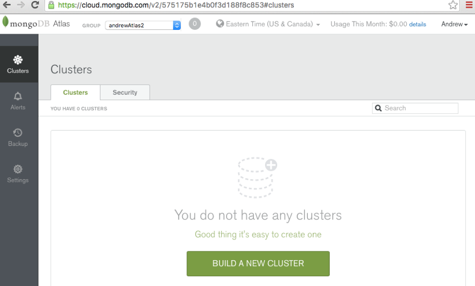
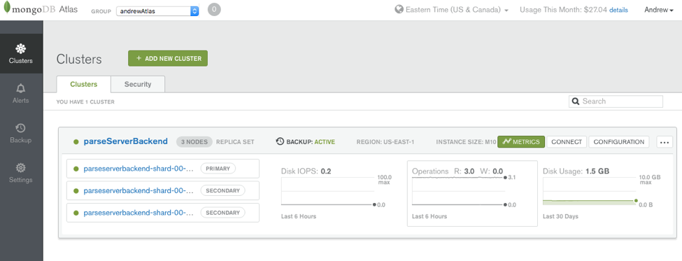
Build and deploy your first cluster (we’ll use a small M10 instance-sized replica set for our example, and deploy it into the US East region) Parse Server Clusters
MongoDB Atlas Cluster
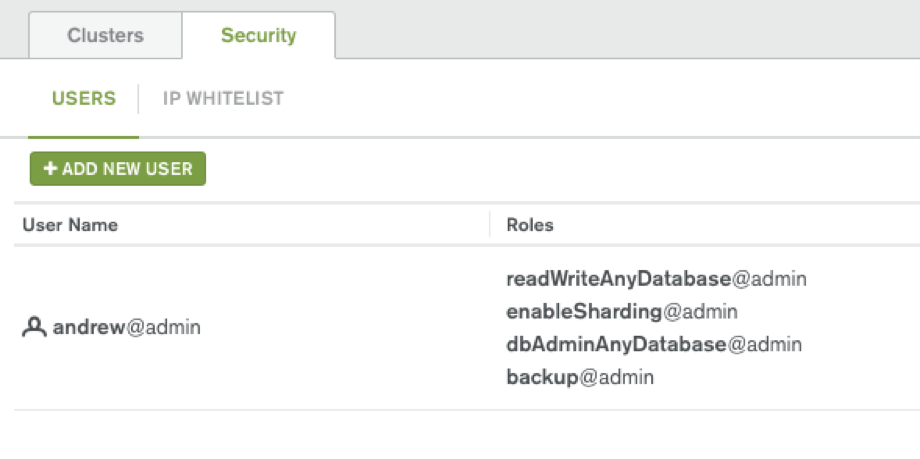
We’ll Create a user with at least readWrite on the applicationDbName database (or the user with readWriteAnyDatabase@admin which gets created automatically will do) Parse Server Mongo DB Atlas

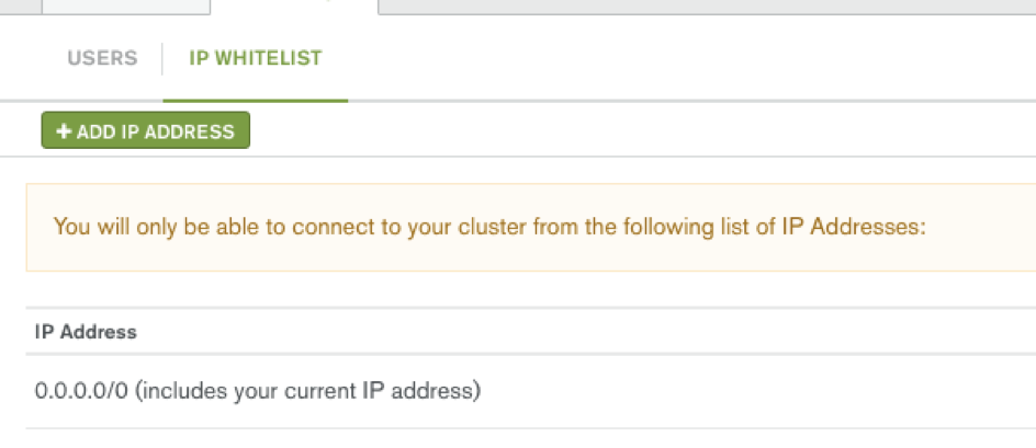
For testing purposes, we will open IP address to all IP addresses initially (0.0.0.0/0): Later we should leave only open to our application servers’ public IP addresses. Parse Server MongoDB Atlas
Choose where and how you want to deploy the Parse Server:
Many options are described here, some of which provide easier set-ups than others. AWS Elastic Beanstalk and Heroku are easy options.

Continue reading %Building a New Parse Server & MongoDB Atlas-Based Application%

20 Best Free Email Marketing Tools And Resources

Original Source: https://www.hongkiat.com/blog/email-marketing-tools-resources/

Email marketing is an essential part of marketing, and one of the best ways to build and maintain relationships with clients and customers. Of course, you can design and send out all the emails…

Visit hongkiat.com for full content.