5 tips for choosing the right typeface
Original Source: http://feedproxy.google.com/~r/CreativeBloq/~3/vXpMl8ygjAM/tips-choosing-typeface-31514399
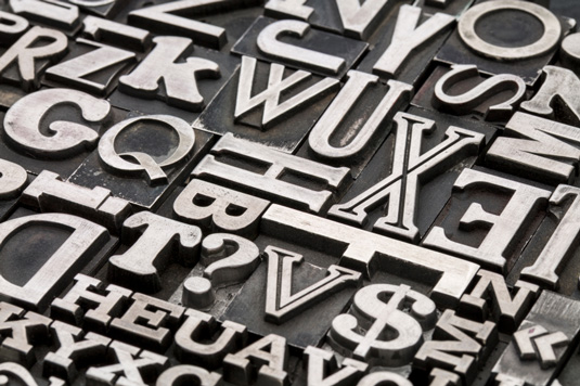
When it comes to picking a typeface, you can’t rely on gut alone
There are thousands of paid-for and free fonts available for creatives to choose from. However, when it comes to picking a typeface, you can't rely on gut alone. Making the right choice depends on function, context and a whole host of other factors. But how do you ensure you're going about it the right way? With these pointers, you won't go far wrong…
01. Think function
Always think about function as well as form. There’s no point finding a typeface that ticks the creative boxes, testing it and wowing your client with it, only to discover that it won’t actually work for the project because it lacks key technical features. Consider these from the start.
02. Follow foundries
Type should be in your consciousness, not something you only think about when you need to use it. Try following some foundries like Dalton Maag, Monotype, Hoefler & Co, Font Bureau and Commercial Type, on social networking sites, read typography blogs or simply keep your eyes peeled for good and bad examples of type you see out in the world. The more you notice, the more you'll know.
03. Test rigorously
Always test your type in ways that are relevant to the project. You don’t know if a typeface will work until you’ve seen it at the right size and tested whether the spacing works. You need a realistic idea of how it’s going to look – which you often won’t get from fake Latin.
04. Think effectively
Like any design decision, typeface selection needs to be the result of effective thinking. The fact that you like a typeface doesn’t necessarily mean it’s going to convey the right brand messages to your target audience. You may convince your client, but the design won’t do its job.
05. Pair up properly
If you’re trying to pair two typefaces, start by defining what you want to achieve: are you aiming for harmony or contrast? Are you looking for complementary typefaces with corresponding curves, for example? Be careful not to let things get too uniform. Done wrong, this can be as inadvisable as double denim. To get it right, read our article on how to find the perfect font pairing.
The tips are taken from an article that originally appeared in Computer Arts issue 237.
Words: Anne Wollenberg
Like this? Read these!
Download fonts from these top resourcesSee some stunning examples of kinetic typographyThese retro fonts will add a touch of nostalgia


Leave a Reply
Want to join the discussion?Feel free to contribute!