To Hell With Subtle Design
Original Source: https://www.webdesignerdepot.com/2017/12/to-hell-with-subtle-design/
 Don’t try to be so damn subtle in web design.
Okay, let me explain that…
About a year or so ago, I made a terrible mistake: I tried to be funny; More specifically, I tried my hand at stand-up comedy. I sat down, wrote out a bunch of jokes that I found amusing; and collected some online acquaintances in video chat to try them out. I did it this way because I live in Mexico, but my first language is English.
And here’s what I found out: Unless people already know you, they may not immediately understand you when you’re trying to be clever. They tend to take what you say rather literally. Also, they will only trust you with a joke that has a long set-up if they already think you’re funny. Also, Mexicans can have a really dark and subtle sense of humor that doesn’t translate to everyone else and it has rubbed off on me. The only Mexican in the virtual room was my biggest fan.
Cleverness is overrated; Subtlety is useless
In web design, those first two points are the ones that truly apply: Cleverness is overrated; Subtlety is useless.
Just give them what they want without making them jump through mental hoops. As a comedian, I failed my “audience” by presenting them with small puzzles. I mean, I thought they were just clever references with obvious punchlines. I figured if they just thought about it for a split second, they’d laugh like I did. That was silly of me.
When people go to a comedian, they don’t want puzzles. They want laughs. That’s why some of the most obvious jokes can carry entire careers. It’s why comedians usually start a set with quick, almost-guaranteed jokes. Once they have captured the attention of the audience—once the audience trusts them to deliver the laughs—they can go into subtler material, and longer jokes.
When people browse the Internet looking for information, they don’t want websites to be puzzles. They don’t want references or clever gimmicks. Those things can be a nice bonus (or Easter egg) but users shouldn’t have to get through them to get to the information or product they want.
So What Exactly Do You Want Us To Stop Doing?
I’m so glad you asked! Let’s tackle subtlety and overwrought cleverness in UX Design: Every time someone comes up with a newfangled form of navigation, an overly-artistic layout, or hides content behind unnecessary clicks, Sir Tim Berners-Lee cries. Stop making Sir Tim cry.
Every time someone…hides content behind unnecessary clicks, Sir Tim Berners-Lee cries
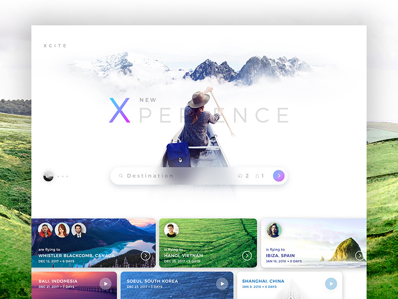
I’m not saying to never do anything new or interesting with your layout. I’m saying that you need to be more careful about it. Every time you consider a brand new approach in web design, ask yourself if it’s going to make things easier or harder for users to find. Then go ask some users. Any users. For the love of all that is holy, stop hiding information and UI elements that people need.
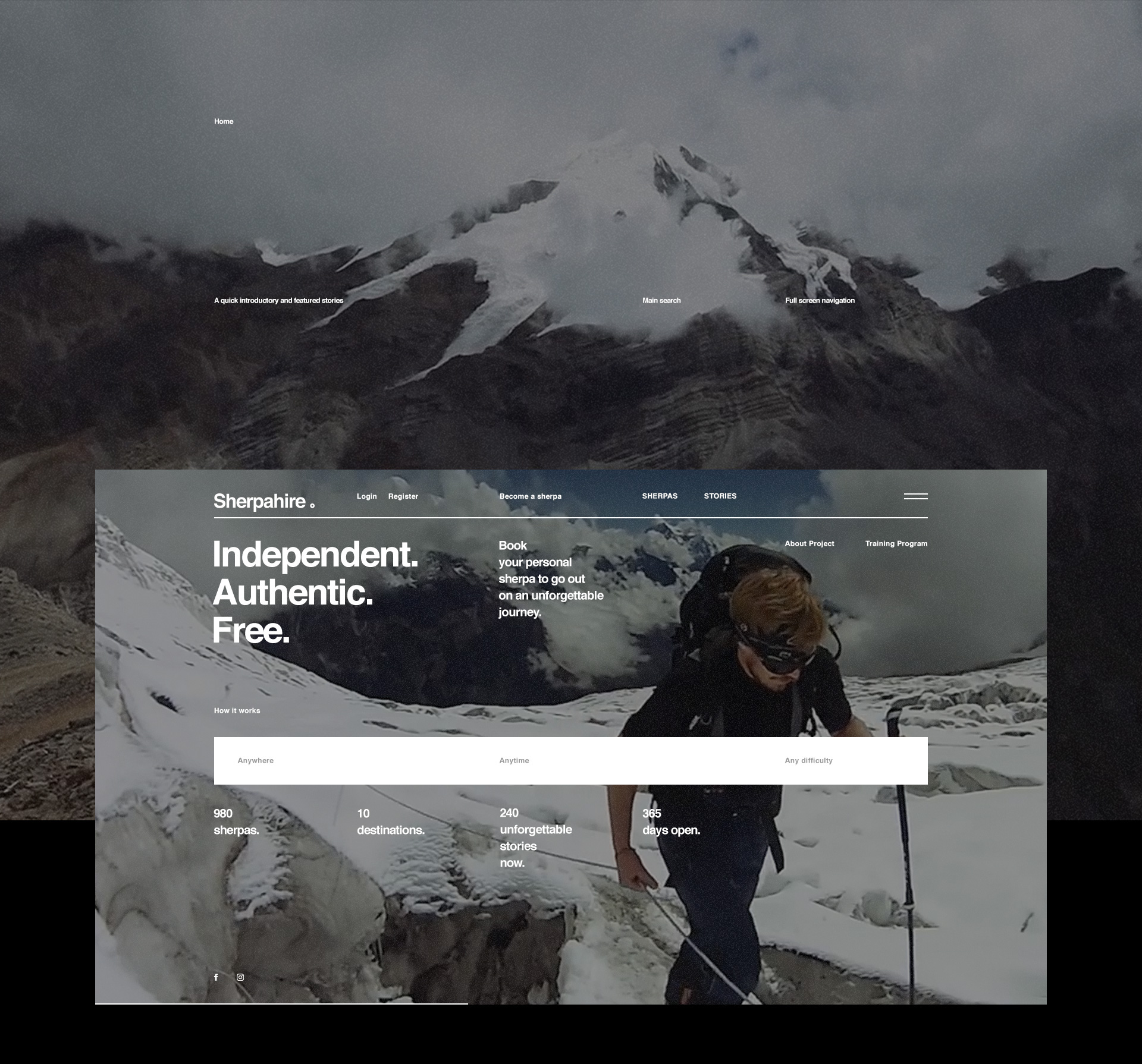
Now, on mobile devices, it might make some sense to hide your navigation behind an extra tap, but that’s really the limit. On tablets and desktop computers, primary navigation just shouldn’t be hidden. It just shouldn’t. There is no good reason. Aesthetics is not a good reason.
Let’s take another example: forms. There is no reason they should not look like forms. No matter how clever it might seem to make text inputs look like something else, it’s really not a big help. Not unless you put up a sign that says, “Click here, and here, and here…”, and then you’re just making more work for yourself.
Yes, forms are sometimes ugly, boring, and frustrating—just like in the offline world. Can they be better? Yes, but only as long as they are still recognizable as forms. The moment they look like anything else, users have to spend extra time figuring them out. Congratulations! You made forms more irritating.
The bits of your website that users actually interact with don’t have to be clever, innovative, or subtle. They just need to work.
On Subtle UI Flourishes
Let’s address UI design next: drop shadows, gradients, and contrast. Specifically, let’s talk about the near-complete absence of contrast on some sites. I’ll admit, this is a trap I’ve fallen into many times, myself: Please don’t look at my current writing portfolio, I’m just about to redesign it yet again.
When you make a gradient, or a drop shadow, it can be tempting to make it as subtle as possible. Light grey stuff on white backgrounds looks elegant. Or at least that’s something we tell ourselves. The truth is, if your user is looking at your site on a screen where that’s not quite calibrated right, a lot of those details can disappear entirely.
If you’re depending on something like a drop shadow or gradient to create affordances (or clues as to how the interface works), having those details disappear can seriously affect usability. It’s a different kind of subtlety, yes, but it needs to be addressed.
Conclusion
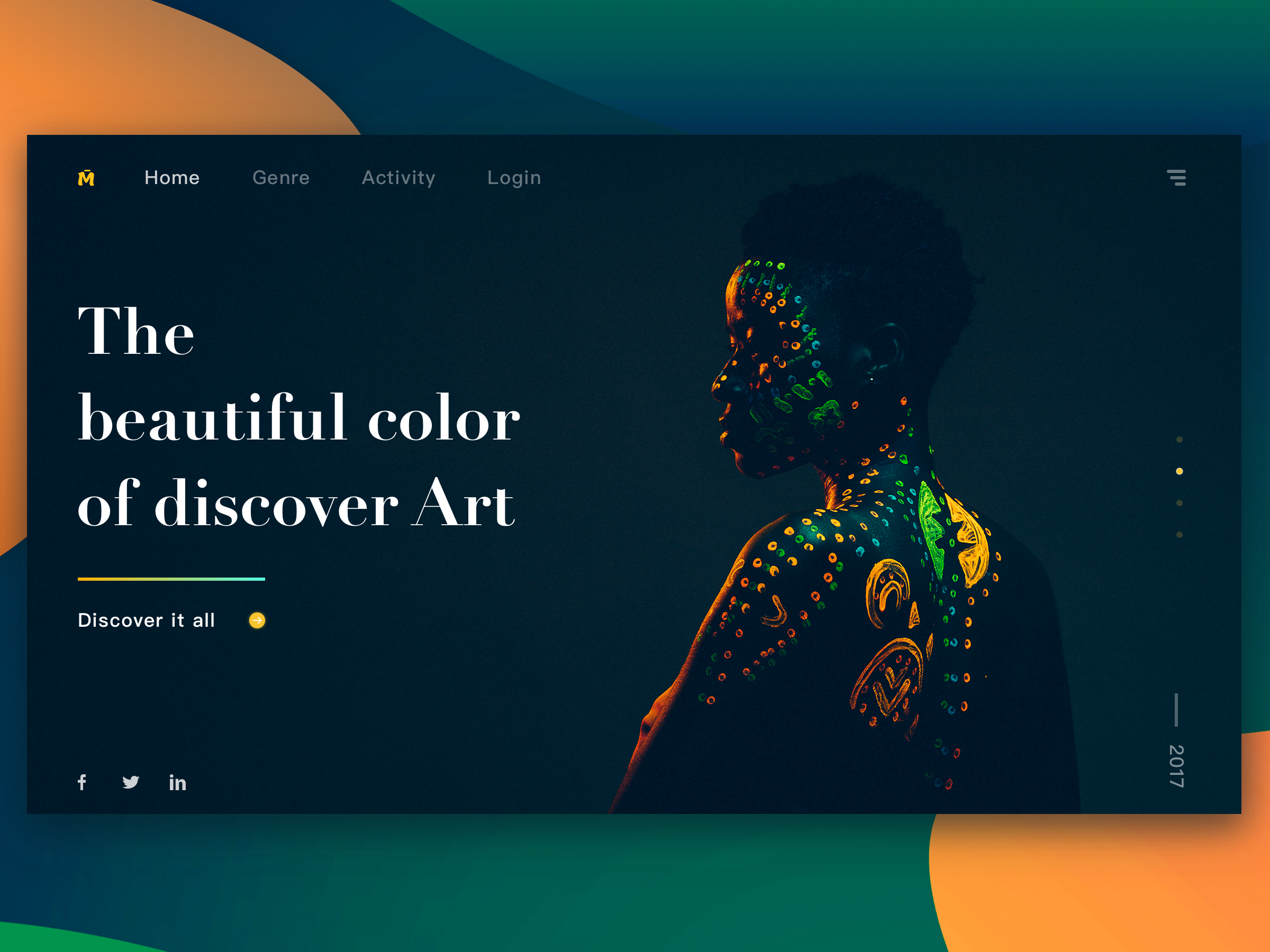
Don’t hold back. Be bold with your colors, your contrast, and your user experience design. Go wild! The only real constraints should be usability, and efficiency. And by that I mean don’t hide the content or features that your users are looking for.
Metaphorically hit them in the face with what they want. It’s what they want.
3500+ Textures, Brushes, Icons, Watercolors & More Graphic Elements
![]()
Source
p img {display:inline-block; margin-right:10px;}
.alignleft {float:left;}
p.showcase {clear:both;}
body#browserfriendly p, body#podcast p, div#emailbody p{margin:0;}

