Original Source: http://feedproxy.google.com/~r/CreativeBloq/~3/j-SCh_lXXkA/free-web-fonts-1131610
It's time-consuming to cut through the ocean of free fonts online, especially web fonts, to find the real gems that punch above their price tag. With this in mind, we've rounded up the greatest free web fonts from around the internet to get you started.
There are various methods to source and license web fonts, including subscription-based models such as Typekit and Fontspring, which boast libraries of quality typefaces that are becoming increasingly popular with professional designers.
If you're on a tight budget, however, or are just looking to experiment on a smaller project, there are plenty of good web fonts available at no cost if you know where to look.
Luckily, we've done the hard work for you, and have put together this list of the best free web fonts around at the moment. There's a broad selection so there should be something here to suit every project. Don't forget to check out our articles on How to use webfonts and How to choose the right typeface for your brand, to help you out.
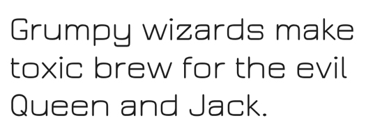
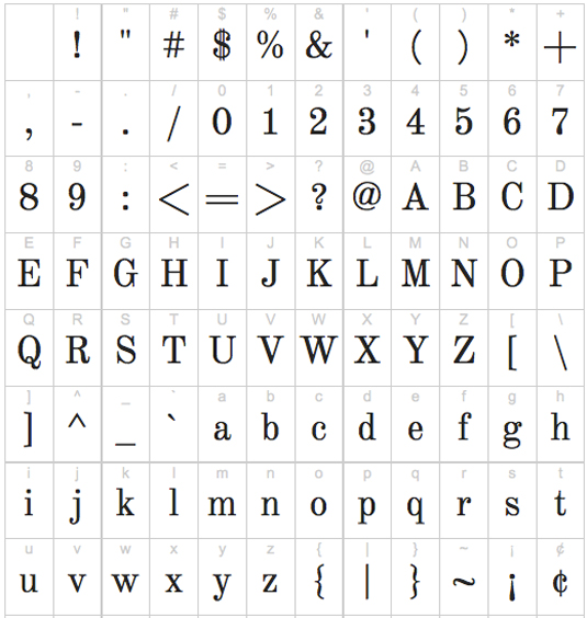
01. Archivo Narrow
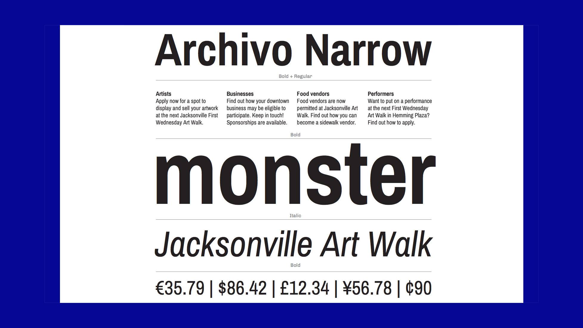
Archivo Narrow is built for high performance typography
Designed by Héctor Gatti and Omnibus-Type Team, Archivo Narrow consists of four fonts with 416 glyphs each. It is designed to be portable and can be used across both print and digital platforms, and its technical and aesthetic characteristics of this typeface are both crafted for high performance typography.
And if you like its style, Archivo Black, a heavyweight grotesque designed for highlights and headlines, is also available.
02. Palanquin
Palanquin has seven weights plus a heavier display family
A Unicode-compliant Latin and Devanagari text type family designed for the digital age, Palanquin is a versatile font family that strikes a balance between typographic conventions and visual flair. It consists of seven text weights and can be extended with a heavier display family, Palanquin Dark.
If you'd like to contribute to the Palanquin project you can find it here on GitHub.
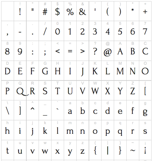
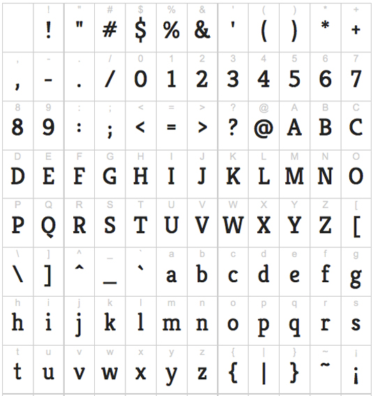
03. Ostrich Sans
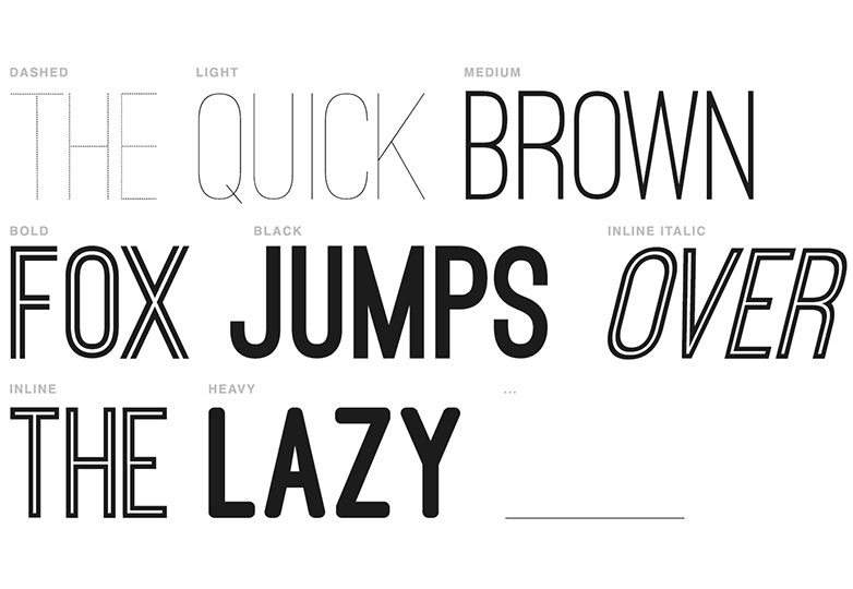
Ostrich Sans is a gorgeous modern sans-serif, available in a variety of styles and weights
Available from The League of Moveable Type, free web font Ostrich Sans is a gorgeous modern sans-serif with a very long neck. The family comes complete with a number of styles and weights, including dash, rounded, ultra light, normal and black.
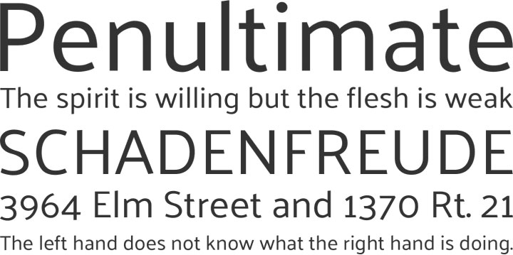
04. PT Sans
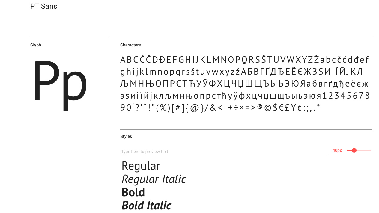
PT Sans is based on Russian sans serif types of the second part of the 20th century
PT Sans was developed for the project Public Types of Russian Federation. Based on Russian sans serif types of the second part of the 20th century, free web font PT Sans also incorporates distinctive features of contemporary humanistic designs.
PT Sans was designed by Alexandra Korolkova, Olga Umpeleva and Vladimir Yefimov and released by ParaType in 2009.
05. Fira Sans
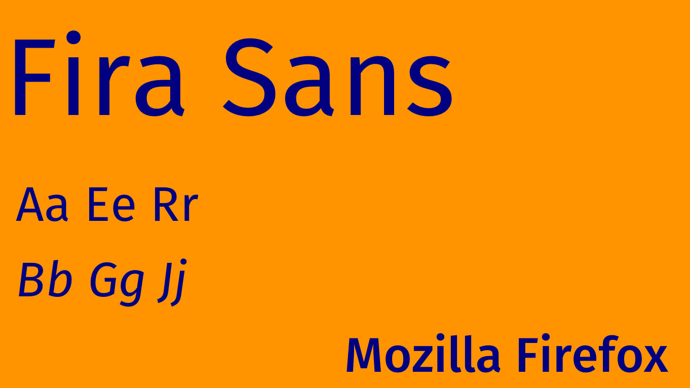
Fira Sans was created by legendary type designer Erik Spiekermann
Free web font Fira Sans was created by legendary type designer Erik Spiekermann, with additional contributions from Carrois Type Design.
Designed to integrate with the character of the Mozilla FirefoxOS, the Fira family aims to cover the legibility needs for a large range of handsets varying in screen quality and rendering.
06. Montserrat
Montserrat is inspired by the urban typography of the region in Buenos Aires
Julieta Ulanovsky created this font because she wanted to preserve the beautiful typography she saw on the street signage in Montserrat, Buenos Aires. As the area is developed, the old posters and signs are lost.
This font is distributed under an open source license and goes some way toward preserving the urban typography of the historic region.
07. Abril Fatface
Perfect for arresting headlines
Abril Fatface is part of a big type family that has 18 styles designed for all kinds of uses. Fatface has a strong, elegant presence that makes for striking headlines. It's commonly paired with Lato, Open Sans and Droid Sans.
08. Playfair Display
Great for squeezing into tight spots
With its extra large x-height and short descenders Playfair Display is particularly suited to headlines, especially if space is tight. It works well with Georgia, and you’ll also see it used with Oswald, Lato and Arvo.
09. GT Walsheim
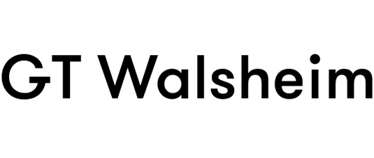
GT Walsheim is a popular choice for design blogs
Used by many design blogs these days, GT Walsheim is a geometric sans-serif typeface designed by Noël Leu and released in 2010 through Swiss foundry Grilli Type.
You have to pay for the full font family, but Grillit Type kindly offers GT Walsheim as a free trial, so you can try before you buy.
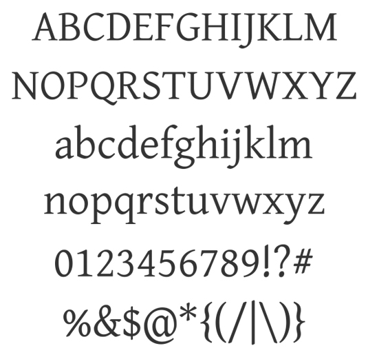
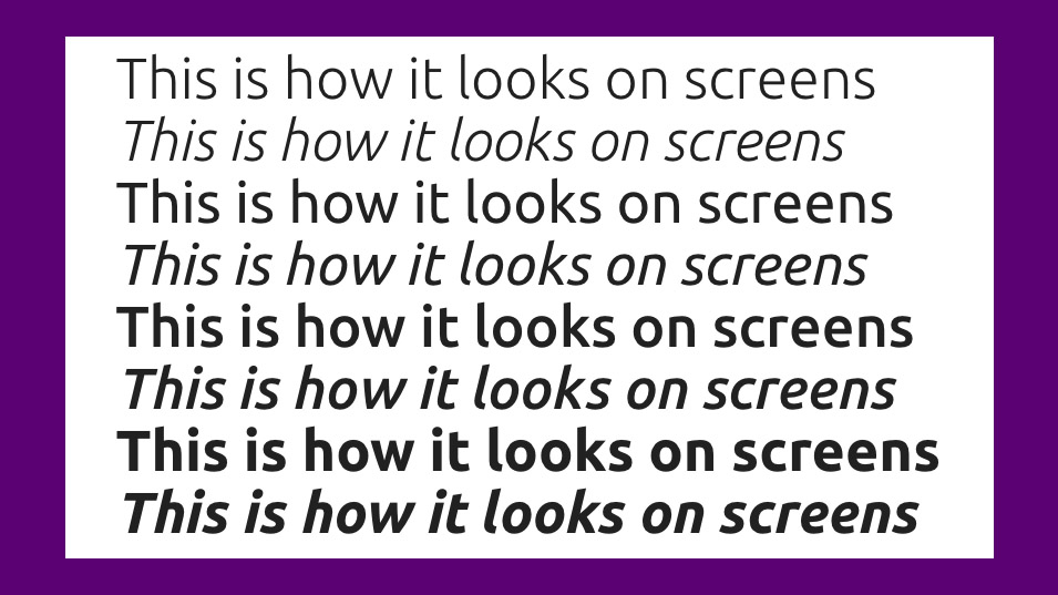
10. Merriweather
A good choice for long reads on screens
If readability on screens is a priority in your project you might reach for Merriweather, which was designed especially for this purpose. Merriweather is always evolving, and you can request features and stay up to date by checking creator Eben Sorkin's blog.
11. Josefin Sans
Josefin Sans captures something of the Swedish design style
Josefin Sans was drawn with vintage Swedish design in mind, and has a geometric, elegant aesthetic. The letter z has a distinctive 'haircut', which was inspired by New Universal Typeface Newut from André Baldinger.
12. Gravitas One
This web font will be perfect for headers and tabs
Designed by Riccardo De Franceschi, Gravitas One is modelled on the 'UK fat face' – a heavy advertising type created during the industrial revolution in England.
This is a font that'll look great in a medium to large scale; perfect for headers, tabs and striking titles.
13. Jura
Jura comes in four different weights, so will work well almost anywhere!
Daniel Johnson wanted to create a Roman alphabet using the same kinds of strokes and curves as the Kayah Li glyphs. Jura was born and has been expanded to include glyphs for the Cyrillic and Greek alphabets.
It's available in light, book, medium, and demibold weights.
14. League Gothic
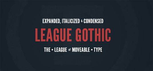
The League of Moveable Type delivers another stellar web font
Originally designed by Morris Fuller Benton for the American Type Founders Company in 1903, League Gothic has been given a new lease of life thanks to The League of Moveable Type.
Thanks to a commission from WND.com, it's been revised and updated with contributions from Micah Rich, Tyler Finck, and Dannci, who have contributed the extra glyphs.
15. Fjord
Fjord is perfect for content on the web
Fjord is a serif typeface, originally designed with printed books in mind, and particularly intended for long texts in small print sizes. This will look great for your longer content on the web as it features sturdy construction, prominent serifs, low-contrast modulation and long elegant ascenders and descenders relative to the 'x' height.
16. Amaranth
Play around with Amaranth and see what works for your site
The Amaranth family is a friendly upright italic design with a slight contrast and distinctive curves. With its three new styles Amaranth works really well with almost any text type. This is a font perfect for playing around with – see what works!
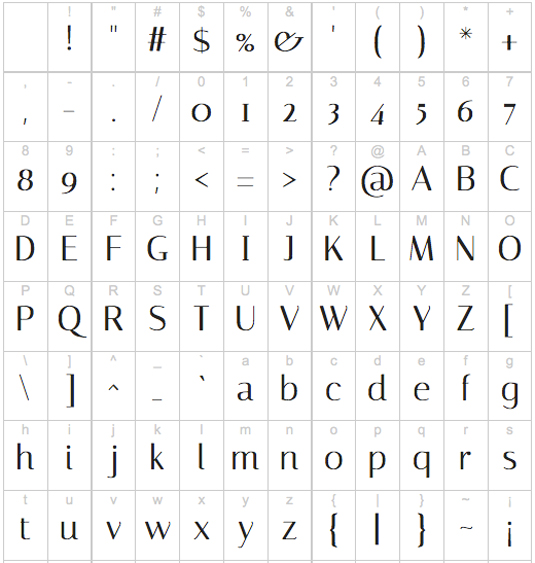
17. Gentium Basic
The free web font Gentium Basic was designed as a multilingual face
Released under the SIL Open Font License, Victor Gaultney's serif was designed specifically as a multilingual face, incorporating Latin, Cyrillic and Greek scripts and advanced support in the Gentium Plus version.
Gentium Basic and Gentium Book Basic are both available as free web fonts, but are restricted to a Latin character set.
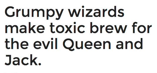
18. Open Sans
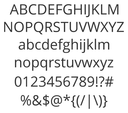
This free web font is crisp, clean and optimised for web and mobile
Designed by Steve Matteson, type director at Ascender Corp, this humanist sans serif boasts great legibility even at small sizes, and has been optimized for both web and mobile interfaces. This free web font has an upright feel, with open letterforms and a neutral-yet-friendly appearance that ensures versatility.
19. Signika
The free web font Signika was designed with clarity in mind
In the tradition set by the likes of Meta and Tahoma, Anna Giedry's designed Signika with signage and wayfinding in mind, where clarity is key. This free web font is a sans serif with low contrast and a tall x-height, qualities that translate well onto screen. Its wide character set includes small caps, pictograms, and arrows.
20. Josefin Slab
The x-height of this free web font is half its caps height
Drawing on the trend for 1930s-style geometric typefaces with some added Scandinavian flavour, Santiago Orozco's distinctive slab serif brings a distinctive 'typewriter' feel to its sans serif counterpart, and this free web font is perhaps best suited to display use. Unusually, Josefin's x-height is half that of its caps height.
21. Forum
This free web font is particularly effective for all-caps headlines
As its name implies, this is a grand Ancient Roman-style serif that is particularly distinctive as a display font used all-caps for headlines, although works stylishly as a sentence-case text face at slightly larger sizes. This free web font's elegant proportions are reminiscent of classical architecture, with semi-circular arches, horizontal cornices, and vertical columns.
Next page: 20 more great free web fonts…
22. Tikal Sans
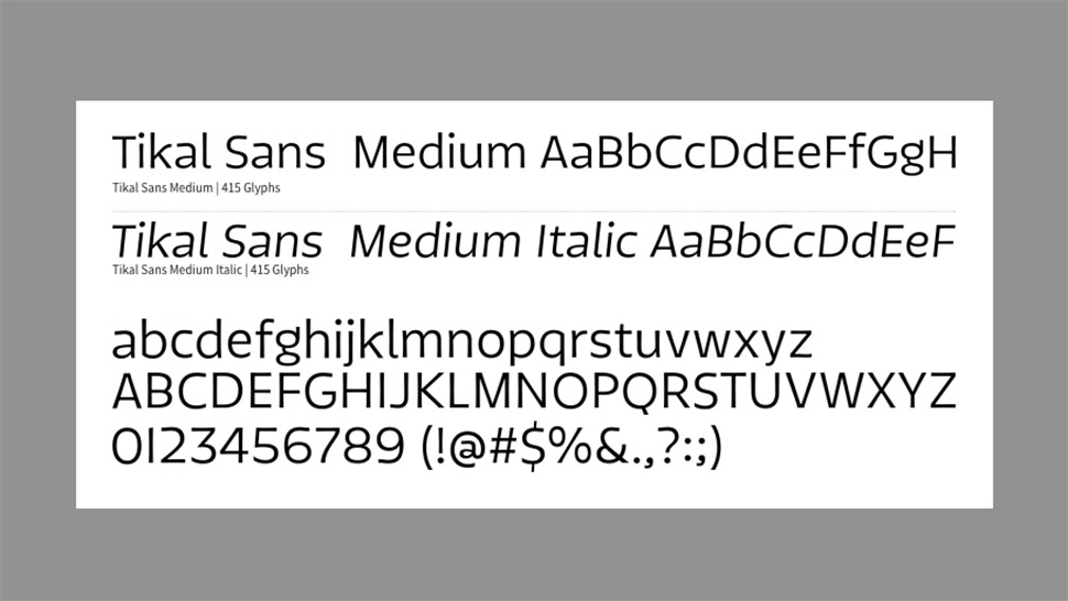
This free web font takes its name from the Mayans’ main city
Taking its name from the Mayans' most prominent city, Tikal Sans' characterful sharp-ended strokes are influenced by glyphs that were used by the South American civilization. Foundry Latinotype gave this web font a large, contemporary-feeling x-height for both legibility and friendly appeal, while its multiple weights ensure maximum versatility.
Note: currently only medium and medium italic are available free.
23. Arvo
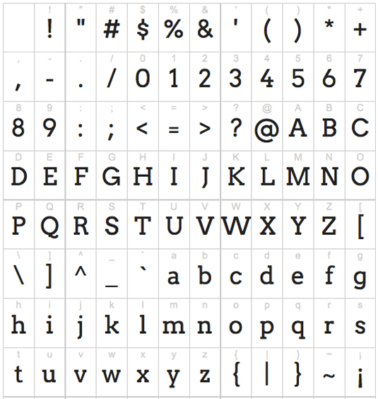
Good arvo, mate! And a very good web font, too…
Equally suited to both print and web, Anton Koovit's geometric slab serif is available in Roman, Italic, Roman Bold, and Bold Italic. Although this free web font has an almost uniform stroke width, Arvo's very slight contrast adds to its character – and it's also carefully hinted to enhance its on-screen readability.
24. Bevan
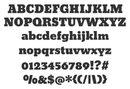
Ultra-bold web fonts don’t always translate to screens, but this one does
This is Vernon Adams' reimagining of a traditional 1930s slab serif by Heinrich Jost. The letterforms have been digitised, reshaped and optimised for the web, with more open counters and stronger stems to ensure that Bevan functions as an ultra-bold display font that suits modern browsers.
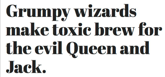
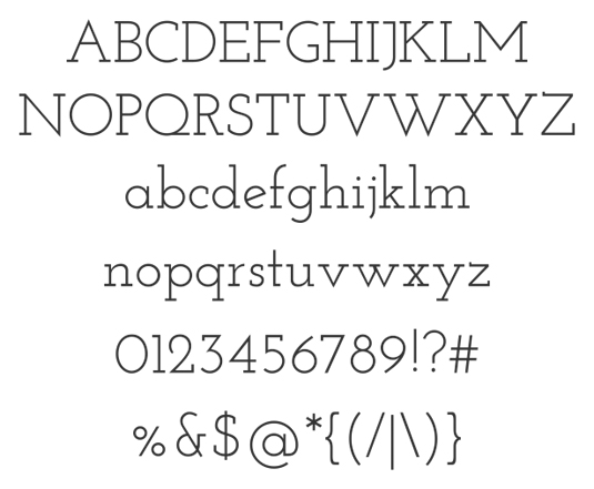
25. Old Standard TT
This web font has a very ‘scientific document’ feel to it
Revisiting the Modern (classicist) serif style that was widespread in the late 19th and early 20th century but later abandoned, this style is well suited to giving style and heritage to particular types of content, such as scientific papers, or for setting Greek or Cyrillic type. The name counterbalances the ‘New Standard’ (Obyknovennaya Novaya) used in much Soviet typography.
26. Kreon
This is a personality-packed web font which is great for blogs
Ideally suited to magazine and news websites, as well as blogs, this characterful serif by Julia Petretta has a slight slab feel to it, but its balanced, low-contrast letterforms convey considerably more personality than a more neutral typewriter-style web font might, making it ideal for headlines. Sans serif and italic versions are currently in development.
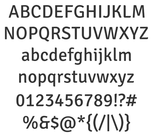
27. Droid Sans
Droid web font is ideal for mobile screens, hence the name
A digital-focused typeface by Ascender Corp’s type director Steve Matteson, Droid Sans has been optimised for maximum readability at small sizes for user interfaces – particularly menus on mobile phone screens (hence the Android-referencing name). It has an upright stress with open letterforms, and balances a neutral feel with a friendly touch.
28. Italiana
This elegant web font adds a touch of class to any site
Another web font geared up for setting newspaper or magazine headlines, which makes it useful for carrying a brand seamlessly across print and digital. Mexico-based designer Santiago Orozco was inspired by traditional Italian calligraphy, and accordingly is well suited to projects that need a touch of elegance and Continental style. Development is ongoing, and Orozco welcomes feedback.
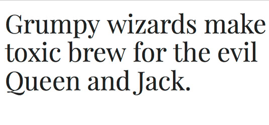
29. Vollkorn
Hardworking web font Vollkorn is its designer’s first attempt as a typeface
Considering it's Friedrich Althausen's first attempt at typeface design, this hardworking, multi-purpose serif (the name is German for 'wholemeal') is a considerable accomplishment, and has been downloaded thousands of times. Its chunky, well-defined serifs give it confidence and energy that make it equally effective at large sizes for headlines or titles, or for larger passages of text.
30. Actor
The free web font Actor has very distinctive 6s and 9s
Like Poly, this free web font emerged from a university project – this time by Thomas Junold while he was studying at Aachen University of Applied Sciences at Karl-Friedrich (Kai) Oetzbach. It has a particularly high x-height that calls for generous line spacing, and also features old-style figures, with 6 and 9 particularly unique.
31. Lato
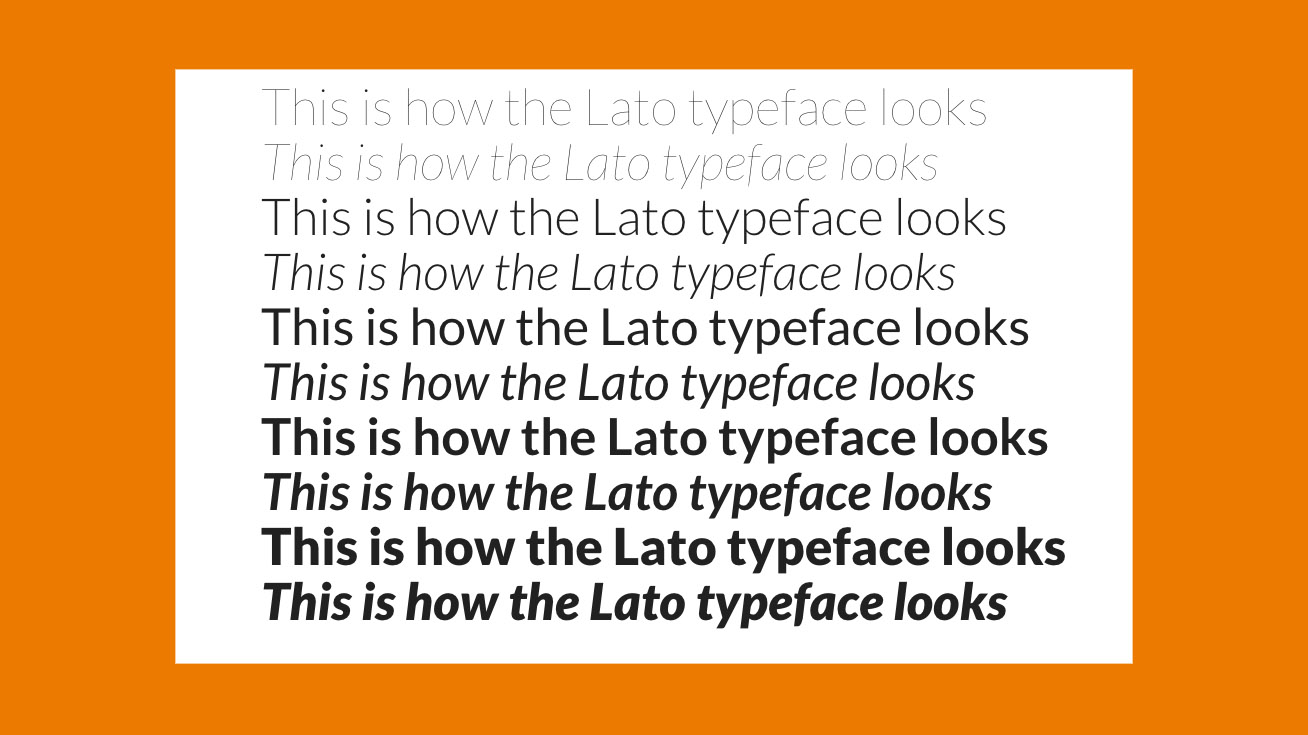
This free web font is published under the Open Font License
A sans serif family created by Polish designer Łukasz Dziedzic, Lato is published under the open-source Open Font License. Originally developed for a client project, which was later steered in a different direction, the face is relatively non-descript when used small, but reveals its character at larger sizes, where its semi-rounded characters add warmth.
32. Average Sans
Average by name… This web font is neutral and no-nonsense
As its name implies, this typeface by Argentine designer Eduardo Tunni has relatively neutral letterforms in terms of structure and proportion, and comes in both sans serif and serif versions that complement each other nicely. It's best used as a text font, or for short, no-nonsense headlines. A serif version, simply called Average, is similarly clear and crisp.
33. EB Garamond
This variation of the Garamond typeface is a great free web font
Since its roots in the 16th century, the humanist serif face Garamond has become a true typographic icon, and much copied. This particular open-source project by Georg Duffner seeks to bring the essence of Claude Garamond's masterpiece onto the web.
The 'EB' stands for Egenolff-Berner, as the web font is based on a specimen created by Conrad Berner while at the Egenolff print office.
34. Ubuntu
Ubuntu is a distinctive web font – and open source, of course
Created by leading London foundry Dalton Maag, this distinctive sans serif font was developed with funding from Canonical Ltd to benefit the wider free software community, and users are encouraged to modify, improve and share the web font. Ubuntu is designed to convey personality on both desktop and mobile screens.
35. Rosario
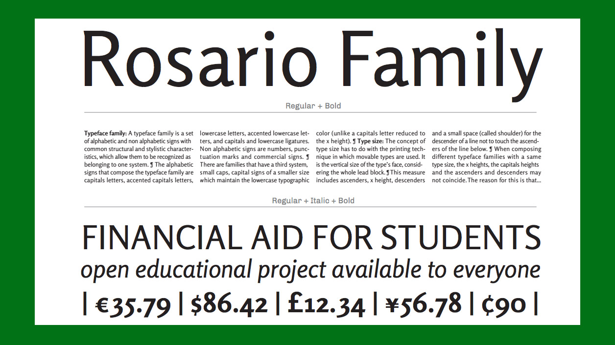
Rosario is perfect for setting paragraph type
Rosario is described by publisher Omnibus as being a classic semi-serif typeface, featuring weak contrast and smooth endings. We think it's an excellent Humanist sans-serif addition to your type arsenal. Perfect for setting paragraph type, Rosario is named after the city where designer Héctor Gatti lives. The font has also benefited from TrueType hinting additions provided by Adobe via their Edge Web Fonts platform.
36. Roboto Slab
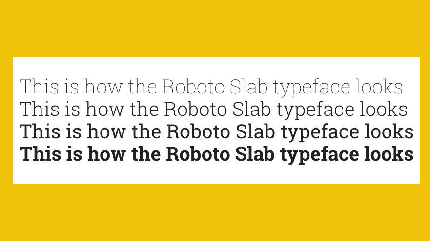
Roboto Slab provides a pleasant reading experience
Roboto Slab is one variant in the wider Roboto family designed by Christian Robertson. The slab version particularly catches the eye with its geometric shapes and open curves. It works equally well as a display font or for dense copy: the letterform rhythm feels natural, making for a pleasant reading experience.
37. Oswald
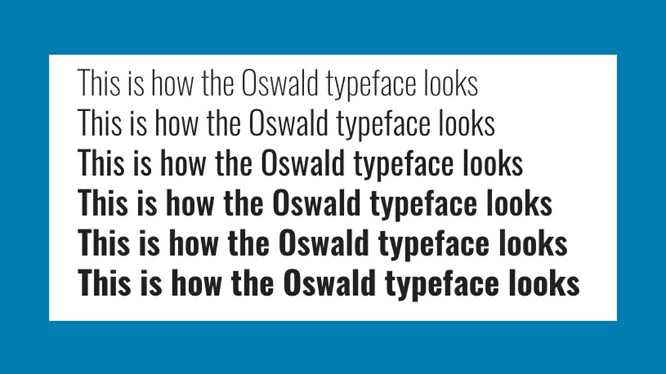
Oswald is a fantastic display font for headlines
One of the first fonts to be featured in Google’s Web Fonts library, Oswald has been updated more recently to include multiple weights, extended character sets and better kerning. The font is a reworking of the classic Alternate Gothic sans-serif typeface style, created by designer Vernon Adams, and is a fantastic display font for headlines and captions.
38. Stalemate
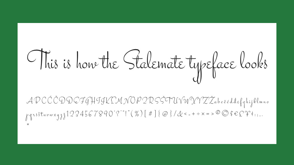
Stalemate works well as an accent font
A wonderfully quaint script design by Jim Lyles, and harking back to vintage origins. This font works well as an accent or display font, adding instant “personal” impact to your typography on the page.
39. Crimson Text
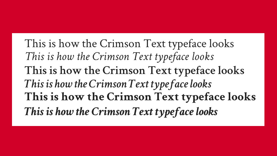
Crimson Text is a solid, well proportioned serif
This wonderfully refined font makes an excellent choice for copy that requires the solidity and impact of a well proportioned serif. Designed by Sebastian Kosch in the best traditions of oldstyle typefaces such as Garamond, this features beautifully rendered ordinals and uppercase forms, making it a solid and reliable choice for many applications.
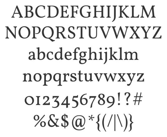
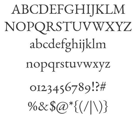
40. Ledger
Free web font Ledger has excellent legibility even on low-resolution screens
A multi-purpose face with a large x-height, strong stroke contrast, and clearly defined serifs and terminals that all contribute to excellent readability, Denis Masharov's free web font Ledger is particularly effective for editorial use – working equally well on the printed page or on a low-resolution screen.
Related articles:
How to use web fontsMaster accessible web typographyBest free fonts for designers


 Further Branding
 When it comes to technology, faster isn’t always better.

