Architecture: House Yorii located in Saitama Prefecture, Japan

Original Source: http://feedproxy.google.com/~r/abduzeedo/~3/LYJJupaanws/architecture-house-yorii-located-saitama-prefecture-japan

Architecture: House Yorii located in Saitama Prefecture, Japan

Architecture: House Yorii located in Saitama Prefecture, Japan

AoiroStudio
Sep 20, 2017

It’s been a little while since our last article about architecture, how about a minimal house located in Saitama Prefecture, Japan. At less than 30km from the center area of Tokyo, you’ll be charmed by its minimalist design where the house structure is surrounded of clean lines. I really love the ancient vs modern take on the balcony deck to the backyard. A simple and yet really meaningful design by Shinsuke Yokoyama.

Shinsuke Yokoyama is an architect and interior designer based in Tokyo, Japan. You should follow more of this work on Behance.

若い夫婦の住まいは,この先の時間の経過と共に家族構成や生活環境が変化していくことが想像される為,シンプルな動線と、可変性のある大空間を用意している。日射をコントロールする為の屋根とつながる大きく迫り出した庇はウッドデッキ,前庭へと視線を誘導する.生活が始まり賑わいが生まれるように、インテリアは白と白木のあっさりとした素材で構成した。大きな屋根が架かった小さな住宅がこれから成長する家庭をおおらかに守っていくストーリーをイメージしている。

Product Gallery
Architecture: House Yorii located in Saitama Prefecture, JapanArchitecture: House Yorii located in Saitama Prefecture, JapanArchitecture: House Yorii located in Saitama Prefecture, JapanArchitecture: House Yorii located in Saitama Prefecture, JapanArchitecture: House Yorii located in Saitama Prefecture, JapanArchitecture: House Yorii located in Saitama Prefecture, JapanArchitecture: House Yorii located in Saitama Prefecture, JapanArchitecture: House Yorii located in Saitama Prefecture, JapanArchitecture: House Yorii located in Saitama Prefecture, JapanArchitecture: House Yorii located in Saitama Prefecture, Japan


Credits
Architect: Kato Architect Office
Constructor: Ozawa Kougyou
Photo: Ryotaro Watanabe
More Links
Learn more about Shinsuke Yokoyama: shinsukeyokoyama.tumblr.com
Follow Shinsuke on Behance

architecture
interior design
japan


Building Inclusive Toggle Buttons

Original Source: https://www.smashingmagazine.com/2017/09/building-inclusive-toggle-buttons/


Some things are either on or off and, when those things aren’t on (or off), they are invariably off (or on). The concept is so rudimentary that I’ve only complicated it by trying to explain it, yet on/off switches (or toggle buttons) are not all alike. Although their purpose is simple, their applications and forms vary greatly.

Building Inclusive Toggle Buttons

In this inaugural post, I’ll be exploring what it takes to make toggle buttons inclusive. As with any component, there’s no one way to go about this, especially when such controls are examined under different contexts. However, there’s certainly plenty to forget to do or to otherwise screw up, so let’s try to avoid any of that.

The post Building Inclusive Toggle Buttons appeared first on Smashing Magazine.

25 Solutions That Heavily Help Designers And Developers

Original Source: http://feedproxy.google.com/~r/Designrfix/~3/cbKB-RQfahs/25-solutions-heavily-designers-developers

Having many web tools and premium services on the market helps a lot but also complicate things. Which one should you use? Some do not have free trials, and you need to pay before deciding if it’s a right fit for you. For all of you in this situation, we have managed to build a […]

The post 25 Solutions That Heavily Help Designers And Developers appeared first on designrfix.com.

Searching for Clean(er) Searches

Original Source: http://inspiredm.com/searching-cleaner-searches/

Inspired Magazine
Inspired Magazine – creativity & inspiration daily

If there is one year for positive change, look no further, it’s 2017. Because there’s no better time than now to do something, but also because this world, on so many levels (well, you know, you’ve been there too) was seriously derailed in the past couple of years.

You are probably involved already, struggling with small or large steps to make a difference in the world, to have a positive impact, minimize your carbon footprint, leave the air breathable and the water drinkable for your kids and their kids. You probably cycle, volunteer, decided to run for office (yay!), sign petitions, enjoy the outdoors. But by the end of your life you will still have spent a few good years staring into a screen. Due to nature of work or for entertainment only, it’s gonna be years, trust me. They add up. Worry not though, you can make a difference even in front of a computer screen doing your daily searches.

I search, You search, We…

You’re online and irrespective of the tasks, you will search at least one time during the course of one working day. Am I right? Searching the www is high in the charts when it comes to spending time online. I mean, we even search for search. Spelling. Our own names. We search for pretty much everything. Everything included. And there’s a carbon meter attached to this daily routine too, as with most activities that need a source of power.

You can imagine our excitement when we discovered that some of those behind several search engines intend to tackle the carbon problem. While DuckDuckGo is more into protecting your online privacy, Google promises to run on 100% renewable energy by the end of this year, and Ecosia plants trees every time you search the web.

Online searches have been steadily growing into trillions since the dawn of the internet. The trend is on the rise and there are no signs of a slowdown.

Raising Awareness while Making Change Happen
Charming server error

No, you cannot literally plant trees by simply searching. At least not yet (have you seen the guy who emailed lemonade? Literally). Ecosia is the search engine that plants trees with its ad revenue. It’s a great example of social change applied to the most common online activity.

You search the web with Ecosia > Search ads generate income for Ecosia > Ecosia uses this income to plant trees.

They’ve planted over 7 million trees so far. Here’s how they decide where to plant them. On their website you can find details about their projects, videos, stories, and useful info on why trees are essential to life – if you ever had any doubts. You don’t have to be a full-time treehugger to get excited when your search for “sugar free” and just planted a tree. I mean, even when their server is down, they’ll put some trees up (see screenshot).

Using  Renewable Energy to Keep them Engines Running
Renewable Energy ProjectsGoogle: New Renewable Energy Projects via venturebeat.com

In 2015, Google bought 44% of its power from wind and solar farms, according to The Guardian, and they plan to go 100% renewable this year. It’s worth keeping an eye on them and see how and when they’ll reach their target. Just in case you were feeling guilty for using Google.

The renewable trend would be very hard to stop, hence similar companies are joining this common-sense challenge along sustainability programs. For the sake of your own carbon footprint, doing a quick search (ha!) to test their sustainability efforts should come in handy.

Search Engines with Renewable Goals Only

If you want to find out more about clean energy, then you should know that there are search engines only for this. Take reegle. It acts as a unique clean energy information portal, targeting specific stakeholders including governments, project developers, businesses, financiers, NGOs, academia, international organizations and civil society. Others, like Solar Search, specialize in searches related to mainly solar energies. You’ll probably come across some inspiring projects.
If you’re really committed to making a difference, don’t stop here, move beyond the search engine. See how clean your apps are. If you’re the techie-sustainable type and have ideas for a low carbon economy, take some time to put them into practice, pitch them, share them, spread the word. Go for it!

Switch it Off and Other Such Details

Saving energy at home and at work matter. Just as low energy consuming applications and power saving system matter. And no, standby is not as friendly as you think.
University of Cambridge has its own green challenge in an attempt to prevent unnecessary energy use. They are committed to reducing carbon emissions energy-and-carbon, and they compiled Facts & Figures to help you find out how much energy you can save from simple actions such as switching off lights and equipment.

“Leaving a computer on overnight for a year creates enough CO2 to fill a double-decker bus.” (Carbon Trust)

“Reducing your PC monitor brightness from 100% to 70% can save up to 20% of the energy the energy the monitor uses.” (Harvard)

A true activist should consider all his actions, and change or adapt as many of his habits as possible, including his virtual ones. Your virtual life has an impact in real life. And not necessarily yours.

More Than Clean Searches

This article does not enourage online activism only. Don’t forget to increase the efficacy of offline activism. These days online and offline have to come together. Entangling your daily virtual existence with meaningful clicks does sound like a powerful tool, a quiet form of activism pushing change in the most unexpected places. Direct action, changing your daily routine, less waste, more awareness in your life, every bit will make a difference in the big scheme of life.

You might not save the world with this, but you’ve certainly made a step in the right direction.
Leave the right footprints. Your grandchildren will be grateful.

This post Searching for Clean(er) Searches was written by Anca Rusu and first appearedon Inspired Magazine.

Collective #340

Original Source: http://feedproxy.google.com/~r/tympanus/~3/XuwQVzWMPoQ/

C340_WOTW

Inspirational Website of the Week: Rafael Derolez

A modern website experience with delightful details and smooth interactions. Our pick this week.

Get inspired

C340_JetPack

Our Sponsor
Take your WordPress site to the next level

Get the ultimate toolkit for WordPress. Jetpack Professional gives you everything you need to design, secure, and grow your site.

Check it out

C340_DragDrop

react-beautiful-dnd

Accessible drag and drop for lists with React.js with a solid API and natural movement of items.

Check it out

C340_fontsize

Font-size: An Unexpectedly Complex CSS Property

An interesting article on the trickiness of the font-size property by Manish Goregaokar.

Read it

C340_ImplicitGrids

The Difference Between Explicit and Implicit Grids

Manuel Matuzovic explains the difference between explicit and implicit CSS grids.

Read it

C340_Delirium

Free Font: Delirium

A charismatic calligraphy typeface by Bruno Fontenelle.

Get it

C340_ShadowDOM

Shadow DOM: fast and encapsulated styles

Learn why CSS encapsulation is so hard and what’s the fastest way to get it in this article by Monica Dinculescu.

Check it out

C340_RogerWaters

Roger Water

An endless flying exploration of a generative, infinite open world. A mind-blowing Chrome Experiment by Stefano Maccarelli.

Check it out

C340_timescale

Timescale

An open-source time-series database fully compatible with Postgres for fast ingest and complex queries.

Check it out

C340_60fps

Performant Web Animations and Interactions: Achieving 60 FPS

Emily Hayman explains all important details involved in making web animations performant.

Read it

C340_gtop

gtop

Gtop is a system monitoring dashboard for terminal.

Check it out

C340_Kozmoz

Kozmoz

A next-generation bookmarking tool that will organize your favorites automatically. Currently in private beta.

Check it out

C340_GA

Tracking Internal Marketing Campaigns With Google Analytics

Christian Ebernickel gives an advanced masterclass on campaign tracking in Google Analytics.

Read it

C340_deeplearnjs

deeplearn.js

Deeplearn.js is an open source hardware-accelerated JavaScript library for machine intelligence allowing you to train neural networks in a browser or run pre-trained models in inference mode.

Check it out

C340_Map

Real World Examples of Map, Filter and Reduce in JavaScript

A practical use case for map(), filter(), and reduce() By Tania Rascia.

Read it

C340_DevBrand

How to build your personal brand as a new developer

Some useful tips on building a personal brand as a developer. By Rick West.

Read it

C340_ES

ES Modules in Node Today!

John-David Dalton announces the release of standard/esm, an opt-in, spec-compliant, ECMAScript (ES) module loader that enables a smooth transition between Node and ES module formats with near built-in performance.

Read it

C340_pagespeed

Page speed optimization

One of the many SEO tools by Varvy that gives you very useful insights on page speed.

Check it out

C340_Tensorflow

Effective Tensorflow

A repo that collects Tensorflow tutorials and best practices.

Check it out

C340_FuncCSS

CSS Utility Classes and “Separation of Concerns”

Adam Wathan shows how to follow a functional CSS approach.

Read it

C340_Siren

The Siren: One-page blog/magazine design concept (Sketch)

A clean and elegant Sketch website template designed by Kulikov Ilya.

Check it out

C340_regex

Learn regex the easy way

In case you missed it: Zeeshan Ahmed wrote this great guide to regular expressions.

Read it

C340_Tormentor

Free Font: Tormentor

A lovely handwritten font made by Besttypeco for Pixel Buddha subscribers.

Get it

C340_Morphing

From Our Blog
Morphing Page Transition

A simple morphing page transition effect where an SVG path gets morphed into another while the current page moves up.

Check it out

Collective #340 was written by Pedro Botelho and published on Codrops.

Building Animated Components, or How React Makes D3 Better

Original Source: https://www.sitepoint.com/how-react-makes-your-d3-better/

D3 is great. As the jQuery of the web data visualization world, it can do everything you can think of.

Many of the best data visualizations you’ve seen online use D3. It’s a great library, and with the recent v4 update, it became more robust than ever.

Add React, and you can make D3 even better.

Just like jQuery, D3 is powerful but low level. The bigger your visualization, the harder your code becomes to work with, the more time you spend fixing bugs and pulling your hair out.

React can fix that.

You can read my book React+d3js ES6 for a deep insight, or keep reading for an overview of how to best integrate React and D3. In a practical example, we’ll see how to build declarative, transition-based animations.

A version of this article also exists as a D3 meetup talk on YouTube.

Is React Worth It?

OK, React is big. It adds a ton of code to your payload, and it increases your dependency footprint. It’s yet another library that you have to keep updated.

If you want to use it effectively, you’ll need a build step. Something to turn JSX code into pure JavaScript.

Setting up Webpack and Babel is easy these days: just run create-react-app. It gives you JSX compilation, modern JavaScript features, linting, hot loading, and code minification for production builds. It’s great.

Despite the size and tooling complexity, React is worth it, especially if you’re serious about your visualization. If you’re building a one-off that you’ll never have to maintain, debug, or expand, stick to pure D3. If you’re building something real, I encourage you to add React to the mix.

To me, the main benefit is that React forces strongly encourages you to componentize your code. The other benefits are either symptoms of componentization, or made possible by it.

The main benefits of using React with your D3 code are:

componentization
easier testing and debugging
smart DOM redraws
hot loading

Componentization encourages you to build your code as a series of logical units — components. With JSX, you can use them like they were HTML elements: <Histogram />, <Piechart />, <MyFancyThingThatIMade />. We’ll dive deeper into that in the next section.

Building your visualization as a series of components makes it easier to test and debug. You can focus on logical units one at a time. If a component works here, it will work over there as well. If it passes tests and looks nice, it will pass tests and look nice no matter how often you render it, no matter where you put it, and no matter who calls it. ?

React understands the structure of your code, so it knows how to redraw only the components that have changes. There’s no more hard work in deciding what to re-render and what to leave alone. Just change and forget. React can figure it out on its own. And yes, if you look at a profiling tool, you’ll see that only the parts with changes are re-rendered.

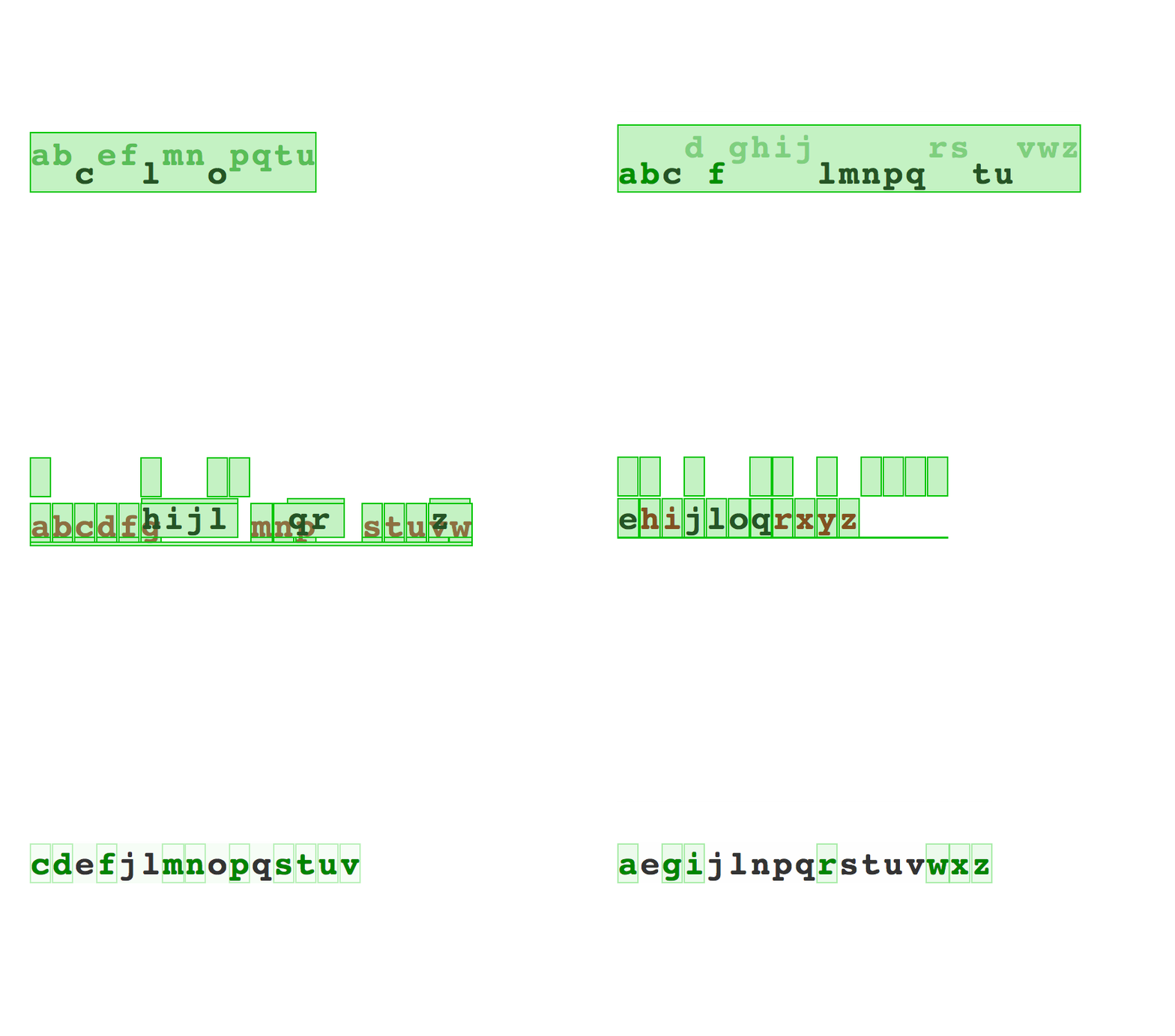
Animated alphabet with flash paint enabled

Using create-react-app to configure your tooling, React can utilize hot loading. Let’s say you’re building a visualization of 30,000 datapoints. With pure D3, you have to refresh the page for every code change. Load the dataset, parse the dataset, render the dataset, click around to reach the state you’re testing … yawn.

With React -> no reload, no waiting. Just immediate changes on the page. When I first saw it in action, it felt like eating ice cream while the crescendo of 1812 Overture plays in the background. Mind = blown.

Benefits of Componentization

Components this, components that. Blah blah blah. Why should you care? Your dataviz code already works. You build it, you ship it, you make people happy.

But does the code make you happy? With components, it can. Components make your life easier because they make your code:

declarative
reusable
understandable
organized

It’s okay if that sounds like buzzword soup. Let me show you.

For instance, declarative code is the kind of code where you say what you want, not how you want it. Ever written HTML or CSS? You know how to write declarative code! Congratz!

React uses JSX to make your JavaScript look like HTML. But don’t worry, it all compiles to pure JavaScript behind the scenes.

Try to guess what this code does:

render() {
// …
return (
<g transform={translate}>
<Histogram data={this.props.data}
value={(d) => d.base_salary}
x={0}
y={0}
width={400}
height={200}
title=”All” />
<Histogram data={engineerData}
value={(d) => d.base_salary}
x={450}
y={0}
width={400}
height={200}
title=”Engineer” />
<Histogram data={programmerData}
value={(d) => d.base_salary}
x={0}
y={220}
width={400}
height={200}
title=”Programmer”/>
<Histogram data={developerData}
value={(d) => d.base_salary}
x={450}
y={220}
width={400}
height={200}
title=”Developer” />
</g>
)
}

If you guessed “Renders four histograms”, you were right. Hooray.

After you create a Histogram component, you can use it like it was a normal piece of HTML. A histogram shows up anywhere you put <Histogram /> with the right parameters.

In this case, the parameters are x and y coordinates, width and height sizing, the title, some data, and a value accessor. They can be anything your component needs.

Parameters look like HTML attributes, but can take any JavaScript object, even functions. It’s like HTML on steroids.

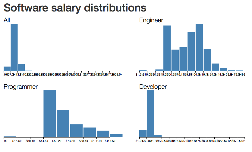
With some boilerplate and the right dataset, that code above gives you a picture like this. A comparison of salary distributions for different types of people who write software.

4 histograms of salary distributions

Look at the code again. Notice how reusable components are? It’s like <Histogram /> was a function that created a histogram. Behind the scenes it does compile into a function call — (new Histogram()).render(), or something similar. Histogram becomes a class, and you call an instance’s render function every time you use <Histogram />.

React components should follow the principles of good functional programming. No side effects, statelessness, idempotency, comparability. Unless you really, really want to break the rules.

Unlike JavaScript functions, where following these principles requires deliberate effort, React makes it hard not to code that way. That’s a win when you work in a team.

Declarativeness and reusability make your code understandable by default. If you’ve ever used HTML, you can read what that code does. You might not understand the details, but if you know some HTML and JavaScript, you know how to read JSX.

Complex components are made out of simpler components, which are made out of even simpler components, which are eventually made out of pure HTML elements. This keeps your code organized.

When you come back in six months, you can look at your code and think, “Ah yes, four histograms. To tweak this, I should open the Histogram component and poke around.”

React takes the principles I’ve always loved about fancy-pants functional programming and makes them practical. I love that.

Let me show you an example — an animated alphabet.

Continue reading %Building Animated Components, or How React Makes D3 Better%

Alessandro Puccinelli's Photographic Celebration of The Harvest

Original Source: http://feedproxy.google.com/~r/abduzeedo/~3/R6Q0HG2u3p4/alessandro-puccinellis-photographic-celebration-harvest

Alessandro Puccinelli’s Photographic Celebration of The Harvest

Alessandro Puccinelli's Photographic Celebration of The Harvest

ibby
Sep 15, 2017

For all of the wine lovers out there it’s no news that this time of year presents the annual harvesting of grapes and along with that, amazing photo opportunities at every turn. We grew ripe with envy when we discovered Alessandro Puccinelli’s beautiful imagery of the Muscat harvest in Southern France wanting to transport ourselves to this magical moment immediately. 

If you’d like a little backstory on the the harvesting of wine grapes, it’s actually the most integral step in the process of wine-making. The time of harvest is determined primarily by the ripeness of the grape as measured by sugar, acid and tannin levels and winemakers base this all-important decision to pick based on the style of wine they wish to produce. I’m pretty sure the lovely woman in the last image may have discovered a bad grape. Enjoy and cheers!


How do grape growers know when to harvest?

The best wine growers are so familiar with the taste of ripeness that they can walk down a row tasting grapes and know intuitively when to pick. However, there is a fair amount of science to back this up. Just so you know, timing the harvest is the single most important decision a grower or winemaker makes each year. 

Wine regions of the world 'The Wine Belt'

Wine Harvest Season Chart

wine-harvest-season

wine harvest
photography
art direction


What 3D UIs Will (Probably) Look Like

Original Source: https://www.webdesignerdepot.com/2017/09/what-3d-uis-will-probably-look-like/

Okay WDD readers, this one is going to get real conceptual. I’m here to talk about leaving two-dimensional user interfaces behind. Ditching the screen. Going 3D in the real world. Well, you know what I mean. You know, the stuff of science fiction that always ends up looking sort of fun, but really tiring and impractical. And that’s before the holo-deck malfunctions and Picard starts shooting the Borg with hard light.

Anyway, everything I’m writing about here has little to no practical application outside of VR… for now. Most of this won’t be applicable to web design for a little while. We’ll get there. And in the meantime, it’s fun to speculate on what it will look like…

The Challenges
Display

We don’t have true 3D user interfaces right now, because the tech just isn’t there yet. It’s getting there, but we don’t have anything commercially ready for UI designers to obsess over. Holograms are getting better, and easier to produce. Motion input is also getting better and better, but it’s not as precise as we’d like it to be, yet.

This is because holograms usually require multiple sources of light. The ones that don’t use reflective surfaces to simulate those sources. Both of these restrictions tend to work against the free form physical interactions people want out of a hologram. Basically, we’re waiting until we can form holograms from particles that are easier to manipulate.

The closest we can get right now is VR. But, well, it’s virtual. It’s a simulation of a 3D interface on a pair of flat screens. So it only half counts. That said, VR will probably end up being our 3D UI mockup tool of the future.

Input

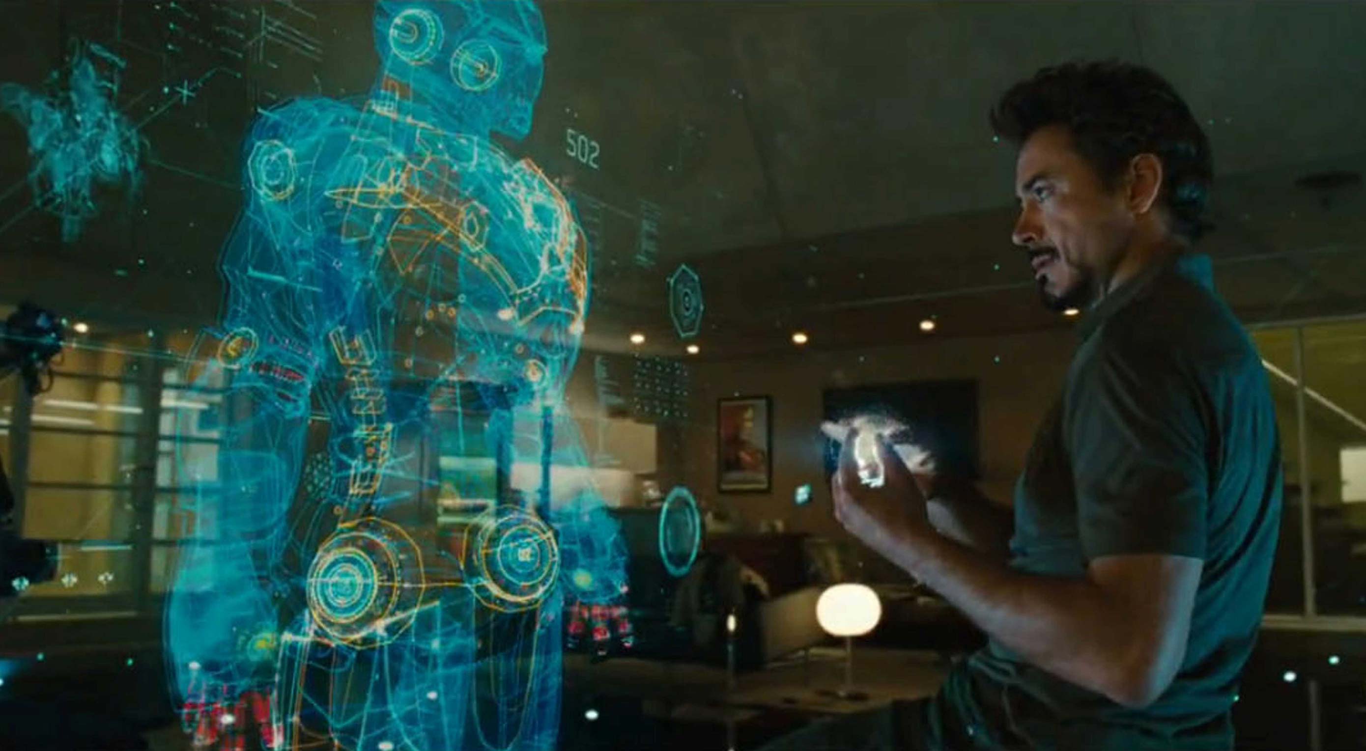
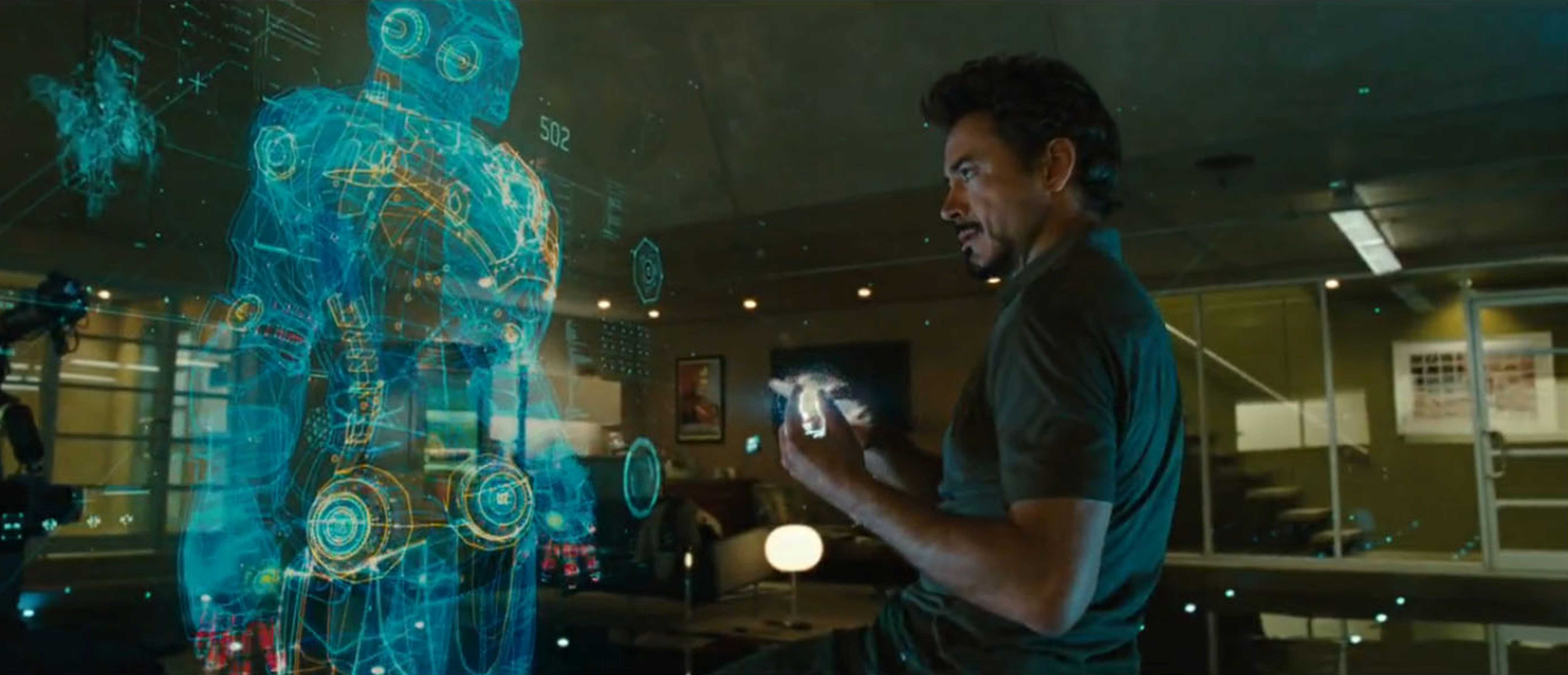
Okay, everybody watched Tony Stark in the Iron Man movies wave his hands around and yell at Jarvis to do stuff, and it looks awesome. The only problem is that waving your arms around like that for long periods is actually really tiring. Ask any actor who has to pretend to interact with these systems. It’s not practical for long work sessions.

The part that the movies got right was the inclusion of voice input. Sure, we don’t have AIs yet, but voice commands are coming along. Any interface that would otherwise require us to stand and reach across the table is going to get a lot of use out of voice commands.

People don’t even use really big touch screens if they don’t have to. Small ones, yes. Big ones only get used if they’re lying at a semi-horizontal angle for drawing purposes.

Organization of Information and Buttons

Technical diagrams and blueprints may look great in 3D. Maybe even movies, too, one day. However, plain old two-dimensional text is still one of the most efficient ways of conveying a lot of information. It’s cognitively efficient, and byte efficient. We may develop a 3D language one day, but as of now, text looks best on a 2D plane.

Look at VR. Look at the menus in apps and games. They’re all represented on 2D planes. So are most of our buttons. I mean, I don’t want to walk across the room to press a button either.

My Predictions

The mouse is still the most precise input tool we have, for now. The keyboard is still the fastest way to input text with minimal editing required. I don’t think they’re just going away. In fact, a sort of 3D mouse that turns small movements of the hand into a cursor that moves about the larger 3D interface might make more sense than stretching your arms the whole width of your projector-screen-thing to manipulate information.

Those sorts of peripherals would also get us around the problems that prevent us from taking a literally hands-on approach, such as light emitters, reflective surfaces, and so on. The actual visual part of the UI might look something like the one featured in Iron Man, but with more context for the information presented.

In the Iron Man examples, all information being presented to the user is brought to the fore by Jarvis, on request. It’s also organized with lots of (completely transparent) white space, with a noticeable lack of a window metaphor. Without Jarvis, we’ll need a more deliberate way to contextualize everything we see in a UI.

For 2D information, the window concept might very well remain in play. For information displayed in three dimensions, it might simply become a “box” metaphor, with translucent lines showing where one 3D app ends, and where the next one begins. Input will have to be contextual, with the cursor constrained to two dimensions when editing text, and freed up under other circumstances.

Going beyond anything possible with today’s tech, another good example of a practical holographic interface is the Omni-tool from the Mass Effect franchise. Goodness knows how they get the holograms to work when the device is implanted into you (usually in the non-dominant wrist, like a watch), but let’s ignore the science for a bit.

The Omni-tool is a purely practical device, used for communications, data analysis, and interacting with unfamiliar hardware. Oh, and stabbing people. Look, we’re ignoring the science!

The point is, it’s a practical interface because the UI is entirely contextual, and adapts to whatever it is you’re doing. It’s also operated with the fingers of one hand. No huge gestures required. Note that every other UI in the Mass Effect universe is either on a flat surface, or activated by voice.

Conclusion

Hollywood artists like to envision a world of completely unusable interfaces. Real 3D UIs will probably look more familiar than most of us seem to want to believe.

And I haven’t even touched on accessibility. How do people who can’t speak, or easily move their arms due to arthritis, interact with a huge holo-table UI? What if multiple people try to interact with it at once?

These are the kinds of questions we’ll have to answer before we embrace arm-waving as the future.

Sitecake’s Simple CMS for Fast, Static Websites – only $19!

Source

p img {display:inline-block; margin-right:10px;}
.alignleft {float:left;}
p.showcase {clear:both;}
body#browserfriendly p, body#podcast p, div#emailbody p{margin:0;}

Design SVG graphics in your browser

Original Source: http://feedproxy.google.com/~r/CreativeBloq/~3/gZM9AZ8zogs/design-svg-graphics-in-your-browser

The Vecteezy Editor is a free vector editing suite that runs right in your browser. This tutorial covers the basic shape tools and editing tools you can use to edit any vectors on the site. This way you can build badges, buttons, logos, or anything else with relative ease.

The GUI for this editor feels similar to Adobe software, so if you already use Photoshop or Illustrator, you'll have an easier time learning the ropes. But even complete beginners can dive into this and pick up the basics from scratch.

Get Adobe Creative Cloud

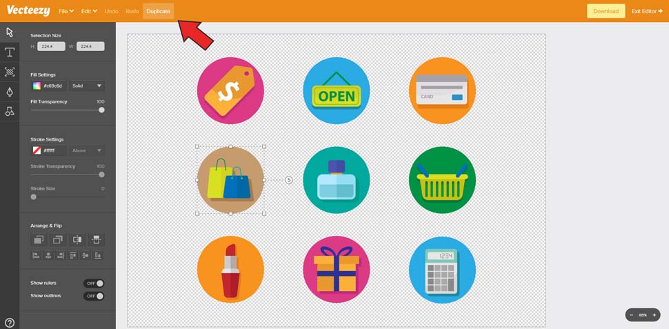
We're going to use these shopping icons from Vecteezy.

Just visit the icons page and click the 'Edit & Download' button. This opens the editor right in your browser so you can customise and build upon these graphics. For this tutorial, we'll show you how to nab some of these icons and convert them into a larger progress bar graphic – the perfect choice for any eCommerce homepage. 

So with those shopping icons open in the Vecteezy Editor, we can get started!

01. Pick the icons

Click into the icon group and select one icon, then click Duplicate at the top

Double-click on the icon group to select all the icons (you might need to double-click twice). I'll use three specific icons for this tutorial: the shopping bags, the credit card and the gift box.

Select the shopping bag and click Duplicate at the very top of the page. This should give you a duplicate of the whole icon. Move this up towards the top and duplicate the other two. 

Note: the gift box isn't fully grouped, so when you click to duplicate you'll only select a piece of the icon. To fix this, just drag a selection box over the entire gift icon, then at the top click Edit->Group. Now, you can duplicate the whole present icon with one click.

Once you have duplicates of all three icons, double-click anywhere on the empty canvas. This brings you outside the group of icons so you can select other objects on the page. If you click any of the older icons, you'll select the whole group. This is perfect, because you'll want to drag them down off the canvas so they're out of sight.

02. Clear the rubbish

Change the background opacity if you want it to be white instead of transparent

Double-click on each duplicated icon to access the individual shapes inside. We only need the main icon, so you should select and delete the colourful circle backgrounds and drop shadows.

To do this, simply zoom in very close and select the background circle. Then press Delete, and it should disappear. 

If the entire icon disappears – don't panic. Just click Undo near the top or press Ctrl/Cmd+Z and try again. You may need to double-click to get inside the icon group.

By the end, you should have three clean icons ready to use. If you don't like the transparent background you can always access the Background panel in the left-hand menu (third button down) and increase the opacity to 100 per cent for a pure white background.

03. Adding text

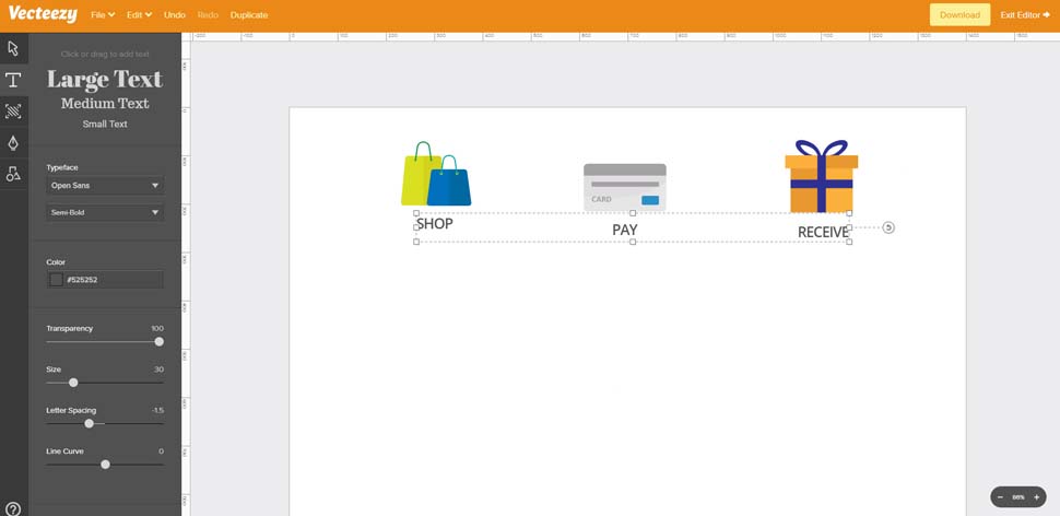
Add text labels under each icon with the same font settings

This progress bar will be incredibly simple; just advertising three stages of an eCommerce shop. 

To emphasise this process, let's add labels underneath each icon. In the left-hand toolbar, find the Text tool (second button) then click underneath the bag icon to add a text block. Add the text 'SHOP' and hit Enter on your keyboard.

This auto-selects the text so you can move it around and find a good position. But if you select the Text tool again, you can change the font family, colour, size, letter spacing and other features.

I'm using Open Sans Semi-Bold size 30 with a -1.50 letter spacing. Text colour is #525252. 

Duplicate this text twice and place the duplicates under the other icons. Use the text 'PAY' under the credit card icon and 'RECEIVE' under the gift box.

You should use the Select tool for repositioning the icons above the text. Also, space each icon close to equidistant apart if possible.

04. Adjusting graphics

Shift+click to select the ribbon shapes and change the background colour

Before creating the progress bar, you can alter any colours you like in the icons.

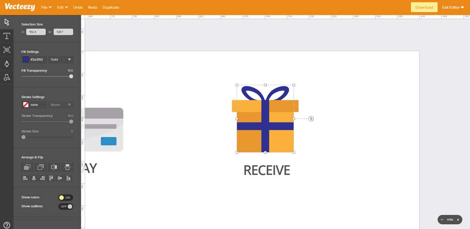
To do this, double-click to enter any icon group, then select whatever shape you want to change. In this case, I'll edit the gift box ribbon to change the colour from blue to green.

Once you're inside the icon group, hold Shift while clicking to select more than one item at a time. I'll select the horizontal and vertical rectangles, plus the bow shape at the top.

In the Select panel (first icon in the left-hand menu) find the Fill settings. You'll see the default colour is #2e3192. Click that Fill menu to access a drop-down colour wheel. Here, you can either drag around to find the colour you want, or enter a hex code directly.

Enter #518531 and hit Enter. This should save the result and update all three shapes at once. Feel free to play around with any other colour settings you'd like to change!

05. Starting the progress bar

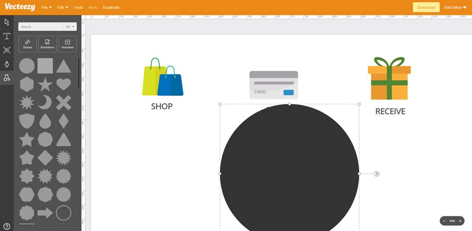
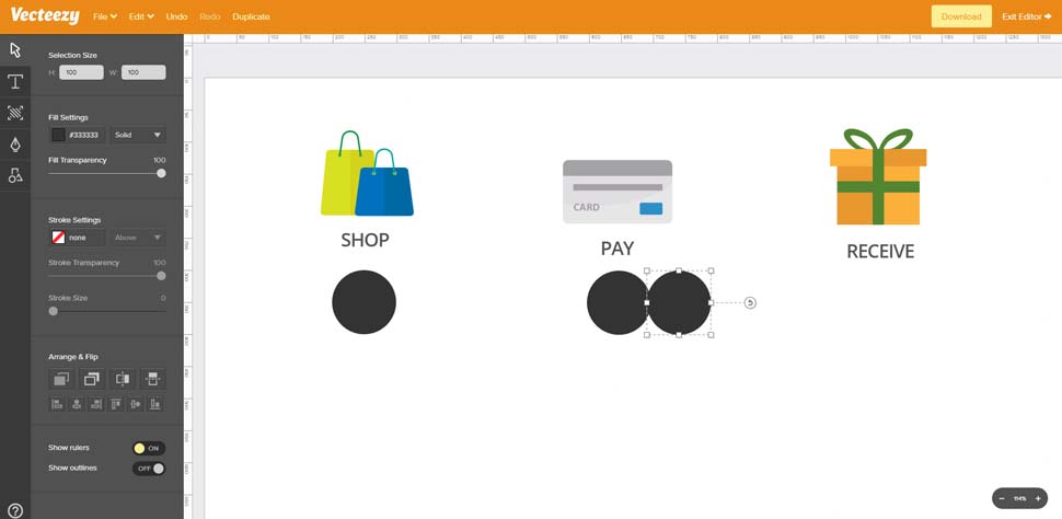
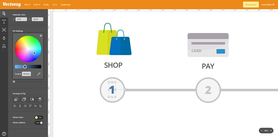
Click the top-left circle in the Elements panel to add a new circle to the canvas

To create a progress bar, you only need two shapes: circles and rectangles. Thankfully, both of these are available in the Elements panel located at the very bottom of the Tools menu.

Click to Elements panel and select the circle shape, which is the very first item in the list. It'll automatically place a dark grey circle in the centre of your workspace.

You can resize the circle by dragging the little white square boxes in the corner or the select boundary. This works well, but it's not as precise as the direct resizing feature.

So instead go back to the Select tool and make sure your new circle is selected. At the very top of the Select tool panel, you should see a selection size with a height and width value. 

Enter 100 in both fields and drag your first circle under the first icon.

06. Duplicating circles

Resize the circle and duplicate twice, then move them under each shopping icon

With your circle shape selected, click Duplicate in the top menu. Now, reposition this duplicate so it aligns closely with your original circle. Try to get it right on top of the first circle so they look like one shape.

Now, if you hold Shift and click, you can drag this duplicate circle in a straight line horizontally. This lets you perfectly align all your circles together in a straight line (or close enough to one).

Do this until you have three different circle shapes at 100 x 100, each placed underneath the three icons.

07. Add some connecting lines

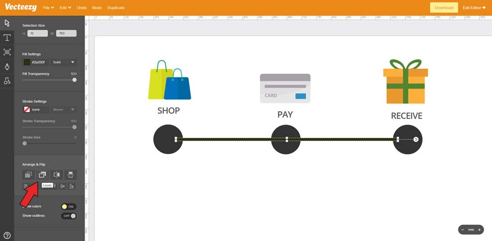
Select the rectangle shape and arrange it behind the three circles

Move back to the Elements panel and find the square shape. Click to add one square onto the canvas.

With this shape selected move back to the Select tool and find the width/height size panel. Since this rectangle should span the entire width of the progress bar, we just need one really long shape. So change the height to 10 and the width to whatever number you need to connect all your circles together. Mine is 750 wide.

Now, with this rectangle in position, look towards the bottom of the Select panel where it says Arrange & Flip. Click the second icon in the top row, which lets you move any selected shape behind the other shapes. 

Note: you may have to click the Lower button a few times to get the rectangle behind all three circles. But now the connecting rectangle is only visible between the circle shapes, so we can add text into the circles later.

08. Recolouring

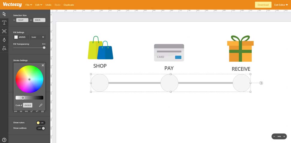
Recolour all the shapes and include a small stroke on the three circles

The current progress bar looks a little dark, so let's alter the colour a bit.

Click to select the long rectangle and find the Fill Settings in the Tools panel. Change the colour to #c5c5c5 and hit Enter.

Now, click anywhere off-canvas to deselect the rectangle. We also want to change the circle colours, and they should be lighter, using the darker grey as a border colour.

Hold Shift, and click each of the three circles. Adjust the fill colour to #f5f5f5, hit Enter and then click the X icon to close the fill colour select panel. Below, you'll find stroke settings. Change the stroke fill to #c5c5c5 and hit Enter. 

Click the X icon to close this colour selection panel, then change the stroke size to 6. At this stage I also recommend grouping all the circles and the rectangle together by dragging a selection box and going to Edit>Group. Now, you can adjust the position of all shapes at once with ease.

09. Adding progress steps

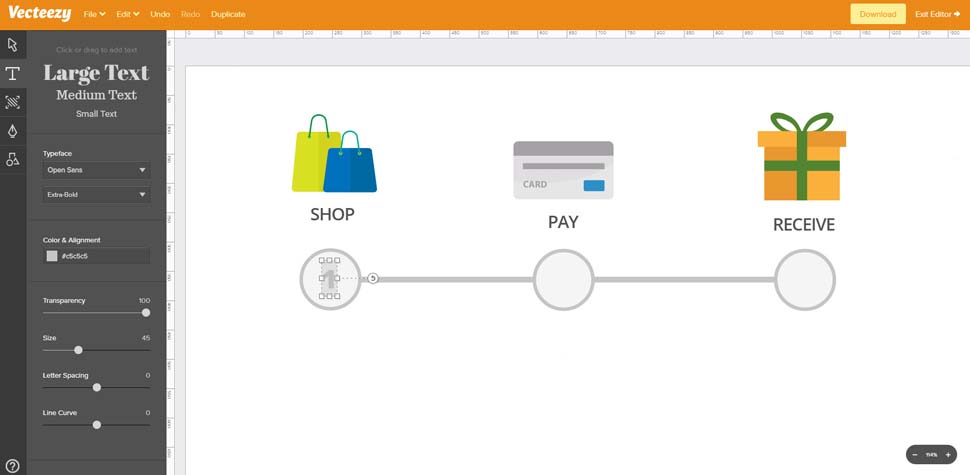
Add a text label into the first circle and duplicate the text for all three shapes

Let's add some numbers into each circle to finalise the progress bar design.

Click the Text tool and enter the number 1 into the first circle. I'm using Open Sans Extra-Bold, size 45 with the colour #c5c5c5 to match the borders. Drag this text so it's positioned in the centre of the circle.

Duplicate the text element and move it into the second circle with the text '2'. Do the same for the third circle with text '3'.

10. Highlight the first step

Recolour the first circle blue so it appears like the active progress step

As a finishing touch, let's highlight the very first step using a lighter blue outline. First select the number '1' you just created, and change the fill to #4976a3. Then click to select the circle behind the text. Find the Stroke Settings and change the stroke colour to #4976a3. This should add a dark blue border around the circle. With the circle still selected, click the Fill Settings and change the colour to #e2ebfa. 

And that's it! Now you can export this as a PNG/JPG using the Download feature in the top-right corner. You can also hide the white background to export this as a transparent PNG and change the overall document size using the Background panel (third button in the left-side menu).

Or if you'd like to save this for future changes, just go to File>Save For Later. You'll have to create a free Vecteezy account but it's a great way to keep your hard work saved for future reference.

This article originally appeared in net magazine issue 295. Buy it here.

Read more:

10 golden rules for responsive SVGsExplore the exciting new features in SVG 2Supercharge SVG animations with GSAP

Cloud Storage as a CDN Option

Original Source: http://inspiredm.com/cloud-storage-cdn-option/

Inspired Magazine
Inspired Magazine – creativity & inspiration daily

If you have a slow site, probably on shared server that receives a lot of traffic, you may be able to speed things up a bit by hosting some of your content on a Content Delivery Network (CDN).

Unfortunately traditional CDN is often priced out of reach for a small business website, but the good news is there is a way to set up cloud storage drives to act as your own personal CDN systems. In this article we’ll discover some methods for doing that.

Cloud storage CDN emulation vs pure CDN

The main difference is cost and volume. Pure CDN usually works out cheaper for high traffic volumes and more expensive for low traffic volumes. Because a typical small business isn’t likely to see the kind of traffic that would make pure CDN worth it, emulating CDN functionality with cloud storage is generally a more affordable and simple solution.

Choosing a cloud storage provider

Using cloud storage for CDN requires that you can make individual files available for direct public access, so this rules out zero-knowledge encryption services, because they’re not designed for general public access.

Second, you don’t want a provider that puts limits on resource access, or at least the limits should not be too strict.

Distributing content you want to get paid for

There are then different options depending on what kind of content you’re hosting. If you’re wanting to host specialist content, for example video, music, or other artistic works, checking out DECENT would be a good idea.

DECENT is a highly specialized blockchain based decentralized content delivery network. It allows you to self-publish anything without dependency on a middleman.

Utilizing peer-to-peer connections, DECENT traffic is very difficult to disrupt or block, which also makes it potentially able to circumvent censorship. It is more oriented toward commercial transactions, and blockchain technology makes these transactions easy to secure.

What it’s not very good for is distributing ordinary files like JavaScript, CSS, and XML files. For that, you’ll need a more regular cloud storage provider. The two biggest players in this field are Google and Amazon. Both are giants, but there are considerable differences between them.

A quick comparison: Amazon vs Google

Amazon comes in two flavors: Amazon S3 and Amazon Drive. The Amazon S3 system is an enterprise level system with all the complexity that you’d expect from such a system. It’s designed for big websites that get a lot of traffic, and the pricing structure is really complicated.

You may never need to worry about the pricing, however, if your needs are reasonably modest. Amazon S3 offers a free deal with 5GB of storage, 20k get requests and 2k put requests.

The problem here is that many of those get requests are not coming from humans, but from robots, so you can quickly burn through 20,000 requests before the month is up if your site is good at attracting robots. When your site does go over the limits, it doesn’t get suspended. You just have to pay up.

Amazon Drive is like Amazon S3 with training wheels. It comes with a much easier to use interface, requiring less technical ability. There’s a subclass called Prime Photos where you can get unlimited photo storage, and 5GB of storage for videos and other files, but it’s only free if you subscribe to Amazon Prime. The next step up provides 100GB of storage for $11.99 per year, and for $59.99 per year you can get 1TB of storage.

The standout thing here is the pricing is much simpler than Amazon S3. You know upfront what you get and what you’re expected to pay for it. It’s not really intended for using as a CDN, but it’s still possible to do it.

If you’re a WordPress user, you may prefer to use Amazon S3 because there are tools especially designed to help you do that through Amazon CloudFront. The complexity of setting that up is going to be beyond the scope of this article, so look for a dedicated article on exactly that topic coming up soon.

Google also has two options available: Google Cloud Storage and Google Drive. If you’re a Gmail user, you already have Google Drive.

Google Cloud Storage is intended for enterprise level use, and as such it requires a certain amount of technical ability to configure it and fine tune it. Google Drive is consumer-grade, but very easy to use with its simple web interface.

Google Drive starts you off with a generous 15GB of free storage, which is way more than most average small business websites will ever need. Should you find you need more, you can upgrade to:

All is not as it seems with these storage limits, however. Google Docs, photos other than full resolution (if stored using Google Photos), and any files shared with you by someone else don’t count toward your storage limit. Unfortunately emails (and attachments) do take up space if you’re actively using the Gmail account.

To give you an idea of how much you can store in 15GB, that is approximately 30 to 40 videos (m4v / mp4) at 1080 x 720 and 90 minutes duration, or about 88,235 photos at 800 x 600 and optimized for the web. It would be unusual for the average small business to need that much for its website.

Google Drive is much less expensive than Amazon Drive. In terms of performance, Amazon may have a bit of an edge, and the documentation with Amazon is better. Head to head, Google is offering better value overall.

Which should you choose? It depends whether you consider performance to be more important than cost.

Hosting images, CSS and JavaScript from Google Drive

This is not a lot more complicated than hosting video. In fact, it may even be easier. Here is what you need to do:

1. In your Google Drive, create a special folder that will store the files

2. Make sure the name you give it helps it stand out from other drive folders

3. Upload all the files to that folder (you can also create subfolders)

4. Select the folder that will be shared and click the share button

5. When the sharing dialog appears, select “Advanced”

6. On the more advanced Sharing Settings dialog, select “Change”

7. Now change the setting to “On – Public on the Web”

8. You will need to repeat the above process for every individual file as well

9. Copy the link for each resource and paste into a text editor

10. Delete everything except the file id

11. Now add text “https://drive.google.com/uc?export=view&” in front of the file id

12. Now you can modify your HTML. For CSS:

For JS:

For an image:

13. Upload the a test version of the HTML file and speed test this vs the original file

Original:

Updated test version with CDN from Google Drive:

Something very important you need to notice here is that with CDN enabled, the performance was actually degraded. This happened because my own web server automatically compresses everything, but the resources transferred to Google Drive are not automatically compressed.

That’s a topic for another day, but the real lesson here is that CDN isn’t always going to be an improvement for page loading time. Where it can still be useful, however, is by reducing disk space and bandwidth on your own server, allowing Google to shoulder the load for you. In most cases, that’s not going to hurt your loading times too much.

Streaming video: Google Drive vs YouTube

Google is the owner of YouTube, so either way you are using the same technology. Performance will be about the same, and the quality will be exactly the same, so why bother comparing? There are some small differences between streaming from either of these two sources.

When your video is hosted on YouTube, it doesn’t cost you anything, and doesn’t take up any storage space you personally own or rent. Videos on YouTube are ad-supported, allow viewers to comment by default, and show a bunch of links to other videos at the end of the video. Users can also find a link to view an embedded video on YouTube instead of on your site. Both of these behaviors are highly undesirable.

Hosting videos on Google Drive means there are no ads, no suggested links at the end of the video, and no option to view the video on YouTube (since it’s not hosted there). Otherwise there are no visible differences.

Hosting on YouTube can lead to greater exposure, if that’s what you’re after. Hosting on Google Drive gives you more control, more exclusivity, and helps keep the viewer on your site without the temptations offered by YouTube.

Both are better than alternatives such as Vimeo, because it is easier to include subtitles and the streaming quality can be adjusted by the viewer to suit their connection speed.

Streaming video from Google Drive and from YouTube uses very similar processes.

1. Upload the video to your Google Drive or to YouTube.

2. Upload or create any required subtitle files.

3. Test your video. Don’t skip this important step.

4. While the video is open, select the three vertical dots in corner of screen, then select “Share” from the menu.

5. Click on the “Advanced” link in the dialog that appears.

6. Click on the”Change” link.

7. Select “On – Public on the Web”

8. Then copy the link location and follow steps 9 to 13, except you’ll be using video HTML instead of image HTML, so your could will look something like this example:

The cc_load_policy property determines whether subtitles / closed captions should be visible by default. It’s good practice to set this to on, but Google applies the policy inconsistently anyway, possibly due to cross-platform complications.

Make sure you really need CDN

Most of the time CDN works fine, but there can be times when a page hangs up because it’s trying to fetch a remote resource that simply won’t load. Google fonts, and certain other Google APIs, are notorious for this.

If you’re hosting your site on servers located in your own country and most of your traffic is local, using CDN may create more problems instead of less.

In any case, always check the results of modifications you make and be sure they’re really beneficial. If they’re not, rewind back to the point where your site was operating at maximum efficiency or try another strategy.

Using a CDN lets you create smaller websites, so even if there’s a slight performance price to pay, it may still be to your advantage if you host multiple sites from a single hosting account.

header image courtesy of Alexandr Ivanov

This post Cloud Storage as a CDN Option was written by Inspired Mag Team and first appearedon Inspired Magazine.