Twentyeight Health Rebranding
Original Source: https://abduzeedo.com/twentyeight-health-rebranding
Twentyeight Health Rebranding

abduzeedo0504—22
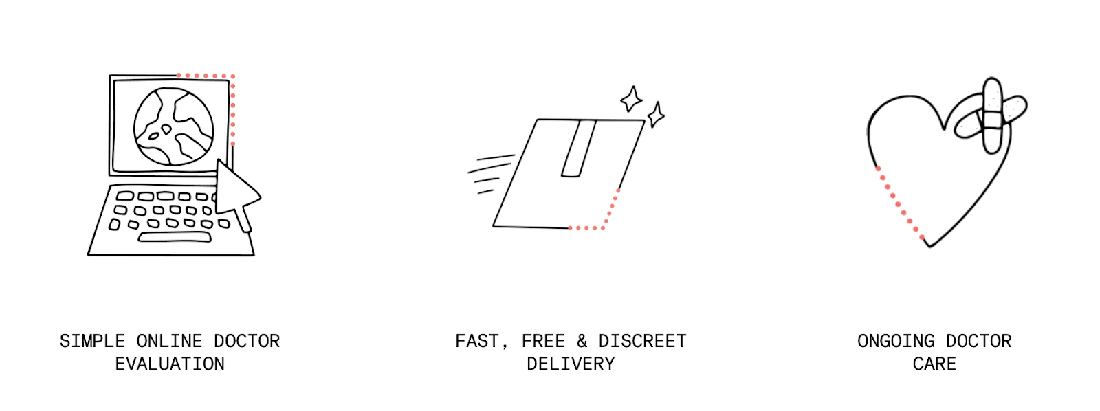
Twentyeight Health is a mission-driven women’s health organization expanding access to reproductive and sexual health services through high quality telemedicine care, a convenient online platform, and affordable options. The company has received multiple awards for its company’s impact, including Fast Company’s Most Innovative Companies, Forbes Next 1000, Top 50 in Digital Health by Rock Health, and the NYC Digital Health 100.
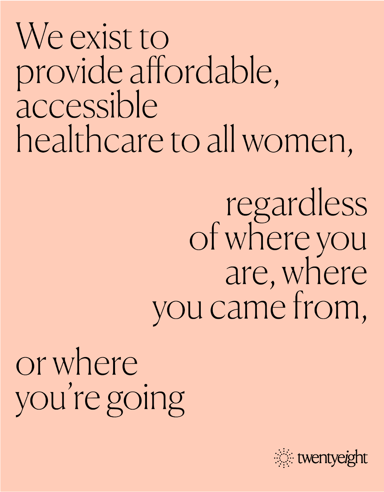
This spring, Twentyeight Health partnered with New York City creative firm Astronaut Monastery on a rebrand that would reflect Twentyeight Health’s mission to provide affordable, accessible healthcare to all women — regardless of where you are, where you came from, or where you’re going.

The logo is a playful, sun-like icon formed of dots, subtly referencing the visual shape of birth control pills. The logotype is punctuated by a slanted “i” that suggests a sense of progress.
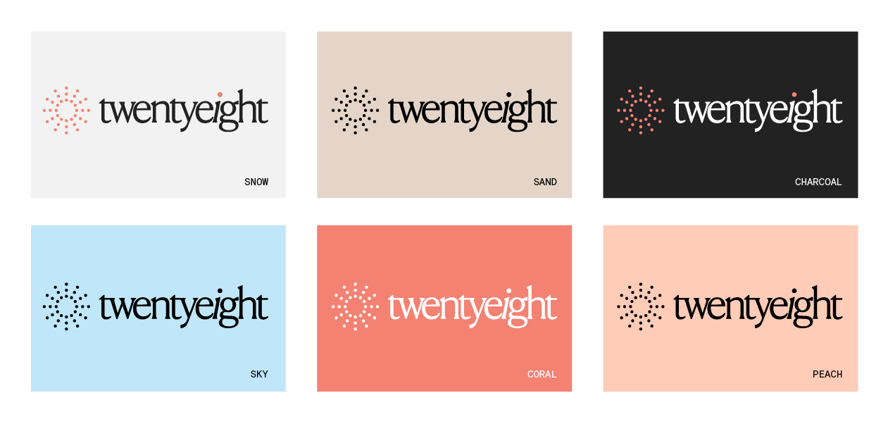
The Twentyeight color palette includes colors that draw inspiration from nature, including snow, sand, charcoal, sky, coral and peach.


For more information, visit:
Website
Instagram


Leave a Reply
Want to join the discussion?Feel free to contribute!