Tour de France rebrands and drops the 'le'
Original Source: http://feedproxy.google.com/~r/CreativeBloq/~3/DM-e4FCn_bM/tour-de-france-rebrand
Le Tour de France is now just Tour de France, according to its new logo. A new bright yellow version of the cycling race's logo was used throughout this year's competition.
And yes, we know, we're a little late to the party, but in all fairness, the competition itself seemed to unveil the new logo and identity with little fanfare, and we were too busy watching Wimbledon/reading our guide to logo design to notice.
The new logo (designer unknown) sticks with the same scrawly font as before, but with subtle differences to the previous logo, created by Joel Guenoun in 2002. The 'o' is now a full circle – which makes sense as it looks more like a wheel than before, the 'u' is less squished in and therefore easier to read, the 'r', or cyclist, is now slightly easier to read too, and there are subtle changes to the letters in the word 'France', which overall add to legibility.
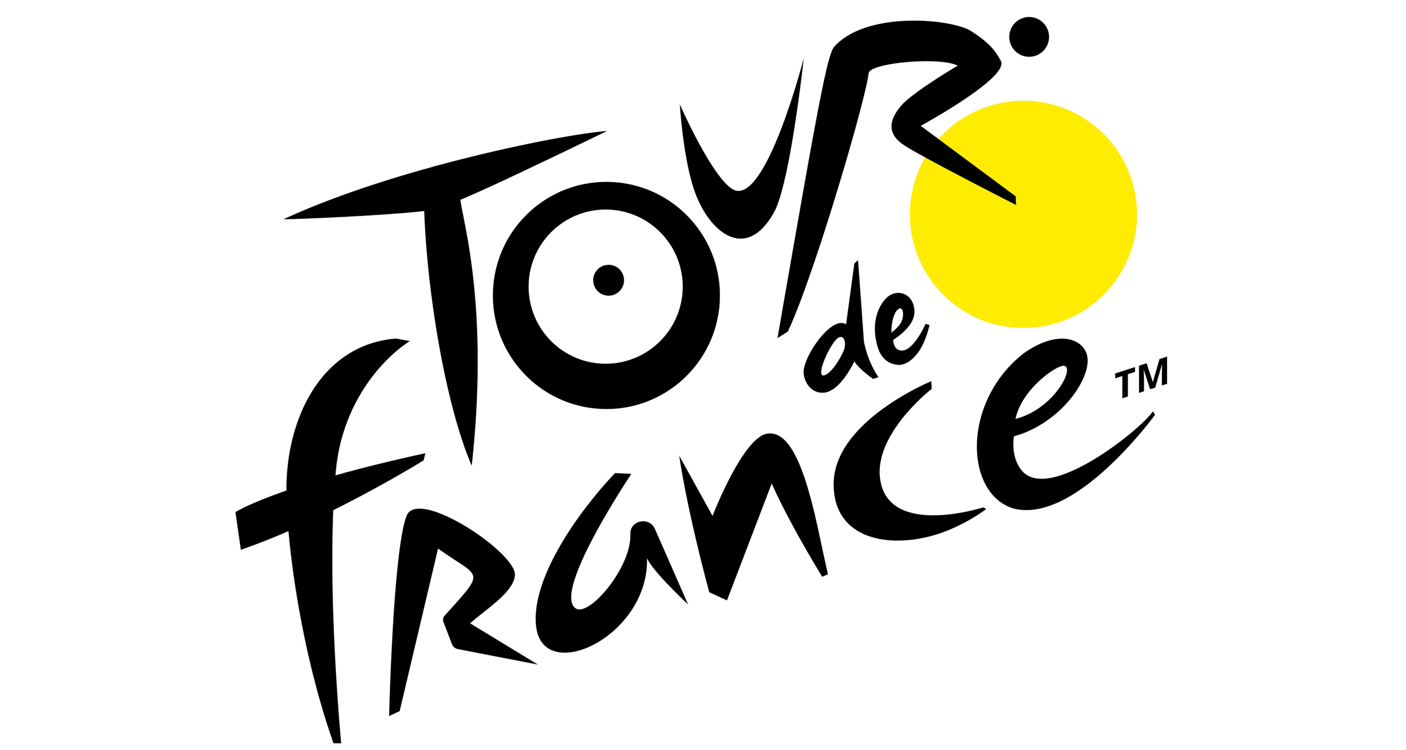
The new logo is trademarked, in case you didn’t know
The 'de' in the logo has also moved, making the logo less likely to be read as 'Le de Tour France'. And of course, the 'le' has gone altogether. This is perhaps the most interesting move in terms of the letters, because the competition is still known as LeTour, even on its own Twitter feed. Was it because the organisers were fed up of people who don't speak French butchering the 'le'? Or was it simply to make the logo neater and easier to place? The designer has also added a 'TM' to the logo, which feels a little unnecessary.
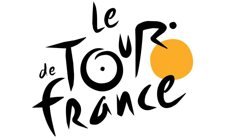
The previous Tour de France logo, complete with a ‘le’
You can see the new logo in action on @LeTour's Twitter feed, below.
The colour palette is also notable. The use of bright yellow, although a little garish, does make sense for Tour de France. The yellow jersey (maillot jaune) is worn by the leader of the race at each stage, and by the winner at the end. And while the previous logo was a sort of nod to this, its circle was more of an orangey hue. This logo matches the jersey much more.
See more about the yellow jersey in the video below.
The dazzling yellow as the wheel/sun of the logo, as well as across the identity in general also reflects the summery feel to the competition, and many will already associate the race with long hot days.
And while those who weren't keen on the previous logo will have hoped the logo would change more significantly, we're just pleased that the 'hidden rider' is still present in the logo. The enlarged 'u' does break this design up a bit, but we think the rider is easier to see now. Although that's perhaps because we can't 'unsee' it.


Leave a Reply
Want to join the discussion?Feel free to contribute!